a guide for the visually perplexed: -...
TRANSCRIPT

A GUIDE FOR THE VISUALLY PERPLEXED:VISUALLY REPRESENTING
SOCIAL NETWORKS
Sean F. EvertonStanford University
© Stanford UniversityJanuary 2004
Version .30A-1

INTRODUCTION
Network analysts have long used sociograms (network diagrams) to visualize the networks they are analyzing. A common technique that analysts use to draft a sociogram is to construct it around the circumference of a circle. The circle helps organize the data, but the order in which analysts place the points is determined only by their attempt to keep the number of lines connecting the various points to a minimum. Typically, researchers using this technique engage in a trial-and-error drafting process until they reach an aesthetically pleasing result (Scott 2000). While such a process can make the structure of relations clearer, the relations between the sociogram’s points reflect no specific mathematical properties. The points are arranged arbitrarily and the distances between them are meaningless.
Not surprisingly, how social network data are spatially arranged in graphs influences how viewers perceive a social network’s structural characteristics (McGrath, Blythe, and Krackhardt 1997). Thus, if we wish to infer “something about the actual sociometric properties of a network, then the physical distance between points should correspond as closely as possible to the graph theoretical distances between them” (Scott 2000:148). To this end, researchers, in recent years, have developed a number of techniques (e.g., metric and non-metric multidimensional scaling, correspondence analysis, spring-embedded algorithms, etc.) that mathematically represent the points in space. This guide provides an overview on how to use these various techniques to visually represent one and two-mode networks.
It begins by first examining how to enter, manipulate and prepare social network data using Microsoft’s Access and Excel programs (Chapter 1). It then demonstrates how to perform initial network analysis in Ucinet (Borgatti and Everett 1997),1 which is a network analysis software program. After preparing our data, it then looks at how to visually represent one-mode (Chapter 2) and two-mode (Chapter 3) networks using two visualization packages, Mage and Pajek.
Mage was developed as a device to be used in molecular modeling (Richardson and Richardson 1992). It produces elegant three-dimensional illustrations that appear as interactive computer displays. Researchers can rotate Mage images, turn parts of the displays on or off, use the mouse to select and identify various points of the network, and animate changes between different arrangements of objects.2 Appendix A provides guidance for editing Mage files (kinemage) in order to take advantages of these features.
Pajek, which is Slovenian for “Spider,” is a network analysis and graph drawing program that has specifically been designed to handle extremely large data sets. It is still in its development stage and can be downloaded for noncommercial use free of charge from the Pajek web site.3 An advantage of Pajek is that its developers are continually updating it, including more and more features that social network analysts use to explore social networks.4
1 UCINET can be purchased from Analytic Technologies (104 Pond Street; Natick, MA 01760) either by phone (508-647-1903) or directly from their web page www.analytictech.com.
2 For more information on Mage, see the article by Freeman, Webster, and Kirke (1998), and visit the following URL: http://www.faseb.org/protein/kinemages/kinpage.html where the program can be downloaded free.
3 Pajek’s latest iteration can be downloaded free for noncommercial use at: http://vlado.fmf.uni-lj/pub/networks/pajek.
Version .42i
After exploring how to visualize simple one and two-mode social networks, the manual then turns to more complex visualization issues. Chapter 4 explores how to visualize social networks over time, while Chapter 5 (forthcoming) looks at various block-modeling techniques available in Ucinet and Pajek.
Note: Version .42 of the manual corrects typographical errors and incorrect references to various figures throughout the manual. It also includes an updated glossary.
4 For example, Pajek .73 included, for the first time, a block modeling option that creates block models based on structural or regular equivalence.
Version .42ii
1. GATHERING AND PREPARING SOCIAL NETWORK DATA
We can gather and prepare social network data in a variety of ways. Here we use Microsoft Access 97 and Excel 97 in order to demonstrate how to gather and prepare the data of one- and two-mode networks.
1.1 Gathering and preparing one-mode social network data
One-mode networks consist of a single set of actors. They differ from two-mode networks in that two-mode networks consist of two sets of actors or one set of actors and one set of events. Actors can be people, groups, organizations, corporations, nation-states, etc. The connections (i.e., relations) between such actors can be friendship or kinship ties, material transactions such as business transactions, the import or export of goods, communication networks involving the sending or receiving of messages, etc.
An example of a one-mode network, one that we will use throughout this manual, is Padgett’s Florentine Families Network (Breiger and Pattison 1986; Padgett and Ansell 1993). Padgett and Ansell collected data on the marriage and business ties (i.e., relations) between 16 prominent Florentine families in 15th century Florence. Both sets of ties were nondirectional and dichotomous. A marital tie was determined to exist if a member of one family married a member of another family while a business tie was determined to exist if a member of one family granted credits, made a loan, or entered into a joint partnership with a member of another family (Wasserman and Faust 1994). For our purposes here we will use the marital tie data.
1.1.1 Gathering and manipulating one-mode social network data
Because of the interchangeability of Microsoft programs we can use either Access or Excel to enter social network data. Excel includes an “autocomplete” feature that compares the text you are typing into a cell with text already entered into the same column. If the same word has been used before, it then completes typing the entry for you. This feature increases accuracy (e.g., consistently spelling the same name the same way each time) and input time, so we recommend, when possible, that you enter social network data initially into Microsoft Excel. You can later import the Excel data into Access. Because we use relatively small networks as examples, it is actually quicker to enter them directly into Access. We use Excel here, however, in order to demonstrate the steps you will want to take with much larger datasets.
We begin by entering the Padgett data into Excel.5 To do so we enter the data into two columns. As can be seen in Figure 1.1 the first column lists the 16 families while the second lists the families with which they have marital ties. Obviously, families with more than one marital tie will be listed more than once in the first column. For example, the Albizzi family has marital ties with the Ginori, Guadagni and Medici families, so it appears three times in the first column. If you look down the first column to the Guadagni family, you will note that it lists a marital tie with the Albizzi family. This is as it should be since the marital ties between the families are reciprocal.
5 The Padgett data are available in matrix form in Appendix B of Wasserman and Faust (Wasserman and Faust 1994:744) and Figure 2.1 in Chapter 2 of this manual.
Version .421-1

In this dataset, the Pucci family has no marital ties with any of the other families. To record this in a way that we ultimately end up with a square matrix, we first have to list the Pucci family in column A with a blank cell next to it in column B. Then, we need to list the Pucci family in column B with a blank cell next to it in column A.
Figure 1.1: Padgett Data Entered into Microsoft Excel 97 Worksheet
After you finish entering the data, you will, of course, want to save it and exit Excel, so that you can move to the next step of importing it into Access.
1.2 Gathering and preparing two-mode social network data
Two-mode networks differ from one-mode networks in that rather than consisting of a single set of actors, they either consist of two sets of actors, or one set of actors and one set of events. Typically, researchers refer to them as affiliation networks, but they have also been referred to as membership networks, dual networks and hypernetworks (Faust 1997; Wasserman and Faust 1994). Affiliation networks are “non-dyadic because the affiliation relation relates each actor to a subset of events, and relates each event to a subset of actors” (Faust 1997:158).
Version .421-2

An example of a two-mode network is Davis’s Southern Club Women (Breiger 1974; Davis, Gardner, and Gardner 1941). Davis and his colleagues recorded the observed attendance of 18 Southern women at 14 social events.
1.2.1 Gathering and manipulating two-mode social network data
As we did with the Padgett data, we enter the data into two columns.6 However, in this case the form of the data differs in that the first column lists the women while the second lists the number of the event that they attended.
Figure 1.2: Southern Women Data Entered Into Microsoft Excel 97 Worksheet
It is important to note that each woman is listed separately for every event they attended. Thus, Laura is listed seven times (with the corresponding event number) because she attended seven different events (1, 2, 3, 5, 6, 7 & 8).
After we finish entering the data, we need to save it, so that we can then import it into Access. Because we import, manipulate, export and read two-mode data in the same way we do one-
6 The Southern Women data is available in matrix form in Figure 3.1 in Chapter 3 of this manual.
Version .421-3

mode data, in what follows we illustrate the process with only one-mode data, but there is no reason why the same techniques cannot be applied to two-mode data.
1.3. Importing social network data into Access 97
The next step in the process is importing this data into Microsoft Access 97. When you first open Access you will see a dialog box that looks like the one in Figure 1.3. Because we are creating a new database, we will choose between the “Blank Database” or “Database Wizard” options. The former, as its name implies, opens up a blank database while the latter initiates a “wizard” that is quite helpful in setting up databases. It provides users with a series of “ready-made” databases that can be readily adapted for other purposes. Our purpose here, however, is not to provide an introduction to Access but simply to show how we can import and manipulate network data using Access. Thus, we will choose the “Blank Database” option. For those who are interested in learning more about Access, we suggest you consult the book, Sams Teach Yourself Access 97 in 21 Days (Eddy, Cassel, Goodling, and Stewart 1998). Once you have created a database, you will choose the option “Open an Existing Database,” which should appear in the list of files appearing just below this option.
Figure 1.3: Access’s Opening Dialog Box
After choosing the “Blank Database” option, you will see a screen that looks similar (but probably not identical) to the one that appears in Figure 1.4.
Version .421-4

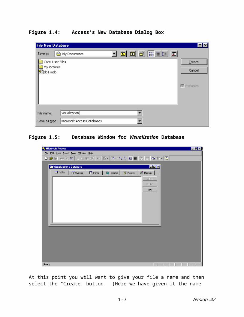
Figure 1.4: Access’s New Database Dialog Box
Figure 1.5: Database Window for Visualization Database
At this point you will want to give your file a name and then select the “Create” button. (Here we have given it the name “Visualization.”) Selecting this opens a new database window similar to the one shown in Figure 1.5. Under the “File” menu select “Get External Data.” This
Version .421-5

provides you with two choices: either to “Import” data or to “Link Files.” Select “Import.” This will bring up a dialog box (Figure 1.6) that allows you to first find the Excel spreadsheet you created earlier and then import it. Note that the box provides a number of criteria by which to locate your files. It even provides a “Find” function if you are unsure as to where you saved your Excel file. The important thing here, though, is that in the “Files of Type” box you have selected “Microsoft Excel.”
Figure 1.6: Access’s Import Dialog Box
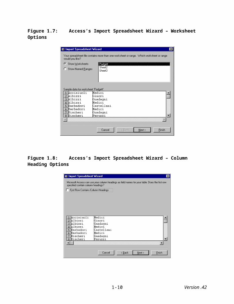
Click on the “Import” button, and Access will bring up its Import Spreadsheet Wizard (see Figure 1.7). As you can see this wizard initially asks what Excel worksheets you want to import. Currently, we are only interested in the Padgett data, which in this case is the default that Access has selected.
Click on the “Next” button, which takes you to the next dialog box (see Figure 1.8) that asks whether the first row of the data contain column headings. In this case it does not, so we do check the box and move on to the following dialog box by clicking on the “Next button.
Version .421-6

Figure 1.7: Access’s Import Spreadsheet Wizard – Worksheet Options
Figure 1.8: Access’s Import Spreadsheet Wizard – Column Heading Options
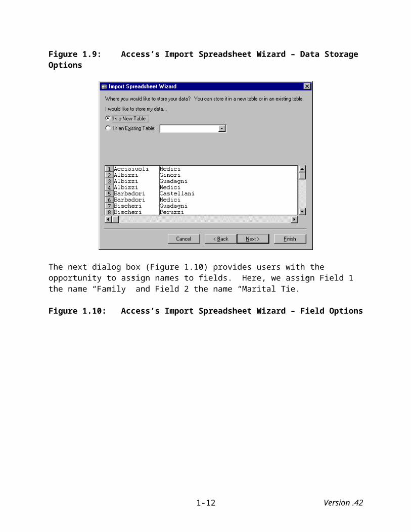
This next dialog box (Figure 1.9) asks where we want to store the data: in an existing table or in a new one. Here, we select the new table option.
Version .421-7
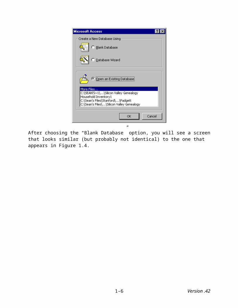
Figure 1.9: Access’s Import Spreadsheet Wizard – Data Storage Options
The next dialog box (Figure 1.10) provides users with the opportunity to assign names to fields. Here, we assign Field 1 the name “Family” and Field 2 the name “Marital Tie.”
Figure 1.10: Access’s Import Spreadsheet Wizard – Field Options
Version .421-8
The next dialog box asks whether you want Access to add the table’s primary key. In this case, we will say yes although whether you do will largely depend on the data being imported and whether it already contains a field you wish to designate as the primary key. For more information on primary keys see Eddy et al. (1998). The final dialog box (not shown) asks you to assign a name to the table you are creating. In this case we use the name “ Padgett.”
Figure 1.11: Access’s Import Spreadsheet Wizard – Primary Key Options
Once the import process is complete Access will return to the standard database window displayed in Figure 1.5 except now it will contain a new table. Clicking on the “Open” button opens a table similar to the one displayed in Figure 1.12.
Version .421-9
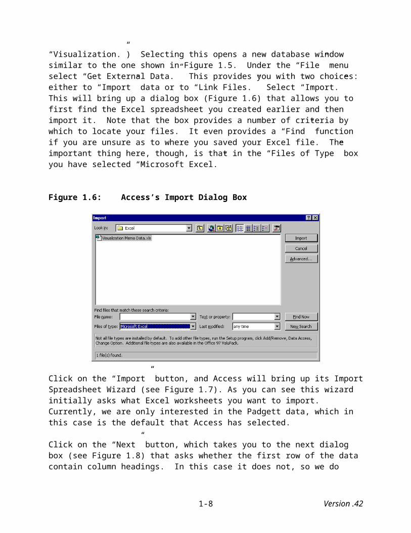
Figure 1.12: Opened Padgett Table in Access
1.4 Creating social network matrices in Access 97
The next step in the process is to create a crosstabulation of the Padgett data such that we can export it as a matrix to Excel and ultimately to Ucinet. At the database window (see Figure 1.5) select the “Queries” tab. Click on the “New” query button, and this will bring up a dialog box similar to the one displayed in Figure 1.13. Select the “Crosstab Query Wizard” option and click “OK.” This will bring up the Crosstab Query wizard, which guide us through the process of creating a crosstabulation.
Version .421-10

Figure 1.13: Access’s Query Dialog Box
The query first asks (see Figure 1.14) what tables and queries that will be used to create the crosstab. Since Access is a relational database, it allows us to use multiple tables in creating our queries. What is extremely helpful is the fact that if after we have created a crosstab (or other query), we make changes to the table(s) on which it is based, Access automatically updates the crosstab.
Figure 1.14: Access’s Crosstab Query Wizard
In this case we only have one table to select (Padgett) so we highlight it and click on the “Next” button. The wizard then asks (Figure 1.15) what fields’ values we want as the row heading.
Version .421-11
Here we select “Family,” move it (using the arrow button) from the “Available Fields” to the “Selected Fields” box and then click on the “Next” button.
Figure 1.15: Access Crosstab Query Wizard – Row Heading Options
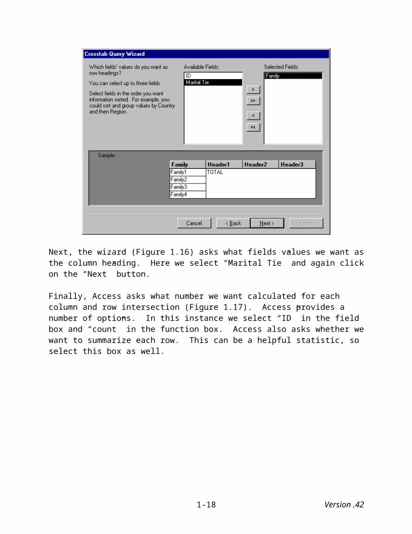
Next, the wizard (Figure 1.16) asks what fields values we want as the column heading. Here we select “Marital Tie” and again click on the “Next” button.
Finally, Access asks what number we want calculated for each column and row intersection (Figure 1.17). Access provides a number of options. In this instance we select “ID” in the field box and “count” in the function box. Access also asks whether we want to summarize each row. This can be a helpful statistic, so select this box as well.
Version .421-12

Figure 1.16: Access Crosstab Query Wizard – Column Heading Options
Figure 1.17: Access Crosstab Query Wizard – Calculation Options
Version .421-13
The final dialog box (not shown) asks what we wish to name the crosstab (it does provide a default name). Type in a name and click on the “Finish” button. This will open a crosstab similar to the one that appears in Figure 1.18.
Figure 1.18: Access 97 Crosstabulation Query of Padgett Data
Notice that the names of the families appear both down the left side (rows) and across the top (columns) as you would find in a typical matrix. The query includes a “Total of ID” column that tabulates (in this case) the number of marital ties that each family has with other families. It also includes a “<>” column that indicates, at least in this case, families that have no ties as is the case with the Pucci family. The blank row indicates that none of the families have a marital tie with the Pucci family. A quick comparison of this data with Wasserman and Faust (1994:744) indicates that we have indeed imported and manipulated the data correctly.
1.5 Preparing data for Ucinet
The next step in the process is to prepare the data for analysis in Ucinet. To do this we first export the data from Access to Excel, and then copy the data from Excel into Ucinet. With the query open that you want to export to Excel, click on the “Tools” menu, select “Office Links,” and click on “Analyze It with MS Excel.” This opens the Excel program and exports the data into Excel (Figure 1.19) in a format that looks almost identical to the Access crosstabulation.
First, delete the second row (blank) and the second (Total ID) and third (<>) columns since these will not be part of our final matrix.7 Next, open Ucinet. Along the top of the screen you will find four buttons. The second opens the “Ucinet Spreadsheet.” In principle, the Ucinet spreadsheet should allow us to import Excel data directly into Ucinet. Unfortunately, it does not always work properly. If it does not, simply copy and paste the data from Excel to Ucinet. Once pasted, the data should look something like what you see in Figure 1.20.
7 Access creates these rows and columns as part of the crosstab query. The totals are useful for initially checking the data, but they are not needed for the matrix.
Version .421-14

Figure 1.19: Exported Access Data into Excel Spreadsheet
Figure 1.20: The Ucinet Spreadsheet
Before we can analyze the data we need to fill the empty cells with zeroes. Ucinet has a feature that will perform this task for us, so all we need to do is go to the cell in the lower right hand cell
Version .421-15

of the matrix. Next, click on the “Fill” icon that can be found on the toolbar. This should fill all the empty cells with zeroes. Next, we need to save the data. The “Save” function can be found under the “File” menu or can be activated by clicking on the “Floppy Disk” icon on the toolbar. Once you have saved the data, click on the “OK” button and you will exit the Ucinet Spreadsheet feature.8
8 We should do one last thing before analyzing the data. Whenever data is pasted and saved into Ucinet as we have done here, Ucinet’s “Display” function does not display the data completely for some reason. This is especially true for large datasets. Thus, it is worth reopening Ucinet’s Spreadsheet feature, opening the file and resaving it. Repeating this procedure seems to take care of the problem.
Version .421-16

2. VISUAL REPRESENTATIONS OF ONE-MODE NETWORKS
As noted earlier one-mode networks consist of a single set of actors and differ from two-mode networks in that the latter consist of two sets of actors or one set of actors and one set of events. We begin by visualizing symmetric one-mode matrices because, at least when it comes to using multidimensional scaling techniques, they are simpler to represent visually than are asymmetric one-mode matrices. For this, we use the marital ties of Padgett’s Florentine Families (discussed in Chapter 1). We first explore how to visually represent this social network using Mage and then repeat the process using Pajek. Next, we explore the somewhat more complicated task of visually representing asymmetric one-mode matrices. For this task, we use the “advice network” of Krackhardt’s (1987) High Technology Managers (discussed in more detail below).
2.1 Visualizing Symmetric One-Mode Matrices using Mage
Figure 2.1 presents the Padgett marriage data in matrix form. Note that the rows and columns are identical (i.e., the names of the various Florentine families) and xij = xji for all i and j.9
Figure 2.1: Adjacency Matrix of Padgett’s Florentine Families
The first task is to use this matrix to calculate a set of related coordinates. We then export both the matrix and its related coordinate files in a form readable by Mage.
2.1.1 Calculating coordinate files
As noted earlier, network analysts have long used sociograms to visualize social networks. A technique that was commonly used was to construct the data around the circumference of a circle. Unfortunately, while such a process can make the structure of relations clearer, the relations between the sociogram’s points reflect no specific mathematical properties. The points
9 This is as it should be since marital ties are, by definition, reciprocal.
Version .422-1

are arranged arbitrarily and the distances between them are meaningless, which, depending on how they are arranged, can lead to varying interpretations of the data (McGrath, Blythe, and Krackhardt 1997).
In recent years analysts have begun using a series of mathematical techniques to locate the points of a network in such a way that the distances between them are meaningful. Multidimensional scaling (MDS) is one such technique. It is a mathematical approach that uses the concepts of space and distance to represent a network’s internal structure, which, in turn, can help reveal, among other things, what actors are “close” to one another or potential cleavages between sets of actors (Wasserman and Faust 1994). The typical input to MDS is a one-mode symmetric matrix consisting of measures of similarity or dissimilarity between pairs of actors. Output generally consists of a set of estimated distances among pairs of actors that can be then represented in one-, two-, three- or higher-dimensional space (Kruskal and Wish 1978; Wasserman and Faust 1994). Using Ucinet we will compute the coordinates of the Padgett data using three-dimensional multidimensional scaling that, in turn, will then be used to place points representing the various families in 3-dimensional space.
Ucinet provides users with a choice between metric and non-metric MDS. Metric MDS takes a given matrix of proximities that measure the similarities or dissimilarities among a set of actors and calculates a set of points in k-dimensional space, such that the distances between them correspond as closely as possible to the input proximities (Borgatti, Everett, and Freeman 1999).10 Metric distance differs from distance in graph theory. In graph theory, the distance between two points is measured in terms of the number of lines in the path that connects the two points. In MDS the distance between two points is the most direct route between them. “It is a distance that follows a rout ‘as the crow flies’, and that may be across ‘open space’ and need not – indeed, it normally will not – follow a graph theoretical path” (Scott 2000:148-149).
There are some limitations to using metric MDS for visualizing social networks. Many relational data sets, such as the Padgett data, are binary in form. That is, they simply indicate either the presence or absence of a tie, and thus we cannot directly use such data to measure proximities. We first need to convert it into other measures, such as correlation coefficients, before calculating it metric properties. However, data conversion such as this may lead researchers to draw unjustifiable conclusions about the data. Even when the data are valued, metric assumptions may be inappropriate. For example, a family with four marital ties may not be twice as central to one with only two. While it may be legitimate to consider the former as being more central than the latter, it is difficult to be certain about how much more central it might be (Scott 2000:157).
Non-metric MDS procedures, like metric MDS procedures, use symmetrical adjacency matrices in which the cells show the similarities or dissimilarities among actors. However, unlike metric MDS procedures, they do not convert these values directly into Euclidean distances. Instead, they consider only rank order. They treat the data, in other words, as ordinal. Non-metric MDS procedures “seek a solution in which the rank ordering of the distances is the same as the rank ordering of the original values” (Scott 2000:157). Non-metric MDS is often preferred because it
10 The Padgett data proximities represent similarities between the families. That is, a “1” in a matrix cell means that the two families represented by that cell share a marital tie.
Version .422-2

tends to provide a better “goodness-of-fit” (stress) statistic. The lower the stress (0 = perfect fit), the better. Generally, stress levels below .1 are considered excellent while levels above .2 are considered unacceptable (Borgatti, Everett, and Freeman 1999).
To illustrate the differences between the two methods we will employ both metric and non-metric MDS procedures, beginning with metric MDS and followed with non-metric MDS.
2.1.1.1 Metric multidimensional scaling
Under the “Tools” menu, first select the “MDS” submenu, which provides a choice between “metric” or “non-metric” MDS scaling. Choose “metric.” This brings up the following dialog box (Figure 2.2):
Figure 2.2: Metric MDS Dialog Box
The parameters of the Metric MDS option are as follows:
Input dataset: Name of file containing the adjacency matrix. Data type: Square symmetric matrix.
Number of dimensions: (Default = 2). This represents the number of dimensions to use in representing items in Euclidean space. Change the default setting to 3.
Similarities or Dissimilarities? (Default = Similarities). This choice determines whether the data will represent similarities or dissimilarities between the nodes. If similarities, large values of X(i,j) will draw i and j close together on the MDS map. If dissimilarities, large values will push i and j apart on the map.
Starting Configuration (Default = Classic): This parameter tells Ucinet how to generate initial location of points in k-dimensional space. It is important to realize that MDS solutions are not unique and are subject to convergence to local minima. The first point means that
Version .422-3
two or more sets of coordinates can be equally good (i.e., having the same stress level) but place points in radically different locations. The second point means that it is possible for the algorithm to fail to find the configuration with the least stress. If you suspect this has happened, it is advisable to run the program several times using random starting configurations (Borgatti, Everett, and Freeman 1999). The choices Ucinet provides are:
Classic - Selecting this option performs Gower's “classical” metric ordination procedure.
File - Reads starting coordinates from UCINET dataset. If this option is chosen then the user must complete the parameter.
Random – This option locates points randomly in space. As noted above MDS procedures often yield lower stress levels when using a random starting configuration
Adjust data to nearest Euclidean (Default = Yes): This procedure iteratively adjusts the data so that it obeys the triangle inequality.
Output dataset (Default = 'MetricMdsCoord'): This file will contain the Euclidean coordinates. Rather than using the default name, choose one that is related to the file you are working with. Here I named the Padgett MDS file “PadgMDS.”
Running this procedure produces both a scatterplot, which we do not need, and an output file that lists the MDS coordinates:
Figure 2.3: Metric Multidimensional Scaling of Padgett Florentine Families
1 2 3 ------ ------ ------ 1 ACCIAIUOL 1.579 -0.278 0.237 2 ALBIZZI 1.215 0.992 0.621 3 BARBADORI 0.007 -1.030 0.566 4 BISCHERI -0.754 0.973 0.117 5 CASTELLAN -0.735 -0.452 0.745 6 GINORI 1.056 1.141 1.337 7 GUADAGNI 0.428 1.268 -0.091 8 LAMBERTES 0.178 1.783 0.399 9 MEDICI 0.896 -0.291 0.174 10 PAZZI 0.455 -0.164 1.846 11 PERUZZI -0.983 0.354 0.674 12 PUCCI -0.323 0.932 1.803 13 RIDOLFI 0.175 -0.190 -0.643 14 SALVIATI 0.873 -0.423 1.410 15 STROZZI -0.790 0.109 0.022 16 TORNABUON 0.676 0.411 -0.647
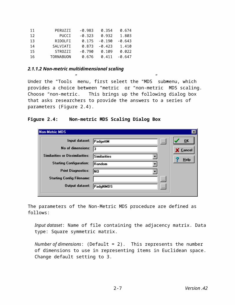
2.1.1.2 Non-metric multidimensional scaling
Under the “Tools” menu, first select the “MDS” submenu, which provides a choice between “metric” or “non-metric” MDS scaling. Choose “non-metric.” This brings up the following dialog box that asks researchers to provide the answers to a series of parameters (Figure 2.4).
Version .422-4

Figure 2.4: Non-metric MDS Scaling Dialog Box
The parameters of the Non-Metric MDS procedure are defined as follows:
Input dataset: Name of file containing the adjacency matrix. Data type: Square symmetric matrix.
Number of dimensions: (Default = 2). This represents the number of dimensions to use in representing items in Euclidean space. Change default setting to 3.
Similarities or Dissimilarities? (Default = Similarities). This choice determines whether the data will represent similarities or dissimilarities between the nodes. If similarities, large values of X(i,j) will draw i and j close together on the MDS map. If dissimilarities, large values will push i and j apart on the map.
Starting Configuration (Default = Torsca): This parameter tells Ucinet how to generate initial location of points in space. As we noted above it is important to know that MDS solutions are not unique and are subject to convergence to local minima. The first point means that two or more sets of coordinates can be equally good (i.e., having the same stress level) but place points in radically different locations. The second point means that it is possible for the algorithm to fail to find the configuration with the least stress. If you suspect this has happened, it is advisable to run the program several times using random starting configurations (Borgatti, Everett, and Freeman 1999). The choices Ucinet provides are:
Classic - Performs Gower's classical metric ordination procedure.
Torsca - Uses principal components of rank-order data.
File - Reads starting coordinates from UCINET dataset. If this option is chosen then the user must complete the parameter.
Version .422-5

Random – This option locates points randomly in space. This procedure often yields lower stress levels and, surprisingly, better images because the coordinates do not end up as closely “bunched” together as when they use the Torsca starting configuration.
Print Diagnostics (Default = No): If Yes is selected, then dyads with large discrepancies between the proximity data and the plot distances will be printed.
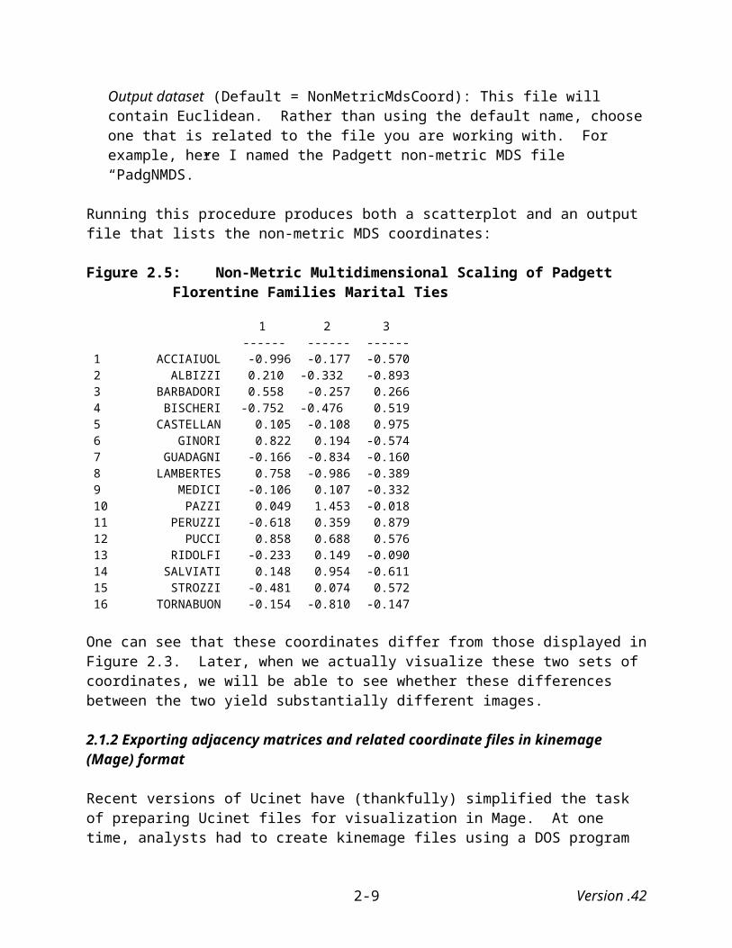
Output dataset (Default = NonMetricMdsCoord): This file will contain Euclidean. Rather than using the default name, choose one that is related to the file you are working with. For example, here I named the Padgett non-metric MDS file “PadgNMDS.”
Running this procedure produces both a scatterplot and an output file that lists the non-metric MDS coordinates:
Figure 2.5: Non-Metric Multidimensional Scaling of Padgett Florentine Families Marital Ties
1 2 3 ------ ------ ------ 1 ACCIAIUOL -0.996 -0.177 -0.570 2 ALBIZZI 0.210 -0.332 -0.893 3 BARBADORI 0.558 -0.257 0.266 4 BISCHERI -0.752 -0.476 0.519 5 CASTELLAN 0.105 -0.108 0.975 6 GINORI 0.822 0.194 -0.574 7 GUADAGNI -0.166 -0.834 -0.160 8 LAMBERTES 0.758 -0.986 -0.389 9 MEDICI -0.106 0.107 -0.332 10 PAZZI 0.049 1.453 -0.018 11 PERUZZI -0.618 0.359 0.879 12 PUCCI 0.858 0.688 0.576 13 RIDOLFI -0.233 0.149 -0.090 14 SALVIATI 0.148 0.954 -0.611 15 STROZZI -0.481 0.074 0.572 16 TORNABUON -0.154 -0.810 -0.147
One can see that these coordinates differ from those displayed in Figure 2.3. Later, when we actually visualize these two sets of coordinates, we will be able to see whether these differences between the two yield substantially different images.
2.1.2 Exporting adjacency matrices and related coordinate files in kinemage (Mage) format
Recent versions of Ucinet have (thankfully) simplified the task of preparing Ucinet files for visualization in Mage. At one time, analysts had to create kinemage files using a DOS program (uci2kin) that combined adjacency matrices with their related coordinate files. Ucinet has now incorporated this process into the program itself.
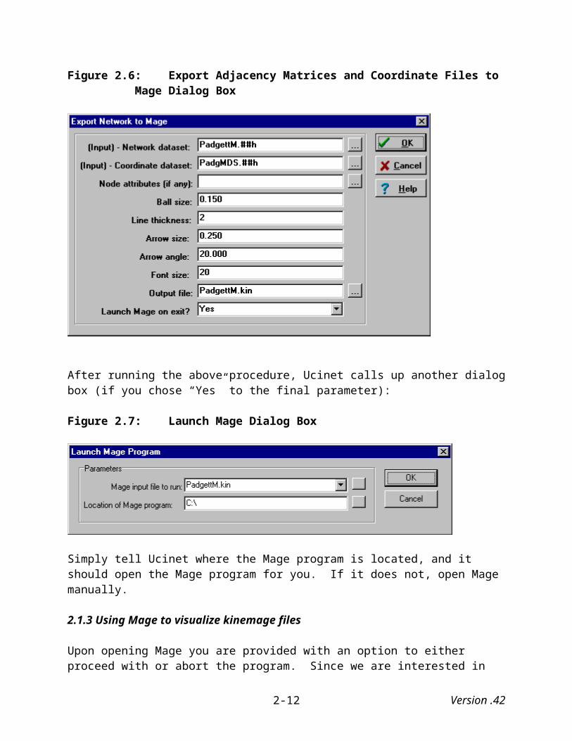
To visualize the Padgett data using the coordinates using metric MDS, under the “Tools” menu, select “Export” and then “Mage.” This brings up a dialog box (Figure 2.6) with the following parameters:
Version .422-6

(Input) Network dataset: Name of file containing data to be exported. Data type: Adjacency matrix. In this example, PadgettM.##h.
(Input) Coordinate dataset: Name of file containing the coordinates of points for the layout of the data (e.g., coordinate output of metric or non-metric MDS). In this example, PadgMDS.##h.
Node attributes (if any): Name of file containing actor attributes, given as a vector of shared attributes so that (1,2,3,1,2,2) means that actors 1 and 4 share the same attribute actors 2, 5,and 6 share the same attribute and actor 3 has a different attribute from all the others. I do not use this in the example.
Ball Size: Use default; easily changed in kinemage file (see Appendix A).
Line Thickness: Use default; easily changed in kinemage file (see Appendix A).
Arrow Size: Use default
Arrow Angle: Use default
Font Size: Use default
Output data file: Name of file to be created. Here, I used PadgettM.kin (the default).
Launch Mage on exit?: Feature in Ucinet that, in theory, allows researchers to launch Mage from within Ucinet. Unfortunately, it does not always work.
Version .422-7
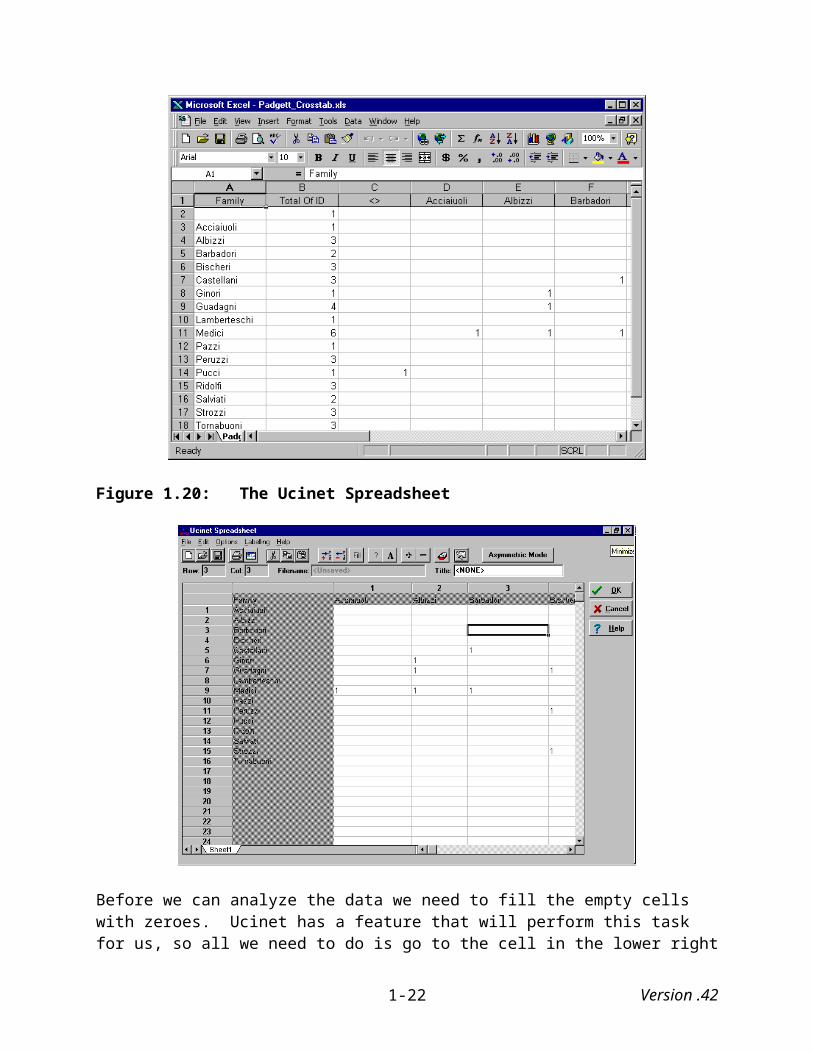
Figure 2.6: Export Adjacency Matrices and Coordinate Files to Mage Dialog Box
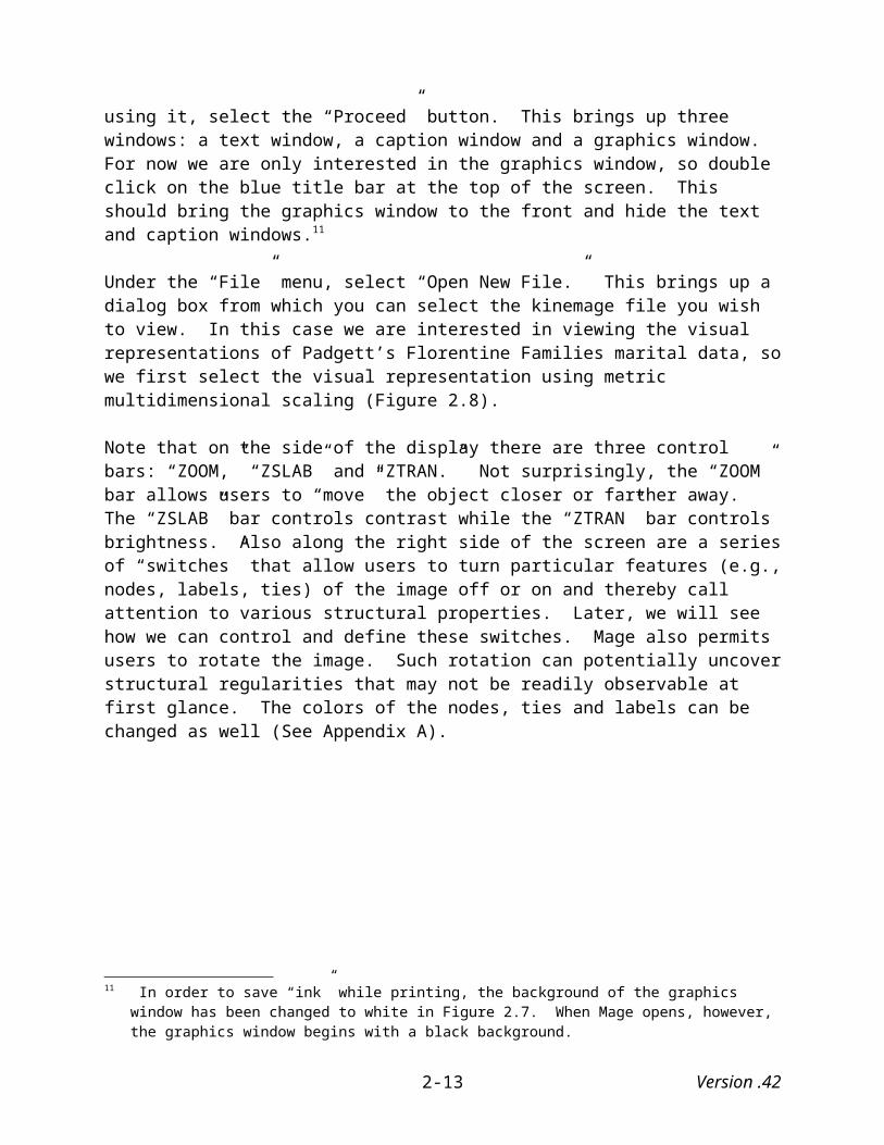
After running the above procedure, Ucinet calls up another dialog box (if you chose “Yes” to the final parameter):
Figure 2.7: Launch Mage Dialog Box
Simply tell Ucinet where the Mage program is located, and it should open the Mage program for you. If it does not, open Mage manually.
2.1.3 Using Mage to visualize kinemage files
Upon opening Mage you are provided with an option to either proceed with or abort the program. Since we are interested in using it, select the “Proceed” button. This brings up three windows: a text window, a caption window and a graphics window. For now we are only interested in the graphics window, so double click on the blue title bar at the top of the screen. This should bring the graphics window to the front and hide the text and caption windows.11
11 In order to save “ink” while printing, the background of the graphics window has been changed to white in Figure 2.7. When Mage opens, however, the graphics window begins with a black background.
Version .422-8

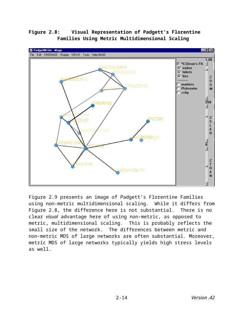
Under the “File” menu, select “Open New File.” This brings up a dialog box from which you can select the kinemage file you wish to view. In this case we are interested in viewing the visual representations of Padgett’s Florentine Families marital data, so we first select the visual representation using metric multidimensional scaling (Figure 2.8).
Note that on the side of the display there are three control bars: “ZOOM,” “ZSLAB” and “ZTRAN.” Not surprisingly, the “ZOOM” bar allows users to “move” the object closer or farther away. The “ZSLAB” bar controls contrast while the “ZTRAN” bar controls brightness. Also along the right side of the screen are a series of “switches” that allow users to turn particular features (e.g., nodes, labels, ties) of the image off or on and thereby call attention to various structural properties. Later, we will see how we can control and define these switches. Mage also permits users to rotate the image. Such rotation can potentially uncover structural regularities that may not be readily observable at first glance. The colors of the nodes, ties and labels can be changed as well (See Appendix A).
Version .422-9

Figure 2.8: Visual Representation of Padgett’s Florentine Families Using Metric Multidimensional Scaling
Figure 2.9 presents an image of Padgett’s Florentine Families using non-metric multidimensional scaling. While it differs from Figure 2.8, the difference here is not substantial. There is no clear visual advantage here of using non-metric, as opposed to metric, multidimensional scaling. This is probably reflects the small size of the network. The differences between metric and non-metric MDS of large networks are often substantial. Moreover, metric MDS of large networks typically yields high stress levels as well.
Version .422-10
Figure 2.9: Visual Representation of Padgett’s Florentine Families Using Non-Metric Multidimensional Scaling
2.2 Visualizing Symmetric One-Mode Matrices using Pajek
Pajek does not use MDS to arrange a network’s nodes in visual space, but rather provides spring-embedding algorithms that place nodes in either 2 or 3-dimensional space in ways similar to MDS. It can also handle extremely large datasets and create kinemage files that can be visualized by Mage. Matrices have to be prepared in such a way that Pajek can read them. Again, the Padgett marriage data are used.
2.2.1 Exporting the adjacency matrix
The first step is to export the adjacency matrix from Ucinet. Under the “Data” menu, select “Export,” which provides us with a choice of exporting the data in a number of formats: DL, Krackplot, Mage, Pajek, Metis, Raw, Ucinet 3.0, and Excel. Under “Pajek,” choose “Network,” which brings up the following dialog box:
Version .422-11

Figure 2.10 Ucinet Export to Pajek Dialog Box
The parameters are defined as follows:
Input dataset: Name of matrix file containing data to be exported. Like before simply select the name of the matrix you plan to export.
Dichotomize vals > than: Allows you to transform valued matrices into dichotomized matrices. Default = null.
Delete isolates: Allows you to delete isolated nodes.
[Input] – Coordinate dataset: Allows you to use coordinates calculated in Ucinet (e.g., MDS) for Pajek visualizations.
[Input] – Attribute dataset: Allows you to create attribute files for visualization with Pajek.
Output dataset: Here provide the name of the file to be created.
Launch Pajek on exit?: Allows you to launch Pajek from within Ucinet once the data are exported.
After running this program, the following dialog box will appear if you chose to launch Pajek upon “exit”:
Version .422-12

Figure 2.11: Launch Pajek Program Dialog Box
If all goes well (and this seems to work from time-to-time), Ucinet launches Pajek when you click the “OK” button. If not, open Pajek manually.
2.2.2 Visualizing with Pajek
When you open Pajek you will initially see that it presents a number menu options. A causal “stroll” through these immediately conveys the sense that Pajek allows users to perform a number of network operations, from basic analyses of networks to creating and analyzing partitions, permutations, clusters, etc. In this manual we merely scrape the surface of Pajek’s capabilities.
After opening Pajek, we need to first import the data prepared and exported by Ucinet. Under the “File” menu, select “Network” and then “Read,” as is illustrated in Figure 2.12 below. Alternatively, you can click on the “open file” icon to the left of the Network dialog box in Pajek’s Main Screen. Either way Pajek automatically looks for files with a “.net” extension. Click on the “.dat” file you exported from Ucinet. In this case it is “PadgettM.net.” Pajek’s report box will appear indicating that it has successfully read the data. In this case the report box tells us that Pajek read 56 lines (see Figure 2.13).
Version .422-13
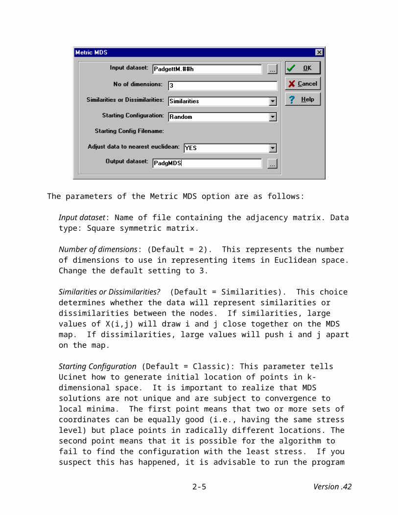
Figure 2.12: Opening Network Data in Pajek
Figure 2.13 Pajek’s Report Box
Close the report box by clicking on the “X” box in the upper right hand corner, and you will return to Pajek’s main screen, except now that the name of the data file that we just read into Pajek appears in the “Network” drop list (Figure 2.14).
Version .422-14

Figure 2.14 Pajek’s Main Screen after Reading Padgett Marriage Network Data
Next, under the “Draw” menu, select “Draw,” (i.e., not “Draw-Partition,” “Draw-Partition-Vector,” “Draw-Vector,” or “Draw-Select All.” – we will return to some of these options later, but for now we stay with a relatively simple case, primarily because we are dealing with one-mode data that does not lend itself to these other forms of analyses). After selecting draw, Pajek brings up the “Draw” screen where the image will appear. The data’s initial appearance depends on which of Pajek’s starting layout options has been chosen or any coordinate data exported from Ucinet. It also brings up a new set of menu selections from which we will next choose one of two drawing programs to graphically represent the Padgett marriage data.
Before drawing the network data we first have to tell Pajek whether the values assigned to the lines connecting the vertices represent similarities or dissimilarities between the vertices. In the case of the Padgett data, a value of “1” indicates the presence of a tie while a value of “0” indicates the absence of one, so the values are indicators of similarity between the various families. To tell Pajek that the Padgett data values represent similarities, under the “Options” menu, select “Value of Lines” and then “Similarities.”
Pajek uses two “spring-embedded” algorithms for visualizing network data: Kamada-Kawai and Fruchterman Reingold. Both algorithms think of the points as pushing and pulling on one
Version .422-15
another and seek to find an optimum solution where there is a minimum amount of stress on the springs connecting the whole set of points (Freeman 2000).
2.2.2.1 The Kamada-Kawai Spring Embedded Algorithm
The Kamada-Kawai (1989) algorithm is based on an assumed attraction between adjacent points and an assumed repulsion between non-adjacent points and allocates points in two-dimensional space. To use this algorithm under the “Layout” menu, select “Kamada-Kawai.” You are next given the option of allowing the algorithm to “freely” distribute the various nodes and their respective edges in visual space, fixing the first and last nodes, or identifying a node you would like to appear in the middle of the drawing (e.g., the most central actor). Using the “Free” option you should get a graphical representation of the Padgett marriage data that is similar to (but not identical) to the one illustrated in Figure 2.15.12
The Kamada-Kawai algorithm has several options worth noting. One is that it allows analysts fix the position of certain vertices (e.g., a specific class), and then optimize the position of all other vertices with the “Fix selected vertices” command. Pajek also allows you to fix the first and last vertices in a network (using the “Fix first and last vertices” command), or place a selected vertex in the middle of the drawing using (using the “Fix one in the middle” command).
12 It is important to note that there is no unique “solution” for either of these algorithms, so that every time we use them, Pajek will draw them differently. In spite of this, repeated drawings of the same network data tend to resemble one another. It is generally a good idea to visualize the data using the energy commands more than once. Results do depend on the starting position of vertices, so different starting positions may (and often do) yield different results. The results are generally similar, but it seems logical that using an energy a second time will yield a more accurate drawing of the data since it will begin with starting positions that are not random and reflect, to a certain extent, the correct relationship between the various nodes.
Version .422-16

Figure 2.15: Visual Representation of Padgett’s Marriage Data Using Kamada-Kawai
Note that in Pajek, unlike in Mage, the lines connecting the various nodes (edges) are represented as arrows. This is because Pajek read the Padgett data exported from Ucinet as “arcs” rather than as “edges,” which they technically are. This is generally not a problem if the social network you are visualizing consists entirely of arcs or entirely of edges. However, if a social network consists of both arcs and edges, then you may need to edit the data if you want the arrows in your graphs to be properly represented. See Appendix B on the editing and printing of Pajek images.
This image itself captures some of the dynamics of this social network. The Medici family, which history and a variety of centrality measures have told us was the most central family, clearly appears to be one of the most, if not the most, central family, while the Pazzi, Acciaiuol, Lambertes, and Ginori families fall along the periphery. It is interesting to note, however, that the Pucci family, which has no marital ties to any of the other families in the network, is located more centrally than are some of the other families. This is nonsensical and points to a limitation of the Kamada-Kawai algorithm. Because in this algorithm unconnected points neither attract nor repel other points in the network, it randomly places unconnected points in social space, such that they occasionally are placed nonsensically. Repeated use of this algorithm to visualize this data seems to confirm this suspicion.
Version .422-17
2.2.2.2 The Fruchterman Reingold Spring Embedded Algorithm
The Fruchterman Reingold (1991) algorithm is similar to the Kamada-Kawai algorithm, but rather than assuming attraction between adjacent points and repulsion between non-adjacent points, it attempts to simulate a system of mass particles where the vertices simulate mass points repelling each other while the edges simulate springs with attracting forces. It then tries to minimize the “energy” of this physical system. It also differs from the Kamada-Kawai algorithm in that it is able to distribute points in both two-dimensional and three-dimensional space.
To use the Fruchterman Reingold algorithm to graphically represent the Padgett marriage data in two-dimensional space, under “Layout” first select “Fruchterman Reingold” and then “2D.” This will produce an image similar to the one displayed in Figure 2.16.
Here, as in Figure 2.14, the Medici family falls in the center of the graph while other families such as the Pazzi, Acciaiuol, Lambertes, and Ginori fall along the periphery. In this drawing, however, the Pucci family is clearly an outlier while in Figure 2.15 it was not. Repeated implementation of this algorithm yields essentially the same representation.
Turning to a three-dimensional graph of this data using the Fruchterman Reingold algorithm, under “Energy” first select “Fruchterman Reingold” and then “3D.” This will produce a three-dimensional similar to the one displayed in Figure 2.17. Here we see patterns similar to the ones seen in Figure 2.15 and 2.16. The Medici family falls at the center of the graph, while the Pazzi, Acciaiuol, Lambertes, and Ginori families fall along the periphery, and the Pucci family is clearly an outlier.
Where this figure differs from the previous one, however, is in the size of the vertices. Some are smaller than the others. For example, the Castellan and Pucci vertices are noticeably smaller than the Pazzi and Ginori vertices. This is because the former vertices are “farther away” than are the latter ones.
You can, however, tell Pajek to keep the vertices the same size by turning off the “perspectives” option located under the “Spin menu before having Pajek draw the data. Nevertheless, users need to be somewhat careful when using three-dimensional representations because it is possible for a vertex to appear, at first glance, to be quite central but, upon closer inspection, prove to be quite far from the center. This is because in these three-dimensional representations, distance is not only measured “left-to-right” and “top-to-bottom,” but also “front-to-back.”
Version .422-18

Figure 2.16: Two-Dimensional Drawing of Padgett’s Marriage Data Using Fruchterman Reingold
Version .422-19

Figure 2.17: Three-Dimensional Drawing of Padgett’s Marriage Data Using Fruchterman Reingold
2.2.3 Layering Images in Pajek
Pajek also allows users to “layer” their images based how, if at all, the data are partitioned. The first step requires that you partition the data, which is generally what you need to do when you are working with one-mode data. Here we will partition the data based on degree, but Pajek allows you to partition data based on a number of different schemes, including “influence domain,” “core,” “valued core,” “depth” and “p-Cliques.” You can also partition data based on the labels or shapes assigned to various vertices.
To partition the Padgett data based on degree, return to Pajek’s main screen by clicking on the “x” box in the upper right hand corner of the “Draw” screen. Next, under the “Net” menu, first select “Partitions,” then “Degree,” and then either “Input” or “Output” (Figure 2.18). Do not select “All” because that command will count the lines between two families twice. This is true even if you transform arcs in Pajek to edges. When you run this procedure, Pajek will create a
Version .422-20
partition based on degree and a vector that represents the normalized degree distribution of the network’s vertices.13
You can also calculate average degree of the network by selecting “Make Vector” under “Partition” menu; you can see the results by first highlight the newly created vector in the vector drop list, and then selecting “Vector” under the “Info” menu. The results will appear in Pajek’s report window (not shown). In this case, Pajek reports that the average degree equals 2.5, which indicates that Padgett’s Florentine families averaged two and a half marriages between them.
2.18 Partitioning Data Based on Degree
Next, under the “Draw” menu, select “Draw-Partition.” This brings up the same image as before, except now the vertices are assigned different colors based on their output degree. Notice that a new menu item has appeared on the Draw screen: “Layers.” This only appears when you have drawn used the “Draw-Partition” option. Under “Layers,” select “Type of Layout,” and then “3D” since this is a three-dimensional drawing.
13 In Pajek, partitions represent discrete values of networks, while vectors represent continuous values. Together these two features allow analysts to draw a network where the vertices vary in color according to a partition (e.g., countries classified by continent) and vary in size according to a vector (e.g., country GDP).
Version .422-21
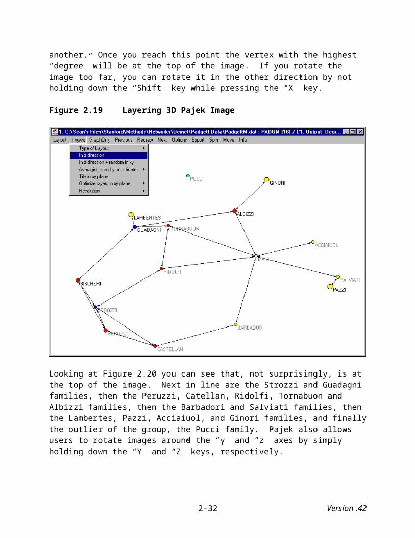
Next, under “Layers,” select “in z direction.” What this option does is draw the vertices in layers (based on degree, in this case) toward the “z” coordinate, while leaving the “x” and “y” coordinates as they are.
What this accomplishes becomes clearer after rotating the image around the “x” axis. To do this, hold down the “Shift” key and then press on the “X” key. Continue to rotate the image until vertices of the same color horizontally “line up” with one another. Once you reach this point the vertex with the highest “degree” will be at the top of the image. If you rotate the image too far, you can rotate it in the other direction by not holding down the “Shift” key while pressing the “X” key.
Figure 2.19 Layering 3D Pajek Image
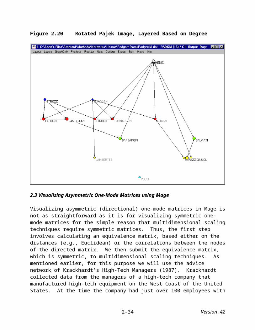
Looking at Figure 2.20 you can see that, not surprisingly, is at the top of the image. Next in line are the Strozzi and Guadagni families, then the Peruzzi, Catellan, Ridolfi, Tornabuon and Albizzi families, then the Barbadori and Salviati families, then the Lambertes, Pazzi, Acciaiuol, and Ginori families, and finally the outlier of the group, the Pucci family. Pajek also allows users to rotate images around the “y” and “z” axes by simply holding down the “Y” and “Z” keys, respectively.
Version .422-22
While layering is not necessarily something that you would want to use every time you visualize social networks, it clearly can highlight some of the structural aspects of social network data.
Version .422-23
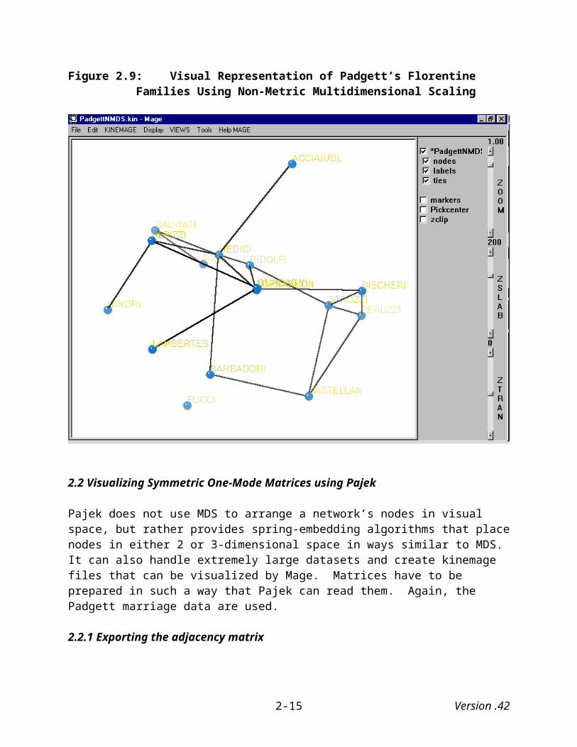
Figure 2.20 Rotated Pajek Image, Layered Based on Degree
2.3 Visualizing Asymmetric One-Mode Matrices using Mage
Visualizing asymmetric (directional) one-mode matrices in Mage is not as straightforward as it is for visualizing symmetric one-mode matrices for the simple reason that multidimensional scaling techniques require symmetric matrices. Thus, the first step involves calculating an equivalence matrix, based either on the distances (e.g., Euclidean) or the correlations between the nodes of the directed matrix. We then submit the equivalence matrix, which is symmetric, to multidimensional scaling techniques. As mentioned earlier, for this purpose we will use the advice network of Krackhardt’s High-Tech Managers (1987). Krackhardt collected data from the managers of a high-tech company that manufactured high-tech equipment on the West Coast of the United States. At the time the company had just over 100 employees with 21 managers. He asked each manager to whom he or she went for advice and whom they considered their friends. He gathered data concerning to whom they reported from company documents. The advice network is displayed in Figure 2.21.
The matrix is clearly asymmetrical. For example, while manager #1 goes to managers 2, 4, 8 16, 18 and 21 for advice, manager #2 goes to managers 6, 7 and 21. Manager #15 seeks advice from all of the other managers, while only managers 10, 18, 19, and 20 seek advice from him or her. In fact, manager #15, along with managers 9, 13, & 19 are sought out for advice less than any of
Version .422-24

the other managers are. By contrast, manager #2 is sought out for advice more (18) than are any of the other managers.
Figure 2.21: Krackhardt’s High Technology Managers’ Advice Network
2.3.1 Calculating equivalence matrices from asymmetric one-mode data
To calculate an equivalence matrix, under the “Network” menu, choose, “Roles & Positions,” then “Structural,” and then “Profile” as illustrated in Figure 2.22:
Figure 2.22 Menu Options for Calculating Equivalence Matrices
This brings up Ucinet’s profile similarity dialog box (see Figure 2.23) with the following parameters:
Version .422-25

Figure 2.23 Profile Similarity Dialog Box
Input dataset: Name of file containing network to be analyzed. Data type: Multirelational, which means that it is capable of calculating the structural equivalence of actors (nodes) for both asymmetric and symmetric matrices.
Measure of profile similarity/distance (Default = Euclidean Distance): Choices are
Euclidean Distance – This is the distance between the vectors in n-dimensional space, that is, the root of the sum of squared differences. We use this method of computing distance here, but we could just as easily have chosen to measure similarity using the Pearson product correlation coefficient.
Correlation – This is the Pearson product correlation coefficient of every pair of profiles.
Matches – This is the proportion of exact matches between all pairs of profiles.
Positive Matches – This is the proportion of exact matches in which at least one element is positive, between all pairs of profiles.
Method of handling diagonal values (Default = Reciprocal): Choices are
Reciprocal - In considering adjacency matrix X and comparing the profile of actor i with the profile of actor j, Ucinet replaces the comparison of elements xii with xji and xij with xjj by the comparisons xii with xjj and xij with xji.
Ignore – Ucinet treats the diagonals as missing values so that the comparisons of xii with xji and xij with xjj are dropped. We will use this option in this case.
Version .422-26

Retain - Profile vectors are compared directly element by element, including the xii and xjj
elements.
Include transpose in calculations? (Default = Yes): Including transposes in the calculations means that profiles correspond to rows and columns. This is not necessary for symmetric data but we use it here for asymmetric data.
For binary data: convert to geodesic distances? (Default = No): Converts binary data to geodesic data before performing an analysis. In this case, we stay with the default and choose “No.”
Diagram Type (Default = 'Dendrogram'): The clustering diagram can either be a Tree Diagram or a Dendrogram. We are not analyzing dendograms or tree diagrams here, so take your pick.
(Output) Equivalence matrix (Default = 'SE'): Name of data file containing actor by actor equivalence matrix. Choose a file name that relates to your input file.
(Output) Partition dataset (Default = 'SEPart'): This is the name of the data file containing partition indicator matrices derived from single link hierarchical clustering.
After selecting the “OK” button, Ucinet first produces either a dendogram or a tree diagram, depending on what type of diagram you chose above. Since for our purposes here we are not analyzing either of these diagrams, close the output box. Next, you will see a structural equivalence matrix that looks similar to the one that is presented in Figure 2.24. Figure 2.24 does not display all of Ucinet’s output. Also included in the output is a hierarchical clustering diagram (similar to a dendogram) based on the equivalence matrix.14
The next step in the process is to submit the structural equivalence matrix to the multidimensional scaling techniques discussed earlier. However, in this case the larger the number the greater the distance of one actor from another. So, when we instructed Ucinet to perform multidimensional scaling on the structural equivalence matrix, we chose the “Dissimilarities” option rather than the “Similarities” option (see Figure 2.25). We ended up using metric MDS, which yielded a stress level of .124.
14 See the discussion of this data with regard to calculating structural equivalence in Wasserman and Faust (1994:366-393).
Version .422-27
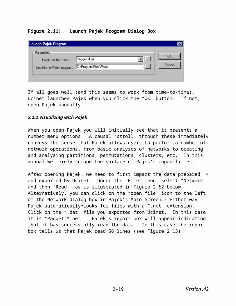
Figure 2.24 Structural Equivalence Matrix
Figure 2.25: Ucinet Metric MDS Dialog Box
Version .422-28

Next, we exported both coordinates calculated from the equivalence matrix and the adjacency (not the equivalence) matrix following the procedures outlined earlier. We then combined these into a file readable by Mage, and this produced the following image
Figure 2.26 Metric MDS of Krackhardt’s High-Tech Managers Advice Network
The image suggests that the advice network is split into two different groups of advice networks with a few actors bridging the two groups. The blue node in the upper left corner of the graph is Manager #2. Note that he or she is somewhat distant from the other managers, which undoubtedly reflects the fact that, in terms of advice sought, he or she is indeed an outlier.
2.4 Visualizing Asymmetric One-Mode Matrices using Pajek
Visualizing asymmetric one-mode matrices in Pajek is not as easy as one would expect, at least I have not discovered a quick way to visualize asymmetric matrices. As such this section is still under construction…
Version .422-29

3. NETWORK VISUAL REPRESENTATIONS OF TWO-MODE NETWORKS
As we noted earlier two-mode networks consist of either two sets of actors, or one set of actors and one set of events. They differ from one-mode networks in that one-mode networks involve only a single set of actors.
3.1 Visualizing Two-Mode Matrices using Mage
The example used here is Davis’s Southern Club Women (Breiger 1974; Davis, Gardner, and Gardner 1941) discussed in Chapter 1. Davis and his colleagues collected these data in the 1930s and represent the observed attendance at 14 social events by 18 Southern women. The result is a person-by-event matrix such that xij is 1 if person i attended social event j, and 0 otherwise:
Figure 3.1: Davis’s Southern Women Network in Matrix Form
The rows represent the eighteen women who attended the various events while the columns represent the events themselves. As you can see that actor #1 (Evelyn) attended events 1, 2, 3, 4, 5, 6, 8, and 9 while actor #17 (Flora) attended only events 9 and 11.
Depending on how we manipulate the data, Mage can visualize two-mode networks in a variety of ways. We begin with the most common method of visualizing two-mode networks, namely by converting two-mode data sets to one-mode (actors or events) data sets. Typically this involves constructing a matrix that is the product of a matrix and its transpose. With regards to Davis’s Southern Women data, cell xij gives the number of events that both women i and j attended.15 Researchers tend to interpret this value as the strength of the social proximity of the two women (Borgatti and Everett 1997).
15 If researchers, rather than multiplying the matrix by its transpose, choose instead to multiply the transpose by the matrix, they will create a square matrix where cell xij gives the number of women who attended both events i and j. Both types of matrices are computed below.
Version .423-1

Next, we turn to two visualization methods that retain both modes (actors and events) of the data. The first uses Ucinet to create a bipartite graph from which we then use correspondence analysis to locate the points in space. Finally, we compute the geodesic distances between all the pairs of nodes in the bipartite graph and then submit the resulting geodesic distance matrix to multidimensional scaling.
3.1.1 Deriving one-mode matrices from two-mode data
Rather than requiring users to first create a matrix’s transpose and then multiplying the two together, Ucinet has provided an “Affiliations” option under its “Data” menu that simplifies the process. Selecting this option brings up the following dialog box.
Figure 3.2 Ucinet Affiliations Dialog Box
The parameters of this process are as follows:
Input dataset: This is the name of file containing 2-mode dataset. In this case “Davis.”
Which mode: (Default = Row). Choices are:
Row: Represents row by row matrix of overlaps, i.e. forms AA'
Column: Represents column by column matrix of overlaps, i.e. forms A'A.
Output dataset: (Default = 'Affiliations'). This will be the name of the new matrix. The default output name is “Affiliations,’ but we recommend providing it with a name that you will easily associate with the original matrix.
Choosing the “row” option yields the following 18 by 18 co-membership matrix:
Version .423-2

Figure 3.3: Co-membership matrix of Davis’s Southern Women
Both the rows and the columns represent actors (i.e., the women) and the numbers in the cells of the matrix represent the number of ties (i.e., the number of common events attended by the women) between the two actors. Thus, Laura (actor #2) attended six of the same events that Theresa (actor #3) did, and Flora (actor #18) attended only one event at which Dorothy (actor #16) also attended. Furthermore, the values on the diagonal tell us the total number of events attended by each actor. Checking the diagonal we can see that Evelyn and Theresa attended the most number of events (8) while Olivia and Flora attended the fewest (2).
Choosing columns instead of rows yields the following 14 by 14 event overlap matrix:
Figure 3.4: Event Overlap Matrix of Davis’s Southern Women
Version .423-3

Here, the rows and the columns represent events and the numbers in the cells of the matrix represent the number of ties between any two events. Thus, two women who attended event #1 also attended event #2, and none of the women who attended event #1 attended event #10. The values on the diagonal tell us the total number of actors attracted by each event. Thus, Event #8 attracted the most women (14), while Events #1 & #2 attracted the fewest (3).
We are now ready to export either one of these adjacency matrices and its related coordinate data. To do this we follow the same procedures as we do for one-mode networks, so there is no need to repeat them again.
3.1.2 Visualizing in Mage
As in our discussion of visualizing one-mode matrices, we used Ucinet to calculate both metric and non-metric MDS coordinates in order to compare how they produce different images from one another. Figure 3.5 illustrates the data using metric MDS:
Figure 3.5: Visual Representation of Davis’s Southern Women Using Metric Multidimensional Scaling
Version .423-4
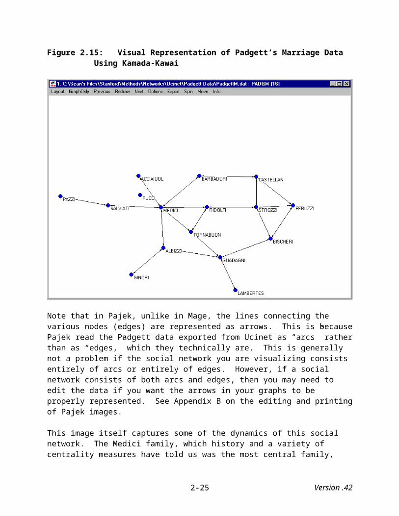
Figure 3.6 illustrates the same data using non-metric MDS. Here, clear differences exist between the visualizations using metric and non-metric MDS. Interestingly, both provide insights in different ways. Figure 3.5 emphasizes two clusters of women and a handful of women less connected than the others. Figure 3.6, on the other hand, emphasizes the isolation of two women in the group (the two balls in the upper right hand of the image).
Figure 3.6: Visual Representation of Davis’s Southern Women Using Non-Metric Multidimensional Scaling
3.1.3 Using correspondence analysis to visually represent two-mode data
Researchers have long used correspondence analysis to measure the distance between nodes. The first step for using correspondence analysis to visually represent two-mode data is to create a bipartite graph. “Any 2-mode incidence matrix can be thought of as a bipartite graph. If the 2-modes are actors and events then the bipartite graph consists of the union of the actors and events as vertices with the edges only connecting actors with events (i.e., no connections between actors or between events). This routine takes a 2-mode incidence matrix and converts it to a 1-mode adjacency matrix of a bipartite graph. If the incidence matrix had n rows and m columns then the
Version .423-5

resultant adjacency matrix would be a square matrix of dimension m+n” (Borgatti, Everett, and Freeman 1999).
3.1.3.1 Creating a bipartite graph in Ucinet
Under the “Transform” menu, choose “Bipartite.” This brings up the following dialog box:
Figure 3.7 Ucinet Bipartite Dialog Box
The parameters are defined as follows:
Input 2-mode dataset: This refers to the name of file containing incidence matrix. In this case it will be Davis.
Value to fill within-mode ties (Default=0.0): The incidence matrix specifies the values of ties from actors to events the values of the (non-existent) ties of actors to actors and events to events is not given. Users can override the default value of zero by specifying their own within mode value.
Make result symmetric? (Default = No). Users can choose to make the resulting matrix symmetric. For our purposes we will select “No.”
Output dataset (Default = bi): This refers to the name of file containing adjacency matrix of bipartite graph. We will change this to “Davisbi.”
Performing this procedure yields this following matrix:
Version .423-6

Figure 3.8 One-mode Bipartite Matrix from Davis Southern Women Two-mode Matrix
Export this matrix following the same procedures used earlier for one-mode data.
3.1.3.2 Correspondence analysis in Ucinet
Correspondence analysis in Ucinet is straightforward. Under the “Tools” menu choose “2-mode scaling,” under which select “Correspondence.” This brings up a dialog box (Figure 3.9) with the following parameters:
Input dataset: This is the name of file containing matrix to be analyzed, it must have at least as many rows as columns (otherwise transpose the matrix then resubmit). Here we select “Davis” not “Davisbi” because if we select the bipartite matrix of the Davis Southern Women data, we will create an output file of combined row and column scores (see below) from the correspondence analysis with 64 lines whereas we only want and need one of 32 lines.
How to scale row and column scores (Default = Coordinates): This parameter tells Ucinet how to scale the row and column scores. The choices that Ucinet provides are (we will use Ucinet’s default):
Coordinates - Scores for each point on each dimension adjusted both for point marginals and dimension weights (eigenvalues).
Version .423-7

CGS - According to Carroll-Green-Schaffer, this transformation makes distance between a row and a column just as interpretable as distance between a row and a row or a column and a column.
Optimal - Scores for each point are corrected for point marginals, but not dimension weights.
Axes - No rescaling is performed.
Number of factors to save (Default = 3): Maximum value of r, the number of eigenvectors used to decompose the matrix. Keep the default
Reconstruct matrix from factors (Default = No): If Yes, the row and column scores are combined to approximate the data matrix with r eigenvectors (see Number of factors to save, above). The result is the best possible approximation of X using matrices of rank r based on a least squares criterion. Keep the default.
Keep the trivial first factor (Default = No): This normalization step prior singular value decomposition causes first eigenvector to be constant. If users choose “Yes,” this factor is retained and eigenvalue percentages include it. If they choose “No,” the factor is dropped and eigenvalue percentages do not include it. Keep the default.
(Output) File to contain row scores (Default = CorrespondenceRScores): This will be the name of dataset to contain coordinates of row points. For our purposes we will use DavisRS.
(Output) File to contain column scores (Default = CorrespondenceCScores): This will be the name of dataset to contain coordinates of column points. For our purposes we will use DavisCS.
(Output) File to contain singular values (Default = CorrespondenceEigen): This will be the name of dataset to contain eigenvalue of each dimension. For our purposes we will use DavisEigen.
(Output) File to contain reconstructed matrix (Default = CorrespondenceRecon): This will be the name of dataset to contain the approximated data matrix (if any). For our purposes we will use DavisRecon.
(Output) File to contain combined row/column scores (Default = CorrespondenceRCScores): This will be the name of dataset to contain concatenated row and column scores to produce single (m+n)-by-r matrix (useful for plotting row and column scores on same map). For our purposes we will use DavisRCS.
Version .423-8

Figure 3.9 Ucinet Correspondence Analysis Dialog Box
This initially provides us with a two-dimensional scatterplot. We will not use this, but it can be printed off or inserted into a Word document. We are interested, however, in the combined row and column scores. We need to export these data following the procedures outlined earlier.
The figure clearly illustrates that some of the women and events are more central than are others. Interestingly, at the upper right portion of the image there are two balls, one representing event 11, the other representing both Flora and Olivia. Flora and Olivia are represented by one ball because their coordinates, as calculated by correspondence analysis, are identical.
Version .423-9

Figure 3.10 Visual Representation of Davis’s Southern Women Using Correspondence Analysis
3.1.4 Using geodesic distance to visualize two-mode data
Borgatti and Everett (1997:247) argue that there are three problems related to correspondence analysis representations of two-mode data (see, however, Roberts 2000). One problem is that the distances in correspondence analysis are not Euclidean, yet researchers using this technique find it difficult to interpret the results in any other way. As such they suggest a variety of different approaches for visually representing two-mode data. One method they recommend is to first compute the geodesic distances between all pairs of nodes in the bipartite graph and then submit the resulting matrix to non-metric MDS.
3.1.4.1 Computing geodesic distance
Before computing the geodesic distance between various nodes, we first have to construct a symmetrical bipartite graph. To do this simply follow the procedures outlined above for creating a bipartite graph, and in the dialog box where Ucinet asks whether you want a symmetrical bipartite graph, select “Yes.” For the Davis data we saved the resulting matrix as Davisbi2
Version .423-10

Geodesic distance is the length of the shortest path between two nodes. Ucinet makes this calculation quite simple. Under the “Network” menu choose “Cohesion,” then “Distance,” which brings up the following dialog box:
Figure 3.11 Ucinet Graph-Theoretic Distance (Geodesic) Dialog Box
The parameters are defined as follows:
Input dataset: This is the name of the file containing dataset to be analyzed. In this case we use “Davisbi2.”
Type of Data (Default = Adjacency): Ucinet provides numerous choices for computing distance. While we will use the default, the choices include:
Adjacency - standard binary data, distance corresponds to graph theoretic geodesic.
Strengths - values indicate cost or lengths of links between nodes. Optimum is strongest path.
Costs - values indicate strengths, capacities or cost. Optimum is the cheapest cost.
Probabilities - values indicate probability of link and restricted to [0,1]. Optimum is most probable path.
Nearness transformation (Default = None): This converts distance matrix to a nearness matrix by a variety of methods. These are:
None - No transformation is applied and raw distances are given as output.
Multiplicative – The distances between nodes are divided into the largest possible distance. New values are given by Yij = (N-1)/Dij.
Additive – The distances between nodes are subtracted from the total number of nodes. New values are given by Yij = N - Dij.
Version .423-11
Linear – The distances between nodes are transformed linearly into [0,1]. New values are given by Yij = 1 - (Dij - 1)/(N-1).
Exponential – The distances between nodes are transformed using exponential decay. New values are given by Yij = bDij. The attenuating factor b is selected by the user and should satisfy 0 < b < 1.
Freq Decay - Uses Burt's 1976 frequency decay function. The nearness of i and j is one minus the proportion of actors that are as close to i as j is.
Attenuation Factor (Default = 0×5): Value of the attenuation factor b when exponential is chosen. Larger values give slower decay.
Output dataset (Default = GeodesicDistance): This refers to the name of data file containing the distance matrix. Here we change it to “DavisGeo.”
Running this procedure produces the following matrix:
Figure 3.12 Geodesic Distances Among Nodes in Davis’s Southern Women Matrix
Because neither the women nor the events are directly connected to one another, the geodesic distances between any two women or between any two events are (and cannot) be less than two
Version .423-12

(or odd-valued) (Borgatti and Everett 1997:249; Faust 1997). Women are only connected to one another through events and events are only connected to one another through women.
The next step is submitting this matrix to multidimensional scaling. Following Borgatti and Everett we will use non-metric MDS. There is no need to repeat these procedures since we outlined them earlier. After completing this task we then export both the MDS coordinates and the symmetric bipartite matrix (not the geodesic distance matrix) in kinemage format. These procedures yield the following representation:
Figure 3.13 Visual Representation of Davis’s Southern Women Data Using MDS of Geodesic Distances
While Borgatti and Everett find this method more appealing than correspondence analysis, in this case the visual representation of the data is less than helpful.
3.2 Visualizing Two-Mode Matrices using Pajek
Pajek offers certain advantages over Mage when it comes to visualizing two-mode networks. While Mage is essentially limited to visualizing one-mode networks (or two-mode networks that have been multiplied by their transpose), Pajek is capable of visualizing two-mode networks in
Version .423-13
their duality. In the following discussion we illustrate how to do this in Pajek. Pajek is also capable of exporting its visualizations in kinemage format, such that it can then be visualized in Mage where we can capitalize on the advantages Mage offers.
As we shall see, Pajek allows users to very simply derive one-mode data from two-mode data, so users do not need to use Ucinet to create transposes of matrices or multiply matrices by their transposes. As we did with Mage, we use Davis’ Southern Women data as an example.
3.2.1 Preparing and reading two-mode data into Pajek
The steps involved for preparing and reading in two-mode data for use in Pajek do not differ from those for preparing and reading in one-mode data, so there is no need to repeat them here. However, when you read two-mode data into Pajek, Pajek’s main screen looks different than it does when you read in one-mode data. As you can see in Figure 3.14 after we read Davis’s Southern Women data into Pajek, not only does information concern the data appear in the Network dialog box, but additional information appears in the Partition dialog box.
Figure 3.14 Pajek’s Main Screen after Reading Davis’s Southern Women Data
Version .423-14

Specifically, the information included in the Partition dialog box informs us that we are dealing with an affiliation network containing 18 actors and 14 events respectively. The Network dialog box also tells us that we have read in two-mode data.
3.2.2 Visualizing one-mode data derived from two-mode data with Pajek
Pajek offers a simple way to derive one-mode data from two-mode matrices. For example, if we wanted to derive an affiliation matrix from the Southern Women data, we simply select “Transform” under Pajek’s “Net” menu, then “2-Mode to 1-Mode” and then “Rows.” We select “Rows” if we want Pajek to create a one-mode matrix based on the actors represented by rows (in this case, the women) or we select “Columns” if we want Pajek to create a one-mode matrix based on the actors represented by columns (in this case, the events). Figure 3.15 demonstrates how to do this, while Figure 3.16 draws a picture of the one-mode co-membership (i.e., women) matrix created.
Figure 3.15 Transforming Two-Mode Matrix to One-Mode Matrix Using Rows
Version .423-15
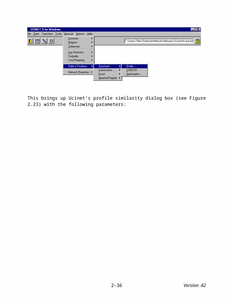
Figure 3.16 Pajek Drawing of Southern Women Co-Membership Matrix
This picture somewhat resembles the image visualized in Mage using the same data and non-metric multidimensional scaling (Figure 3.6).
3.2.3 Visualizing two-mode data with Pajek
Using Pajek to visualize two-mode data is as simple as using Pajek to visualize one-mode data although we do have additional options. To begin with, under the “Draw” menu, select “Draw,” which (as before) brings up the “Draw” screen where the image initially appears as a single point in space. As before, it also brings up a new set of menu selections from which we will next choose one of two drawing programs to graphically represent Davis’ Southern Women data.
Rather than exploring all the drawing algorithms this time we only use the Fruchterman Reingold algorithm to visually represent the data. Under “Layout” first select “Fruchterman Reingold” and then “2D.” This will produce an image similar to the one displayed in Figure 3.11 (see Figure 3.17):
Version .423-16
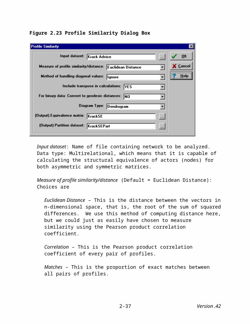
Figure 3.17 Drawing of Davis’s Southern Women Data using 2-D Fruchterman Reingold
Certain patterns are apparent from this initial visualization. The women appear to be clustered into two groups: Dorothy, Helen, Nora, Katherine, Sylvia and Verne belong to one cluster while Ruth, Eleanor, Laura, Evelyn, Theresa, Brenda, Frances and Charlotte belong to the other. Olivia and Flora do not appear to belong to either of the two groups. Not only are the women clustered into groups, so are the events. Events 10, 12, 13 and 14 are clustered together and are associated with the first cluster of women, while events 1, 3, 4 and 5 are clustered together and are associated with the second cluster of women. Event 11 is the outlier event and is primarily associated with Olivia and Flora. Interestingly, events 7, 8 and 9 are quite central in this visualization, which suggests that they served as “bridge” events in that women from both clusters attended them.
Now return to Pajek’s main screen and under the “Draw” menu, select “Draw-Partition,” and you will see an image similar to the one that appears in Figure 3.17 (see Figure 3.18):
Version .423-17
Figure 3.18 Drawing of Davis’s Southern Women using 2-D Fruchterman Reingold Algorithm and “Draw-Partition” Option
While the layout is the same, the vertices representing the events and actors are assigned different colors. In this case the actors are colored yellow while the events are colored green. Using different colors to visually represent the different modes helps make distinguishing between the two modes somewhat easier.
It is even easier to distinguish between the two if the vertices of the two modes are different shapes as they are in Figure 3.19. Here the vertices representing the women are still colored yellow and remain in the shape of an ellipse, but the events are now colored blue and are in the shape of a triangle.
Version .423-18

Figure 3.19 Drawing of Davis’s Southern Women using 2-D Fruchterman Reingold Algorithm, Defining Shapes and Colors of Vertices with Input File
In order to change the shapes and colors of particular vertices, they need to be defined in the Pajek file itself. See section Appendix B, Section B.5.1.
Version .423-19

4. SOCIAL NETWORKS OVER TIME
A once common criticism of social network analysis was that it conveyed a static, rather than dynamic, understanding of a social structure (i.e., it did not incorporate change), especially when it focused on ties that had become routinized over time (Marsden 1990; Nadel 1957). In recent years, however, researchers have demonstrated that such a bias is not inherent in social network analysis and have offered ways of modeling temporal changes in social networks (see e.g., Giuffre 1999). Nevertheless, the visual presentation of social networks over time is still in its infancy. Analysts have made great strides in using visualization techniques to explore social networks (see e.g., Borgatti and Everett 1997; Castilla, Hwang, Granovetter, and Granovetter 2000; Freeman 1999, 2000; Freeman, Webster, and Kirke 1998), but they have just begun to extend these techniques the examination of social networks over time . When visualizing a social network over time, analysts often present it as “movie.” That is, they portray it a series of snapshots at different points in time in the life of the social network (Assimakopoulos, Everton, and Tsutsui 2003). Movies such as these are most effective when readers have access to them either on-line or as a file so that they can run through them on their own. As valuable as this approach is, it does not always lend itself to publication in standard academic journals. Thus, there remains the need for presenting changes over time in a single “snapshot.”
Here, I demonstrate both ways of picturing social networks over time, first using data from Sampson’s (1968) study of a Roman Catholic monastery (described below), and then with data of Silicon Valley semiconductor companies (Assimakopoulos, Everton, and Tsutsui 2003; Castilla, Hwang, Granovetter, and Granovetter 2000). For both social networks, I present them both in “movie” form and as a single snapshot.
4.1 The Sampson Monastery data
Samuel Sampson (1968) conducted his study of a Roman Catholic monastery in the late 1960s, which was a unique time in the life of the Roman Catholic Church. Between October 1962 and December 1965 all of the Roman Catholic Church’s bishops and cardinals met for the Second Vatican Council (Vatican II) and introduced a number of changes in the way that male and female religious orders lived and worshipped together. Some welcomed these changes. Others did not. Almost immediately after the council drew its meeting to a close, there was a steep decline in the number of women and men entering religious orders and a sharp rise in the number who left their respective orders (Stark 2001; Stark and Finke 2000).
Sampson sensed (correctly) that it might be worthwhile to examine how one monastery responded to the changes put for the Vatican II. During his stay, a “crisis in the cloister” occurred that resulted in the expulsion of four monks and the voluntary departure of several others. In the end, only four of the eighteen monks remained.
Sampson recorded the social interactions among a group of eighteen monks and collected sociometric data along four dimensions: Esteem (SAMPES) and disesteem (SAMPDES), liking (SAMPLK) and disliking (SAMPDLK), positive (SAMPIN) and negative influence (SAMPNIN), and praise (SAMPPR) and blame (SAMPNPR). He had each monk rank only his
Version .424-1

top three choices where “3” indicated the highest or first choice and “1” the last. Some of the monks offered tied ranks for their top four choices.
Sampson gathered most of the data after the breakup occurred. The only exception to this was that he gathered “liking” data at three different points in time (SAMPLK1, SAMPLK2, and SAMPLK3). This is the time data we intend to use under the assumption that it reflects changes of in-group sentiment over time. Figures 4.1 through 4.3 present Sampson’s “liking” matrices.
Figure 4.1: Sampson “Liking” Matrix at Time “1”
Figure 4.2: Sampson Liking Matrix at Time “2”
Version .424-2
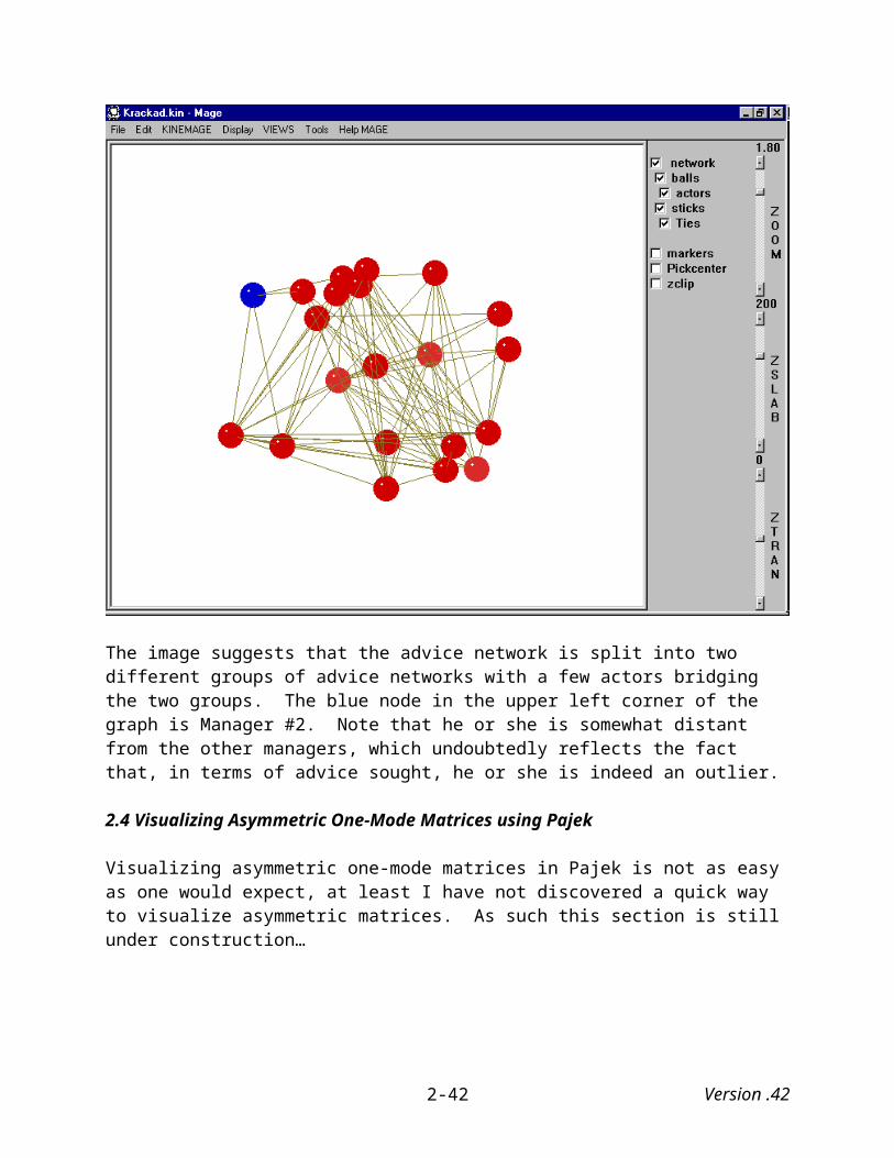
Figure 4.3: Sampson Liking Matrix at Time “3”
4.1.1 Creating a movie of the Sampson Monastery data
The first step in creating a movie of the Sampson monastery data is to prepare the data so that you can export the three “liking” data sets from Ucinet16 and then read them separtely into Pajek. Once we have read all three matrices into Pajek, we select to Pajek’s “Draw” window in order to set up Pajek’s drawing functions. First, under the “Options” menu, select “Value of Lines” and then “Similarities” since the higher the number indicates a stronger attraction between the sender and receiver.
Because Pajek allows us to draw a series of networks using the “Previous” and “Next” buttons, we need to tell Pajek how we want it to draw the networks that are loaded into memory. Under the “Options” menu, select “Previous/Next,” then “Optimize Layouts,” and then the drawing algorithm (i.e., Kamada-Kawai, 2-dimensional Fruchterman Rinegold, 3-dimensional Fruchterman Reingold) we wish to use to draw your layout. In this example, I chose the 3-dimensional Fruchterman Reingold algorithm (See Figure 4.4).
We also need to tell Pajek which object (Network, Partition, Vector) will change when we select the Previous/Next option. Since the only objects loaded into memory are the three Sampson matrices, I selected the “Network” option (See Figure 4.5). If we wanted to draw a series of partitions, then we would select “Partition.”
16 The Sampson data comes with the Ucinet software package, so most people should not have to create the data from scratch based on the matrices presented in Figures 4.1 through 4.3.
Version .424-3

Figure 4.4 Selecting Layout Optimization for Pajek’s Previous/Next Drawing Options
Figure 4.5 Telling Pajek which Object (Network, Partition, Vector) to Apply When Previous/Next Option is Selected.
Version .424-4

The next step is to simply to draw the social network data at time “1,” and then click on the “Next” button to see Pajek’s drawing of the social network data at time “2” and then again to see it at time “3.” We can also watch the movie in “reverse” by clicking continuously on the “Previous” button. Figures 4.6 through 4.8 show the Sampson liking data over the three points in time as drawn by Pajek.
What is somewhat clear from these drawings is that the social network appears to split apart from time “one” to time “three.” At time “one” the social network is relatively undifferentiated. Romuald (10) and Bonaventure (5) lie at the center of the social network and appear, in many ways, to hold it together. By time three, however, neither of them appears at the center of the network, and in fact the network appears to be splintering by that point.
Figure 4.6 Pajek Drawing of Sampson Liking Data at Time “1”
Version .424-5

Figure 4.7 Pajek Drawing of Sampson Liking Data at Time “2”
Figure 4.8 Pajek Drawing of Sampson Liking Data at Time “3”
Version .424-6

4.1.2 Creating a single snapshot of the Sampson Monastery data over time
Creating a single snapshot of social network data over time is a somewhat more complicated task. The first step involves the construction of a super matrix that combines all three of the “liking” matrices. Because one of the goals here is to present the matrices at different times, we cannot simply “stack” the matrices on top of one another as illustrated in Figure 4.9. As will become clear later, if we stacked the matrices like this, the three points in time would collapse onto one another and provide a meaningless picture of their relationship over time.
Figure 4.9 Stacked “Super Matrix”
Sampson Liking Matrix
at Time 1
Sampson Liking Matrix
at Time 2
Sampson Liking Matrix
at Time 3
Instead, we need to create a 3 x 3 super matrix where the individual submatrices appear along the diagonal as is illustrated in Figure 4.10 where each row and column represents a separate time period. Furthermore, in order to connect each monk with himself across time periods, we also need to include identity matrices connecting the monks at time “1” to themselves at time “2” and the monks at time “2” to themselves at time “3.” This also keeps the networks distinct from one another Pajek draws them. Figure 4.9 illustrates this as well. The remaining matrices included in the super matrix contain all zeros.
Version .424-7

Figure 4.9 3 x 3 “Super Matrix”
Sampson Liking Matrix at Time 1
1 1 1 1 1 1
Sampson Liking Matrix
at Time 2
1 1 1 1 1 1
Sampson Liking Matrix at Time 3
4.1.2.1 Creating zero and identity matrices
Ucinet V provides a simple procedure for combining matrices. Before turning to that step, however, we first need to create the “zero” and identity matrices that we will combine with the three “liking” matrices.
Creating an zero matrix from an existing matrix is straightforward in Ucinet. We first need to select Ucinet’s “Recode” option, which is found under the “Transform” submenu. Selecting this brings a dialog box with the following parameters (see Figure 4.10):
Input dataset: Name of dataset to be recoded. Data type: Matrix. Because I want to create a matrix full of zeros with the same actors and dimensions as Sampson’s 18 x 18 monastery network, I recode one (it could be any of the matrices) of Sampson’s matrices as the base matrix (“Sampson Like 1”).
Rows to recode: (Default = All). You specify the rows you want to recode with a list. You can list each row number separated by a comma or space and/or connect them with the keywords TO, FIRST and LAST. Thus, FIRST 3, 5 TO 7, 10, 12 would give row numbers 1, 2, 3, 5, 6, 7, 10 and 12. ALL gives all possible rows. You can also use lists kept in a UCINET dataset. Enter the filename followed by ROW (or COLUMN) and a number to specify which row or column of the file to use. The list must be specified using a binary vector where a 1 in position k indicates that vertex k is a member of the list, a zero indicates that k is not a member. In this case, I want all rows (and columns) recoded to zero, I use Ucinet’s default settings.
Cols to recode: (Default = All). Same as rows recode command – see above.
Version .424-8

Mats (levels) to recode: (Default = All). Ucinet also allows you to recode matrices in much the same way as recoding rows and columns. The command, FIRST 3, 5 TO 7, 10, 12, would give matrix numbers 1, 2, 3, 5, 6, 7, 10 and 12. As with rows and columns you can use lists kept in a UCINET dataset. Enter the filename followed by ROW (or COLUMN) and a number to specify which row or column of the file to use. The list must be specified using a binary vector where a “1” in position k indicates that vertex k is a member of the list, a zero indicates that k is not a member.
Include diagonal values: (Default = No). “Yes” means that diagonal values are recoded. “No” ignores the diagonal in the recoding. Here, I choose “yes.”
Recode boxes: Five boxes of the form “values to are recoded as ” are used to perform the actual recodes. Thus, if the values x, y and z are entered so that the completed line reads “values x to y are recoded as z”, then all values of the matrix in the range from x to y inclusive are changed to the value z. To change a single value set both x and y to the value. In this case, I tell Ucinet to recode all values between 0 and 99 to equal 0. Since there are no values greater than 3, this will insure that all of cells in the matrix will equal zero.
Output dataset: (Default = 'Recode'). Name of file that contains recoded matrix. Here, I name the file “Sampson Like 0.”
Figure 4.10 Ucinet’s Recode Dialog Box
The next step is to create an identity matrix, which is easily accomplished using Ucinet’s “Diagonal” option, which you will also find under the “Transform” submenu. Selecting this option brings up a dialog box with the following parameters (see Figure 4.11):
Version .424-9
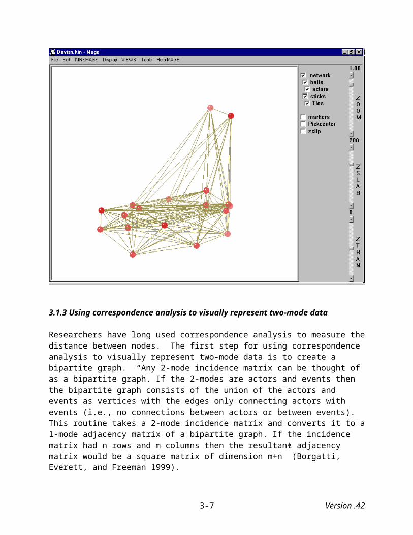
Input database: This is the name of matrix on which to perform the transformations. Data type: square matrix. Here, I use the recently created “Sampson Like 0” matrix.
New diagonal value(s): (Default = 0). A single value will set all diagonal elements to the value. A list will set the diagonal to the values in the list that are separated by a space or comma. Since I want to create an identity matrix, I set the diagonal value to “1.”
(Output) Diagonal Dataset: (Default = 'DiagonalSaveDiag'). This is the name of file that contains a square matrix with the diagonal of the input dataset as its diagonal and zeros elsewhere. This file is not displayed in the Log File, and is not a concern of ours in this case.
(Output) Changed Matrix: (Default = 'DiagonalNewMat'). This is the name of file that contains matrix with new diagonal values.
Figure 4.11 Ucinet’s “Diagonal” Dialog Box
4.1.2.2 Joining matrices in Ucinet
After creating the zero and identity matrices, the next step is to combine the matrices into a super matrix like the one illustrated in Figure 4.9. To do this, we can use Ucinet’s “Join” option, which is found under the “Data” submenu.” Selecting this option brings up a dialog box with the following parameters (see Figure 4.12):
Files selected: These are the names of datasets each containing one or more matrices. You should enter them in the order required in the merged data set. To enter a file, highlight one or more files in the Possible Files and click on the “ > ” button, and they will be moved across. Clicking on “ < ” moves the files back. You can move all possible files across by clicking on “ >> ” or “ << ”. To select more than one file press “Ctrl” and then click on your files of choice. Dims to join: (Default = Rows). This defines which method you will use for joining the matrices. Your choices are:
Version .424-10
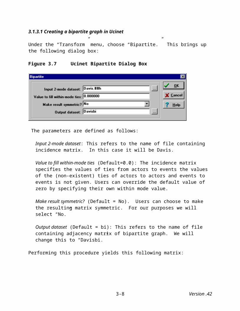
Rows: Matrices combine row-wise creating extra rows. Each matrix must be a single relation with an equal number of columns.
Columns: Matrices combine column-wise creating extra columns. Each matrix must be a single relation with an equal number of rows.
Matrices: Matrices appended as additional matrices or relations. Networks must all have the same dimensions.
Destination filename (Default = 'Joined'): Name of the file which will contain merged dataset.
Figure 4.12 Ucinet’s “Join” Dialog Box
We begin by creating the first “column” of the super matrix by joining (with rows) the “Sampson Like 1” matrix with two zero matrices.. It is worth noting that because Ucinet does not allow you select a file “twice,” we need to create and use a second “zero” matrix (“Sampson Like 0b”). Figure 4.13 illustrates this:
Version .424-11
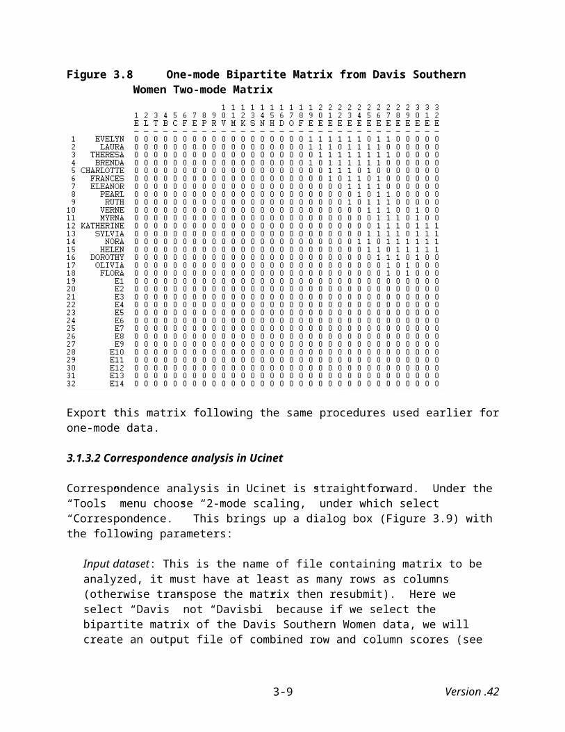
Figure 4.13 Creating First Column (Time One) of Sampson Liking Data
Next, we need to create the second and third columns of the super matrix. Here, we include the identity matrix in the appropriate places (see Figure 4.14 and 4.15).
Figure 4.14 Creating Second Column (Time Two) of Sampson Liking Data
Version .424-12

Figure 4.15 Creating Third Column (Time Three) of Sampson Liking Data
The next and final step involves combining the three columns into a single super matrix as illustrated in Figure 4.9 above and demonstrated in 4.16 below.
Figure 4.16 Combining the Three Columns of Sampson Liking Data into a Super Matrix
Version .424-13
Please note that in this instance under the option “Dims to join” we needed to select “Columns” rather than “Rows” since we are now combining columns together.
4.1.2.3 Visualizing Sampson super matrix in Pajek
We now have created a 54 x 54 matrix that we can export and read into Pajek. After setting Pajek’s “Draw” options so that the value of lines reflect “Similarities (found under the “Options” submenu), turning the “perspective” option off (found under the “Spin” submenu), and then using the Fruchterman Reingold algorithm to draw the network, we create with a picture similar to the one presented in Figure 4.17 below.
The social network data at time “1” appears on the left side of the drawing, time “2” in the middle, and time “3” on the right side. What this drawing indicates is that the monastery’s social network (at least based on affect) appears to have become more fragmented over time, which is what we saw in the “movie” data drawn above. The advantage of viewing all three points in time simultaneously is that we can see the change at a glance. Obviously, this visualization technique would not be appropriate for visualizing more than five or six points in time since the drawing would become too “crowded.” For relatively few points in time, however, it is useful and illuminating technique.
Figure 4.17 Pajek Simultaneous Drawing of Sampson Liking Data at Three Points in Time
Version .424-14

4.1.2.4 Visualizing Sampson super matrix in Mage
As noted elsewhere Pajek exports its drawings in kinemage format so that we can view them using Mage. As Figure 4.18 illustrates, the Mage image looks relatively identical (as it should) to the Pajek drawing. If that is all we could do with the image in Mage, there probably would not be much point in exporting Pajek images to Mage except for, perhaps, aesthetic reasons. However, Mage permits the manipulation of network images in ways that can potentially help analysts uncover hidden features of a social network.
Figure 4.18 Mage Image of Exported Pajek Drawing
Aside from allowing analysts to rotate the image in a number of ways, Mage provides a number of ways of altering the Mage image by editing the kinemage document. Through a series of edits (see Appendix A, section A.4) we can create a series of network images where only the ties within each of the “three” social networks are visible (Figure 4.19), where only the ties across time are visible (Figure 4.20), or where none of the ties are visible (Figure 4.21). These ties (and even the actors/nodes) can be turned on and off by clicking on the appropriate box on the right hand panel of the Mage screen:17
17 The cutting and pasting of coordinates is easier said than done. Large Mage files contain a high number of vector coordinates, and the analyst needs to be careful when cutting and pasting them into other parts of the document. See Appendix A.
Version .424-15
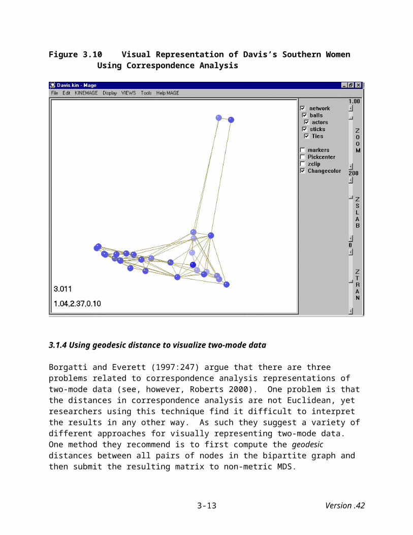
Figure 4.19 Mage Image of Exported Pajek Drawing With Only Network Ties Visible
Figure 4.20 Mage Image of Exported Pajek Drawing With Only Ties Across Time Visible
Version .424-16
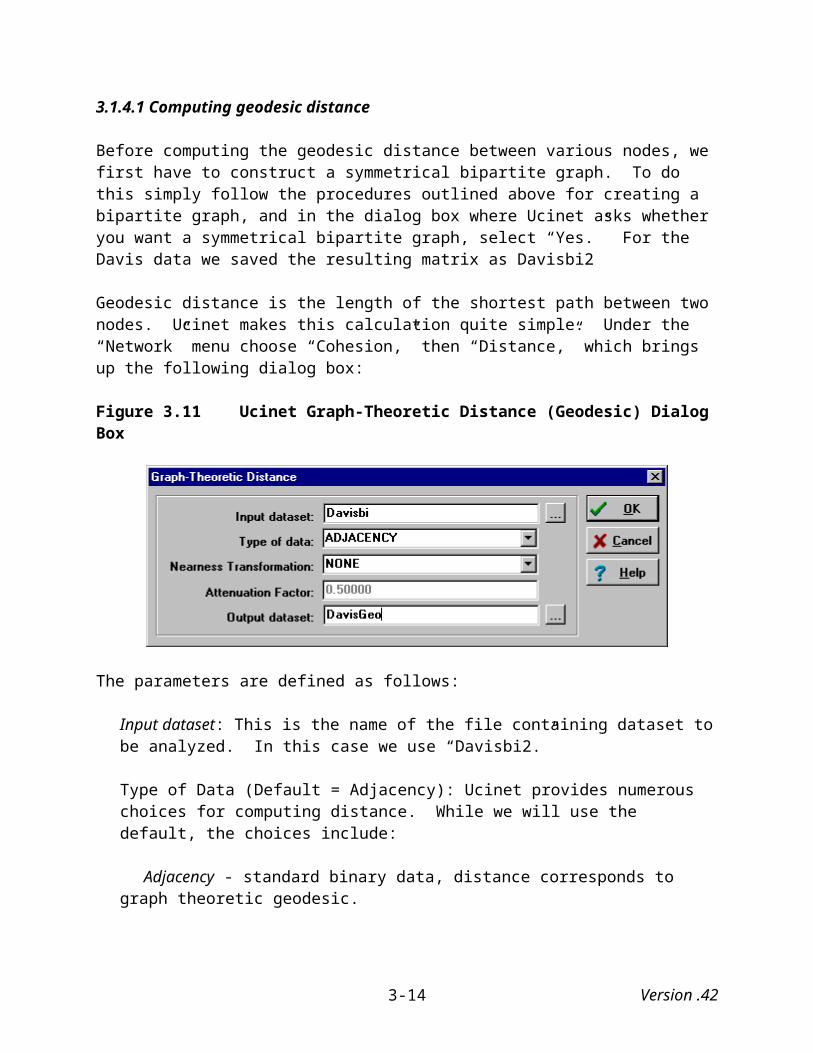
Figure 4.21 Mage Image of Exported Pajek Drawing With No Ties Across Time Visible
Figure 4.22 Mage Image of Exported Pajek Drawing With Various Visualization Options
Version .424-17
Another series of edits (See Appendix A, section A.4) allows us to create an image like the one presented in Figure 4.22 where different colors highlight the social network at different times. The available visualization options under Mage are found along the control panel on the right-hand side of the Mage screen, some of which I have “checked.” A final “feature” demonstrated here involves drawing a line connecting the monk “Amand” across the three points in time. The “finished” product (after editing the file so that “Amand’s name appears on the right hand side of the Mage screen and the ties connecting the nodes are blue) appears in Figure 4.23 below:
Figure 4.23 Mage Screen With Tie Connecting “Amand” Over Time
4.2 Silicon Valley’s Semiconductor Industry
Many Silicon Valley firms have a Silicon Valley semiconductor “genealogy chart”18 hanging in their lobbies, that traces their roots back to Fairchild Semiconductor and Shockley Transistors. It illustrates the entrepreneurial spirit that has spawned so many new start-ups in the area and has made the Valley the center of the high-tech industry in the world. Instead of staying in a large successful company, engineers and other employees of Silicon Valley companies have often preferred to launch their own start-ups, with the hope of striking it rich. In moving to new companies, individuals took with them skills and expertise that would make the companies in Silicon Valley operate on similar sets of ideas and principles.
18 Don Hoefler (1971) first put together the Silicon Valley “genealogy chart” in 1971. This “genealogy chart” was subsequently updated by the trade association, Semiconductor Equipment and Materials International (SEMI), for more information, including instructions of how to order the current poster version, visit http://www.semi.org.
Version .424-18

The genealogy chart provides relational information on founders of companies in Silicon Valley semiconductor community and the founders’ previous company affiliation. It represents all of the companies as boxes in chronological order of the founding date from left to right, from 1947 to 1986. Two companies are connected when one is founded by someone from the other. While the chart portrays the community’s evolution over time, the mere connections between companies are difficult to see because of the volume and complexity of ties.
In order to create both a movie and a single snapshot of the change in Silicon Valley’s semiconductor industry social network, I divided the the genealogy chart into six periods (1947-1960, 1961-1965, 1966-1970, 1971-1975, 1976-1980, 1981-1986) and then visualize the network at these slices of time. To do this, I first created six two-mode matrices where the rows represent previous affiliation of founders and the columns the companies they founded. From these, I derived six one-mode “affiliation” matrices by multiplying the two-mode matrices by their transposes. In these one-mode matrices, a tie exists between two companies if individuals from the two companies joined to found a third company. In other words, when somebody from company “A” joined with somebody from company “B” to start company “C,” a tie exists between companies “A” and “B.”
4.2.1 A movie of Silicon Valley semiconductor industry
Figures 4.24 through 4.29 present a movie of Silicon Valley’s semiconductor industry from 1947 through 1986 based on the SEMI genealogy chart. These were created in the same manner as the movie of the Sampson monastery data outlined above. What is clear from this sequence of network drawings is that the semiconductor industry of Silicon Valley became increasingly interconnected over time. In particular, there appears to be a big jump in interconnectedness from the period 1976-1980 to the period from 1981 to 1986
Version .424-19
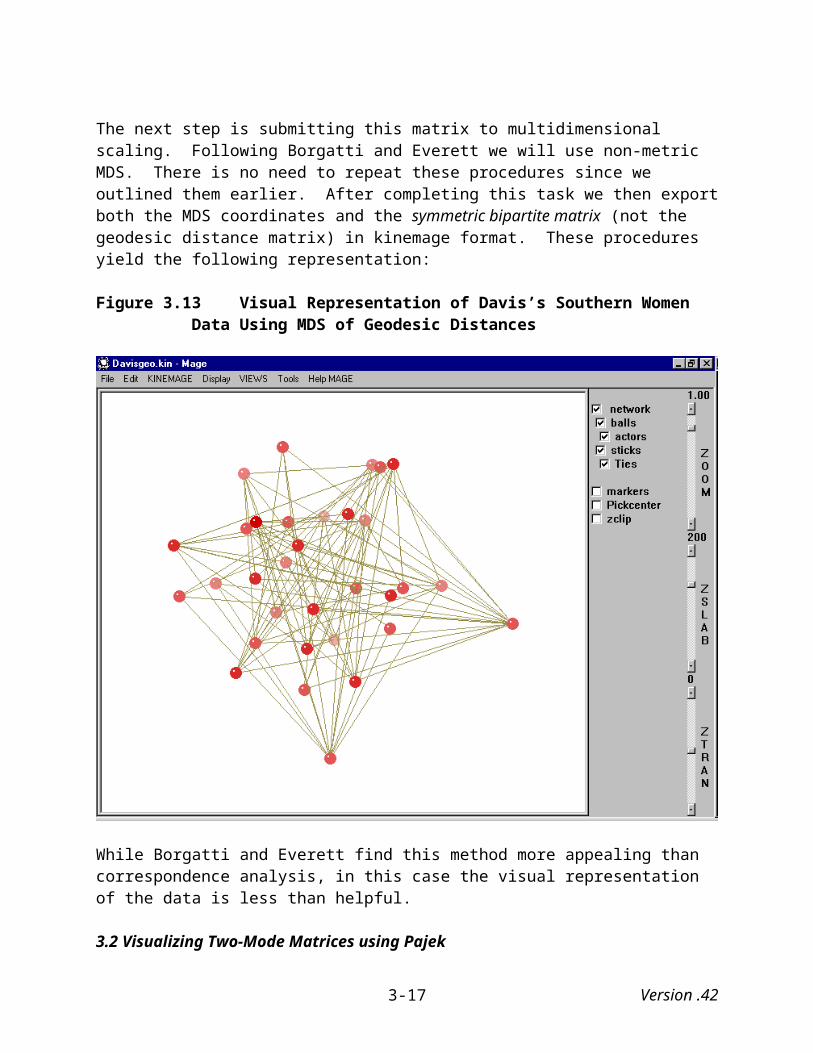
Figure 4.24 Pajek Image of Silicon Valley Semiconductor Firms, 1947-1960
Figure 4.25 Pajek Image of Silicon Valley Semiconductor Firms, 1961-1965
Version .424-20

Figure 4.26 Pajek Image of Silicon Valley Semiconductor Firms, 1966-1970
Figure 4.27 Pajek Image of Silicon Valley Semiconductor Firms, 1971-1975
Version .424-21
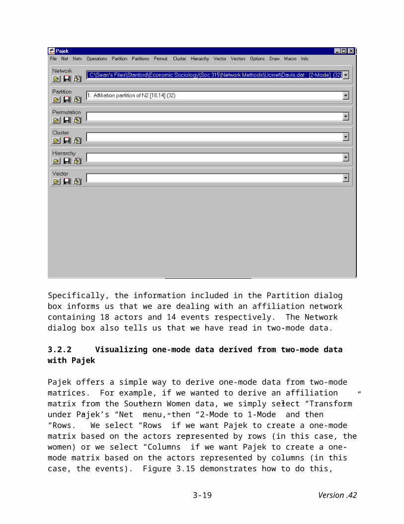
Figure 4.28 Pajek Image of Silicon Valley Semiconductor Firms, 1976-1980
Figure 4.29 Pajek Image of Silicon Valley Semiconductor Firms, 1981-1986
Version .424-22
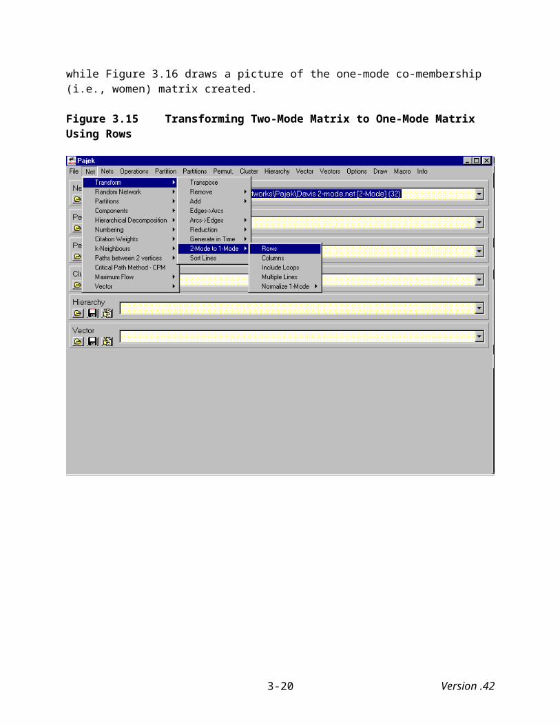
4.2.2 A single snapshot of the Silicon Valley semiconductor industry data over time
Like with the Sampson Monastery data, to visualize, in a single snapshot, changes in the social network of Silicon Valley’s semiconductor industry we need to construct a super matrix that consists of all six matrices. Doing this, however, is far more complex in this case because each of the six matrices is a different size.
More to come…
Version .424-23

APPENDIX A: EDITING AND PRINTING MAGE IMAGES Generally, most people will want to edit the original kinemage file in order to add labels, change the size or color of the lines and balls representing the network, etc. The best way to edit a kinemage file is by using the text editors, Wordpad or Notepad. Using Microsoft Word or other word-processing programs is inadvisable because they will try to save the file in another format (e.g., .doc, .wpd).
A.1 The Kinemage File
When you open a kinemage file, the first part of the data will look something like this:
@text coordinates from file: PadgMDS.txt@kinemage 1@caption coordinates from file: PadgMDS.txt@onewidth@zclipoff@group {network}@subgroup {balls}
Text that occurs between the “@text” and “@caption” lines appears in Mage’s text window, while text that occurs between the “@caption” and “@onewidth” lines appears in Mage’s caption window. The next part of the data, which is the actual node list (i.e., balllist) looks like this:
@balllist {actors} color= red radius= 0.150{} 1.579, -0.278, 0.237{} 1.215, 0.992, 0.621{} 0.007, -1.030, 0.566{} -0.754, 0.973, 0.117{} -0.735, -0.452, 0.745{} 1.056, 1.141, 1.337{} 0.428, 1.268, -0.091{} 0.178, 1.783, 0.399{} 0.896, -0.291, 0.174{} 0.455, -0.164, 1.846{} -0.983, 0.354, 0.674{} -0.323, 0.932, 1.803{} 0.175, -0.190, -0.643{} 0.873, -0.423, 1.410{} -0.790, 0.109, 0.022{} 0.676, 0.411, -0.647
There are several things you can do with the first line (@balllist). You can change the color of the actors (balls) to almost any color (e.g., blue, yellow, purple, etc.). You can also change the size (radius) of the balls. In fact, when a network contains a lot of actors, sometimes the balls cluster so tightly together that you cannot observe any ties between them. In such instances, it is often helpful to reduce the size of the radius (e.g., from .15 to .05), which is what we did for the visual representations presented in Figures 2.7 and 2.8 above.
Version .424-1

Note that these MDS coordinates are the same ones presented in Figure 2.4. The difference is the brackets that lie to the left of the coordinates, which represent the labels of the data. Right now, of course, there are none, but they can easily be added in the text editor. You can program Mage so that a label will appear in the Mage image whenever you click the mouse over a “ball” or have the labels appear “permanently.”
The next section of the kinemage file is the vector list, which tells Mage what ties exist between the various actors and what color to use for the ties:
@subgroup {sticks}@vectorlist {Ties} color= yellowtintP 1.579, -0.278, 0.237 0.896, -0.291, 0.174P 1.215, 0.992, 0.621 1.056, 1.141, 1.337P 1.215, 0.992, 0.621 0.428, 1.268, -0.091P 1.215, 0.992, 0.621 0.896, -0.291, 0.174 P 0.007, -1.030, 0.566 -0.735, -0.452, 0.745P 0.007, -1.030, 0.566 0.896, -0.291, 0.174
As you can see the data is broken down into sections. The first line beginning with the letter P and is followed by the actor’s MDS coordinates. The second line tells Mage the coordinates of the other actor to which the present actor has a tie. Thus, the first actor (coordinates = 1.579, -0.278, 0.237) has a tie with only one other actor, while the next actor (coordinates = 1.215, 0.992, 0.621) has ties with three other actors.
A.2 Adding labels to kinemage (.kin) files
Labels can be easily added to the kinemage files. Notice that in the node list there is nothing the brackets that precedes the coordinates. In the following example, we have filled in the brackets with the names of the 16 Florentine families. We can temporarily display the labels by clicking on a vertex with the mouse or permanently display them by incorporating the labels into the image and saving it as a new file.
@balllist {actors} color= red radius= 0.150{Acciaiuol}1.579, -0.278,0.237{Albizzi}1.215, 0.992, 0.621{Barbadori}0.007, -1.030, 0.566{Bischeri}-0.754, 0.973, 0.117{Castellan} -0.735, -0.452, 0.745{Ginori} 1.056, 1.141, 1.337{Guadagni} 0.428, 1.268, -0.091{Lambertes} 0.178, 1.783, 0.399{Medici}0.896, -0.291, 0.174{Pazzi}0.455,-0.164, 1.846{Peruzzi}-0.983,0.354, 0.674
Version .424-2

{Pucci}-0.323, 0.932, 1.803{Ridolfi}0.175,-0.190, -0.643{Salviati}0.873,-0.423, 1.410{Strozzi}-0.790,0.109, 0.022{Tornabuon}0.676,0.411, -0.647
To incorporate the labels into the image permanently, first select the “Draw New” option under the Edit menu. This will bring up a whole new set of options along the right hand side of the display. To insert labels you need to click on the box to the left of the “Labels” option as illustrated in Figure A.1.
Figure A.1 “Draw New” Display in Mage
Next, simply click the vertices (balls) where you want to the label to appear. Figure A.2 shows the same network data displayed in Figure A.1 (Metric MDS of Padgett marital data) except that it includes labels for all of the vertices, and it has been rotated so that the labels are more readable. We can then save this modified kinemage (“.kip”) file.
Version .424-3

Figure A.2 Mage Image with Labels
A.3 Changing the color of vertices in kinemage (.kin, .kip) files
Mage also allows users to easily change the color of the vertices in kinemage files. We have already seen how the color of the vertices can be edited within the kinemage file. Here, we explore how to change the color from within Mage itself.
Say in the previous example, we wanted to highlight the Medici family because of its centrality. To change the color of the Medici vertex, first select the “Change Color” option under the “Edit” menu. This brings up a new “Changecolor” option along the right hand side of the display. If it is not already checked, check it now. Next, click on the Medici vertex. This will bring up a color selection dialog box similar to the one in Figure A.3.
Note that this box gives you a choice between changing the color of the entire network (list) or a single point in the network. To change the color of the Medici vertex, select the “Point” option and then the color of your choice. Be sure to choose one that is readily distinguishable from the colors in the rest of the vertices in the network. Here, we choose “blue” as illustrated in the Figure 2.13. As before, this new image can be saved as a modified kinemage file.
Version .424-4

Figure A.3 Mage’s Color Selection Dialog Box
Figure A.4 Mage Image with the Color of the “Medici” Vertex Changed.
A.4 Complex editing of kinemage files
We can use complex editing techniques of kinemage files that allow us to view a structure of a social network in a number of (potentially) useful ways. To illustrate some of these techniques, we will draw on Sampson’s monastery data used in Chapter 4.
Version .424-5
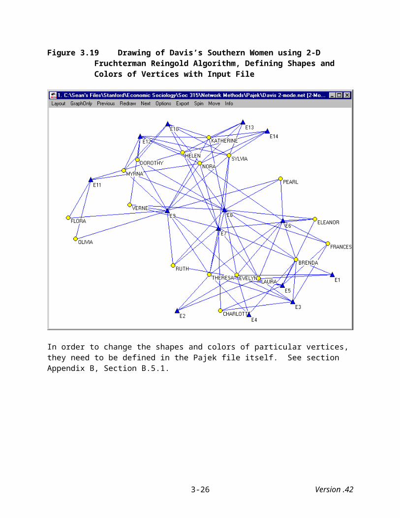
The kinemage document includes both a node (ball) and a vector list (see Appendix A, p. A-2). In the Sampson data we used to produce an image of the three liking matrices simultaneously (see Figure 4.18), the entire vector list appeared under the following heading:
@vectorlist {} color = yellow
While the list is too long to reproduce here, the coordinates for the vectors emanating from the first actor appeared as follows:
@vectorlist {} color = yellowP 1.501 3.625 4.1091.669 4.879 2.088P 1.501 3.625 4.1091.234 5.268 5.533P 1.501 3.625 4.1091.822 2.979 5.249P 1.501 3.625 4.1091.531 3.118 2.965P 1.501 3.625 4.1095.078 4.153 4.409
As noted above, the set of coordinates following the letter “P” designate the coordinates of the node where the vector begins, while the second set of coordinates (on the next line) designate the coordinates where the vector ends. The last set of vector coordinates is of particular interest because it names the vector the connects the first actor at time “1” to himself at time “2.”19
Assume that we wanted to change the colors of the ties connecting the various nodes and to separate the ties within the network at each point in time from the ties that connect the network across time. To do so, we can rename the initial vector list “network ties,” change the color of ties from yellow to white (“white” ties appear as “black” against a white background), and then include the command “off” at the end of the line, which tells Mage that a subsequent command will it, and then cut the coordinates of vectors connecting the nodes across time and paste them under their own separate heading. Just looking at the coordinates for the first actor, they would now appear as follows in the kinemage file:
@vectorlist {network ties} color = white offP 1.501 3.625 4.1091.669 4.879 2.088P 1.501 3.625 4.1091.234 5.268 5.533P 1.501 3.625 4.1091.822 2.979 5.249P 1.501 3.625 4.1091.531 3.118 2.965…@vectorlist {ties across time} color = red offP 1.501 3.625 4.1095.078 4.153 4.409
19 I was able to identify his coordinates at time “2” by examining the Mage’s node list (balllist ).
Version .424-6
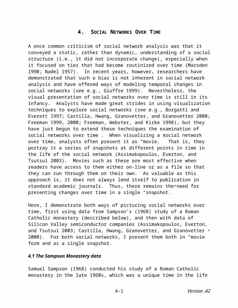
These edits create a kinemage document that allows us to present an image of the network with only the ties within each of the “three” social networks visible (Figure 4.19), with only the ties across time visible (Figure 4.20), with none of the ties visible (Figure 4.21), and so on. These ties (and even the actors/nodes) can be turned on and off by clicking on the appropriate box on the right hand panel of the Mage screen. It is certainly worth noting that the cutting and pasting of coordinates is easier said than done. Large Mage files contain a large number of vector coordinates, and we need to be very careful when cutting and pasting them into other parts of the document.
Figure 4.19 is reproduced below (Figure A.5):
Figure A.5 Mage Image of Exported Pajek Drawing With Only Network Ties Visible
Not only can we copy/cut and paste vector lists, but we can also copy/cut and paste the node lists. To create the set of pictures that appear in Figures 4.23 and 4.24, we need to first set up a new “group” with the following command:
@group {network}
Under this we need to copy and paste the entire node list below it, separating the at the three points in time with the following command lines as it appears on the following page (Figure A.6). These commands also assign different colors to the network at the three points in time.
Version .424-7

Figure A.6: Newly Created Kinemage Node List (Balllist) with New Command Lines
@group {network}@balllist {liking time 1} color= blue radius= 0.200{ROMUL_10}1.501 3.625 4.109{BONAVEN_5}1.531 3.118 2.965{AMBROSE_9}1.669 4.879 2.088{BERTH_6}1.012 5.940 7.090{PETER_4}1.234 5.268 5.533{LOUIS_11}0.933 4.431 7.724{VICTOR_8}1.460 2.230 1.945{WINF_12}1.145 3.306 4.969{JOHN_1}0.987 2.763 6.273{GREG_2}1.365 5.873 6.654{HUGH_14}1.596 4.276 6.644{BONI_15}1.475 1.609 4.281{MARK_7}1.323 6.343 3.158{ALBERT_16}1.822 2.979 5.249{AMAND_13}1.960 1.653 3.894{BASIL_3}1.473 1.156 2.530{ELIAS_17}1.663 6.582 1.076 {SIMP_18}1.454 5.182 2.254@balllist {liking time 2} color= green radius= 0.200{ROMUL_10}5.078 4.153 4.409{BONAVEN_5}5.144 3.368 3.095{AMBROSE_9}5.164 5.652 2.535{BERTH_6}4.579 6.438 7.168{PETER_4}4.822 5.981 5.896{LOUIS_11}4.379 5.335 8.228{VICTOR_8}5.011 2.861 1.827{WINF_12}4.582 5.036 6.479{JOHN_1}4.540 3.412 7.148{GREG_2}4.561 7.798 6.261{HUGH_14}5.130 4.645 6.399{BONI_15}4.956 2.327 4.819{MARK_7}4.782 7.351 3.658{ALBERT_16}5.527 2.128 4.818{AMAND_13}5.445 2.069 3.775{BASIL_3}5.076 1.658 2.478{ELIAS_17}5.096 7.053 0.938{SIMP_18}4.891 7.290 2.059@balllist {liking time 3} color= red radius= 0.200{ROMUL_10}8.778 4.561 3.425{BONAVEN_5}8.646 3.397 2.428{AMBROSE_9}8.679 6.416 2.511{BERTH_6}7.859 7.756 8.023{PETER_4}8.116 7.581 6.787{LOUIS_11}7.622 6.731 9.062{VICTOR_8}8.476 3.358 1.826{WINF_12}7.775 6.034 8.369{JOHN_1}8.001 4.991 7.140{GREG_2}7.945 8.844 6.507{HUGH_14}8.473 5.999 7.498{BONI_15}8.456 3.482 4.380{MARK_7}8.270 7.834 4.147{ALBERT_16}9.067 3.317 4.524
Version .424-8
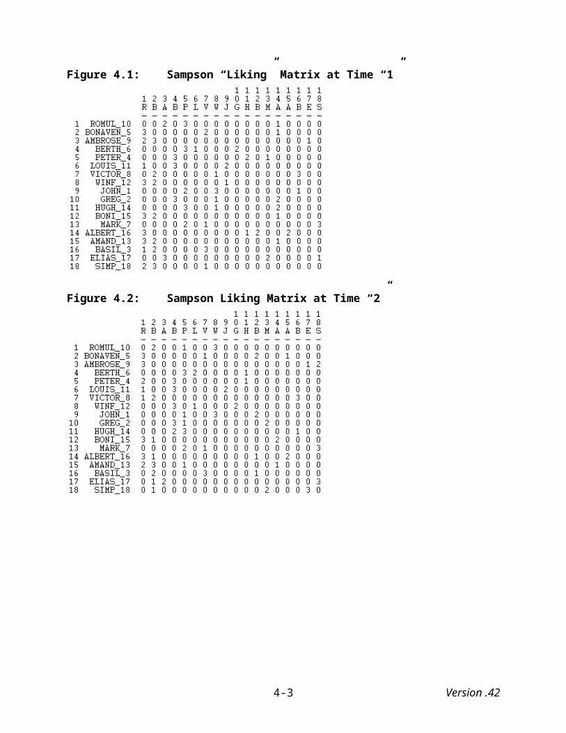
{AMAND_13}8.916 1.783 3.158{BASIL_3}8.496 1.795 1.346{ELIAS_17}8.504 7.453 1.088{SIMP_18}8.409 7.774 2.121
Version .424-9
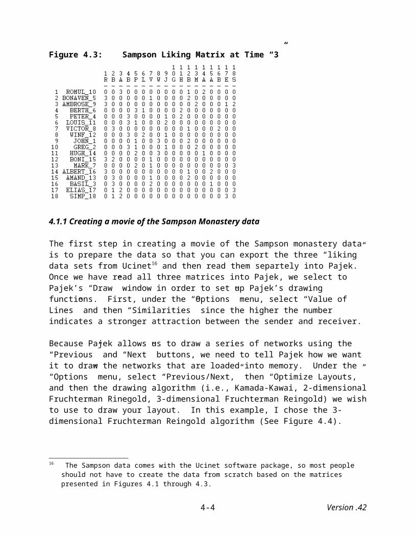
Next, I copied the two vector lists already in the kinemage file and pasted them below the new node list. I then separated the first vector list (i.e., the one that contains the ties within each of the “three” social networks) according to the three points in time with the following commands:
@vectorlist {time 1 ties} color = white off
@vectorlist {time 2 ties} color = white off
@vectorlist {time 3 ties} color = white off
These edits create a Mage image like the one presented in Figure 4.22 (and below – Figure A.7) with the visualization options contained on control panel on the right-hand side of the Mage screen, some of which I have “checked”:
Figure A.7 Mage Image of Exported Pajek Drawing With Various Visualization Options
The final “feature” illustrated in chapter four involved drawing a line from one node to another. In this case I drew a line connecting the monk “Amand” with himself across the three points in time. The first step involves selecting the “Draw New” option found under the “Edit” menu. Selecting this option brings up a set of drawing options on Mage’s control panel (A.8)
Version .424-10

Figure A.8 Mage Screen When “Draw New” Option is Selected
After ensuring that the “Drawline” option is checked, I clicked on Amand’s node at time “1” and then again on his node at time “2.” This procedure drew a line between those two nodes. Next, I clicked on Amand’s node at time “2” and then again on his node at time “3,” and this drew a line between these two nodes. The “finished” product (after editing the file so that “Amand’s name appears on the right hand side of the Mage screen and the ties connecting the nodes are blue) appears in Figure 4.23 above and A.9 below:
Version .424-11
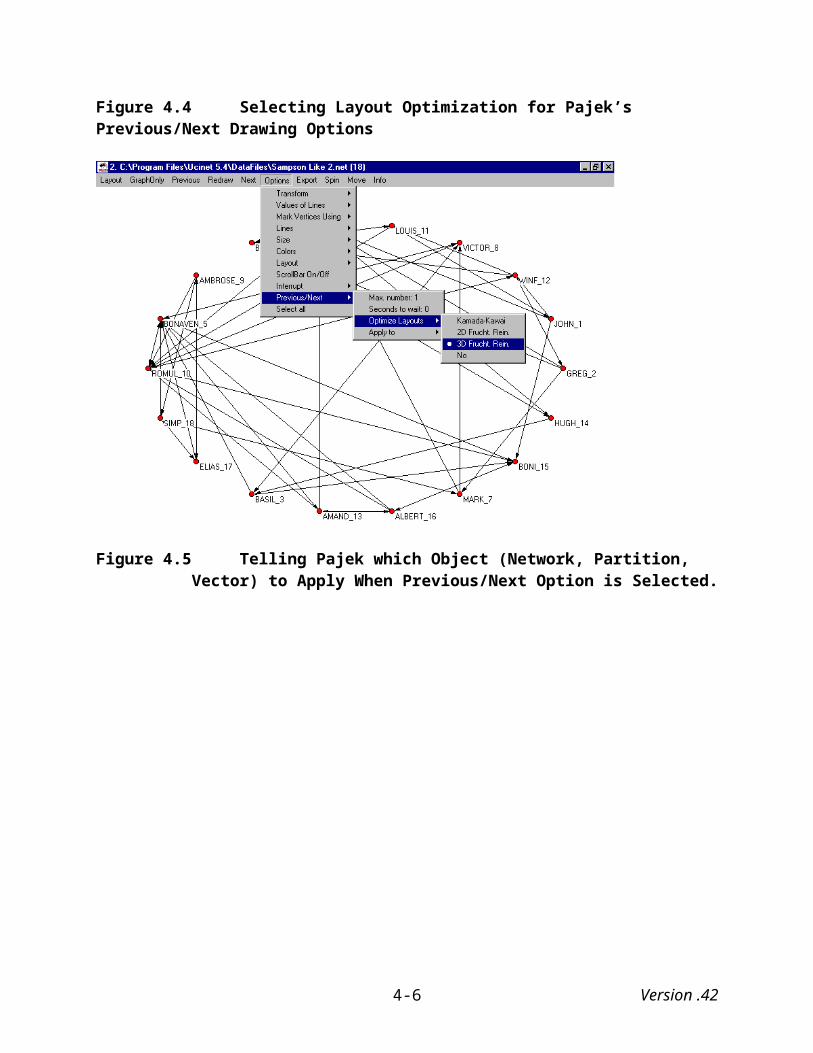
Figure A.9 Mage Screen With Tie Connecting “Amand” Over Time
A.5 Printing Mage Images
Perhaps the easiest way to print Mage images is to first take a “picture” of the Mage image by holding down the “Alt” and “Prt Sc” (Print Screen) buttons at the same time and then pasting the resulting bitmap image into your document. The pasted image can be cropped, sized, etc. using the “Picture” toolbar. That is the technique used to include the Mage (and Pajek) images in this manual.
More to come…
Version .424-12
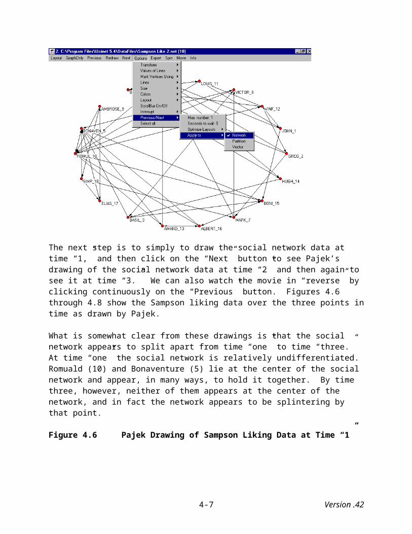
APPENDIX B: EDITING AND PRINTING PAJEK IMAGES
B.1 Resizing Pajek images
One of the first things that users often encounter is that the initial drawing is too big for the screen. Pajek allows you to resize the image in a number of ways. One of the simplest methods is to use the resize option located under the “Options/Transform” menu (see Figure B.1)
Figure B.1: Pajek’s Resize Option
This brings up a series of three dialog boxes that will ask you the factor by which you want to resize the drawing in each direction (i.e., “x,” “y,” “z.”). Here we use a factor of .90 for each direction.20
20 Since this is only a two-dimensional drawing, we technically need to only resize it in two directions, that is, along the x and y axes.
Version .42B-1

Figure B.2 Pajek “x-direction” Resize Dialog Box
By typing .90 in every direction, Pajek proportionally reduces the drawing’s size by that factor. Looking at Figure B.3 we can see that the drawing now “fits” the screen better than it did before (see B.1). The names of the two families on the right (Acciaiuol and Lambertes) are now readable.
Figure B.3 Resized Pajek Drawing
We could have just as easily have resized the image in only one direction, but if we had done that the drawing would not have been resized proportionally. If we had wanted to enlarge the drawing, we could have typed in a factor greater than 1.0.
Version .42B-2
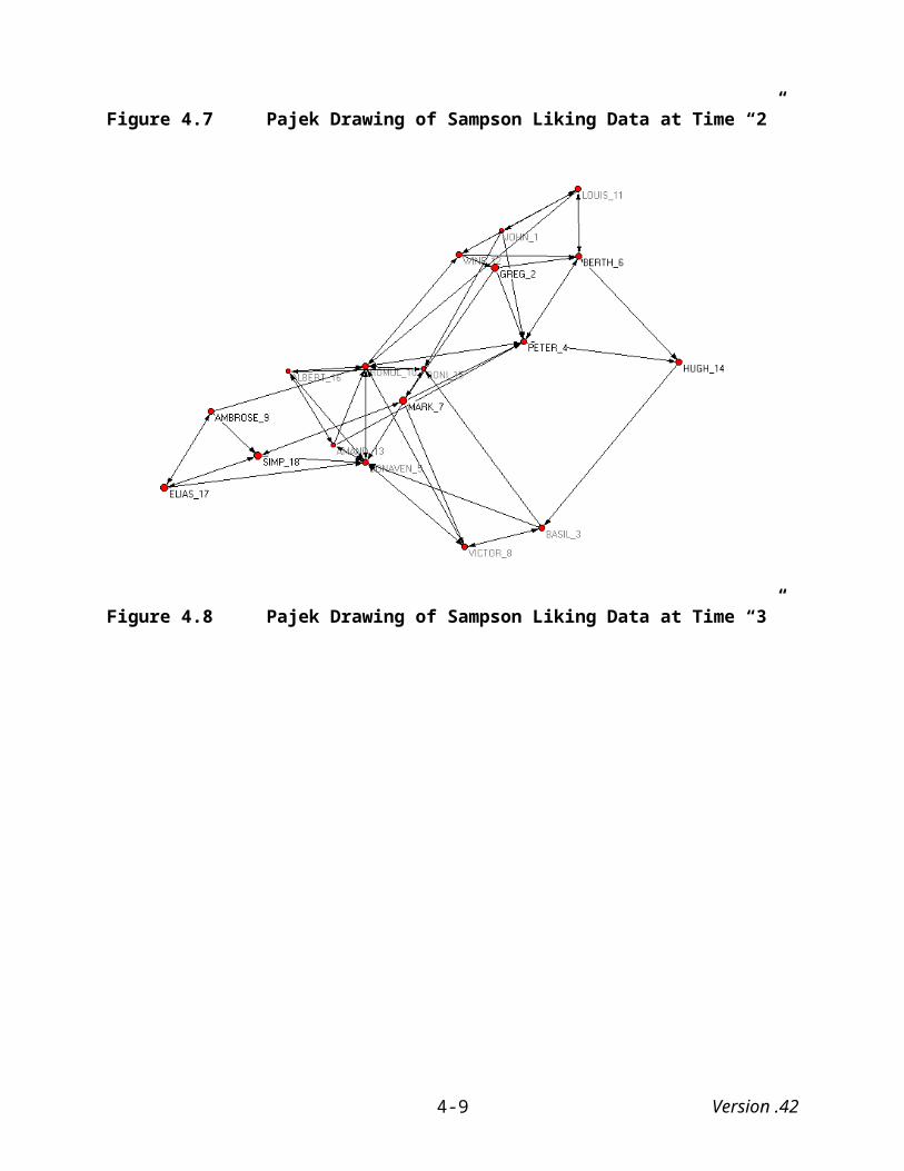
Another method for resizing images included in Pajek is also found under the “Options/Transform” menu. Instead of selecting “Resize,” select “Fit Area.” This brings up two further alternatives: (1) “max(x), max(y), max (z)” and (2) “max(x,y,z).” The first redraws the picture as large as possible by resizing each coordinate (i.e., direction, axis, dimension) independently. The second redraws the picture as large as possible while keeping the proportions between the coordinates the same. See Figure B.4.
Figure B.4 Pajek Fit Area Options
B.2 Rotating Pajek images
We noted earlier that users need to be somewhat careful when using three-dimensional representations because it is possible for a vertex to appear, at first glance, to be quite central but, upon closer inspection, turn out to be quite far from the center. This is because in these three-dimensional representations, distance is not only measured “left-to-right” and “top-to-bottom,” but also “front-to-back.” Luckily, Pajek provides an spin option that permits users to examine drawings from a number of different angles (dimensions), which in turn allows them to potentially uncover structural aspects of the social network that at first glance may not be apparent. To spin a Pajek image under the “Spin” menu, select “Spin Around.”
Figure B.5 Selecting Pajek’s “Spin Around” Option
Selecting this option brings up a dialog box that asks you how many degrees you wish to spin the drawing. The default is 360.
Version .42B-3
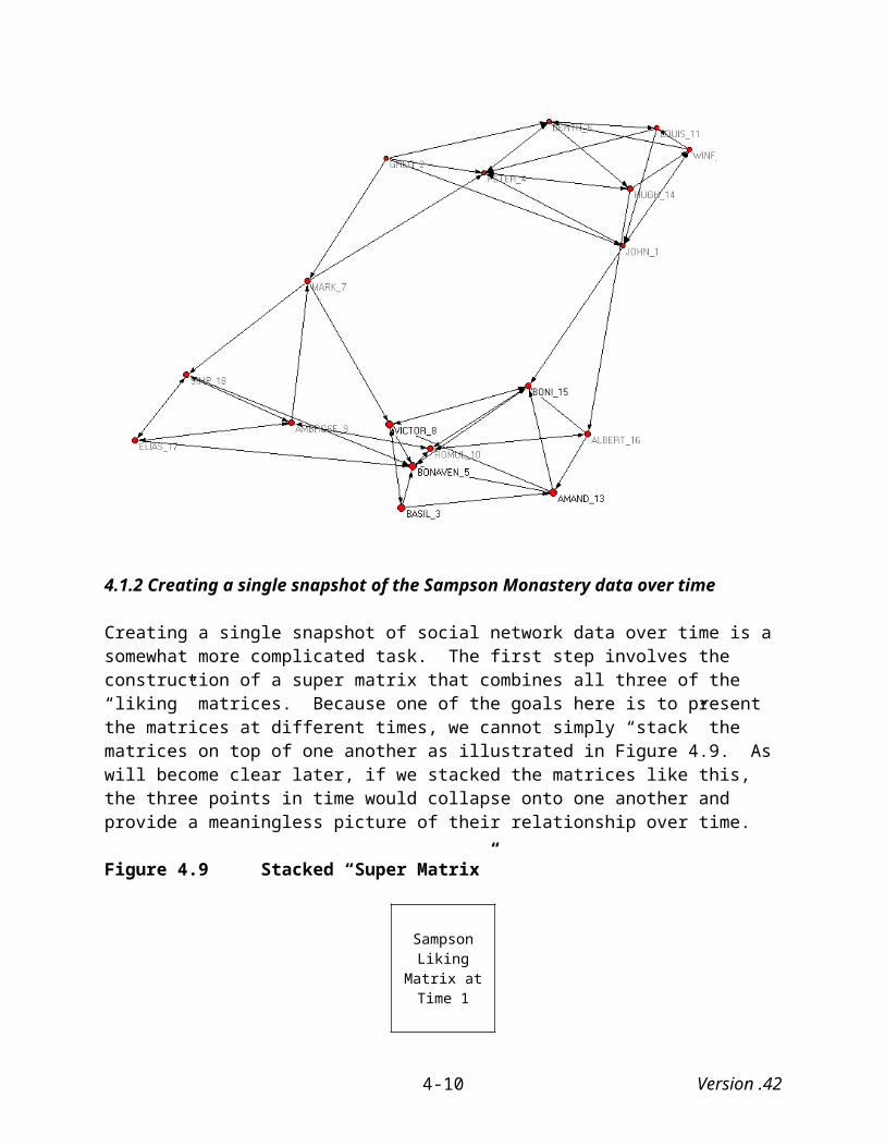
Figure B.6 Pajek’s Spin Dialog Box
The first time you spin it, you will probably want to spin it 360 degrees so that you can see the network’s entire structure. Afterward, however you may want to spin it in intervals.
B.3 Marking vertices
Pajek also provides users with a number of other options for “spicing-up” your drawings. For example, under the “Options” menu you will find an option to mark the vertices with labels, numbers, vector labels (if vector of the same size is also present), without labels, without labels and arrows, and with real sizes on or off.
Figure B.7 Options for Marking Vertices in Pajek
B.4 Drawing and Marking Lines
Pajek draws arcs, which are directed lines that connect one actor in a graph to another, as lines with arrows. It draws edges, which are undirected lines that connect one actor to another actor, as lines without arrows. However, it also allows users to modify the way it initially draws lines.
For example, you can tell it to draw or not to draw “edges” or to draw or not to draw “arcs.” Thus, if you have social network data that contains both arcs and edges, you can drop the arcs out of the picture, the edges out of the picture, or both (see Figure B.9)
Version .42B-4
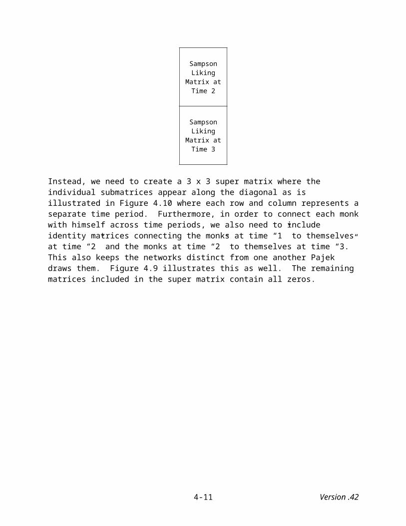
Figure B.9 Drawing Lines in Pajek
You can also mark lines in Pajek drawings with labels or values. In order to do so the data file must first contain labels and values. Otherwise, clicking on either of these options will not change the drawing’s appearance.
Figure B.10 Marking Lines in Pajek
B.5 Changing Sizes and Colors
Pajek also permits users to determine the size of the vertices, lines, arrows and fonts used in drawings. You can also “return” the drawing to its default sizes. Selecting any of these options brings up a dialog box that allows users to type in various sizes.
Version .42B-5
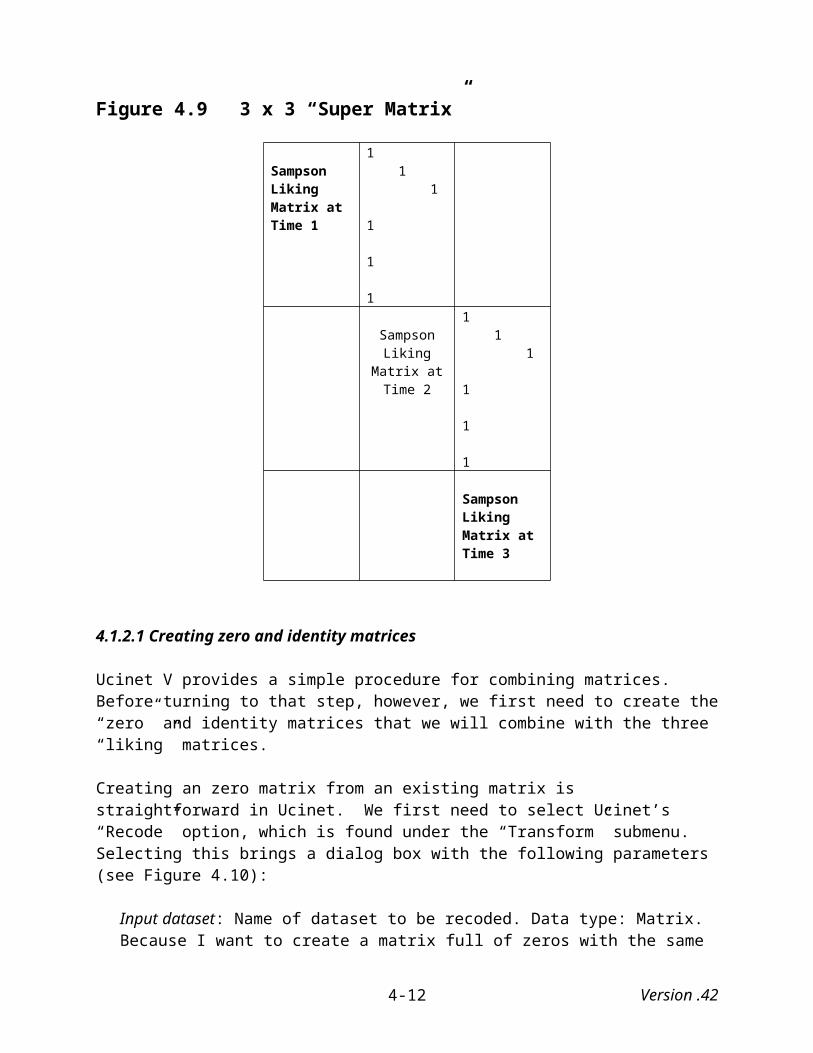
Figure B.11 Adjusting Sizes in Pajek
It also permits users to determine the colors of the background and the vertices, lines, arrows and fonts used in drawings.
Figure B.12 Changing Colors in Pajek
Selecting any of these options brings up the “color” dialog box found in Figure B.13.
Figure B.13 Pajek’s Color Dialog Box
Version .42B-6
Pajek also provides users with the option of using colors of vertices, arcs and edges as defined by an input file.
B.5.1 Defining vertices by input files
For example, a portion of the previous example’s Pajek file appears in Figure B.14 below. Note that the phrase “ellipse ic Yellow” appears to the right of the first vertex’s (“Evelyn”) coordinates. What this tells Pajek is that beginning with this vertex and for all following vertices until another command is provided, the vertices will be in the shape of an ellipse and their internal color (i.e., “ic”) will be yellow. The next command – “triangle ic Blue” – tells Pajek that beginning with this vertex, vertices will now be in the shape of a triangle and their internal color will be blue. Pajek vertices can be in the shape of ellipses, boxes, triangles and diamonds. A wide array of colors is also available.
Figure B.14 Pajek Data File
B.6 Saving social network data in Pajek
Version .42B-7
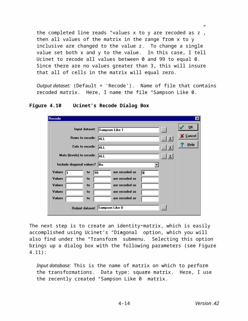
Once you have read network data into Pajek, you can save it as a Pajek network file. To do this, select “Network” under the “File” menu and then select “Save” (See Figure B.14).
Figure B.14 Saving Network Data in Pajek
Alternatively, you can click on the disk save icon (i.e., a picture of a floppy disk). In this case we save it under the name “PadgettM.net” (Pajek automatically assigns the “.net” extension, so there is no need to include it when naming the file. If you do not intend to do any further analysis or visualization with this data, then it is probably not necessary to save the data as a Pajek network. As we have already seen, you can visualize data with “.dat” extensions. However, if you want to save a particular drawing of the data or if you want to edit it later, then you probably want to save it in Pajek format.
B.7 Exporting Pajek images
You can export Pajek created images in a number of formats: “EPS/PS,” “SVG” (Scaleable Vector Graphics), “VRML,” “MDL MOLfile,” “Kinemage” (Mage), and “Bitmap.” Selecting “Options” brings up a dialog box where you can control EPS, SVG and VRML defaults.
Version .42B-8
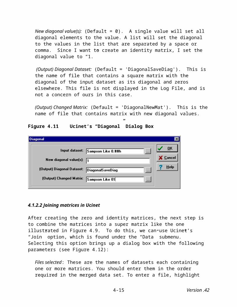
Because we are also creating visual representations of social networks using Mage, we illustrate Pajek’s exporting capabilities by exporting a Pajek image in Kinemage format.
Under the “Export” menu, select “Kinemage” and then “Current Network Only” option. This option exports only the current network. You also have the option of exporting the current and all subsequent networks in kinemage format. We will stick with one for now.21
Figure B.15 Exporting Pajek Images as a Kinemage Document
21 During the process of exporting a dialog box will appear asking what resize factor you want to use. For now use Pajek’s default of “1.0.”
Version .42B-9

The resulting Mage image looks as follows:
Figure B.16 Mage Image of Exported Pajek Drawing
B.8 Printing Mage Images
Perhaps the easiest way to print Pajek images is to first take a “picture” of the image by holding down the “Alt” and “Prt Sc” (Print Screen) buttons at the same time and then pasting the resulting bitmap image into your document. The pasted image can be cropped, sized, etc. using the “Picture” toolbar. That is the technique used to include the Pajek (and Mage) images in this manual.
More to come…
Version .42B-10
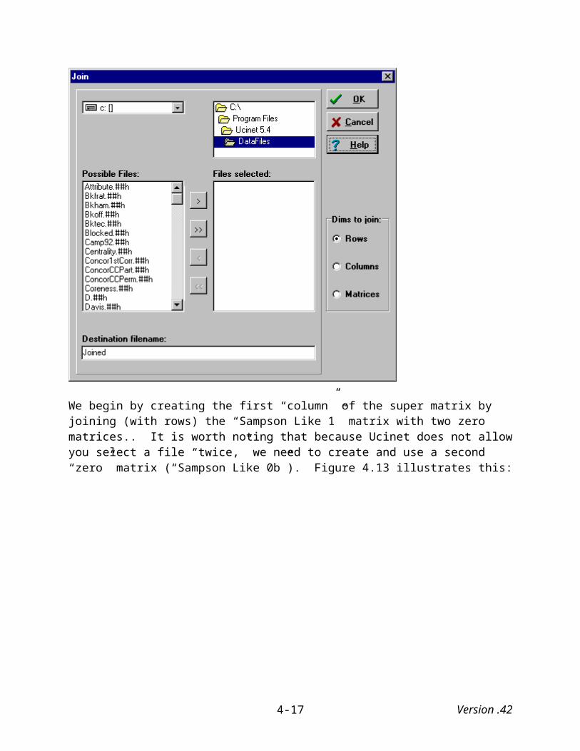
APPENDIX C: GLOSSARY OF TERMS
Actor: Actors can be people, subgroups, organizations, collectivities, communities, nation-states, etc.
Affiliation network: A type of two-mode network consisting of one set of actors and one set of events.
Arc: A directed line that connects one actor in a digraph (directed graph) to another actor.
Complete network: A complete network is a network with a density of one (i.e., maximum density).
Degree: The degree of a vertex equals the number of lines incident with it.
Density: Density is the number of lines in a simple network, expressed as a proportion of the maximum possible number of lines.
Dyadic network: A type of two-mode network consisting of two sets of actors.
Digraph (Directed graph): A graph where one or more lines (arc) are directed from one vertex to another.
Directed line: A directed line is commonly known as an arc, which is simply a line that points from one vertex to another.
Edges: An undirected line that connects one actor to another.
Fruchterman Reingold: The Fruchterman Reingold algorithm attempts to simulate a system of mass particles where the vertices simulate mass points repelling each other while the edges simulate springs with attracting forces. It then tries to minimize the “energy” of this physical system. It differs from the Kamada-Kawai algorithm in that it is able to distribute points in both two-dimensional and three-dimensional space. See also Kamada-Kawai and Spring embedded algorithms.
Geodesic: Geodesic distance is the length of the shortest path between two nodes.
Graph: A graph is a model for a social network with ties between pairs of actors (vertices). A tie can be either present or absent between each pair of actors. See digraph and simple (directed and undirected) graph.
Incident: A line is defined by its endpoints (vertices), which are said to be incident with the line.
Version .42C-1
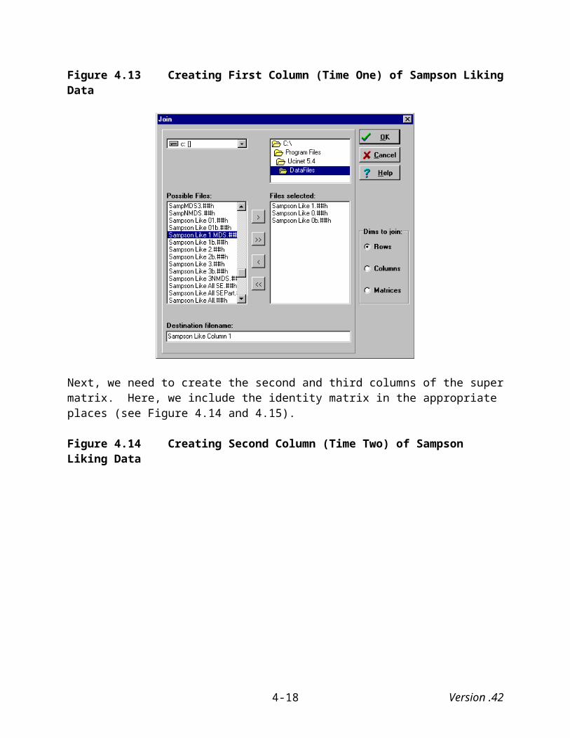
Kamada-Kawai: The Kamada-Kawai spring embedded algorithm assumes an attraction between adjacent points (vertices), repulsion between non-adjacent points and allocates points in two-dimensional space. See also Fruchterman Reingold and Spring embedded algorithms.
Line: A line is a relation between two vertices (e.g., actors or events). They can be either directed or undirected.
Loop: A loop is a line that connects a vertex with itself.
Multidimensional scaling: Mathematical techniques designed to (see metric and non-metric multidimensional scaling).
Network: A network consists of a graph with additional information concerning the graph’s vertices and/or lines.
Nodal degree: The degree of a node is the number of lines that are incident with it.
One-mode network: A network that consists of a single set of actors. See also two-mode network.
Partition: A network partition is a discrete classification or clustering of vertices that assigns each vertex to exactly one class or cluster.
Simple undirected graph: A graph that has no loops (i.e., a line between a node and itself) and includes no more than one edge between a pair of nodes.
Simple directed graph: A graph that does not contain multiple arcs (loops are allowed, however).
Spring embedded algorithms: Graph-drawing algorithms that treat points (vertices) as pushing and pulling on one another that seeks to find an optimum solution where there is a minimum amount of stress on the springs connecting the whole set of points. See also Fruchterman Reingold and Kamada-Kawai.
Two-mode network: A network that consists of two sets of actors (i.e., dyadic network), or one set of actors and one set of events (i.e., affiliation network). See also one-mode network.
Undirected line: An undirected line is a line that connects two vertices but does not point from one vertex to another.
Vector: In Pajek, a vector assigns a numerical (continuous) value to each vertex in a network.
Version .42C-2
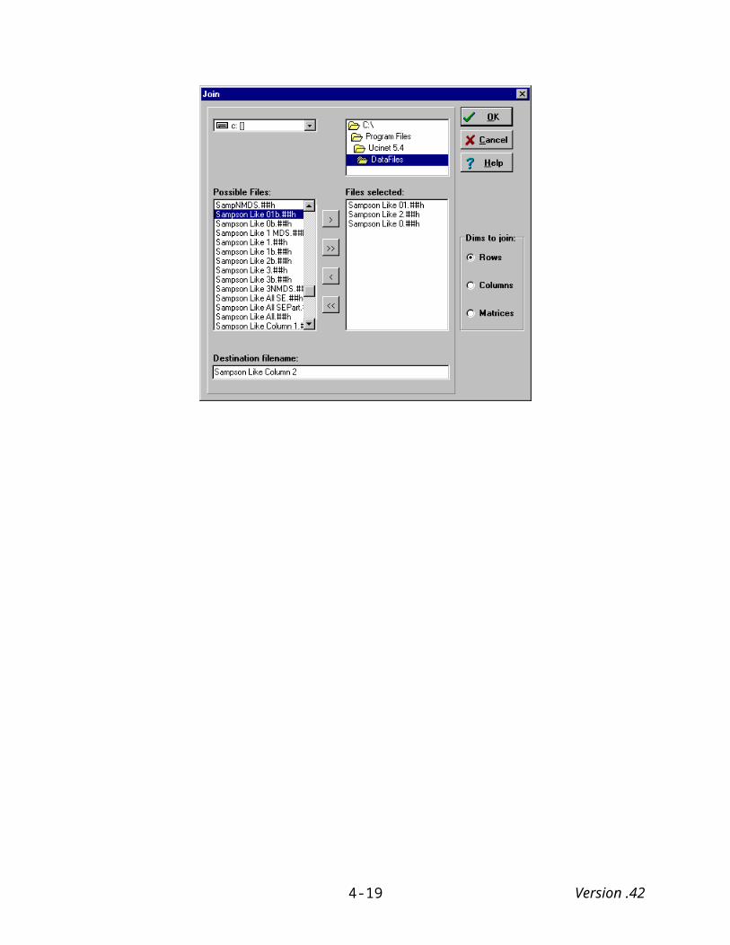
REFERENCES
Assimakopoulos, Dimitris, Sean F. Everton, and Kiyoteru Tsutsui. 2003. "The Semiconductor Community in Silicon Valley: A Network Analysis of the SEMI Genealogy Chart (1947-1986)." International Journal of Technology Management 25:181-199.
Borgatti, Stephen P. and Martin G. Everett. 1997. "Network Analysis of 2-mode data." Social Networks 19:243-269.
Borgatti, Stephen P., Martin G. Everett, and Linton C. Freeman. 1999. Ucinet 5 for Windows: Software for Social Network Analysis. Natick: Analytical Technologies.
Breiger, R. L. 1974. "The Duality of Persons and Groups." Social Forces 53:181-190.
Breiger, R. L. and P. E. Pattison. 1986. "Cumulated Social Roles: The Duality of Persons and their Algebras." Social Networks 8:215-256.
Castilla, Emilio, Hokyu Hwang, Ellen Granovetter, and Mark Granovetter. 2000. "Social Networks in Silicon Valley." Pp. 218-247 in The Silicon Valley Edge: A Habitat for Innovation and Entrepreneurship, edited by C.-M. Lee, H. S. Rowen, W. F. Miller, and M. G. Hancock. Stanford, CA: Stanford University Press.
Davis, A, B. Gardner, and M. R. Gardner. 1941. Deep South. Chicago: University of Chicago Press.
Eddy, Craig, Paul Cassel, Joel Goodling, and Robert Stewart. 1998. Sams Teach Yourself Access 97 in 21 Days. Indianapolis, Indiana: Sams Publishing.
Faust, Katherine. 1997. "Centrality in Affiliation Networks." Social Networks 19:157-191.
Freeman, Linton C. 1999. "Using Molecular Modeling Software in Social Network Analysis: A Practicum." University of California, Irvine, Irvine, CA. Retrieved June 15, 2000 (http://eclectic.ss.uci.edu/~lin/chem.html).
________. 2000. "Visualizing Social Networks." Journal of Social Structure 1.
Freeman, Linton C., Cynthia M. Webster, and Deirdre M. Kirke. 1998. "Exploring Social Structure Using Dynamic Three-Dimensional Color Images." Social Networks 20:109-118.
Fruchterman, T. and E. Reingold. 1991. "Graph Drawing by Force-Directed Replacement." Software--Practice and Experience 21:1129-1164.
Giuffre, K. 1999. "Sandpiles of Opportunity: Success in the Art World." Social Forces 77:815-832.
Version .42R-1
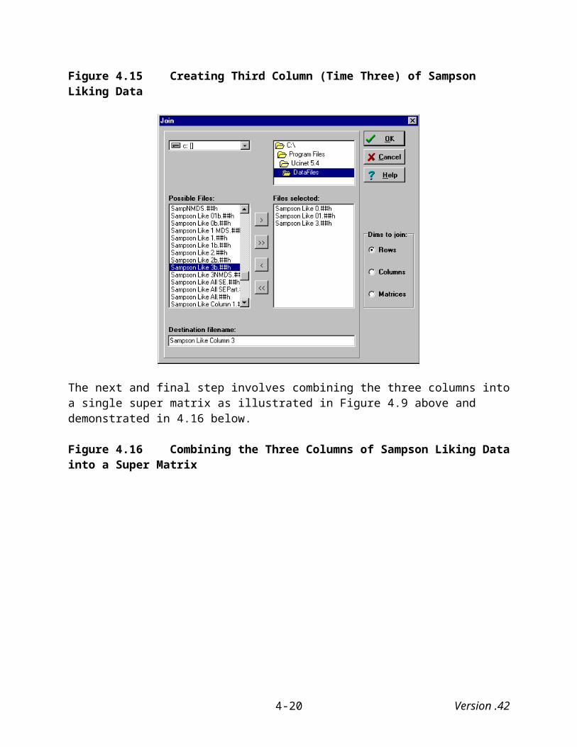
Hoefler, Don C. 1971. "Silicon Valley U.S.A." Electronic News, January 11, pp. 1, 4-5.
Kamada, T. and S. Kawai. 1989. "An Algorithm for Drawing General Undirected Graphs." Information Processing Letters 31:7-15.
Krackhardt, David. 1987. "Cognitive Social Structures." Social Networks 9:109-134.
Kruskal, Joseph B. and Myron Wish. 1978. Multidimensional Scaling. Newbury Park, CA: Sage Publications.
Marsden, Peter V. 1990. "Network Data and Measurement." Pp. 435-463 in Annual Review of Sociology, vol. 16. Palo Alto, CA: Annual Reviews.
McGrath, Cathleen, Jim Blythe, and David Krackhardt. 1997. "The Effect of Spatial Arrangements on Judgments and Errors in Interpreting Graphs." Social Networks 19:223-242.
Nadel, Siegfried F. 1957. The Theory of Social Structure. London: Cohen and West.
Padgett, J. F. and C. K. Ansell. 1993. "Robust Action and the Rise of the Medici, 1400-1434." American Journal of Sociology 98:1259-1319.
Richardson, David C. and Jane S. Richardson. 1992. "The Kinemage: A Tool for Scientific Communication." Protein Science 1:3-9.
Roberts, John M. Jr. 2000. "Correspondence Analysis of Two-mode Network Data." Social Networks 22:65-72.
Sampson, Samuel F. 1968. “A Novitiate in a Period of Change: An Experimental and Case Study of Relationships.” Unpublished Ph.D. dissertation, Department of Sociology, Cornell University.
Scott, John. 2000. Social Network Analysis: A Handbook. 2nd. Thousand Oaks, CA: Sage Publications.
Stark, Rodney. 2001. Sociology: Internet Edition. 8th. Belmont, CA: Wadsworth/Thomson Learning.
Stark, Rodney and Roger Finke. 2000. "Catholic Religious Vocations: Decline and Revival." Review of Religious Research 42:125-145.
Wasserman, Stanley and Katherine Faust. 1994. Social Network Analysis: Methods and Applications. Cambridge, UK: Cambridge University Press.
Version .42R-2