a decade of mortality massachusetts: 2000- · pdf filea decade of mortality massachusetts:...
TRANSCRIPT

0%
10%
20%
30%
40%
50%
60%
1842
1847
1852
1857
1862
1867
1872
1877
1882
1887
1892
1897
1902
1907
1912
1917
1922
1927
1932
1937
1942
1947
1952
1957
1962
1967
1972
1977
1982
1987
1992
1997
2003
2009
Year
Perc
ent o
f Tot
al D
eath
s
Infectious Disease
Heart Disease
Cancer
Injuries
Division of Research and Epidemiology, Bureau of Health Information, Statistics, Research, and Evaluation,
Massachusetts Department of Public Health
July 11, 2012
A Decade of Mortality Massachusetts: 2000-2009


A Decade of Mortality
Massachusetts: 2000-2009
Deval L. Patrick, Governor Timothy P. Murray, Lieutenant Governor
JudyAnn Bigby, MD, Secretary of Health and Human Services John Auerbach, Commissioner of Public Health
Gerald F. O’Keefe, Bureau Director Bureau of Health Information, Statistics, Research, and Evaluation
Bruce Cohen, Director Division of Research and Epidemiology
Stanley E. Nyberg, Registrar Registry of Vital Records and Statistics
Massachusetts Department of Public Health
July 11, 2012

Acknowledgments This report was prepared by Malena Orejuela Hood and Bruce Cohen, of the Division of Research and Epidemiology, Bureau of Health Information, Statistics, Research, and Evaluation. Special thanks go to: James K. West, Bureau of Health Information, Statistics, Research, and Evaluation ; Jerry O’Keefe, Director, Bureau of Health Information, Statistics, Research, and Evaluation; Stanley Nyberg, Registrar, Registry of Vital Records and Statistics; Charlene Zion, Kevin Foster, and Karin Barrett, Registry of Vital Records and Statistics; and Paul Oppedisano and Jamie Wilkins, MassCHIP. We also wish to thank DPH peer reviewers for their comprehensive review of this publication. Data in this report have been collected through the efforts of the Registry of Vital Records and Statistics staff, including: Sharon Pagnano, Maria Vu, Tara Andrews, June Deloney, Annie B. Hobbs, Ramona Irving, Maureen McKean, Robert McMahan, AnnMarie Neault, Denise O'Gara, Adele Pascar, Mary Risser, Phyllis Rotman, Mary Lou Rossetti, Monica Smith, Ian Skolnik, Helen Ba, Pamela Corbin, Crystal Steward, Maisy Wong, Christina Bocolos, Mike Baker, and Marta Mercado.
To obtain additional copies of this report, contact: Massachusetts Department of Public Health
Bureau of Health Information, Statistics, Research, and Evaluation 250 Washington Street, 6th floor
Boston, MA 02108
or
Massachusetts Department of Public Health Registry of Vital Records and Statistics
150 Mt. Vernon Street 1st Floor Dorchester, MA 02125
(617) 740-2670
This and other Department of Public Health publications can be downloaded from the following website:
http://www.mass.gov/dph/resep/resep.htm
(Click on Population Health Statistics and then on Death Data.)
To obtain more information on deaths in Massachusetts and other Department of Public Health data:
register for the Department’s free, Internet-based public health information service, MassCHIP, via the website at:
http://masschip.state.ma.us
or call 888-MAS-CHIP (toll free in MA) or 617-624-5629

5
EXECUTIVE SUMMARY This report presents an overall summary of trends in deaths for Massachusetts residents that occurred in the decade of 2000 to 2009. Data on mortality are based on information retrieved from death certificates filed with the Massachusetts Registry of Vital Records and Statistics. For access to 2009 death data, please visit MassCHIP, an Internet-based public health information service, via the website at: http://masschip.state.ma.us. Massachusetts mortality indicators have improved over time and continue to compare favorably with the US: more than half of the leading cause-specific mortality rates are lower in Massachusetts than in the US, including cancer, heart disease, stroke, unintentional injuries, Alzheimer ’s disease, and diabetes. In 2009, the overall age-adjusted death rate for Massachusetts fell to a record low of 675 deaths per 100,000 persons and life expectancy at birth reached an all-time high of 80.7 years. In 2009, 51,915 Massachusetts residents died, a number which was 3% lower than in 2008, and which is part of a decade-long decline that has averaged 1.1% per year since 2000. In 2009, there were continued declines in many of the leading causes of death such as cancer, heart disease, stroke, influenza and pneumonia, and chronic lower respiratory disease. The continued decline in deaths from these chronic conditions may be related to prevention, early detection, and better treatment. Since 2000 there have been continued declines in rates for stroke (5.1% per year), influenza and pneumonia (5.0% per year), heart disease (3.7% per year), diabetes-related death rates (3.2% per year), chronic lower respiratory disease (CLRD) (2.5% per year), and all cancers combined (1.8% per year). In 2009, there were 124 deaths from HIV/AIDS, which was the lowest annual number of HIV/AIDS deaths in Massachusetts since the peak of the epidemic in 1994 (998 HIV/AIDS deaths); and has been declining by 9.7% per year since 2003. The proportion of HIV/AIDS deaths who are persons ages 45 and older has increased 1.8 times (75% in 2009 vs. 41% in 2000). Deaths of persons ages 45 and older accounted for three-fourths of HIV/AIDS deaths, which was this group’s largest proportion ever. These statistics also suggest that people are living longer with HIV/AIDS. In 2009, 70% of injury deaths were unintentional or “accidental”; 18% were suicides; 6% were homicides; and 3% were of undetermined intent. Suicide rates have been increasing by 2% per year since 2000, while homicide rates have remained stable. By combining injuries of all intents (unintentional, suicide, homicide, injuries of undetermined intent), injuries continues to be the third leading cause of death in 2009 among residents of all ages and the leading cause of death among residents 1-44 years of age. Overall injuries of all intents have been increasing at a rate of 1.6% per year since 2000. Throughout the past decade, poisonings, which include fatal drug overdoses, was the leading cause of injury death in Massachusetts. Opioids, including heroin, oxycodone, morphine, codeine, and methadone, continue to be the agent most associated with poisoning deaths (67%) and it has been
A Decade of Mortality Massachusetts: 2000-2009
6
increasing at 5% per year since 2000. In 2009, for the 3rd year in a row, falls were the second cause of injury death in Massachusetts, and have continued to increase at an average of 11% per year since 2000. The majority of fall-related deaths occurred among persons ages 65 and older (80%) and fall death rates were highest among residents ages 85 years and older. In 2009, motor vehicle-related deaths was the fourth leading cause of injury death in the state and have been declining by 5.9% per year since 2002. Of these deaths, 18% were to pedestrians, 15% to motorcyclists, and 66% to occupants of motor vehicles and unspecified persons. In 2009, hanging, strangulation or suffocation was the third leading cause of injury death, and it was the leading cause of suicides in the state. Deaths by hanging, strangulation or suffocation have been increasing at a rate of 2.8% per year since 2000. This category includes not only suicidal hanging but also choking, unintentional infant suffocation, and aspiration leading to death. The 2009 infant mortality rate (IMR) has decreased by 30% since 1990 but has remained stable since 2000. In 2009, Blacks continued to have the highest IMR among all race and ethnicity groups at 7.8 deaths per 1,000 live births followed by Hispanics at 7.1 deaths per 1000 live births. The IMR for Blacks has been declining at an average of 3.5% per year since 2000. Premature mortality and mortality amenable to health care are two summary non disease-specific measures that have been developed to enhance the utility of mortality data to identify opportunities for potential system changes1. In 2009, premature deaths (deaths before age 75) accounted for 37% of all deaths in the state and have been declining by 3.3% per year since 2003. By examining deaths to persons younger than 75, it is possible to identify many issues that are more amenable to systematic public health approaches to health promotion and disease prevention2. Amenable mortality is defined as “deaths from certain causes that should not occur in the presence of timely and effective health care”. An important difference between amenable mortality and premature mortality is that the causes of amenable mortality do not include injuries3. Amenable mortality includes deaths from causes amenable to secondary prevention through early detection and treatment: this includes causes where screening and treatment are effective; for example breast, cervical, and skin cancer. Overall, amenable mortality rates have been declining at 4.0% per year since 2000. Amenable mortality was developed to assess the quality of health care systems, but, more recently it has been used to identify areas with deficiencies in access, quality, efficiency and equity in health care.
1 Caution should be exercised when using mortality indicators such as Years of Potential Life Lost, premature mortality, and amenable mortality in comparative studies. The upper age cutoff for all three indicators, the specific causes of death included in amenable mortality calculations, and the difficulty in assessing the contribution of factors to mortality should be carefully evaluated. 2 Patricia Martens, et al. The Health and Health Care Use of Registered First Nations People Living in Manitoba: A Population-Based Study. http://www.umanitoba.ca/centres/mchp/reports/reports_02/rfn.htm 3 Since injuries are not included in the amenable mortality calculation, a substantial number of premature deaths are not included.

7
All Cause Mortality In Massachusetts, the age-adjusted death rate from all causes fell to a record low of 675 deaths per 100,000 in 2009, down 4% from 2008 and 17% in the last decade, continuing a decreasing trend in the death rate and mirroring a decline in the death rate nationwide (Figure 1). In Massachusetts, this rate has been declining at an annual percent change (APC) of about 2% per year4 since 2000, and in 2009 it was 9% lower than the preliminary US rate (741 deaths per 100,000 persons5). The Massachusetts rate has been consistently lower than that of the US from 1990 to the present. Figure 1. All Cause Mortality Rates, Massachusetts and US: 2000-2009
675
812 741
872
0
100
200
300
400
500
600
700
800
900
2000 2001 2002 2003 2004 2005 2006 2007 2008 2009
Age
adju
sted
rate
per
100
,000
Massachusetts US
*The Annual Percent Change (APC) is significantly different from zero (p ≤ .05).
Since 2000, age-adjusted death rates for all race and Hispanic ethnic groups6 have decreased: Hispanic rates have declined 3% per year, and rates among Whites, Blacks, and Asians have declined 2% per year respectively (Figure 2). In 2009, as in previous years, Blacks have the highest death rate (19% higher than that for Whites), while Asians have the lowest (almost half that of Whites). The true death rates for both Asians and Hispanics may be higher than the rates presented in this report for several reasons. There are well-known difficulties in calculating accurate mortality rates for Massachusetts’s smaller populations such as Hispanics, Asians, and Native Americans7,8,9. Race and ethnicity are collected differently for death certificates than in the census. Race and ethnicity are self-reported in the decennial Census count, which is the denominator of the mortality rates; whereas, race, and ethnicity on death certificates are collected by the funeral director from an informant or by observation. Use 4 APC= Annual Percent Change. Join Point Analysis, a statistical tool, will be used to examine significant trends in mortality indicators. This tool was developed by the National Cancer Institute. 5 Deaths: Preliminary Data for 2009. NCHS, March 2011. Volume 59, Number 4. 6 Race categories, White, Black, American Indian, Asian, and Hispanic are mutually exclusive, for example, when we refer to White residents, this means White non-Hispanic residents. 7 Arias E. Quality of race and Hispanic origin reporting on death certificates in the United States. Presented at the 2004 NCHS Data Users Conference. Washington, DC, July 14, 2004. Available at: http://www.cdc.gov/nchs/ppt/duc2004/arias.pps. 8 US Centers for Disease Control and Prevention, National Center for Health Statistics. Vital and Health Statistics (Series 2, Number 128), Quality of Death Rates by Race and Hispanic Origin: A Summary of Current Research, 1999. US Department of Health and Human Services. 9 Sorlie, P. D., Rogot, E., & Johnson, N. J. (1992). Validity of the Death Certificate. Epidemiology, 3(2), 181-184.
APC 2%*

8
caution when interpreting race and ethnicity in mortality data because the potential undercounts in population data and misclassification on death certificates may result in inaccuracies in mortality statistics. Figure 2. All Cause Mortality Rates by Race and Ethnicity, Massachusetts: 2000-2009
815
683
934
812
585440
401 353
0
100
200
300
400
500
600
700
800
900
1000
2000 2001 2002 2003 2004 2005 2006 2007 2008 2009
Age
adj
uste
d ra
te
per 1
00,0
00
White BlackHispanic Asian
Most deaths occur among persons ages 65 years and older. Ten years ago, the number of deaths among persons ages 75-84 and 85 and older was about the same (Figure 3). In 2009, even though the older age group (85 years and older) accounted for only 2% of the population in the state, it continues to have the highest number of deaths and has been increasing at a rate of 0.7% per year since 200010 while deaths among persons ages 75-84 have been decreasing at a rate of 2.4% per year since 2000. Figure 3. Number of Deaths by Age, Massachusetts: 2000-2009
11,17711,586
9,7467,380
17,554 13,943
18,113 19,004
0
5,000
10,000
15,000
20,000
25,000
2000 2001 2002 2003 2004 2005 2006 2007 2008 2009
Num
ber o
f dea
ths
Under 65 65-74 75-84 85+
10 Since 2000, persons ages 85 years and older have accounted for only 2% of the population in the state.

9
Place of death Of the 51,915 deaths in 2009, 21,197 (41%) people died in hospitals, 15,185 (29%) died in nursing homes, 12,490 (23%) died at home, 2,060 (4%) died in other locations such as doctor’s offices, group homes, foster homes, residential programs, private agencies, prisons, hospice facilities, or unlicensed facilities, and 585 (1%) were pronounced dead on arrival at emergency departments. Since 2000, deaths at hospitals (inpatient/outpatient) have been decreasing at a rate of 2.1% per year, deaths at home have been increasing at 0.8% per year, and deaths at nursing homes have been decreasing at 1.3% per year (Figure 4). Deaths on arrival at emergency departments have been decreasing at 11.4% per year since 2004, and deaths at other places continued to increase at a rate of 12.8% per year since 2003. The large increase in this “Other” category might reflect the expansion of residential hospices in the state. Figure 4. Number of Deaths by Location, Massachusetts: 2000-2009
21,197
25,246
12,94011,744
504
1,001
15,18517,355
2,060
8920
5,000
10,000
15,000
20,000
25,000
30,000
2000 2001 2002 2003 2004 2005 2006 2007 2008 2009
Num
ber o
f dea
ths
Hospital At home Dead on arrivalNursing Home Other
Leading Causes of Death Cause-of-death ranking11 (leading causes of death) is a useful tool for illustrating the relative burden of cause-specific mortality. The rankings denote the most frequently occurring causes of death among those causes eligible to be ranked12. Causes are ranked according to their number, and not their mortality rate. Unlike mortality rates, rankings do not convey cause-specific mortality risk or the absolute burden of causes of death. The rank of a specific cause—its mortality burden relative to other causes—may decline over time even if its mortality rate has not changed, or its rank may remain the same over time even if its mortality rate is rising or declining.
11 Heron MP. Deaths: Leading causes for 2004. National vital statistics reports; Vol 56 no 5.Hyattsville, MD: National Center for Health Statistics. 2007. 12 The National Center for Health Statistics (NCHS) publishes a list of 113 selected causes of death from which we select the leading 57 causes and order them by their number of deaths.

10
In 2009, the top 10 causes of death in Massachusetts were the same as those in 2000, but they were not in the same rank order (Table 1). Starting in 2006, cancer has been the leading cause of death, followed by heart disease. By combining injuries of all intents (unintentional, suicide, homicide, injuries of undetermined intent), injuries rose from the fifth leading cause of death in 2000 to the third leading cause of death among all residents in 2009.
Table 1. Leading Causes of Death, Massachusetts: 2000 and 2009
As in previous years, cancer and heart disease combined accounted for almost half of all deaths. The rate for all cancers has been decreasing at an APC of 1.8% per year since 2000 while heart disease has been decreasing at 3.7% per year (Figure 5). In 2009, the heart disease death rate fell to a record low of 155 deaths per 100,000 persons, a decrease of 6% from the previous year.
Figure 5. Cancer and Heart Disease Rates, Massachusetts: 2000-2009
155
217
174206
0
50
100
150
200
250
2000 2001 2002 2003 2004 2005 2006 2007 2008 2009
Age
adju
sted
rate
per
100
,000
Heart Disease Cancer
2000 (10 years ago) 2009 (most recent year) Cause Rank Number
of Deaths Age
Adjusted rate per 100,000
Rank Number of Deaths
Age Adjusted rate per 100,000
Cancer 2 14,006 206.9 1 13,042 174.0 Heart Disease 1 15,313 218.0 2 12,233 155.0 All Injuries combined 5 2,386 35.9 3 2,920 41.4 Stroke 3 3,645 51.2 4 2,552 32.2 Chronic Lower Respiratory Disease 4 2,911 41.9 5 2,546 33.6 Alzheimer’s Disease 7 1,427 19.7 6 1,690 20.6 Influenza & Pneumonia 6 2,110 29.3 7 1,335 16.8 Nephritis 9 1,230 17.6 8 1,267 16.1 Diabetes 8 1,353 19.7 9 995 13.1 Septicemia 10 896 12.9 10 753 9.8

11
As in 2000, among all cancer deaths, lung cancer ranked first, colorectal second, and female breast cancer third in the number of cancer deaths in 2009. In the last decade there have been great declines in most causes of cancer deaths. Lung cancer death rates have been decreasing by 1.4% per year, colorectal cancer has declined by 3.8% per year, and female breast cancer has declined by 2.6% per year since 2000 (Figure 6). The death rate for prostate cancer declined at 7.6% per year between 2000 and 2003, and has remained stable since 2004 (trend was not statistically significant).
Figure 6. Cancer Deaths by Causes, Massachusetts: 2000-2009
54.4
48.4
26.622.2
15.120.8
22.2
29.4
0
10
20
30
40
50
60
2000 2001 2002 2003 2004 2005 2006 2007 2008 2009
Age
adju
sted
rate
per
100
,000
Lung Cancer Female Breast CancerColorectal Cancer Prostate Cancer
Ovarian cancer has also been declining at about 2% per year since 2000. No other significant changes were seen among other major cancers (Figure 7).
Figure 7. Other Cancer Death Rates, Massachusetts: 2000-2009
1211
54
22
7.79.1
55
0
2
4
6
8
10
12
14
2000 2001 2002 2003 2004 2005 2006 2007 2008 2009
Age
adj
uste
d ra
te
per
100,
000
Pancreatic Cancer Uterine CancerCervical Cancer Ovarian CancerBladder Cancer

12
Despite declines in the number of deaths from stroke, it remained the third leading cause of death in Massachusetts in 2009, after cancer and heart disease. The stroke death rate has declined 5.1% per year since 2000 (Figure 8). Since 2000, death rates for influenza and pneumonia have also declined by 5.0% per year, and chronic lower respiratory disease (CLRD) has declined by 2.5% per year. Figure 8. Death Rates for Other Leading Causes of Death, Massachusetts: 2000-2009
32.2
50.9
16.8
29.1
41.833.6
17.5 16.2
0
10
20
30
40
50
60
2000 2001 2002 2003 2004 2005 2006 2007 2008 2009
Age
adj
uste
d ra
te p
er 1
00,0
00
Stroke Influenza and PneumoniaChronic Lower Respiratory Disease Nephritis
When diabetes is examined as a contributing cause13 of death as well as the underlying cause14 of death, we capture the full mortality burden of diabetes. In 2009, diabetes was either the underlying or a contributing cause of death (i.e., a diabetes-related cause of death) for 3,526, or 7.0% of all deaths in Massachusetts. In one-third of these deaths, diabetes was recorded as the underlying cause of death, and it was listed as a contributing cause of death in 2,531 deaths (shown on Table 1). The rate for diabetes-related deaths (includes both deaths as a contributing cause or as the underlying cause of death) has declined by 3.2% per year since 2000 while the rate for diabetes as an underlying cause of death has declined 5.8% per year since 2002 (Figure 9).
13 A contributory cause of death is a significant condition that unfavorably influences the course of the morbid process and thus contributes to the fatal outcome, but which is not related to the disease or condition directly causing death. 14 The underlying cause of death is defined as the disease or injury which initiated the chain of events leading directly to death, or the circumstances of the accident or violence which produced the fatal injury.

13
Figure 9. Diabetes Death Rates, Massachusetts: 2000-2009
19.6 13.1
41.9 33.3
61.5
46.4
0
10
20
30
40
50
60
70
2000 2001 2002 2003 2004 2005 2006 2007 2008 2009
Age
-adj
uste
d de
ath
rate
s pe
r 100
,000
pop
ulat
ion
Underlying Cause Rate Contributing Cause Rate Diabetes-Related Rate
In 2009, as in previous years, suicides outnumbered homicides in Massachusetts by 3 to 1. The trend analysis shows that suicide rates have been increasing by 2% per year since 2000, while homicide rates have remained stable (Figure 10). Figure 10. Intentional Injury Death Rates, Massachusetts: 2000-2009
6
8
23
0
1
2
3
4
5
6
7
8
9
2000 2001 2002 2003 2004 2005 2006 2007 2008 2009
Age
adj
uste
d ra
te
per 1
00,0
00
Suicide Homicide
Poisonings, most of which are drug overdoses, continued to be the leading cause of injury deaths (867 in 2008 vs. 941 in 2009) and have increased at 4.9% per year since 2000 (Figure 11). Opioids, including but not limited to heroin, oxycodone, morphine, codeine, and methadone, continued to be the class of drugs most associated with poisoning deaths (67%).

14
Figure 11. All Poisoning and Opioids-related Poisoning Deaths, Massachusetts: 2000-2009
Fall-related deaths have increased at an average of 10.5% per year since 2000 and for the 3rd year in a row, was the second leading cause of injury death in Massachusetts (Figure 12). The number of motor vehicle-related deaths was stable between 2000 and 2002 (trend was not statistically significant), and has been declining by 5.9% per year since 2002. In 2009, hanging, strangulation or suffocation was the third leading cause of injury death, and it was the leading cause of suicides in the state. Hanging, strangulation or suffocation has increased at 2.8% per year since 2000.
Figure 12. Number of Fall, Motor Vehicle-related, and Hanging/Suffocation Deaths, Massachusetts: 2000-2009
512
222
493
374379
268
0
100
200
300
400
500
600
2000 2001 2002 2003 2004 2005 2006 2007 2008 2009
Num
ber
of d
eath
s
Falls Motor vehicle-related Hanging, strangulation or suffocation
627
363
586
941
0
200
400
600
800
1,000
1,200
2000 2001 2002 2003 2004 2005 2006 2007 2008 2009
Num
ber o
f Dea
ths
Opioid-related Poisoning Deaths
Total Poisoning Deaths

15
In 2009, there were 124 Massachusetts residents who died from HIV/AIDS, which was the lowest annual number of HIV/AIDS deaths in Massachusetts since the peak of the epidemic in 1994 (998 HIV/AIDS deaths). Looking at the past decade, the number of HIV/AIDS deaths was stable between 2000 and 2003 (trend was not statistically significant), and has been declining by 9.7% per year since 2003 (Figure 13). This sharp decline from 1994 can be explained by the introduction of Highly Active Anti-Retroviral Therapy (HAART) in 1997. More recent reductions in deaths have been possible because of the reduction in incidence of HIV infection in Massachusetts since 2000.
Figure 13. Number of HIV/AIDS Deaths, Massachusetts: 1987-2009
241315
404447
632701
777
998 997
648
277 244 242 226 249 229 226 211 180 179143 143 124
0
200
400
600
800
1,000
1,200
1987
1988
1989
1990
1991
1992
1993
1994
1995
1996
1997
1998
1999
2000
2001
2002
2003
2004
2005
2006
2007
2008
2009
Num
ber o
f dea
ths
In 2009, the proportion of HIV/AIDS deaths for persons ages 45 years and older was 3.7 times what it was at the peak of the epidemic in 1994 (75% vs. 20%) and 1.8 times what it was in 2000 (75% vs. 41%) (Figure 14). In 1994, 80% of deaths were to persons under 45; whereas in 2009 it was 25%. This is consistent with an overall aging of the prevalent population, which in turn is a function of increased survival.
Figure 14. HIV/AIDS by Age Group, Massachusetts: 1994-2009
59%
80%
25%
41%
20%
75%
0%
10%
20%
30%
40%
50%
60%
70%
80%
90%
100%
1994 1995 1996 1997 1998 1999 2000 2001 2002 2003 2004 2005 2006 2007 2008 2009
Per
cent
of H
IV/A
IDS
Deat
hs
< 45 years 45+ years

16
Infant Mortality The infant mortality rate (IMR)is a traditional indicator of the quality of health and health care in a community. It measures the number of infant deaths (deaths of infants less than one year of age) per 1,000 live births. The 2009 IMR has decreased by 30% since 1990 but has remained stable since 2000 (Figure 15)15. Figure 15. Infant Mortality Rate, Massachusetts: 1990-2009
7.0
4.94.6
0
1
2
3
4
5
6
7
8
1990
1991
1992
1993
1994
1995
1996
1997
1998
1999
2000
2001
2002
2003
2004
2005
2006
2007
2008
2009
Infa
nt d
eath
s pe
r 100
0 liv
e bi
rths
In 2009, Blacks continued to have the highest IMR among all race and ethnicity groups at 7.8 deaths per 1,000 live births followed by Hispanics at 7.1 deaths per 1000 live births (Figure 16). The IMR for Blacks has been declining at an average of 3.5% per year since 2000.
Figure 16. Infant Mortality Rates by Race and Ethnicity, Massachusetts: 2000-2009
4.13.8
7.8
12.8
7.1
5.2
0
2
4
6
8
10
12
14
2000 2001 2002 2003 2004 2005 2006 2007 2008 2009
Infa
nt d
eath
s pe
r 100
0 liv
e bi
rths
White Black Hispanic
15 Infant mortality statistics in this report are based upon a final 2009 death file and may differ from those in natality reports based on preliminary death files.
17
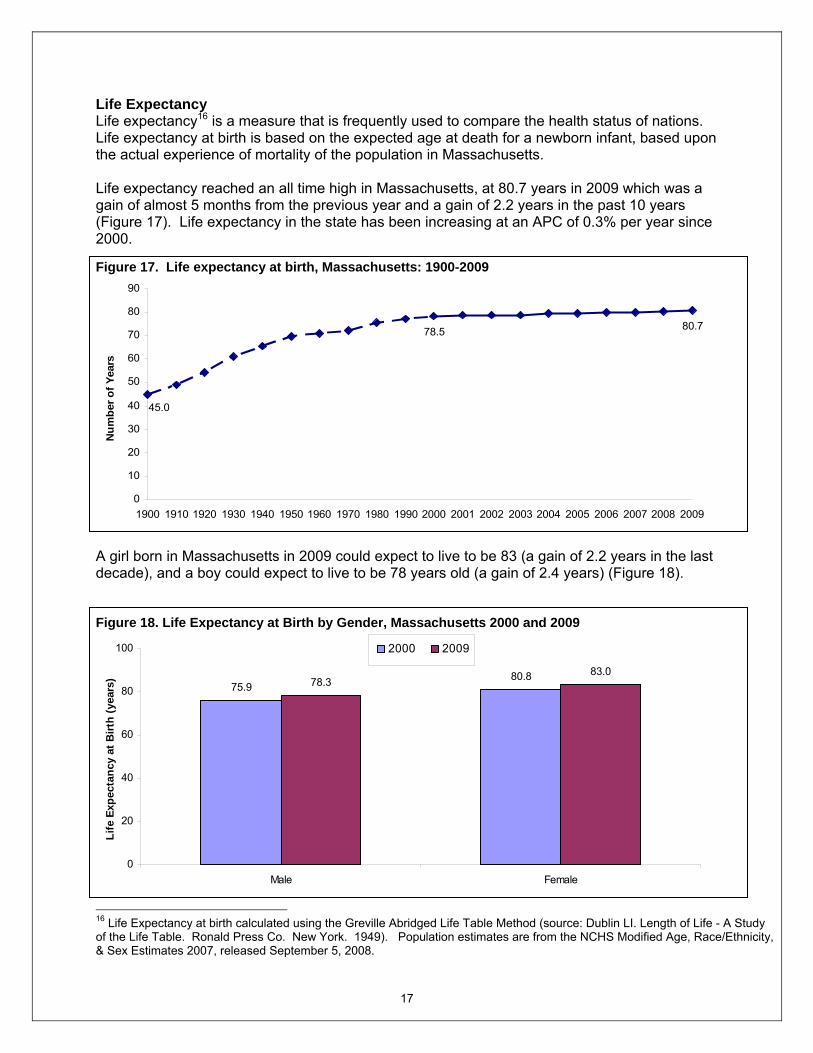
Life Expectancy Life expectancy16 is a measure that is frequently used to compare the health status of nations. Life expectancy at birth is based on the expected age at death for a newborn infant, based upon the actual experience of mortality of the population in Massachusetts. Life expectancy reached an all time high in Massachusetts, at 80.7 years in 2009 which was a gain of almost 5 months from the previous year and a gain of 2.2 years in the past 10 years (Figure 17). Life expectancy in the state has been increasing at an APC of 0.3% per year since 2000. Figure 17. Life expectancy at birth, Massachusetts: 1900-2009
80.7
45.0
78.5
0
10
20
30
40
50
60
70
80
90
1900 1910 1920 1930 1940 1950 1960 1970 1980 1990 2000 2001 2002 2003 2004 2005 2006 2007 2008 2009
Num
ber o
f Yea
rs
A girl born in Massachusetts in 2009 could expect to live to be 83 (a gain of 2.2 years in the last decade), and a boy could expect to live to be 78 years old (a gain of 2.4 years) (Figure 18). Figure 18. Life Expectancy at Birth by Gender, Massachusetts 2000 and 2009
75.980.878.3
83.0
0
20
40
60
80
100
Male Female
Life
Exp
ecta
ncy
at B
irth
(yea
rs)
2000 2009
16 Life Expectancy at birth calculated using the Greville Abridged Life Table Method (source: Dublin LI. Length of Life - A Study of the Life Table. Ronald Press Co. New York. 1949). Population estimates are from the NCHS Modified Age, Race/Ethnicity, & Sex Estimates 2007, released September 5, 2008.

18
Calculation of life expectancy at birth for sub-state areas was possible by using the Chiang methodology which allows for calculation of life expectancy for small areas, even where there are no deaths in the age groups17. Great variation exists by geographic areas. Figure 19 examines changes in life expectancy between 2000 and 2009 among the largest communities in the state defined as communities with populations of 42,000 or greater. Brookline and Newton had the highest life expectancy at birth in both time periods: Brookline gained 4 years and Newton gained 2 years between these 2 time periods. There was no change on life expectancy for Chicopee, Fall River, Haverhill and Pittsfield between 2000 and 2009. In 2009, Bristol, Hampden, Plymouth, Suffolk and Worcester counties had higher age adjusted death rates than the state overall, whereas Middlesex and Norfolk had lower rates than the state overall (Table 2). Death rates for all counties except Dukes and Nantucket18 have declined significantly from 2000. Table 2. Number of Deaths and Death rates by County, Massachusetts: 2000 and 2009
2000 2009
County Total Deaths Age- adjusted Death Rate
Total Deaths Age- adjusted Death Rate
Barnstable 2,762 741.6 2,737 680.9* Berkshire 1,547 806.9 1,356 682.0* Bristol 5,107 848.8 4,775 730.3* Dukes 125 761.5 123 610.2 Essex 6,533 803.6 6,080 671.9* Franklin 699 837.0 630 685.7* Hampden 4,729 906.7 4,140 733.4* Hampshire 1,286 850.4 1,179 675.2* Middlesex 11,840 780.7 10,559 629.7* Nantucket 54 675.3 57 572.9 Norfolk 5,830 767.5 5,271 636.4* Plymouth 3,894 847.2 3,948 717.5* Suffolk 5,477 880.2 4,609 662.2* Worcester 6,708 835.4 6,449 722.5* Massachusetts 56,591 816.5 51,915 675.1*
* Statistically significantly different from 2000.
17 This method has also been illustrated in Newell C. Methods and Models in Demography. John Wiley & Sons (Chichester, 1994). 18 This might be due to small number of deaths in both counties.

19
Figure 19. Life Expectancy at birth for selected largest towns, Massachusetts 2000 and 2009
83
76 77 77 78 7775
7976
7875
7976
7976 76
7983
77
85*82* 81*81*79 79*
83*79*80*79
82*7878
87*
78* 78*82*83*
80*
0
10
20
30
40
50
60
70
80
90
Boston
Brockto
nBroo
kline
Cambri
dgeChic
opee
Fall Rive
rFramingh
amHav
erhill
Lawrenc
e
Lynn
Medford
Newton
Pittsfie
ldQuin
cySom
erville
Spring
field
Waltham
Worceste
rMA Tota
lLi
fe E
xpec
tanc
y at
birt
h (y
ears
)
2000 2009
* Statistically significantly different from 2000 figure.

20
Premature Mortality A good summary measure of the impact of death on different groups in the population is premature mortality19,20. The premature mortality rate (PMR) measures the rate of deaths that occur before the age of 75 years of age per 100,000, age-adjusted to the 2000 US Standard Population under 75 years of age. PMR is considered an excellent, single measure of the health status of a population21. The reason for this is that the vast majority of deaths to persons ages 75 years and older are due to chronic conditions associated with aging. By examining deaths to persons younger than 75 years, it is possible to identify many issues that are responsive to systematic public health approaches to health promotion and disease prevention. An attractive feature of PMR analyses is that it moves away from considering single causes or single risk factors of death to taking a broader community perspective. PMR may be related to socioeconomic status, and its correlates such as environmental conditions, housing, education, and stress, higher rates of smoking, substance abuse, violence, obesity, and lack of access to care22. PMR analyses make it clear that community health status is related to many factors. Health care is certainly one of these factors, but not the only factor. However, there are other possible reasons for high PMRs: specific sub-populations of younger persons at risk for motor vehicle-related deaths in rural areas and heart attack deaths in persons ages 45 to 64 years in suburban areas. Premature deaths (deaths before age 75) accounted for 37% of all deaths in the state. The overall premature mortality rate was stable between 2000 and 2003 (trend was not statistically significant), and has been declining by 3.3% per year since 2003 (Figure 20).
Figure 20. Premature Mortality Rates (PMR): Massachusetts: 2000-2009
277
347
0
50
100
150
200
250
300
350
400
2000 2001 2002 2003 2004 2005 2006 2007 2008 2009
Age
adju
sted
rat
e pe
r 100
,000
19 Carstairs V, Morris R. Deprivation and Health in Scotland. Aberdeen, Scotland: Aberdeen University Press, 1991. 20 Patricia Martens, et al. The Health and Health Care Use of Registered First Nations People Living in Manitoba: A Population-Based Study. http://www.umanitoba.ca/centres/mchp/reports/reports_02/rfn.htm 21 Reid RJ, Roos NP, MacWilliam L, Frohlich N, Black C. Assessing population health care need using a claims-based ACG morbidity measure: A validation analysis in the province of Manitoba. Health Serv Res 2002;37(5):1345-64. 22 Martens PJ, Frohlich N, Carriere KC, Derksen S, Brownell M. Embedding child health within a framework of regional health: Population health status and sociodemographic indicators. Can J Public Health 2002:93(Suppl 2) : S15-S20.

21
Since 2000, age-adjusted premature mortality rates for all race and Hispanic ethnic groups have decreased: PMR for Blacks have declined 4.1% per year, Hispanic rates have declined 3.8% per year, PMR for Asians have declined 3.6% per year and PMR for Whites have declined 3.2% per year (Figure 21). In 2009, Blacks had the highest PMR, experiencing 1.5 times the rate of premature deaths as Whites (410.9 vs. 275.2 deaths per 100,000). Asians (134.4) and Hispanics (261.6) had the lowest PMR, but the PMR for Hispanics was higher than that of Asians. The true death rates for both Asians and Hispanics may be higher than the rates presented in this report for several reasons, as explained earlier on page 8. Caution is needed when interpreting race and ethnicity in mortality data because the potential undercounts in population data and misclassification on death certificates may result in inaccuracies in mortality statistics. Figure 21. Premature Mortality Rates (PMR) by Race and Ethnicity: Massachusetts: 2000-2009
275
342
537
411
334
262
176134.4
0
100
200
300
400
500
600
700
2000 2001 2002 2003 2004 2005 2006 2007 2008 2009
Age
adju
sted
rate
pe
r 100
,000
White Black Hispanic Asian
In 2009, among the 30 largest communities, eight communities showed decreases in their PMRs from 2000: Brookline (down 41%), Somerville (down 37%), Framingham (down 32%), Malden (down 28%), Cambridge (down 28%), Brockton (down 20%), Springfield (down 17%), and Boston (down 16%) (Table 3).

22
Table 3. Rank of Premature Mortality Rates for the Largest 30 Communities, Massachusetts: 2000 and 2009 (Sorted by PMR in 2009)
2000 2009 City/Town Number of
Premature Deaths
PMR (per 100,000)
Number of Premature
Deaths
PMR (per 100,000)
Lowell 412 487.0 419 489.2 New Bedford 380 422.5 409 464.8 Springfield 655 510.0 565 423.8* Fall River 398 451.9 361 422.2 Revere 187 375.6 189 415.0 Worcester 689 465.7 624 414.0 Lynn 362 460.5 324 404.8 Chicopee 259 446.9 222 389.7 Taunton 196 386.3 197 378.3 Attleboro 166 436.7 147 377.5 Pittsfield 181 366.7 172 373.9 Weymouth 205 358.2 215 373.7 Brockton 379 461.1 323 367.9* Haverhill 210 411.6 197 366.9 Lawrence 231 434.1 216 361.2 Boston 1,996 430.5 1,659 359.5* Plymouth 169 387.3 177 356.2 Leominster 151 389.0 140 351.0 Barnstable 174 296.5 181 335.2 Methuen 139 336.4 143 332.1 Quincy 342 380.1 285 309.1 Peabody 180 336.0 181 304.9 Malden 220 415.0 165 300.7* Medford 185 324.7 162 287.5 Waltham 180 336.3 150 268.2 Somerville 238 412.5 153 260.8* Cambridge 235 317.2 178 229.0* Framingham 209 335.2 144 228.8* Newton 182 219.4 143 170.6 Brookline 116 233.3 68 137.5*
STATE TOTAL 20,923 347.3 18,966 277.0* * Statistically significantly different from 2000 rate.

23
Years of potential life lost (YPLL) at age 75 There are two measures of years of potential life lost: potential years of life lost and average potential years of life lost. Potential years of life lost (PYLL) is the years of life lost per thousand population ages 1 through 74 years. It is similar to PMR but gives greater weight to the death of a younger person, by adding up the number of years “lost” when a person dies before age 75 years23. Average PYLL is calculated by dividing PYLL by the number of deaths among persons under 75 years. In general, PYLL is large if there is a high death rate among young or middle-aged persons, and small if most of the deaths in a population occur in later life24. For example, PYLL for an individual who dies of cancer at age 50 is 25 years where as PYLL for the same disease is five years if the person died at age 70. For all premature deaths (death before age 75) among Massachusetts residents in 2009, 344,726 potential years of life were lost, which represented a decrease of 4%from the 2000 figure of 359,377 (Table 4). There have been declines in PYLL due to chronic conditions ranging from 7% for cancer to 20% for diabetes and 22% for stroke. The largest decline in PYLL was for HIV/AIDS which in 2009 declined by 58% compared to 2000. In 2009, 7,729 potential years of life were lost due to homicides, which represented an increase of 36% from 2000. PYLL due to suicide also increased by 19% and PYLL due to unintentional injuries and injuries of undetermined increased by 14% from 2000. In 2009 as in 2000, premature deaths due to perinatal conditions, homicide, unintentional injuries, suicide, and HIV/AIDS continued to have the highest average PYLL. In 2009, the average PYLL increased for all causes combined and for heart disease when compared to 2000. For instance, someone who in 2009 died from heart disease did so on average 14.9 years earlier than his/her life expectancy. In comparison, each person who died from heart disease in 2000 died on average 13.8 years earlier than his/her expectancy. Table 4. Leading Categories of Death Ranked by Total Potential Years of Life Lost before age 75 Years (PYLL), Massachusetts: 2000 and 2009
2000 2009
Cause PYLL Average
PYLL PYLL Average
PYLL All Causes 359,377 17.2 344,726* 18.2* Cancer 100,179 13.8 92,910* 13.9 Heart Disease 61,123 13.8 50,153* 14.9* Unintentional injuries and Injuries of undetermined intent25 43,152 34.3 49,093* 32.0 Perinatal Conditions 17,271 74.4 16,305* 74.4 Suicide 12,912 34.6 15,400* 30.8 Homicide 5,670 45.4 7,729* 44.2 Stroke 8,927 12.5 6,969* 14.1 Diabetes 7,868 13.7 6,295* 14.0 HIV/AIDS 7,172 32.0 3,021* 24.8 Alzheimer's Disease 842 7.4 789 9.1
* Statistically significantly different from 2000 figure. 23 This method gives more weight to causes of death occurring at younger ages than to those occurring at later ages. Following previous reports, we have set the maximum age to be 75 years so that we do not include deaths beyond average life expectancy. 24 Young TK. Population Health: Concepts and Methods. Oxford: Oxford University Press, 1998. 25 These 2 intentions are combined because in 2005 there were policy changes affecting the classification of fatal poisonings where there is no evidence of suicide or homicide at the MA Office of the Chief Medical Examiner.

24
Amenable Mortality Amenable mortality is defined as “deaths from certain causes that should not occur in the presence of timely and effective health care”.26 These causes include infectious diseases of childhood; diseases for which there are immunizations; cancers, such as leukemia, which have effective treatments; and cancers that have effective screening, such as colorectal and breast cancers27. An important difference between amenable mortality and premature mortality is that the causes of amenable mortality do not include injuries. This concept was developed in the 1970s in the United States and has been implemented by many countries as a tool to track changes over time and assess the performance of health care systems. Amenable mortality was developed to assess the quality of health care systems, and more recently it has been used to identify areas with deficiencies in access, quality, efficiency and equity in health care. However, there are limitations to this approach: upper age cutoff, the specific causes of death included in amenable mortality calculations, and the difficulty in assessing the contribution of factors to mortality should be carefully evaluated. In 2009, deaths amenable to health care accounted for 10% of deaths overall. Moreover, they accounted for 28% of all premature deaths. When we observe changes in time in mortality rates to causes amenable to health care by race and Hispanic ethnicity we see that it has declined by 4.2% per year since 2000 for Whites (Figure 22). The rate for Blacks was stable between 2000 and 2003 (trend was not statistically significant), and has been declining by 5.5% per year since 2003. Changes in other groups were not statistically significant. Overall, amenable mortality rates have been declining at a rate of 4.0% per year since 2000. Figure 22. Amenable Mortality Rates by Race and Ethnicity, Massachusetts: 2000-2009
75.0
105.4126.1
142.9
37.940.6
67.864.5
75.7103.6
0
50
100
150
200
2000 2001 2002 2003 2004 2005 2006 2007 2008 2009
Age
adju
sted
rate
pe
r 100
,000
Whites Blacks Asians Hispanics Total
26 For a list of causes of death considered amenable to health care, see Table 5. 27 E. Nolte and M. McKee, Does Healthcare Save Lives? Avoidable Mortality Revisited (London: Nuffield Trust, 2004).

25
NOTES: Data on mortality are based on information retrieved from death certificates filed with the Massachusetts Registry of Vital Records and Statistics. Physicians and medical examiners assign the cause of death through a system that allows for the possibility of multiple causes. Demographic information on the certificates, such as age, race, Hispanic ethnicity, gender, educational attainment, marital status, and occupation, is recorded by the funeral director based on information provided by an informant, usually a family member, or, in the absence of an informant, based on observation or omitted. Resident data include all deaths that occur to residents of the Commonwealth, regardless of where the deaths occur. In Massachusetts, a resident is a person with a permanent address in one of the 351 cities and towns. Occurrence data include all deaths that occur within the state, whether to residents or nonresidents. All data in this publication are for Massachusetts residents unless otherwise stated. There is an exchange agreement among the 50 states, District of Columbia, Puerto Rico, US Virgin Islands, Guam, and Canadian provinces that provides for the exchange of copies of death records for persons dying in a state other than their state of residence. These records are used for statistical purposes only, and they allow each state or province to track the deaths of its residents. The data in this publication refer to the underlying cause of death as generated by the Super Mortality Medical Indexing, Classification, and Retrieval system (Super MICAR), unless specifically noted. This is a computer software algorithm developed by the National Center for Health Statistics and used by all US jurisdictions so that the assignment of cause of death codes is consistent. The International Classification of Diseases (ICD) classifies mortality information for statistical purposes. The ICD was first used in 1900 and has since been revised about every 10 years, with the exception of the ICD-9, which was in use between 1979 and1998. Revision of ICD codes and resulting changes in classification and rules for selecting the underlying cause of death have important implications for the analysis of mortality trends by cause of death. For some causes of death, the discontinuity in trend can be substantial28. Therefore, considerable caution should be used in analyzing cause-of-death trends for periods of time that extend across more than one revision of ICD. Similarly, as noted earlier, there are well-known difficulties in calculating accurate mortality rates for smaller populations such as Asians, Native Americans and Hispanics. Race and ethnicity are self-reported in the decennial Census count, which is the denominator of the mortality rates; whereas, race, and ethnicity on death certificates are collected by the funeral director from an informant or by observation. Caution is needed when interpreting race and ethnicity in mortality data because the potential undercounts in population data and misclassification on death certificates may result in inaccuracies in mortality statistics. In this report, race categories, White, Black, American Indian, Asian, and Hispanic are mutually exclusive. For example, when we refer to White residents, this means White non-Hispanic residents. Rates are per 100,000 and are age-adjusted to the 2000 US Standard Population. Comparison of rates is based on tests of statistical significance. Comparative words, for example, “higher,” “lower,” “increase,” and “decrease” are used only when the rates being compared are statistically different at P ≤ .05 level. Join point regression was used to calculate
28 National Center for Health Statistics, Data Warehouse. Updated comparability ratios (ICD–10 and ICD–9) [online]. 2004.ftp://ftp.cdc.gov/pub/Health_Statistics/NCHS/Datasets/Comparability/icd9_icd10/Comparability_Ratio_tables.xls

26
the number and location (in time) of points where trends change direction (join points)29. The join point regression model describes the trend as a sequence of linear segments between corresponding join points, so that each segment has an associated annual percent change (APC), which is tested for its statistical significance30. Caution should be exercised when using mortality indicators such as Years of Potential Life Lost, premature mortality, and amenable mortality in comparative studies. The upper age cutoff for all three indicators, the specific causes of death included in amenable mortality calculations, and the difficulty in assessing the contribution of factors to mortality should be carefully evaluated. Population Sources Two sources of population estimates were used to calculate population-based rates:
• State and County Death Rates We used the 2009 Modified Age, Race/Ethnicity, and Sex (MARS) estimates, from the
National Center for Health Statistics (NCHS) and the Census Bureau Population Estimates Program. These population estimates are stratified by single year of age, sex, race, and Hispanic ethnicity. These estimates are not available for geographic levels below the county31.
• City and town death rates We used internal estimates based upon NCHS and Census Bureau population estimates for 2005, which are the most up-to-date estimates available by age, race, and sex at the sub-county level. As soon as new population data are available, revised rates will be posted on MassCHIP, the Department’s online database (http://masschip.state.ma.us).
Potential Years of Life Lost Total potential years of life lost is calculated by multiplying the number of deaths for each group by the years of life lost (the difference between life expectancy and the midpoint of the age group, then adding the figures for all age groups). A measure of the impact of death from various diseases on society, highlighting the total loss to society, especially the loss contributed by early deaths. For the purpose of calculating PYLL, we have adjusted the maximum age to be 75 years so that we do not include deaths beyond average life expectancy.
29 National Cancer Institute, Join Point Regression Program. September 2003: Bethesda, MD. 30 Kim HJ, et al., Permutation Tests for Joinpoint Regression with Applications to Cancer Rates. Statistics in Medicine, 2000. 19: p. 335-351. 31 National Center for Health Statistics. Postcensal estimates of the resident population of the United States for July 1, 2000-July 1, 2009, by year, county, age, bridged race, Hispanic origin, and sex (Vintage 2009). Prepared under a collaborative arrangement with the US Census Bureau; released July 23, 2010. Available from: http://www.cdc.gov/nchs/about/major/dvs/popbridge/popbridge.htm as or March 28, 2011.

27
Table 5. Causes of Death Considered Amenable to Health Care
Cause of Death Considered Amenable to Health Care
Age
ICD-10 Codes
Intestinal infections 0-14 A00-A09 Tuberculosis 0-74 A15-A19, B90 Other infectious (Diphtheria, Tetanus, Poliomyelitis) 0-74 A36, A35,A80, A40-A41 Whooping cough 0-14 A37 Measles 1 to 14 B05 Malignant neoplasm of colon and rectum 0-74 C18-C21 Malignant neoplasm of skin, 0-74 C44 Malignant neoplasm of breast, 0-74 C50 Malignant neoplasm of cervix uteri 0-74 C53 Malignant neoplasm of cervix uteri and body of the uterus 0-44 C54, C55 Malignant neoplasm of testis 0-74 C62 Hodgkin’s disease 0-74 C81 Leukemia 0-44 C91-C95 Diseases of the thyroid 0-74 E00-E07 Diabetes mellitus 0-49 E10-E14 Epilepsy 0-74 G40-G41 Chronic rheumatic heart disease 0-74 I05-I09 Hypertensive disease 0-74 I10-I13, I15 Ischemic heart disease 0-74 I20-I25 Cerebrovascular disease 0-74 I60-I69 All respiratory diseases (excl. pneumonia/influenza) 1 to 14 J00-J09, J20-J99 Influenza 0-74 J10-J11 Pneumonia 0-74 J12-J18 Peptic ulcer 0-74 K25-K27 Appendicitis 0-74 K35-K38 Abdominal hernia 0-74 K40-K46 Cholelithiasis & cholecystitis 0-74 K80-K81 Nephritis and nephrosis 0-74 N00-N07, N17-N19, N25-N27 Benign prostatic hyperplasia 0-74 N40 Misadventures to patients during surgical and medical care All Y60-Y69, Y83-Y84 Maternal deaths All O00-O99 Congenital cardiovascular anomalies 0-74 Q20-Q28 Perinatal deaths, all causes excluding stillbirths All P00-P96 Note: Amenable Causes are from E. Nolte and M. McKee, Does Healthcare Save Lives? Avoidable Mortality Revisited (London: Nuffield Trust, 2004). Available at http://content.healthaffairs.org/cgi/data/27/1/58/DC1/1. Accessed 7/15/2010

28