a comparison of results between interactive and non
TRANSCRIPT

A comparison of results between interactive and non-interactive forms of visualisation to improve learning.
A case study of Te Waihora/Lake Ellesmere, Canterbury, New Zealand
B. Otinpong1, S. Charters2, A. McKinnon2 and B. Gidlow3
1Department of Computing, Christchurch Polytechnic Institute of Technology; PO Box 540, Christchurch 8140, New Zealand; 2Department of Informatics and Enabling Technologies,3Department of Social Science,
Parks, Recreation, Tourism and Sport; Lincoln University; PO Box 85084, Lincoln 7647, New Zealand
Email: [email protected]
Abstract: Computer-aided visualisation has been used in a number of natural resource management applications with the aim of enhancing people’s understanding of issues, but little evaluation of the effectiveness of these tools has been undertaken. The purpose of this study was to investigate whether there are significant differences in knowledge acquisition depending on the form in which visualisation of environmental changes is presented, using a case study of Te Waihora/Lake Ellesmere, a broad, shallow lagoon in the South Island of New Zealand.
Te Waihora/Lake Ellesmere is separated from the Pacific Ocean by the long narrow sandy Kaitorete Spit. Its unique position allows for it to be opened to the sea periodically to provide drainage and prevent flooding of surrounding farmlands. There is a lack of agreement among the diverse stakeholders regarding the appropriate levels at which the lake level should be maintained throughout the year.
We describe an interactive visualisation tool (ElleVis) which shows the effects of different lake opening regimes on lake values at Te Waihora/Lake Ellesmere. The tool allows users to input different opening scenarios and visualise the resulting impact on water levels around the lake at various times. It incorporates historical rainfall data from New Zealand’s National Institute of Water and Atmospheric Research to deliver a graphical map display, including a summary table with a ‘traffic light’ status for lake values - birds, fish, farming and other stakeholder interests at different locations around the lake. The interactive nature of the ElleVis tool allows the stakeholders to compare Te Waihora/Lake Ellesmere under different opening scenarios using one interactive tool. However, it is possible, for example, that providing information about changes in lake behaviour in a carefully and clearly presented non-interactive form may be as successful as providing it in an interactive form of ElleVis.
A true experimental design was adopted to measure the knowledge of forty participants (randomly assigned to two test groups) who have various interests at Te Waihora, before and after using their assigned interventions of either –interactive or non-interactive - form of visualisation.
Overall, the results of this study show that participants demonstrate a greater knowledge gain through the use of interactive visualisation (M =18.05), than through information provided non-interactively (M =12.45), t (40) =2.663, p < .05). More widely, we think that the findings from this study can stimulate meaningful discussions and dialogue about whether interactive visualisation tools might contribute to assessing understanding in environmental management in situations that involve contested resources or a multiplicity of interests.
Keywords: Personal understanding, interactive visualisation, static visualisation, evaluation, visual simulation
21st International Congress on Modelling and Simulation, Gold Coast, Australia, 29 Nov to 4 Dec 2015 www.mssanz.org.au/modsim2015
1916

Otinpong et al., A Comparison of results between Interactive and Non-Interactive forms of Visualisation
1. INTRODUCTION
Issues relating to manipulation of natural environments are widely recognised to be a major concern to stakeholders (Lorie, 2006). Natural environments are valued for their pristine wilderness appearances, and human interventions normally seek to be in sympathy with the aesthetics of natural environments wherever possible. Challenges also exist in communicating these issues and management options to stakeholders and it has been suggested that visualisation techniques could facilitate stakeholder engagement, increase understanding and improve the quality of decision making (Orland, Budthimedhee, & Uusitalo, 2001; Sheppard, 2005). Authors such as Tufte and Graves-Morris (1983) argue that non-interactive visualisations are helpful when planners want to inform decision-makers about relatively simple and straightforward issues. The way people perceive and interact with visualisations can influence their understanding of issues and the usefulness of the visualisation systems (Zudilova-Seinstra, Adriaansen, & van Liere, 2009). It is on this basis that an interactive visualisation tool (ElleVis) together in its non-interactive form was developed and presented as a medium to communicate to Te Waihora/Lake Ellesmere stakeholders with diverse opinions/interest. This is used to address the question of whether interactive visualisation provides greater knowledge gains than a non-interactive form of information provision. The research question we are exploring is: “Does use of an interactive visualisation make a significantly greater contribution to people’s understanding of the impacts of lake opening regimes on lake values at Te Waihora/Lake Ellesmere than use of a non-interactive visualisation?” For the purposes of this study, the term “lake values” refers to farming, nature conservation and other stakeholder interests, which are affected by the different opening regimes at Te Waihora/Lake Ellesmere. These values have been identified by the various stakeholders as being of significance to them (Hearnshaw & Hughey, 2010).
2. CASE STUDY SITE
Te Waihora/Lake Ellesmere in the Canterbury region of the South Island of New Zealand is a broad, shallow lagoon separated from the Pacific Ocean by the long, narrow, sandy Kaitorete Spit. Its unique position allows it to be mechanically “opened” to the sea periodically to provide drainage to prevent flooding of surrounding farmlands. There is a lack of agreement between the various stakeholders as to the levels at which the lake should be maintained and how that level should be allowed to vary. Different lake levels are perceived to advantage/disadvantage some stakeholders’ interests. For example a high lake level will inundate surrounding farmlands but is good for recreational fishing and duck shooting.
3. ELLeVIS
To explore the research question presented in the introduction, an interactive visualisation tool (ElleVis) was developed. The tool is designed to provide information which a range of stakeholders would need to aid their decision making about the lake. The primary source of stakeholder requirements was the lake opening consent (CRC 042860) from the local Regional Council (Environment Canterbury). This identified the need for the visualisation to show:
• The level and area of the lake at different lake levels • The shoreline and farmlands covered at different lake levels • The impact on birdlife and native fisheries at different lake levels • The impact on livestock along the surrounding farmlands at different lake levels
The design of ElleVis shown below in Figure 1 has three main components: a “traffic light” summary table; a map showing lake extent; and a lake level time series graph. The tool allows users to configure lake opening scenarios and select the conditions under which they are viewed. The data for the visualisation are generated by the Plover model (Raffensperger, 2009) which simulates the behaviour of the lake. The time series graph shown in Figure 1 shows the level above mean sea level (amsl) of the lake over the year. The graph is augmented with blue shaded areas that show when the lake has been opened to the sea. The shading gives a visual indication of the frequency and duration of lake openings.
1917

Otinpong et al., A Comparison of results between Interactive and Non-Interactive forms of Visualisation
Figure 1. ElleVis visualisation interface.
The “traffic light” summary table shown in Figure 1 represents an overview of information on the impact of the opening regimes on lake values. The cells are colour coded to help participants to distinguish which lake values are good (green), tolerable (amber) and unacceptable (red). The summary table view provides stakeholders with overview information on lake values at a glance for the opening regime entered. Each row in the table represents one lake value with each colour representing the month of the year. The concept of the “traffic light” was applied to the choice of colours used in the summary table. Research by (Kristensen & Gabrielsen, 2000) has suggested that, for thousands of years, the colour red has represented danger, stop or “suffer the consequences” in most western cultures. Red was chosen to show the lake level caused by unacceptable conditions for that lake value. The “good” ranges in which the lake values thrive the most are denoted by the colour green. The colour amber denoted the ranges between “good” and “unacceptable”, which are “tolerable” conditions. The use of shaded cells to indicate the best and worst results has been used previously by (Lorie, 2006) in his design of decision support tables to solve water resources management issues. The interactive map shown in Figure 1 allows stakeholders to see the consequences of different opening regimes on the extent of the lake. The image is a topographic map with the lake superimposed. A slider beneath the image allows the extent of the lake during the year to be explored on a day by day basis. A non-interactive visualisation consisting of screen shots taken from the interactive tool (ElleVis) but presented in paper form was also developed as part of a medium to communicate to participants of the study.
4. STUDY DESIGN
A pre-test and post-test design was used for this study (Dimitrov & Rumrill, 2003). Using this design, participants are pretested, exposed to the intervention (Interactive and Non-interactive – paper based – forms of ElleVis), and then post-tested. Figure 2 shows an overview of the process involved in measuring change in participants’ understanding using different forms of information provision. One group – Group A – experienced the interactive visualisation while the other – Group B - experienced screen shots taken from ElleVis as a non-interactive/paper-based visualisation.
1918

Otinpong et al., A Comparison of results between Interactive and Non-Interactive forms of Visualisation
For the purposes of this study, the target population was people who have an interest and understanding in Te Waihora/Lake Ellesmere and its future management, rather than the general public; for example, local residents, farmers, fishers and recreationists around the lake; employees of governmental and non-governmental organisations who have vested interests in the lake. It was anticipated that their interest in the lake would encourage such people to participate. Forty participants (20 in each treatment group, A and B) were used for the study. Letters for participation in the study were sent to all participants. The study was conducted individually at a time and place most convenient to each participant.
Figure 2. Overview of study design.
4.1 Conducting the study
Participants were randomly assigned to two treatment groups – Group A and Group B. Group A participated in the interactive version of ElleVis, Group B the non-interactive version. Group A participants were pre-tested, then exposed to a visual demonstration intended to show them how to use the visualisation tool, which is customised software. The demonstration involved participants ‘seeing and interacting’ with the visualisation but not exploring all possible scenarios. Then they were given guided-exploration tasks using the interactive visualisation tool, ElleVis. The purpose of the guided exploration is for participants to be informed of lake values that they may be less familiar with under different opening regimes. Finally, the participants were post-tested. Group B participants were pre-tested then shown how to locate and interpret the different features of ElleVis using the paper-based visualisation. They were then given the same guided-exploration tasks as Group A, however this group completed them using the non-interactive visualisation rather than the interactive visualisation. A post-test then took place.
4.2 Data Analysis
Participants’ responses in the pre-test and post-test were scored using a grading schedule. The mean, median and standard deviation were calculated to determine if there were any changes in their levels of understanding. To determine whether differences in scores between the pre-test and post-test were statistically significant, a paired sample t-test was conducted for both groups. In addition, an independent t-test was performed on the comparative changes in understanding that occurred in both groups to determine whether are significant differences in knowledge outcomes depending on the form in which information was presented.
5. RESULTS
The pre-test and post-test had 22 questions; therefore a score of -22 would be obtained if a participant gave wrong answers to all questions. A score of 44 would be obtained where a participant gave fully correct answers to all questions. The maximum possible change is 66 (-22 to +44), which would be the case if a participant gave all wrong answers in the pre-test and then all fully correct answers in the post-test or vice versa. 5.1 Group A: Interactive ElleVis Table 1 presents the raw scores of participants who used the interactive ElleVis tool. Based on the comparison of raw scores, the data in Table 1 suggest that each participant increased their personal understanding about lake values after using the interactive ElleVis tool. The mean scores increased from 20.95 in the pre-test to 39 in the post-test. The standard deviation decreased from 7.57 in the pre-test to 3.04 in the post-test (see Table 2). The
1919

Otinpong et al., A Comparison of results between Interactive and Non-Interactive forms of Visualisation
results in Table 2 show that participants’ mean scores were significantly higher (M = 39) for their personal understanding of the impact of Te Waihora/Lake Ellesmere opening regimes on lake values after using the interactive ElleVis visualisation tool than before (M=20.95). Table 1. Raw scores of participants who used interactive ElleVis (Group A)
A paired samples t-test (Bakan, 1966) was undertaken to assess the likelihood that the change in means of the pre-test and post-test happened by chance. This was determined using a two-tailed ‘t’ test with an alpha of 0.05 and using a null hypothesis that the group means of the pre-test and post-test were equal (t (19) =9.893, p < .001)). The results show that the difference in group means of the pre-test and post-test of all participants who used the interactive ElleVis were highly unlikely to happen by chance.
5.2 Group B: Non-Interactive ElleVis In terms of raw scores, the data in Table 3 suggest that each participant increased their personal understanding of lake values after using the non-interactive form of ElleVis. The results in Table 4 show that participants’ mean scores were significantly higher (M = 32.9) for their personal understanding of the impact of Te Waihora/Lake Ellesmere opening regimes on lake values after using the non-interactive ElleVis than before (M=20.45). Table 3. Raw scores of participants with non-interactive ElleVis (Group B)
A paired samples t-test (Bakan, 1966) was undertaken to assess the likelihood that the change in means of the pre-test and post-test happened by chance. This was determined using a two-tailed ‘t’ test with an alpha of 0.05 and using a null hypothesis that the group means of the pre-test and post-test were equal (t (19) =11.914, p < .001)). The results show that the difference in group means of the pre-test and post-test of all participants who used the non-interactive ElleVis were highly unlikely to happen by chance.
1 The numbering sequence reflects the statistically randomised way in which participants were allocated to the two different groups for study purposes.
Participants1 Pre-test Post-test Change P5 23 39 16 P7 21 40 19 P9 12 41 29
P10 29 41 12 P12 15 35 20 P15 16 37 21 P16 30 43 13 P19 22 40 18 P21 13 41 28 P24 14 41 27 P25 12 37 25 P27 23 40 17 P29 31 36 5 P30 34 44 10 P31 16 40 24 P33 25 40 15 P35 26 37 11 P36 25 36 11 P39 26 31 5 P40 6 41 35
Participants Pre-test Post-test Change P1 15 33 18 P2 10 30 20 P3 28 33 5 P4 24 35 11 P6 26 34 8 P8 10 18 8 P11 22 43 21 P13 25 39 14 P14 8 20 12 P17 24 36 12 P18 21 37 16 P20 20 36 16 P22 28 40 12 P23 37 40 3 P26 19 36 17 P28 10 23 13 P32 18 28 10 P34 28 40 12 P37 11 23 12 P38 25 34 9
Table 4. Descriptive statistics
Tests Mean N
Std.
Deviation
Post-test 32.9 20 7.10
Pre-test 20.45 20 7.79
Table 2. Descriptive statistics
Tests Mean N Std.
Deviation
Post-test 39 20 3.04
Pre-test 20.95 20 7.57
1920
Otinpong et al., A Comparison of results between Interactive and Non-Interactive forms of Visualisation
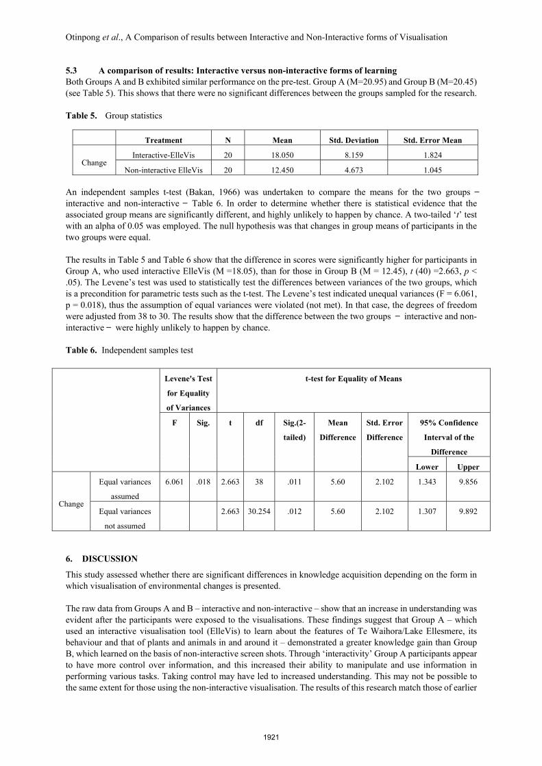
5.3 A comparison of results: Interactive versus non-interactive forms of learning Both Groups A and B exhibited similar performance on the pre-test. Group A (M=20.95) and Group B (M=20.45) (see Table 5). This shows that there were no significant differences between the groups sampled for the research. Table 5. Group statistics
Treatment N Mean Std. Deviation Std. Error Mean
Change Interactive-ElleVis 20 18.050 8.159 1.824
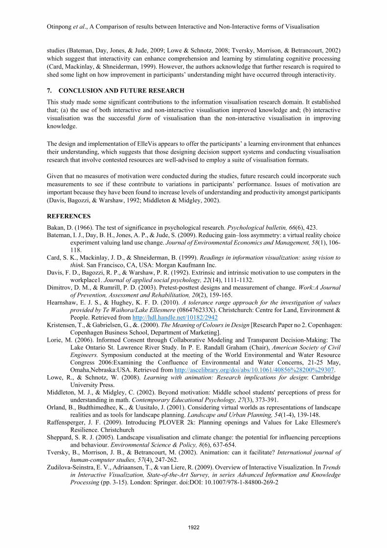
Non-interactive ElleVis 20 12.450 4.673 1.045 An independent samples t-test (Bakan, 1966) was undertaken to compare the means for the two groups ̶ interactive and non-interactive ̶ Table 6. In order to determine whether there is statistical evidence that the associated group means are significantly different, and highly unlikely to happen by chance. A two-tailed ‘t’ test with an alpha of 0.05 was employed. The null hypothesis was that changes in group means of participants in the two groups were equal. The results in Table 5 and Table 6 show that the difference in scores were significantly higher for participants in Group A, who used interactive ElleVis (M =18.05), than for those in Group B (M = 12.45), t (40) =2.663, p < .05). The Levene’s test was used to statistically test the differences between variances of the two groups, which is a precondition for parametric tests such as the t-test. The Levene’s test indicated unequal variances (F = 6.061, p = 0.018), thus the assumption of equal variances were violated (not met). In that case, the degrees of freedom were adjusted from 38 to 30. The results show that the difference between the two groups ̶ interactive and non-interactive ̶ were highly unlikely to happen by chance. Table 6. Independent samples test
6. DISCUSSION
This study assessed whether there are significant differences in knowledge acquisition depending on the form in which visualisation of environmental changes is presented. The raw data from Groups A and B – interactive and non-interactive – show that an increase in understanding was evident after the participants were exposed to the visualisations. These findings suggest that Group A – which used an interactive visualisation tool (ElleVis) to learn about the features of Te Waihora/Lake Ellesmere, its behaviour and that of plants and animals in and around it – demonstrated a greater knowledge gain than Group B, which learned on the basis of non-interactive screen shots. Through ‘interactivity’ Group A participants appear to have more control over information, and this increased their ability to manipulate and use information in performing various tasks. Taking control may have led to increased understanding. This may not be possible to the same extent for those using the non-interactive visualisation. The results of this research match those of earlier
Levene's Test
for Equality
of Variances
t-test for Equality of Means
F Sig. t df Sig.(2-
tailed)
Mean
Difference
Std. Error
Difference
95% Confidence
Interval of the
Difference
Lower Upper
Change
Equal variances
assumed
6.061 .018 2.663 38 .011 5.60 2.102 1.343 9.856
Equal variances
not assumed
2.663 30.254 .012 5.60 2.102 1.307 9.892
1921
Otinpong et al., A Comparison of results between Interactive and Non-Interactive forms of Visualisation
studies (Bateman, Day, Jones, & Jude, 2009; Lowe & Schnotz, 2008; Tversky, Morrison, & Betrancourt, 2002) which suggest that interactivity can enhance comprehension and learning by stimulating cognitive processing (Card, Mackinlay, & Shneiderman, 1999). However, the authors acknowledge that further research is required to shed some light on how improvement in participants’ understanding might have occurred through interactivity.
7. CONCLUSION AND FUTURE RESEARCH
This study made some significant contributions to the information visualisation research domain. It established that; (a) the use of both interactive and non-interactive visualisation improved knowledge and; (b) interactive visualisation was the successful form of visualisation than the non-interactive visualisation in improving knowledge. The design and implementation of ElleVis appears to offer the participants’ a learning environment that enhances their understanding, which suggests that those designing decision support systems and conducting visualisation research that involve contested resources are well-advised to employ a suite of visualisation formats. Given that no measures of motivation were conducted during the studies, future research could incorporate such measurements to see if these contribute to variations in participants’ performance. Issues of motivation are important because they have been found to increase levels of understanding and productivity amongst participants (Davis, Bagozzi, & Warshaw, 1992; Middleton & Midgley, 2002).
REFERENCES
Bakan, D. (1966). The test of significance in psychological research. Psychological bulletin, 66(6), 423. Bateman, I. J., Day, B. H., Jones, A. P., & Jude, S. (2009). Reducing gain–loss asymmetry: a virtual reality choice
experiment valuing land use change. Journal of Environmental Economics and Management, 58(1), 106-118.
Card, S. K., Mackinlay, J. D., & Shneiderman, B. (1999). Readings in information visualization: using vision to think. San Francisco, CA, USA: Morgan Kaufmann Inc.
Davis, F. D., Bagozzi, R. P., & Warshaw, P. R. (1992). Extrinsic and intrinsic motivation to use computers in the workplace1. Journal of applied social psychology, 22(14), 1111-1132.
Dimitrov, D. M., & Rumrill, P. D. (2003). Pretest-posttest designs and measurement of change. Work:A Journal of Prevention, Assessment and Rehabilitation, 20(2), 159-165.
Hearnshaw, E. J. S., & Hughey, K. F. D. (2010). A tolerance range approach for the investigation of values provided by Te Waihora/Lake Ellesmere (086476233X). Christchurch: Centre for Land, Environment & People. Retrieved from http://hdl.handle.net/10182/2942
Kristensen, T., & Gabrielsen, G., &. (2000). The Meaning of Colours in Design [Research Paper no 2. Copenhagen: Copenhagen Business School, Department of Marketing].
Lorie, M. (2006). Informed Consent through Collaborative Modeling and Transparent Decision-Making: The Lake Ontario St. Lawrence River Study. In P. E. Randall Graham (Chair), American Society of Civil Engineers. Symposium conducted at the meeting of the World Environmental and Water Resource Congress 2006:Examining the Confluence of Environmental and Water Concerns, 21-25 May, Omaha,Nebraska:USA. Retrieved from http://ascelibrary.org/doi/abs/10.1061/40856%28200%29307.
Lowe, R., & Schnotz, W. (2008). Learning with animation: Research implications for design: Cambridge University Press.
Middleton, M. J., & Midgley, C. (2002). Beyond motivation: Middle school students' perceptions of press for understanding in math. Contemporary Educational Psychology, 27(3), 373-391.
Orland, B., Budthimedhee, K., & Uusitalo, J. (2001). Considering virtual worlds as representations of landscape realities and as tools for landscape planning. Landscape and Urban Planning, 54(1-4), 139-148.
Raffensperger, J. F. (2009). Introducing PLOVER 2k: Planning openings and Values for Lake Ellesmere's Resilience. Christchurch
Sheppard, S. R. J. (2005). Landscape visualisation and climate change: the potential for influencing perceptions and behaviour. Environmental Science & Policy, 8(6), 637-654.
Tversky, B., Morrison, J. B., & Betrancourt, M. (2002). Animation: can it facilitate? International journal of human-computer studies, 57(4), 247-262.
Zudilova-Seinstra, E. V., Adriaansen, T., & van Liere, R. (2009). Overview of Interactive Visualization. In Trends in Interactive Visualization, State-of-the-Art Survey, in series Advanced Information and Knowledge Processing (pp. 3-15). London: Springer. doi:DOI: 10.1007/978-1-84800-269-2
1922