3: distributions for quantitative data review ‐ unit 3: distributions for quantitative data ... -...
TRANSCRIPT

MATH 075 – Final Review ‐ Unit 3 Student:
Adapted from Dustin Silva and the COC’s Stat Team
Final Review ‐ Unit 3: Distributions for Quantitative Data
Instructions: Show all your work. Use complete sentences when explaining. Round values to one decimal place. You may use a scientific calculator. Notes, books, phones or computers are not allowed. Topics to Remember:
Know the difference between categorical & quantitative variables
Shapes of Dotplots, Histograms, and Boxplots
How to calculate the Mean, Median, IQR, ADM, and SD
How to calculate whether a data point is an outlier or not
Make a dotplot, boxplot, and histogram using data
Write a paragraph essay to describe a distribution described by summary statistics and graphs.
Some formulas to remember:
3 1IQR Q Q x
xn
2
1
x xSD
n
| |x xADM
n
Main concepts:
Quantitative variable (numerical):
- Takes numerical values (number) that have a certain ordering, from smaller to larger
- Values are measured in certain units (inch, pound, etc.)
- Can be averaged (mean value makes sense)
- Examples: income ($), height (cm), weight (kg), age (years), test score (points or %) etc.
Categorical variable (qualitative)
- Data are grouped into 2 or more categories
- There is no particular ordering of the categories (which is why we cannot talk about the
shape of categorical data since the shape is determined by our ordering of the categories)
- Cannot be averaged (mean value does not make sense)
- Examples: gender, race, eye color, smoking status, zip codes, age group, etc.
Variables that neither quantitative nor categorical
- Any identifier of a single subject or object (student ID card, serial number of a computer,
etc.) is neither a quantitative nor a categorical variable. Namely, for a category we would
need to have a group of subjects/objects that fall into that category. However, we can make
categories out such identifiers – e.g. all student ID numbers that start with an even number.
Distribution of data
- When describing quantitative data, we are talking about the distribution of data.
- The distribution of quantitative data is described by: Shape, Center, Spread, and Outliers.
- Outliers: unusual values, i.e. values that do not fit well into the general pattern of data

Shapes of Data
Right skewed: majority of data cluster on the left (lower data values) and fewer data has higher
values. The data tails off to the right.
Left skewed: majority of data cluster on the right (higher data values), and fewer data has lower
values. The data tails off to the left.
Symmetric with a central peak (bell‐shaped): Central peak and tails to the left and right. Majority of data cluster around the center.
Uniform: About the same amount of data occurs for each variable value. Data forms a rectangular
shape.

Measures of Center
The center of a distribution is a single value that represents the TYPICAL VALUE in a data set.
MEAN For bell‐shaped distributions the mean is the best measure of center.
“Fair Share”:
represents the amount of variable value per individual
“Balancing Point of a Distribution”:
distances balanced on each side of mean (sum of distances above/below mean is 0)
MEDIAN For skewed distributions we use the median as the best measure of center
about 50% of data fall below and 50% are above this value
suitable for skewed distributions
LEFT SKEW: Outliers pull the mean to the left of the median.
RIGHT SKEW: Outliers pull the mean to the right of the median
MODE the value that appears most often (peak of the dotplot)
Order the data.
Odd number of data values: find the middle value
Even number of data points: find the average of the two middle values
Add all the data values and divide this sum by the number of data points
1 2 ...i nx x x xx
n n
MEDIAN MEDIAN
MEAN MEAN

Measures of Spread
When we wish to describe the variability of data, we talk about the spread of the distribution.
Overall range = max ‐ min
Initial measure of spread, not the best measure of spread (especially in data sets with outliers)
Acceptable only when other measures of spread are not meaningful
For example, consider: 6, 7, 8, 9, 9, 9, 9, 9, 9, 9, 9, 9, 9, 11, 13, 15. The boxplot
has 0 width since Q1 = Q3 = Median. In this case the overall range serves as a measure of spread.
Typical Range:
Better measure of spread, estimated by looking at the dotplot
Describes range for the bulk of data (where most dots cluster)
More accurate measures of spread:
For bell‐shaped distributions the standard deviation is the best measure of spread.
For skewed distributions we use the IQR as the best measure of spread.
Outliers
Unusual values, i.e. data points that deviate from the rest of the data, i.e. do not fit well into the general
pattern of data.
Criteria for outliers:
1. Bell‐shaped data
Any data value that is more than 2 standard deviations away from the center
Low outlier: Value < 2x s
High outlier: Value > 2x s
2. Skewed data
Any data value that is more than 1.5*IQR away from the box
Low outlier: Value < 1 1.5Q IQR
High outlier: Value > 3 1.5Q IQR

Describing a Distribution:
Shape, Center, Spread, Outliers
BELL-SHAPED (NORMAL)
DISTRIBUTION
Best measure of center:
Mean ( x ) – typical value
Best measure of spread:
Standard Deviation
Typical range:
x s ≤ Middle 68% ≤ x s
Outliers: any data values that are more
than 2 standard deviations away from
the mean.
Best measure of center:
Median
Best measure of spread:
IQR
Typical range:
Q1 ≤ Middle 50% ≤ Q3
SKEWED
DISTRIBUTION
Outliers: any data values that are more
than 1.5*IQR below Q1 or above Q3.

Practice questions
1) For each type of variable determine if it is categorical, quantitative, or neither.
Eye color ‐ categorical
Height ‐ quantitative
Student ID number ‐ identifier
Student ID numbers that start with 102 ‐ categorical
Gender ‐ categorical
Zip codes – categorical (one zip code contains many homes, so it is not an identifier)
Number of text messages sent per day ‐ quantitative
2) For which one of the following distributions will the median probably be a better measure of center than the mean? Circle the correct answer. Explain your choice using a complete sentence.
Repeated volume measurements of the same liter of soda
Income data from a large random sample of individuals.
Homework scores with a bell‐shaped distribution
Reason: This is a right skewed distribution, so the median is a better measure of center.
3) Suppose you roll a fair, six‐sided die 100 times and then make a histogram of your results. Which of
the following would be the characteristics of the histogram you would obtain?
a. Normal / Bell‐Shaped / Symmetric with a central peak
b. Uniform
c. Skewed‐right
d. Skewed‐left
4) What shape would you expect the following variable to have:
The age of students enrolled in Math 075 during the Spring 2015 term.
a. Uniform
b. Skewed‐right
c. Skewed‐left
d. Normal / Bell‐Shaped / Symmetric with a central peak

5) What shape would you expect the following variable to have: Weights of female babies born in SCV’s Henry Mayo hospital during the previous year.
a. Skewed‐left
b. Skewed‐right
c. Normal / Bell‐Shaped / Symmetric with a central peak
d. Uniform
6) What shape would you expect the following variable to have: The last digit of a cell phone number in a group of 1,000 randomly selected people.
a. Skewed‐left
b. Skewed‐right
c. Uniform
d. Normal / Bell‐Shaped / Symmetric with a central peak
7) Which histogram could represent the distribution of scores on an easy accounting exam? Explain.
a. Histogram I
b. Histogram II
c. Histogram III
d. Histogram IV
Reason: if the exam is easy, the majority will attain high score, so only a few students would get lower scores. Thus, the distribution is right skewed.
8) An automobile brake and muffler shop reported the repair bills for their customers yesterday.
a) What percent of cars had a repair cost of at least $200?
The total number of repairs is n = 20. There were exactly 24 repairs with cost of $200 or more.
12 3 4
20
5 43
0.6 60%5
b) What percent of cars had a repair cost between $50 and $150?
If this does NOT include the $150 cost, then there were exactly 4 repairs with cost between $50 and $150.
24 3 8
40
5 83
0.6 60%5

9) In a study of job satisfaction, a researcher surveyed 30 employees at a local university. Employees
rated their job satisfaction on a scale of 1‐10, with 1 = not at all satisfied and 10 = totally satisfied. The histogram shows the distribution of employee responses. Your task is to find the median. Be sure to show all your work and explain your reasoning. Your work on calculating the median:
Each response is a single integer, so we exactly know the data values. Thus we know the 30 data values.
Explanation: There are 30 values, the median is the average of the 15th and the 16th data value.
Counting 15 data values from the left (or right), we arrive to the bin where the response to the
survey is 8. Since all the values in this bin are 8, then the median is also 8.
10) Let’s review the interquartile range.
a) Find the interquartile range for this set of scores:
2, 3, 4, 4, 5, 6, 7, 8
3 1 6.5 3.5 3IQR Q Q
b) The middle 50% of the data points falls between which two values?
1, 2, 3, 4, 5, 5, 5, 6, 7, 7, 8, 9
Q1 = 3.5 Q3 = 6.5
Q1 = 3.5 Q3 = 7
The middle half of the data lies between Q1 and Q3, so the middle 50% falls between 3.5 and 7.0.
M = 4.5
M = 5

11) The five‐number summary of the weight (in pounds) of fish caught in a bass tournament is:
Min Q1 Median Q3 Max
2.3 2.8 3.0 3.3 4.5
a) Is it more appropriate to use the mean and standard deviation or the median and IQR to describe
these data? Explain.
Without a histogram or boxplot, it is difficult to know the shape, but we anyways do not know
the mean and the standard deviation so there is no option to use these statistics, so the only
statistics that we can use are the median and IQR.
Note: we can still estimate of the shape if we compare the spread of lower and upper half of data:
Spread for lower half of data: Median – Min = 3.0‐2.3 =0.7
Spread for upper half of data: Max – Median = 4.5 – 3.0 = 1.5
The spread for upper half of data is more than two times bigger, indicating right skew. Based on this, the median and the IQR better describe the data.
b) Would you expect the mean weight of all fish caught to be higher or lower than the median?
Explain.
If the data are right skewed, the mean would be higher than the median. This is so because in a
right skewed distribution there are high outliers which increase the sum total of data values so
then the mean increases (note: the median remains unaffected by outliers).
c) Were any of these fish outliers? Explain.
IQR = Q3 – Q1 = 3.3 – 2.8 = 0.5
Criterion for outliers:
Low outlier < Q1 – 1.5 (IQR) = 2.8 – 1.5 (0.5) = 2.8 – 0.75 = 2.05
Upper outlier > Q3 + 1.5 (IQR) = 3.3 + 1.5 (0.5) = 3.3 + 0.75 = 4.05
Conclusion: there are no low outliers (the minimum of 2.3 does not fall below 2.05). However,
there is at least one high outlier, the maximum (the max value of 4.5 exceeds 4.05

12) Students in a biology class kept a record of the height (in centimeters) of 15 plants for a class experiment. These are the data:
44, 41, 47, 55, 48, 45, 53, 75, 42, 56, 41, 49, 46, 44, 52
Order the data.
41, 42, 42, 44, 44, 45, 46, 47, 48, 49, 52, 53, 55, 56, 75
a) Sketch the dotplot for the data.
Dotplot for 15 Plant Heights
Plant Height (cm)
b) Sketch the histogram for the data.
Histogram for 15 Plant Heights
Plant Height (cm)
c) Determine the five‐number summary of the data.
The median is the middle value (the 8th value, which is 47), and Q1 and Q3 are the medians of the
left/right half of the data.
Min Q1 Median Q3 Max
41 44 47 53 75 d) Are there any outliers in the data?
IQR = Q3 – Q1 = 53 – 44 = 9
Criterion for outliers:
Low outlier < Q1 – 1.5 (IQR) = 44 – 1.5 (9) = 44 – 13.5 = 30.5
Upper outlier > Q3 + 1.5 (IQR) = 53 + 1.5 (9) = 53 + 13.5 = 66.5
Conclusion:
There are no low outliers (the minimum of 41 does not fall below 30.5).
Any value over 66.5 is a high outlier. There is one high outlier (maximum of 75)
e) Draw a boxplot for the data.
The whisker goes only as
far as is the last data
point before the outlier
(so it stops at 56)

13) The summary statistics below describe the data collected by a business person who researched the amount of money that 65 customers spent buying gas on a particular gas station during one week.
Variable n Mean St. Dev. Median Min Max Q1 Q3
Fuel Cost ($/week) 65 27.17 7.69 27.36 9.95 48.06 22.28 32.57
a) What is the best prediction for the number of receipts with weekly fuel cost below 27.36$? State
what this number represents in the data set.
50% of data fall below the median, so about 32 receipts.
b) 25% of all receipts are more than how much money?
25% of data fall above Q3, so 25% of receipts are more than $32.57
c) 25% of all receipts are less than how much money?
25% of receipts fall below Q1, so 25% of receipts are less than $22.28
d) What percent of receipts are between $22.28 and $32.57? The middle half of data.
14) Consider the boxplot below.
a) Which quarter has the smallest spread of data? The smallest spread is for the 2nd quarter
b) What is this spread? 7 (from 52 to 59 units)
c) Which quarter has the largest spread of data? The 1st quarter
d) What is this spread? 29 (from 23 to 52 units)
e) Find the Interquartile Range (IQR). IQR = Q3 – Q1 = 76 – 52 = 24
15) Mary has the following scores in three exams: 81, 93, and 84. In order to get a grade A in the course,
she would need an average score of at least 88 on the four exams. What is the minimum score that
she must attain in the fourth exam in order to get a grade A in the course? Show all your work.
81 93 8488 88 258 4 88
4258 352
258 258
94
xx x
x
x
Calculate the spread for
each quarter of data.

16) Consider the following data: 1, 1, 2, 3, 3, 4, 5, 5
a) Calculate the sample mean for the data.
1 1 2 3 3 4 5 4
8 83
5 2x
b) Write the expressions for the ADM (Average Deviation from the Mean) and SD (Standard
Deviation).
2| |,
1
x x x xADM SD
n n
c) Calculate the ADM. d) Calculate the SD.
x x x | |x x
1 ‐2 2
1 ‐2 2
2 ‐1 1
3 0 0
3 0 0
4 1 1
5 2 2
5 2 2
x x x 2x x
1 ‐2 4
1 ‐2 4
2 ‐1 1
3 0 0
3 0 0
4 1 1
5 2 4
5 2 4
17) All students in a physical education class completed a basketball free‐throw shooting event and the highest number of shots made was 32. The next day, the PE teacher realized that he had made a mistake. The student had actually made 35 shots. Indicate whether changing the student’s score made each of these summary statistics increase, decrease, or stay about the same:
Mean ‐ increases (we add a bigger value, so the sum total increases, so does the mean)
Median ‐ remains the same (the same value is positioned in the middle, so median is the same)
Range ‐ increases (Min is still the same, but Max increased, so Range = Max – Min increases)
IQR ‐ remains the same (only the Max has changed, but Q1 and Q3 are still the same)
Standard Deviation ‐ increases (we get more spread about the mean)
= 10 = 18
1.25| | 10 5
8 4
x xADM
n
2 18
2.571 7
1.60x x
SDn

18) Using the histogram, boxplot, and summary statistics, write a paragraph essay that summarizes your
analysis of the given data set which describes the sizes (in acres) of 36 vineyards in the Finger Lakes
region of New York.
Summary statistics:
Variable n Mean SD Median Minimum Maximum Q1 Q3
Acres 37 50.05 47.93 37 6 243 19 62
Use these summary statistics to determine the criteria for outliers:
IQR = IQR = Q3 – Q1 = 62 – 19 = 43
Low Outlier < Q1 – 1.5 (IQR) = 19 – 1.5 (43) = 19 – 64.5 = ‐ 45.5 – NO LOW OUTLIERS
High Outlier > Q3 + 1.5(IQR) = 62 + 1.5 (43) = 62 + 64.5 = 126.5 ‐ TWO HIGH OUTLIERS

Essay:
Our data set describes the 37 vineyards in the Finger Lakes region of New York. Our variable of interest
is the size of a vineyard, measured in acres. The smallest vineyard has 6 acres only, and the largest has
243 acres, so the total variation in sizes is 237 acres.
The right skew of the histogram indicates that most vineyards are rather small. Due to the skew, we use
the median as the measure of center and IQR as the measure of spread. Thus, the typical vineyard is of
median size of 37 acres, and, typically, the middle 50% of vineyards span from 19 to 62 acres. Thus, the
vineyards that are in the middle half of our data can vary by up to 43 acres in size. Any vineyard of size
that exceeds 126.5 acres would be an outlier and there are two such vineyards. There are no low
outliers.
In conclusion, the vineyards in the Finger Lakes Region are rather small, most of them less than 100
acres in their size.
Reminder (which may not be provided in the exam): State the number of vineyards on which the data
were collected. State the smallest and the largest value, and the overall range. Describe the shape and explain what
this particular shape implies in the context of the data. Based on the shape, state what would be the best measure
for each the center and the spread. Interpret the meaning of the center in the context of the data (this means you
should state the size of a typical vineyard). Interpret the spread in the context of the data (this means you should
state the two values that typical sizes fall in between, as well as up to how much vineyards in the middle half of the
data can vary in their size). State the criteria for outliers; if there are any outliers, state how many are there and
which values they have. Note: Try to avoid using the word “data” in your essay and rather talk about acreages
(imagine that you are a journalist writing a meaningful story about sizes of vineyards).

MATH 075 – Final Review - Unit 4 Student:
Adapted from Dustin Silva and the Statistics Team of COC
Final Review - Unit 4: Examining Relationships for Quantitative Data
SCATTERPLOT:
A scatterplot is a graph that displays the relationship between two quantitative variables X and Y
Each dot in the plot represents an ordered pair (X, Y) describing the same individual
RESPONSE AND EXPLANATORY VARIABLE
Response variable (Y) –variable of our interest, which we wish to estimate (“predict”) for some X value
Explanatory variable (X) - may explain or influence values in a response variable, so for each value of X there is a corresponding value of Y.
INTERPRETING THE SLOPE AND Y-INTERCEPT
Equation of a line:
y mx b= + m - slope
b - y-intercept
Slope ( m ):
Average rate of change of the response variable (y) with respect to the explanatory variable (x)
Interpretation: “For every one unit of increase in the explanatory variable, the value of the y-variable increases / decreases by m units on average”
y-intercept (b ):
This is a point with coordinates ( )0, b . This represents the point where the line crosses the y-axis.
Interpretation: “When explanatory variable (X) equals 0, the value of response (Y) variable is b units”
Note: For a specific example or data set, the interpretation should be in the context of the data.
DESCRIBING THE RELATIONSHIP BETWEEN TWO QUANTITATIVE VARIABLES:
To describe the relationship between two quantitative variables, we describe the:
Direction (positive , negative)
Form (linear , curvilinear)
Strength (weak, moderate, strong)
Outliers (which data points are possible outliers & whether any outlier is influential)

- 2 -
Correlation coefficient ( r )
Values of r range between -1 and 1, or written as a compound inequality: 1 1r− ≤ ≤
r measures the strength and direction of a LINEAR relationship between two quantitative variables.
Caution: When interpreting the correlation coefficient we must examine the scatterplot. The value of r cannot tell us if the relationship is linear or whether there is or there is no relationship.
If r is close to 0 ( 0r ≈ ), it does not mean that there is no relationship
If r is close to 1 ( 1r ≈ ), it does not mean that the relationship is linear
Correlation (association) does not imply causation: Do not assume that the explanatory variable causes a change in the values of the response variable. An association does not necessarily imply causation:
- There may be just a statistical relationship (association) between the X and Y variables through a third variable (lurking variable) that was not measured but it connects the X and Y variable.
- Association may indicate causation, but to prove this we need to carry out an experiment.
LINEAR REGRESSION Least squares line (line of best fit, regression line): This is the equation of the line that best approximates the data. From the equation we compute the
predicted value of the response variable (Y) for some value of the explanatory variable (X) . The equation is corresponds to the smallest value of SSE (sum of squared errors)
Residual (error of our linear model):
ˆResidual Y Y= −
Y - observed (actual) value
Y - predicted value
If the data point is above the line, the residual is positive (the prediction is an underestimate)
If the data point is below the line, the residual is negative (the prediction is an overestimate)
Extrapolation is when we are making predictions outside the scope of X-data (practical domain). Such predictions are unreliable because we do not know if the pattern continues outside the scope of X-data. Therefore, a regression model is valid only within the scope of X- data.
Coefficient of Determination ( 2r ): shows which percent of the total variation in the values of the response (Y) variable can be explained by the given explanatory (X) variable.
Standard Error ( es ): when predicting the value of the response (Y) variable using our linear model, then we
can be off by es± units, on average.

- 3 -
1. Fill in the Blank:
a) Suppose that the scatterplot of the data shows a linear pattern. In this case, the value of r measures
the ____________________________ and ____________________________ of the observed linear
relationship between two ____________________________ variables.
b) The value of r ranges between _______________________ and _______________________ , or
written as a compound inequality _______________________ .
c) If there is a positive association, then the value of r is _______________________.
If there is a negative association, then the value of r is _______________________.
d) The association is perfectly linear if the scatterplot shows a strong linear relationship and the value of r
equals exactly ____________or ____________.
e) Suppose that the scatterplot of (X, Y) data shows a linear pattern.
A value of r close to ____________ indicates that there is a strong positive linear relationship.
A value of r close to ____________ indicates that there is a strong negative linear relationship.
f) A value of r close to 0 indicates that there is a very _______________________ linear relationship or
there is a _______________________ relationship.
g) The r2 takes values between _______________________ and _______________________.
h) The _______________ of a simple linear regression model is the value of y when the value of x is zero.
i) In a simple linear regression model, the slope term represents the change in the y-value associated
with a _____________ increase in the x-value.
j) The least squares simple linear regression model minimizes the _________________.
direction strength
quantitative
-1 1
1 1r− ≤ ≤
positive
negative
1 -1
1
-1
weak
nonlinear
0 1
In terms of percents, the r-squared value is between 0 and 100 %
Y-intercept
one unit
SSE
Out of all the infinitely many possible lines, the line of best fit is the one for which the Sum of Squared Errors (SSE) is minimal. Note: This means the standard error will be minimal for the line
of best fit, since 2SSE
e ns −= .

- 4 -
2. In 2012, Jill bought a house for $145,000. In 2017, the value of the house was estimated at $230,000. Find a linear equation that represents the value of Jill’s house. Let X be the number of years since 2010.
a) Write the data as two ordered pairs.
b) Find the slope. Be sure to include appropriate units.
c) Write a sentence to interpret the slope. With each additional year, the value of the house increases by $17,000, on average.
d) What is the Y-intercept in this case?
e) Find a linear equation to model the data. Let x represent number of years after 2010. The equation is: 17000 111000y x= +
f) Use the equation to estimate the value of Jill’s house in 2015. In this case we have 5x = , so the value of the house is:
( )17,000 5 111,00085,000 111,000196,000
y = +
= +=
The value in 2015 was $196,000.
g) What is the range of x-values (practical domain) for this data set?
The scope of X-data corresponds to years from 2012 to 2017, so x is between 2 and 7.
As a compound inequality: 2 7x≤ ≤
h) Would an estimate of the value of Jill’s house for the year 2020 be reliable? Why?
No, because this is outside the scope of our x-data so this would be an extrapolation and as such unreliable (so there could be an error, if the trend does not continue)
(x1, y1) = (2, 145000)
(x2, y2) = (7, 230000)
2 1
2 1
230000 145000 85000 $170005 5 year
y ymx x− −
= = = =−
17000y mx b y x b= + ⇒ = + Substituting the coordinates (2, 145000) we obtain:
( )145000 17000 2145000 34000
111000
bb
b
= +
= +=
Thus the Y-intercept is (0, b) = 111000
- 5 -
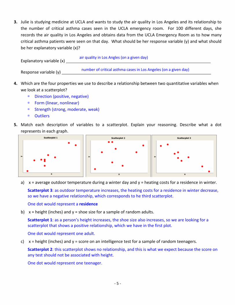
3. Julie is studying medicine at UCLA and wants to study the air quality in Los Angeles and its relationship to the number of critical asthma cases seen in the UCLA emergency room. For 100 different days, she records the air quality in Los Angeles and obtains data from the UCLA Emergency Room as to how many critical asthma patients were seen on that day. What should be her response variable (y) and what should be her explanatory variable (x)?
Explanatory variable (x) _______________________________________________________________
Response variable (y) _________________________________________________________________
4. Which are the four properties we use to describe a relationship between two quantitative variables when we look at a scatterplot? Direction (positive, negative) Form (linear, nonlinear) Strength (strong, moderate, weak) Outliers
5. Match each description of variables to a scatterplot. Explain your reasoning. Describe what a dot represents in each graph.
a) x = average outdoor temperature during a winter day and y = heating costs for a residence in winter.
Scatterplot 3: as outdoor temperature increases, the heating costs for a residence in winter decrease, so we have a negative relationship, which corresponds to he third scatterplot.
One dot would represent a residence
b) x = height (inches) and y = shoe size for a sample of random adults.
Scatterplot 1: as a person’s height increases, the shoe size also increases, so we are looking for a scatterplot that shows a positive relationship, which we have in the first plot.
One dot would represent one adult.
c) x = height (inches) and y = score on an intelligence test for a sample of random teenagers.
Scatterplot 2: this scatterplot shows no relationship, and this is what we expect because the score on any test should not be associated with height.
One dot would represent one teenager.
air quality in Los Angles (on a given day)
number of critical asthma cases in Los Angeles (on a given day)

- 6 -
6. Consider the four scatterplots shown below.
a) Which graph has the strongest linear correlation? Plot 4
b) Which graph has the strongest non-linear correlation? Plot 2
c) Which graph(s) have approximately zero correlation coefficient? Plot 2 and 3
7. Consider the four scatterplots shown below. Determine which two of the scatterplots have 0r ≈ and which two have 1r ≈ . Write your guess under each scatterplots.
Scatterplot 1
1r ≈
Scatterplot 2
0r ≈
Scatterplot 3
0r ≈
Scatterplot 4
1r ≈
a) Does the value of the correlation coefficient always show that a relationship exists? Explain why.
No, because it is possible to have a strong nonlinear relationship, and yet 0r ≈ (as in Scatterplot 3).
b) Does the value of the correlation coefficient always show that the relationship is linear? Explain why.
No, because it is possible to have 1r ≈ and yet have a nonlinear relationship (as in Scatterplot 1).
The main idea in this exercise is to emphasize that r only after we have confirmed from the scatterplot that the relationship is linear, we are allowed to use the value of rstrength and direction. In other words, r serves as a measure of direction and strength of a LINEAR relationship.

- 7 -
8. John Allen Paulos, a mathematics professor at Temple University, renowned for his popular books on mathematical literacy, often brought up examples to tackle the widespread confusion between association and causation. One such example that is trying to invite us to infer a causal connection would be the following: In large cities of the USA, the consumption of hot chocolate is negatively correlated with crime rate. Circle the correct answer(s):
a) To reduce the crime rate in large cities, the officials should require that each resident drinks a cup of hot chocolate each day.
b) Obviously, drinking more hot chocolate does not lower the crime rate.
c) Drinking hot chocolate reduces the crime rate in a large city.
For the above example, answer the questions:
d) What is the explanatory variable? __________________________________________________
e) What is the response variable? ____________________________________________________
f) Identify a plausible lurking variable in this scenario.
9. A survey of the world’s nations shows a strong positive correlation (r = 0.921) between the percentage of a
country’s population using cell phones and life expectancy at birth.
a) What is the explanatory variable? __________________________________________________
b) What is the response variable? ____________________________________________________
c) Does this strong positive correlation prove that the use of a cell phone leads to an increase in life expectancy? Explain your answer using a complete sentence.
No, association does not prove causation. Our X and Y variables may be linked through a third variable.
c) If not, identify two possible lurking variables involved in this study. Explain your answer using a
complete sentence.
If a country is wealthier, then in that country almost everyone will have a cell phone, so the percentage of the country’s population that uses cell phones will be high. At the same time, more wealth should also mean better access to food for everybody, better health care, better education, better work conditions, social care of elderly, etc. – and all these positively influence a person’s life expectancy.
Consumption of hot chocolate in a large city of the USA
Crime rate in a large city of the USA
Percentage of a country’s population using cell phones
Life expectancy at birth

- 8 -
10. We looked at 40 randomly selected men to analyze the relationship between the weight of a man and his BMI (Body Mass Index). The results of our statistical analysis are shown as follows.
Linear Regression Model for Men’s BMI Y = 16.217 + 0.053 *X
The Correlation Coefficient: r = 0.696 Coefficient of determination: r2 = 0.485 Standard Error: se = 1.49
A portion of the data table (sorted by increasing weights) is shown below.
Weight (Lbs) BMI
1. 152.6 23.5 2. 156.3 24.8 3. 161.9 24.6 4. 162.4 23.4 5. 164.2 26.1
36. 209.4 29.2 37. 213.3 26.7 38. 214.5 29.5 39. 230.2 22.0 40. 237.1 30.5
a) What is the correlation coefficient of this linear model? What does it tell us about the direction and strength of the potential linear relationship between a man’s BMI and weight?
0.696r = - since the scatterplot indicates a linear relationship we can use the value of the correlation
coefficient to measure the direction and strength between a man’s BMI and weight. Thus, we have a positive and moderately strong relationship. The “positive” means that as a man’s weight increases, so will the BMI also increase – or, we can say that “heavier men tend to have higher BMI.”
b) A trainer said that if a man is heavy, it will cause him to have a large BMI. Do the data support this
statement? No, that is not true – association does not prove causation.
c) What is the 2r value and what does it tell us?
2 0.485 48.5%r = = - so 48.5% of the total variation in men’s BMI score is explained by the weight.
d) Are there any other lurking variables that might influence BMI besides weight? What are they and what percentage of the variability of BMI are they associated with?
Yes, and these variables account for 51.5% of the variability in the BMI score. Such variables could be genetics, diet, lifestyle, exercise, health, stress, etc.

- 9 -
e) Use the regression equation to predict the BMI of the heaviest man in the data set. Then find the residual for this man. Based on this, conclude if the prediction is an overestimate or an underestimate.
The data table is organized by increasing weights, so the heaviest man is the 40th entry with weight:
237.1x =
Substitute this value into the equation:
( )Predicted BMI 16.217 0.053 237.128.78 28.8
= +
= ≈
Residual=Actual-Predicted 30.5 28.8 1.7= − =
f) For which range of men’s weights can we use our regression line to predict a men’s BMI?
For men with weights between 152.6 lbs through 237.1 lbs, so for 152.6 lbs 237.1 lbsx≤ ≤ .
g) Use the regression equation to predict the BMI of a man that weighs 220 pounds. How accurate do you think this prediction is?
( )Predicted BMI 16.217 0.053 220 27.88 27.9= + = ≈
The data table does not contain this weight, so we cannot compute the residual. In such cases, we use the value of the standard error to estimate the prediction error. The standard error of 1.49 indicates that when we are predicting BMI scores using our regression equation, our predictions can be off by 1.49± on average.
h) Suppose we wish to use the regression line to predict the BMI of a man that is 100 pounds. Would this
prediction be reliable? Why or why not? This would not be a reliable prediction since this weight is outside the scope of our X-data.
i) Find the influential outliers in this data set. Suppose that we remove this data point and recalculate r . How does the value of r change? Explain in a complete sentence.
The influential outlier is a man whose weight is 230.2 lbs and the BMI score is unusually low, with a value of 22.0. Removing the influential outlier from the data set we are making the relationship stronger, so the value of r would increase, getting closer to 1.
The positive residual means that the actual data point is above the regression line, so the predicted value (on the line) is an underestimate.

- 10 -
11. Consider four scatterplots with regression lines and four corresponding residual plots. In two cases the linear model is appropriate, and in two cases the regression line fails to capture important aspects of the relationship between the variables.
a) Match each scatterplot to its residual plot.
Scatterplot I corresponds to Residual Plot
Scatterplot II corresponds to Residual Plot
Scatterplot III corresponds to Residual Plot
Scatterplot IV corresponds to Residual Plot
b) Match each description with the appropriate residual plot(s).
Description Residual Plot(s)
The residuals show a curved pattern, suggesting that the linear
model is not appropriate. B
The pattern in the residual plot shows fanning out, suggesting
that predictions based on the regression line will result in greater
error as we move from left to right through the range of the
explanatory variable. The linear model is not appropriate.
D
Residuals are randomly scattered with no distinctive pattern. This
suggests that the linear model is appropriate. A, C
D
C
B
A
MATH 075 – Final Review – Unit 5
Adapted from Dustin Silva and the COC’s Statistics Team
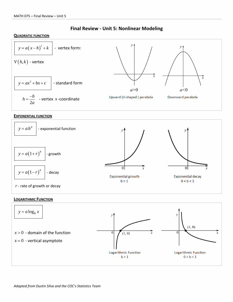
Final Review ‐ Unit 5: Nonlinear Modeling
QUADRATIC FUNCTION
2y a x h k ‐ vertex form:
,V h k ‐ vertex
2y ax bx c ‐ standard form
2
bh
a
‐ vertex x ‐coordinate
EXPONENTIAL FUNCTION
xy ab ‐ exponential function
1 xy a r ‐ growth
1 xy a r ‐ decay
r ‐ rate of growth or decay
LOGARITHMIC FUNCTION
logby a x
0x ‐ domain of the function
0x ‐ vertical asymptote
‐ 2 ‐
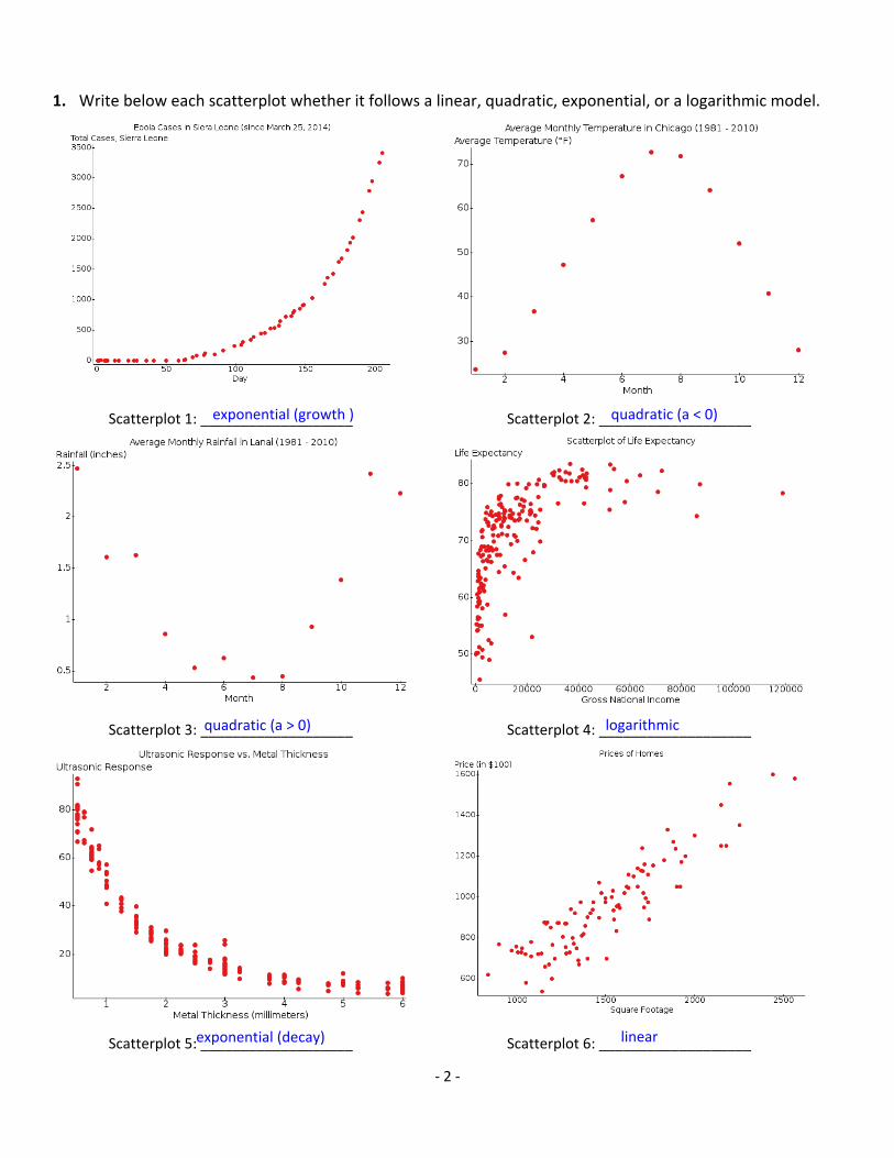
1. Write below each scatterplot whether it follows a linear, quadratic, exponential, or a logarithmic model.
Scatterplot 1: ___________________ Scatterplot 2: ___________________
Scatterplot 3: ___________________ Scatterplot 4: ___________________
Scatterplot 5: ___________________ Scatterplot 6: ___________________
exponential (growth ) quadratic (a < 0)
quadratic (a > 0) logarithmic
exponential (decay) linear
‐ 3 ‐
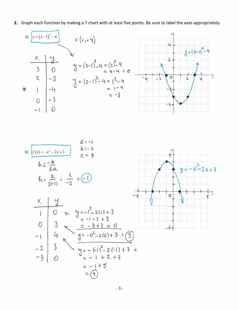
2. Graph each function by making a T chart with at least five points. Be sure to label the axes appropriately.

‐ 4 ‐

‐ 5 ‐
3. Find the equation of the quadratic function in the vertex form 2y a x h k if the parabola passes
through the point (6, 5) and the vertex is located at (4, ‐3).

‐ 6 ‐
4. The height of a ball thrown straight up is modeled by a quadratic function shown below.
23.601 62.683 16.806y t t
The time is the explanatory variable (t) and the height is the response variable (y).
a) The above quadratic equation corresponds to the standard form 2y a t bt c . Write the value for
each of the coefficients a , b , and c . Be careful to not mix up the coefficients (e.g. observe which
coefficient multiplies 2t , and which one multiplies t ).

‐ 7 ‐
5. The number of rabbits on a farm increases exponentially, with a monthly growth
rate of 18%. Suppose that there were 2 rabbits initially.

‐ 8 ‐
7. Using a United Nation’s data set on life expectancy for residents of various countries ( y ) depending on the
nation’s GNI ( x ), we carried out regression, using both the quadratic and logarithmic model. The
regression equation, coefficient of determination ( 2r ), and standard error ( es ) are given for each model.
Quadratic Model
262.211 0.714 0.758y x x
2 0.5449r
5.990es
Logarithmic Model
57.677 5.848 lny x
2 0.6411r
5.306es
a) Based on the above scatterplots regression curves, which model is a better fit for the data? Why?
The logarithmic model is a better fit because the regression curve better follows the data.
b) Based on the coefficient of determination ( 2r ), which model is a better fit for the data. Why?
The logarithmic model is a better fit since 2r is greater (64.11%, as opposed to 54.49% that we have
for the quadratic model).
c) Based on the standard error ( es ), which model is a better fit for the data. Why?
The logarithmic model is better since the standard error is smaller (5.306 years as opposed to 5.990
years with the quadratic model).
d) Conclude which model would be a better fit for the data.
By all the above criteria, the logarithmic model is a better fit for the data.

MATH 075 – Final Review – Unit 6
Adapted from Dustin Silva and the Statistics Team of COC
Final Review - Unit 6: Two-way Tables and Probability
1. The following table shows a preferred type of sport in a group of randomly selected adults in the U.S.A.
and Canada.
Baseball Soccer Basketball Hockey Total
U.S.A. 253 76 198 147 674
Canada 121 113 165 188 587
Total 374 189 363 335 1261
Find the marginal values (totals), and answer the questions. Round all answers to the nearest hundredth.

- 2 -
2. Members of a local DVD store were asked about their age and the genre of movie that they like the most. The data
obtained include three age groups (18-35, 36-59, and 60 or above) and six movie genres (Action, Drama,
Comedy, Science-Fiction, Horror, and Documentary).
Genre Age
Action 18-35
Documentary 60+
Drama 36-59
Sci-Fi 36-59
Comedy 18-35
Comedy 36-59
Action 36-59
Horror 18-35
Action 36-59
Documentary 36-59
Drama 60+
Action 60+
Genre Age
Comedy 36-59
Drama 36-59
Action 18-35
Comedy 60+
Horror 36-59
Documentary 60+
Drama 36-59
Sci-Fi 18-35
Comedy 60+
Action 18-35
Horror 18-35
Drama 36-59
Based on the data, create a two-way table that relates the age and the movie genre.
Action Drama Comedy SciFi Horror Doc. Total
18 – 35 3 0 1 1 2 0 7
36 – 59 2 4 2 1 1 1 11
60+ 1 1 2 0 0 2 6
Total 6 5 5 2 3 3 24

- 3 -
3. When picking their major, college students make a decision based on whether they prefer arts or science.
Approximately 12% of male students choose science.
Approximately 9% of female students choose science.
Approximately 65% of college students are females.
Suppose that we have a random sample of 10,000 college students. Fill out the following two-way table
and then answer the questions.
Art Science Total
Male 3,080 420 3,500
Female 5,915 585 6,500
Total 8,995 1,005 10,000
Questions:
a) If a person is a female, what is the probability that they will choose a science major?
P (Science | Female) = 585 0.09 9%6500
= =
b) If a person is in science, what is the probability that they are a female?
P (Female | Science) = 585 0.5821 58.21%
1005≈ =
c) What is the probability that a randomly selected person is a male AND has a major in arts?
P (Male AND Arts) = 3080 0.3080 30.80%
10000≈ =
d) What is the probability that a randomly selected person is either a male OR an arts major?
P (Male OR Arts) = P(Male) + P(Arts) – P(Male AND Arts) = 3500 8995 3080 9415 0.9415 94.15%
10000 10000 10000 10000+ − = = =
This is not new information! This is exactly what we knew initially.

- 4 -
4. A bag contains 30 balls of different colors and labels. There are:
12 blue balls numbered 1, 2, 3, 4, 5, 6, 7, 8, 9, 10, 11, and 12.
6 yellow balls numbered: 1, 2, 3, 4, 5, and 6.
6 red balls numbered 1, 2, 3, 4, 5, and 6.
6 green balls numbered 1, 2, 3, 4, 5, and 6.
Find the probability of each of the following. Round all values to the nearest hundredth.
a) A randomly selected ball is blue.
P (blue) = 12 2 0.4 40.00%30 5
= = =
b) A randomly selected ball is yellow or green.
P (yellow or green) = 6 6 12 2 0.4 40.00%30 30 5+
= = = =
c) A randomly selected ball is NOT red.
P (not red) = 1 – P(red) = 61 1 0.2 0.8 80.00%
30− = − = =
d) A randomly selected ball is numbered by 4.
P (4) = 4 0.1333 13.33%
30= ≈
e) A randomly selected ball is red and divisible by 3.
P (red and divisible by 3) = 2 0.0666 6.67%
30= ≈
f) A randomly selected ball is blue or even-numbered.
P (blue or even) = P(blue) + P(even) – P(blue and even) = 12 15 6 21 0.70 70.00%30 30 30 30
+ − = = =

- 5 -
5. A random sample consisting of 400 adults was surveyed. The participants were asked which place they
would like to visit for a weekend getaway. Here is the two-way table that summarizes the data.
Hawaii Florida Neither Total
Woman 104 65 3 172
Man 113 98 17 228
Total 217 163 20 400
Find the marginal values (totals), and provide answers. Round all values to the nearest hundredth.
a) P(Woman) = 172 0.43 43.00%400
= =
b) P(Woman | Prefers Hawaii) =104 0.47926 47.93%217
= ≈
c) P(Woman or Prefers Hawaii)= P(Woman) + P(Hawaii) – P(Woman and Havaii) =
172 217 104 285 0.7125 71.25%400 400 400 400
= + − = = =
d) Which of the following probability statements involves the computation of 113217
?
Probability of picking someone who is a male.
Probability of picking someone who prefers Hawaii.
Probability of picking someone who is both a male and prefers Hawaii.
Probability of picking someone who prefers Hawaii if we are given that the person is a male.
Probability of picking a man if we are given that the person prefers Hawaii.
e) Which of the following probability statements is found with the computation: 65400
?
Probability of picking someone who is a female.
Probability of picking someone who prefers Florida.
Probability of picking a woman if we are given that the person prefers Florida.
Probability of picking someone who prefers Florida if we are given that the person is a female.
Probability of picking someone who is both a female and prefers Florida.