20150901-lecture-2 20150901-lecture-2
DESCRIPTION
20150901-Lecture-2 20150901-Lecture-220150901-Lecture-2 20150901-Lecture-220150901-Lecture-2 20150901-Lecture-220150901-Lecture-2 20150901-Lecture-220150901-Lecture-2 20150901-Lecture-220150901-Lecture-2 20150901-Lecture-220150901-Lecture-2 20150901-Lecture-220150901-Lecture-2 20150901-Lecture-220150901-Lecture-2 20150901-Lecture-220150901-Lecture-2 20150901-Lecture-220150901-Lecture-2 20150901-Lecture-220150901-Lecture-2 20150901-Lecture-220150901-Lecture-2 20150901-Lecture-2TRANSCRIPT
DAT630Exploring Data
Krisztian Balog | University of Stavanger
01/09/2015
Introduction to Data Mining, Chapter 3
Data Exploration- Preliminary investigation of the data in order to
better understand its specific characteristics- Can aid in selecting the appropriate
preprocessing and data analysis techniques- Can even address some of the questions
typically answered by data mining- Finding patterns by visually inspecting the data
Three major topics- Summary statistics- Visualization- On-Line Analytical Processing (OLAP) The Iris Data Set
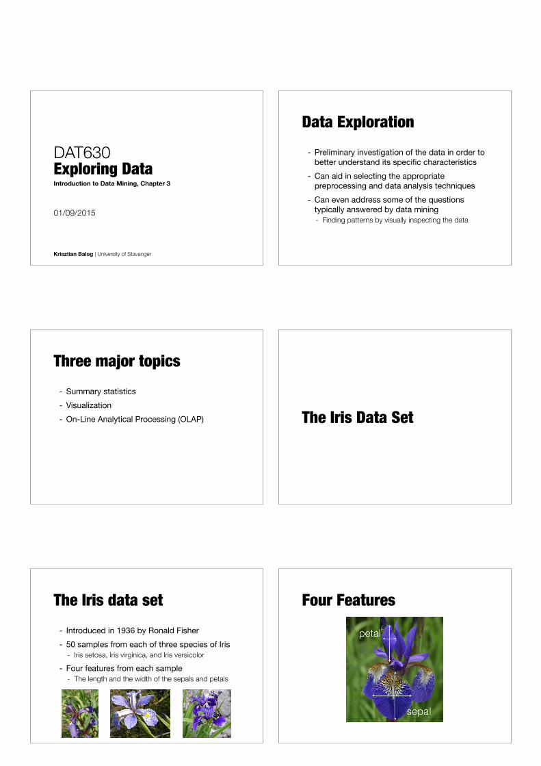
The Iris data set- Introduced in 1936 by Ronald Fisher- 50 samples from each of three species of Iris
- Iris setosa, Iris virginica, and Iris versicolor
- Four features from each sample- The length and the width of the sepals and petals
Four Features
Summary Statistics
Summary Statistics- Quantities that capture various
characteristics of a potentially large set of values with a single number (or a small set of numbers)
- Examples- Average household income - Fraction of students who complete a BSc in 3 years
Frequency- The frequency of an attribute value is the
percentage with which the value occurs in the data set - For example, given the attribute ‘gender’ and a
representative population of people, the gender ‘female’ occurs about 50% of the time
- x is a categorical attribute that can take values {v1,…,vk} and there are m objects in total
frequency(vi) =number of objects with attribute value vi
m
Mode- The mode of a an attribute is the most
frequent attribute value- The notion of a mode is only interesting if attribute
values have different frequencies
- The notions of frequency and mode are typically used with categorical data
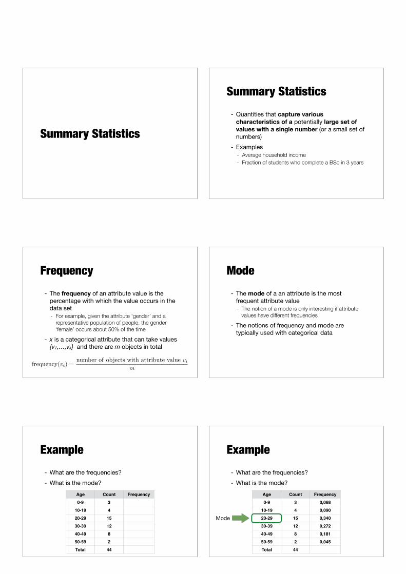
Example- What are the frequencies?- What is the mode?
Age Count Frequency0-9 310-19 420-29 1530-39 1240-49 850-59 2Total 44
Example- What are the frequencies?- What is the mode?
Age Count Frequency0-9 3 0,06810-19 4 0,09020-29 15 0,34030-39 12 0,27240-49 8 0,18150-59 2 0,045Total 44
Mode
Percentiles- For continuous data, the notion of a percentile
is more useful - Given an ordinal or continuous attribute x and
a number p between 0 and 100, the pth percentile is a value xp of x such that p% of the observed values of x are less than xp- For instance, the 50th percentile is the value x50%
such that 50% of all values of x are less than x50%
- min(x)= x0% max(x)= x100%
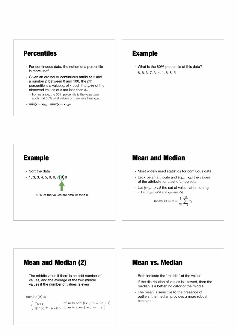
Example- What is the 80% percentile of this data?- 8, 6, 3, 7, 3, 4, 1, 6, 8, 5
Example- Sort the data - 1, 3, 3, 4, 5, 6, 6, 7, 8, 8
80% of the values are smaller than 8
Mean and Median- Most widely used statistics for contiuous data- Let x be an attribute and {x1,…,xm} the values
of the attribute for a set of m objects- Let {x(1),…,x(m)} the set of values after sorting
- I.e., x(1)=min(x) and x(m)=max(x)
mean(x) = x̄ =1
m
mX
i=1
xi
Mean and Median (2)- The middle value if there is an odd number of
values, and the average of the two middle values if the number of values is even
⇢x(r+1), if m is odd (i.e., m = 2r + 1)
12 (x(r) + x(r+1)), if m is even (i.e., m = 2r)
median(x) =
Mean vs. Median- Both indicate the "middle" of the values- If the distribution of values is skewed, then the
median is a better indicator of the middle- The mean is sensitive to the presence of
outliers; the median provides a more robust estimate
Trimmed Mean- To overcome problems with the traditional
definition of a mean, the notion of a trimmed mean is sometimes used
- A percentage p between 0 and 100 is specified; the top and bottom (p/2)% of the data is thrown out; then mean is calculated the normal way
- Median is a trimmed mean with p=100%, the standard mean corresponds to p=0%
Example- Consider the set of values {1, 2, 3, 4, 5, 90}- What is the mean?- What is the median?- What is the trimmed mean with p=40%?
Example- Consider the set of values {1, 2, 3, 4, 5, 90}- What is the mean? 17.5- What is the median? (3+4)/2 = 3.5- What is the trimmed mean with p=40%? 3.5
- Trimmed values (with top-20% and bottom-20% of the values thrown out): {2,3,4,5}
Range and Variance- To measure the dispersion/spread of a set of
values (for continuous data)- Range
- Variance*
- Standard deviation is the square root of variance
range(x) = max(x)�min(x) = x(m) � x(1)
variance(x) = s
2x
=1
m
mX
i=1
(xi
� x̄)2
*This is the correct formula for variance. The one in the book is erroneous!
Range vs. Variance- Range can be misleading if the values are
concentrated in a narrow area, but there are also a relatively small number of extreme values
- Hence, the variance is preferred as a measure of spread
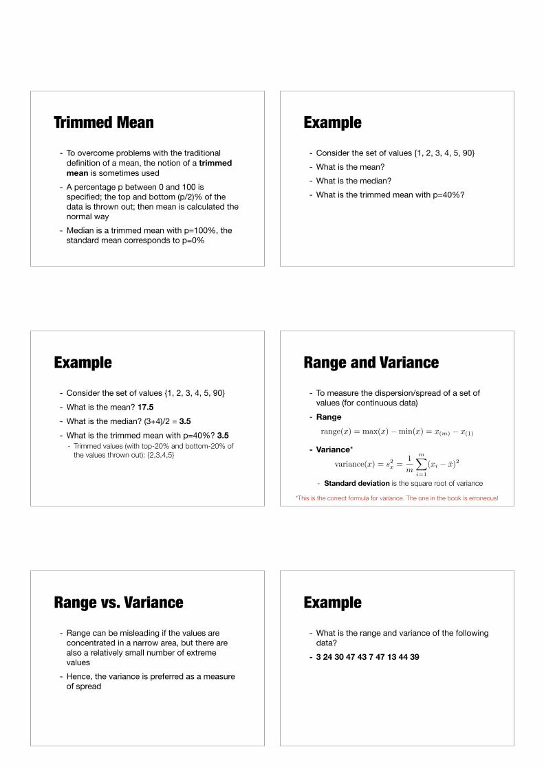
Example- What is the range and variance of the following
data?- 3 24 30 47 43 7 47 13 44 39
Example- What is the range and variance of the following
data?- 3 24 30 47 43 7 47 13 44 39
- Range: 47-3 = 44 - Variance: 289.57
- mean: 29.7
More Robust Estimates of Spread
- Variance is particularly sensitive to outliers- The mean can be distorted by outliers; variance
uses the squared difference between the mean and other values
- Absolute Average Deviation (AAD)
AAD(x) =1
m
mX
i=1
|xi � x̄|
More Robust Estimates of Spread (2)
- Median Absolute Deviation (MAD)
- Interquartile Range (IQR)
MAD(x) = median�|x1 � x̄|, . . . , |xm � x̄|
�
IQR(x) = x75% � x25%
Visualization
Goals and Motivation- Data visualization is the display of information
in a graphic or tabular format- The motivation for using visualization is that
people can quickly absorb large amounts of visual information and find patterns in it
- Visualization is a powerful and appealing technique for data exploration- Humans can easily detect general patterns and
trends as well as outliers and unusual patterns
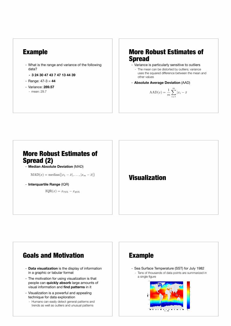
Example- Sea Surface Temperature (SST) for July 1982
- Tens of thousands of data points are summarized in a single figure
Outline for this part- General concepts
- Representation - Arrangement - Selection
- Visualization techniques- Histograms - Box plots - Scatter plots - Contour plots - …
Representation- Mapping of information to a visual format- Data objects, their attributes, and the
relationships among data objects are translated into graphical elements such as points, lines, shapes, and colors- Objects are often represented as points - Attribute values can be represented as the position
of the points or using color, size, shape, etc. - Position can express the relationships among points
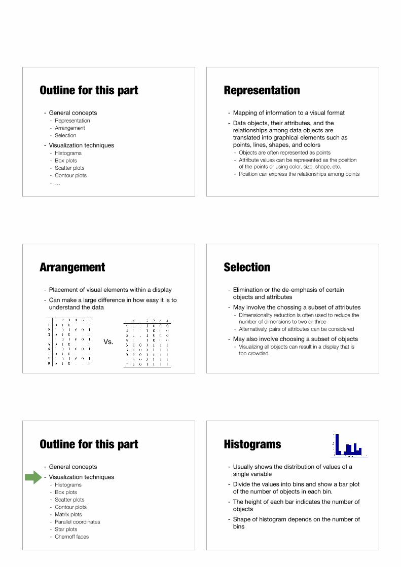
Arrangement- Placement of visual elements within a display- Can make a large difference in how easy it is to
understand the data
Vs.
Selection- Elimination or the de-emphasis of certain
objects and attributes- May involve the chossing a subset of attributes
- Dimensionality reduction is often used to reduce the number of dimensions to two or three
- Alternatively, pairs of attributes can be considered
- May also involve choosing a subset of objects- Visualizing all objects can result in a display that is
too crowded
Outline for this part- General concepts- Visualization techniques
- Histograms - Box plots - Scatter plots - Contour plots - Matrix plots - Parallel coordinates - Star plots - Chernoff faces
Histograms- Usually shows the distribution of values of a
single variable- Divide the values into bins and show a bar plot
of the number of objects in each bin. - The height of each bar indicates the number of
objects- Shape of histogram depends on the number of
bins
Example- Petal width
10 bins 20 bins
2D Histograms- Show the joint distribution of the values of two
attributes - Each attribute is divided into intervals and the two
sets of intervals define two-dimensional rectanges of values
- Visually more complicated, e.g., some columns may be hidden by others
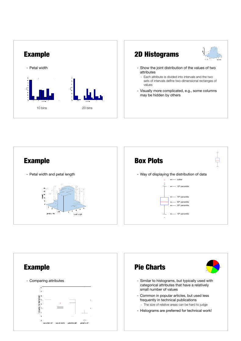
Example- Petal width and petal length
Box Plots- Way of displaying the distribution of data
outlier
10th percentile
25th percentile
75th percentile
50th percentile
10th percentile
outlier
10th percentile
25th percentile
75th percentile
50th percentile
10th percentile
Example- Comparing attributes
Pie Charts- Similar to histograms, but typically used with
categorical attributes that have a relatively small number of values
- Common in popular articles, but used less frequently in technical publications- The size of relative areas can be hard to judge
- Histograms are preferred for technical work!

http://www.businessinsider.com/pie-charts-are-the-worst-2013-6 http://www.businessinsider.com/pie-charts-are-the-worst-2013-6
Scatter Plots- Attributes values determine the position- Two-dimensional scatter plots most common,
but can have three-dimensional scatter plots- Often additional attributes can be displayed by
using the size, shape, and color of the markers that represent the objects
Example
Example- Arrays of scatter plots to summarize the
relationships of several pairs of attributes
Contour Plots- Useful when a continuous attribute is
measured on a spatial grid- They partition the plane into regions of similar
values- The contour lines that form the boundaries of
these regions connect points with equal values- The most common example is contour maps of
elevation
Celsius
Example
Celsius
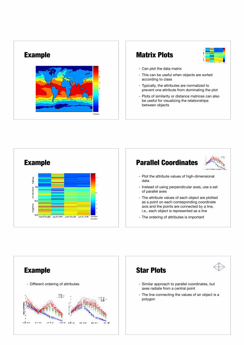
Matrix Plots- Can plot the data matrix- This can be useful when objects are sorted
according to class- Typically, the attributes are normalized to
prevent one attribute from dominating the plot- Plots of similarity or distance matrices can also
be useful for visualizing the relationships between objects
standard deviation
Example
standard deviation
Parallel Coordinates- Plot the attribute values of high-dimensional
data- Instead of using perpendicular axes, use a set
of parallel axes - The attribute values of each object are plotted
as a point on each corresponding coordinate axis and the points are connected by a line, i.e., each object is represented as a line
- The ordering of attributes is important
Example- Different ordering of attributes
Star Plots- Similar approach to parallel coordinates, but
axes radiate from a central point- The line connecting the values of an object is a
polygon
Example
Setosa Versicolour Virginica
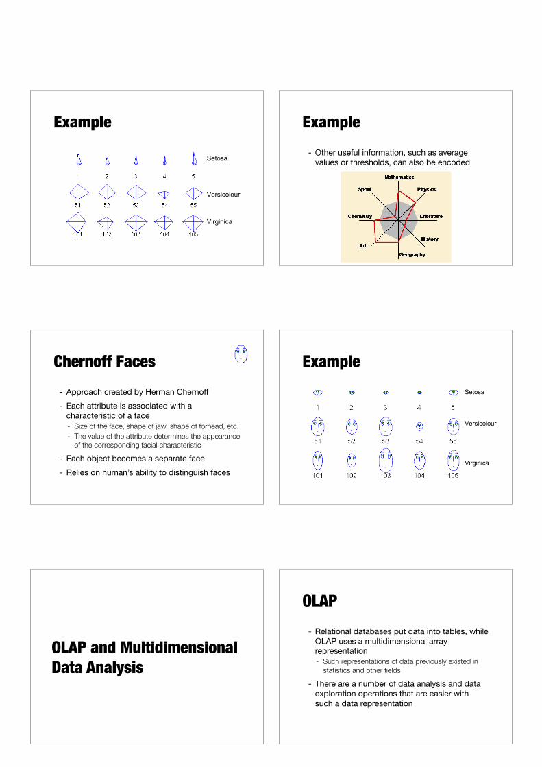
Example- Other useful information, such as average
values or thresholds, can also be encoded
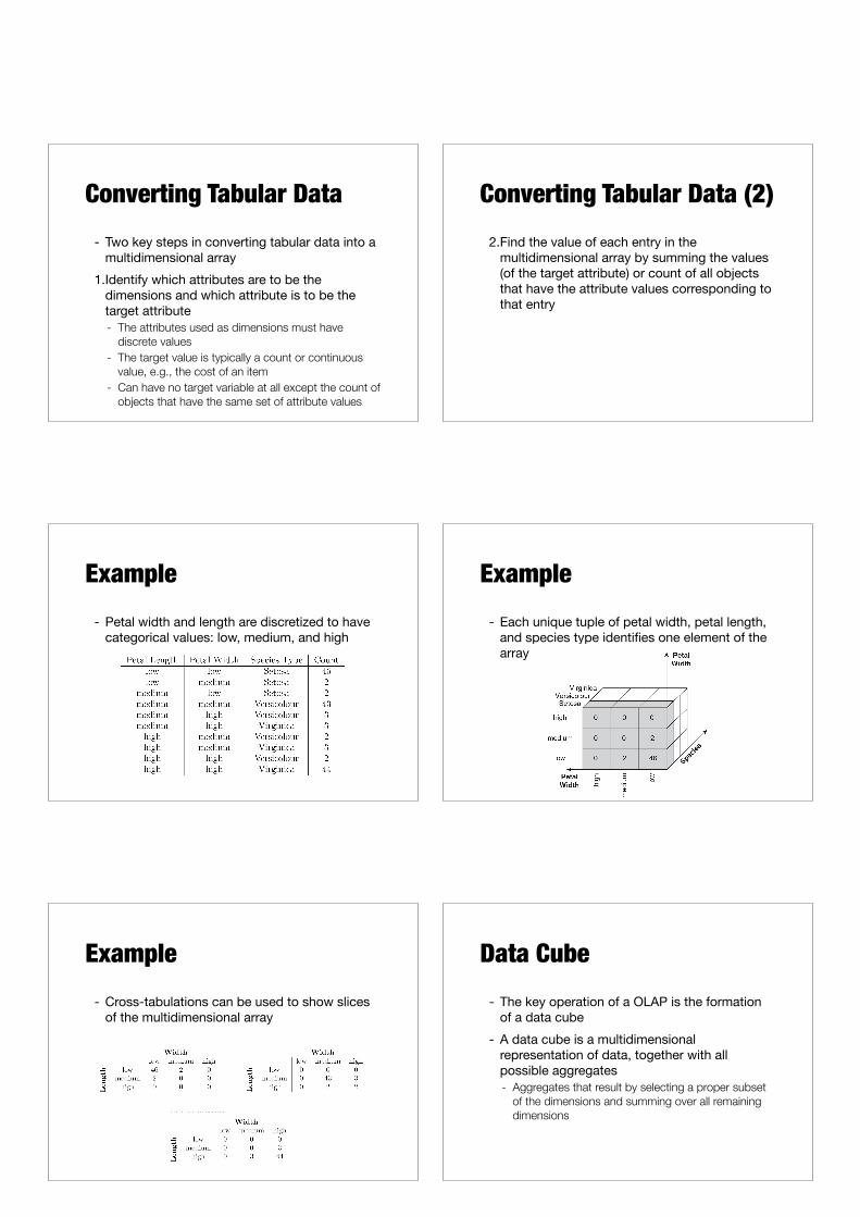
Chernoff Faces- Approach created by Herman Chernoff- Each attribute is associated with a
characteristic of a face- Size of the face, shape of jaw, shape of forhead, etc. - The value of the attribute determines the appearance
of the corresponding facial characteristic
- Each object becomes a separate face- Relies on human’s ability to distinguish faces
ExampleSetosa
Versicolour
Virginica
OLAP and Multidimensional Data Analysis
OLAP- Relational databases put data into tables, while
OLAP uses a multidimensional array representation- Such representations of data previously existed in
statistics and other fields
- There are a number of data analysis and data exploration operations that are easier with such a data representation
Converting Tabular Data- Two key steps in converting tabular data into a
multidimensional array1.Identify which attributes are to be the
dimensions and which attribute is to be the target attribute- The attributes used as dimensions must have
discrete values - The target value is typically a count or continuous
value, e.g., the cost of an item - Can have no target variable at all except the count of
objects that have the same set of attribute values
Converting Tabular Data (2)2.Find the value of each entry in the
multidimensional array by summing the values (of the target attribute) or count of all objects that have the attribute values corresponding to that entry
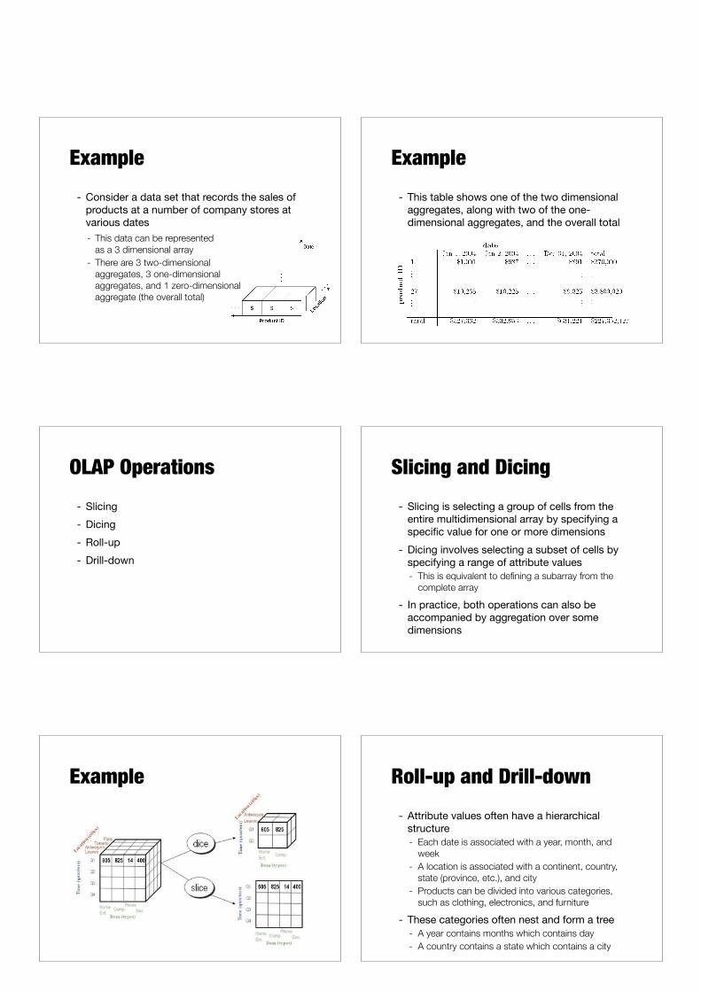
Example- Petal width and length are discretized to have
categorical values: low, medium, and high
Example- Each unique tuple of petal width, petal length,
and species type identifies one element of the array
Example- Cross-tabulations can be used to show slices
of the multidimensional array
Data Cube- The key operation of a OLAP is the formation
of a data cube- A data cube is a multidimensional
representation of data, together with all possible aggregates- Aggregates that result by selecting a proper subset
of the dimensions and summing over all remaining dimensions
Example- Consider a data set that records the sales of
products at a number of company stores at various dates- This data can be represented
as a 3 dimensional array - There are 3 two-dimensional
aggregates, 3 one-dimensional aggregates, and 1 zero-dimensional aggregate (the overall total)
Example- This table shows one of the two dimensional
aggregates, along with two of the one-dimensional aggregates, and the overall total
OLAP Operations- Slicing- Dicing- Roll-up- Drill-down
Slicing and Dicing- Slicing is selecting a group of cells from the
entire multidimensional array by specifying a specific value for one or more dimensions
- Dicing involves selecting a subset of cells by specifying a range of attribute values- This is equivalent to defining a subarray from the
complete array
- In practice, both operations can also be accompanied by aggregation over some dimensions
Example Roll-up and Drill-down- Attribute values often have a hierarchical
structure- Each date is associated with a year, month, and
week - A location is associated with a continent, country,
state (province, etc.), and city - Products can be divided into various categories,
such as clothing, electronics, and furniture
- These categories often nest and form a tree- A year contains months which contains day - A country contains a state which contains a city
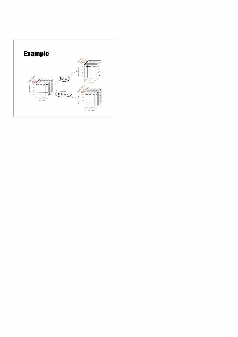
Example