1845645685 colour b
TRANSCRIPT
WITeLibraryHome of the Transactions of the Wessex Institute, the WIT electronic-library
provides the international scientific community with immediate and permanentaccess to individual papers presented at WIT conferences. Visit the WIT eLibrary
at http://library.witpress.com
WIT Press publishes leading books in Science and Technology.Visit our website for the current list of titles.
www.witpress.com
WITPRESS
&COLOUR IN ART,COLOUR IN ART,COLOUR IN ART,COLOUR IN ART,COLOUR IN ART,
DESIGN NATUREDESIGN NATUREDESIGN NATUREDESIGN NATUREDESIGN NATURE

This page intentionally left blank

&C A BrebbiaC A BrebbiaC A BrebbiaC A BrebbiaC A Brebbia,
Wessex Institute of Technology, UK
C GreatedC GreatedC GreatedC GreatedC GreatedThe University of Edinburgh, UK
M W CollinsM W CollinsM W CollinsM W CollinsM W CollinsBrunel University, UK
Editors:
COLOUR IN ART,COLOUR IN ART,COLOUR IN ART,COLOUR IN ART,COLOUR IN ART,DESIGN NATUREDESIGN NATUREDESIGN NATUREDESIGN NATUREDESIGN NATURE

Published by
WIT PressAshurst Lodge, Ashurst, Southampton, SO40 7AA, UKTel: 44 (0) 238 029 3223; Fax: 44 (0) 238 029 2853E-Mail: [email protected]://www.witpress.com
For USA, Canada and MexicoWIT Press25 Bridge Street, Billerica, MA 01821, USATel: 978 667 5841; Fax: 978 667 7582E-Mail: [email protected]://www.witpress.com
British Library Cataloguing-in-Publication DataA Catalogue record for this book is availablefrom the British Library
ISBN: 978-1-84564-568-7
Library of Congress Catalog Card Number: 2011922775
The texts of the papers in this volume were set individually by the authors or under their supervision.
No responsibility is assumed by the Publisher, the Editors and Authors for any injury and/or damage topersons or property as a matter of products liability, negligence or otherwise, or from any use or operationof any methods, products, instructions or ideas contained in the material herein. The Publisher does notnecessarily endorse the ideas held, or views expressed by the Editors or Authors of the material containedin its publications.
© WIT Press 2011.
Printed in Great Britain by MPG Biddles Ltd, King’s Lynn
The material contained herein is reprinted from a special editions of Design & Nature and Ecodynamics,Vol.4, No.3, published by WIT Press.
All rights reserved. No part of this publication may be reproduced, stored in a retrieval system, ortransmitted in any form or by any means, electronic, mechanical, photocopying, recording, or otherwise,without the prior written permission of the Publisher.
C A BrebbiaC A BrebbiaC A BrebbiaC A BrebbiaC A Brebbia,Wessex Institute of Technology, UK
C GreatedC GreatedC GreatedC GreatedC GreatedThe University of Edinburgh, UK
M W CollinsM W CollinsM W CollinsM W CollinsM W CollinsBrunel University, UKEditors:
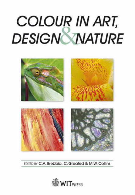
Foreword:towards one culture .......................................................................................................... 1Animal camouflage: biology meets psychology, computer science and artI.C. CUTHILL & T.S. TROSCIANKO ........................................................................................... 5Lusciousness, the crafted image in a digital environmentR. KESSELER ................................................................................................................................ 25The diversity of flower colour: how and why?B.J. GLOVER ................................................................................................................................. 33Sensations from natureM.J. FRYER ................................................................................................................................... 41Goethe, Eastlake and Turner: from colour theory to artC.S. KÖNIG & M.W. COLLINS ................................................................................................... 51ZvukM. GREATED ................................................................................................................................ 61Time and change: colour, taste and conservationJ.P. CAMPBELL............................................................................................................................. 77Thermo-hydraulics, colour and artJ.A. PATORSKI .............................................................................................................................. 89Nature’s fluctuating colour captured on canvas?F. SCHENK .................................................................................................................................... 97On the use of colour in experimental fluid mechanicsJ.T. TURNER & S. ZHANG ........................................................................................................ 109Maxwell’s first coloured light sources: artists’ pigmentsR.C. DOUGAL ............................................................................................................................. 125
SPECIAL RESEARCH
Past present and future craft practices projectL. DONALD ............................................................................................................................. 133Figuring light: colour and the intangibleR. DAVEY ................................................................................................................................. 135GaeluxTM
J. STUART-MURRAY .............................................................................................................. 137Colour in the countryside buildings, landscapes, cultureR. LAING & S. BAXTER ........................................................................................................ 139Developing the CREATE Network in EuropeC. PARRAMAN & A. RIZZI .................................................................................................... 141Colour, light and sacred spacesE. TANTCHEVA ....................................................................................................................... 143Analysis of the use of yellow in seventeenth-century church interiorsE. TANTCHEVA, V. CHEUNG & S. WESTLAND ................................................................ 145
CONTENTS

This page intentionally left blank

FOREWORD: TOWARDS ONE CULTURE
M.W. COLLINSSchool of Engineering & Design, Brunel University, UK
SNOW’S TWO CULTURES
C.P. Snow’s The Two Cultures [1a] stemmed from his Rede Lectures of 50 years ago at CambridgeUniversity, a University which seems to figure rather prominently in this Introduction. ‘By trainingI was a scientist: by vocation I was a writer…plenty of days when I have spent the working hourswith scientists and then gone off at night with some literary colleagues…two groups…who hadalmost ceased to communicate at all’. So he experienced ‘two cultures’ ([1a], pp 1, 2). Despite hisCambridge being ‘a university where scientists and non-scientists meet every night at dinner…thereseemed to be no place where the cultures meet’ (pp 15, 16). In the website review by Danny Lee [2],Snow’s divide between the sciences and humanities, hindered the process of solving the world’sproblems. Now a dictionary definition of the word culture reflects something of the force of Snow’sessential thesis: ‘the attitudes and values which inform a society’ [3]. The iconic status that this thesisachieved then (just notice the number of reprints in later versions) to some extent is perpetuated in itsCanto edition reissue [1b]. In fact, for the modern reader an up-to-date reassessment, such as providedby Professor Stefan Collini’s extensive Introduction, could be of even more value than the originalbook. In addition, Snow was bitterly opposed at the time by the literary critic F.R. Leavis. As part ofthe website – actually a Daily Telegraph article [4] – Robert Whelan tells the story of Leavis’s‘astonishingly vitriolic counter-lecture’ to Snow. Whelan is an interesting witness, as he ‘was anundergraduate at Cambridge 10 years later’.
Whelan’s authority is as Deputy Director of the think-tank Civitas, and if Snow’s message explainedthe problem rather than the solution, Whelan’s message is plain bleak. He uses Snow’s view of theEnglish educational system a half-century ago as a catalyst for his own current analysis. It should benoted here that the Scottish system is independent of the English one. Whereas Snow criticised thescientists who couldn’t ‘manage’ a novel by Dickens on the one hand, with the humanities professorsignorant of the Second Law of Thermodynamics on the other, Whelan sees an educational system,not just incapable of delivering a C.P. Snow to a Cambridge Fellowship at the age of 25, but capableof delivering history students to the same university ignorant of both the Reformation and Renaissance.For Whelan it is no longer ‘whether children should be taught to translate Horace or to solve algebraicequations: it is a question of whether they are to be taught anything at all’. So he would see present-day Snows and Leavises ‘equally appalled’ and ‘united in desperation’. Putting his bleakness to oneside, we will briefly examine the issues themselves and will see that they have considerable relevanceto this Special Issue. While the discussion is somewhat personal it is essentially on behalf of myfellow Guest Editors. Our hope is that it will resonate with you the reader, and perhaps stimulate yourown reaction!
Firstly, there are the scientists and engineers of Snow’s bipolar culture. The plain truth is that ascientist’s effectiveness as a scientist militates against taking equally-balanced interests in thehumanities. He or she only has a limited amount of time and effort available, and it is crucial that adam-designing civil engineer, for example, is an excellent dam designer. It is hardly attractive as arelaxation or spare-time activity to describe it as a ‘struggle through’ a Dickens novel. By coincidence,however I have become aware of the very issues that Whelan finds are missing in his historyundergraduates. Let me quote a sentence I happened to read recently: ‘Perhaps it is sufficient to sa
Colour in Art, Design & Nature 1
2 Colour in Art, Design & Nature
that the Renaissance remains a defining moment in the history of Europe, and indeed in world history, rather than the defining moment which enthusiasts have sometimes claimed’ ([4] p. xvi). I was entering the world of Michael Mallett and John Hale, the latter ‘a teacher of Renaissance history at the Universities of Warwick and Berkeley’ ([5] p. xviii). Mallett is revising Hale’s Renaissance in Europe and the above sentence is the conclusion to his Preface. Further, if Chapter 1 of the book (entitled Time and Space) is at all typical of Hale’s scholarship, I can understand Whelan’s high regard for Renaissance studies. It is densely packed with what I find is fascinating information. Now I cannot really explain why I find this rather private occupation absorbing, as opposed to my fellow Guest Editor Clive Greated, who has been a prominent member of a well-known music group on the Edinburgh scene for a considerable time. And we are just two examples of Snow’s science culture! Let us turn to the Second Law of Thermodynamics. In his ‘second look’ Snow actually ‘regretted’ using ‘the Second Law of Thermodynamics’ as ‘my test question about scientific literacy’ [1a], pp 71, 72). A present-day C.P. Snow would probably admit such regrets were wrong! These days, with the issues of global warming and energy shortages being so crucial, the awareness of thermodynamics is much more widespread. Again, currently I have the privilege of being an Editor of a Volume on Lord Kelvin and his contribution to thermodynamics, being prepared for the International Series on Design in Nature published by WIT [6]. Now we cannot expect C.P. Snow’s ‘humanity professors’ [4] to read such papers as ‘Sadi Carnot’s contribution to the second law of thermodynamics’ by Don Lemmons and Margaret Penner [7] (most scientists and engineers would probably not, either), any more than I would be inclined to read Renaissance and the drama of Western History [8] quoted by Michael Mallet. Nonetheless, [8] is very important (William Bousma’s famous presidential address to the American Historical Association in 1978, [4] p. xv) somewhat paralleling [7]’s contribution to the understanding of Carnot’s genius and the Second Law. Writing for the Editors of [6] then, we should try to distil the scholarship of work such as [7], in such a way that our Volume might even attract an alter ego ‘humanities professor’. The message of this Editorial is to see things positively, and I don’t think Whelan’s bleakness is fairly justified. Recently, the Daily Telegraph [9], with its details of the 2009’s national A Level results, depicts thriving levels of performance. Yes, the Lead Editorial on ‘Grade inflation’ mentions a survey carried out by Civitas. But within that thriving performance there are some pretty impressive case studies, all with colour photographs. Jess Fitzpatrick combined training for the England Olympic rowing team with achieving high grades in Maths, History (As) and German (B). No doubt, C.P. Snow would have been proud of her cross-cultural potential. George Weller transferred from a school ‘blighted by violence’ to Brighton College in a new educational experiment, achieving four A grades in Maths and Sciences. He’s going to study natural sciences at Cambridge. Most spectacular is the ‘maths prodigy’ Niall Thomson, also going to Cambridge with four As, but at the age of 15. So above the fog of a national educational debate, sunlight is still shining brightly. What will Fitzpatrick, Weller and Thomson be doing in ten year’s time? More satisfying for this Book is Whelan’s concluding vision: ‘that human beings are capable of moving from barbarism to civilisation by using their intellectual and moral capacities…ought to unite scientists and literary intellectuals alike’. We now consider how the study of colour relates to Snow’s main theme of the divide between the sciences and humanities, and to Whelan’s vision of uniting them.
COLOUR AND CULTURE
We advance the idea – a possibility that didn’t seem to occur to Snow – that the two cultures can be regarded, at least to some extent, as two sides of the same coin. We use the modulation ‘to some extent’ because here we substitute ‘arts’ for ‘humanities’. The best-selling author John Barrow,

Colour in Art, Design & Nature 3 an astronomer at the University of Sussex, UK, explores this identity elegantly and comprehensively in his The Artful Universe [10]. Quoting from the blurb we have: ‘Why do we like certain types of art or music?’…the relationship between the pure maths of Pythagoras and the music of the Beatles…..our appreciation of landscape painting’. Barrow’s approach is to explain the natural and cosmic environments, within which Homo sapiens must operate to produce the creative arts These environments, therefore, form the terms of reference or set of constraints, such that one culture (the arts) is inevitably closely connected with the other (the sciences). For the purposes of this Editorial Barrow concludes his Preface with the highly significant statement: ‘The humanities are not manifestations of human creativity alone. Aesthetics and cultural development can find themselves constrained by a mind-cage imposed by our physical nature and by the universality of the cosmic environment in which we have our being. The arts and the sciences flow from a single source; they are informed by the same reality; and their insights are linked in ways that make them look less and less like alternatives’. Now the specific catalyst for this publication was a meeting held at Edinburgh on ‘Colour in Art, Design and Nature’. As Guest Editors our conviction is that colour represents a powerful movement ‘towards one culture’. John Barrow, for example, addresses the issue of ‘the origins and uses of colour in Nature’. Two other instances have appeared recently in the engineering professional press. Firstly, ‘Science through the eyes of art’ [11] ‘introduces…a new series of articles…that science can also be seen through the “eyes” of art’. Also, ‘The Art of Medicine’ [12] was an exhibition held in London by the British Institute of Radiology, with the background ‘Art and Medicine have been influencing each other for centuries’.
In the context of a single culture, even more telling is the reference to Colour in The Oxford Companion to Art ([13] pp 256–264). This book is described as a ‘non-specialist introduction to the fine arts’, so is perhaps in the same league of general understanding as [5] and [6]. In it Colour is one of only three quoted examples sufficiently significant ‘for understanding and appreciation over a wide field of art’ ([13] p. v), and is written by the Editor himself, Harold Osborne. The first paragraph of Osborn’s article shows the interdisciplinary character of colour studies, and does indeed cross Snow’s cultural boundaries. ‘The study of colour falls within the fields of physics, physiology and psychology…. All three approaches have a bearing on the problem of colour in relation to art’ ([13], p. 256). Our current publication seeks not only to contribute to address colour’s ‘problem’ per se, but also to do it in ways that will, we hope, enlighten and inspire the readers.
CONTENTS OF THIS BOOK
The book is ambitiously inter-disciplinary. This is apparent from the enclosed papers. In fact, our Foreword now evolves into a brief review of the various papers. The book may be divided into four main sections, defined in terms of the authors themselves. Firstly, there are two papers by biologists. Beverley Glover surveys the whole scene of floral colouring with its hows and whys. Innes Cuthill addresses biological camouflage, pointing out in the Abstract the necessity for collaboration between ‘biologists, neuroscientists, perceptual psychologists and computer scientists’. In fact, his co-author is from a Department of Experimental Psychology. Secondly, the largest section is by practising artists: Franziska Schenk and Rob Kesseler (art and biology) Michael Fryer (the artistic process), Marianne Greated (panoramic art and sound) with Patsy Campbell as an art historian. Thirdly, there are two engineering-based papers: John Turner & Shanying Yang, and Jacek Patorski, the latter comparing colour-based patterns from thermofluids results with biology (butterfly wing patterns).
4 Colour in Art, Design & Nature
Finally, two papers address some of the historical proponents of colour theory and art: Carola König & Michael Collins, and Richard Dougal. These deal respectively with the Goethe-Eastlake-Turner sequence and, as an appropriate climax with demonstration, Maxwell’s genius as expressed by his colour wheel. These eleven papers, in full colour, form a striking contribution to the commonwealth of colour studies and to a possible unification of Snow’s two cultures. Colour and inter-disciplinarity go hand in hand. This so often involves the authors leaving the comfort zone of their original speciality and striving for excellence in another. The personal story of Franziska Schenk is but one good example. In closing, may I draw your attention to the influential figure of Charles Eastlake? First we have the story in the Goethe, Eastlake & Turner paper of his industry in translating Goethe’s work into English together with annotations. This sequence emphasises psychology – Osborne’s ‘third leg’ of colour studies. Then in Patsy Campbell’s paper she describes how some artists’ original green paints of spring mutated by chemical action to autumnal browns. This scientific misunderstanding, ‘completely contradicting the original message’, led Victorian painters to conceive of ‘an ideal world’, which was muted in colour. Eastlake used his great authority to aid the adoption of this rather sombre view of nature into recommended artistic practice! While an obvious conclusion is that scientific ignorance can cause the best of us to get things wrong, a rather different and more positive deduction may also be drawn. The same human psyche that inspired Titian and Lorraine to celebrate with bright greens, made an altogether duller interpretation happily acceptable to Eastlake and his contemporaries. It seems to this Editor that our perceptions of aesthetics and beauty must be very flexible indeed as to find absolute opposites equally fascinating. If so, it goes to show how wonderful are the construction and operation of the human brain. Does psychology win in the end? Does colour lead to a single culture?
REFERENCES
[1a] Snow C.P., The Two Cultures and a second look, 2nd Edition, Cambridge University Press: Cambridge, UK, 1964. [1b] Snow C.P., The Two Cultures, Canto Edition, Cambridge University Press: Cambridge, UK, 1993.
[2] Yee, D. Book Review of The Two Cultures, http://dannyreviews.com/h/The_Two_Cultures.html, 30 July 2009.
[3] Chambers Concise Dictionary, Chief Ed. C. Schwarz, Chambers: Edinburgh, UK, 1991. [4] Whelan, R., Fifty years on, CP Snow’s ‘The Two Cultures’ are united in desperation,
http://www.telegraph.co.uk/technology/5273453/Fifty-years-on-CP-Snows-Two-Cultures-are.....html [5] Hale, J.R., The Renaissance in Europe, Revised 2nd Edition with Preface by M. Mallett, The Folio Society:
London, UK, 2001. [6] Kelvin, Thermodynamics and the Natural World, eds. M.W. Collins, R.C. Dougall & C. Koenig,
International Series on Design and Nature, WIT Press: Southampton, UK (in preparation). [7] Lemons, D.S. & Penner, M.K., Sadi Carnot’s contribution to the second law of thermodynamics, Am. J. Phys.
76 (1), 2008. [8] Bouwsma, W., Renaissance and the Drama of Western History, American Historical Review, LXXXIV,
1979. [9] The Daily Telegraph, Telegraph Media Group: London, UK, 21 August 2009. [10] Barrow, J., The Artful Universe, Oxford University Press: Oxford, UK, 1995. [11] Tamir, A., Science through the eyes of art, The Chemical Engineer, p 49, March 2006. [12] The Art of Medicine, Newsletter, 166, Institute of Physics and Engineering in Medicine, P 1, 11 February
2009. [13] The Oxford Companion to Art, ed. H. Osborne, Oxford University Press: Oxford, UK, 1970.

Colour in Art, Design & Nature
ANIMAL CAMOUFLAGE: BIOLOGY MEETS PSYCHOLOGY, COMPUTER SCIENCE AND ART
I.C. CUTHILL1 & T.S. TROSCIANKO2
1School of Biological Sciences, University of Bristol, UK.2Department of Experimental Psychology, University of Bristol, UK.
ABSTRACTAnimal camoufl age provides some of the most striking examples of the workings of natural selection, whether employed defensively to reduce predation risk, or offensively to minimise alerting prey. While the general benefi ts of camoufl age are obvious, understanding the precise means by which the viewer is fooled represent a challenge to a biologist, because camoufl age is an adaptation to the eyes and mind of another animal. Therefore, a full understanding of the mechanisms of camoufl age requires an interdisciplinary investigation of the percep-tion and cognition of non-human species, involving the collaboration of biologists, neuroscientists, perceptual psychologists and computer scientists. Modern computational neuroscience grounds the principles of Gestalt psychology, and the intuition of generations of artists, in specifi c mechanisms that can be tested. We review the various forms of animal camoufl age from this perspective, illustrated by the recent upsurge of experimental studies of long-held, but largely untested, theories of defensive colouration.Keywords: animal colouration, antipredator behaviour, camoufl age, colour vision, crypsis, defensive colouration.
1 INTRODUCTION‘The colours of many animals seem adapted to their purposes of concealing themselves, either to avoid danger, or to spring upon their prey’ Erasmus Darwin, 1794 [1]. One hundred years later, stud-ies of animal camoufl age provided some of the earliest support for Erasmus Darwin’s grandson, Charles, and his theory of natural selection [2–4]. But paradoxically, a detailed and comprehensive theory of how camoufl age actually works – the mechanisms rather than the broad function – has only recently started to be formulated. With a few notable exceptions [5–7], the concepts have advanced little since the classic work of Abbott Thayer [8, 9] and Hugh Cott [10]. It is not an overstatement to conclude that Cott’s 1940 book, with a strong adaptationist stance typical of behavioural ecology today but unusual for its time, provided a huge leap forward, but inhibited the subsequent study of camoufl age for about half a century. Cott seemed to have ‘solved’ camoufl age, his razor-sharp insight and the self-evident ‘design’ in the animals featured his illustrations backing up arguments which fused concepts from arts and Gestalt psychology. However, argument from intuition is only the start-ing point for a properly scientifi c theory of camoufl age, and illustrations, deliberately chosen to illustrate a ‘typical’ situation or selected with a subconscious subjective bias, can be misleading. Furthermore, while Gestalt psychology was the starting point for modern theories of perception, in Cott’s day the theory amounted to a set of unifying principles that made sense of experimental data; the contents of the black box were uncertain. Today, computational neuroscience seeks to expose the mechanisms underlying perception [11]. Only by uniting tightly focussed experiments (in lab and fi eld) with detailed knowledge of the mechanisms underlying vision can a comprehensive theory of camoufl age, as evolved by animals or as designed by humans, be developed.
1.1 Camoufl age and evolutionary biology
To a biologist, one of the most intriguing, and challenging, features of camoufl age is that the major selective force shaping its evolution is the perception of another species. What we see, as human
6 Colour in Art, Design & Nature
observers, is irrelevant; what matters in evolutionary terms is the perception and cognition of the animal from which the target species is hiding [12, 13]. This could be a prey concealed from a predator, or a predator concealed from its quarry. What is likely in each case is that, unless that species from which concealment is sought is an Old World primate, the visual system is likely to be very different from that of humans. Human vision has had a trivial role in the evolution of colour patterns in any species other than our own whereas, for example, bird vision has been a major selective force for insect colouration, insects displaying some of the most impressive and diverse camoufl age tactics seen in nature. The realisation that other animals see different colour worlds from our own has revolutionised and invigorated the study of signalling [14–17], yet has rarely been applied to camoufl age. Both low level perceptual mechanisms and higher cognitive process such as learning have been shown to shape the evolution of signals [18]. Camoufl age, where the premium is on concealment rather than conspicuousness, must be similarly infl uenced, and the ways in which camoufl age exploits ‘receiver psychology’ [15] was clearly understood by early writers in both biology [10] and Gestalt psychology [19–21]. A major challenge for biolo-gists is that we still do not have a detailed understanding of which perceptual mechanisms camoufl age ‘exploits’, whether the same principles apply to human and non-human animal vision, or which environments and perceptual mechanisms select for which camoufl age strategies under different circumstances. The evolutionary biologist interested in explaining camoufl age must therefore fi rst understand receptor physiology and the neural processing of the signals emanating from the photoreceptors.
1.2 Camoufl age and neuroscience
Theories of vision in psychology [and, to a large extent, artifi cial intelligence (AI)] are under-standably dominated by the human model, but it would be unwise to generalise from such an unusual vertebrate. First, the primate visual cortex is a vastly sophisticated upstream processing unit (if you like, a deluxe Adobe Photoshop™ for image enhancement), whereas most animals do more visual processing nearer the retina. Maybe primates have to do this extensive post-processing, because the retinal array transducing the light information leaves much to be desired? Leaving aside the fact that many vertebrates, including birds, have a fourth retinal cone cell type sensitive to ultraviolet (UV) light [22, 23], Catarrhine primates such as humans have considerable overlap in the spectral sensitivity of their long- and medium-wave (L and M) cones [24]. Most vertebrates have fairly evenly spaced receptor sensitivities, and birds reduce spectral overlap (and decrease bandwidth) further, with pigmented oil droplets that fi lter the incoming light. This leads to not only a more saturated colour signal in birds [25, 26], but also a greater degree of spatiotemporal noise than primate vision [27, 28]. While the red–green opponent response is much more stable than the blue–yellow response across diurnal changes in illumina-tion for primates, it is less so for birds [27, 28]. This seems to be consistent with the hypothesis [29, 30] that the high degree of overlap in spectral sensitivity of the primate M and L cones represents a trade-off between red–green discrimination and luminance sensitivity, the latter of which in primates is a joint function of M and L cones. This is not the case in birds, in which a distinct cone class, the double cones, seems to subserve luminance-based tasks [31]. Finally, birds’ sensitivity to contrast, at all spatial frequencies, is signifi cantly lower than that of pri-mates [32]. This would appear to be a severe compromise to detecting cryptic prey. Primate and bird visual systems have clearly found different solutions to the trade-offs described above, but the signifi cance of this for detecting prey (or predators) using colour or luminance cues remains to be investigated.

Colour in Art, Design & Nature 7
1.3 Camoufl age and psychology
To a psychologist, the relevance of camoufl age is not so much in the object but in the viewer. How you ‘break’ camoufl age revolves around two of the major issues in visual perception, target-background segmentation and object recognition, but under precisely the conditions where this task is most dif-fi cult [33]. This is because camoufl age patterns have been designed, by natural selection or by humans, to deceive the mechanisms of target-background segmentation and object recognition. Under conditions where targets are designed to be inconspicuous, the ‘binding problem’ (how dispa-rate object features are bound, cognitively, into a whole) is particularly severe. There is little literature on object recognition by humans where the objects are heavily camoufl aged, but there is an exten-sive literature on visual search, including situations in which this is slow and ineffi cient. This will often be the case with complex natural backgrounds and polymorphic targets, a task which humans and, famously, birds [7, 34–36] readily solve. An understanding of the psychological mechanisms involved in camoufl age breaking must deal not only with the fi gure-ground segmentation issue, but also discrimination between the target and similar objects in the visual fi eld.
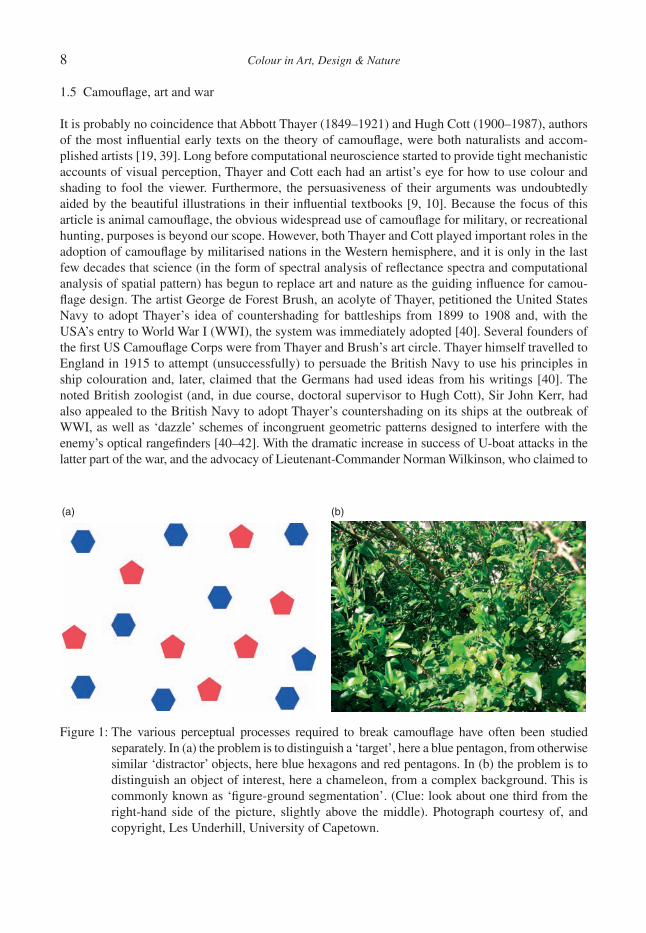
There are two traditions in the human visual search literature: the fi rst considers search for a target among ‘distractors’ (Fig. 1a). These are discrete non-target objects, already segmented from the background in early visual processing, that are confusable to differing degrees with the target and each other [37]. The other tradition (of particular concern in the AI approach to vision) focuses on the segmentation process itself: how are objects distinguished from the background in the fi rst place (Fig. 1b)? There is increasing realisation that it is unrealistic to treat segmentation and object recog-nition (and confusion with distractors) as serial processes with the fi rst completed before the second can occur [38]. This is something we shall return to later with regard to disruptive colouration, where object recognition takes a central role.
1.4 Camoufl age and computer science
Researchers in artifi cial vision must tackle the same issues that challenge psychologists dealing with human visual systems (feature detection, feature binding, target-background segmentation and object recognition). The difference is that they need not be constrained by features specifi c to human visual systems, either at the receptor level (e.g. spectral sensitivity or spatial distribution) or subse-quent processing. Furthermore, because the goal is implementation of algorithms to achieve effi cient extraction of the desired information, accounts of vision in computer science must always be rooted in specifi ed mechanisms. For these reasons, approaches developed in computer vision may be par-ticularly useful for understanding animal camoufl age. Until recently, most adaptive accounts of camoufl age have relied on necessary, but weak, tests showing that a given pattern simply improves concealment (not how) and arguments heavily reliant on introspection: the untested assumption that what fools (or appears to fool) the human observer fools the predator. Consider these quotes from popular biology textbooks (italics added): ‘patterns . . . detract the eye from the animal’s outline’, ‘patterns . . . which turn attention away from other details and especially from the animal’s outline’. Really? What is the evidence that any of this is going on in the predator’s head? Instead, the way to understand the ‘design features’ of camoufl age is to focus on the mechanisms of predator perception and cognition that the colour patterns are designed to fool. Once the putative function (adaptive advantage) of a colour pattern is specifi ed at the level of a neural mechanism in the predator’s nerv-ous system, that function can be tested in precise and powerful ways. In addition, and importantly, taking a computational approach minimises the temptation to impute higher cognitive processes than necessary to explain the phenomenon.
8 Colour in Art, Design & Nature
1.5 Camoufl age, art and war
It is probably no coincidence that Abbott Thayer (1849–1921) and Hugh Cott (1900–1987), authors of the most infl uential early texts on the theory of camoufl age, were both naturalists and accom-plished artists [19, 39]. Long before computational neuroscience started to provide tight mechanistic accounts of visual perception, Thayer and Cott each had an artist’s eye for how to use colour and shading to fool the viewer. Furthermore, the persuasiveness of their arguments was undoubtedly aided by the beautiful illustrations in their infl uential textbooks [9, 10]. Because the focus of this article is animal camoufl age, the obvious widespread use of camoufl age for military, or recreational hunting, purposes is beyond our scope. However, both Thayer and Cott played important roles in the adoption of camoufl age by militarised nations in the Western hemisphere, and it is only in the last few decades that science (in the form of spectral analysis of refl ectance spectra and computational analysis of spatial pattern) has begun to replace art and nature as the guiding infl uence for camou-fl age design. The artist George de Forest Brush, an acolyte of Thayer, petitioned the United States Navy to adopt Thayer’s idea of countershading for battleships from 1899 to 1908 and, with the USA’s entry to World War I (WWI), the system was immediately adopted [40]. Several founders of the fi rst US Camoufl age Corps were from Thayer and Brush’s art circle. Thayer himself travelled to England in 1915 to attempt (unsuccessfully) to persuade the British Navy to use his principles in ship colouration and, later, claimed that the Germans had used ideas from his writings [40]. The noted British zoologist (and, in due course, doctoral supervisor to Hugh Cott), Sir John Kerr, had also appealed to the British Navy to adopt Thayer’s countershading on its ships at the outbreak of WWI, as well as ‘dazzle’ schemes of incongruent geometric patterns designed to interfere with the enemy’s optical rangefi nders [40–42]. With the dramatic increase in success of U-boat attacks in the latter part of the war, and the advocacy of Lieutenant-Commander Norman Wilkinson, who claimed to
Figure 1: The various perceptual processes required to break camoufl age have often been studied separately. In (a) the problem is to distinguish a ‘target’, here a blue pentagon, from otherwise similar ‘distractor’ objects, here blue hexagons and red pentagons. In (b) the problem is to distinguish an object of interest, here a chameleon, from a complex background. This is commonly known as ‘fi gure-ground segmentation’. (Clue: look about one third from the right-hand side of the picture, slightly above the middle). Photograph courtesy of, and copyright, Les Underhill, University of Capetown.
(a) (b)

Colour in Art, Design & Nature 9
have arrived at the concept of distraction camoufl age independently of Thayer, the British Admiralty adopted dazzle painting on ships in 1917 [42]. With the advent of alternative ranging devices and sonar, the more bizarre naval camoufl age schemes were dropped after WWI and camoufl age seems have rapidly ceased to be in vogue, no doubt helped by the cost and complication of applying multiple paint schemes. The University of Glasgow holds a letter from Hugh Cott to Winston Churchill, imploring that the principles of camoufl age be taken seriously in military colour schemes, so it seems that by World War II (WWII) the principles of concealment needed to be relearned, and the arguments used by Thayer decades earlier had to be repeated.
At the start of WWII, the Italian army stands out as having a disruptive patterned material (tela mimetizzata) used, initially, for tents but subsequently uniforms. Most European armies at the time had drab, monochrome khaki, grey or green uniforms and, during the war, although widespread on vehicles, camoufl age uniforms tended to be restricted to elite units or specifi c theatres of war [42, 43]. Ubiquitous military camoufl age is therefore a modern phenomenon and it is interesting to see that the designs are infl uenced by similar pressures to that imposed by natural selection on animal colouration. Obviously, the perception of the viewer is paramount so, just as insect camoufl age needs to extend into the ultraviolet because birds can see UV [23, 44, 45], so must modern military uniforms have a low infra-red signature to fool night-vision equipment [43]. Evolution can only improve on existing designs through mutation and selection from standing genetic variation, so every organism is a weighted combination of phylogenetic history and recent adaptation. For this reason, comparative analyses of adaptation must separate similarities due to phylogeny (evolution-ary relatedness) from those due to common selective pressures [46]. Similarly, military camoufl age owes much to the history of the nation and army concerned, and not just what is best for a particular background; otherwise, one might imagine that all armies in a particular theatre of war would have similar colour schemes. National conservatism in camoufl age design is evident: the brush strokes in the original WWII paratrooper’s Denison smock are still apparent in the current British army ‘dis-ruptive pattern material’, a fondness for pointillism is seen in German camoufl age from WWI to WWII to the ‘Flecktarn’ of the modern German army, while the modern French army uses blocky patterns similar to those employed by Cubist artists on French military equipment in WWI [19, 42]. Part of the diversity of camoufl age designs is also due to the confl icting pressure of the need to dis-tinguish friend from foe (in WWII the US Marines abandoned their ‘frogskin’ camoufl age pattern soon after the Normandy landings because of similarity to Waffen SS schemes; in the fi rst Gulf War, the British army swapped from a four-colour to a two-colour desert scheme, because it had previ-ously sold the old design to the Iraqi army [42, 43]). In addition, it is tempting to think that, just as sexual selection can favour animal signals more elaborate than that needed for effi cient transfer of information [47], so too some military camoufl age designs do more than simply conceal the subject whilst being identifi able as ‘friend’. The pixellated patterns of modern digital designs, such as the Canadian Army CADPAT or US Marine MARPAT, clearly cannot have a function in camoufl age; natural backgrounds are not pixellated, so the success of the camoufl age relies on being seen at suf-fi cient distance for the individual colour blocks to be invisible. Thus, these pixellated patterns seem to have a signalling component: a digital design tells the enemy (and probably, even more impor-tantly, the soldiers wearing it) that this army has the latest and best technology available to it.
2 TYPES OF CAMOUFLAGEHistorical and contemporary accounts classify camoufl age in different ways, the most popular break-down being background matching, disruptive colouration and masquerade. The ability to change colours rapidly to match one’s surroundings, dynamic camoufl age, is sometimes treated as a sepa-rate category. However, we do not do so here because the goal of this article is to explore how
10 Colour in Art, Design & Nature
different types of camoufl age exploit different aspects of the viewer’s perception, rather than the speed of change or mechanisms of colour production. Dynamic camoufl age is forever associated in the public’s eye with the chameleon (Fig. 1b), and assimilated into our language as synonymous with blending to match the current situation. In fact, chameleons appear to mainly use colour change in signalling to conspecifi cs [48] and the true masters of dynamic camoufl age are the cephalopods, most notably some species of octopus and cuttlefi sh [49, 50]. Such abilities would seem to be highly advantageous, but are seen in relatively few organisms. Some are undoubtedly constrained by the nature of the epidermal covering (e.g. feathers and fur have their pigment content fi xed at the time of growth) or the lack of specialised pigment cells or the nervous control necessary to effect fast changes. Even if not an absolute constraint (i.e. physiologically or genetically impossible), the (untested) assumption is that many animals have a lifestyle and/or environment where rapid change is not suffi ciently advantageous for natural selection to have overcome such constraints.
2.1 Masquerade
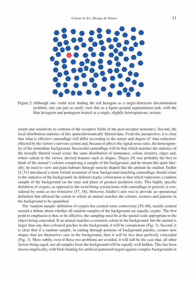
Cott (1940) distinguished between resemblance to a specifi c background object and a generalised resemblance to the background. The former is now commonly referred to as masquerade, the latter as background matching or crypsis [51]. It might seem like an entirely semantic point whether, say, a leaf-like body form constitutes resemblance to a specifi c object (a.k.a. masquerade) or represents background matching. However, in principle, the two types of concealment are interfering with predator perception in different ways. Masquerade, mimicry of a specifi c background object (e.g. a leaf or bird’s dropping), depends on incorrect object recognition rather a failure to segment an object from the background. As such, the necessary perceptual models for understanding masquerade are those relevant to target-distractor discrimination rather than with those related to target segmentation from a complex textured background. An animal adopting masquerade would, if placed on a highly contrasting background, still be ignored by the viewer because, it has not been recognised as being a signifi cant object (e.g. for a predator, suitable prey). Conversely, an animal reliant on back-ground matching would, if similarly treated, be revealed and cease to be protected. This thought experiment, to our knowledge, has never been performed and, in practice, a masquerade-type camoufl age would often benefi t from a failure of segmentation and detection, in common with back-ground matching. Indeed, particular backgrounds can sometimes be classifi ed as a set of distractor objects or as a homogeneous texture (Fig. 2), and human, and animal, brains are liable to switch between different percepts.
2.2 Background matching
Intuitively the simplest form of camoufl age to understand, background matching or crypsis [51–53] succeeds when the viewer does not discriminate the object from its background: a failure of target-ground (or fi gure-ground) segmentation. Lack of object recognition is not implied; the viewer does not even detect that an object is there, because it blends into the background. Many classic examples of natural selection in the wild have been attributed to background matching under predation risk, most famously, or infamously [54, 55], the peppered moth Biston betularia. What is less clear, and highlighted in recent reviews [56], is just what aspects of the background need to be matched, and how well?
Whether an object matches the background depends on (at least) two things. First, how the view-er’s nervous system fi lters the incoming information, both spectrally (from a continuous spectrum of light to, in humans during daylight, three photoreceptor outputs) and spatially (dependent upon the
Colour in Art, Design & Nature 11
extent and sensitivity to contrast of the receptive fi elds of the post-receptor neurones). Second, the local distribution statistics of this spatiochromatically fi ltered data. From this perspective, it is clear that what is effective camoufl age will differ according to the nature and degree of ‘data reduction’ effected by the viewer’s nervous system and, because it affects the signal:noise ratio, the heterogene-ity of the immediate background. Successful camoufl age will be that which matches the statistics of the neurally fi ltered visual scene: the same distribution of luminance, colour, textures, edges and, where salient to the viewer, derived features such as shapes. Thayer [9] was probably the fi rst to think of the animal’s colours comprising a sample of the background, and he meant this quite liter-ally; he used to view and paint habitats through stencils shaped like the animals he studied. Endler [5, 51] introduced a more formal treatment of how background-matching camoufl age should relate to the statistics of the background; he defi ned cryptic colouration as that which represents a random sample of the background (at the time and place of greatest predation risk). This highly specifi c defi nition of crypsis, as opposed to the word being synonymous with camoufl age in general, is con-sidered by some as too restrictive [57, 58]. However, Endler’s aim was to provide an operational defi nition that allowed the extent to which an animal matches the colours, textures and patterns in the background to be quantifi ed.
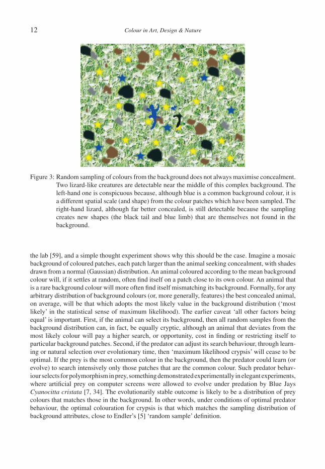
The ‘random sample’ defi nition of crypsis has created some controversy [59, 60], mainly centred around a debate about whether all random samples of the background are equally cryptic. The fi rst point to emphasise is that, to be effective, the sampling must be at the spatial scale appropriate to the object being concealed. If an animal matches a common colour in the background, but the animal is larger than any thus-coloured patches in the background, it will be conspicuous (Fig. 3). Second, it is clear that if a random sample, in cutting through portions of background patches, creates new shapes that are themselves rare in the background, then it will be less than perfectly concealed (Fig. 3). More subtly, even if these two problems are avoided, it will still be the case that, all other factors being equal, not all samples from the background will be equally well hidden. This has been shown empirically, with birds hunting for artifi cial patterned targets against complex backgrounds in
Figure 2: Although one could treat fi nding the red hexagon as a target-distractor discrimination problem, one can just as easily view this as a fi gure-ground segmentation task, with the blue hexagons and pentagons treated as a single, slightly heterogeneous, texture.
12 Colour in Art, Design & Nature
the lab [59], and a simple thought experiment shows why this should be the case. Imagine a mosaic background of coloured patches, each patch larger than the animal seeking concealment, with shades drawn from a normal (Gaussian) distribution. An animal coloured according to the mean background colour will, if it settles at random, often fi nd itself on a patch close to its own colour. An animal that is a rare background colour will more often fi nd itself mismatching its background. Formally, for any arbitrary distribution of background colours (or, more generally, features) the best concealed animal, on average, will be that which adopts the most likely value in the background distribution (‘most likely’ in the statistical sense of maximum likelihood). The earlier caveat ‘all other factors being equal’ is important. First, if the animal can select its background, then all random samples from the background distribution can, in fact, be equally cryptic, although an animal that deviates from the most likely colour will pay a higher search, or opportunity, cost in fi nding or restricting itself to particular background patches. Second, if the predator can adjust its search behaviour, through learn-ing or natural selection over evolutionary time, then ‘maximum likelihood crypsis’ will cease to be optimal. If the prey is the most common colour in the background, then the predator could learn (or evolve) to search intensively only those patches that are the common colour. Such predator behav-iour selects for polymorphism in prey, something demonstrated experimentally in elegant experiments, where artifi cial prey on computer screens were allowed to evolve under predation by Blue Jays Cyanocitta cristata [7, 34]. The evolutionarily stable outcome is likely to be a distribution of prey colours that matches those in the background. In other words, under conditions of optimal predator behaviour, the optimal colouration for crypsis is that which matches the sampling distribution of background attributes, close to Endler’s [5] ‘random sample’ defi nition.
Figure 3: Random sampling of colours from the background does not always maximise concealment. Two lizard-like creatures are detectable near the middle of this complex background. The left-hand one is conspicuous because, although blue is a common background colour, it is a different spatial scale (and shape) from the colour patches which have been sampled. The right-hand lizard, although far better concealed, is still detectable because the sampling creates new shapes (the black tail and blue limb) that are themselves not found in the background.

Colour in Art, Design & Nature 13
Whilst the requirements for optimal background pattern matching can thus be stated simply, none of the published models applied to animal colouration allow one to perform the necessary calcula-tions of ‘match’. Successful receptor-based models of colour discrimination [61] and statistical methods for comparing sets of colour patches [62] do not address spatial pattern, and methods for comparing the distribution of colour patch types and sizes [5] do not capture the attributes of patch shape or relative position. Physiologically based (as opposed to AI) models incorporating both spa-tial and chromatic attributes of visual scenes are relative new [63]. Based on low-level properties of the retinal cone cells and post-receptor processing, measured psychophysically, such models allow one to quantify the luminance, colour and textural differences that a would-be camoufl age breaker must exploit. Spatiochromatic models have yet to be tested in the context of camoufl age breaking, but offer promise for application to non-human animals because the models are based only on low-level properties of vision, properties that can be readily measured.
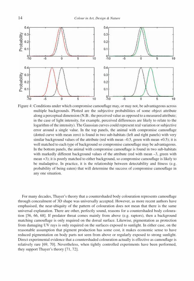
2.2.1 Multiple backgrounds and compromise crypsisWhile Thayer [9] noted that a habitat generalist could not be perfectly camoufl aged against all back-grounds, it was Merilaita who fi rst formalised the conditions under which compromise camoufl age could have higher fi tness than a specialist strategy of matching one background type [6, 64]. Although compromise camoufl age can be seen as an alternative to Endler’s ‘random sample’ defi nition of optimal crypsis, Endler himself had earlier clearly considered how compromise crypsis could some-times be favoured: ‘Species that are not as specifi c for background habitats show a lower mean crypsis than specialists because their patterns must be some sort of average of all backgrounds against which they rest, and cannot be very cryptic on any single background. The semi-generalists show a higher mean crypsis than the generalists, probably because it is easier to resemble two habi-tats than many’ [5]. As captured by Merilaita et al.’s [6] model and similar approaches that allow for changes in predator behaviour [65], in the event of a likely trade-off between the effectiveness of a given camoufl age in two habitats, a compromise strategy is favoured when the trade-off is convex (improved camoufl age in one habitat does not decrease concealment in the other by a proportionate amount). Ruxton et al. [56] reason that this is more likely for habitats that are visually more similar, and we can use a toy model to see why (Fig. 4). However, implementation and testing of more rigor-ous perceptual models, where one can predict the shape of the trade-off function from visual attributes of the background, has not been attempted.
2.2.2 Countershading and concealmentMany animals are darker on their backs than their bellies. Another of Abbott Thayer’s early insights was that this dorso-ventral pattern could represent camoufl age in the face of illumination from above [8]. Thayer realised that a uniformly coloured object, even if it matched the background col-our perfectly, would receive greater irradiance on its upper surface and its underside would be in shadow. Just as an artist would use a dorso-ventral shading to create the illusion of solidity in a 2D drawing, so a real object could be revealed by its differential illumination and self-shading (Fig. 5). Thayer [8] proposed that a countershaded pattern, inverting the gradient of illumination, would counterbalance the differential shading and so disguise 3D form. At one level, this could be consid-ered a form of background matching because there is a better match to the refl ected radience of the background when viewed from above or, in aquatic environments, where the veiling light represents a background, the side. At another level, and one which Thayer himself emphasised, the disguising of 3D form itself – the ‘fl attening’ of the object – could interfere with object recognition [56, 66, 67]. As such, it could be classed as a separate type of camoufl age, with certain commonalities to both background matching and disruptive colouration.
14 Colour in Art, Design & Nature
For many decades, Thayer’s theory that a countershaded body colouration represents camoufl age through concealment of 3D shape was universally accepted. However, as more recent authors have emphasised, the near-ubiquity of the pattern of colouration does not mean that there is the same universal explanation. There are other, perfectly sound, reasons for a countershaded body coloura-tion [56, 66, 68]. If predator threat comes mainly from above (e.g. raptors), then a background matching camoufl age is only required on the dorsal surface. Likewise, pigmentation as protection from damaging UV rays is only required on the surfaces exposed to sunlight. In either case, on the reasonable assumption that pigment production has some cost, it makes economic sense to have reduced pigmentation on body parts not seen from above or regularly exposed to strong sunlight. Direct experimental evidence that a countershaded colouration actually is effective as camoufl age is relatively rare [69, 70]. Nevertheless, when tightly controlled experiments have been performed, they support Thayer’s theory [71, 72].
Figure 4: Conditions under which compromise camoufl age may, or may not, be advantageous across multiple backgrounds. Plotted are the subjective probabilities of some object attribute along a perceptual dimension (N.B:. the perceived value as opposed to a measured attribute; in the case of light intensity, for example, perceived differences are likely to relate to the logarithm of the intensity). The Gaussian curves could represent real variation or subjective error around a single value. In the top panels, the animal with compromise camoufl age (dotted curve with mean zero) is found in two sub-habitats (left and right panels) with very similar background values of the attribute (red with mean –0.5, green with mean +0.5); it is well matched to each type of background so compromise camoufl age may be advantageous. In the bottom panels, the animal with compromise camoufl age is found in two sub-habitats with markedly different background values of the attribute (red with mean –3, green with mean +3); it is poorly matched to either background, so compromise camoufl age is likely to be maladaptive. In practice, it is the relationship between detectability and fi tness (e.g. probability of being eaten) that will determine the success of compromise camoufl age in any one situation.

Colour in Art, Design & Nature 15
2.3 Disruptive colouration
The US Army Field Manual on Camoufl age, Concealment and Decoys (FM-3, Department of the Army, Washington, DC, 30 August, 1999) defi nes disruption as ‘altering or eliminating regular pat-terns and target characteristics’. Whilst disruptive colouration may work in tandem with background matching [73, 74], the key distinction is that it functions through intereference with object or feature recognition rather than detection per se [58, 75]. In fact, several phenomena are grouped under the heading ‘disruptive’ colouration (clear from the fact that the aforementioned FM-3 includes use of
Figure 5: The homogeneous grey cylinder (a), when lit from above (b), is revealed by the gradient in refl ected light created by self-shadowing. The countershaded cylinder (c), which is darker on top in a gradient that counterbalances the potential illumination, when lit from above (d) has fewer clues to its 3D form.
16 Colour in Art, Design & Nature
pyrotechnics and fl ares under this heading, and Thayer frequently used the term ‘dazzle coloura-tion’), and these probably exploit different perceptual mechanisms.
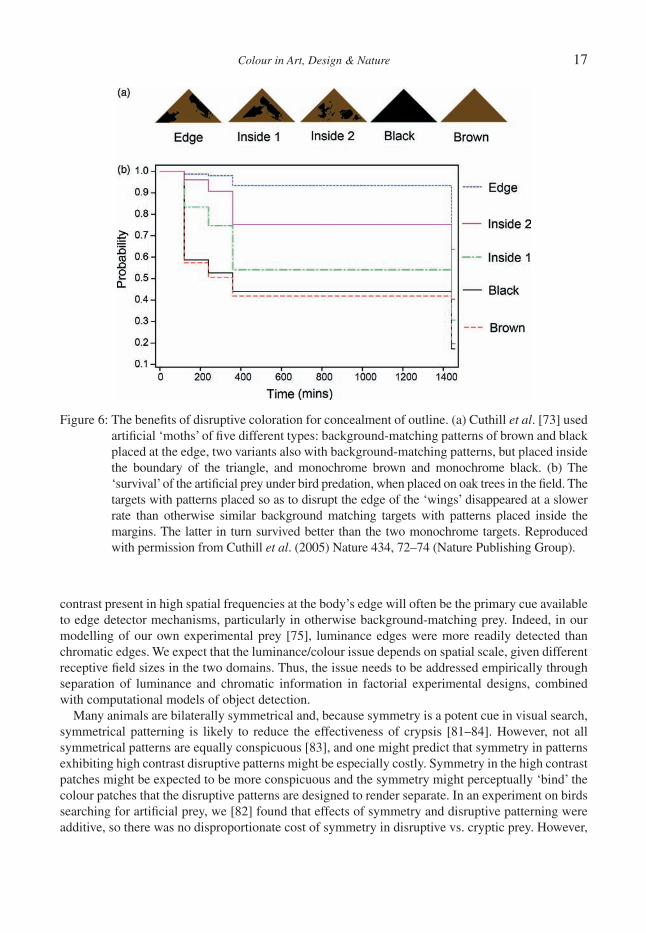
2.3.1 Outline disguiseThe most familiar role of disruptive patterns, in military or animal camoufl age, is to break up the outline of the body, the latter (on account of mismatches in the spatial phase of patterns, or shadows) potentially revealing an animal even if it perfectly matches the background [8, 9]. Merilaita [76] analysed the distribution of white patches on a marine isopod (Idotea baltica) and showed that they intercepted the edge of the animal’s body more than expected by chance. Thus, although the colour of the animal suggests simply crypsis (it is brown with white spots on a brown alga which has white spots due to epizoites living on its surface), the distribution of colours suggests an additional use of disruptive colouration. That placement of constrasting colour patches at a body’s periphery enhances concealment above and beyond similarly background-matching colours placed non-peripherally, was tested by Cuthill et al. [73]. They used small triangular notionally moth-like targets, baited with dead mealworms, pinned to oak trees throughout natural woodlands; they then tracked the disap-pearance of the mealworms over time. The higher ‘survival’ of targets with edge-disrupting patterns compared to targets without peripheral patterns, and of oak-like patterned targets compared to mon-ochrome brown or black, illustrates the benefi ts of both disruptive colouration and background matching (Fig. 6).
Through computational modelling, Stevens and Cuthill [75] have shown how high contrast bound-aries between disruptive pattern elements at a body’s outline interfere with detection of the (weaker) true edge. Disruptive colouration can be said to exploit edge-detection mechanisms to create false bounding contours, and so interfere with object recognition by outline. Their model, parameterised for bird vision, successfully predicted the survival of artifi cial prey under avian predation in the fi eld (Fig. 6). Cuthill et al. [73] also showed that shades that contrasted more strongly with each other were more effective than lower-contrast shades, just as Thayer [9] and Cott [10] had proposed. Cott went further and, in what he termed the principles of differential blending combined with maximum disruptive contrast, he proposed that some colours on an animal should blend with the background, whereas others should stand out (maximally). That is, disruptive patterns may be more effective in inhibiting object recognition if some colour patches are highly conspicuous. Whether this is so remains unclear, there being evidence both for [77] and against the proposition [74, 78]. We call this the Friesian Cow Paradox (on a suggestion from Daniel Osorio): on the strong theory of disruptive colouration, a black-and-white Friesian cow should be better concealed on a black-and-grey rocky background than would a black-and-grey cow, because, while the black blends with the background, white creates the maximum disruptive contrast with black. This seems paradoxical because our intuition suggests that the conspicuousness of the white would override any benefi ts of disrupted object recognition; at the very least we might expect the conspicuous but unrecognised white objects to provoke closer inspection, at which point the cow is revealed. However, maybe other animals have less sophisticated object recognition alogorithms, or are more wary and less curious, than humans. With only three experiments that have ever addressed this issue [74, 77, 78], and opposite conclu-sions drawn, this issue demands rigorous investigation [79].
Another issue that remains to be examined is the relative effi cacy of chromatic vs. luminance contrast between disruptive colour patches. Schaefer and Stobbe [77], based on analysis of the con-trasts present in their artifi cial prey, concluded that chromatic contrast was probably more important. If colour is a more reliable cue to surface properties than luminance (because of variable illumination; [80]), then an animal with homogeneous colour may be more detectable than one of homogeneous luminance. On this argument, chromatic disruptive patterns may be particularly effective. Yet luminance
Colour in Art, Design & Nature 17
contrast present in high spatial frequencies at the body’s edge will often be the primary cue available to edge detector mechanisms, particularly in otherwise background-matching prey. Indeed, in our modelling of our own experimental prey [75], luminance edges were more readily detected than chromatic edges. We expect that the luminance/colour issue depends on spatial scale, given different receptive fi eld sizes in the two domains. Thus, the issue needs to be addressed empirically through separation of luminance and chromatic information in factorial experimental designs, combined with computational models of object detection.
Many animals are bilaterally symmetrical and, because symmetry is a potent cue in visual search, symmetrical patterning is likely to reduce the effectiveness of crypsis [81–84]. However, not all symmetrical patterns are equally conspicuous [83], and one might predict that symmetry in patterns exhibiting high contrast disruptive patterns might be especially costly. Symmetry in the high contrast patches might be expected to be more conspicuous and the symmetry might perceptually ‘bind’ the colour patches that the disruptive patterns are designed to render separate. In an experiment on birds searching for artifi cial prey, we [82] found that effects of symmetry and disruptive patterning were additive, so there was no disproportionate cost of symmetry in disruptive vs. cryptic prey. However,
Figure 6: The benefi ts of disruptive coloration for concealment of outline. (a) Cuthill et al. [73] used artifi cial ‘moths’ of fi ve different types: background-matching patterns of brown and black placed at the edge, two variants also with background-matching patterns, but placed inside the boundary of the triangle, and monochrome brown and monochrome black. (b) The ‘survival’ of the artifi cial prey under bird predation, when placed on oak trees in the fi eld. The targets with patterns placed so as to disrupt the edge of the ‘wings’ disappeared at a slower rate than otherwise similar background matching targets with patterns placed inside the margins. The latter in turn survived better than the two monochrome targets. Reproduced with permission from Cuthill et al. (2005) Nature 434, 72–74 (Nature Publishing Group).
18 Colour in Art, Design & Nature
we used disruptive patterns in which all colour elements blended with (different) components of the background, and so the effect of symmetry on patterns with maximum disruptive contrast (as defi ned above) remain untested. Furthermore, all previous experiments (op. cit. [81–83]) have only com-pared perfectly symmetrical with completely asymmetrical prey. Crucially, it is unknown whether low levels of asymmetry in camoufl age reduce detection chances, or are even detectable [85], so maybe, from a starting point of high symmetry, the strength of selection for asymmetrical cryptic colouration is negligible.
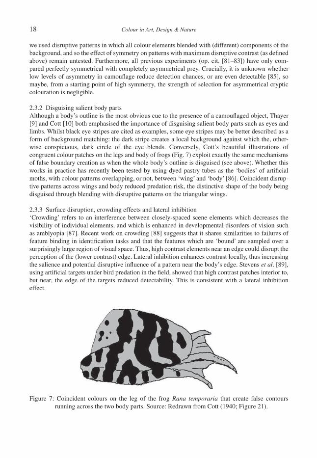
2.3.2 Disguising salient body partsAlthough a body’s outline is the most obvious cue to the presence of a camoufl aged object, Thayer [9] and Cott [10] both emphasised the importance of disguising salient body parts such as eyes and limbs. Whilst black eye stripes are cited as examples, some eye stripes may be better described as a form of background matching: the dark stripe creates a local background against which the, other-wise conspicuous, dark circle of the eye blends. Conversely, Cott’s beautiful illustrations of congruent colour patches on the legs and body of frogs (Fig. 7) exploit exactly the same mechanisms of false boundary creation as when the whole body’s outline is disguised (see above). Whether this works in practice has recently been tested by using dyed pastry tubes as the ‘bodies’ of artifi cial moths, with colour patterns overlapping, or not, between ‘wing’ and ‘body’ [86]. Coincident disrup-tive patterns across wings and body reduced predation risk, the distinctive shape of the body being disguised through blending with disruptive patterns on the triangular wings.
2.3.3 Surface disruption, crowding effects and lateral inhibition‘Crowding’ refers to an interference between closely-spaced scene elements which decreases the visibility of individual elements, and which is enhanced in developmental disorders of vision such as amblyopia [87]. Recent work on crowding [88] suggests that it shares similarities to failures of feature binding in identifi cation tasks and that the features which are ‘bound’ are sampled over a surprisingly large region of visual space. Thus, high contrast elements near an edge could disrupt the perception of the (lower contrast) edge. Lateral inhibition enhances contrast locally, thus increasing the salience and potential disruptive infl uence of a pattern near the body’s edge. Stevens et al. [89], using artifi cial targets under bird predation in the fi eld, showed that high contrast patches interior to, but near, the edge of the targets reduced detectability. This is consistent with a lateral inhibition effect.
Figure 7: Coincident colours on the leg of the frog Rana temporaria that create false contours running across the two body parts. Source: Redrawn from Cott (1940; Figure 21).

Colour in Art, Design & Nature 19
2.3.4 Distraction of attentionWhile placing contrasting colour patches at the body’s edge or on prominent features are the most obvious uses of disruptive colouration, other phenomena are discussed under the same banner. For example, Thayer [9] also used the term ‘dazzle colouration’ [19, 39, 41] and Endler [79], like many before, considered that ‘conspicuous elements distract the predator’s attention’. The explanations we discussed under ‘outline disguise’, namely, the exploitation of edge-detection mechanisms, are lia-ble to be pre-attentive. However, colours that act via distraction of attention might be effective even if they did not occur on the body edge. Therefore, like other recent authors [57, 89], we feel that there are disruptive effects that potentially exploit different mechanisms from those reliant on edge detectors. One is the use of high contrast repetitive patterns placed at irregular angles to interfere with motion perception and target tracking [90], as in the WWI warships discussed earlier. However, ‘dazzle’ marks could work in static camoufl age via (at least) two mechanisms.
Scenes are not analysed in a single process, but rather are inspected by an attentional mechanism which fi lters information at any one time and scene location. Attention is required for most object recognition tasks, and its deployment in humans is usually studied by measuring eye movements. Such eye movements are task-relevant and lead to little memory for previously-inspected informa-tion [91, 92]. The effects of camoufl age on eye movements has only recently received attention [93], but we posit that, when an object is effectively camoufl aged, eye movements to detect it will be more widely distributed, and more numerous. Thus (for human observers), eye tracking can provide a rich description of the visual demands of an object localisation and recognition task. If high contrast colour patches aid camoufl age because they distract attention from the features of objects that aid recognition (e.g. boundaries, eyes), then we predict eye movements would be drawn to the former and, crucially, attend to boundaries, eyes, etc. less than in the absence of the distraction features. Importantly, object recognition must be impaired or the theory fails. This specifi c hypothesis on the mechanism involved is yet to be tested, but in fact the evidence that any natural camoufl age marks act through distraction of attention is surprisingly sparse. Dimitrova et al. [94], in aviary experi-ments on blue tits (Cyanistes caeruleus) hunting for artifi cial prey, have shown that search times for prey with high contrast marks on them were longer than for similar prey that actually matched the background better. This could be a distraction effect, but the conspicuousness needed to distract attention would itself seem to be costly if it draws a predator to investigate a location that it other-wise might ignore. Indeed, Stevens et al. [95] found that conspicuous markings applied to otherwise cryptic artifi cial prey, in the fi eld, reduced their survival. More generally, if conspicuous markings constitute a reliable predictor of the presence of a prey item, it would seem plausible that predators would learn this and any distraction effect would become irrelevant. Perhaps distraction marks could be effective if similar colours and shapes occur in the background, or on non-prey objects, at suffi -cient frequency that predators do not learn that they predict prey presence.
3 CONCLUSIONS AND WIDER SIGNIFICANCEBringing computational and psychological approaches to bear on an age-old biological question, the adaptive role of colouration in concealment, has clear benefi ts, but the fl ow of ideas is not one-way. Because visual systems have evolved to solve real-world problems, of which camoufl age breaking is one, then many design features of human vision should be explicable with reference to the ecology of humans and other primates. The evolution of trichromacy as an adaptation to frugivory or folivory is a clear example [24]; the attempt to relate vision to the statistics of natural scenes is another [96–98]. An evolutionary perspective can also explain features of visual systems that are not obvious solutions to immediate problems, but instead phylogenetic constraints (or rather, legacies of ances-tral solutions to different problems). Some of the (many) differences between human and, for

20 Colour in Art, Design & Nature
example, bird colour vision may be legacies of our dichromatic, largely nocturnal, mammalian past, where visual pigments, retinal oil droplets and photoreceptor specialisation for luminance and chro-matic vision were lost [22]. Just as we seek to modernise the biological study of colouration through infusion of the theory and technology of computational neuroscience, so we wish to free the latter of the (usually unrecognised) constraints of modelling the world through human eyes.
ACKNOWLEDGEMENTSWe would like to thank the Biotechnology and Biological Sciences Research Council, UK, for funding our research and colleagues, particularly Neill Campbell, Martin Stevens, John Endler and Sami Merilaita, for discussions on many of the ideas we have written about.
REFERENCES [1] Darwin, E., Zoonomia, J. Johnson: London, 1794 (reprinted by Project Gutenberg www.
gutenberg.org). [2] Wallace, A.R., Darwinism. An Exposition of the Theory of Natural Selection with Some of its
Applications, Macmillan & Co: London, 1889. [3] Poulton, E.B., The Colours of Animals: Their Meaning and Use. Especially Considered in the
Case of Insects, 2nd edn, The International Scientifi c Series, vol. LXVIII, Kegan Paul, Trench Trübner & Co. Ltd.: London, 1890.
[4] Beddard, F.E., Animal Coloration; An Account of the Principle Facts and Theories Relating to the Colours and Markings of Animals, 2nd edn, Swan Sonnenschein: London, 1895.
[5] Endler, J.A., Progressive background matching in moths, and a quantitative measure of cryp-sis. Biological Journal of the Linnean Society, 22(3), pp. 187–231, 1984.
[6] Merilaita, S., Tuomi, J. & Jormalainen, V., Optimization of cryptic coloration in heterogeneous habitats. Biological Journal of the Linnean Society, 67(2), pp. 151–161, 1999.
[7] Bond, A.B. & Kamil, A.C., Visual predators select for crypticity and polymorphism in virtual prey. Nature, 415, pp. 609–613, 2002.
[8] Thayer, A.H., The law which underlies protective coloration. The Auk, 13, pp. 477–482, 1896.
[9] Thayer, G.H., Concealing-Coloration in the Animal Kingdom: An Exposition of the Laws of Disguise Through Color and Pattern: Being a Summary of Abbott H. Thayer’s Discoveries, Macmillan: New York, 1909.
[10] Cott, H.B., Adaptive Coloration in Animals, Methuen & Co. Ltd.: London, 1940.[11] Rolls, E.T. & Deco, G., Computational Neuroscience of Vision, Oxford University Press:
Oxford, 2002.[12] Bennett, A.T.D., Cuthill, I.C. & Norris, K.J., Sexual selection and the mismeasure of color.
American Naturalist, 144(5), pp. 848–860, 1994.[13] Endler, J.A., On the measurement and classifi cation of colour in studies of animal colour pat-
terns. Biological Journal of the Linnean Society, 41(4), pp. 315–352, 1990.[14] Endler, J.A., Signals, signal conditions, and the direction of evolution. American Naturalist,
139(Suppl.), pp. S125–S153, 1992.[15] Guilford, T. & Dawkins, M.S., Receiver psychology and the evolution of animal signals. Ani-
mal Behaviour, 42, pp. 1–14, 1991.[16] Ryan, M.J. & Keddy-Hector, A., Directional patterns of female mate choice and the role of
sensory biases. American Naturalist, 139, pp. S4–S35, 1992.[17] Endler, J.A. & Basolo, A.L., Sensory ecology, receiver biases and sexual selection. Trends in
Ecology and Evolution, 13(10), pp. 415–420, 1998.
Colour in Art, Design & Nature 21
[18] ten Cate, C. & Rowe, C., Biases in signal evolution: learning makes a difference. Trends in Ecology and Evolution, 22(7), pp. 380–387, 2007.
[19] Behrens, R.R., False Colors: Art, Design and Modern Camoufl age, Bobolink Books: Dysart, Iowa, 2002.
[20] Behrens, R.R., Camoufl age, art and Gestalt. North American Review, 265(4), pp. 8–18, 1980.[21] Behrens, R.R., Visual art and camoufl age. Leonardo, 11(3), pp. 203–204, 1978.[22] Cuthill, I.C., Color Perception, in: Bird Coloration. Mechanisms and Measurement, eds
G.E. Hill & K.J. McGraw, vol. 1, Harvard University Press: Cambridge MA, pp. 3–40, 2006.[23] Cuthill, I.C., Partridge, J.C., Bennett, A.T.D., Church, S.C., Hart, N.S. & Hunt, S., Ultraviolet
vision in birds. Advances in the Study of Behaviour, 29, pp. 159–214, 2000.[24] Surridge, A.K., Osorio, D. & Mundy, N.I., Evolution and selection of trichromatic vision in
primates. Trends in Ecology & Evolution, 18(4), pp. 198–205, 2003.[25] Vorobyev, M., Coloured oil droplets enhance colour discrimination. Proceedings of the Royal
Society of London B, 270(1521), pp. 1255–1261, 2003.[26] Vorobyev, M., Osorio, D., Bennett, A.T.D., Marshall, N.J. & Cuthill, I.C., Tetrachromacy, oil drop-
lets and bird plumage colours. Journal of Comparative Physiology A, 183, pp. 621–633, 1998.[27] Lovell, P.G., Tolhurst, D.J., Parraga, C.A., Baddeley, R., Leonards, U. & Troscianko, J., Stabil-
ity of the color-opponent signals under changes of illuminant in natural scenes. Journal of the Optical Society of America A, 22(10), pp. 2060–2071, 2005.
[28] Lovell, P.G., Tolhurst, D.J., Parraga, C.A., Baddeley, R.J., Leonards, U., Troscianko, J. & Troscianko, T., Opponent channel responses to changes in the illuminant of natural scenes for primates and birds. Perception, 34, pp. 59, 2005.
[29] Osorio, D., Ruderman, D.L. & Cronin, T.W., Estimation of errors in luminance signals encoded by primate retina resulting from sampling of natural images with red and green cones. Journal of the Optical Society of America A, 15(1), pp. 16–22, 1998.
[30] Osorio, D. & Vorobyev, M., Colour vision as an adaptation to frugivory in primates. Proceed-ings of the Royal Society of London B, Biological Sciences, 263, pp. 593–599, 1996.
[31] Jones, C.D. & Osorio, D., Discrimination of orientated visual textures by poultry chicks. Vision Research, 44, pp. 83–89, 2004.
[32] Ghim, M.M. & Hodos, W., Spatial contrast sensitivity of birds. Journal of Comparative Physi-ology A, 192(5), pp. 523–534, 2006.
[33] Troscianko, T., Benton, C.P., Lovell, P.G., Tolhurst, D.J. & Pizlo, Z., Camoufl age and visual perception. Philosophical Transactions of the Royal Society of London B, 364(1516), pp. 449–461, 2009.
[34] Bond, A.B. & Kamil, A.C., Spatial heterogeneity, predator cognition, and the evolution of color polymorphism in virtual prey. Proceedings of the National Academy of Sciences of the United States of America, 103, pp. 3214–3219, 2006.
[35] Pietrewicz, A.T. & Kamil, A.C., Visual detection of cryptic prey by blue jays (Cyanocitta cris-tata). Science, 195, pp. 580–582, 1977.
[36] Pietrewicz, A.T. & Kamil, A.C., Search image formation in the Blue Jay (Cyanocitta cristata). Science, 204, pp. 1332–1333, 1979.
[37] Duncan, J. & Humphreys, G.W., Visual search and stimulus similarity. Psychological Review, 96(3), pp. 433–458, 1989.
[38] Brady, M.J. & Kersten, D., Bootstrapped learning of novel objects. Journal of Vision, 3(6), pp. 413–422, 2003.
[39] Behrens, R.R., The theories of Abbott H. Thayer: father of camoufl age. Leonardo, 21, pp. 291–296, 1988.
22 Colour in Art, Design & Nature
[40] Behrens, R.R., Art & Camoufl age, North American Review: Cedar Falls, Iowa, 1981.[41] Behrens, R.R., The role of artists in ship camoufl age during World War I. Leonardo, 32,
pp. 53–59, 1999.[42] Newark, T., Newark, Q. & Borsarello, J.F., Brassey’s Book of Camoufl age, Brassey’s (UK)
Ltd.: Littlehampton, 1996.[43] Newark, T. & Miller, J., Camoufl age, Thames & Hudson: London, 2007.[44] Church, S.C., Bennett, A.T.D., Cuthill, I.C. & Partridge, J.C., Avian ultraviolet vision and its
implications for insect protective coloration, in: eds H.V. Emden & M. Rothschild, Insect and Bird Interactions, Intercept Press: Andover, pp. 165–184, 2004.
[45] Church, S.C., Bennett, A.T.D., Cuthill, I.C. & Partridge, J.C., Ultraviolet cues affect the foraging behaviour of blue tits. Proceedings of the Royal Society of London B, 265, pp. 1509–1514, 1998.
[46] Harvey, P.H. & Pagel, M.D., The Comparative Method in Evolutionary Biology, Oxford Uni-versity Press: Oxford, 1991.
[47] Andersson, M., Sexual Selection, Princeton University Press: Princeton, NJ, 1994.[48] Stuart-Fox, D. & Moussalli, A., Selection for social signalling drives the evolution of chame-
leon colour change. PLoS Biology, 6(1), pp. e25, 2008.[49] Hanlon, R., Cephalopod dynamic camoufl age. Current Biology, 17(11), pp. R400–R404, 2007.[50] Hanlon, R.T., Forsythe, J.W. & Joneschild, D.E., Crypsis, conspicuous, mimicry and poly-
phenism as antipredator defences of foraging octopuses on Indo-Pacifi c coral reefs, with a method of quantifying crypsis from video tapes. Biological Journal of the Linnean Society, 66, pp. 1–22, 1999.
[51] Endler, J.A., An overview of the relationships between mimicry and crypsis. Biological Jour-nal of the Linnean Society, 16(1), pp. 25–31, 1981.
[52] Endler, J.A., Interactions between predators and prey, in: eds J.R. Krebs & N.B. Davis, Behav-ioural Ecology: an Evolutionary Approach, 3rd edn, Blackwell: Oxford, pp. 169–196, 1991.
[53] Endler, J.A., Frequency-dependent predation, crypsis and aposematic coloration. Philosophi-cal Transactions of the Royal Society of London B, 319(1196), pp. 505–523, 1988.
[54] Cook, L.M., Changing views on melanic moths. Biological Journal of the Linnean Society, 69(3), pp. 431–441, 2000.
[55] Coyne, J.A., Of moths and men: intrigue, tragedy and the peppered moth. Nature, 418(6893), pp. 19–20, 2002.
[56] Ruxton, G.D., Sherratt, T.N. & Speed, M.P., Avoiding Attack, Oxford University Press: Oxford, 2004.
[57] Stevens, M. & Merilaita, S., Animal camoufl age: current issues and new perspectives. Philo-sophical Transactions of the Royal Society of London B, 364, pp. 423–427, 2009.
[58] Stevens, M. & Merilaita, S., Defi ning disruptive coloration and distinguishing its functions. Philosophical Transactions of the Royal Society of London B, 364(1516), pp. 481–488, 2009.
[59] Merilaita, S. & Lind, J., Background-matching and disruptive coloration, and the evolution of cryptic coloration. Proceedings of the Royal Society B, 272, pp. 665–670, 2005.
[60] Stevens, M., Cuthill, I.C., Párraga, C.A. & Troscianko, T., The effectiveness of disruptive col-oration as a concealment strategy, in: eds J.-M. Alonso, et al., Visual Perception (Part 2): Progress in Brain Research, vol. 155, Elsevier: Amsterdam, pp. 49–65, 2006.
[61] Vorobyev, M. & Osorio, D., Receptor noise as a determinant of colour thresholds. Proceedings of the Royal Society of London B, 265, pp. 351–358, 1998.
[62] Endler, J.A. & Meilke, P.W.J., Comparing color patterns as birds see them. Biological Journal of the Linnean Society, 86, pp. 405–431, 2005.
Colour in Art, Design & Nature 23
[63] Lovell, P.G., Párraga, C.A., Troscianko, T., Ripamonti, C. & Tolhurst, D., Evaluation of a multi-scale color model for visual difference prediction. ACM Transactions on Applied Perception, 3, pp. 155–178, 2006.
[64] Merilaita, S., Lyytinen, A. & Mappes, J., Selection for cryptic coloration in a visually heteroge-neous habitat. Proceedings of the Royal Society B, 268(1479), pp. 1925–1929, 2001.
[65] Houston, A.I., Stevens, M. & Cuthill, I.C., Animal camoufl age: compromise or specialize in a 2 patch-type environment? Behavioral Ecology, 18, pp. 769–775, 2007.
[66] Ruxton, G.D., Speed, M.P. & Kelly, D.J., What, if anything, is the adaptive function of coun-tershading? Animal Behaviour, 68, pp. 445–451, 2004.
[67] Rowland, H.M., From Abbott Thayer to the present day: what have we learned about the function of countershading? Philosophical Transactions of the Royal Society of London B, 364(1516), pp. 519–527, 2009.
[68] Kiltie, R.A., Countershading: universally deceptive or deceptively universal. Trends in Ecology & Evolution, 3(1), pp. 21–23, 1988.
[69] Speed, M.P., Kelly, D.J., Davidson, A.M. & Ruxton, G.D., Countershading enhances crypsis with some bird species but not others. Behavioral Ecology, 16, pp. 327–334, 2004.
[70] Edmunds, M. & Dewhirst, R.A., The survival value of countershading with wild birds as pred-ators. Biological Journal of the Linnean Society, 51(4), pp. 447–452, 1994.
[71] Rowland, H.M., Cuthill, I.C., Harvey, I.F., Speed, M.P. & Ruxton, G.D., Can’t tell the caterpil-lars from the trees: countershading enhances survival in a woodland. Proceedings of the Royal Society B, 275(1651), pp. 2539–2545, 2008.
[72] Rowland, H.M., Speed, M.P., Ruxton, G.D., Edmunds, M., Stevens, M. & Harvey, I.F., Coun-tershading enhances cryptic protection: an experiment with wild birds and artifi cial prey. Animal Behaviour, 74, pp. 1249–1258, 2007.
[73] Cuthill, I.C., Stevens, M., Sheppard, J., Maddocks, T., Párraga, C.A. & Troscianko, T.S., Disruptive coloration and background pattern matching. Nature, 434, pp. 72–74, 2005.
[74] Stevens, M., Cuthill, I.C., Windsor, A.M.M. & Walker, H.J., Disruptive contrast in animal camoufl age. Proceedings of The Royal Society B, 273(1600), pp. 2433–2438, 2006.
[75] Stevens, M. & Cuthill, I.C., Disruptive coloration, crypsis and edge detection in early visual processing. Proceedings of the Royal Society B, 273(1598), pp. 2141–2147, 2006.
[76] Merilaita, S., Crypsis through disruptive coloration in an isopod. Proceedings of the Royal Society B, 265(1401), pp. 1059–1064, 1998.
[77] Schaefer, H.M. & Stobbe, N., Disruptive coloration provides camoufl age independent of back-ground matching. Proceedings of the Royal Society B, 273(1600), pp. 2427–2432, 2006.
[78] Fraser, S., Callahan, A., Klassen, D. & Sherratt, T.N., Empirical tests of the role of disrup-tive coloration in reducing detectability. Proceedings of the Royal Society B, 274(1615), pp. 1325–1331, 2007.
[79] Endler, J.A., Disruptive and cryptic coloration. Proceedings of the Royal Society B, 273, pp. 2425–2426, 2006.
[80] Osorio, D. & Vorobyev, M., Photoreceptor spectral sensitivities in terrestrial animals: adapta-tions for luminance and colour vision. Proceedings of the Royal Society of London B, 272, pp. 1745–1752, 2005.
[81] Cuthill, I.C., Hiby, E. & Lloyd, E., The predation costs of symmetrical cryptic coloration. Pro-ceedings of the Royal Society B, 273, pp. 1267–1271, 2006.
[82] Cuthill, I.C., Stevens, M., Windsor, A.M.M. & Walker, H.J., The effects of pattern symmetry on detection of disruptive and background-matching coloration. Behavioral Ecology, 17(5), pp. 828–832, 2006.
24 Colour in Art, Design & Nature
[83] Merilaita, S. & Lind, J., Great tits (Parus major) searching for artifi cial prey: implications for cryptic coloration and symmetry. Behavioral Ecology, 17, pp. 84–87, 2006.
[84] Osorio, D., Symmetry versus crypsis. Trends in Ecology and Evolution, 9(9), pp. 346–346, 1994.
[85] Swaddle, J.P., Limits to length asymmetry detection in starlings: implications for biological signalling. Proceedings of the Royal Society of London B, 266(1426), pp. 1299–1303, 1999.
[86] Cuthill, I.C. & Székely, A., Coincident disruptive coloration. Philosophical Transactions of the Royal Society of London B, 364, pp. 489–496, 2009.
[87] Levi, D.M. & Klein, S.A., Vernier acuity, crowding, and amblyopia. Vision Research, 25, pp. 979–991, 1985.
[88] Pelli, D.G., Palomares, M. & Majaj, N.J., Crowding is unlike ordinary masking: distinguishing feature integration from detection. Journal of Vision, 4, pp. 1136–1169, 2004.
[89] Stevens, M.S., Winney, I.S., Cantor, A. & Graham, J., Outline and surface disruption in animal camoufl age. Proceedings of the Royal Society B, 276, pp. 781–786, 2009.
[90] Stevens, M., Yule, D.H. & Ruxton, G.D., Dazzle coloration and prey movement. Proceedings of the Royal Society B, 275, pp. 2639–2643, 2008.
[91] Irwin, D.E. & Zelinsky, G.J., Eye movements and scene perception: memory for things observed. Perception & Psychophysics, 64(6), pp. 882–895, 2002.
[92] Tatler, B.W., Gilchrist, I.D. & Land, M.F., Visual memory for objects in natural scenes: from fi xations to object fi les. Quarterly Journal of Experimental Psychology A, 58(5), pp. 931–960, 2005.
[93] Neider, M.B. & Zelinsky, G.J., Searching for camoufl aged targets: effects of target-background similarity on visual search. Vision Research, 46(14), pp. 2217–2235, 2006.
[94] Dimitrova, M., Stobbe, N., Schaefer, H.M. & Merilaita, S., Concealed by conspicuousness: distractive prey markings and backgrounds. Proceedings of the Royal Society B, in press, 276, pp. 1905–1910, 2009.
[95] Stevens, M., Graham, J., Winney, I.S. & Cantor, A., Testing Thayer’s hypothesis: can camou-fl age work by distraction? Biology Letters, 4, pp. 648–650, 2008.
[96] Wachtler, T., Lee, T.W. & Sejnowski, T.J., Chromatic structure of natural scenes. Journal of the Optical Society of America A, 18(1), pp. 65–77, 2001.
[97] Sekuler, A.B. & Bennett, P.J., Visual neuroscience: resonating to natural images. Current Biol-ogy, 11(18), pp. R733–R736, 2001.
[98] Tolhurst, D.J. & Tadmor, Y., Discrimination of spectrally blended natural images: optimisation of the human visual system for encoding natural images. Perception, 29(9), pp. 1087–1100, 2000.

Colour in Art, Design & Nature
LUSCIOUSNESS, THE CRAFTED IMAGE IN A DIGITAL ENVIRONMENT
R. KESSELERCentral Saint Martins College of Art and Design, University of the Arts London, UK.
ABSTRACTWith its seemingly endless array of colourful forms and structures, the plant world has inspired generations of artists and illustrators, resulting in a spectacular wealth of paintings and illustrations that have served to inform and captivate its many audiences. Approaches to working from plants refl ect the diversity of source material and the intention of the artist, from the anatomical accuracy for purposes of identifi cation to expressive inter-pretation. The development of digital imaging within the arts and sciences over the past twenty years has been swift and impressive and its affect on the forms of creation has been marked and unavoidable. We have become as accustomed to viewing images of outer space developed from data sent back from the Hubble Telescope or live views from within the human body. However, in a climate where programmes are constantly being devel-oped to facilitate the production of visual spectacle, the ability to retain the trace of the artist’s hand becomes more diffi cult. For the past ten years, the author has worked with botanists at the Royal Botanic Gardens, Kew, exploring the creative potential of plant material at a microscopic level. While working with a variety of micro-scopic processes and imaging technologies, issues have arisen concerning the status of the fi nal image. The evolution of the work during this period has sought to address some of these issues.Keywords: art and science, botanical art, collaboration, craft, digital art, Kew, microscopy, photography.
1 INTRODUCTIONAt the second conference on Colour in Art, Design and Nature at the Linnean Society, London [1], the audience was reminded of the spectacular diversity and function of colour in nature. One’s sense of bewildering wonder at the evolution of such structural ingenuity, linked to physical and chemical complexities entailed in transmitting chromatic messages was only matched by the dedication of people willing to devote their lives to better understanding of the phenomena in its most minute detail. However, what became apparent during the proceedings were the philosophical stumbling blocks in fi nding a suitable language to deal with such spectacular diversity and our emotional responses to it. This case of nature imitating art, highlights what Lisa Corrin [2] describes in her catalogue essay for the exhibition, The Greenhouse Effect, as ‘the untameable contradictions and fi ssures in our thinking about the nature culture dichotomy.’
There was reluctance particularly amongst scientists in the audience to ascribe status to the image. This is not surprising as status within science is often dependant upon proof and proof is something altogether more slippery when it comes to art. However, if art might be defi ned by its intentions, then images of thinly sliced sections of wood, stained to reveal aspects of their vascular structures and made by scientists for scientifi c purposes, clearly are not art, however, visually appealing they might be. It is through its intentions and context that the image is transformed into an art object. For the author’s exhibition, Canopy (Fig. 1), in the Nash Conservatory Kew, the wood sections have been printed onto Japanese silk and hung from the steel girders supporting the roof. In this way, the images are analogous to the verticality of the original trees, the traditional role of trees as architec-tural supports and to the cellular load bearing function of the steel girders. The situation becomes more complex when one moves into the realm of botanical illustration with images created by artists primarily for the purpose of scientifi c identifi cation, but which through their alluring visual appeal become objects for cultural consumption. It could even be argued that the popularity of gardening
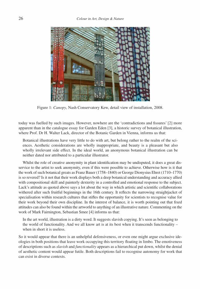
26 Colour in Art, Design & Nature
today was fuelled by such images. However, nowhere are the ‘contradictions and fi ssures’ [2] more apparent than in the catalogue essay for Garden Eden [3], a historic survey of botanical illustration, where Prof. Dr H. Walter Lack, director of the Botanic Garden in Vienna, informs us that:
Botanical illustrations have very little to do with art, but belong rather to the realm of the sci-ences. Aesthetic considerations are wholly inappropriate, and beauty is a pleasant but also wholly irrelevant side effect. In the ideal world, an anonymous botanical illustration can be neither dated nor attributed to a particular illustrator.
Whilst the role of creative anonymity in plant identifi cation may be undisputed, it does a great dis-service to the artist to seek anonymity, even if this were possible to achieve. Otherwise how is it that the work of such botanical greats as Franz Bauer (1758–1840) or George Dionysius Ehret (1710–1770) is so revered? Is it not that their work displays both a deep botanical understanding and accuracy allied with compositional skill and painterly dexterity in a controlled and emotional response to the subject. Lack’s attitude as quoted above says a lot about the way in which artistic and scientifi c collaborations withered after such fruitful beginnings in the 16th century. It refl ects the narrowing straightjacket of specialisation within research cultures that stifl es the opportunity for scientists to recognise value for their work beyond their own discipline. In the interest of balance, it is worth pointing out that fi xed attitudes can also be found within the artworld to anything of an illustrative nature. Commenting on the work of Mark Fairnington, Sebastian Smee [4] informs us that:
In the art world, illustration is a dirty word. It suggests slavish copying. It’s seen as belonging to the world of functionality. And we all know art is at its best when it transcends functionality – when in short it is useless.
So it would appear that there is an unhelpful defensiveness, or even one might argue exclusive ide-ologies in both positions that leave work occupying this territory fl oating in limbo. The emotiveness of descriptions such as slavish and functionality appears as a hierarchical put down, whilst the denial of aesthetic content would appear futile. Both descriptions fail to recognise autonomy for work that can exist in diverse contexts.
Figure 1: Canopy, Nash Conservatory Kew, detail view of installation, 2008.
Colour in Art, Design & Nature 27
2 THE IMAGE OF NATURE AND THE NATURE OF THE IMAGEMusing over how a close-up view of a stained section showing the cellular patterns in a wood sample might resemble an abstract painting may appear akin to Hamlet ascribing animal characteristics to cloud shapes [5], a fallback upon our intuitive senses which employ cognitive spatial mapping and pattern identifi cation to navigate life successfully. It could be argued that the pioneering work of artists and photographers during the 20th century in some way refl ected, or even anticipated the scientifi c deconstruction of the physical world, and in so doing created images that re-humanised the scientifi c. As Dawn Ades [6] points out:
Modern photography emerged during the ‘glorious technomania of the twenties’. Its most artic-ulate spokesperson, László Moholy-Nagy, argued that photography was more than just a means of reproduction; it was revolutionising vision.
Problems around the aesthetic identity of the scientifi c image are compounded by the trend to run competitions for the ubiquitously labelled Sci-Art photographs such as the Nikon Small World com-petition [7]. In these competitions, images that have been created predominantly by scientists in the course of their work is selected for informational content, technical profi ciency and visual impact. That they hold a fascination for specialists and non-specialists alike is clear in the increased appetite for this kind of material. What is less clear is the philosophical shift from scientifi c data to a visual art object. The taste for scientifi c images begs the question – what are the criteria for any aesthetic judgments that are being made? Do these criteria relate to either contemporary art practice or is there a scientifi c taxonomy of style and content?
3 THE NATURE OF COLLABORATIONIt is within this territory that the author’s practice exists. Through the collaborations with botani-cal scientists at the Royal Botanic Gardens, Kew, working with microscopic plant material as a source for this work, an increasing interest evolved to move the creative nature of using scientifi c technologies and the depiction of microscopic plant imagery to a more artistically autonomous and sophisticated level. Although not being a scientist, the author’s work is conducted at the research level within the science community, with their languages and technologies being applied in the creation of the artwork. The work being made for its own artistic purposes, may not be considered science, however, the scientifi c community recognises the increasingly valuable con-tribution it makes in raising awareness of their important work in maintaining plant diversity. It is a two-way exchange.
It may be a truism that nature is a culturally conditioned experience, but nature has a way of defi n-ing its own context, and it does not matter that you understand how the iridescence in butterfl y wings and bird feathers is the result of the diffraction of light across complex surface topographies, when confronted by a peacock in full display. The powerful visual spectacle becomes a mesmerising one that precedes analysis, be it scientifi c or cultural. It is not the intention when creating the work to promote a return to an open jawed sublime unquestioning method of viewing nature, but more to allow some space for creating work imbued with a sense of awe and wonder equivalent to its inspi-rational source – one in which the scientifi c technology and the hands of the artist are seamlessly fused into a moving and perhaps unsettling visual experience. With the development of digital imag-ing and the capability of sophisticated software on most home computers with the power to transform every banal photograph into an arty picture, there is an expectation that anything can be achieved at the push of a button. Even with artists’ predilection for disrupting technology, it can be hard to achieve an individual voice and it is only through clarity of intention coupled with a mastery of technology that artistic identity might be maintained.
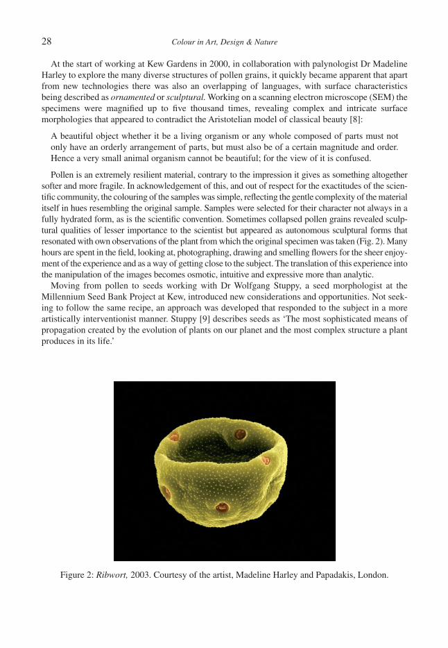
28 Colour in Art, Design & Nature
At the start of working at Kew Gardens in 2000, in collaboration with palynologist Dr Madeline Harley to explore the many diverse structures of pollen grains, it quickly became apparent that apart from new technologies there was also an overlapping of languages, with surface characteristics being described as ornamented or sculptural. Working on a scanning electron microscope (SEM) the specimens were magnifi ed up to fi ve thousand times, revealing complex and intricate surface morphologies that appeared to contradict the Aristotelian model of classical beauty [8]:
A beautiful object whether it be a living organism or any whole composed of parts must not only have an orderly arrangement of parts, but must also be of a certain magnitude and order. Hence a very small animal organism cannot be beautiful; for the view of it is confused.
Pollen is an extremely resilient material, contrary to the impression it gives as something altogether softer and more fragile. In acknowledgement of this, and out of respect for the exactitudes of the scien-tifi c community, the colouring of the samples was simple, refl ecting the gentle complexity of the material itself in hues resembling the original sample. Samples were selected for their character not always in a fully hydrated form, as is the scientifi c convention. Sometimes collapsed pollen grains revealed sculp-tural qualities of lesser importance to the scientist but appeared as autonomous sculptural forms that resonated with own observations of the plant from which the original specimen was taken (Fig. 2). Many hours are spent in the fi eld, looking at, photographing, drawing and smelling fl owers for the sheer enjoy-ment of the experience and as a way of getting close to the subject. The translation of this experience into the manipulation of the images becomes osmotic, intuitive and expressive more than analytic.
Moving from pollen to seeds working with Dr Wolfgang Stuppy, a seed morphologist at the Millennium Seed Bank Project at Kew, introduced new considerations and opportunities. Not seek-ing to follow the same recipe, an approach was developed that responded to the subject in a more artistically interventionist manner. Stuppy [9] describes seeds as ‘The most sophisticated means of propagation created by the evolution of plants on our planet and the most complex structure a plant produces in its life.’
Figure 2: Ribwort, 2003. Courtesy of the artist, Madeline Harley and Papadakis, London.
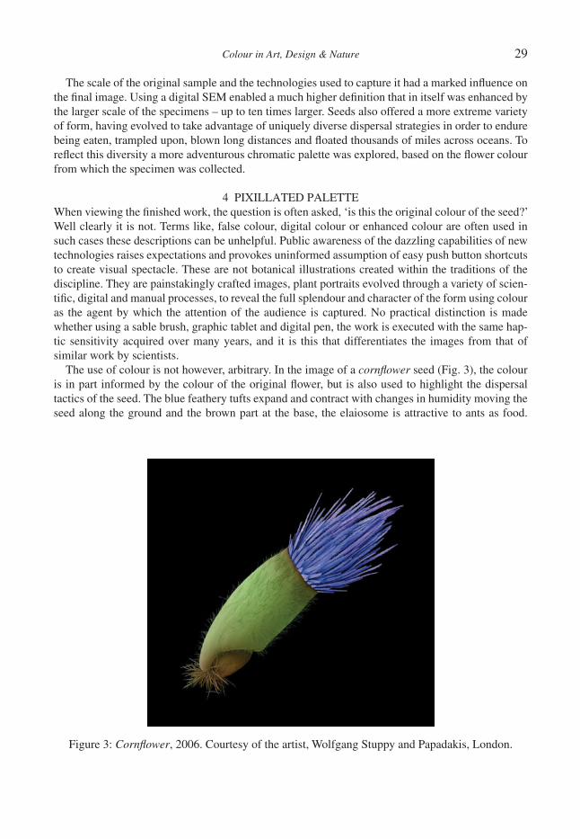
Colour in Art, Design & Nature 29
The scale of the original sample and the technologies used to capture it had a marked infl uence on the fi nal image. Using a digital SEM enabled a much higher defi nition that in itself was enhanced by the larger scale of the specimens – up to ten times larger. Seeds also offered a more extreme variety of form, having evolved to take advantage of uniquely diverse dispersal strategies in order to endure being eaten, trampled upon, blown long distances and fl oated thousands of miles across oceans. To refl ect this diversity a more adventurous chromatic palette was explored, based on the fl ower colour from which the specimen was collected.
4 PIXILLATED PALETTEWhen viewing the fi nished work, the question is often asked, ‘is this the original colour of the seed?’ Well clearly it is not. Terms like, false colour, digital colour or enhanced colour are often used in such cases these descriptions can be unhelpful. Public awareness of the dazzling capabilities of new technologies raises expectations and provokes uninformed assumption of easy push button shortcuts to create visual spectacle. These are not botanical illustrations created within the traditions of the discipline. They are painstakingly crafted images, plant portraits evolved through a variety of scien-tifi c, digital and manual processes, to reveal the full splendour and character of the form using colour as the agent by which the attention of the audience is captured. No practical distinction is made whether using a sable brush, graphic tablet and digital pen, the work is executed with the same hap-tic sensitivity acquired over many years, and it is this that differentiates the images from that of similar work by scientists.
The use of colour is not however, arbitrary. In the image of a cornfl ower seed (Fig. 3), the colour is in part informed by the colour of the original fl ower, but is also used to highlight the dispersal tactics of the seed. The blue feathery tufts expand and contract with changes in humidity moving the seed along the ground and the brown part at the base, the elaiosome is attractive to ants as food.
Figure 3: Cornfl ower, 2006. Courtesy of the artist, Wolfgang Stuppy and Papadakis, London.

30 Colour in Art, Design & Nature
Figure 4: Krameria, showing: (1) original specimen, (2) coated specimen, (3) SEM screenshots and (4) assembled greyscale image. Courtesy of the artist, Wolfgang Stuppy and Papadakis, London.

Colour in Art, Design & Nature 31
They take it to their nests, and after eating, push the remains back out where it may be further dis-persed by the wind, enabling germination of the embryo seed as seen in the green body in the centre. So, just as plants employ colour coded messages to attract an audience of insect collaborators, through artistic intervention the author uses colour to create images that draw the viewer in with a disquieting sense of familiarity and wonder at something so small.
Moving from seeds to fruit, offered further challenges. While some fruits are only a few millime-tres in diameter, the majority are far in excess of what might fi t in an SEM. In between were a collection of fruits just on the limit with what could fi t in the SEM chamber but which required multiple shots necessitating complex reassembly. This is not what the microscope was designed for or how scientists normally use it, but it is the nature of the collaboration that drives the work into new territories. The process of moving from specimen to fi nal image is a transformative mixture of recon-structive surgery and artistic interpretation as is shown in the fruit of the Krameria erecta (Fig. 4). The original specimen was coated in an ultra fi ne layer of platinum to increase conduction and reduce electrostatic charge when it was in the chamber. Being large (8 mm long) 26 individual shots were required to capture the whole specimen. These were subsequently reassembled correcting dis-tortions of parallax and repairing damaged sections prior to cleaning up distracting backgrounds, adjusting tonal balance to bring out the full, three dimensionality of the form prior to colouring. As in other examples, colour choices are derived by reference to the original fl ower colour in what has developed into a slow and painstaking operation, working with a pen and graphic tablet, building up and erasing through successive layers of applied colour over many hours, with the same control and sensitivity that would be used with a paintbrush on paper.
Figure 5: Cimicifuga, Courtesy of the artist, Wolfgang Stuppy and Papadakis, London.
32 Colour in Art, Design & Nature
5 CONCLUSIONCollaborations between artists and scientists might suggest outcomes resulting in a hybrid fusion of cultures with unrealistic expectation of super progeny. However, in reality the outcomes are more subtle, far more diverse and more widely dispersed than might be imagined. The nature of artistic work derived from, or created within a scientifi c context is a complex and evolving one, loaded with confl icting ideologies. As it would appear that the opportunities and desires for collaboration between artists and scientists are likely to increase, it is important that the outcomes are based on a deep understanding of respective disciplines. Through his work with scientists at Kew, the author has made it his responsibility to go beyond artistic cherry picking, and to engage with the science at a meaningful level. The benefi ts arising from this are not only respect for the work within the scientifi c community, but a greater confi dence in the positioning of the work in the artworld. The fi nal result is one in which the manipulative hand of the artist, aided by the creative application of diverse tech-nologies has intervened to produce an image autonomous from science but with that disturbing sense of hypereality that science can evoke, as in the mysterious and sensual image of the Cimicifuga seed (Fig. 5). It is this other worldliness that distinguishes the result from a functional specimen, however, alluring it might be. Historically, the work of the fi nest botanical artists has risen above the mere recording of specimens for scientifi c purposes. In creating this new body of work, the author has exploited new scientifi c technologies and employed his artistic experience in the manipulation of colour to communicate a personal sense of wonder, placing it within a contemporary art context and revealing the natural world to new audiences.
REFERENCES[1] Colour Design and Engineering, colour in Plants and Animals: Inspiration for Design. Linnean
Society and Institute of Mechanical Engineers: London, 2007.[2] Corrin, L., The Greenhouse Effect, Serpentine Gallery: London, pp. 40–60, 2000.[3] Lack, H.W.L., Garden Eden, Taschen: Koln, p. 14, 2001.[4] Smee, S., The Natural Gallery, Daily Telegraph: London, pp. 4–5, 2004.[5] Shakespeare, W., The Tragedy of Hamlet, Prince of Denmark, Act 3, Scene 2.[6] Ades, D., Little Things: Close-up Photography and Film 1839–1963, Fruitmarket Gallery:
Edinburgh, p. 21, 2008.[7] http://www.nikonsmallworld.com/.[8] Aristotle, Poetics, 7, 1450b–1451a; trans. S.H. Butcher, Aristotle, On the Art of Poetry, Bobbs-
Merrill, Inc., Liberal Arts Press: Indianapolis, pp. 11–12, 1956.[9] Kesseler, R. & Stuppy, W., Seeds, Time Capsules of Life, Papadakis: London, p. 21, 2006.
Colour in Art, Design & Nature
THE DIVERSITY OF FLOWER COLOUR: HOW AND WHY?
B.J. GLOVERDepartment of Plant Sciences, University of Cambridge, UK.
ABSTRACTThe diversity of fl ower colour has astonished artists, gardeners and scientists for centuries. Flowers generate colour by refl ecting only a subset of the wavelengths which make up white light, resulting in a coloured appear-ance. This is achieved either through the use of chemical pigments which absorb certain wavelengths, or by the use of structures which refl ect only certain wavelengths. Chemical colour has been well studied in plants, and the three major pigment groups are fl avonoids, carotenoids and betalains. Spatial and temporal regulation of the synthesis of these pigments gives pattern and depth of colour to the fl ower. Combinations of pigments can result in variations in fi nal fl ower colour, while the addition of metal ions and the alteration of cell pH can also infl uence the fi nal wavelengths absorbed by pigments. Focussing light into the pigment-containing regions of the cell, using specialised cell shapes, also infl uences intensity of fl ower colour. Structural colour, including iridescence, is produced independently of pigment colour, and can overlay it. Flower colour itself is viewed as an advertisement to attract pollinating animals to the rewards (usually nectar) contained within the fl ower. This article concludes with an analysis of the long-running debate over whether specifi c fl ower colours attract specifi c pollinators, or whether all colours are simply different ways of attracting a wide variety of animals.Keywords: anthocyanin, betalain, carotenoid, fl ower, iridescence, petal, pigment, pollination, structural colour.
1 INTRODUCTIONThe bright colours of fl owers are primarily a signal to attract pollinating insects by making the fl oral tissue stand out against a background of vegetation. This argument is supported by modern analysis of insect visual acuity, which indicates that vegetation is visually very similar to bark, soil and stone from an insect’s point of view. All these materials weakly refl ect light across the whole range of an insect’s visual spectrum. Leaves differ from the rest only in absorbing red light, but since red is at the very periphery of the visual spectrum for most insects, this makes little difference [1].
Biological colours can be produced in two different ways. Many animals produce ‘structural’ colours, caused by the refraction of light from complex physical surfaces. Although there is some evidence that plants can use structural colour too, they primarily produce colour by synthesising pigments, which absorb subsets of the visible spectrum, refl ecting back only what they do not absorb and causing the tissue to be perceived as the refl ected colours. Chlorophyll absorbs light in both the red and blue parts of the spectrum, refl ecting only green light, and causes leaves to appear green to us. Similarly, a fl ower that we perceive as red contains pigments, which absorb yellow, green and blue light, leaving red light as the only wavelength visible to us which is refl ected.
2 CHEMICAL COLOUR IN FLOWERSChemical colour is produced through the absorption of light by pigments. Plant pigments can be divided into three chemical classes: the fl avonoids, the betalains and the carotenoids. The fl avonoids are the major fl oral pigments, and give rise to ivory and cream colours (through pigment types called fl avonols and fl avones), yellow and orange colours (through aurones and chalcones) and the red–pink–purple–blue range (the anthocyanins, Fig. 1a). The betalains are a group of pigments found exclusively in the Angiosperm order Caryophyllales, and nowhere else in the plant kingdom. They give the red colour to beetroot and also to some fl owers (Fig. 1c). The carotenoids are much more widespread, although less signifi cant as fl oral pigments than the fl avonoids. Carotenoids give yellow and orange colour to fl owers (Fig. 1b).

34 Colour in Art, Design & Nature
2.1 Flavonoids
The fl avonoids are a group of phenolic compounds in which two six-carbon rings are linked by a three-carbon unit. Flavonoids are water soluble and accumulate in the vacuoles of higher plant cells. They play a number of roles in plant physiology and development. Flavonoids may be involved in defence against pathogens and predators, are a component of the legume-Rhizobium signalling cas-sette, are required for correct pollen development and pollen tube growth, protect sensitive tissues from ultraviolet radiation, and act as antioxidants and metal chelators.
Flavonoid synthesis has been characterised in some detail, both from a biochemical perspective and from a molecular genetic one (reviewed by Martin and Gerats [2]). The most detailed studies have used the petals of Antirrhinum and Petunia as models. Antirrhinum fl owers normally produce a magenta anthocyanin, called cyanidin. Petunia fl owers produce a purple anthocyanin, delphinidin. Since the blueness of the anthocyanin is determined by the degree of hydroxylation of the B ring, in theory, a plant can always hydroxylate the molecule less, and thus make less blue anthocyanins, but it will not necessarily have the enzymes to hydroxylate it more, and so cannot make bluer anthocy-anins. In fact, investigation of this hypothesis in Petunia has revealed that the enzymes of the biosynthetic pathway have a greater effi ciency for conversion of their usual substrates, and cannot therefore easily produce orange pelargonidins from less hydroxylated substrates [3].
The fi rst committed step of fl avonoid synthesis is the condensation of three acetate units and a hydroxycinnamic acid unit to produce chalcone, the key intermediate in the synthesis of all fl avo-noids [2]. Chalcone itself is usually yellow or orange, and can be used as a pigment in its own right. It may also be converted into a yellow aurone, the pigment which provides the bright yellow colour to many Compositae fl owers, such as Dahlia [4]. Usually, however, chalcone is modifi ed to a colour-less fl avanone, and fl avanone then feeds into one of three further pathways. Flavanone may be directly converted into fl avones, which vary in colour from very pale to bright yellow, depending on their degree of hydroxylation. Alternatively, fl avanone can be converted into dihydrofl avonol, which can then be modifi ed by fl avonol synthase to various fl avonols. The fl avonols are usually colourless, but act as co-pigments, stabilising and modifying the colour of other pigment molecules. Alterna-tively, dihydrofl avonols may be modifi ed through a number of steps to make anthocyanins. Anthocyanins provide a number of different colours, depending on several factors. They may range from orange/brick red (known as pelargonidins), red/magenta (cyanidins) to purple/blue (delphini-dins), with increased blueness determined by an increase in hydroxyl groups. The two main classes of glycosides also affect the blueness of the molecule. Methylation of an anthocyanin tends to shift its colour towards red, compared to bluer unmethylated molecules.
Figure 1: Flower colour produced by (a) anthocyanins in rose, (b) carotenoids in Freesia, (c) betalains in Christmas cactus.
a b c
Colour in Art, Design & Nature 35
Anthocyanin is transported across the vacuolar membrane into the vacuole, where it is stored, by the glutathione pump [5]. The pigment is fi rst conjugated with glutathione, by the enzyme glutath-ione S-transferase.
2.2 Carotenoids
Carotenoids are amongst the most widespread pigments in the natural world. In plants, they play important roles in photosynthesis, where they act as accessory light harvesting pigments and as photo-protectants [6], as well as acting as fl oral and fruit pigments. In mammals they are the precur-sors for vitamin A synthesis, and in fi sh they are essential for phototropic responses [7]. The carotenoids are a family of isoprenoid derivatives. Isoprenoids themselves are lipid molecules, with an estimated 22,000 different types known. They have essential roles as membrane sterols, compo-nents of chlorophyll, cytokinins, abscisic acid and a variety of roles in plant secondary metabolism. They are usually classifi ed by the number of carbon atoms they contain. The carotenoid family con-tains conjugated polyene molecules, composed of 40 carbon atoms. Carotenoid hydrocarbons are known as carotenes, and include pigments such as zeaxanthin. The addition of oxygen to these mol-ecules creates the oxygenated carotenoids, or xanthophylls, which are also important pigments.
The absorption spectrum of a particular carotenoid molecule is determined by the conjugated poly-ene system and additional structural features. Each conjugated double bond increases the wavelength of maximum absorption by 7–35 nm [7]. Thus, deep orange fl owers may contain unoxidised lycopene, orange fl owers contain β-carotene, and yellow fl owers often contain highly oxidised xanthophylls.
2.3 Betalains
The betalains have been less well studied than the carotenoids and anthocyanins. They replace anthocyanins as the colouration in fl owers and fruit of the order Carophyllales [8]. Common betalain-pigmented plants include beetroot, the petals of the Christmas cactus and the brightly coloured bracts of Bougainvillea.
The betalains are water-soluble nitrogen-containing pigments, and come in two main colour groups. The betacyanins are red to purple, while the betaxanthins are yellow. The early and late steps of betalain synthesis are catalysed by enzymes, but the vast majority of intermediate reactions in the synthetic pathway occur spontaneously [8].
3 MODIFYING CHEMICAL COLOUR IN FLOWERS
3.1 Regulating pigment synthesis
Since the types of pigments produced has such a range of effects on fl ower colour it is hardly surpris-ing that the pigmentation pathways should be under tight regulatory control. This regulation is both spatial and temporal, generating colour patterns on almost all fl owers (Fig. 2a), and in some species changing the colours of petals during their development. For example, the fl owers of Viola cornuta cultivar “Yesterday, Today and Tomorrow” change from white to pale pink to purple over the space of 5–8 days. This change in colour has been shown to be the result of a steady increase in anthocy-anin production over the time period. While such a colour change may seem extraordinary, the fact that it is initiated by pollination (without which the petals remain white) suggests that plant growth regulator-mediated signals from germinating pollen tubes trigger the change in anthocyanin regula-tion, perhaps to change the attractiveness or visibility of the fl ower to potential pollinators [9].

36 Colour in Art, Design & Nature
It has been shown that the activities of the genes encoding the enzymes of anthocyanin biosynthe-sis are predominantly regulated at the transcriptional level. It can be inferred from this, that the majority of petal pigmentation patterns are specifi ed by the expression patterns of regulatory genes which control the activity of the biosynthetic genes [3]. By convention, anthocyanin regulatory loci are divided into those which specifi cally control anthocyanin deposition (by regulating ‘late’ biosyn-thetic genes, some way down the pathway), and those which control the synthesis of other fl avonoids (by regulating ‘early’ biosynthetic genes). A number of genes have been shown to be important in both pathways, and three key groups of proteins have been shown to be involved. The most impor-tant of these are transcriptional activators of the MYB and basic helix-loop helix families (reviewed by Martin et al. [10]).
3.2 Metal ions
Interactions between fl oral pigments and metal ions can also alter the fi nal colour of the petals (Fig. 2b). For example, the bright blue colour of cornfl owers stems from an interaction between the purple anthocyanin, delphinidin and molecules of the metal iron, absorbed by the plant’s roots from the soil. The combination of the pigment with the metal results in a molecule that gives the fl ower, a very bright blue colour. Another good example of this sort of interaction is the variable colour of the fl owers of Hydrangea. Hydrangea fl owers are blue if there is aluminium in the soil, as aluminium and delphinidin form a very stable, very blue complex. If there is less aluminium available in the soil, and more molybdenum, then the fl owers appear pink instead. The same pigment interacts with molybdenum ions and changes to a light pink colour. The presence of this changeable pigment in Hydrangea is exploited by gardeners, who water the soil around their plants with a solution contain-ing the appropriate ion to generate the fi nal fl ower colour of their choice.
3.3 pH
The pH of petal cells can also affect the fi nal colour of the fl ower, as pH determines anthocyanin structure and absorption spectrum. For example, the light blue petals of Ipomoea tricolor, Morning Glory, owe their colour to the effect of a high petal pH on their anthocyanin (Fig. 2c). The closed buds of these fl owers are purplish red and their cells have a pH of 6.6. However, when the fl owers open petal cell pH increases to 7.7, and the pigment changes colour to sky blue [11]. Yoshida et al. [12]
a b c d
Figure 2: Final fl ower colour is controlled by (a) spatial regulation of pigment synthesis in Petunia hybrida, (b) metal ions in Meconopsis, (c) pH in Ipomoea, (d) petal cell shape in Antirrhinum majus (left, fl ower with conical petal epidermal cells, right, fl ower with fl at petal epidermal cells).
Colour in Art, Design & Nature 37
discovered that the increased pH is due to active transport of Na+ and/or K+ from the cytosol to the vacuoles. The ability of vacuolar pH, controlled by membrane transporters, to alter fl ower colour without any change in the types of pigment produced, gives plants the fl exibility to alter their fi nal petal colour after pigments have been made. Stewart et al. [13] observed that the colours of several wild fl ower species became bluer as they aged, correlated with an increase in petal pH.
3.4 Focussing light into pigment
A very subtle way in which the colour of a petal can be enhanced is by focusing of light into pig-mented regions. Kay et al. [14] proposed that conical-papillate shaped epidermal cells increased the amount of light absorbed by the pigments in fl owers, enhancing the perceived colour of the petal.
The mixta mutant of Antirrhinum fails to develop conical-papillate petal cells and instead has fl at petal cells. The signifi cance of the conical-papillate cells in enhancing colour is shown by the fact that the mixta mutant was originally identifi ed in a screen of mutagenised plants, because it was paler in colour than wild type fl owers (Fig. 2d). The mutant petal also has a matt texture, unlike the velvety sparkle of the wild type petal [15].
By comparing the ability of epidermal cells to focus light in the wild-type and mixta mutant lines, conical-papillate cells have been shown to enhance visible pigmentation. Conical-papillate cells focus light approximately twice as well as the mutant fl at cells, and they focus it into the region of the epidermis where the pigment is contained [16]. The wild-type Antirrhinum petals refl ected sig-nifi cantly less light away from the fl ower than mixta mutant petals did, and absorbed signifi cantly more light. These differences can be attributed to the focusing of the light onto the light-absorbing pigments in the epidermal cells, and to the reduction in refl ection of light at low angles of incidence, resulting in the greater depth of colour of wild-type conical-celled fl owers [16].
4 STRUCTURAL COLOUR IN FLOWERSStructural colours have been very poorly studied in plants, and are generally thought of as an animal phenomenon. However, a recent report suggests that they might be surprisingly widespread in plants, just mainly visible in the ultraviolet region of the spectrum. This would make them clearly apparent to most pollinating animals, but invisible to the human eye.
Whitney et al. [17] observed iridescence over the red pigmented patch at the base of the Hibiscus trionum petal. Iridescence is the change in hue of a surface when viewed from different angles, and can only be generated by structural (not pigment-based) methods. They analysed the structure of the petal, and found that the epidermal cells in the iridescent region, where overlain with long thin stripes of cuticle. These cuticular striations were shown to be of the same frequency and amplitude as the diffraction grating on a compact disk (CD), and to generate iridescence through the same interference with light refl ection as shown by a CD. Whitney et al. [17] further demonstrated that bumblebees could see the iridescence arising from the diffraction gratings, and could be trained to associate it with a nectar reward.
Cuticular striations are very commonly found on plant epidermal surfaces. Their ability to func-tion as diffraction gratings will be strongly dependent on the extent to which they are ordered. However, preliminary analyses have identifi ed suitable striations in 10 plant families to date, as well as in many garden varieties of tulip (Whitney and Glover, unpublished). Although very few of these fl owers look iridescent to the human eye, analysis of the diffractive optics of their diffraction grat-ings indicates that the bulk of the structural colour produced is in the blue and ultraviolet part of the spectrum. This region is highly visible to animal pollinators, especially insects, but not visible to the human eye. It therefore seems likely that many fl owers produce structural colours, including

38 Colour in Art, Design & Nature
iridescent ones, through the use of diffraction gratings made from cuticle, but that the structural colours they produce are rarely visible to people.
5 WHY THE DIVERSITY OF FLOWER COLOUR?Colours act as advertisements, enticing animal pollinators to visit fl owers for the rewards that they contain. What is less clear is whether particular colours act as advertisements to particular animals. In the rush to fi nd evidence to support Darwin’s evolutionary theory, the visually obvious similarities between fl ower colour and pollinator preferences were seized upon by many authors as clear exam-ples of the consequences of natural selection. It was only in the 1980s that experimental approaches were fi rst taken to assess whether particular fl oral traits were under selection by pollinators. In 1996, two critical essays were published, both questioning the concept of plant/pollinator specialisation [18, 19]). Both papers suggested that generalisation, with fl owers receiving pollinator service from more than one type of animal, was very frequent in nature. The data now emerging allow us to make initial comments on the utility of the idea that different fl ower colours acts as advertisements to particular animals.
The literature contains many examples of attempts to assess pollinator discrimination between petals of different colours. In some cases, discrimination is clear, in others, the animals showed no discrimination, and in many cases some animals discriminated while others did not. These experi-ments indicate that the attraction of multiple pollinators can result in mixed selective pressures, even where one animal shows very clear discrimination. For example, Raphanus raphanistrum, wild rad-ish, has yellow fl owers or white fl owers, controlled by a single locus. The frequency of the yellow morph varied from 7% to 60% in the populations studied by Kay [20], but in all these populations the butterfl y Pieris rapae much preferred the yellow form to the white. On the site with 60% yellow fl owers, 307 visits to wild radish fl owers by the butterfl ies were observed – and 306 of the 307 were to yellow fl owers. However, honey bees showed no preference for yellow fl owers over white, main-taining the polymorphism within the population.
Bradshaw and Schemske [21] provided clear evidence that both bumblebees and hummingbirds distinguish between different coloured forms of Mimulus, using near isogenic lines that would be unlikely to differ in traits other than fl ower colour itself. Mimulus lewisii is normally pink, as a result of anthocyanin deposition, and is primarily pollinated by bumblebees. M. cardinalis is normally orange/red, as a result of both anthocyanin and carotenoid deposition, and is primarily pollinated by hummingbirds. Bradshaw and Schemske [21] introgressed the YUP locus, responsible for caroten-oid deposition, from each species into the other background, through four generations, ensuring 97% genetic identity between the new lines and their most similar parent. This resulted in orange col-oured M. lewisii fl owers and deep pink M. cardinalis fl owers. Pollinator visits to these fl owers were recorded, and revealed that orange-fl owered M. lewisii received 68-fold more visits from humming-birds than the wild type pink, but a signifi cant reduction in bumblebee visits. Similarly, the pink-fl owered M. cardinalis received 74-fold more visits from bumblebees than the wild type orange (although little reduction in hummingbird visits). These experiments show that both bumblebees and hummingbirds exhibit strong discrimination on the basis of petal colour. The near isogenic nature of the lines used in this study makes it likely, although not certain, that colour is the only signifi cant factor in the choices made by pollinators.
These studies, and many others like them, tell us that animals can discriminate between different fl ower colours, and often do so. However, it is diffi cult to extrapolate from this to a view that each individual fl ower colour is a specialist advertisement to a particular animal. Indeed, most pollinators can learn to associate any colour they can see with food, and so will learn to view the array of fl ower colours before them as indicating a range of potential food sources. The answer to whether there are

Colour in Art, Design & Nature 39
specialised relationships between different fl ower colours and different animals then comes down to a question of how frequently plants specialise on a single pollinator species or group, and how fre-quently they are pollinated by a wide range of animals. Empirical data on the frequency of specialisation in pollination systems are currently in short supply, but it is likely that a good degree of generalisation exists, leading us to conclude that much of the diversity of fl ower colour is simply due to the many different solutions plants have evolved to the problem of attracting animals by standing out against a green background.
6 CONCLUSIONSThe diversity of fl ower colour is astonishing, especially when compared to the relative uniformity of colour of other plant organs, such as leaves. That diversity is attributable to complex combinations of different pigments, located in different parts of the cell, and regulated in their synthesis both tem-porally through the life of the fl ower and spatially among the different fl oral regions. Pigments are enhanced and modifi ed through the use of metal ions, specifi c pH regimes and specialised cell shapes which focus light. They can also be overlain with structural colours which may be iridescent and most frequently refl ect wavelengths visible to insects but not to the human eye. This great diver-sity of fl ower colour serves as advertising to the enormous variety of animal pollinators, but much more empirical evidence is needed before we can say with confi dence whether particular colour regimes attract particular animals, or whether all colours simply serve to make fl owers stand out from the surrounding foliage.
REFERENCES [1] Kevan, P., Giurfa, M. & Chittka, L., Why are there so many and so few white fl owers? Trends
in Plant Science, 1, pp. 280–284, 1996. [2] Martin, C. & Gerats, T., The control of fl ower coloration. The Molecular Biology of Flowering,
ed. B. Jordan, CAB International: Wallingford, pp. 219–255, 1993. [3] Mol, J., Grotewold, E. & Koes, R., How genes paint fl owers and seeds. Trends in Plant Science,
3, pp. 212–217, 1998. [4] Nakayama, T., Enzymology of aurone biosynthesis. Journal of Bioscience and Bioengineer-
ing, 94, pp. 487–491, 2002. [5] Marrs, K.A., Alfenito, M.R., Lloyd, A.M. & Walbot, V., A glutathione S-transferase involved
in vacuolar transfer encoded by the maize gene Bronze-2. Nature, 375, pp. 397–400, 1995. [6] Hirschberg, J., Production of high-value compounds: carotenoids and vitamin E. Current
Opinion in Biotechnology, 10, pp. 186–191, 1999. [7] Goodwin, T.W., The Biochemistry of the Carotenoids, Vol. 1, Chapman and Hall: New York,
1980. [8] Strack, D., Vogt, T. & Schliemann, W., Recent advances in betalain research. Phytochemistry,
62, pp. 247–269, 2003. [9] Farzad, M., Griesbach, R. & Weiss, M.R., Floral colour change in Viola cornuta L.
(Violaceae): a model system to study regulation of anthocyanin production. Plant Science, 162, pp. 225–231, 2002.
[10] Martin, C., Prescott, A., Mackay, S., Bartlett, J. & Vrijlandt, E., The control of anthocyanin biosynthesis in fl owers of Antirrhinum majus. Plant Journal, 1, pp. 37–49, 1991.
[11] Yoshida, K., Kondo, T., Okazaki, Y. & Katou, K., Cause of blue petal colour. Nature, 373, p. 291, 1995.
[12] Yoshida, K., Kawachi, M., Mori, M., Maeshima, M., Kondo, M., Nishimura, M. & Kondo, T., The involvement of tonoplast proton pumps and Na+(K+)/H+ exchangers in the change of petal
40 Colour in Art, Design & Nature
colour during fl ower opening of morning glory, Ipomoea tricolor cv. Heavenly Blue. Plant and Cell Physiology, 46, pp. 407–415, 2005.
[13] Stewart, R.N., Norris, K.H. & Asen, S., Microspectrophotometric measurement of pH and pH effect on color of petal epidermal cells. Phytochemistry, 14, pp. 937–942, 1975.
[14] Kay, Q.O.N., Daoud, H.S. & Stirton, C.H., Pigment distribution, light refl ection and cell struc-ture in petals. Botanical Journal of the Linnean Society, 83, pp. 57–84, 1981.
[15] Noda, K., Glover, B.J., Linstead, P. & Martin, C., Flower colour intensity depends on specialised cell shape controlled by a MYB-related transcription factor. Nature, 369, pp. 661–664, 1994.
[16] Gorton, H.L. & Vogelmann, T.C., Effects of epidermal cell shape and pigmentation on optical properties of Antirrhinum petals at visible and ultraviolet wavelengths. Plant Physiology, 112, pp. 879–888, 1996.
[17] Whitney, H., Kolle, M., Andrew, P., Chittka, L., Steiner, U. & Glover, B.J., Floral irides-cence, produced through diffractive optics, acts as a cue for animal pollinators. Science, 323, pp. 130–133, 2009.
[18] Herrera, C., Floral traits and plant adaptation to insect pollinators: a devil’s advocate approach. Floral Biology, eds D. Lloyd & S. Barrett, Chapman and Hall: New York, pp. 65–87, 1996.
[19] Waser, N., Chittka, L., Price, M., Williams, N. & Ollerton, J., Generalization in pollination systems, and why it matters. Ecology, 77, pp. 1043–1060, 1996.
[20] Kay, Q.O.N., Preferential pollination of yellow-fl owered morphs of Raphanus raphanistrum by Pieris and Ersistralis spp. Nature, 261, pp. 230–232, 1976.
[21] Bradshaw, H. & Schemske, D., Allele substitution at a fl ower colour locus produces a pollinator shift in monkeyfl owers. Nature, 426, pp. 176–178, 2003.

Colour in Art, Design & Nature
SENSATIONS FROM NATURE
M.J. FRYER3, The Thrift, Bean, Dartford, Kent DA2 8BL, UK.
ABSTRACTSensations from nature provoke an emotional response from a particular motif around which a painting is constructed. Nature is not slavishly copied but the sensations are submitted to the necessity of making a picture in which the compositional elements are brought into unity over the whole surface to achieve stability. Within the stability there are local areas of dissonance to add a dynamic structure to the composition and to attract the gaze as the painting is examined by very rapid eye movements (saccades). Examples are given of a number of paintings by the author comprising two abstracts and four landscapes. Colours are heightened and usually highly saturated, so that they have an intense purity to express the emotions with greatest clarity and may not be imitative. Each colour is put down in relation to all other colours with consideration for their interrelationships and expressiveness. Painting is instinctive but has an underlying theoretical basis relying on the juxtaposition and displacement of complementary colours and of dissonant colour. In order to demonstrate the methodology of painting, two series of ‘progressive’ images are given that show the completion of two additional landscapes in six stages.Keywords: complementary, harmony, heightened colour, landscape paintings, Mike Fryer, saccades, stability.
1 INTRODUCTIONThe paintings by the author described in this paper are often categorised as the work of a ‘colourist’ since they are painted with heightened colour, that is, with bright, intense or saturated colour. But the word ‘colourist’ is something of a variable term. To some it is almost derogatory in the sense of ‘only being a colourist’ as if it is a simplistic methodology whilst others use the term to merely describe the use of heightened colour without reference to the methodology or philosophy behind it. The real-ity is that colour is used as a means of expression to transform the sensations received from nature into a painting, that is, to transform input into output. This expression is based on a complex interac-tion of perception, emotion, the practice of painting, non-imitative colour, colour theory and the need to make a painting.
The paintings under discussion are part of a practice that comprises abstract, landscape, still life and fi gurative works. In addition, the practice includes printmaking consisting of some etching but primarily digital prints. For the digital work, the image is always constructed from a blank screen and never from imported images as a reaction against the facile use of fi lters such as found in Adobe® Photoshop® to transform poor imagery into poor prints as evident in certain digital print-making; the methodology is, therefore, analogous to that of painting. A range of work can be viewed at the author’s online gallery [1].
This paper examines only landscape paintings, because they are examples of work produced in direct response to the stimuli received from nature and their transformation into a composition and as such, they demonstrate the effect and result of the sensations from nature. These paintings are the result of a studio practice, where these sensations from nature, captured in sketching, photographs and visual memory, are synthesised into a composition on canvas or board.
The predominant medium is acrylic paint although some work is in water colour, oil or pastel. Acrylic paint is a medium that offers good fl exibility and allows for working in a variety of techniques.
All photographs in this paper were taken by the author unless otherwise stated. The progressive photographs are the result of studio shots and were taken as a record of the development of the paintings and were not originally intended for publication.
42 Colour in Art, Design & Nature
2 THE METHODOLOGY OF PAINTINGHow do these sensations from nature, the total input of colour, form, smell and sound come to be transformed into a painting? It is simply an emotional response to the sensations received from a particular motif: something in what is seen must stimulate a reaction. The painting is a response to God’s creation in all its varied forms, its glorious colour and vitality giving a spiritual dimen-sion to the work. The particular motif in a landscape that attracts such attention can be the shape or colour of a fi eld or a group of trees or a building, etc. The whole painting is then established around that motif.
Well-meaning people will indicate the location of what they consider to be a beautiful landscape that ‘must’ be painted. But when examined, it elicits little interest and does not result in any emo-tional response. Indeed, it is more likely that if there was a rusty oil drum sitting by the road it would be seen as more interesting and worth sketching! What is essential is that the sensations received from a motif must result in an emotional response. This emotional response will be strong enough to sustain the considerable time necessary to examine the landscape and potentially produce many versions of artwork in order to develop ideas and produce a fi nal painting.
The emotional response does not mean that the paintings are a simplistic portrayal of feelings but rather one scene or view is selected over others because, the sensations from that scene provoke the response. The emotions triggered vary considerably, such as, excitement, exhilaration, joy or passion with a motif as it is mentally transformed into a painting and the colour interrelationships are contemplated and subsequently developed in practice.
Matisse reduced his work to essentials [2], fi nding an equivalence of the painter’s perception of nature, which did not reproduce what he saw but transfi gured it. He translated the tonal values of the colours he saw into heightened colour of the same relationships. The paintings described here do not follow that system, and as a result, this work, whilst having a stability also has a dynamism in which perspective may be distorted, or the interrelationships of elements may be changed in the composi-tion. For example, the de-saturation or lightening of the colours of distant objects to give the effect of aerial perspective is often deliberately not undertaken in order to maintain overall stability when painting with heightened colour (Fig. 1c, Meopham).
Nature is not slavishly copied but the sensations are submitted to the necessity of making a picture. The aim is to bring the compositional and colour elements into a unity over the whole surface to achieve stability. Within the stability there may be local areas of discord that are brought into balance over the whole composition. Thus, the use of colour is a construct, it is a means of expression, but not in the sense of attributing meaning to certain colours but simply as an expression of the emotional response to a landscape, the sensations from nature.
The attempt to achieve stability of the paintings involves a complex interaction of composi-tion, colour and a sense of integrity. The composition has to be constructed, such that, it conveys an idea of place, that is, a particular landscape, not in a sterile manner but incorporating a dynamic structure and in such a way that the composition occupies the space of the canvas in equilibrium. Stability of colour is achieved by balancing hue, saturation and lightness throughout the paint-ing. However, balance is not a question of everything fi tting with everything else, since as Arnheim [3] rightly stated, this represents ‘the most primitive kind of harmony, suitable at best for the colour schemes of nurseries and baby clothing’. The stability is achieved through the integration of the different colour components in the painting: the disharmonies that are in bal-ance only in the context of the whole; the small isolated touches of colour that relate to displaced colour; the areas of serenity and of agitation; the juxtaposed complementaries or dissonances. Thus, the colour balance is complex and includes the painting as a whole, there are not inessential or redundant parts.
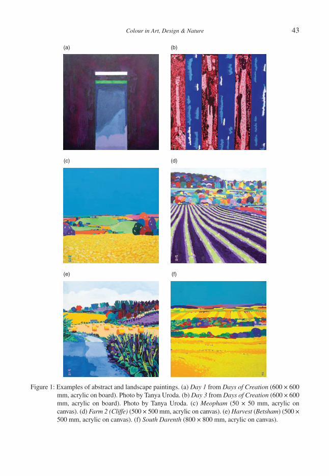
Colour in Art, Design & Nature 43
(a) (b)
(c) (d)
(e) (f)
Figure 1: Examples of abstract and landscape paintings. (a) Day 1 from Days of Creation (600 × 600 mm, acrylic on board). Photo by Tanya Uroda. (b) Day 3 from Days of Creation (600 × 600 mm, acrylic on board). Photo by Tanya Uroda. (c) Meopham (50 × 50 mm, acrylic on canvas). (d) Farm 2 (Cliffe) (500 × 500 mm, acrylic on canvas). (e) Harvest (Betsham) (500 × 500 mm, acrylic on canvas). (f) South Darenth (800 × 800 mm, acrylic on canvas).
44 Colour in Art, Design & Nature
The third aspect of stability is that of the sense of integrity which relates both to the composition and the use of colour. Each painting is executed after considerable thought and planning with sketches and investigations of composition and colour before the fi nal version is realised. Hence, the paint-ings are not accidental, unfi nished or meretricious, but seek to have a stability, such that the paintings maintain validity through time.
Examples of some paintings can be seen in Fig. 1, which shows two abstracts and four landscapes. Day 1 (Fig. 1a) and Day 2 (Fig. 1b) show two paintings from a series of seven on the days of crea-tion. These works are painted with very dilute paint that is poured on the board and allowed to dry for different times, at certain stages tissue paper is pressed onto the paint and pulled off leaving a ‘print-like’ texture. The layer of paint is very thin and the technique allows the build-up of many layers producing a rich depth of colour. Figure 1b has the added technique of spotting paint onto the board to give highly opaque dots. This style of painting has been developed over a number of years and is referred to as ‘abstract graphism’, whereby a written text or emotion is represented by graphical and colour elements that can be ‘read’ to discover the underlying meaning.
Figure 1c–f show various landscapes on canvas, c. and f. both have their sky in fl at phthalocyanine blue and d. and e., the latest paintings shown here, have a more complex sky in different tones of blue with clouds. All four landscapes are the result of experiments exploring the fusion of landscape with abstraction such that compositional elements may be greatly simplifi ed. For example, many of the trees in South Darenth (Fig. 1f) comprise interwoven lines or curves rendered in different hues and tonal values; it is evident that they are trees from the context. In all four of these landscape paintings, some elements such as trees or fi elds are painted in fl at colour, again, to simplify the composition and allow the colours to resonate with little reference to their form.
Why use heightened colour, why not use pastel colours rather than highly saturated colours that have such a strong impact? The hues used in these paintings are common to many painters but they are highly saturated which gives them an intense purity so they have the clarity to express emotion in the desired way. With anything less, the emotion would become diluted and would not represent the true response to the sensations from nature and so the paintings would lack integrity. These saturated colours resonate with each other in a lively and dynamic way that best expresses that emotional response.
The colours are not copies of nature and are therefore, used with purpose; if a sky is red or green then it is because it creates the desired stability, and as Matisse [4] said: ‘When I use a green it doesn’t mean grass; when I use a blue, it doesn’t mean the sky’ thus, if a sky is painted blue then that particular blue is important, not because sky is often blue. In the author’s recent work skies have been simplifi ed to a uniform phthalocyanine blue to allow the landscape to speak without hindrance or competition. At present some paintings still have skies of uniform blue but some move from this and go back to having clouds (Fig. 1e), and in the future some may have skies coloured red or green; for the present this uniformity of colour is being explored.
Bruce et al. [5] discuss the way the world around us is perceived. They describe the way our eyes scan the surrounding scene so that our gaze is directed to points of interest. These scans are called Saccades and are very rapid movements of the eyes up to 500°/s. The saccadic scanning allows analysis of those parts of the scene by the fovea, a small central area of the retina rich in cone pho-toreceptors providing high acuity vision in bright light. Bruce et al. describe sampling of the optic array as occurring in three ways: fi rst, saccadic scanning of the scene to fi xate objects with foveal vision; second, with ‘pursuit’ movement to keep objects in foveal vision as they move; and, fi nally, ‘convergence’ movement to maintain foveal vision of both eyes if distance to the scene changes.
Saccades are sudden and intermittent whilst ‘pursuit’ and ‘convergence’ movements are smooth and continuous. So when viewing static paintings the information input is primarily by saccadic scan-ning of the painting. Yarbus in the 1950s–1960s recorded the eye movements of subjects as they

Colour in Art, Design & Nature 45
looked at paintings and found that they looked mostly at high contrast areas, fi ne detail areas and areas with human or biological interest. He found [6] that saccades were in response to viewing strategies such as examining a painting to answer specifi c questions about the content or to simply examine the painting. Yarbus has been criticised for his methodology which was intrusive and may therefore have distorted the results but recent experiments by Lipps and Pelz [7] confi rm the task dependency but with a less dramatic effect.
Saccadic scanning has important implications for the painter. So often we read or see on television documentary art programmes supposedly erudite critics examining a painting and describing how the painter ‘leads’ the observer’s eyes around the composition. While this might sound plausible and represent received opinion, the studies of saccadic scanning indicate that a least, a priori, the view-ing of a painting does not necessarily follow the composition, but occurs in the observer a posteriori, after information input when compositional elements are recognised and can be understood [8].
The paintings described here aim to have an overall balance of colour but have local areas of dissonance. These are placed in the painting to add a dynamic structure to the composition and to act as visual ‘traps’ when the image is examined using saccadic scanning. Hence, by using unexpected hue and tonal combinations, the eye is fi xated as it scans the painting so that the observer will per-haps be surprised by compositional elements, have a greater information input and therefore, a better understanding of the painting.
This can be seen in Fig. 1c, Meopham, where pyrrole orange is juxtaposed with permanent rose (quinacridone) on both left and right near the horizon to give perhaps an unexpected colour con-trast. Further examples can be seen in Fig. 3f, Bridges of London, where the pale pyrrole orange of the Post Offi ce Tower in centre horizon and the light green (phthalo green and hansa yellow) building to the left horizon stand out in high contrast to the phthalocyanine blue sky. In addition, there are a number of buildings painted with alternating light and dark horizontal bands that give striking visual impact.
Of course, compositional elements that may be described as effectively ‘leading’ the eye are present in these paintings but these are designed to give a stable structure to the painting not to lead the observer. Indeed, although colour is extremely important in these paintings, composition is regarded as being of greatest importance and therefore, above the use of colour.
3 THE METHODOLOGY OF USING COLOURHow is one colour placed against another? It is like a puzzle in many dimensions, about contrast and complement, about harmony and how it fi ts with the composition, about mood and excitement. Paintings are often worked in phases of colour, adding touches of the same colour to different places on the canvas, always checking the result. Each colour must be put down in relation to the other colours with consideration for how they work together and what feeling or expressiveness is given. Underlying this there is strong theoretical basis, but it is not painting in theory but instinct. If the sensations from nature evoke an emotional response that results in a painting, then the painting has to be instinctive, without stopping to think through some aspect of colour theory; if this happened, then the painting would become sterile and stifl e the sense of emotion. With years of practice there is enough experience to know instinctively what colour goes with what to produce the desired effect to free the process of painting from such sterility.
The theoretical basis relies on the use of complementary colours that are juxtaposed, next to or near each other and those displaced in different parts of the painting [9]. Thus, the complementary colours interact in different ways depending on their proximity with both local and displaced inter-actions giving local and overall stability. In addition to the complementary colours, those close to each other in hue are placed together (such as pyrrole orange and quinacridone), that is, those hues
46 Colour in Art, Design & Nature
adjacent or near adjacent on the colour wheel [9] in order to produce areas of local dynamic colour interaction that lack harmony. Itten [10] described colour harmony in geometric terms in relation to the colour wheel, whereby combinations of hues would be harmonious if when mixed they yielded grey–black such as opposite hues (that is, a primary and secondary hue, being a mixture of all three primaries). But two adjacent hues would lack the geometric opposites and so not yield grey–black when mixed. Such dissonances constitute part of the ‘visual traps’ described earlier.
3.1 Progressives
In order to show the methodology of painting, two series of ‘progressives’ are given in Fig. 2 and Fig. 3 that show the development of two paintings: Bridges of London (acrylic on canvas, 800 × 800 mm) and Grubb Street (acrylic on canvas, 800 × 800 mm). These photographs are the result of ‘snap-shots’ taken in the studio often under poor lighting and were not originally intended for publication.
3.1.1 Grubb StreetFigure 2a–e show the stages of painting the landscape Grubb Street (a small village in North Kent) and Fig. 2f shows the finished painting in the same scale. Some stages show that colours are changed as the painting develops, this is either because one colour is used as under-painting for another or to define edges clearly or because adjustment is needed during the execution of the work as more colours are seen to resonate with each other. In Fig. 2a, dioxazine purples and reds (quinacridones) are added; notice that the tonal value of the purples are the same in the foreground and background. In Fig. 2b, there is the addition of light greens (phthalo green and hansa yellow) and lighter purples giving a simple interaction of secondaries that are either juxtaposed or displaced. Figure 2c shows the laying in of foreground greens (phthalocyanine greens and hansa yellow) with course stippling (naphthol green, phthalo green, bismuth yellow and cadmium yellow) and the development of mid-ground trees in purples and blues (cobalt blue, phthalo turquoise blue and cobalt blue cerulean) and the purple stripes of the mid-ground field.
In Fig. 2d, the fi rst layer of the sky (phthalocyanine blue) is painted and mid-ground and distant purples; note that the distant purple is darker than the mid-ground trees to give the correct stability in relation to the blue sky and the purples and reds of the distant hills and fi elds. This is, therefore, contrary to ideas of aerial perspective. Figure 2e shows the nearly completed painting with the laying in of greens, yellows, oranges and reds. This includes the bright green fi eld on the left to centre dis-tance and an orange line (pyrrole orange) centre right of distance to resonate with the bands of purple, permanent rose and quinacridone violet. The fi nal painting in Fig. 2f indicates that the draw-ing is adjusted by reducing the height of the right-hand tree, the remaining far-ground trees and fi elds are completed and the sky has three more layers of blue added.
3.1.2 Bridges of LondonFigure 3a–e show the stages of painting the landscape Bridges of London (a view looking up-river from Tower Bridge); the fi nal work is shown in Fig. 3f. Again some colour changes are evident for the same reasons as described for Grubb Street above. Figure 3a shows the laying in of the blue sky and the phthalo green, pyrrole red and pyrrole orange base colours for the river. In Fig. 3b, dioxazine purples and reds (alizarin crimson) are added for some of the buildings and boats, and the river is developed by adding stippling of reds and oranges in different tones. Figure 3c shows the laying in of light greens (phthalo green and hansa yellow), light blues (phthalo turquoise blue and light reds)
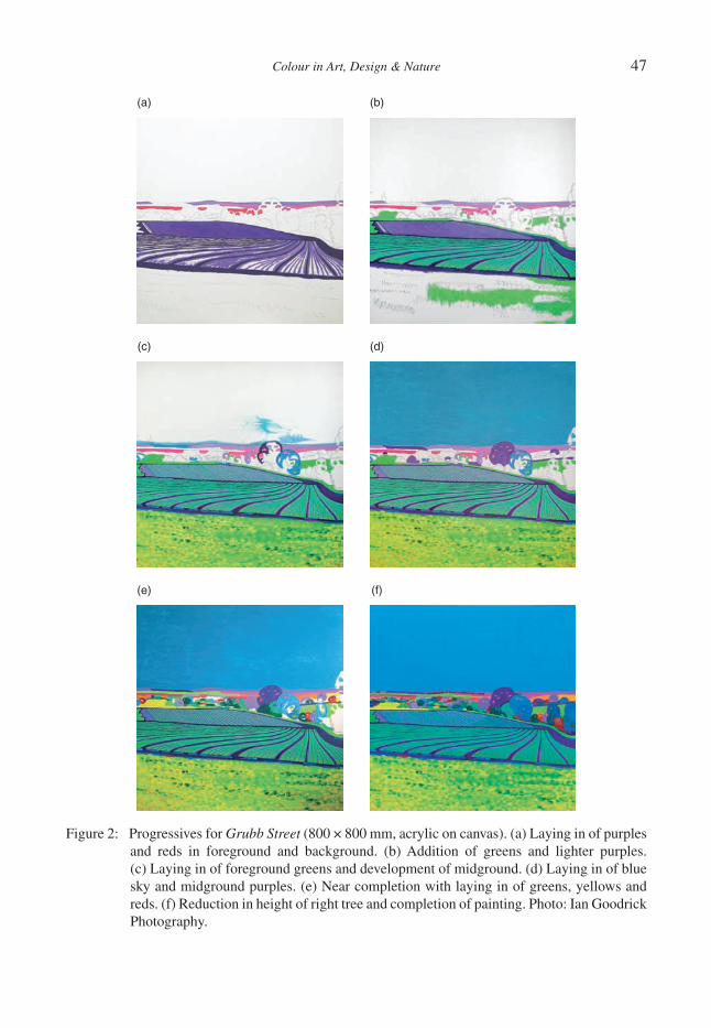
Colour in Art, Design & Nature 47
Figure 2: Progressives for Grubb Street (800 × 800 mm, acrylic on canvas). (a) Laying in of purples and reds in foreground and background. (b) Addition of greens and lighter purples. (c) Laying in of foreground greens and development of midground. (d) Laying in of blue sky and midground purples. (e) Near completion with laying in of greens, yellows and reds. (f) Reduction in height of right tree and completion of painting. Photo: Ian Goodrick Photography.
(a) (b)
(c) (d)
(e) (f)

48 Colour in Art, Design & Nature
(a) (b)
(c) (d)
(e) (f)
Figure 3: Progressives for Bridges of London (800 × 800 mm, acrylic on canvas). (a) Laying in of blue sky and green, red and orange base colours for river. (b) Laying in of purples and reds for buildings and development of river. (c) Laying in of light greens and reds of buildings and blues on ship. (d) Laying in of dark greens and reds for buildings and further work on river. (e) Near completion of buildings and rough blocking in of boats. (f) Showing completed painting. Photo: Ian Goodrick Photography.
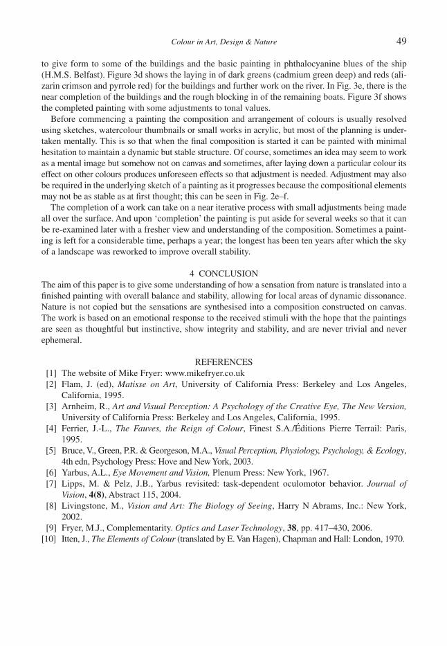
Colour in Art, Design & Nature 49
to give form to some of the buildings and the basic painting in phthalocyanine blues of the ship (H.M.S. Belfast). Figure 3d shows the laying in of dark greens (cadmium green deep) and reds (ali-zarin crimson and pyrrole red) for the buildings and further work on the river. In Fig. 3e, there is the near completion of the buildings and the rough blocking in of the remaining boats. Figure 3f shows the completed painting with some adjustments to tonal values.
Before commencing a painting the composition and arrangement of colours is usually resolved using sketches, watercolour thumbnails or small works in acrylic, but most of the planning is under-taken mentally. This is so that when the fi nal composition is started it can be painted with minimal hesitation to maintain a dynamic but stable structure. Of course, sometimes an idea may seem to work as a mental image but somehow not on canvas and sometimes, after laying down a particular colour its effect on other colours produces unforeseen effects so that adjustment is needed. Adjustment may also be required in the underlying sketch of a painting as it progresses because the compositional elements may not be as stable as at fi rst thought; this can be seen in Fig. 2e–f.
The completion of a work can take on a near iterative process with small adjustments being made all over the surface. And upon ‘completion’ the painting is put aside for several weeks so that it can be re-examined later with a fresher view and understanding of the composition. Sometimes a paint-ing is left for a considerable time, perhaps a year; the longest has been ten years after which the sky of a landscape was reworked to improve overall stability.
4 CONCLUSIONThe aim of this paper is to give some understanding of how a sensation from nature is translated into a fi nished painting with overall balance and stability, allowing for local areas of dynamic dissonance. Nature is not copied but the sensations are synthesised into a composition constructed on canvas. The work is based on an emotional response to the received stimuli with the hope that the paintings are seen as thoughtful but instinctive, show integrity and stability, and are never trivial and never ephemeral.
REFERENCES [1] The website of Mike Fryer: www.mikefryer.co.uk [2] Flam, J. (ed), Matisse on Art, University of California Press: Berkeley and Los Angeles,
California, 1995. [3] Arnheim, R., Art and Visual Perception: A Psychology of the Creative Eye, The New Version,
University of California Press: Berkeley and Los Angeles, California, 1995. [4] Ferrier, J.-L., The Fauves, the Reign of Colour, Finest S.A./Éditions Pierre Terrail: Paris,
1995. [5] Bruce, V., Green, P.R. & Georgeson, M.A., Visual Perception, Physiology, Psychology, & Ecology,
4th edn, Psychology Press: Hove and New York, 2003. [6] Yarbus, A.L., Eye Movement and Vision, Plenum Press: New York, 1967. [7] Lipps, M. & Pelz, J.B., Yarbus revisited: task-dependent oculomotor behavior. Journal of
Vision, 4(8), Abstract 115, 2004. [8] Livingstone, M., Vision and Art: The Biology of Seeing, Harry N Abrams, Inc.: New York,
2002. [9] Fryer, M.J., Complementarity. Optics and Laser Technology, 38, pp. 417–430, 2006.[10] Itten, J., The Elements of Colour (translated by E. Van Hagen), Chapman and Hall: London, 1970.

This page intentionally left blank
Colour in Art, Design & Nature
GOETHE, EASTLAKE AND TURNER: FROM COLOUR THEORY TO ART
C.S. KÖNIG1 & M.W. COLLINS2
1Institute for Bioengineering, Brunel University, UK. 2School of Engineering and Design, Brunel University, UK.
ABSTRACTWolfgang Goethe was a unique fi gure in the history of colour theory, being the founder of modern German lit-erature at the same time as being a scientist. His reaction to the colour experiments of Newton was both intense and controversial. It resulted in a comprehensive exposition of colour theory especially relevant to art. As a member of the Royal Academy, the English painter Sir Charles Eastlake was suffi ciently gripped by it to trans-late it into English. J.M.W. Turner annotated this translation and two iconic paintings resulted. Also, Turner exploited any available approaches to colour theory and this broader issue also involves Sir David Brewster and the Scottish Enlightenment. In this paper, we will give an initial study of the sequence from Goethe to Turner, together with the other issues.Keywords: WGoethe, JMWTurner, CEastlake, DBrewster, Scottish Enlightenment, colour theory, colour polarity
1 INTRODUCTIONThis study forms part of the wider historical connections between Newton’s (1642–1727) studies on colour and Turner’s (1775–1851) use of it. The men were giants in their respective fi elds of science and art. Newton epitomised the ‘rock-like status of knowledge’ [1] and of Turner ‘no artist has had a more passionate interest in colour’ [2]. The most prominent bridge between Newton’s science and Turner’s art is provided by Goethe (1749–1842). Goethe, the literary (and poet, and play writer) had even considered a career as a professional painter. As a critic and art lover, it is said that his art col-lection considered of a staggering 26,511 pieces, from all periods in art history by the end of his life [3]. The publication of his own extensive experiments on colour in 1810 [4] constituted ‘a scathing attack on Newton’ [5]. Despite this anti-Newtonianism [6], Eastlake (1793–1865) was so impressed by Goethe’s work that he translated it into English in 1840 [7]. Eastlake’s preface in Theory of Col-ours [7] is a surprisingly modern-reading justifi cation for doing this, and moreover, he provides some 50 pages of detailed notes of archival character. Although not a scientist (some notes are by S.F., meaning ‘scientifi c friend’ [7]), Eastlake was of the highest regard in the art world, to become President of the Royal Academy in 1850 and the fi rst Director of the National Gallery in 1855 [8].
Eastlake and Turner were very close friends [9] and Turner extensively annotated his copy of Eastlake’s translation. Indeed also Lady Eastlake paid frequent tribute to Turner as an artist [10]. With self-confessed diffi culty this has been analysed in detail by Gage [11]. In consistency with Turner’s general attitude to art theory –‘never heard him utter a single rule of colour’ [12] – the notes are, for example, ‘elliptical’ when choosing between Goethe and Newton [11]. None the less, on Goethe’s key concept of the polarity of light and darkness, Gage makes the telling comment that Turner ‘was far closer (to Goethe) than he could ever have imagined’ [13]. Moreover, again quoting Gage [11] it resulted in the ‘purest essay in practical theory which Turner ever made’ – his iconic Deluge paintings of 1843, the title of one of which includes Goethe. In keeping with this polarity, Turner’s creative process could include painting ‘sheet after sheet of washes, especially ochre and blue’ [14].
This all lent, and lends, considerable status to Goethe’s work. To Gage’s [15] ‘routinely included in scientifi c, as well as philosophical discussions of colour’, and ‘absorbed into the mainstream
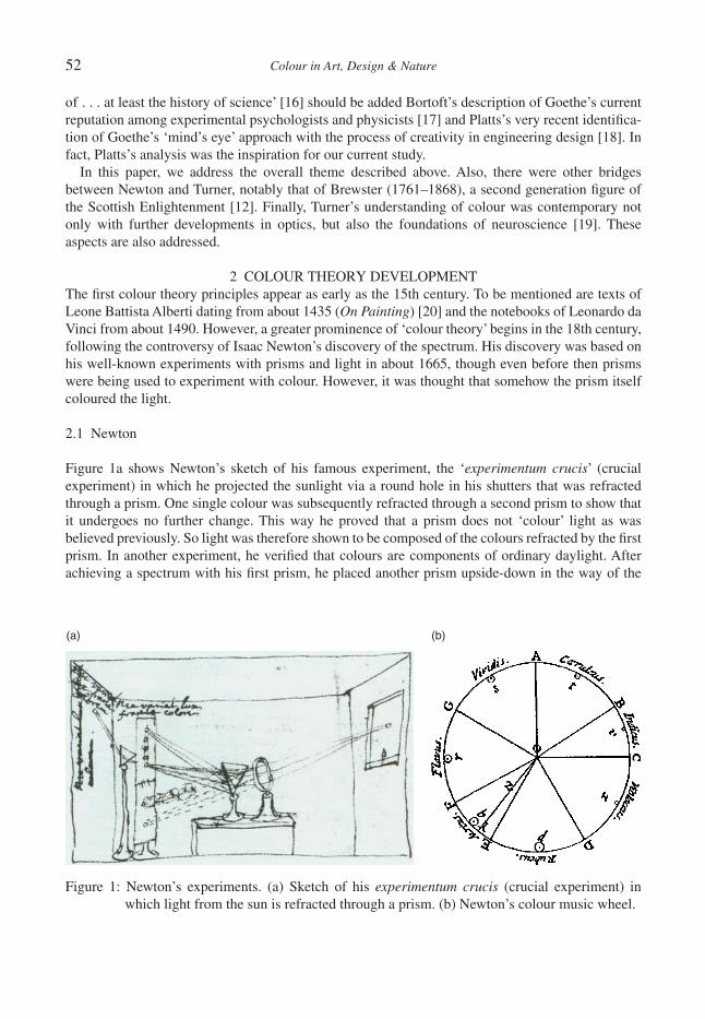
52 Colour in Art, Design & Nature
of . . . at least the history of science’ [16] should be added Bortoft’s description of Goethe’s current reputation among experimental psychologists and physicists [17] and Platts’s very recent identifi ca-tion of Goethe’s ‘mind’s eye’ approach with the process of creativity in engineering design [18]. In fact, Platts’s analysis was the inspiration for our current study.
In this paper, we address the overall theme described above. Also, there were other bridges between Newton and Turner, notably that of Brewster (1761–1868), a second generation fi gure of the Scottish Enlightenment [12]. Finally, Turner’s understanding of colour was contemporary not only with further developments in optics, but also the foundations of neuroscience [19]. These aspects are also addressed.
2 COLOUR THEORY DEVELOPMENTThe fi rst colour theory principles appear as early as the 15th century. To be mentioned are texts of Leone Battista Alberti dating from about 1435 (On Painting) [20] and the notebooks of Leonardo da Vinci from about 1490. However, a greater prominence of ‘colour theory’ begins in the 18th century, following the controversy of Isaac Newton’s discovery of the spectrum. His discovery was based on his well-known experiments with prisms and light in about 1665, though even before then prisms were being used to experiment with colour. However, it was thought that somehow the prism itself coloured the light.
2.1 Newton
Figure 1a shows Newton’s sketch of his famous experiment, the ‘experimentum crucis’ (crucial experiment) in which he projected the sunlight via a round hole in his shutters that was refracted through a prism. One single colour was subsequently refracted through a second prism to show that it undergoes no further change. This way he proved that a prism does not ‘colour’ light as was believed previously. So light was therefore shown to be composed of the colours refracted by the fi rst prism. In another experiment, he verifi ed that colours are components of ordinary daylight. After achieving a spectrum with his fi rst prism, he placed another prism upside-down in the way of the
Figure 1: Newton’s experiments. (a) Sketch of his experimentum crucis (crucial experiment) in which light from the sun is refracted through a prism. (b) Newton’s colour music wheel.
(a) (b)
Colour in Art, Design & Nature 53
light spectrum after passing the fi rst prism. The band of colours recombined into the original, white sunlight. He published his experiments by giving his public ‘optical’ lectures between 1670 and 1672. His paper ‘Theory about Light and Colours’ in the Royal Society’s journal, Philosophical Transactions, was published in 1672 [21]. The fi rst edition of his ‘Theory of Colour’ (Opticks) appeared in 1704 [22] in which he discussed the so-called ‘primary colours’. Newton believed there were seven primary colours constituting the spectrum; red, orange, yellow, green, blue, indigo, and violet. Figure 1b shows his colour music wheel in which the colours of the spectrum are shown in sequence from red to violet, as wedges between musical notes. In consistency with the analogy thinking of the Greek sophists of the classic age, he chose seven colours out of a belief that there was a connection between the colours, the musical notes, the days of the week, and the by then known planets in the solar system. Newton was also equating the physical qualities of light with those of pigments. Although he was wrong in assuming that these qualities were the same, he implied the possibility of applying certain aspects of optical theory to painting [23].
2.2 Moses Harris
Between 1766 and 1770, that is around one hundred years after Newton’s separation of white light through a prism, a book with the title The Natural System of Colours [24] appeared, dedicated to the head of the Royal Academy at the time, Sir Joshua Reynolds. There the English entomologist and engraver Moses Harris examines Newton’s work and attempts to explain the principles by which further colours can be created from three ‘primary’ (sometimes called ‘primitive’) colours based on RYB (red–yellow–blue) theory. He writes ‘the principles on which are produced, materially, or by the painter’s art, all the varieties if colour which can be formed from red, blue and yellow; which three GRAND or PRINCIPLE COLOURS contain all the hues and teints to be found in the different objects of nature’. His published colour chart is the fi rst ever to appear in full hue or colour (Fig. 2a), and is the fi rst completely symmetrical and complementary colour system [25]. His prismatic wheel contains six major colours, the three generative, red, yellow and blue, and the three mediate or sec-ondary hues, orange, green and purple, omitting Newton’s seventh colour, indigo [23]. This colour mixing behaviour had long been known to printers, dyers and painters, but these trades preferred pure pigments to primary colour mixtures, because the mixtures often turned out as too dull, i.e. as too unsaturated.
Quite soon after, in 1790, Hermann von Helmholtz and James Clerk Maxwell fi rst discovered that the primary colours of light were in fact red, green and blue.
3 GOETHE’S COLOUR EXPERIMENTSUntil Goethe no one had questioned the validity of Newton’s ideas on light and colour. Goethe, being both a poet and a scientist, was unique in the way the very different disciplines interacted in his achievements. Goethe’s reasons for developing his own colour theory are complex, being of both rational and spiritual nature. Although he states that the painter’s interest is at the heart of his inves-tigations, his well-known antipathy against Newton’s theories on colour and light may have been an equally strong motivator. Goethe’s book, a 1400 page treatise, Theory of Colours (‘Zur Farbenlehre’) [4, 7] was published in 1810. It is not so much a theory, but a description of his experiments and their results. Due to his own experimental interpretations, he was misled in believing Newton to be wrong. Goethe states: ‘I am the only person in this century who has the right insight into the diffi cult science of colours, that is, what I am rather proud of, and that is what gives me the feeling that I have out-stripped many’ [26]. Goethe devises colour science in a completely new way. Whereas Newton had viewed colour solely from a physical point of view, which involved light striking objects and entering
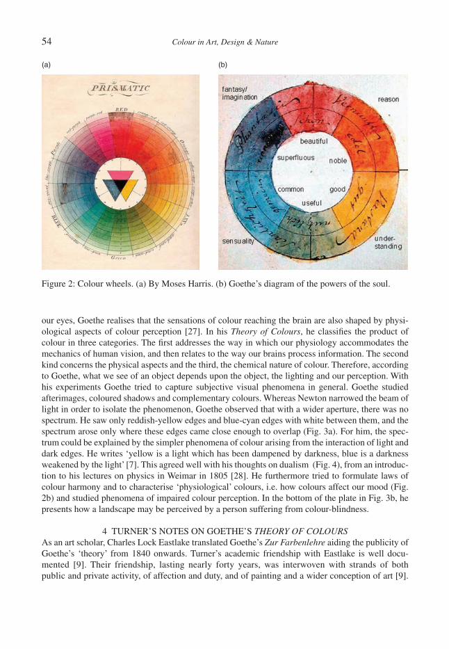
54 Colour in Art, Design & Nature
our eyes, Goethe realises that the sensations of colour reaching the brain are also shaped by physi-ological aspects of colour perception [27]. In his Theory of Colours, he classifi es the product of colour in three categories. The fi rst addresses the way in which our physiology accommodates the mechanics of human vision, and then relates to the way our brains process information. The second kind concerns the physical aspects and the third, the chemical nature of colour. Therefore, according to Goethe, what we see of an object depends upon the object, the lighting and our perception. With his experiments Goethe tried to capture subjective visual phenomena in general. Goethe studied afterimages, coloured shadows and complementary colours. Whereas Newton narrowed the beam of light in order to isolate the phenomenon, Goethe observed that with a wider aperture, there was no spectrum. He saw only reddish-yellow edges and blue-cyan edges with white between them, and the spectrum arose only where these edges came close enough to overlap (Fig. 3a). For him, the spec-trum could be explained by the simpler phenomena of colour arising from the interaction of light and dark edges. He writes ‘yellow is a light which has been dampened by darkness, blue is a darkness weakened by the light’ [7]. This agreed well with his thoughts on dualism (Fig. 4), from an introduc-tion to his lectures on physics in Weimar in 1805 [28]. He furthermore tried to formulate laws of colour harmony and to characterise ‘physiological’ colours, i.e. how colours affect our mood (Fig. 2b) and studied phenomena of impaired colour perception. In the bottom of the plate in Fig. 3b, he presents how a landscape may be perceived by a person suffering from colour-blindness.
4 TURNER’S NOTES ON GOETHE’S THEORY OF COLOURSAs an art scholar, Charles Lock Eastlake translated Goethe’s Zur Farbenlehre aiding the publicity of Goethe’s ‘theory’ from 1840 onwards. Turner’s academic friendship with Eastlake is well docu-mented [9]. Their friendship, lasting nearly forty years, was interwoven with strands of both public and private activity, of affection and duty, and of painting and a wider conception of art [9].
(a) (b)
Figure 2: Colour wheels. (a) By Moses Harris. (b) Goethe’s diagram of the powers of the soul.

Colour in Art, Design & Nature 55
Therefore, it is hardly surprising that Turner would own a copy of Eastlake’s translation, Goethe’s Theory of Colours, which he annotated in detail [29]. From 1843 to 1847 Eastlake became Keeper of the London’s National Gallery followed by directorship from 1855 until his death in 1865. In this position, he would become responsible for the reception and initial installation of Turner’s bequest [8].
Turner studied Goethe’s work thoroughly and though critical of it, he readily responded to Goethe’s scientifi c analysis of colour [30], some of it well-documented by his lectures. Indeed the lecture notes of his Perspective Lectures series suggest that Turner was well aware of Goethe’s work prior to the Eastlake’s translation since Turner resigned from his professorship in 1837 [29]. Undeni-ably Turner’s interest in optics in relation to painting is manifest in his notes for the Royal Academy lecture dealing with colours. Turner visited Weimar to paint Goethe’s portrait in 1819. According to Gage [29] the poet found that Turner already knew the outlines of his work as its principles were embodied in the writings of a number of British anti-Newtonians (see later). Turner noted the dis-tinction between mathematical and ‘optical’, i.e. visible, colour which he tried to put right in later lectures. In a note to Goethe Turner saw this as the main barrier between science and art [11]. While Goethe had been concerned to show that the division between mathematical and ‘optical’ colour was an illusionary one – albeit not being fully successful – Turner maintained them as distinct [11]. What links Turner and Goethe is their common belief of polarities [29], i.e. light and dark or warm and cool colours.
5 TURNER’S OTHER COLOUR THEORY INFLUENCESFull justice cannot be done to the Goethe–Eastlake–Turner theme without considering the infl uence of other post-Newtonian workers on Turner’s use of colour theory. The principles of Goethe’s work
(a) (b)
Figure 3: Goethe’s experiments. (a) Experiments with aperture and spectrum. (b) His fi rst diagram.

56 Colour in Art, Design & Nature
were embodied in the writings of a number of British anti-Newtonian scientists and artists like James Sowerby, Edward Bankcroft, Jospeh Reade and David Brewster which circulated among painters [29]. Here we restrict our discussion to infl uences of Moses Harris and Brewster on Turner’s work. Space does not allow consideration of other important fi gures such as Field.
Newton’s colour wheel with seven spectral components (Fig. 1b and [5]) was never really accepted. By contrast, Moses Harris’s wheel (Fig. 2a and [5]) with its three primary and three secondary col-ours, constituted ‘the basic form for all subsequent colour wheels’ [23]. Harris’s work is said to be exemplary for the level of understanding of colour order at the time [31]. Now colour was a signifi -cant feature of Turner’s Royal Academy lectures on perspective, as described by Gage [13], and in 1818 he promulgated several ‘colour-circles’ [13]. One of these was derived from Moses Harris’s wheel, but ‘completely reinterpreted’. In all three yellow was the dominant primary, expressing the light partner of his light-shade interpretation of colour.
Duality of manifestation as contrast:
welightbody
andandand
two souls,andandandandandandand
two parts of a body,and
breathing.
the objects;darkness,soul,
mindGodthoughtidealssensualityfantasybeing
material,the world,elaboration,realities,reason,intellect,longing,
right left
Physical experience:magnet.
How Distinct Colour isConsidered in a general point of view, colour is determined towards one of two sides. Itthus presents a contrast which we call polarity, and which we may fitly designate by the expressions plus and minus.
Plusyelloweffectlightbrightnesswarmthproximityrepulsionaffinity with acids
Minusbluedeprivationshadowdarknesscoldnessdistanceattractionaffinity with alkalis
(b)
(a)
Figure 4: Goethe’s thoughts on duality. (a) From an introduction to the lectures on physics, Weimar, October 2, 1805. (b) From Theory of Colours, both from [28].

Colour in Art, Design & Nature 57
This connects with a further key bridge between Newton, Goethe and Turner, that of the ‘brilliant and highly ambitious’ Scottish physicist Sir David Brewster [7,12]). He so successfully investi-gated aspects of the diffraction and polarisation of light, that he was internationally honoured before the age of 40. His publishing drive was little short of awesome, with ‘between three and four hundred Transactions papers’ and founding Editorships of The Edinburgh Encyclopedia, The Edinburgh Philosophical Journal and the Edinburgh Journal of Science [12, 32]. Also, in contrast to this, he was the inventor (re-discoverer [32]) of the Kaleidoscope of which some 200,000 were sold as soon as it was marketed [33]. Returning to Goethe, Eastlake himself admitted that his general science was savaged by the British optical establishment, describing the response as ‘somewhat vindictive’ and ‘unsparing criticism’ [7]. Goethe was ‘opposed particularly vehe-mently’ by Brewster [8,34].
However, in two crucial aspects Brewster’s convictions confi rmed those of Goethe. Like Moses Harris, red–yellow–blue was primary [35], implying the good colour wheel would be sixfold (Brews-ter spoke of the irrationality of the spectrum) rather than Newton’s seven [5]. Also, yellow was at Brewster’s RYB ‘apex’ being, uncannily like Goethe, ‘closest to the still more fundamental white light’. In Turner’s 1818 lectures yellow and white were ‘on a par’ in his warm/cool colour ranges [33]. The overall story of Turner’s Scottish visits includes the painter James Skene, a stage manage-ment partner with Sir Walter Scott for King William IV’s Edinburgh visit [12]. So Turner is linked via Brewster, Skene and Scott, with the later Scottish Enlightenment [12, 36], and in art history terms, Gage has Turner and Brewster in considerable resonance [33].
6 TURNER’S USE OF COLOUR IN HIS PAINTINGSDue to Turner’s long career the colours in his paintings refl ect how the manufacture of pigments changed in that time. In his early works, he used both organic pigments and mineral pigments includ-ing ochres, but he began using industrial products soon after they were introduced: cobalt blue appears in his works by 1810, chrome yellow by 1815 and emerald green from the 1830s [37]. This in connection with his accumulated knowledge of colour science altered his use of colour, but it was also subject to other stimuli. In [23], it is noted that paintings of his in the early 1820s appear much brighter and this brighter palette was attributed directly to his trip to Italy in 1819.
In Turner’s colour circle Diagram I (Fig. 5), a modifi cation of Harris’s ‘prismatic’ colour wheel [31], the upper and lower portions symbolise the light and dark of day and night [13]. Blue and red stand for degrees of shade, while yellow suggests light itself [37]. By using a mixture of RYB col-ours in pigments, he realised the destruction of the colour, tending towards ‘monotony, discord and mud’ [23].
Turner’s pairing of paintings Shade and Darkness – the Evening of the Deluge and Light and Colour (Goethe’s Theory) – the Morning after the Deluge – Moses Writing the Book of Genesis (Fig. 6) stand in direct reference to Goethe. Originally the pair was painted and framed as octagons carrying two of Turner’s last and most inspired statements of the natural vortex [37]. Here, Goethe’s colour polarity is evident from the light and dark or warm and cool colour oppositions along with their associated positive and negative connotations. These are clearly expressed in these terms by his usage of gold and grey [14]. In addition, Turner wanted to represent the harmonies of contrasting colours, but he adopted neither the theories of Newton nor Goethe. For Turner, their ideas followed the spectrum and primary colour frameworks too rigidly, so were unable to refl ect the diversity of colours and tonal relationships in nature. Thus, he also experimented with different colour combina-tions [37] and in ‘illustrating Goethe’s point – governed by his teeming mind – used colour as a means of controlling structures of his paintings’ [14]. However, it should be noted that even prior to Shade and Darkness and Light and Colour Turner produced pairings of paintings with the discussed
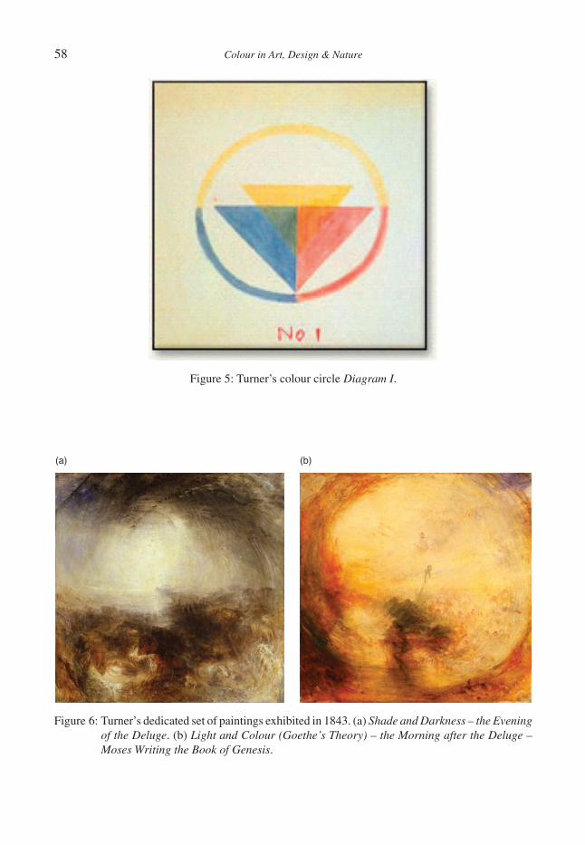
58 Colour in Art, Design & Nature
Figure 5: Turner’s colour circle Diagram I.
(a) (b)
Figure 6: Turner’s dedicated set of paintings exhibited in 1843. (a) Shade and Darkness – the Evening of the Deluge. (b) Light and Colour (Goethe’s Theory) – the Morning after the Deluge – Moses Writing the Book of Genesis.
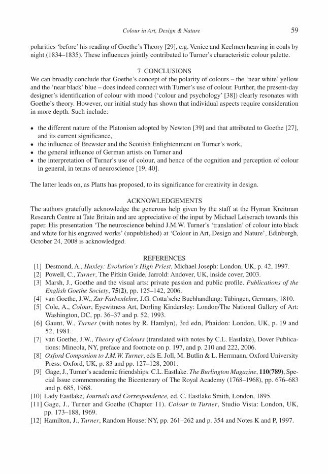
Colour in Art, Design & Nature 59
polarities ‘before’ his reading of Goethe’s Theory [29], e.g. Venice and Keelmen heaving in coals by night (1834–1835). These infl uences jointly contributed to Turner’s characteristic colour palette.
7 CONCLUSIONSWe can broadly conclude that Goethe’s concept of the polarity of colours – the ‘near white’ yellow and the ‘near black’ blue – does indeed connect with Turner’s use of colour. Further, the present-day designer’s identifi cation of colour with mood (‘colour and psychology’ [38]) clearly resonates with Goethe’s theory. However, our initial study has shown that individual aspects require consideration in more depth. Such include:
• the different nature of the Platonism adopted by Newton [39] and that attributed to Goethe [27], and its current signifi cance,
• the infl uence of Brewster and the Scottish Enlightenment on Turner’s work,
• the general infl uence of German artists on Turner and
• the interpretation of Turner’s use of colour, and hence of the cognition and perception of colour in general, in terms of neuroscience [19, 40].
The latter leads on, as Platts has proposed, to its signifi cance for creativity in design.
ACKNOWLEDGEMENTSThe authors gratefully acknowledge the generous help given by the staff at the Hyman Kreitman Research Centre at Tate Britain and are appreciative of the input by Michael Leiserach towards this paper. His presentation ‘The neuroscience behind J.M.W. Turner’s ‘translation’ of colour into black and white for his engraved works’ (unpublished) at ‘Colour in Art, Design and Nature’, Edinburgh, October 24, 2008 is acknowledged.
REFERENCES [1] Desmond, A., Huxley: Evolution’s High Priest, Michael Joseph: London, UK, p. 42, 1997. [2] Powell, C., Turner, The Pitkin Guide, Jarrold: Andover, UK, inside cover, 2003. [3] Marsh, J., Goethe and the visual arts: private passion and public profi le. Publications of the
English Goethe Society, 75(2), pp. 125–142, 2006. [4] van Goethe, J.W., Zur Farbenlehre, J.G. Cotta’sche Buchhandlung: Tübingen, Germany, 1810. [5] Cole, A., Colour, Eyewitness Art, Dorling Kindersley: London/The National Gallery of Art:
Washington, DC, pp. 36–37 and p. 52, 1993. [6] Gaunt, W., Turner (with notes by R. Hamlyn), 3rd edn, Phaidon: London, UK, p. 19 and
52, 1981. [7] van Goethe, J.W., Theory of Colours (translated with notes by C.L. Eastlake), Dover Publica-
tions: Mineola, NY, preface and footnote on p. 197, and p. 210 and 222, 2006. [8] Oxford Companion to J.M.W. Turner, eds E. Joll, M. Butlin & L. Herrmann, Oxford University
Press: Oxford, UK, p. 83 and pp. 127–128, 2001. [9] Gage, J., Turner’s academic friendships: C.L. Eastlake. The Burlington Magazine, 110(789), Spe-
cial Issue commemorating the Bicentenary of The Royal Academy (1768–1968), pp. 676–683 and p. 685, 1968.
[10] Lady Eastlake, Journals and Correspondence, ed. C. Eastlake Smith, London, 1895.[11] Gage, J., Turner and Goethe (Chapter 11). Colour in Turner, Studio Vista: London, UK,
pp. 173–188, 1969.[12] Hamilton, J., Turner, Random House: NY, pp. 261–262 and p. 354 and Notes K and P, 1997.
60 Colour in Art, Design & Nature
[13] Gage, J., Colour in the perspective lectures (Chapter 6). Colour in Turner, Studio Vista: London, UK, pp. 106–117, 1969.
[14] Wilton, A., Turner and colour, in Art/Neuroscience Series in front of ‘Bright Stone of Honour’, Ashmolean Museum, Oxford University, 2008.
[15] Gage, J., Colour and Meaning, Thames and Hudson: London, UK, p. 169, 1999.[16] Gage, J., Frankfurt and Weimar, Goethe and art, exhibition reviews. The Burlington Magazine,
136(1099), p. 717, 1994.[17] Bortoft, H., Goethe’s Scientifi c Consciousness, Monograph Series 22, Institute for Cultural
Research: London, UK, p. 9 and 10, 1998.[18] Platts, J., Newton, Goethe and the process of perception: an approach to design. Optics and
Laser Tech., 38(4–6), Special Issue: colour and design in the natural and manmade worlds, eds N. Harkness, C. Greated, D. Cutler & M. Collins, pp. 205–209, 2006.
[19] Leiserach, M. & Whiteley, J., Movement, Colour and Perspective in J.M.W. Turner and Later Artists, Lecture List for Michaelmas Term 2006, Committee for the history of art, University of Oxford: Oxford, UK, 2006; ART + NEUROSCIENCE Seminar Series, Trinity Term 2008, St. John’s College, Oxford, UK, p. 261, 2008.
[20] Alberti, L.B., On painting, 1435.[21] Newton, I., Theory about light and colours. Philosophical Transactions, Journal of the Royal
Society, 1672.[22] Newton, I., Opticks, Theory of Colour, 1st edn, 1704.[23] Finley, G.E., Turner: an early experiment with colour theory. Journal of the Warburg and Cour-
tauld Institutes, 30, pp. 357–366, 1967.[24] Harris, M., The Natural System of Colours, ~1770.[25] Gage, J., Colour and Meaning, University of California Press: Berkley, p. 137, 1999.[26] Webexhibits, http://www.webexhibits.org/colorart/ch.html.[27] Duck, M.J., Newton and Goethe on colour: physical and physiological considerations, Annals
of Science, 45, pp. 507–519, 1988.[28] Matthaei, R. (ed), Goethe’s Colour Theory, Studio Vista Ltd.: London, p. 68, 1971.[29] Gage, J., Turner’s annotated books: Goethe’s ‘Theory of Colours’. Turner Studies, 4(2),
pp. 34–52, 1984.[30] Exum, J.C. & Moore, S.D., Biblical Studies/Cultural Studies: The Third Sheffi eld Colloquium,
Continuum International Publishing Group, p. 306, 1998.[31] Spillmann, W., Moses Harris’s The Natural System of Colours and its later representations,
Color Research and Application, 29(5), pp. 333–341, 2004.[32] Wikipedia, items for David Brewster.[33] Gage, J., Turner and the colour-science of his time (Chapter 7). Colour in Turner, Studio Vista:
London, UK, pp. 118–127, 1969.[34] Stephenson, H., Goethe’s Conception of Knowledge and Science, Edinburgh University Press,
p. 6, 1995.[35] Brewster, D., On a new analysis of solar light. Trans. Roy. Soc. Edinb., 12, pp. 123–136, 1834.[36] Wikipedia, items for Scottish Enlightenment.[37] Webpages of Tate Britain, Colour & Line – Turner’s Experiments, http://www.tate.org.uk/
britain/exhibitions/turnercolourandline/.[38] Llewelyn-Bowen, L., Design Rules, Contender Books/BBC: London, UK, pp. 67–73, 2003.[39] White, M., Isaac Newton, Fourth Estate: London, UK, p. 56, 1998.[40] Purves, D. & Lotto, R.B., Why We See What We Do, Sinauer Associates Inc.: Sunderland, MA,
USA, pp. 17–40, 2003.

Colour in Art, Design & Nature
ZVUK
M. GREATEDGlasgow School of Art, Glasgow, UK.
ABSTRACTThe author uses her exhibition Zvuk to explore ways in which sound within an exhibition of static visual art affects the overall sensory environment. Zvuk relates to the theme of anthropogenic noise and includes a 20 m panorama with surround sound. Independent evaluation reinforces the hypothesis that the visual and sonic images are strongly related.Keywords: art, colour, evaluation, exhibition, M Greated, noise, panorama, science, soundscape, sound, Zvuk.
1 INTRODUCTIONFor some time through exhibitions such as Sonitus and Kyst, the author has explored the connections between sound and vision and challenged this through her art practice. The hypothesis is that the occur-rence of sound within a visual art exhibition changes the way in which one experiences the visual art, and vice versa, and that the overall sensory environment signifi cantly affects the way in which a ‘viewer’ interprets and responds to either the sound or the visual elements in the work (Throughout this text the word ‘viewer’ is used to refer to the audience. This is the normal word to describe the audience/viewer/listener/participant in a visual art gallery context). The author is specifi cally looking at the combination of static visual art, in particular, the notion of painting and the panorama within a sound environment. There has been much consideration of sound in connection with the moving image through fi lm and video or sound with other digital media such as computing and web based art but there is little evidence of research into sound (as opposed to music) in connection with drawing or painting.
The art gallery, both traditional and contemporary, is generally a place of quiet contemplation or refl ection. Sounds within galleries are often assumed to be disruptive, therefore, a considered use of sound has much potential to affect the viewer. The addition of sound to what is traditionally a visual arena brings not only a time-based element into the visual work but also creates a different focus and opens the possibility of multiple channels of experience. This text addresses these issues using, as a case study, an experimental exhibition where sound was used alongside paintings. The exhibition held in Minsk, Belarus, was entitled Zvuk, the Russian word for sound.
2 BACKGROUNDSince 2007, the author has worked with sounds placed within the same environments as panoramic paintings thus situating her practice within the traditions of panoramic image and landscape painting as well as those of audiovisual installation. This work has stemmed directly from an attempt to marry the two areas of the audio and visual, considering the nature of each and allowing them to have a symbiotic relationship where one gains and feeds off the other with the resultant meaning being more than the sum of its parts. One of the unusual aspects of visual art, in particular painting, is that it treats the visual work as a temporal, experiential work, through the act of the viewer having to look or scan over the work with no fi xed viewpoint. This treats the painting or image as an installation, where the space itself and the environment are integral to the artwork.
The themes within the work relate to sound and came through an investigation of noise within our current environment, with both the visual and sonic imagery stemming from this. Scientifi c research
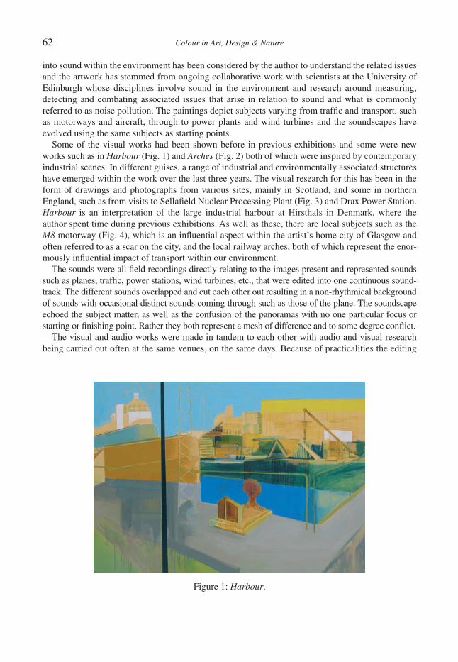
62 Colour in Art, Design & Nature
into sound within the environment has been considered by the author to understand the related issues and the artwork has stemmed from ongoing collaborative work with scientists at the University of Edinburgh whose disciplines involve sound in the environment and research around measuring, detecting and combating associated issues that arise in relation to sound and what is commonly referred to as noise pollution. The paintings depict subjects varying from traffi c and transport, such as motorways and aircraft, through to power plants and wind turbines and the soundscapes have evolved using the same subjects as starting points.
Some of the visual works had been shown before in previous exhibitions and some were new works such as in Harbour (Fig. 1) and Arches (Fig. 2) both of which were inspired by contemporary industrial scenes. In different guises, a range of industrial and environmentally associated structures have emerged within the work over the last three years. The visual research for this has been in the form of drawings and photographs from various sites, mainly in Scotland, and some in northern England, such as from visits to Sellafi eld Nuclear Processing Plant (Fig. 3) and Drax Power Station. Harbour is an interpretation of the large industrial harbour at Hirsthals in Denmark, where the author spent time during previous exhibitions. As well as these, there are local subjects such as the M8 motorway (Fig. 4), which is an infl uential aspect within the artist’s home city of Glasgow and often referred to as a scar on the city, and the local railway arches, both of which represent the enor-mously infl uential impact of transport within our environment.
The sounds were all fi eld recordings directly relating to the images present and represented sounds such as planes, traffi c, power stations, wind turbines, etc., that were edited into one continuous sound-track. The different sounds overlapped and cut each other out resulting in a non-rhythmical background of sounds with occasional distinct sounds coming through such as those of the plane. The soundscape echoed the subject matter, as well as the confusion of the panoramas with no one particular focus or starting or fi nishing point. Rather they both represent a mesh of difference and to some degree confl ict.
The visual and audio works were made in tandem to each other with audio and visual research being carried out often at the same venues, on the same days. Because of practicalities the editing
Figure 1: Harbour.
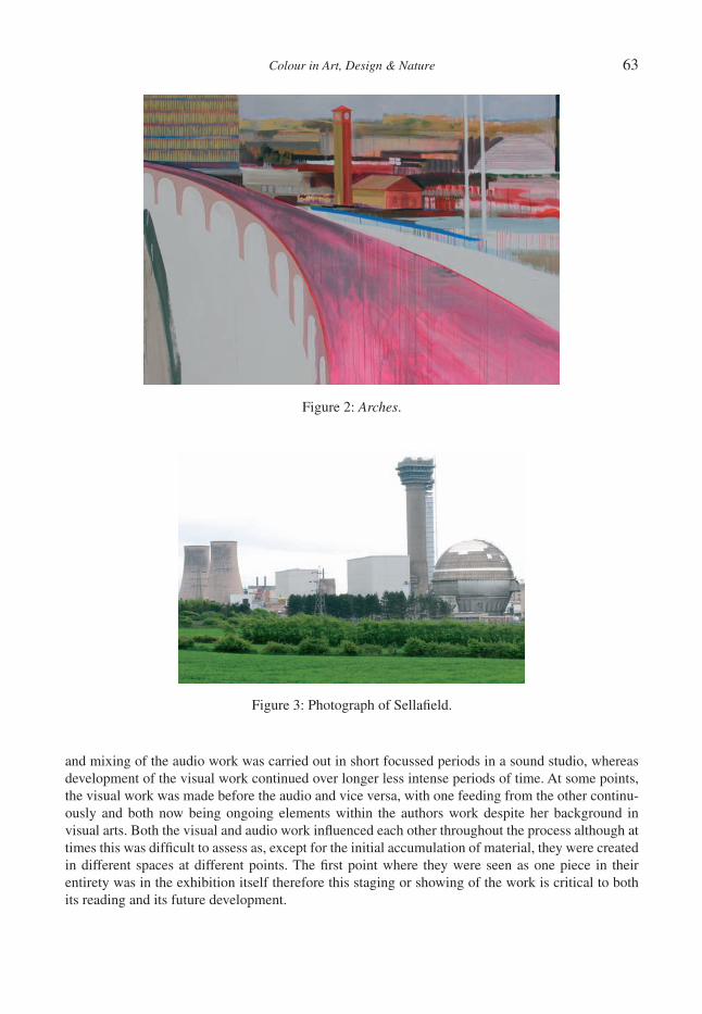
Colour in Art, Design & Nature 63
and mixing of the audio work was carried out in short focussed periods in a sound studio, whereas development of the visual work continued over longer less intense periods of time. At some points, the visual work was made before the audio and vice versa, with one feeding from the other continu-ously and both now being ongoing elements within the authors work despite her background in visual arts. Both the visual and audio work infl uenced each other throughout the process although at times this was diffi cult to assess as, except for the initial accumulation of material, they were created in different spaces at different points. The fi rst point where they were seen as one piece in their entirety was in the exhibition itself therefore this staging or showing of the work is critical to both its reading and its future development.
Figure 2: Arches.
Figure 3: Photograph of Sellafi eld.

64 Colour in Art, Design & Nature
3 THE EXHIBITIONZvuk was held in September 2008 in a gallery in the Palace of the Republic: a large cultural centre in the main square of Minsk, the capital city of Belarus. The city itself has a population of around two million with the central square being the hub of the city, acting as a local landmark and meeting place. Hosting a range of activities such as ballet, opera and musical concerts, the building has a restaurant, café and also a municipal art gallery that has connections with the University of Culture in Minsk and hosts a diverse range of contemporary exhibitions. The curator Denis Barsukov, also an artist, works alongside an assistant and a small team of invigilators/installers to run the gallery. Most of the work shown in the gallery originates from Belarus and the former Eastern Bloc. There is limited international art exhibited in Minsk due to the political climate creating a scene rather isolated from international, and particularly western, markets and cultural interactions. However, these do include some more experimental exhibitions curated by Barsukov in recent years such as Techno Art in 2007 [1]. Despite the apparent inaccessibility to wider markets and cultural scenes in Minsk, experience has suggested that through the media, the people are culturally aware of the inter-national context and are unusually active in terms of frequenting cultural activities.
The gallery is housed in the lower part of the building and consists of three adjoining rooms, two rectangular and one which is almost a hexagonal space. As the viewers entered the main door of the gallery they came upon a proportionally long rectangular room (Room 1), which led through to two other rooms, with the natural passage taken being through the hexagonal room (Room 2), then to the fi nal room (Room 3). This varying room structure was used strategically to enhance the different uses and discrete nature of the work in each room with the hexagonal room in particular allowing the opportunity to work within a space that surrounded a viewer in an effectively circular way [2]. There was a seemingly innate order through which viewers negotiated the space within the gallery that enabled the artist to have control over the sequence of experience and how works would be come across and this partly dictated the installation and assisted decisions in the placement of works throughout the three spaces.
Figure 4: M8.

Colour in Art, Design & Nature 65
In Rooms 1 and 3, paintings were hung of various sizes and subjects (Fig. 5), whereas within the hexagonal room two long images were hung creating the idea of a panorama, which wrapped the entire perimeter of the room, bar the doorways (Figs 6 and 7). This was made up of two one-metre high paintings, with the circumference of the room being approximately 20 metres. The panorama was installed into the gallery by being attached to a made to measure metal frame, which was hung in sections around the wall. The painting was then attached to the front side of the frame, which was then hidden, creating a continuous line with the paper sitting around 100 mm out from the wall. Also, within this room a three-dimensional soundscape was installed with the 5:1 surround sound speakers being placed strategically within appropriate corners around the gallery. What resulted was a space in which the viewer was surrounded by the painting, in a similar way to the original pano-ramas of the 18th and 19th century, yet also encompassed by loosely relating sounds.
Figure 5: Zvuk.
Figure 6: Zvuk panorama (section 1).
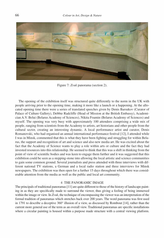
66 Colour in Art, Design & Nature
The opening of the exhibition itself was structured quite differently to the norm in the UK with people arriving prior to the opening time, making it more like a launch or a happening. At the allo-cated opening time there were a series of translated speeches given by Denis Barsukov (Curator of Palace of Culture Gallery), Debbie Radcliffe (Head of Mission at the British Embassy), Academi-cian A.V. Belui (Belarus Academy of Sciences), Nikita Foamin (Belarus Academy of Sciences) and myself. The opening was very busy with approximately 100 attendees comprising a wide mix of people, ranging from scientists from the Academy to artists, art historians and other people from the cultural sector, creating an interesting dynamic. A local performance artist and curator, Denis Romanovski, who had organised an annual international performance festival [12], I attended while I was in Minsk, commented that this is what they have been fi ghting and struggling for within Bela-rus, the support and recognition of art and science and also new media art. He was excited about the fact that the Academy of Science wants to play a role within arts or culture and the fact they had invested resources into this relationship. He seemed to think that this was a shift in thinking from the point of view of scientifi c bodies and was keen to engage them further and it was suggested that this exhibition could be seen as a stepping-stone into allowing the local artistic and science communities to gain some common ground. Several journalists and press attended with three interviews with dif-ferent national TV stations, a German and a local radio station and three interviews for Minsk newspapers. The exhibition was then open for a further 15 days throughout which there was consid-erable attention from the media as well as the public and local art community.
4 THE PANORAMIC IMAGEThe principals of traditional panoramas [11] are quite different to those of the history of landscape paint-ing in as they are specifi cally made to surround the viewer, thus giving a feeling of being immersed within the image or view. In Zvuk, the technique of encompassing the viewer was an interpretation of the formal tradition of panoramas which stretches back over 200 years. The word panorama was fi rst used in 1791 to describe a deceptive 360° illusion of a view, as discussed by Rombout [14], rather than the current more general use of the term as an overall view. Traditional panoramas are specifi c installations where a circular painting is housed within a purpose made structure with a central viewing platform.
Figure 7: Zvuk panorama (section 2).
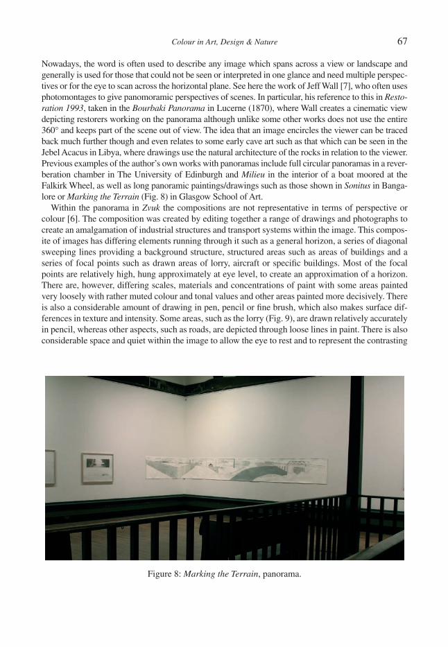
Colour in Art, Design & Nature 67
Nowadays, the word is often used to describe any image which spans across a view or landscape and generally is used for those that could not be seen or interpreted in one glance and need multiple perspec-tives or for the eye to scan across the horizontal plane. See here the work of Jeff Wall [7], who often uses photomontages to give panomoramic perspectives of scenes. In particular, his reference to this in Resto-ration 1993, taken in the Bourbaki Panorama in Lucerne (1870), where Wall creates a cinematic view depicting restorers working on the panorama although unlike some other works does not use the entire 360° and keeps part of the scene out of view. The idea that an image encircles the viewer can be traced back much further though and even relates to some early cave art such as that which can be seen in the Jebel Acacus in Libya, where drawings use the natural architecture of the rocks in relation to the viewer. Previous examples of the author’s own works with panoramas include full circular panoramas in a rever-beration chamber in The University of Edinburgh and Milieu in the interior of a boat moored at the Falkirk Wheel, as well as long panoramic paintings/drawings such as those shown in Sonitus in Banga-lore or Marking the Terrain (Fig. 8) in Glasgow School of Art.
Within the panorama in Zvuk the compositions are not representative in terms of perspective or colour [6]. The composition was created by editing together a range of drawings and photographs to create an amalgamation of industrial structures and transport systems within the image. This compos-ite of images has differing elements running through it such as a general horizon, a series of diagonal sweeping lines providing a background structure, structured areas such as areas of buildings and a series of focal points such as drawn areas of lorry, aircraft or specifi c buildings. Most of the focal points are relatively high, hung approximately at eye level, to create an approximation of a horizon. There are, however, differing scales, materials and concentrations of paint with some areas painted very loosely with rather muted colour and tonal values and other areas painted more decisively. There is also a considerable amount of drawing in pen, pencil or fi ne brush, which also makes surface dif-ferences in texture and intensity. Some areas, such as the lorry (Fig. 9), are drawn relatively accurately in pencil, whereas other aspects, such as roads, are depicted through loose lines in paint. There is also considerable space and quiet within the image to allow the eye to rest and to represent the contrasting
Figure 8: Marking the Terrain, panorama.
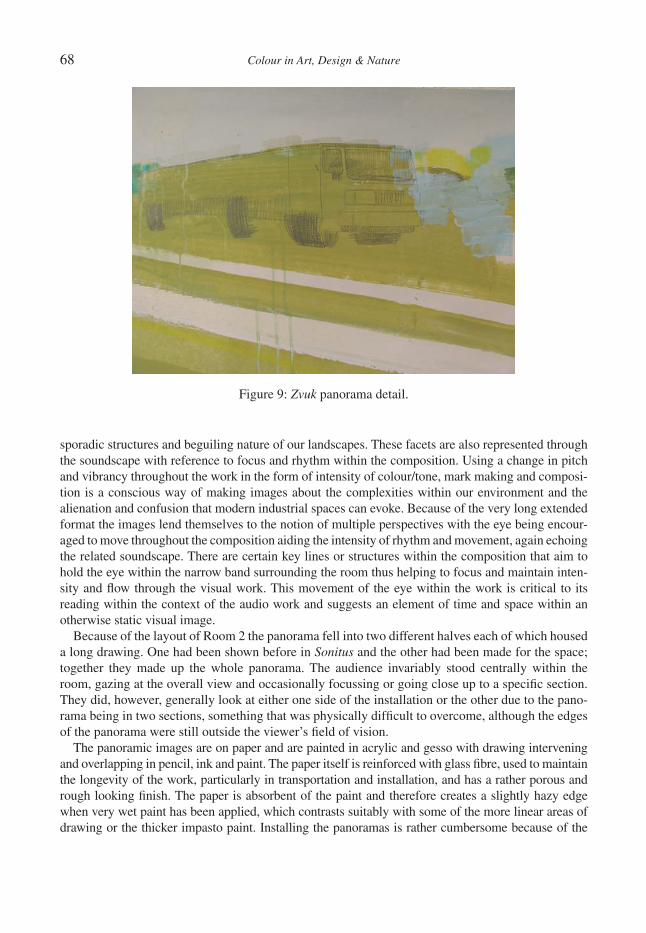
68 Colour in Art, Design & Nature
sporadic structures and beguiling nature of our landscapes. These facets are also represented through the soundscape with reference to focus and rhythm within the composition. Using a change in pitch and vibrancy throughout the work in the form of intensity of colour/tone, mark making and composi-tion is a conscious way of making images about the complexities within our environment and the alienation and confusion that modern industrial spaces can evoke. Because of the very long extended format the images lend themselves to the notion of multiple perspectives with the eye being encour-aged to move throughout the composition aiding the intensity of rhythm and movement, again echoing the related soundscape. There are certain key lines or structures within the composition that aim to hold the eye within the narrow band surrounding the room thus helping to focus and maintain inten-sity and fl ow through the visual work. This movement of the eye within the work is critical to its reading within the context of the audio work and suggests an element of time and space within an otherwise static visual image.
Because of the layout of Room 2 the panorama fell into two different halves each of which housed a long drawing. One had been shown before in Sonitus and the other had been made for the space; together they made up the whole panorama. The audience invariably stood centrally within the room, gazing at the overall view and occasionally focussing or going close up to a specifi c section. They did, however, generally look at either one side of the installation or the other due to the pano-rama being in two sections, something that was physically diffi cult to overcome, although the edges of the panorama were still outside the viewer’s fi eld of vision.
The panoramic images are on paper and are painted in acrylic and gesso with drawing intervening and overlapping in pencil, ink and paint. The paper itself is reinforced with glass fi bre, used to maintain the longevity of the work, particularly in transportation and installation, and has a rather porous and rough looking fi nish. The paper is absorbent of the paint and therefore creates a slightly hazy edge when very wet paint has been applied, which contrasts suitably with some of the more linear areas of drawing or the thicker impasto paint. Installing the panoramas is rather cumbersome because of the
Figure 9: Zvuk panorama detail.

Colour in Art, Design & Nature 69
desire to maintain the full length, i.e. one continuous piece of paper for each length of wall in the exhi-bition without folding, damaging edges or ripping in the de-installation.
The colours within the panoramas are from a limited palette ranging from viridian green through to ochres and greys, mainly within the earth range of colours. This simplifi cation of palette and nar-row colour range within the panorama contrasts signifi cantly with the other paintings in the exhibition. This again separates the impression given by Room 2 and creates a distinct environment within this space. The decision to use a limited palette seems to have enhanced not only the slightly unnerving atmosphere within this room but also allows the images and sounds to take presidence over the col-our or added element that a vibrant use of colour may bring within this already complex work.
In The Hague, Netherlands there is an excellent example of a complete panorama known as the Mesdag Panorama (1881) (Fig. 10), after Hendrik Willem Mesdag, the artist who painted it. It is almost 120 metres long by 14 metres high, one of the few complete panoramas in Europe and the oldest one in its original location [17]. Panoramas were normally housed in purpose built pavilions with natural lighting coming from the ceiling, a central viewing platform and distance between the viewer and the work to help create the illusion. The painting within this panorama is a precise depic-tion of the scene, as one would imagine it was. Mesdag corresponded with and was inspired by Willem Roelofs (1822–1897) and his desire was to create a naturalistic image within his painting. Seeliger ([17], p. 25) points out that Roelofs’ mission was to ‘try to discard all mannerisms and in a word try to imitate nature through feeling’. The colours are rather muted, almost as in a hazy day, and create a relatively accurate impression of looking into the distance.
Due to the enforced distance created by the physical setting of the pavilion style gallery a viewer cannot get close to the painting itself therefore the discrepancies of brush strokes or technical repre-sentation of the scene are more or less invisible to the naked eye. This creates a photographic, almost lifelike image where the viewer has the sensation of standing within this setting and genuinely look-ing out over the view. Jan Wolkers describes this sense of awe ([17], p. 58), ‘You slip in to be
Figure 10: Mesdag Panorama.
70 Colour in Art, Design & Nature
overwhelmed by improbably distant views from the top of the dunes, to be made giddy with the heav-ing swell of the vast sea, to breathe the air of the scale-encrusted nets, blending with the tarry smell of freshly-caulked fi shing boats on the beach, and the stench of rotting cockles among the washed-up jellyfi sh and the glistening sea lettuce along the high-water mark, to be sucked up with streaming hair into the clouds, to fl y with the seagulls, to veer like the swallows among the orange roofs of the peace-ful fi shing village, where the bracing air of pickled herring seeps from the very windows, to ripple along with the marram grass covering the dunes, where the biotope of lizard and backstriped toad has been blended with masterful strokes of the brush in the vegetation and the sand.’
An additional element to the Mesdag Panorama is that there is sand and actual debris, such as driftwood, etc., placed between the viewing stand and the physical painting. This enhances the crea-tion of the optical illusion of standing in a central viewing point as it becomes diffi cult in places to tell where the real sand fi nishes and the panoramic image begins. It adds a very different element to the work as it takes on the physical presence of the space, adding to the idea that this is an early environmental installation, created with what is possible and available. This method of display is still used extensively in museum natural history displays of animals and birds as well as in botanical gardens such as the cactus house at Kew.
Within the museum now there is also a soundtrack which plays as the viewer observes the pano-rama although unfortunately this is a rather tame description of the work aimed at the general public or tourist. This distracts quite signifi cantly from the viewing of the work as it gives a very specifi c viewpoint or slant to the reading of the image. The soundtrack is an aural interpretation of the work and its history, with some additional background music and is not in keeping with the period of creation of the work or in my opinion the intention. The context for this type of panorama is also of interest as the pavilion with viewing platform, sand, debris and voiceover is housed within a museum, making it a rather odd scene rather like a beach amusement or novelty aspect of a holiday. The pavil-ion structure certainly is part of the work, although the context can confuse the intent and rigour of the powerful panoramic image. The scale, lighting and viewing pavilion created for this panorama are integral aspects of the work and even today people are intrigued by the work and atmosphere it creates.
Currently, there have been many developments in panoramas in relation to photography, virtual environments or digital manipulation such as those by Scottish artist Graham Mack [20]. Similar processes are also used by estate agents on their websites to enable prospective clients a 360 view of a house. In ArtVision, the museum magazine for Mesdag Panorama, ‘an unlimited view in all direc-tions’, ‘a constantly changing scene’ and ‘a clear view of a specifi c subject’ are all suggested as different ways of viewing. The traditional panoramas were as lifelike as was possible to create at that time. However, there have been many interpretations and much scope for exploration and the role of the panorama is constantly changing, being reinterpreted. Rombout even devotes a section to these new interpretations in The Panorama Phenomenon [14], where contemporary and particularly digital photographic versions are investigated.
A signifi cant difference in the author’s panoramas and those referred to is that the Zvuk panoramas are not realistic observations of a scene but rather an amalgam or composite image of a landscape. They use methods of painting to represent but also to obscure and create different focuses within the work. They are not supposed to be observed purely for the spectacle of seeing but rather to create a surrounding environment for the viewer to inhabit, as opposed to the workings of the camera obscura, where one is confronted by a moving image but where the sound element is absent. The soundscape is critical to the reading of the Zvuk panorama; however, both the Mesdag and Zvuk panoramas cre-ate an environment through the tools of a surrounding painting and an environment integral to experiencing that, in physical and sensory terms.

Colour in Art, Design & Nature 71
5 THE SOUNDSCAPEThe soundscape was installed in the central gallery space with the objective of combining the visual and sound elements to create an immersive environment for the viewer. It is known from previous psychoacoustic tests [8, 18], that the sonic environment in a space affects the way in which visual images are viewed therefore combining the two should affect both the reading of the visual and the sonic. Because the panorama encircles the viewer a surround sound installation was particularly appropriate, so the two elements worked in tandem to create an atmosphere of complete immersion in the environment as well as introducing a temporal element into the work. The soundscape was made up from a series of sounds commonly heard as part of our man-made environment, recorded by the artist in the fi eld. The experience of the artist in actually recording the sounds in person on location was felt to be important and for this reason sound effect records or downloads were never used even though there are vast collections freely available from archival sources and the internet. McCartney ([9], p. 2) says ‘Can you call a piece a soundscape if it is made from sound effect CD’s? Does it make a difference? How well do soundscape composers know the place that they record?’
The sounds were recorded digitally and then mixed and edited on Cubase to create six surround sound fi les which were then played through the 5.1 surround sound speaker system. The reason for using the surround sound was to give the most realistic overall impression of sounds moving in a space and to move away from the directional stereo sound that often comes from speaker systems but does not represent the more reverberant reality of differing environments nor the specifi c move-ments of certain individual sounds. Surround sound gives the artist more control of how the sound works with images and encourages a closer relationship between the sound and image. In many ways, it allows the artist to compose sounds within a space the way that one may compose elements in a painting or install works within a gallery.
The word soundscape is the sonic equivalent of the word landscape and refers to the aural environ-ment or sound picture that is created by a collection of sounds, with different connotations, dependent on the context or one’s standpoint. A scientist may think of a soundscape as being the sound environment in a particular location with urban soundscapes, for example, often taking the form of complex noise maps constructed prior to the approval of a residential development to check that the ambient sound levels are of an acceptable level. An artist, on the other hand, may create a soundscape by combining different sounds in order to evoke concepts or sensations associated with a particular environment or indeed create an imaginary environment through a soundscape. This idea has its origins in the Musique Concrete movement developed in Paris in the 1950s by composers such as Pierre Schaeffer. Musique Concrete differs from other electronic music composition by being made up from recorded or ‘found’ sounds, as opposed to sounds that have been generated by electronic synthesis. These sounds are pieced together and manipulated in various ways to create a complete composition, but as Roads [13] points out, ‘it also refers to the manner of working with such sounds. Composers of Musique Concrete work directly with sound objects. Their compositions demand new forms of graphic notation, outside the boundaries of traditional scores for orchestras.’
In the case of the Zvuk soundscape, the graphical notation was produced by Cubase software that generates a display of the complete sound set shown in a temporal framework, effectively replacing the orchestral score. In the 1970s, a movement of acoustic ecologists emerged in Canada, dedicated to the recording and preservation of environmental sounds and this ultimately led on to a genre of soundscape composition, which is now accepted as a musical form in its own right. McCartney [9] says, ‘All of the processes involved in soundscape composition, from listening to recording, compo-sition and reception, are deeply enmeshed in issues of time, memory and place.’ In discussing the composition Cricket Voice by Hildegard Westerkamp, McCartney says, ‘Westerkamp challenges the description of soundscape composition as similar to Musique Concrete. Westerkamp asserts that
72 Colour in Art, Design & Nature
soundscape composition begins with conscious listening and awareness of our role as soundmakers. This is awareness of sound in context – unlike with the sound object of Musique Concrete, sound is not isolated but forms part of an environment that shapes it.’
Early Musique Concrete used tape recorders to piece together sound fragments, which may or may not have been manipulated by analogue devices such as fi lters and tape loops. Contemporary sound-scapes, on the other hand, can utilise the vast resources associated with digital technology to form found sounds into complete works. In structural terms, as pointed out by Traux [19], a soundscape may be based on a fi xed, moving or variable spatial perspective. From the fi xed perspective, the listener is static and the movement of the sound itself creates the temporal element. In the moving perspective, the lis-tener goes on a journey through a series of acoustic spaces, e.g. entering a harbour on a boat or moving from one room to the next. Variable perspectives are more abstract; they edge away from the creation of a single coherent landscape image and do not necessarily have clear analogues in the real world. Within these structures there may be a myriad of sonic transformations, e.g. changing speed, reversing or rever-berating, and the soundscape may be triggering memory recollections, rather than reconstructing a real situation. The Zvuk soundscape operates from a predominantly fi xed perspective.
A major advance in the production of soundscapes in recent years has been through the use of multi-phonic sound reproduction systems, usually known as surround sound. Early recordings for soundscapes, e.g. the fi rst recordings for the World Soundscape Project at Simon Fraser University, Canada [19], were stereophonic (or stereo), giving a limited degree of directionality in the reproduc-tion space. In stereo reproduction, the sounds are panned between two loudspeakers in front of the viewer, but there are no sounds from behind. Later works frequently use octophonic surround sound, which gives a much greater degree of immersion in the sonic environment. For practical purposes, it is possible to achieve very realistic spatial movement of sound in the horizontal plane by recording in mono and then intensity panning the resulting sound to the fi ve channels in a 5.1 confi guration in which fi ve loudspeakers handle high and mid range frequencies and the sixth channel is used solely for the low frequencies or bass, known as low frequency effect (LFE). This was the procedure used for the Zvuk soundscape. Strictly speaking, the signals routed to each loudspeaker should incorpo-rate both intensity and phase differences, dependent on the location of the sound source, but as pointed out by Moore [10], ‘One of the most important perceptual cues for both the direction and distance of a sound source is its intensity.’ So in practice the phase differences can be ignored with very little sacrifi ce in realism. On a matter of nomenclature, according to Rumsey ([15], p. 88), “strictly, the international standard nomenclature for 5.1 surround should be ‘3–2–1’, the last digit indicating the number of LFE channels”.
Six core sounds were used to produce the Zvuk soundscape: (i) motorway 1, (ii) motorway 2, (iii) a train, (iv) a plane, (v) a pneumatic drill in the street and (vi) a hissing factory noise. These were all recorded in mono with a high quality dynamic microphone and a digital recorder and when nec-essary a muff to minimise wind noise as the recordings were predominantly taken outdoors. There were effectively three characteristic time scales on which the different sound fragments occurred; a second for the industrial noises, ten seconds for the passing trains and aircraft and in excess of a minute for the background motorway. The sounds related to the images making up the panoramas, e.g. the aircraft sound, but also evoked subconscious links with the paintings in the other spaces within the exhibition, e.g. the train sound and the motorway. The source material for both the sound-scape and paintings were often taken at the same time.
Spatially the most successful movement effects were obtained when the sound source was recorded passing close to the microphone, e.g. the train sound was recorded on a station platform when a train approached from a distance, drew up alongside the platform and then drew away again. Similarly, the aircraft sound was recorded close to an airport as the plane fl ew overhead. As with most natural
Colour in Art, Design & Nature 73
environments, the overall sound was a combination of specifi c discrete sounds with well defi ned direc-tional characteristics and more general background sounds coming from all directions. Rumsey ([15], p. 2) points out “overall then, the spatial characteristics of natural sounds tend to split into ‘source’ and ‘environment’ categories, sources being relatively discrete, localised entries and environments often consisting of more general ‘ambient’ sound that is not easily localised and has a diffuse character. Such ambient sound is often said to create a sense of envelopment or spaciousness that is not tied to any specifi c sound source, but is the result of refl ections, particularly in indoor environments. The spacious-ness previously referred to as ‘outdoorness’ is much less related to refl ections, probably being more strongly related to the blending of distant sound sources that have become quite diffuse.”
The soundscape was constructed in Cubase SX3, a music production software package produced by the German company Steinberg that incorporates powerful editing facilities. Cubase has a feature that allows monophonic signals to be panned between fi ve loudspeakers arranged in a 5.1 confi gura-tion, i.e. left front, right front, centre, left surround and right surround using a graphical interface. With this it was possible to move the sounds around the room in effectively any desired pattern. Thus, for example, the train could be heard to enter the space from one side, stop in the middle and exit at the other side. The program recorded the time histories of the different pans used throughout the soundscape production so that the effects could be reproduced when the soundscape was replayed. Six tracks were set up, one for each of the core sounds, and these were edited for volume and panned between the fi ve speakers to generate the spatial movement. They were then bounced down together with the LFE channel to produce a set of six synchronised wave fi les, one for each of the six loud-speaker channels. The total length of the soundscape was ten minutes, after which time it was set to repeat as in an art exhibition such as Zvuk the soundscape has to be generated so that it plays auto-matically once it is set up at the beginning of a day. This was implemented by burning all six tracks to a DVD using Discwelder Bronze software.
Because of the multi-directional nature of sound within a reverberant setting there is a potential problem of noise pollution in the surrounding areas. Within the gallery that hosted Zvuk Rooms 1, 2 and 3 were adjoining with doorways that were open and wide, with no sound barriers. The sound from the panoramic room, Room 2, therefore, did extend outwards and percolate into the other rooms (Rooms 1 and 3). The fact that there was sound throughout the entire gallery meant that the sound environment upon entering the panoramic room was less alien to the viewer. Because of well-known diffraction effects [4] the sounds that carry throughout a large space are the ones with more bass; therefore, in Rooms 1 and 3 the sounds were relatively distorted and non-directional with the louder sounds and low frequency sounds carrying through and the subtle noises attenuated. In prac-tice, this resulted in certain sounds such as the plane and train being heard throughout the gallery space and others, such as the factory, being almost indistinguishable outside the room which housed the panorama. The author has looked into the possibility of encompassing these fi ndings into future exhibitions either through separating the sound or creating different acoustical spaces or alterna-tively by embracing this fi ltering effect and enhancing it through further deformations similar to the way in which the reverberation chamber was used as an extreme reverberant setting.
6 EVALUATIONThe philosophy of evaluation is discussed in many texts, e.g. Chelimsky and Shadish [5] and Rutman [16], but is quite complex and so in order to ensure an unbiased view on the impact of the different aspects of the exhibition, a professional evaluator was engaged from the Belarus Academy of Sciences. Thirty people attending the exhibition were selected by the evaluator and asked to give written responses to 14 questions whilst others were selected to be interviewed on a one-to-one basis. The questions were composed in collaboration with the evaluator who also wrote them out in

74 Colour in Art, Design & Nature
Belarusian and afterwards translated all the questions and answers into English. The evaluation included questions relating to the age and background of the respondents. These were selected to represent a spread of ages from under 25 years to over 55 years, of which nearly two-thirds of the people questioned were below the age of 30 years and virtually all of these said that they attended art events at least once a year, refl ecting the fact that a high proportion of those attending cultural events in Belarus are young people. Twenty percent of the respondents had some professional con-nection with the arts and most of the responses were quite detailed, well considered and in depth, indicative of both a high level of interest in the artwork and environmental subject matter and a well informed audience.
The fi rst questions put by the evaluator related to the paintings, e.g. ‘Have you enjoyed seeing paintings of industrial structures?’ and, ‘How did the panoramic paintings make you feel?’ In response to these there were many comments of a general nature like ‘very contemporary, condensed but sim-ple’, ‘not so much enjoyment, rather a quite new form of painting’ which suggested that the exhibition was understood to be signifi cantly different to what people were used to seeing in Belarus. Comments relating more specifi cally to the industrial landscapes included ‘I meditated on a complicated civilisa-tion and man-made world,’ ‘odd attraction’ and ‘I began to think about the noise problem.’ There was much interest in the panoramic room, exemplifi ed by comments such as ‘like fi nding yourself in the centre of action’, ‘proximity to noise’, ‘it creates a feeling of being in a cage; the panorama begins to evolve’ and ‘there are no corners; it seems like everything is surrounding you’.
The contrasting colour palettes between the different spaces in the exhibition appear to have made a signifi cant impact. One visitor remarked, ‘the serious subject was brought to life but in the king-dom of hope there is no winter; the colour shows it’. Another remarked that ‘the pink painting remains in the mind most of all because it is pulsating’ a reference to the predominantly pink paint-ing Arches. The comment ‘absolutely vivid and new; bright colours and deep imagination’ again appears to relate mainly to the railway and harbour paintings.
One of the primary objectives of the evaluation was to ascertain how the sound affected the percep-tion of the visual images. As the exhibition was set up, the sound was focussed in Room 2 containing the panoramic images so the audience could contrast viewing the individual paintings in a quieter environment with sporadic background noise to the panoramic room, where the images were accom-panied by the surrond soundscape. Virtually, all the people questioned felt that the sound had a marked effect on how they viewed the images. Typical comments were ‘the sound draws attention to the images and makes them more vivid’, ‘the sound amplifi es the illusion of a large space’, ‘the addition of the sound intensifi es the impressions’, ‘the sound makes it real’, ‘the sound vivifi es the panorama’, ‘the sound is the refl ection of life’, ‘the perception of the painting depends on the sound’, ‘the sound with the painting creates a plastic performance in my mind; the picture begins a life in motion’, ‘the sound helps you to feel ecological problems connected with man-made objects’, ‘with sound the impression is more absolute’ and ‘the sound helps you to imagine the objects moving’.
A number of people said that hearing the sounds within the visual environment of panoramas encircling their space, made them aware of sounds that would otherwise go unnoticed. One viewer commented, ‘I just want to stop and try to distinguish different sounds; those you can hear almost every day but pay no attention to.’ A number of people noted that the sound introduced a temporal effect into an otherwise static image. One person said, ‘the picture seems to turn into a movie; the panorama begins to evolve’. Another said, ‘The sound helps one imagine that the events and objects are moving.’
Some of the questions related to the overall effect of the exhibition. Out of all the respondents, only one said that they had seen an exhibition like this before. A couple of respondents said that they had previously come across exhibitions, where background music was played. The majority of people
Colour in Art, Design & Nature 75
found the effect on them to be disturbing so they left the exhibition with vivid images and an impres-sion of anxiety, rather than a sense of aesthetic pleasure and some of the comments here were quite extreme. Some examples are ‘I had a feeling of alarm, stress and even fear. I just wanted to leave the gallery and even the city as quickly as possible,’ ‘if the painter had wished to awake the public from their daily mental state, she has succeeded in it’, ‘The images are good but I can’t say I like them because the objects induce abhorrence.’ One expressed a feeling of ‘effort and exhaustion’ and said that they would have ‘liked the subject matter to have been different, e.g. of nature or children’. Yet another remarked, ‘It takes your breath away.’ Another respondent saw the exhibition as ‘unusual’ but ‘a harmonious combination of painting and sound’.
There were also questions relating to the social implications of the work and the responses show a general consensus that the exhibition helped to make the audience experience visually and aurally the contemporary world we live in. One visitor remarked, ‘I meditated on our complicated civilisation; with the help of sound, the painter uncovers some of the problems of our man-made environment.’ Another visitor remarked, ‘the painter makes an impression on me; I feel the subject really troubles her.’ Most people already knew about the issues associated with increasing sound levels in the environment but thought that the exhibition raised their level of awareness, e.g. one person said ‘my opinion was con-solidated – I already knew about the damaging infl uence of industrial development on living nature but the exhibition consolidated my opinion’. The comments suggest that the exhibition stirred the viewer’s feeling of what is happening in our present milieu and provoked contemplation and thought.
7 CONCLUSIONThe exhibition Zvuk came about through development of work around issues of noise in our environ-ment, which led to ongoing analysis of sound and vision within the context of visual art. The use of panoramic images has come directly from the desire to make work that encompasses the viewer and directly relates and blurs the temporal and spatial experience. A desire to create images which are not so fi xed or static yet still embrace the sensitive qualities of mark-making, texture and colour that can be found within drawing or painting has emerged as this work has developed. In a similar vein, there is an aspiration to make sounds which are three dimensional and textured, overlapping and complex yet still poignant within the context of an exhibition. It is important to keep in mind the artists own visual background and ensure development of the aesthetics of sound within this context. One observation has been that people fi nd sounds that are not considered music to be noise and therefore a nuisance, as opposed to non-art or design visuals which they fi nd easier to disregard if they do not connect with them. This is after all the origin of the work, from research around noise pollution, but this needs to be constantly re-evaluated in terms of perceived beauty within art or engagement with the visual and aural elements.
The interest in Zvuk from the local population and particularly through cultural quarters was over-whelming, with nearly 1000 visitors and much interest from the general public as well as contemporary artists and critics. The curator sent a recent email stating that the exhibition was ‘highly valued by the art society of Minsk’. The interest was three fold in that there was a genuine interest in the artwork itself, in the paintings as well as the soundscape. There was also a deep curios-ity around the idea of artwork relating to an issue such as the environment, which was uncommon if not unheard of in their current scene, and also there was a sense of enquiry around the use of sound alongside the rather industrial images. Many of the conversations were around the role of art in soci-ety, something that has radically changed as Belarussian identity has emerged from the former USSR, and the possibilities that are open in terms of materials and new technologies.
As stated by Calvert et al. [3], ‘A recent study has revealed that vision can be radically altered by sound in a non-temporal task, even when there is no ambiguity in the visual stimulus.’ Zvuk as well
76 Colour in Art, Design & Nature
as being an exhibition was also a testing ground for a variety of aspects of art practice mainly around how we experience work and how differing sensory experiences affect each other. The level of enquiry and interest that came from this exhibition, both in terms of refl ection of practice and through the response of the audience and local community in Minsk, has further engaged the author in the exploration and connection between sound and vision and how this can be a vehicle through which to create and experience art.
ACKNOWLEDGEMENTSThe author greatly acknowledges funding from the Engineering and Physical Sciences Research Council, support from the British Embassy of Belarus and suggestions from Martin Hammer and Karen Forbes.
REFERENCES [1] Barsukov, D., “Techno Art” Catalogue, Palace of the Republic Gallery, Minsk, 2007. [2] Blesser, B. & Salter, L.R., Space Speaks, Are You Listening? MIT Press, 2007. [3] Calvert, G.A., Spence, C. & Stein, B.E., The Handbook of Multisensory Processes, Cambridge:
MIT Press, p. 32, 2004. [4] Campbell, M., Greated, C. & Myers, M., Musical Instruments, Oxford University Press, p. 43,
2006. [5] Chelimsky, E. & Shadish, W. (eds), Evaluation for the 21st Century: A Handbook, Sage Pub-
lications, 1997. [6] Gage, J., Colour and Meaning, Thames and Hudson, 1999. [7] Galassi, P., Jeff Wall, Selected Essays and Interviews, MOMA: New York, NY, pp. 229–234,
2007. [8] Greated, M., The nature of sound and vision in relation to colour. Inspiration for Design; Spe-
cial issue of Optics and Laser Technology, in press. [9] McCartney, A., Circumscribed journeys through soundscape composition. Organised Sound,
7(1), pp. 1–3, 2002.[10] Moore, F.R., Elements of Computer Music, Prentice Hall, p. 353, 1990.[11] Oettermann, S., The Panorama: History of a Mass Medium, Zone Books, 1997.[12] Petrov, V. & Romanovski, D., Navinki, 9th International Performance Festival in Minsk, As-
sociation for Contemporary Art Minsk, 2007.[13] Roads, C., The Computer Music Tutorial, MIT Press, p. 117, 1996.[14] Rombout, T., “The Panorama Phenomenon” Uitgeverij P/F Kunstbeeld, Panorama Mesdag
and International Panorama Council, p. 5, 2006.[15] Rumsey, F., Spatial Audio, Focal Press, 2004.[16] Rutman, L. (ed.), Evaluation Research Methods, Sage Publications, 1984.[17] Seeliger, B.B.E., ArtVision, Betapress BV, Gilze, 2003.[18] Shams, L., Kamitani, Y. & Shimojo, S., Modulations of visual perception by sound. The Hand-
book of Multisensory Processes, eds G.A. Calvert, C. Spence & B.E. Stein, MIT Press, 2004.[19] Traux, B., Genres and techniques of soundscape composition as developed at Simon Fraser
University. Organised Sound, 7(1), pp. 5–14, 2002.[20] Panorama Mesdag: A Magnifi cent Experience in Time and Space. Museum leafl et. Available from:
http://www.worldwidepanorama.org/worldwidepanorama/wwp1205/html/GrahamMack.html.

Colour in Art, Design & Nature
TIME AND CHANGE: COLOUR, TASTE AND CONSERVATION
J.P. CAMPBELLHonorary Fellow, History of Art, ACE, University of Edinburgh, UK.
ABSTRACTThis paper surveys some major factors which commonly affect colour in paintings over time, with particular reference to art historical judgements about artists’ original intentions. A range of the most common causes of colour alteration, both external and intrinsic, such as surface dirt, darkening varnish, over-painting and old re-touching, the natural yellowing of ageing oil, the rising refractive index of drying oil, fugitive pigments and the effects of light is considered. The extent to which these changes in the appearance of paintings have con-sequences for taste, have implications for the training of art historians and affect how far conservators can, or should, restore colours to their original state is briefl y noted.Keywords: Dirt, varnish, oil, re-touching, over-painting, conservation, fugitive, refractive index, light, pigment.
1 INTRODUCTIONTime changes the appearance of paintings, and these changes affect how works of art are attributed, evaluated, interpreted and appreciated, as the engraving by William Hogarth’s (1697–1764) Time Smoking a Picture 1761 graphically demonstrates (Fig. 1). The illustration shows an oil painting, already obscured by the application of layers of tinted varnish, being further damaged by Father Time, who blows a grimy pall of dirty smoke over the original bright pigments.
Colours, as well as supports, grounds and varnishes of paintings, change over time. These changes can be caused by the intervention of external forces: by accident, such as damage through damp or abrasion and their subsequent repair, by deliberate application of superfi cial layers of glue or var-nish, or simply from the gradual deposit of dirty grease from candle smoke and settling grime from the general surroundings. Changes in colour may also develop from the intrinsic nature of the mate-rials used to make the painting. When ageing paintings are examined, the critic’s understanding of the artist’s intention about the role of colour in his work will be affected by the alterations that have occurred since it was made. To make any reasonable judgement about a painting, art critics should consider how far time has damaged the colour and the colour-tonal balance of that particular work of art, and how far these changes might affect the perception, interpretation and judgement of the artist’s intention. Conservators of paintings have to consider, on a case by case basis, what they ought to do about re-touching missing, damaged or changed areas of paint.
Colour has always held a central role in the study and appreciation of paintings. In the late 17th century, French artists and professional art historians hotly debated the relative supremacy of draw-ing or colour in painting [1]. Roger de Piles (1635–1709) rationalised the judgement of the quality of an artist’s achievement by dividing artistic achievement into four aspects: composition, draw-ing, colour and expression. He allotted marks for each aspect on a score chart with marks from 1 to 20, where 20 equalled unattainable, divine perfection. In this system, Michelangelo only attained a score of 4 out of 20 for colour, whereas Titian was considered to be supreme in colour with the maximum attainable mark of 18 [2]. At least one reason why Michelangelo’s ability as a colourist was so underrated by critics such as De Piles and Sir Joshua Reynolds (1723–1792) was that his paintings had suffered changes over time. We can see from the recent cleaning project of Michelangelo’s Sistine Ceiling, that accumulated layers of glue and deposits of candle grease dirt on the surface of the ceiling had dimmed the effect of the original bright tints almost to a mono-chromatic appearance [3, 4].
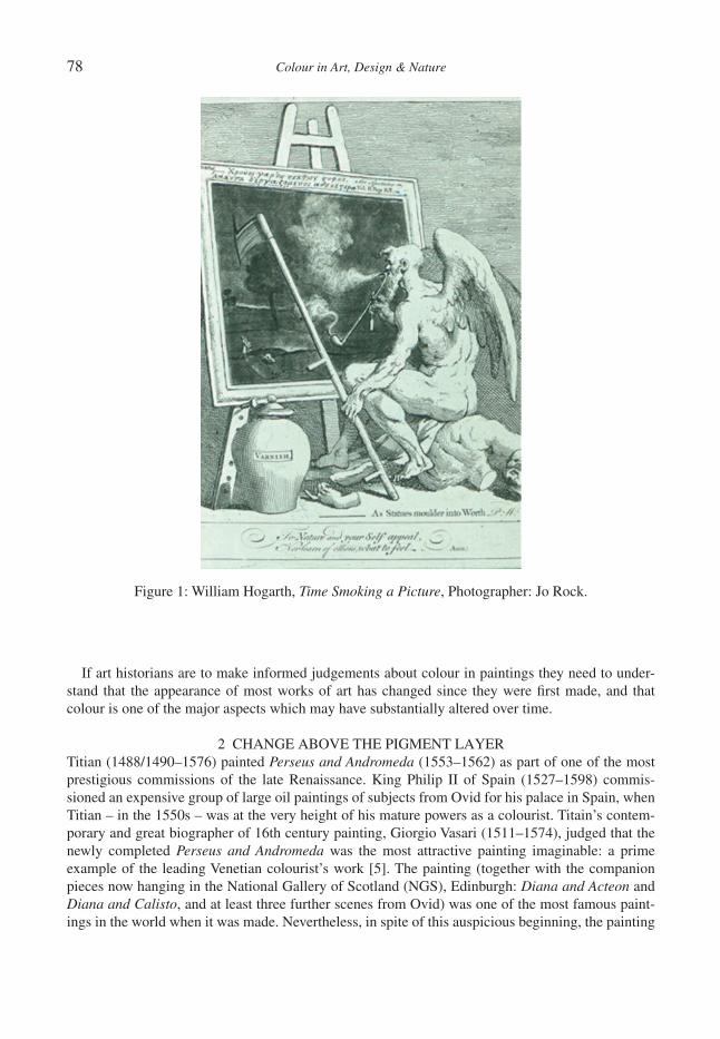
78 Colour in Art, Design & Nature
If art historians are to make informed judgements about colour in paintings they need to under-stand that the appearance of most works of art has changed since they were fi rst made, and that colour is one of the major aspects which may have substantially altered over time.
2 CHANGE ABOVE THE PIGMENT LAYERTitian (1488/1490–1576) painted Perseus and Andromeda (1553–1562) as part of one of the most prestigious commissions of the late Renaissance. King Philip II of Spain (1527–1598) commis-sioned an expensive group of large oil paintings of subjects from Ovid for his palace in Spain, when Titian – in the 1550s – was at the very height of his mature powers as a colourist. Titain’s contem-porary and great biographer of 16th century painting, Giorgio Vasari (1511–1574), judged that the newly completed Perseus and Andromeda was the most attractive painting imaginable: a prime example of the leading Venetian colourist’s work [5]. The painting (together with the companion pieces now hanging in the National Gallery of Scotland (NGS), Edinburgh: Diana and Acteon and Diana and Calisto, and at least three further scenes from Ovid) was one of the most famous paint-ings in the world when it was made. Nevertheless, in spite of this auspicious beginning, the painting
Figure 1: William Hogarth, Time Smoking a Picture, Photographer: Jo Rock.
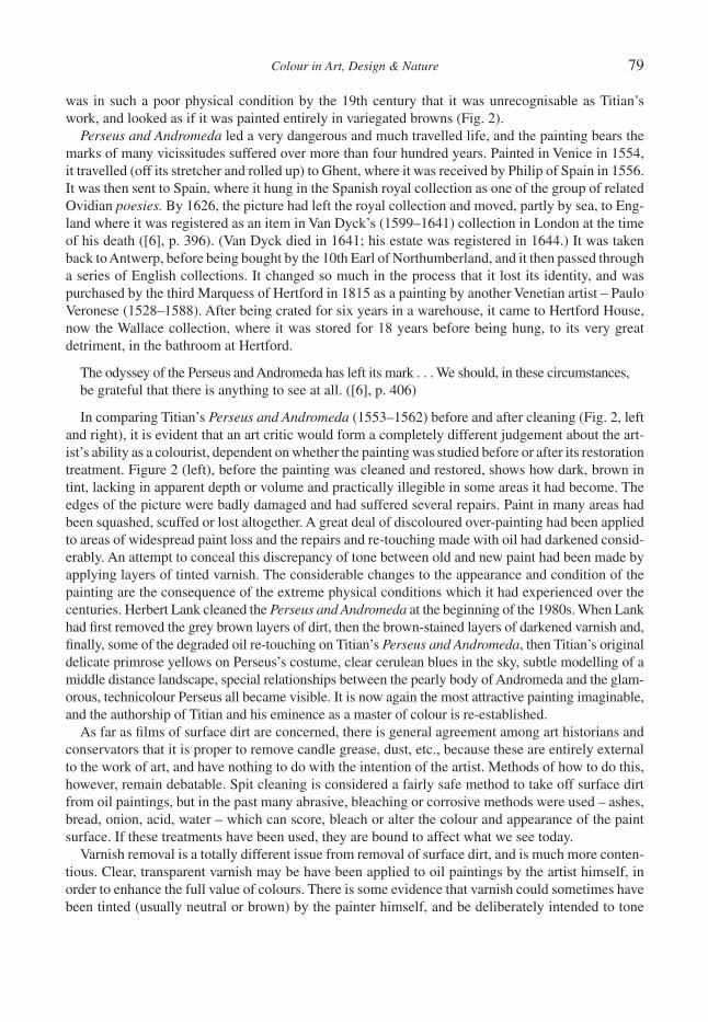
Colour in Art, Design & Nature 79
was in such a poor physical condition by the 19th century that it was unrecognisable as Titian’s work, and looked as if it was painted entirely in variegated browns (Fig. 2).
Perseus and Andromeda led a very dangerous and much travelled life, and the painting bears the marks of many vicissitudes suffered over more than four hundred years. Painted in Venice in 1554, it travelled (off its stretcher and rolled up) to Ghent, where it was received by Philip of Spain in 1556. It was then sent to Spain, where it hung in the Spanish royal collection as one of the group of related Ovidian poesies. By 1626, the picture had left the royal collection and moved, partly by sea, to Eng-land where it was registered as an item in Van Dyck’s (1599–1641) collection in London at the time of his death ([6], p. 396). (Van Dyck died in 1641; his estate was registered in 1644.) It was taken back to Antwerp, before being bought by the 10th Earl of Northumberland, and it then passed through a series of English collections. It changed so much in the process that it lost its identity, and was purchased by the third Marquess of Hertford in 1815 as a painting by another Venetian artist – Paulo Veronese (1528–1588). After being crated for six years in a warehouse, it came to Hertford House, now the Wallace collection, where it was stored for 18 years before being hung, to its very great detriment, in the bathroom at Hertford.
The odyssey of the Perseus and Andromeda has left its mark . . . We should, in these circumstances, be grateful that there is anything to see at all. ([6], p. 406)
In comparing Titian’s Perseus and Andromeda (1553–1562) before and after cleaning (Fig. 2, left and right), it is evident that an art critic would form a completely different judgement about the art-ist’s ability as a colourist, dependent on whether the painting was studied before or after its restoration treatment. Figure 2 (left), before the painting was cleaned and restored, shows how dark, brown in tint, lacking in apparent depth or volume and practically illegible in some areas it had become. The edges of the picture were badly damaged and had suffered several repairs. Paint in many areas had been squashed, scuffed or lost altogether. A great deal of discoloured over-painting had been applied to areas of widespread paint loss and the repairs and re-touching made with oil had darkened consid-erably. An attempt to conceal this discrepancy of tone between old and new paint had been made by applying layers of tinted varnish. The considerable changes to the appearance and condition of the painting are the consequence of the extreme physical conditions which it had experienced over the centuries. Herbert Lank cleaned the Perseus and Andromeda at the beginning of the 1980s. When Lank had fi rst removed the grey brown layers of dirt, then the brown-stained layers of darkened varnish and, fi nally, some of the degraded oil re-touching on Titian’s Perseus and Andromeda, then Titian’s original delicate primrose yellows on Perseus’s costume, clear cerulean blues in the sky, subtle modelling of a middle distance landscape, special relationships between the pearly body of Andromeda and the glam-orous, technicolour Perseus all became visible. It is now again the most attractive painting imaginable, and the authorship of Titian and his eminence as a master of colour is re-established.
As far as fi lms of surface dirt are concerned, there is general agreement among art historians and conservators that it is proper to remove candle grease, dust, etc., because these are entirely external to the work of art, and have nothing to do with the intention of the artist. Methods of how to do this, however, remain debatable. Spit cleaning is considered a fairly safe method to take off surface dirt from oil paintings, but in the past many abrasive, bleaching or corrosive methods were used – ashes, bread, onion, acid, water – which can score, bleach or alter the colour and appearance of the paint surface. If these treatments have been used, they are bound to affect what we see today.
Varnish removal is a totally different issue from removal of surface dirt, and is much more conten-tious. Clear, transparent varnish may be have been applied to oil paintings by the artist himself, in order to enhance the full value of colours. There is some evidence that varnish could sometimes have been tinted (usually neutral or brown) by the painter himself, and be deliberately intended to tone
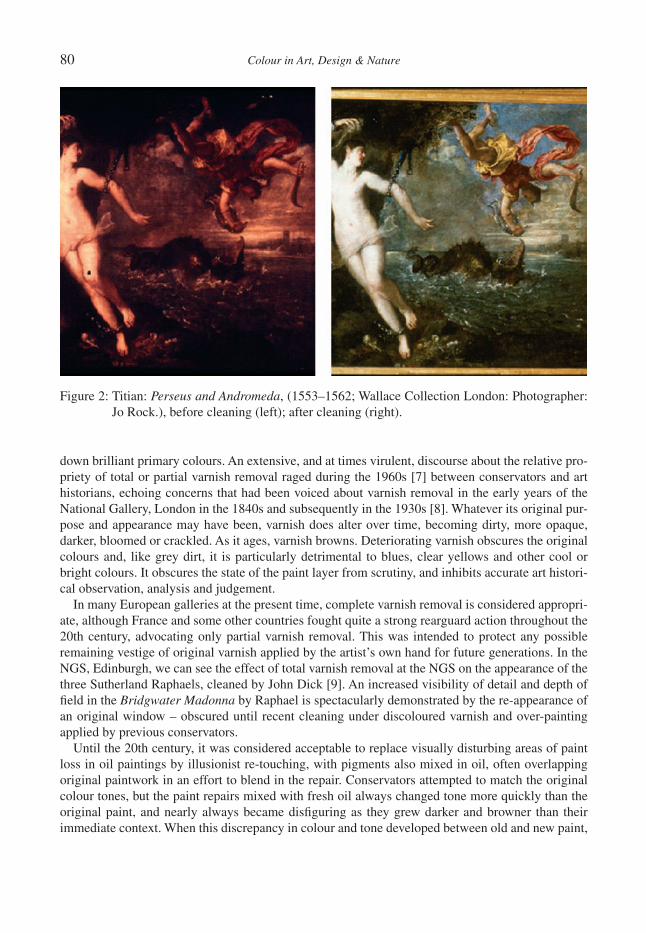
80 Colour in Art, Design & Nature
down brilliant primary colours. An extensive, and at times virulent, discourse about the relative pro-priety of total or partial varnish removal raged during the 1960s [7] between conservators and art historians, echoing concerns that had been voiced about varnish removal in the early years of the National Gallery, London in the 1840s and subsequently in the 1930s [8]. Whatever its original pur-pose and appearance may have been, varnish does alter over time, becoming dirty, more opaque, darker, bloomed or crackled. As it ages, varnish browns. Deteriorating varnish obscures the original colours and, like grey dirt, it is particularly detrimental to blues, clear yellows and other cool or bright colours. It obscures the state of the paint layer from scrutiny, and inhibits accurate art histori-cal observation, analysis and judgement.
In many European galleries at the present time, complete varnish removal is considered appropri-ate, although France and some other countries fought quite a strong rearguard action throughout the 20th century, advocating only partial varnish removal. This was intended to protect any possible remaining vestige of original varnish applied by the artist’s own hand for future generations. In the NGS, Edinburgh, we can see the effect of total varnish removal at the NGS on the appearance of the three Sutherland Raphaels, cleaned by John Dick [9]. An increased visibility of detail and depth of fi eld in the Bridgwater Madonna by Raphael is spectacularly demonstrated by the re-appearance of an original window – obscured until recent cleaning under discoloured varnish and over-painting applied by previous conservators.
Until the 20th century, it was considered acceptable to replace visually disturbing areas of paint loss in oil paintings by illusionist re-touching, with pigments also mixed in oil, often overlapping original paintwork in an effort to blend in the repair. Conservators attempted to match the original colour tones, but the paint repairs mixed with fresh oil always changed tone more quickly than the original paint, and nearly always became disfi guring as they grew darker and browner than their immediate context. When this discrepancy in colour and tone developed between old and new paint,
Figure 2: Titian: Perseus and Andromeda, (1553–1562; Wallace Collection London: Photographer: Jo Rock.), before cleaning (left); after cleaning (right).
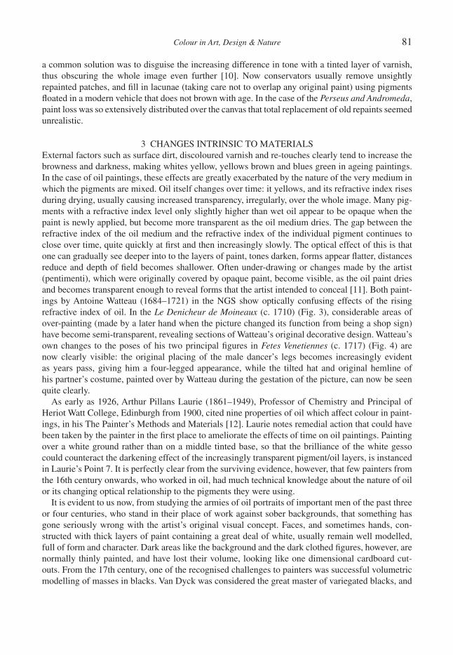
Colour in Art, Design & Nature 81
a common solution was to disguise the increasing difference in tone with a tinted layer of varnish, thus obscuring the whole image even further [10]. Now conservators usually remove unsightly repainted patches, and fi ll in lacunae (taking care not to overlap any original paint) using pigments fl oated in a modern vehicle that does not brown with age. In the case of the Perseus and Andromeda, paint loss was so extensively distributed over the canvas that total replacement of old repaints seemed unrealistic.
3 CHANGES INTRINSIC TO MATERIALSExternal factors such as surface dirt, discoloured varnish and re-touches clearly tend to increase the browness and darkness, making whites yellow, yellows brown and blues green in ageing paintings. In the case of oil paintings, these effects are greatly exacerbated by the nature of the very medium in which the pigments are mixed. Oil itself changes over time: it yellows, and its refractive index rises during drying, usually causing increased transparency, irregularly, over the whole image. Many pig-ments with a refractive index level only slightly higher than wet oil appear to be opaque when the paint is newly applied, but become more transparent as the oil medium dries. The gap between the refractive index of the oil medium and the refractive index of the individual pigment continues to close over time, quite quickly at fi rst and then increasingly slowly. The optical effect of this is that one can gradually see deeper into to the layers of paint, tones darken, forms appear fl atter, distances reduce and depth of fi eld becomes shallower. Often under-drawing or changes made by the artist (pentimenti), which were originally covered by opaque paint, become visible, as the oil paint dries and becomes transparent enough to reveal forms that the artist intended to conceal [11]. Both paint-ings by Antoine Watteau (1684–1721) in the NGS show optically confusing effects of the rising refractive index of oil. In the Le Denicheur de Moineaux (c. 1710) (Fig. 3), considerable areas of over-painting (made by a later hand when the picture changed its function from being a shop sign) have become semi-transparent, revealing sections of Watteau’s original decorative design. Watteau’s own changes to the poses of his two principal fi gures in Fetes Venetiennes (c. 1717) (Fig. 4) are now clearly visible: the original placing of the male dancer’s legs becomes increasingly evident as years pass, giving him a four-legged appearance, while the tilted hat and original hemline of his partner’s costume, painted over by Watteau during the gestation of the picture, can now be seen quite clearly.
As early as 1926, Arthur Pillans Laurie (1861–1949), Professor of Chemistry and Principal of Heriot Watt College, Edinburgh from 1900, cited nine properties of oil which affect colour in paint-ings, in his The Painter’s Methods and Materials [12]. Laurie notes remedial action that could have been taken by the painter in the fi rst place to ameliorate the effects of time on oil paintings. Painting over a white ground rather than on a middle tinted base, so that the brilliance of the white gesso could counteract the darkening effect of the increasingly transparent pigment/oil layers, is instanced in Laurie’s Point 7. It is perfectly clear from the surviving evidence, however, that few painters from the 16th century onwards, who worked in oil, had much technical knowledge about the nature of oil or its changing optical relationship to the pigments they were using.
It is evident to us now, from studying the armies of oil portraits of important men of the past three or four centuries, who stand in their place of work against sober backgrounds, that something has gone seriously wrong with the artist’s original visual concept. Faces, and sometimes hands, con-structed with thick layers of paint containing a great deal of white, usually remain well modelled, full of form and character. Dark areas like the background and the dark clothed fi gures, however, are normally thinly painted, and have lost their volume, looking like one dimensional cardboard cut-outs. From the 17th century, one of the recognised challenges to painters was successful volumetric modelling of masses in blacks. Van Dyck was considered the great master of variegated blacks, and

82 Colour in Art, Design & Nature
artists who hoped to emulate the distinguished effects of the master paid particular attention to nuanced shading of impressive fi gures clothed in rich robes or well cut suits. Painters did not realise that the very medium in which they worked would eventually foil this ambition. Most of the original careful modelling of dark-clad fi gures, many details of clothing, most differentiation of texture, subtle changes of tone and colour between fi gure and dark background, can now only be discerned in infra-red photographs or X-rays. No amount of dirt or varnish removal from these thinly painted blacks can restore the painter’s original effects of mass and volume, which continue to degrade. There is little that a conservator can do about this situation.
4 PIGMENT CHANGEArtists have always yearned for jewel-like, vivid, pure, clear hues, and these tend to come from toxic lead, arsenic or mercurial compounds, or from unstable animal or plant extracts, such as cochineal or the madders. Although Renaissance artists often ground their own pigments from tried and tested recipes, it became common from the 18th century onwards to buy from professional colour-men, who supplied ready made pigments and materials which could be seductively bright but were often unstable, and which had other undesirable properties. Pigments themselves, for instance, are not immune to change. Some inert colours are very stable over time, but these are often the duller earth colours such as the yellow ochres, umbers or terra verte and terra cotta [13, 14].
Perhaps the most common and dramatic pigment change is that of copper resinate green, verdigris or copper acetate green, which oxidises if it is not sealed from the air and which then turns from a
Figure 3: Antoine Watteau, The Robber of the Sparrow’s Nest, Courtesy of the National Gallery of Scotland.
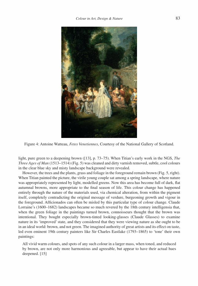
Colour in Art, Design & Nature 83
light, pure green to a deepening brown ([13], p. 73–75). When Titian’s early work in the NGS, The Three Ages of Man (1513–1514) (Fig. 5) was cleaned and dirty varnish removed, subtle, cool colours in the clear blue sky and misty landscape background were revealed.
However, the trees and the plants, grass and foliage in the foreground remain brown (Fig. 5, right). When Titian painted the picture, the virile young couple sat among a spring landscape, where nature was appropriately represented by light, modelled greens. Now this area has become full of dark, fl at autumnal browns, more appropriate to the fi nal season of life. This colour change has happened entirely through the nature of the materials used, via chemical alteration, from within the pigment itself, completely contradicting the original message of verdure, burgeoning growth and vigour in the foreground. Affi cionados can often be misled by this particular type of colour change. Claude Lorraine’s (1600–1682) landscapes became so much revered by the 18th century intelligensia that, when the green foliage in the paintings turned brown, connoisseurs thought that the brown was intentional. They bought especially brown-tinted looking-glasses (Claude Glasses) to examine nature in its ‘improved’ state, and they considered that they were viewing nature as she ought to be in an ideal world: brown, and not green. The imagined authority of great artists and its effect on taste, led even eminent 19th century painters like Sir Charles Eastlake (1793–1865) to ‘tone’ their own paintings:
All vivid warm colours, and spots of any such colour in a larger mass, when toned, and reduced by brown, are not only more harmonious and agreeable, but appear to have their actual hues deepened. [15]
Figure 4: Antoine Watteau, Fetes Venetiennes, Courtesy of the National Gallery of Scotland.

84 Colour in Art, Design & Nature
Eastlake had great authority in 19th century Britain as a Director of the National Gallery of London, Secretary to the Fine Arts Commission, scholar, and as a professional painter. Many followed dictates laid out in his texts on painting technique:
The toning brown should be used everywhere to mitigate crudeness, even in partial tints (that may be too vivid) and spots – for where, on a very light scale the toning is proportioned – not only in draperies, skies, landscape and inanimate objects, but even in fl esh [15].
These ideas had great infl uence in corrupting 19th century taste by equating bright colours in paint-ing with vulgarity, but they were corroborating an already fi xed conviction among connoisseurs. The art patron and amateur landscape artist Sir George Beaumont (1753–1827) averred that a good land-scape painting should have the tone of an old violin, and the story goes that Constable (1776–1837) took the violin belonging to his friend and fellow guest, Sir David Wilkie (17855-1841), and laid it on Sir George’s bright green lawn, in order to demonstrate the falsehood of their host’s idea.
5 FUGITIVE PIGMENTSAll these instigators of change in the appearance of oil paintings caused old pictures to look very fl at and brown, in contrast to the descriptions of how they struck viewers when newly made. There is yet a further major issue related to colour change which has grossly affected art historical judge-ment: that of fugitive pigments. A notorious example of colour disappearing completely and causing an embarrassing misunderstanding among art historians in the interpretation of iconogra-phy, is the tempera painting in the National Gallery, London by Lorenzo Monaco (c. 1370–1445) of The Coronation of the Virgin completed in 1413 (Fig. 6). Scholarly discussions about the sym-bolism of the very unusual colour of the Virgin’s white robe as a demonstration of her inviolate innocence and essential purity were undercut when the painting was considered for conservation. At this point, an area of the Virgin’s white robe, which had been protected from light by over-painting, was found to be a rich royal mauve. Tests on white areas revealed that a fugitive (probably vegetable based) red lac with blue underlay had been used and the red on the surface had faded over time, affected by the ultra violet rays of daylight. The symbolism of the original purple had traditionally indicated the royalty of the Queen of Heaven rather than the innocence of the Virgin [16].
Later, in an 18th century context, when artists were continually seeking brilliant and jewel-like primary colours in ready-made industrial pigments available from their colour suppliers, J.B. Greuze (1725–1805) painted his famous Girl Mourning her Dead Canary (NGS) in 1765 (Fig. 7). It was
Figure 5: Titian (Tiziano Vecelli), Three Ages of Man, on long term loan to the National Gallery of Scotland, Courtesy of Private Owner: before cleaning (left); tree – after cleaning and varnish removal (right).
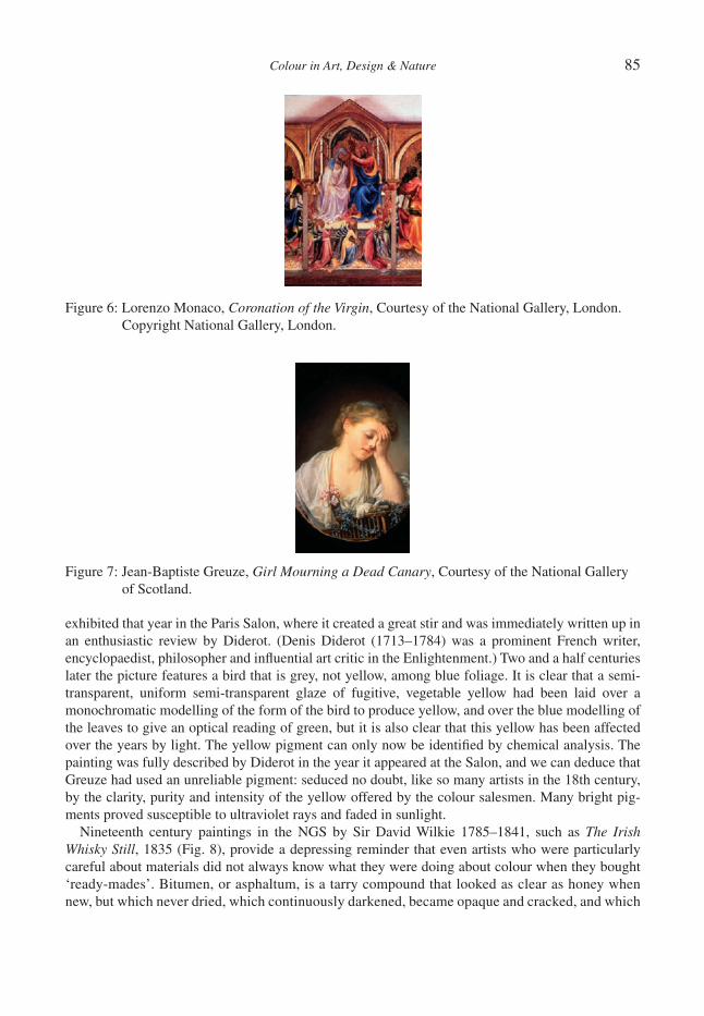
Colour in Art, Design & Nature 85
exhibited that year in the Paris Salon, where it created a great stir and was immediately written up in an enthusiastic review by Diderot. (Denis Diderot (1713–1784) was a prominent French writer, encyclopaedist, philosopher and infl uential art critic in the Enlightenment.) Two and a half centuries later the picture features a bird that is grey, not yellow, among blue foliage. It is clear that a semi-transparent, uniform semi-transparent glaze of fugitive, vegetable yellow had been laid over a monochromatic modelling of the form of the bird to produce yellow, and over the blue modelling of the leaves to give an optical reading of green, but it is also clear that this yellow has been affected over the years by light. The yellow pigment can only now be identifi ed by chemical analysis. The painting was fully described by Diderot in the year it appeared at the Salon, and we can deduce that Greuze had used an unreliable pigment: seduced no doubt, like so many artists in the 18th century, by the clarity, purity and intensity of the yellow offered by the colour salesmen. Many bright pig-ments proved susceptible to ultraviolet rays and faded in sunlight.
Nineteenth century paintings in the NGS by Sir David Wilkie 1785–1841, such as The Irish Whisky Still, 1835 (Fig. 8), provide a depressing reminder that even artists who were particularly careful about materials did not always know what they were doing about colour when they bought ‘ready-mades’. Bitumen, or asphaltum, is a tarry compound that looked as clear as honey when new, but which never dried, which continuously darkened, became opaque and cracked, and which
Figure 6: Lorenzo Monaco, Coronation of the Virgin, Courtesy of the National Gallery, London. Copyright National Gallery, London.
Figure 7: Jean-Baptiste Greuze, Girl Mourning a Dead Canary, Courtesy of the National Gallery of Scotland.
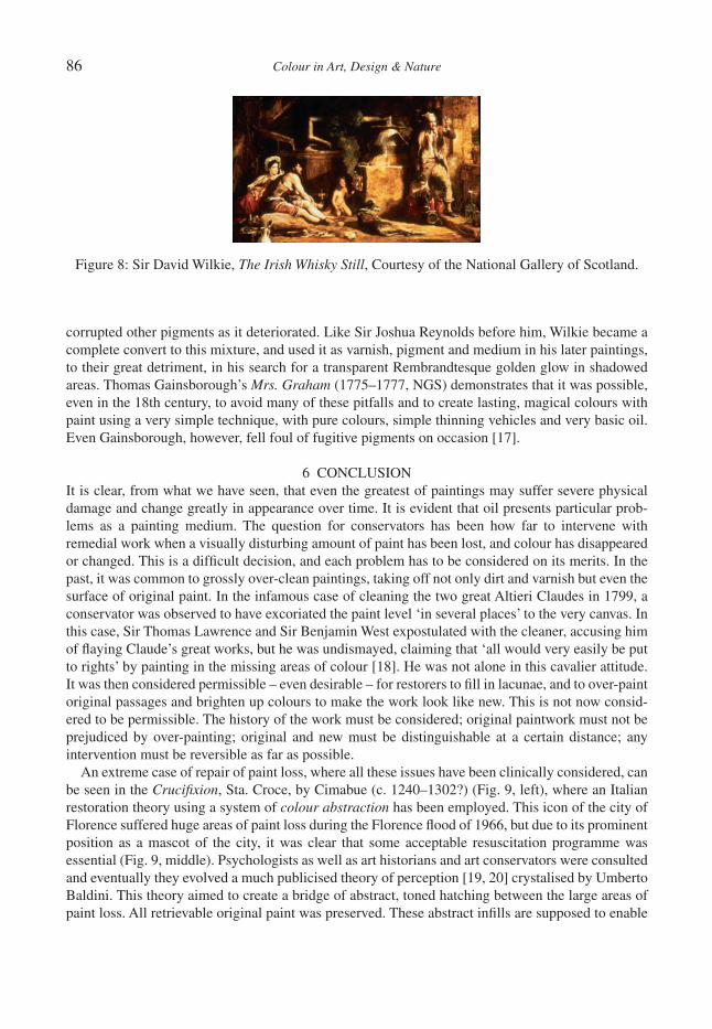
86 Colour in Art, Design & Nature
corrupted other pigments as it deteriorated. Like Sir Joshua Reynolds before him, Wilkie became a complete convert to this mixture, and used it as varnish, pigment and medium in his later paintings, to their great detriment, in his search for a transparent Rembrandtesque golden glow in shadowed areas. Thomas Gainsborough’s Mrs. Graham (1775–1777, NGS) demonstrates that it was possible, even in the 18th century, to avoid many of these pitfalls and to create lasting, magical colours with paint using a very simple technique, with pure colours, simple thinning vehicles and very basic oil. Even Gainsborough, however, fell foul of fugitive pigments on occasion [17].
6 CONCLUSIONIt is clear, from what we have seen, that even the greatest of paintings may suffer severe physical damage and change greatly in appearance over time. It is evident that oil presents particular prob-lems as a painting medium. The question for conservators has been how far to intervene with remedial work when a visually disturbing amount of paint has been lost, and colour has disappeared or changed. This is a diffi cult decision, and each problem has to be considered on its merits. In the past, it was common to grossly over-clean paintings, taking off not only dirt and varnish but even the surface of original paint. In the infamous case of cleaning the two great Altieri Claudes in 1799, a conservator was observed to have excoriated the paint level ‘in several places’ to the very canvas. In this case, Sir Thomas Lawrence and Sir Benjamin West expostulated with the cleaner, accusing him of fl aying Claude’s great works, but he was undismayed, claiming that ‘all would very easily be put to rights’ by painting in the missing areas of colour [18]. He was not alone in this cavalier attitude. It was then considered permissible – even desirable – for restorers to fi ll in lacunae, and to over-paint original passages and brighten up colours to make the work look like new. This is not now consid-ered to be permissible. The history of the work must be considered; original paintwork must not be prejudiced by over-painting; original and new must be distinguishable at a certain distance; any intervention must be reversible as far as possible.
An extreme case of repair of paint loss, where all these issues have been clinically considered, can be seen in the Crucifi xion, Sta. Croce, by Cimabue (c. 1240–1302?) (Fig. 9, left), where an Italian restoration theory using a system of colour abstraction has been employed. This icon of the city of Florence suffered huge areas of paint loss during the Florence fl ood of 1966, but due to its prominent position as a mascot of the city, it was clear that some acceptable resuscitation programme was essential (Fig. 9, middle). Psychologists as well as art historians and art conservators were consulted and eventually they evolved a much publicised theory of perception [19, 20] crystalised by Umberto Baldini. This theory aimed to create a bridge of abstract, toned hatching between the large areas of paint loss. All retrievable original paint was preserved. These abstract infi lls are supposed to enable
Figure 8: Sir David Wilkie, The Irish Whisky Still, Courtesy of the National Gallery of Scotland.
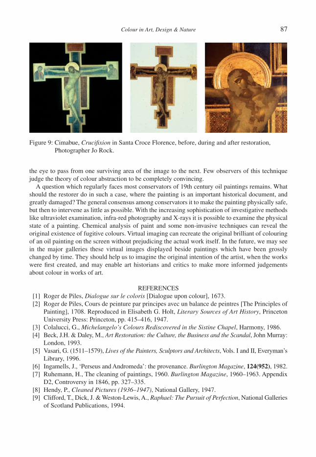
Colour in Art, Design & Nature 87
the eye to pass from one surviving area of the image to the next. Few observers of this technique judge the theory of colour abstraction to be completely convincing.
A question which regularly faces most conservators of 19th century oil paintings remains. What should the restorer do in such a case, where the painting is an important historical document, and greatly damaged? The general consensus among conservators it to make the painting physically safe, but then to intervene as little as possible. With the increasing sophistication of investigative methods like ultraviolet examination, infra-red photography and X-rays it is possible to examine the physical state of a painting. Chemical analysis of paint and some non-invasive techniques can reveal the original existence of fugitive colours. Virtual imaging can recreate the original brilliant of colouring of an oil painting on the screen without prejudicing the actual work itself. In the future, we may see in the major galleries these virtual images displayed beside paintings which have been grossly changed by time. They should help us to imagine the original intention of the artist, when the works were fi rst created, and may enable art historians and critics to make more informed judgements about colour in works of art.
REFERENCES [1] Roger de Piles, Dialogue sur le coloris [Dialogue upon colour], 1673. [2] Roger de Piles, Cours de peinture par principes avec un balance de peintres [The Principles of
Painting], 1708. Reproduced in Elisabeth G. Holt, Literary Sources of Art History, Princeton University Press: Princeton, pp. 415–416, 1947.
[3] Colalucci, G., Michelangelo’s Colours Rediscovered in the Sistine Chapel, Harmony, 1986. [4] Beck, J.H. & Daley, M., Art Restoration: the Culture, the Business and the Scandal, John Murray:
London, 1993. [5] Vasari, G. (1511–1579), Lives of the Painters, Sculptors and Architects, Vols. I and II, Everyman’s
Library, 1996. [6] Ingamells, J., ‘Perseus and Andromeda’: the provenance. Burlington Magazine, 124(952), 1982. [7] Ruhemann, H., The cleaning of paintings, 1960. Burlington Magazine, 1960–1963. Appendix
D2, Controversy in 1846, pp. 327–335. [8] Hendy, P., Cleaned Pictures (1936–1947), National Gallery, 1947. [9] Clifford, T., Dick, J. & Weston-Lewis, A., Raphael: The Pursuit of Perfection, National Galleries
of Scotland Publications, 1994.
Figure 9: Cimabue, Crucifi xion in Santa Croce Florence, before, during and after restoration, Photographer Jo Rock.

88 Colour in Art, Design & Nature
[10] Restauration des peintures, Les dossiers du departement des peitntures 21, Musee du Louvre, No. 9, pp. 34–36, 1984. Repeints assombris et vernis jauni.
[11] Ruhemann, H., The Cleaning of Paintings, Praeger, p. 167, 1967.[12] Laurie, A.P., The Painter’s Methods and Materials, Dover: New York, p. 155, 1967.[13] Harley, R.D., Artist’s Pigments c1600–1835, 1970.[14] Feller, R.L., Artists’ Pigments: A Handbook of their History and Characteristics, CUP, 1985.[15] Eastlake, C.L., Sir, Methods and Materials of Painting of the Great Schools and Masters,
Vol. 2, Dover: New York, pp. 363–364, 1960.[16] Burnstock, A., The fading of the virgin’s robe in Lorenzo Monaco’s ‘Coronation of the Virgin’.
National Gallery Technical Bulletin, 12, pp. 58–65, 1988.[17] Bomford, D., Roy A. & Saunders, D., Gainsborough’s ‘Dr. Ralph Schomberg’. NGL Technical
Bulletin, 12, pp. 44–57, 1988.[18] Whitley, Artists and their Friends in England, Vol. 2, pp. 358–359, 1700–1799.[19] Baldini, U. & Casazza, O., The Cimabue Crucifi x, Exhibition Catalogue: Florence, 1982.[20] Baldini, U., Teoria del restauro e unita di metodologia, 2 vols, Nardini Publications: Florence,
1978 and 1981.
Colour in Art, Design & Nature
THERMO-HYDRAULICS, COLOUR AND ART
J.A. PATORSKIPaul Scherrer Institute, Villigen-PSI, Switzerland.
ABSTRACTThis paper describes a thermo-hydraulics experiment performed on the mock-up of the liquid-metal cooled steel target container of a spallation neutron source. The beam of the Paul Scherrer Institute 600 MeV proton accelerator is used to obtain a high-neutron fl ux. This bombards a target under realistic experimental condi-tions, hence, becoming a probe for scientifi c experiments. The goal was to analyse and visualise the cooling of the target proton entrance window. In the mock-up, heat removal is realised by forced convection of a mercury coolant. A description of the test set-up is given and qualitative as well as quantitative results from the cooling process are presented visually. In addition, an improvement in interpretation of data is shown by using colours. In the fi nal section, an artistic output entitled ‘The Collection’ is presented; this consists of artifi cially-coloured infrared thermograms resembling, and compared with, butterfl ies.Keywords: thermo-hydraulics of liquid metals, IR Thermography measurements, visualization of internal fl ow within convection boundary layer, heat transfer visualization, art in science
1 INTRODUCTIONAs part of the development programme of the Swiss Intense Neutron Source (SINQ) at the Paul Scherrer Institute (PSI) and the European Spallation Source (ESS), neutron spallation sources exper-imental concepts with liquid-metal (LM) targets have been proposed [1].
One concept using a high-power neutron spallation source with a circulated LM target is shown in Fig. 1. The 600 MeV proton beam of the PSI accelerator penetrates into the target of the SINQ facility through a beam entry window. This window is strongly heated by the proton beam, the heat deposition in the steel wall resulting in a heat fl ux q* of up to 140 W/cm2 at the inner surface of the window. The LM, in this case, mercury, is simultaneously used as target material and coolant. It is contained in an approximately 4-m long structure made of concentric pipes and vessels. The neu-tron-producing part of the target consists of two concentric steel pipes fi lled with mercury and placed in the centre of the SINQ moderator tank. The lower part of the outer pipe is closed off with a hemispherical shell, i.e. LM container (LMC), causing the LM fl owing down the annulus to perform a U-turn and to return upwards through the inner riser pipe (RP) to the electro-magnetic pump and the target heat exchanger.
The experiments on the cooling of the proton beam entry window are part of the development pro-gramme for neutron spallation sources with LM targets at PSI. A two-dimensional and dynamic (2DD) method of using infrared thermography (IRT) techniques is applied for visualising the cooling effi -ciency of the heated window wall. This 2DD IRT methodology developed at PSI was around 2000 [2], and constantly improved upon subsequently [3, 4]. It allows the elaboration of heat transfer coeffi cient (HTC) charts. The 2DD IRT methodology is based on the emissivity-corrected measurement of the thermal radiation fi eld emitted from the outer surface and arithmetical constructions of the temperature fi elds on outer and inner surfaces of the LMC window. Finally, the fi eld of the differential temperature, i.e. the difference between the inner-surface temperature and the bulk LM coolant temperature, is worked out. In this way, the differential temperature thermograms obtained, together with known val-ues of the applied heat fl ux, allow both qualitative and quantitative HTC characteristics of the cooling to be determined. The patterns of the fl ow in the boundary layer on the inner surface of the window wall are made visible. Finally, animated IR differential thermogram sequences can be generated, allowing
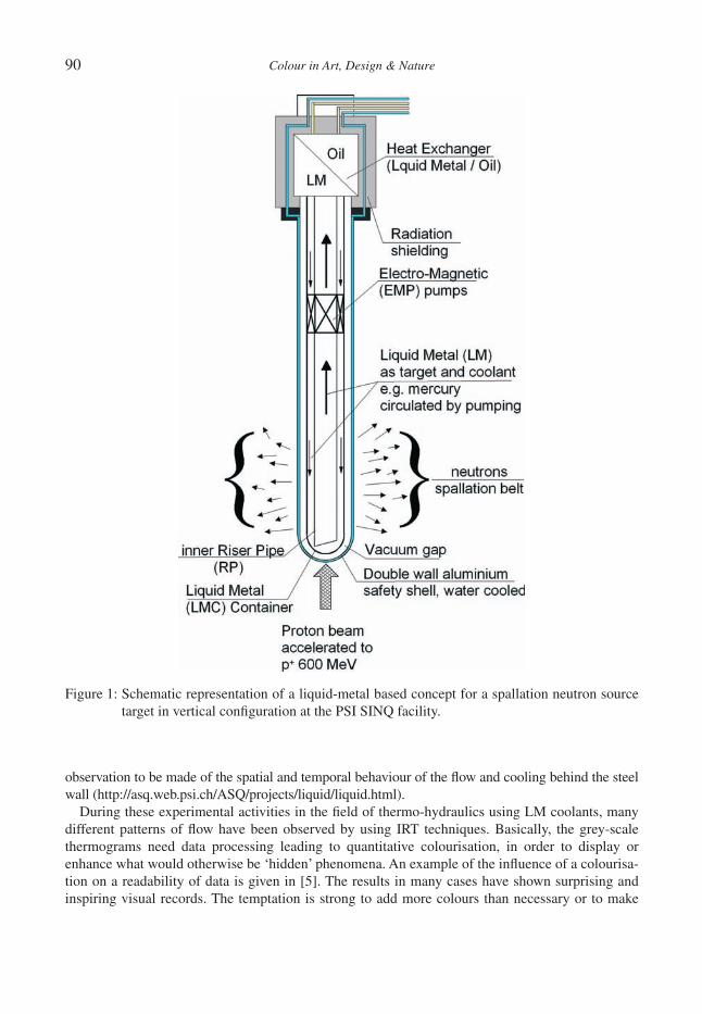
90 Colour in Art, Design & Nature
observation to be made of the spatial and temporal behaviour of the fl ow and cooling behind the steel wall (http://asq.web.psi.ch/ASQ/projects/liquid/liquid.html).
During these experimental activities in the fi eld of thermo-hydraulics using LM coolants, many different patterns of fl ow have been observed by using IRT techniques. Basically, the grey-scale thermograms need data processing leading to quantitative colourisation, in order to display or enhance what would otherwise be ‘hidden’ phenomena. An example of the infl uence of a colourisa-tion on a readability of data is given in [5]. The results in many cases have shown surprising and inspiring visual records. The temptation is strong to add more colours than necessary or to make
Figure 1: Schematic representation of a liquid-metal based concept for a spallation neutron source target in vertical confi guration at the PSI SINQ facility.
Colour in Art, Design & Nature 91
combinations of scientifi c thermograms to create an artistic collage. In this Special Issue, results of thermo-hydraulics experiments are presented which, whilst fulfi lling their scientifi c objective, also lay claim to artistic character. ‘The Collection’ which resulted has been rewarded at the IR Image Gallery of THERMOSENSE XXII and is now shown for the fi rst time in a printed publication as an additional ‘artistic’ aspect of this experiment. The hope is that more experimentalists may be inspired with similar ideas to make scientifi c investigations appealing to the general public by visualising them in an artistic form.
2 EXPERIMENTS2.1 Goals
Because of the importance of target integrity, cooling of the proton beam entry window should be experimentally investigated in great detail. In reality, the Gaussian-distributed density of power deposition by the SINQ proton beam in the target window will result in a peak heat fl ux of 140 W/cm2 in the centre of the inside window surface and an average value, taken over the proton beam ‘foot print’ area, of about 70 W/cm2. Therefore, the goal of this test was to show that the proposed cooling concept of the target is able to avoid local overheating of the window and to guarantee the integrity of the target. The basic idea of the test was to observe the cooling effect of the fl owing heavy LM on the heated hemispherical shell of the target mock-up. An important condition of the test was to use the same materials as foreseen for the concept of the real target (steel DIN 1.4057) with mercury as the spallation material and coolant.
2.2 Set-up and instrumentation
Figure 2 shows the set-up of the skin effect heating (SEH) experiments with the IR scanner (IR ther-mography camera) in a central axial position. The instrumentation of the test made it possible to observe the cooling effects with high spatial and temporal resolution. The 2DD IRT methodology was developed and applied for the fi rst time in this test [2]. Two different geometrical fl ow confi gu-rations with fl at-cut und slanted-cut ending of the RP, respectively, and different pump fl ow rates were examined with the goal of fi nding out whether window cooling was adequate and if a slanted edge of the RP had a positive infl uence on heat removal. The geometry adopted was that of the exist-ing vertical target of the SINQ facility (window diameter 212.8 mm). The window wall thickness of 2.88 mm was chosen to achieve an optimum for the high-frequency electrical heating in the wall, without depositing heat in the fl uid. A suitable volume heating mechanism for the window, the so-called SEH, was chosen in order to optimise the conditions for IR thermography measurements. More details are given in the technical descriptions [2]. Forced mercury fl ow is established by elec-tromagnetic pumping at different fl ow rates (from 0.6 l/s, 1.2 l/s, 2.4 l/s up to 3.6 l/s). At low fl ow rates, convection may be additionally infl uenced by the weak buoyancy effects caused by the SEH. The latter produces a power deposition resulting in a heat fl ux of 2-11 W/cm2 in the central region of the inside window surface. This value is much smaller than the average heat fl ux of 70 W/cm2 produced in the real SINQ target by the proton beam, but it is high enough to study the characteris-tics of the heat transfer process from the window to the LM.
The experiments were carried out at the Institute of Physics of the University of Latvia (IPUL) in Riga-Salaspils, using a test loop with a capacity of about 6 tons of mercury. The temperature meas-urements on the window surface were made both with the 2D non-contact IR thermography device FLIR-AGEMA Thermovision THV900 SWTE and with thermocouples. More details of THV900 can be found in [6].
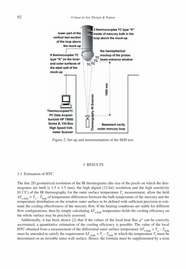
92 Colour in Art, Design & Nature
3 RESULTS
3.1 Estimation of HTC
The fi ne 2D geometrical resolution of the IR thermograms (the size of the pixels on which the ther-mograms are built is 1.5 × 1.5 mm), the high digital (12-bit) resolution and the high sensitivity (0.1°C) of the IR thermography for the outer surface temperature To measurement, allow the fi eld ΔTo.bulk = To – Tbulk of temperature differences between the bulk temperature of the mercury and the temperature distribution on the window outer surface to be defi ned with suffi cient precision to esti-mate the cooling effectiveness of the mercury fl ow. If the heating conditions are stable for different fl ow confi gurations, then by simply calculating ΔTo.bulk temperature-fi elds the cooling effi ciency on the whole surface may be precisely assessed.
Additionally, it has been shown [2] that if the values of the local heat fl ux q* can be correctly ascertained, a quantitative estimation of the cooling effi ciency is possible. The value of the local HTC obtained from a measurement of the differential outer surface temperature ΔTo.bulk = To – Tbulk must be amended to satisfy the requirement ΔTi.bulk = Ti – Tbulk in which the temperature Ti must be determined on an invisible inner wall surface. Hence, the formula must be supplemented by a term
Figure 2: Set-up and instrumentation of the SEH test.

Colour in Art, Design & Nature 93
representing the thermal resistance of the window, which, for a power density constant in the direc-tion normal to the wall amounts to δ/2k. Thus:
δΔ Δ= = = −i.bulk o.bulk1/ HTC ,
* * 2
T Th
q q k
where h is the local thermal resistivity of the boundary layer, k is the thermal conductivity (for DIN 1.4057 k = 25 W/m°K), q* is the local heat fl ux, δ is the wall thickness, Ti is the temperature on the inner surface, To is the temperature on the outer surface of the window wall, and Tbulk is the mercury bulk temperature.
3.2 Estimation and visualisation of cooling effi ciency
In addition to visualisation of the cooling effi ciency with HTC-charts, thermograms allow some deductions to be made regarding the characteristics of the fl ow itself. In particular, the fl ow pattern (e.g. detection of dead zones) can be studied especially within the conductive boundary layer on the inner surface of the window.
The basic geometrical confi guration of the inner guide pipe with a circumferentially uniform ‘fl at’ gap of 2 cm to the window (horizontal fl at edge of the RP) is shown in elevation (cross section) in Fig. 3a and in plan view (vertical axial projection) in Fig. 3b. In the case of forced convection with a pump fl ow rate of 1.2 l/s, the grey-scale thermogram obtained prior to fi nal data treatment is shown in Fig. 3c. In such ‘raw’ grey-scale thermograms, the effects of boundary layer fl ow patterns on values of ΔTo.bulk are insuffi ciently visible. This problem is overcome by the use of coloured iso-therms, as shown in Fig. 3d. The advantage gained by using colour in visualisation of fl uid fl ows.
The isotherm lines, marked yellow and green for values ΔTo.bulk = 3.6°C and ΔTo.bulk = 7.2°C, respectively, help to visualise the cooling effect of the fl ow. The isotherm line at 7.2°C can be clearly
Figure 3: Typical thermograms obtained for experiments with uniform or ‘fl at’ gap of 2 cm. (a) Elevation (cross section). (b) Plan view (vertical axial projection), for geometrical confi guration of the inner guide pipe. (c) Grey-scale ‘raw’ ΔTo.bulk differential IR thermogram, the pattern of the dead zone caused by the swirl in the central region is diffi cult to recognise. (d) Coloured ΔTo.bulk – isotherm differential IR thermograms render the central swirl pattern of the fl ow more visible.
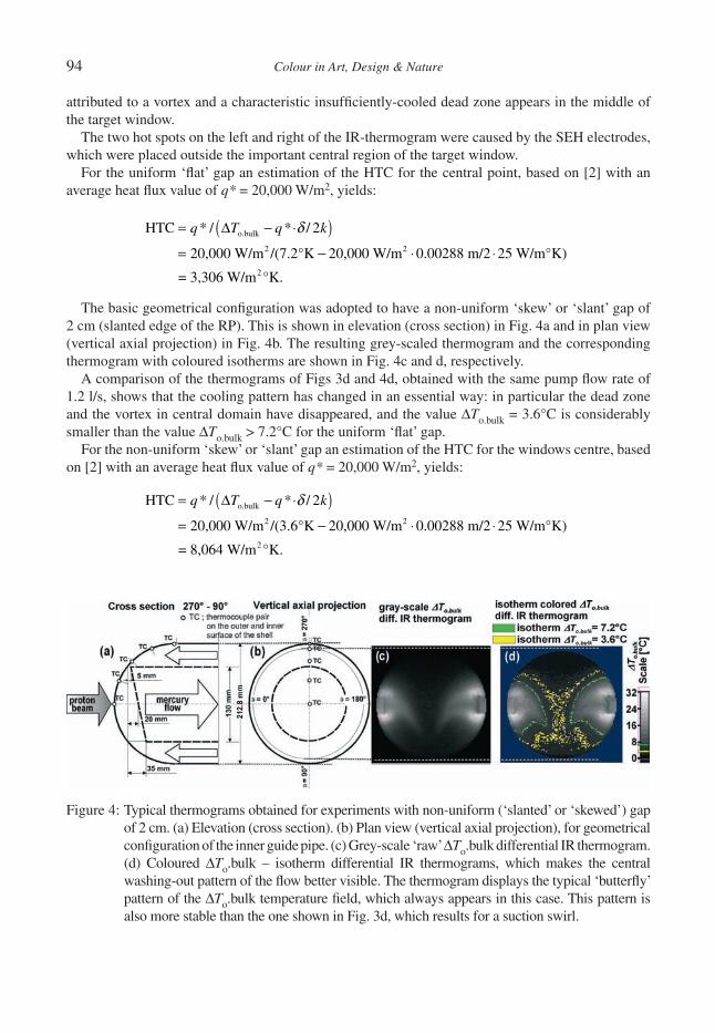
94 Colour in Art, Design & Nature
attributed to a vortex and a characteristic insuffi ciently-cooled dead zone appears in the middle of the target window.
The two hot spots on the left and right of the IR-thermogram were caused by the SEH electrodes, which were placed outside the important central region of the target window.
For the uniform ‘fl at’ gap an estimation of the HTC for the central point, based on [2] with an average heat fl ux value of q* = 20,000 W/m2, yields:
( )δ= Δ − ⋅
= − ⋅ ⋅o.bulk
2 2
2
HTC * / * / 2
20,000 W/m /(7.2°K 20,000 W/m 0.00288 m/2 25 W/m°K)
= 3,306 W/m °K.
q T q k
The basic geometrical confi guration was adopted to have a non-uniform ‘skew’ or ‘slant’ gap of 2 cm (slanted edge of the RP). This is shown in elevation (cross section) in Fig. 4a and in plan view (vertical axial projection) in Fig. 4b. The resulting grey-scaled thermogram and the corresponding thermogram with coloured isotherms are shown in Fig. 4c and d, respectively.
A comparison of the thermograms of Figs 3d and 4d, obtained with the same pump fl ow rate of 1.2 l/s, shows that the cooling pattern has changed in an essential way: in particular the dead zone and the vortex in central domain have disappeared, and the value ΔTo.bulk = 3.6°C is considerably smaller than the value ΔTo.bulk > 7.2°C for the uniform ‘fl at’ gap.
For the non-uniform ‘skew’ or ‘slant’ gap an estimation of the HTC for the windows centre, based on [2] with an average heat fl ux value of q* = 20,000 W/m2, yields:
( )δ= Δ − ⋅
= − ⋅ ⋅o.bulk
2 2
2
HTC * / * / 2
20,000 W/m /(3.6°K 20,000 W/m 0.00288 m/2 25 W/m°K)
= 8,064 W/m °K.
q T q k
Figure 4: Typical thermograms obtained for experiments with non-uniform (‘slanted’ or ‘skewed’) gap of 2 cm. (a) Elevation (cross section). (b) Plan view (vertical axial projection), for geometrical confi guration of the inner guide pipe. (c) Grey-scale ‘raw’ ΔTo.bulk differential IR thermogram. (d) Coloured ΔTo.bulk – isotherm differential IR thermograms, which makes the central washing-out pattern of the fl ow better visible. The thermogram displays the typical ‘butterfl y’ pattern of the ΔTo.bulk temperature fi eld, which always appears in this case. This pattern is also more stable than the one shown in Fig. 3d, which results for a suction swirl.

Colour in Art, Design & Nature 95
The comparison of the estimated HTC values shows the advantage of the RP with slanted cut-off; it is more than twice as effective in the case of forced convection with a 1.2 l/s fl ow rate.
The dynamic behaviour of the temperature fl ow patterns on the steel window can be viewed on the web page (http://asq.web.psi.ch/ASQ/projects/liquid/liquid.html) or in the animation inserted as a supplement to the electronic issue of this paper. Clicking on the IR-thermograms initialises the appertaining hyperlink to a movie sequence of thermograms. The 1 Hz ‘live’ visualisations have been prepared by averaging, emissivity correction and subtraction of IR-thermography sequences originally recorded with a time resolution of 20 Hz.
More details concerning SEH experiments on the cooling of the SINQ target entry window can be found in [2].
4 ARTThe pattern of differential thermograms in Fig. 4d has led to a science–art association, by comparing them with butterfl ies in Fig. 5. More specifi cally some artifi cially coloured scaling, an entire collec-tion of ‘infrared butterfl ies’ was created and compared with photos of ‘organic’ butterfl ies.
Figure 5: ‘The Collection’ brings together the beauty of natural and infrared butterfl ies. The round thermograms show the convex surface of a heated hemispherical steel container, in which a thin wall is cooled from inside by fl owing mercury. The picture was awarded fi rst prize at the SPIE XXII Thermosense IR Image Gallery.
96 Colour in Art, Design & Nature
5 CONCLUSIONSThe use of only two colours for isotherms of grey-scale IR-thermography in the SEH test series with currently available time-, space- and temperature-resolution of the AGEMA THV900 equipment gives satisfactory results for:
• the visualisation of the temperature fi elds with his characteristic pattern, produced by the mercury fl ow behind the proton beam entry window of the mock-up for the LM spallation neutron source target concept with the SINQ conditions, and
• the comparison of the local convective HTCs for different steady-state fl ow conditions and geo-metrical cooling confi gurations. For this, more qualitative comparison, the precise absolute value of the local heat fl ux q* need not be known, but it is imperative to ensure that the distribution of the local heat fl ux q* remains the same for all confi gurations compared and that the mercury bulk temperature is simultaneously controlled.
6 ACKNOWLEDGEMENTSThe preparation of the SEH test at PSI and its realisation in Riga was very work-intensive and time-consuming. For the great effort involved, the author would like to acknowledge the contribution of all participants at IPUL and PSI. The author is especially grateful to his PSI PT colleagues: Rade Milenkovic for the motivation of writing of this paper for the Special Issue of the International Journal of Design and Nature and Ecodynamics; Beat Sigg and Karel Samec for the English formulation of the text; Sergej Dementjevs for his valuable assistance during the whole experimentation and data evaluation period. Finally, the most important thanks for the fi nancial supporting of the expensive experimentation are going to Professor Hans Ullmaier, former leader of the ESS project and Dr. Guenter Bauer, former leader of the Department of Spallation Neutron Source of PSI.
REFERENCES[1] Bauer, G.S., Technology issues in the design of medium-to-high power spallation targets for
accelerator driven systems. J. Phys. IV France, 9, pp. Pr7-91–Pr7113, 1999.[2] Patorski, J.A., Bauer, G.S. & Dementjev, S., Two-dimensional and dynamic method of visual-
ization of the fl ow characteristics in a convection boundary layer using infrared thermography. Journal of Theoretical and Applied Mechanics, 39, pp. 351–376, 2001.
[3] Patorski, J.A. & Groeschel, F., Experimental determination of local convection heat transfer coeffi cient fi eld using two-dimensional and dynamic infrared thermography (2DD-IRT) meth-od. Proceedings of SPIE, Thermosense XXVIII, Vol. 6205, eds Jonathan J. Miles, G. Raymond Peacock & Kathryn M. Knettel, SPIE: Bellingham, Washington, USA, 2006.
[4] Patorski, J.A. & Groeschel F., Measurement of heat transfer coeffi cient for a proton beam entry window of a liquid metal target. Journal of Heat Transfer Research, 39(7), pp. 571–585, 2008.
[5] Marakkos, K. & Turner, J.T., Vortex generation in the cross-fl ow around a cylinder attached to an end-wall. Journal of Optics & Laser Technology, 38(4–6), pp. 277–285, 2006.
[6] Thermovision®900 Series User’s Manual, AGEMA Infrared Systems: Danderyd, Sweden, 1993.

Colour in Art, Design & Nature
NATURE’S FLUCTUATING COLOUR CAPTURED ON CANVAS?
F. SCHENKBirmingham City University, England.
ABSTRACTFor centuries artists and natural scientists have been captivated by the colour changing effects of iridescence. Producing brilliant fl ashes of colour in the natural world, the phenomenon is best known in the displays of ‘living jewels’, e.g. tropical birds and butterfl ies, where the colour perceived changes with viewing angle. Such striking effects are not produced by chemical pigments but by complex physical structures interplaying with light. Until now, artists have tried to capture these luminous, oscillating colours with varying degrees of success. However, for the fi rst time, latest advances in ‘pigment’ technology offer artists the exciting, but chal-lenging, potential to introduce the full spectacle of iridescence into painting. These ‘pigments’ (developed with lucrative industrial applications in mind) currently remain restricted to commercial usage. The major drawback seriously impeding their advancement in art is that they do not adhere to colour theory as applied in painting. Having worked on adapting iridescent technology from its inception, gradual emergence and now rapid expan-sion, the author traces the sustained effort necessary on her part to overcome the many inherent challenges. Interweaving the fi ndings of art theory, physics and personal studio practice, an attempt is made to position the new technology within the wider discourse on colour. And readers are furnished with an increased understand-ing of the scientifi c and aesthetic principles governing iridescence.Keywords: colour theory, interference fl akes, iridescence, optical physics, painting.
1 INTRODUCTION: MULTIFACETED ‘RAINBOW’ HUESThe fl uctuating colours of ‘living jewels’, such as exotic beetles, butterfl ies and birds have always captivated man. To our ancestors, these luminous creatures appeared to have magical properties, playing a major role in the mythologies of ancient civilisations. Most noteworthy in this context is Iris, the bird-winged messenger of the Olympian Gods and personifi cation of the rainbow, immor-talised in the very word ‘iridescence’. Following Newton’s seminal double prism experiment, which proved that white light consists of all the colours of the rainbow, the science of physics has continued to reveal new dimensions to the aesthetics and mystical qualities initially assigned to iridescence by the Ancients. However, it was not until the mid-20th century that scanning electron microscopy allowed observation at a nano-scale, thereby fi nally proving beyond doubt what the Ancients had intuitively believed. The colours of the rainbow and iridescence are indeed inextricably linked. Both phenomena are caused by light interacting with transparent colourless matter [1]. A rainbow is cre-ated when the water droplets, like Newton’s prism, split white light into its components – the colours of the spectrum. Layered nano-structures found in iridescent bird-feathers also act as light splitters, making (via constructive interference) certain pure spectral colours visible [2]. Accelerated scientifi c research into Nature’s optical devices has, since the millennium, led to the manufacture of an ever-expanding range of innovative iridescent fl akes [3]. Because of their novel multi-layered structure, generating fl uctuating colour, we can fi nally begin to creatively explore Nature’s iridescence in art.
In tandem, a new academic fi eld dedicated to iridescence has emerged. Scientists from diverse backgrounds (and subsequently artists) have begun to stake the nascent territory. In so doing they reaffi rm what the physicist and philosopher Von Weizsäcker believes: namely, that colour is ‘home-less’ or rather – ‘at home in a kind of no man’s land bordered by physics, psychology, philosophy and art’ [4]. Physics and art, disciplines located on either side of that border, have developed surpris-ingly similar attitudes that undervalue colour. The physicist Simon [2] laments that: ‘Modern scientifi c thinking as fi rst established in the seventeenth century has long used color as a classic
98 Colour in Art, Design & Nature
example of a “subjective,” or secondary, quality, as opposed to form, which was considered an “objective,” or primary quality.’ Arguing along similar lines, the artist and theorist Batchelor traces the supremacy attributed in the Arts to disegno (palpable form/line) over colore (intangible colour) back to antiquity and the belief that objects somehow remain unchanged in substance if their colour was removed. He concludes that Chromophobia – a fear of corruption or contamination through colour – has always lurked within Western culture. Chromophobia adopts two guises: one denounces colour as alien (i.e. primitive, feminine, oriental, narcotic) and therefore dangerous; the other mar-ginalises colour as superfi cial and cosmetic – ‘a secondary quality of experience, and thus unworthy of serious consideration . . . either way, colour is routinely excluded from the higher concerns of the Mind. It is other to the higher values of Western culture’ [5].
By the 1960s, Von Weizsäcker [4] was suggesting that the old scientifi c theory of separating all phenomena according to their objective or subjective qualities could no longer be justifi ed. Colour in all its manifestations is one phenomenon and no sharp distinction can be made between its purely physical and purely aesthetic aspects. Embracing the tenet of his insightful analysis, this paper inter-weaves the fi ndings of physics, art theory and personal studio practice.
2 THE LEGACY OF CHEMICAL PIGMENTSGage [6] recently stated: ‘Any account of colour in art must begin with the belief, which dominated Western culture for centuries . . . that colours are of two distinct types, those that are stable attributes of material substances, and those that are “accidental”, such as the evanescent colours of the rainbow and the colours of some birds’ feathers, which change according to the viewpoint of the spectator.’ The ‘stable’ colours of material substances associated with chemical pigments (predominant both in Nature and the man-made environment) have long been the preoccupations of painters. It is on this type of pigment, traditionally used in paints, that artistic colour theories and the rules of subtractive colour mixing are based. Demonstrably, however, chemical pigments appear dull in comparison to the iridescent beams encountered in Nature and change neither colour nor brightness even when viewed from different angles. They absorb particular wavelengths of incoming white light. The col-our impression is the remaining part of the light. When the primaries red, yellow and blue are combined, the mixture becomes darker with each colour added. More and more light is subtracted until black results. On that path towards darkness lies – grey.
2.1 Grey: the anti-colour
Paradoxically the author’s journey towards iridescence began with grey. In the late 1990s, I embarked on a series of portraits based on Gerhard Richter’s monochromatic photo-paintings. Taking on his mantle, I appropriated selected biographical photos from Richter’s personal collection in his ‘The Daily Practice of Painting’ (1995). Richter himself has created copies of photographs seemingly devoid of personal experience, vision and style, thereby questioning widespread views of what con-stitutes a ‘masterpiece’ and indeed a ‘master’. In contrast, my series reveals Richter posing, continuously taking centre stage, and as such reinforcing the rather clichéd image of the male artist as the mediator and lonely, pensive thinker (Fig. 1). Yet, markedly, my Richter series seeks to simul-taneously present a stranger caught in the slow process of aging – a momento mori.
Imposing a ‘mechanical’, ‘detached’ photographic style on to subjects such as transience and death may seem alienating at fi rst. But, at closer inspection, the fertile ‘contradictions’ intrinsic to Richter’s work become rather intriguing. An early diagnosis suggests that we are dealing with a severe case of Chromophobia here. Richter claims that he pursues ‘no programme, no style, no direction’ [7] – a nihilist stance associated with the ‘non-colour’ grey. ‘Grey is the welcome and only

Colour in Art, Design & Nature 99
possible equivalent for indifference, non-commitment, absence of opinion [7].’ This seems to fi t neatly into Batchelor’s analysis of a Western tradition, suppressing the subjective realm of the senses (and colour) in favour of the objective realm of the mind (and form), which in turn has led to paint-ing’s subordination in favour of photography. Barthes sees colour as ‘a coating applied later on to the original truth of the black-and-white photograph . . . colour is an artifi ce, a cosmetic (like the kind used to paint corpses) [8].’ However, Richter sees black-and-white photographs as no closer to the truth. To him, they too are ‘a cosmetic’ that masks the transitory nature of life. By creating a hybrid that is neither photo nor painting, he reveals the photo as a constructed image – a painted fake – no truer to reality than painting itself. In tandem, the ‘objective’ gaze of the camera/viewer is deliber-ately obfuscated by blurring, introducing ‘uncertainty, transience, incompleteness [7].’ Our naïve faith in the supremacy of photography is subverted.
Richter’s photo-paintings are neither photograph nor painting, objective nor subjective, rational nor emotive, clear nor obscure, real nor fake: they are liminal, ambiguously vague, hovering in the ‘between’. They question ‘fi xed form, the posit sign’ [7] thus uncovering the ‘non-colour’ grey, readily associated with the truth and reality, as perhaps the most deceptive colour of all. This rejec-tion of ‘the fi xed’ has kindled my preoccupation with iridescence.
Figure 1: Richter, oil on canvas, 80 × 100, 1998.
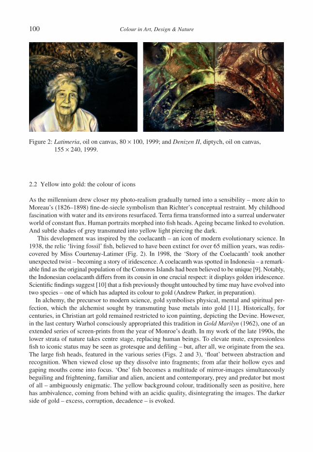
100 Colour in Art, Design & Nature
2.2 Yellow into gold: the colour of icons
As the millennium drew closer my photo-realism gradually turned into a sensibility – more akin to Moreau’s (1826–1898) fi ne-de-siecle symbolism than Richter’s conceptual restraint. My childhood fascination with water and its environs resurfaced. Terra fi rma transformed into a surreal underwater world of constant fl ux. Human portraits morphed into fi sh heads. Ageing became linked to evolution. And subtle shades of grey transmuted into yellow light piercing the dark.
This development was inspired by the coelacanth – an icon of modern evolutionary science. In 1938, the relic ‘living fossil’ fi sh, believed to have been extinct for over 65 million years, was redis-covered by Miss Courtenay-Latimer (Fig. 2). In 1998, the ‘Story of the Coelacanth’ took another unexpected twist – becoming a story of iridescence. A coelacanth was spotted in Indonesia – a remark-able fi nd as the original population of the Comoros Islands had been believed to be unique [9]. Notably, the Indonesian coelacanth differs from its cousin in one crucial respect: it displays golden iridescence. Scientifi c fi ndings suggest [10] that a fi sh previously thought untouched by time may have evolved into two species – one of which has adapted its colour to gold (Andrew Parker, in preparation).
In alchemy, the precursor to modern science, gold symbolises physical, mental and spiritual per-fection, which the alchemist sought by transmuting base metals into gold [11]. Historically, for centuries, in Christian art gold remained restricted to icon painting, depicting the Devine. However, in the last century Warhol consciously appropriated this tradition in Gold Marilyn (1962), one of an extended series of screen-prints from the year of Monroe’s death. In my work of the late 1990s, the lower strata of nature takes centre stage, replacing human beings. To elevate mute, expressionless fi sh to iconic status may be seen as grotesque and defi ling – but, after all, we originate from the sea. The large fi sh heads, featured in the various series (Figs. 2 and 3), ‘fl oat’ between abstraction and recognition. When viewed close up they dissolve into fragments; from afar their hollow eyes and gaping mouths come into focus. ‘One’ fi sh becomes a multitude of mirror-images simultaneously beguiling and frightening, familiar and alien, ancient and contemporary, prey and predator but most of all – ambiguously enigmatic. The yellow background colour, traditionally seen as positive, here has ambivalence, coming from behind with an acidic quality, disintegrating the images. The darker side of gold – excess, corruption, decadence – is evoked.
Figure 2: Latimeria, oil on canvas, 80 × 100, 1999; and Denizen II, diptych, oil on canvas, 155 × 240, 1999.

Colour in Art, Design & Nature 101
To create the illusion of gold, I relied on conventional oil paints. However, not entirely suited to the task, these rather dull paints, based as they are on chemical pigments, proved far from ideal [12]. The vivid golden and more familiar silver beams of iridescence generated by many fi sh, on the other hand, appear identical to the actual precious metal. Yet, surprisingly, neither gold nor silver traces are found in their scales/skin. The metallic-like colour perceived is the result of transparent nano-scale multi-layer refl ectors interacting with light [13]. Nature has been transmuting ordinary matter into noble metals for millions of years. As can be expected this ‘fool’s gold’, when fi nally resolved by science, kindled a gold rush in industry. From the mid-20th century the race was on to develop com-mercially viable synthetic versions. This led to a breakthrough in the 1970s when a fi rst generation of iridescent fl akes that, like fi sh, mimic precious metals via the phenomenon of light interference, was introduced [14]. While they are still mainly in use today, essentially all this early mica-based technology equates to is, in effect, a single-layer refl ector: a pale imitation of Nature’s much more complex and sophisticated multi-layer refl ectors.
3 IRIDESCENCESHowever, at the beginning of the 21st century, fuelled by the rapid advancements of nano-science and nano-manufacturing, the evolution of iridescent technology is gaining considerable momentum. An ever-expanding range of second-generation iridescent fl akes, no longer based on mica, has been introduced. Their novel multi-layered thin fi lm structure generates purer, more intense interference colours and, in some instances, distinct colour travel [3]. Their rise to prominence in specifi c facets of industry has been driven by commercial interest with applications in the motor, cosmetics, fashion and printing industries paramount. Yet most of the excitement seems to have bypassed fi ne art paint-ing. While this is partly due to a lack of awareness and availability, together with high cost involved, the major drawback is surely the challenge the actual creative application presents. As iridescent fl akes are optical devices governed by the rules of additive colour theory (based on the primaries red, blue and green) the established methods of easel painting no longer apply. Their conversion to paint-ing requires something truly innovative.
3.1 ‘Chameleonesque’ colour: the colour of change
In 1999, this technology came to my attention in a chance conversation at the opening of ‘Begin-nings’ (my group show at the Whitworth Gallery, Manchester). At the time I was working on a series
Figure 3: Denizen I, oil on canvas, 155 × 120, 1999; and Skulduggery, diptych, oil on canvas, 180 × 425, 1999.

102 Colour in Art, Design & Nature
inspired by the chameleon’s subtleties of transformation. A representative from a leading pigment manufacturer suggested latest colour-shift fl akes might be pertinent. Having been provided with the fl akes by the manufacturer it, in fact, subsequently took me several years to gain a basic understand-ing of the optical principles involved and transform the raw material, ironically a grey powder, into a medium suitable for painting.
By 2004, I was at last ready to introduce the new technology into my work. While artist in residence at the National Marine Aquarium Plymouth I had, with increasing fascination, observed that unsung hero, the cuttlefi sh. Perpetually metamorphosing, this ‘Chameleon of the Sea’ features a continuously changing display of kaleidoscopic colour, pattern and texture. In an instant, waves of colour can fl ow across its entire body, changing hue from maybe green to violet and back again – a dynamic fl ow of oscillating colour never seen in painting. Yet, the prejudice still lingers, that: ‘Intelligent beings have a language represented by articulate sounds . . . colour, then, is the peculiar characteristic of the lower forms of nature. [15].’ However, while ‘mute’, here, colour has become a complex language [16] sup-ported by a colour ‘technology’ so sophisticated that it equals, if not surpasses, that of our digital age [1]. In loose analogy to a television screen, cuttlefi sh skin contains individually adjustable ‘sub-dots’/cells (the beads in Sea Change, Fig. 5). These cells are (chemical) primary-colour-units that switch on (expand) and switch off (contract), or remain in between, thus (in combination) assuming any colour desired via optical mixing. In addition, iridescent ‘mirror’ cells refl ect colours from the surroundings.
Figure 5: Sea Change, diptych, iridescent paint and beads on board, 90 × 120, 2006.
Figure 4: Studies of Cuttlefi sh, mixed media (beads, wax and iridescent paint), A4, 2003–2006.
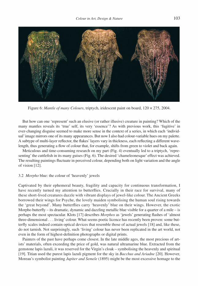
Colour in Art, Design & Nature 103
But how can one ‘represent’ such an elusive (or rather illusive) creature in painting? Which of the many mantles reveals its ‘true’ self, its very ‘essence’? As with previous work, this ‘fugitive’ in ever-changing disguise seemed to make more sense in the context of a series, in which each ‘individ-ual’ image mirrors one of its many appearances. But now I also had colour-variable hues on my palette. A subtype of multi-layer refl ector, the fl akes’ layers vary in thickness, each refl ecting a different wave-length, thus generating a fl ow of colour that, for example, shifts from green to violet and back again.
Meticulous and time-consuming research on my part (Fig. 4) eventually led to a triptych, ‘repre-senting’ the cuttlefi sh in its many guises (Fig. 6). The desired ‘chameleonesque’ effect was achieved. The resulting paintings fl uctuate in perceived colour, depending both on light variation and the angle of vision [12].
3.2 Morpho blue: the colour of ‘heavenly’ jewels
Captivated by their ephemeral beauty, fragility and capacity for continuous transformation, I have recently turned my attention to butterfl ies. Crucially in their race for survival, many of these short-lived creatures dazzle with vibrant displays of jewel-like colour. The Ancient Greeks borrowed their wings for Psyche, the lovely maiden symbolising the human soul rising towards the ‘great beyond’. Many butterfl ies carry ‘heavenly’ blue on their wings. However, the exotic Morpho butterfl y – its dramatic, dynamic and dazzling metallic blue visible for a quarter of a mile – is perhaps the most spectacular. Klots [17] describes Morphos as ‘jewels’ generating fl ashes of ‘almost three-dimensional . . . living’ colour. What seems poetic licence has recently been proven: some but-terfl y scales indeed contain optical devices that resemble those of actual jewels [18] and, like these, do not tarnish. Not surprisingly, such ‘living’ colour has never been replicated in the art world, not even in the form of highest-defi nition photographs or digital prints.
Painters of the past have perhaps come closest. In the late middle ages, the most precious of art-ists’ materials, often exceeding the price of gold, was natural ultramarine blue. Extracted from the gemstone lapis lazuli, it was reserved for the Virgin’s cloak – symbolising the heavenly and spiritual [19]. Titian used the purest lapis lazuli pigment for the sky in Bacchus and Ariadne [20]. However, Moreau’s symbolist painting Jupiter and Semele (1895) might be the most excessive homage to the
Figure 6: Mantle of many Colours, triptych, iridescent paint on board, 120 × 275, 2004.
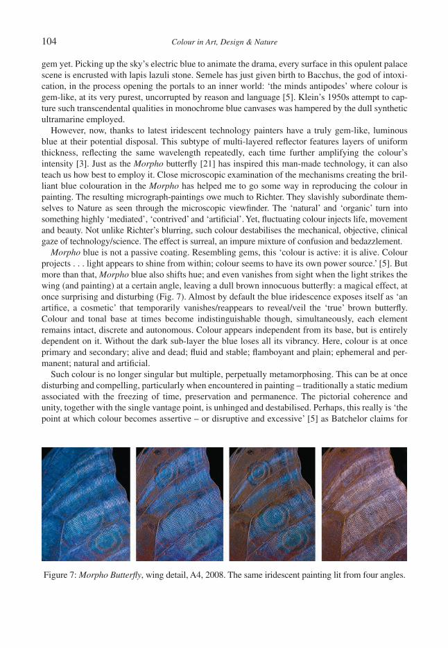
104 Colour in Art, Design & Nature
gem yet. Picking up the sky’s electric blue to animate the drama, every surface in this opulent palace scene is encrusted with lapis lazuli stone. Semele has just given birth to Bacchus, the god of intoxi-cation, in the process opening the portals to an inner world: ‘the minds antipodes’ where colour is gem-like, at its very purest, uncorrupted by reason and language [5]. Klein’s 1950s attempt to cap-ture such transcendental qualities in monochrome blue canvases was hampered by the dull synthetic ultramarine employed.
However, now, thanks to latest iridescent technology painters have a truly gem-like, luminous blue at their potential disposal. This subtype of multi-layered refl ector features layers of uniform thickness, refl ecting the same wavelength repeatedly, each time further amplifying the colour’s intensity [3]. Just as the Morpho butterfl y [21] has inspired this man-made technology, it can also teach us how best to employ it. Close microscopic examination of the mechanisms creating the bril-liant blue colouration in the Morpho has helped me to go some way in reproducing the colour in painting. The resulting micrograph-paintings owe much to Richter. They slavishly subordinate them-selves to Nature as seen through the microscopic viewfi nder. The ‘natural’ and ‘organic’ turn into something highly ‘mediated’, ‘contrived’ and ‘artifi cial’. Yet, fl uctuating colour injects life, movement and beauty. Not unlike Richter’s blurring, such colour destabilises the mechanical, objective, clinical gaze of technology/science. The effect is surreal, an impure mixture of confusion and bedazzlement.
Morpho blue is not a passive coating. Resembling gems, this ‘colour is active: it is alive. Colour projects . . . light appears to shine from within; colour seems to have its own power source.’ [5]. But more than that, Morpho blue also shifts hue; and even vanishes from sight when the light strikes the wing (and painting) at a certain angle, leaving a dull brown innocuous butterfl y: a magical effect, at once surprising and disturbing (Fig. 7). Almost by default the blue iridescence exposes itself as ‘an artifi ce, a cosmetic’ that temporarily vanishes/reappears to reveal/veil the ‘true’ brown butterfl y. Colour and tonal base at times become indistinguishable though, simultaneously, each element remains intact, discrete and autonomous. Colour appears independent from its base, but is entirely dependent on it. Without the dark sub-layer the blue loses all its vibrancy. Here, colour is at once primary and secondary; alive and dead; fl uid and stable; fl amboyant and plain; ephemeral and per-manent; natural and artifi cial.
Such colour is no longer singular but multiple, perpetually metamorphosing. This can be at once disturbing and compelling, particularly when encountered in painting – traditionally a static medium associated with the freezing of time, preservation and permanence. The pictorial coherence and unity, together with the single vantage point, is unhinged and destabilised. Perhaps, this really is ‘the point at which colour becomes assertive – or disruptive and excessive’ [5] as Batchelor claims for
Figure 7: Morpho Butterfl y, wing detail, A4, 2008. The same iridescent painting lit from four angles.
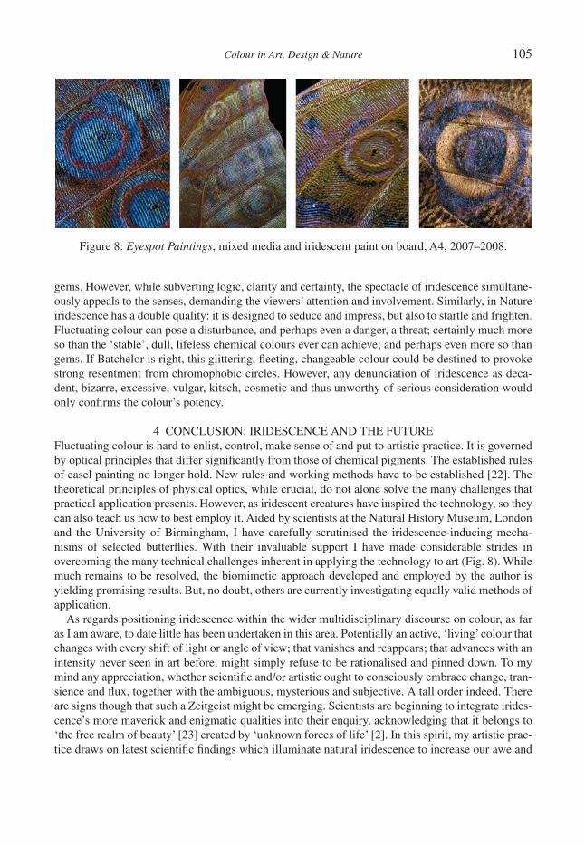
Colour in Art, Design & Nature 105
gems. However, while subverting logic, clarity and certainty, the spectacle of iridescence simultane-ously appeals to the senses, demanding the viewers’ attention and involvement. Similarly, in Nature iridescence has a double quality: it is designed to seduce and impress, but also to startle and frighten. Fluctuating colour can pose a disturbance, and perhaps even a danger, a threat; certainly much more so than the ‘stable’, dull, lifeless chemical colours ever can achieve; and perhaps even more so than gems. If Batchelor is right, this glittering, fl eeting, changeable colour could be destined to provoke strong resentment from chromophobic circles. However, any denunciation of iridescence as deca-dent, bizarre, excessive, vulgar, kitsch, cosmetic and thus unworthy of serious consideration would only confi rms the colour’s potency.
4 CONCLUSION: IRIDESCENCE AND THE FUTUREFluctuating colour is hard to enlist, control, make sense of and put to artistic practice. It is governed by optical principles that differ signifi cantly from those of chemical pigments. The established rules of easel painting no longer hold. New rules and working methods have to be established [22]. The theoretical principles of physical optics, while crucial, do not alone solve the many challenges that practical application presents. However, as iridescent creatures have inspired the technology, so they can also teach us how to best employ it. Aided by scientists at the Natural History Museum, London and the University of Birmingham, I have carefully scrutinised the iridescence-inducing mecha-nisms of selected butterfl ies. With their invaluable support I have made considerable strides in overcoming the many technical challenges inherent in applying the technology to art (Fig. 8). While much remains to be resolved, the biomimetic approach developed and employed by the author is yielding promising results. But, no doubt, others are currently investigating equally valid methods of application.
As regards positioning iridescence within the wider multidisciplinary discourse on colour, as far as I am aware, to date little has been undertaken in this area. Potentially an active, ‘living’ colour that changes with every shift of light or angle of view; that vanishes and reappears; that advances with an intensity never seen in art before, might simply refuse to be rationalised and pinned down. To my mind any appreciation, whether scientifi c and/or artistic ought to consciously embrace change, tran-sience and fl ux, together with the ambiguous, mysterious and subjective. A tall order indeed. There are signs though that such a Zeitgeist might be emerging. Scientists are beginning to integrate irides-cence’s more maverick and enigmatic qualities into their enquiry, acknowledging that it belongs to ‘the free realm of beauty’ [23] created by ‘unknown forces of life’ [2]. In this spirit, my artistic prac-tice draws on latest scientifi c fi ndings which illuminate natural iridescence to increase our awe and
Figure 8: Eyespot Paintings, mixed media and iridescent paint on board, A4, 2007–2008.
106 Colour in Art, Design & Nature
reverence for Nature’s ingenuity ‘which creates beauty and splendor that exceeds all functional need and purpose’ [2].
Can we therefore predict a sparkling future for iridescence in art? Presciently, in 1999 Koolhaas foresaw that ‘colour could make a comeback . . . simply through the impact of new technologies and new effects. In a world where nothing is stable, the permanence of (chemical) colour is slightly naïve; maybe it could change’ [24]. And indeed colour has changed. Referring to colour-shift fl akes, Ball [19] confi rms: ‘Certainly I think all these media will be used – because that is the way of art, to fi nd ways to take advantage of what technology has to offer; . . . technology opens new doors for artists.’ And Nature, it would seem, continues to open even more.
ACKNOWLEDGMENTSThis research was supported by the Arts Council of England and the Arts and Humanities Research Council (AHRC).
REFERENCES [1] Parker, A., In the Blink of an Eye: How Vision Kick-started the Big Band of Evolution, Free
Press: London, p. 109, subsequent quotation is from p. 91, 2003. [2] Simon, H., The Splendor of Iridescence, Dodd, Mead & Company: New York, p. 172, subse-
quent quotations are from p. 236 and the preface, 1971. [3] Pfaff, G., Optical principles, manufacture, properties and types of special effect pigments
(Chapter 2). Special Effect Pigments, ed. G. Pfaff, 2nd edn, Vincentz Network: Hannover, pp. 72–83, 2008.
[4] Von Weizsäcker, C.F., forword to Heimendahl, E., Licht und Farbe: Ordnung und Funktion der Farbwelt, Walter de Groyter: Berlin, 1961, quoted in Simon [2], p. 237.
[5] Batchelor, D., Chromophobia, Reaktion: London, p. 23, subsequent quotation is from p. 74, 2000.
[6] Gage, J., Colour in Art, Thames and Hudson: London, p. 15, 2006. [7] Richter, G., The Daily Practice of Painting, Thames and Hudson: London, p. 22, subsequent
quotations are from p. 58, 82, 73 and 80, 1995. [8] Barthes, R., Camera Lucida: Refl ections on Photography, Hill and Wang: New York, p. 81,
1981. [9] Weinberg, S., A Fish Caught in Time, Fourth Estate: London, 1999.[10] Holder, M.T., Erdmann, M.V., Wilcox, P., Caldwell, R.L. & Hillis, D.M., Two living species of
coelacanths? PNAS, 96(22), pp. 12616–12620, 1999.[11] Gage, J., Colour and Culture, Thames and Hudson: London, p. 139, 1993.[12] Schenk, F. & Harvey, J., Refl ections on the natural history museum: the art of iridescence and
nature’s jewels. Int. J. of the Arts in Society, 3(5), pp. 133–144, 2009.[13] Parker, A., ‘Simple’ optical refl ectors in animals. Structural Color in Biological Systems, eds
S. Kinoshita & S. Yoshioka, Osaka University Press: Osaka, p. 46, 2005.[14] Greenstein, L.M., Nacreous (Pearlescent) Pigments and Interference Pigments. The Pigment
Handbook, 2nd edn, Vol. 1, Wiley: New York, pp. 829–857, 1988.[15] Blank, C., The Grammar of Painting and Engraving, 1867. Colour, ed. D. Batchelor, Whitecha-
pel: London, and MIT Press: Cambridge, Massachusetts, pp. 32–34, 2008.[16] Hanlon, T.R. & Messenger, J.H., Cephalopod Behaviour, Cambridge University Press:
Cambridge, pp. 120–131, 1996.[17] Klots, A.B., Living Insects of the World, Doubleday: New York, 1959, quoted in Simon [2],
p. 198.
Colour in Art, Design & Nature 107
[18] Vukusic, P., Structural colour effects in Lepidoptera. Structural Color in Biological Systems, eds S. Kinoshita & S.Yoshioka, Osaka University Press: Osaka, p. 107, 2005.
[19] Ball, P., Bright Earth: The Invention of Colour, Vintage Books: London, p. 265, subsequent quote is from p. 384, 2008.
[20] Bomford, D., The history of colour in art, Colour: Art & Science, eds T. Lamb & J. Bourriau, Cambridge University Press: Cambridge, p. 20, 1995.
[21] Berthier, S., Iridescences: The Physical Colors of Insects, Springer: London, p. 88, 2007.[22] Schenk, F. & Parker, A., Iridescent Colour: From Nature to the Painter’s Palette, Leonardo, in
press.[23] Portmann, A., The Beauty of Butterfl ies, B.T. Batsford: London, 1951, quoted in Simon [2],
p. 238.[24] Koolhaas, R., The Future of Colours is Looking Bright, 1999. Colour, ed. D. Batchelor,
Whitechapel: London, and MIT Press: Cambridge, Massachusetts, pp. 219–220, 2008.

This page intentionally left blank

Colour in Art, Design & Nature
ON THE USE OF COLOUR IN EXPERIMENTAL FLUID MECHANICS
J.T. TURNER & S. ZHANGSchool of Mechanical, Aerospace and Civil Engineering, University of Manchester, Manchester, UK.
ABSTRACTThis paper discusses how colour is used in experimental fl uid fl ow studies. Firstly, colour (defi ned scientifi cally by the wavelength of the light) can be used to discriminate between different channels in optical instrumentation, mak-ing it possible to measure several fl ow properties, simultaneously, and without any intrusion into the fl ow. These aspects of modern fl ow measurement are discussed in terms of some examples. Alternatively, the results of the fl ow measurement may be represented in the form of images, graphs and three-dimensional schematics with colour being used to identify and emphasise particular features that might otherwise remain concealed. The experimental results presented in the paper confi rm that using colour to discriminate between sets of data has several important advantages over the older black and white or grey scale forms of representation. Not only do colours provide an excellent basis for communication through graphical and three-dimensional presentations, but the resulting clar-ity may also help to reveal complex forms of fl uid fl ow behaviour. Moreover, the inherent artistic appeal of some colour representations can draw the viewer into the technical detail, helping to simplify physical phenomena in ways that would not otherwise be possible. Although the observations made on the presentation of data are illus-trated with reference to a number of experimental fl uid fl ow problems, many of the methods and observations would be applicable in other situations, where scientifi c or technological data needs to be presented.Keywords: colour, data presentation, experiment, fl uid fl ow measurement, graphics, images, light, understand-ing, wavelength.
1 INTRODUCTIONTurner and Zhang [1] discussed the arrival of the digital computer in a previous paper, highlighting the impact of digital methods since the fi rst computers arrived in the mid-1950s. The paper also traced the development of digital technology, covering the introduction of hardware systems and the associated software. Several experimental fl ow problems were introduced and the data derived from these were used to show the benefi ts offered by coloured presentations, and other advanced forms of data processing.
In reviewing the rapid growth to dominance of digital technology, it needs to be understood that the innovations represented the result of research within many different organisations and were intro-duced in an entirely haphazard fashion. Thus, although the new computers permitted massive amounts of calculation to be performed routinely by the mid-1950s, these operations were much less conven-ient than is the case with modern systems. Moreover, the associated display devices (i.e. printers and monitors) and general purpose software packages for data processing took much longer to reach the mass market. As a result, coloured graphics and the colour monitor did not become common until 1984 with the arrival of the Apple Macintosh. Similarly, printers were limited to black and white operation until the 1990s. Naturally, for several years after their introduction, the cost of each of these tools was considerably higher than is now the case. Compare this with the situation today, where dedicated software tools (e.g. for word processing, statistical analysis, three-dimensional drawing and graphical presentation) are readily available to everyone, and at relatively low prices.
The ability to capture information on physical systems (and particularly fl uid fl ow data) at very high speed could never have been envisaged by previous generations. Instead, the fl ow would be observed and reported in simple, easily understood, terms, such as a sketch, a measured fl ow rate or an averaged velocity. Figure 1, for example, shows some typical results presented by Leonardo da

110 Colour in Art, Design & Nature
Vinci (1452–1519) [2]. Da Vinci studied the fl ow of water into a distribution chamber and reduced his results to a series of black and white sketches, indicating how the surface of the water in the chamber was disturbed. These observations on the behaviour of a turbulent jet, and the manner in which turbu-lent eddies are formed and move in the body of the fl ow, are still recognised as valid today, despite the lack of instrumentation in those early days. Imagine how coloured presentations would have added to the impact of Da Vinci’s already considerable infl uence on experimental fl uid mechanics.
Noting the current importance of digital technology, it is perhaps surprising to recall that the elec-tronic calculator and the slide rule were still the most commonly used methods for large-scale calculations until the late 1970s. Contrast this with the situation today, where everyone can have desk top access (at relatively low cost) to a personal computer (PC). Moreover, the associated periph-erals, such as the colour printer, mouse, keyboard and massive storage capacity, are ubiquitous, relatively low cost and demanded as a right by virtually every PC user. These developments have provided enormous benefi ts for the experimentalist, because of the many improved forms of instru-mentation and data capture systems, together with more sophisticated methods of analysis and presentation, that are available.
In the present context, it is worth refl ecting on the fact that the fi rst digital computer only became operational in 1948. Since then, there have been continuing developments to the extent that digital technology now embraces not just computers but everyday devices, such as digital calculators, watches and clocks, controllers for central heating systems and other domestic appliances, such as microwaves and washing machines, digital cameras and scanners, mobile phones, digital video discs, personal music players, the internet and other devices too numerous to mention here. It is astounding that these devices only became available within the last twenty years [1].
Consider, now, the use and advantages of colour in measuring fl uid fl ow properties, then the need to record and present these. Tremendous improvements in instrumentation have occurred as a result of the digital revolution, enabling important properties, such as the pressure, temperature and velocity of the fl uid to be measured, often remotely using non-intrusive diagnostic methods, in ways that were not
Figure 1: Leonardo da Vinci presented his results, showing the surface disturbances produced by water fl owing into a distribution chamber, as a series of black and white sketches.
Colour in Art, Design & Nature 111
available previously. Earlier investigators such as Da Vinci had to rely on observation or, much later, could resort to physically intrusive methods in which a sensor (e.g. a thermocouple) was inserted into the fl ow, introducing the possibility that the fl ow patterns would be altered by the sensor. Now, many of these intrusive methods have been superseded by non-intrusive sensors and digital instrumentation systems, inevitably with a digital computer controlling the data acquisition and processing - please refer to [1] for more detailed discussion and a chronology of these developments.
Many of the measurement techniques introduced in the past twenty years make use of the principals of optics and rely, more often than not, on the properties of the light emitted by a laser (light amplifi ca-tion by stimulated emission and radiation). After over fi fty years of intensive development, the name laser is now applied to a whole family of light-emitting devices, following the introduction of the fi rst laser in the mid-1950s [3, 4]. The principal characteristic of a laser is its ability to produce an intense beam of light at a precisely specifi ed wavelength that is collimated so that the diameter of its cross-section remains the same over very long distances. It also has other important properties that are exploited in measurement systems, although these properties cannot be discussed in any detail here.
Soon after the introduction of the laser, a range of non-intrusive fl ow velocity measuring techniques began to emerge, of which the fi rst was laser Doppler anemometry (LDA). This was described by Yeh and Cummings [5] but more complete details have been given by Durst et al. [6] and Albrecht et al. [7]. The fi rst LDA systems used a helium–neon laser operating at 633 nm (red) and were capable of meas-uring one (or sometimes two) components of the fl uid velocity, simultaneously, and at a well-defi ned position in the fl ow.
With the arrival of the argon-ion laser (1964), coupled with improved optical components, such as colour fi lters and detectors, it became possible to generate a beam of light containing two or more colours simultaneously. Specialised instruments (e.g. the photometer and the spectrometer) can then be used to discriminate between these ‘colours’ to a fraction of a nano-metre. These developments allowed several channels of optical instrumentation to operate in parallel, with separation of the channels being made possible by colour fi lters. After some forty years, colour separation remains at the heart of all modern LDA systems, as will be demonstrated later in this paper.
Following intensive development, LDA and several other related optical diagnostic methods employing a laser as the light source are currently used to measure, for example, the fl uid velocity, temperature and, simultaneously, the size and velocity of fl uid borne particles.
In addition to point measuring techniques, such as LDA, both qualitative and quantitative methods based on digital imaging are increasingly used. These methods use high speed imaging to measure the movement of small particles carried by the fl ow. The most commonly used method is currently referred to as particle image velocimetry, or PIV, [8, 9]. Digital imaging techniques not only offer considerable power and fl exibility but also provide an opportunity for post-processing the images so as to enhance any chosen feature. No-where is the traditional view, that ‘every picture is worth a thousand words’, more appropriate than in experimental fl uid fl ow studies. Thus, many measurements are made by cap-turing the movement of small particles (typically 5 μm in diameter, or less) carried by the fl ow. Then, by using one or more specially designed digital cameras, and image analysis techniques, the distribu-tion of the fl uid velocity across a plane in the fl ow defi ned by a sheet of laser light can be obtained. Similarly, the distribution of the local fl uid temperature can be measured by interrogating the images of small temperature sensitive liquid crystal particles that are carried by the fl ow. The wavelength (or colour) of the light refl ected by these crystals changes in response to the fl uid temperature. More infor-mation on this technique is available in [10]. Another family of spectroscopic methods relies on the detection and analysis of the wavelength distributions of the light emitted by the target substance, after irradiation by a laser source. These light scattering methods can be employed to measure the chemical composition of a fl uid, or the concentration of combustion products in fl ue gases.

112 Colour in Art, Design & Nature
2 COLOUR AND ITS REPRESENTATIONVision is the term used to describe the ability of the eye to respond to electromagnetic radiation. By defi nition, light is that part of the electromagnetic spectrum that stimulates the retina of the (human) eye, and the brain, then associates different colours with different wavelengths of the light. Typi-cally, the human eye has the ability to resolve wavelengths extending from the ultra-violet (around 380 nm) to the infrared region of the visible spectrum (around 740 nm). Even so, colour is subjective because the sensitivity to different wavelengths varies signifi cantly between individuals, implying that each person sees a slightly different image when receiving the light scattered or refl ected from an object. For the average subject, however, the sensitivity of the normal human eye varies in an approximately Gaussian fashion in daylight, reaching a maximum in the green region of the spec-trum. Typically, thousands of different colours can be distinguished. However, modern optical devices show even greater sensitivity and better discrimination between wavelengths than this. More information can be found in [9b and c].
As discussed previously in [1], entirely new technical challenges needed to be overcome before the introduction of colour monitors and printers. In simple terms, a coloured image, for example, captured on a digital camera, is stored as an array of small coloured dots (or pixels). These coloured dots are represented, fi rst as an electrical charge on the imaging device in response to the character-istics of the incident light, before being transmitted to the digital computer, where both the colour and position of the pixels within the image are stored numerically. When it becomes necessary to display the image, the stored data is converted back into a visual display through a colour printer, the computer monitor or the camera display screen. This ability to represent images in digital form has proved to be extremely valuable in experimental fl uid mechanics and, as mentioned previously, sev-eral techniques are now based on digital imaging [8, 10, 11]. Furthermore, the rise in storage capacity, now typically measured in Giga-bytes (109 bytes, where one byte represents one 16 bit number in binary form), has been accompanied by a massive growth in the image sizes offered by modern cameras (typically 10 MB). Similarly, the number and range of possible colours that can be represented digitally has risen steadily as the numerical precision of digital computers has increased, and corresponding improvements have been made to display monitors and colour printers. Again, these factors were discussed in the earlier paper.
In modern measurement systems, a PC is typically used to capture and store the data in digital form. The sensor signals can then be converted from the original input (say a temperature or pres-sure) into a voltage. These voltage values are then interpreted through detailed analysis, or the observed signals might need to be converted into another form, for example, back into the original pressures or temperatures. Specialised software also allows the data to be analysed, for example, to determine how the intensity of the scattered light varies with the wavelength. These advances have revolutionised experimental study, greatly extending the range of properties that can be measured, and enabling better methods of analysis and presentation to be adopted.
3 SIMPLE GRAPHICAL DISTRIBUTIONS – THE ADVANTAGES OF COLOURThe most frequently used form of data presentation will consist of a graph showing how one variable changes as the other is altered. Superimposing several distributions on the same graph enables the effect of two (or more) ‘independent variables’ on the ‘dependent variable’ to be shown. Formerly, until colour techniques and hardware became generally available, graphs of this kind had to be pro-duced in black and white. This created problems which were usually solved by allocating one symbol to each curve, for example, + × o Δ, possibly combined with dashed, chain-dotted, and continuous lines of varying thicknesses. This was a cumbersome process, in comparison with typical graphs today, where colour is conveniently used to distinguish between the curves.

Colour in Art, Design & Nature 113
The results presented in Figs 3 and 4 show the acoustic signal produced by a microphone inserted into the wall of a pipe, so as to be exposed to the gas within, in response to an injected pulse of sound, for example, from a loudspeaker. In these experiments, the pipe contained air at atmospheric pressure but could have contained any other gas. Using this technique, known as acoustic refl ecto-metry, an acoustic pulse is transmitted through the fl uid in the pipe, and any refl ections are recorded by a microphone or pressure transducer exposed to the same fl uid. In this situation, the microphone responds to all the acoustic refl ections produced by the internal features of the pipe, for example, small steps in the wall due to fl anges, junctions, bends and valves. It is found that the refl ections also carry information about any leakage through the pipe wall, or a blockage, irrespective of whether that blockage is caused by a liquid or a solid deposit. This provides an effective method for monitor-ing the condition of pipelines, such as those delivering natural gas from undersea wells [12]. During the development of this technique, experiments were performed to measure the acoustic response associated with a pool of water forming in a pipe fi lled with air (Fig. 2).
The time-wise variation of the small electrical output signals generated by the microphone were captured [via an analogue to digital converter (ADC)] and input to the PC. These signals were then processed to produce graphs of the type shown in Fig. 3. The fi gures on the right side of the graph represent the extent of the ‘water blockage’, as a percentage of the cross-section of the pipe, and the letters denote different positions along the length of the pool of water as the depth was altered. In producing the graph of signal amplitude against distance, the time required for the refl ection caused by the water blockage to reach the microphone was converted into a distance by multiplying by the known speed of sound. From the acoustic response, the position and length of the blockage could then be determined [12, 13].
To obtain these results, the ADC was used to sample the microphone signal at a sampling rate of 25 kHz (i.e. 25,000 voltage values were recorded and stored, in digital form, each second).
Figure 2: Schematic diagram showing the test arrangement used to investigate the acoustic signature produced by a pool of water in a pipe.

114 Colour in Art, Design & Nature
This relatively high sampling rate enables the scale representing the distance travelled by the acous-tic refl ections to be expanded without any loss of defi nition, thereby zooming in on the acoustic refl ections caused by the water blockage. This expanded view of the data, in the vicinity of the acoustic refl ection caused by the water blockage, is shown in Fig. 4.
-0.5
-0.4
-0.3
-0.2
-0.1
0
0.1
0.2
0.3
0.4
0.5
23 33 43 53 63
Vol
tage
(V
)8%
20%
23%
26%
27%
31%
32%
34%
35%
38%
39%
44%
50%
7313
Distance (m)
Figure 3: Time history of the acoustic signal, showing the position of a water pool inside a pipe.
-0.5
-0.4
-0.3
-0.2
-0.1
0
0.1
0.2
0.3
0.4
0.5
17.5 18 18.5 19 19.5Distance (m)
Vol
tage
(V
)
8%20%23%26%27%31%32%34%35%38%39%44%50%
17 20
Figure 4: Typical processed data showing the fi rst signifi cant acoustic peak associated with the refl ection caused by the water, for various amounts of blockage.

Colour in Art, Design & Nature 115
Apart from the visual appeal of this graphical display, observe how easy it is to follow any of the curves through from the left to the right of this graphical presentation. Clearly, assigning a different colour to each blockage condition enables the results to be interpreted very easily. This would not be the case for a black and white graph of this complexity.
The second example of multi-variable graphical representations, which will be referred to here, is taken from an experimental study of a turbulent jet of fan-blown air issuing horizontally from a precisely manufactured, axisymmetric nozzle. Complete details of this experimental programme may be found in [14], and a brief description is given in [1].
Firstly, the fl ow was ‘visualised’ by injecting paraffi n vapour ‘smoke’ into the annular fl ow to reveal the fl ow patterns in the shear layers at the periphery of the main jet. These fl ow patterns were illuminated by means of a light sheet produced by a continuous wave argon-ion laser operating at 514.5 nm (i.e. in the green region of the spectrum). The light sheet was positioned to intersect the jet cross-section normal to its axis; in other experiments, not considered here but described in [1], another light sheet was positioned along the vertical diameter parallel to the axis of the jet.
In a second series of experiments, two-component LDA was used to obtain detailed quantitative measurements of the axial and radial velocity variations at successive stations downstream as the jet spread into the laboratory. The main features of the experimental arrangement are shown in Fig. 5, and have been described previously in [14, 15, 16].
In these experiments, the LDA traversing system enabled the beams produced by an argon-ion laser to be brought to an intersection, and then positioned at each measurement position across the diameter of the jet. The measurement volume – defi ned by the crossing of the four intersecting laser beams shown in Fig. 5 – was traversed across the jet and local values for the axial and radial velocity components were obtained by operating the LDA instrumentation system. This traversing and measurement could be done automatically, under computer control, with a positional accuracy of better than 0.05 mm and a typical interval between the measurement positions of 2.5 mm. During data collection, the laser light scattered
Figure 5: The free jet apparatus showing the second author in the process of data collection, the primary and secondary nozzles, parts of the two-component LDA apparatus and the high-precision automated traversing mechanism.
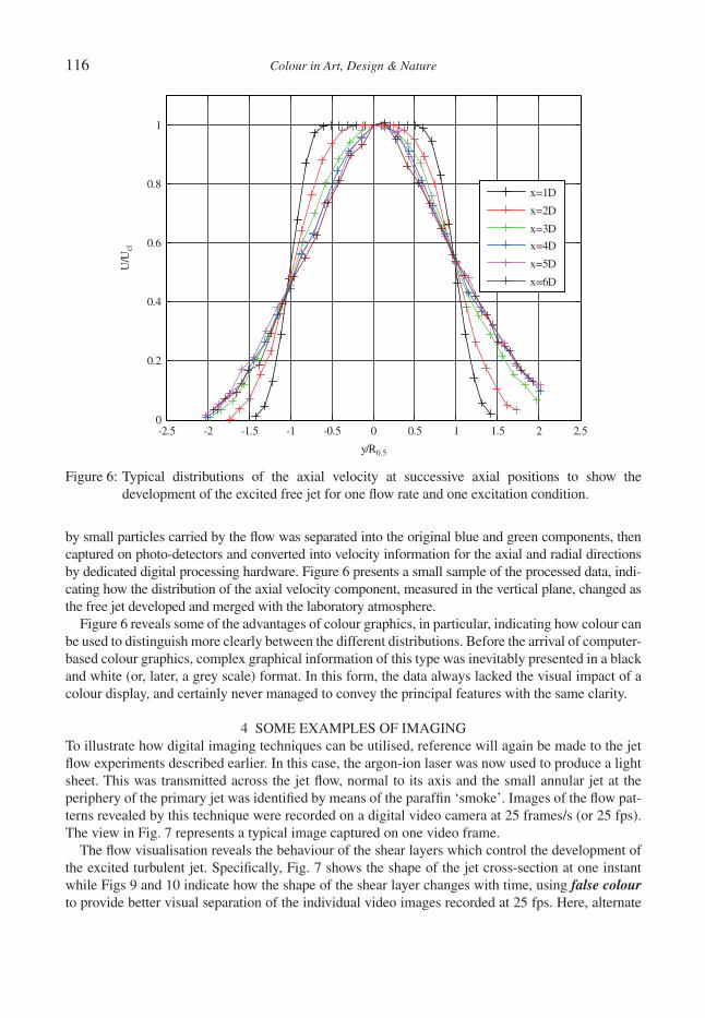
116 Colour in Art, Design & Nature
by small particles carried by the fl ow was separated into the original blue and green components, then captured on photo-detectors and converted into velocity information for the axial and radial directions by dedicated digital processing hardware. Figure 6 presents a small sample of the processed data, indi-cating how the distribution of the axial velocity component, measured in the vertical plane, changed as the free jet developed and merged with the laboratory atmosphere.
Figure 6 reveals some of the advantages of colour graphics, in particular, indicating how colour can be used to distinguish more clearly between the different distributions. Before the arrival of computer-based colour graphics, complex graphical information of this type was inevitably presented in a black and white (or, later, a grey scale) format. In this form, the data always lacked the visual impact of a colour display, and certainly never managed to convey the principal features with the same clarity.
4 SOME EXAMPLES OF IMAGINGTo illustrate how digital imaging techniques can be utilised, reference will again be made to the jet fl ow experiments described earlier. In this case, the argon-ion laser was now used to produce a light sheet. This was transmitted across the jet fl ow, normal to its axis and the small annular jet at the periphery of the primary jet was identifi ed by means of the paraffi n ‘smoke’. Images of the fl ow pat-terns revealed by this technique were recorded on a digital video camera at 25 frames/s (or 25 fps). The view in Fig. 7 represents a typical image captured on one video frame.
The fl ow visualisation reveals the behaviour of the shear layers which control the development of the excited turbulent jet. Specifi cally, Fig. 7 shows the shape of the jet cross-section at one instant while Figs 9 and 10 indicate how the shape of the shear layer changes with time, using false colour to provide better visual separation of the individual video images recorded at 25 fps. Here, alternate
-2.5 -2 -1.5 -1 -0.5 0 0.5 1 1.5 2 2.50
0.2
0.4
0.6
0.8
1
y/R0.5
U/U
cl
x=1D
x=2D
x=3D
x=4D
x=5D
x=6D
Figure 6: Typical distributions of the axial velocity at successive axial positions to show the development of the excited free jet for one fl ow rate and one excitation condition.
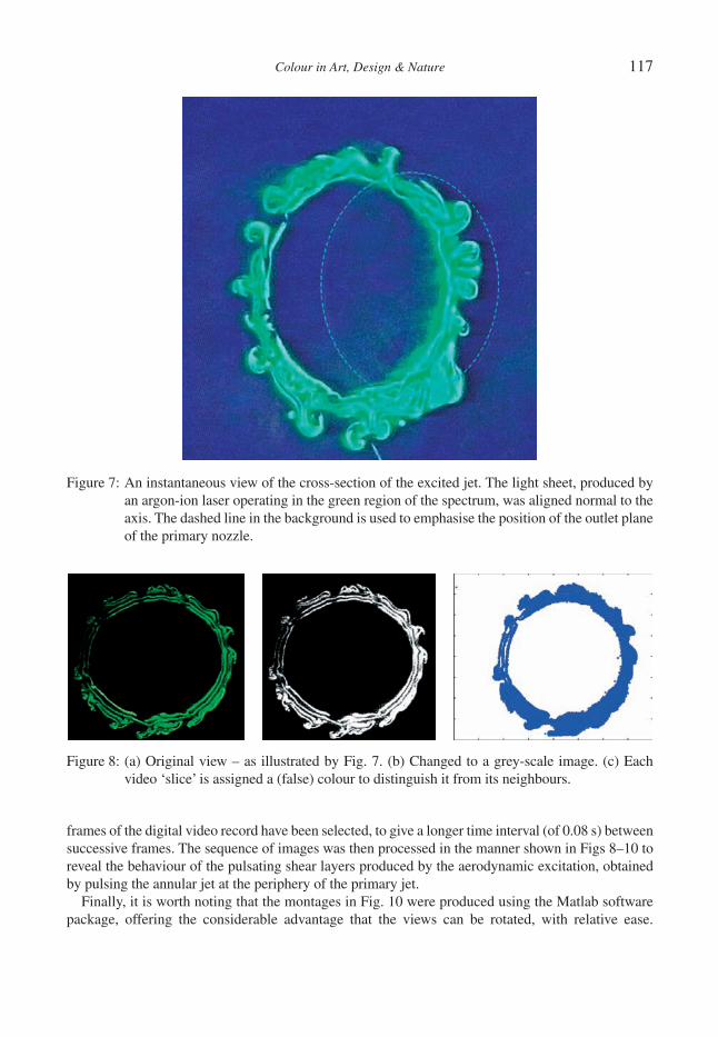
Colour in Art, Design & Nature 117
frames of the digital video record have been selected, to give a longer time interval (of 0.08 s) between successive frames. The sequence of images was then processed in the manner shown in Figs 8–10 to reveal the behaviour of the pulsating shear layers produced by the aerodynamic excitation, obtained by pulsing the annular jet at the periphery of the primary jet.
Finally, it is worth noting that the montages in Fig. 10 were produced using the Matlab software package, offering the considerable advantage that the views can be rotated, with relative ease.
Figure 7: An instantaneous view of the cross-section of the excited jet. The light sheet, produced by an argon-ion laser operating in the green region of the spectrum, was aligned normal to the axis. The dashed line in the background is used to emphasise the position of the outlet plane of the primary nozzle.
Figure 8: (a) Original view – as illustrated by Fig. 7. (b) Changed to a grey-scale image. (c) Each video ‘slice’ is assigned a (false) colour to distinguish it from its neighbours.

118 Colour in Art, Design & Nature
Here, the two fl ow directions have been chosen to illustrate the principal features of the shear layer behaviour, both inside and outside the annular shear layer region.
Extensive studies over a long period have confi rmed that the excitation generally increases the mixing of the turbulent free jet, so that it spreads more rapidly, and that there are preferred frequencies for the pulsations. Further information may be found in [14, 15, 16].
Figure 9: Successive slices are aligned along the chosen direction, separated by the assigned colour and an arbitrary distance (which might be dependent on the fl ow velocity or the frame time interval).
Figure 10: The sequence of images is combined into a montage, revealing how the shear layers at the periphery of the jet change with time. All of these images were obtained in a single plane, illuminated by the laser sheet.
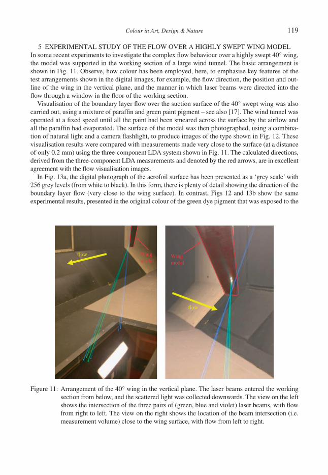
Colour in Art, Design & Nature 119
5 EXPERIMENTAL STUDY OF THE FLOW OVER A HIGHLY SWEPT WING MODELIn some recent experiments to investigate the complex fl ow behaviour over a highly swept 40° wing, the model was supported in the working section of a large wind tunnel. The basic arrangement is shown in Fig. 11. Observe, how colour has been employed, here, to emphasise key features of the test arrangements shown in the digital images, for example, the fl ow direction, the position and out-line of the wing in the vertical plane, and the manner in which laser beams were directed into the fl ow through a window in the fl oor of the working section.
Visualisation of the boundary layer fl ow over the suction surface of the 40° swept wing was also carried out, using a mixture of paraffi n and green paint pigment – see also [17]. The wind tunnel was operated at a fi xed speed until all the paint had been smeared across the surface by the airfl ow and all the paraffi n had evaporated. The surface of the model was then photographed, using a combina-tion of natural light and a camera fl ashlight, to produce images of the type shown in Fig. 12. These visualisation results were compared with measurements made very close to the surface (at a distance of only 0.2 mm) using the three-component LDA system shown in Fig. 11. The calculated directions, derived from the three-component LDA measurements and denoted by the red arrows, are in excellent agreement with the fl ow visualisation images.
In Fig. 13a, the digital photograph of the aerofoil surface has been presented as a ‘grey scale’ with 256 grey levels (from white to black). In this form, there is plenty of detail showing the direction of the boundary layer fl ow (very close to the wing surface). In contrast, Figs 12 and 13b show the same experimental results, presented in the original colour of the green dye pigment that was exposed to the
Wingmodel
flow
flow Wingmodel
Figure 11: Arrangement of the 40° wing in the vertical plane. The laser beams entered the working section from below, and the scattered light was collected downwards. The view on the left shows the intersection of the three pairs of (green, blue and violet) laser beams, with fl ow from right to left. The view on the right shows the location of the beam intersection (i.e. measurement volume) close to the wing surface, with fl ow from left to right.
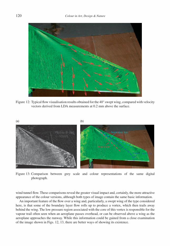
120 Colour in Art, Design & Nature
wind tunnel fl ow. These comparisons reveal the greater visual impact and, certainly, the more attractive appearance of the colour versions, although both types of image contain the same basic information.
An important feature of the fl ow over a wing and, particularly, a swept wing of the type considered here, is that some of the boundary layer fl ow rolls up to produce a vortex, which then trails away behind the wing. The low pressure region associated with the core of this vortex is responsible for the vapour trail often seen when an aeroplane passes overhead, or can be observed above a wing as the aeroplane approaches the runway. While this information could be gained from a close examination of the image shown in Figs. 12, 13, there are better ways of showing its existence.
Figure 12: Typical fl ow visualisation results obtained for the 40° swept wing, compared with velocity vectors derived from LDA measurements at 0.2 mm above the surface.
Attachment
Separation line
Vortex trajectory
(a) (b)
Figure 13: Comparison between grey scale and colour representations of the same digital photograph.
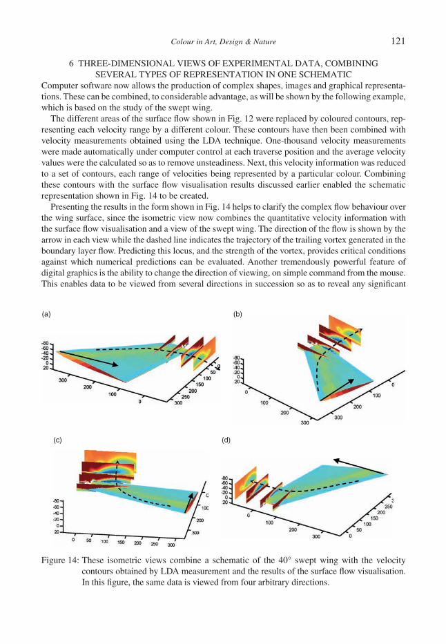
Colour in Art, Design & Nature 121
6 THREE-DIMENSIONAL VIEWS OF EXPERIMENTAL DATA, COMBINING SEVERAL TYPES OF REPRESENTATION IN ONE SCHEMATIC
Computer software now allows the production of complex shapes, images and graphical representa-tions. These can be combined, to considerable advantage, as will be shown by the following example, which is based on the study of the swept wing.
The different areas of the surface fl ow shown in Fig. 12 were replaced by coloured contours, rep-resenting each velocity range by a different colour. These contours have then been combined with velocity measurements obtained using the LDA technique. One-thousand velocity measurements were made automatically under computer control at each traverse position and the average velocity values were the calculated so as to remove unsteadiness. Next, this velocity information was reduced to a set of contours, each range of velocities being represented by a particular colour. Combining these contours with the surface fl ow visualisation results discussed earlier enabled the schematic representation shown in Fig. 14 to be created.
Presenting the results in the form shown in Fig. 14 helps to clarify the complex fl ow behaviour over the wing surface, since the isometric view now combines the quantitative velocity information with the surface fl ow visualisation and a view of the swept wing. The direction of the fl ow is shown by the arrow in each view while the dashed line indicates the trajectory of the trailing vortex generated in the boundary layer fl ow. Predicting this locus, and the strength of the vortex, provides critical conditions against which numerical predictions can be evaluated. Another tremendously powerful feature of digital graphics is the ability to change the direction of viewing, on simple command from the mouse. This enables data to be viewed from several directions in succession so as to reveal any signifi cant
(a) (b)
(c) (d)
Figure 14: These isometric views combine a schematic of the 40° swept wing with the velocity contours obtained by LDA measurement and the results of the surface fl ow visualisation. In this fi gure, the same data is viewed from four arbitrary directions.
122 Colour in Art, Design & Nature
behaviour of the fl ow – although massive amounts of calculation are needed to achieve this. By way of example, the four views in Fig. 14 show the same graphical information at different orientations, thereby revealing how the vortex moves relative to the upper surface of the swept wing.
It is estimated that a minimum of 500 MB of numerical data was needed to process the LDA and image data, before constructing just one of these views. Further vectorised information was then neces-sary to create the other different views as the images were rotated. Clearly, this computationally intensive process would never have been possible in the days before digital technology was available. It should also be noted, for the record, that the experimental results embodied in Fig. 14 correspond to tests performed in the wind tunnel at just one free-stream velocity level and one angle of incidence.
7 CONCLUSIONSColour discrimination is at the heart of many tools used by the experimentalist, providing a basis for the optical techniques that make use of some property of laser light to determine a fl ow characteris-tic and because of the advantages that colour offers for graphical representations and images. A number of these topics have been discussed and some examples of the possibilities have been given. It is the view of the authors that digital technology, and particularly non-intrusive optical methods of measurement, have revolutionised experimental fl uid mechanics. It is surprising to refl ect that these changes have taken place over a period of no more than thirty years.
REFERENCES [1] Turner, J.T. & Zhang, S., Analysis, presentation, and understanding in experimental fl u-
id fl ow studies: an evolutionary story. J. Optics and Laser Technology. (doi: 10.1016/j.optiastec.2009.12.002).
[2] For information on the work of Leonardo da Vinci. Available from: (a) www.efl uids.com/efl uids/gallery/gallery_pages/da_vinci_page.htm; (b) http://en.wikipedia.org/wiki/Leonardo_da_Vinci#Scientifi c_studies.
[3] Bertolotti, M., The History of the Laser, CRC Press, 2005. [4] For the invention of the laser. Available from: www.bell-labs.com/history/laser/. Additionally,
regarding the disputed ownership of this invention. Available from: http://www.essortment.com/all/historylaserin_rnxv.htm.
[5] Yeh, Y. & Cummins, H.Z., Localized fl uid fl ow measurements with a He–Ne laser spectrometer. Applied Physics Letters, 4, p. 176, 1964.
[6] Durst, F., Melling, A. & Whitelaw, J.H., Principles and Practice of Laser-Doppler Anemometry, Academic Press, 1976.
[7] Albrecht, H.E., Borys, M., Damaschke, N. & Tropea, C., Laser Doppler and Phase Doppler Measurement Techniques, Springer–Verlag, 2003.
[8] Adrian, R.J., Twenty years of particle image velocimetry. Experiments in Fluids, 39(2), pp. 159–169, 2005.
[9] For alternative methods of colour representation, the defi nition of a pixel, and information on the colour and spatial responses of the human eye. Available from: (a) http://www.klammeraffe.org/~fritsch/uni-sb/fsinfo/Papers/webdesign/webdesign.html; (b) http://en.wikipedia.org/wiki/Color_vision; (c) http://www.stanford.edu/class/ee368b/Handouts/09-HumanPerception.pdf.
[10] Hiller, W. & Kowalewski, T.A., Simultaneous measurement of the temperature and velocity fi elds in thermal convective fl ows, in Flow Visualization IV, ed C. Veret, Hemisphere: Paris, pp. 617–622, 1987.
[11] For an informative introduction to particle image velocimetry (PIV). Available from: www.holomap.com/dpiv.htm.
Colour in Art, Design & Nature 123
[12] Papadopoulou, K.A., Shamout, M.N., Lennox, B., Mackay, D., Taylor, A.R., Turner, J.T. & Wang, X., An evaluation of acoustic refl ectometry for leakage and blockage detection. I.Mech.E. Proc., Series E, 222(6), pp. 959–966, 2008.
[13] Papadopoulou, K.A., Leakage and Blockage Detection in Pipelines Using an Acoustic Inspection Tool, PhD thesis, University of Manchester, 2008.
[14] Zhang, S., Digital imaging and optical fl ow diagnostics applied to turbulent jets with and without excitation, PhD thesis, University of Manchester, 2006.
[15] Szajner, A. & Turner, J.T., Visualisation of an aerodynamically excited free jet, in Flow Visual-ization IV, ed C. Veret, Hemisphere: Paris, pp. 533–539, 1987.
[16] Zhang, S. & Turner, J.T., Aerodynamic control of a free turbulent jet using helical excitation. Eighth International Symposium on Fluid Control, Measurement and Visualization (Flucome). Chengdu, China, 2005.
[17] Merzkirch, W., Flow Visualization, Academic Press: New York, 1987.

This page intentionally left blank
Colour in Art, Design & Nature
MAXWELL’S FIRST COLOURED LIGHT SOURCES: ARTISTS’ PIGMENTS
R.C. DOUGALJames Clerk Maxwell Foundation, Scotland, UK.
ABSTRACTA description is given of James Clerk Maxwell’s strategy, in his early study of the additive mixing of light from coloured samples. He used the scattered daylight from known areas of card coated with artists’ pigments. Vermil-ion, emerald green and ultramarine were the optimum choice of standards for red, green and blue, respectively. They suited Thomas Young’s description of colour vision. Maxwell’s design of an analogue device – his ‘colour top’ – for varying the areas of the contributing pigments was remarkably simple. His meticulous observations with it allowed him to substantially further the understanding of perception of colour at the time, mid-19th century. The interpretation of a few very basic spectroscopic measurements on sunlight refl ected from pigments are in line with Maxwell’s conclusions.Keywords: additive colour mixing of light, artists’ pigments, colour top, spectra.
1 INTRODUCTIONMaxwell’s earliest research on the perception of colour used daylight refl ected from artists’ pigments. By observing in broadly repeatable ambient conditions, he was able to identify regularities in the per-ception of combinations of light refl ected from the range of colours provided by these pigments. He was guided in his design of equipment and strategy by the description of Thomas Young [1] of the most likely structure of those light sensitive detectors in the human eye – cells called ‘cones’ because of their shape – which are sensitive to colour. Coloured image production, especially projected images but also in colour photography [2], owes much to Maxwell’s researches. So does the use of colour in the design of objects across the whole range of manufacturing industry, and in the design of light sources.
2 MAXWELL’S STRATEGY2.1 Apparatus
Maxwell’s apparatus [3] – his colour top – was a step change in design from the preceding work of James D. Forbes, Professor of Natural Philosophy at Edinburgh University, where Maxwell was a student from 1847 to 1850. His work on colour continued when he transferred to Cambridge University in 1850 (Fig. 1).
On to a circular platform approximately 20 cm in diameter, Maxwell placed three interleaved col-oured discs – card painted with artists’ pigments as indicated in Fig. 2. The areas of the exposed segments could be varied, by hand, continuously and then screwed fi xed while the top was spun. The perimeter scale, calibrated from 0 to 100, provided directly the relative areas of the exposed segments. The two smaller interleaved discs mounted centrally allowed systematic comparative measurements to be made for the range of pigments chosen [3].
When the disc was spun, each segment swept across, appearing to cover, the whole area of the platform (Fig. 3). The eye therefore intercepted simultaneously light from the three pigments propa-gating independently between the circular area of the top’s platform and observer. The spectrum of the light arriving at the eye was a combination of the three spectra from the pigments used. The response of the eye–brain system was the perceived colour of the composite object.

126 Colour in Art, Design & Nature
Figure 1: Maxwell as a young man at Cambridge (ca. 1854), holding the colour top. Reproduced by permission of the Master and Fellows of Trinity College Cambridge (left). Statue (by Alexander Stoddart) of James Clerk Maxwell, unveiled in George Street, Edinburgh on 25 November, 2008. It shows Maxwell in period dress, holding in his hands his colour top (right).
Figure 2: Drawing showing design of layout of coloured segments on Maxwell’s colour top. Reproduced by permission of the Royal Society of Edinburgh from Transactions of the Royal Society of Edinburgh, volume XXI, pp. 275–298, 1853–1857.

Colour in Art, Design & Nature 127
2.2 Observations
Young had pointed out that there had to be light sensitive areas on the retina at the back of the eye which responded to different regions of the visible spectrum. Three such areas were suffi cient, sensi-tive to different colour ranges: violets and blues (least sensitive); the whole spectrum but especially the greens and neighbouring blues and yellows; and the whole spectrum but especially yellow and the neighbouring greens and reds – the last, curiously, including a relatively slight enhanced sensitiv-ity to blue and violet at the other end of the spectrum. The areas are networks of light sensitive cells called ‘cones’ because of their shape. The areas are now referred to as preferentially sensitive to short (S), medium (M) and long (L) wavelengths. All three areas responded to the ‘white light’ of daylight. If all could respond similarly to the composite light from red, green and blue pigments, the observer would ‘see’ a colour depending on the proportions of red, green and blue on the platform. Selective refl ection of the light of the complete daylight spectrum implies selective absorption. The colour from one unique set of proportions would be untinted, or neutral, grey rather than the white of (nearly) the full daylight spectrum that would be refl ected from best quality white card.
Maxwell’s strategy was to match that grey to the grey that was produced by the light from two smaller interleaved discs, one white and the other black, mounted centrally on the platform of the top. His optimum choices of red, green and blue pigments as standards were vermilion, emerald green and ultramarine, respectively. A few other combinations of pigments could also produce other shades of grey. From the tallies of the sets of fi ve refl ecting areas, three for pigments and one each for white and black, Maxwell was able to describe the colours of any of the other pigments in terms
Figure 3: Demonstration model of Maxwell’s colour top being shown following the evening. Reception at Maxwell’s birthplace, 14 India Street, Edinburgh (left). Demonstration top being spun. Fortuitously, the rotation speed and exposure time permitted imaging together of light from adjacent colour segments. Visible are the brown from green and red, and the magenta from red and blue. The cyan from blue and green is obscured. Photographs courtesy of Madeleine Shepherd.

128 Colour in Art, Design & Nature
of his standards. On to Newton’s circle of colours [4], he superimposed an equilateral triangle of colours (Fig. 4). Alongside is Maxwell’s sketch of his colour triangle [5].
The colour of each of his three standard pigments (vermilion, emerald green and ultramarine) is given ‘weight’ 1. Suppose light is obtained from known proportions of the three pigments, giving their relative ‘weights’. Following Newton, the position of the corresponding colour might be expected to lie somewhere in the triangle, got from a centre of gravity type of estimate. In Fig. 5, from [5], is a diagrammatic summary of Maxwell’s results. The positions for other pigments lie outside the triangle but are keyed geometrically to the colours inside. The numbers alongside indicate their weights. The 1.3 for pale chrome shows that it was brighter than the vermilion, consistent with the observation that when vermilion was replaced by pale chrome, the matching grey was lighter. He thus established that basic rules for combining light from different pigments (additive mixing) could be written in terms of vermilion, emerald green and ultramarine blue as the primaries. That pale chrome and the others should lie outside the triangle was an outcome from Maxwell’s analysis of the relevant tallies in the records of his observations. They led to proportions of pale chrome and ultramarine from which the perceived colour would match unique proportions of vermilion and emerald green. They also pointed to yellows and oranges lying between greens and reds.
The observations were extended to match colours rather than two greys. His strategy [3] was far removed from trial and error:
Thus we may combine ultramarine, pale chrome and black, so as to produce a tint [in the annulus] identical with that of a compound of vermilion and emerald green [in the centre] …. The best method of arriving at a result in the case before us, is to render the hue of the red and the green
Figure 4: Maxwell’s diagram with the positions of the various pigments marked in relative to the positions of the standards, got from observations of the light scattered by the various pigments (left). Reproduced by permission of the Royal Society of Edinburgh from Transactions of the Royal Society of Edinburgh, volume XXI, pp. 275–298, 1853–1857. Maxwell’s colour triangle [5] (right).

Colour in Art, Design & Nature 129
combination something like that of the yellow, to reduce the purity of the yellow by the admixture of blue, and to diminish the intensity by the addition of black.
Yet a further extension was to match the tints when observing them through coloured glass and under different illuminations. Of the latter, there were only two of any use – ‘day-light’ and ‘gas-light (Edinburgh)’. The proportions of the pigments had to be readjusted each time. Maxwell commented that all ‘these experiments are really evidence relating to the constitution of eye, and not mere comparisons of two things which are in themselves identical …’.
By contrast, red, yellow and blue are the primary colours of artists. Light from a patch painted as any mixture of red, yellow and blue pigments is intercepted by the eye as a single beam whose spec-trum is interpreted by the eye as a single colour. The colour for artists’ pigments so mixed is called ‘subtractive’: the colour we see is the response to composite light having those wavelengths not absorbed by the pigment mix.
2.3 Interpretation
The boundary of Maxwell’s colour triangle can be superimposed on to the CIE chromaticity chart (Fig. 5), matching approximately the colours of his artists’ pigments – to which we no longer have access – to three of the colours on the chart [6]. This confi rms that the gamut of colours got from combining light from various proportions of vermilion, emerald green and ultramarine is only a frac-tion of the complete range including other pigments. This is how the gamuts of available colours from other choices of standards can still be conveniently represented diagrammatically nowadays (see e.g. Meyn [7]).
The observations required dedication, even doggedness, on the part of the team. This was typi-cally Maxwell in control of the equipment and the volunteer observer, trained to keep his eyes relaxed by looking only at the spinning top and then only when directed to do so by Maxwell, and
Figure 5: Maxwell’s display of the results of his observations [5] (left). CIE chromaticity chart with estimate of position of Maxwell’s colour triangle superimposed. Chart from website of Colour Group (Great Britain) [6].
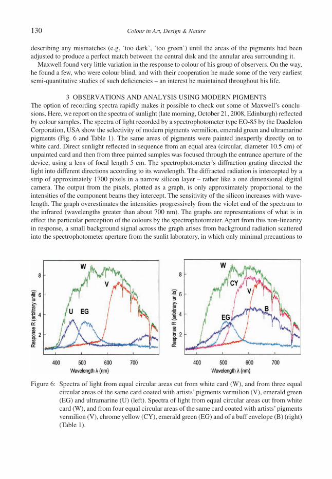
130 Colour in Art, Design & Nature
describing any mismatches (e.g. ‘too dark’, ‘too green’) until the areas of the pigments had been adjusted to produce a perfect match between the central disk and the annular area surrounding it.
Maxwell found very little variation in the response to colour of his group of observers. On the way, he found a few, who were colour blind, and with their cooperation he made some of the very earliest semi-quantitative studies of such defi ciencies – an interest he maintained throughout his life.
3 OBSERVATIONS AND ANALYSIS USING MODERN PIGMENTSThe option of recording spectra rapidly makes it possible to check out some of Maxwell’s conclu-sions. Here, we report on the spectra of sunlight (late morning, October 21, 2008, Edinburgh) refl ected by colour samples. The spectra of light recorded by a spectrophotometer type EO-85 by the Daedelon Corporation, USA show the selectivity of modern pigments vermilion, emerald green and ultramarine pigments (Fig. 6 and Table 1). The same areas of pigments were painted inexpertly directly on to white card. Direct sunlight refl ected in sequence from an equal area (circular, diameter 10.5 cm) of unpainted card and then from three painted samples was focused through the entrance aperture of the device, using a lens of focal length 5 cm. The spectrophotometer’s diffraction grating directed the light into different directions according to its wavelength. The diffracted radiation is intercepted by a strip of approximately 1700 pixels in a narrow silicon layer – rather like a one dimensional digital camera. The output from the pixels, plotted as a graph, is only approximately proportional to the intensities of the component beams they intercept. The sensitivity of the silicon increases with wave-length. The graph overestimates the intensities progressively from the violet end of the spectrum to the infrared (wavelengths greater than about 700 nm). The graphs are representations of what is in effect the particular perception of the colours by the spectrophotometer. Apart from this non-linearity in response, a small background signal across the graph arises from background radiation scattered into the spectrophotometer aperture from the sunlit laboratory, in which only minimal precautions to
Figure 6: Spectra of light from equal circular areas cut from white card (W), and from three equal circular areas of the same card coated with artists’ pigments vermilion (V), emerald green (EG) and ultramarine (U) (left). Spectra of light from equal circular areas cut from white card (W), and from four equal circular areas of the same card coated with artists’ pigments vermilion (V), chrome yellow (CY), emerald green (EG) and of a buff envelope (B) (right) (Table 1).

Colour in Art, Design & Nature 131
suppress background are possible (and justifi ed for this purpose). Each pigment produces its charac-teristic spectrum of wavelengths of the radiation it selectively refl ects. The white card refl ects all wavelengths present. It is the solar spectrum in which the many dips result from absorption of radia-tion in its path between the sun and the earth – the so-called Fraunhofer absorption lines.
Maxwell’s observations in [3] referred to above together with the appearance of the demonstration top spinning (Fig. 3) indicate that a suitably weighted combination of light from vermilion and emer-ald green pigments should produce the sensation of brown. Taking advantage of the bright mid-morning sunlight on the day, the measurements reported here had been extended to include the spectrum of light refl ected from a circular disc cut from a pale brown (buff) envelope, and from the artists’ pigment chrome yellow (Fig. 6). The spectra peak at very nearly the same wavelength. Sim-plifying, the brown can be thought of as a darkened (or less bright) yellow. However, the brown spectrum extends further into the shorter wavelengths. A glance at the spectra for vermilion and emerald green does suggest that from them a composite spectrum for some shade of brown should result. This is in line with the spectroscopic measurements by Erjavac and Vaupotic [8] on the per-ceived brown of dyes and leaves.
4 CONCLUSIONThe path from Maxwell’s observations of light from artists’ pigments to current research in colour science is not direct. He progressed to working with light from sunlight dispersed by prisms, trans-ferring the strategy he developed for pigments [9]. However, his early work on refl ected colour can be appreciated better when placed against a backdrop derived from measurements typifying current research and teaching. The bonus is that it brings to the fore the often overlooked fact that as well as a renowned theorist James Clerk Maxwell was a brilliant experimenter. In 1860, he was awarded the prestigious Rumford Medal of the Royal Society of London, ‘for his research on the composition of colours, and other optical properties’.
5 ACKNOWLEDGEMENTSThe author gratefully acknowledges the use of facilities in the School of Physics and Astronomy, Edinburgh University, and items from the archives of the James Clerk Maxwell Foundation, 14 India Street, Edinburgh (Maxwell’s birthplace in 1831).
Table 1: Artists’ pigments [Daler-Rowney (Georgian)] used to provide refl ected light for spectroscopic analysis.
Pigment Components Codes
Vermilion (hue) 588 Arylamide yellowDisazo orangeBON arylamide red
GX PY73PO 34PR 210
Emerald Green (hue) Arylamide yellowPhthalocyanine greenZinc oxide
IOGPY3PG7PW4
French ultramarine 123 Ultramarine blue PB 29
Chrome yellow (hue) 623 Arylamide yellowArylamide yellow
PY 1:1GX PY 73
132 Colour in Art, Design & Nature
REFERENCES[1] Young, T., The Bakerian lecture: on the theory of light and colours. Phil. Trans. R. Soc. London,
92, pp. 12–48, 1802.[2] Coote, J.H., An Illustrated History of Colour Photography, Fountain Press, 1993.[3] Maxwell, J.C., Experiments on colour, as perceived by the eye, with remarks on colour blind-
ness. Trans. Roy. Soc. Edin., 21, pp. 275–298, 1857.[4] Newton, I., Optiks, Dover Publications Inc.: New York, 1952.[5] Campbell, L. & Garnett, W., Life of James Clerk Maxwell, Macmillan & Co: London, 1882.[6] http://www.colour.org.uk/xydiagram.png.[7] Meyn, J.-P., Colour mixing based on daylight. Eur J Phys, 29, pp. 1017–1032, 2008.[8] Erjavac, M. & Vaupotic, N., Bottle model of colour vision with the colour brown as an example.
Eur. J. Phys., 27, pp. 611–620, 2006.[9] Dougal, R.C., Greated, C.A. & Marson, A.J., Then and now: James Clerk Maxwell and colour.
Optic Laser Tech., 38, pp. 210–218, 2006.
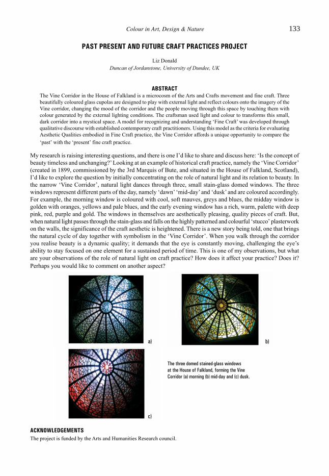
PAST PRESENT AND FUTURE CRAFT PRACTICES PROJECT
Liz DonaldDuncan of Jordanstone, University of Dundee, UK
ABSTRACTThe Vine Corridor in the House of Falkland is a microcosm of the Arts and Crafts movement and fine craft. Threebeautifully coloured glass cupolas are designed to play with external light and reflect colours onto the imagery of theVine corridor, changing the mood of the corridor and the people moving through this space by touching them withcolour generated by the external lighting conditions. The craftsman used light and colour to transforms this small,dark corridor into a mystical space. A model for recognizing and understanding ‘Fine Craft’ was developed throughqualitative discourse with established contemporary craft practitioners. Using this model as the criteria for evaluatingAesthetic Qualities embodied in Fine Craft practice, the Vine Corridor affords a unique opportunity to compare the‘past’ with the ‘present’ fine craft practice.
My research is raising interesting questions, and there is one I’d like to share and discuss here: ‘Is the concept ofbeauty timeless and unchanging?’ Looking at an example of historical craft practice, namely the ‘Vine Corridor’(created in 1899, commissioned by the 3rd Marquis of Bute, and situated in the House of Falkland, Scotland),I’d like to explore the question by initially concentrating on the role of natural light and its relation to beauty. Inthe narrow ‘Vine Corridor’, natural light dances through three, small stain-glass domed windows. The threewindows represent different parts of the day, namely ‘dawn’ ‘mid-day’ and ‘dusk’ and are coloured accordingly.For example, the morning window is coloured with cool, soft mauves, greys and blues, the midday window isgolden with oranges, yellows and pale blues, and the early evening window has a rich, warm, palette with deeppink, red, purple and gold. The windows in themselves are aesthetically pleasing, quality pieces of craft. But,when natural light passes through the stain-glass and falls on the highly patterned and colourful ‘stucco’ plasterworkon the walls, the significance of the craft aesthetic is heightened. There is a new story being told, one that bringsthe natural cycle of day together with symbolism in the ‘Vine Corridor’. When you walk through the corridoryou realise beauty is a dynamic quality; it demands that the eye is constantly moving, challenging the eye’sability to stay focused on one element for a sustained period of time. This is one of my observations, but whatare your observations of the role of natural light on craft practice? How does it affect your practice? Does it?Perhaps you would like to comment on another aspect?
The three domed stained-glass windowsat the House of Falkland, forming the VineCorridor (a) morning (b) mid-day and (c) dusk.
a) b)
c)
ACKNOWLEDGEMENTSThe project is funded by the Arts and Humanities Research council.
Colour in Art, Design & Nature 133

This page intentionally left blank

FIGURING LIGHT: COLOUR AND THE INTANGIBLE
Richard DaveySchool of Art and Design, Nottingham Trent University, UK
ABSTRACTThis research note is based on an exhibition that took place at the Djanogly Art Gallery, University of Nottingham in2008. It focuses on the insights provided by the work of four visual artists into the nature of colour and its role as afiguring of light; a physical representation of something intangible and invisible.
In the 1690s Sir Isaac Newton’s experiments with prisms showed that the colours of the spectrum are containedin white light. Therefore, when we see colour we are also ‘seeing’ light – an invisible, intangible substance thatotherwise lies beyond the boundaries of ordinary sensory perception. In subsequent centuries colour has beensubject to a number of different investigative approaches ranging through the physical, optical, psychological,technical, and philosophical but it still remains an essentially elusive substance, defying neat definitions and all-encompassing theories. This research has taken the work of four artists – Duncan Bullen, Jane Bustin, RebeccaPartridge, and Richard Kenton Webb, and used it as a starting point that reveals insights into the nature ofcolour, not only as a mysterious and elusive substance, but also as something that allows the intangible andinvisible to become present.
Seen close up, the subtly tinted surfaces of Duncan Bullen’s drawings are covered with a grid of dynamic dotsmade by silverpoint and coloured pencil. But from a distance the evidence of their intensely concentratedmanufacture dissolves into a mesmerising, shimmering surface that gives form to light. Colour in Jane Bustin’spaintings has no form to give it meaning, and as a result our eyes are forced to rest in its inner depths. Lost in thetimeless space of Superblack we are not only made aware of our sense of vision, but all of our other senses aswell. Rebecca Partridge’s dynamic canvases offer an intensely coloured realisation of synaesthetic experience.They also evoke the invisible bridge of potential colour that is contained in the electromagnetic waves of lightthat bridge the space between, linking the ‘self’ with the ‘other’, the ‘micro’ and the ‘macro’. Richard KentonWebb’s intense paintings and delicate plaster sculptures are an investigation of the colour red that forms part ofa larger ‘colour sound’ project. Not only does his use of his own hand made pigments allow us to explore theunique character of each colour, but the subtle forms that lie at their heart provide a tentative form for thedistinctive sense of ‘movement’ that he associates with each colour. These works propose new ways of seeingthe world and understanding reality, allowing colour to be a figuring of light; a representation of the intangible.
Colour in Art, Design & Nature 135

This page intentionally left blank

GAELUXTM
John Stuart-MurraySchool of Landscape Architecture, Edinburgh College of Art, UK
ABSTRACTThe GaeluxTM image attempts to make a visual representation of the unique semantic qualities, with which the ScottishGaelic language imbues its particular vocabulary for colour.
GaeluxTM explores the spectrum of colours in the Scottish Gaelic language and how they are applied to landscapesin the Highlands of Scotland. It observes, as have others (Cheape, 2008, Drummond, 2007, MacDonald 2008,Stuart-Murray, 2006) that there are many terms, which do not translate into English, many terms for whichEnglish has only one word and many terms, which would appear to overlap if a translation into English isattempted. This applies in particular to words representing blue, green, yellow, white and grey. It may be that theagricultural practice of transhumance required more precision than English in order to distinguish the conditionof upland pasture from a distance, prior to the arduous process of moving cattle from lowland grazings.
The GaeluxTM image also conjectures that hue does not appear to have constancy in its application to landscape.The speculation is that colour temperature and saturation are more important determinants than hue. The GaeluxTM
image depicts a mock paint chart with a matrix of colours, which are shown as gradients as a means of illustratingthese points. In this way the Scottish Gaelic colour vocabulary is trademarked as unique.
Gaelux charts
REFERENCESCheape, H. (2008) A’ lasadh le càrnaid: Rhyme and Reason in Perceptions of Tartan, Journal of Scottish Society for Art
History, Vol. 13, 2008–09.Drummond, P. (2007) Scottish Hill Names their Origin and Meaning, Scottish Mountaineering Trust.MacDonald, M. (2008) Seeing Colour in the Gaidhealtachd Window to the West, University of Dundee unpublished manuscript.Stuart-Murray, J. (2006) Differentiating the Gaelic Landscape of the Perthshire Highlands, School of Scottish Studies 34,
University of Edinburgh.
Colour in Art, Design & Nature 137

This page intentionally left blank

COLOUR IN THE COUNTRYSIDE BUILDINGS, LANDSCAPE, CULTURE
Richard Laing1 and Seaton Baxter2
1Robert Gordon University, Aberdeen, UK2University of Dundee, UK
ABSTRACTThe rural landscape makes a significant contribution to the material and financial wealth of the nation. Colour makesa significant contribution to our perception of scenic beauty and our psychological wellbeing.
In rural landscapes, large patterns of natural colour are punctuated with point sources of applied colour in newbuildings and engineering structures, including wind turbines.
• What applied colours should be advocated?• How significant is the landscape colour pattern and its changeable nature?• Is there a theoretical basis for the choice of applied colour, or is it a matter of individual preference?• Does it matter who chooses the colours?
The Design Council responded to the debate with three publications in the 1970s. How far is such advice stillrelevant, with colours of buildings and landscapes changing dramatically? The colour of the farmed landscapeis changing, with large areas of new crops grown, and changed almost annually. Will the rules or guidance alsochange?
It is possible that colour choice is important depending on the preference value of the landscape. For poorquality landscapes, applied colour should emphasis the source, but for high quality landscapes should besubordinate to the landscape. The research proposed has a wider methodological aim – to address the subjectfrom both holistic and reductionist standpoints: the former avoiding reduction of the landscape to a sum of itsparts, the latter illuminating the relationship between objects, colours and areas of significance.
Carving Dovecot (dove house)
Colour in Art, Design & Nature 139

This page intentionally left blank
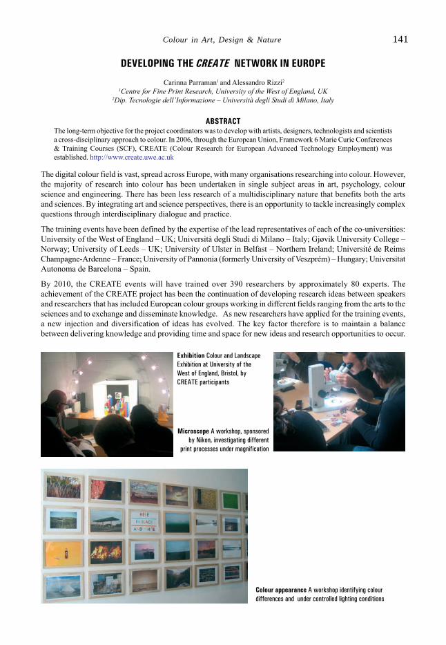
DEVELOPING THE CREATE NETWORK IN EUROPE
Carinna Parraman1 and Alessandro Rizzi2
1Centre for Fine Print Research, University of the West of England, UK2Dip. Tecnologie dell’Informazione – Università degli Studi di Milano, Italy
ABSTRACTThe long-term objective for the project coordinators was to develop with artists, designers, technologists and scientistsa cross-disciplinary approach to colour. In 2006, through the European Union, Framework 6 Marie Curie Conferences& Training Courses (SCF), CREATE (Colour Research for European Advanced Technology Employment) wasestablished. http://www.create.uwe.ac.uk
The digital colour field is vast, spread across Europe, with many organisations researching into colour. However,the majority of research into colour has been undertaken in single subject areas in art, psychology, colourscience and engineering. There has been less research of a multidisciplinary nature that benefits both the artsand sciences. By integrating art and science perspectives, there is an opportunity to tackle increasingly complexquestions through interdisciplinary dialogue and practice.
The training events have been defined by the expertise of the lead representatives of each of the co-universities:University of the West of England – UK; Università degli Studi di Milano – Italy; Gjøvik University College –Norway; University of Leeds – UK; University of Ulster in Belfast – Northern Ireland; Université de ReimsChampagne-Ardenne – France; University of Pannonia (formerly University of Veszprém) – Hungary; UniversitatAutonoma de Barcelona – Spain.
By 2010, the CREATE events will have trained over 390 researchers by approximately 80 experts. Theachievement of the CREATE project has been the continuation of developing research ideas between speakersand researchers that has included European colour groups working in different fields ranging from the arts to thesciences and to exchange and disseminate knowledge. As new researchers have applied for the training events,a new injection and diversification of ideas has evolved. The key factor therefore is to maintain a balancebetween delivering knowledge and providing time and space for new ideas and research opportunities to occur.
Exhibition Colour and LandscapeExhibition at University of theWest of England, Bristol, byCREATE participants
Microscope A workshop, sponsoredby Nikon, investigating different
print processes under magnification
Colour appearance A workshop identifying colourdifferences and under controlled lighting conditions
Colour in Art, Design & Nature 141

This page intentionally left blank
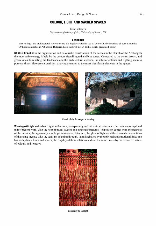
COLOUR, LIGHT AND SACRED SPACES
Elza TantchevaDepartment of History of Art, University of Sussex, UK
ABSTRACTThe settings, the architectural structures and the highly symbolic use of colour in the interiors of post-ByzantineOrthodox churches in Arbanassi, Bulgaria, have inspired my art-textile works presented below.
SACRED SPACES: In the organisation and colouristic construction of the scenes in the church of the Archangelsthe most active energy is held by the colours signalling red and blue tones. Compared to the ochre, brown, andgreen tones dominating the landscape and the architectural exterior, the interior colours and lighting seem topossess almost fluorescent qualities, drawing attention to the most significant elements in the spaces.
Church of the Archangels – Morning
Weaving with light and colour: Light, reflections, transparency and intricate structures are the main areas exploredin my present work, with the help of multi-layered and ethereal structures. Inspiration comes from the richnessof the interior, the apparently simple yet intricate architecture, the glow of lights and the ethereal constructionsof the rising incense with the sunlight beaming through. I am fascinated by the spiritual and emotional links onehas with places, times and spaces, the fragility of these relations and – at the same time – by the evocative natureof colours and textures.
Basilica in the Sunlight
Colour in Art, Design & Nature 143

This page intentionally left blank

ANALYSIS OF THE USE OF YELLOW IN SEVENTEENTH-CENTURY CHURCH INTERIORS
Elza Tantcheva, Vien Cheung1 and Stephen Westland1
Department of History of Art, School of Humanities, University of Sussex, UK1School of Design, University of Leeds, UK
ABSTRACTThe identification and communication of colour is of extensive interest in art historical research. In this work analyticalmethods were employed in the initial identification and subsequent reasonably accurate representation of ‘colour’data for the churches using the Munsell colour-notation system. Two metrics for similarity were used, one based onthe closest spectral match and the other on the closest colorimetric match. In both cases, the match criterion was theleast-square error metric.
There is a relatively high frequency in the use of yellows in the iconographic tradition of the Eastern Church.The colour is associated with the representation of the divine light and is used instead of gold in painting thehaloes of saintly figures [1].
The use of analytical methods can provide an unambiguous description, but one which provides an abstractconcept of colour, which may be an alien form to use in discussions in an art historical context. The employmentof a physical colour system, such as the Munsell system, permits the transition between conceptual and visualand avoids inaccuracy in the communication of the experienced colour. For each colour measurement, theclosest Munsell sample was found using two metrics for similarity, one based on the closest spectral match andthe other based on the closest colorimetric match. We suggest that the colorimetric matches are perceptuallycloser to the originals.
Figure 1: Church of the Archangels Michael and Gabriel, Arbanassi,Bulgaria: Depiction of the tree of Jesse painted in the seventeenthcentury.
Figure 2 shows the reflectance spectrum (line) for the yellow in the Church of the Archangels Michael andGabriel – one of the four churches studied in this work – and its closest spectral (circle) and colorimetric (cross)Munsell matches. Illustrations using sRGB representation (but subject to the vagaries of colour management) ofthe reflectances are also shown.
Figure 2: Spectral data for target (line) with closest spectral (circle) and colorimetric (cross) Munsell matches for the Church of the ArchangelsMichael and Gabriel sample and the corresponding colours in sRGB representation.
REFERENCE[1] Sendler, E. (1981), L’Icone: Image de l’invisible, Editions Desclee De Brouwers.
Colour in Art, Design & Nature 145

This page intentionally left blank

...for scientists by scientists
We are now able to supply you with details of newWIT Press titles via
E-Mail. To subscribe to this free service, or forinformation on any of our titles, please contactthe Marketing Department, WIT Press, AshurstLodge, Ashurst, Southampton, SO40 7AA, UK
Tel: +44 (0) 238 029 3223Fax: +44 (0) 238 029 2853
E-mail: [email protected]
Compliant Structures inNature and EngineeringEdited by: C.H.M. JENKINS, Montana StateUniversity, USA
Nature is the grand designer and human engineershave taken great motivation from it since theearliest of times. This book celebrates structuralcompliance in nature and human technology.Examples of compliant structures in natureabound, from the walls of the smallest cell, to thewings of the condor, to the tail of the gray whale.The subject of compliant structures in nature andengineering is timely and important, albeit quitebroad and challenging.A concise summary of the important features ofthese interesting structures, this volumedemonstrates, wherever possible, a mappingbetween naturally compliant structures and thepromise and opportunity commensurate in humanengineering.Series: Design and Nature, Vol 5ISBN: 1-85312-941-0Published 2005 / 296pp / £107.00/US$214.00/€150.00
Eco-Architecture IIIHarmonisation between Architecture andNatureEdited by: S. HERNÁNDEZ, University of ACoruña, Spain, C.A. BREBBIA, Wessex Instituteof Technology, UK and W.P. De WILDE, Vrije
Universiteit Brussel, BelgiumArchitecture ought to be in harmony with nature,including its immediate environs. Decisions haveto be taken on ecological grounds concerninglocations, siting and orientation, as well as thewell-informed choiceof materials.Eco-Architecture makes every effort to minimisethe use of energy at each stage of a building’s lifecycle, including that embodied in the extractionand transportation of materials, their fabrication,their assembly into the building and ultimately theease and value of their recycling when thebuilding’s life is over. The design may also takeinto consideration the use of energy in buildingmaintenance and changes in its use, not tomention its lighting, heating and cooling,particularly where the energy consumed involvesthe emission of greenhouse gases. Substantialsavings can be achieved by the choice ofmaterials appropriate for passive energy systems,especially natural ventilation, summer shadingand winter solar heat gain. Solar and wind energycan provide heating and electric power.Papers presented are in the following topics:Ecological and Cultural Sensitivity; Design withNature; Building Technologies; Design by PassiveSystems; Life Cycle Assessment; QuantifyingSustainability in Architecture; Case Studies;Resources and Rehabilitation; Issues fromEducation, Research and Practice.WIT Transactions on Ecology and theEnvironment, Vol 128ISBN: 978-1-84564-430-7 eISBN: 978-1-84564-431-4 Published 2010 / 624pp /£237.00/US$474.00/€332.00
WIT Press is a major publisher of engineering research. Thecompany prides itself on producing books by leadingresearchers and scientists at the cutting edge of their
specialities, thus enabling readers to remain at the forefront ofscientific developments. Our list presently includes
monographs, edited volumes, books on disk, and software inareas such as: Acoustics, Advanced Computing, Architectureand Structures, Biomedicine, Boundary Elements, EarthquakeEngineering, Environmental Engineering, Fluid Mechanics,
Fracture Mechanics, Heat Transfer, Marine and OffshoreEngineering and Transport Engineering.

...for scientists by scientists
All prices correct at time of going to press butsubject to change.
WIT Press books are available through yourbookseller or direct from the publisher.
WITPressAshurst Lodge, Ashurst, Southampton,SO40 7AA, UK.Tel: 44 (0) 238 029 3223Fax: 44 (0) 238 029 2853E-Mail: [email protected]
Nature and DesignEdited by: M.W. COLLINS and M.A.
ATHERTON,
London South Bank University, UK and J.A.
BRYANT, University of Exeter, UK
Combining authority, inspiration and state-of-the-art knowledge, this volume provides acomprehensive study of the fundamental lawsof nature and design.Partial Contents: Optical Reflectors and Antireflectors inAnimals; Adaptive Growth; Robustness and Complexity;A Medical Engineering Project in the Field of CardiacAssistance; Creativity and Nature; Design in Plants; TheTree as an Engineering Structure.
Series: Design and Nature, Vol 1ISBN: 1-85312-852-XPublished 2005 / 360pp£149.00/US$298.00/€209.00
Flow Phenomena in NatureVolume 1 – A Challenge to Engineering Design
Volume 2 – Inspiration, Learning andApplications
Edited by: R. LIEBE, SIEMENS Power Generation,
Germany
Do we have an adequate understanding of fluiddynamics phenomena in nature and evolution, andwhat physical models do we need? What can welearn from nature to stimulate innovations inthinking as well as in engineering applications?Concentrating on flight and propulsion, this uniqueand accessible book compares fluid dynamicssolutions in nature with those in engineering.The respected international contributors presentup-to-date research in an easy to understandmanner, giving common viewpoints from fieldssuch as zoology, engineering, biology, fluidmechanics and physics. This transdisciplinaryapproach eliminates barriers and opens widerperspectives to both of the challenging questionsabove.
Volume 1 – A Challenge to Engineering DesignVolume 1 – A Challenge to Engineering DesignVolume 1 – A Challenge to Engineering DesignVolume 1 – A Challenge to Engineering DesignVolume 1 – A Challenge to Engineering Design
Introduction to Fluid Dynamics in Nature andEngineering; Swimming and Flying in Nature;Steady and Unsteady Fluid Flow: Simulation ofOscillating Wing/Fin Performance; The FiniteNatural Vortex: Understanding of the Generationof Lift and Thrust in Nature.Series: Design and Nature, Vol 7ISBN: 978-1-84564-001-9eISBN: 978-1-84564-261-7Published 2007 / 416pp£130.00/US$260.00/€182.00
Applications in Engineering and Medicine:Inspirations from Nature; Steady and UnsteadyFluid Dynamics: Specific Numerical andExperimental Methods.Series: Design and Nature, Vol 8ISBN: 978-1-84564-095-8eISBN: 978-1-84564-262-4Published 2007 / 432pp £130.00/US$260.00/€182.00
SET ISBN: 978-1-84564-099-6£234.00/US$468.00/€328.00(10% saving when you buy two volumestogether)
VVVVVolume 2 – Inspiration, Lolume 2 – Inspiration, Lolume 2 – Inspiration, Lolume 2 – Inspiration, Lolume 2 – Inspiration, Learning and Applicationsearning and Applicationsearning and Applicationsearning and Applicationsearning and Applications