13a portfolio presentation
TRANSCRIPT


2 3
Contacts Table of contentKarina FinkeGermany, Leer+4915752631265
[email protected]://www.facebook.com/KarinaFinkePhotography/http://kfinke-photography.handcraft.com/MainPage.html
• Magazine Cover• Brochure • PhotoDesign• Montage• Web Page Mockup• Coding• Flag• Business Identity• Prezi
4-56-78-910-1112-1314-1516-1718-1920-21

4 5
Magazine CoverDESCRIPTION: Design a magazine cover that showcases a self-portrait as well as articles about yourself.
OBJECTIVE: Use the basic tools of InDesign to create a cover of a real or fictional magazine.
PROGRAMS: InDesign, Photoshop.
INSTRUCTOR: Emily Anne Watson Kunz
COURSE & SECTION: COMM 130 section 11
DATE: May 4, 2016
PROCESS: I was first making sketches on the paper and thinking about ideas how to put everything together. Then I decided to make my own magazine title. So my magazine call Designer. It’s about famous designers and their life stories. I want to be a designer in the future. I love everything, that connect with design. After that, I was making in InDesign program a shape map. So I looked through my sketches what I want to do with my magazine cover page and made a desition for the shape map. Then was the most interesting part – to create the actual magazine cover page. I went through my pictures to choose one with good looking me in good quality. That was not that hard because I have a good digital camera Canon 650D with 2 great lenses. And I take pictures all the time. That is my another hobby. So, when I had a picture, I photoshopped it a little bit, cut the background out. Then placed it in InDesign and was continually working there. It took me a while to create article titles and also choose the right color scheme and place it right. Made a lot of corrections, asked for a lot of critique. I decided to make the magazine title in front of my picture, while my face would of hide it all. Once I was finished, I saved the InDesign file and then exported a JPEG at 150 ppi. Also refined after feedback from my teacher - adjusting the boxes and giving more space around the text.

6 7
BrochureDESCRIPTION: Design a logo and brochure for a company.
OBJECTIVE: Set up and align a two-sided, folded document. Learn how to wrap text around an image. Use paragraph styles in InDesign.
PROGRAMS: InDesign, Photoshop, Illustrator.
INSTRUCTOR: Emily Anne Watson Kunz
COURSE & SECTION: COMM 130 section 11
DATE: July 7, 2016
PROCESS: This was interesting project to do and really big one.So, first I created the document in InDesign. Made the basic grids. Then was thinking of an idea for the topic of the brochure. Picked the needed pictures and wrote the text for the brochure. Then made a logo in Illustrator. Then I added the body copy to InDesign to see how it will fit there. Added all pictures as well. In Photoshop opened one of the pictures I wanted to work on for the future text wrapping. It was a lot of work for cutting out the background, but I finally did it. Then saved it in Photoshop and paste it in InDesign. As well did with a logo from Illustrator. By doing so, I could edit the original in Photoshop and Illustrator and it would automatically update in InDesign when I was refreshing the links. I also made a decision on the color scheme. Was making changes during getting critiques from my classmates and teacher. Then exported the brochure document as JPEGS.

8 9
PhotoDesignDESCRIPTION: By using photography and design skills, create a project that encompasses a consistent color scheme from the image.
OBJECTIVE: Learn basic photography skills. Combine photo(s) with design elements using Photoshop.
PROGRAMS: Photoshop.
INSTRUCTOR: Emily Anne Watson Kunz
COURSE & SECTION: COMM 130 section 11
DATE: May 17, 2016
PROCESS: I was thinking of the color scheme first and also was searching for ideas for my picture for this project. Then I was walking in the city and saw a beautiful tree with flowers and made some good shots. At home I took the most good picture and decided to change my color scheme to this one I have now. Then I photoshopped the picture a little bit. Then Created a document 8.5×11 inch in Photoshop. Placed my picture there and started to create a color scheme and added swatches as well. Also was looking for a good matching quote for this picture. I tried to keep a good flow throughout the design. Also aligned everything. Then got some critiques and made changes to my project to look better. Then after the last corrections, I went to print it out. It turned out pretty well. Also after feedback from my teacher did some changes - increase the size of image slightly so that it extends all the way to the left and right sides of design without the small strip of the background.

10 11
MontageDESCRIPTION: Design a spiritual poster montage using the blend of images and type.
OBJECTIVE: Use Photoshop layer masks to blend multiple images together. Apply appropriate typography.
PROGRAMS: Photoshop.
INSTRUCTOR: Emily Anne Watson Kunz
COURSE & SECTION: COMM 130 section 11
DATE: May 25, 2016
PROCESS: First, I was looking for a spiritual quote. Then made a research for the pictures that would match for this quote. I had first version of the project at the beginning. But then I made one more, that I made to the final project. Then in Photoshop I combined all the various pictures I used to create the montage effect. I used a variety of layer masks and the brush tool to create the gradual blended effect. Was adding changes according to the coming critique. I made sure to abide by the design principles such as alignment, repetition, and flow. After a lot of changes I finished my project that you can see now.

12 13
Web Page MockupDESCRIPTION: Design a website homepage using a grid.
OBJECTIVE: Use Photoshop to design a mocup of a website homepage with the help of a grid.
PROGRAMS: InDesign, Photoshop.
INSTRUCTOR: Emily Anne Watson Kunz
COURSE & SECTION: COMM 130 section 11
DATE: June 21, 2016
PROCESS: First, I did a sketch. Started with a simple design that I wanted. Then was looking for a company that I wanted to make a website for. I thought right away about my favorite Germany and how much I like to travel, so the idea about German Touring came quick into my mind. Then I chose a color scheme and searched different bus companies to see if they had images that had those colors. Then was looking for the images for my website. I found everything I wanted. Then I created a shape map and added all my content in. I made a few changes from my draft, but I like in what it turn out. My teacher said in feedback to remove the stroked boxes around the link titles for a bit of simplification. Also on the «read more» text, to make it bold or another color so it pops out a bit more as a link. And I made this changes.
14 15
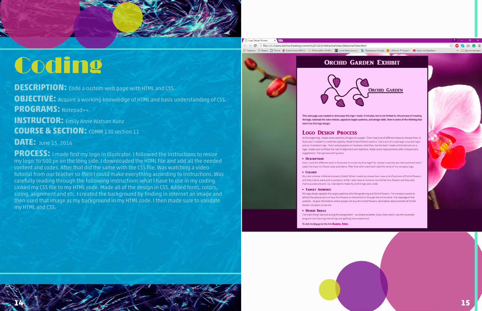
CodingDESCRIPTION: Code a custom web page with HTML and CSS.
OBJECTIVE: Acquire a working knowledge of HTML and basic understanding of CSS.
PROGRAMS: Notepad++.
INSTRUCTOR: Emily Anne Watson Kunz
COURSE & SECTION: COMM 130 section 11
DATE: June 15, 2016
PROCESS: I made first my logo in Illustrator. I followed the instructions to resize my logo to 500 px on the long side. I downloaded the HTML file and add all the needed content and codes. After that did the same with the CSS file. Was watching a video tutorial from our teacher so then I could make everything according to instructions. Was carefully reading through the following instructions what I have to use in my coding. Linked my CSS file to my HTML code. Made all of the design in CSS. Added fonts, colors, sizing, alignment and etc. I created the background by finding in internet an image and then used that image as my background in my HTML code. I then made sure to validate my HTML and CSS.

16 17
FlagDESCRIPTION: International Federation of Vexillological Associations asked you to redesign a city/state flag of your choice. Each of the design elements and colors in your flag should represent a key element of the group it represents.
OBJECTIVE: Improve research skills and create a new design for a flag.
PROGRAMS: Illustrator.
INSTRUCTOR: Emily Anne Watson Kunz
COURSE & SECTION: COMM 130 section 11
DATE: June 8, 2016
PROCESS: I was doing flag project and first of all had to choose the flag I wanted to redesign. I did choose the flag of the city I’m living in (Leer, Germany). I Wikipedia I found some information about this city: “Leer is a town in the district of Leer, the northwestern part of Lower Saxony, Germany. It is situated on the river Leda, a tributary of the river Ems, near the border with the Netherlands. Leer had been a settlement long before it was first mentioned in written documents. Originally the city was situated at a meander near the mouth of the river Leda into the Ems, which is still the center of the town today. Even though Leer is some 30 km (19 mi) away from the coast, it can be reached by large ships via the Ems. Leer lies close to the Dutch border; the district of Leer shares a border with the Dutch province of Groningen.” Here also a lot of fields and flat area everywhere, a lot of rains and almost always green. Did some other research and after that made some sketches. Then started to do it in Illustrator. Picked the most favorite sketch and did create it. I used pretty simple shape tools. Longer was working on alignment and changes according to feedbacks. Finally, I got it done and I think it looks great. Made after feedback some changes - moving the steam in the icon up just a bit to have consistent spacing with the rest of the icon design.

18 19
Business IdentityDESCRIPTION: Create a logo for a company/service/organization and establish a visual identity across documents.
OBJECTIVE: Create a new logo to fit a company or personal image. Design consistent layout for various business documents.
PROGRAMS: InDesign, Illustrator.
INSTRUCTOR: Emily Anne Watson Kunz
COURSE & SECTION: COMM 130 section 11
DATE: June 1, 2016
PROCESS: At the beginning I made some sketches for the logo on a paper. Then I had a lot of different ideas. Then in Illustrator I started creating some of my sketches digitally. I created three different options. I made a sort of a type logo, a symbol logo, and an illustration logo. Then I asked people on Facebook what they like the best. Then I made a final desition on a logo. Then I created my letterhead and business card. I made sure to follow the rule of alignment and repetition. Made some improvements after critiques and suggestions. Then got everything done.

20 21
PreziDESCRIPTION: Create an instructional presentation using the Prezi software to demonstrate it’s features and capabilities.
OBJECTIVE: Learn how to use Prezi and use it as a resource for giving visual presentations.
PROGRAMS: Prezi, Photoshop, Illustrator.
INSTRUCTOR: Emily Anne Watson Kunz
COURSE & SECTION: COMM 130 section 11
DATE: May 10, 2016
PROCESS: Prezi program is new for me. So it took me a while to practice there, so then I was able to start creating my own presentation. I was thinking about ideas and topics. Then I choose one of my pictures, photoshopped it and used it like a background of my presentation. I choose the topic that is really close to me right now because I am pregnant at the moment. I thought that “Myths about pregnancy” will be interesting to know for a lot of people, not only for pregnant women. I also draw a sketch of my main presentation page. I based on my picture and made slides around the clothing on the picture. After that, I opened Prezi and added there my background. Then made slides around the clothing (some of them were on the clothing at the beginning, but I changed it). Then I made titles and found pictures to match them. Later added additional content. Also made decisions on the fonts and colors. Also added some corrections after critique to my alignment and fonts.