10 principles of - design...
TRANSCRIPT

10 PRINCIPLES OF EFFECTIVE S IGNAGE
Principles are concentrated truth, packaged for application to a wide variety of circumstances.
A true principle makes decisions clear even under the most confusing circumstances.
Our goal with this communication is to organize the truth associated with effective signage into simple statements of principle that you can use to maake better signage decisions for your business.
BECAUSE YOU HAVE SOMETHING IMPORTANT TO SAY
1641 Kaiser Avenue | Irvine, CA 92614
10 PRINCIPLES OF EFFECTIVE SIGNAGE
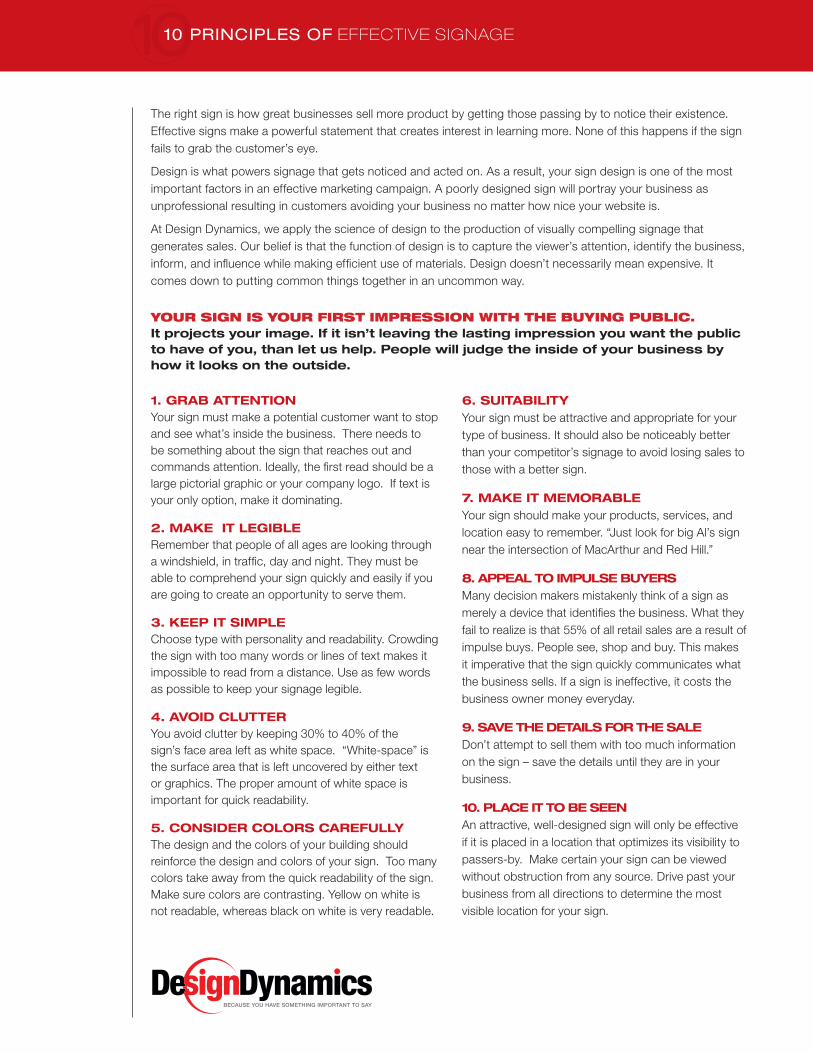
YOUR SIGN IS YOUR FIRST IMPRESSION WITH THE BUYING PUBLIC. It projects your image. If it isn’t leaving the lasting impression you want the public to have of you, than let us help. People will judge the inside of your business by how it looks on the outside.
The right sign is how great businesses sell more product by getting those passing by to notice their existence. Effective signs make a powerful statement that creates interest in learning more. None of this happens if the sign fails to grab the customer’s eye.
Design is what powers signage that gets noticed and acted on. As a result, your sign design is one of the most important factors in an effective marketing campaign. A poorly designed sign will portray your business as unprofessional resulting in customers avoiding your business no matter how nice your website is.
At Design Dynamics, we apply the science of design to the production of visually compelling signage that generates sales. Our belief is that the function of design is to capture the viewer’s attention, identify the business, inform, and infl uence while making effi cient use of materials. Design doesn’t necessarily mean expensive. It comes down to putting common things together in an uncommon way.
1. GRAB ATTENTIONYour sign must make a potential customer want to stop and see what’s inside the business. There needs to be something about the sign that reaches out and commands attention. Ideally, the fi rst read should be a large pictorial graphic or your company logo. If text is your only option, make it dominating.
2. MAKE IT LEGIBLERemember that people of all ages are looking through a windshield, in traffi c, day and night. They must be able to comprehend your sign quickly and easily if you are going to create an opportunity to serve them.
3. KEEP IT SIMPLEChoose type with personality and readability. Crowding the sign with too many words or lines of text makes it impossible to read from a distance. Use as few words as possible to keep your signage legible.
4. AVOID CLUTTERYou avoid clutter by keeping 30% to 40% of the sign’s face area left as white space. “White-space” is the surface area that is left uncovered by either text or graphics. The proper amount of white space is important for quick readability.
5. CONSIDER COLORS CAREFULLYThe design and the colors of your building should reinforce the design and colors of your sign. Too many colors take away from the quick readability of the sign. Make sure colors are contrasting. Yellow on white is not readable, whereas black on white is very readable.
6. SUITABILITYYour sign must be attractive and appropriate for your type of business. It should also be noticeably better than your competitor’s signage to avoid losing sales to those with a better sign.
7. MAKE IT MEMORABLEYour sign should make your products, services, and location easy to remember. “Just look for big Al’s sign near the intersection of MacArthur and Red Hill.”
8. APPEAL TO IMPULSE BUYERSMany decision makers mistakenly think of a sign as merely a device that identifi es the business. What they fail to realize is that 55% of all retail sales are a result of impulse buys. People see, shop and buy. This makes it imperative that the sign quickly communicates what the business sells. If a sign is ineffective, it costs the business owner money everyday.
9. SAVE THE DETAILS FOR THE SALEDon’t attempt to sell them with too much information on the sign – save the details until they are in your business.
10. PLACE IT TO BE SEENAn attractive, well-designed sign will only be effective if it is placed in a location that optimizes its visibility to passers-by. Make certain your sign can be viewed without obstruction from any source. Drive past your business from all directions to determine the most visible location for your sign.
BECAUSE YOU HAVE SOMETHING IMPORTANT TO SAY

KEYS TO EFFECTIVE SIGN DESIGN
COLORS
■ Choose colors that have good contrast
■ Colors with no contrast are difficult to read
■ Avoid using complementary colors Although they have contrast, their similar tonal values result in visual competition.
SANS SERIF SERIF
example of bad kerningexample of bad letterspacingexample of bad font condensingexample of bad font expansion
BECAUSE YOU HAVE SOMETHING IMPORTANT TO SAY
FONTS AND TYPOGRAPHY
■ Sans serif fonts are best for fast legibility
■ Use proper kerning (space between letter pairs) and letterspacing (the spacing between the letterforms in a piece of text)
■ Do not artificially expand or condense type to fit a space. Use the expanded or condensed version of font from the
selected font family.
■ Use no more than two fonts for your sign Choosing 2 fonts that compliment each other can make your
message stand out.
AgAg Ag AgAgAg
AgAg Ag AgAgAg
Ag AgAgAg Ag Agexamples of poor color contrast
Ag AgAg Ag AgAgcomplementary colors visually compete
examples of good color contrast
USE FONTS THAT ARE CLEARLY LEGIBLE WHEN VIEWED FROM A DISTANCE.
The following chart from the United States Sign Council (USSC) will help you to determine what size type is needed for your custom sign.
LETTER HEIGHT MAXIMUM DISTANCE BEST DISTANCE
3" 100' 30'
4" 150' 40'
6" 200' 60'
8" 350' 80'
9" 400' 90'
10" 450' 100'
12" 525' 120'
15" 630' 150'
18" 750' 180'
24" 1000' 240'
30" 1250' 300'
36" 1500' 360'
42" 1750' 420'

fi ve most common
mistakes made in
business-sign design:
Attempting to be cute,
elegant or understated
Attempting to blend into the
surrounding environment
Including too much
information
Placing the sign too high or in
a poor location
Under spending
summary
Your sign will do many things for your business, from creating
the � rst impression to being your opening message to potential
customers about your products and services.
Signs do this through a combination of size, text, color,
construction, placement and more. Keep these 10 signage
principles in mind to improve the likelihood of you having a sign
that grows sales for your business.
BECAUSE YOU HAVE SOMETHING IMPORTANT TO SAY
1641 Kaiser Avenue | Irvine, California | 92614www.DesignDynamics.com | 949.870.3320
10 PRINCIPLES OF EFFECTIVE SIGNAGE