1 uncertainties in measurement - university of · pdf file1 uncertainties in measurement...
TRANSCRIPT
Experimental Analysis 8/8/2006 A.1
EXPERIMENTAL ANALYSIS
1 UNCERTAINTIES IN MEASUREMENT Whenever scientists measure a quantity, whether directly or by calculation from more basic measurements, it is necessary to have an idea of how accurate the result is. Some instruments give very accurate readings and the uncertainties in our measurements are negligible (but not zero); other instruments or measuring techniques give substantial uncertainties, and we need to know about this. And in some experiments where we count discrete randomly occurring events (such as decay of radioactive atoms), there is inherent scatter or uncertainty present. Gaining a working knowledge of how to handle uncertainties in measurement (i.e. ‘what to put after the ± sign’) will be an important part of your Experimental Physics course. Knowing the uncertainty in the result of a physical measurement greatly enhances the value of that measurement, for then we know how far it can be trusted. We can make full use of the measurement, without pushing it too far. For example, some estimates give the age of the oldest stars as greater than the time since the Big Bang, which is impossible. Perhaps there are inadequacies in the theory of evolution of stars and/or the cosmological theory giving the age of the universe. But before reaching that conclusion, it is vital to have good estimates of the uncertainties of the two age values, to see whether the disagreement is really significant. For a more familiar example, suppose you use a ruler to measure the length of a steel rod and find a value of 190.1 mm. You can't be certain of the last figure - maybe the length is really 190.2 mm or even 190.3 (or 190.0 or 189.9). In this case the uncertainty (about 0.1 to 0.2 mm) is clear from the number of figures used to quote the result. We would not give any more because we cannot read them from the ruler. Now you ask someone to calculate what the length will be when the rod has been cut into three equal pieces. The answer comes back as 63.3666667 mm. Do you believe that? Quite apart from the limited cutting accuracy and the width of the cuts, clearly those extra figures (...66667) have just been read off a calculator display. Does this matter? Yes, because the extra figures are misleading. They are not valid; they are pure fiction, in fact, and we should report results that are true within their known and stated limitations. Common sense (and a bit of thought) tells you what to expect in the above example with the ruler. The same combination of common sense and consideration of the system you are measuring is the most important ingredient for handling uncertainties in physics. There are also some formulae for calculating and combining uncertainties, which we will deal with in a later section.
Experimental Analysis 8/8/2006 A.2
1.0 Indicating uncertainty There are two different ways of indicating the uncertainties in the numerical values of scientific quantities. 1. Explicit - using ± followed by a number. This is often used for results derived directly
from experimental quantities. Using the example of the ruler, the steel rod’s length is 190.1 ± 0.1 mm.
2. Implicit - restricting the number of significant figures so that only the last digit is uncertain. Using the example of the ruler, the steel rod’s length is 190.1 mm. This convention should be used for the final answers in all Physics tests, assignments and examinations. The intermediate steps of any calculation should usually have one or two more significant figures to prevent the accumulation of ‘round-off’ effects.
Each of these methods is covered in more detail below, but first we will clarify the distinction between decimal places and significant figures.
1.0.1 Decimal Places and Significant Figures
Decimal places are not the same as significant figures. The following numbers all have 3 decimal places (the number of digits to the right of the decimal point): 1.231 0.100 423.756 0.012 0.003 The following numbers all have 3 significant figures (working from the left, start counting at the first non-zero digit and continue to the far right, including all subsequent zeros): 1.23 0.100 0.000340 4.00 x 10³ 0.0741 x 10⁻⁶
Note that powers of 10 can be employed to avoid the use of excessive significant figures. Assume for instance that, for a calculated length of 3800 m, the last two digits happen to be very uncertain (the true value might be anywhere between 3700 m and 3900 m). Then the result would be better stated as 3.8 x 10³ m or 3.8 km or even 0.0038 x 10⁶ m. On the other hand, if you measure a length of exactly 1 m, it should be recorded as 1.00 m or 1.000 m depending how reliable the measurement was. Don’t just use 1 m. In Physics tests and exams you should assume, in the absence of other information, that numerical data have an appropriate number of significant figures.
1.0.2 Use of ±
Unless the uncertainty is derived from a large number of high quality measurements, the uncertainty itself is often very uncertain - probably by at least 10% and maybe up to a factor of 2. Thus it is usually written with only one significant figure. The actual answer is then rounded to have the same number of decimal places. For example, assume a calculator gives a result of an averaged measurement as: mean = 1.37415 mm with an SEM (defined in section 1.3) = 0.0438 mm.
Experimental Analysis 8/8/2006 A.3
Then the final answer is quoted as (1.37 ± 0.04) mm. ‘Rounding’ consists of removing unwanted digits from the righthand end of a number (e.g. 1.413 rounded to two significant figures is 1.4). If the digits being removed represent more than 0.5 in the last remaining digit then that digit is increased by one (e.g. 1.463 rounded to two significant figures is 1.5). If the digits being removed represent exactly 0.5, there is a convention that the last digit is increased by one only if it will then be an even digit (e.g. 1.450 rounded to two significant figures is 1.4 whereas 1.550 rounds to 1.6).
1.0.3 Combinations of values
How do you use decimal places and significant figures in calculations? • For calculations involving addition or subtraction, the answer should have the
same number of decimal places as whichever number in the calculation has the least decimal places. If using scientific notation, all the quantities should first be converted to the same power of 10.
• For calculations involving multiplication or division, the answer should have the same number of significant figures as whichever number in the calculation has the least significant figures.
These rules are a bit rough but to get better results you would need to know the actual uncertainty of each quantity (see section 1.5).
1.1 Sources of uncertainty in measurements In this section we discuss the five principal sources of uncertainty in the measurements we make. In general more than one source will affect each measurement, but we often find that one such source dominates and the corresponding uncertainty is the one quoted as the uncertainty associated with the measurement.
1.1.1 Calibration
Suppose you use a magnifier to help you read a ruler more accurately. You could certainly read to 0.1 mm quite well in this way. But what if the ruler is one of those cheaply made plastic ones - how well do its markings actually represent real millimeters? Such rulers may be wrong by about 0.5 mm or even 1 mm along a 300 mm ruler, when compared with a high-quality scale. This would be what we call a calibration error of the measuring device. All measuring instruments have a calibration uncertainty at some level. It is usually stated by the manufacturer. For example, some of the digital multimeters in the laboratory have a quoted limit of inaccuracy of 0.5% of the reading.
1.1.2 Resolution
Readings you make are usually limited to a certain number of significant digits. For a ruler, the reason for this limit is obvious. In the case of instruments with a digital readout it depends on the number of digits displayed and for analog instruments on the number of divisions indicated. The smallest amount by which the quantity may vary before you can actually detect this change is termed the resolution of the instrument. For digital instruments it is safe to quote ± 1 in the least significant digit. For analog instruments it depends
Uncertainty to 1 significant figure
Answer limited in decimal places to match uncertainty
Key Point
Experimental Analysis 8/8/2006 A.4
somewhat on the experimenter's skill in reading the scale (there is no hard and fast rule of half the smallest scale division).
1.1.3 Experimental technique
Some errors arise from the physical process involved in making the measurement. Parallax error is one such uncertainty. This occurs when the observer's line of sight, the scale pointer and the scale are not properly aligned. Another example is using a stopwatch to measure a time interval. There will always be some delay due to the observer's reaction time. A part of good experimental design is to be aware of such problems, and to minimise their effects.
1.1.4 Statistical fluctuations
In some physical processes and experiments the outcome is governed by the probability of randomly occurring events. For example take the radioactive decay of Rn-222. If we count for 1 minute and obtain 103 decays then we know that from the statistical theory of such processes (the Poisson distribution) there is an uncertainty associated with this result of approximately ± 10 counts (i.e. ± 103 ). This statistical uncertainty is also true for other counting experiments where a random process is involved in generation of the events.
1.1.5 Variation in the quantity itself
Some quantities we may need to measure are not as well defined as we might think at first sight. For example say we want to measure the thickness of a wire. We may find that the thickness is not constant along the length of the wire. So the ‘diameter’ of the wire is not a single number at all, but really a function of distance along the wire, and probably the angle around the wire too. Whether this matters or not will depend on the extent of the variations and the accuracy required for our particular application. You have to use your judgement, based on all the facts available.
1.2 Random versus systematic uncertainties Most uncertainties, including those discussed above, can be classified as either random or systematic.
1.2.1 Random uncertainties
Random uncertainties produce scatter in observed values, about either a single value being measured or a fit to some predicted behaviour (eg a straight line). Random uncertainties can arise from statistical fluctuations, variations in the quantity being measured, resolution effects and some types of errors due to experimental technique. For example, if we use a ruler to make three measurements of the length of a rod (being careful not to let our memory of a previous measurement influence the next one), and get 190.0, 190.1, 190.1 mm, the scatter in these readings is a random error. The effect of random uncertainties can be reduced by taking more readings and averaging. Most times when we repeat experiments we obtain slightly different results. This may be due to different conditions or fluctuations in human error such as parallax or observer's reaction time. In electronic instruments it may be due to the electrical ‘noise’ in the circuit or the instrument.

Experimental Analysis 8/8/2006 A.5
1.2.2 Systematic uncertainties
If the measuring instrument used is not calibrated properly, all values may be consistently low or high. This leads to systematic uncertainty. It is no help taking more readings - since all readings are similarly affected, the error will not be reduced by averaging the results. In one type of systematic uncertainty all readings may be simply offset by a given amount. A common example is the zero error on a micrometer screw gauge. When the micrometer is shut the scale may not read zero. This reading is termed the zero error and should be determined and then subtracted from all values to correct for the systematic error. Another type of systematic uncertainty is where all readings are consistently low, by say 2%, due to calibration error. In such cases we are likely to know the maximum magnitude of the error (eg the manufacturer says that the scale is accurate to ± 2 %), but we do not know the actual error unless the instrument has been specifically checked against a more accurate one. If we did know the error, then we could adjust the reading to allow for it (as for the zero error of a micrometer screw gauge). (Removal of errors in this way is never possible in the case of random uncertainties, precisely because they are random – i.e. unpredictable from one measurement to the next.) Systematic uncertainties are not always obvious to discover, and it is an important experimental skill to be able to spot possible sources of systematic errors.
1.2.3 The borderline between random and systematic uncertainties
In some cases it is not obvious whether the uncertainties are random or systematic. As an example consider the parallax error associated with a measurement. If the magnitude and sign (i.e. direction) of the error varies with each reading then the uncertainty is (almost) random. However, if the experimental technique is such that the parallax error causes the reading to be too high or low by about the same amount each time then the error is mostly systematic. Again, some thought should always be used, rather than blind application of rules. Many physical quantities vary with temperature, pressure or other conditions. If we cannot ensure that these remain constant throughout our experiment then we are introducing a further uncertainty in the quantity we are measuring. The error introduced is likely to be partly random and partly systematic. Similarly the error due to variation of a quantity itself (such as the diameter of the wire mentioned above) may be neither fully random nor fully systematic. All these factors should be taken into account in your 'common-sense' appraisal of the uncertainties in a measurement.
1.3 Repeated measurements We now discuss in more detail how we can reduce random uncertainties by taking repeated measurements. If repeated measurements of the same quantity give slightly different results (that is, a scatter of results about some preferred value), what should we do about it? There are two things to consider - firstly, how shall we get a single 'best' result from the set of readings, and secondly, how can we quantify (measure) the actual degree of scatter of the readings? Let us consider both those tasks in turn.
Experimental Analysis 8/8/2006 A.6
1.3.1 Why we use the mean of a set of readings
Suppose we have measured the height of water in Sydney Harbour relative to a fixed mark, and that we made 10 measurements over a period of 5 minutes (short enough that tidal variation will not introduce a systematic trend). We obtained readings of 0.78, 0.76, 0.73, 0.74, 0.90, 0.76, 0.85, 0.87, 0.84, 0.79 m. The main cause of scatter, i.e. differences between the readings, will be ripples going past the height gauge (an example of a variation in the quantity itself). To get the best possible single estimate of the desired quantity from the set of data, the procedure is simple - just take the mean (i.e. average) of the readings. This is 0.802 m. It is intuitively clear that the mean is in some way more accurate than any one of the individual readings. It has averaged out much of the scatter. In a later section we will show precisely how much better the mean is than a single measurement. By the way, note that our primary aim in taking the mean of a set of data is to average out random errors. If there is some systematic trend, eg the numbers keep getting bigger as the tide comes in, then the mean is going to tell us about the average of the trend at the time of the measurements, and is not going to effectively remove random measuring errors. Again, be observant, note all relevant aspects of the situation, and think about what you are doing.
1.3.2 Quantifying the scatter in measurements
Now let us consider the ways we might measure the degree of scatter in the readings of the water height in Sydney Harbour. In other words, what should we put after the ± sign. We could use the difference between the smallest reading (0.73 m) and the largest (0.90m). Although the difference, 0.17 m, does give some indication of the scatter, it is not the best method because it ignores all the other readings. And if we took a larger number of readings we would tend to get a higher maximum and lower minimum, even though the actual characteristics of the scatter did not change. We could calculate the difference of each reading from the mean. That difference tells us how far from the mean the individual reading is. Since we have 10 readings, we could then average the differences. That would make use of all the readings, but would it work? Satisfy yourself that in fact the sum of the positive differences will cancel out the sum of the negative differences, so this will not do what we want. We could cure that problem by instead averaging the absolute values of the differences; that would be a valid method but is not used much because its theoretical properties are difficult to analyse. The preferred method to quantify random scatter is:
(i) Calculate the difference of each reading from the mean (as above) (ii) Square the differences, so that they are all positive (iii) Average the squared differences (iv) Take the square root, so that the result has the same physical dimensions as the
original measurements. The result is called the rms (or root mean square) deviation of the results about their mean. It is also called the standard deviation. For the water level measurements above, we get
Experimental Analysis 8/8/2006 A.7
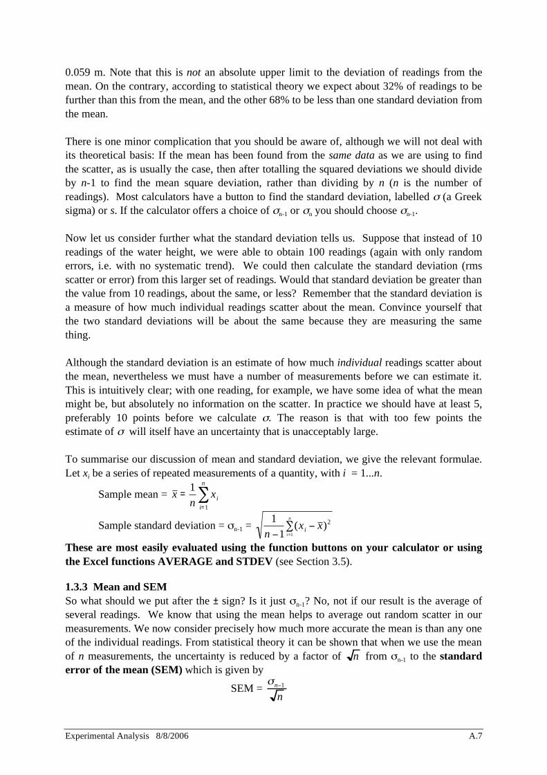
0.059 m. Note that this is not an absolute upper limit to the deviation of readings from the mean. On the contrary, according to statistical theory we expect about 32% of readings to be further than this from the mean, and the other 68% to be less than one standard deviation from the mean. There is one minor complication that you should be aware of, although we will not deal with its theoretical basis: If the mean has been found from the same data as we are using to find the scatter, as is usually the case, then after totalling the squared deviations we should divide by n-1 to find the mean square deviation, rather than dividing by n (n is the number of readings). Most calculators have a button to find the standard deviation, labelled (a Greek sigma) or s. If the calculator offers a choice of n-1 or n you should choose n-1. Now let us consider further what the standard deviation tells us. Suppose that instead of 10 readings of the water height, we were able to obtain 100 readings (again with only random errors, i.e. with no systematic trend). We could then calculate the standard deviation (rms scatter or error) from this larger set of readings. Would that standard deviation be greater than the value from 10 readings, about the same, or less? Remember that the standard deviation is a measure of how much individual readings scatter about the mean. Convince yourself that the two standard deviations will be about the same because they are measuring the same thing. Although the standard deviation is an estimate of how much individual readings scatter about the mean, nevertheless we must have a number of measurements before we can estimate it. This is intuitively clear; with one reading, for example, we have some idea of what the mean might be, but absolutely no information on the scatter. In practice we should have at least 5, preferably 10 points before we calculate . The reason is that with too few points the estimate of will itself have an uncertainty that is unacceptably large. To summarise our discussion of mean and standard deviation, we give the relevant formulae. Let xi be a series of repeated measurements of a quantity, with i = 1...n.
Sample mean = x =1
nxi
i=1
n
Sample standard deviation = n-1 = 1
n 1(xi x )2
i=1
n
These are most easily evaluated using the function buttons on your calculator or using the Excel functions AVERAGE and STDEV (see Section 3.5). 1.3.3 Mean and SEM So what should we put after the ± sign? Is it just n-1? No, not if our result is the average of several readings. We know that using the mean helps to average out random scatter in our measurements. We now consider precisely how much more accurate the mean is than any one of the individual readings. From statistical theory it can be shown that when we use the mean of n measurements, the uncertainty is reduced by a factor of n from n-1 to the standard error of the mean (SEM) which is given by
SEM = n 1
n

Experimental Analysis 8/8/2006 A.8
In our water level example, with n = 10 readings, mean x = 0.802 m and standard deviation = 0.059 m, we find SEM = 0.019 m. We would write the result as h = (0.80 ± 0.02) m. So
we obtained a very useful improvement (reduction in uncertainty) by averaging the 10 readings. To better understand the meaning of SEM it may help to consider the following: suppose that we repeated the
entire water level experiment 20 times - so we would have 20 sets of 10 readings. From each set we could
calculate a mean. Those means would not all be quite the same; they would have a scatter, which we could find
by calculating the standard deviation of the 20 means from the overall grand mean. But we do not need to go to
all that trouble; from just the one set of readings, with its mean and standard deviation of the individual readings
about the mean, we can estimate what the rms scatter of the mean is. This is just the SEM, and since it gives us
the scatter of any one of the means about the grand mean, that is exactly what we want as the uncertainty
estimate of the one mean that we did actually find in our experiment. So it is the SEM that we should put after
the ± sign.
For a given experimental setup the standard deviation of the readings is fixed, so the SEM can be reduced by taking more readings. The above formula shows explicitly how much the rms scatter is reduced by taking the mean of a number of readings. (Provided they really are randomly distributed - here you need to use common sense to check that this condition is satisfied.) In the example above (with 10 readings), we found the standard deviation = 0.059 m, If the data are random,
then 68% of the readings are expected to fall within the range from 0.74 to 0.86 m. We also found the
SEM = 0.019 m. If the data are random and we take a new set of data, there is a 68% chance that the new mean
will be in the range 0.78 to 0.82 m.
1.3.4 What if there are discrepant points?
Sometimes what is supposed to be a consistent set of repeat readings measuring the same quantity, or data that are expected to lie along a linear relationship, will instead contain one or more very discrepant values. We sometimes call these ‘outliers’. For example, suppose the above set of water level readings had been 0.78, 0.76, 0.73, 0.74, 0.90, 0.76, 0.25, 0.87, 0.84, 0.79 m. The lowest reading, 0.25, seems incompatible with the rest. The mean has dropped to 0.742 m, but the standard deviation has more than tripled, to 0.182 m. We use the squared deviations in calculating the rms deviation, so it is very sensitive to outliers, because they have large deviations which get even larger when squared. A single outlier point can dominate the entire total of the squared deviations, as in the example here. A point (reading) can be classed as an outlier, and hence suspect, if omitting it reduces the standard deviation by a lot, say a factor of two or more (providing that there are still about 6 to 10 or more points remaining). We do not like to throw readings out just because they seem discrepant - far better to re-examine the experimental work and the calculations to try to find and correct the cause of the discrepancy. Use your common sense, but ask your tutor for guidance and approval before discarding readings in this way.
Experimental Analysis 8/8/2006 A.9
1.4 Quoting results When quoting results we present the best estimate for the quantity itself (generally the mean) and the associated uncertainty. It is usual to quote only one significant figure in the uncertainty (sometimes two figures if the first is 1) and then round the best estimate to the same decimal place as the uncertainty. Consider an experiment in which Planck's constant was determined and we obtained a result of 6.648 10-34 J.s and an uncertainty of 4 10-36 J.s. We would quote the result as h = (6.65 ± 0.04) 10-34 J.s. If an actual uncertainty is not quoted (or not relevant) the number of significant figures is used as a guide to represent the uncertainty. Therefore, when quoting a result based on direct measurements made with a metre rule, 0.342 m is appropriate but 0.34247 m is misleading and incorrect.
1.5 Combining uncertainties Most experimental results are calculated from measurements of several quantities, each of which has its own uncertainty. For example, to find the density of a brass cube we measure its mass and its volume, both with their own uncertainty, then we calculate density = mass/volume. How do we find the uncertainty in the density? Here we give the guidelines for combining uncertainties in measured values to give the uncertainty in the final result. Firstly, we distinguish between uncertainties expressed as limits of errors such as calibration and resolution and those associated with random statistics (such as standard deviation, SEM and counting experiments). We will only combine limits with other limits and SEMs with SEMs. We also define two methods of referring to uncertainties: (i) absolute uncertainties (the actual value) and (ii) relative uncertainties in which the absolute uncertainty is divided by the reading and thus expressed as a fraction (usually a percentage) of the reading.
For limits, the main rules are as follows: • when quantities are added or subtracted, add their absolute uncertainties • when quantities are multiplied or divided, add their relative uncertainties
For SEMs (and standard deviations) the same rules apply but you need to use the square of the quantities.
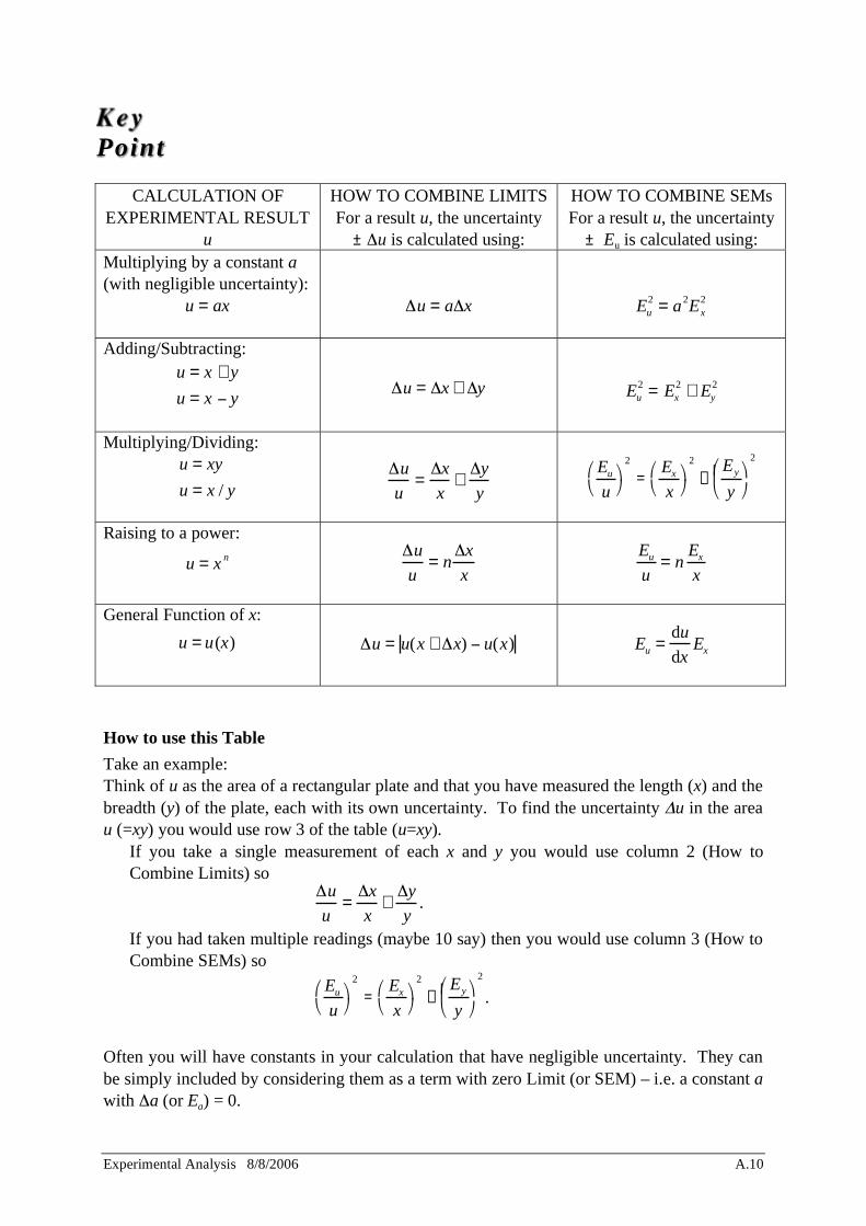
These rules are presented in the accompanying Table. • x and y represent two quantities being measured and the result is u. • The limits of uncertainty in the respective quantities are represented by x, y and u. • The SEMs are represented by Ex, Ey and Eu.
Key Point
Experimental Analysis 8/8/2006 A.10
CALCULATION OF EXPERIMENTAL RESULT
u
HOW TO COMBINE LIMITS For a result u, the uncertainty
± u is calculated using:
HOW TO COMBINE SEMs For a result u, the uncertainty
± Eu is calculated using: Multiplying by a constant a (with negligible uncertainty):
u = ax
u = a x
Eu2
= a2Ex2
Adding/Subtracting: u = x + y
u = x y
u = x + y
Eu2
= Ex2
+ Ey2
Multiplying/Dividing: u = xy
u = x / y
u
u=
x
x+
y
y
Eu
u
2
=Ex
x
2
+Ey
y
2
Raising to a power:
u = x n
u
u= n
x
x
Eu
u= n
Ex
x
General Function of x:
u = u(x)
u = u(x + x) u(x)
Eu =du
dxEx
How to use this Table
Take an example: Think of u as the area of a rectangular plate and that you have measured the length (x) and the breadth (y) of the plate, each with its own uncertainty. To find the uncertainty u in the area u (=xy) you would use row 3 of the table (u=xy). • If you take a single measurement of each x and y you would use column 2 (How to
Combine Limits) so
u
u=
x
x+
y
y.
• If you had taken multiple readings (maybe 10 say) then you would use column 3 (How to Combine SEMs) so
Eu
u
2
=Ex
x
2
+Ey
y
2
.
Often you will have constants in your calculation that have negligible uncertainty. They can be simply included by considering them as a term with zero Limit (or SEM) – i.e. a constant a with a (or Ea) = 0.
Key Point
Experimental Analysis 8/8/2006 A.11
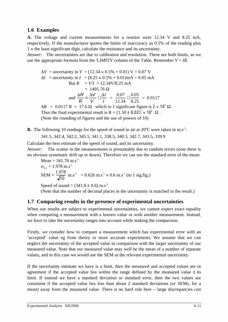
1.6 Examples A. The voltage and current measurements for a resistor were 12.34 V and 8.25 mA, respectively. If the manufacturer quotes the limits of inaccuracy as 0.5% of the reading plus 1 the least significant digit, calculate the resistance and its uncertainty. Answer: The uncertainties are due to calibration and resolution. These are both limits, so we use the appropriate formula from the 'LIMITS' column of the Table. Remember V = IR.
V = uncertainty in V = (12.34 0.5% + 0.01) V = 0.07 V I = uncertainty in I = (8.25 0.5% + 0.01)mA = 0.05 mA
But R = V/I = 12.34V/8.25 mA = 1495.76
and
R
R=
V
V+
I
I =
0.07
12.34+
0.05
8.25 = 0.0117
R = 0.0117 R = 17.6 which to 1 significant figure is 2 101 . Thus the final experimental result is R = (1.50 ± 0.02) 103 . (Note the rounding of figures and the use of powers of 10)
B. The following 10 readings for the speed of sound in air at 20oC were taken in m.s-1:
341.5, 342.4, 342.2, 345.5, 341.1, 338.5, 340.3, 342.7, 343.5, 339.9
Calculate the best estimate of the speed of sound, and its uncertainty. Answer: The scatter in the measurements is presumably due to random errors (note there is no obvious systematic drift up or down). Therefore we can use the standard error of the mean:
Mean = 341.76 m.s-1
n-1 = 1.978 m.s-1
SEM = 1.978
10 m.s-1 = 0.626 m.s-1 0.6 m.s-1 (to 1 sig.fig.)
Speed of sound = (341.8 ± 0.6) m.s-1 (Note that the number of decimal places in the uncertainty is matched in the result.)
1.7 Comparing results in the presence of experimental uncertainties When our results are subject to experimental uncertainties, we cannot expect exact equality when comparing a measurement with a known value or with another measurement. Instead, we have to take the uncertainty ranges into account while making the comparison. Firstly, we consider how to compare a measurement which has experimental error with an ‘accepted’ value eg from theory or more accurate experiments. We assume that we can neglect the uncertainty of the accepted value in comparison with the larger uncertainty of our measured value. Note that our measured value may well be the mean of a number of separate values, and in this case we would use the SEM as the relevant experimental uncertainty. If the uncertainty estimate we have is a limit, then the measured and accepted values are in agreement if the accepted value lies within the range defined by the measured value ± its limit. If instead we have a standard deviation or standard error, then the two values are consistent if the accepted value lies less than about 2 standard deviations (or SEMs, for a mean) away from the measured value. There is no hard rule here – large discrepancies can
Experimental Analysis 8/8/2006 A.12
occur by chance, but there is only a 5 % probability of a discrepancy of 2 standard deviations or more occurring by chance. If the observed discrepancy is larger than this, the most likely explanation is that the measured and accepted values are not consistent. Secondly, we consider how to compare two independent measurements, both subject to experimental uncertainties. If the uncertainties are limits, we check to see whether the range 1st value ±1st uncertainty has any overlap with the range 2nd value ± 2nd uncertainty. The values are consistent if there is some overlap. If the uncertainties are standard deviations or SEMs, the situation is a little more complex. For your needs here it will suffice to check whether there is any overlap between 1st value ± 1.5 1st SD (or SEM)} and 2nd value ± 1.5 2nd SD (or SEM)}. You use SD or SEM depending on which is the appropriate measure of the uncertainty for the quantities being considered. Again, while it is possible that occasional large fluctuations could produce no overlap even when the values really are consistent, it is far more likely that the values are not consistent if these ranges do not overlap.

Experimental Analysis 8/8/2006 A.13
2 GRAPHS Graphs provide a very clear method of demonstrating relationships between quantities and also for calculating others. For example, plotting the voltage across a component as a function of the current through it will show whether the component has a fixed resistance (graph will be a straight line) and, if so, what is the best estimate of that resistance (the slope of the line).
2.1 Drawing graphs By convention, the independent variable is plotted along the x-axis and the dependent variable along the y-axis. The independent variable is the one the experimenter controls (varies) and which causes a change in the dependent variable. Graphs should be clearly labelled with appropriate units. If our current readings were of the order of mA there is no need to convert to A and have labels like 0.001, 0.005 etc. on the graph. The units mA would be preferred (which would be labelled as ‘Current (mA)’ or perhaps ‘Current (10-3 A)’). Each graph should also have a descriptive title or caption. Where appropriate uncertainty estimates should also be included in the graph. These are usually indicated by uncertainty bars as shown below. Uncertainty in x Uncertainty in y Uncertainties in x and y
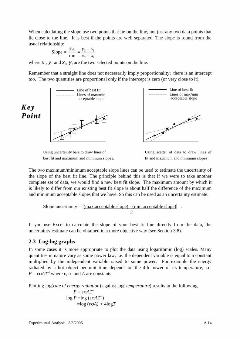
2.2 Linear graphs When we plot data it is best to choose the variables on the x and y axes such that a straight line is the expected form. It is easy to discern and fit a straight line to the data but not so clear to fit, say, a parabola. As an example, consider a series of measurements of distance and time for an object rolling down an incline from rest. We want to calculate the acceleration using the formula s = 1
2 at 2 . Plotting s against t2 should result in a straight line and the slope should give half the acceleration, a/2. We would fit a straight line to the data such that the line is as close to as many points as possible. If there is some random uncertainty associated with each point we should draw uncertainty bars to indicate this. Our line of best fit should pass within or close to these bars. In addition to the line of best fit we should also draw two lines that represent the maximum and minimum acceptable slopes. Ideally, these lines should pivot somewhere around the centroid (centre) of the data and extend to the limits of the uncertainty bars. Otherwise, the scatter of the data is used to obtain the two lines of reasonable fit.
Experimental Analysis 8/8/2006 A.14
When calculating the slope use two points that lie on the line, not just any two data points that lie close to the line. It is best if the points are well separated. The slope is found from the usual relationship:
Slope = rise
run=
y2 y1
x2 x1
where x1, y1 and x2, y2 are the two selected points on the line.
Remember that a straight line does not necessarily imply proportionality; there is an intercept too. The two quantities are proportional only if the intercept is zero (or very close to it).
Using uncertainty bars to draw lines of Using scatter of data to draw lines of
best fit and maximum and minimum slopes. fit and maximum and minimum slopes The two maximum/minimum acceptable slope lines can be used to estimate the uncertainty of the slope of the best fit line. The principle behind this is that if we were to take another complete set of data, we would find a new best fit slope. The maximum amount by which it is likely to differ from our existing best fit slope is about half the difference of the maximum and minimum acceptable slopes that we have. So this can be used as an uncertainty estimate:
Slope uncertainty = |(max.acceptable slope) - (min.acceptable slope)| . 2
If you use Excel to calculate the slope of your best fit line directly from the data, the uncertainty estimate can be obtained in a more objective way (see Section 3.8).
2.3 Log-log graphs In some cases it is more appropriate to plot the data using logarithmic (log) scales. Many quantities in nature vary as some power law, i.e. the dependent variable is equal to a constant multiplied by the independent variable raised to some power. For example the energy radiated by a hot object per unit time depends on the 4th power of its temperature, i.e. P = AT 4 where , and A are constants. Plotting log(rate of energy radiation) against log( temperature) results in the following
P = AT 4 log P =log ( AT 4)
=log ( A) + 4logT
Line of best fit Lines of max/min acceptable slope
Line of best fit Lines of max/min acceptable slope
Key Point
Experimental Analysis 8/8/2006 A.15
which has the form y = b + 4x representing a straight line with a slope of 4.
To calculate the slope of a log-log graph we need to take the log of the (x, y) values. So for two points (x1, y1) and (x2, y2) the slope is
slope = log y2 log y1
log x2 log x1
=
log y2y1
log x2x1
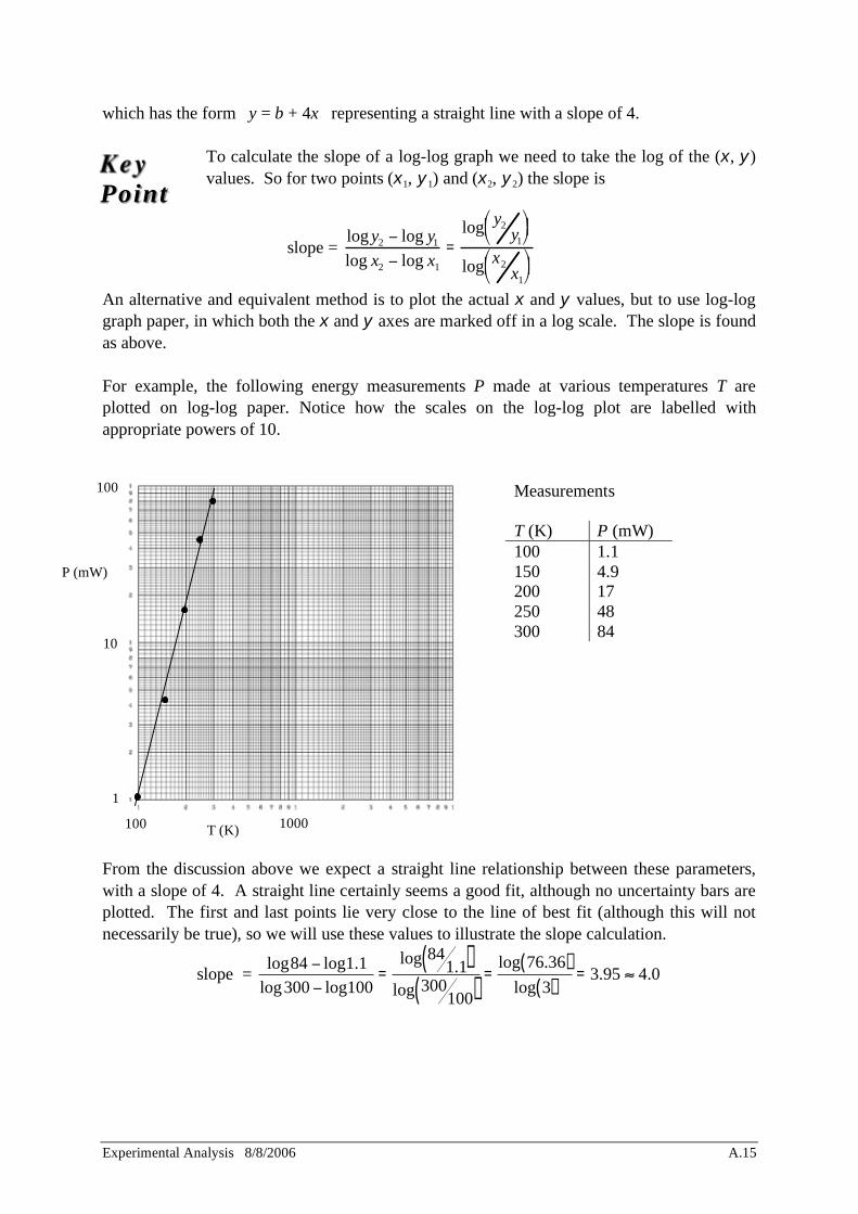
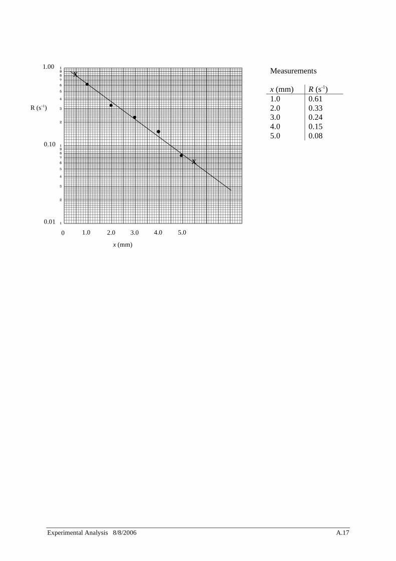
An alternative and equivalent method is to plot the actual x and y values, but to use log-log graph paper, in which both the x and y axes are marked off in a log scale. The slope is found as above. For example, the following energy measurements P made at various temperatures T are plotted on log-log paper. Notice how the scales on the log-log plot are labelled with appropriate powers of 10.
Measurements T (K) P (mW) 100 1.1 150 4.9 200 17 250 48 300 84
From the discussion above we expect a straight line relationship between these parameters, with a slope of 4. A straight line certainly seems a good fit, although no uncertainty bars are plotted. The first and last points lie very close to the line of best fit (although this will not necessarily be true), so we will use these values to illustrate the slope calculation.
slope = log84 log1.1
log300 log100=
log 841.1( )
log 300100( )
=log 76.36( )
log 3( )= 3.95 4.0
100 1000 T (K)
P (mW)
1
10
100
Key Point
Experimental Analysis 8/8/2006 A.16
Thus the equation describing these data is P T 4, as expected.
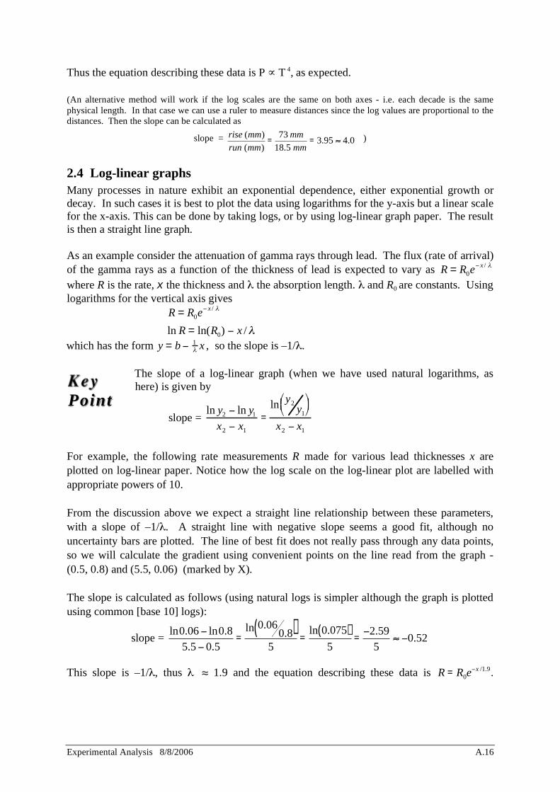
(An alternative method will work if the log scales are the same on both axes - i.e. each decade is the same physical length. In that case we can use a ruler to measure distances since the log values are proportional to the distances. Then the slope can be calculated as
slope = rise (mm)
run (mm)=
73 mm
18.5 mm= 3.95 4.0 )
2.4 Log-linear graphs Many processes in nature exhibit an exponential dependence, either exponential growth or decay. In such cases it is best to plot the data using logarithms for the y-axis but a linear scale for the x-axis. This can be done by taking logs, or by using log-linear graph paper. The result is then a straight line graph. As an example consider the attenuation of gamma rays through lead. The flux (rate of arrival) of the gamma rays as a function of the thickness of lead is expected to vary as R = R0e
x / where R is the rate, x the thickness and the absorption length. and R0 are constants. Using logarithms for the vertical axis gives
R = R0ex /
ln R = ln(R0) x /
which has the form y = b 1 x , so the slope is –1/ .
The slope of a log-linear graph (when we have used natural logarithms, as here) is given by
slope = ln y2 ln y1
x2 x1
=
ln y2y1
x2 x1
For example, the following rate measurements R made for various lead thicknesses x are plotted on log-linear paper. Notice how the log scale on the log-linear plot are labelled with appropriate powers of 10. From the discussion above we expect a straight line relationship between these parameters, with a slope of –1/ . A straight line with negative slope seems a good fit, although no uncertainty bars are plotted. The line of best fit does not really pass through any data points, so we will calculate the gradient using convenient points on the line read from the graph - (0.5, 0.8) and (5.5, 0.06) (marked by X). The slope is calculated as follows (using natural logs is simpler although the graph is plotted using common [base 10] logs):
slope = ln0.06 ln0.8
5.5 0.5=
ln 0.060.8( )
5=
ln 0.075( )5
=2.59
50.52
This slope is –1/ , thus 1.9 and the equation describing these data is R = R0e
x /1.9.
Key Point
Experimental Analysis 8/8/2006 A.17
Measurements x (mm) R (s-1) 1.0 0.61 2.0 0.33 3.0 0.24 4.0 0.15 5.0 0.08
0 5.0
x (mm)
R (s-1)
0.01
0.10
1.00
4.0 3.0 2.0 1.0
X
X

Experimental Analysis 8/8/2006 A.18
This page is blank
Experimental Analysis 8/8/2006 A.19
3 USING MICROSOFT EXCEL FOR ANALYSING AND PLOTTING DATA
3.1 Introduction
Excel is the most widely available of the ‘spreadsheet’ programs for PCs. It provides an easy way to tabulate experimental data, make calculations based on that data, plot the results, and print clearly laid out pages showing the results (and plots). These are important functions in the Physical Sciences and in any other quantitative work.
This note aims to give you enough information to get started and to use Excel for analysis and plotting of results where it is needed in several of the experimental modules.
3.2 Getting Started
If the Windows Desktop screen is showing (coloured background with a ‘Start’ button at the lower left), use the mouse to place the arrow (cursor) on the Start button and press the left mouse button. This will show a menu; move the mouse pointer to highlight ‘Programs’, which should bring up another menu, and from this move to the line labelled ‘Excel’. Release the mouse button here (or press it again); this should start Excel. If a rectangular grid of lines is on the screen, then the previous users have left Excel running (which they should not do). 1
If you have problems getting started, ask a tutor.
The basic idea behind a spreadsheet such as Excel is that we have a rectangular grid of ‘cells’. They are referred to by their column letters and row numbers, for example the top left cell is A1, the one next to it on the right is B1, the one below B1 is B2, etc. To select a particular cell, move the cursor (mouse) to that cell and click the left mouse button once.
Each cell can contain either:
• A number you have entered (eg an experimental measurement). To do this simply type the number and press Enter or one of the arrow keys.
• A formula you have typed in (or copied from another place, see below). A formula takes results from other cells and calculates some new value that you need. For example the formula =26.5+C5/10-A1*2.531 adds 26.5 to 1/10th of whatever value is in C5 and subtracts 2.531 times the value in A1 and puts the result in whatever cell contains this formula. The tricky (and useful) thing is that where the cell appears on the main part of the screen we see the result from that formula rather than the formula itself. We can review the formula itself in the little window towards the top left of the screen.
• A label consisting of characters you type in from the keyboard. Labels do not take part in the calculations, but are used to make your screen display and printouts clear by indicating
1 In this case move the cursor to the word File at the top left and click the left mouse button on it. Move the cursor down to highlight Exit and click on that. This will bring up a box asking whether you want to save the changes to the current spreadsheet. If there is no sign of the previous users, assume they have finished with the file and so click on ‘No’. The system will now be ready for you to restart as above.
Experimental Analysis 8/8/2006 A.20
what the various quantities in the other cells are. You should always label your spreadsheet columns to show the quantity and its units, just as you would if you were writing in your logbook. To enter a label, just type the text. Excel will recognise that it is not a valid number or formula, and so make it a label. (If the label could be misinterpreted as a formula, eg /sec, then type ‘/sec to force interpretation as a label.) You should also type in a general heading at the top of your sheet to identify the experiment and your lab team.
Across the top of the Excel screen is a row of options: File, Edit, View, Insert, etc. If you point to one of these and press the left mouse button you will get a drop-down menu giving various options. You will not need to know or use all of these, but you will need to be familiar with the system and to use some of them. Under File in particular, are important options for saving your work, printing it, and exiting from Excel. Some items in these menus are shown in a light shade - these are unavailable because they depend on some precondition which has not been satisfied at the moment.
Below the File, Edit, View, Insert line there are two rows each containing many icons. These rows are called Toolbars, and the icons give access to further useful functions. If you point to any one of these and leave the cursor there for a second or so, Excel will display a label saying what that button does.
To move around inside a large spreadsheet, which will not all fit on the screen at once, you can use the arrow keys or use the mouse to move the grey square in the vertical strip at the right hand side of the screen (press and hold left mouse button, release after moving the grey square).
3.3 Entering Data
Move the cursor to the desired cell and select that cell by clicking the left mouse button. Type in the number, with decimal point if required. Powers of 10 can be entered: eg for 3.6 10-6 type in 3.6E-6. Press enter (return) key. If you make a mistake, simply reselect the cell and type the new value in - it will replace the old one.
3.4 Editing and Formatting your Spreadsheet
Often you will find you need to insert a new blank row (horizontal) or column (vertical) of cells, to give you more room for headings or another column for calculated quantities, or just to make the sheet easier to read. Select the cell next to where you want the new row or column to be, then from the top row use the mouse to choose Insert, and from the menu choose Rows or Columns as appropriate.
If you make a mistake in editing, you can use Edit - the first item in its menu will usually offer to undo the last command you carried out. To erase the contents of one or more cells, select the cells and use Edit…Clear…Contents.
In many situations you will need to select a group of neighbouring cells – this designates them, ready for some action you want to carry out on the whole group of cells. It is done by
Experimental Analysis 8/8/2006 A.21
pressing the left mouse button with the cursor in the top left cell of the desired group, and then holding the mouse button down while moving to the lower right cell of the group. (This is called ‘click and drag’.)
To make the labels you type above each column stand out clearly it helps to put them in bold type (eg Force) and in the row directly below type the units ( / Newtons). To get bold type, select the cell(s), then click on the B button in the lower toolbar. The labels can be centred in their cells by selecting them and clicking the ‘Centre’ button (shown at left) in the same toolbar. Sometimes you will want to move a group of cells from one place to another. Select the cells using click and drag, then press the ‘Cut’ button in the first toolbar. Click on the top left cell of the destination area and press the Enter key – the cells will appear in their new location.
3.5 More about formulas
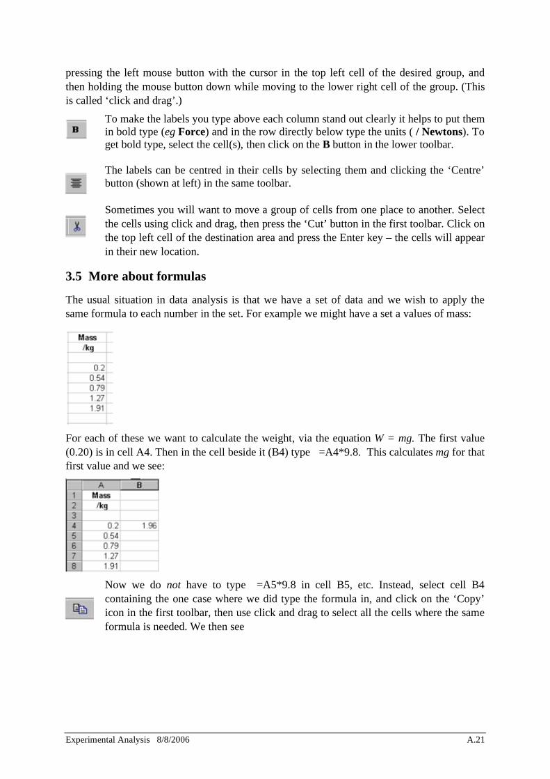
The usual situation in data analysis is that we have a set of data and we wish to apply the same formula to each number in the set. For example we might have a set a values of mass:
For each of these we want to calculate the weight, via the equation W = mg. The first value (0.20) is in cell A4. Then in the cell beside it (B4) type =A4*9.8. This calculates mg for that first value and we see:
Now we do not have to type =A5*9.8 in cell B5, etc. Instead, select cell B4 containing the one case where we did type the formula in, and click on the ‘Copy’ icon in the first toolbar, then use click and drag to select all the cells where the same formula is needed. We then see
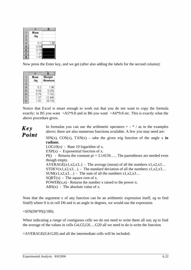
Experimental Analysis 8/8/2006 A.22
Now press the Enter key, and we get (after also adding the labels for the second column):
Notice that Excel is smart enough to work out that you do not want to copy the formula exactly: in B5 you want =A5*9.8 and in B6 you want =A6*9.8 etc. This is exactly what the above procedure gives.
In formulas you can use the arithmetic operators + - * / as in the examples above; there are also numerous functions available. A few you may need are:
SIN(x), COS(x), TAN(x) – take the given trig function of the angle x in radians. LOG10(x) - Base 10 logarithm of x. EXP(x) - Exponential function of x. PI() - Returns the constant pi = 3.14159….. The parentheses are needed even though empty. AVERAGE(x1,x2,x3..) - The average (mean) of all the numbers x1,x2,x3… STDEV(x1,x2,x3…) - The standard deviation of all the numbers x1,x2,x3… SUM(x1,x2,x3…) - The sum of all the numbers x1,x2,x3… SQRT(x) - The square root of x. POWER(x,n) - Returns the number x raised to the power n. ABS(x) - The absolute value of x.
Note that the argument x of any function can be an arithmetic expression itself, eg to find Sin( ) where is in cell D6 and is an angle in degrees, we would use the expression
=SIN(D6*PI()/180).
When indicating a range of contiguous cells we do not need to write them all out; eg to find the average of the values in cells G4,G5,G6….G20 all we need to do is write the function
=AVERAGE(G4:G20) and all the intermediate cells will be included.
Key Point

Experimental Analysis 8/8/2006 A.23
3.6 Plotting graphs
Your data for plotting will usually be in columns: the values to be used for the horizontal axis must be in a column somewhere to the left of the values to be plotted on the vertical axis. (By the way, if you want other people to be able to understand your graphs, make sure you use the horizontal axis for the independent variable – the one you controlled – and the vertical axis for the dependent variable – the one that you measured and/or calculated.)
First you have to select the columns of x and y data. If they are adjacent, use click and drag to select the block of cells from the top of the x axis column to the bottom of the y axis column (omit the headings). [If the x and y data are not in adjacent columns, select the x column first, then press the Ctrl key while selecting the y column; both should be highlighted.] Then click on Insert..Chart... This begins a multi-step process to create a graph (Chart).
1. Choose the type of Chart you want - choose XY (Scatter). The others are for business applications and use the x data only as labels, with the points plotted equally spaced on the horizontal axis whatever the x values are!
Choose the type of XY (Scatter) Chart you want - with or without lines or points. You should always have a marker to highlight data points, but you will usually not want a line simply joining the points. Choose Next to proceed.
2. Confirms the block of data to be used. The ranges look a bit confusing because Excel adds $ signs in the cell references2. Choose Next to proceed.
3. Add headings and axis labels. Choose ‘No’ for ‘Add a legend’. Use a Chart Title such as Wire Vibration Frequency vs Tension: 6 REG 08 – this describes what the plot is (note this means ‘y variable vs x variable’, not the other way around) and gives your team number so you can tell which is your plot on the printer. Note a trap – use the mouse cursor to move from one subwindow to the next; if you use the enter key it assumes you are finished and does not let you put in the rest of the labels. Type in labels and units for both x and y axes. Choose Next to proceed.
4. Place the Chart As new sheet and choose Finish and your graph should be done.
5. To improve the screen view of the graph, choose View, size with window and change the aspect ratio of the graph so the graph is better proportioned on the page. The default graph in EXCEL has grey background, but you should change to a plain white background. Select (click in) the plot area and choose Format, Selected Plot Area, Area, None. Choose OK to proceed.
Most aspects of the plot can be modified if necessary. Click in the plot area to select the plot. Then click something that needs changing: for example Excel may decide to extend the x axis to include zero, and we may not want this. In that case click on one of the values shown on the x axis, and choose Format from the top command line. The first item will then be Selected Axis.
2 This has the effect of making the cell references absolute, which means that a copy operation would not automatically change cell references when we copy a formula into new cells.
Key Point
Experimental Analysis 8/8/2006 A.24
Choosing this will bring up a box offering various options, including setting the minimum of the range to be plotted (click the appropriate tab at the top – in this case Scale). Choosing Chart from the main menu can also be used to alter the format of your Chart.
3.7 Fitting a Straight Line to Experimental Data
In Physics we often plot data in a way which leads to theory predicting a straight line. (This makes it easy to fit the correct functional form – a straight line – and to see the scatter of the points about that fit.) To get Excel to draw a line of best fit:
1. Select the chart window (one click somewhere inside the plot)
2. Use Chart…Add Trendline.
3. Choose Linear to get a straight line fit; the other options can be appropriate in other situations.
4. Under the tab Options, check the boxes for Display Equation on Chart and Display R2 Value on Chart. From the equation you can see the slope and intercept of the fitted line. The R2 value indicates how good a fit you have - 1 for a perfect fit. (The equation and R2 value can be moved to a more convenient place on the plot using the mouse.)
5. Select the trendline by clicking on it somewhere away from the data points. (It will already be selected if you have just inserted it.)
6. Choose Format…Selected Trendline. (If the Format menu does not offer this option, you did not successfully select the trendline.)
7. Under the tab Patterns choose the line weight 3rd from the bottom (click the down arrow button to get the alternatives.) Otherwise the default gives a plotted line that looks OK on the screen but is too thick when printed.
The linear ‘trendline’ or regression line is the straight line which minimises the sum of squares of the deviations of the data from the line (in the y direction). This is equivalent to minimising the standard deviation of the points from the line rather than from their mean (see Sections 1.3.2 and 2.2)
3.8 Finding Slope and Intercept and their Uncertainties with LINEST
In some cases you will be asked to use the LINEST function; this analyses your x and y data and gives the slope and intercept and both their uncertainties. To use LINEST:
1. Note the ranges of cells containing the x and y data (it does not have to be plotted)
2. Find a suitable space on the spreadsheet where you have a vacant block of 2 2 cells
3. Select those 2 2 cells using click and drag
Key Point
Key Point
Experimental Analysis 8/8/2006 A.25
4. Type =LINEST(y_first:y_last,x_first:x_last,true,true) where y_first is the top cell of the column of y data, y_last is the bottom cell, and similarly for x. For example, if the x axis data are in B5 to B10 and the y axis data are in D5 to D10, we would use the form =LINEST(D5:D10,B5:B10,true,true).
5. Note that typing =LINEST(y_first:y_last,x_first:x_last,false,true) forces the function to be linear (straight line) with no intercept. The graph passes through the origin.
6. Do not just press the Enter key. Instead, you have to press the Ctrl, Shift and Enter keys together.
7. You should get a number in each of the 4 target cells3, giving:
Slope Intercept Uncertainty in slope Uncertainty in intercept
You can also select a 2 3 block of cells (2 columns x 3 rows), in which case one of the extra values displayed is the R2 value.
Always review critically the results of any ‘black box’ calculation such as this! Is the slope about what you expect? Do the uncertainties look reasonable? It is not correct just because it came from a computer - remember ‘GIGO’ (Garbage In, Garbage Out).
3.9 Printing
To print your ‘worksheet’ - i.e. the spreadsheet cells with your data and calculated results:
Use click and drag to select the area of the sheet you want to print. This is likely to extend from A1 to some cell such as G20 at the lower right. Make sure to include the titles you have put in to describe the sheet and what the columns are.
1. From the top menu choose File...Print.
2. In the Print dialog box, for ‘Print What’ click the circle for Selection. Do not choose either of the other alternatives - they can tie the printer up printing useless blank cells/pages. Leave the number of copies at 1.
3. Check which printer is specified. It will have a name such as ROOM402, indicating the location of the printer which will be used. If the wrong room is shown, you can change the printer name to the correct one.
4. When all is correct, click on the OK button – once only.
3 If you only get one number, in the top left cell, then you did not successfully select the 2 2 block.
If the system freezes with the message ‘Cannot change part of array’, press the ESC key, clear out the 2 2 block (Select, then Edit…Clear…Contents) and redo the whole operation carefully – the problem is due to illegal LINEST input.

Experimental Analysis 8/8/2006 A.26
5. It may take a while for your printout to appear, particularly if a lot of people are using the printer at the same time. Do NOT resubmit the print job just because yours did not come out immediately. (A few people doing this a few times causes a printer queue logjam and then jobs really do get delayed.) If you still get nothing when you think the job should have been printed, ask for assistance.
To print your graph:
1. Get the graph on screen (if it is not already) by clicking on the tab (near the bottom of the screen) with a name such as ‘Chart 1’.
2. From the top menu choose File...Print.
3. Check printer as in point 4 above.
4. Click OK button.
5. See point 5 above - to help avoid printer queue delays.
3.10 Saving your File
You can save your entire Excel ‘workbook’ (spreadsheet plus any plots) for later retrieval:
1. From the top command line choose File…Save As.
2. Select drive e:
3. Give your file a name (maximum 8 characters) based on your team number, so you will be able to find it again later. Eg 6REG08A1. (The files from all teams on all days are on the same drive, so this matters.) Write in your team log the filename you have used. The additional characters (A1 in the above example) are chosen by you to distinguish your files, since you may save a number of different Workbooks at different times.
4. Click on OK.
3.11 Exiting from Excel
When you have finished using your spreadsheet, make sure you have saved it, then use File…Exit to get out of Excel.
3.12 Sample of an Excel spreadsheet
See next two pages.

Experimental Analysis 8/8/2006 A.27

Experimental Analysis 8/8/2006 A.28

Experimental Analysis 8/8/2006 A.29
This page is blank
Experimental Analysis 8/8/2006 A.30
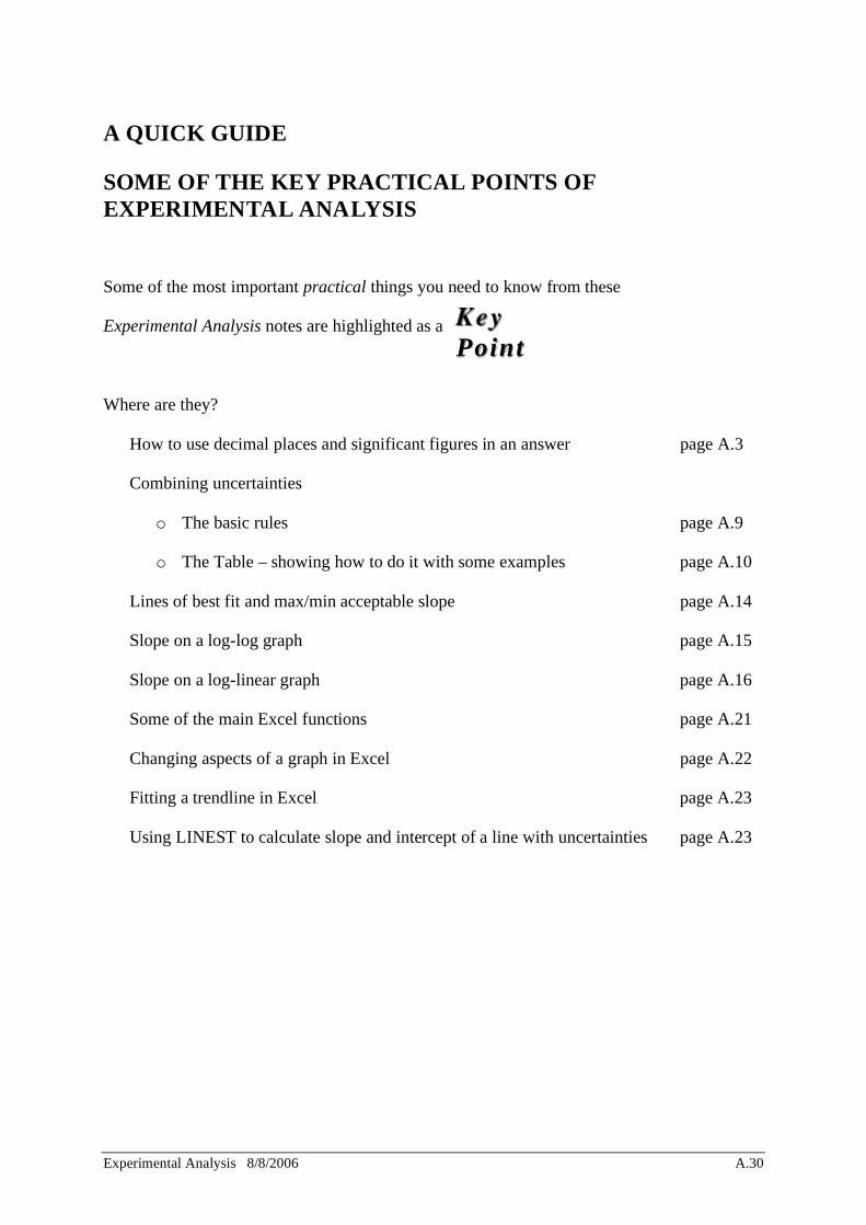
A QUICK GUIDE
SOME OF THE KEY PRACTICAL POINTS OF EXPERIMENTAL ANALYSIS
Some of the most important practical things you need to know from these
Experimental Analysis notes are highlighted as a
Where are they?
• How to use decimal places and significant figures in an answer page A.3
• Combining uncertainties
o The basic rules page A.9
o The Table – showing how to do it with some examples page A.10
• Lines of best fit and max/min acceptable slope page A.14
• Slope on a log-log graph page A.15
• Slope on a log-linear graph page A.16
• Some of the main Excel functions page A.21
• Changing aspects of a graph in Excel page A.22
• Fitting a trendline in Excel page A.23
• Using LINEST to calculate slope and intercept of a line with uncertainties page A.23
Key Point