1 the box model. 2 xhtml elements block and inline elements block is a stand alone element and...
Post on 21-Dec-2015
214 views
TRANSCRIPT

1
The Box Model

2
XHTML Elements
• Block and inline elements
• Block is a stand alone element and inline goes inside block elements
• CSS allows you to control every aspect of how an element is displayed
• Elements can be given unique identities

3
line-height property line-height: 1.6em
• Allows you to specify the amount of vertical space between each line of your text
• Can improve readability and improve contrast
• Can specify the line height in pixels, or using an em or percent value that’s relative to the font size
• Space between lines is known as “leading” in the publishing industry

4
line-height property
• Adjusting line height of text on a page using line-height: 1.6em
• Increasing line height using 1.6em or 1.6 times the font size
• The line-height property is inherited by all the elements
body { font-size: small;font-family: Verdana, Geneva, Arial, san-
serif;line-height: 1.6em;
}

5
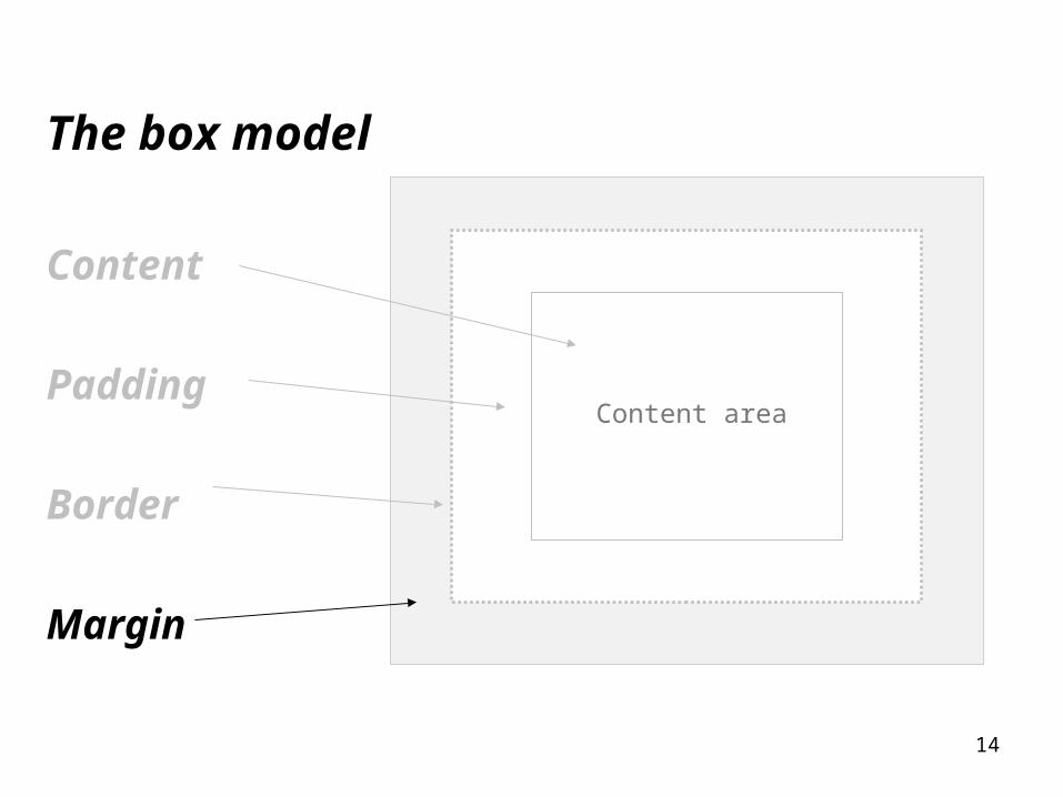
The box model
• CSS elements treats every element as if it were represented by a box

6
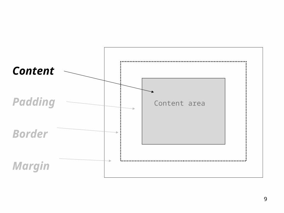
Every element is a box
• Every box has a content area that holds text or image
• Content area is surrounded by optional padding
• Padding is surrounded by optional border
• Border is surrounded by optional margin

7
The box model
Content
Padding Content area
Border
Margin

8
Content area
Content area
holds the element’s
content
No visible box
Only big enough to fit content
9
Content
Padding Content area
Border
Margin

10
Padding Content area

11
Content
Padding
Border
Margin
Content area

12
Border

13
Margin
14
The box model
Content
Padding
Border
Margin
Content area
15
Using CSS to control box’s appearance
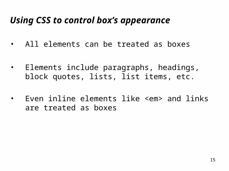
• All elements can be treated as boxes
• Elements include paragraphs, headings, block quotes, lists, list items, etc.
• Even inline elements like <em> and links are treated as boxes

16
Box styling options
Content
Padding
Border
Margin

17
Use any combination in Box Styling
• Content (contains an element)
• Padding (area outside of content, provides extra space around content and the border)
• Border(appears around padding, solid, no border, colors or eight styles)
• Margin(appears around border, left, right, top, bottom, provides space between your element and other elements, margin provides a buffer between box/element and things around it)

18
Box model is optional
Benefits to using:
• Controlling how elements sit on a page
• Controlling relative position of other elements
• Altering various aspects of each elements padding and margins to achieve positioning and appearance
• Enables designer the ability to create interesting designs
• Padding and margin provide more visual space

19
Adding a custom style using a class
Class allows us to create a custom style A class can be applied as many times as you want within a page Properties add a border to any element that is in the logo class
<p class=“logo”>Our paragraph</p>

20
Adds a border element that is in the logo class
<p class=“logo”>Our paragraph</p>
.logo {
border-color: black;
border-width: 1px;
border-style solid;
background-color: #a7cece;
}
logo paragraph will now be style with a aquamarine background and a thin black border around it

21
Adding 25 pixels of padding to all sides
.logo {
border-color: black;
border-width: 1px;
border-style solid;
background-color: #a7cece;
padding: 25px;
}

22
Adding 30 pixels of margins around the content
.logo {border-color: black;border-width: 1px;border-style solid;background-color: #a7cece;padding: 25px;margin: 30px;}

23
Adding a background image
.logo {
border-color: black;
border-width: 1px;
border-style solid;
background-color: #a7cece;
padding: 25px;
margin: 30px;
background-image: url(images/name.gif);
}

24
Adding more style
• Add a line height of 1.9em
• Change the font style to italic
• Change the color to #444444
• And change the font family to Georgia, “Times New Roman”, Times, serif

25
Adding a line height, italic style, serif font, font color
.logo {line-height: 1.9em;font-style: italic;font-family: Georgia, Times, serif;color: #444444;border-color: black;border-width: 1px;border-style solid;background-color: #a7cece;padding: 25px;margin: 30px;background-image: url(images/name.gif);
}

26
background-image property
background-image: url(images/name.gif);
• Used to set the background image of an element
• Places an image in the background of an element, image will repeat if necessary
• Not for placing images in a page (use <img>)
• Use background-image to improve the attractiveness of your element

27
background-image property
background-image: url(images/name.gif);
• Background image repeats if required
• Background image shows under the content area and padding not outside the border and not in the margin
28
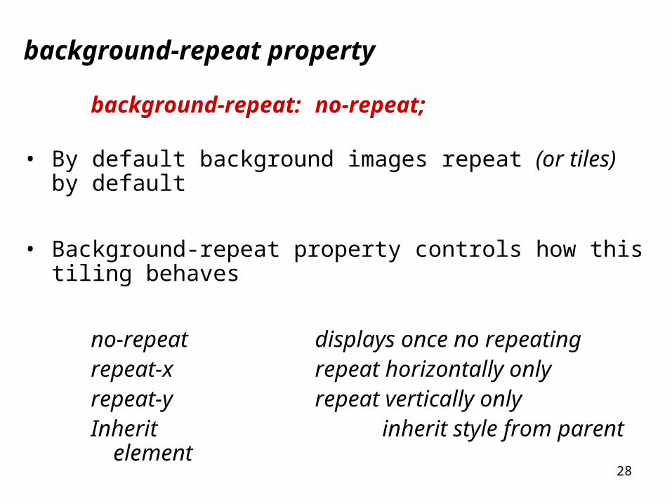
background-repeat property
background-repeat: no-repeat;
• By default background images repeat (or tiles) by default
• Background-repeat property controls how this tiling behaves
no-repeat displays once no repeatingrepeat-x repeat horizontally onlyrepeat-y repeat vertically onlyInherit inherit style from parent
element
29
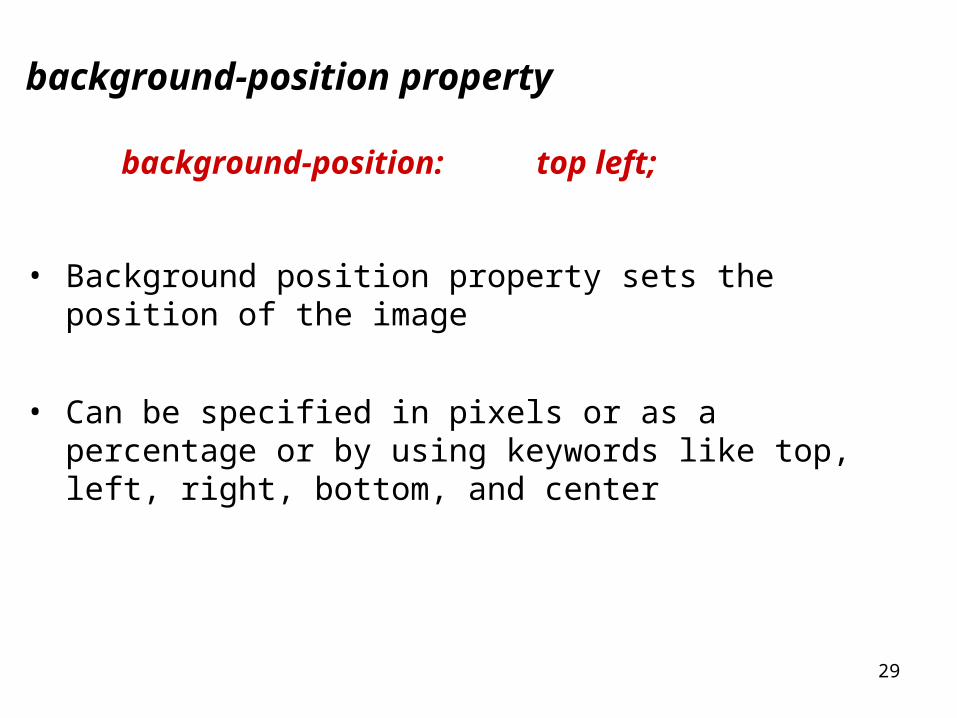
background-position property
background-position: top left;
• Background position property sets the position of the image
• Can be specified in pixels or as a percentage or by using keywords like top, left, right, bottom, and center

30
padding-left: 80px;
• Increase the padding on the left side only
padding-left: 80px;

31
padding-left: 80px;
• Can be used at the same time with existing padding
padding: 25px;
• Be careful of ordering though
padding: 25px;
padding-left: 80px;
• Will first add padding on all sides to 25 pixels• Then will change padding on the left to 80 pixels

32
margin-right: 250px;
• Increase the margin on the right side only
margin-right: 250px;
33
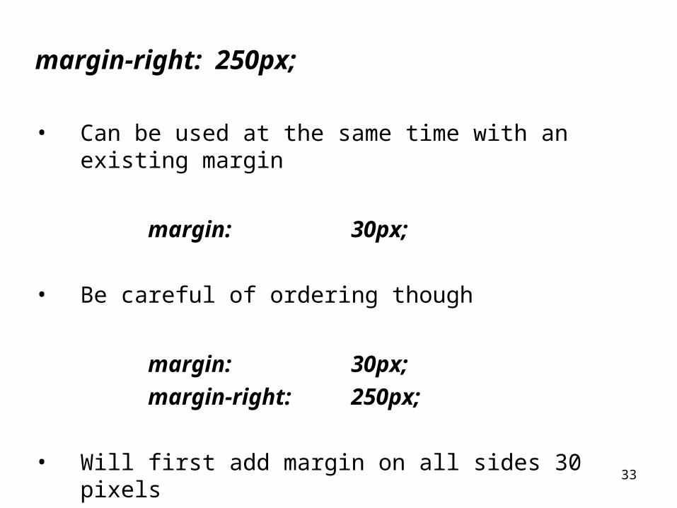
margin-right: 250px;
• Can be used at the same time with an existing margin
margin: 30px;
• Be careful of ordering though
margin: 30px;
margin-right: 250px;
• Will first add margin on all sides 30 pixels• Then will change margin on the right to 250 pixels
34
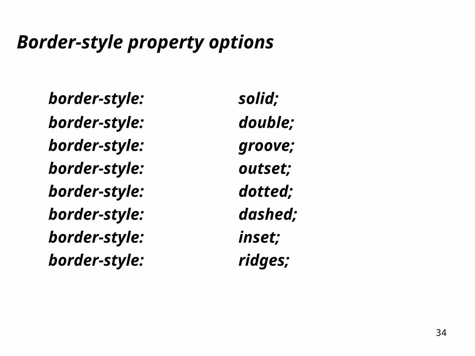
Border-style property options
border-style: solid;
border-style: double;
border-style: groove;
border-style: outset;
border-style: dotted;
border-style: dashed;
border-style: inset;
border-style: ridges;

35
Border-width property
Controls the width of the border
Border-width: thinBorder-width: mediumBorder-width: thick
Border-width: 1pxBorder-width: 2pxBorder-width: 3pxBorder-width: 4pxBorder-width: 5pxBorder-width: 6px

36
Border-color property
Sets the color of the border, use color names, rgb, or hex codes
Pick one method…
Border-color: red;
Border-color: rgb(100%, 0%, 0%);
Border-color: #ff0000;
37
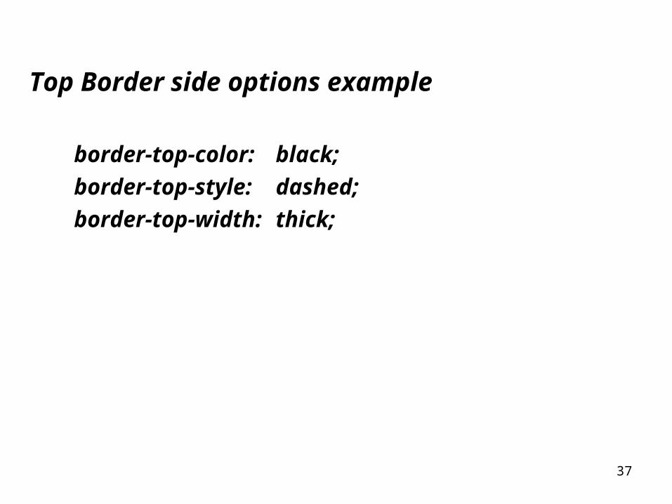
Top Border side options example
border-top-color: black;
border-top-style: dashed;
border-top-width: thick;

38
Right Border side options example
border-right-color: red;
border-right-style: dotted;
border-right-width: thin;

39
Left Border side options example
border-left-color: blue;
border-left-style: double;
border-left-width: medium;
40
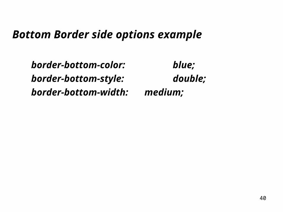
Bottom Border side options example
border-bottom-color: blue;
border-bottom-style: double;
border-bottom-width: medium;

41
Adding to stylesheet
.logo {line-height: 1.9em;font-style: italic;font-family: Georgia, Times, serif;color: #444444;border-color: white;border-width: 1px;border-style dashed;background-color: #a7cece;padding: 25px;margin: 30px;background-image: url(images/name.gif);}

42
Class selector
Selects all elements belonging to the specials class
.specials {
color: red;
}

43
The id attribute
• Similar to a class, but called id not class,
• Added inside an element tag <p id=“name” >
• Each element can have only one id
• id represents a unique element
• id names must start with a letter and be followed by only letters and digits
• No spaces or special characters allowed

44
id example
<p id=“footer”>
paragraph styled by an id called footer
</p>

45
Elements can have both an id and a class
• id represents a unique identifier for an element
• An element can still belong to one or more classes

46
Paragraph Class selector
Selects only paragraphs belonging to specials class
p.specials {
color: red;
}

47
id selector
Selects any element that has the id “footer”
#footer {
color: red;
}
• An id selector should match only one element in a page

48
Adding an id selector
• Add id to element
<p id=“footer”>paragragh with id </p>
• Create a id selector within stylesheet
#footer {
line-height: 1.9em;
font-style: italic;
font-family: Georgia, Times, serif;
color: #444444;
}

49
Paragraph id selector
Selects only a <p> element if it has the id footer
p#footer {
color: red;
}

50
Element can have both class and id
Applying both a class and a id, unusual, not recommended but possible?
p#footer {
line-height: 1.9em;
font-style: italic;
font-family: Georgia, Times, serif;
color: #444444;
}

51
Using multiple style sheets
You can specify multiple stylesheets to your document/page
<head>
<meta http-equiv="Content-Type" content="text/html; charset=iso-8859-1" />
<title>Adams Document</title>
<link type=“text/css” rel=“Style Sheet” href=“corporate.css” />
<link type=“text/css” rel=“Style Sheet” href=“regional.css” />
<link type=“text/css” rel=“Style Sheet” href=“local.css” />
</head>

52
Order determines which takes precedence
• The last style will override any before it
(if both styles define the same element)
<link type=“text/css” rel=“Style Sheet” href=“corporate.css” />
<link type=“text/css” rel=“Style Sheet” href=“regional.css” />
<link type=“text/css” rel=“Style Sheet” href=“local.css” />
• Also, any internal or inline styles of the same element will override any ext CSS

53
You can specify multiple stylesheets for multiple devices
Media=“screen”
Computer screens
Media=“print”
Print devices
Media=“handheld”
Portable devices
Leaving out the media definition will define style as suitable for devices

54
Using multiple style sheets
• You can specify multiple stylesheets for multiple devices
Media=“screen” Media=“print” Media=“handheld”
<link type=“text/css” rel=“Style Sheet” href=“corporate.css” media=“screen”/>
<link type=“text/css” rel=“Style Sheet” href=“regional.css” media=“print”/>
<link type=“text/css” rel=“Style Sheet” href=“local.css” media=“handheld” />

55
Using multiple style sheets
• Not all browsers may support the styles for the different devices, but newer and future browsers should
• Other types of media styles are available
end