1 supplementary information appendix global
TRANSCRIPT

1
SUPPLEMENTARY INFORMATION APPENDIX
Global biogeography of human infectious diseases
Kris A. Murray1,2*, Nicholas Preston3, Toph Allen4, Carlos Zambrana-Torrelio4,
Parviez R. Hosseini4 and Peter Daszak4
Affiliations:
1Grantham Institute – Climate Change and the Environment, Faculty of Natural
Sciences, Imperial College London, Exhibition Road, London, UK
2School of Public Health, Faculty of Medicine, Imperial College London, Norfolk
Place, London, UK
3Children’s Hospital Informatics Program, Boston Children’s Hospital, Boston,
Massachusetts, USA
4EcoHealth Alliance, 460 West 34th St, New York, New York, USA
*Correspondence to: Kris Murray: [email protected]

2
SI Appendix Figures S1 - S6 Table S1-S2 Appendices S1 – S4 References
3
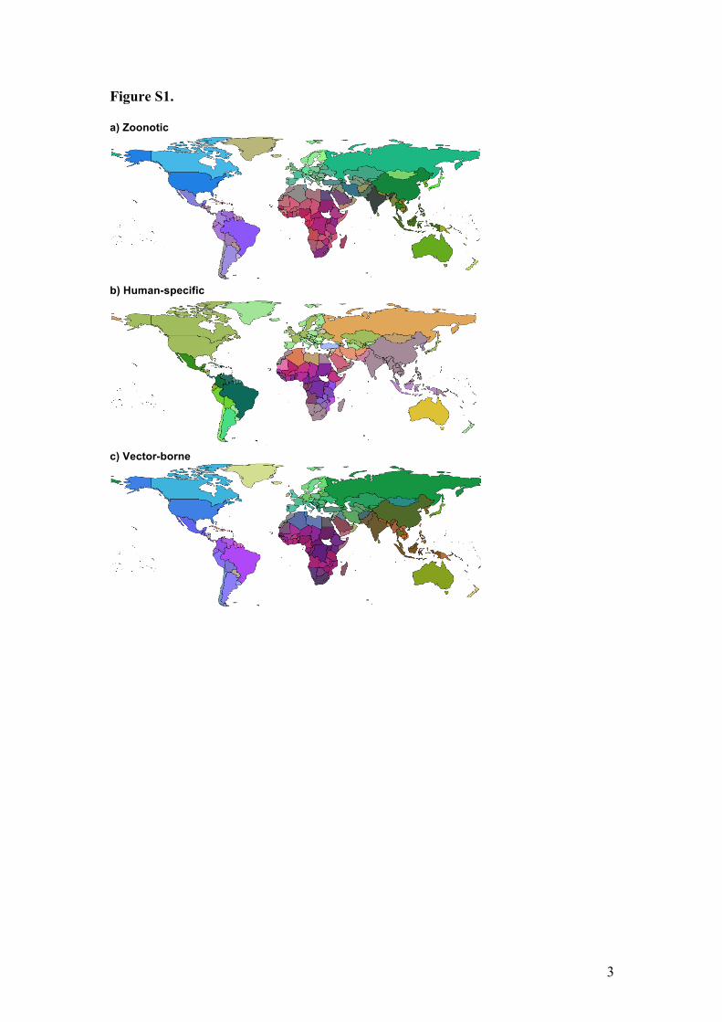
Figure S1. a) Zoonotic
b) Human-specific
c) Vector-borne
4
d) Viruses
e) Bacteria
f) Parasites
g) 3D RGB color scale illustration for Fig. 1 (main text) and Fig. S1 a-f (above). Each point in example on right represents a country with its colors for mapping determined by its position in nmds space)
Figure S1. Global human infectious disease pathogeographic patterns for separate disease classes (all diseases combined shown in main text, Fig 1). Ordination analysis of Sørensen dissimilarity (βsor) of human infectious disease assemblages. Color similarity represents infectious disease assemblage similarity among countries (see Methods).
5
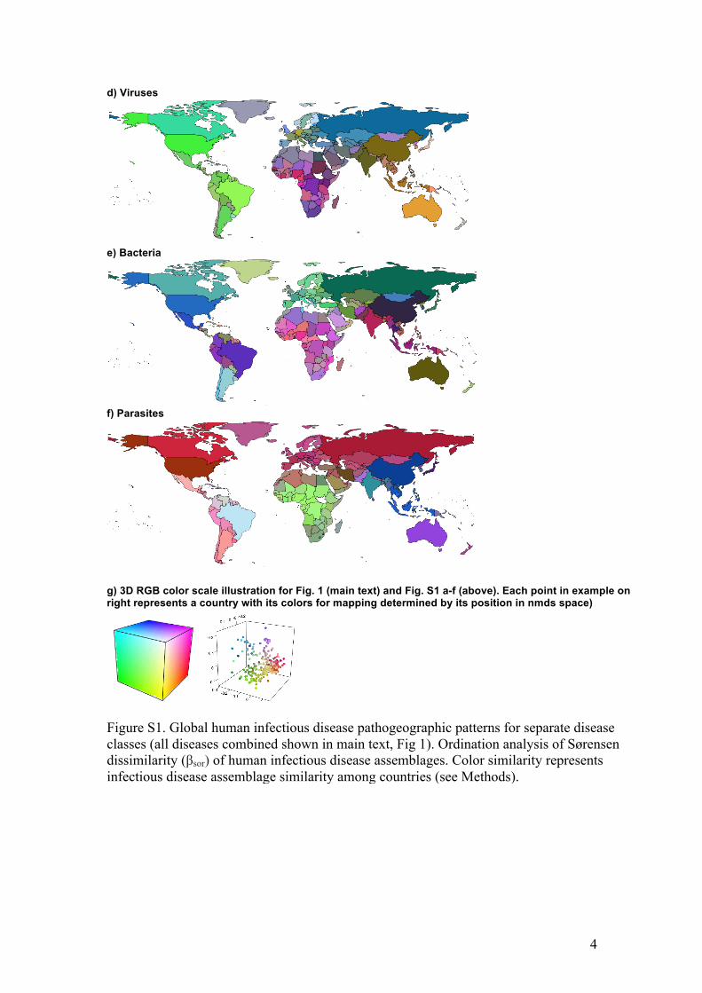
Figure S2.
Figure S2. Country specific zoonotic disease co-zones derived from assessing the similarity of zoonotic disease assemblages (1-βsor) among countries. Illustrated are two focal countries: DRC = Democratic Republic of Congo, and THA = Thailand. Warmer colors show greater similarity in zoonotic disease assemblages relative to the focal country.
DRC
0.54
1
THA
0.55
1
6
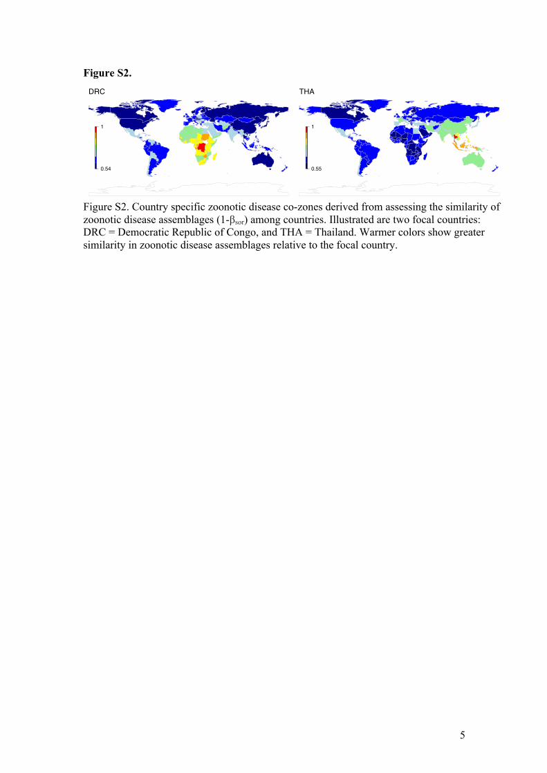
Figure S3.
Figure S3. Variance partition plot showing the relative contribution of geographic distance vs. extrinsic factors in predicting the similarity of infectious disease assemblages among countries for various disease classes (see Table 1 for description and sample sizes of classes). Total variation attributable to each category is the pure component plus the shared component. Extrinsic variables are described in the Methods. SI Appendix Table S1 shows model R2 values and significance tests of the extrinsic predictors. SI Appendix Fig S5 shows relative influence of the separate extrinsic variables.
ALL
Bacteria
Human
Non.vector
Parasites
Vector
Viruses
Zoonotic
0 20 40% Variation explained, R2
Dis
ease
cla
ss Variance components
Pure DistanceSharedPure Extrinsic

7
Figure S4.
Figure S4. The correlation between the similarity of infectious disease assemblages among countries and the extrinsic predictors. A value of 0 on the y-axis indicates identical assemblages. See SI Appendix Table S1 for model summaries. The All diseases class is not shown to reduce clutter.
8
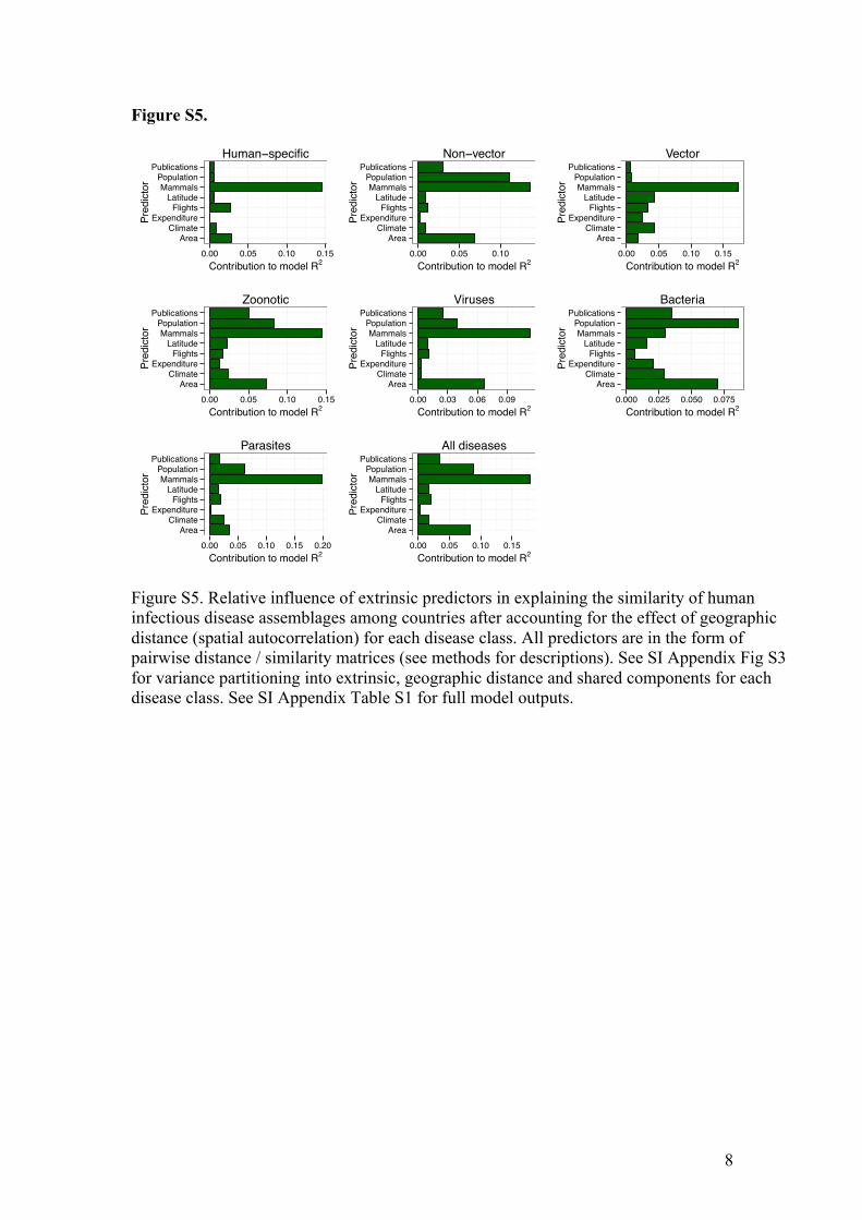
Figure S5.
Figure S5. Relative influence of extrinsic predictors in explaining the similarity of human infectious disease assemblages among countries after accounting for the effect of geographic distance (spatial autocorrelation) for each disease class. All predictors are in the form of pairwise distance / similarity matrices (see methods for descriptions). See SI Appendix Fig S3 for variance partitioning into extrinsic, geographic distance and shared components for each disease class. See SI Appendix Table S1 for full model outputs.
AreaClimate
ExpenditureFlights
LatitudeMammals
PopulationPublications
0.00 0.05 0.10 0.15Contribution to model R2
Pred
icto
rHuman−specific
AreaClimate
ExpenditureFlights
LatitudeMammals
PopulationPublications
0.00 0.05 0.10Contribution to model R2
Pred
icto
r
Non−vector
AreaClimate
ExpenditureFlights
LatitudeMammals
PopulationPublications
0.00 0.05 0.10 0.15Contribution to model R2
Pred
icto
r
Vector
AreaClimate
ExpenditureFlights
LatitudeMammals
PopulationPublications
0.00 0.05 0.10 0.15Contribution to model R2
Pred
icto
r
Zoonotic
AreaClimate
ExpenditureFlights
LatitudeMammals
PopulationPublications
0.00 0.03 0.06 0.09Contribution to model R2
Pred
icto
r
Viruses
AreaClimate
ExpenditureFlights
LatitudeMammals
PopulationPublications
0.000 0.025 0.050 0.075Contribution to model R2
Pred
icto
r
Bacteria
AreaClimate
ExpenditureFlights
LatitudeMammals
PopulationPublications
0.00 0.05 0.10 0.15 0.20Contribution to model R2
Pred
icto
r
Parasites
AreaClimate
ExpenditureFlights
LatitudeMammals
PopulationPublications
0.00 0.05 0.10 0.15Contribution to model R2
Pred
icto
r
All diseases

9
Figure S6.
Figure S6. Global human infectious disease pathogeographic regions (All diseases). Cluster analysis of Sørensen dissimilarity (βsor) of human infectious disease assemblages (N=187 diseases). k=12 clusters were specified a priori for direct comparison with previous zoogeographic studies (3). Cluster colors were assigned to broadly align with ordination results in Fig. 1. Indicative biogeographic regional labels are shown in the legend.

10
Table S1. Ebola 2013 additive co-zone rankings from this study in comparison to the 22 at risk countries identified in Pigott et al (5). ISO shows the ISO3 country code. Ebola_avgBsim_2014 shows the similarity in the zoonotic infectious disease assemblages between the listed country and all Ebola primary case countries. Higher ranked countries have higher zoonotic infectious disease assemblage similarities to Ebola-positive countries. There is 63.2% overlap between the top 22 lists from this study and from Pigott et al. (5)
11
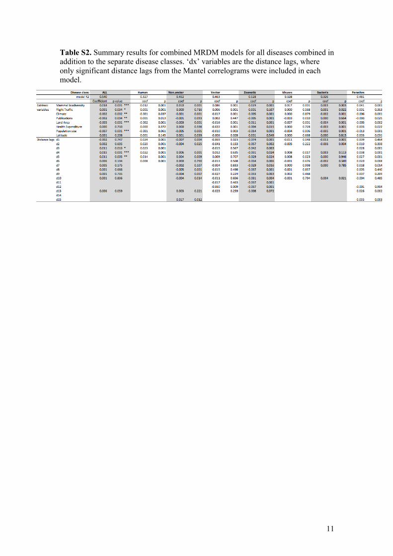
Table S2. Summary results for combined MRDM models for all diseases combined in addition to the separate disease classes. ‘dx’ variables are the distance lags, where only significant distance lags from the Mantel correlograms were included in each model.

12
Appendix S1 – Methodological details and Results of the Ebola-specific co-zone test case Rationale and Methods We treated Ebola virus spillover as if it were a completely novel and as yet undescribed disease. We assumed that spillover cases across multiple countries looked sufficiently alike to suspect a single causative agent but that no causative agent or other ecological clues about its origin had yet been described, other than it was strongly suspected to be zoonotic on the basis of all suspected cases reporting direct contact with dead wildlife.
To generate an Ebola-specific co-zone layer, we summed and took the average of the pairwise similarity values (1-βsor) for zoonotic diseases across all Ebola countries relative to all other countries at four separate time points (1976 = DRC, Sudan; 1994 = 1976 + Cote d’Ivoire + Gabon; 2000 = 1994 + Uganda + Republic of Congo; 2014 = 2000 + Guinea), reflecting the addition of Ebola positive countries through time. Strain differences were not considered separately in this analysis in order to remain consistent with the hypothetical assumptions (i.e., not having any specific information about the disease), with an Ebola country being defined by the presence of a primary spillover case of any African strain (Zaire, Sudan, Bundibugyo and Tai Forest).
Validation
For validation, we first qualitatively evaluated the ability for Ebola co-zone models in one time point to flag higher risk countries for recording new Ebola cases in the next time point. To do this, we created a ranked list of countries sorted by their disease assemblage similarity to the Ebola positive countries in each time point and assessed whether higher ranked countries were more likely to become Ebola-positive at the next time step.
Second, we compared results of the 2014 model (all 8 Ebola countries included) to the ‘at risk’ countries identified by Pigott et al. (5), which were derived from an ecological niche model for Ebola developed from Ebola-specific data at a much higher resolution. Specifically, we produced a top 22 list of countries ‘at risk’ of Ebola based purely on patterns of zoonotic infectious disease co-occurrence and evaluated its congruence with the list of 22 ‘at risk’ countries produced by Pigott et al. (5).
Results Past outbreaks Ebola co-zones calculated at each time point were qualitatively effective at shortlisting ‘at risk’ countries subsequently becoming Ebola positive countries in the next time point. Specifically, the 1976 model (Fig 3a) placed countries subsequently recording cases in 1994 amongst the higher risk countries (Gabon rank 13, avg βsor = 0.84; Cote D’Ivoire rank 27, avg βsor = 0.79), the 1994 model (Fig 3b) placed countries subsequently recording cases in 2000 among the highest risk countries (Republic of Congo rank 3, avg βsor = 0.88; Uganda rank 8, avg βsor = 0.86), and the

13
2000 model (Fig 3c) placed Guinea as a relatively high risk for Ebola (rank 41, avg βsor = 0.77). Our model also suggested that in the lead up to the 2014 outbreak, West Africa was identifiable as a region at risk for future Ebola outbreaks on the basis of historical zoonotic co-occurrence patterns, contrary to what was regarded before 2014 as the area in which Ebola virus was endemic (11). Six West African countries appeared on our top 22 list from the 2000 model (Nigeria, Liberia, Cote D’Ivoire, Niger, Sierra Leone and Benin). However, our model did not flag Guinea (rank 41. avg βsor = 0.77) specifically as being the most likely source of the current outbreak compared to the other countries subsequently affected which ranked higher (Liberia rank 6, avg βsor = 0.87; Sierra Leone rank 20, avg βsor = 0.82). While our models could also be run with individual Ebola strains to improve specificity of the predictions, outbreaks of any strain is the observational unit most relevant to this study since we assumed we had no information about the disease other than it being of suspected zoonotic origin (see Methods). Niche modeling Compared to recent Ebola niche modeling from high resolution spatial data (5), our 2014 Ebola co-zone model placed all countries considered ‘at risk’(N=22) from the Pigott study in the top 36 countries in terms of the similarity of zoonotic disease assemblages to Ebola positive countries (SI Appendix Table S1). Our top 12 countries were all on Pigott et al.’s top 22 list, while our top 22 had 63.6% overlap (14/22) with the ‘at risk’ countries predicted by Pigott et al. (5). Both studies thus agreed that Congo, Democratic Republic of Congo, Gabon, Nigeria, Uganda, Liberia, Sudan, Cote D’Ivoire, Cameroon, Central African Republic, Angola, Madagascar, Togo and Malawi were at relatively high risk. Six of the seven countries that have produced primary cases of Ebola appear here (Congo, DRC, Gabon, Uganda, Sudan, Cote D’Ivoire; Guinea is the exception). Given the agreement between studies, the remaining countries that appear here should also be considered at the highest risk of future novel cases of Ebola spillover, including Nigeria, Liberia, Cameroon, Central African Republic, Angola, Madagascar, Togo and Malawi (SI Appendix Table S1). The remaining 8 countries on Pigott et al.’s top 22 list that were not included on our top 22 included Ethiopia, Sierra Leone, Ghana, Tanzania, Burundi, Mozambique, Guinea and Equatorial Guinea. These countries exhibit areas of environmental suitability consistent with past Ebola outbreaks (as per Pigott et al.), and our study ranked them all inside the top 36 countries that exhibit the most similar disease assemblages to Ebola producing countries (range of avg βsor = 0.89 - 0.81 for countries ranked 1-36). All of these countries could thus also be considered at risk of future cases of Ebola spillover on the basis of historical zoonotic disease co-occurrence patterns (SI Appendix Table S1). The remaining 8 countries in our top 22 that were not on Pigott et al.’s list included Zimbabwe, Chad, Benin, Niger, Senegal, Eritrea, Zambia and Somalia. All of these countries border Pigott et al’s (5) ‘at risk’ countries. Future cases of Ebola appearing in these countries, either as primary cases or by the movement across borders of infected people, seem relatively likely, as indicated by historical patterns of zoonotic disease co-occurrence (SI Appendix Table S1).
14
Our model placed 6 countries ahead of Equatorial Guinea (our lowest ranked country of Pigott et al’s ‘at risk’ countries, avg βsor = 0.81) that were outside both studies’ top 22. These were Rwanda, Mali, Burkina Faso, Gambia, Kenya, and Sao Tome and Principe. With the exception of Gambia and Sao Tome and Principe, all of these countries are border countries to Pigott’s top 22, while Sao Tome and Principe lies off the coast of Gabon (an Ebola positive country). Again, future cases of Ebola appearing in these countries, either as primary cases or by the movement across borders of infected people, seem plausible on the basis of historical zoonotic disease co-occurrence patterns and should be considered potentially at risk (SI Appendix Table S1).

15
Appendix S2 – Turnover and Nestedness components of Sørensen dissimilarity We followed Baselga (1) in partitioning out these components of beta diversity. Baselga (1) shows that βsor is comprised of these two additive components, reflecting the fractions of total dissimilarity derived from turnover and nestedness, respectively. Baselga (1) also shows that the turnover fraction of βsor is equivalent to Simpson’s dissimilarity index (βsim), which is a richness independent index first proposed by Simpson (2). In the case of equal disease richness between two countries, βsor = βsim , since all components of dissimilarity are attributable to turnover (i.e., there can be no nestedness component). However, in the case of unequal richness, the difference between βsor and βsim is equal to the nestedness component of overall dissimilarity. Baselga (1) defined this as βnes , such that βsor = βsim + βnes (see Baselga 2010 for equations and proof).

16
Appendix S3 – Clustering methodological details
In addition to ordination, we performed hierarchical cluster analyses (linkage function unweighted pair-group method using arithmetic averages, UPGMA) on the dissimilarity matrices to assess the qualitative fit between zoogeographic and pathogeographic patterns. Kreft and Jetz (3) suggest that cluster analyses form the basis for defining statistically supported groups or regions in biogeographic analyses. Clustering was used here only to assess the qualitative fit between zoogeographic and pathogeographic patterns. We thus chose a priori k=12 groups for direct comparison with previous biogeographic analyses on vertebrates (3). Cluster analyses were performed with the ‘hclust’ function in R (base stats) (4).

17
Appendix S4 – Methodological details of deriving extrinsic predictor variables for use in MRDM models
We derived pairwise ‘distance’ (or dissimilarity) matrices for the explanatory variables congruent with our response matrix (disease dissimilarity). ‘Distance’: We calculated the minimum distance (closest border to border distance in km) between all country pairs with the ‘distmatrix’ function in the R package cshapes (6). Extrinsic variables: ‘Mammals’: We calculated pair-wise mammal dissimilarity (using the same methods and indices as for diseases described above) after generating lists of mammal species occurring in all countries globally from publicly available mammal distribution data maintained by IUCN (http://www.iucnredlist.org/technical-documents/spatial-data) using QGIS (7). All disease dissimilarity matrices and the mammalian dissimilarity matrix were converted to its similarity form (1- βsor ) and log transformed. ‘Climate’: We calculated a metric of climatic dissimilarity from the Global Environmental Stratification (GEnS) dataset (8), which is a ‘statistically derived global bioclimate classification’ system that stratifies the Earth's surface into zones of similar climate using a single scalar measure. We generated a pair-wise climate dissimilarity matrix for all country pairs by calculating the absolute difference in mean GEnS values (sqrt transformed for analyses). Mean values by country and the scale used shown below (cf. high resolution results presented in (8), Fig. 2 (note different color scale used)).
‘Flight traffic’: We calculated the volume of direct flight traffic between all pairs of countries using the IATA dataset, , supplied by Diio, LLC through their APGdat service (9) and the methods described in Hosseini et al. (10). Inbound and outbound flights between country pairs were highly correlated (R2 = 0.99), so rather than averaging we used only inbound flights (log transformed) as a proxy for the volume of human air traffic between country pairs. Indirect flights (i.e., those requiring a third country connection) were not considered. ‘Publications’: We calculated an index to proxy the difference in observation effort for infectious diseases based on the volume of published literature taking place in each country. We programmatically extracted place names from all studies published in the PubMed Open Access Subset (http://www.ncbi.nlm.nih.gov/pmc/tools/openftlist) and plotted these in space using the GeoNames database (http://www.geonames.org) for name matching to estimate
18
the geographic distribution of medically relevant observation effort globally. We summed the number of publications to country level for use as an index of observation effort in MRDM analyses (log transformed). ‘Latitude’: We calculated the absolute difference in mean latitude (sqrt transformed) for all country pairs from the open access Countries of the World (COW) database hosted by the Americas Open Geocode (AOG) database (http://www.opengeocode.org/download/cow.php). ‘Expenditure’: We calculated the absolute difference (log transformed) in per capita health expenditure between countries from World Bank data. ‘Population’: We calculated the absolute difference (log transformed) in human population size between countries from World Bank data. ‘Area’: We calculated the absolute difference (log transformed) in land area between countries from World Bank data (http://data.worldbank.org/). All World Bank data were for the year 2010.

19
References
1. Baselga A (2010) Partitioning the turnover and nestedness components of beta diversity. Glob
Ecol Biogeogr 19(1):134-143. 2. Simpson GG (1943) Mammals and the nature of continents. American Journal of Science
241(1):1-31. 3. Kreft H & Jetz W (2010) A framework for delineating biogeographical regions based on
species distributions. J Biogeogr 37(11): 2029-2053. 4. R Core Team (2012) R: A language and environment for statistical computing. https://www.r-
project.org/ 5. Pigott DM, et al. (2014) Mapping the zoonotic niche of Ebola virus disease in Africa.
Elife 3:e04395. 6. Weidmann NB & Gleditsch KS (2010) Mapping and measuring country shapes. The R
Journal 2(1):18-24. 7. QGIS Development Team (2014) QGIS Geographic Information System. Open Source
Geospatial Foundation Project. http://www.qgis.org/en/site/ 8. Metzger MJ, et al. (2013) A high-resolution bioclimate map of the world: a unifying
framework for global biodiversity research and monitoring. Glob Ecol Biogeogr 22(5):630-638.
9. LLC D (2009) apgDat Diio, LLC. 10. Hosseini P, Sokolow SH, Vandegrift KJ, Kilpatrick AM, & Daszak P (2010) Predictive Power
of Air Travel and Socio-Economic Data for Early Pandemic Spread. PLoS ONE 5(9):e12763. 11. Baize S, et al. (2014) Emergence of Zaire Ebola virus disease in Guinea. N Engl J Med
371(15):1418-1425.