1- date timepicker 2- month calendar 3- user defined controls
TRANSCRIPT

1- Date TimePicker2- Month Calendar
3- User Defined Controls

2

DateTimePicker
• DateTimePicker allows us to select date and time.
• DateTimePicker is based on the control class. When we click on the drop-down arrow on this control it displays a month calendar from which we can make selections.
• When we make a selection that selection appears in the textbox part of the Date TimePicker.

Notable Properties of Date TimePicker
• The Format property in the Appearance section is used to select the format of the date and time selected.
• Default value is long which displays the date in long format. Other values include short, time and custom

Behavior Section • The CustomFormat property allows us to set the
format for date and time depending on what we like. To use the CustomFormat property we need to set the Format property to Custom.
• The MaxDate Property allows us to set the maximum date we want the Date TimePicker to hold. Default MaxDate value set by the software is 12/31/9998
• The MinDate Property allows us to set the minimum date we want the Date TimePicker to hold. Default MinDate value set by the software is 1/1/1753 .

2-MonthCalendar
• The MonthCalendar control allows us to select date.
• The difference between a DateTimePicker and MonthCalendar is, in MonthCalendar we select the date visually and in Date TimePicker when we want to make a selection we click on the drop-down arrow and select the date from the MonthCalendar which is displayed.

Notable Behavior properties of MonthCalendar
• FirstDayOfWeek: Default value is Default which means that the week starts with Sunday as the first day and Saturday as last. You can set the first day of the week depending upon your choice by selecting from the predefined list with this property.
• ShowToday: Default value is set to True which displays the current date at the bottom of the Calendar. Setting it to False will hide it.

• ShowTodayCircle: Default value is set to True which displays a red circle on the current date. Setting it to False will make the circle disappear.
• ShowWeekNumber: Default is False. Setting it to True will display the week number of the current week in the 52 week year. That will be displayed towards the left side of the control.


• Visual Studio .NET allows developers to share their custom controls with other developers.
3- User-Defined Controls
User-Defined ControlsTo create a UserControl that can be exported to other solutions, do the following:
1. Create a new Windows Control Library project.2. Inside the project, add controls and functionality to the UserControl

3. Build the project. Visual Studio .NET creates a .dll file for the UserControl in the output directory. The file is not executable. Select Project > Properties to find the output directory and output file.
4. Create a new Windows application.
5. Import the UserControl. In the new Windows application, right click the ToolBox, and select Customize Toolbox.... In the dialog that appears, select the .NET Framework Components tab. Browse for the .dll file, which is in the output directory for the Windows control library project. Click the checkbox next to the control, and click OK
User-Defined Controls

User-Defined Controls

User-Defined Controls

• 6. The UserControl appears on the ToolBox and can be added to the form as if it were any other control.
User-Defined Controls

User-Defined Controls

• Control classes do not have a Main method—they cannot be run by themselves.
• To test their functionality, add them to a sample Windows application and run them there.
User-Defined Controls

ExampleExample• Create a UserControl called LoginPasswordUserControl. • The LoginPasswordUserControl contains the following:
o Label (loginLabel) that displays String “Login:”.o TextBox (loginTextBox) where the user enters a login name.o Label (passwordLabel) that displays the String “Password:”o TextBox (passwordTextBox) where a user inputs a password
• LoginPasswordUserControl must provide Public read-only properties Login and Password that allow an application to retrieve the user input from a login TextBox.
• Use the new control in application that displays the values input by the LoginPasswordUserControl.
18

19
SolutionSolution
• In order to create LoginPasswordUserControl application, do the following:1. Custom control (Class Library)(Class Library)
Create your custom control “LoginPasswordUserControl” from other predefined controls , TextBoxes and Labels and add required functionality to it. Then it will appears in the user’s ToolBox .
2. Application (Windows application)(Windows application)Share the “LoginPasswordUserControl” by adding it into a Form and add more controls and functionalities.

1. Create a new Class Library named “LoginPasswordUserControl”.

2. Delete the file named “Class1.vb” that is initially provided with the project.

3- Right click the project in the Solution Explorer and select Add> User Control… in the dialog that appears, name the user control “LoginPasswordUserControl” file and click Add.
23
Class LibraryClass Library
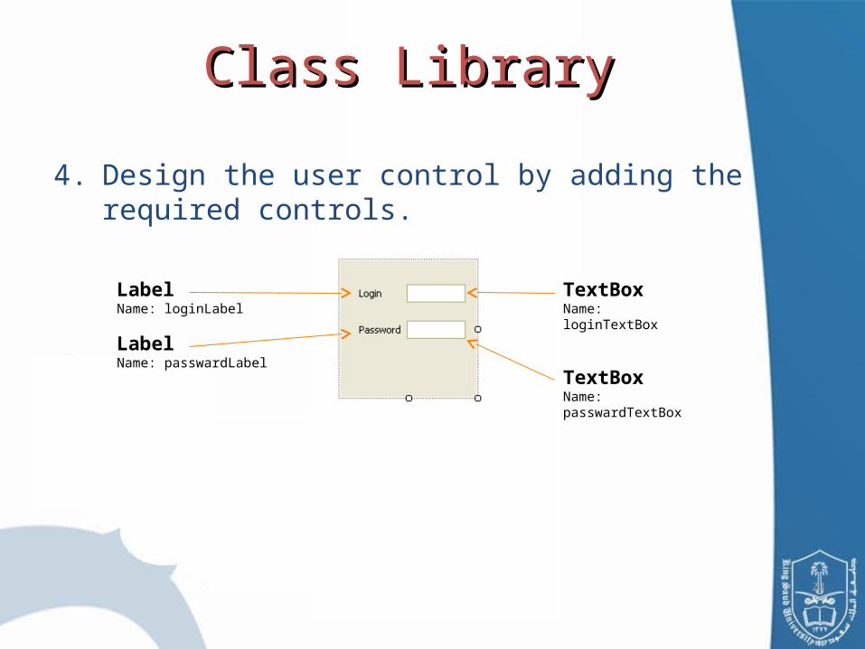
4. Design the user control by adding the required controls.
TextBoxName: loginTextBox
TextBoxName: passwardTextBox
LabelName: loginLabel
LabelName: passwardLabel

24
• Change the PasswardChar property of the passwardTextBox
to “*”.
• In order for the TextBoxes to change in the Windows application; change its Modefier property to “Public”

25
5. Build the project and the Visual Studio will create a .dll file in the solution’s bin/Release directory.
( Note: class libraries are not executable files, they are used to define classes
that are reused on other executable applications)

1. Create a Windows application and name it
“LoginPasswordUserControlApp”.
Windows ApplicationWindows Application

27
Windows ApplicationWindows Application2. Right click the Toolbox and select Choose Items…

28
In the dialog, click Browse… and locate the .dll file for the class library you already created in the Class Library (step 6). The item will then appear in the Choose ToolBox Items dialog. If it is not already checked, check this item.

29
Note: By completing step 2,the user control is now listed in the Toolbox, and can be added to the any Form as if it were any other control. You may add more controls and functionality to the Form as needed.

30
3. Add a Button “OK” to your Form.
4. Add functionality to your controls, by adding the following:

31
5 -Build and debug