1 census 2010: new hampshire’s shifting landscape mapping recent changes in the state’s...
TRANSCRIPT

1
Census 2010: New Hampshire’s
shifting landscapeMapping recent changes in the
state’s population patterns
March 2011

2
Data released earlier this week by the U.S. Census Bureau paints an interesting portrait of the population changes that shaped New Hampshire over the past decade.The following maps, prepared by Center staff, illustrate a handful of those data points. They don’t necessarily answer any questions about New Hampshire’s future. But they do raise questions about the policy pressures, challenges and opportunities facing the state in the coming years.
A shifting landscape

33
• Here’s a basic overview of New Hampshire’s population according to the Census data from 2010. Not many surprises here.
• The most densely populated areas are in the state’s southern areas, particularly Rockingham, Hillsborough and Merrimack counties.
• The highest population centers are in and around Manchester and Nashua, with pockets of density scattered in the cities.
• The North Country remains sparsely populated.
• Total state population increased 6.5 percent since 2000, with 1.3 million people now calling New Hampshire home. But let’s look at how that population has shifted over the past decade…..

4
• This map details where the growth and loss in population, town by town, occurred since 2000.
• Some obvious points: the biggest increases came in Hillsborough and Rockingham counties. We can also see the influence that Interstate 93 has on population growth over the past decade.
• Other pockets of large increase: the Conway and Plymouth regions, the Lakes Region and the Upper Valley. We’ll return to those later.
• And while nearly every region saw some increase in population, the declines were focused largely on the North Country.
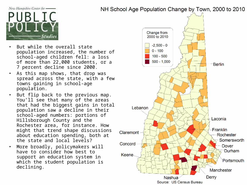
5
• But while the overall state population increased, the number of school-aged children fell: a loss of more than 22,000 students, or a 7 percent decline since 2000.
• As this map shows, that drop was spread across the state, with a few towns gaining in school-age population.
• But flip back to the previous map. You’ll see that many of the areas that had the biggest gains in total population saw a decline in their school-aged numbers: portions of Hillsborough County and the Rochester area, for instance. How might that trend shape discussions about education spending, both at the state and local levels?
• More broadly, policymakers will have to consider how best to support an education system in which the student population is declining.

6
• This map, illustrating where the growth in housing units occurred over the past decade, underscores several trends in New Hampshire’s growth.
• First, the importance of major transportation lines, such as I-93, in shaping population patterns. How will that influence future discussions about investments in the infrastructure?
• And while nearly every community saw a growth in housing over the decade, several other pockets are obvious: the Lakes Region and the White Mountains, particularly the Conway area. These is likely due to a growth in seasonal homes, but how might that trend shape discussions about property values and the ability of the state’s amenities (its mountains and lakes) to attract newcomers?

7
• The state’s Hispanic population increased nearly 80 percent since 2000, though in relatively small numbers overall: from 20,500 to 36,700 over the past decade.
• Nearly every community in the state saw an increase in the Hispanic population, with the biggest increases concentrated in cities and the towns along the southern stretch of I-93.
• One point to consider: Nationwide, Census numbers indicate that Hispanics made up more than half of all population growth nationwide since 2000. New Hampshire has typically been a state that relied on in-migration to grow, but how will that change if future growth nationally is driven largely by a population that has not traditionally been drawn to the state?

8
• One of the big political debates that will follow from the new Census data is the redrawing of the state’s legislative districts. We don’t know where or how those new borders will be drawn. But we offer the following two maps, which can be a start to that conversation.
• The map at right shows the boundaries of the current House districts. The colors indicate whether those districts will likely have to be increased or decreased in size. The lighter colors indicate districts that have too small a population for their current level of representation in Concord, while the two darker colors indicate those districts where the population now exceeds the number of people needed for a single representative.

9
• This map shows the same information for the New Hampshire State Senate. When lawmakers redraw these lines in the coming months, they’ll likely have to increase the size of any district in light brown or tan (where the population has fallen below the level required for each Senate district). Similarly, they’ll likely have to decrease the size of districts in dark brown and red (where population increases have been highest.)
• Note that District 13, centering on Nashua, now has the biggest variance from the “ideal” number of residents for a state Senate district.

10
Want more?
• For more information on New Hampshire demographics, as well as many other public policy issues, visit the Center’s website at nhpolicy.org.
• For more U.S. Census data, go to census.gov.
• Check out the Center on Facebook: facebook.com/nhpolicy