teasers headlines byline display head initial cap standing head index logo…. and many more...
TRANSCRIPT

History and Current Trends of
News Design

Teasers Headlines Byline Display head Initial cap Standing head Index Logo…. And MANY more (see your handout)
First, some terms to know…

Publick Occurences, America’s first
newspaper, made its debut 300 years ago. But like most colonial newspapers, it was printed on paper smaller than the pages of a typical book and more like a pamphlet or newsletter
Most colonial weeklies ran news items one after another in deep, wide columns of text. There were no headlines and very little art.
After the Revolutionary War, dailies first appeared and began introducing
The simple beginnings
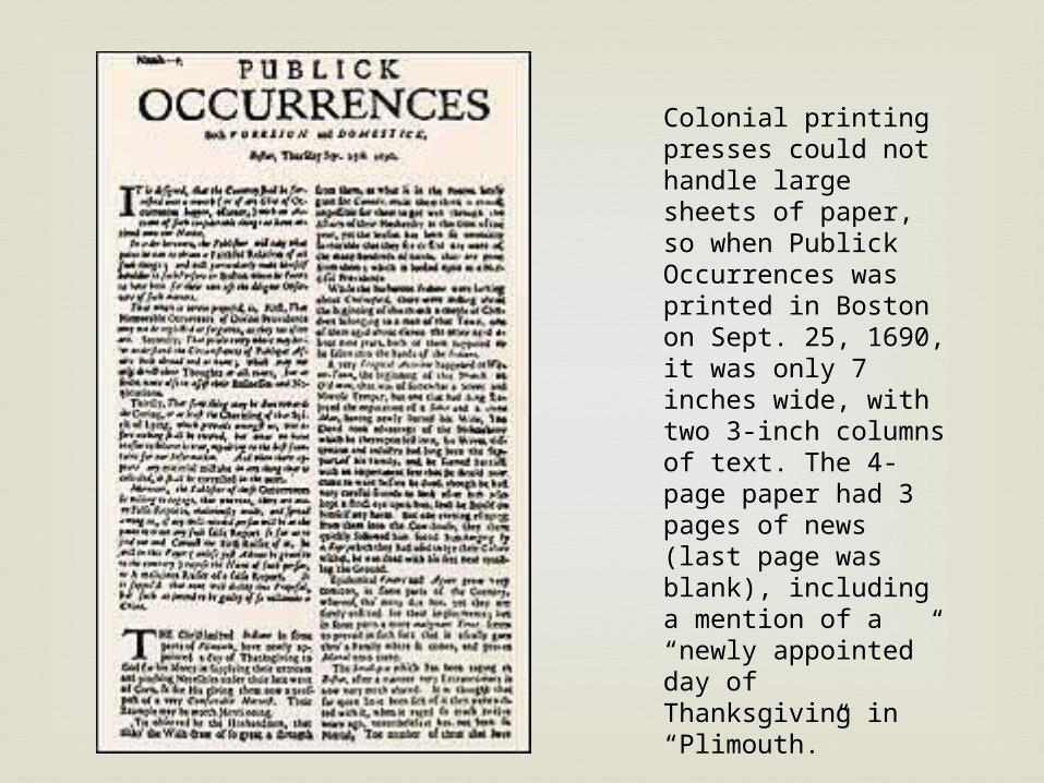
Colonial printing presses could not handle large sheets of paper, so when Publick Occurrences was printed in Boston on Sept. 25, 1690, it was only 7 inches wide, with two 3-inch columns of text. The 4-page paper had 3 pages of news (last page was blank), including a mention of a “newly appointed” day of Thanksgiving in “Plimouth.”

Throughout the 19th century, all newspapers
looked more or less the same. Text was hung like wallpaper, in long rows, with vertical rules between columns. Maps or engravings were sometimes used as art.
During the Civil War, papers began devoting more space to headline display, stacking vertical layers of deckers, or decks, in a dizzying variety of typefaces.
News photos did not become common until the early 1900s.
The 19th century
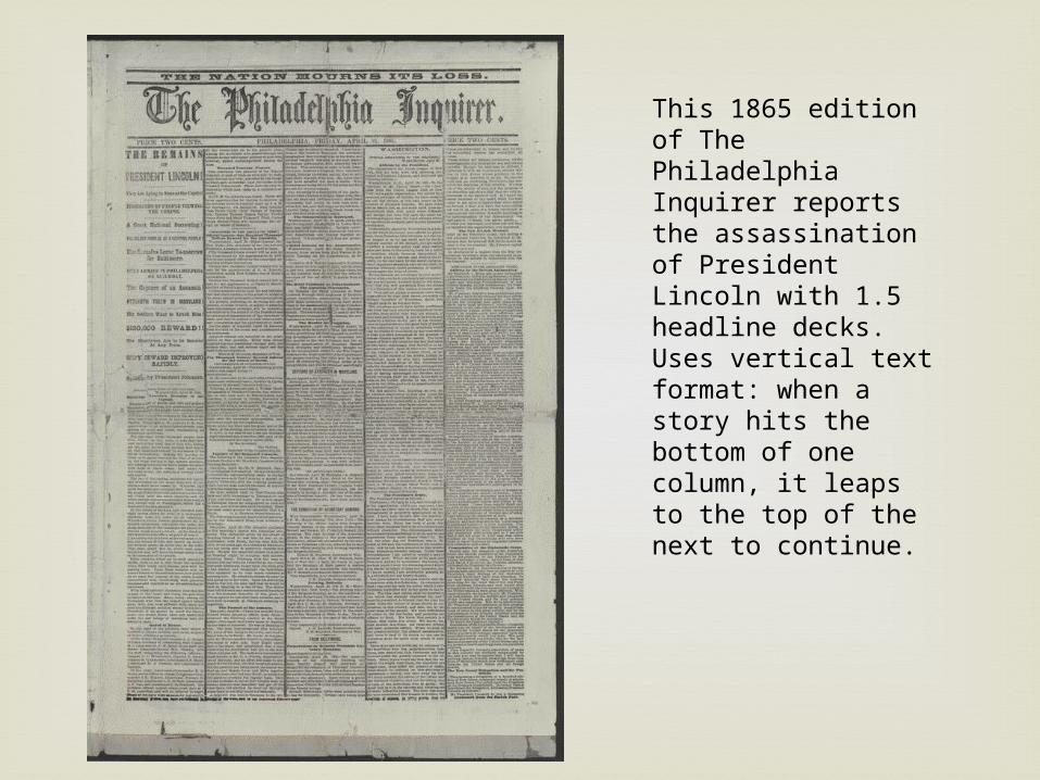
This 1865 edition of The Philadelphia Inquirer reports the assassination of President Lincoln with 1.5 headline decks. Uses vertical text format: when a story hits the bottom of one column, it leaps to the top of the next to continue.
By about 1900, newspapers began looking
more like newspapers. Headlines grew bigger, bolder and wider Deep stacks of decks gradually eliminated Page design developed greater variety as news
became departmentalized The 20’s saw the rise of tabloids- small, half-
sheet papers packed with photos and sensational headlines
The early 20th century

This 1898 edition of the New York Journal tries to stir up readers with sensational allegations about the destruction of troops. Notice how loud the type is and how horizontal the page’s design elements are: The headline, the illustrations and even the text run the full width of the page in a very symmetrical layout.

By today’s standards, even the best looking
papers from 20 years ago look clumsy and old fashioned.
Most of the current trends in page design were in place by the late 60’s More and bigger photos Quieter, more refined headline type A move from -8 and -9 column pages to a
standard 6-column page White gutters between columns instead of rules
The not too distant past…

The 1966 front page from The Times is astoundingly bad-but to be fair, typical of the 1960’s. The bizarre shapes of photos stories collide in a disorganized jumble.

Current trends
Newspaper Websites

The term “newspaper website” refers to any news-related website that
has the editorial focus of an online periodical. Many of the websites mentioned here are the online versions of major newspapers, but others are standard news websites and some blur the line between news website and blog.
Regardless of what type of news they cover, they all face the challenge of displaying a huge amount of content on the home page, which creates plenty of layout, usability and navigational challenges for the designer.
The lessons that can be learned from examining how news websites address these challenges can be valuable for designers who work with other types of websites, including ones with blog theme designs.
It’s interesting to see how they integrate advertisements in the design. In some cases, the ads are somewhat intrusive or excessive, but most news websites are able to use ads without turning readers away, in part because of the content that’s available.
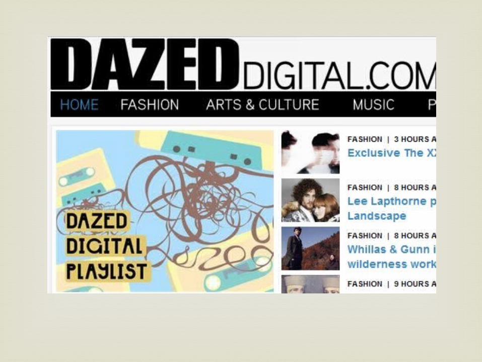
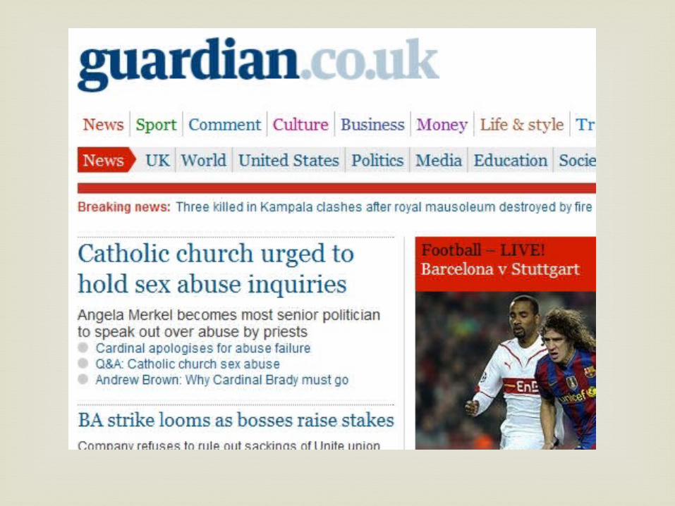
News websites

Color Schemes Header and sidebar banners Top navigation Tabbed content areas Grid-based layouts
Common Trends
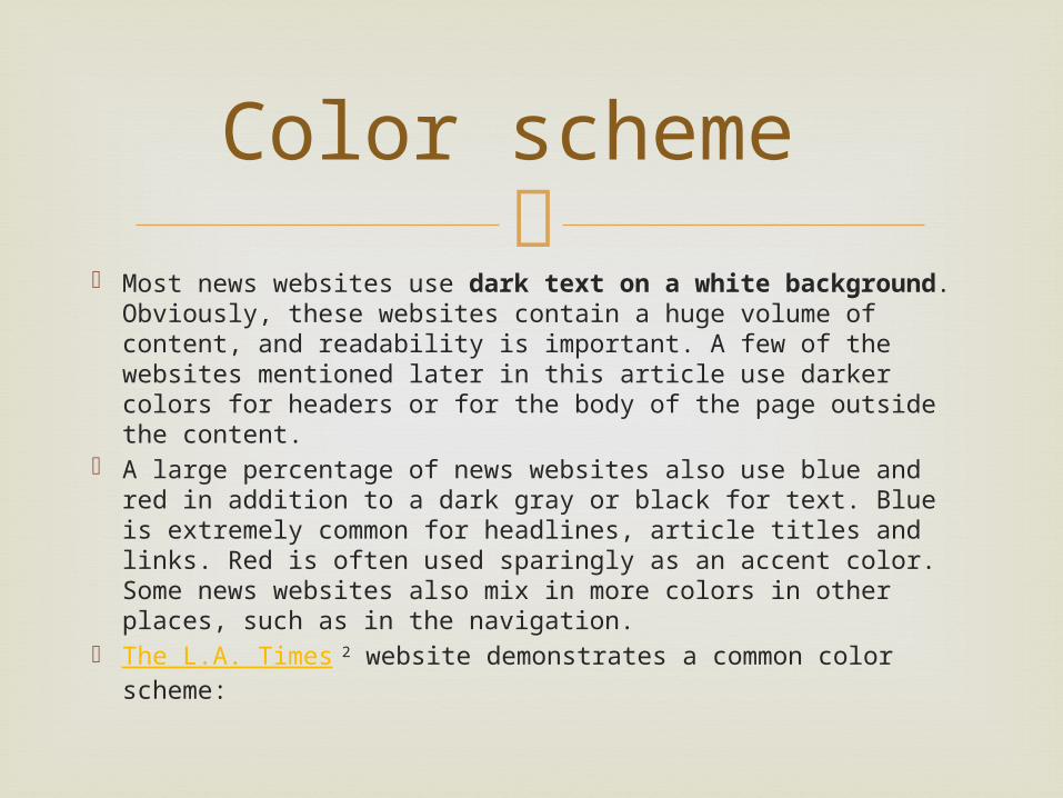
Most news websites use dark text on a white background.
Obviously, these websites contain a huge volume of content, and readability is important. A few of the websites mentioned later in this article use darker colors for headers or for the body of the page outside the content.
A large percentage of news websites also use blue and red in addition to a dark gray or black for text. Blue is extremely common for headlines, article titles and links. Red is often used sparingly as an accent color. Some news websites also mix in more colors in other places, such as in the navigation.
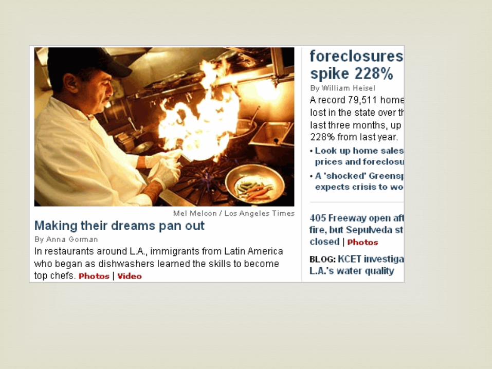
The L.A. Times 2 website demonstrates a common color scheme:
Color scheme
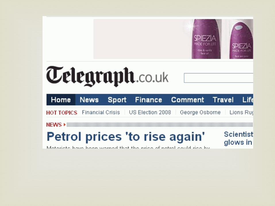
Of course, all of these websites need to produce
revenue, and banner ads in headers are a key source of income. Some websites use banner ads on all pages, and others exclude banners on the home page but display them above the header on other pages.
While blogs commonly use 125 by 125 pixel banners in sidebars, news websites commonly use 300 by 250 banners or tall skyscrapers. Many of the websites mix in some AdSense or other text link ads.
The Telegraph 4 uses a 730 by 90 pixel banner over its header.
Header and sidebar banners

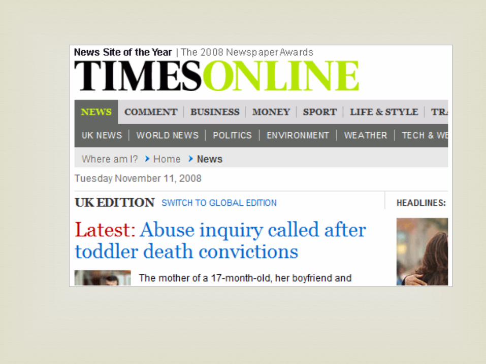
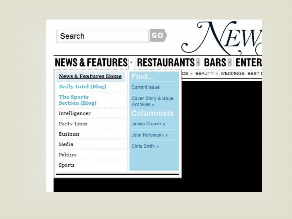
Although there are a few notable exceptions to
this trend, most news websites put their primary navigation menu just below the header and above the content. The New York Times 6 and MSNBC 7 are two of the exceptions, as they both use the left sidebar for the main navigation.
The Times Online uses a two-level navigation menu.
Top navigation

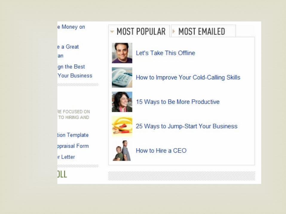
Many news websites use tabbed content areas
that allow visitors to see popular articles, recent articles, most commented articles, etc. This is sometimes used in the sidebar, and other times in the main content area, such as on Wired 9. This allows for more control by users over what content and links they see, and it can save space in the design by making more content accessible in a specific area.
Tabbed content areas

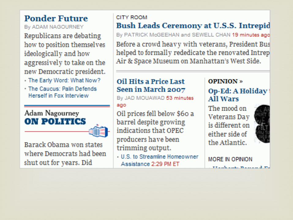
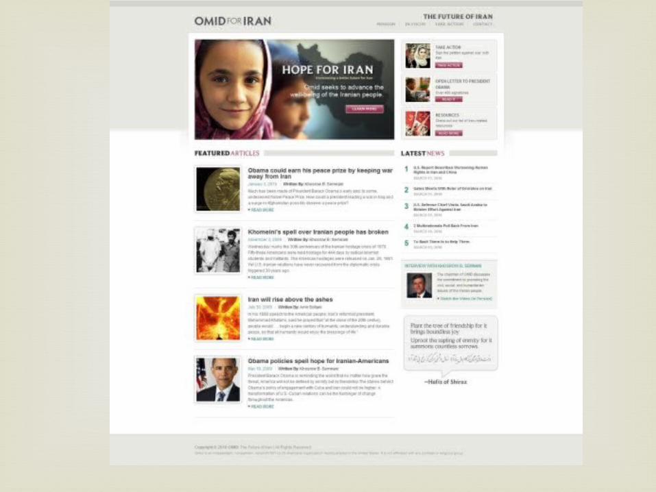
Newspaper websites are commonly built with
grid-based designs. The grid is a popular choice not only because of the sharp look it creates but because it’s one of the most effective ways to manage and organize a large amount of content. The New York Times
11 has one of the more well-known grid-based layouts.
Grid-based layouts


The line between a news website and a blog is
a fine one, and the two types are difficult to distinguish sometimes. For the purpose of this article, “blog” refers more to a traditional blog than to a commercialized news blog by a team of writers. While there are certainly similarities between blogs and news websites, there are also some key differences. Social media integration RSS feeds Comments
News websites versus blogs


Current trends
Web Design
White/Light Backgrounds:
Like most content-heavy sites, news and magazine-style sites tend to have white or light-colored backgrounds, which is generally better for readability. Of course, there are exceptions to this, but especially among the major news sites, white backgrounds rule.
Current trends: web design

Grid-based
Layouts of news sites are often grid-based. Grids are especially effective for these types of sites because there are generally several columns and lots of articles excerpts and sub-sections throughout the front page. The grid helps to keep the content well-spaced and scannable.
Current Trends: Web Design


Typography as a design element
News sites have to fit a lot of content onto the page. There is of course text and headlines, images, navigation, advertisements, and it all results in pages that frequently don’t have a lot of excess design elements. the grid layout and typography wind up being a significant design element on many news and magazine sites.
Current Trends: Web Design


Image thumbnails
Most news or magazine-style sites include links to a lot of articles or posts from the front page. It’s very common for these articles to have a thumbnail image associated with them, especially for lead stories.
Current Trends: Web Design


Prominent Site Search
With so much content on the site, a site-wide search is critical to helping visitors find what they are looking for. Most news or magazine sites will include a site search in a prominent location that can be found quickly and easily. In many cases it is at the top of the page. Having a site search that is easy to find and effective at providing accurate results will help to keep visitors on the site and to improve usability.
Current Trends: Web Design


Category-based Navigation
With lots of content on a site it becomes necessary to have navigation that is logical and simple. Most news sites categorize the articles and allow visitors to find what they are looking for by providing category-based navigation.
Current Trends: Web Design

Horizontal Navigation menu
Although horizontal navigation menus are rather common on almost any type of site, they are especially common on news sites. Vertical menus are sometimes used for sub-navigation, but very few news sites use them for the primary navigation.
Current Trends: Web Design

Drop Down Menus
Many of these horizontal menus are drop down or mega menus that expand to provide visitors with more options. With lots of content in various categories and su-categories, these types of menus can make it easier for visitors if they know where they want to go.
Current Trends: Web Design

Section for Video Content
In recent years as video has become more common online more news sites have established specific sections for video content. Often times the front page or the sidebar will include a section that showcases recent videos added to the site.
Current Trends: Web Design


Popular content sections
With content that is added very quickly and frequently, helping visitors to find something is an important part of usability. Many news sites choose to show links to articles that are currently popular, this is frequently in the sidebar.
Current Trends: Web Design
Social Media Integration
Like many blogs, most news sites are now including social media and social networking integration. In some cases it may be voting buttons, or it could be links to Twitter and Facebook profiles
Current Trends: Web Design


Righthand Sidebars
Although some news sites use a sidebar at the left side, the typical layout is to have a right sidebar. In most cases this applies to the front page and to content pages.
Current Trends: Web Design
http://vandelaydesign.com/blog/design/news-
websites/
http://www.smashingmagazine.com/2008/11/11/newspaper-website-design-trends-and-examples/
Works cited