world spatiotemporal analytics and … · world spatiotemporal analytics and mapping project...
TRANSCRIPT
WORLD SPATIOTEMPORAL ANALYTICS AND MAPPING PROJECT (WSTAMP): DISCOVERING, EXPLORING, AND MAPPING SPATIOTEMPORAL PATTERNS
ACROSS THE WORLD’S LARGEST OPEN SORUCE DATA SETS
Robert Stewarta, Jesse Piburnb, Alex Sorokinea, Aaron Myersa, Jessica Moehlb, and Devin Whitea
aOak Ridge National Laboratory, 1 Bethel Valley Road, Oak Ridge, TN 37831 - (stewartrn, sorokina, myersat, whiteda1)@ornl.gov bOak Ridge Associated Universities, 1 Bethel Valley Road, Oak Ridge, TN 37831 - (piburnjo, moehljj)@ornl.gov
KEY WORDS: Global, Data Mining, Spatiotemporal, Visualization, Tool, Analytics ABSTRACT: The application of spatiotemporal (ST) analytics to integrated data from major sources such as the World Bank, United Nations, and dozens of others holds tremendous potential for shedding new light on the evolution of cultural, health, economic, and geopolitical landscapes on a global level. Realizing this potential first requires an ST data model that addresses challenges in properly merging data from multiple authors, with evolving ontological perspectives, semantical differences, and changing attributes, as well as content that is textual, numeric, categorical, and hierarchical. Equally challenging is the development of analytical and visualization approaches that provide a serious exploration of this integrated data while remaining accessible to practitioners with varied backgrounds. The WSTAMP project at Oak Ridge National Laboratory has yielded two major results in addressing these challenges: 1) development of the WSTAMP database, a significant advance in ST data modeling that integrates 10,000+ attributes covering over 200 nation states spanning over 50 years from over 30 major sources and 2) a novel online ST exploratory and analysis tool providing an array of modern statistical and visualization techniques for analyzing these data temporally, spatially, and spatiotemporally under a standard analytic workflow. We discuss the status of this work and report on major findings.
1. INTRODUCTION
Major datasets from sources like the World Bank (WB), United Nations (UN), and the World Health Organization (WHO), provide a wealth of national level geographic, socio-economic, health, and environmental data, collectively providing decades of information on thousands of attributes with spatial coverages ranging from small territories to the entire globe. These sources have served as major assets to academia, government, and economic domains providing important information for studies and inquiries that advance science and inform policy makers. We assert that the application of advanced spatiotemporal (ST) analytics within and across these datasets holds tremendous potential for shedding new light on the evolution of cultural, health, economic, and geopolitical landscapes. Two major challenges exist in realizing this potential. First, we are unaware of any publically available ST database integration of these major global data sets. Aggregators such as World Bank and United Nations certainly exist, where smaller vendors contribute data for wider dissemination. We refer here to higher integration across these major data vendors. Secondly, although the number of highly useful online data visualization tools continues to grow both in count and capability, we have yet to encounter a web tool capable of providing a serious collection of spatiotemporal analytics. For example, the World Bank provides a handful of visualization tools including the World Bank Data Visualizer (World Bank, 2015) and the eAtlas (World Bank, 2015b). The World Bank Data Visualizer provides users with a single visualization method, a motion bubble chart with filtering capabilities. While this method is valuable, having only a single visualization method and no analytical capabilities limits the tool’s usefulness for conducting deeper analytics. The eAtlas has expanded capabilities from the Data Visualizer, providing users a map,
chart, and table views for World Bank data, but as the name suggests the eAtlas is intended to be a reference source and is not a platform for analysis. An example of a more robust tool that an organization provides for exploration and visualization of their data is the World Integrated Trade Solution (WITS) tool (World Bank & UNCTAD, 2015) hosted by World Bank in collaboration with United Nations Conference on Trade and Development (UNCTAD). Relying heavily on treemap visualizations, WITS allows users to explore various aspects related to international trade data. While WITS is a mature platform for data exploration, no analytical capabilities are provided and the tool is specific to the international trade data collected by its developers. The examples mentioned so far have been tools tied to the exploration of a particular database. Google’s Public Data Explorer (Google, 2015) is different in this aspect. The Public Data Explorer provides a limited number of visualizations that can be used across multiple databases; however, users can only explore data within one database at a time. For example, a user can explore WB data and a user can explore World Trade Organization (WTO) data but cannot compare a WB indicator to a WTO indicator. Online tools developed with rigorous analytical capabilities are much more limited in availability than tools focused only on visualization, especially tools developed for the analysis of spatiotemporal data. If a user wants spatiotemporal analysis and visualization beyond the simplest implementation, they are currently limited to desktop applications such as GeoVISTA Studio (Takatsuka & Gahegan, 2002) or STempo (Peuquet et al., 2015 in press). GeoVISTA Studio aims to provide a programming-free environment of spatiotemporal visualization and analysis. STempo is another desktop application for spatiotemporal analysis built for the analysis and discovery of
ISPRS Annals of the Photogrammetry, Remote Sensing and Spatial Information Sciences, Volume II-4/W2, 2015 International Workshop on Spatiotemporal Computing, 13–15 July 2015, Fairfax, Virginia, USA
This contribution has been peer-reviewed. The double-blind peer-review was conducted on the basis of the full paper. doi:10.5194/isprsannals-II-4-W2-95-2015
95

patterns resulting from spatiotemporal event data relying on an underlying analytical approach of T pattern analysis. While STempo provides spatiotemporal analytic capability, it is built for a specific use case and implements only one analytic approach. In the area of business intelligence, commercial platforms such as SAS Visual Analytics, IBM Cognos, and Domo provide robust tools to help companies explore and analyze their data. Larger organizations often provide tools for exploring and visualizing data themselves. These tools are developed around the specific data needs of each organization and are rarely available to anyone other than their client. Against this backdrop, the World SpatioTemporal Analytics and Mapping Project (WSTAMP) at Oak Ridge National Laboratory (ORNL) aims to lay the necessary foundations in multi-vendor data integration, methods, and tools for pursuing advances in interdisciplinary ST analytics within an online modeling environment. A number of novel results have emerged from this work thus far: WSTAMP Database: Integration of over 30 major sources under a single data model accounts for continual expansions of data over time, the ontological evolution of nation states, and varying vendor perspectives and information requirements. Currently the database contains over 10,000 attributes with 15 million data covering 5 decades and over 200 geographic entities. WSTAMP Tool: A novel online tool for selecting countries, attributes, and time frames for applying and visualizing spatiotemporal analytics within and across major data sources. Particularly novel is the application architecture which ties together open source assets such as OpenLayers, D3, R statistical programming language, and PostgreSQL data as services operating on scalable virtual infrastructure. Spatial PCA Trend Maps: A method of mapping principle temporal trends spatially that uncovers spatiotemporal patterns in a single static map. Attribute Portfolio Distance: Allows users to analyze the temporal and spatial patterns of portfolios of multiple attributes (e.g. economic, health, or military portfolios) over time. We anticipate the benefits of this work extending beyond the scope of the WSTAMP project, helping to advance the larger field of spatiotemporal analysis. We continue now with a background discussion followed by descriptions of the database, tool, and emerging analytics. We provide a simple example application and conclude with future work.
2. DATA MODEL
It is widely known that a great deal of global economic and environmental data supplied by governments and international organizations is available at the country level on regular time intervals. A closer inspection of these data surfaces an immediate challenge: what exactly is the set of countries? Table 1 shows the number of countries for major sources. Values vary for a number of reasons. Some authors simply follow more countries or regions than others. For example, the CIA World Factbook includes a number of island nations that others such as World Bank don’t include, for example, Palmyra
Atoll or Midway Islands. Secondly, some data simply go further back in time than others. For example, Correlates of War extends back to 1816 including countries and territories that ceased to exist prior to the advent of datasets such as WHO like Trieste or Dathina Confederation.
Source Number of nations, dependencies, and territories
World Health Organization
221
World Factbook 285 United Nations Environmental Programme
238
Correlates of War 1165 World Bank 217
Table 1. Number of countries by source
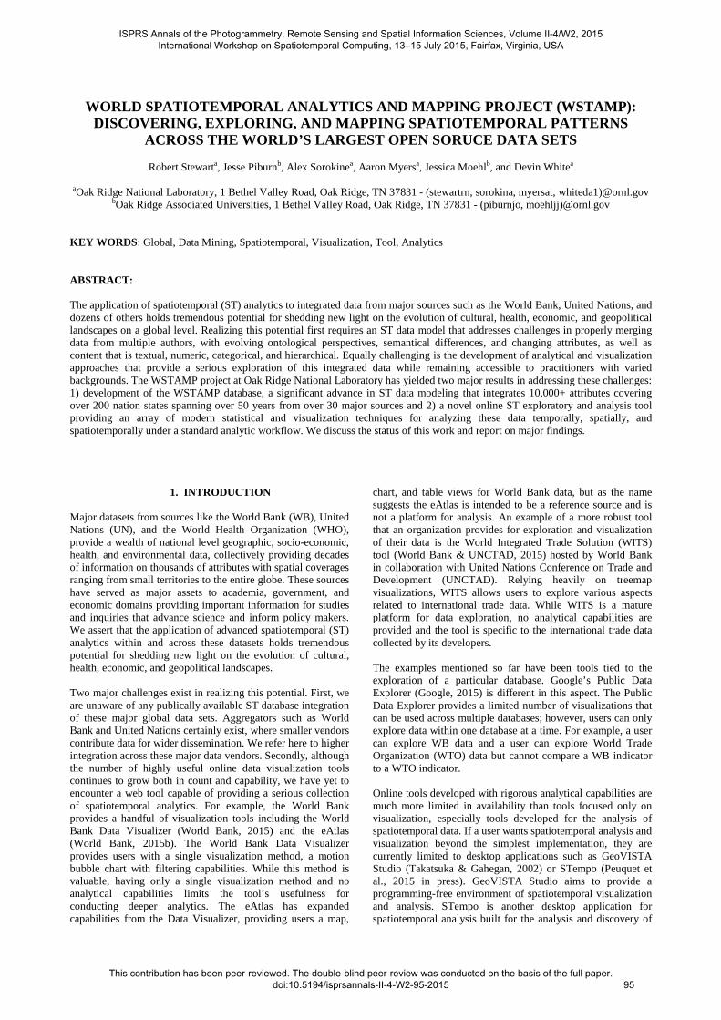
These issues do not cause major concern in properly merging the data. A much larger concern is rooted in the very meaning that dataset vendors/authors/makers assign to the word “country” or “state”. Recognition of a country depends in part on legal or political consensus and not every nation recognizes every other nation as such. For example, Serbia does not recognize Kosovo as an independent state and Israel does not recognize the Palestinian State (as of 2014). Indeed a great work has been spent on how to define countries or nation states and on study of non-trivial rules of their existence (Crawford, 2006, Robinson 2010, 2012). Major databases are not immune to these differences. For example, Taiwan is listed in the CIA World Factbook but not in the United Nations data. Vendors may also simply have scientific or economic interests that are unrelated to these larger issues of nation status that guide their decision to separately follow areas like Taiwan. Another major consideration is the evolution of countries over time. Countries merge and break apart (Sudan, Yugoslavia). Some countries may have colonies that eventually become independent or included into other countries. The implication is that the very geographic support under spatiotemporal analytics is fluid and changing. It is critical to account for this dynamic process lest spurious results emerge from analytics. For example, the agricultural output of a country may suddenly appear to drop by half suggesting a cataclysmic event, when in fact there was only a peaceful breakup of the country into several independent entities. To address these challenges, we developed a data driven approach to manage not only differences in how countries are defined but in how they evolve. We begin by defining some concepts. World Entities: In light of these circumstances, we use the term world entities instead of country or state to refer more abstractly to the set of geographic regions on which authors collect data. This avoids the potentially contentious issue of recognized nations or variations in vendor information interests. For any given database a world entity exists if it appears in the database and does not otherwise. While the United Nations is certainly aware of Taiwan, from the purely data driven perspective of the United Nations database, Taiwan and China never existed as separate entities. Entity Evolution: World entities may emerge, cease to exist, merge with each other, or split. We represent such events as existential transformations and Figure 2 shows the different kinds of this type of events in WSTAMP.
ISPRS Annals of the Photogrammetry, Remote Sensing and Spatial Information Sciences, Volume II-4/W2, 2015 International Workshop on Spatiotemporal Computing, 13–15 July 2015, Fairfax, Virginia, USA
This contribution has been peer-reviewed. The double-blind peer-review was conducted on the basis of the full paper. doi:10.5194/isprsannals-II-4-W2-95-2015
96
These existential events are recorded indicating successor and predecessor entities providing a complete picture of geographic support over time for each dataset. Figure 3 depicts these data as a graph in the case of Yugoslavia.
Figure 2. Existential transformation of world entities
Figure 3. Graph of existential transformations over time. As a rule, a world entity’s timeline begins on their first mention in the dataset. When this event is detected, it is necessary to determine what event occurred. Few datasets (COW being one of them) explicitly provide information on the reasons why a new entity has emerged, for example, a new state being established as a breakup or merger of other states or a colony gaining independence. Others make no explicit comment and external sources (e.g. subject matter expertise, COW, government documents, news accounts) are necessary to determine exactly what occurred and record any important relationships such as its successors or predecessors. Because of such discrepancies in many cases merging of the datasets becomes a non-trivial task. For example, when a country emerges from a breakup, the WB will estimate attribute values backwards in time prior to the breakup. This is the case for South Sudan where World Bank has data for decades prior to its creation. From a purely data driven perspective, this creates a peculiar circumstance where South Sudan has existed for decades as viewed by WB. Though peculiar, this actually presents an entirely consistent and systematic approach to integrating numerous datasets that with widely disparate approaches to data production. This is discussed in greater detail shortly. Events: An event is defined as any attribute value or existential transformation associated with a world entity. That is, the succession (creation) of South Sudan from Sudan and a reporting of this year’s Sudan birth rate by WHO are both considered events for Sudan. The former is considered an existential event and the latter an observational event.
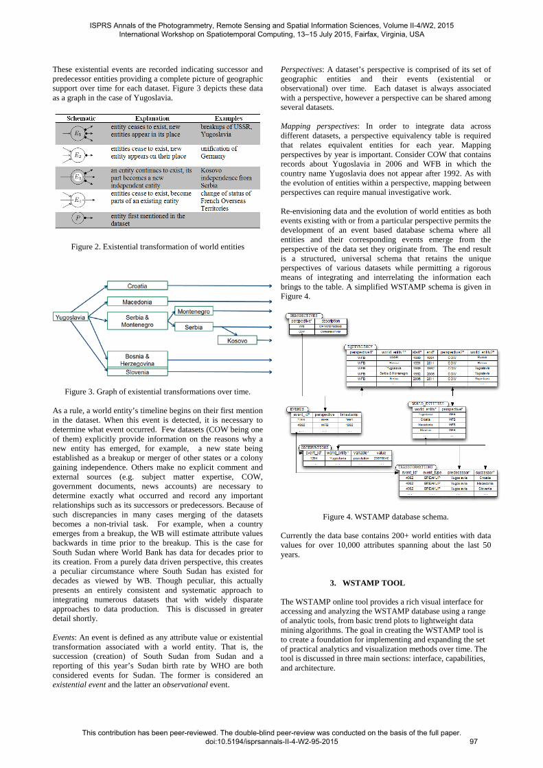
Perspectives: A dataset’s perspective is comprised of its set of geographic entities and their events (existential or observational) over time. Each dataset is always associated with a perspective, however a perspective can be shared among several datasets. Mapping perspectives: In order to integrate data across different datasets, a perspective equivalency table is required that relates equivalent entities for each year. Mapping perspectives by year is important. Consider COW that contains records about Yugoslavia in 2006 and WFB in which the country name Yugoslavia does not appear after 1992. As with the evolution of entities within a perspective, mapping between perspectives can require manual investigative work. Re-envisioning data and the evolution of world entities as both events existing with or from a particular perspective permits the development of an event based database schema where all entities and their corresponding events emerge from the perspective of the data set they originate from. The end result is a structured, universal schema that retains the unique perspectives of various datasets while permitting a rigorous means of integrating and interrelating the information each brings to the table. A simplified WSTAMP schema is given in Figure 4.
Figure 4. WSTAMP database schema. Currently the data base contains 200+ world entities with data values for over 10,000 attributes spanning about the last 50 years.
3. WSTAMP TOOL
The WSTAMP online tool provides a rich visual interface for accessing and analyzing the WSTAMP database using a range of analytic tools, from basic trend plots to lightweight data mining algorithms. The goal in creating the WSTAMP tool is to create a foundation for implementing and expanding the set of practical analytics and visualization methods over time. The tool is discussed in three main sections: interface, capabilities, and architecture.
ISPRS Annals of the Photogrammetry, Remote Sensing and Spatial Information Sciences, Volume II-4/W2, 2015 International Workshop on Spatiotemporal Computing, 13–15 July 2015, Fairfax, Virginia, USA
This contribution has been peer-reviewed. The double-blind peer-review was conducted on the basis of the full paper. doi:10.5194/isprsannals-II-4-W2-95-2015
97
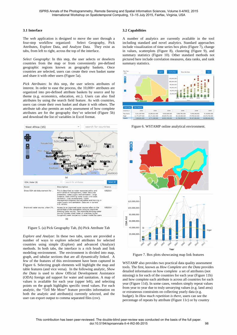
3.1 Interface The web application is designed to move the user through a four-step workflow organized: Select Geography, Pick Attributes, Explore Data, and Analyze Data. They exist as tabs, from left to right, across the top of the interface. Select Geography: In this step, the user selects or deselects countries from the map or from conveniently pre-defined geographic regions known as geography baskets. Once countries are selected, users can create their own basket name and share it with other users (Figure 5a). Pick Attributes: In this step, the user selects attributes of interest. In order to ease the process, the 10,000+ attributes are organized into pre-defined attribute baskets by source and by theme (e.g. economics, education, etc.). Users can also find attributes by using the search field feature. As with countries, users can create their own basket and share it with others. The attribute tab also permits an early assessment of how complete attributes are for the geography they’ve selected (Figure 5b) and download the list of variables in Excel format.
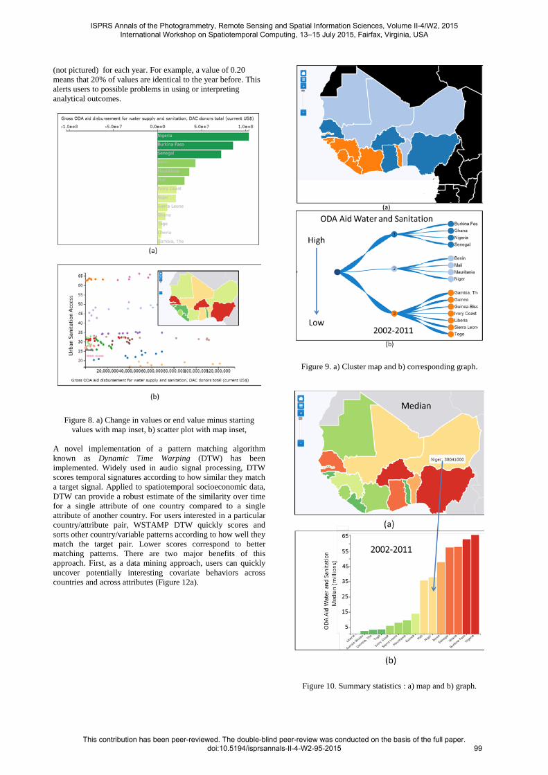
Figure 5. (a) Pick Geography Tab, (b) Pick Attribute Tab Explore and Analyze: In these two tabs, users are provided a number of ways to explore selected attributes for selected countries using simple (Explore) and advanced (Analyze) methods. In both tabs, the interface is a rich brush and link modeling environment. The environment is divided into map, graph, and tabular sections that are all dynamically linked. A few of the features of this environment have been captured in Figure 6. Selecting graph elements will highlight the map and table features (and vice versa). In the following analytic, Show the Data is used to show Official Development Assistance (ODA) foreign aid support for water and sanitation. A map of values is available for each year (upper left), and selecting points on the graph highlights specific trend values. For each analytic, the “Tell Me More” feature provides information on both the analytic and attribute(s) currently selected, and the user can export output to comma separated files (csv).
3.2 Capabilities A number of analytics are currently available in the tool including standard and novel analytics. Standard approaches include visualization of time series box plots (Figure 7), change in values, scatterplots (Figure 8), clustering (Figure 9), and summary statistics (Figure 10). Other standard methods not pictured here include correlation measures, data ranks, and rank summary statistics.
Figure 6. WSTAMP online analytical environment.
Figure 7. Box plots showcasing map link features
WSTAMP also provides two practical data quality assessment tools. The first, known as How Complete are the Data provides detailed information on how complete a set of attributes (not missing) is for each of the countries for each year (Figure 11b) and how complete each attribute is across all countries for each year (Figure 11d). In some cases, vendors simply repeat values from year to year due to truly unvarying values (e.g. land area) or extraneous constraints on collecting yearly data (e.g. budget). In How much repetition is there, users can see the percentage of repeats by attribute (Figure 11c) or by country
ISPRS Annals of the Photogrammetry, Remote Sensing and Spatial Information Sciences, Volume II-4/W2, 2015 International Workshop on Spatiotemporal Computing, 13–15 July 2015, Fairfax, Virginia, USA
This contribution has been peer-reviewed. The double-blind peer-review was conducted on the basis of the full paper. doi:10.5194/isprsannals-II-4-W2-95-2015
98
(not pictured) for each year. For example, a value of 0.20 means that 20% of values are identical to the year before. This alerts users to possible problems in using or interpreting analytical outcomes.
Figure 8. a) Change in values or end value minus starting values with map inset, b) scatter plot with map inset,
A novel implementation of a pattern matching algorithm known as Dynamic Time Warping (DTW) has been implemented. Widely used in audio signal processing, DTW scores temporal signatures according to how similar they match a target signal. Applied to spatiotemporal socioeconomic data, DTW can provide a robust estimate of the similarity over time for a single attribute of one country compared to a single attribute of another country. For users interested in a particular country/attribute pair, WSTAMP DTW quickly scores and sorts other country/variable patterns according to how well they match the target pair. Lower scores correspond to better matching patterns. There are two major benefits of this approach. First, as a data mining approach, users can quickly uncover potentially interesting covariate behaviors across countries and across attributes (Figure 12a).
Figure 9. a) Cluster map and b) corresponding graph.
Figure 10. Summary statistics : a) map and b) graph.
ISPRS Annals of the Photogrammetry, Remote Sensing and Spatial Information Sciences, Volume II-4/W2, 2015 International Workshop on Spatiotemporal Computing, 13–15 July 2015, Fairfax, Virginia, USA
This contribution has been peer-reviewed. The double-blind peer-review was conducted on the basis of the full paper. doi:10.5194/isprsannals-II-4-W2-95-2015
99
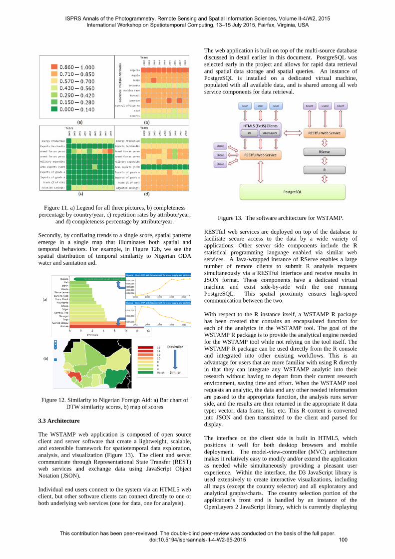
Figure 11. a) Legend for all three pictures, b) completeness percentage by country/year, c) repetition rates by attribute/year,
and d) completeness percentage by attribute/year. Secondly, by conflating trends to a single score, spatial patterns emerge in a single map that illuminates both spatial and temporal behaviors. For example, in Figure 12b, we see the spatial distribution of temporal similarity to Nigerian ODA water and sanitation aid.
Figure 12. Similarity to Nigerian Foreign Aid: a) Bar chart of DTW similarity scores, b) map of scores
3.3 Architecture The WSTAMP web application is composed of open source client and server software that create a lightweight, scalable, and extensible framework for spatiotemporal data exploration, analysis, and visualization (Figure 13). The client and server communicate through Representational State Transfer (REST) web services and exchange data using JavaScript Object Notation (JSON). Individual end users connect to the system via an HTML5 web client, but other software clients can connect directly to one or both underlying web services (one for data, one for analysis).
The web application is built on top of the multi-source database discussed in detail earlier in this document. PostgreSQL was selected early in the project and allows for rapid data retrieval and spatial data storage and spatial queries. An instance of PostgreSQL is installed on a dedicated virtual machine, populated with all available data, and is shared among all web service components for data retrieval.
Figure 13. The software architecture for WSTAMP.
RESTful web services are deployed on top of the database to facilitate secure access to the data by a wide variety of applications. Other server side components include the R statistical programming language enabled via similar web services. A Java-wrapped instance of RServe enables a large number of remote clients to submit R analysis requests simultaneously via a RESTful interface and receive results in JSON format. These components have a dedicated virtual machine and exist side-by-side with the one running PostgreSQL. This spatial proximity ensures high-speed communication between the two. With respect to the R instance itself, a WSTAMP R package has been created that contains an encapsulated function for each of the analytics in the WSTAMP tool. The goal of the WSTAMP R package is to provide the analytical engine needed for the WSTAMP tool while not relying on the tool itself. The WSTAMP R package can be used directly from the R console and integrated into other existing workflows. This is an advantage for users that are more familiar with using R directly in that they can integrate any WSTAMP analytic into their research without having to depart from their current research environment, saving time and effort. When the WSTAMP tool requests an analytic, the data and any other needed information are passed to the appropriate function, the analysis runs server side, and the results are then returned in the appropriate R data type; vector, data frame, list, etc. This R content is converted into JSON and then transmitted to the client and parsed for display. The interface on the client side is built in HTML5, which positions it well for both desktop browsers and mobile deployment. The model-view-controller (MVC) architecture makes it relatively easy to modify and/or extend the application as needed while simultaneously providing a pleasant user experience. Within the interface, the D3 JavaScript library is used extensively to create interactive visualizations, including all maps (except the country selector) and all exploratory and analytical graphs/charts. The country selection portion of the application’s front end is handled by an instance of the OpenLayers 2 JavaScript library, which is currently displaying
ISPRS Annals of the Photogrammetry, Remote Sensing and Spatial Information Sciences, Volume II-4/W2, 2015 International Workshop on Spatiotemporal Computing, 13–15 July 2015, Fairfax, Virginia, USA
This contribution has been peer-reviewed. The double-blind peer-review was conducted on the basis of the full paper. doi:10.5194/isprsannals-II-4-W2-95-2015
100

a simple Bing-hosted country map. OpenLayers was selected due to its efficiency and to demonstrate that it could be quickly integrated to enrich the user experience with remotely-served geospatial content. The Bing map is used for convenience, but OpenLayers can be pointed at any standard web mapping service. For more straightforward data display tasks (e.g., exploration), the application connects to the RESTful web service that sits directly on top of the PostgreSQL database and retrieves required content. Apart from advances in data modeling, services architecture, and tool development, progress in advancing methods of characterizing and visualizing space-time dynamics have also emerged. We continue with a discussion of two important results.
4. VISUALIZING SPATIAL PCA
Demšar et al. (2012) recently categorized the use of principal components analysis (PCA) on spatial data into four major categories. Among these is atmospheric science PCA named for its common use in the atmospheric sciences since the 1950s. In this approach, PCA is applied to time series measurements collected at particular point locations, where the locations themselves become the attributes and time acts as the observations. Applying this approach to area locations reveals principal trends that characterize world entity behaviors. Here, a color is assigned to the principal component trend for each major factor. World entities are colored by the factor they load highest on. The result is a spatiotemporal map of attribute behaviors over time where the map legend refers not to single value but to the major principal component trend and its inverse. Figure 14 shows the results for a variable called Wealth and Consumption1.
Figure 14. Spatial visualization of explanatory PCA trends where colors correspond to prevailing temporal behaviors.
This map is particularly useful in quickly identifying countries with similar temporal behaviors. Blue countries are generally increasing in terms of the Wealth and Consumption variable, red countries are generally decreasing, and so forth. In this case, the PCA eigenvector scree plot suggested the majority of variance is explained by the first 3 temporal factors. The majority of countries do load highest on these three factors. However, some countries load highest on the much smaller factors (e.g. 4, 5, etc.). This suggests that the behavior of these countries is anomalous and warrants further inspection. All countries loading highest on factors 4 and higher are grouped
1 Wealth and Consumption is an index variable created by authors in a separate study.
as anomalous signatures and colored gray. By observing the map, one can quickly discern these as well as identify areas of spatial factor clustering (e.g. central Africa) and or spatial outliers (e.g. Mongolia).
5. ATTRIBUTE PORTFOLIO DISTANCE
An extension of DTW known as Attribute Portfolio Distance (APD) has been developed allowing users to create and compare portfolios of multiple attributes at once. Details can be found in Piburn et al. (2015). APD allows a user to find one overall similarity measure across portfolios comprised of multiple attributes over any given time period. A user can choose if they want to consider the magnitude of differences within attributes or if they only are interested in the shape of the temporal trend. This measure is an aggregate DTW score (average, median, etc.) over all attributes in the portfolio creating a matrix of country x country similarity scores. The resulting scores can be clustered hierarchically or a user can pick a particular country of interest which to compare all other countries to, with these distances being easily input into all standard spatiotemporal analyses such as Moran’s I and non-spatial analyses such as K-means clustering. Here we only present the hierarchical visualization. In Table 15 and Table 16 we provide the countries and selected attributes for APD, respectively. For this example we selected a time frame of 1994-2013 and are only looking at the shape of the temporal trend. Countries
Albania Germany Portugal
Armenia Greece Romania
Austria Hungary Russia
Azerbaijan Ireland Serbia
Belarus Italy Slovakia
Belgium Kazakhstan Slovenia
Bosnia & Herzegovina
Kyrgyzstan Spain
Bulgaria Latvia Sweden
Croatia Lithuania Switzerland
Czech Republic Macedonia Tajikistan
Denmark Moldova Turkey
Estonia Montenegro Turkmenistan
Finland Netherlands Ukraine
France Norway United Kingdom
Georgia Poland Uzbekistan
Table 15. Countries included in APD analysis.
Attribute Name Source
Foreign direct investment, net inflows World Bank
Industry, value added (current US$) World Bank
GDP (current US$) World Bank
Table 16. Attributes used in APD analysis.
ISPRS Annals of the Photogrammetry, Remote Sensing and Spatial Information Sciences, Volume II-4/W2, 2015 International Workshop on Spatiotemporal Computing, 13–15 July 2015, Fairfax, Virginia, USA
This contribution has been peer-reviewed. The double-blind peer-review was conducted on the basis of the full paper. doi:10.5194/isprsannals-II-4-W2-95-2015
101
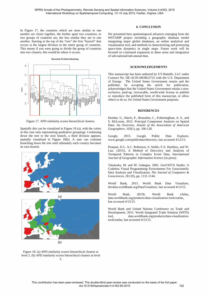
In Figure 17, the countries which are most similar to one another are closer together, the further apart two countries, or two groups of countries are, the less similar they are to one another. Starting at the top of the “tree” the first “branch” that occurs is the largest division in the entire group of countries. This means if you were going to divide the group of countries into two clusters, this would be where it occurs.
Figure 17. APD similarity scores hierarchical clusters. Spatially this can be visualized in Figure 18 (a), with the colors in this case only representing qualitative groupings. Continuing down the tree to the next branch, a third division appears, spatially visualized in Figure 18(b). A user can continue branching down the tree until ultimately each country becomes its own branch.
Figure 18. (a) APD similarity scores hierarchical clusters at level 2. (b) APD similarity scores hierarchical clusters at level
3.
6. CONCLUSION We presented here spatiotemporal advances emerging from the WSTAMP project including a geographic database model integrating major global databases, an online analytical and visualization tool, and methods in characterizing and portraying space-time dynamics in single maps. Future work will be focused on continued expansion in these areas and integration of sub-national/sub-annual data.
ACKNOWLEDGEMENTS This manuscript has been authored by UT-Battelle, LLC under Contract No. DE-AC05-00OR22725 with the U.S. Department of Energy. The United States Government retains and the publisher, by accepting the article for publication, acknowledges that the United States Government retains a non-exclusive, paid-up, irrevocable, world-wide license to publish or reproduce the published form of this manuscript, or allow others to do so, for United States Government purposes.
REFERENCES
Demšar, U., Harris, P., Brunsdon, C., Fotheringham, A. S., and S. McLoone, 2012. Principal Component Analysis on Spatial Data: An Overview. Annals of the Association of American Geographers, 103(1), pp. 106-128. Google, 2015. Google Public Data Explorer, www.google.com/publicdata/directory, last accessed 4/12/15. Peuquet, D.J., A.C. Robinson, S. Stehle, F.A. Hardisty, and W. Luo, (2015), A Method of Discovery and Analysis of Termporal Patterns in Complex Event Data, International Journal of Geographic Information Science (in press). Takatsuka, M. and M. Gahegan, 2002. GeoVISTA Studio: A Codeless Visual Programming Environment For Geoscientific Data Analysis and Visualization, The Journal of Computers & Geosciences, 28 (10), pp. 1131-1144. World Bank, 2015. World Bank Data Visualizer, devdata.worldbank.org/DataVisualizer, last accessed 4/13/15. World Bank, 2015b. World Bank eAtlas, data.worldbank.org/products/data-visualization-tools/eatlas, last accessed 4/13/15. World Bank and United Nations Conference on Trade and Development, 2015. World Integrated Trade Solution (WITS) tool, data.worldbank.org/products/data-visualization-tools/eatlas, last accessed 4/13/15.
ISPRS Annals of the Photogrammetry, Remote Sensing and Spatial Information Sciences, Volume II-4/W2, 2015 International Workshop on Spatiotemporal Computing, 13–15 July 2015, Fairfax, Virginia, USA
This contribution has been peer-reviewed. The double-blind peer-review was conducted on the basis of the full paper. doi:10.5194/isprsannals-II-4-W2-95-2015
102