watercolour new zealand inc.€¦ · watercolour new zealand inc. newsletter 161 september –...
TRANSCRIPT
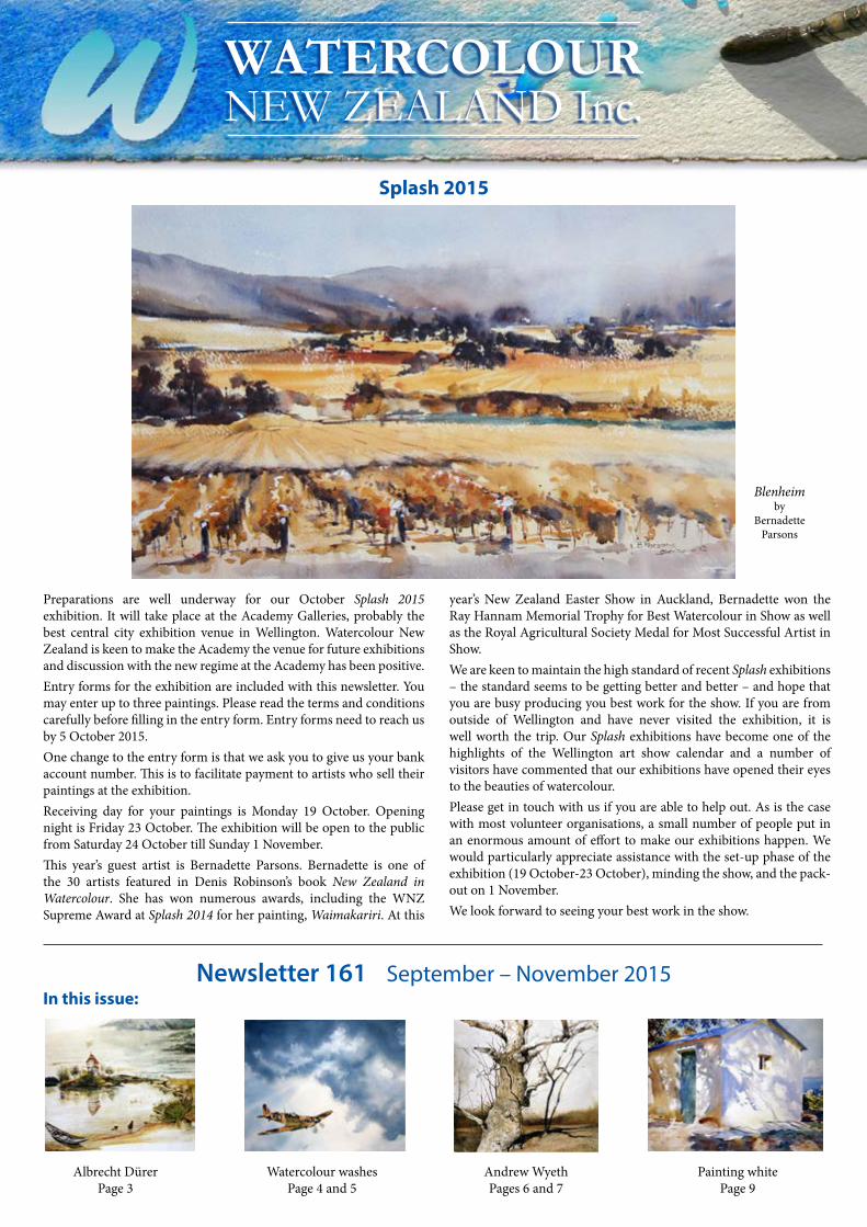
Blenheimby
BernadetteParsons
WATERCOLOURNEW ZEALAND Inc.
Newsletter 161 September – November 2015
Preparations are well underway for our October Splash 2015 exhibition. It will take place at the Academy Galleries, probably the best central city exhibition venue in Wellington. Watercolour New Zealand is keen to make the Academy the venue for future exhibitions and discussion with the new regime at the Academy has been positive.Entry forms for the exhibition are included with this newsletter. You may enter up to three paintings. Please read the terms and conditions carefully before filling in the entry form. Entry forms need to reach us by 5 October 2015.One change to the entry form is that we ask you to give us your bank account number. This is to facilitate payment to artists who sell their paintings at the exhibition. Receiving day for your paintings is Monday 19 October. Opening night is Friday 23 October. The exhibition will be open to the public from Saturday 24 October till Sunday 1 November. This year’s guest artist is Bernadette Parsons. Bernadette is one of the 30 artists featured in Denis Robinson’s book New Zealand in Watercolour. She has won numerous awards, including the WNZ Supreme Award at Splash 2014 for her painting, Waimakariri. At this
year’s New Zealand Easter Show in Auckland, Bernadette won the Ray Hannam Memorial Trophy for Best Watercolour in Show as well as the Royal Agricultural Society Medal for Most Successful Artist in Show. We are keen to maintain the high standard of recent Splash exhibitions – the standard seems to be getting better and better – and hope that you are busy producing you best work for the show. If you are from outside of Wellington and have never visited the exhibition, it is well worth the trip. Our Splash exhibitions have become one of the highlights of the Wellington art show calendar and a number of visitors have commented that our exhibitions have opened their eyes to the beauties of watercolour. Please get in touch with us if you are able to help out. As is the case with most volunteer organisations, a small number of people put in an enormous amount of effort to make our exhibitions happen. We would particularly appreciate assistance with the set-up phase of the exhibition (19 October-23 October), minding the show, and the pack-out on 1 November.We look forward to seeing your best work in the show.
In this issue:
Albrecht DürerPage 3
Watercolour washesPage 4 and 5
Andrew WyethPages 6 and 7
Painting whitePage 9
Splash 2015
Ahuriri River Terraces, by Adrienne Pavelka
The Great Piece of Turf
Young Hare
www.watercolournewzealand.co.nzPage 2 Watercolour New Zealand Inc. Page 3
Watercolour historyFrom the President
Right now we’re gearing up for our October Splash 2015 exhibition at the Academy of Fine Arts gallery, a first class Central Wellington venue. We would welcome volunteers from our members in the Wellington region to help us with the exhibition to make it less of a case of “so much being owed by so many to so few”. We’re confident we can mount another top class show and would urge you to send us your best work for the exhibition.Our last exhibition, WW1 in Watercolours at Splash was most successful with very good attendance and sales. Exhibition manager Claire Clark has nominated the exhibition for the Arts section of the Wellington Airport Regional Community Awards and I’m pleased to report that Watercolour New Zealand has made the finals. The winners will be announced on 25 August, the date this newsletter goes to the printer.
Since the last newsletter we have run two successful workshops: a youth workshop tutored by Alfred Memelink, the fees subsidised from the Eleanor Fyle Training Fund and Portraits in Watercolour with Eric Dyne. Both workshops were well attended and generated a lot of positive comment. We would welcome your suggestions regarding possible workshops we could run in 2016.I would hope that if you haven’t already got your paintings done for our October exhibition, you will get down to work soon to produce some masterpieces
John ToftPresident, Watercolour New Zealand Inc.
John Sell Cotman was born seven years after Turner. Like Turner, he was the son of a barber. In the summer of 1798, Cotman went to London to learn to be a painter. His father consulted John Opie, later to become Professor of Painting at the Royal Academy, regarding his son’s choice of career. Opie’s verdict was blunt: “Let him rather black boots than follow the profession of artist”. Fortunately for the development of watercolour, Cotman ignored his advice.The Drop Gate in Duncombe Park, painted in 1805 on one of his three visits to Yorkshire, is one of Cotman’s best-known paintings. Cotman usually painted in the studio from pencil drawings done on location but he said in a letter that this painting was “coloured from Nature and close copies of that fickle Dame”. Martin Hardie wrote in Water-Colour Painting in Britain “The Drop Gate is a drawing of nothing but some broken rails hanging over a stream – a drop gate, a water pool and some weeds – but the design is such as no other painter of the time would have conceived; a design of straight lines, horizontal and diagonal, and sharp angles contrasting with the soft contours of foliage and the curves of burdock, lyrical in its rhythm and colour”. Indeed, as Hardie wrote, “It was an ‘abstract’ art”, executed by a master of pattern and design.
ALBRECHT DÜRER:Father of European watercolourBY JOHN TOFT
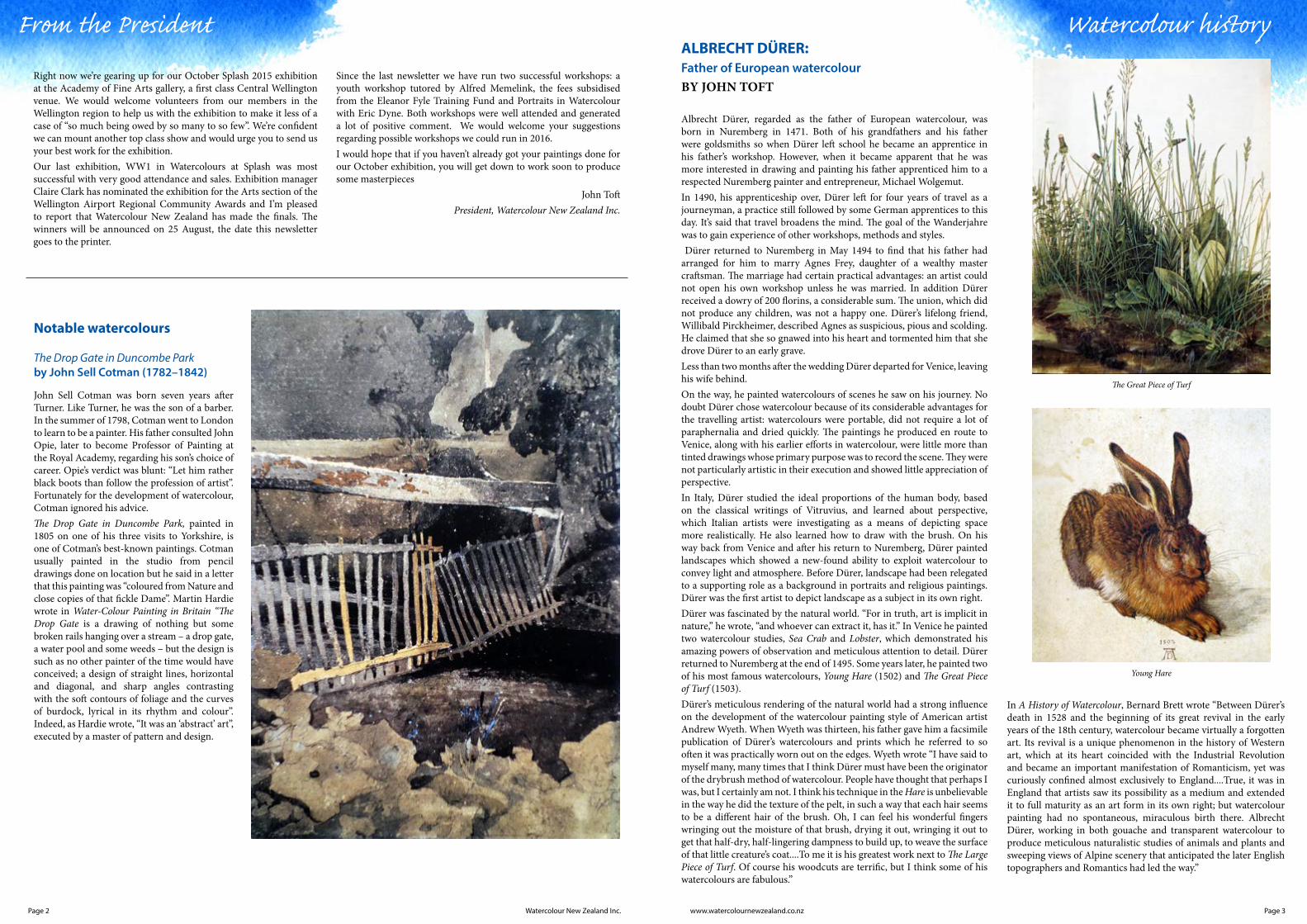
Albrecht Dürer, regarded as the father of European watercolour, was born in Nuremberg in 1471. Both of his grandfathers and his father were goldsmiths so when Dürer left school he became an apprentice in his father’s workshop. However, when it became apparent that he was more interested in drawing and painting his father apprenticed him to a respected Nuremberg painter and entrepreneur, Michael Wolgemut.In 1490, his apprenticeship over, Dürer left for four years of travel as a journeyman, a practice still followed by some German apprentices to this day. It’s said that travel broadens the mind. The goal of the Wanderjahre was to gain experience of other workshops, methods and styles. Dürer returned to Nuremberg in May 1494 to find that his father had arranged for him to marry Agnes Frey, daughter of a wealthy master craftsman. The marriage had certain practical advantages: an artist could not open his own workshop unless he was married. In addition Dürer received a dowry of 200 florins, a considerable sum. The union, which did not produce any children, was not a happy one. Dürer’s lifelong friend, Willibald Pirckheimer, described Agnes as suspicious, pious and scolding. He claimed that she so gnawed into his heart and tormented him that she drove Dürer to an early grave.Less than two months after the wedding Dürer departed for Venice, leaving his wife behind.On the way, he painted watercolours of scenes he saw on his journey. No doubt Dürer chose watercolour because of its considerable advantages for the travelling artist: watercolours were portable, did not require a lot of paraphernalia and dried quickly. The paintings he produced en route to Venice, along with his earlier efforts in watercolour, were little more than tinted drawings whose primary purpose was to record the scene. They were not particularly artistic in their execution and showed little appreciation of perspective. In Italy, Dürer studied the ideal proportions of the human body, based on the classical writings of Vitruvius, and learned about perspective, which Italian artists were investigating as a means of depicting space more realistically. He also learned how to draw with the brush. On his way back from Venice and after his return to Nuremberg, Dürer painted landscapes which showed a new-found ability to exploit watercolour to convey light and atmosphere. Before Dürer, landscape had been relegated to a supporting role as a background in portraits and religious paintings. Dürer was the first artist to depict landscape as a subject in its own right. Dürer was fascinated by the natural world. “For in truth, art is implicit in nature,” he wrote, “and whoever can extract it, has it.” In Venice he painted two watercolour studies, Sea Crab and Lobster, which demonstrated his amazing powers of observation and meticulous attention to detail. Dürer returned to Nuremberg at the end of 1495. Some years later, he painted two of his most famous watercolours, Young Hare (1502) and The Great Piece of Turf (1503). Dürer’s meticulous rendering of the natural world had a strong influence on the development of the watercolour painting style of American artist Andrew Wyeth. When Wyeth was thirteen, his father gave him a facsimile publication of Dürer’s watercolours and prints which he referred to so often it was practically worn out on the edges. Wyeth wrote “I have said to myself many, many times that I think Dürer must have been the originator of the drybrush method of watercolour. People have thought that perhaps I was, but I certainly am not. I think his technique in the Hare is unbelievable in the way he did the texture of the pelt, in such a way that each hair seems to be a different hair of the brush. Oh, I can feel his wonderful fingers wringing out the moisture of that brush, drying it out, wringing it out to get that half-dry, half-lingering dampness to build up, to weave the surface of that little creature’s coat....To me it is his greatest work next to The Large Piece of Turf. Of course his woodcuts are terrific, but I think some of his watercolours are fabulous.”
Notable watercolours
The Drop Gate in Duncombe Parkby John Sell Cotman (1782–1842)
In A History of Watercolour, Bernard Brett wrote “Between Dürer’s death in 1528 and the beginning of its great revival in the early years of the 18th century, watercolour became virtually a forgotten art. Its revival is a unique phenomenon in the history of Western art, which at its heart coincided with the Industrial Revolution and became an important manifestation of Romanticism, yet was curiously confined almost exclusively to England....True, it was in England that artists saw its possibility as a medium and extended it to full maturity as an art form in its own right; but watercolour painting had no spontaneous, miraculous birth there. Albrecht Dürer, working in both gouache and transparent watercolour to produce meticulous naturalistic studies of animals and plants and sweeping views of Alpine scenery that anticipated the later English topographers and Romantics had led the way.”
Page 4 Page 5www.watercolournewzealand.co.nzWatercolour New Zealand Inc.
Watercolour WashesBY DENNIS GREENWOOD The watercolour wash-water-soluble paint spreading across a damp paper surface-is the phenomenon which gives this medium its characteristic look.
Personally, I love doing BIG washes, washes which leave the paper and run across the table and down the cupboard doors onto the floor. There is a considerable risk that this habit will cost you a fortune and produce nothing worth looking at, but statistically you may produce a gob-smacking gem occasionally.
I would recommend all watercolourists to launch into a decent-sized, variegated wash whenever they get out of bed in the morning feeling supremely confident. It’s a real tonic to watch the colours gradually merge and muddy in front of your eyes. It’s an analogy with life really-struggling desperately to control the forces which invariably work against you and ultimately ‘take you to the cleaners’.
However, it is important to remain bullish about the possibilities for a successful outcome.
To this end, here’s a quick checklist of the parameters which may help determine your success:
Colour Theory
It’s really helpful to know a little about light and how we see its constituent parts as colours. Read up about hue, value and brilliance, the 3 variables of colour. Armed with this knowledge, you can combine colours confidently. Successfully is another matter.
Paints
Dye-based paints stain and tend to migrate (move around) more easily on damp paper. They often go where you don’t want them to. Sometimes chance is more serendipitous than intention.
Pigment-based paints migrate in a more controllable fashion and use can be made of their sedimentary properties. Because they contain large insoluble particles they tend to be more opaque. This can be a blessing or a curse.
Brushes:
Buy good brushes so that the ferrule doesn’t come loose from the handle when you’re adding a final sweeping stroke or so the bristles don’t fall out constantly as with chronic alopecia.
Paper
Buy the best. Consistency of sizing is THE most important feature.
Having a Plan
You must have a plan. Even if it’s “I’m using only green today. What can I create?”
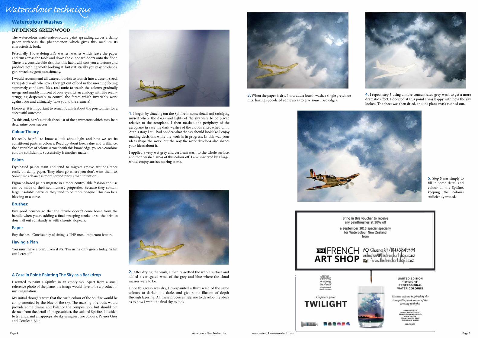
A Case in Point: Painting The Sky as a Backdrop
I wanted to paint a Spitfire in an empty sky. Apart from a small reference photo of the plane, the image would have to be a product of my imagination.
My initial thoughts were that the earth colour of the Spitfire would be complemented by the blue of the sky. The massing of clouds would provide some drama and balance the composition, but should not detract from the detail of image subject, the isolated Spitfire. I decided to try and paint an appropriate sky using just two colours: Payne’s Grey and Cerulean Blue
Watercolour technique
1. I began by drawing out the Spitfire in some detail and satisfying myself where the darks and lights of the sky were to be placed relative to the aeroplane. I then masked the periphery of the aeroplane in case the dark washes of the clouds encroached on it. At this stage I still had no idea what the sky should look like-I enjoy making decisions while the work is in progress. In this way your ideas shape the work, but the way the work develops also shapes your ideas about it.
I applied a very wet grey and cerulean wash to the whole surface, and then washed areas of this colour off. I am unnerved by a large, white, empty surface staring at me.
2. After drying the work, I then re-wetted the whole surface and added a variegated wash of the grey and blue where the cloud masses were to be.
Once this wash was dry, I overpainted a third wash of the same colours to darken the darks and give some illusion of depth through layering. All these processes help me to develop my ideas as to how I want the final sky to look.
3. When the paper is dry, I now add a fourth wash, a single grey/blue mix, having spot-dried some areas to give some hard edges.
4. I repeat step 3 using a more concentrated grey wash to get a more dramatic effect. I decided at this point I was happy with how the sky looked. The sheet was then dried, and the plane mask rubbed out.
5. Step 5 was simply to fill in some detail and colour on the Spitfire, keeping the colours sufficiently muted.
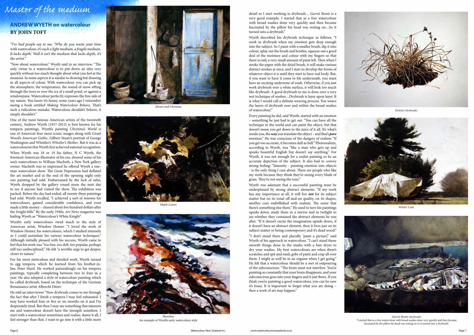
Alvaro and ChristinaGrasses (drybrush)
Winter CoatMaple Leaves
Garret Room (drybrush)“I started that as a free watercolour with broad washes done very quickly and then became
fascinated by the pillow his head was resting on so it turned into a drybrush”.
ShorelineAn example of Wyeth’s early watercolour style
Page 6 Page 7www.watercolournewzealand.co.nzWatercolour New Zealand Inc.
ANDREW WYETH on watercolourBY JOHN TOFT
“I’ve had people say to me, ‘Why do you waste your time with watercolour, it’s such a light medium, a fragile medium. It lacks depth.’ Well it isn’t the medium that lacks depth, it’s the artist.” “Now about watercolour,” Wyeth said in an interview. “The only virtue to a watercolour is to put down an idea very quickly without too much thought about what you feel at the moment. In some aspects it is similar to drawing but drawing in all aspects of colour. With watercolour, you can pick up the atmosphere, the temperature, the sound of snow sifting through the trees or over the ice of a small pond, or against a windowpane. Watercolour perfectly expresses the free side of my nature. You know it’s funny, some years ago I remember seeing a book entitled Making Watercolour Behave. That’s such a ridiculous mistake. Watercolour shouldn’t behave, it simply shouldn’t.”One of the most famous American artists of the twentieth century, Andrew Wyeth (1917-2012) is best known for his tempera paintings. Wyeth’s painting Christina’s World is one of America’s four most iconic images along with Grant Wood’s American Gothic, Gilbert Stuart’s portrait of George Washington and Whistler’s Whistler’s Mother. But it was as a watercolourist that Wyeth first achieved national recognition. When Wyeth was 18 or 19 his father, N C Wyeth, the foremost American illustrator of his era, showed some of his son’s watercolours to William Macbeth, a New York gallery owner. Macbeth was so impressed he offered Wyeth a one-man watercolour show. The Great Depression had deflated the art market and at the end of the opening night only one painting had sold. Embarrassed by the lack of sales, Wyeth dropped by the gallery round noon the next day to see if anyone had visited the show. The exhibition was packed. Before the day had ended, all twenty three paintings had sold. Wyeth recalled, “I achieved a sort of renown for watercolours, gained considerable confidence, and even made a little money – cleared about five hundred dollars after the freight bills.” By the early 1940s, Art News magazine was hailing Wyeth as “Watercolour’s White Knight”.Wyeth’s early watercolours owed much to the style of American artist, Winslow Homer. “I loved the work of Winslow Homer, his watercolours, which I studied intensely so I could assimilate his various watercolour techniques.” Although initially pleased with his success, Wyeth came to feel that his work was “too free, too deft, too popular, perhaps still too undisciplined.” He felt “a terrible urge to get deeper, closer to nature.” For his most meticulous and detailed work, Wyeth turned to egg tempera, which he learned from his brother-in-law, Peter Hurd. He worked painstakingly on his tempera paintings, typically completing between two to four in a year. He also adopted a style of watercolour painting which he called drybrush, based on the technique of the German Renaissance artist Albrecht Dürer.He told an interviewer “Now drybrush comes to me through the fact that after I finish a tempera I may feel exhausted. I may have worked four or five or six months on it and I’m desperately tired. But then I may see something that interests me and watercolour doesn’t have the strength somehow. I start with a watercolour sometimes and realise, damn it all, I feel stronger than that. I want to go into it with a little more
detail so I start working in drybrush.... Garret Room is a very good example. I started that as a free watercolour with broad washes done very quickly and then became fascinated by the pillow his head was resting on....So it turned into a drybrush.” Wyeth described his drybrush technique as follows; “I work in drybrush when my emotion gets deep enough into the subject. So I paint with a smaller brush, dip it into colour, splay out the brush and bristles, squeeze out a good deal of the moisture and colour with my fingers so that there is only a very small amount of paint left. Then when I stroke the paper with the dried brush, it will make various distinct strokes at once, and I start to develop the forms of whatever object it is until they start to have real body. But, if you want to have it come to life underneath, you must have an exciting undertone of wash. Otherwise, if you just work drybrush over a white surface, it will look too much like drybrush. A good drybrush to me is done over a very wet technique of washes....Drybrush is layer upon layer. It is what I would call a definite weaving process. You weave the layers of drybrush over and within the broad washes of watercolour.”Every painting he did, said Wyeth, started with an emotion – something he just had to get out. “You can have all the technique in the world and can paint the object, but that doesn’t mean you get down to the juice of it all. It’s what’s inside you, the way you translate the object – and that’s pure emotion.” He was conscious of the dangers of realism “If you get too accurate, it becomes dull as hell.” Photorealism, according to Wyeth, was “like a man who gets up and speaks beautiful English but doesn’t say anything.” For Wyeth, it was not enough for a realist painting to be an accurate depiction of the subject. It also had to convey strong feeling: “Intensity - painting emotion into objects - is the only thing I care about. There are people who like my work because they think they’re seeing every blade of grass. They’re not seeing the tone.”Wyeth was adamant that a successful painting must be underpinned by strong abstract elements: “If my work has any importance at all, it will live not for its subject matter but on its tonal off-and-on quality, on its shapes, another core embellished with realism. The sense that there’s something else there.” He used to turn his paintings upside down, study them in a mirror and in twilight to see whether they contained the abstract elements he was after. “If it doesn’t excite the imagination upside down, if it doesn’t have an abstract element, then it lives just on its subject matter or being contemporary and it’s dead wood.”“I don’t stand there and placidly ‘paint a picture’,” said Wyeth of his approach to watercolour. “I can’t stand those smooth things done in the studio with a hair dryer to dry your washes. My best watercolours are when there’s scratches and spit and mud, gobs of paint and crap all over them. I might as well be in an orgasm when I get going.” He felt that a watercolour should be a sort of outpouring of the subconscious: “The brain must not interfere. You’re painting so constantly that your brain disappears, and your subconscious goes into your fingers and it just flows. If you think you’re painting a good watercolour, you can be sure it’s lousy. It is important to forget what you are doing – then a work of art may happen.”
Master of the medium
Corfu Lights and Shadowby John Singer Sargent
Passchendaele, by Jocelyn Hampton
La Biancheriaby John Singer Sargent
Page 9www.watercolournewzealand.co.nzPage 8 Watercolour New Zealand Inc.
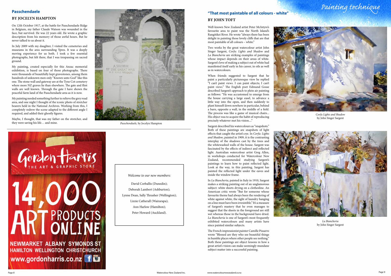
On 12th October 1917, at the battle for Passchendaele Ridge in Belgium, my father Claude Watson was wounded in the face, but survived. He was 22 years old. He wrote a graphic description from his memory of those awful hours. But he never talked to us about it.
In July 2009 with my daughter, I visited the cemeteries and museums in the area surrounding Ypres. It was a deeply moving experience for us both. I took a few essential photographs, but felt there, that I was trespassing on sacred ground.
My painting, created especially for this Anzac memorial exhibition, is based on four of those photographs. There were thousands of beautifully kept gravestones, among them hundreds of unknown men only “Known unto God” like this one. The stone wall and gateway are at the Tyne Cot cemetery where more NZ graves lie than elsewhere. The gate and flint walls are well known. Through the gate I have shown the peaceful farm land of the Passchendaele area as it is now.
My painting needed something further to relieve the grey road area, and one night I thought of the iconic photo of stretcher bearers held in the National Archives. Working from this, I completely redrew the scene adapted to the different angle I required, and added their ghostly figures.
Maybe, I thought, that was my father on the stretcher, and they were saving his life… and mine.
PasschendaeleBY JOCELYN HAMPTON
Painting technique
Well-known New Zealand artist Peter McIntyre’s favourite area to paint was the North Island’s Rangitikei River. He wrote “always there has been delight in painting those lovely cliffs that are that most paintable of all colours – white.”
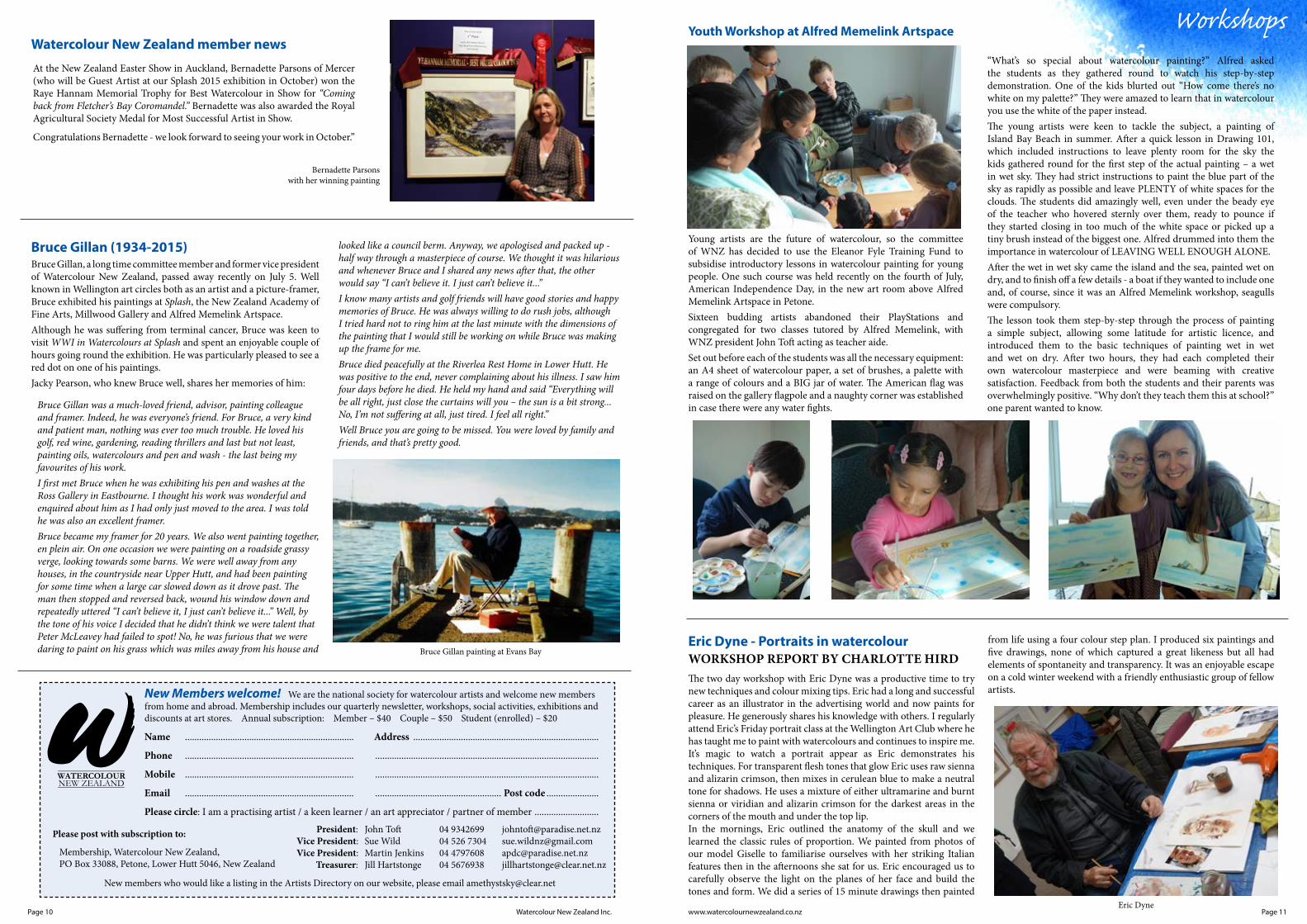
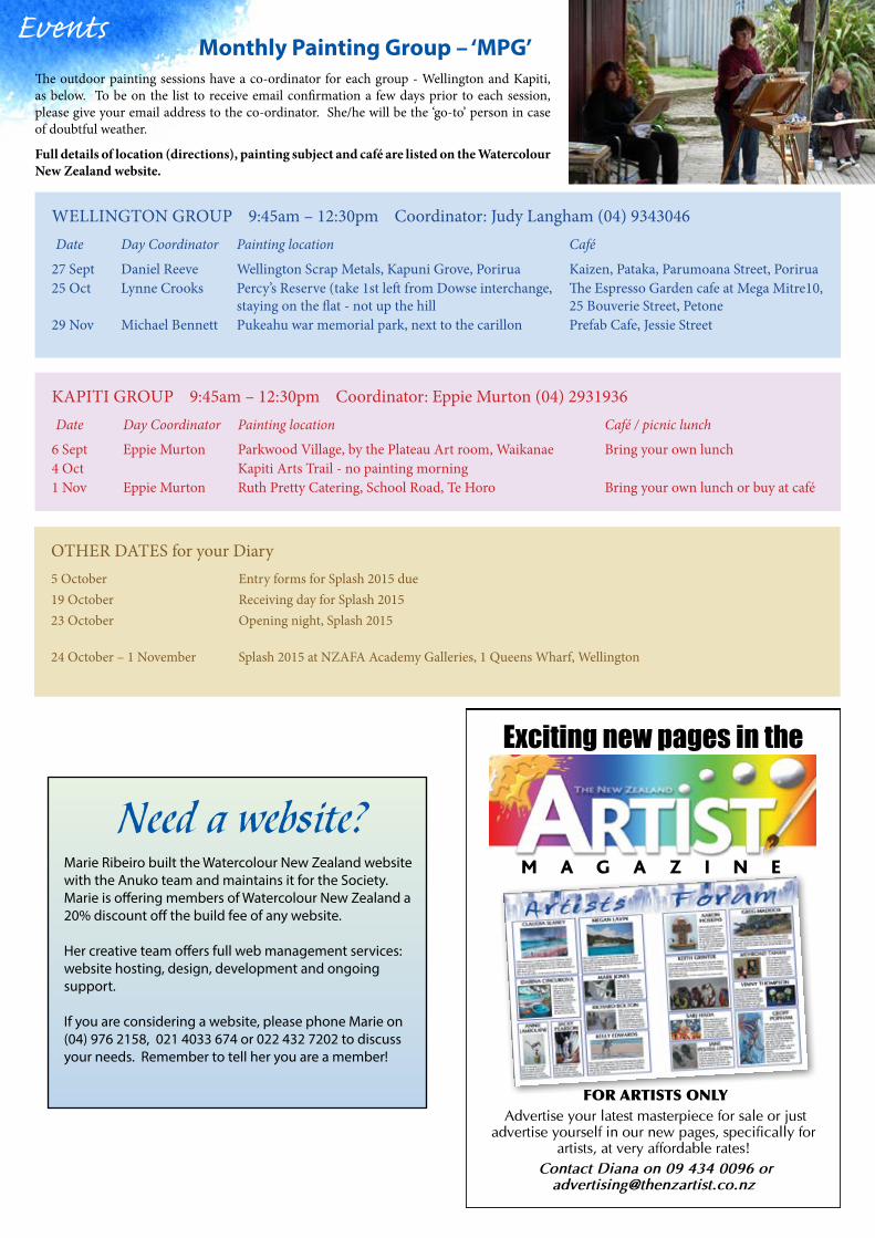
Two works by the great watercolour artist John Singer Sargent, Corfu: Lights and Shadow and La Biancheria are striking examples of paintings whose impact depends on their areas of white. Sargent’s love of making a subject out of white had manifested itself early in his career, in oils as well as in watercolours.
When friends suggested to Sargent that he paint a particularly picturesque view he replied “I can’t paint views. I can paint objects; I can’t paint views.” The English poet Edmund Gosse described Sargent’s approach to plein air painting as follows: “He was accustomed to emerge from the house carrying a large easel, to advance a little way into the open, and then suddenly to plant himself down nowhere in particular, behind a barn, opposite a wall, in the middle of a field. The process was like a game of musical chairs...His object was to acquire the habit of reproducing precisely whatever met his vision....”
Sargent described his watercolours as “snapshots.” Both of these paintings are snapshots of light effects that caught the artist’s eye. In Corfu: Lights and Shadow, painted in 1909, it is the contrasting interplay of the shadows cast by the trees and the whitewashed walls of the house. Sargent was fascinated by the effects of indirect and reflected light. Australian watercolour artist Greg Allen, in workshops conducted for Watercolour New Zealand, recommended studying Sargent’s paintings to learn how to paint reflected light. Look at the way, in this painting, Sargent has painted the reflected light under the eaves and inside the window frame.
In La Biancheria, painted in Italy in 1910, Sargent makes a striking painting out of an unglamorous subject: white sheets drying on a clothesline. An American critic wrote “But for someone whose favourite theme had always been the rendering of white against white, the sight of laundry hanging on a line must have been irresistible.” It’s a measure of Sargent’s mastery that he even manages to suggest that the sheets in the foreground are still wet whereas those in the background have dried. La Biancheria is one of Sargent’s most frequently exhibited watercolours and many artists have since painted similar subjects.
The French impressionist painter Camille Pissarro wrote “Blessed are they who see beautiful things in humble places where other people see nothing.” Both these paintings are object lessons in how a great artist’s vision can make seemingly mundane subject matter into a successful painting.
“That most paintable of all colours - white”BY JOHN TOFT
David Corballis (Dunedin);
Deborah Lambert (Ashburton);
Lynne Dean, Sally Thrasher (Wellington);
Lizzie Catherall (Wairarapa);
Ann Harlow (Hamilton);
Peter Howard (Auckland).
Welcome to our new members:
Bernadette Parsonswith her winning painting
Bruce Gillan painting at Evans Bay
www.watercolournewzealand.co.nz Page 11Page 10 Watercolour New Zealand Inc.
WorkshopsYouth Workshop at Alfred Memelink Artspace
Young artists are the future of watercolour, so the committee of WNZ has decided to use the Eleanor Fyle Training Fund to subsidise introductory lessons in watercolour painting for young people. One such course was held recently on the fourth of July, American Independence Day, in the new art room above Alfred Memelink Artspace in Petone.Sixteen budding artists abandoned their PlayStations and congregated for two classes tutored by Alfred Memelink, with WNZ president John Toft acting as teacher aide.Set out before each of the students was all the necessary equipment: an A4 sheet of watercolour paper, a set of brushes, a palette with a range of colours and a BIG jar of water. The American flag was raised on the gallery flagpole and a naughty corner was established in case there were any water fights.
Eric Dyne
New Members welcome! We are the national society for watercolour artists and welcome new members from home and abroad. Membership includes our quarterly newsletter, workshops, social activities, exhibitions and discounts at art stores. Annual subscription: Member – $40 Couple – $50 Student (enrolled) – $20
Name ....................................................................... Address ..............................................................................
Phone ....................................................................... ..............................................................................................
Mobile ....................................................................... ..............................................................................................
Email ....................................................................... ..................................................... Post code ......................
Please circle: I am a practising artist / a keen learner / an art appreciator / partner of member ...........................
President: John Toft 04 9342699 [email protected] Vice President: Sue Wild 04 526 7304 [email protected] Vice President: Martin Jenkins 04 4797608 [email protected] Treasurer: Jill Hartstonge 04 5676938 [email protected]
Please post with subscription to:
Membership, Watercolour New Zealand, PO Box 33088, Petone, Lower Hutt 5046, New Zealand
New members who would like a listing in the Artists Directory on our website, please email [email protected]
“What’s so special about watercolour painting?” Alfred asked the students as they gathered round to watch his step-by-step demonstration. One of the kids blurted out “How come there’s no white on my palette?” They were amazed to learn that in watercolour you use the white of the paper instead.The young artists were keen to tackle the subject, a painting of Island Bay Beach in summer. After a quick lesson in Drawing 101, which included instructions to leave plenty room for the sky the kids gathered round for the first step of the actual painting – a wet in wet sky. They had strict instructions to paint the blue part of the sky as rapidly as possible and leave PLENTY of white spaces for the clouds. The students did amazingly well, even under the beady eye of the teacher who hovered sternly over them, ready to pounce if they started closing in too much of the white space or picked up a tiny brush instead of the biggest one. Alfred drummed into them the importance in watercolour of LEAVING WELL ENOUGH ALONE.After the wet in wet sky came the island and the sea, painted wet on dry, and to finish off a few details - a boat if they wanted to include one and, of course, since it was an Alfred Memelink workshop, seagulls were compulsory. The lesson took them step-by-step through the process of painting a simple subject, allowing some latitude for artistic licence, and introduced them to the basic techniques of painting wet in wet and wet on dry. After two hours, they had each completed their own watercolour masterpiece and were beaming with creative satisfaction. Feedback from both the students and their parents was overwhelmingly positive. “Why don’t they teach them this at school?” one parent wanted to know.
At the New Zealand Easter Show in Auckland, Bernadette Parsons of Mercer (who will be Guest Artist at our Splash 2015 exhibition in October) won the Raye Hannam Memorial Trophy for Best Watercolour in Show for “Coming back from Fletcher’s Bay Coromandel.” Bernadette was also awarded the Royal Agricultural Society Medal for Most Successful Artist in Show.
Congratulations Bernadette - we look forward to seeing your work in October.”
Watercolour New Zealand member news
Eric Dyne - Portraits in watercolourWORKSHOP REPORT BY CHARLOTTE HIRDThe two day workshop with Eric Dyne was a productive time to try new techniques and colour mixing tips. Eric had a long and successful career as an illustrator in the advertising world and now paints for pleasure. He generously shares his knowledge with others. I regularly attend Eric’s Friday portrait class at the Wellington Art Club where he has taught me to paint with watercolours and continues to inspire me. It’s magic to watch a portrait appear as Eric demonstrates his techniques. For transparent flesh tones that glow Eric uses raw sienna and alizarin crimson, then mixes in cerulean blue to make a neutral tone for shadows. He uses a mixture of either ultramarine and burnt sienna or viridian and alizarin crimson for the darkest areas in the corners of the mouth and under the top lip.In the mornings, Eric outlined the anatomy of the skull and we learned the classic rules of proportion. We painted from photos of our model Giselle to familiarise ourselves with her striking Italian features then in the afternoons she sat for us. Eric encouraged us to carefully observe the light on the planes of her face and build the tones and form. We did a series of 15 minute drawings then painted
from life using a four colour step plan. I produced six paintings and five drawings, none of which captured a great likeness but all had elements of spontaneity and transparency. It was an enjoyable escape on a cold winter weekend with a friendly enthusiastic group of fellow artists.
Bruce Gillan (1934-2015)Bruce Gillan, a long time committee member and former vice president of Watercolour New Zealand, passed away recently on July 5. Well known in Wellington art circles both as an artist and a picture-framer, Bruce exhibited his paintings at Splash, the New Zealand Academy of Fine Arts, Millwood Gallery and Alfred Memelink Artspace.Although he was suffering from terminal cancer, Bruce was keen to visit WWI in Watercolours at Splash and spent an enjoyable couple of hours going round the exhibition. He was particularly pleased to see a red dot on one of his paintings.Jacky Pearson, who knew Bruce well, shares her memories of him:
Bruce Gillan was a much-loved friend, advisor, painting colleague and framer. Indeed, he was everyone’s friend. For Bruce, a very kind and patient man, nothing was ever too much trouble. He loved his golf, red wine, gardening, reading thrillers and last but not least, painting oils, watercolours and pen and wash - the last being my favourites of his work.I first met Bruce when he was exhibiting his pen and washes at the Ross Gallery in Eastbourne. I thought his work was wonderful and enquired about him as I had only just moved to the area. I was told he was also an excellent framer. Bruce became my framer for 20 years. We also went painting together, en plein air. On one occasion we were painting on a roadside grassy verge, looking towards some barns. We were well away from any houses, in the countryside near Upper Hutt, and had been painting for some time when a large car slowed down as it drove past. The man then stopped and reversed back, wound his window down and repeatedly uttered “I can’t believe it, I just can’t believe it...” Well, by the tone of his voice I decided that he didn’t think we were talent that Peter McLeavey had failed to spot! No, he was furious that we were daring to paint on his grass which was miles away from his house and
looked like a council berm. Anyway, we apologised and packed up - half way through a masterpiece of course. We thought it was hilarious and whenever Bruce and I shared any news after that, the other would say “I can’t believe it. I just can’t believe it...”I know many artists and golf friends will have good stories and happy memories of Bruce. He was always willing to do rush jobs, although I tried hard not to ring him at the last minute with the dimensions of the painting that I would still be working on while Bruce was making up the frame for me.Bruce died peacefully at the Riverlea Rest Home in Lower Hutt. He was positive to the end, never complaining about his illness. I saw him four days before he died. He held my hand and said “Everything will be all right, just close the curtains will you – the sun is a bit strong...No, I’m not suffering at all, just tired. I feel all right.” Well Bruce you are going to be missed. You were loved by family and friends, and that’s pretty good.
Exciting new pages in the
M A G A Z I N E
FOR ARTISTS ONLYAdvertise your latest masterpiece for sale or just
advertise yourself in our new pages, specifically for artists, at very affordable rates!
Contact Diana on 09 434 0096 or [email protected]
EventsMonthly Painting Group – ‘MPG’
The outdoor painting sessions have a co-ordinator for each group - Wellington and Kapiti, as below. To be on the list to receive email confirmation a few days prior to each session, please give your email address to the co-ordinator. She/he will be the ‘go-to’ person in case of doubtful weather.
Full details of location (directions), painting subject and café are listed on the Watercolour New Zealand website.
WELLINGTON GROUP 9:45am – 12:30pm Coordinator: Judy Langham (04) 9343046Date Day Coordinator Painting location Café
27 Sept Daniel Reeve Wellington Scrap Metals, Kapuni Grove, Porirua Kaizen, Pataka, Parumoana Street, Porirua25 Oct Lynne Crooks Percy’s Reserve (take 1st left from Dowse interchange,
staying on the flat - not up the hillThe Espresso Garden cafe at Mega Mitre10, 25 Bouverie Street, Petone
29 Nov Michael Bennett Pukeahu war memorial park, next to the carillon Prefab Cafe, Jessie Street
KAPITI GROUP 9:45am – 12:30pm Coordinator: Eppie Murton (04) 2931936Date Day Coordinator Painting location Café / picnic lunch
6 Sept Eppie Murton Parkwood Village, by the Plateau Art room, Waikanae Bring your own lunch4 Oct Kapiti Arts Trail - no painting morning1 Nov Eppie Murton Ruth Pretty Catering, School Road, Te Horo Bring your own lunch or buy at café
OTHER DATES for your Diary5 October Entry forms for Splash 2015 due19 October Receiving day for Splash 201523 October Opening night, Splash 2015
24 October – 1 November Splash 2015 at NZAFA Academy Galleries, 1 Queens Wharf, Wellington
Need a website? Marie Ribeiro built the Watercolour New Zealand website with the Anuko team and maintains it for the Society. Marie is offering members of Watercolour New Zealand a 20% discount off the build fee of any website.
Her creative team offers full web management services: website hosting, design, development and ongoing support. If you are considering a website, please phone Marie on (04) 976 2158, 021 4033 674 or 022 432 7202 to discuss your needs. Remember to tell her you are a member!