volvo brand identity and communication guideline · volvo brand identity and communication...
TRANSCRIPT
Volvo Brandidentity and Communication Guideline

1. INTRODUCTION
Vo lvo Brand Ident i t y and C ommunic a t ion Gu ide l ine – March 2016 3
Content
1. Introduction 4Related assets 5The Volvo trademark rules 6Golden rules to protect the Volvo trademark 7
2. Our brand – our heritage 8Above all, we´re competent 10Keys to purpose-built communication 12Things to talk about before you start 14
3. Core elements 16Brand carriers 18Typography 34Colors 40
4. Tone of voice 45Writing for both heart and mind 48 A dialogue 50
5. Tonality in imagery 52Many lenses, one brand 54The essence of our brand 56 Images reflecting different stages 58Products 60People 74Places 90PR 94Conceptual images 98Photographing a useful image 100
6. Stationery 103General rules 106Business cards 107Name tags 108Letterheads 110Envelopes 112Compliments slips 114Fax sheets 116Invoices 118E-mail signatures 119
7. Printed material 121How to put the wow into printed material 124General rules 126 Brochures, covers 130 Brochures, inside spreads 140Information sheets 144Magazines 150Advertising 154Posters 160Safeguarding the white margin 166 Rollups 168Billboards and large printed banners 174Direct marketing 188
8. Presentations 209The tools for a great presentation 212 Internal presentations 216 External presentations 222
9. Film 229Project our brand, frame by frame 230A good plan makes a great film 232Film types 234An epic film 238Film duration 240Consistency is key 242
10. Digital 251Immediately recognizable as an interface with Volvo 254 Brand identity basics for our digital communication 256 Web 258 Software service and system 260Mobile apps 262Social media 264 E-mail newsletter 266 Web banners 268
11. Radio 275Sounds like our brand 278 Radio 280
12. PR 283Act as the spokesperson for the industry 286Sharpen your delivery 288
13. Packaging 291Packaging 294Labels on boxes 295
14. Vehicles 297Corporate vehicles 300Service vehicles 301Volvo-branded service vehicles 302Side stripe on service vehicles 304Volvo Action Service 305Dual- and multi-brand dealer vehicles 306Multi-branded vehicles 307
15. Clothing 309Corporate clothing 312In multi-branded environments 313
AppendixVolvo font equivalents Film production from A–ZPromoting financial offers

1. INTRODUCTION
4 Vo lvo Brand Ident i t y and C ommunic a t ion Gu ide l ine – March 2016
These guidelines are designed to encapsulate the perceptions of the Volvo brand in all our communication. They outline the visual identity standards of the Volvo brand as used in external communication. Consistently and with accuracy, across communication, channels and business entities – across the globe.
Consistency in look and feel, values and brand personality is the cornerstone of our communication strategy.
By creating compelling and coherent brand experiences that add value to the target audiences and clearly support each Volvo-branded business, we promote our common objective: To make Volvo the world’s most preferred brand in our industries.
When studying this document, pay close attention to the elements we all share when expressing our brand. The colors, typefaces and logotypes, of course, but also the channel-specific elements that help form a coherent impression of the Volvo brand. These brand essentials are highlighted in the various chapters, and some of them are specified in detail in supporting documents such as the Volvo Brand Identity Guideline.
This is a steering document for market and corporate levels across Volvo-branded businesses: Volvo Trucks, Volvo Buses, Volvo Construction Equipment and Volvo Penta and. It also applies to Volvo Financial Services when promoting financing and insurance offers for any of the Volvo-branded entities.
Any dealer level guidelines produced must adhere to the basic principles stated in these guidelines.
Use these guidelines for reference in your daily work as a marketer or communicator, and for briefing agencies and partners.
This document defines the standards that go into all Volvo marketing and communication. Everything else – from marketing tactics and content strategies down to advertising messages – is defined by the respective business entity, in order to efficiently address diverse industry needs and customer buying criteria.
Understanding the mind-set of customers and prospects is imperative. Each marketing opportunity and concept must be evaluated from an outside-in perspective, making sure that verified needs, wants and expectations are addressed.
Finally! Be creative when it comes to content and messaging. Innovative and dynamic messaging is what drives our brand and is the key to marketing success for our business.
Good luck!
What
Why
How
Who
Remember
1. INTRODUCTION
Vo lvo Brand Ident i t y and C ommunic a t ion Gu ide l ine – March 2016 5
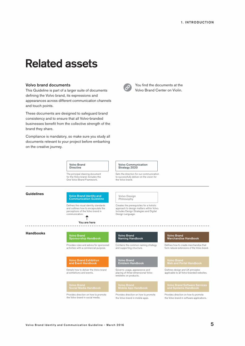
Related assets
You are here
Volvo Brand Directive
Guidelines
Handbooks
The principal steering document for the Volvo brand. Includes the One Volvo Brand Framework.
Volvo Communication Strategy 2020
Sets the direction for our communication to successfully deliver on the vision for the Volvo brand.
Volvo Brand Identity and Communication Guideline
Defines the visual identity standards and outlines how to encapsulate the perceptions of the Volvo brand in communication.
Volvo Brand Exhibition and Event Handbook
Volvo Brand Social Media Handbook
Details how to deliver the Volvo brand at exhibitions and events.
Provides direction on how to promote the Volvo brand in social media.
Volvo Brand Emblem Handbook
Volvo Brand Web and Portal Handbook
Volvo Brand Mobile App Handbook
Volvo Brand Software Services and Systems Handbook
Governs usage, appearance and placing of three-dimensional Volvo emblems on products.
Provides direction on how to promotethe Volvo brand in mobile apps.
Volvo Brand Sponsorship Handbook
Provides rules and advice for sponsored activities with a commercial purpose.
Volvo Brand Naming Handbook
Contains the common naming strategy and supporting structure.
Volvo Brand Merchandise Handbook
Defines how to create merchandise that form natural extensions of the Volvo brand.
Outlines design and UX principles applicable to all Volvo-branded websites.
Provides direction on how to promotethe Volvo brand in software applications.
Volvo brand documentsThis Guideline is part of a larger suite of documents defining the Volvo brand, its expressions and appearances across different communication channels and touch points.
These documents are designed to safeguard brand consistency and to ensure that all Volvo-branded businesses benefit from the collective strength of the brand they share.
Compliance is mandatory, so make sure you study all documents relevant to your project before embarking on the creative journey.
You find the documents at the Volvo Brand Center on Violin.
Volvo Design Philosophy
Creates the prerequisites for a holistic approach to design matters within Volvo. Includes Design Strategies and Digital Design Language.
1. INTRODUCTION
6 Vo lvo Brand Ident i t y and C ommunic a t ion Gu ide l ine – March 2016
The Volvo trademark rules and how to put them into practice:
The Volvo Trademark Rules define the very basis of our brand identity and underpin all our business communication. They also protect the Volvo trademark from being misused, degraded or stolen. So please study this section carefully. At the end of the day, it will both benefit our business and enhance the customer experience.
TR ADEMARK BASICS
What is a trademark?Typically, it is a name or a symbol that identifies the origin of a product. The Volvo word mark logotype is one example.
Note that “Volvo” often appears as a trademark also when it is not displayed in the logotype format. One example is in running text, when “Volvo” is used together with a product designation as in “Volvo FH16”, for example. Another example is the “Volvo” used in our iron mark and the Volvo grill slash.
Who owns the Volvo trademark?Volvo Trademark Holding AB owns, maintains and manages all the trademarks consisting of or containing Volvo. This legal entity is jointly owned by AB Volvo and Volvo Car Corporation, and grants licenses to those two industrial entities to use the Volvo trademark.
In order for both Volvo Car Corporation and AB Volvo to continue to harness the power of the Volvo brand, each party’s freedom to act independently is limited by the mutual undertakings given in relation to the trademark.
Why protect it?The point of owning a registered trademark is to prevent others from profiting from it. In fact, legal actions can be taken against anyone who – even in subtle ways – uses a registered trademark without permission.
If any company could put labels saying “Volvo” on its products, the meaning of “Volvo” would change radically – and the value of our brand would diminish rapidly.
It all boils down to customer benefitsProtecting our brand is not only about protecting our own interests. By following the trademark rules in your everyday work life, you also make things easier for our customers: our trademark and identity will be easy to recognise, and our company will be perceived as solid and trustworthy.
Stick to the trademark rules and you will help strengthen the image of Volvo Trucks, Volvo Buses, Volvo Construction Equipment and Volvo Penta as businesses that keep their promises.

1. INTRODUCTION
Vo lvo Brand Ident i t y and C ommunic a t ion Gu ide l ine – March 2016 7
Golden rulesto protect the Volvo trademark
Rely on these key points to protect the integrity of the Volvo trademark in your daily work. For further details, please study the Volvo Trademark Rules.
1. Never invent your own logotypes/symbolsCreating new logotypes or logo-like symbols for e.g. products, services, projects, teams or departments is not allowed. Use only approved brand carriers in accordance to these guidelines and supporting handbooks, and you will contribute to a uniform brand appearance worldwide.
2. Write Volvo properlyIt’s Volvo with a capital V. Always. Never play around with the word, and never use it in the plural form or as a verb. The Volvo logotype may not be used in running text.
3. Expose Volvo in all the right places – but only thereSponsoring activities gives our brand powerful exposure, so make sure you sponsor the right ones. Consult sponsorship management within your organization before signing any sponsorship contracts.
4. Don’t use Volvo as a trademark on products from sources out of our controlTo safeguard the validity of the trademark, a Volvo product must be tightly linked to the holder of the rights: either by way of ownership of the manufacturing company or by contractual arrangements that ensure active quality control.
5. Don’t put “Volvo” in an independent partner’s company or domain nameOnly dealers, importers and companies owned by Volvo can use it.
6. Report suspected infringementsAlert Volvo Trademark Holding AB, Volvo Group Brand Portfolio Management or brand management
within your organization immediately. Do not take any action against the infringer yourself.
7. Name Volvo-branded offerings according to the naming strategyEnsure compliance with the principles, naming architecture and processes stated in the Volvo Brand Naming Handbook.
8. Make sure the trademark is validly protected before you launch a new product or service, or enter a new marketCheck with brand management within in your organization to make sure that the trademark you plan to use is sufficiently protected.
9. Do not develop your own merchandiseAll Volvo-branded merchandise products are to be developed/approved centrally.
10. Use official Volvo signage onlySigns used at Volvo premises must conform to the Volvo Identity Programme’s specifications, and be purchased from centrally approved suppliers.
11. Use approved furniture only Furniture, materials and components used in front- and back-office environments must comply with centrally developed concepts and specifications.
12. Don’t allow a supplier to refer to Volvo in its marketingAccording to the general purchasing conditions applied by Volvo, the supplier shall not use any corporate name or trademarks belonging to or licensed to AB Volvo or its subsidiaries. Exception may be granted, but only by the Volvo Group Brand Portfolio Management.
Please seek advice from brand management within your organization in any trademark related issues.

2 . OUR BR AND – OUR HE RITAGE
8 Vo lvo Brand Ident i t y and C ommunic a t ion Gu ide l ine – March 2016
our brand,our heritage

2 . OUR BR AND – OUR HE RITAGE
Vo lvo Brand Ident i t y and C ommunic a t ion Gu ide l ine – March 2016 9
Gothenburg 1927: Volvo was born during a great wave of Swedish innovation. Its founders shared a human-centric vision, where technology is a means for improving people's lives. It was a simple idea: a statement putting what’s most important into immediate focus.
“Automobiles are driven by people. Therefore, the guiding principle behind everything we build at Volvo is – and must remain – safety.”Today with products covering a range of industries worldwide, the same driving force, the very values that define the brand, are just as relevant. It’s the absolute focus; the singular purpose that makes us leaders in every industry we touch. And it’s our people that make sure we are driving the right innovative solutions. Always designed with the drivers and operators, and everyone affected by our products, as the primary consideration.
With our core values of quality, safety and environmental care, we are a brand that places people first. We concentrate on safety to protect our most valuable assets – our customers – but also their customers and the general public, contributing to a safer society. We value long-term partnerships, which demands a consistent focus on quality in products, services and relationships. And we seek to improve lives both on and off the job, which is why we take every possible measure to care for the environment.
In order to become the world’s most preferred brand, in our industries, we need to communicate this often and consistently. So people know the motivation and thinking behind everything that carries the Volvo brand.

2 . OUR BR AND – OUR HE RITAGE
10 Vo lvo Brand Ident i t y and C ommunic a t ion Gu ide l ine – March 2016
The Volvo brand’s emotional positioning is firmly connected to competence. The reason is obvious: we are the industry experts, renowned for our pioneering mind-set and our ability to turn visions into reality.
Our products and services, and the benefits they deliver, must form the backbone of all our communication. Getting across how our total organization’s delivery improves the everyday lives of our customers today and into tomorrow builds relevance and credibility among our target audiences.
We convey our competence by being knowledgeable and informative, focusing on facts (rather than bragging with-out substance). Sharing insights and value-adding details with the ease of a natural leader signals confidence in our
Above all, we re
Effectively building the Volvo brand in the market is a matter of balancing rational and emotional values in all our communication. It is imperative that every marketing and customer touch-point creates an emotional connection with the target audience – one that consistently conveys our unique brand character.
offer, and demonstrates our deep understanding of customer needs and industry demands. We deliver a first-rate experience at every single point of contact with our audiences, and never compromise on our core values.
Future-oriented, human-centric messages are an effective means to reflect the way we anticipate tomorrow’s customer needs, paving the way for a sustainable future through our ever-evolving offerings.
Finally, Volvo’s innovative spirit must be evident in our ways of communicating. We progressively explore new ways to attract attention, and consistently high- light features that have a strong innovative message. But we avoid saying that we are “innovative” – it’s something we prove.

2 . OUR BR AND – OUR HE RITAGE
Vo lvo Brand Ident i t y and C ommunic a t ion Gu ide l ine – March 2016 11
E XPRE SSIONS THAT ADD EMOTIVE DYNAMICS
To bring attention and gravity to our brand, our communication is enriched with distinct emotional expressions:
Dynamic Caring Self-assured Here is how to convey these differentiators:
Market our offerings in a dynamic way:
• Challenge industry clichés.
• Dare to be different when orchestrating your marketing efforts.
• Create desire for our brand by portraying our offerings in the most attractive way.
Express that we’re caring in the way we meet and serve customers:
• Show that we’re trustworthy – only make promises that can be kept.
• Make customers feel reassured that our solutions will give them peace of mind.
• Show how we care – nurture the image of an empathetic brand.
Be self-assured when calling for attention:
• Show how we are the industry leader.
• Provide a premium experience in every channel.
• Express that we make customers successful.
• Show that we’re confident – but never come across as arrogant.

2 . OUR BR AND – OUR HE RITAGE
12 Vo lvo Brand Ident i t y and C ommunic a t ion Gu ide l ine – March 2016
Clearly defining the role of each piece of communication, adapting messaging to the target group, and taking on an integrated marketing approach. In a nutshell, these are the keys to efficient marketing that drives customers towards the purchase of a Volvo product or service.
How to use this marketing modelWhen planning a new activity, the simplified purchase funnel can be used as a high-level planning and validation tool, for example for:
• putting each piece of marketing in a campaign into context:
- defining its objective - ensuring the proper balance between
emotional and rational content
• ensuring channel coordination and synergies
• applying the correct emotional touch.
Although perhaps the most obvious example of where the purchase funnel mechanisms come into play is major product launches, the funnel is just as applicable for dealer campaigns as well.
How different communication channels and assets relate to the purchase funnel is detailed in the following chapters.
Target verified customer needsCarefully mapping the needs, desires and preferences of the target audience is key to success in any marketing initiative. Ensure that:
• key messages are relevant to the target group (considering e.g. buying criteria, business drivers, industry trends)
• the communication appeals to, and is understood by, the target group
• channels used are prioritized based on customer behavior and habits.
communication
Keys to
purpose- built
2 . OUR BR AND – OUR HE RITAGE
Vo lvo Brand Ident i t y and C ommunic a t ion Gu ide l ine – March 2016 13
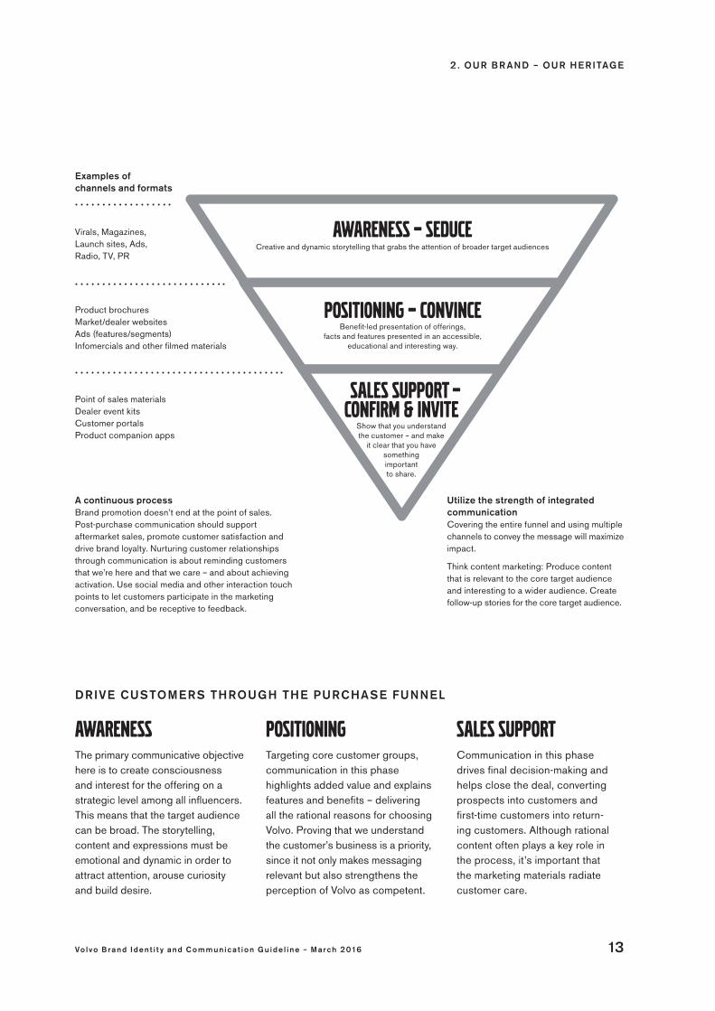
Virals, Magazines, Launch sites, Ads, Radio, TV, PR
Examples of channels and formats
Product brochuresMarket/dealer websitesAds (features/segments)Infomercials and other filmed materials
Point of sales materials Dealer event kitsCustomer portalsProduct companion apps
Awareness The primary communicative objective here is to create consciousness and interest for the offering on a strategic level among all influencers. This means that the target audience can be broad. The storytelling, content and expressions must be emotional and dynamic in order to attract attention, arouse curiosity and build desire.
PositioningTargeting core customer groups, communication in this phase highlights added value and explains features and benefits – delivering all the rational reasons for choosing Volvo. Proving that we understand the customer’s business is a priority, since it not only makes messaging relevant but also strengthens the perception of Volvo as competent.
Sales supportCommunication in this phase drives final decision-making and helps close the deal, convertingprospects into customers and first-time customers into return-ing customers. Although rational content often plays a key role in the process, it’s important that the marketing materials radiate customer care.
Awareness – seduceCreative and dynamic storytelling that grabs the attention of broader target audiences
Positioning – convinceBenefit-led presentation of offerings,
facts and features presented in an accessible, educational and interesting way.
sales support – confirm & invite
Show that you understand the customer – and make
it clear that you have something important to share.
A continuous process Brand promotion doesn’t end at the point of sales. Post-purchase communication should support aftermarket sales, promote customer satisfaction and drive brand loyalty. Nurturing customer relationships through communication is about reminding customers that we’re here and that we care – and about achieving activation. Use social media and other interaction touch points to let customers participate in the marketing conversation, and be receptive to feedback.
DRIVE CUSTOMERS THROUGH THE PURCHASE FUNNEL
Utilize the strength of integrated communicationCovering the entire funnel and using multiple channels to convey the message will maximize impact.
Think content marketing: Produce content that is relevant to the core target audience and interesting to a wider audience. Create follow-up stories for the core target audience.

2 . OUR BR AND – OUR HE RITAGE
14 Vo lvo Brand Ident i t y and C ommunic a t ion Gu ide l ine – March 2016
Things to think about
This is a comprehensive document, providing an extensive range of guidelines. But if you follow the strategy, and incorporate the provided consistency guidelines, you will create communications that help secure our position and build our brand equity long-term.
Use these six steps as a high-level guide. A central reference point for validating your work; securing that it aligns with the strategic direction set within this document.
Before youstart
2 . OUR BR AND – OUR HE RITAGE
Vo lvo Brand Ident i t y and C ommunic a t ion Gu ide l ine – March 2016 15
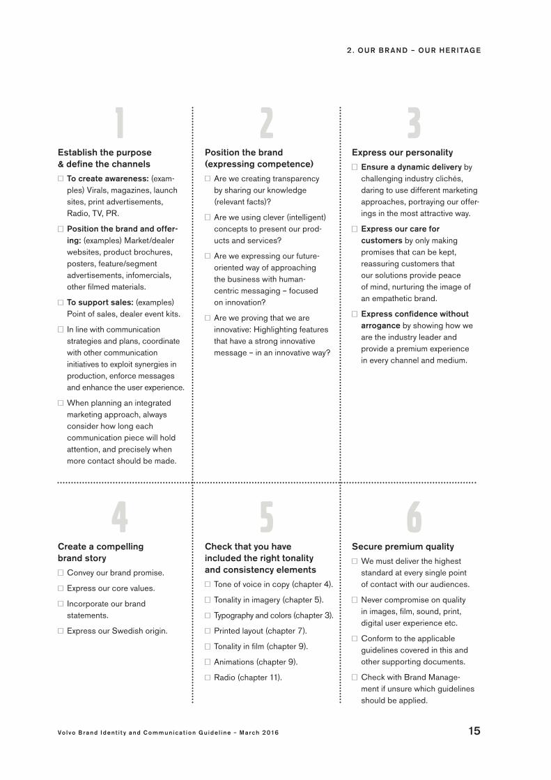
Establish the purpose & define the channels
To create awareness: (exam-ples) Virals, magazines, launch sites, print advertisements, Radio, TV, PR.
Position the brand and offer-ing: (examples) Market/dealer websites, product brochures, posters, feature/segment advertisements, infomercials, other filmed materials.
To support sales: (examples) Point of sales, dealer event kits.
In line with communication strategies and plans, coordinate with other communication initiatives to exploit synergies in production, enforce messages and enhance the user experience.
When planning an integrated marketing approach, always consider how long each communication piece will hold attention, and precisely when more contact should be made.
Position the brand (expressing competence)
Are we creating transparency by sharing our knowledge (relevant facts)?
Are we using clever (intelligent) concepts to present our prod-ucts and services?
Are we expressing our future- oriented way of approaching the business with human- centric messaging – focused on innovation?
Are we proving that we are innovative: Highlighting features that have a strong innovative message – in an innovative way?
Express our personality
Ensure a dynamic delivery by challenging industry clichés, daring to use different marketing approaches, portraying our offer-ings in the most attractive way.
Express our care for customers by only making promises that can be kept, reassuring customers that our solutions provide peace of mind, nurturing the image of an empathetic brand.
Express confidence without arrogance by showing how we are the industry leader and provide a premium experience in every channel and medium.
Create a compelling brand story
Convey our brand promise.
Express our core values.
Incorporate our brand statements.
Express our Swedish origin.
Secure premium quality
We must deliver the highest standard at every single point of contact with our audiences.
Never compromise on quality in images, film, sound, print, digital user experience etc.
Conform to the applicable guidelines covered in this and other supporting documents.
Check with Brand Manage-ment if unsure which guidelines should be applied.
1 2 3
4 5 6Check that you have included the right tonality and consistency elements
Tone of voice in copy (chapter 4).
Tonality in imagery (chapter 5).
Typography and colors (chapter 3).
Printed layout (chapter 7).
Tonality in film (chapter 9).
Animations (chapter 9).
Radio (chapter 11).
3 . CORE E LE ME NTS
16 Vo lvo Brand Ident i t y and C ommunic a t ion Gu ide l ine – March 2016
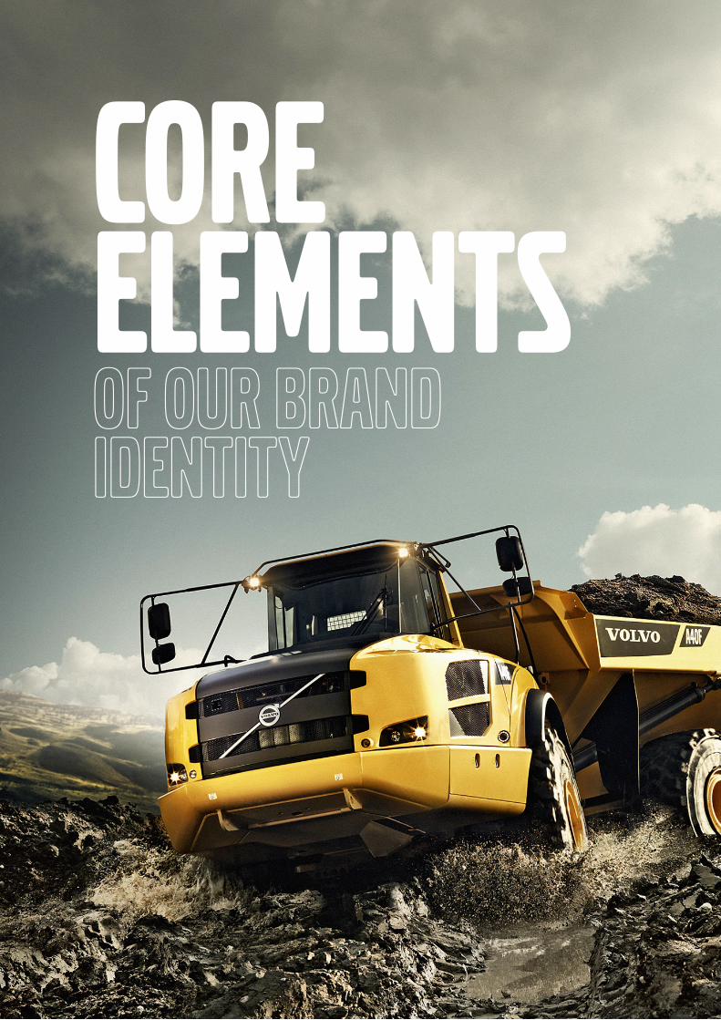
Core elementsof our brand identity
3 . CORE E LE ME NTS
Vo lvo Brand Ident i t y and C ommunic a t ion Gu ide l ine – March 2016 17
At the core of our brand’s visual identity are a few elements that provide recognition and differentiation in every single piece of communication.
This chapter presents the core elements one by one, along with universal rules that ensure proper use of them across all communication channels. Please take the time to read and understand these fundamentals as they are the keys to creating a consistent visual brand experience. Success lies in our ability to ensure that the Volvo brand remains distinct, differentiated – and consistent.
Brand carriers 10
Entity identifiers 19
The Volvo word mark logotype 20
Minimum size and clear zones 21
Protecting 22 the Volvo word mark logotype
The Volvo iron mark 24
Minimum size and clear zones 25
Entity identifier 26
Protecting 28 the Volvo iron mark
The Volvo Penta logotype 30
Minimum size and clear zones 31
Protecting 32 the Volvo Penta logotype
Typography 34
Protecting 39 the Volvo fonts
Colors 40

3 . CORE E LE ME NTS
18 Vo lvo Brand Ident i t y and C ommunic a t ion Gu ide l ine – March 2016
Brand carriers CHECKLIST
Treat each brand carrier as an inseparable element. Do not alter any of them.
Do not use a brand carrier as part of new symbols and never incorporate it in a box or other graphical element that could be perceived as a logotype.
Always reproduce the brand carriers from master artwork.
Regardless of where they meet the eyes of our audiences, our brand carriers must truly convey the premium quality inherent in the Volvo brand. Apply the rules outlined in this chapter to ensure clear and consistent presentation of the respective brand carrier.
The Volvo word mark logotype The Volvo word mark logotype is the main identification carrier for our brand. As a trademark, it is also the core Volvo brand. See page 20-23 for details.
The Volvo iron markFrom the very beginning, the Volvo iron mark has been at the heart of the Volvo brand. It is used by Volvo Trucks, Volvo Buses and Volvo Construction Equipment in all communication channels. It is also used by Volvo Financial Services in all their Volvo-branded business communication. See page 24-29 for details.
There is also a product emblem version – the Volvo product iron mark – dedicated for use on and in vehicles and machines.
The Volvo Penta logotypeThe Volvo Penta logotype is the identification carrier for Volvo Penta. It has the same legal protection as the Volvo word mark logotype. See page 30-33 for details.

3 . CORE E LE ME NTS
Vo lvo Brand Ident i t y and C ommunic a t ion Gu ide l ine – March 2016 19
Entity identifiers
In certain printed material, the Volvo iron mark is combined with a text clarifying which business entity is the sender of the communication: Volvo Trucks, Volvo Buses, Volvo Construction Equipment or Volvo Financial Services. As for Volvo Trucks and Volvo Buses, a tagline is also presented.
The Volvo iron mark and the text forms an indivisible visual entity that is referred to as entity identifier. It is always to be presented on a white background. Note that the text should not be translated. See page 26-27 for further details.
Volvo Buses The Volvo Buses entity identifier consists of the text “Volvo Buses. Driving quality of life” and the Volvo iron mark. This graphic entity is always presented on a white background.
Volvo Construction Equipment The Volvo Construction Equipment entity identifier consists of the text “Volvo Construction Equipment” and the Volvo iron mark. This graphic entity is always presented on a white background.
Volvo Trucks The Volvo Trucks entity identifier consists of the text “Volvo Trucks. Driving Progress” and the Volvo iron mark. This graphic entity is always presented on a white background.
3 . CORE E LE ME NTS
20 Vo lvo Brand Ident i t y and C ommunic a t ion Gu ide l ine – March 2016
The Volvo word mark logotype
CHECKLIST
Ensure sufficient contrasts to safeguard logotype visibility on colored and photographic backgrounds.
Always reproduce the Volvo word mark logotype from master artwork.
Use the artwork version matching the application and reproduction size.
The few simple rules stated in this section safeguard that this logotype is properly presented across communication channels and formats.
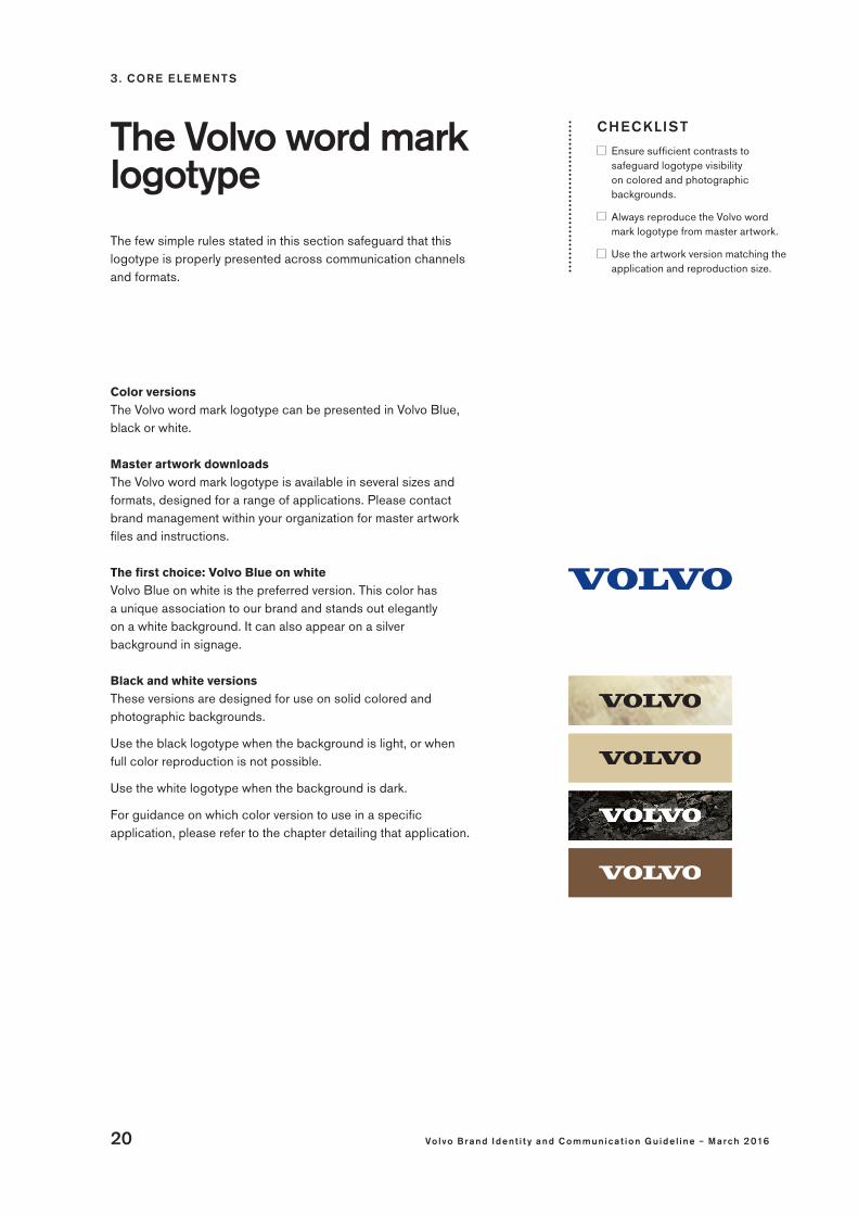
Color versions The Volvo word mark logotype can be presented in Volvo Blue, black or white.
Master artwork downloadsThe Volvo word mark logotype is available in several sizes and formats, designed for a range of applications. Please contact brand management within your organization for master artwork files and instructions.
The first choice: Volvo Blue on whiteVolvo Blue on white is the preferred version. This color has a unique association to our brand and stands out elegantly on a white background. It can also appear on a silver background in signage.
Black and white versionsThese versions are designed for use on solid colored and photographic backgrounds.
Use the black logotype when the background is light, or when full color reproduction is not possible.
Use the white logotype when the background is dark.
For guidance on which color version to use in a specific application, please refer to the chapter detailing that application.

3 . CORE E LE ME NTS
Vo lvo Brand Ident i t y and C ommunic a t ion Gu ide l ine – March 2016 21
Minimum size and clear zones
CHECKLIST
Never violate the clear zone. It safeguards visibility and protects the integrity of the Volvo brand.
Ensure that there is a proper visual balance between the Volvo word mark logotype and all other visual elements it accompanies.
Always adhere to the minimum size rule.
For a variety of applications there are fixed or, in some cases, recommended sizes in which the Volvo word mark logotype should be reproduced. These are detailed in the respective chapters of these guidelines.
However, there are two fundamental rules that must be adhered to at all times: the minimum size and the clear zone.
Minimum size: 25 mmTo ensure that the Volvo word mark logotype is clearly visible, it should never be rendered less than 25 mm wide.
The only exception is for merchandise, on which the minimum size is 10 mm in width. However, visibility and clarity must always be ensured.
Clear zonesThe clear zone is an area surrounding the Volvo word mark logotype in which no other graphic elements or texts are to be presented. The clear zone, which extends in all directions, protects the integrity of the logotype and ensures that it stands out clearly.
Minimum clear zone = the height of the logotypeThe minimum distance between the Volvo word mark and any other graphical element equals the height of the logotype. When presented next to another logotype, a double clear zone must be applied.
The only exceptions to the clear zone rule are found in a few signage solutions and event perimeter boards at e.g. sports courts. Please refer to the Signage and Exhibitions and events chapters for details.
Double clear zoneWhen presented next to another logotype, double clear zone applies.
X
X X
X X
25 mm/0.98''
3 . CORE E LE ME NTS
22 Vo lvo Brand Ident i t y and C ommunic a t ion Gu ide l ine – March 2016
Protectingthe Volvo word mark logotype
CHECKLIST
Ensure that agencies and partners producing Volvo-branded communication apply the Volvo Brand Identity Guideline.
Always reproduce the Volvo word mark logotype from master artwork.
Safeguard that all material produced is properly approved prior to final production and distribution.
Report misuse and suspected brand infringements to Volvo Trade-mark Holding AB, Volvo Group Brand Portfolio Management or brand management within your organization.
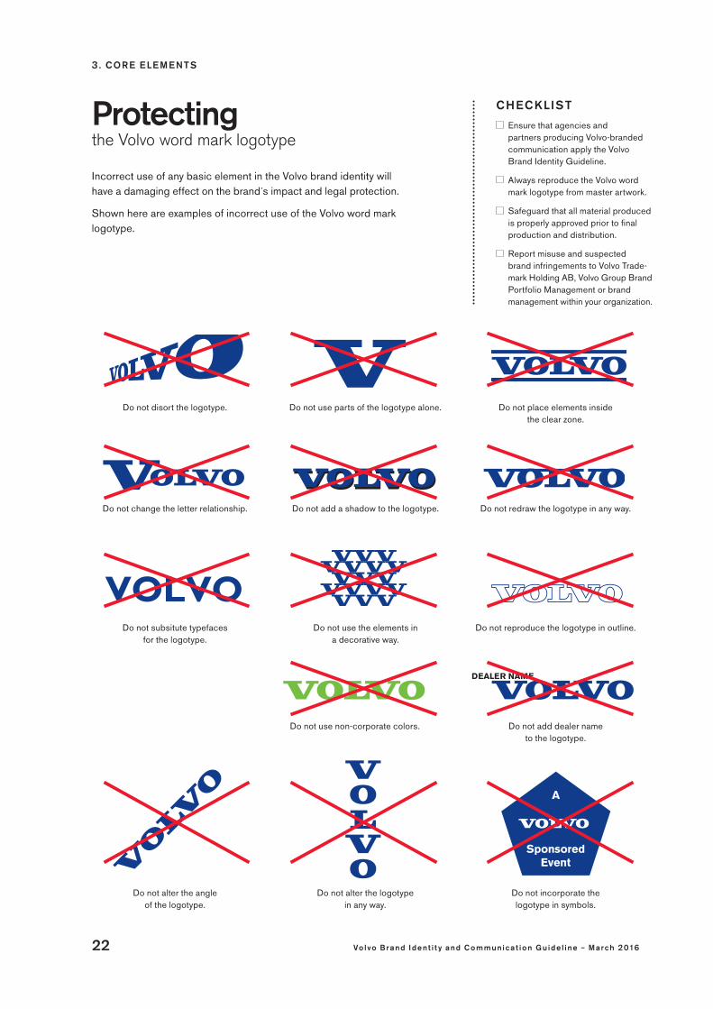
Incorrect use of any basic element in the Volvo brand identity will have a damaging effect on the brand´s impact and legal protection.
Shown here are examples of incorrect use of the Volvo word mark logotype.
Do not disort the logotype. Do not place elements inside the clear zone.
Do not redraw the logotype in any way.Do not change the letter relationship. Do not add a shadow to the logotype.
Do not subsitute typefaces for the logotype.
Do not use the elements in a decorative way.
Do not reproduce the logotype in outline.
Do not use parts of the logotype alone.
Do not add dealer name to the logotype.
Do not alter the angle of the logotype.
Do not use non-corporate colors.
Do not alter the logotype in any way.
Do not incorporate the logotype in symbols.

3 . CORE E LE ME NTS
Vo lvo Brand Ident i t y and C ommunic a t ion Gu ide l ine – March 2016 23
Never place the Volvo logotype in a narrow box.
Do not add visual effects to the logotype.
Caboris aptas er eseuam molor
erspid ajsind
quia sapeera de magnihi eraser
Do not use the logotype in running text.
Do not put a corona around the logotype.
Do not reverse the colorways.
Do not use non-corporate typefaces. Do not use the logotype on graduated backgrounds.
Do not create unapproved descriptors.Do not use non-corporate colors and do not abbreviate company descriptors.
Do not place the descriptor within the clearzone.
Do not use the logotype in visually complex backgrounds.
Do not print or make the logotype in gold or bronze.
Do not use Volvo Blue on non-corporate colors.
Do not place other logotypes within the clearzone.

3 . CORE E LE ME NTS
24 Vo lvo Brand Ident i t y and C ommunic a t ion Gu ide l ine – March 2016
The Volvo iron mark CHECKLIST
The Volvo iron mark should always be presented on a white background in communication materials. It must never appear boxed in by other elements.
Always reproduce the Volvo iron mark from master artwork.
Use the artwork version matching the application and reproduction size.
Never use the line-art version in printed material or digital communication.
Used in all communication channels by Volvo Trucks, Volvo Buses, Volvo Construction Equipment and Volvo Financial Services, the Volvo iron mark must be consistently treated according to the few simple rules stated in this section.
Master artworkThe Volvo iron mark is available in several sizes and formats, designed for a range of applications. Please contact brand management within your organization for master artwork files and instructions.
Specific artwork for small applicationsThe appearance of the Volvo iron mark must always be consistent. For reproductions smaller than 14 mm or 40 px in width, please refer to the master artwork designed specifically for small applications.
Color versions Obviously, presenting the Volvo iron mark in color is preferred, since the Volvo Blue color – unique to our brand – is then clearly conveyed.
However, the Volvo iron mark may also be reproduced in grey- scale when full-color reproduction is not possible, for example, in black and white communication materials or single-black print and copier applications (forms, test reports, etc.).
There is also a line-art version of the Volvo iron mark reserved for use on merchandise (embossing, etching, spot UV varnishing, etc. to create subtle tone-to-tone effects).
3 . CORE E LE ME NTS
Vo lvo Brand Ident i t y and C ommunic a t ion Gu ide l ine – March 2016 25
Minimum size and clear zones
CHECKLIST
Never violate the clear zone. It safeguards visibility and protects the integrity of the Volvo brand.
Ensure that there is a proper visual balance between the Volvo iron mark and all other visual elements it accompanies.
Always adhere to the minimum size rule.
For a variety of applications there are fixed or, in some cases, recommended sizes in which the Volvo iron mark should be reproduced. These are detailed in the respective chapters of these guidelines.
However, there are two fundamental rules that must be adhered to at all times: the minimum size and the clear zone.
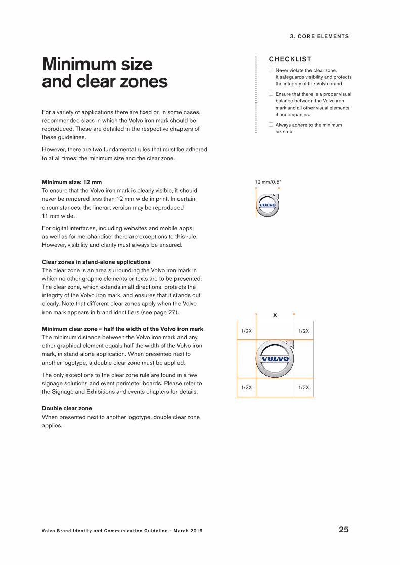
Minimum size: 12 mmTo ensure that the Volvo iron mark is clearly visible, it should never be rendered less than 12 mm wide in print. In certain circumstances, the line-art version may be reproduced 11 mm wide.
For digital interfaces, including websites and mobile apps, as well as for merchandise, there are exceptions to this rule. However, visibility and clarity must always be ensured.
Clear zones in stand-alone applicationsThe clear zone is an area surrounding the Volvo iron mark in which no other graphic elements or texts are to be presented. The clear zone, which extends in all directions, protects the integrity of the Volvo iron mark, and ensures that it stands out clearly. Note that different clear zones apply when the Volvo iron mark appears in brand identifiers (see page 27).
Minimum clear zone = half the width of the Volvo iron mark The minimum distance between the Volvo iron mark and any other graphical element equals half the width of the Volvo iron mark, in stand-alone application. When presented next to another logotype, a double clear zone must be applied.
The only exceptions to the clear zone rule are found in a few signage solutions and event perimeter boards. Please refer to the Signage and Exhibitions and events chapters for details.
Double clear zoneWhen presented next to another logotype, double clear zone applies.
12 mm/0.5”
X
1/2X1/2X
1/2X1/2X

3 . CORE E LE ME NTS
26 Vo lvo Brand Ident i t y and C ommunic a t ion Gu ide l ine – March 2016
Entity identifier CHECKLIST
Always reproduce the entity identifier from master artwork.
When adjusting the size to fit a certain format, ensure that the proportions between the Volvo iron mark and the text are correct.
Always present the entity identifier on a white background.
Requests to use translated taglines must be forwarded to global brand management within the organization concerned for advice and approval.
Never violate the clear zone.
The entity identifier is used in printed marketing materials by Volvo Trucks, Volvo Buses, Volvo Construction Equipment and Volvo Financial Services, reinforcing the brand identity and clarifying the identity of the sender. It can also be used in online campaigns, for example on product launch websites.
Anatomy of the entity identifier
• The text is placed to the left of the Volvo iron mark, proportional in width to the size of the Volvo iron mark as illustrated.
• The clear zone between the Volvo iron mark and the text is also based on the size of the Volvo iron mark.
• The text is set in Volvo Sans Pro Medium in black.
• The background is always white.
For master artwork, please contact brand management within your organization.
1/3 X
X
1/6 X
3 . CORE E LE ME NTS
Vo lvo Brand Ident i t y and C ommunic a t ion Gu ide l ine – March 2016 27
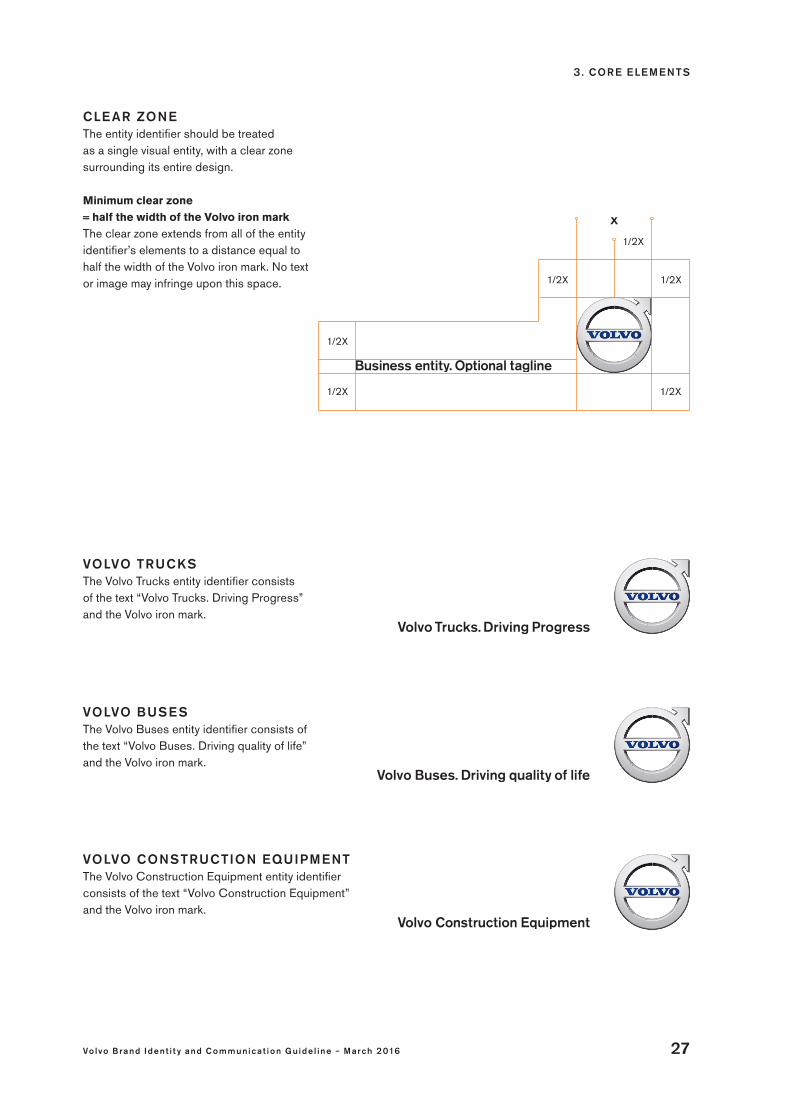
CLE AR ZONE The entity identifier should be treated as a single visual entity, with a clear zone surrounding its entire design.
Minimum clear zone = half the width of the Volvo iron mark The clear zone extends from all of the entity identifier’s elements to a distance equal to half the width of the Volvo iron mark. No text or image may infringe upon this space. 1/2X
1/2X
X
1/2X
1/2X
1/2X
1/2X
VOLVO BUSE S The Volvo Buses entity identifier consists of the text “Volvo Buses. Driving quality of life” and the Volvo iron mark.
VOLVO CONSTRUCTION EQUIPMENT The Volvo Construction Equipment entity identifier consists of the text “Volvo Construction Equipment” and the Volvo iron mark.
VOLVO TRUCKS The Volvo Trucks entity identifier consists of the text “Volvo Trucks. Driving Progress” and the Volvo iron mark.

3 . CORE E LE ME NTS
28 Vo lvo Brand Ident i t y and C ommunic a t ion Gu ide l ine – March 2016
Do not use Volvo Sans Pro in a font weight other than Medium.
Do not use Volvo Broad.
Do not change the text color.
Do not place the text above the Volvo iron mark. Do not set the text on two lines.
Do not use Volvo Serif.
Do not break the text’s alignment with the base of the Volvo iron mark.
Do not use on colored or photographic backgrounds.
Protectingthe Volvo iron mark
CHECKLIST
Ensure that agencies and partners producing Volvo-branded communi-cation apply the Volvo Brand Identity and Communication Guideline.
Always reproduce the Volvo iron mark from master artwork.
Safeguard that all material produced is properly approved prior to final production and distribution.
Report misuse and suspected brand infringements to Volvo Trademark Holding AB, Volvo Group Brand Portfolio Management or brand management within your organization.
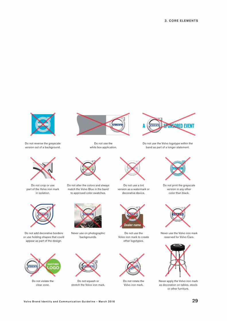
Incorrect use of any basic element in the Volvo brand identity will have a damaging effect on the brand´s impact and legal protection.
Shown here are examples of incorrect use of the Volvo iron mark.
3 . CORE E LE ME NTS
Vo lvo Brand Ident i t y and C ommunic a t ion Gu ide l ine – March 2016 29
Do not crop or use part of the Volvo iron mark
in isolation.
Never use on photographic backgrounds.
Do not rotate the Volvo iron mark.
Do not use the Volvo iron mark to create
other logotypes.
Do not violate the clear zone.
Never apply the Volvo iron mark as decoration on tables, stools
or other furniture.
Do not reverse the greyscale version out of a background.
Do not squash or stretch the Volvo iron mark.
Do not use the white box application.
Do not print the greyscale version in any other
color than black.
Do not alter the colors and always match the Volvo Blue in the band
to approved color swatches.
Do not use a tint version as a watermark or
decorative device.
Never use the Volvo iron mark reserved for Volvo Cars.
Do not use the Volvo logotype within the band as part of a longer statement.
Do not add decorative borders or use holding shapes that could
appear as part of the design.

3 . CORE E LE ME NTS
30 Vo lvo Brand Ident i t y and C ommunic a t ion Gu ide l ine – March 2016
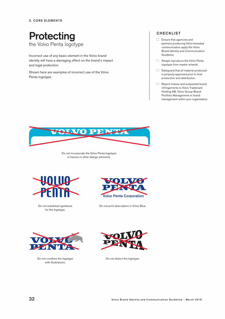
To ensure consistency and legal protection of the Volvo Penta logotype, the few simple rules stated in this section must be adhered to at all times.
The Volvo Penta logotype
CHECKLIST
Ensure sufficient contrasts to safeguard logotype visibility on colored and photographic backgrounds.
Always reproduce the Volvo Penta logotype from master artwork.
Use the artwork version matching the application and reproduction size.
Color versions The Volvo Penta logotype can be presented in Volvo Blue, black or white.
Master artworkThe Volvo Penta logotype is available in several sizes and formats, designed for a range of applications. Please contact brand management within your organization for master artwork files and instructions.
The first choice: Volvo Blue on whiteThe stacked Volvo Penta logotype, with the word “Penta” centered below the word “Volvo”, in Volvo Blue on white is the preferred version. This color has a unique association to our brand and stands out elegantly on a white background.
Black and white versionsThese versions are designed for use on solid colored and photographic backgrounds.
Use the black logotype when the background is light, or when full color reproduction is not possible.
Use the white logotype when the background is dark.
For guidance on which color version to use in a specific application, please refer to the chapter detailing that application.
Single-line version for specific applicationsThis Volvo Penta logotype version is for use on specific application only: in corporate stationery, on products and on promotional items. The basic rules applicable to the stacked Volvo Penta logotype also apply to the single-line version.

3 . CORE E LE ME NTS
Vo lvo Brand Ident i t y and C ommunic a t ion Gu ide l ine – March 2016 31
26.5 mm/1.05’’
Minimum size and clear zones
CHECKLIST
Never violate the clear zone. It safeguards visibility and protects the integrity of the Volvo brand.
Ensure that there is a proper visual balance between the Volvo Penta logotype and all other visual elements it accompanies.
Always adhere to the minimum size rule.
For a variety of applications there are fixed or, in some cases, recommended sizes in which the Volvo Penta logotype should be reproduced. These are detailed in the respective chapters of these guidelines.
However, there are two fundamental rules that must be adhered to at all times: the minimum size and the clear zone.
Minimum size: 26.5 mmTo ensure that the Volvo Penta logotype is clearly visible, the stacked version should never be rendered less than 26.5 mm wide in print. For the single-line version, the minimum size is determined by the length of the word “Volvo” which should not measure less than 25 mm.
For digital interfaces, including websites and mobile apps, as well as for merchandise, there are exceptions to this rule. However, visibility and clarity must always be ensured. Clear zoneThe clear zone is an area surrounding the Volvo Penta logotype in which no other graphic elements or texts are to be presented. The clear zone, which extends in all directions, protects the integrity of the logotype, and ensures that it stands out clearly.
Minimum clear zone = the height of the word “Volvo” The minimum distance between the Volvo Penta logotype and any other graphical element equals the height of the word “Volvo” in the logotype. When presented next to another logotype, a double clear zone must be applied.
The only exceptions to the clear zone rules are found in a few signage solutions and event perimeter boards. Please refer to the Signage and Exhibitions and events chapters for details.
X
X
X
X
X
3 . CORE E LE ME NTS
32 Vo lvo Brand Ident i t y and C ommunic a t ion Gu ide l ine – March 2016
Do not incorporate the Volvo Penta logotype in frames or other design elements.
Do not print descriptors in Volvo Blue.
Do not distort the logotype.Do not combine the logotype with illustrations.
Do not substitute typefaces for the logotype.
Protectingthe Volvo Penta logotype
CHECKLIST
Ensure that agencies and partners producing Volvo-branded communication apply the Volvo Brand Identity and Communication Guideline.
Always reproduce the Volvo Penta logotype from master artwork.
Safeguard that all material produced is properly approved prior to final production and distribution.
Report misuse and suspected brand infringements to Volvo Trademark Holding AB, Volvo Group Brand Portfolio Management or brand management within your organization.
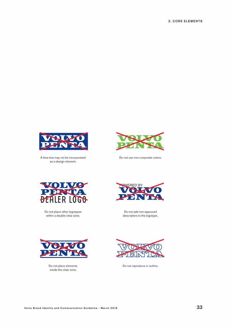
Incorrect use of any basic element in the Volvo brand identity will have a damaging effect on the brand´s impact and legal protection.
Shown here are examples of incorrect use of the Volvo Penta logotype.
3 . CORE E LE ME NTS
Vo lvo Brand Ident i t y and C ommunic a t ion Gu ide l ine – March 2016 33
Do not place other logotypes within a double clear zone.
Do not place elements inside the clear zone.
Do not add non-approved descriptors to the logotype.
Do not reproduce in outline.
A blue box may not be incorporated as a design element.
Do not use non-corporate colors.

3 . CORE E LE ME NTS
34 Vo lvo Brand Ident i t y and C ommunic a t ion Gu ide l ine – March 2016
our typography builds consistency
Our typography has both a functional and an aesthetic side. It creates impact, ensuring text is legible and easy to read, and at the same time it creates a distinct character that is easy to recognize. Volvo has four typefaces, all of which are strong identifiers for the Volvo brand: Volvo Broad Pro, Volvo Broad Outline, Volvo Sans Pro and Volvo Serif Pro.
These typefaces support a range of languages. For non-supported languages and media formats, there are designated font equivalents to use.

3 . CORE E LE ME NTS
Vo lvo Brand Ident i t y and C ommunic a t ion Gu ide l ine – March 2016 35
Volvo Serif BoldVolvo Serif Bold ItalicVolvo Serif RegularVolvo Serif Italic
volvo broad
Volvo Sans SuperVolvo Sans BoldVolvo Sans MediumVolvo Sans RegularVolvo Sans Light
volvo broad Outline
Volvo Broad Pro is the font that is most closely linked with our brand. It is a forceful upper-case typeface designed for impact and recognition.
It is designed for large sizes and functions well for titles and headings, for example, in brochures, advertisements and customer magazines. It also works well in product designations.
This headline typeface provides an open, airy feeling and makes quite a striking impression, especially when placed on images.
Proper contrast between typeface and background is key to successful use of Volvo Broad Outline typeface.
This distinct and legible typeface clearly represents the quality and integrity of the Volvo brand. Volvo Sans Pro comes in five weights, which provide useful variation, and is suitable for sub-headings, introductions, body copy and captions.
Volvo Serif Pro is open and closely allied to script. Its elegant proportions make is very suitable for descriptive or narrative text. This typeface is available in four weights. It can be used in longer body copy, captions and quotes – but not in headlines.

3 . CORE E LE ME NTS
36 Vo lvo Brand Ident i t y and C ommunic a t ion Gu ide l ine – March 2016
CHECKLIST
Ensure readability, quality and clarity at all times through e.g. spacing, kerning and placing of text.
Do not set text in too loose tracking.
Never change or distort the Volvo typefaces to create new weights or letter-shapes, since that would compromise the legal protection of the typefaces unique to Volvo.
Write Volvo properly, with a capital V. Never use the Volvo word mark logotype or the Volvo Penta logotype in running text.
Private dealers with a corporate identity of their own are never allowed to use the Volvo typefaces in communication promoting their company.
Designed to create an impact, the Volvo brand typefaces provide recognition and differentiation while promoting legibility. We primarily use four fonts, unique to our brand: Volvo Broad, Volvo Broad Outline, Volvo Sans and Volvo Serif.
Using the Volvo brand typefaces consistently in print and on screen, in accordance to the instructions provided in these guidelines, will maximize the Volvo brand’s visual presence across communication channels, industries and markets. Basic usage rules are detailed on the following pages.
Reserved for market communicationThe Volvo typefaces are to be used in external communication. For internal communication such as internal newsletters, Word letters, forms and for e.g. customer communication or correspondence that is not marketing material, Arial or Times New Roman must be used.
Typefaces for digital interfacesDue to legal reasons and technical constraints, Arial is used instead of Volvo Sans on Volvo-branded websites and desktop applications, e.g. in sub-headings, body text and navigation.
A balanced used of the Volvo Broad Digital typeface, which is a headline typeface developed for responsive digital designs, promotes brand identification across digital media, including mobile apps.
Language supportThe Volvo typefaces are available as OpenType fonts. Several languages are supported, including Western and Central European languages.
TypographyGuiding principles
Please contact brand management within your organization for access to the Volvo typefaces.

3 . CORE E LE ME NTS
Vo lvo Brand Ident i t y and C ommunic a t ion Gu ide l ine – March 2016 37
Volvo Broad Pro• Use Volvo Broad Pro only in titles, bigger headlines
and product designations.• Can be used on white or colored backgrounds and
on images. When placed on an image or colored background, it must be set in white or black.
• Colored headlines set in Volvo Broad Pro may only be used on white backgrounds.
• Use Volvo Broad Digital to ensure proper appearance in responsive digital formats.
• Volvo Broad Pro must not be used in stationery documents.
Volvo Sans Pro• Use Volvo Sans Pro for sub-headings, introductions,
body copy and captions. • Should not be used in titles and main headlines.
The only exception is headlines within brochures.• Should be used as the primary typeface for present-
ing technical information and specifications.• Can be used on white or colored backgrounds and
on images. When placed on an image or colored background, it must be set in white or black.
• Colored text set in Volvo Sans Pro may only be used on white backgrounds.
• Should a headline set in Volvo Broad Pro grow too long when translated, e.g. so that it exceeds the set number of lines on the brochure front cover, the head-line can be set in Volvo Sans Medium Pro instead.
• Never alter Volvo Sans Pro to italic.
Volvo Broad OutlineVolvo Broad Outline is available in three versions, each intended for a specific use:• Broad Outline Large for large print headlines• Broad Outline Medium for print headlines• Broad Outline Small for web headlines
• Make sure to use the appropriate version of Volvo Broad Outline for your application.
• Use Volvo Broad Outline only on images and colored backgrounds – not on white.
• Ensure that contrast between text and background is sufficient. Verify text legibility.
• Do not set Volvo Broad Outline headlines in other colors or tints than full black or white.
Volvo Serif Pro• Use Volvo Serif Pro in longer body copy, captions and
quotes.• Never set a headline in Volvo Serif Pro.• Can be used on white or colored backgrounds and on
images. When placed on an image or colored back-ground, it must be set in white or black.
• Colored text set in Volvo Serif Pro may only be used on white backgrounds.

3 . CORE E LE ME NTS
38 Vo lvo Brand Ident i t y and C ommunic a t ion Gu ide l ine – March 2016
USAGE T YPEFACE NAME T YPEFACE SPECIFICATIONS
External communication Volvo Sans Pro Volvo Sans See the Printed material chapter for details
External communication Volvo Serif Pro Volvo Serif See the Printed material chapter for details
External communication Volvo Broad ProVolvo Broad
See the Printed material chapter for details
External communication Volvo Broad Outline Volvo Broad Outline See the Printed material chapter for details
Official Volvo Ocean Race communication
Distressed Volvo Broad Distressed Volvo Broad
Contact Volvo Group Brand Portfolio Management
External websites (responsive designs) and apps
Volvo Broad DigitalVolvo Broad digital
Volvo Brand Web and Portal Handbook
External websites Arial Arial Volvo Brand Web and Portal Handbook
Driver/operator environments Volvo Instrument Volvo Instrument Contact Volvo product design department
Internal communication Arial Arial
Office documents and presentations
Arial Arial As in Office templates
Internal communication Times New Roman Times New Roman
Office documents and presentations
Times New Roman Times New Roman As in Office templates
Typography

3 . CORE E LE ME NTS
Vo lvo Brand Ident i t y and C ommunic a t ion Gu ide l ine – March 2016 39
Incorrect use of any basic element in the Volvo brand identity will erode the cohesion of the entire system. Shown here are examples of incorrect use of the Volvo typefaces, which would have a damaging effect on their impact and legal protection:
Protectingthe Volvo fonts
ABC
Do not make italics out of upright letters.
Do not fill or adjust parts of the characters.
Do not overdo visual effect combinations like 3D extrusion,
outline, drop shadows etc.
Abc Abc
Never put an image into Volvo Broad Outline.
Do not change outlines to dotted or stitched lines.
Do not affect the appearance of the characters by removing parts, apply
in pattern grids or the like.
ABC
Do not use Volvo Broad Outline in any color.
ABC
Do not jeopardize readability and clarity, e.g. by positioning Volvo Broad Outline (in black
or white) on a scattered image background.
A BC
Do not set Volvo Broad Pro vertically or diagonally. Set this
typeface horizontally only.
A BC
Do not manually change outline information to create other weights
or letter shapes.
Do not stretch/extend (or condense) to change the width of the characters.
Do not use Volvo Broad Outline in black on white background. Volvo Broad
Outline can only be used (in black or white) on images.

3 . CORE E LE ME NTS
40 Vo lvo Brand Ident i t y and C ommunic a t ion Gu ide l ine – March 2016
colors
Color is a key design element in the creation of the Volvo identity. Proper use is differentiating and creates recognition. A specific hierarchy for color use should be followed at all times. Used correctly, it creates a consistent brand expression, a distinct identity, and a characteristic Swedish look and feel.
from our
swedish heritage
3 . CORE E LE ME NTS
Vo lvo Brand Ident i t y and C ommunic a t ion Gu ide l ine – March 2016 41
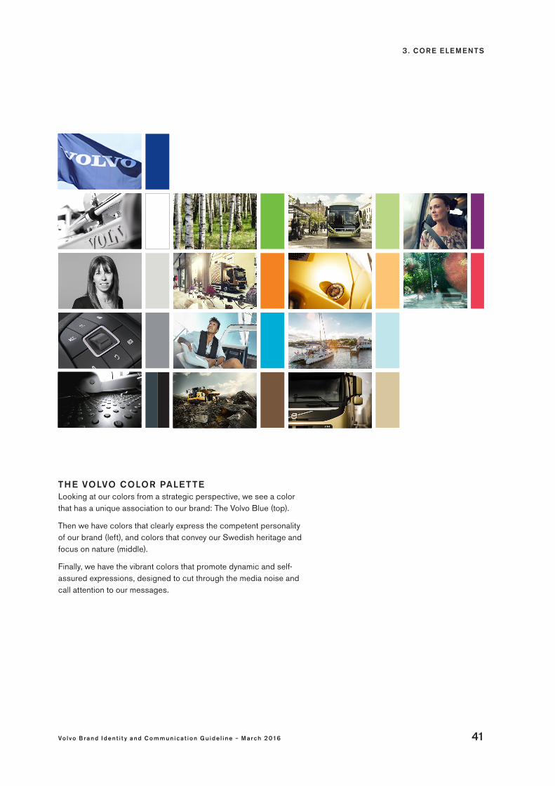
THE VOLVO COLOR PALET TELooking at our colors from a strategic perspective, we see a color that has a unique association to our brand: The Volvo Blue (top).
Then we have colors that clearly express the competent personality of our brand (left), and colors that convey our Swedish heritage and focus on nature (middle).
Finally, we have the vibrant colors that promote dynamic and self-assured expressions, designed to cut through the media noise and call attention to our messages.
3 . CORE E LE ME NTS
42 Vo lvo Brand Ident i t y and C ommunic a t ion Gu ide l ine – March 2016
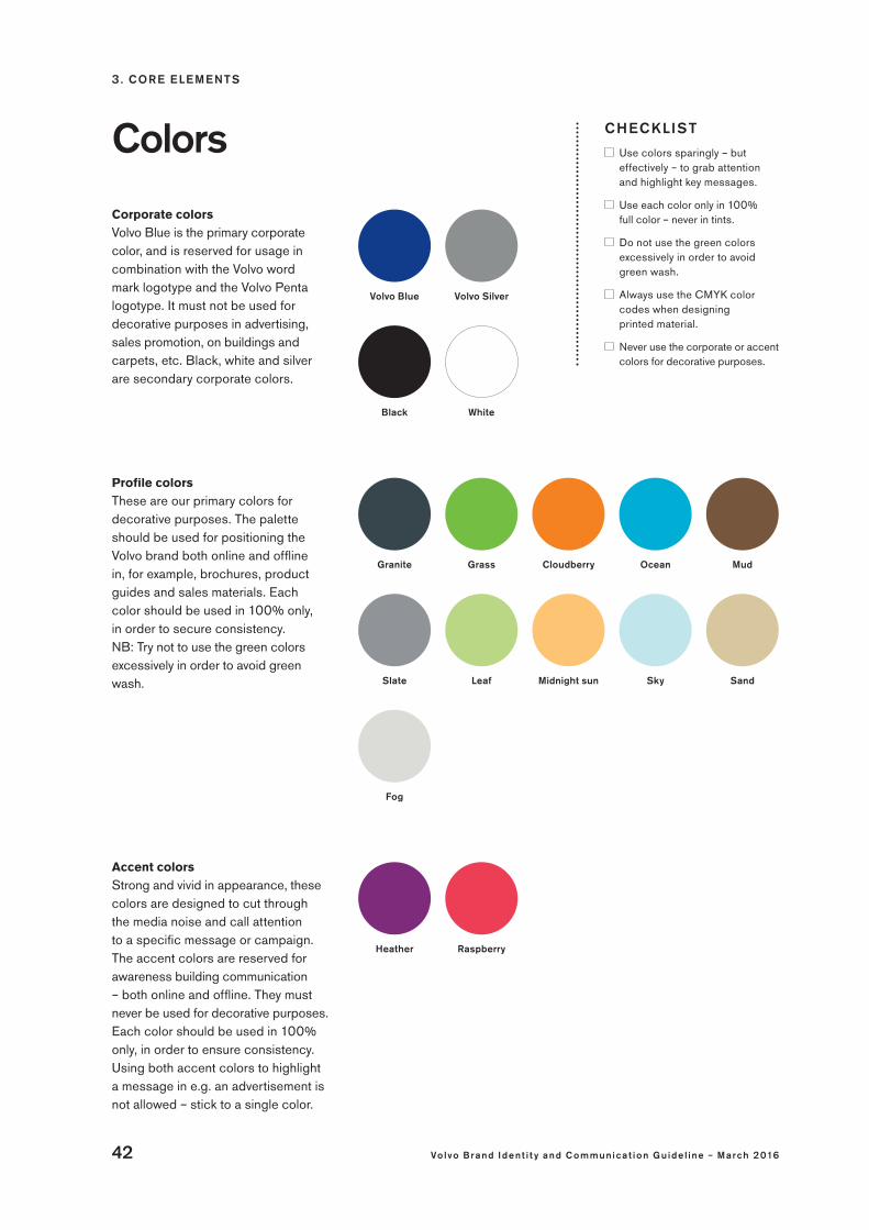
CHECKLIST
Use colors sparingly – but effectively – to grab attention and highlight key messages.
Use each color only in 100% full color – never in tints.
Do not use the green colors excessively in order to avoid green wash.
Always use the CMYK color codes when designing printed material.
Never use the corporate or accent colors for decorative purposes.
Colors
Corporate colorsVolvo Blue is the primary corporate color, and is reserved for usage in combination with the Volvo word mark logotype and the Volvo Penta logotype. It must not be used for decorative purposes in advertising, sales promotion, on buildings and carpets, etc. Black, white and silver are secondary corporate colors.
Profile colors These are our primary colors for decorative purposes. The palette should be used for positioning the Volvo brand both online and offline in, for example, brochures, product guides and sales materials. Each color should be used in 100% only, in order to secure consistency. NB: Try not to use the green colors excessively in order to avoid green wash.
Accent colors Strong and vivid in appearance, these colors are designed to cut through the media noise and call attention to a specific message or campaign. The accent colors are reserved for awareness building communication – both online and offline. They must never be used for decorative purposes. Each color should be used in 100% only, in order to ensure consistency. Using both accent colors to highlight a message in e.g. an advertisement is not allowed – stick to a single color.
RaspberryHeather
Volvo SilverVolvo Blue
WhiteBlack
Granite MudOceanGrass
SandSkyLeaf
Cloudberry
Midnight sun
Fog
Slate

3 . CORE E LE ME NTS
Vo lvo Brand Ident i t y and C ommunic a t ion Gu ide l ine – March 2016 43
Signal colors The signal colors are standard colors, not unique to the Volvo brand, and serve one purpose only: To highlight user feedback messages. These colors are primarily intended for use in online forms and digital applications, but may also be used in printed material such as product manuals and service handbooks – for signal and alert purposes only. The colors intuitively signal: • Success (green) • Warning (yellow) • Error (red)
Success green
Warning yellow
Error red
Business-specific colors There are a few exceptions where business-specific colors, or colors unique to one Volvo-branded business, may be used. For example the yellow, gray and orange colors used in Volvo Construction Equipment’s fact sheet product illustrations.
Note that the use of business-specific colors are always exceptions that must be approved by Volvo Group Brand Portfolio Management.
White is a visual enhancer It is important to recognize the vital role that white backgrounds, frames and open “space” play in our visual communications. White makes the Volvo iron mark and the Volvo Penta logotype stand out – and our colors glow.
Call to action Blue – for digital use onlyThis color is reserved for high priority call-to-action elements, such as buttons and links in digital channels. Not only does Call to action Blue create perceptions of trust, dependability and strength – its ability to create focus without distracting the user has been verified in user tests. It also resembles the color used in “hyperlinks” at the dawn of the Internet, meaning that many users intuitively associate it with moving on. Note that Call to action Blue must not be used for decorative purposes, and never appear in printed material.
Call-to-acton Blue

3 . CORE E LE ME NTS
44 Vo lvo Brand Ident i t y and C ommunic a t ion Gu ide l ine – March 2016
COLOR PANTONE C M Y K R G B W E B#
Corporatecolors
Volvo Blue 2747 100 85 0 15 24 40 113 182871
Volvo Silver 877 – – – – – – – –
White White 0 0 0 0 255 255 255 f f f f f f
Black Black 0 0 0 100 0 0 0 000000
Profilecolors
Granite Cool Gray 11 22 0 0 85 77 78 83 4d4e53
Slate Cool Gray 7 2 0 0 50 145 146 150 919296
Fog Cool Gray 2 0 0 4 15 216 215 213 d8d7d5
Grass 368 59 0 100 0 120 184 51 78b833
Leaf 365 30 0 62 0 200 230 145 c8e691
Cloudberry 152 0 60 100 0 221 118 17 dd7611
Midnight sun 1355 0 25 63 0 252 204 130 fccc82
Ocean 312 96 0 15 0 22 166 201 16a6c9
Sky 7457 23 0 7 0 186 220 230 badce6
Mud 7505 36 53 71 38 112 78 54 704e36
Sand 7501 15 18 41 0 220 204 167 dccca7
Accentcolors
Heather 512 63 100 20 0 118 51 105 763369
Raspberry 710 0 90 60 0 216 68 81 d84451
Signalcolors
Success – 100 0 100 0 71 150 45 47962d
Warning – 0 10 100 0 247 211 2 f7d302
Error – 0 100 100 0 196 0 26 c4001a
For digitaluse only
Call to action Blue – – – – – 18 81 181 1251b5
Color codes