user interfaces & ux - tutprojekti/ui lecture.pdf · user interfaces & ux tie-13106...
TRANSCRIPT

User Interfaces & UXTIE-1310620.9.2016
Laura HokkanenUnit of Human-Centered Technology
(IHTE)
Slides by Thomas Olsson
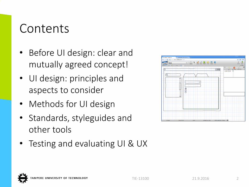
Contents
• Before UI design: clear and mutually agreed concept!
• UI design: principles and aspects to consider
• Methods for UI design
• Standards, styleguides and other tools
• Testing and evaluating UI & UX
21.9.2016TIE-13100 2
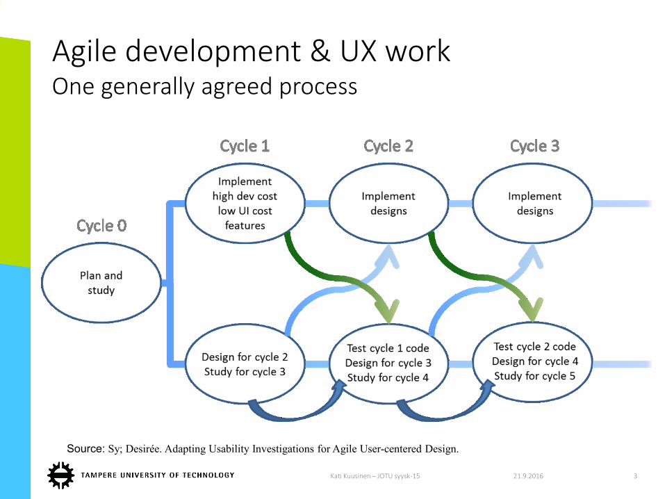
Agile development & UX workOne generally agreed process
21.9.2016Kati Kuusinen – JOTU syysk-15 3
Source: Sy; Desirée. Adapting Usability Investigations for Agile User-centered Design.
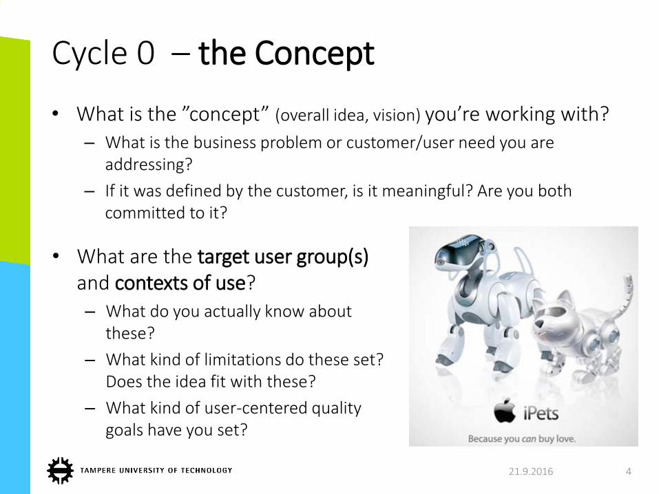
Cycle 0 – the Concept
• What is the ”concept” (overall idea, vision) you’re working with?– What is the business problem or customer/user need you are
addressing?
– If it was defined by the customer, is it meaningful? Are you both committed to it?
21.9.2016 4
• What are the target user group(s) and contexts of use? – What do you actually know about
these?
– What kind of limitations do these set? Does the idea fit with these?
– What kind of user-centered quality goals have you set?
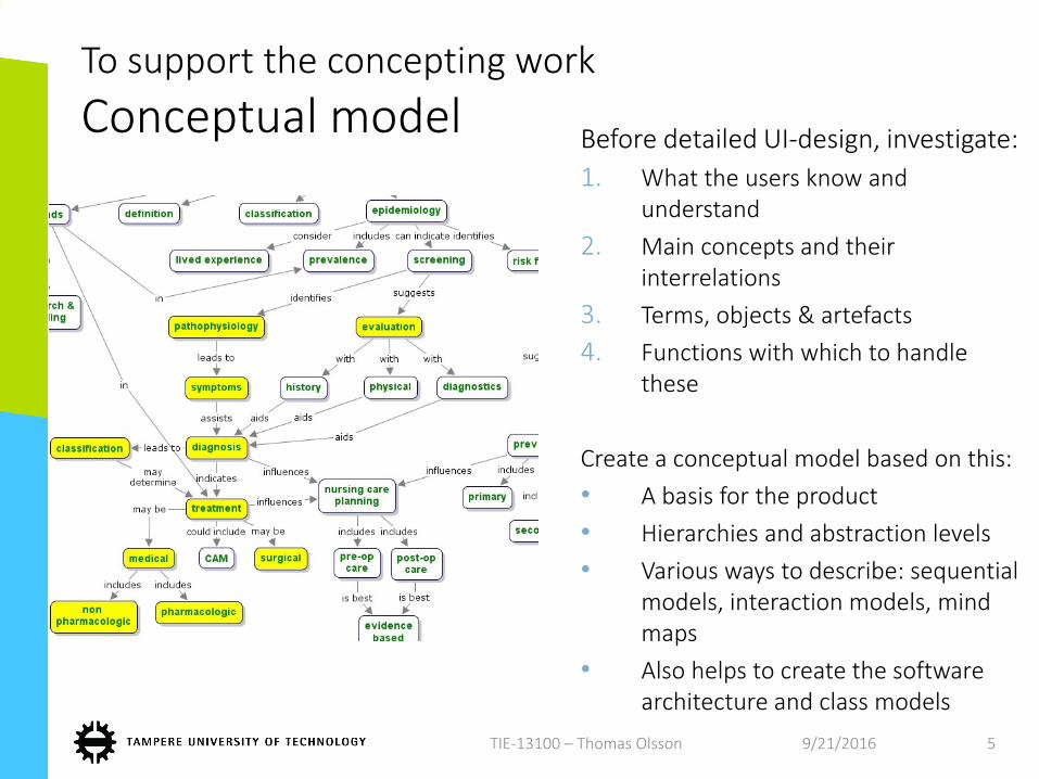
To support the concepting work
Conceptual modelBefore detailed UI-design, investigate:
1. What the users know and understand
2. Main concepts and their interrelations
3. Terms, objects & artefacts
4. Functions with which to handle these
Create a conceptual model based on this:
• A basis for the product
• Hierarchies and abstraction levels
• Various ways to describe: sequential models, interaction models, mind maps
• Also helps to create the software architecture and class models
9/21/2016TIE-13100 – Thomas Olsson 5
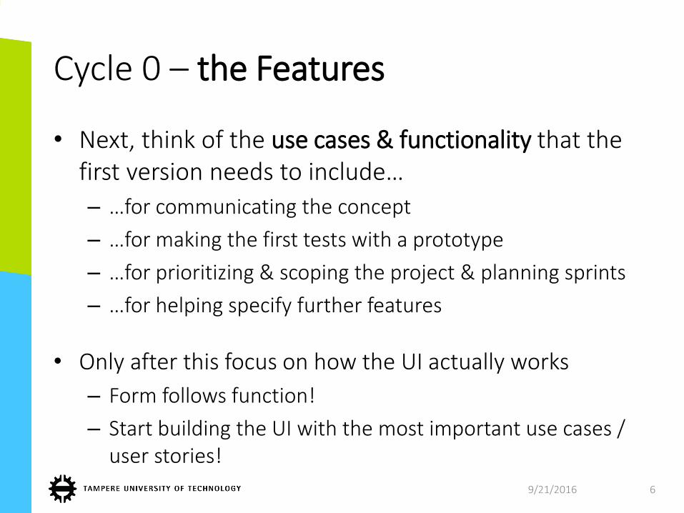
Cycle 0 – the Features
• Next, think of the use cases & functionality that the first version needs to include…
– …for communicating the concept
– …for making the first tests with a prototype
– …for prioritizing & scoping the project & planning sprints
– …for helping specify further features
• Only after this focus on how the UI actually works
– Form follows function!
– Start building the UI with the most important use cases / user stories!
9/21/2016 6
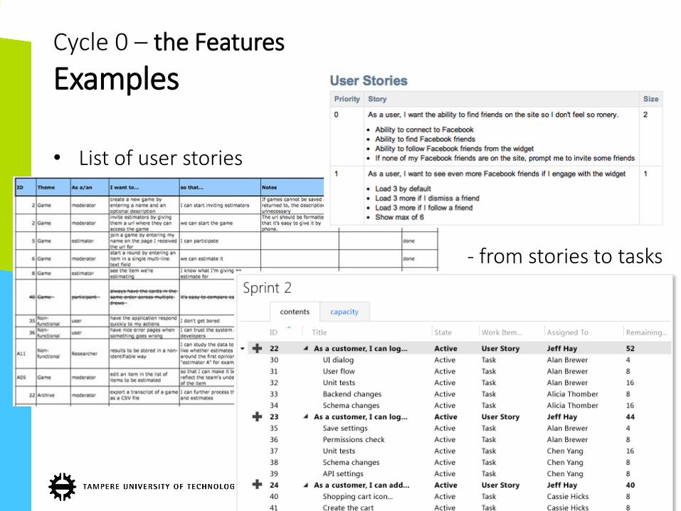
• List of user stories
• 1 - from stories to tasks
21.9.2016 7
Cycle 0 – the Features
Examples
Some UI design principles to keep in mind
21.9.2016 8
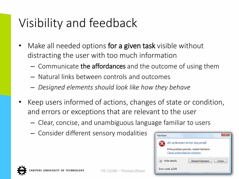
Visibility and feedback
• Make all needed options for a given task visible without distracting the user with too much information
– Communicate the affordances and the outcome of using them
– Natural links between controls and outcomes
– Designed elements should look like how they behave
• Keep users informed of actions, changes of state or condition, and errors or exceptions that are relevant to the user
– Clear, concise, and unambiguous language familiar to users
– Consider different sensory modalities
9/21/2016TIE-13100 – Thomas Olsson 9
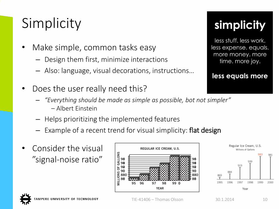
Simplicity
• Make simple, common tasks easy– Design them first, minimize interactions
– Also: language, visual decorations, instructions…
• Does the user really need this? – “Everything should be made as simple as possible, bot not simpler”
– Albert Einstein
– Helps prioritizing the implemented features
– Example of a recent trend for visual simplicity: flat design
• Consider the visual ”signal-noise ratio”
30.1.2014TIE-41406 – Thomas Olsson 10
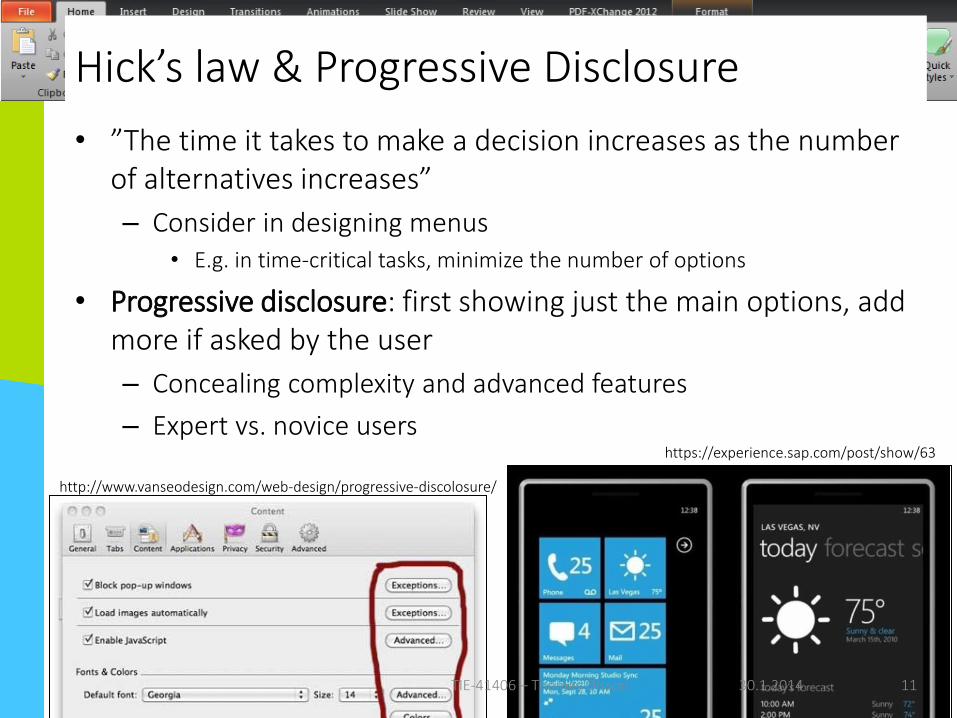
Hick’s law & Progressive Disclosure
• ”The time it takes to make a decision increases as the number of alternatives increases”
– Consider in designing menus• E.g. in time-critical tasks, minimize the number of options
• Progressive disclosure: first showing just the main options, add more if asked by the user
– Concealing complexity and advanced features
– Expert vs. novice usershttps://experience.sap.com/post/show/63
http://www.vanseodesign.com/web-design/progressive-discolosure/
30.1.2014TIE-41406 – Thomas Olsson 11
Error recovery & user control
• People will make mistakes
• Design should be flexible and tolerant, reducing the cost of mistakes and misuse– Undo/redo actions, be forgiving with varied inputs
– Confirmations
– Use your error messages as a teaching situation: show what action was wrong, and ensure that she/he knows how to prevent the error from occurring again
• A clearly marked "emergency exit" to leave the unwanted state
21.9.2016TIE-13100 – Thomas Olsson 12
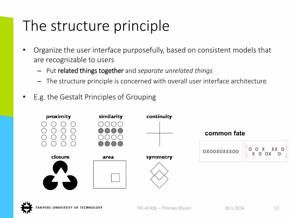
The structure principle
• Organize the user interface purposefully, based on consistent models that are recognizable to users
– Put related things together and separate unrelated things
– The structure principle is concerned with overall user interface architecture
• E.g. the Gestalt Principles of Grouping
30.1.2014TIE-41406 – Thomas Olsson 13
common fate
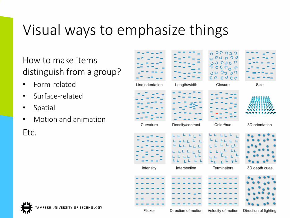
Visual ways to emphasize things
How to make itemsdistinguish from a group?• Form-related
• Surface-related
• Spatial
• Motion and animation
Etc.
9/21/2016 14
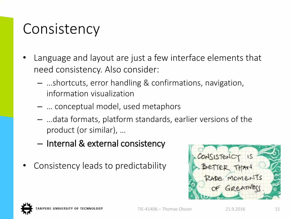
Consistency
• Language and layout are just a few interface elements that need consistency. Also consider:
– …shortcuts, error handling & confirmations, navigation, information visualization
– … conceptual model, used metaphors
– …data formats, platform standards, earlier versions of the product (or similar), …
– Internal & external consistency
• Consistency leads to predictability
21.9.2016TIE-41406 – Thomas Olsson 15
More about how to design usable and pleasurable UIs
• Nielsen’s 10 usability heuristics:– http://www.nngroup.com/articles/ten-usability-heuristics/
• Norman’s design principles:– Visibility, Feedback, Consistency, Mapping, Affordances…– http://www.csun.edu/science/courses/671/bibliography/preece.html
• Shneiderman’s 8 golden rules– E.g. enable shortcuts, simple error handling, reduce memory-
load• http://faculty.washington.edu/jtenenbg/courses/360/f04/sessions/sc
hneidermanGoldenRules.html
• Use of colors:– Marcus Aaron: Graphic Design for Electronic Documents and User
Interfaces
• ISO standard 9241-10: Ergonomic requirements for office work with visual display terminals (VDTs) -- Part 10: Dialogue principles
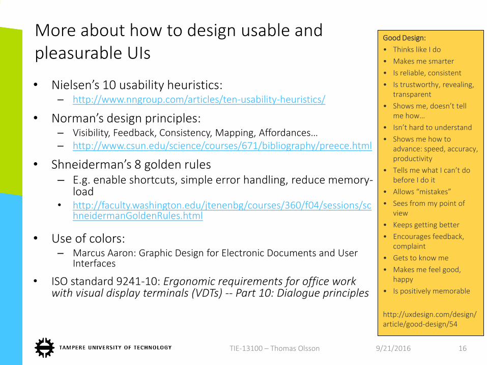
Good Design:
• Thinks like I do
• Makes me smarter
• Is reliable, consistent
• Is trustworthy, revealing, transparent
• Shows me, doesn’t tell me how…
• Isn’t hard to understand
• Shows me how to advance: speed, accuracy, productivity
• Tells me what I can’t do before I do it
• Allows “mistakes”
• Sees from my point of view
• Keeps getting better
• Encourages feedback, complaint
• Gets to know me
• Makes me feel good, happy
• Is positively memorable
http://uxdesign.com/design/article/good-design/54
9/21/2016TIE-13100 – Thomas Olsson 16
A few simple methods
• To be used after the concept is clear and you have a priority list of user stories / use cases
21.9.2016 17
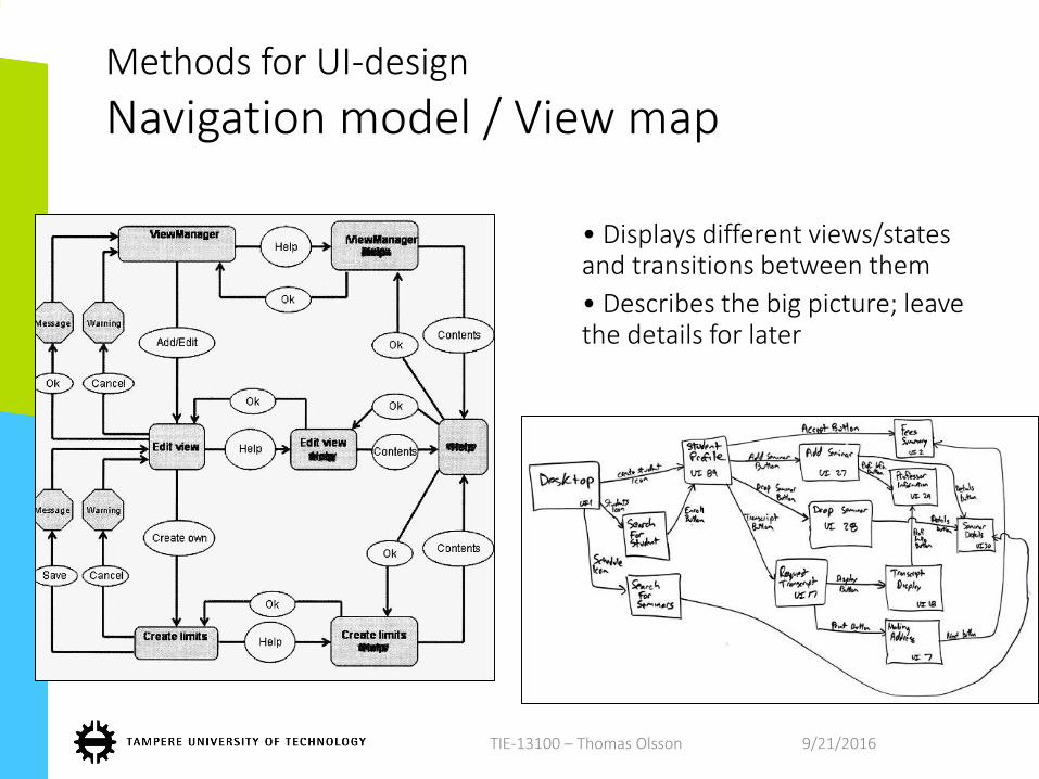
Methods for UI-design
Navigation model / View map
• Displays different views/states and transitions between them
• Describes the big picture; leave the details for later
9/21/2016TIE-13100 – Thomas Olsson
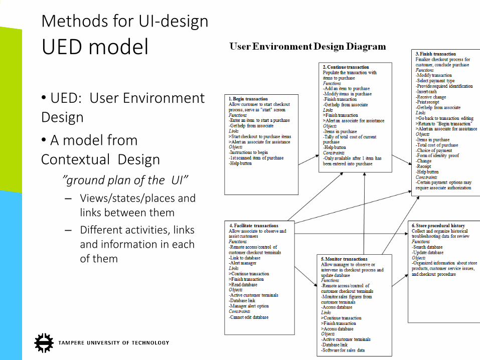
• UED: User Environment Design
• A model from Contextual Design
”ground plan of the UI”
– Views/states/places and links between them
– Different activities, links and information in each of them
Methods for UI-design
UED model
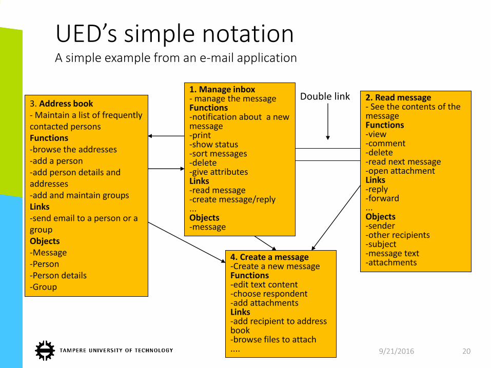
UED’s simple notationA simple example from an e-mail application
3. Address book- Maintain a list of frequently contacted personsFunctions-browse the addresses-add a person-add person details and addresses-add and maintain groupsLinks-send email to a person or a groupObjects-Message-Person-Person details-Group
3. Address book- Maintain a list of frequently contacted personsFunctions-browse the addresses-add a person-add person details and addresses-add and maintain groupsLinks-send email to a person or a groupObjects-Message-Person-Person details-Group
1. Manage inbox- manage the messageFunctions-notification about a new message-print-show status-sort messages-delete-give attributesLinks-read message-create message/reply...Objects-message
1. Manage inbox- manage the messageFunctions-notification about a new message-print-show status-sort messages-delete-give attributesLinks-read message-create message/reply...Objects-message
2. Read message- See the contents of the messageFunctions-view-comment-delete-read next message-open attachmentLinks-reply-forward...Objects-sender-other recipients-subject-message text-attachments
2. Read message- See the contents of the messageFunctions-view-comment-delete-read next message-open attachmentLinks-reply-forward...Objects-sender-other recipients-subject-message text-attachments
4. Create a message-Create a new messageFunctions-edit text content-choose respondent-add attachmentsLinks-add recipient to address book-browse files to attach....
4. Create a message-Create a new messageFunctions-edit text content-choose respondent-add attachmentsLinks-add recipient to address book-browse files to attach....
Double link
9/21/2016 20
UED-models
• UED is based on earlier, less detailed plans and aim at specifying the structure of the system
• However, does not yet go to details (e.g. placement of UI elements, graphics, detailed terminology)
• Makes sense to identify problems or missing/excess actions as early as possible
• Focus on the workflow, simplicity of the overall system
• After this, wireframes and view templates can be designed– Feel free to apply the different methods and phases
depending on your case
9/21/2016TIE-13100 – Thomas Olsson 21
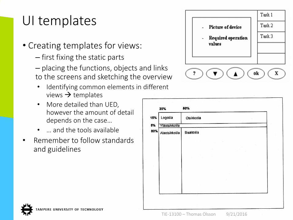
UI templates
• Creating templates for views:– first fixing the static parts
– placing the functions, objects and links to the screens and sketching the overview• Identifying common elements in different
views templates
• More detailed than UED, however the amount of detail depends on the case…
• … and the tools available
• Remember to follow standards and guidelines
9/21/2016TIE-13100 – Thomas Olsson9/21/2016TIE-13100 – Thomas Olsson
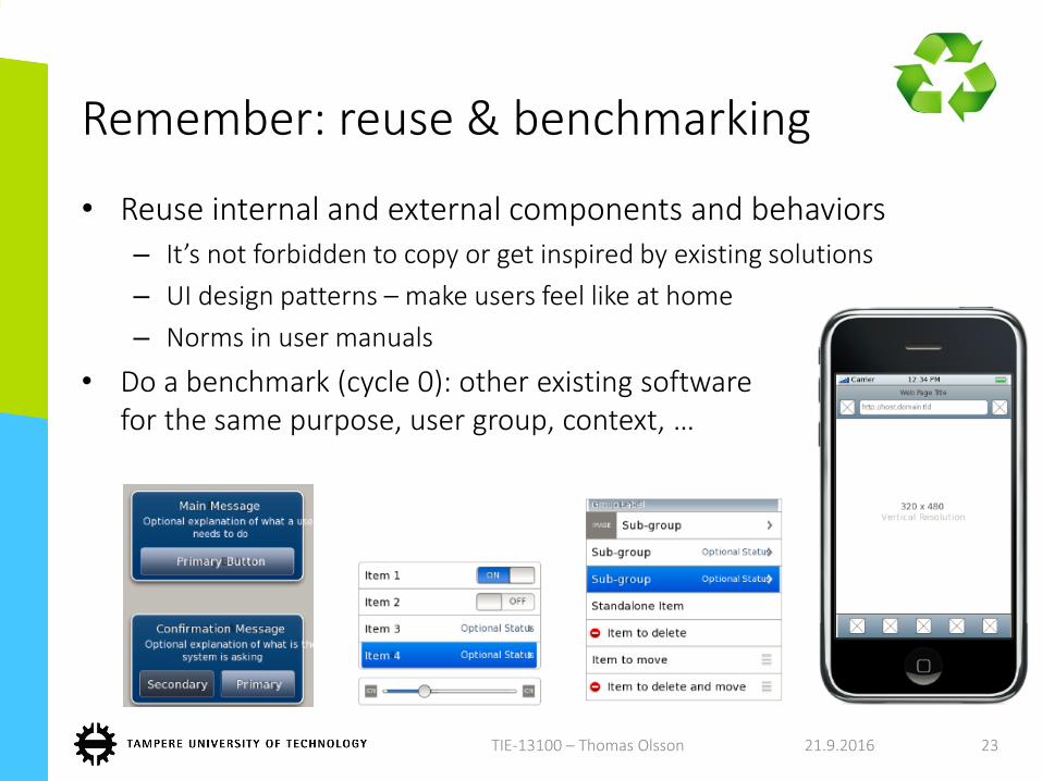
Remember: reuse & benchmarking
• Reuse internal and external components and behaviors– It’s not forbidden to copy or get inspired by existing solutions
– UI design patterns – make users feel like at home
– Norms in user manuals
• Do a benchmark (cycle 0): other existing software for the same purpose, user group, context, …
21.9.2016TIE-13100 – Thomas Olsson 23
Style guides & guidelines
• Platform-specific style guides, e.g.:• Google: http://googlesystem.blogspot.com/2008/03/googles-design-
guidelines.html
• Mac OS developer library: https://developer.apple.com/library/ios/documentation/UserExperience/Conceptual/MobileHIG/
https://developer.apple.com/watch/human-interface-guidelines/
• W3C mobile web: http://www.w3.org/Mobile/
• Of course, some of these things might affect already the concept design check them now
• Some of the guidelines might contradict with general UI design principles something to compromize with
249/21/2016TIE-13100 – Thomas Olsson 24
Other types of guidelinesSearch for these as home work!
• Specific input/output techniques, multimodal interfaces
• In Web & mobile: Responsive design, Flat design
• Social media & online communities, privacy, personal information management
• Special user groups, accessibility
• Internationalization & localization, culture-specific guidelines
• Graphical design principles, color palettes, contrast
• General typography rules– Usually: sans serif for displays; aligning text
• The customer might have their own restrictions or guidelines! In-house rules etc.
9/21/2016TIE-13100 – Thomas Olsson 25
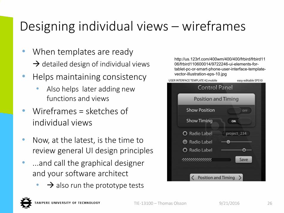
Designing individual views – wireframes
• When templates are ready detailed design of individual views
• Helps maintaining consistency• Also helps later adding new
functions and views
• Wireframes = sketches of individual views
• Now, at the latest, is the time to review general UI design principles
• ...and call the graphical designer and your software architect
• also run the prototype tests
9/21/2016TIE-13100 – Thomas Olsson 26
http://us.123rf.com/400wm/400/400/frbird/frbird11
06/frbird110600014/9722246-ui-elements-for-
tablet-pc-or-smart-phone-user-interface-template-
vector-illustration-eps-10.jpg

Tools for UI design & prototyping
• Free wireframing and prototyping tools that are ”good enough” for this course– For example:
http://www.balsamiq.com/, https://gomockingbird.com/ , http://mockflow.com/ , https://clickdummy.com , https://moqups.com
• Check http://www.cooper.com/prototyping-tools
279/21/2016TIE-13100 – Thomas Olsson 27
And then what?
• Detailed design of– Visual ”looks”: colors, icons, symbols, typography…
– Terminology
– Audio elements, animations, other outputs
– Menus, configurations
– Interactions: sequences of individual use cases / user tasks
– Error handling and error messages
– User guide and other guidance
+ design of many other things that cannot be covered in one lecture
+ evaluation of how the design supports the design targets & requirements (validation & verification)
Constant iteration and refinement, as usual
9/21/2016 28
Testing the UI
• UI is a central asset in your product so test it well!
• ”Verification” and especially ”validation”
– Test both with your customer and with users
– In multiple phases:
MVP – paper – interactive mock-up – functional UI
21.9.2016 29

The ”layers” of UX testing
21.9.2016 30
Requirements & product concept
Information architecture
and navigation
Detailed UI & visual design
Concept testing”validation”
Testing the interactionand some key features”validation/verification”
Usability testing, Long-term UX evaluation”verification”
Concepts, ”MVPs”
Lo-fi prototypes
Hi-fi prototypes
TIE-13100 – Thomas Olsson
Some approaches regarding evaluation
• Observation while using + think-aloud + Interviewing – Think aloud: momentary viewpoints, subjective, unfocused, requires
clarification
• Selecting the best option, ordering according to preference– Using baselines & benchmarks: People are usually good in saying which
option is better
• Attributing words (e.g. adjectives), sentence completion – “Describe the quality of this system in 3 words?”– ”I feel that this system is good for…”
• Measurement scale options, e.g.: – agreement scale (Likert): (Totally agree) 5 – 4 – 3 – 2 – 1 (totally disagree)
– semantic differentials: Innovative – – – – – Old-fashioned
– specific dimensions: always – frequently – occasionally – seldom – never
TIE-13100 – Thomas Olsson
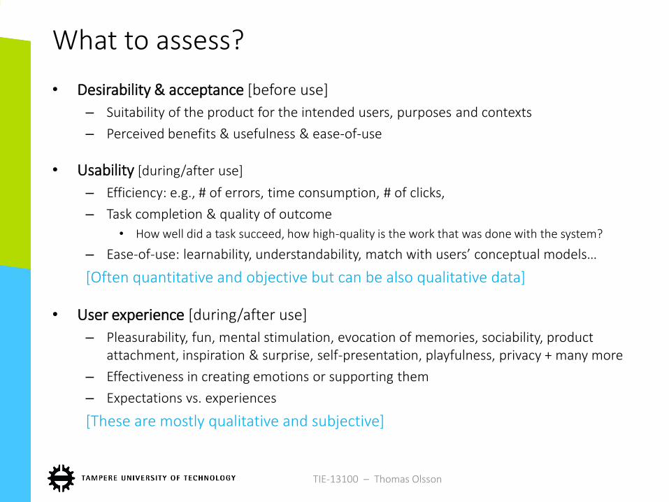
What to assess?
• Desirability & acceptance [before use]
– Suitability of the product for the intended users, purposes and contexts
– Perceived benefits & usefulness & ease-of-use
• Usability [during/after use]
– Efficiency: e.g., # of errors, time consumption, # of clicks,
– Task completion & quality of outcome
• How well did a task succeed, how high-quality is the work that was done with the system?
– Ease-of-use: learnability, understandability, match with users’ conceptual models…
[Often quantitative and objective but can be also qualitative data]
• User experience [during/after use]
– Pleasurability, fun, mental stimulation, evocation of memories, sociability, product attachment, inspiration & surprise, self-presentation, playfulness, privacy + many more
– Effectiveness in creating emotions or supporting them
– Expectations vs. experiences
[These are mostly qualitative and subjective]
TIE-13100 – Thomas Olsson