university of california san diego - home...
TRANSCRIPT
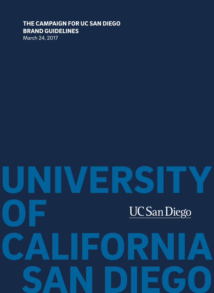
UNIVERSITY OF CALIFORNIA
SAN DIEGO
THE CAMPAIGN FOR UC SAN DIEGO BRAND GUIDELINESMarch 24, 2017
THE CAMPAIGN FOR UC SAN DIEGOAN INTRODUCTION
In launching the Campaign for UC San Diego, an ambitious, comprehensive $2 billion fundraising effort, our goal was simple: secure the philanthropic resources necessary to drive innovation that advances society, expand the donor base, create a culture of philanthropy, and ultimately help solve the world’s most pressing problems.
To accomplish this, we must consistently produce attention-grabbing, thought-provoking campaign communications that inspire people to give. Consider these guidelines your tool kit in achieving continuity across our various touch points. By applying consistent verbal and visual elements that demonstrate our unique approach to problem-solving, we can inspire transformative change.
Updated 3/24/17 Introduction 6.1
CAMPAIGNTHEME
Continue the nontradition.
This playful verbal twist on a common phrase embodies just how uncommon we are here at the leading edge of the continent. Where other universities have a tradition, we have a nontradition. (After all, our very founding was an experiment.) Where most academics want to tackle issues, we want to make them one giant nonissue.
In a way, “non” is the glue of our campaign.
And where “non” could come off as divisive and negative, we flip that prefix on its head, in each creative instance finding a positive new way to approach, well, everything.
This is what will demonstrate our campus’s refreshingly unique way of looking at the world. And our curious approach to solving its problems.
Through a blend of bold, smart language; compelling photography; and eye-catching graphics, our communications will creatively push the boundaries of conventional fundraising campaigns—and inspire transformational giving.
In the following pages, you will learn when, where, and how to use these verbal and visual cues across all media.
With your help, we can continue the nontradition that is UC San Diego.
6.2 THE CAMPAIGN FOR UC SAN DIEGO
Updated 3/24/17 Campaign Theme 6.3
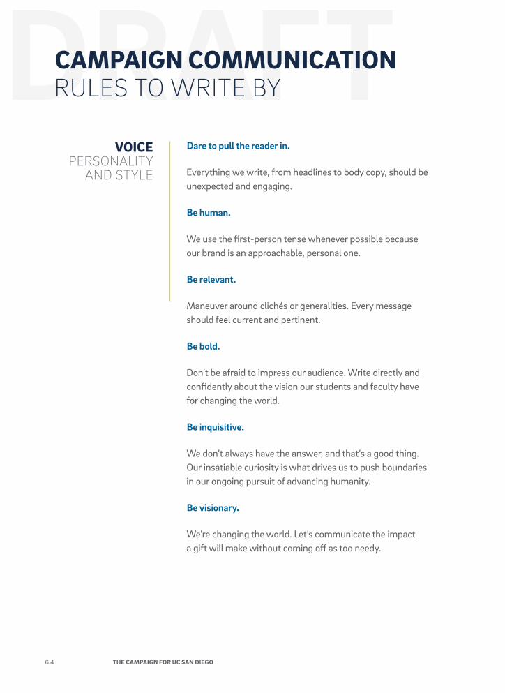
VOICE PERSONALITY
AND STYLE
Dare to pull the reader in.
Everything we write, from headlines to body copy, should be unexpected and engaging.
Be human.
We use the first-person tense whenever possible because our brand is an approachable, personal one.
Be relevant.
Maneuver around clichés or generalities. Every message should feel current and pertinent.
Be bold.
Don’t be afraid to impress our audience. Write directly and confidently about the vision our students and faculty have for changing the world.
Be inquisitive.
We don’t always have the answer, and that’s a good thing. Our insatiable curiosity is what drives us to push boundaries in our ongoing pursuit of advancing humanity.
Be visionary.
We’re changing the world. Let’s communicate the impact a gift will make without coming off as too needy.
CAMPAIGN COMMUNICATIONRULES TO WRITE BY
6.4 THE CAMPAIGN FOR UC SAN DIEGO
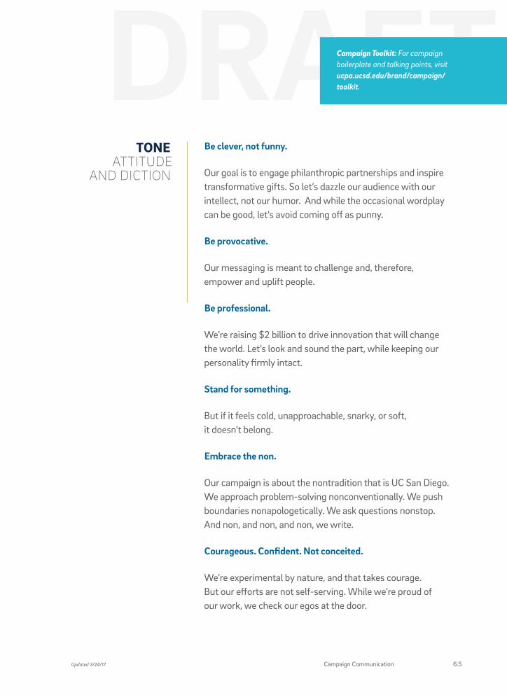
TONEATTITUDE
AND DICTION
Be clever, not funny.
Our goal is to engage philanthropic partnerships and inspire transformative gifts. So let’s dazzle our audience with our intellect, not our humor. And while the occasional wordplay can be good, let’s avoid coming off as punny.
Be provocative.
Our messaging is meant to challenge and, therefore, empower and uplift people.
Be professional.
We’re raising $2 billion to drive innovation that will change the world. Let’s look and sound the part, while keeping our personality firmly intact.
Stand for something.
But if it feels cold, unapproachable, snarky, or soft, it doesn’t belong.
Embrace the non.
Our campaign is about the nontradition that is UC San Diego. We approach problem-solving nonconventionally. We push boundaries nonapologetically. We ask questions nonstop. And non, and non, and non, we write.
Courageous. Confident. Not conceited.
We’re experimental by nature, and that takes courage. But our efforts are not self-serving. While we’re proud of our work, we check our egos at the door.
Campaign Toolkit: For campaign boilerplate and talking points, visit ucpa.ucsd.edu/brand/campaign/toolkit.
Updated 3/24/17 Campaign Communication 6.5
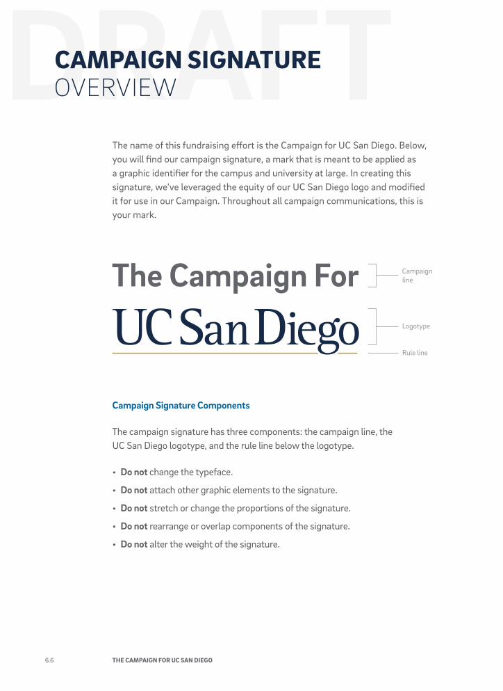
CAMPAIGN SIGNATUREOVERVIEW
The name of this fundraising effort is the Campaign for UC San Diego. Below, you will find our campaign signature, a mark that is meant to be applied as a graphic identifier for the campus and university at large. In creating this signature, we’ve leveraged the equity of our UC San Diego logo and modified it for use in our Campaign. Throughout all campaign communications, this is your mark.
Campaign Signature Components
The campaign signature has three components: the campaign line, the UC San Diego logotype, and the rule line below the logotype.
• Do not change the typeface.
• Do not attach other graphic elements to the signature.
• Do not stretch or change the proportions of the signature.
• Do not rearrange or overlap components of the signature.
• Do not alter the weight of the signature.
Rule line
Logotype
Campaign line
6.6 THE CAMPAIGN FOR UC SAN DIEGO
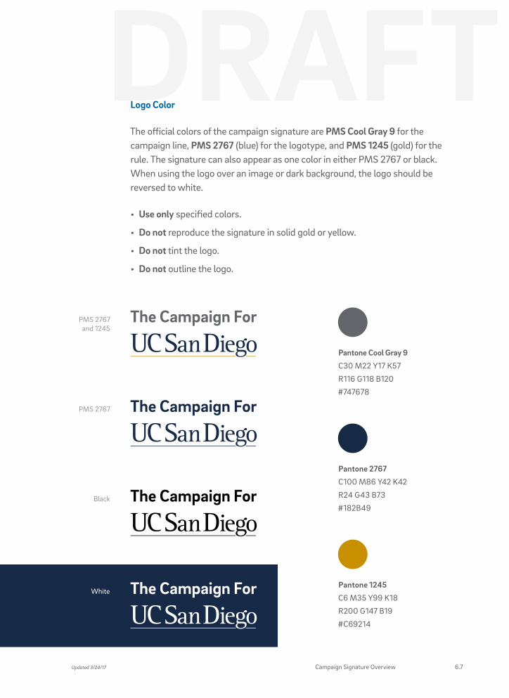
Logo Color
The official colors of the campaign signature are PMS Cool Gray 9 for the campaign line, PMS 2767 (blue) for the logotype, and PMS 1245 (gold) for the rule. The signature can also appear as one color in either PMS 2767 or black. When using the logo over an image or dark background, the logo should be reversed to white.
• Use only specified colors.
• Do not reproduce the signature in solid gold or yellow.
• Do not tint the logo.
• Do not outline the logo.
WhitePantone 1245
C6 M35 Y99 K18
R200 G147 B19
#C69214
Pantone 2767
C100 M86 Y42 K42
R24 G43 B73
#182B49
PMS 2767 and 1245
PMS 2767
Black
Pantone Cool Gray 9
C30 M22 Y17 K57
R116 G118 B120
#747678
Updated 3/24/17 Campaign Signature Overview 6.7
CAMPAIGN SIGNATUREUSAGE
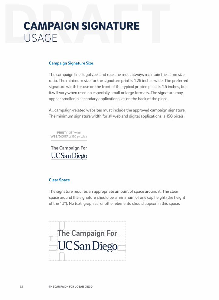
Campaign Signature Size
The campaign line, logotype, and rule line must always maintain the same size ratio. The minimum size for the signature print is 1.25 inches wide. The preferred signature width for use on the front of the typical printed piece is 1.5 inches, but it will vary when used on especially small or large formats. The signature may appear smaller in secondary applications, as on the back of the piece.
All campaign-related websites must include the approved campaign signature. The minimum signature width for all web and digital applications is 150 pixels.
Clear Space
The signature requires an appropriate amount of space around it. The clear space around the signature should be a minimum of one cap height (the height of the "U"). No text, graphics, or other elements should appear in this space.
PRINT: 1.25” wideWEB/DIGITAL: 150 px wide
6.8 THE CAMPAIGN FOR UC SAN DIEGO
Questions? Contact Creative Services and Publications at [email protected] with any questions about applying the campaign signature on print collateral, websites, and products.
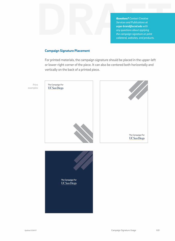
Campaign Signature Placement
For printed materials, the campaign signature should be placed in the upper-left or lower-right corner of the piece. It can also be centered both horizontally and vertically on the back of a printed piece.
Print examples
Updated 3/24/17 Campaign Signature Usage 6.9
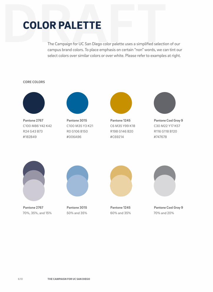
COLOR PALETTEThe Campaign for UC San Diego color palette uses a simplified selection of our campus brand colors. To place emphasis on certain “non” words, we can tint our select colors over similar colors or over white. Please refer to examples at right.
CORE COLORS
Pantone 2767
C100 M86 Y42 K42
R24 G43 B73
#182B49
Pantone 1245
C6 M35 Y99 K18
R198 G146 B20
#C69214
Pantone 3015
C100 M35 Y3 K21
R0 G106 B150
#006A96
Pantone Cool Gray 9
C30 M22 Y17 K57
R116 G118 B120
#747678
Pantone 2767
70%, 35%, and 15%
Pantone 3015
50% and 35%
Pantone 1245
60% and 35%
Pantone Cool Gray 9
70% and 20%
6.10 THE CAMPAIGN FOR UC SAN DIEGO
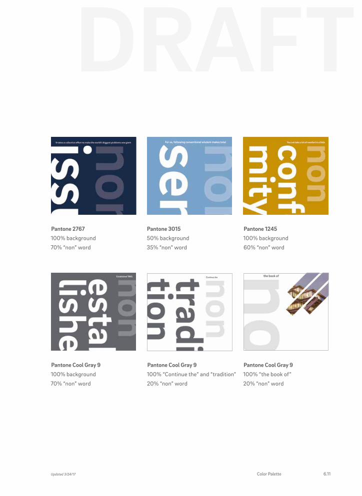
Pantone 2767
100% background
70% “non” word
Pantone Cool Gray 9
100% background
70% “non” word
Pantone 3015
50% background
35% “non” word
Pantone Cool Gray 9
100% “Continue the” and “tradition”
20% “non” word
Pantone 1245
100% background
60% “non” word
Pantone Cool Gray 9
100% “the book of”
20% “non” word
Updated 3/24/17 Color Palette 6.11
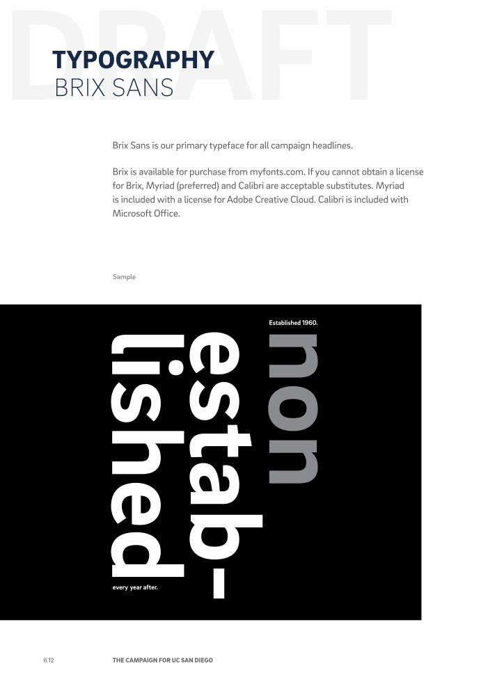
TYPOGRAPHYBRIX SANS
Sample
Brix Sans is our primary typeface for all campaign headlines.
Brix is available for purchase from myfonts.com. If you cannot obtain a license for Brix, Myriad (preferred) and Calibri are acceptable substitutes. Myriad is included with a license for Adobe Creative Cloud. Calibri is included with Microsoft Office.
6.12 THE CAMPAIGN FOR UC SAN DIEGO
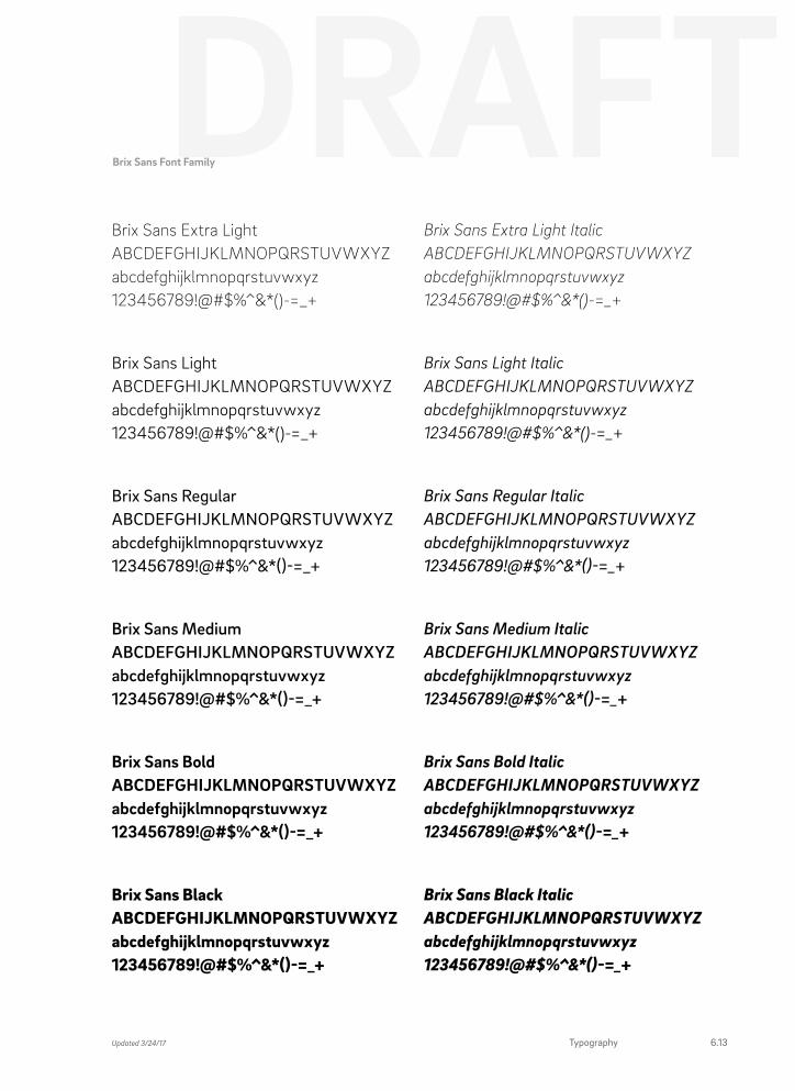
Brix Sans Extra Light ABCDEFGHIJKLMNOPQRSTUVWXYZ abcdefghijklmnopqrstuvwxyz 123456789!@#$%^&*()-=_+
Brix Sans Light ABCDEFGHIJKLMNOPQRSTUVWXYZ abcdefghijklmnopqrstuvwxyz 123456789!@#$%^&*()-=_+
Brix Sans Regular ABCDEFGHIJKLMNOPQRSTUVWXYZ abcdefghijklmnopqrstuvwxyz 123456789!@#$%^&*()-=_+
Brix Sans Medium ABCDEFGHIJKLMNOPQRSTUVWXYZ abcdefghijklmnopqrstuvwxyz 123456789!@#$%^&*()-=_+
Brix Sans Bold ABCDEFGHIJKLMNOPQRSTUVWXYZ abcdefghijklmnopqrstuvwxyz 123456789!@#$%^&*()-=_+
Brix Sans Black ABCDEFGHIJKLMNOPQRSTUVWXYZ abcdefghijklmnopqrstuvwxyz 123456789!@#$%^&*()-=_+
Brix Sans Extra Light Italic ABCDEFGHIJKLMNOPQRSTUVWXYZ abcdefghijklmnopqrstuvwxyz 123456789!@#$%^&*()-=_+
Brix Sans Light Italic ABCDEFGHIJKLMNOPQRSTUVWXYZ abcdefghijklmnopqrstuvwxyz 123456789!@#$%^&*()-=_+
Brix Sans Regular Italic ABCDEFGHIJKLMNOPQRSTUVWXYZ abcdefghijklmnopqrstuvwxyz 123456789!@#$%^&*()-=_+
Brix Sans Medium Italic ABCDEFGHIJKLMNOPQRSTUVWXYZ abcdefghijklmnopqrstuvwxyz 123456789!@#$%^&*()-=_+
Brix Sans Bold Italic ABCDEFGHIJKLMNOPQRSTUVWXYZ abcdefghijklmnopqrstuvwxyz 123456789!@#$%^&*()-=_+
Brix Sans Black Italic ABCDEFGHIJKLMNOPQRSTUVWXYZ abcdefghijklmnopqrstuvwxyz 123456789!@#$%^&*()-=_+
Brix Sans Font Family
Updated 3/24/17 Typography 6.13
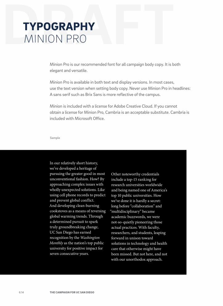
TYPOGRAPHYMINION PRO
Sample
Minion Pro is our recommended font for all campaign body copy. It is both elegant and versatile.
Minion Pro is available in both text and display versions. In most cases, use the text version when setting body copy. Never use Minion Pro in headlines: A sans serif such as Brix Sans is more reflective of the campus.
Minion is included with a license for Adobe Creative Cloud. If you cannot obtain a license for Minion Pro, Cambria is an acceptable substitute. Cambria is included with Microsoft Office.
In our relatively short history, we’ve developed a heritage of pursuing the greater good in most unconventional fashion. How? By approaching complex issues with wholly unexpected solutions. Like using cell phone records to predict and prevent global conflict. And developing clean-burning cookstoves as a means of reversing global warming trends. Through a determined pursuit to spark truly groundbreaking change, UC San Diego has earned recognition by the Washington Monthly as the nation’s top public university for positive impact for seven consecutive years.
Other noteworthy credentials include a top-15 ranking for research universities worldwide and being named one of America’s top 10 public universities. How we’ve done it is hardly a secret: long before “collaboration” and
“multidisciplinary” became academic buzzwords, we were not-so-quietly pioneering those actual practices. With faculty, researchers, and students, leaping forward in unison toward solutions in technology and health care that otherwise might have been missed. But not here, and not with our unorthodox approach.
6.14 THE CAMPAIGN FOR UC SAN DIEGO
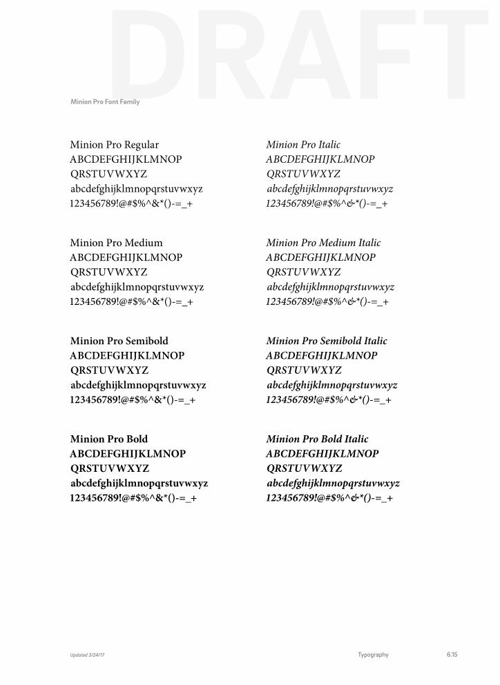
Minion Pro Regular ABCDEFGHIJKLMNOP QRSTUVWXYZ abcdefghijklmnopqrstuvwxyz 123456789!@#$%^&*()-=_+
Minion Pro Medium ABCDEFGHIJKLMNOP QRSTUVWXYZ abcdefghijklmnopqrstuvwxyz 123456789!@#$%^&*()-=_+
Minion Pro Semibold ABCDEFGHIJKLMNOP QRSTUVWXYZ abcdefghijklmnopqrstuvwxyz 123456789!@#$%^&*()-=_+
Minion Pro Bold ABCDEFGHIJKLMNOP QRSTUVWXYZ abcdefghijklmnopqrstuvwxyz 123456789!@#$%^&*()-=_+
Minion Pro Italic ABCDEFGHIJKLMNOP QRSTUVWXYZ abcdefghijklmnopqrstuvwxyz 123456789!@#$%^&*()-=_+
Minion Pro Medium Italic ABCDEFGHIJKLMNOP QRSTUVWXYZ abcdefghijklmnopqrstuvwxyz 123456789!@#$%^&*()-=_+
Minion Pro Semibold Italic ABCDEFGHIJKLMNOP QRSTUVWXYZ abcdefghijklmnopqrstuvwxyz 123456789!@#$%^&*()-=_+
Minion Pro Bold Italic ABCDEFGHIJKLMNOP QRSTUVWXYZ abcdefghijklmnopqrstuvwxyz 123456789!@#$%^&*()-=_+
Minion Pro Font Family
Updated 3/24/17 Typography 6.15
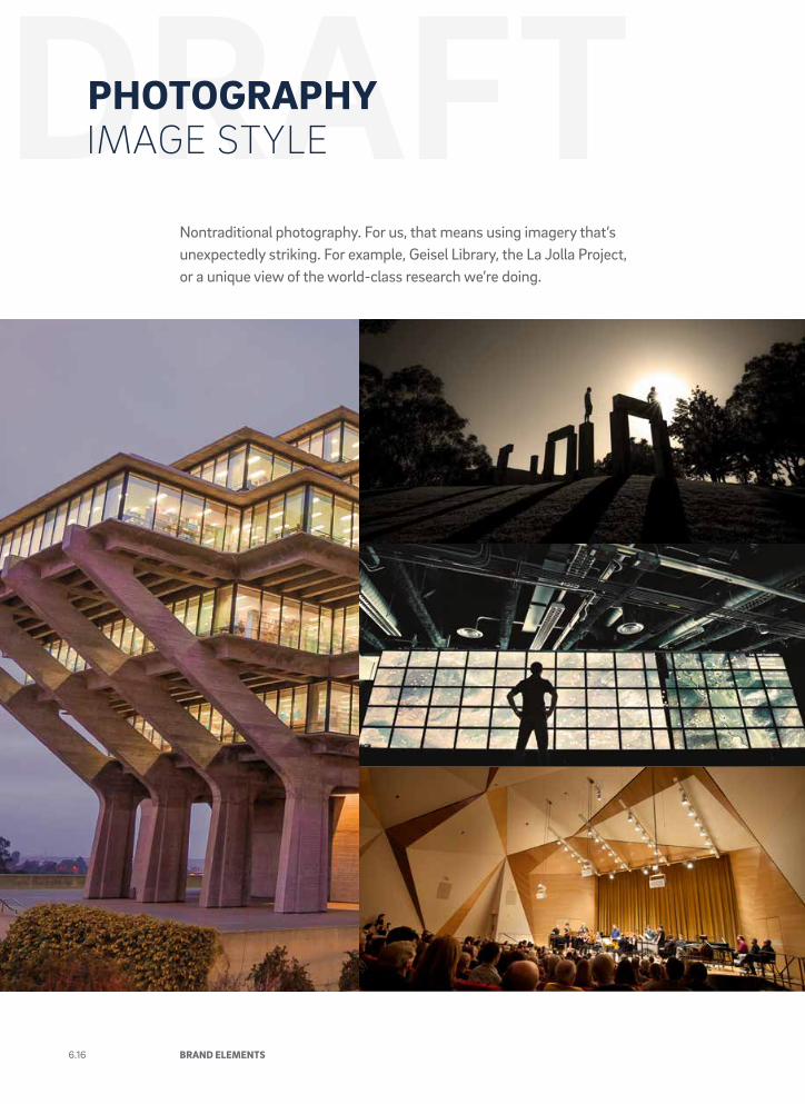
Nontraditional photography. For us, that means using imagery that’s unexpectedly striking. For example, Geisel Library, the La Jolla Project, or a unique view of the world-class research we’re doing.
PHOTOGRAPHYIMAGE STYLE
6.16 BRAND ELEMENTS
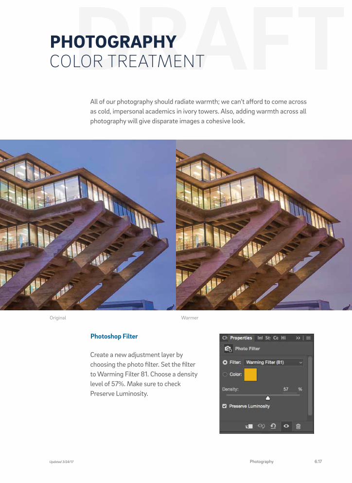
All of our photography should radiate warmth; we can’t afford to come across as cold, impersonal academics in ivory towers. Also, adding warmth across all photography will give disparate images a cohesive look.
PHOTOGRAPHYCOLOR TREATMENT
Photoshop Filter
Create a new adjustment layer by choosing the photo filter. Set the filter to Warming Filter 81. Choose a density level of 57%. Make sure to check Preserve Luminosity.
WarmerOriginal
Updated 3/24/17 Photography 6.17
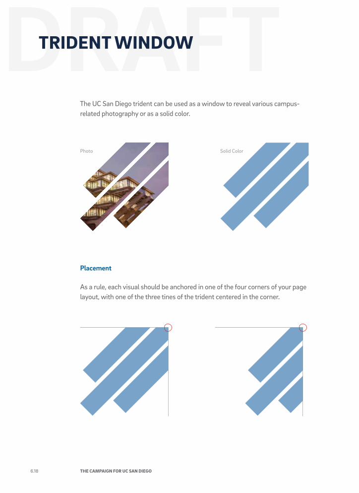
The UC San Diego trident can be used as a window to reveal various campus-related photography or as a solid color.
Placement
As a rule, each visual should be anchored in one of the four corners of your page layout, with one of the three tines of the trident centered in the corner.
TRIDENT WINDOW
Photo Solid Color
6.18 THE CAMPAIGN FOR UC SAN DIEGO
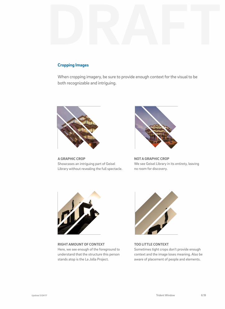
Cropping Images
When cropping imagery, be sure to provide enough context for the visual to be both recognizable and intriguing.
A GRAPHIC CROP Showcases an intriguing part of Geisel Library without revealing the full spectacle.
RIGHT AMOUNT OF CONTEXT Here, we see enough of the foreground to understand that the structure this person stands atop is the La Jolla Project.
NOT A GRAPHIC CROP We see Geisel Library in its entirety, leaving no room for discovery.
TOO LITTLE CONTEXT Sometimes tight crops don’t provide enough context and the image loses meaning. Also be aware of placement of people and elements.
6.19Updated 3/24/17 Trident Window
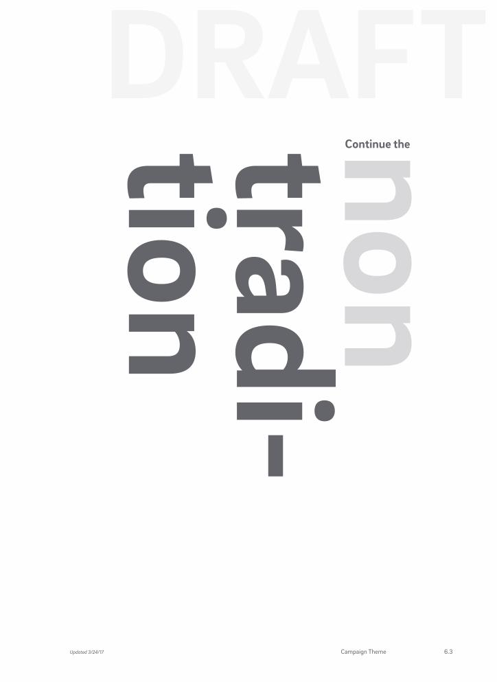
“NON” WORDS OVERVIEW
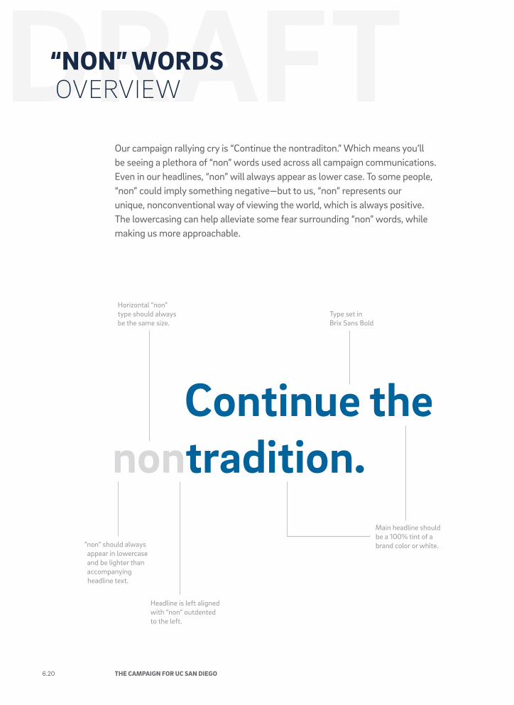
Our campaign rallying cry is “Continue the nontraditon.” Which means you’ll be seeing a plethora of “non” words used across all campaign communications. Even in our headlines, “non” will always appear as lower case. To some people, “non” could imply something negative—but to us, “non” represents our unique, nonconventional way of viewing the world, which is always positive. The lowercasing can help alleviate some fear surrounding “non” words, while making us more approachable.
Continue thenontradition.
“non” should always appear in lowercase and be lighter than accompanying headline text.
Headline is left aligned with “non” outdented to the left.
Type set in Brix Sans Bold
Horizontal “non” type should always be the same size.
Main headline should be a 100% tint of a brand color or white.
6.20 THE CAMPAIGN FOR UC SAN DIEGO
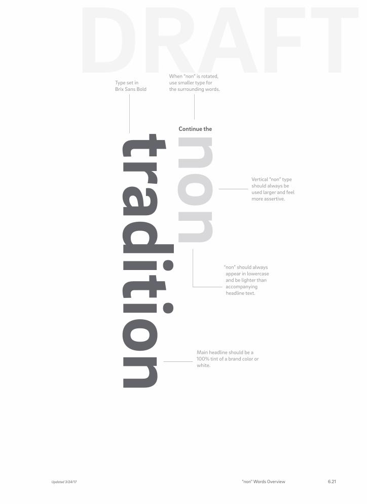
non tradition
Continue the
Vertical “non” type should always be used larger and feel more assertive.
“non” should always appear in lowercase and be lighter than accompanying headline text.
When “non” is rotated, use smaller type for the surrounding words.
Main headline should be a 100% tint of a brand color or white.
Type set in Brix Sans Bold
Updated 3/24/17 "non" Words Overview 6.21
Here are some simple rules to help you become more familiar with how you should not use “non” words.
• Do not capitalize “non.”
• Do not use “non” at 100% opacity of select color value of headline.
• Use only specified colors.
• Do not outline the type.
• Do not underline the “non” word.
"Continue the nontradition" is not the Campaign signature. Always include the signature on pieces that use "non" words.
“NON” WORDS USAGE
6.22 THE CAMPAIGN FOR UC SAN DIEGO
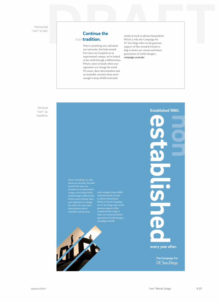
Horizontal "non" in text
Continue thetradition.non
minds on track to advance humankind. Which is why the Campaign for UC San Diego relies on the generous support of like-minded friends to help us foster our current and future generations of world changers.campaign.ucsd.edu
There’s something very odd about our university. Just look around. Ever since our inception as an experimental campus, we’ve looked at the world through a different lens. Which comes in handy when your aspiration is to change the world. Of course, sheer determination and an insatiable curiosity alone aren’t enough to keep 40,000 motivated
The Campaign For
Vertical "non" as headline
non established
Established 1960.
aren’t enough to keep 40,000 motivated minds on track to advance humankind. Which is why the Campaign for UC San Diego relies on the generous support of like-minded friends to help us foster our current and future generations of world changers. campaign.ucsd.edu
There’s something very odd about our university. Just look around. Ever since our inception as an experimental campus, we’ve looked at the world through a different lens. Which comes in handy when your aspiration is to change the world. Of course, sheer determination and an insatiable curiosity alone
every year after.
The Campaign For
Updated 3/24/17 "non" Words Usage 6.23