unchanging: successful political design
DESCRIPTION
An essay arguing that visual success of political art is dependent upon conguence with Lakoff's familial models of political thought. It was the final "paper" for my Modern Art History class.TRANSCRIPT

From Facism to Communism to Democracy,the commonalities of successful political design

Design is not a tangible state asset such as money, guns, or foot soldiers; nor is it among the intangible as-sets normally prescribed to powerful politicians such as great speeches and a likeable character.
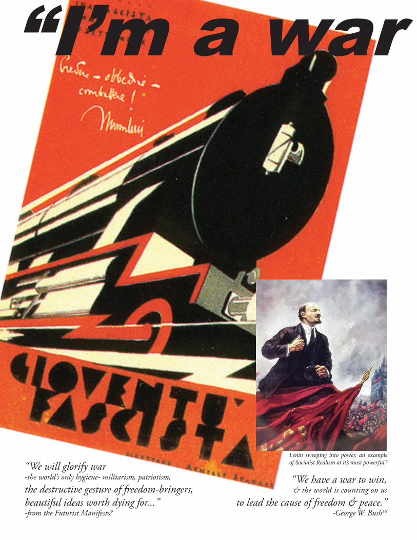
However, some of the most important political machines in recent history were also the best equipped artistically. While the design motifs adapted to their time period, the design of current day political cam-paigns have a direct lineage to Hitler, Lenin, Mao, Napoleon, and others.
While this is not a psychology paper, I must detour to the subconscious to explain part of my thesis. Amer-icans conceptualize government as a family model with the president as head of the family. In short, Americans understand the role of government through one of the “Nation as a Family” metaphors -generally either a “Nurturant Parenting” or a “Strict-Father” nuclear family model. Each dictate how one understands the dynamics of politics and is the basis for their judgment of politicians.1
For example, popular Republicans tend to be the aggressors, like Reagan and Nixon. The nation as a family model also explains why George H. W. Bush didn’t win any brownie points for getting out of Iraq quickly or being fiscally responsible and breaking his promise not to raise taxes- he wasn’t being the strong father figure conservatives wanted.1
So there lies our compass for successful political design: matching the visual look with the core princi-pals of the subconscious family model and politics of the day.
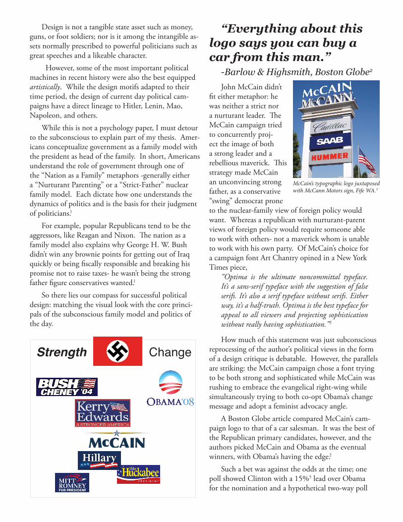
John McCain didn’t fit either metaphor: he was neither a strict nor a nurturant leader. The McCain campaign tried to concurrently proj-ect the image of both a strong leader and a rebellious maverick. This strategy made McCain an unconvincing strong father, as a conservative “swing” democrat prone to the nuclear-family view of foreign policy would want. Whereas a republican with nurturant-parent views of foreign policy would require someone able to work with others- not a maverick whom is unable to work with his own party. Of McCain’s choice for a campaign font Art Chantry opined in a New York Times piece,
“Optima is the ultimate noncommittal typeface. It’s a sans-serif typeface with the suggestion of false serifs. It’s also a serif typeface without serifs. Either way, it’s a half-truth. Optima is the best typeface for appeal to all viewers and projecting sophistication without really having sophistication.”5
How much of this statement was just subconscious reprocessing of the author’s political views in the form of a design critique is debatable. However, the parallels are striking: the McCain campaign chose a font trying to be both strong and sophisticated while McCain was rushing to embrace the evangelical right-wing while simultaneously trying to both co-opt Obama’s change message and adopt a feminist advocacy angle.
A Boston Globe article compared McCain’s cam-paign logo to that of a car salesman. It was the best of the Republican primary candidates, however, and the authors picked McCain and Obama as the eventual winners, with Obama’s having the edge.2
Such a bet was against the odds at the time; one poll showed Clinton with a 15%5 lead over Obama for the nomination and a hypothetical two-way poll
McCain’s typographic logo juxtaposed with McCann Motors sign, Fife WA.3
“Everything about this logo says you can buy a car from this man.”
-Barlow & Highsmith, Boston Globe2
Strength Change
“We will glorify war-the world’s only hygiene- militarism, patriotism,
the destructive gesture of freedom-bringers, beautiful ideas worth dying for...”-from the Futurist Manifesto9
“We have a war to win,& the world is counting on us
to lead the cause of freedom & peace.”-George W. Bush16
“I’m a war president”
Lenin sweeping into power, an example of Socialist Realism at it’s most powerful.8
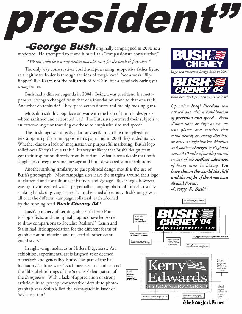
-George Bush originally campaigned in 2000 as a moderate. He attempted to frame himself as a “compassionate conservative,”
“We must also be a strong nation that also cares for the weak & forgotten.”7
Th e only way conservatives could accept a caring, supportive father fi gure as a legitimate leader is through the idea of tough love.1 Not a weak “fl ip-fl opper” like Kerry, not the half-truth of McCain, but a genuinely caring yet strong leader.
Bush had a diff erent agenda in 2004. Being a war president, his meta-phorical strength changed from that of a foundation stone to that of a tank. And what do tanks do? Th ey speed across deserts and fi re big fucking guns.
Mussolini sold his populace on war with the help of Futurist designers, whom sanitized and celebrated war.8 Th e Futurists portrayed their subjects at an extreme angle or towering overhead to emphasize size and speed.9
Th e Bush logo was already a fat sans-serif, much like the stylized let-ters supporting the train opposite this page, and in 2004 they added italics. Whether due to a lack of imagination or purposeful marketing, Bush’s logo rolled over Kerry’s like a tank.10 It’s very unlikely that Bush’s design team got their inspiration directly from Futurism. What is remarkable that both sought to convey the same message and both developed similar solutions.
Another striking similarity to past political design motifs is the use of Bush’s photograph. Most campaign sites leave the margins around their logo uncluttered and use minimalist banners and signage. Bush’s logo, however, was tightly integrated with a perpetually changing photo of himself, usually shaking hands or giving a speech. In the “media” section, Bush’s image was all over the diff erent campaign collateral, each adorned by the running head Bush Cheney 04.11
Bush’s butchery of kerning, abuse of cheap Pho-toshop eff ects, and unoriginal graphics have led some to draw comparisons to Socialist Realism.12 Lenin and Stalin had little appreciation for the diff erent forms of graphic communication and rejected all other avant guard styles.8
In right wing media, as in Hitler’s Degenerate Art exhibition, experimental art is laughed at or deemed off ensive13 and generally dismissed as part of the hal-lucinatory “culture wars.” Such baseless attack of art and the “liberal elite” rings of the Socialists’ denigration of the Bourgeoisie. With a lack of appreciation or strong artistic culture, perhaps conservatives default to photo-graphs just as Stalin killed the avant-garde in favor of Soviet realism.8
“I’m a war president”
Operation Iraqi Freedom was carried out with a combination of precision and speed... From distant bases or ships at sea, we sent planes and missiles that could destroy an enemy division, or strike a single bunker. Marines and soldiers charged to Baghdad across 350 miles of hostile ground, in one of the swiftest advances of heavy arms in history. You have shown the world the skill and the might of the American Armed Forces. -George W. Bush15
Logo as a moderate George Bush in 2000
Bush logo aft er Operation Iraqi Freedom11

“The intensity and immediacy of baroque art and its individualism and detail—observed in such things as the convincing rendering of cloth and skin textures—make it one of the most compelling periods of Western art.”
-Wikipedia17
Just as Napoleon and other leaders used the “high art” of oil paintings for propaganda purposes,18 so too has Obama used the arts to communicate his message. The only difference is that the gallery was BarackObama.com. Whatever your opinion of the artistic merit of computer design, there is no denying that Obama’s brand image has deep roots in art history.19
Take, for instance, Obama’s pose on the home page. It is not the ag-gressive pose of Lenin sweeping into power -but one of lightness. It has the same grandeur that possesses Bernini’s bust of Loui the XIV. His expression matches that of the Baroque period saint and angels,21 their faces serene as if holding some deep knowledge which gives them total inner peace. The level of detail associated with the Baroque period is here as well; individual spikes of light radiate from the center column, stray fibers wave around, and a lens flare all subtly blend into a cloud of light.
The logo is of a minimalist design, following the convention in recent de-cades to distill the message into a form recognizable even in only two colors.19 They did so masterfully, distilling the Americana of the Midwestern rolling fields of grain and cleverly combining it with Obama. It’s different enough to separate itself from the cliched vaguely patriotic logos of most candidates yet close enough to known symbols and ideas to firmly anchor it in our memory.
The website version of the logo adds a glimmer, a reflection of the glow-ing light curling around the edges of the content box and enveloping Obama before being swallowed by a tenebristic background.
A similar omnipotent light poured though most of the graphic illustra-
Bernini’s Loui the XIV20
The Ascension of Our Lady21

tions in the central image carousel. These objects were dramatically posed as well -just as the Baroque artists would pose their figures21- gliding on an up-ward trajectory, levitating the message they embody into the realm of angels.
During the transition period, official seals and stylized icons replaced the logo. The tone changed from one of offering hope to one of briefings and declarations.22 However, the design team seemed to have taken over, not laid off. They created an official looking, yet stylish placard for the quasi-legal Office of the President Elect.22 The graphic illustrations for the website came down to eye level, but were still dramatically posed and lit. The background lost its ethereal cloud of light but kept the dark, heavily saturated tenebristic blue background, as if its occupants took a nap and turned off the light.22
After the transition from President Elect to President, the Presidential website was replaced too. The new site shares a stylistic heritage to BarackO-bama.com but lost many of its Baroque flourishes to government sanctioned Neo-Classical themes. The fonts changed to uppercase serifs and traditional symbols of stars and eagles are in their customary places while the back-ground has changed to that of a creamy, ivory white.
The new website is not strictly Neo-Classical, however. The designers took the time to transform a linked web page into a screen shot of a browser, add a spot light effect, adjust the perspective like that of a 3D object on top of a dark, tenebristic background. One could say that the lighter blues play-fully transitioning to darker ones, the plaster molding detail of the back-ground, and the use of fleurons gives the new website’s predominantly Neo-Classical look a hint of Rococo.23
The rich artistic design motif of the Obama campaign feels deliberately crafted, adding to the perception of Obama as an intelligent, careful, and car-ing candidate.
Barack Obama at his quasi-official, yet ex-tremely stylish, President Elect podium.22

“No one has ever been this excited about a presidential candidate -ever.”
-Justin Hemminger, Tigereye Design24
Th e huge volume of outsider art created for the Obama campaign wasn’t an accident. Both the Nazis and the Obama internal design apparatus created a volume of high quality art. Hitler was himself a failed artist and devoting the only lucid chapter of Mein Kampf to the importance of visual symbol-ism.8 Once in power the Nazi’s enforced something akin to party art discipline, passing laws governing the use of the vari-ous governmental collateral. Th ey even created sub-brands for the SS, the Gestapo, and other offi cial party organs.8
However, both the Nazi and the Obama offi cials embraced outsider artwork for their initial campaigns.8,25 Most cam-paigns package their logos and designs in a static way, making changes very time consuming.11 Th e Obama team made alter-ing the designs very easy by providing the original application fi les for the majority of campaign materials.
Tigereye produces offi cial Obama merchandise and has been making political materials for 30 years. Before Obama, Tigereye employed 30 people; by Nov 5th they surged to nearly 500 employ-ees, ran 3 shifts a day, moved to a larger space, and added an additional ship-ping facility.24 Seven months after the election they are still selling 286 spe-cial interest group buttons, everything from veterans to truckers for Obama.24
Th e mass production and style of outsider artwork is of direct lineage from the Soviet Constructivism of the 1920’s8 and the Pop Art movement of the 1950’s.14 Th e iconic Hope poster by Shepard Farey is an odd pairing; Farey’s art mimics of the communist propaganda of Soviet Russia and China, yet some of his methods and styles were handed down by Andy Warhol and popularized by consumerist embracing Pop-Art movement:
“What’s great about this country is that America started the tradition where the richest consumers buy essentially the same things as the poorest. You can be watching TV and see Coca Cola, and you know that the President drinks Coca Cola, Liz Taylor drinks Coca Cola, and just think, you can drink Coca Cola, too.”-Andy Warhol26
Enabled by the low cost of screen printing and instant delivery mecha-nism of the internet, the Obama Hope poster was distributed by Farey in the hundreds of thousands and printed by anyone who cared to do so. Th e ulti-mate dream of the pop-art movement27 came true: you could not only buy a little piece of Obama’s Hope, you could make it at home too.
Farey’s riff on Warhol’s Campbell’s series
Th e original “Hope” poster before being cleaned up for quasi-offi cial use.
Warhol’s iconic Cambell’s Soup Can
When politicians want strength they turn towards heavy, Nazi-esque designs,8, 11 when they want intellect or hope they turn to the awe-inspiring Baroque techniques, and when they want populace fervor they adopt Socialist Constructivism.
Bush emphasized a clean break from Clinton, so he dis-played strength and caring through leadership in 2000. His re-election campaign graphics displayed strength through power,.1 the bedrock of a war president -just how the Fascists liked it.
Al Gore tried to distance himself from Clinton, instead of trying to take some credit for the economic and diplomatic victories of the Clinton administration. Gore and Kerry tried to project strength and intellect simultaneously, only to come off wooden and unlikable. Kerry wanted to be a clean break from Bush and also a kind of super-set of Bush.1 As such, the intellect conveyed by Kerry’s serif logo fell apart atop a minia-turized yet capitalized A STRONGER AMERICA, as opposed to the Bush style A STRONGER AMERICA.10
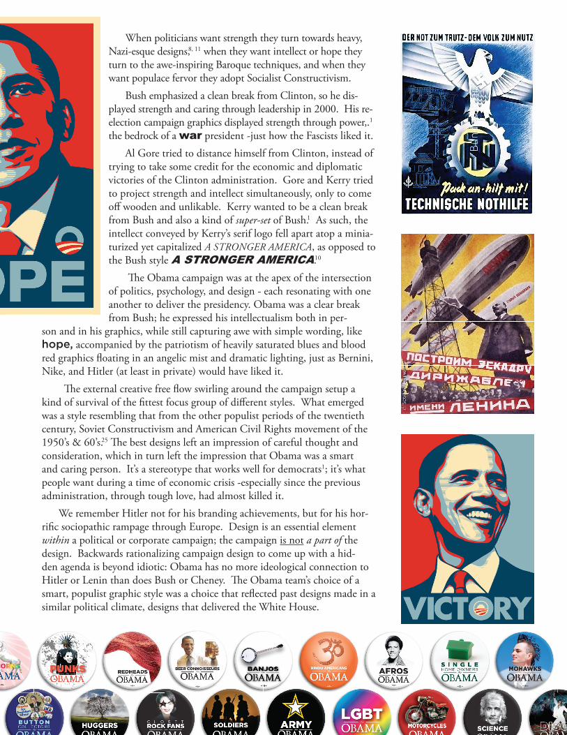
Th e Obama campaign was at the apex of the intersection of politics, psychology, and design - each resonating with one another to deliver the presidency. Obama was a clear break from Bush; he expressed his intellectualism both in per-
son and in his graphics, while still capturing awe with simple wording, like hope, accompanied by the patriotism of heavily saturated blues and blood red graphics fl oating in an angelic mist and dramatic lighting, just as Bernini, Nike, and Hitler (at least in private) would have liked it.
Th e external creative free fl ow swirling around the campaign setup a kind of survival of the fi ttest focus group of diff erent styles. What emerged was a style resembling that from the other populist periods of the twentieth century, Soviet Constructivism and American Civil Rights movement of the 1950’s & 60’s.25 Th e best designs left an impression of careful thought and consideration, which in turn left the impression that Obama was a smart and caring person. It’s a stereotype that works well for democrats1; it’s what people want during a time of economic crisis -especially since the previous administration, through tough love, had almost killed it.
We remember Hitler not for his branding achievements, but for his hor-rifi c sociopathic rampage through Europe. Design is an essential element within a political or corporate campaign; the campaign is not a part of the design. Backwards rationalizing campaign design to come up with a hid-den agenda is beyond idiotic: Obama has no more ideological connection to Hitler or Lenin than does Bush or Cheney. Th e Obama team’s choice of a smart, populist graphic style was a choice that refl ected past designs made in a similar political climate, designs that delivered the White House.

References1. Lakoff, George. Moral Politics : How Liberals and Conservatives Think. Chicago: University Of Chicago Press, 2002.
2. Berlow, Sam, and Cyrus Highsmith. “What font says ‘Change’? - The Boston Globe.” Boston.com. 27 Jan. 2008. 11 May 2009 <http://www.boston.com/bostonglobe/ideas/articles/2008/01/27/what_font_says_change/>
3. “McCann Cadillac Saab Hummer: Dealership Directions, Specials and Financing - AutoTrader.com.” New Cars, Used Cars - Find Cars at AutoTrader.com. 10 May 2009 <http://www.autotrader.com/dealer/info/WA/Seattle/98121/570942/McCann_Cadillac_Saab_Hummer.jsp?address=98121&distance=100&keywords=HUMMER&showMap=false&start_page=browse_dealers&origuri=/find/Seattle/Tacoma-HUMMER-dealers-98121.jsp&browsepath=/find/dealers>.
4. Rudin, Ken. “McCain Too Moderate, Some GOP Conservatives Say .” NPR : National Public Radio. 4 Feb. 2008. 9 June 2009 <www.npr.org/templates/story/story.php?storyId=18664285>.
5. Heller, Steven. “OPTIMA TYPEFACE - Campaign Stops Blog - NYTimes.com.” 2008 Elections - Opinion - Campaign Stops Blog - NYTimes.com. 21 Apr. 2008. 13 May 2009 <http://campaignstops.blogs.nytimes.com/tag/optima-typeface/>.“Gallup Daily: Where the Election Stands .” Gallup Daily. 28 Jan. 2008. 9 June 2009 <www.usaelectionpolls.com/2008/polls/pdfs/gallup-national-polls-jan25to27.pdf>.
6. “Election 2008: McCain vs. Clinton and Obama.” Rasmussen Reports: The Most Comprehensive Public Opinion Data Anywhere. 30 Jan. 2008. 10 June 2009 <http://www.rasmussenreports.com/public_content/politics/election_20082/2008_presidential_election/john_mc-cain_match_ups/election_2008_mccain_vs_clinton_and_obama>.
7. Bruni, Frank, and Drummond Ayres Jr.. “The 2000 Campaign: The Texas Governor; Challenges by Rivals Sent Front-Runners to Plan B/Bush Moving Toward Center - The New York Times.” The New York Times - Breaking News, World News & Multimedia. 8 May 2008. 23 May 2009
8. Heller, Steven. Iron Fists: Branding the 20th-Century Totalitarian State. London: Phaidon Press Inc., 2008.
9. Marinetti, F. T.. “The Founding and Manifesto of Futurism .” ItalianFuturism.org | Events, Exhibitions, and Scholarship pertaining to Italian Futurism. 23 May 2009 <http://www.italianfuturism.org/manifestos/foundingmanifesto/>.
10. DADICH, SCOTT. “The New York Times > Opinion > Op-Ed Contributor: What You See Is What You Get.” The New York Times - Breaking News, World News & Multimedia. 9 Oct. 2004. 12 June 2009 <http://www.nytimes.com/2004/10/09/opinion/09dadich.html?th>.
11. “GeorgeWBush.com :: W Stuff Downloads.” Internet Archive: Wayback Machine. 2 Mar. 2004. 9 June 2009 <http://web.archive.org/web/20040204021054/www.georgewbush.com/WStuff/downloads.aspx>.
12. Heller, Steven. “POTUS Typographicus: Appealing to the Baseline and George W’s Typographic Legacy — AIGA | the professional association for design.” AIGA | the professional association for design. 30 Mar. 2006. 9 June 2009 <http://www.aiga.org/content.cfm/potus-itypographicusi-appealing-to-the-baseline-and-george-w-s-t>.
13. Landan, Katie. “’Artery’ Exhibit Prompts an Art Attack in Arkansas Town .” FOXNews.com. 3 June 2009. 9 June 2009 <http://www.foxnews.com/story/0,2933,524999,00.html>.
14. Kleiner, Fred S., and Christin J. Mamiya. Gardner’s Art Through the Ages (with ArtStudy Student CD-ROM and InfoTrac ) (Gard-ner’s Art Through the Ages). Belmont, CA: Wadsworth Publishing, 2004.
15. “President Bush Announces Major Combat Operations in Iraq Have Ended.” WhiteHouse.gov. 1 May 2003. 5 May 2009 <http://georgewbush-whitehouse.archives.gov/news/releases/2003/05/20030501-15.html>.
16. Woolley, John, and Gerhard Peters. “George W. Bush: Remarks in York, Pennsylvania.” The American Presidency Project. 4 July 2004. 6 June 2009 <http://www.presidency.ucsb.edu/ws/index.php?pid=63490&st=&st1=>.
17. “Baroque Art.” Wikipedia, Retrieved 3 June 2009 <http://en.wikipedia.org/wiki/Baroque_art>
18. Christenson, Elroy. “Eng. & Fr. Art Neo-Classic.” Art 253. North Seattle Community College, Seattle, WA. 18 April 2009.
19. Zavonava, Ludjmila. Personal Interview. 2 June 2009.
20. Grand, Louis le. Wikimedia Commons. Digital image. [ LouisXIV-Bernini.jpg Bust of Louis XIV, by Gianlorenzo Bernini]. 2006. Wikimedia. 26 May 2009
21. Gaulli, Giovanni . File:Giovanni Batista Gaulli - Ascensão de Nsa Senhora 01.jpg. Digital image. [The Ascension of Our Lady]. 0. Wi-kimedia Commons. 28 May 2009 <http://commons.wikimedia.org/wiki/File:Giovanni_Batista_Gaulli_-_Ascens%C3%A3o_de_Nsa_Sen-hora_01.jChristenson, Elroy. “Baroque Time-Period Lecture Series.” Art 253. North Seattle Community College, Seattle, WA. 2-16 April 2009.
22. “Despite Bells and Whistles, ‘Office of President-Elect’ Holds No Authority - Political News - FOXNews.com .” Breaking News | Latest News | Current News - FOXNews.com. 25 Nov. 2002. 22 Apr. 2009 <http://www.foxnews.com/politics/2008/11/25/despite-bells-whistles-office-president-elect-holds-authority/>.“Home.” Change.gov. 2 May 2009 <change.gov/content/home>.

23. “Welcome to the White House.” WhiteHouse.gov. 12 June 2009 <http://www.whitehouse.gov>.
24. Pollack, Lisa. “This American Life - Episode# 372: The Inauguration Show.” This American Life. 16 Jan. 2009. 9 June 2009 <www.thisamericanlife.org/Radio_Episode.aspx?sched=1279>.
25. Arnon, Ben. “Ben Arnon: How the Obama “Hope” Poster Reached a Tipping Point and Became a Cultural Phenomenon: An Inter-view With the Artist Shepard Fairey.” Breaking News and Opinion on The Huffington Post. 13 Oct. 2008. 8 June 2009 <www.huffing-tonpost.com/ben-arnon/how-the-obama-hope-poster_b_133874.html>.
26. Warhol, Andy. The Philosophy of Andy Warhol: From A to B and Back Again (Signed). Toronto: Harcourt Brace Jovanovich, 1975.
27. Christenson, Elroy. “Pop-Art” Art 253. North Seattle Community College, Seattle, WA. 30 June 2009.
SpecialThe title is typeset in “Alte Schwabacher -DemiBold” (Un) a gothic font used by the Third Reich, “Hoefler Go-tham -Medium” (change) used by the Barack Obama 2008 presidential campaign, and “Arial Black -Italic (ing) used in both the 2000 and 2004 George Bush presidential campaigns.
The Bush/Kerry logo graphic on page 3 is from the New York Times (it accompanied previous reference #10) web-site and is not my creation.28. Scher, Paula. Information graphic comparing the logo of 2004 candidates.. 2004. N/A. Comparing the Logo of Candidates. By N/A N/A. NYC: The New York Times, 2004. 7 May 2009 <http://www.nytimes.com/imagepages/2004/10/08/opinion/20041009_opart2.html>.
Many of the ideas of political framing comes from George Lakoff and his ground-breaking work. I attributed all of the ideas related to him via his book Moral Politics. In some cases it actually came from his other books. Ad-ditionally, Steven Heller provided many of critiques of the war graphics. I ran out of time towards the end with this paper thus the attributions are not perfect. If I missed anything else, I am sorry.
The text of this paper is under the Creative Commons BY-SA license.
