typotheque fedra sans pro / std
TRANSCRIPT

© 2009, Typotheque.com. For information purposes only.
ewjduhizrtvnsgfq123456789
Fedra Sans Pro™
Fedra Sans Std™
Typotheque type specimen & OpenType feature specification. Please read before using the fonts.
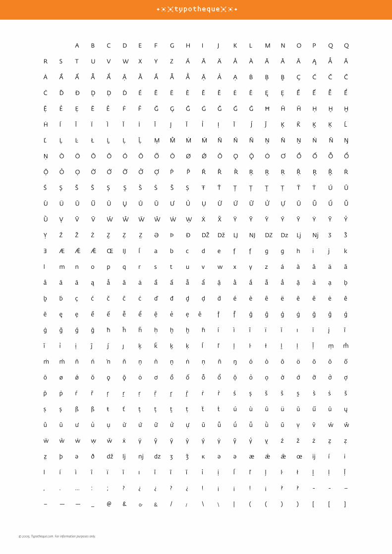
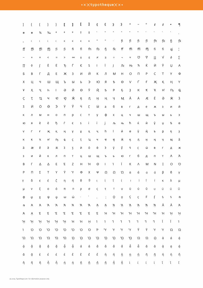
Multilingual OpenType font family supporting 84 languages and transliteration schemes, including Polytonic Greek and Cyrillic (with their own small caps), with extensive typographic features.
The same OpenType features less Greek and Cyrillic.
What is OpenType?OpenType is a cross-platform font format developed by Adobe and Microsoft. It has a potential to provide advanced typographic features such as multilingual character sets, ligatures, small capitals, various numeral styles, and contextual substitutions. OpenType, as the new industry standard, supports Unicode, which enables the fonts to contain a large number of characters. While PostScript fonts are a technically limited to a maximum of only 256 characters, OpenType fonts can have more than 65,000 glyphs. This means that a user does not need to have separate fonts for Western, Central European, Baltic, Cyrillic or Greek languages, but could have one single file which supports all these encodings. OpenType fonts work in all applications, however only some applications take advantage of the advanced OpenType features. Other applications will only use the first 256 characters. For more about OpenType information go to www.typotheque.com/opentype
ABCDEGH
AB
OpenType features in Fedra Sans ProDesigned by Peter Biľak, 2001-2009 with Гаянэ Багдасарян (Cyrillic) and Παναγιώτης Χαρατζόπουλος (Greek).
version 4.0

© 2009, Typotheque.com. For information purposes only.
GreekΗ Typotheque είναι μία εταιρεία σχεδιασμού γραμματοσειρών με έδρα την Χάγη της Ολλανδίας, όπου αναπτύσσει και εμπορεύεται πρωτότυπες γραμματοσειρές για Mac και PC. Δέσμευσή μας είναι να συνεχίσουμε την παράδοση των ανεξάρτητων εταιρειών σχεδιασμού γραμματοσειρών, συνεισφέροντας ένα μικρό κομμάτι στην εξέλιξη της τυπογραφίας, δημιουργώντας ποιοτικές γραμματοσειρές όπου
CzechTypotheque je písmolijna sídlící v Holandském Hágu, vyvíjející orig-inální písma pro Mac a PC. Jsme za-vázáni tradici nezávislých písmolijen, přispívajících svým malým dílem do neustále se rozvíjející historie písmové tvorby, navrhováním vysoce kvalitních písem, které odrážejí naši dobu a reflektují její potřeby. Mimo vývoje vlastního sortimentu se Typotheque specializuje na vytváření specifických typografických řešení pro rozmanité
RussianТипотек—шрифтовая фирма, находящаяся в Гааге (Нидерланды), разрабатывающая и реализующая оригинальные шрифты для платформ Macintosh и PC. Наша задача заключается в продолжении традиций независимых шрифтовых фирм, каждая из которых вносит свой небольшой вклад в историю шрифтов,
MalteseTypotheque, hija fabbrika ta’ stili ta’ l-ittajpjar imwaqqfa f’The Hague, l-Olanda, li tiżviluppa u tpoġġi għall-bejgħ fis-suq kummerċjali, fonts oriġinali għall-Mac u kompjuters (PC). Il-kariga tagħna hi li nkomplu t-tradizzjonijiet ta’ dawn it-tip ta’ fabbriki independenti; nikkon-tribwixxu, bil-parti żgħira tagħna, għas-sekwenza kontinwa ta’ l-istorja ta’ l-ittajpjar, noħolqu stili ta’ karattri partikulari li
LithuanianTypotheque - šriftų gamybos įmonė Hagoje, Nyderlanduose, kuria ir parduoda originalius fontus Mac ir PC platformoms. Mūsų tik-slas yra puoselėti nepriklausomų šriftų kūrėjų tradiciją, prisidėti prie šrifto istorijos t stinumo kuriant kokybiškus šriftus, kurie atspindi mūsų laikmetį ir tarnauja mūsų reikmėms. Typotheque specializuojasi kurti įvairius klientų pageidaujamus šriftus, pritaikytus įvairioms programoms ir kalboms.
SloveneTypotheque je oblikovalski atelje s sedežem v Hagu na Nizozemskem, ki razvija in trži originalne tipografije za osebne računalnike PC in Macintosh. Naš cilj je nadaljevati tradicijo ob-likovanja neodvisnih tipografij; želimo si prispevati tudi svoj delež k razvoju tekom zgodovine. To želimo doseći z ustvarjanjem kakovostnih tipografij, ki izražajo naš čas in služijo njegovim potrebam. Razen razvijanja malopro-dajne knjižnice je Typotheque special-izirana tudi v oblikovanju namenskih
Rhaeto-RomanicTypotheque è in atelier da letras a Den Haag, Pajais Bass, che sviluppa e venda scrittiras originalas per Mac e PC. Nossa finamira è da cuntinuar cun la tradiziun dals ateliers da le-tras independents, contribuind ina pitschna part a la cuntinui-tad da l’istorgia da la tipografia e creond scrittiras da qualitad che reflecteschan noss temp e servan als basegns da quel. Sper il svilup da questa collecziun
NorwegianTypotheque er eit fonthus som ligg i Haag, Nederland. Vi utviklar og sel original fontar for Mac og PC. Vår visjon er å føre vidare tradisjonane til dei uavhengige fonthusa og å gje vårt bidrag til denne historia ved å skape kvalitetsfontar som reflekterer vår tid og møter samtida sine krav. I tillegg til å utvikle fontbiblioteket, spesi-aliserer Typotheque seg i skaping av spesiallaga fontar til eit utval
BulgarianTypotheque е фирма за шрифтове в Хага, Холандия, която разработва и продава оригинални шрифтове за Mac и PC. Нашата цел е да продължаваме традициите на независимите фирми за шрифтове, като даваме своя скромен принос в историческото развитие на печата и създаваме качествени шрифтове в духа на нашето съвремие и неговите нужди. Освен шрифтовата
HungarianA Typotheque betűtervező műhely, amely Hollandiában alakult, Hágában, ahol betűket fejleszt és forgalmaz Macintoshra és PC-re. Elkötelezettek vagyunk a független betűöntőműhelyek tradíciói iránt, napjaink szükségleteihez igazodó kiváló minőségű fontjainkkal ma-gunk is hozzá szeretnénk járulni a betűtörténet fejlődéséhez. A standard font-készletek készítése mellett a Ty-potheque egyedi betű-fejlesztésekre specializálódik különféle nyelvekhez
PortugueseTypotheque é uma fundição tipográfica situada em Haia, Países Baixos, desenvolvendo e comercializando fontes originais para Mac e PC. O nosso compromisso é continuar com a tradição das fundições tipográficas independentes, contribuindo um pouco para a sequência contínua da história da tipografia; criando tipos de letra de qualidade que reflectem os nossos tempos
UkrainianТипотек — шрифтова фірма, що знаходиться у Гаазі (Нідерланди), розробляє та реалізує ориґінальні шрифти для платформ Macintosh та PC. Наше завдання полягає у продовженні традицій незалежних шрифтових фірм, які вкладають свій невеличкий внесок в історію шрифтів, створюючи якісні ґарнітури, що відбивають запити сьогодення. Крім розробки шрифтів для
EsperantoTypotheque estas litertipaj fandejo kies sidejo troviĝas en Hago, Nederlando. Ĝi kreas kaj distribuas originalajn litertiparoj por Makintoŝ kaj PK. Nia tasko estas daŭrigi la tradicion de la memstaraj presliteraj fandejoj donante nian kontribuadeton al la senĉesa sekvo de la tipografi-historio per la kreado de altkvali-taj litertiparoj reflektantaj niajn tempojn kaj respondantaj al ĝiaj bezonoj. Typotheque ne nur
Hawaiian‘O Typotheque he wahi ho‘ohehe‘e hua kēpau ma Ka Haka, Hōlani, a hana a kū‘ai aku mākou i nā hua kumu no ka Mac me ka PC. ‘O kā mākou ho‘ohiki ‘ana ka ho‘omau i ka mo‘olelo lō‘ihi loa o nā wahi ho‘ohehe‘e hua kū‘oko‘a, a ka mālama ‘ana i ia mo‘olelo ‘oki ‘ole me ka ha‘aha‘a, ‘oiai e hana ana mākou i nā hua kēpau pono a maika‘i no kēia wā. Eia a‘e, koe ka hana ‘ana i ka waihona hua kēpau no ke kū‘ai aku kū‘ai mai, ‘o ka ‘oihana mākaukau loa
SwedishTypotheque är ett neder-ländskt stilgjuteri med bas i Haag, som utvecklar och marknadsför originalfonter för Mac och PC. Vårt mål är att fortsätta bidra med vår lilla bit till den fortsatta typhistoriens, skapa typsnitt som reflekterar vår tid och möter dess behov. Förutom utvecklingen av vårt kom-mersiella typsnittsbibliotek, specialiserar sig Typotheque på
WelshFfowndri deip ydy Typotheque yn yr Hâg, yr Iseldiroedd sydd yn datblygu a marchnata ffontiau gwreiddiol ar gyfer Mac a PC. Ein hymrwymiad ni yw i barhau traddodiadau ffown-drïoedd teip annibynnol, gan gyfrannu ein rhan fechan ni i’r dilyniant parhaol o hanes teip, gan greu teipiau wyneb o safon sy’n adlewyrchu a gwasanaethu yr oes sydd ohoni. Yn ogystal â datblygu’r llyfrgell adwerthol
IcelandicTypotheque er leturfyrirtæki í Haag í Hollandi. Fyrirtækið þróar og markaðssetur up-prunalegar leturtegundir fyrir Makka og PC. Fyrirtækið einbe-itir sér að því að viðhalda he-fðum sjálfstæðra leturhönnuða og leggja þannig að mörkum til að viðhalda samfellu í sögu leturgerða. Jafnframt þessu er leitast við að hanna gæðaletur sem endurspeglar nútímann og þjónar tilgangi samtímans.
BelarusianТыпатэка, шрыфтавая фірма, якая знаходзіцца у Гаазе (Нідэрланды), распрацоўвае і распаўсюджвае арыгінальныя шрыфты для платформ Macin-tosh і PC. Нашае прызначэнне, працягваць традыцыі незалежных славалітняў, робячы свой невялічкі ўклад у гісторыю шрыфту, ствараючы якасные гарнітуры, якія адлюстроўваюць сёняшні дзень і служаць сучасным патрэбам.
FaroeseTypotheque er eitt skrift virkið, við høvuðssæti í Haag í Hollandi, ið tilevnar og selur skriftsnið til Mac- og PCteldur. Vit vilja halda áfram siðirnar hjá óheftu skriftsniðavirkjunum, og geva okkara lítla ískoyti til skrift søguna, við at skapa tíðarhós-kandi góðskugóðar stavamyn-dir. Afturat at menna og økja um okkara at skriftsavn, hevur Typotheque serkunnleika í
RomanianTypotheque este o agenţie de creaţie de caractere de litere cu sediul la Haga, Olanda şi dezvoltă precum şi comercializează fonturi origi-nale pentru Mac şi PC. Scopul nostru este de a continua tradiţia agenţiilor de creaţie de caractere de litere inde-pendente, contribuind aşa cum putem la succesiunea continuă a istoriei în domeniu, creînd fonturi reprezentative care
Fedra Sans
supports
over
80 languages

© 2009, Typotheque.com. For information purposes only.
Fedra Sans was originally commissioned by Paris-based Ruedi Baur Integral Design and developed as a corporate font for Bayerische Rück, a German insurance company, as part of their new visual identity. According to the commissioner, the objective was to ‘de-protestantize Univers’, the typeface which Bayerische Rück had been using since Otl Aicher designed their first visual identity in the 1970s. The typeface reflects the original brief: it humanises the communicated message and adds simple, informal elegance. The most important criterion was to create a typeface which works equally well on paper and on the computer screen, and is consistent across all computer platforms. The typeface attempts to reconcile two opposing design approaches: rigidity of a typeface designed for the computer screen and flexibility of a handwriting. After first versions of the typeface were completed and digitised, the project was cancelled as Bayerische Rück was acquired by another even larger multinational corporation. This put an early end to the story of the custom font. Since a lot of work had been done already, Biľak decided to complete the typeface,adding extra weights and expert fonts. Shortly before the planned release date of the typeface, Biľak’s studio was broken into, and his computers and back-up system containing all the font data were stolen. What initially seemed like the ultimate designer’s disaster was actually beneficial for Fedra. The incident delayed its release, allowing him to re-examine the early design decisions, made under the assumption that the font would be exclusive to the company and never publicly available. The new version is more versatile, offering a wider range of fonts, a number of special typographic features. The spacing of the font was altered, as well as the slope of the italics. Many characters were redrawn creating a more flexible type family.
Peter Biľak was born in Czechoslovakia, studied in England, the USA, and France to end up in The Netherlands. Works in the field of editorial, graphic, and type design, teaches part time at the Royal Academy in The Hague. He is the founder of Typotheque (1999), and Dot Dot Dot in 2000, together with Stuart Bailey. Besides fonts in Typotheque he has also designed fonts for FontShop International (e.g. FF Eureka).
About the font
About the designer
Fedra Sans Pro LightFedra Sans Pro Light ItalicFedra Sans Pro BookFedra Sans Pro Book ItalicFedra Sans Pro NormalFedra Sans Pro Normal ItalicFedra Sans Pro MediumFedra Sans Pro Medium ItalicFedra Sans Pro BoldFedra Sans Pro Bold Italic
Available versions

© 2009, Typotheque.com. For information purposes only.
Instead of seeking inspiration in the past, Fedra Sans is a synthetic typeface where aesthetic and technological decisions are linked. Fedra combines seemingly contradictory ways of constructing characters into one harmonious font. Its humanistic roots (the rhythm of the handwriting) is balanced with rational drawing (a coarse computer-screen grid).
Fedra Sans has five weights, italics, small caps, and expert sets for each weight and four different numeral systems (proportional, lining figures; old style figures; tabular, fixed-width figures; and fractions), plus additional open circled and closed circled numerals. Also available is a Cyrillic, Greek, Greek polytonic. All these fonts are built into our Fedra Sans Pro OpenType font.
Combined, these variants result in a typeface suitable even for most complex typographic situations.
H Fedra Serif A είναι μια ανισόπαχη γραμματοσειρά χαμηλού κοντράστ με πατούρες και αποτελεί μέρος μιας οικογένειας γραμματοσειρών που περιλαμβάνει επίσης παραλλαγές όπως η ισόπαχη χωρίς πατούρες (Sans Serif) και η ισόπαχη με χαρακτήρες σταθερού πλάτους (Monospace). Aντί να αναζητά έμπνευση στο παρελθόν, η Fedra Serif είναι μια σύγχρονη, πολυσύνθετη γραμματοσειρά όπου η αισθητική και τεχνολογική πλευρά της είναι συνδεδεμένες.
H Fedra συνδυάζει φαινομενικά αντιφατικούς τρόπους σχεδίασης σε μια απόλυτα, όμως, αρμονική γραμματοσειρά. Oι ανθρωπιστικές της καταβολές (χειρόγραφος ρυθμός) ισορροπούν με τον ορθολογικό σχεδιασμό (τραχύς κάνναβος στην οθόνη του υπολογιστή). H Fedra Serif διαθέτει 4 βάρη, πλάγια, μικρά κεφαλαία και σέτ ειδικών χαρακτήρων (experts) για κάθε βάρος και τρία διαφορετικά συστήματα αρίθμησης (ανισοϋψείς αναλογικοί, ισοϋψείς αναλογικοί καθώς και αριθμοί σταθερού πλάτους), ενώ εκτός από μονοτονικό, είναι διαθέσιμη και σε πολυτονικό σύστημα. H γραμματοσειρά διατίθεται επίσης σε δύο διαφορετικές εκδοχές με διαφορετικά ύψη των ανωφερών και κατωφερών στοιχείων. H εκδοχή A ταιριάζει στις αναλογίες της Fedra Sans, με μεγάλο ύψος πεζών (x-height) και μικρά ανωφερή.
H εκδοχή B έχει αυξημένο κοντράστ και επιμηκυμένα ανωφερή, γεγονός που την κάνει ιδανικότερη για εκτυπώσεις υψηλής ανάλυσης ή χρήση σε μεγαλύτερες στιγμές γραμμάτων. O συνδυασμός αυτών των
Когда в 2002 году я приступил к работе над шрифтом Федра Сериф, я намеревался дополнить его знаками кириллического и греческого алфавитов. Я разработал греческую версию параллельно с латинской в сотрудничестве с Панагиотисом Харатзопулосом.
Процесс стимулировался с обеих сторон: не только рисунок латинских знаков определял рисунок греческих, но и наоборот, греческие знаки влияли на латинские, поскольку обе версии создавались одновременно. Я надеялся, что результатом такого метода работы станет подлинный греческий шрифт, а не просто эллинизированный латинский. Разработка кириллицы началась уже после публикации латинской части, поэтому метод работы должен был отличаться от работы над греческими знаками. Поскольку латинский и греческий шрифты были уже закончены, я хотел создать оригинальный кириллический шрифт, способный как дополнить их, так и функционировать самостоятельно. Важно отметить, что этот шрифт разрабатывался не из коммерческих соображений: это не было заказом или решением дизайнерской проблемы. И, поскольку срок сдачи работы отсутствовал, было достаточно времени для экспериментов и проб, которые оказались чрезвычайно полезны, хотя для завершения проекта потребовалось почти два года. Несмотря на то, что я восемь лет изучал в школе русский язык и свободно на нем изъяснялся, я считал полезным привлечь к работе над проектом носителя языка. Дело не в том, что я считаю
Latin Ελληνικά Кириллица
typeface γραμματοσειρά шрифт

© 2009, Typotheque.com. For information purposes only.
historycontemporarinessоригинальный кириллический шрифт progressspeculation & reflexion cumulative culture
technologyιστορία της προόδουenvironment
© 2009, Typotheque.com. For information purposes only.
\
© 2009, Typotheque.com. For information purposes only.

© 2009, Typotheque.com. For information purposes only.

© 2009, Typotheque.com. For information purposes only.
a b c d e é è f g h
i j k l m o p q r s t u v w x y z
. , $ ¢a b c
d e é è f g h i j k l m n o p q r s t u
v w x y z = + . , $ ¢

© 2009, Typotheque.com. For information purposes only.
¡¿ab?! (d-e) [€1–2$] ▶ ¡¿AB?! (D-E) [€1–2$]
Small Capitals & All Small Caps (smcp & c2sc)In Adobe applications there are two methods of applying small capitals. The first one (fig 1) replaces only lower case letters by small caps. The second method (fig 2) replaces also capital letters by small capitals, and substitutes regular quotation, exclamation, question marks for lowered small caps quotes.
Case Sensitive forms (case)When caps are applied from within an application (not when text is typed in caps) appropriate case-sensitive forms are automatically applied. Regular brackets, paranthesis, dashes, hyphen, currency symbols, and numerals are replaced with their capital forms.
t
‘ABC’ ‘Abc/Defg’?! ▶ ‘ABC’ ‘Abc/Defg’?!‘ABC’ ‘Abc/Defg’?! ▶ ‘ABC’ ‘abc/Defg’?!
we
Slashed Zero (zero)Because in some circumstances ‘0’, can be mistaken for an ‘O’, alternative forms of ‘slashed zero’ are available.
v012345 012345 ▶ 012345 012345
Standard Ligatures (liga)Standard ligatures are glyphs which are designed to improve the kerning and readability of certain letter pairs. For example, when this feature is activated, typing ‘f’ and ‘i’ will automatically produce the ‘fi’ ligature. Using ligatures does not affect the spelling and hyphenation of your text in any way.
dfiflffifflfhffjfkąj ▶ fiflffifflfhffjfkąj
Arbitrary Fractions (frac)Typotheque OpenType fonts include includes a number of pre-designed fractions. Other arbitrary fractions are easily made by using the fraction feature.
21/2 31/10 41.25/5,100 ▶ 21/2 31/10 41.25/5,100 h
Discretionary Ligatures (dlig)Fedra Sans Pro includes handy features such as replacing hyphen and greater than/less than signs with by real arrows, or automatic activation of circled numerals by closing them in parenthesis when the discretionary ligature feature is activated. Brackets activate alternative inverse enclosed numerals. Discretionary ligatures are off by default in Adobe applications.
(1) (12) (123) [4] [567890] ▶ (1) (12) (123) [4] [567890] --> -> <-- -^, ^- ▶ ‒→ → ←‒↑↓ ---------------------> ▶ ‒‒‒‒‒‒‒‒‒‒‒‒‒‒→
u
Traditional Cyrillic forms on the left, and preferred Bulgarian shapes on the right
Traditional Cyrillic forms on the left, and Serbian / Macedonian cursive variants on the right.
Localized Forms (locl)Some languages such as Bulgarian, Serbian or Macedonian prefer variant letter shapes to the standard Cyrillic shapes. This feature replaces standard forms with localized ones, when the text is tagged Bulgarian, Serbian or Macedonian. (This feature is not yet supported in any software, that’s why we mirrored it to Stylistic Set 5 (Bulgarian) and Stylistic set 4 (Serbian).
r54
гпклдвцщзьъитж ▶ гпклдвцщзьъитж
бдгтп ▶ бдгтп
Superscript / superiors (sups)Replaces all styles of figures (old style, tabular, lining) and letters with their superior alternates, which can be used for footnotes, formulas, etc. Superior characters are more legible than mathematically scaled characters, have similar stroke weight, more generous spacing, and better complement the rest of the text.
zx(1+1.42 × 6) = γ37 πr2 ▶ x ⁽1+1.42×6⁾ = γ37 πr2
Subscript / inferiors (sinf)Replaces all styles of figures (old style, tabular, lining) and letters with their inferior alternates, used primarily for mathematical or chemical notation. Inferior characters are more legible than mathematically scaled characters, have similar weight of stroke, more generous spacing, and better complement the rest of the text.
iH2O (10,00 + $500) sm ▶ H2O ₍10,00 + $500) sm
Overview of supported OpenType layout features
fig.1
fig.2

© 2009, Typotheque.com. For information purposes only.
Stylistic Alternates (salt + ss01-09)Fedra includes some alternative characters which can be activated by turning on ‘stylistic alternates’ in Adobe Illustrator, or alternatively by selecting stylistic sets 1 to 9 in InDesign.
123456789
gğĝģġ ▶ gğĝģġffiflfhffiß ▶ ffiflffffißβθφ ▶ βθφбгдтn ▶ бгдтūгпклдв ▶ гпклдвQq ▶ Qqαγιπτυ ▶ αγιπτυilïíĭĺľŀł ▶ ilïíĭĺľŀł& ▶ &
Tabular Lining Figures (tnum_lnum)Tabular Oldstyle Figures (tnum_onum)Proportional Oldstyle Figures (pnum_onum)Proportional Lining Figures (pnum_lnum)Changes figures to any selected style: Lining figures which fit better with all-capital text, old-style figures, for use in a flow of lowercase and upper case text, or tabular (fixed width) versions. Brackets, parenthesis, dashes, and monetary figures are also replaced by their appropriate version.
sgf
({[012-3456–789 $€¥)]}({[012-3456–789 $€¥]})([{012-3456–789 $€¥}])({[012-3456–789 $€¥]})
Ornaments (ornm)Collection of various symbols, borders and ornaments.n•••••••••••••••✈•♡☝☞••••• etc.
€$¢£¥₥₤₡₢₫₣₦₧₨₪₩₭₮₱₴¤ Currency (crcy)Collection of various currency symbols: (U+20A0..U+20CF)q
Ordinals (ordn)The ordinals feature replaces alphabetic glyphs (not numerals) with their corresponding superior forms.
j1a 2o No1 ▶ 1a 2o №1
Stylistic Set 1
Stylistic Set 2
Stylistic Set 3
Stylistic Set 4
Stylistic Set 5
Stylistic Set 6
Stylistic Set 7
Stylistic Set 8
Stylistic Set 9

© 2009, Typotheque.com. For information purposes only.
Font overview
Family name Fedra Sans Pro and Std
Designed by Peter Biľak (with Гаянэ Багдасарян and Παναγιώτης Χαρατζόπουλος)
Released November 2009
Font format OpenType PS
Supported encodings Latin 1 (1252), Latin 2 –Central European (1250), Turkish (1254), Baltic (1257), Greek
(1253), Cyrillic (1251), Greek Extended, Superscripts & Subscripts, Number forms,
Arrows, Currency symbols, Geometric Shapes, Miscellaneous symbols
Number of characters per style 2.540 (Pro) 1.096 (Std)
Number of fonts in family 10
Supported OpenType features Capital Spacing (CPSP), Slashed Zero (ZERO), Localized Forms (locl),
Denominators (DNOM), Arbitrary fractions (FRAC), Subscript/inferiors (SINF),
Superscript/Superiors (SUPS), Case-Sensitive Forms (CASE), Small Capitals From
Capitals (C2SC), Small Capitals (SMCP), Oldstyle Figures (ONUM), Lining Figures
(LNUM), Tabular Figures (TNUM), Proportional Figures (PNUM), Terminal Forms
(FINA), Ordinals (ORDN), Stylistic Alternates (SALT), Stylistic Sets (ss01-ss09),
Standard Ligatures (LIGA), Discretionary Ligatures (DLIG), Ornaments (ORNM),
Access all Alternates (aalt), Swash (swsh), Glyphs composition/decomposition
(ccmp)
Available at www.typotheque.com
For the complete list of applications taking advantage of OpenType layout
features please visit
www.typotheque.com/static/opentype_feature_support
Typotheque Zwaardstraat 16, 2584 tx Den Haag, The Netherlands e: [email protected], t: +31 70 322 6119, f: +31 84 831 6741
Supported languages Abaza, Adyghe, Afar, Afrikaans, Albanian, Avar, Azeri (Latin), Balkar, Basque,
Belarusian, Bosnian, Breton, Bulgarian, Catalan, Croatian, Czech, Danish,
Dargin, Dutch, English, Esperanto, Estonian, Faroese, Finnish, French, Friulian,
German, Greek, Greek (polytonic), Greenlandic, Hawaiian, Hungarian, Icelandic,
Indonesian, Ingush, Interlingua, Irish Gaelic, Italian, Kabardian, Komi, Kumyk,
Kurdish (Latin), Lak, Latvian, Lezgian, Lithuanian, Luxemburgish, Macedonian,
Malay, Maltese, Mordvin (Erzya), Mordvin (Moksha), Māori, Nanai, Nenets,
Nivkh, Norwegian (Bokmål), Norwegian (Nynorsk), Polish, Portuguese, Rhaeto-
Romanic, Romani, Romanian, Russian, Sanskrit transliteration, Sámi (Inari), Sámi
(Lule), Sámi (Northern), Sámi (Southern), Selkup, Serbian (Cyrillic), Serbian (Latin),
Slovak, Slovene, Sorbian, Spanish, Swahili, Swedish, Tabasaran, Tagalog (Filipino),
Turkish, Ukrainian, Vietnamese, and Welsh
Fedra Sans, which format to choose
PostScript font OpenType Std OpenType ProNumber of glyphs per font 246 1096 2540 Number of supported languages 26 45 84Number of fonts in family 35 10 10Price per font € 60 € 90 € 120Price of full family € 520 € 690 € 830