tms asp.net component pack v2.6 developers quick start guide asp.net... · tms software tms asp.net...
TRANSCRIPT
TMS SOFTWARE TMS ASP.NET COMPONENT PACK
DEVELOPERS QUICK START GUIDE
1
TMS ASP.NET COMPONENT PACK
V2.6
DEVELOPERS QUICK START GUIDE
April 2010 Copyright © 2003 - 2010 by tmssoftware.com bvba
Web: http://www.tmssoftware.com Email : [email protected]
TMS SOFTWARE TMS ASP.NET COMPONENT PACK
DEVELOPERS QUICK START GUIDE
2
Contents Supported .NET development environments Installation Updates Upgrade notes Support Website login License agreement Component overview Version history Frequently asked questions
TMS SOFTWARE TMS ASP.NET COMPONENT PACK
DEVELOPERS QUICK START GUIDE
3
Supported .NET development environments The TMS ASP.NET Component Pack supports following development environments: Microsoft™ Visual Studio .NET 2003 Microsoft™ Visual Studio .NET 2005 Microsoft™ Visual Studio .NET 2005 with Microsoft AJAX (only with registered version) Microsoft™ Visual Studio .NET 2008 with Microsoft AJAX Microsoft™ Visual Studio .NET 2010 with Microsoft AJAX Supported browsers: Internet Explorer 6,7,8 Firefox 3, 3.5 Chrome 4.0
Installation Installation of components in the IDE 1) Execute SETUP.EXE This will install files under the folder: \Program Files\tmssoftware\TMSWebControls 2) From the Visual Studio IDE menu, choose Tools, Customize Toolbox Switch to the .NET Framework Components tab Choose Browse and pick TMSWebControls.DLL from the folder \Program Files\tmssoftware\TMSWebControls (for the registered version, either compile the solution for the IDE you’re working with or download the precompiled assemblies from the registered users page on our website) 3) Some components require additional installation steps The ClientDebugOut component requires DebugOutXControl1.ocx to be installed. This can be installed with following command line: regsvr32 DebugOutXControl1.ocx DebugOutXControl1.ocx is located in the folder: \Program Files\tmssoftware\TMSWebControls 4) Various components (Menus, HelpTip, AdvWebGrid) require optionally that JS client script files are in your webapplication path (when CachedScript is set to true), when starting a new web
TMS SOFTWARE TMS ASP.NET COMPONENT PACK
DEVELOPERS QUICK START GUIDE
4
application that uses such components, copy the appropriate menu JS file to your webapplication path. The JS files are located in the folder: \Program Files\tmssoftware\TMSWebControls\Scripts
TMS SOFTWARE TMS ASP.NET COMPONENT PACK
DEVELOPERS QUICK START GUIDE
5
Installation of sample applications Sample applications are provided for Visual Studio .NET for C# and VB.NET, Delphi 2005, Delphi 2006, 2007 C# Samples for Visual Studio .NET 2003: Copy the folder “\Program Files\tmssoftware\TMSWebControls\DemoVSNET2003” into your IIS webserver path under virtual directory \DemosVSNet2003 (ie. normally c:\inetpub\wwwroot\DemosVSNet2003) From the IIS administration, create an application directory for this virtual directory. To run the DB demos which are based on Access files, it is required to set the folder c:\inetpub\wwwroot\DemosVSNet2003 as a shared folder. Index.aspx is the project startup file. C# Samples for Visual Studio .NET 2005: Choose : File, Open, “Web Site” from the Visual Studio IDE and browse to the folder “\Program Files\tmssoftware\TMSWebControls\DemoVSNET2005” and start the application C# Samples for Visual Studio .NET 2008: Choose : File, Open, “Web Site” from the Visual Studio IDE and browse to the folder “\Program Files\tmssoftware\TMSWebControls\DemoVSNET2008” and start the application C# Samples for Visual Studio .NET 2010: Choose : File, Open, “Web Site” from the Visual Studio IDE and browse to the folder “\Program Files\tmssoftware\TMSWebControls\DemoVSNET2010” and start the application VB.NET Samples for Visual Studio .NET 2003: Copy the folder “\Program Files\tmssoftware\TMSWebControls\DemosVBNET2003” into your IIS webserver path under virtual directory \DemosVBNet2003 (ie. normally c:\inetpub\wwwroot\DemosVBNet2003) From the IIS administration, create an application directory for this virtual directory. To run the DB demos which are based on Access files, it is required to set the folder c:\inetpub\wwwroot\DemosVBNet2003 as a shared folder. Index.aspx is the project startup file. VB.NET Samples for Visual Studio .NET 2005: Choose : File, Open, “Web Site” from the Visual Studio IDE and browse to the folder “\Program Files\tmssoftware\TMSWebControls\DemoVBNET2005” and start the application VB.NET Samples for Visual Studio .NET 2008: Choose : File, Open, “Web Site” from the Visual Studio IDE and browse to the folder “\Program Files\tmssoftware\TMSWebControls\DemoVBNET2008” and start the application VB.NET Samples for Visual Studio .NET 2010: Choose : File, Open, “Web Site” from the Visual Studio IDE and browse to the folder “\Program Files\tmssoftware\TMSWebControls\DemoVBNET2010” and start the application
TMS SOFTWARE TMS ASP.NET COMPONENT PACK
DEVELOPERS QUICK START GUIDE
6
Important note: When opening the demo applications in Visual Studio .NET make sure that: 1) In the References of the project, a reference is correctly pointing to tmswebcontrols.dll 2) The demo csproj.webinfo file is correctly pointing the path in your webserver where the project is installed.
Updates The TMS ASP.NET Component Pack registered version comes with full source code, a license for commercial use and a full version cycle of free updates. A full version cycle means that from version x.y to version x+1.y, the updates are free. For example, if a registration starts at version v1.9, updates are free till version v2.9. The updates for the TMS ASP.NET Component Pack are frequently made available. The latest date of the updates can be seen after login on our website (see next section). This date reflects the exact file date of the latest update.
Upgrade info When upgrading from a former version of the TMS ASP.NET Component Pack, some minor modifications to current projects are required. In the Menus and Grid components, font property attributes in the ASPX files of projects will have to be removed as a new Font type has been used. View the HTML code of the ASPX file and remove the Font property attributes and select View, Refresh, after which the problem should be solved.
Support TMS ASP.NET Component Pack Pro registered users have priority support on the special email provided upon registration as well as newsgroup access. For general help: [email protected] For sales and other questions: [email protected]
Website login Registered users of the TMS ASP.NET Component Pack Pro receive a code with which it is possible to login on the website to obtain:
Free updates for a full version cycle of the components.
Discount offers on other products
TMS SOFTWARE TMS ASP.NET COMPONENT PACK
DEVELOPERS QUICK START GUIDE
7
Access to additional documentation
Access to samples projects Login on the website is done with:
Email with which you registered the TMS ASP.NET Component Pack
Code that is sent by email with the first registered version Direct link to login: http://www.tmssoftware.com/site/login.asp Important notes Keep this email and code in a safe place. If for some reason, your registration email address changes, the only way to have this updated is by sending email to TMS software to request for a change. The email must be sent from the original email address and specify the new address to change to. Make sure to use an email account that can handle file attachments up to 1.5MB.
License agreement A license for commercial use of the components is provided upon registration. Under commercial use of the components is all types of use in commercially operating companies or organisations. Registration of the components also entitles to free updates, full source and high priority technical support. The TMS ASP.NET Component Pack is available with two licensing schemes, a single developer license and a site license. The details of the two license types are below: TMS ASP.NET Component Pack single developer license agreement The single developer license of the component gives you the right to:
Using the component for development of applications or any type of software module in general by a single developer within the company holding the license.
Sell any commercial compiled application with the control, published by the company holding the license
Make modifications to the source code of component for own use.
Use the component and source code on all development systems used by the developer assigned by the company holding the license.
Request future versions of the component at any time either through the web or by email for a full version cycle of the component.
Access to priority email support by the single developer assigned by the company holding the license.
Sell any number of applications in any quantity without any additional run-time fees or royalties required.
The license agreement prevents you from:
Distributing parts or full source code of any component from TMS software.
TMS SOFTWARE TMS ASP.NET COMPONENT PACK
DEVELOPERS QUICK START GUIDE
8
Using parts or full source code of components from the TMS software for creating any type of other components that are distributed or sold with or without source code.
Changing the source code of any component from TMS software and sell or distribute this as a modified product.
Creating a descendant compiled product such as OCX or ActiveX control and sell or distribute this as a product.
Using the control in applications sold with different publisher name than the company holding the license.
Transfer the license to any other developer than the original registered developer
Using the components by multiple developers in the company holding the license TMS ASP.NET Component Pack site license The site license of the component gives you the right to:
Using the component for development of applications or any type of software module in general by an unlimited number of developers within the company holding the license.
Sell any commercial compiled application with the control, published by the company holding the license
Make modifications to the source code of component for own use.
Use the component and source code on all development systems used by the developer assigned by the company holding the license.
Request future versions of the component at any time either through the web or by email for a full version cycle of the component.
Access to priority email support by the developers assigned by the company holding the license.
Sell any number of applications in any quantity without any additional run-time fees or royalties required.
Change at any time the number of developers using the TMS software components within the company holding the license.
Notify TMS software at any time to allow new developers within the company to access the priority email support.
Allow any number of developers within the company holding the license to access the web based interface for obtaining product updates.
The site license agreement prevents you from:
Distributing parts or full source code of any component from TMS software.
Using parts or full source code of components from the TMS software for creating any type of other components that are distributed or sold with or without source code.
Changing the source code of any component from TMS software and sell or distribute this as a modified product.
Creating a descendant compiled product such as OCX or ActiveX control and sell or distribute this as a product.
Using the control in applications sold with different publisher name than the company holding the license.
Transfer the license to any other developer not working for the company holding the license.
TMS SOFTWARE TMS ASP.NET COMPONENT PACK
DEVELOPERS QUICK START GUIDE
9
Termination of license
The license agreement terminates immediately after violation of any of the terms and conditions described. A termination of the license means that the company has no longer any rights to use the components for development, sell applications using the components, obtain free updates of the components and is no longer entitled to email support or any other form of support. The company or developer holding the license is responsible for respecting the terms and conditions of the license agreement and shall thus make sure that no other person has access to the TMS Components to use these for any purposes that violate the license agreement.
TMS SOFTWARE TMS ASP.NET COMPONENT PACK
DEVELOPERS QUICK START GUIDE
10
Component overview
Edit & advanced input controls
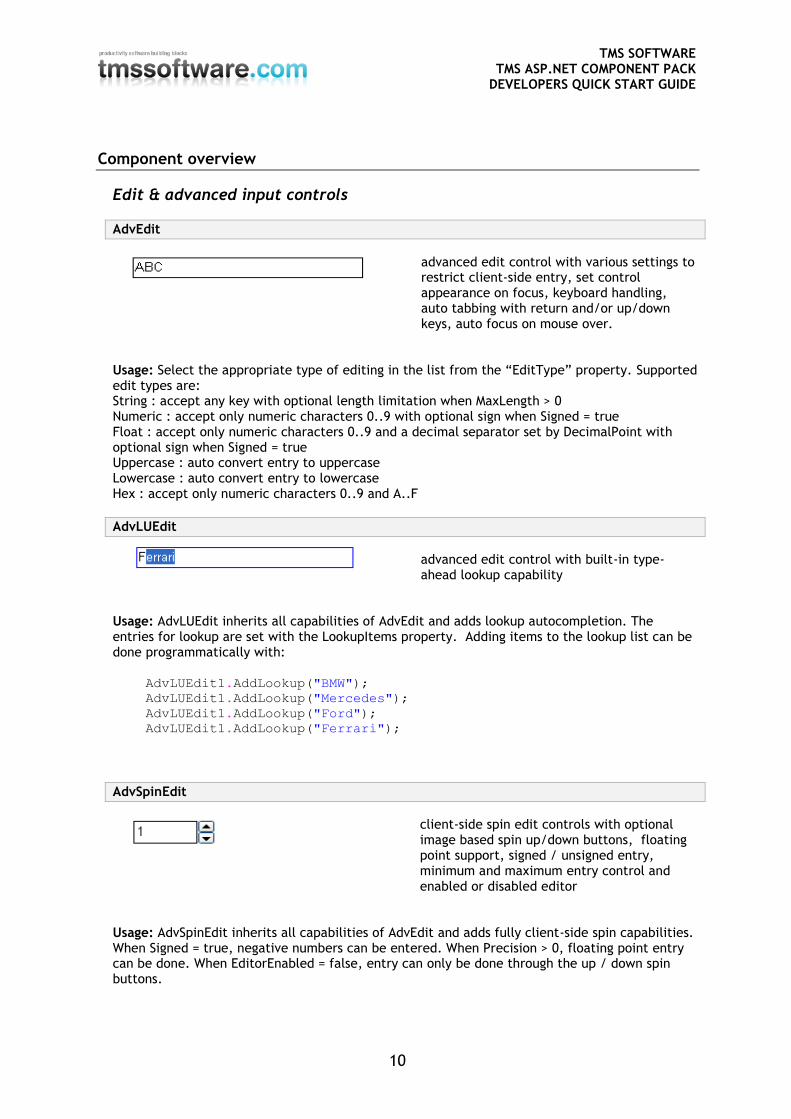
AdvEdit
advanced edit control with various settings to restrict client-side entry, set control appearance on focus, keyboard handling, auto tabbing with return and/or up/down keys, auto focus on mouse over.
Usage: Select the appropriate type of editing in the list from the “EditType” property. Supported edit types are: String : accept any key with optional length limitation when MaxLength > 0 Numeric : accept only numeric characters 0..9 with optional sign when Signed = true Float : accept only numeric characters 0..9 and a decimal separator set by DecimalPoint with optional sign when Signed = true Uppercase : auto convert entry to uppercase Lowercase : auto convert entry to lowercase Hex : accept only numeric characters 0..9 and A..F
AdvLUEdit
advanced edit control with built-in type-ahead lookup capability
Usage: AdvLUEdit inherits all capabilities of AdvEdit and adds lookup autocompletion. The entries for lookup are set with the LookupItems property. Adding items to the lookup list can be done programmatically with:
AdvLUEdit1.AddLookup("BMW");
AdvLUEdit1.AddLookup("Mercedes");
AdvLUEdit1.AddLookup("Ford");
AdvLUEdit1.AddLookup("Ferrari");
AdvSpinEdit
client-side spin edit controls with optional image based spin up/down buttons, floating point support, signed / unsigned entry, minimum and maximum entry control and enabled or disabled editor
Usage: AdvSpinEdit inherits all capabilities of AdvEdit and adds fully client-side spin capabilities. When Signed = true, negative numbers can be entered. When Precision > 0, floating point entry can be done. When EditorEnabled = false, entry can only be done through the up / down spin buttons.
TMS SOFTWARE TMS ASP.NET COMPONENT PACK
DEVELOPERS QUICK START GUIDE
11
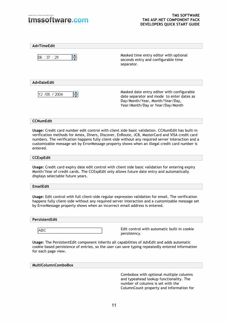
AdvTimeEdit
Masked time entry editor with optional seconds entry and configurable time separator.
AdvDateEdit
Masked date entry editor with configurable date separator and mode to enter dates as Day/Month/Year, Month/Year/Day, Year/Month/Day or Year/Day/Month
CCNumEdit
Usage: Credit card number edit control with client side basic validation. CCNumEdit has built-in verification methods for Amex, Diners, Discover, EnRoute, JCB, MasterCard and VISA credit card numbers. The verification happens fully client-side without any required server interaction and a customizable message set by ErrorMessage property shows when an illegal credit card number is entered.
CCExpEdit
Usage: Credit card expiry date edit control with client side basic validation for entering expiry Month/Year of credit cards. The CCExpEdit only allows future date entry and automatically displays selectable future years. EmailEdit
Usage: Edit control with full client-side regular expression validation for email. The verification happens fully client-side without any required server interaction and a customizable message set by ErrorMessage property shows when an incorrect email address is entered.
PersistentEdit
Edit control with automatic built-in cookie persistency.
Usage: The PersistentEdit component inherits all capabilities of AdvEdit and adds automatic cookie based persistence of entries, so the user can save typing repeatedly entered information for each page view.
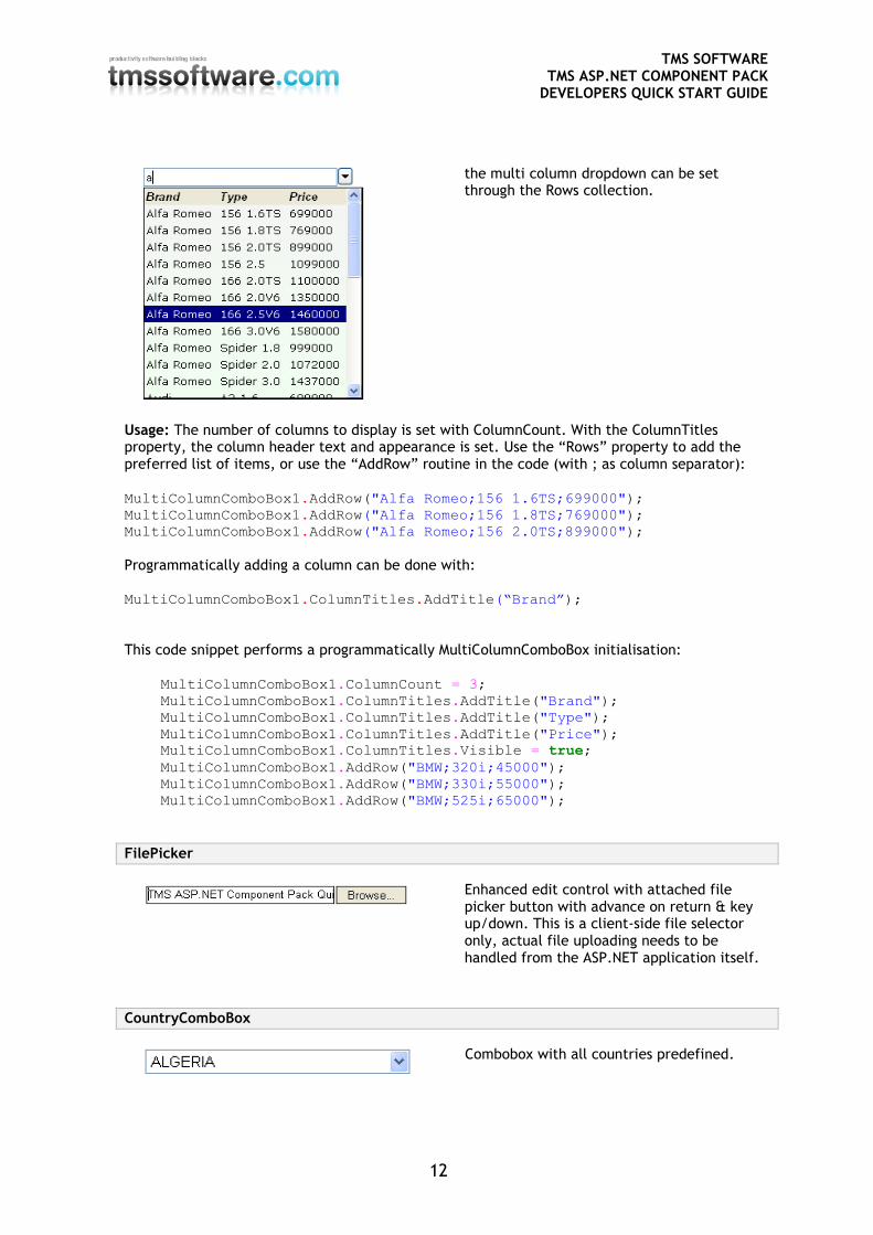
MultiColumnComboBox
Combobox with optional multiple columns and typeahead lookup functionality. The number of columns is set with the ColumnCount property and information for
TMS SOFTWARE TMS ASP.NET COMPONENT PACK
DEVELOPERS QUICK START GUIDE
12
the multi column dropdown can be set through the Rows collection.
Usage: The number of columns to display is set with ColumnCount. With the ColumnTitles property, the column header text and appearance is set. Use the “Rows” property to add the preferred list of items, or use the “AddRow” routine in the code (with ; as column separator): MultiColumnComboBox1.AddRow("Alfa Romeo;156 1.6TS;699000");
MultiColumnComboBox1.AddRow("Alfa Romeo;156 1.8TS;769000");
MultiColumnComboBox1.AddRow("Alfa Romeo;156 2.0TS;899000");
Programmatically adding a column can be done with: MultiColumnComboBox1.ColumnTitles.AddTitle(“Brand”); This code snippet performs a programmatically MultiColumnComboBox initialisation:
MultiColumnComboBox1.ColumnCount = 3;
MultiColumnComboBox1.ColumnTitles.AddTitle("Brand");
MultiColumnComboBox1.ColumnTitles.AddTitle("Type");
MultiColumnComboBox1.ColumnTitles.AddTitle("Price");
MultiColumnComboBox1.ColumnTitles.Visible = true;
MultiColumnComboBox1.AddRow("BMW;320i;45000");
MultiColumnComboBox1.AddRow("BMW;330i;55000");
MultiColumnComboBox1.AddRow("BMW;525i;65000");
FilePicker
Enhanced edit control with attached file picker button with advance on return & key up/down. This is a client-side file selector only, actual file uploading needs to be handled from the ASP.NET application itself.
CountryComboBox
Combobox with all countries predefined.
TMS SOFTWARE TMS ASP.NET COMPONENT PACK
DEVELOPERS QUICK START GUIDE
13
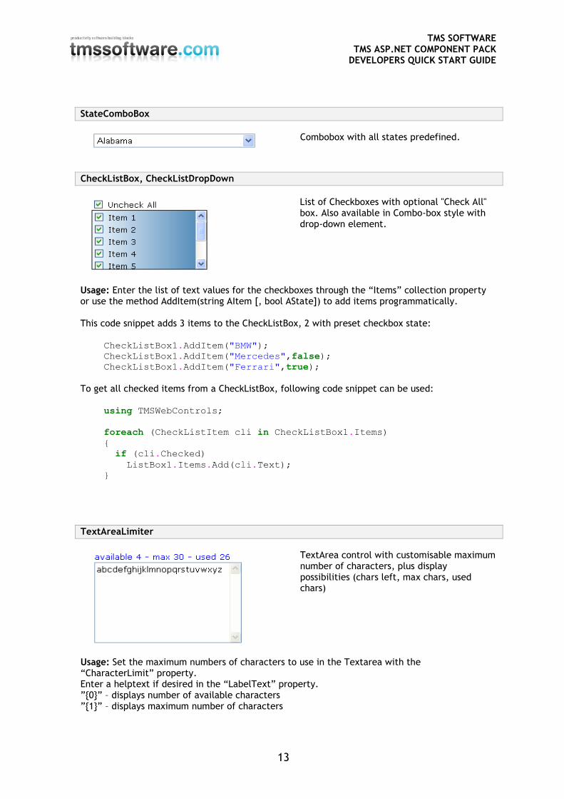
StateComboBox
Combobox with all states predefined.
CheckListBox, CheckListDropDown
List of Checkboxes with optional "Check All" box. Also available in Combo-box style with drop-down element.
Usage: Enter the list of text values for the checkboxes through the “Items” collection property or use the method AddItem(string AItem [, bool AState]) to add items programmatically. This code snippet adds 3 items to the CheckListBox, 2 with preset checkbox state:
CheckListBox1.AddItem("BMW");
CheckListBox1.AddItem("Mercedes",false);
CheckListBox1.AddItem("Ferrari",true);
To get all checked items from a CheckListBox, following code snippet can be used:
using TMSWebControls;
foreach (CheckListItem cli in CheckListBox1.Items)
{
if (cli.Checked)
ListBox1.Items.Add(cli.Text);
}
TextAreaLimiter
TextArea control with customisable maximum number of characters, plus display possibilities (chars left, max chars, used chars)
Usage: Set the maximum numbers of characters to use in the Textarea with the “CharacterLimit” property. Enter a helptext if desired in the “LabelText” property. ”{0}” – displays number of available characters ”{1}” – displays maximum number of characters
TMS SOFTWARE TMS ASP.NET COMPONENT PACK
DEVELOPERS QUICK START GUIDE
14
”{2}” – displays number of used characters
Enhanced button controls
AdvImageButton
Usage: Tri-state image based button control. Images can be set for normal, hot and pressed state.
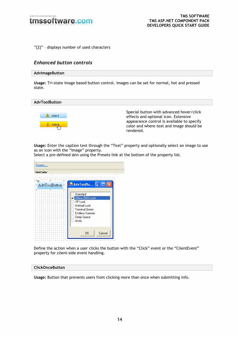
AdvToolButton
Special button with advanced hover/click effects and optional icon. Extensive appearance control is available to specify color and where text and image should be rendered.
Usage: Enter the caption text through the “Text” property and optionally select an image to use as an icon with the “Image” property. Select a pre-defined skin using the Presets link at the bottom of the property list.
Define the action when a user clicks the button with the “Click” event or the “ClientEvent” property for client-side event handling.
ClickOnceButton
Usage: Button that prevents users from clicking more than once when submitting info.
TMS SOFTWARE TMS ASP.NET COMPONENT PACK
DEVELOPERS QUICK START GUIDE
15
Grid
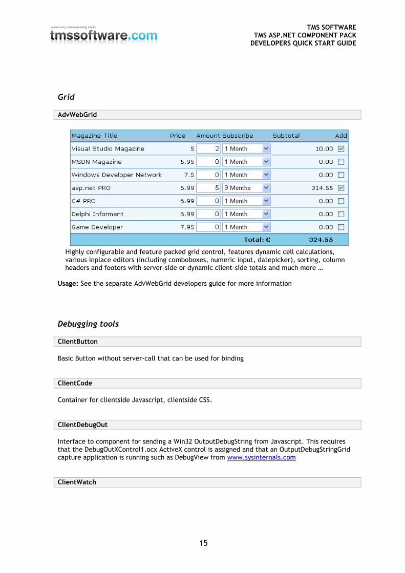
AdvWebGrid
Highly configurable and feature packed grid control, features dynamic cell calculations, various inplace editors (including comboboxes, numeric input, datepicker), sorting, column headers and footers with server-side or dynamic client-side totals and much more …
Usage: See the separate AdvWebGrid developers guide for more information
Debugging tools
ClientButton
Basic Button without server-call that can be used for binding
ClientCode
Container for clientside Javascript, clientside CSS.
ClientDebugOut
Interface to component for sending a Win32 OutputDebugString from Javascript. This requires that the DebugOutXControl1.ocx ActiveX control is assigned and that an OutputDebugStringGrid capture application is running such as DebugView from www.sysinternals.com
ClientWatch
TMS SOFTWARE TMS ASP.NET COMPONENT PACK
DEVELOPERS QUICK START GUIDE
16
Interface to component for sending OutputDebugString from Javascript, in seperate window, for easy client-side script debugging
Usage: The above screenshot demonstrates what happens when you click the button after you added the following attribute in the code: Button1.Attributes.Add("onclick","OutputDebugString('debug data');");
Date & time Clock
Usage: Client side running clock showing local machine time. With the property ShowSeconds, it can be choosen whether time display is with or without seconds.
DateLabel
Usage: Client-side automatic date of the day display. Dateformat and date separator can be choosen.
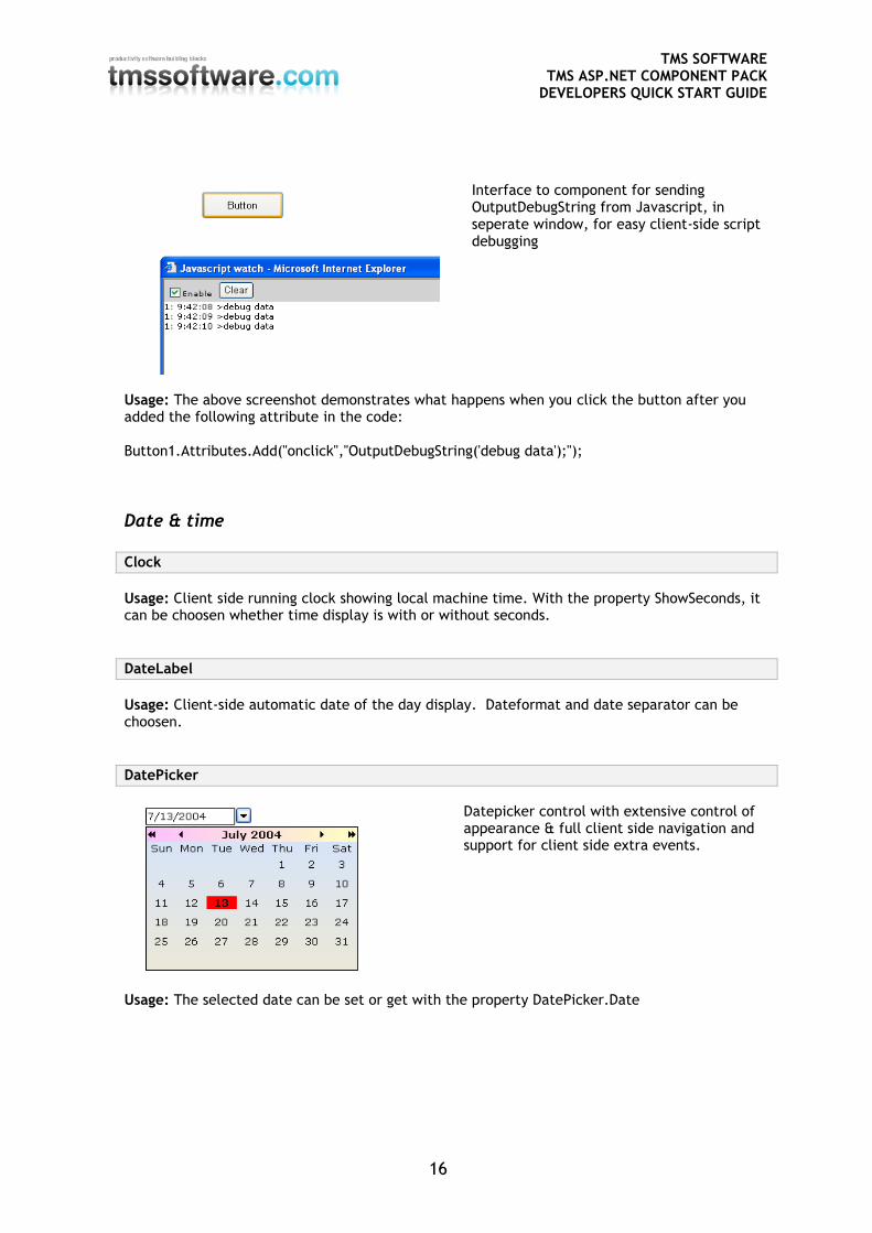
DatePicker
Datepicker control with extensive control of appearance & full client side navigation and support for client side extra events.
Usage: The selected date can be set or get with the property DatePicker.Date
TMS SOFTWARE TMS ASP.NET COMPONENT PACK
DEVELOPERS QUICK START GUIDE
17
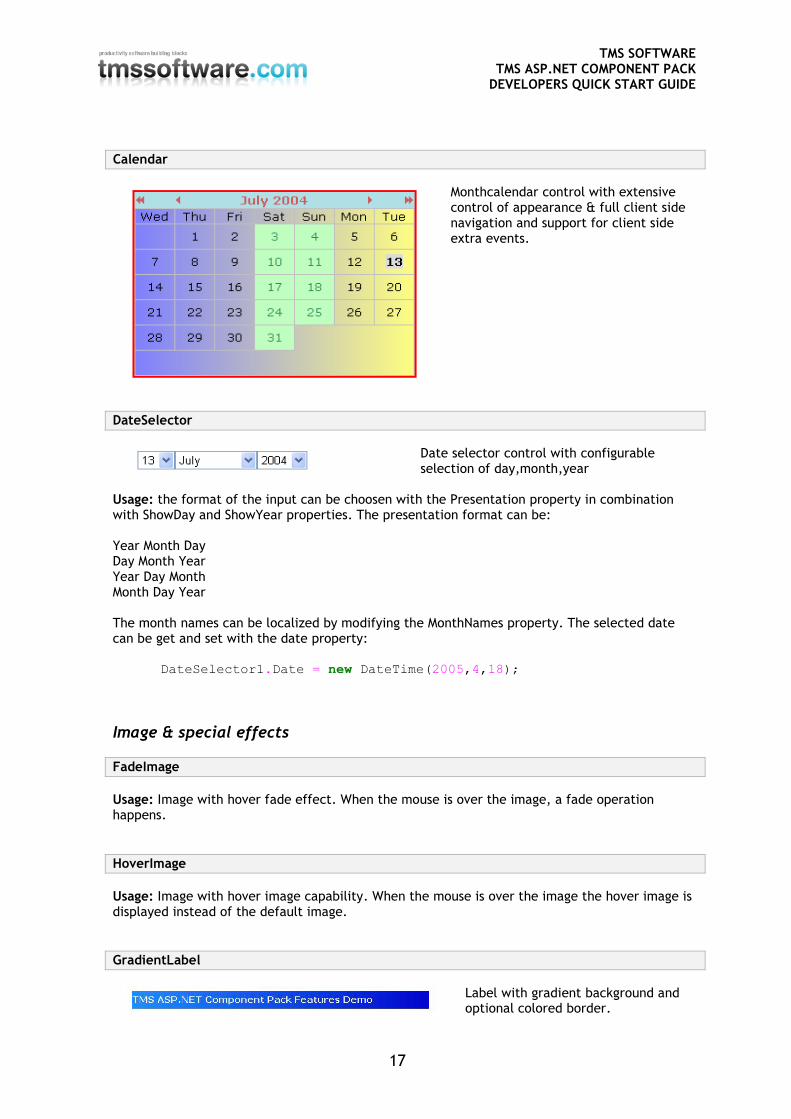
Calendar
Monthcalendar control with extensive control of appearance & full client side navigation and support for client side extra events.
DateSelector
Date selector control with configurable selection of day,month,year
Usage: the format of the input can be choosen with the Presentation property in combination with ShowDay and ShowYear properties. The presentation format can be: Year Month Day Day Month Year Year Day Month Month Day Year The month names can be localized by modifying the MonthNames property. The selected date can be get and set with the date property: DateSelector1.Date = new DateTime(2005,4,18);
Image & special effects
FadeImage
Usage: Image with hover fade effect. When the mouse is over the image, a fade operation happens.
HoverImage
Usage: Image with hover image capability. When the mouse is over the image the hover image is displayed instead of the default image.
GradientLabel
Label with gradient background and optional colored border.
TMS SOFTWARE TMS ASP.NET COMPONENT PACK
DEVELOPERS QUICK START GUIDE
18
NoSpamEmailLabel
Usage: Email link that prevents spambots of getting your email address from a webpage.
HelpTip
Label with helptip capability, showing a full HTML formatted help on click.
Usage: Enter the text to appear on the Label in the “LinesText” property. Enter the text to appear on the HelpTip in the “LinesHelp” property. Note: It is required that the helptipe handling .JS & .CSS files (helptip.js, helptip.css) are copied into the webapplication folder.
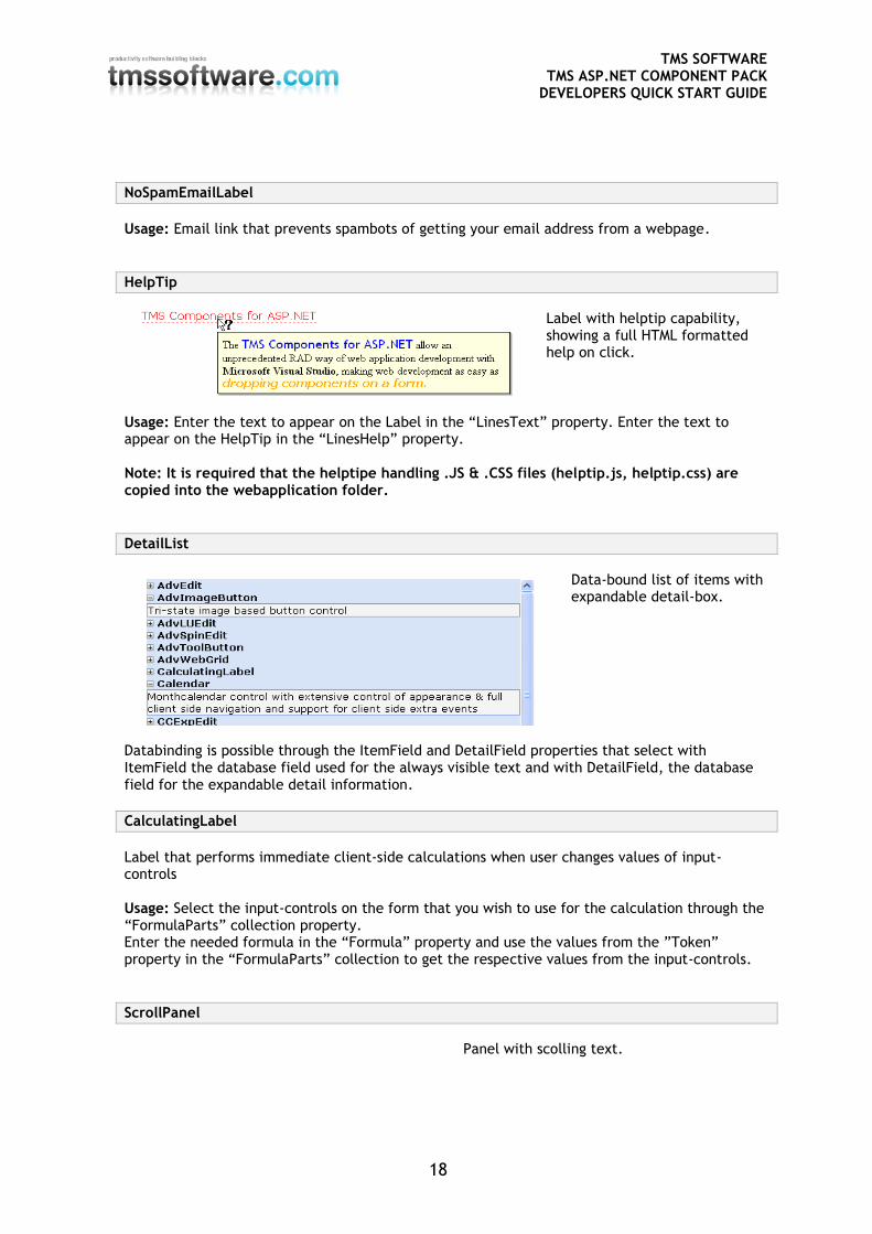
DetailList
Data-bound list of items with expandable detail-box.
Databinding is possible through the ItemField and DetailField properties that select with ItemField the database field used for the always visible text and with DetailField, the database field for the expandable detail information.
CalculatingLabel
Label that performs immediate client-side calculations when user changes values of input-controls Usage: Select the input-controls on the form that you wish to use for the calculation through the “FormulaParts” collection property. Enter the needed formula in the “Formula” property and use the values from the ”Token” property in the “FormulaParts” collection to get the respective values from the input-controls.
ScrollPanel
Panel with scolling text.
TMS SOFTWARE TMS ASP.NET COMPONENT PACK
DEVELOPERS QUICK START GUIDE
19
Usage: Enter each line that should appear in the ticker panel trough the “MessageList” collection property.
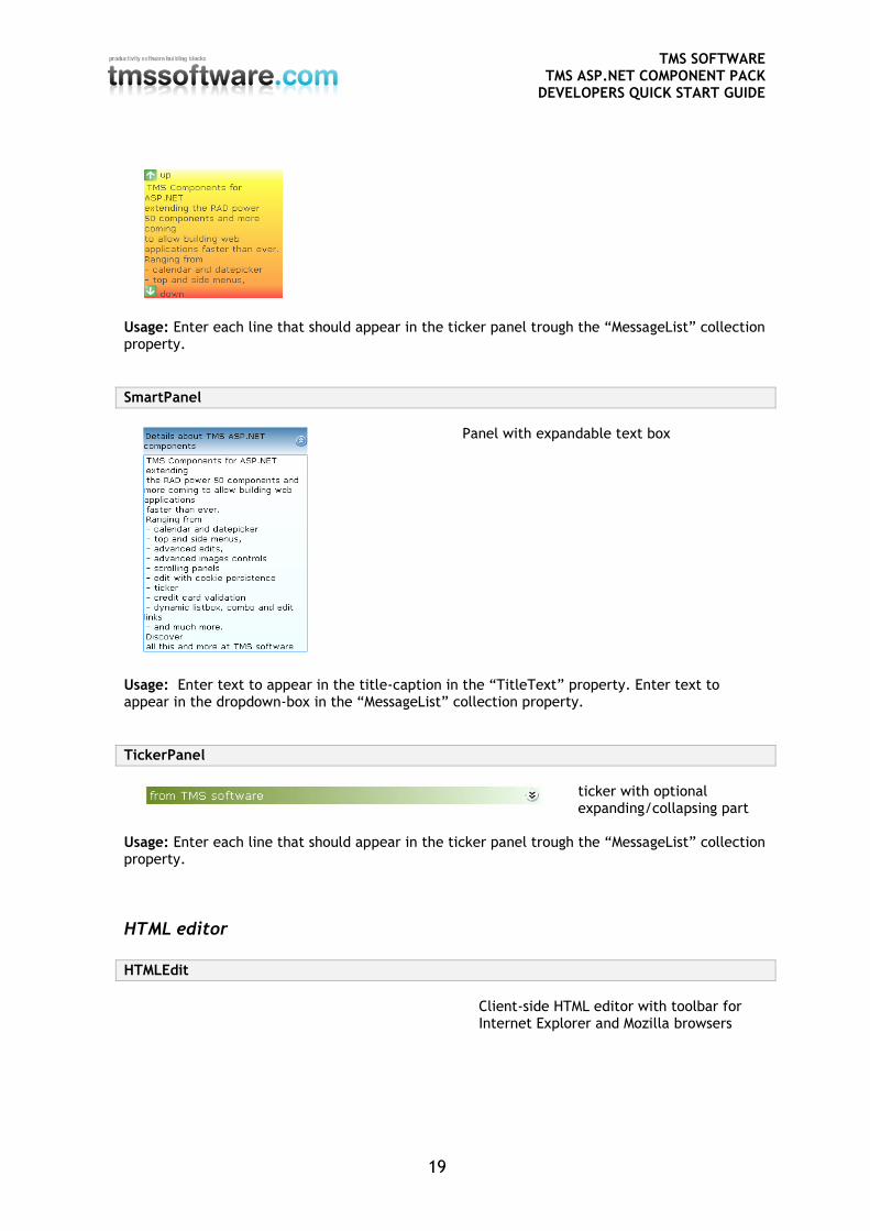
SmartPanel
Panel with expandable text box
Usage: Enter text to appear in the title-caption in the “TitleText” property. Enter text to appear in the dropdown-box in the “MessageList” collection property.
TickerPanel
ticker with optional expanding/collapsing part
Usage: Enter each line that should appear in the ticker panel trough the “MessageList” collection property.
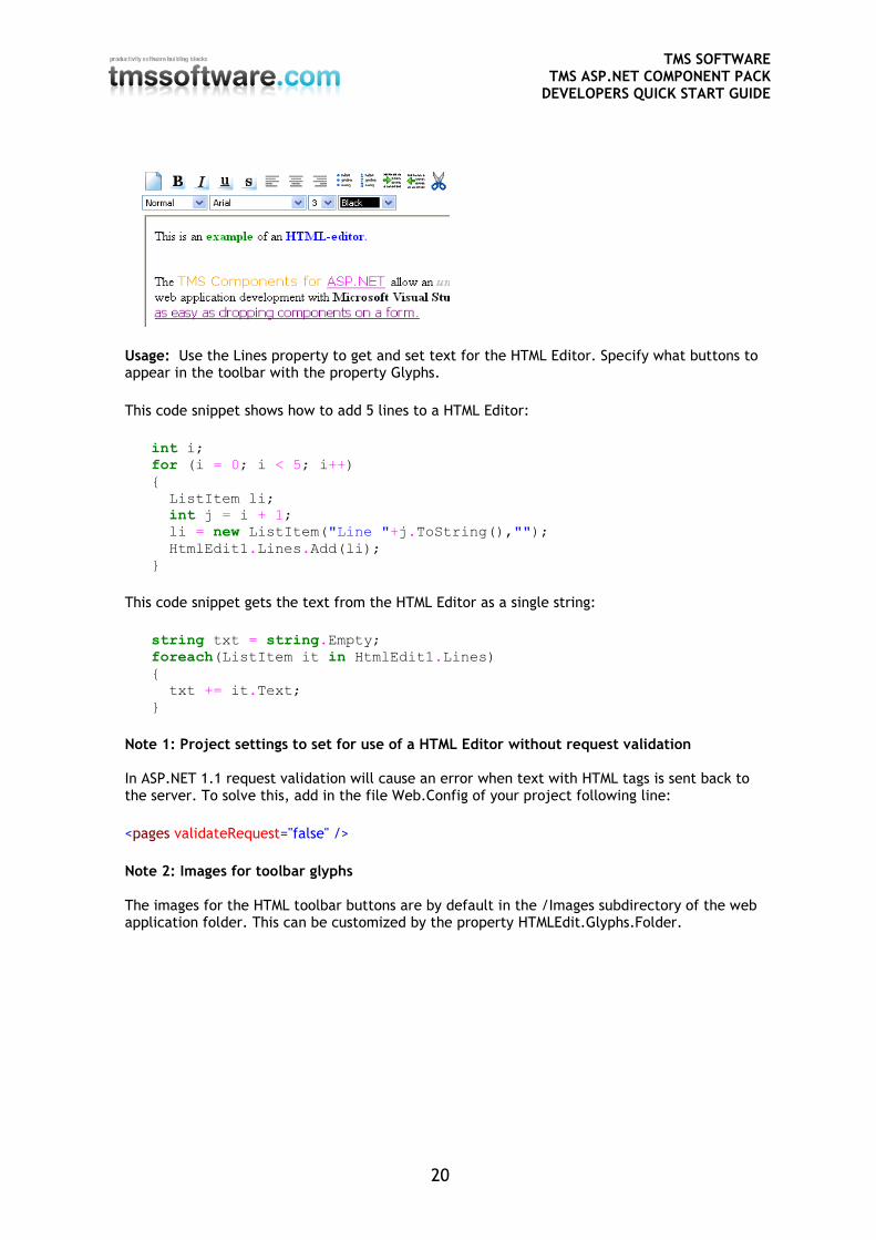
HTML editor HTMLEdit
Client-side HTML editor with toolbar for Internet Explorer and Mozilla browsers
TMS SOFTWARE TMS ASP.NET COMPONENT PACK
DEVELOPERS QUICK START GUIDE
20
Usage: Use the Lines property to get and set text for the HTML Editor. Specify what buttons to appear in the toolbar with the property Glyphs.
This code snippet shows how to add 5 lines to a HTML Editor:
int i;
for (i = 0; i < 5; i++)
{
ListItem li;
int j = i + 1;
li = new ListItem("Line "+j.ToString(),"");
HtmlEdit1.Lines.Add(li);
}
This code snippet gets the text from the HTML Editor as a single string:
string txt = string.Empty;
foreach(ListItem it in HtmlEdit1.Lines)
{
txt += it.Text;
}
Note 1: Project settings to set for use of a HTML Editor without request validation In ASP.NET 1.1 request validation will cause an error when text with HTML tags is sent back to the server. To solve this, add in the file Web.Config of your project following line:
<pages validateRequest="false" />
Note 2: Images for toolbar glyphs The images for the HTML toolbar buttons are by default in the /Images subdirectory of the web application folder. This can be customized by the property HTMLEdit.Glyphs.Folder.
TMS SOFTWARE TMS ASP.NET COMPONENT PACK
DEVELOPERS QUICK START GUIDE
21
Menu controls
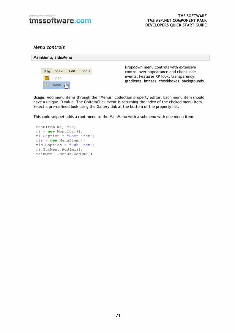
MainMenu, SideMenu
Dropdown menu controls with extensive control over appearance and client-side events. Features XP look, transparency, gradients, images, checkboxes, backgrounds.
Usage: Add menu items through the “Menus” collection property editor. Each menu item should have a unique ID value. The OnItemClick event is returning the index of the clicked menu item. Select a pre-defined look using the Gallery link at the bottom of the property list.
This code snippet adds a root menu to the MainMenu with a submenu with one menu item:
MenuItem mi, mis;
mi = new MenuItem();
mi.Caption = "Root item";
mis = new MenuItem();
mis.Caption = "Sub Item";
mi.SubMenu.Add(mis);
MainMenu1.Menus.Add(mi);
TMS SOFTWARE TMS ASP.NET COMPONENT PACK
DEVELOPERS QUICK START GUIDE
22
This code snippet shows how to show the text and index of a clicked menu item in a label: Label1.Text = e.Item.Caption + " : " + e.Item.ItemIndex.ToString(); From the Menu designer, it is possible to add client-side scripts as well. To open a new page from client-side script, the following Javascript code snippet can be added in the Menu designer for a menu item: window.location.href = "http://www.tmssoftware.com/"
return; // no server side processing will happen when calling return
Menus can also be loaded from XML files with the method LoadFromXml(string FileName). This is the most basic structure of a menu in XML: <?xml version="1.0" encoding="utf-8"?> <Menu> <MenuItem Text="File" ID="1"> <SubMenu> <MenuItem Text="Open" ID="12"> <MenuItem Text="Save" ID="13"> <MenuItem Text="Save as" ID="14"> </SubMenu> <MenuItem Text="Edit" ID="2"> <SubMenu> <MenuItem Text="Cut" ID="21"> <MenuItem Text="Copy" ID="22"> <MenuItem Text="Paste" ID="23"> </SubMenu> </Menu> A menu item can have more attributes, a full list is: <MenuItem Text="MenuText" ID="1" ImageURL="MenuImageURL" Enabled="True" Checked="False" Separator="False" Hint="MenuHintText" Script="MenuClientSideJavascript"> Note: It is required that the menu handling .JS files (tms_menu*.js) are copied into the webapplication folder when the property CachedScript is set to true.
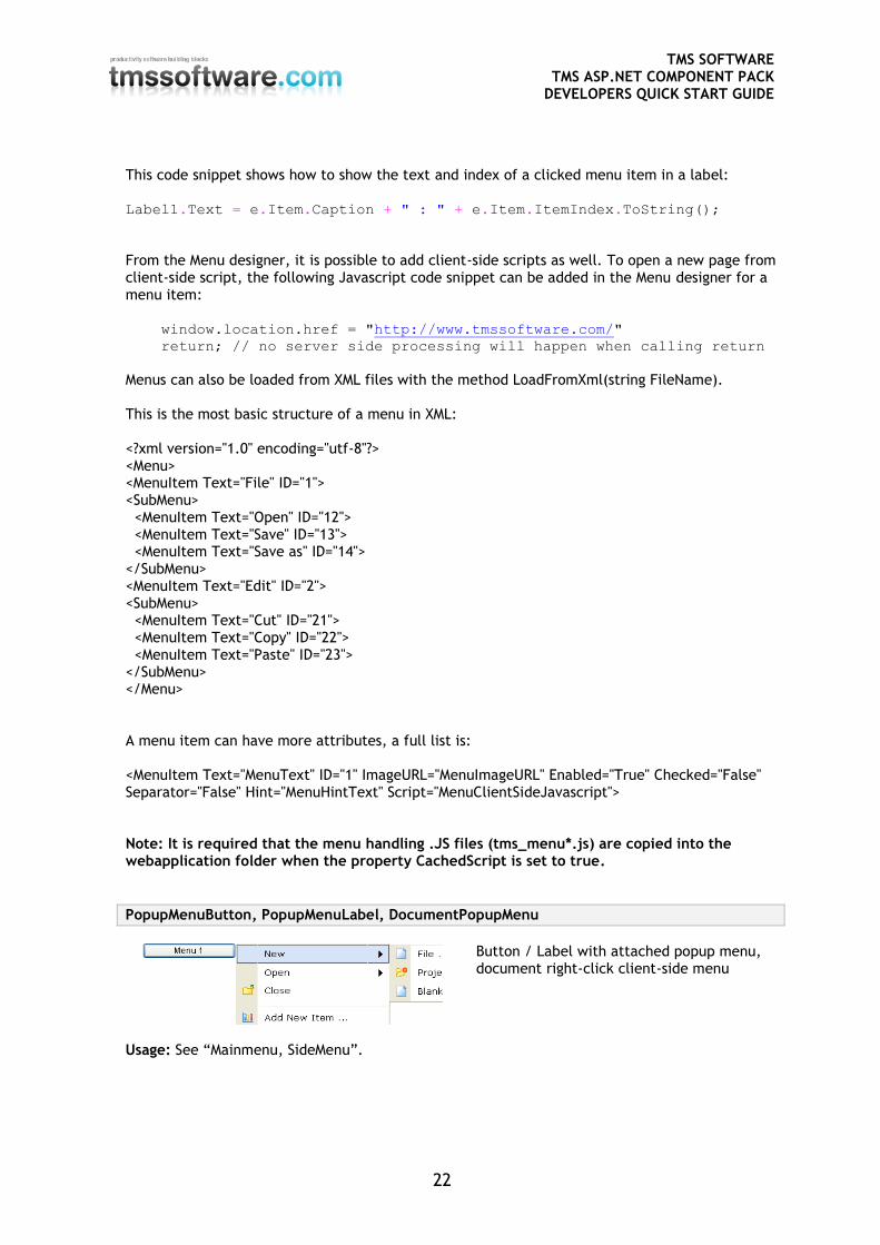
PopupMenuButton, PopupMenuLabel, DocumentPopupMenu
Button / Label with attached popup menu, document right-click client-side menu
Usage: See “Mainmenu, SideMenu”.
TMS SOFTWARE TMS ASP.NET COMPONENT PACK
DEVELOPERS QUICK START GUIDE
23
Note: It is required that the menu handling .JS files (tms_menu*.js and tms_popupmenu.js) are copied into the webapplication folder.
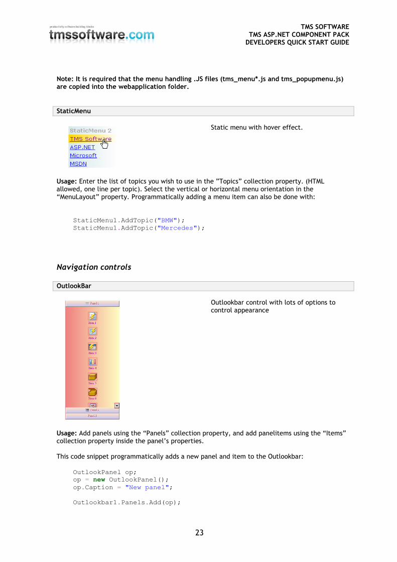
StaticMenu
Static menu with hover effect.
Usage: Enter the list of topics you wish to use in the ”Topics” collection property. (HTML allowed, one line per topic). Select the vertical or horizontal menu orientation in the “MenuLayout” property. Programmatically adding a menu item can also be done with:
StaticMenu1.AddTopic("BMW");
StaticMenu1.AddTopic("Mercedes");
Navigation controls OutlookBar
Outlookbar control with lots of options to control appearance
Usage: Add panels using the “Panels” collection property, and add panelitems using the “Items” collection property inside the panel’s properties. This code snippet programmatically adds a new panel and item to the Outlookbar:
OutlookPanel op;
op = new OutlookPanel();
op.Caption = "New panel";
Outlookbar1.Panels.Add(op);
TMS SOFTWARE TMS ASP.NET COMPONENT PACK
DEVELOPERS QUICK START GUIDE
24
OutlookItem oi;
oi = new OutlookItem();
oi.Caption = "New item";
op.Items.Add(oi);
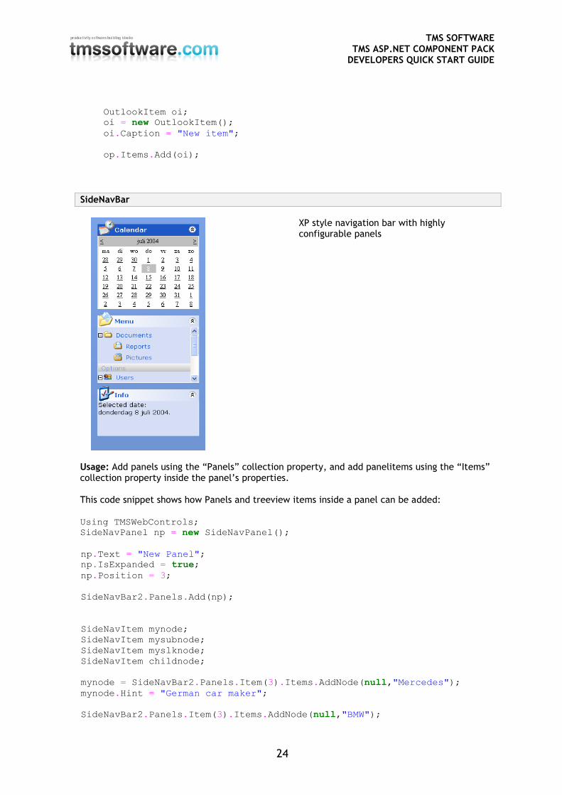
SideNavBar
XP style navigation bar with highly configurable panels
Usage: Add panels using the “Panels” collection property, and add panelitems using the “Items” collection property inside the panel’s properties. This code snippet shows how Panels and treeview items inside a panel can be added: Using TMSWebControls;
SideNavPanel np = new SideNavPanel();
np.Text = "New Panel";
np.IsExpanded = true;
np.Position = 3;
SideNavBar2.Panels.Add(np);
SideNavItem mynode;
SideNavItem mysubnode;
SideNavItem myslknode;
SideNavItem childnode;
mynode = SideNavBar2.Panels.Item(3).Items.AddNode(null,"Mercedes");
mynode.Hint = "German car maker";
SideNavBar2.Panels.Item(3).Items.AddNode(null,"BMW");
TMS SOFTWARE TMS ASP.NET COMPONENT PACK
DEVELOPERS QUICK START GUIDE
25
// add to same sibling as last item
SideNavBar2.Panels.Item(3).Items.AddNode(mynode, "VolksWagen");
mysubnode = SideNavBar2.Panels.Item(3).Items.AddChild(mynode,"models");
myslknode = SideNavBar2.Panels.Item(3).Items.AddChild(mysubnode, "SLK");
SideNavBar2.Panels.Item(3).Items.AddChild(mysubnode, "SL");
SideNavBar2.Panels.Item(3).Items.AddChild(mysubnode, "SLR");
childnode = SideNavBar2.Panels.Item(3).Items.AddChildFirst(mysubnode,
"S");
SideNavBar2.Panels.Item(3).Items.AddChild(myslknode, "SLK 2004");
SideNavBar2.Panels.Item(3).Items.DeleteNode(myslknode);
myslknode.DeleteChildren();
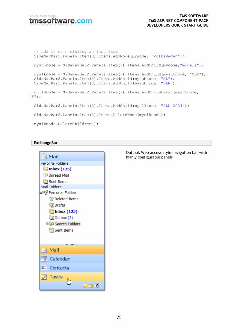
ExchangeBar
Outlook Web access style navigation bar with highly configurable panels
TMS SOFTWARE TMS ASP.NET COMPONENT PACK
DEVELOPERS QUICK START GUIDE
26
Usage: Add panels using the “Panels” collection property, and add panelitems using the “Items” collection property inside the panel’s properties. This code snippet shows how Panels and treeview items inside a panel can be added: Using TMSWebControls;
ExchangePanel np = new ExchangePanel();
np.Text = "New Panel";
ExchangeBar1.Panels.Add(np);
ExchangeItem mynode;
ExchangeItem mysubnode;
ExchangeItem myslknode;
ExchangeItem childnode;
mynode = ExchangeBar1.Panels.Item(3).Items.AddNode(null,"Mercedes");
mynode.Hint = "German car maker";
ExchangeBar1.Panels.Item(3).Items.AddNode(null,"BMW");
// add to same sibling as last item
ExchangeBar1.Panels.Item(3).Items.AddNode(mynode, "VolksWagen");
mysubnode = ExchangeBar1.Panels.Item(3).Items.AddChild(mynode,"models");
myslknode = ExchangeBar1.Panels.Item(3).Items.AddChild(mysubnode, "SLK");
ExchangeBar1.Panels.Item(3).Items.AddChild(mysubnode, "SL");
ExchangeBar1.Panels.Item(3).Items.AddChild(mysubnode, "SLR");
childnode = ExchangeBar1.Panels.Item(3).Items.AddChildFirst(mysubnode,
"S");
ExchangeBar1.Panels.Item(3).Items.AddChild(myslknode, "SLK 2004");
ExchangeBar1.Panels.Item(3).Items.DeleteNode(myslknode);
myslknode.DeleteChildren();
Miscellaneous
ScrollBarColors
Easy configuration of browser scrollbar appearance
ScrollBarPersistence
Control persists the browser scroll position upon page refreshes
TMS SOFTWARE TMS ASP.NET COMPONENT PACK
DEVELOPERS QUICK START GUIDE
27
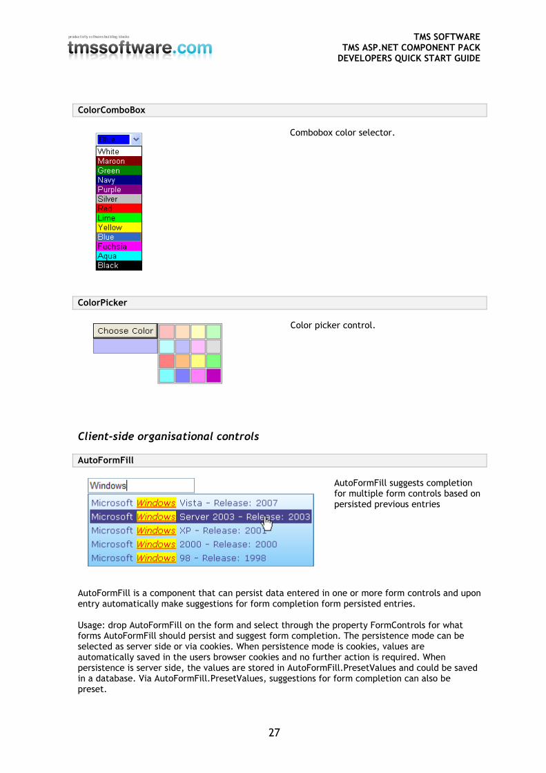
ColorComboBox
Combobox color selector.
ColorPicker
Color picker control.
Client-side organisational controls
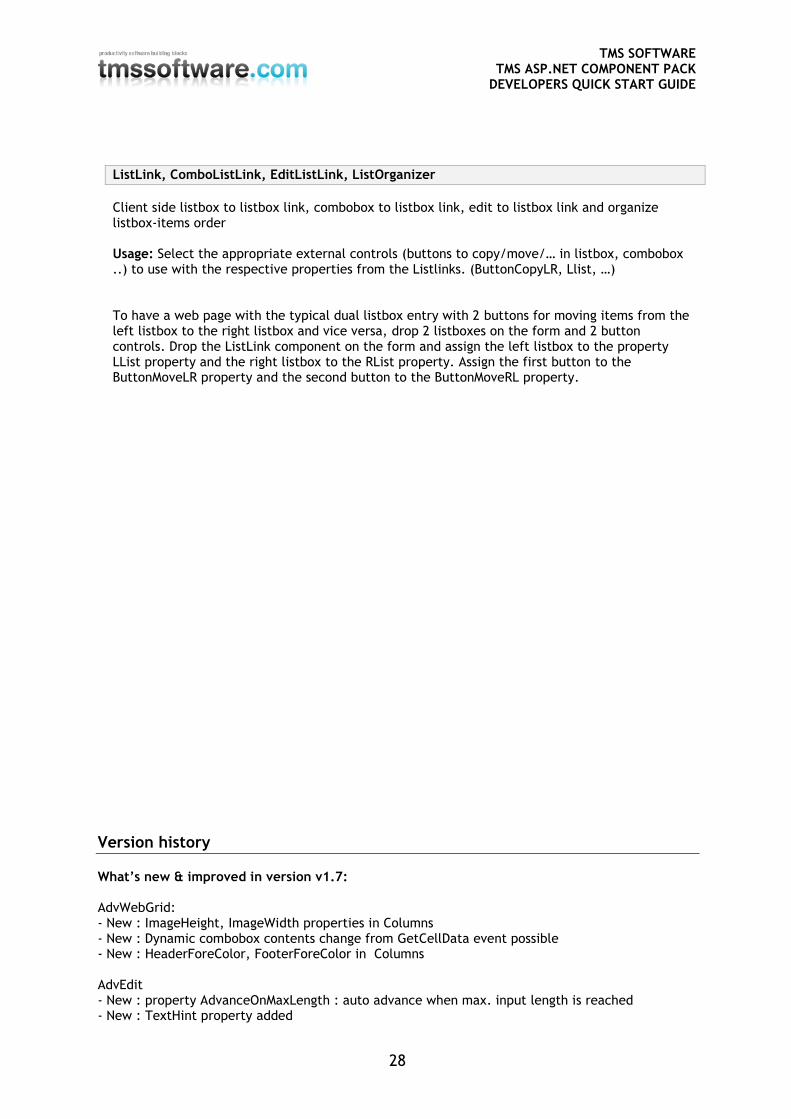
AutoFormFill
AutoFormFill suggests completion for multiple form controls based on persisted previous entries
AutoFormFill is a component that can persist data entered in one or more form controls and upon entry automatically make suggestions for form completion form persisted entries. Usage: drop AutoFormFill on the form and select through the property FormControls for what forms AutoFormFill should persist and suggest form completion. The persistence mode can be selected as server side or via cookies. When persistence mode is cookies, values are automatically saved in the users browser cookies and no further action is required. When persistence is server side, the values are stored in AutoFormFill.PresetValues and could be saved in a database. Via AutoFormFill.PresetValues, suggestions for form completion can also be preset.
TMS SOFTWARE TMS ASP.NET COMPONENT PACK
DEVELOPERS QUICK START GUIDE
28
ListLink, ComboListLink, EditListLink, ListOrganizer
Client side listbox to listbox link, combobox to listbox link, edit to listbox link and organize listbox-items order Usage: Select the appropriate external controls (buttons to copy/move/… in listbox, combobox ..) to use with the respective properties from the Listlinks. (ButtonCopyLR, Llist, …) To have a web page with the typical dual listbox entry with 2 buttons for moving items from the left listbox to the right listbox and vice versa, drop 2 listboxes on the form and 2 button controls. Drop the ListLink component on the form and assign the left listbox to the property LList property and the right listbox to the RList property. Assign the first button to the ButtonMoveLR property and the second button to the ButtonMoveRL property.
Version history What’s new & improved in version v1.7: AdvWebGrid: - New : ImageHeight, ImageWidth properties in Columns - New : Dynamic combobox contents change from GetCellData event possible - New : HeaderForeColor, FooterForeColor in Columns AdvEdit - New : property AdvanceOnMaxLength : auto advance when max. input length is reached - New : TextHint property added
TMS SOFTWARE TMS ASP.NET COMPONENT PACK
DEVELOPERS QUICK START GUIDE
29
- New : TextAlign property added HTMLEdit - New : option to add tag for preformatted text - Improved : support for different sizes of toolbar button images MultiColumnComboBox - New : SelectionChanged client event added - New : SelectionIndexChanged server event added - New : AutoPostBack property added - New : SelectionIndex property added - Improved dropdown width control - Improved dropdown auto control hiding - Improved : support to add images in the combobox dropdown added - Improved : support for use on user controls AdvSpinEdit - New DecimalPoint property added AdvDateEdit, AdvTimeEdit - New : modes YearMonthDay & YearDayMonth added - New : AutoFocus, FocusBorderColor, BackColor, BorderColor added - Improved : automatic advance while editing & cursor handling ClickOnceButton - Improved : handling as submit button with client validation AdvToolButton - New : control of image versus text position added Clock - Improved : default background color handling - SideMenu, MainMenu, DocumentPopupMenu, PopupMenuLabel, PopupMenuButton - New : Tooltip support added - New: LoadFromXml function added - Improved : menu designer with drag & drop support - Improved : disabled root menu items handling AdvSideNavBar - New : Single panel open mode added - OutlookBar : Button3D property added
Frequently asked questions
MainMenu, SideMenu
1. How to programmatically add a menu
This code snippet adds a root menu to the MainMenu with a submenu with one menu
item:
C#
TMS SOFTWARE TMS ASP.NET COMPONENT PACK
DEVELOPERS QUICK START GUIDE
30
MenuItem mi, mis;
mi = new MenuItem();
mi.Caption = "Root item";
mis = new MenuItem();
mis.Caption = "Sub Item";
mi.SubMenu.Add(mis);
MainMenu1.Menus.Add(mi);
VB.NET
Dim mi As TMSWebControls.MenuItem
Dim mis As TMSWebControls.MenuItem
mi = New TMSWebControls.MenuItem
mi.Caption = "Root Item"
mis = New TMSWebControls.MenuItem
mis.Caption = "Sub Item"
mi.SubMenu.Add(mis)
MainMenu1.Menus.Add(mi)
2. How to navigate to another page from client-script
In the client-script of the menu item put :
window.location.href = "http://www.tmssoftware.com/" return;
HtmlEdit
1. How to programmatically add a HTML Editor
This code snippet adds 5 lines to a HTML Editor:
int i; for (i = 0; i < 5; i++)
{
ListItem li;
int j = i + 1;
li = new ListItem("Line "+j.ToString(),"");
HtmlEdit1.Lines.Add(li);
}
2. How to programmatically get the text of a HTML Editor
This code snippet gets the text from the HTML Editor as a single string:
string txt = string.Empty;
foreach(ListItem it in HtmlEdit1.Lines)
{
txt += it.Text;
}
TMS SOFTWARE TMS ASP.NET COMPONENT PACK
DEVELOPERS QUICK START GUIDE
31
3. Project settings to set for use of a HTML Editor without request validation
In ASP.NET 1.1 request validation will cause an error when text with HTML tags is sent
back to the server. To solve this, add in the file Web.Config of your project following line:
<pages validateRequest="false" />
AdvWebGrid
1. How to add combobox items to a combobox column in AdvWebGrid programmatically
This code snippet adds the value "New item" to the combobox in the 2nd column of the
AdvWebGrid:
ListItem lt = new ListItem("New item");
Column col = (Column) AdvWebGrid1.Columns[1];
col.ComboItems.Add(lt);
2. How to programmatically insert a new column with centered alignment in
the grid
The code creates a new column, sets its alignment property and adds it to the grid:
TMSWebControls.Column col;
col = new TMSWebControls.Column();
col.Alignment = Column.Aligning.Center;
AdvWebGrid1.Columns.Add(col);
OutlookBar
1. How to change OutlookBar items programmatically
This code snippet shows how to change a panel's caption and item's caption programmatically:
OutlookPanel op;
OutlookItem oi;
op = (OutlookPanel)Outlookbar1.Panels[0];
op.Caption = "Panel Caption";
oi = (OutlookItem)op.Items[0];
oi.Caption = "Item Caption";