the role of aesthetics in web design - popart studio · the role of aesthetics in web design...
TRANSCRIPT

63
Nordicom Review 28 (2007) 1, pp. 63-76
The Role of Aesthetics in Web Design
LISBETH THORLACIUS
AbstractWeb sites are rapidly becoming the preferred media choice for information search, com-pany presentation, shopping, entertainment, education, and social contacts. At the sametime we live in a period where visual symbols play an increasingly important role in ourdaily lives. The aim of this article is to present and discuss the four main areas in whichaesthetics play an important role in the design of successful Web sites: aesthetics play animportant role in supporting the content and the functionality, in appealing to the taste ofthe target audience, in creating the desired image for the sender, and in addressing therequirements of the Web site genre.
Key Words: web design, visual communication, aesthetics, functionality, taste, image,website genre
IntroductionThe term aesthetics in the context of this article covers visual, sound and interactivemeans of effect. However, the article focuses primarily on the visual means of effect interms of colours, typography, design, pictures, video clips, flash animations, etc.
Visual communication is a reality as soon as a word is typed, a colour chosen, or atext displayed on the screen, and any visual expression, whether it is intentional or not,communicates something to the visitor of the site. The Web designer can never bypassthe effects of graphic design elements. These are given on every Web site. If we choosea vibrant, warm red colour for the menu, we communicate something different than ifwe had chosen a calm, cool blue colour. If we have a specially designed typographymade for our headlines we leave a more personal impression on our Website than if wechoose the most common typography such as, for example, Verdana. However, complex,multimedia installations, impressive pictures, and video clips are, at least in principle,optional extras, since they are not given factors that must be dealt with in any Web de-sign. We are forced to work with the visual elements of text and colour, but we canbypass aesthetic effects in the form of stimulating multimedia Flash installations andpretty pictures.
The only thing we cannot avoid is that there is always visual communication on aWeb site, whether the use of visual effects is deliberate or not. We need to know aboutgraphic effects and visual symbols, so that our communication can be intentional.1 Thevisual effects play an important role in the communication of content, in addition tocreating more or less aesthetic experiences.

64
FunctionalityThe term functionality in this context covers the user friendly aspects of interfaces andHuman Computer Interaction (HCI), where the main objective is to create effectivewebsites where the user quickly and efficiently can obtain the desired pieces of infor-mation without being delayed by long downloading times or blind alleys when navigat-ing on the site. Jakob Nielsen has played an important role worldwide in giving direc-tives for the design of hyper-functional Web sites in, for example, Usability Engineer-ing from 1993 and Designing web usability from 1999. Nielsen’s definition of userfriendly Web design embraces five central components: learnability, efficiency,memorability, errors and satisfaction. The usability expert, Rolf Molich operates withan additional component within user friendly Web design which is the aspect ofunderstandability. These components are all important in considering the quality of theWeb site in terms of functionality.
Figure 1. www.useit.com
The large amount of visually and graphically ill-considered, rash Web sites illustratesthat there are still some Web designers who operate according to a narrow conceptionof “functionality” and completely neglect the value of the visual communication in sup-porting the functionality. The Web site of Web guru Jakob Nielsen, www.useit.com, isan example of a site that downplays the use of graphic effects. This is confirmed byNielsen himself in the entry ”Why this site has almost no graphics.” He explains thathe did not want to waste money on an artist and chose instead to do the graphic designhimself. The problem with Nielsen’s Web site is that even though Nielsen feels that his

65
site has almost no graphic effects, he can not bypass the fact that the few graphics onthe site do communicate something; but the visual communication at www.useit.com hasnot been carefully considered. The garish yellow banner at the top of the home page willfor many people clash against the pastel yellow and blue colours used elsewhere on thepage and call attention to that which according to Nielsen should be ”invisible” to theuser.
In this case, the casual handling of visual effects indicates a sloppy and unprofes-sional sender, which is not an accurate image of Nielsen and probably has not been hisintention with the Web site. However, another page on the Web site, ”About JakobNielsen”, which contains a biography and pictures of Jakob Nielsen, is created withharmony and balance between the colours and their placement. There is open space anda consistent use of blue colours. This page gives an impression of a sender who is or-ganized and has a sense of quality, which probably is more aligned with how Nielsenwants to appear through his Web site.
The graphic effects, in other words, are an inevitable part of any Web site. We can-not choose whether or not they should be included. We have to consider graphic effects,even when the goal is to create ”invisible” visual communication, which achieves itspurpose through seamless integration with functionality and content.
What might indeed be considered optional and open to discussion is the extent ofadditional aesthetic experiences in the form of video clips, Flash animation, pretty pic-tures, etc. The use of such effects on Web sites should depend on the intended targetaudience, the sender image and the Web site genre.
A Historical Look at Web SitesSince the proliferation of Web sites began in the early 1990s, the relationship betweenfunctionality and aesthetics has been a topic of heated discussion.
One of the proponents of functionality and usability on the Internet is the above-mentioned Jakob Nielsen, who has contributed some of the most important researchregarding software development and Human-Computer-Interaction (HCI). Nielsen ad-vocated the hyper-functional approach in his book ”Usability Engineering” from 1993,where he introduced the slogan ”Less is More”, a phrase that he borrowed from themodernist architect Mies van der Rohe (Engholm, 2003, p. 127). But as the role of aes-thetics in Web design increasingly became an issue of contention in the first half of the1990s, different opinions regarding the relationship between aesthetics and functionalitywere expressed.
David Siegel, who in the book ”Creating Killer Web Sites” from 1996 argued for theimportance of aesthetic dimensions, was a proponent of aesthetic Web sites. The func-tionalists, on the other hand, argued that it did not matter if a Web site was blue or red,as long as it was functional and user-friendly. The introduction of Flash spurred heatedarguments. The Web designer Curt Cloninger argued that Flash, with its amazing pos-sibilities for creating aesthetic experiences, was an important supplement to html.Nielsen argued against the use of Flash because of long downloading times that de-creased functionality and usability. But during the second half of the 90s, there was agrowing interest in placing more emphasis on aesthetic effects.
However, in the beginning of the 21st century there has been a renewed tendency tofavour hyper functional Web sites without any superfluous aesthetics. There are severalreasons for this. First of all, Web designers had to realize that the use of Flash-elements

66
on Web sites created too many frustrations, since many users could not even open thepages, or the downloading time was too long. Furthermore, in most cases the Flash el-ements did not provide any kind of aesthetic enjoyment; rather, they often disrupted andannoyed the users. The designers could not control their excitement over this new toy,and Flash was often used haphazardly by people with no graphic design background.That resulted in messy Web sites with Flash elements that blinked and moved across thepage without creating aesthetic experiences for the user. Again and again, one wasforced to agree with Jakob Nielsen that less aesthetics on Web sites was more.
In addition, the dotcom-crisis towards the end of the 1990’s and the internationalfinancial crisis caused many organizations to cut down on the large costs of designingunique Web sites with Flash and other advanced aesthetic effects. This resulted in agrowing interest in cheaper solutions in the form of standard layouts, such as ”Obvious”,leading to less emphasis on aesthetic expressions, especially for many information andpresentation sites from both private and public organizations.
The Role of Aesthetics in Contemporary Web DesignWhile the relationship between functionality and aesthetics has been discussed for a longtime, a renewed discussion that focuses on aesthetic effects in Web design in a broaderperspective is desirable. There are several reasons for this. Firstly, the fast developmentin IT-technology and the introduction of broadband in present times have made it pos-sible to accommodate the users who wish to receive communication in the form of multi-sensory aesthetic experiences, without necessarily sacrificing content and function be-cause of long downloading times. And just as people today are increasingly expected tobe up-to-date on IT-development, it will also be expected that people who work withWeb design possess not only knowledge of functional aspects, but also understand howto communicate through aesthetic means. We have reached an era where the technicaland functional aspects of a Web site are taken for granted. People just expect it to work.The technology is viewed as a basic foundation for aesthetic experiences. According toIda Engholm, the discussion of function and aesthetics in Web design resembles the shiftin design styles during the consumption growth in the post war era, when many of theproducts that were marketed – from bicycles to electrical appliances – only differedfrom each other by minor variations of the basic concepts. All technical and functionalproblems were in reality solved; people expected that the product worked and utilizedthe latest version of the technology. Next followed an interest in ”differentiating”through external aesthetic and image-related signals (Engholm 2003, p. 134).
Secondly, the growing tendency to replace language with visual symbols in the 20th
century, especially in the marketing of products, seems to have exploded in the 21st
century. Life style expert Henrik Vejlgaard states in his book “Forbrug i Designer-samfundet” [Consumption in the Designer Society]: “In a world where a picture meansmore than words, no one has the time or bothers to read lengthy advertising copy.”(Vejlgaard 2004, p. 49). Visual symbols have become an integral part of our daily lives;therefore, it is increasingly relevant to understand their communicative effects. Theorientation towards visual communication is not only prevalent in marketing, but in allforms of professional communication, including the Web site as a medium. In particu-lar, young people communicate – and want to be communicated to – through visualsymbols.

67
Aesthetics Support Sender Image, Content and Function,Web Site Genre and Target AudienceIt is important – especially for Web designers – to be able to differentiate between thedifferent ways in which visual aesthetics play a role in the creation of Web sites.
1) The aesthetic effects have an important role in all types of Web sites concerning howthe sender is perceived, i.e. the image that is conveyed of the organization or indi-vidual behind the information. All Web sites have a sender or information source, andall the linguistic, functional, and aesthetic effects on a Web site communicate some-thing about that source.
2) The aesthetic effects must support the content and the functional aspects. Web sitesare more user-friendly when they contain aesthetic effects that support the navigationand interaction functions.
3) The aesthetic effects must be adapted to the genre of Web site. For example, weexpect an entertainment Web site to offer a reasonable amount of aesthetic experi-ences, whereas our primary expectation of an information search Web site is that wecan get the desired information as efficiently as possible.
4) The aesthetic effects should be adapted to the target audience. A presentation sitetargeting a young audience must be designed in accordance with the contemporarytrends in visual aesthetics and should differ from a presentation site that targets thegeneral adult population.
The most successful Web sites are therefore the sites where the Web designer has cre-ated the aesthetic aspects in accordance with the four above-mentioned areas: senderimage, functionality, genre and target audience.
Aesthetics Support Sender ImageThe aesthetic effects play a crucial role in creating the profile of the sender and thus theimage of the organization or individual behind the Web site. Therefore it is importantthat even Web sites that mostly have an information purpose also aesthetically reflectthe organization behind the site.
For instance, The Danish Railroad Service ( DSB) has created a visual profile on theirWeb site in an exemplary way2. DSB’s Web site contains a unique and modern design,unlike the more simple and anonymous designs commonly used by service organizationsthat target a broad segment of the population. To obtain a unique expression, DSB hascreated an untraditional and dynamic design, including their own typeface ”via”, whichis used in the headlines. The layout is clean and indicates that DSB is a well-organizedcompany that understands contemporary trends. Every detail seems well-planned: con-temporary typeface, use of pictures, and a well-arranged layout.
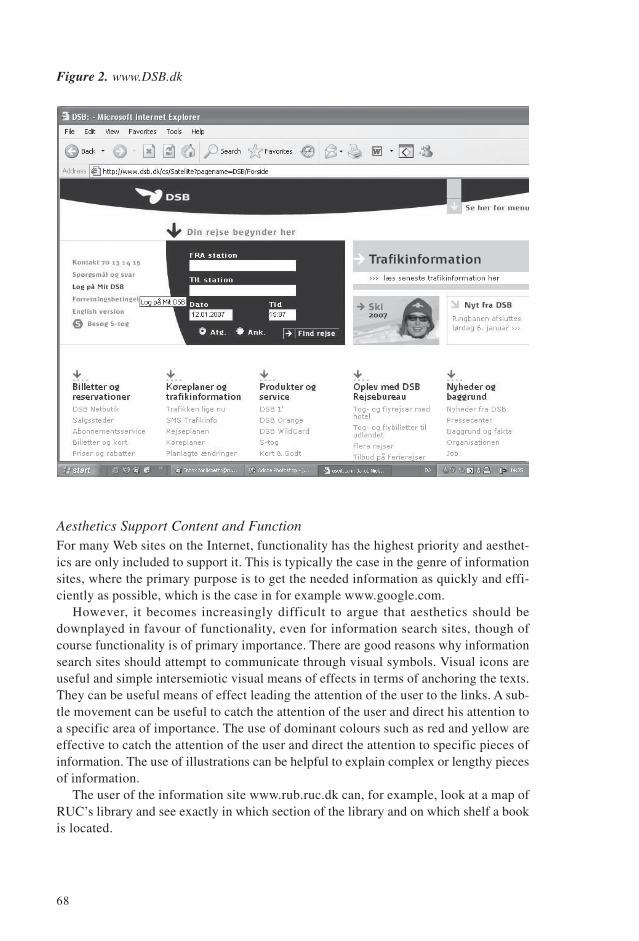
68
Figure 2. www.DSB.dk
Aesthetics Support Content and FunctionFor many Web sites on the Internet, functionality has the highest priority and aesthet-ics are only included to support it. This is typically the case in the genre of informationsites, where the primary purpose is to get the needed information as quickly and effi-ciently as possible, which is the case in for example www.google.com.
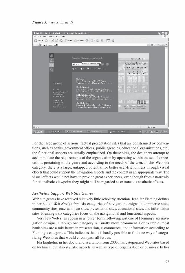
However, it becomes increasingly difficult to argue that aesthetics should bedownplayed in favour of functionality, even for information search sites, though ofcourse functionality is of primary importance. There are good reasons why informationsearch sites should attempt to communicate through visual symbols. Visual icons areuseful and simple intersemiotic visual means of effects in terms of anchoring the texts.They can be useful means of effect leading the attention of the user to the links. A sub-tle movement can be useful to catch the attention of the user and direct his attention toa specific area of importance. The use of dominant colours such as red and yellow areeffective to catch the attention of the user and direct the attention to specific pieces ofinformation. The use of illustrations can be helpful to explain complex or lengthy piecesof information.
The user of the information site www.rub.ruc.dk can, for example, look at a map ofRUC’s library and see exactly in which section of the library and on which shelf a bookis located.
69
Figure 3. www.rub.ruc.dk
For the large group of serious, factual presentation sites that are constrained by conven-tions, such as banks, government offices, public agencies, educational organizations, etc.,the functional aspects are usually emphasized. On these sites, the designers attempt toaccommodate the requirements of the organization by operating within the set of expec-tations pertaining to the genre and according to the needs of the user. In this Web sitecategory, there is a large, untapped potential for better user-friendliness through visualeffects that could support the navigation aspects and the content in an appropriate way. Thevisual effects would not have to provide great experiences, even though from a narrowlyfunctionalistic viewpoint they might still be regarded as extraneous aesthetic effects.
Aesthetics Support Web Site GenresWeb site genres have received relatively little scholarly attention. Jennifer Fleming definesin her book ”Web Navigation” six categories of navigation designs: e-commerce sites,community sites, entertainment sites, presentation sites, educational sites, and informationsites. Fleming’s six categories focus on the navigational and functional aspects.
Very few Web sites appear in a ”pure” form following just one of Fleming’s six navi-gation designs, although one category is usually more prominent. For example, mostbank sites are a mix between presentation, e-commerce, and information according toFleming’s categories. This indicates that it is hardly possible to find one way of catego-rizing Web sites that would encompass all issues.
Ida Engholm, in her doctoral dissertation from 2003, has categorized Web sites basedon technical but also stylistic aspects as well as type of organization or business. In her
70
dissertation WWW’s designhistorie – website udviklingen i et genre- og stilteoretiskperspektiv [WWW’s design history – the development of Web sites in a genre and stylis-tic perspective], Engholm contributes with a categorization of Web sites in terms ofstylistic characteristics. For example: The HTML-style, the modernist style, the digitalmodernist style, the trash-style, the CAD-style, the pixel-style, the Kawaii-style, theManga-style, the Japanese minimalist style, the digital deconstructivist style, the punkrock style, etc.
Engholm’s categories of Web sites based on the stylistic aspects are a useful supple-ment to Fleming’s six Web site categories based on the navigational and functional aspects.
The navigation design and the graphic and stylistic aspects must be adapted to thespecific needs of that particular organization. It is important that the Web designer un-derstands that the functional aspects should not always take priority over the aestheticaspects. A presentation site for an art museum or furniture design company must ofcourse be user-friendly, but the graphic, stylistic, and aesthetic effects play an impor-tant role. A functional Web site, but void of well thought out aesthetic means of effect,for an art museum would have low credibility and might be detrimental to the museum’simage, even if navigation and information search worked perfectly.
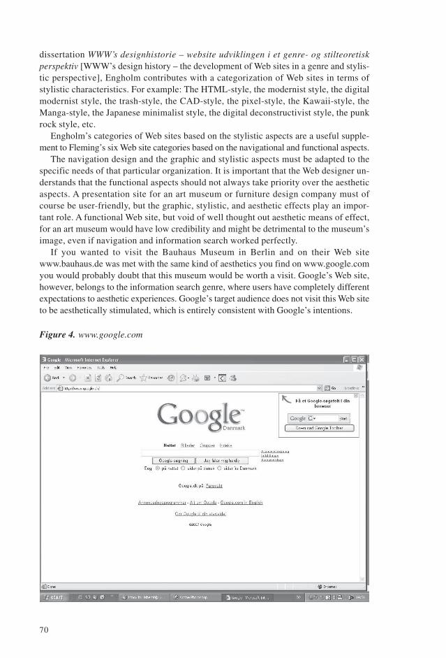
If you wanted to visit the Bauhaus Museum in Berlin and on their Web sitewww.bauhaus.de was met with the same kind of aesthetics you find on www.google.comyou would probably doubt that this museum would be worth a visit. Google’s Web site,however, belongs to the information search genre, where users have completely differentexpectations to aesthetic experiences. Google’s target audience does not visit this Web siteto be aesthetically stimulated, which is entirely consistent with Google’s intentions.
Figure 4. www.google.com

71
Figure 5. www.bauhaus.de
Aesthetics in Support of the Taste of the Target AudienceThere are two domineering trends within Web design that reflect respectively a taste forthe modernist, style and a taste for an eclectic experience-oriented style. Whether tochoose the modernist style or the experience-oriented style should depend on the tasteand the needs of the target audience.
Modernist Aesthetic Web SitesThe modernist taste for minimalist design in a broad perspective originated in the earlypart of the 19th century with the functionalist movement in architecture and design. Thefunctionalist movement was opposed to external ornamentation and all kinds of eclec-ticism within art and design. The functionalists believed that architecture and designshould primarily be functional and devoid of superfluous ornamentation. From an aes-thetic point of view, the functionalists found minimalist and functionalist design moreappealing and formed an opposition to the aesthetic values of the Art Nouveau move-ment which were dominant in the early part of the 19th century. This taste in design isstill one of the dominant discourses within taste in our present times.
The presentation site of the New York designer Bruce Mau, www.brucemaudesign.com, is an example of a modernist, minimalist site with a pleasant balance betweenfunctionality and aesthetics. The site has no extraneous aesthetics; however, its fewvisual effects in the form of colour, typeface, and layout convey a superior aestheticquality within a minimalist paradigm. A minimalist Web site with no extraneous aesthet-

72
ics, and visual effects only in the form of typeface and text layout, can be just as aes-thetically pleasing as a Web site with lots of pretty pictures and fancy Flash installations.Which style is preferable will depend on the purpose of the site and the taste of the targetaudience.
Figure 6. www.brucemaudesign.com
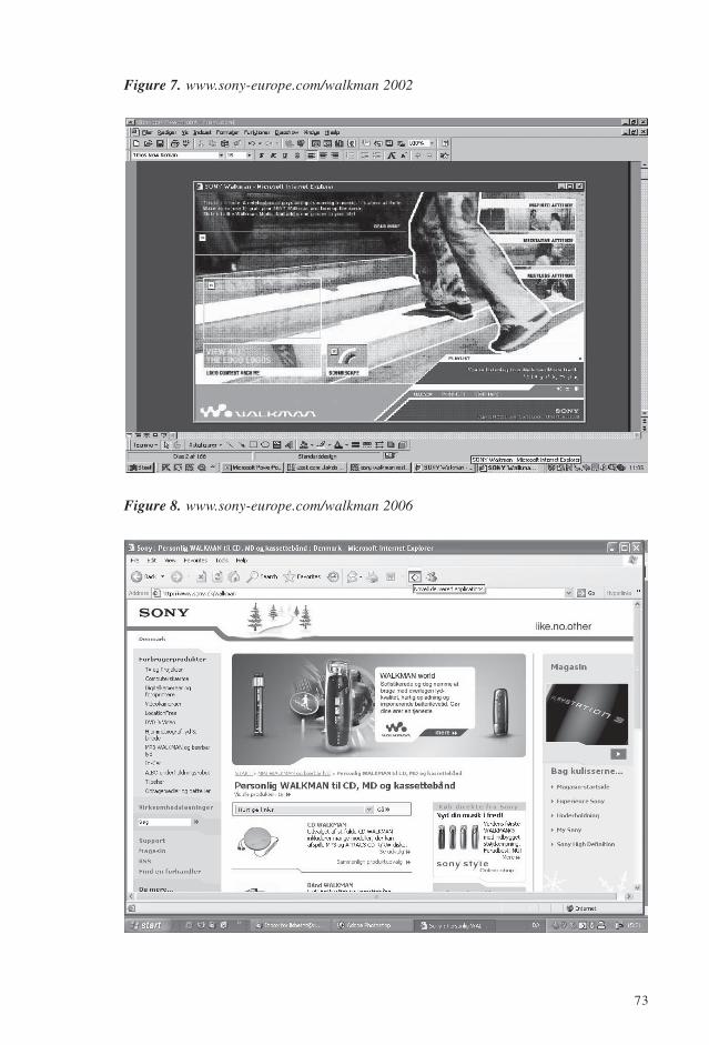
The trend toward simplicity has also reached the e-commerce genre, where many com-panies have re-designed their experience-oriented Web sites to be more simple andanonymous. For example, in 2003 Sony replaced their Flash-based, multimedia Website, which they had launched in early 2002, and which contained the full spectrum ofaesthetic effects in the form of sound, pictures, and animation, with a more plain andanonymous site. The return to a more functionalist, digital-modernist style was partiallycaused by too many downloading difficulties with the more complex Web site. In 2006,however, due to the introduction of the broadband, Sony offers experience-orientedvideo clips on their Web site, but they have, as an overall means of aesthetic expression,maintained a modernist, digital style on their Web site.
Experience-oriented, Aesthetic Web SitesAlong with a taste for a modernist, minimalist design devoid of extraneous aestheticmeans of effects, a taste discourse is simultaneously flourishing with roots in thepostmodern aesthetic values that favour the eclectic, multi-sensory, experience-orienteddesign.
73
Figure 7. www.sony-europe.com/walkman 2002
Figure 8. www.sony-europe.com/walkman 2006
74
Jean-Francois Lyotard introduced the term the postmodern as a term for a traditionor a state that is a development of the modern (Lyotard 1986, p. 19). Postmodernityrejects the idea of a universal truth and is characterised by the replacement of the greatnarratives by many small narratives. There no longer exist, social directives of how tothink or behave.
People in the postmodern society, especially today’s youth, have grown up with a largedegree of wealth, among other things due to developments in digitalization. This meansthat basic physical needs such as the needs for food and shelter are met, and when the basicneeds are met, there is a growing need for self-actualization and experiences in daily life.
There is a growing trend for everything from shopping malls to banks to attract at-tention through events and exhibitions that present exciting possibilities for interactiveand sensory experiences. It is no longer enough to sell products based on basic facts.Products are increasingly sold on the basis of non-material values, i.e., the experiencesand narratives with which they are associated.
When we go to shopping malls, cafes, etc. we also expect to experience somethingin addition to the product itself. It might be in the form of an exciting store design withnew, unexpected combinations of product assortments, fragrances, music videos, inter-active experiences with the products, and, not least new and innovative packaging of theproduct. These factors become decisive in our choice of shopping place.
These postmodern values have also influenced a large amount of Web sites, more andmore of us begin to expect aesthetic experiences when we visit a Web site, both in theentertainment genre and the e-commerce genre.
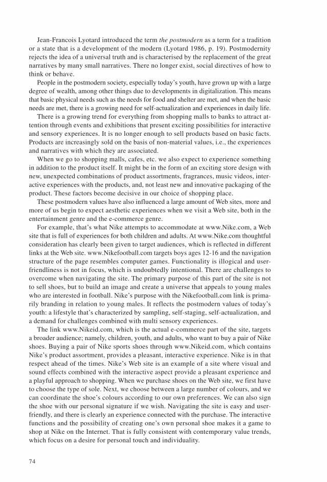
For example, that’s what Nike attempts to accommodate at www.Nike.com, a Website that is full of experiences for both children and adults. At www.Nike.com thoughtfulconsideration has clearly been given to target audiences, which is reflected in differentlinks at the Web site. www.Nikefootball.com targets boys ages 12-16 and the navigationstructure of the page resembles computer games. Functionality is illogical and user-friendliness is not in focus, which is undoubtedly intentional. There are challenges toovercome when navigating the site. The primary purpose of this part of the site is notto sell shoes, but to build an image and create a universe that appeals to young maleswho are interested in football. Nike’s purpose with the Nikefootball.com link is prima-rily branding in relation to young males. It reflects the postmodern values of today’syouth: a lifestyle that’s characterized by sampling, self-staging, self-actualization, anda demand for challenges combined with multi sensory experiences.
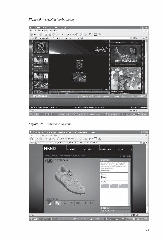
The link www.Nikeid.com, which is the actual e-commerce part of the site, targetsa broader audience; namely, children, youth, and adults, who want to buy a pair of Nikeshoes. Buying a pair of Nike sports shoes through www.Nikeid.com, which containsNike’s product assortment, provides a pleasant, interactive experience. Nike is in thatrespect ahead of the times. Nike’s Web site is an example of a site where visual andsound effects combined with the interactive aspect provide a pleasant experience anda playful approach to shopping. When we purchase shoes on the Web site, we first haveto choose the type of sole. Next, we choose between a large number of colours, and wecan coordinate the shoe’s colours according to our own preferences. We can also signthe shoe with our personal signature if we wish. Navigating the site is easy and user-friendly, and there is clearly an experience connected with the purchase. The interactivefunctions and the possibility of creating one’s own personal shoe makes it a game toshop at Nike on the Internet. That is fully consistent with contemporary value trends,which focus on a desire for personal touch and individuality.
75
Figure 9. www.Nikefootball.com
Figure 10. www.Nikeid.com

76
www.Nike.com is a hybrid between several genres: the presentation, e-commerce,and entertainment genres. The presentation genre, which in Nike’s case could also bedescribed as a branding site, conveys how Nike wants to be perceived by the public. Thee-commerce genre gives the customer an opportunity to buy Nike shoes through the site.The entertainment genre provides opportunities to play games and be entertained.
This site is just a precursor for what awaits us in the future in the form of aestheticand interactive experiences on the Internet, especially targeting young audiences whoare in favour of postmodernistic design in terms of the eclectic and experience-orientedmeans of effect.
Notes1. For further readings on colour symbolism and typography I will refer to Lene Bjerregaard’s
Farveordbog [Colour Dictionary], Theo van Leeuwen and Carey Jewitt’s Handbook of Visual Analy-sis, Gunther Kress and Theo van Leeuwen’s Reading Images. The Grammar of Visual Design, andRudolf Arnheim’s Art and Visual Perception.
2. For a more thorough discussion of the analytical method used to analyze the DSB Web site, as well asother Web sites, please see my article: “A Model of Visual, Aesthetic Communication Focusing onWeb Sites”. In: Nielsen, Janni (red.) Digital Creativity. Vol. 13, No. 2. Maj 2002. Holland. Swets &Zeitlinger. 2002, page 85-98.
ReferencesArnheim, Rudolf (1974) Art and Visual Perception. A Psychology of the Creative Eye. California: Univer-
sity of California Press.Bjerregaard, Lene (2002) Farveordbog – farvernes skjulte universelle signaler. Ballerup, Denmark. Bygge-
centrum.Cloninger, Curt (2002)Fresh Styles for Web Designers. Indianapolis: New Riders.Engholm, Ida (2003) WWW’s designhistorie – website udviklingen i et genre- og stilteoretisk perspektiv.
København: IT-Universitetet. (Diss.).Fleming, Jennifer (1998) Web Navigation. Designing the User Experience. Sebastopol, California: O’Reilly
& Associates.Jakobsen, Poul Erik & Jakobsen, Louise Byg (2003) Trend Sociologi. Herning: Pej gruppens forlag. (2nd ed.).Kress, Gunther & van Leeuwen, Theo (1996) Reading Images. The Grammar of Visual Design.
London:Routledge.Lyotard, Jean Francois (1986) Det postmoderne forklaret for børn. Copenhagen: Akademisk forlag
(Translated by Niels Brügger, Finn Frandsen og Susanne Lervad).Molich, Rolf (2000) Brugervenligt webdesign. København: Nyt Teknisk Forlag.Nielsen, Jakob (1993) Usability Engineering. Boston, San Diego, New York: Academic Press.Nielsen, Jakob (1999) Designing Web Usability. Indianapolis. New Riders. 1999.Siegel, David (1996) Creating Killer Web Sites. Indianapolis: Hayden Books (2nd ed.)Thorlacius, Lisbeth (2002) ‘A Model of Visual, Aesthetic Communication Focusing on Web Sites’, in Niel-
sen, Janni (red.) Digital Creativity, 13(2002)2, Holland. Swets & Zeitlinger, pp. 85-98.van Leeuwen, Theo & Jewitt (2001) Carey Handbook of Visual Analysis. London: Sage.Vejlgaard, Henrik (2004) Forbrug i designersamfundet. København: Børsens Forlag.
LISBETH THORLACIUS, Ph.D., Associate Professor, Department of Communication,Business and Information Technologies, Roskilde University, Kommunikationsvej 1,DK-4000 Roskilde, [email protected]