the principles of design chapter 3 balance emphasis/focal point unity/harmony rhythm contrast...
TRANSCRIPT
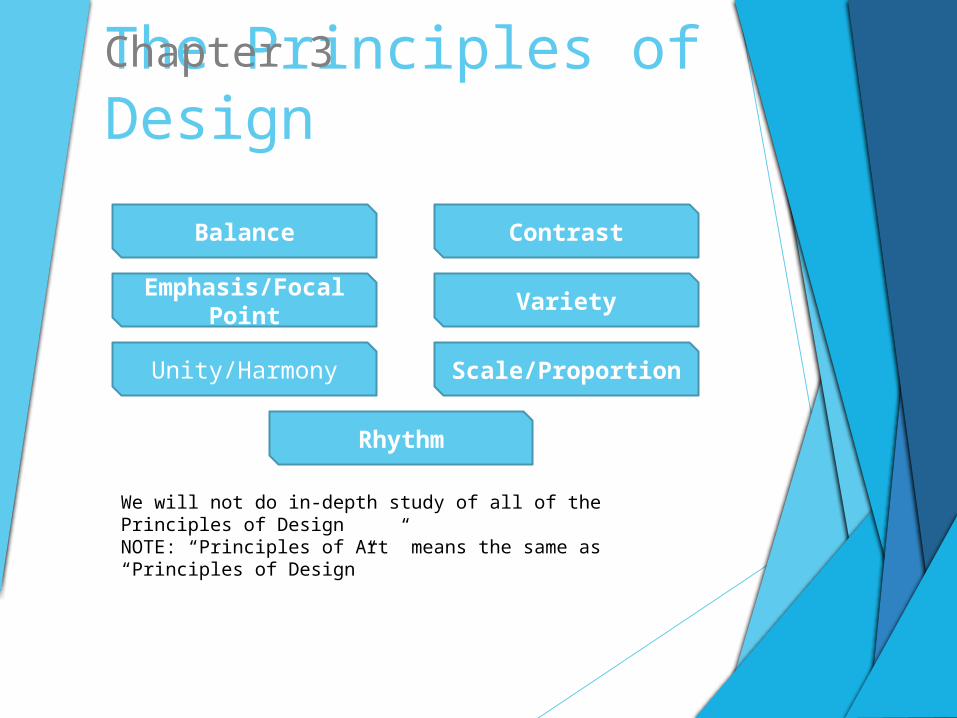
The Principles of DesignChapter 3
Balance
Emphasis/Focal Point
Unity/Harmony
Rhythm
Contrast
Variety
Scale/Proportion
We will not do in-depth study of all of the Principles of Design NOTE: “Principles of Art” means the same as “Principles of Design”
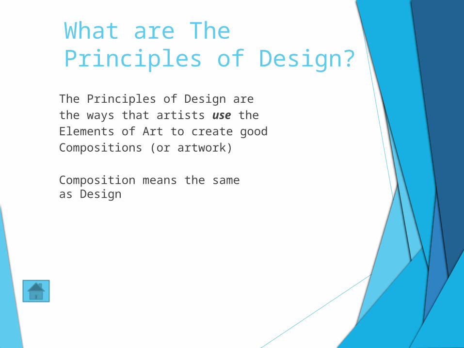
What are The Principles of Design?
The Principles of Design arethe ways that artists use theElements of Art to create good Compositions (or artwork)
Composition means the sameas Design
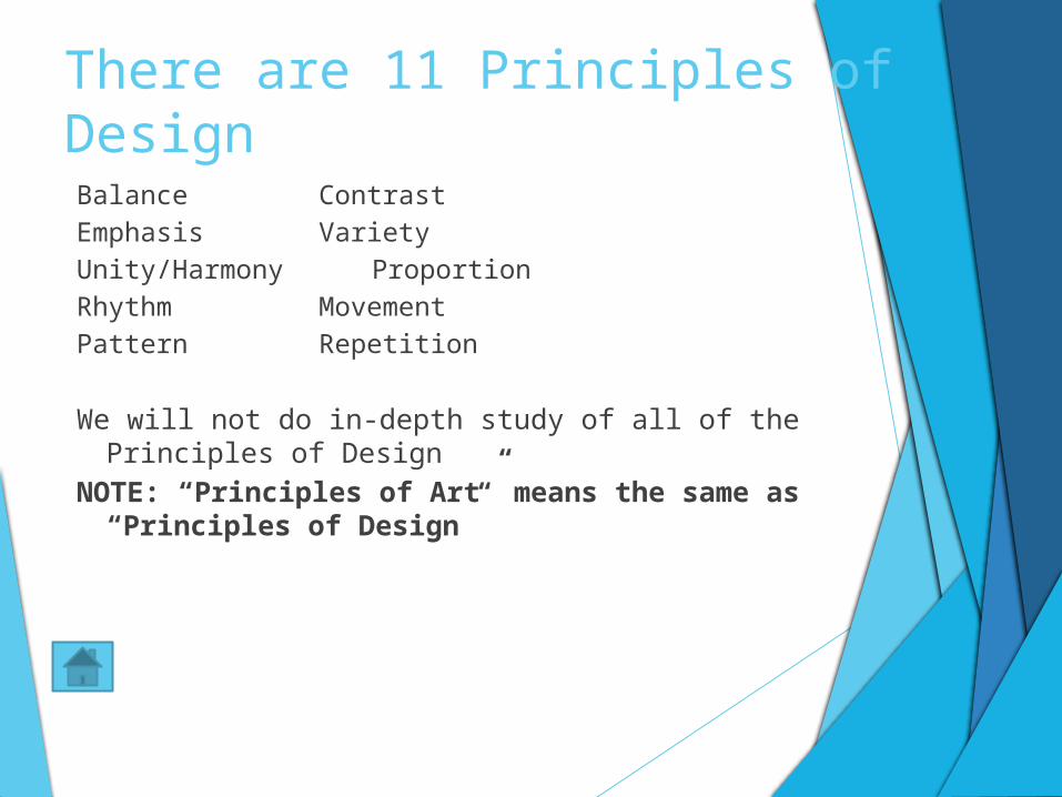
There are 11 Principles of Design
Balance ContrastEmphasis Variety Unity/Harmony ProportionRhythm MovementPattern Repetition
We will not do in-depth study of all of the Principles of Design NOTE: “Principles of Art” means the same as “Principles
of Design”
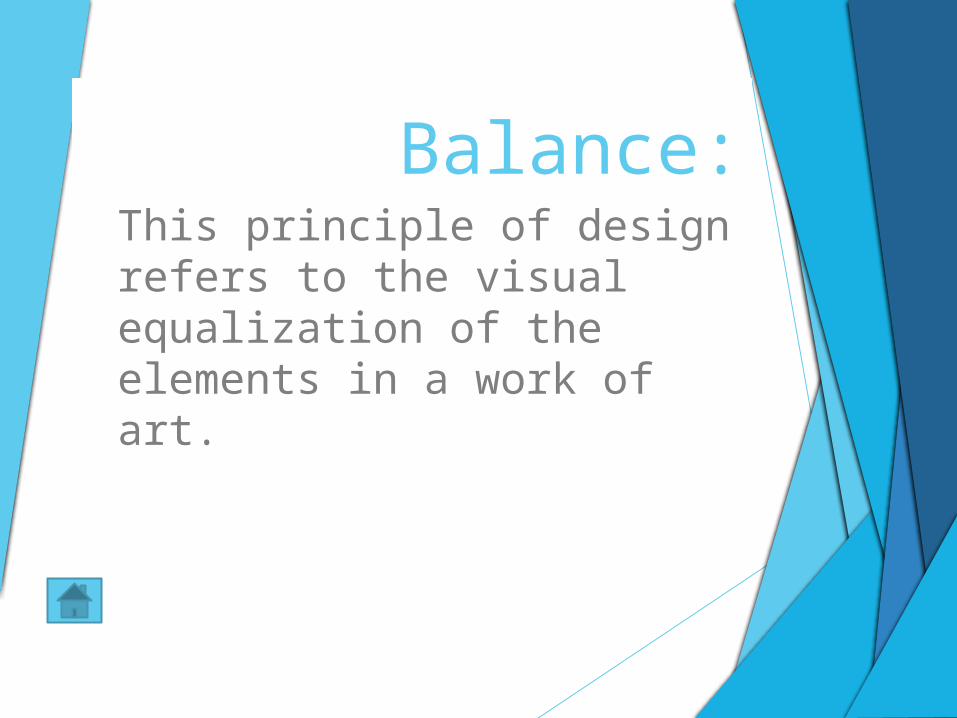
Balance:This principle of design refers to the visual equalization of the elements in a work of art.
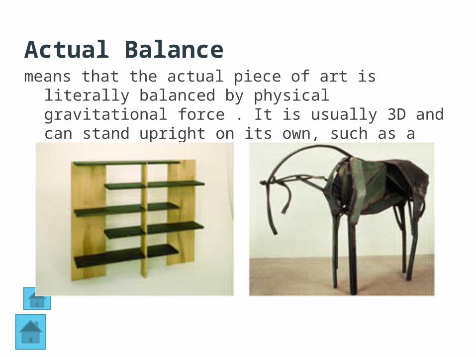
Actual Balancemeans that the actual piece of art is literally balanced
by physical gravitational force . It is usually 3D and can stand upright on its own, such as a sculpture.
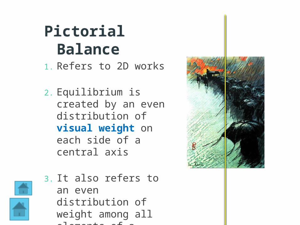
Pictorial Balance
1. Refers to 2D works
2. Equilibrium is created by an even distribution of visual weight on each side of a central axis
3. It also refers to an even distribution of weight among all elements of a composition
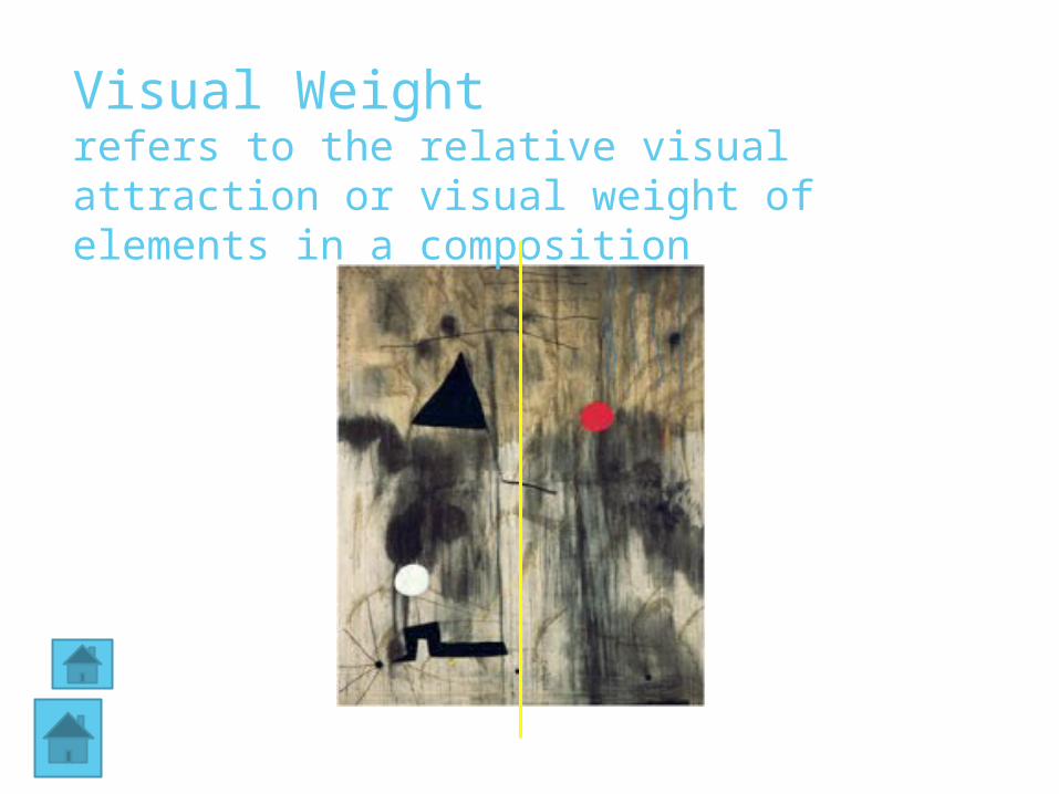
Visual Weight refers to the relative visual attraction or visual weight of elements in a composition
The are three major types of pictorial balanceHorizontal balance - elements on the left
and right side of the composition seem to be about equal.
Vertical balance - the elements at the top and bottom of the composition are in balance.
Radial balance - design elements radiate from the center point. Frequently used in ceramics, jewelry, basketry, stained glass, and other crafts.
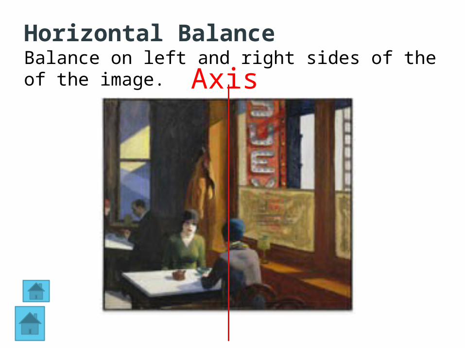
Axis
Horizontal BalanceBalance on left and right sides of the of the image.
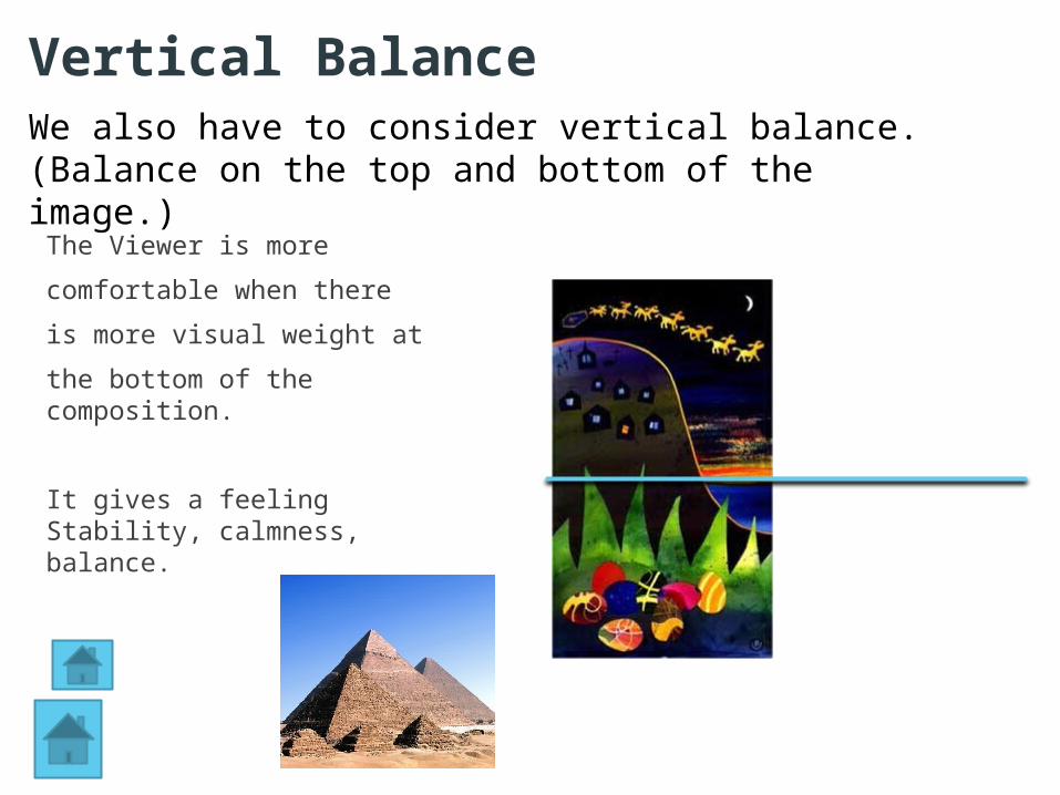
The Viewer is more
comfortable when there
is more visual weight at
the bottom of the composition.
It gives a feeling Stability, calmness, balance.
Vertical BalanceWe also have to consider vertical balance. (Balance on the top and bottom of the image.)
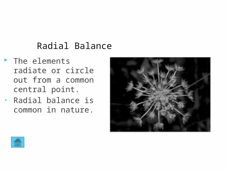
Radial Balance The elements radiate
or circle out from a common central point.
• Radial balance is common in nature.
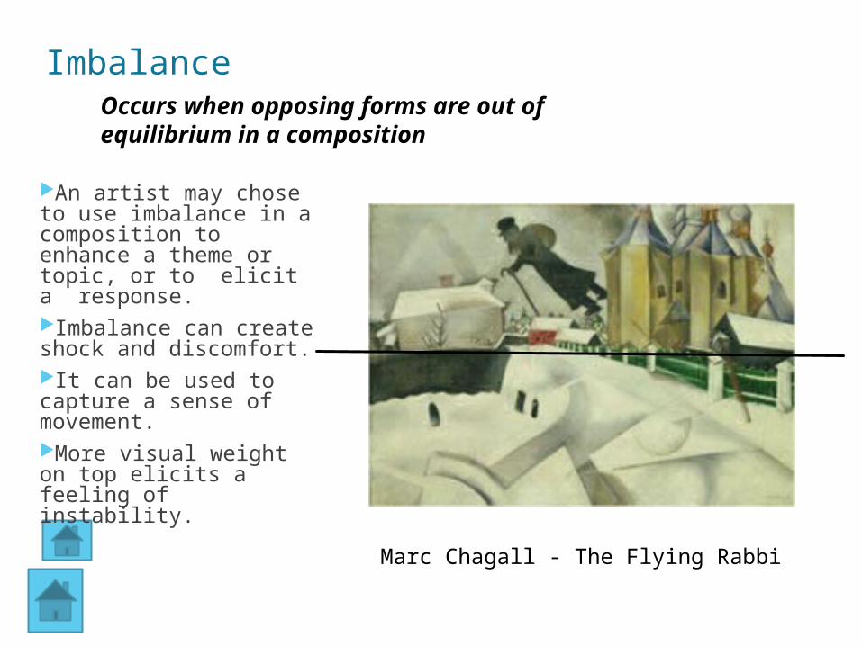
Imbalance
An artist may chose to use imbalance in a composition to enhance a theme or topic, or to elicit a response.Imbalance can create shock and discomfort. It can be used to capture a sense of movement.More visual weight on top elicits a feeling of instability.
Marc Chagall - The Flying Rabbi
Occurs when opposing forms are out of equilibrium in a composition
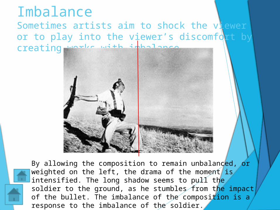
Imbalance Sometimes artists aim to shock the viewer or to play into the viewer’s discomfort by creating works with imbalance
By allowing the composition to remain unbalanced, or weighted on the left, the drama of the moment is intensified. The long shadow seems to pull the soldier to the ground, as he stumbles from the impact of the bullet. The imbalance of the composition is a response to the imbalance of the soldier.
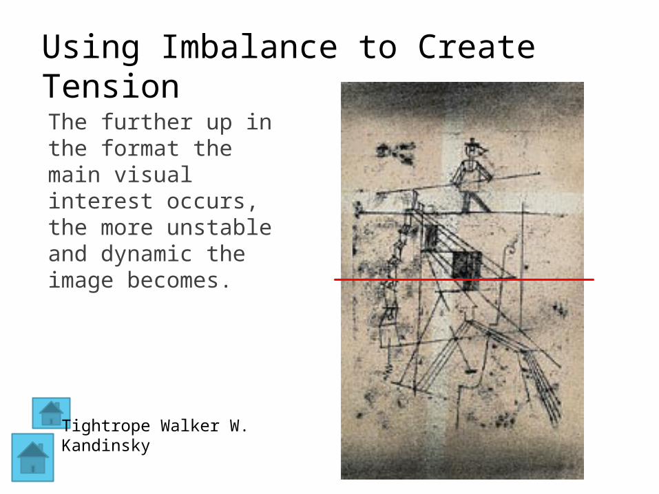
Using Imbalance to Create Tension
The further up in the format the main visual interest occurs, the more unstable and dynamic the image becomes.
Tightrope Walker W. Kandinsky
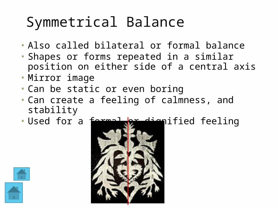
Symmetrical Balance
• Also called bilateral or formal balance• Shapes or forms repeated in a similar position on
either side of a central axis• Mirror image• Can be static or even boring• Can create a feeling of calmness, and stability• Used for a formal or dignified feeling
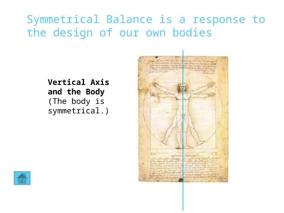
Symmetrical Balance is a response to the design of our own bodies
Vertical Axis and the Body(The body is symmetrical.)
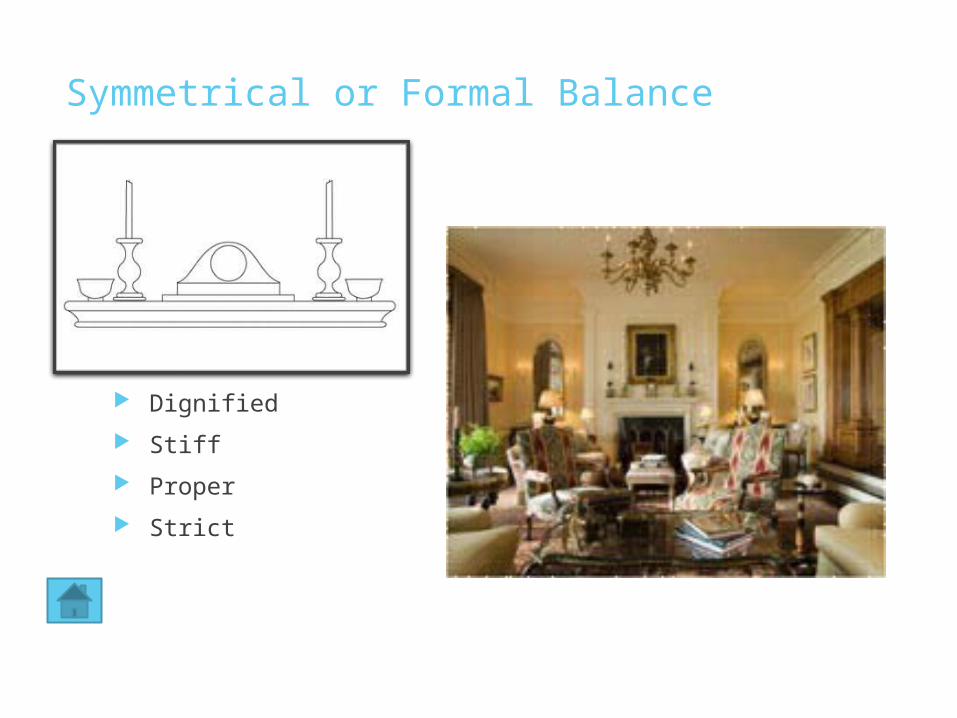
Symmetrical or Formal Balance
Dignified
Stiff
Proper
Strict
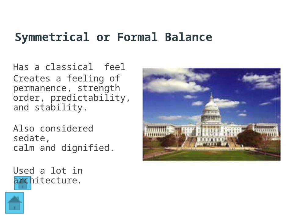
Has a classical feelCreates a feeling of permanence, strengthorder, predictability, and stability.
Also considered sedate,calm and dignified.
Used a lot in architecture.
Symmetrical or Formal Balance
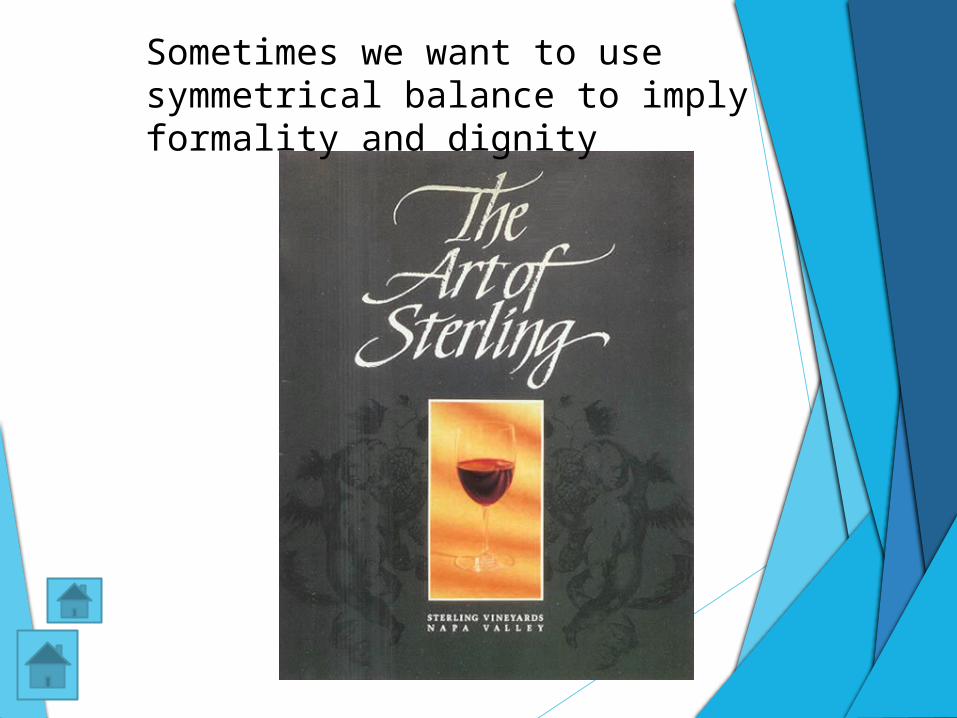
Sometimes we want to use symmetrical balance to imply formality and dignity
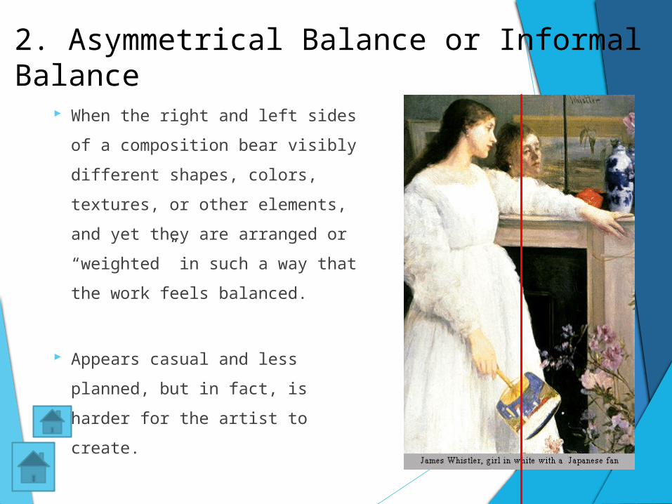
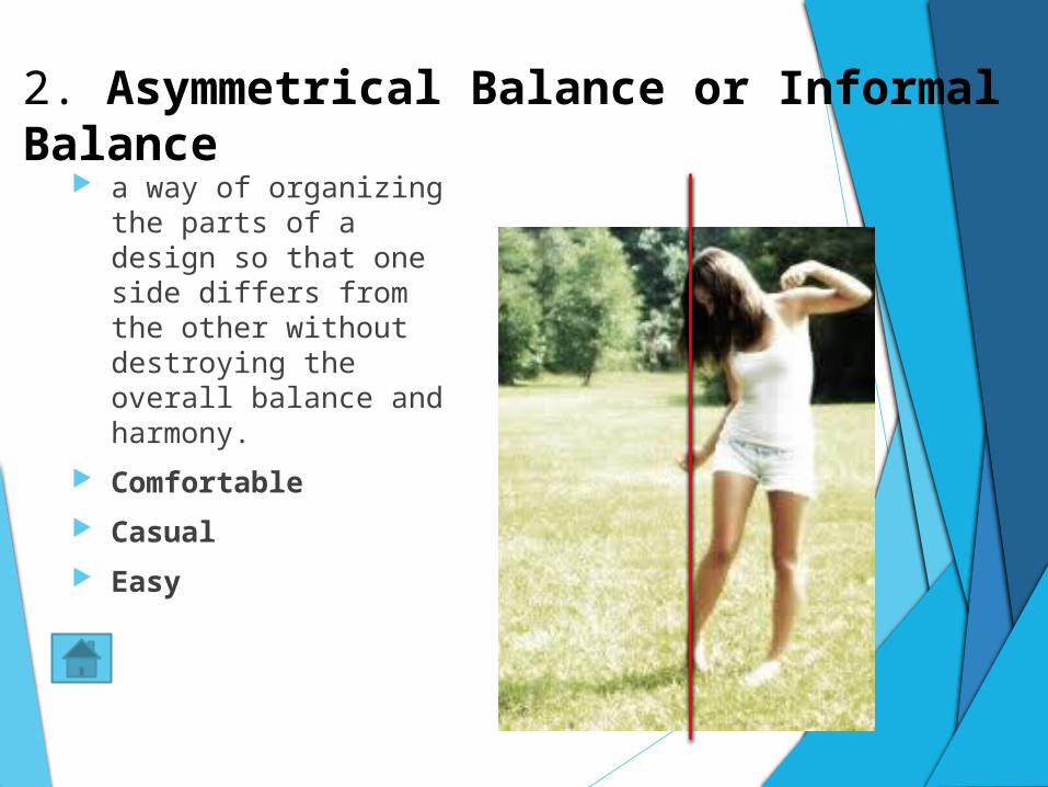
2. Asymmetrical Balance or Informal Balance
When the right and left sides of
a composition bear visibly
different shapes, colors,
textures, or other elements,
and yet they are arranged or
“weighted” in such a way that
the work feels balanced.
Appears casual and less
planned, but in fact, is harder
for the artist to create.
2. Asymmetrical Balance or Informal Balance
a way of organizing the parts of a design so that one side differs from the other without destroying the overall balance and harmony.
Comfortable
Casual
Easy
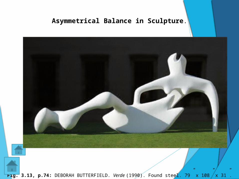
Fig. 3.13, p.74: DEBORAH BUTTERFIELD. Verde (1990). Found steel. 79” x 108” x 31”.
Asymmetrical Balance in Sculpture.

What type of balance is shown here?
Here the larger figures to the right are balanced by the many smaller figures to the left. Also, Seurat added additional "light" to the left. How does this add balance to the painting?
George Seurat, (French) 1859-1891, Sunday Afternoon on the Island of La Grand Jatte
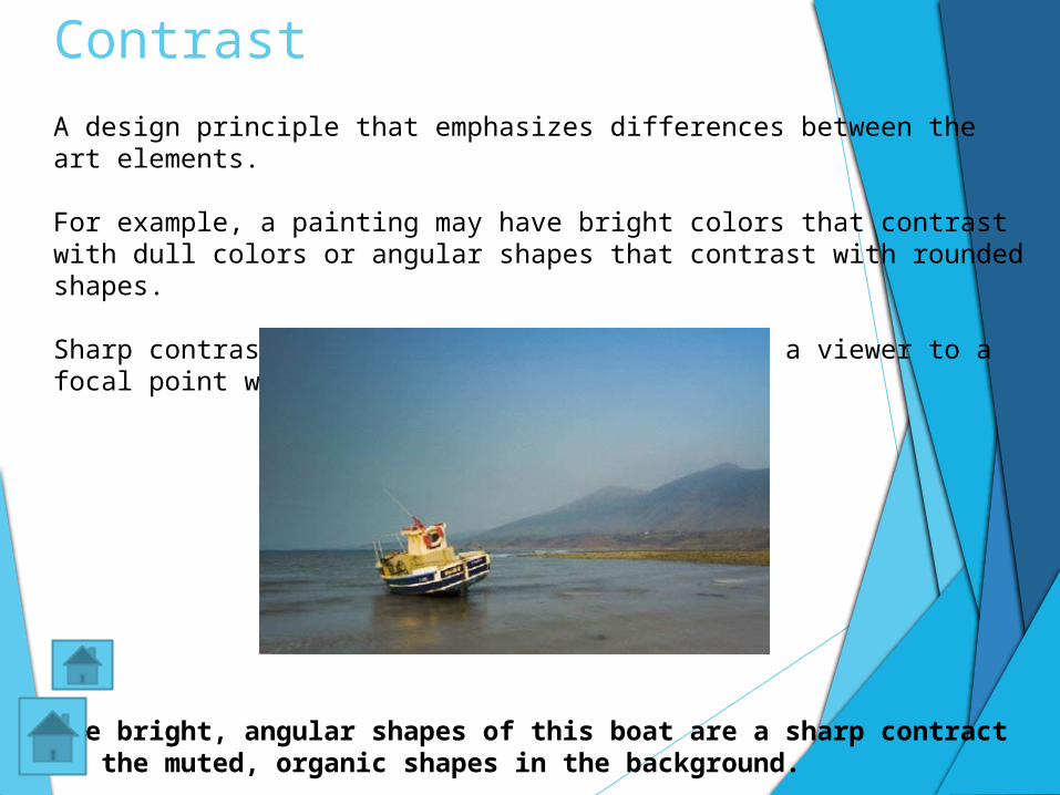
Contrast
A design principle that emphasizes differences between the art elements.
For example, a painting may have bright colors that contrast with dull colors or angular shapes that contrast with rounded shapes.
Sharp contrast draws attention and can direct a viewer to a focal point within a work of art.
The bright, angular shapes of this boat are a sharp contract to the muted, organic shapes in the background.
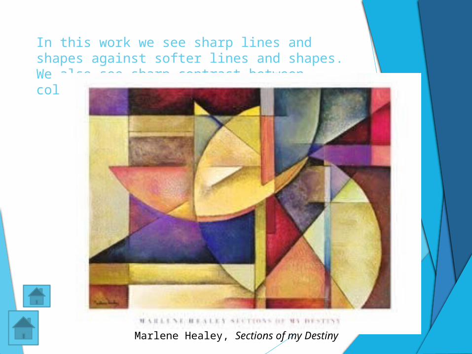
In this work we see sharp lines and shapes against softer lines and shapes. We also see sharp contrast between colors.
Marlene Healey, Sections of my Destiny
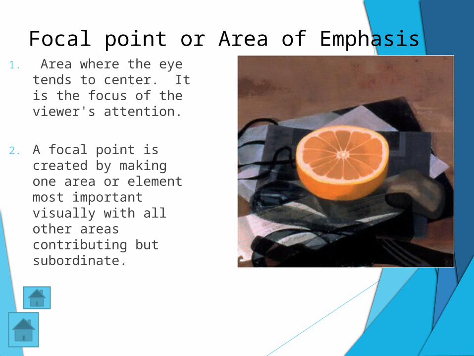
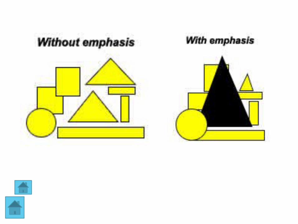
1. Area where the eye tends to center. It is the focus of the viewer's attention.
2. A focal point is created by making one area or element most important visually with all other areas contributing but subordinate.
Focal point or Area of Emphasis
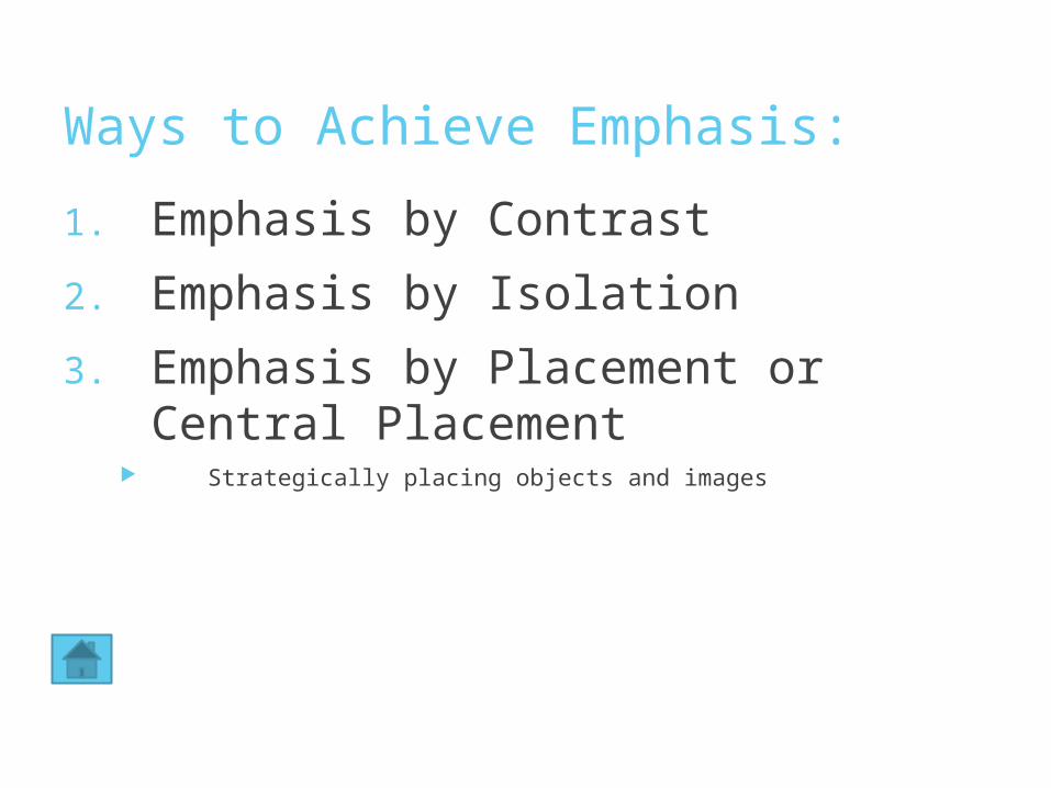
Ways to Achieve Emphasis:
1. Emphasis by Contrast
2. Emphasis by Isolation
3. Emphasis by Placement or Central Placement
Strategically placing objects and images
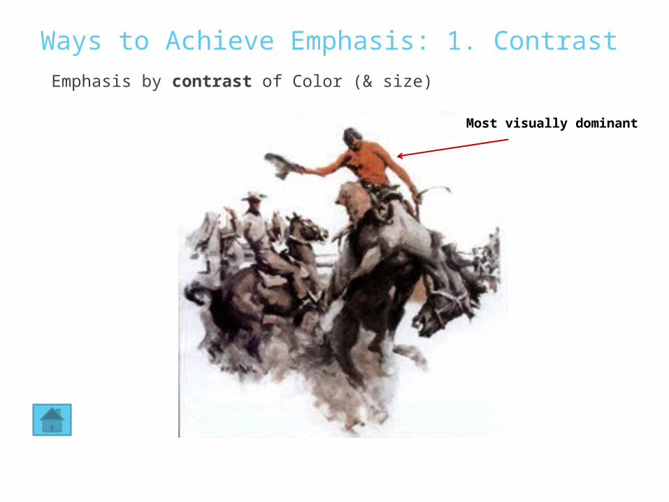
Ways to Achieve Emphasis: 1. ContrastEmphasis by contrast of Color (& size)
Most visually dominant
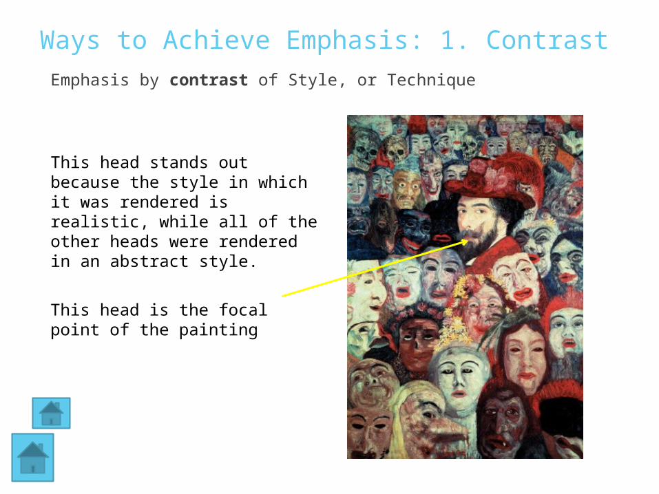
Ways to Achieve Emphasis: 1. ContrastEmphasis by contrast of Style, or Technique
This head stands out because the style in which it was rendered is realistic, while all of the other heads were rendered in an abstract style.
This head is the focal point of the painting
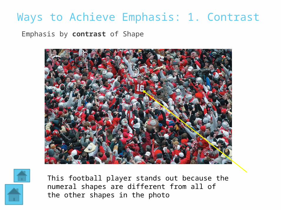
Ways to Achieve Emphasis: 1. ContrastEmphasis by contrast of Shape
This football player stands out because the numeral shapes are different from all of the other shapes in the photo
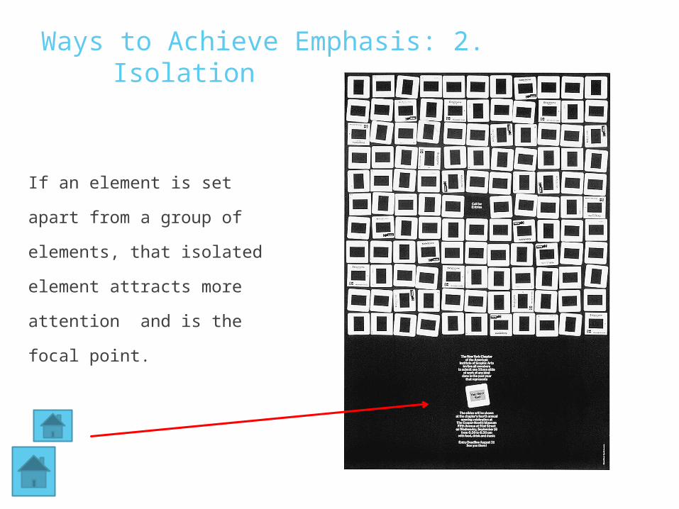
Ways to Achieve Emphasis: 2. Isolation
If an element is set apart from
a group of elements, that
isolated element attracts
more attention and is the
focal point.
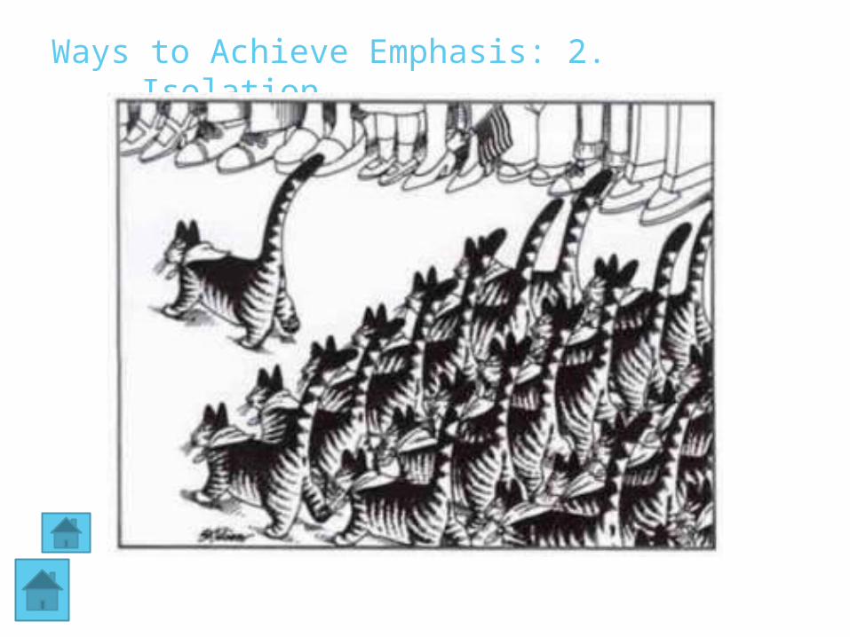
Ways to Achieve Emphasis: 2. Isolation
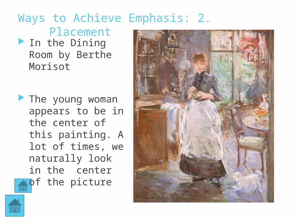
Ways to Achieve Emphasis: 2. Placement
In the Dining Room by Berthe Morisot
The young woman appears to be in the center of this painting. A lot of times, we naturally look in the center of the picture
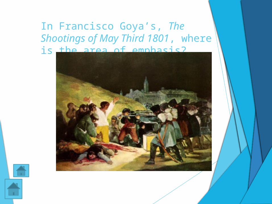
In Francisco Goya’s, The Shootings of May Third 1801, where is the area of emphasis?
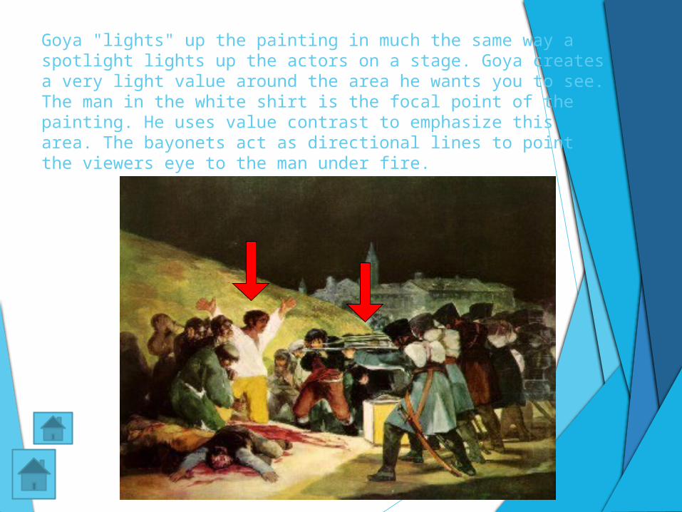
Goya "lights" up the painting in much the same way a spotlight lights up the actors on a stage. Goya creates a very light value around the area he wants you to see. The man in the white shirt is the focal point of the painting. He uses value contrast to emphasize this area. The bayonets act as directional lines to point the viewers eye to the man under fire.
Variety
Variety is achieved when the art elements are combined in various ways to increase visual interest.
For instance, an assortment of shapes that are of a variety of sizes attracts more attention than an assortment of shapes all the same size.
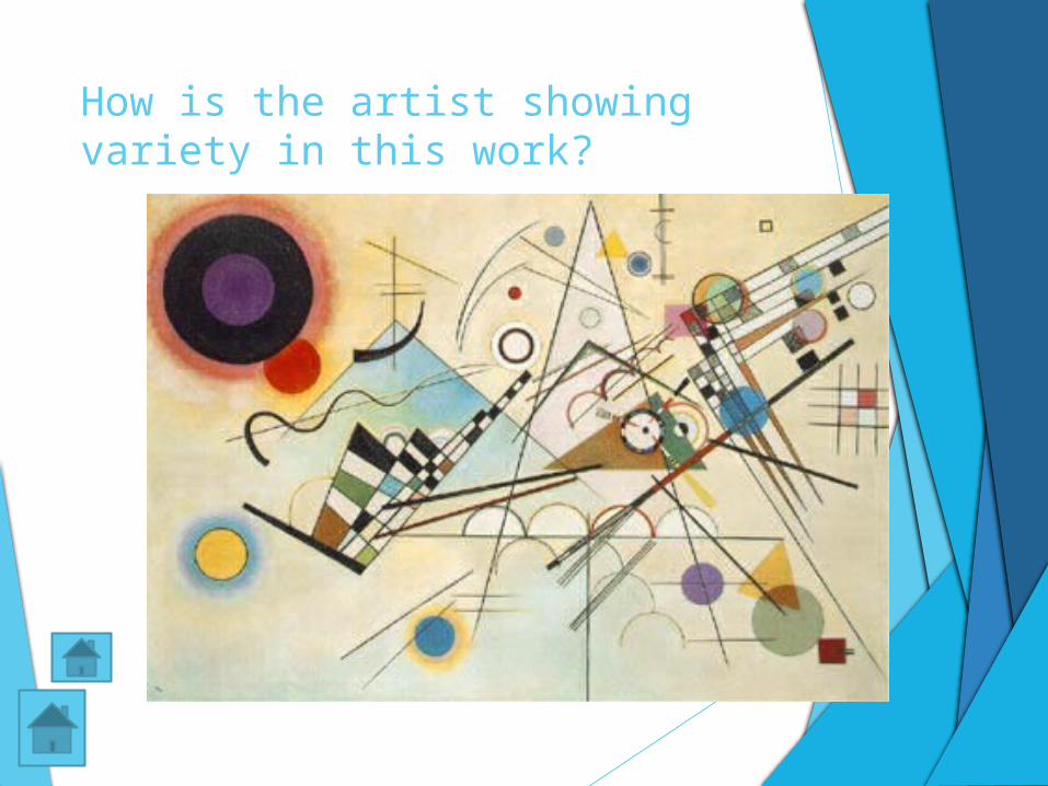
How is the artist showing variety in this work?
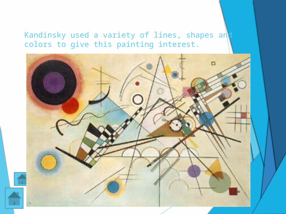
Kandinsky used a variety of lines, shapes and colors to give this painting interest.
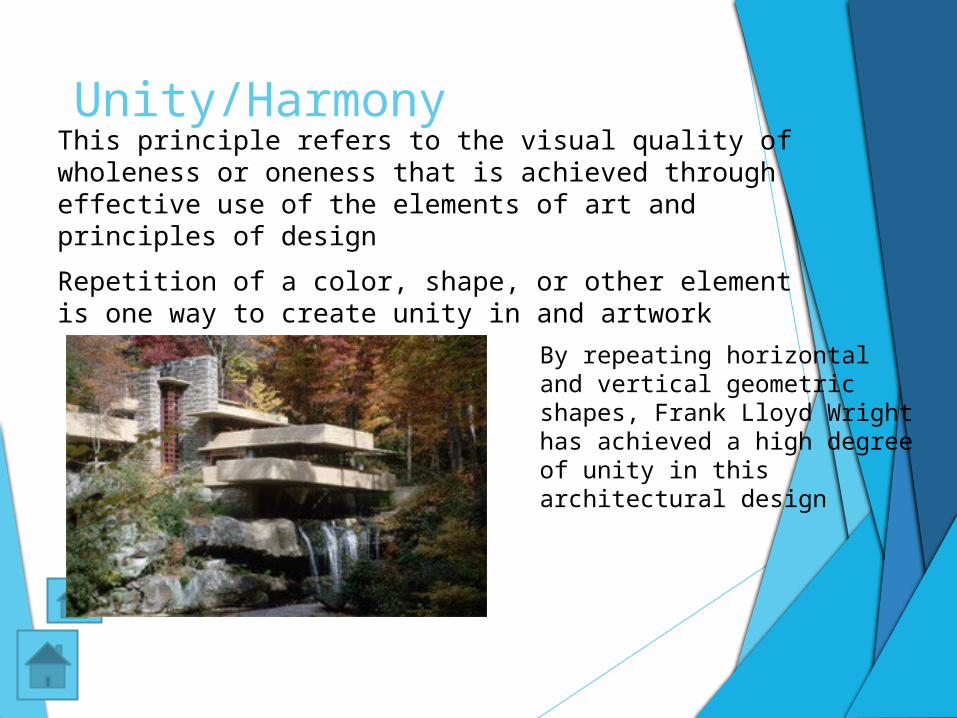
Unity/HarmonyThis principle refers to the visual quality of wholeness or oneness that is achieved through effective use of the elements of art and principles of design
Repetition of a color, shape, or other element is one way to create unity in and artwork
By repeating horizontal and vertical geometric shapes, Frank Lloyd Wright has achieved a high degree of unity in this architectural design
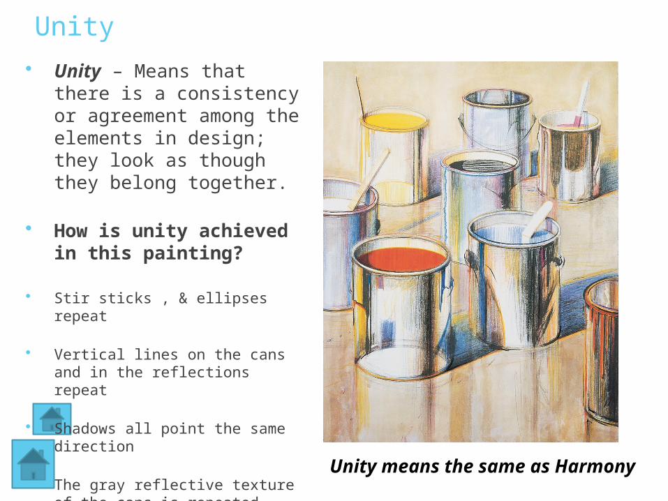
Unity Unity – Means that there
is a consistency or agreement among the elements in design; they look as though they belong together.
How is unity achieved in this painting?
Stir sticks , & ellipses repeat
Vertical lines on the cans and in the reflections repeat
Shadows all point the same direction
The gray reflective texture of the cans is repeated Unity means the same as Harmony
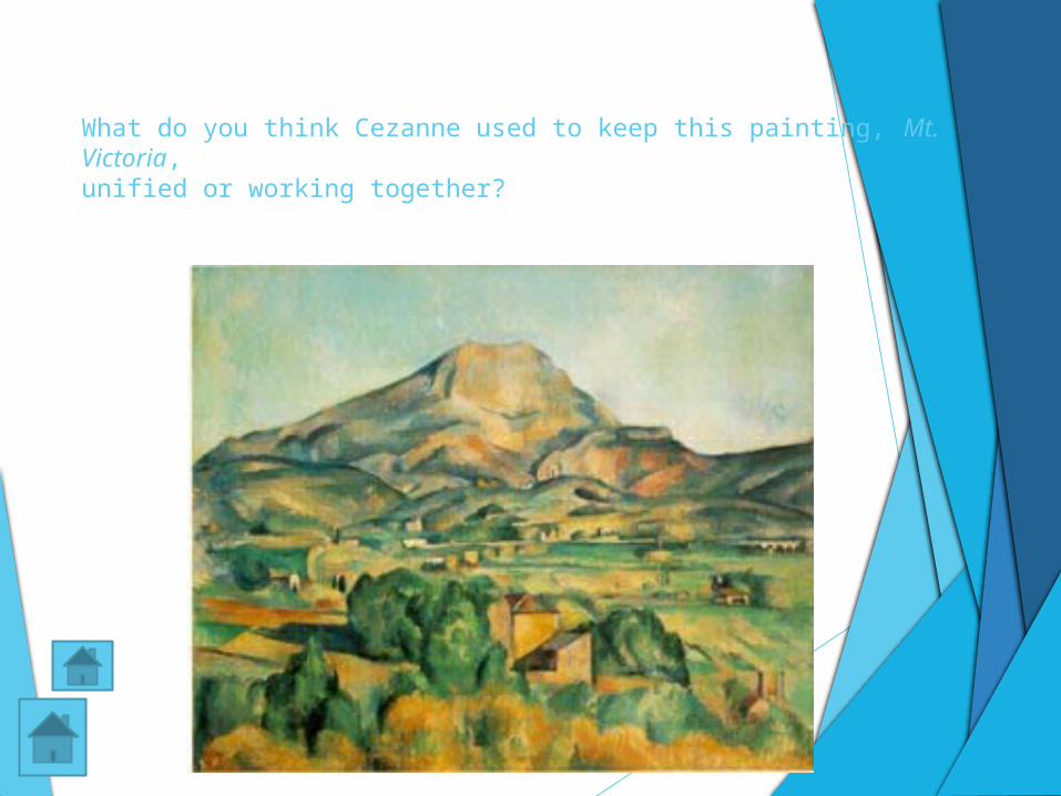
What do you think Cezanne used to keep this painting, Mt. Victoria,
unified or working together?
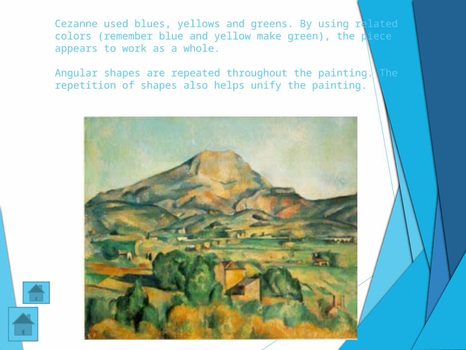
Cezanne used blues, yellows and greens. By using related colors (remember blue and yellow make green), the piece appears to work as a whole.
Angular shapes are repeated throughout the painting. The repetition of shapes also helps unify the painting.
Ways to Achieve Unity and Variety with Unity
Grid
Color harmony
Keeping one or more aspects of the work constant
Continuity
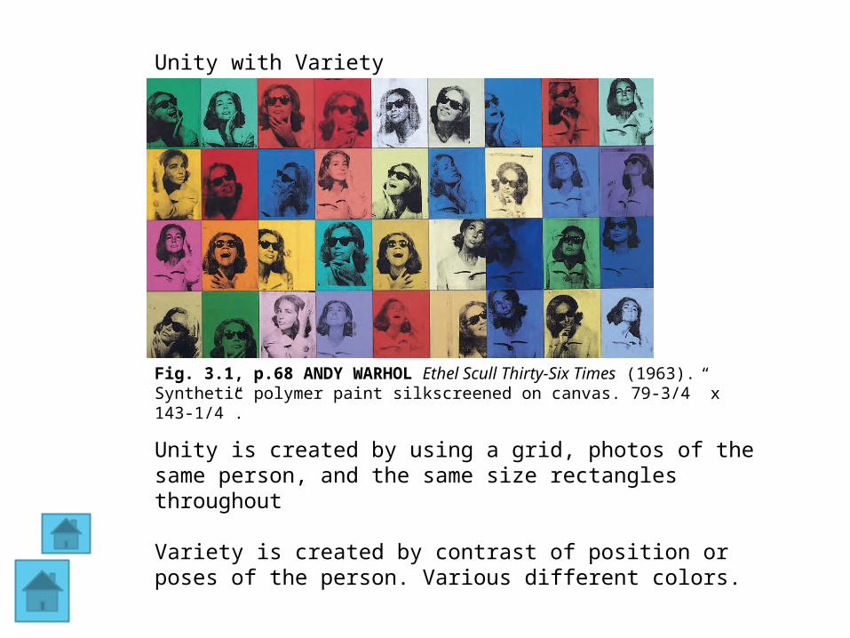
Fig. 3.1, p.68 ANDY WARHOL Ethel Scull Thirty-Six Times (1963). Synthetic polymer paint silkscreened on canvas. 79-3/4” x 143-1/4”.
Unity is created by using a grid, photos of the same person, and the same size rectangles throughout
Variety is created by contrast of position or poses of the person. Various different colors.
Unity with Variety
Types of Unity
Visual Unity - Artwork that is unified by color, shape, composition or some other visual design principle.
Conceptual Unity - artwork that has a common theme or concept throughout it. Sometime an artwork will have both conceptual and
visual unity.
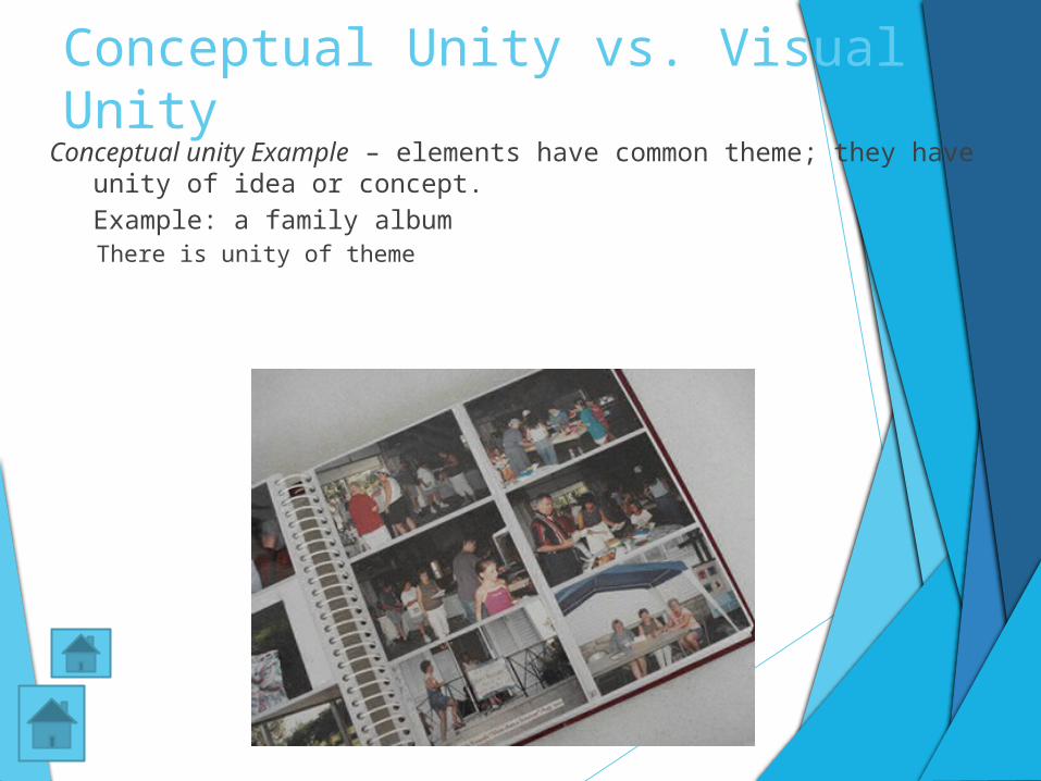
Conceptual Unity vs. Visual Unity
Conceptual unity Example – elements have common theme; they have unity of idea or concept. Example: a family albumThere is unity of theme
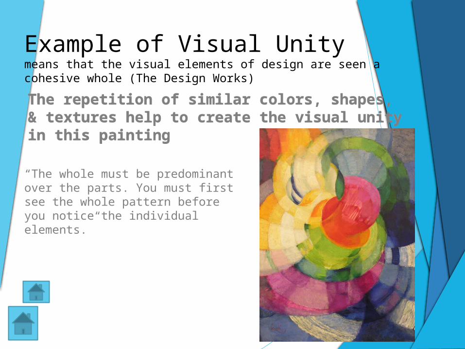
“The whole must be predominant over the parts. You must first see the whole pattern before you notice the individual elements.”
Example of Visual Unity means that the visual elements of design are seen a cohesive whole (The Design Works)
The repetition of similar colors, shapes, & textures help to create the visual unity in this painting
The repetition of similar colors, shapes, & textures help to create the visual unity in this painting
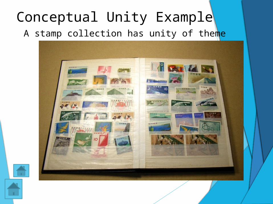
Conceptual Unity Example A stamp collection has unity of theme
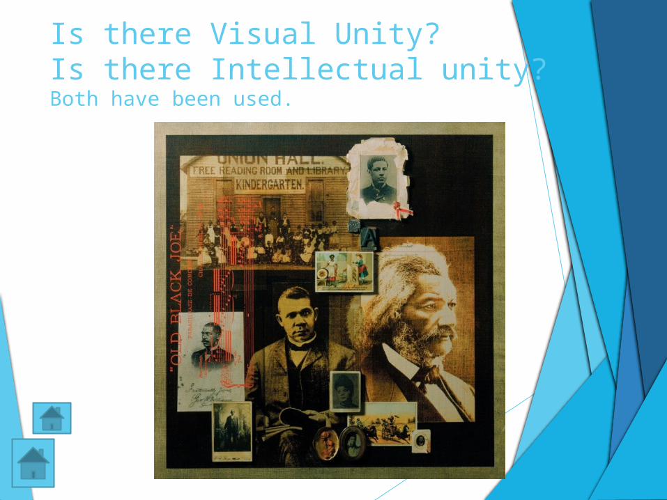
Is there Visual Unity? Is there Intellectual unity?Both have been used.
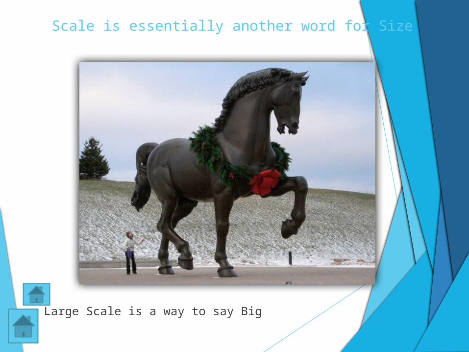
Scale is essentially another word for Size
Large Scale is a way to say Big
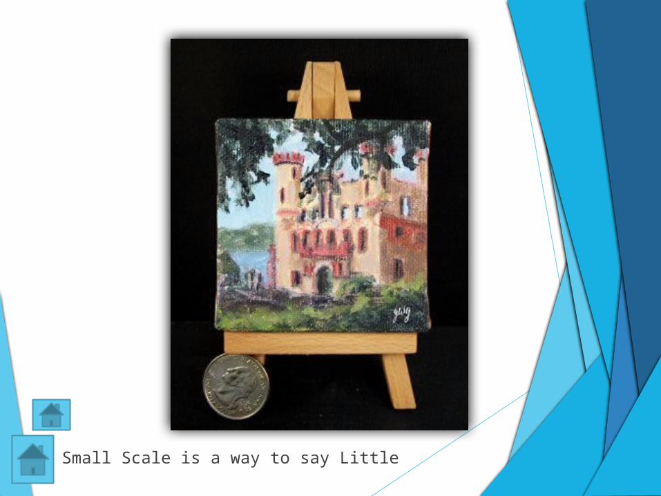
Small Scale is a way to say Little
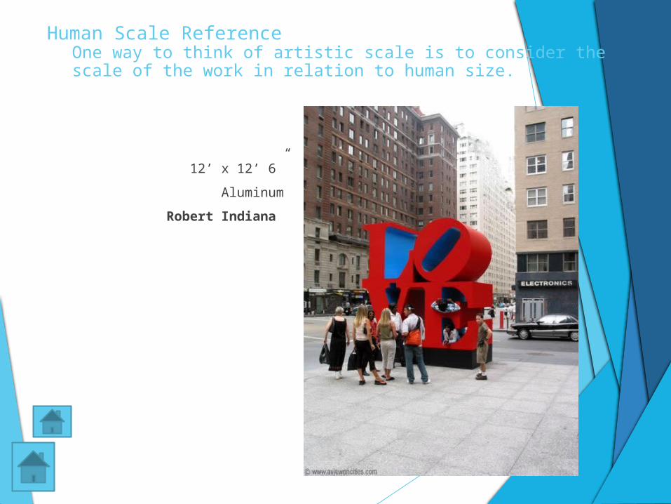
Human Scale ReferenceOne way to think of artistic scale is to consider the scale of the work in relation to human size.
12’ x 12’ 6”
Aluminum
Robert Indiana
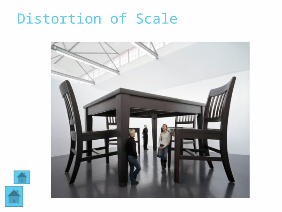
Distortion of Scale
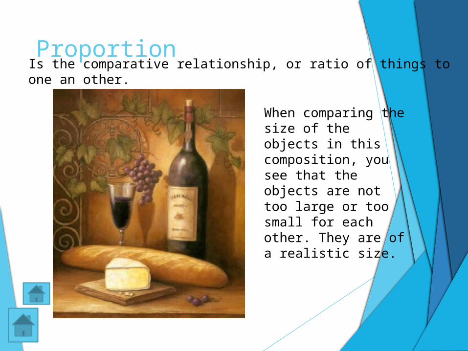
ProportionIs the comparative relationship, or ratio of things to one an other.
When comparing the size of the objects in this composition, you see that the objects are not too large or too small for each other. They are of a realistic size.
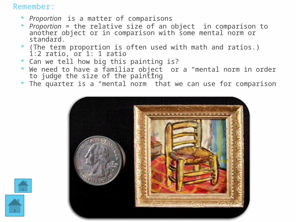
Remember: Proportion is a matter of comparisons Proportion = the relative size of an object in comparison to another
object or in comparison with some mental norm or standard. (The term proportion is often used with math and ratios.)
1:2 ratio, or 1: 1 ratio Can we tell how big this painting is? We need to have a familiar object or a “mental norm in order to
judge the size of the painting The quarter is a “mental norm” that we can use for comparison
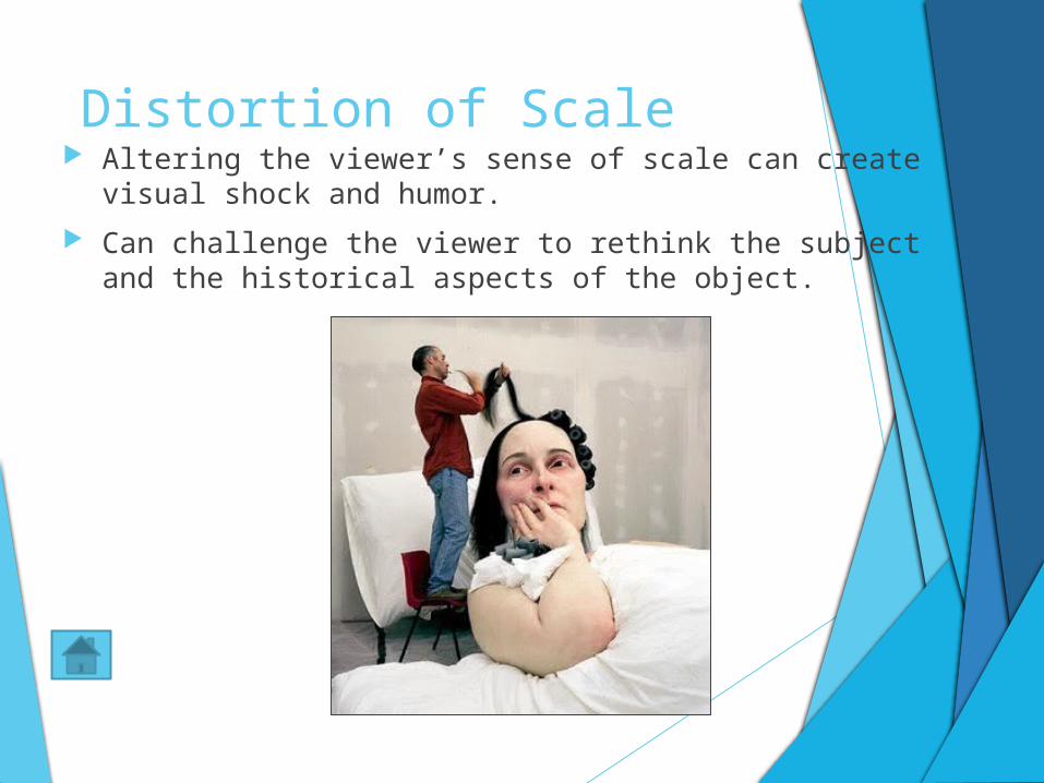
Distortion of Scale Altering the viewer’s sense of scale can create visual shock
and humor.
Can challenge the viewer to rethink the subject and the historical aspects of the object.
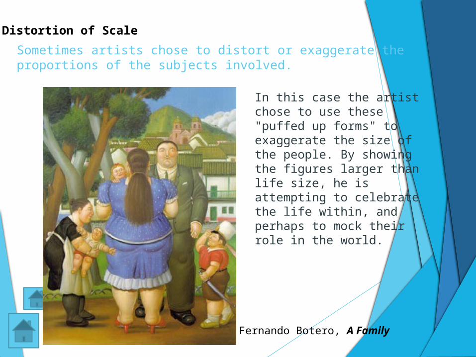
Sometimes artists chose to distort or exaggerate the proportions of the subjects involved.
Fernando Botero, A Family
In this case the artist chose to use these "puffed up forms" to exaggerate the size of the people. By showing the figures larger than life size, he is attempting to celebrate the life within, and perhaps to mock their role in the world.
Distortion of Scale
Hierarchal Scaling
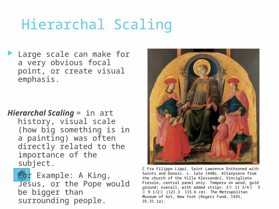
Large scale can make for a very obvious focal point, or create visual emphasis.
Hierarchal Scaling = in art history, visual scale (how big something is in a painting) was often directly related to the importance of the subject.
For Example: A King, Jesus, or the Pope would be bigger than surrounding people.
C Fra Filippo Lippi. Saint Lawrence Enthroned with Saints and Donors. c. late 1440s. Altarpiece from the church of the Villa Alessandri, Vincigliata Fiesole, central panel only. Tempera on wood, gold ground; overall, with added strips: 3 ユ 11 3/4 モ 3 ユ 9 1/2 モ (121.3 115.6 cm). The Metropolitan Museum of Art, New York (Rogers Fund, 1935, 35.31.1a).
Rhythm in Visual Art?1. Rhythm is a design principle based on repetition.
2. It involves a repetition of elements that are the same or only
slightly different.
3. Rhythm refers to a way of utilizing the art elements to produce
the look and feel of rhythmic movement with a visual tempo or
beat
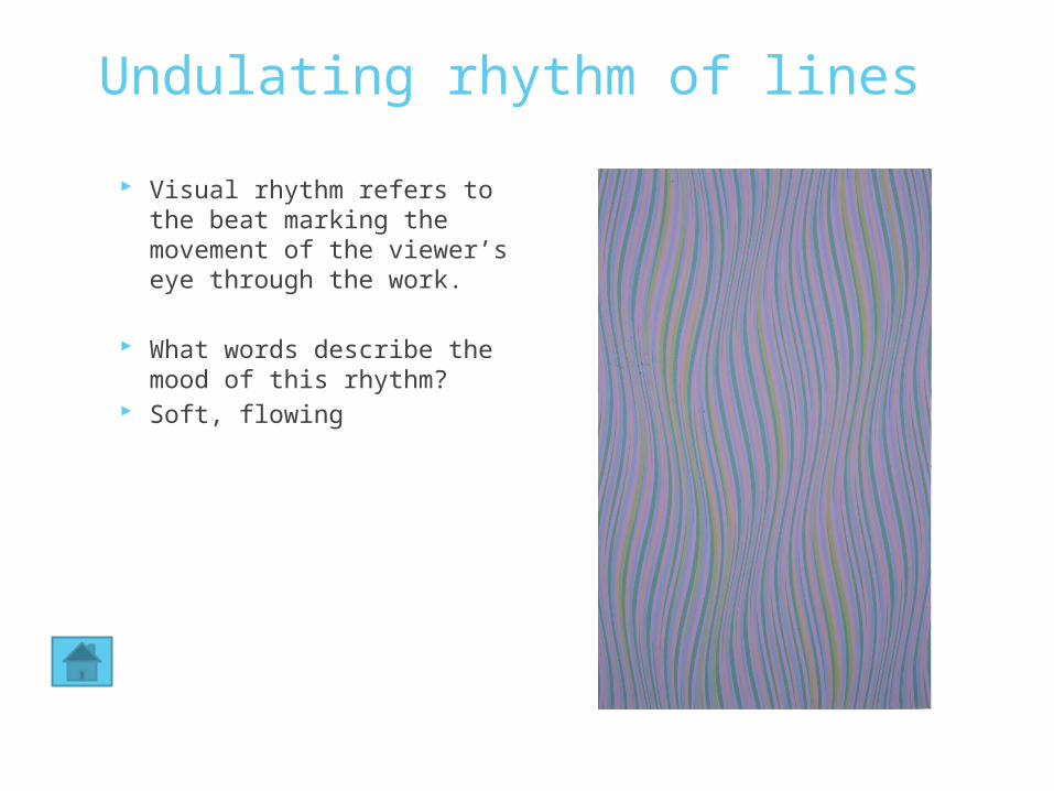
Undulating rhythm of lines
Visual rhythm refers to the beat marking the movement of the viewer’s eye through the work.
What words describe the mood of this rhythm?
Soft, flowing
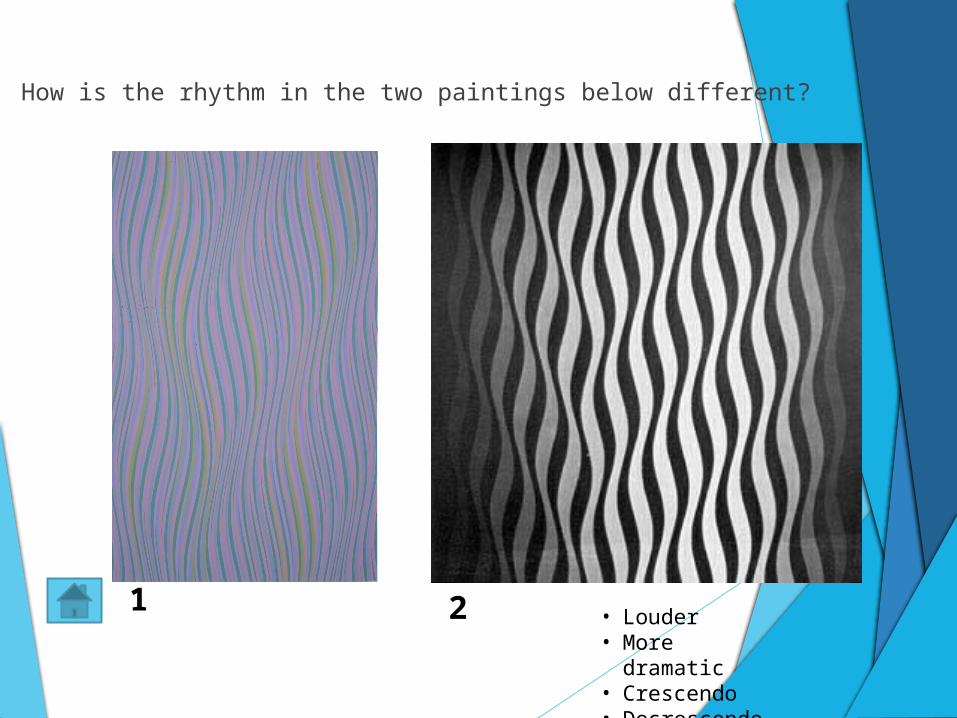
How is the rhythm in the two paintings below different?
1 2 • Louder• More dramatic• Crescendo• Decrescendo
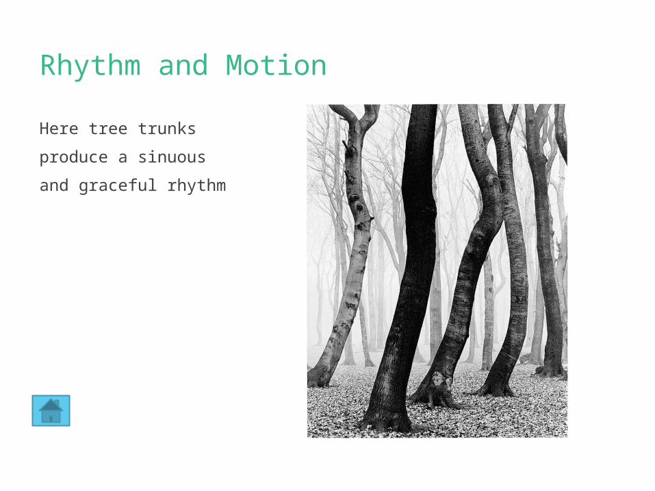
Rhythm and Motion
Here tree trunks
produce a sinuous
and graceful rhythm
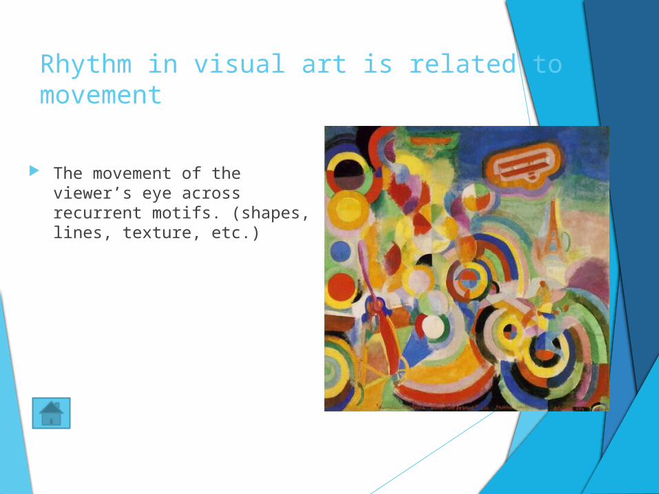
Rhythm in visual art is related to movement
The movement of the viewer’s eye across recurrent motifs. (shapes, lines, texture, etc.)
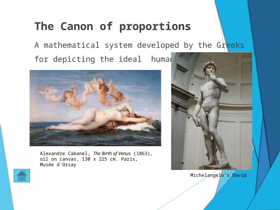
The Canon of proportions
A mathematical system developed by the Greeks for
depicting the ideal human body.
Alexandre Cabanel, The Birth of Venus (1863), oil on canvas, 130 x 225 cm. Paris, Musée d'Orsay
Michelangelo’s David
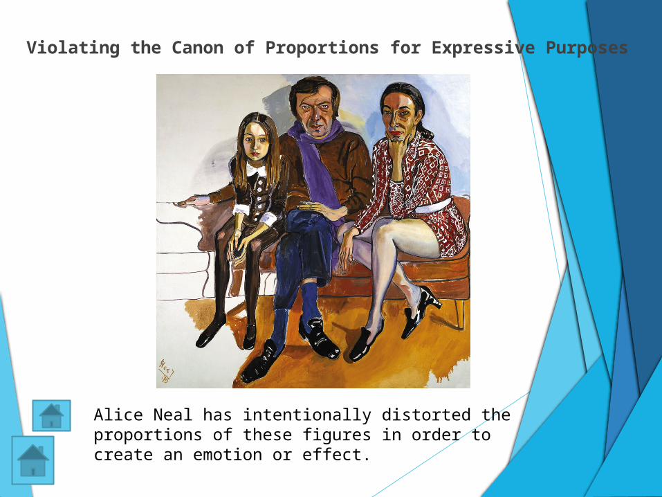
Violating the Canon of Proportions for Expressive
Purposes
Alice Neal has intentionally distorted the proportions of these figures in order to create an emotion or effect.
The End