the importance of visuals nada vukadinović introduction in this unit you will learn why we need to...
TRANSCRIPT
The Importance of Visuals
Nada Vukadinović
Introduction
In this unit you will learn why we need to visualise what we say during a presentation. You will also learn the principles for preparing effective slides, particularly using computer slides.
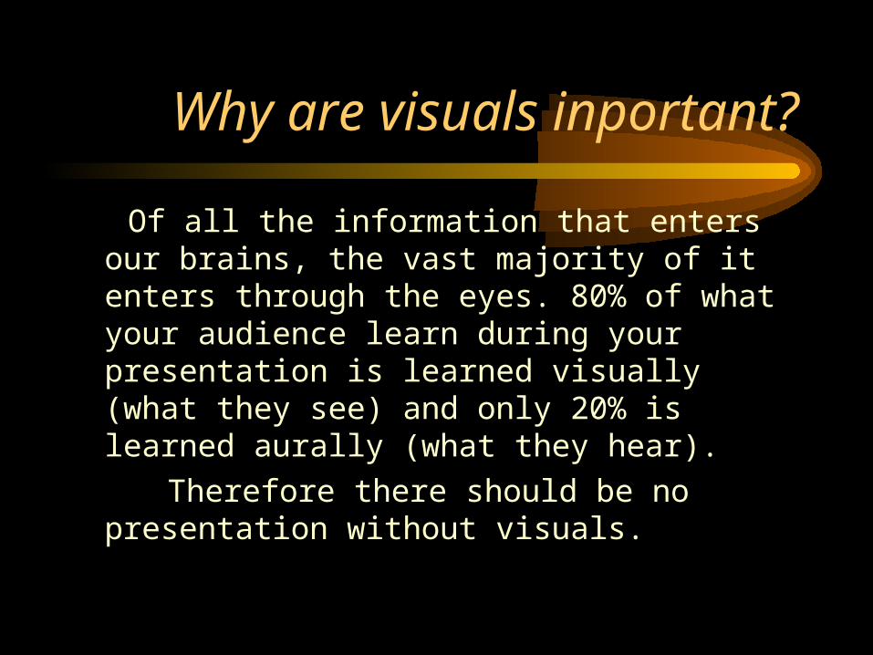
Why are visuals inportant?
Of all the information that enters our brains, the vast majority of it enters through the eyes. 80% of what your audience learn during your presentation is learned visually (what they see) and only 20% is learned aurally (what they hear).
Therefore there should be no presentation without visuals.
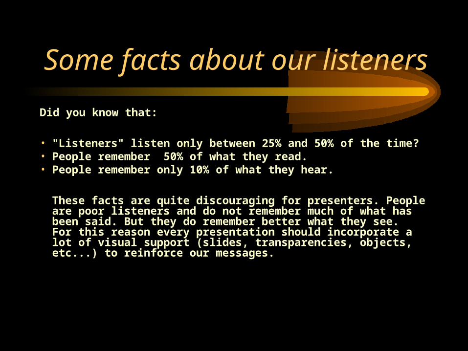
Some facts about our listeners
Did you know that:
• "Listeners" listen only between 25% and 50% of the time?• People remember 50% of what they read.• People remember only 10% of what they hear.
These facts are quite discouraging for presenters. People are poor listeners and do not remember much of what has been said. But they do remember better what they see. For this reason every presentation should incorporate a lot of visual support (slides, transparencies, objects, etc...) to reinforce our messages.
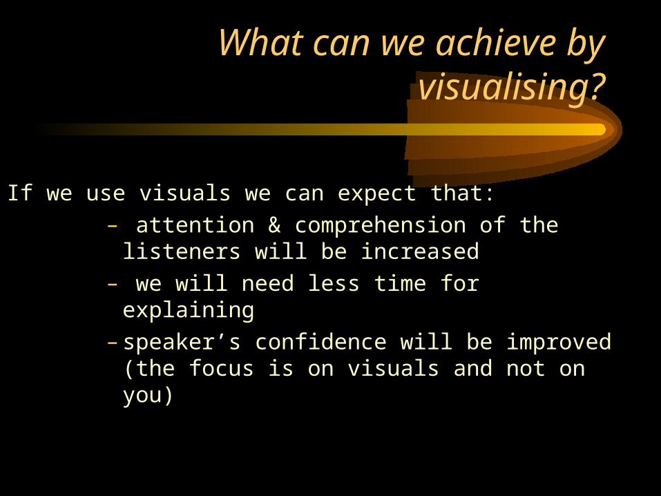
What can we achieve by visualising?
If we use visuals we can expect that:
– attention & comprehension of the listeners will be increased
– we will need less time for explaining
– speaker’s confidence will be improved (the focus is on visuals and not on you)
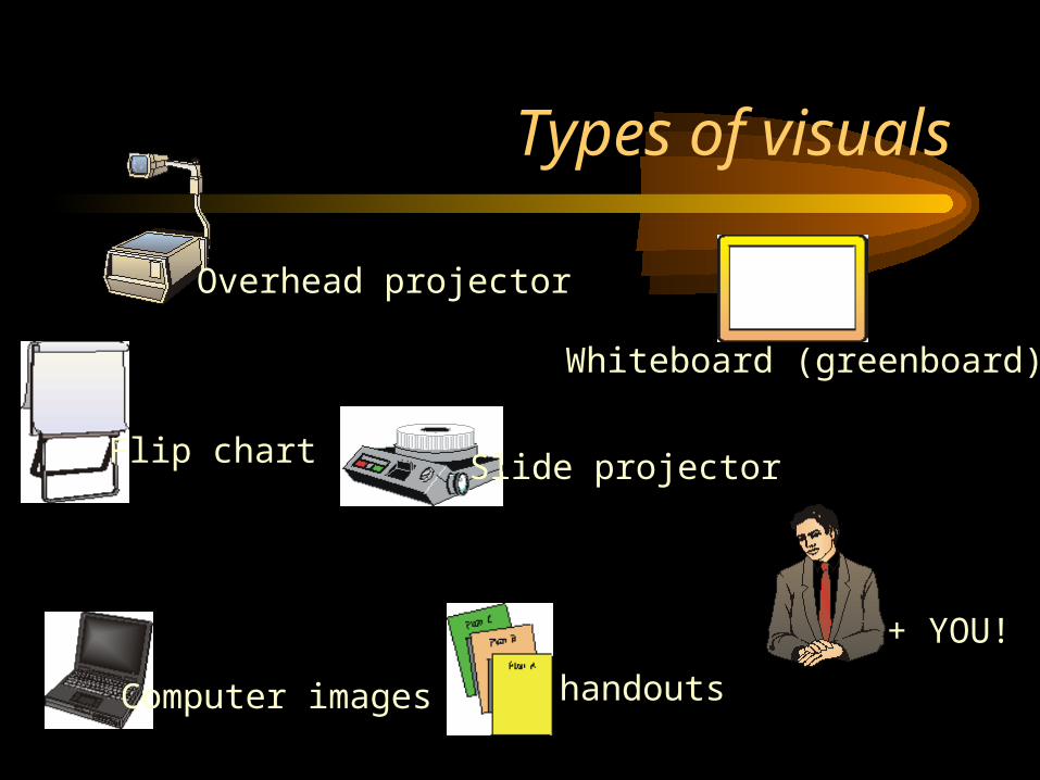
Types of visuals
Overhead projector
Whiteboard (greenboard)
Flip chart Slide projector
Computer images handouts
+ YOU!
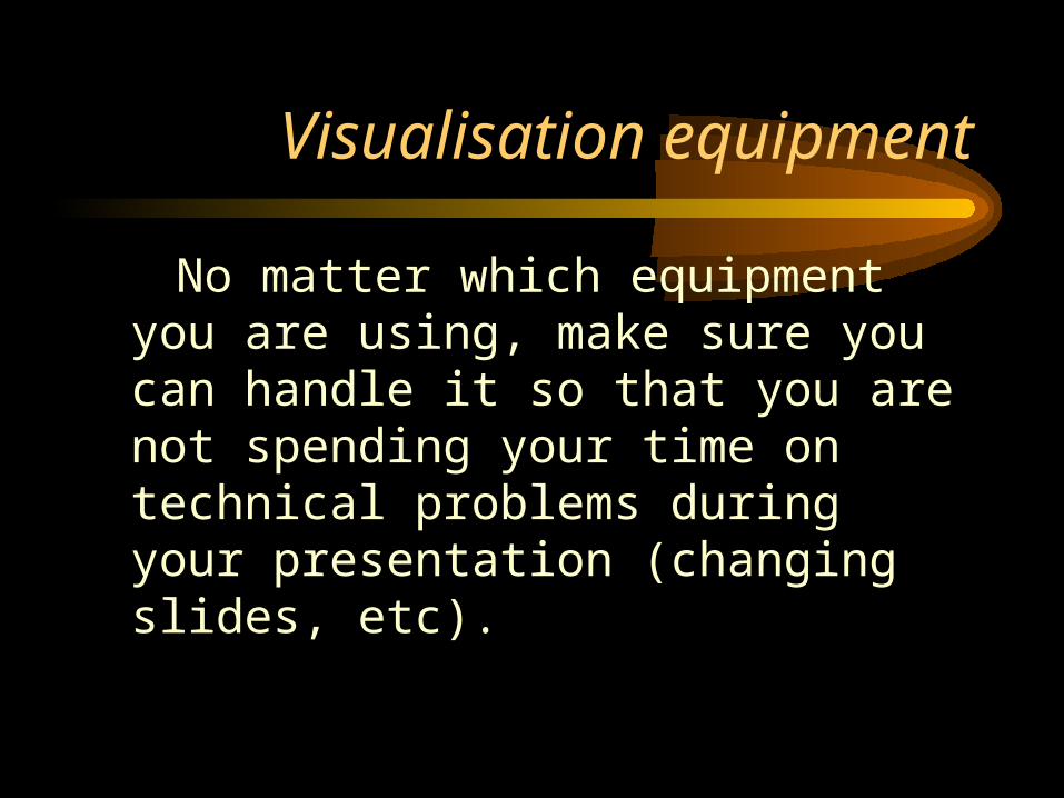
Visualisation equipment
No matter which equipment you are using, make sure you can handle it so that you are not spending your time on technical problems during your presentation (changing slides, etc).
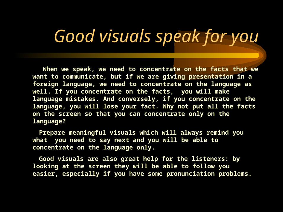
Good visuals speak for you
When we speak, we need to concentrate on the facts that we want to communicate, but if we are giving presentation in a foreign language, we need to concentrate on the language as well. If you concentrate on the facts, you will make language mistakes. And conversely, if you concentrate on the language, you will lose your fact. Why not put all the facts on the screen so that you can concentrate only on the language?
Prepare meaningful visuals which will always remind you what you need to say next and you will be able to concentrate on the language only.
Good visuals are also great help for the listeners: by looking at the screen they will be able to follow you easier, especially if you have some pronunciation problems.
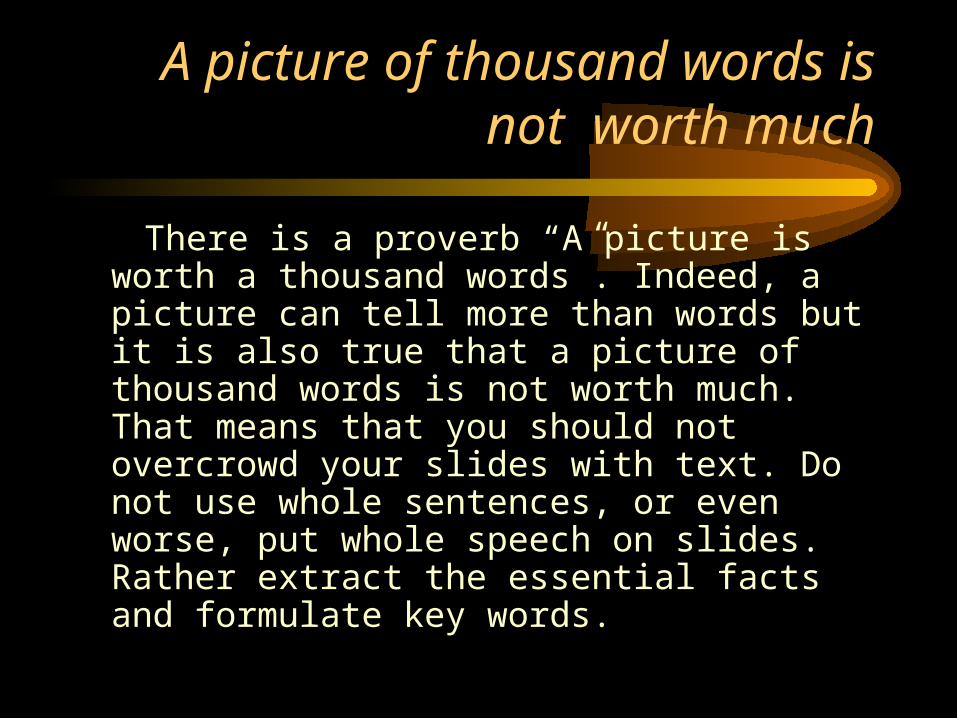
A picture of thousand words is not worth much
There is a proverb “A picture is worth a thousand words”. Indeed, a picture can tell more than words but it is also true that a picture of thousand words is not worth much. That means that you should not overcrowd your slides with text. Do not use whole sentences, or even worse, put whole speech on slides. Rather extract the essential facts and formulate key words.
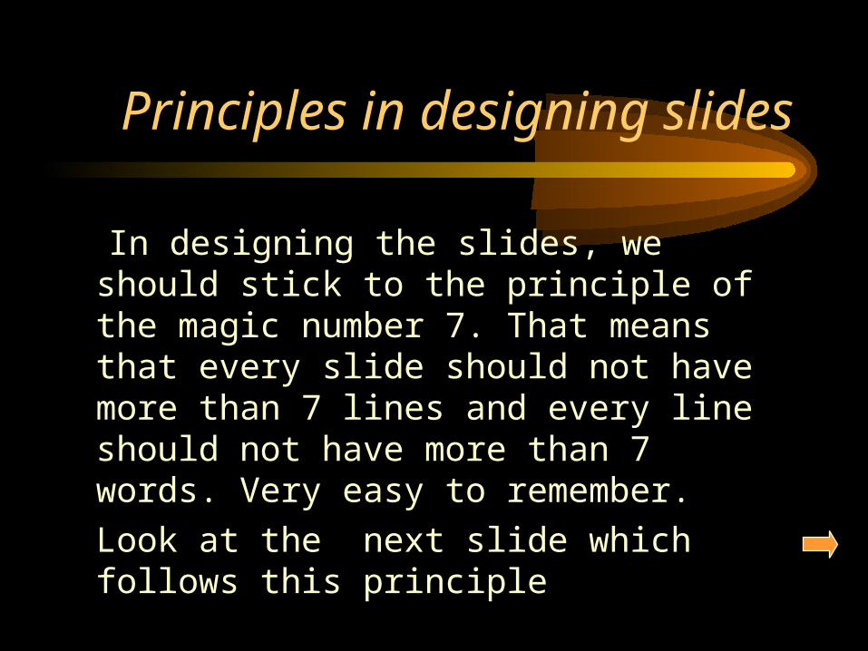
Principles in designing slides
In designing the slides, we should stick to the principle of the magic number 7. That means that every slide should not have more than 7 lines and every line should not have more than 7 words. Very easy to remember.
Look at the next slide which follows this principle
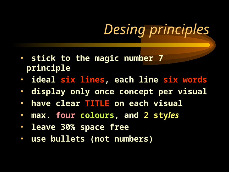
Desing principles
• stick to the magic number 7 principle
• ideal six lines, each line six words
• display only once concept per visual
• have clear TITLE on each visual
• max. four colours, and 2 styles
• leave 30% space free
• use bullets (not numbers)
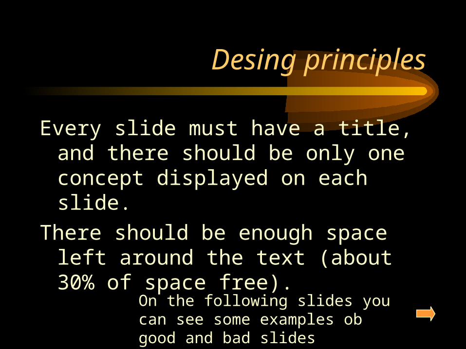
Desing principles
Every slide must have a title, and there should be only one concept displayed on each slide.
There should be enough space left around the text (about 30% of space free).
On the following slides you can see some examples ob good and bad slides

Bad slide: too many concepts
LEUKEMIA
What is:• malignant disease• bone marrow
Types of leukemia:• acute• chronic
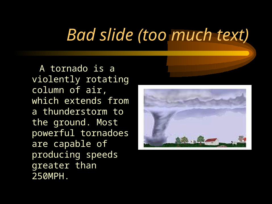
Bad slide (too much text)
A tornado is a violently rotating column of air, which extends from a thunderstorm to the ground. Most powerful tornadoes are capable of producing speeds greater than 250MPH.
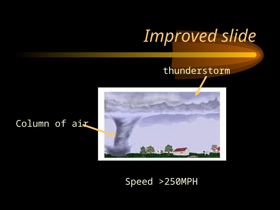
Improved slide
Column of air
thunderstorm
Speed >250MPH
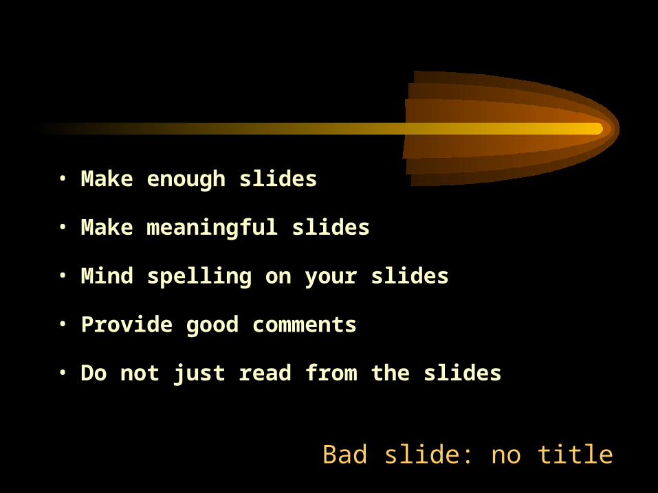
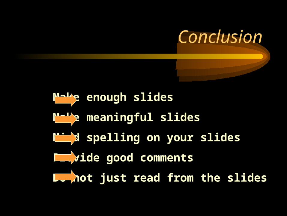
• Make enough slides
• Make meaningful slides
• Mind spelling on your slides
• Provide good comments
• Do not just read from the slides
Bad slide: no title
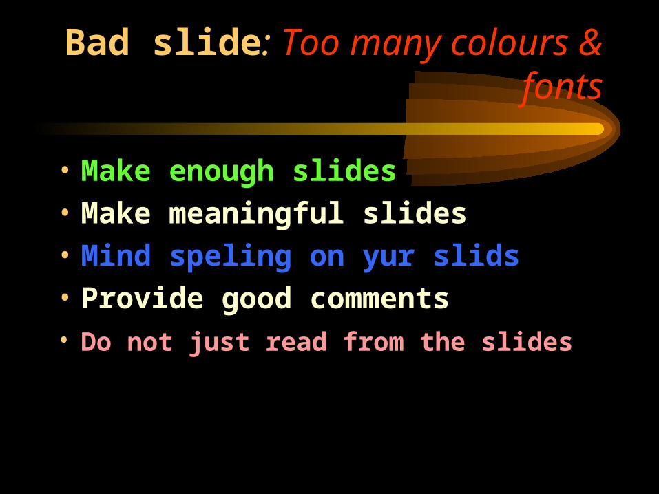
Bad slide: Too many colours & fonts
• Make enough slides• Make meaningful slides• Mind speling on yur slids
• Provide good comments • Do not just read from the slides
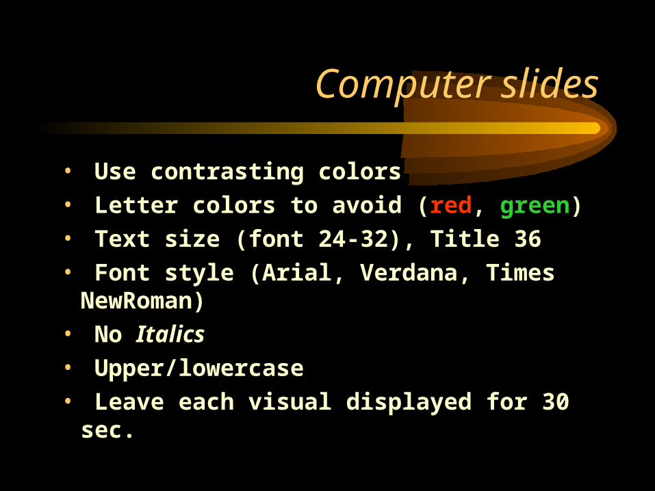
Computer slides
• Use contrasting colors
• Letter colors to avoid (red, green)
• Text size (font 24-32), Title 36
• Font style (Arial, Verdana, Times NewRoman)
• No Italics
• Upper/lowercase
• Leave each visual displayed for 30 sec.

• Try before your give your presentation!
• Audio effects (use sound effect sparingly!)
• Do not make a show of effects
• Be careful with effects! Some are very disturbing
• Particularly transitions (flies in, drops down).
Special effects
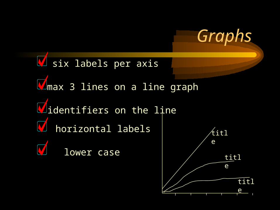
six labels per axis
max 3 lines on a line graph
identifiers on the line
horizontal labels
lower case
title
title
title
Graphs
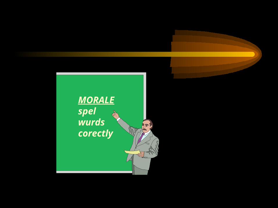
MORALEspelwurdscorectly
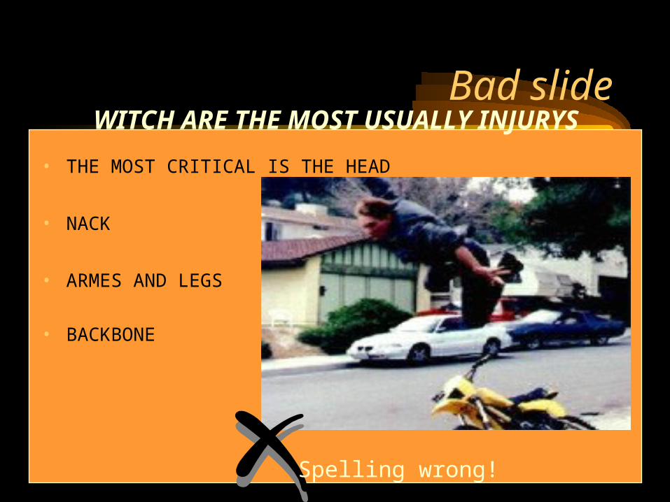
WITCH ARE THE MOST USUALLY INJURYS
• THE MOST CRITICAL IS THE HEAD
• NACK
• ARMES AND LEGS
• BACKBONE
Spelling wrong!
Bad slide
Make enough slides
Make meaningful slides
Mind spelling on your slides
Provide good comments
Do not just read from the slides
Conclusion