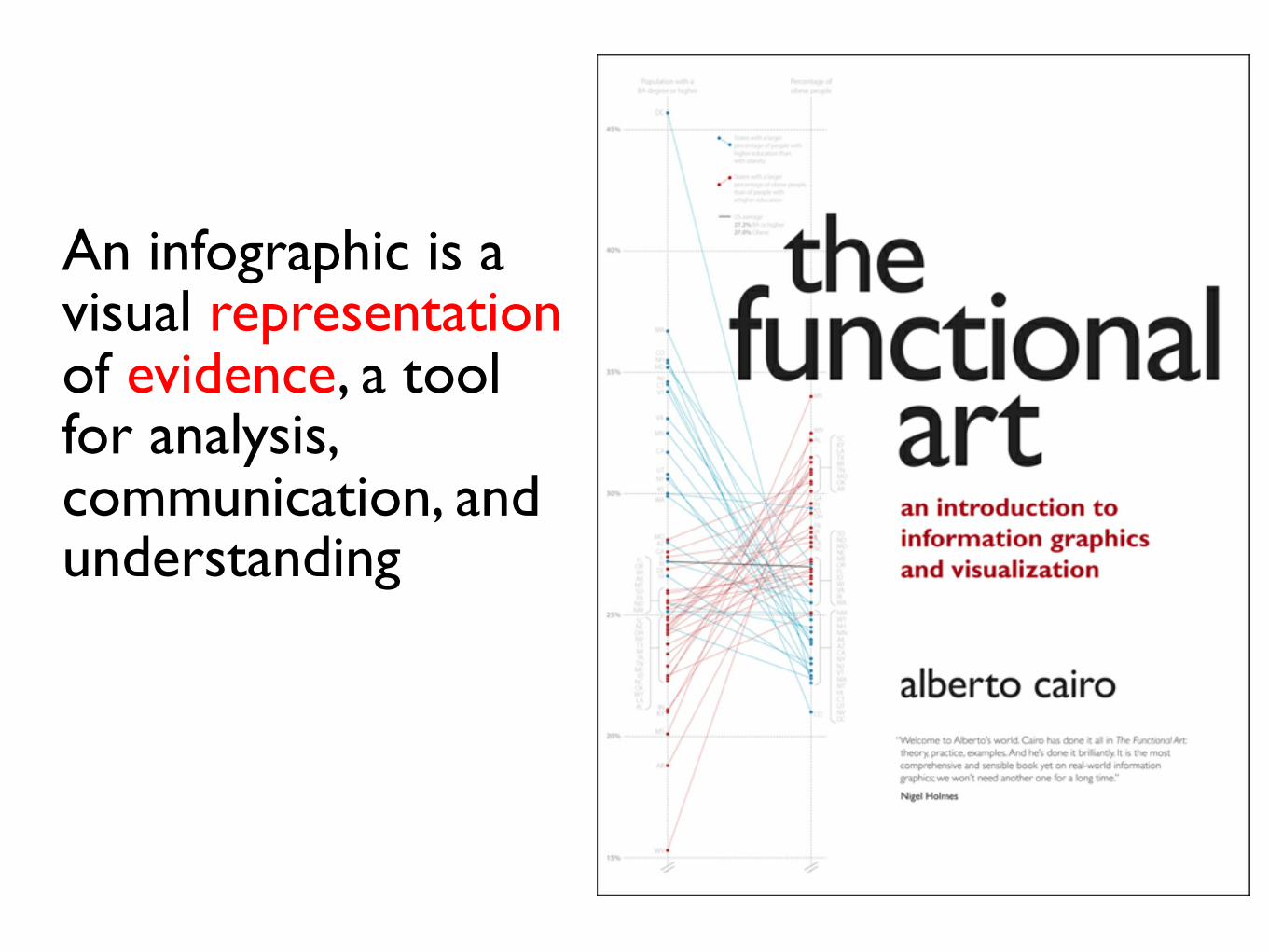
the functional art: design and infographics | journalism interactive conference 2013 |...
DESCRIPTION
PRESENTER: Alberto Cairo (@albertocairo), Instructor, University of Miami. DESCRIPTION: Too many journalists still relate the word "design" to making pages and websites look prettier. As a consequence, they think that the main goal of an infographic is to be eye-catching, engaging, and fun. They argue that infographics are means to "simplify" data that only specialized professionals are capable of creating. This presentation will debunk all these myths and propose an alternative view of infographics and visualizations as means to make messages richer, deeper, and more effective.TRANSCRIPT
A Functional Art
40%
45%
35%
30%
25%
20%
15%
DC
MA
CO
MS
WV
NHMD
NJCTVT
VI
MN
CA
UTNYKSWA
MOAZGAILRI
DEHI
INKY
MS
AR
WV
AKWIORFL
MTSDPA
NDNMSCNEOHNVTXMIIA
TNMEID
NCOKWYLAAL
NC
SDDE ND
MDNEMEORFLIDWIVA
WYNH
WARI
NM
MNAKAZCANYNJVTMAMTHICTUTNVDC
CO
SCKYLATXMITNMOOKAR
GAINKSOHPAIAIL
Population with aBA degree or higher
Percentage ofobese people
AL
States with a largerpercentage of people withhigher education thanwith obesity
States with a largerpercentage of obese peoplethan of people witha higher education
US average27.2% BA or higher27.0% Obese
how to embrace and teach infographics and visualization
Alberto CairoUniversity of Miami
www.thefunctionalart.comTwitter: @albertocairo
An infographic is a visual representation of evidence, a tool for analysis, communication, and understanding
Two partsEvidenceRepresentation
Throughout the years I’ve become concerned about the way we teach what evidence is in J-Schools
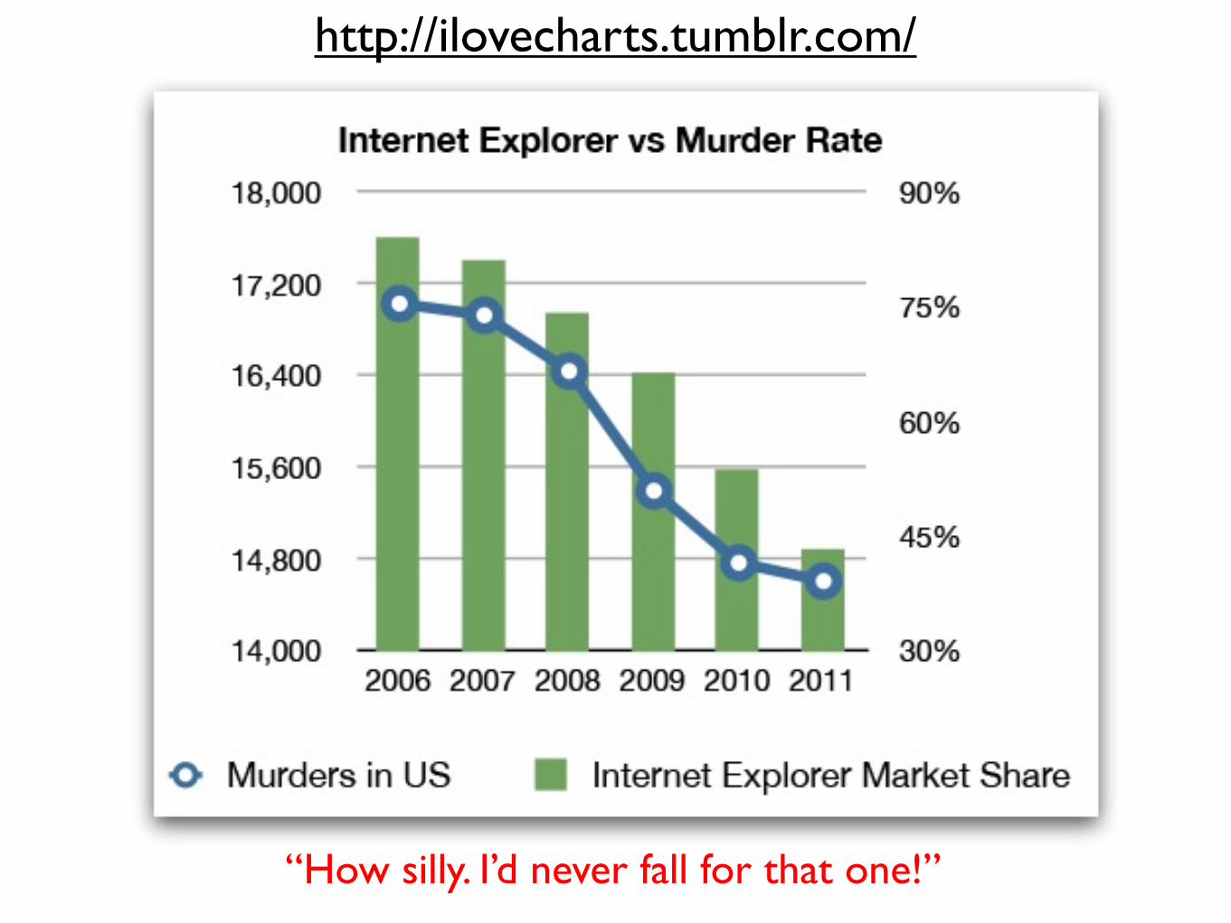
http://ilovecharts.tumblr.com/
“How silly. I’d never fall for that one!”
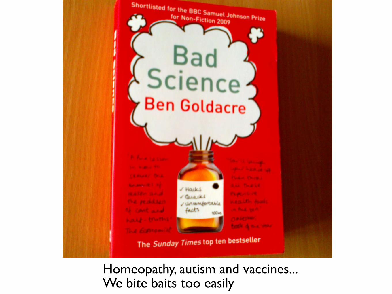
Homeopathy, autism and vaccines... We bite baits too easily
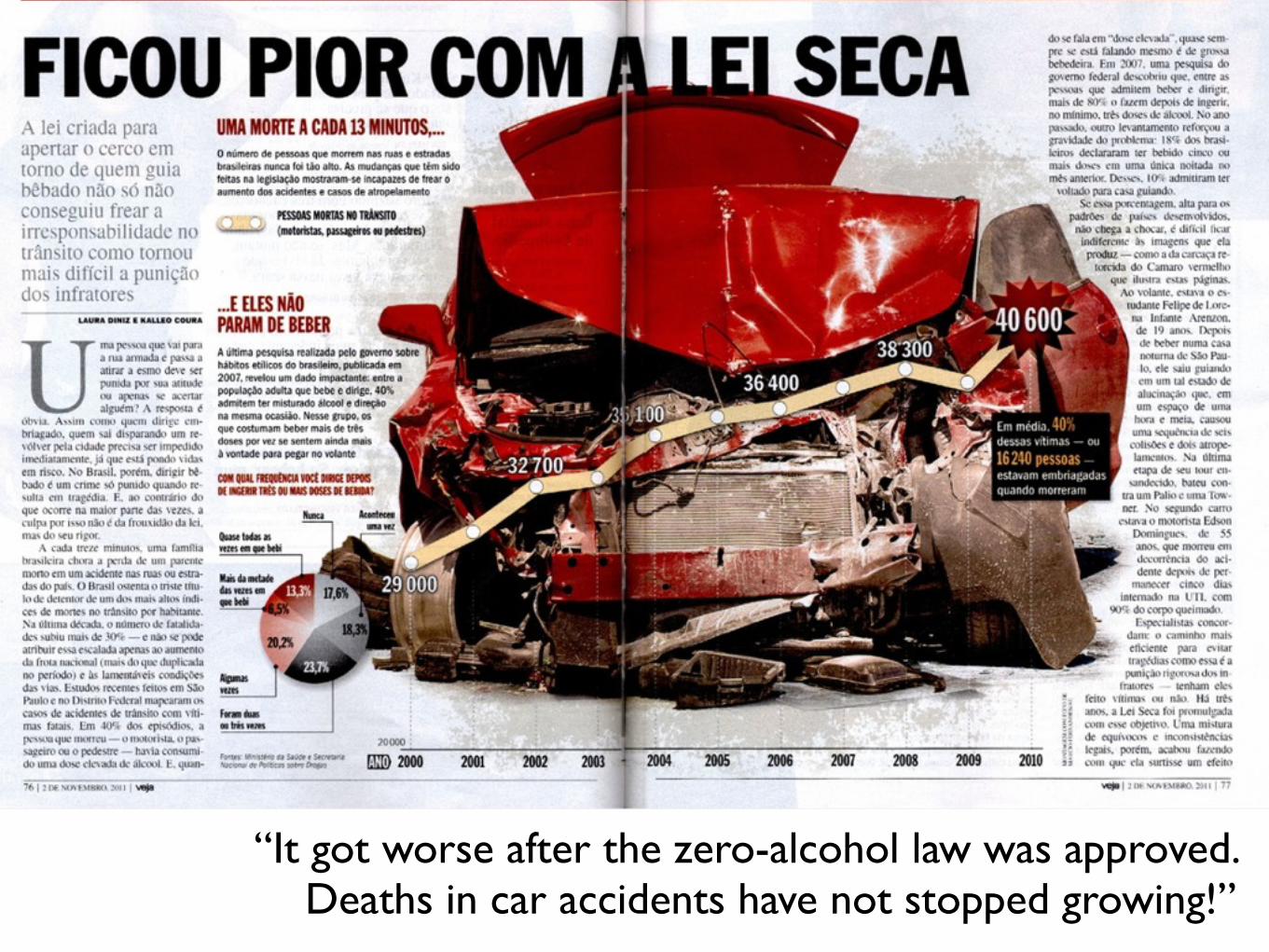
“It got worse after the zero-alcohol law was approved. Deaths in car accidents have not stopped growing!”
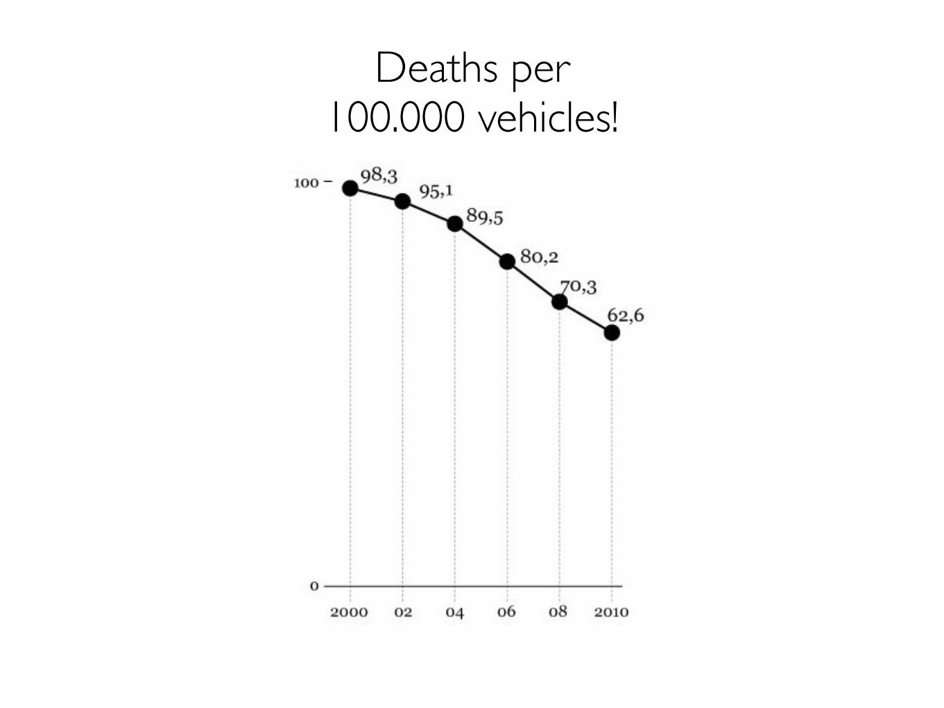
Deaths per100.000 vehicles!
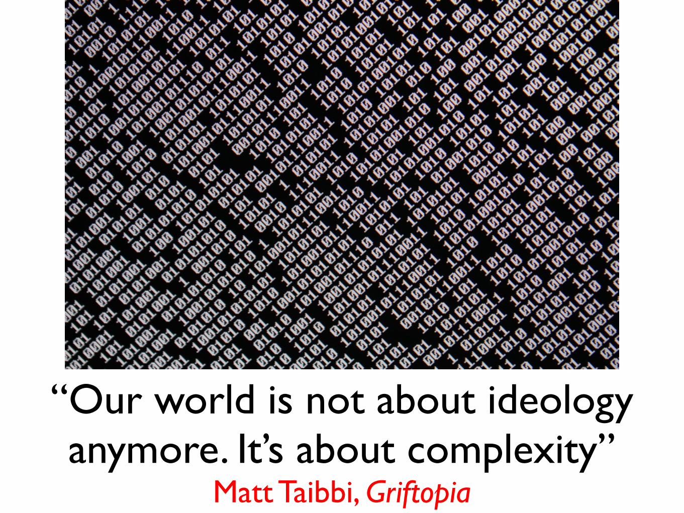
“Our world is not about ideology anymore. It’s about complexity”
Matt Taibbi, Griftopia
Are we teaching students and learn ourselves how to deal with that complexity?
Moreover...We talk a lot about storytelling, but are we really sure that we understand what the challenges and limits of storytelling may be?Do we teach them to our students?
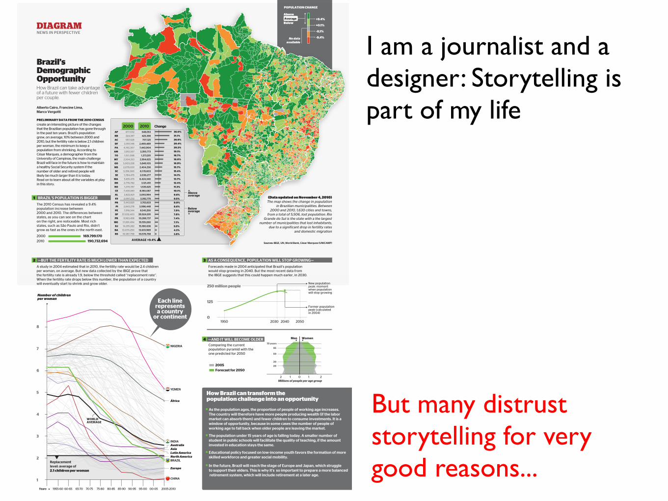
I am a journalist and a designer: Storytelling is part of my life
AVERAGE +9.4%
DIAGRAMNEWS IN PERSPECTIVE
How Brazil can take advantageof a future with fewer childrenper couple.
Brazil’sDemographicOpportunity
Alberto Cairo, Francine Lima,Marco Vergotti
2000
1950
250 million people
2010 190,732,694169.799.170
AP
RR
AC
DF
PA
AM
TO
MT
GO
MS
SC
SE
MA
RN
RO
CE
AL
ES
PB
PI
PE
SP
PR
MG
RJ
BA
RS
648,553
425,398
707,125
2,469,489
7,443,904
3,350,773
1,373,551
2,954,625
5,849,105
2,404,256
6,178,603
2,036,277
6,424,340
3,121,451
1,535,625
8,180,087
3,093,994
3,392,775
3,753,633
3,086,448
8,541,250
39,924,091
10,266,737
19,159,260
15,180,636
13,633,969
10,576,758
477,032
324,397
557,526
2,051,146
6,192,307
2,812,557
1,157,098
2,504,353
5,003,228
2,078,001
5,356,360
1,784,475
5,651,475
2,776,782
1,379,787
7,430,661
2,822,621
3,097,232
3,443,825
2,843,278
7,918,344
37,032,403
9,563,458
17,891,494
14,391,282
13,070,250
10,187,798
Change36.0%
31.1%
26.8%
20.4%
19.1%
18.7%
18.0%
16.9%
15.7%
15.4%
14.1%
13.7%
12.4%
11.3%
10.1%
9.6%
9.5%
9.0%
8.6%
7.9%
7.8%
7.4%
7.1%
5.5%
4.3%
3.8%
20.2%
BRAZIL’S POPULATION IS BIGGER
2000 2010
—BUT THE FERTILITY RATE IS MUCH LOWER THAN EXPECTED AS A CONSEQUENCE, POPULATION WILL STOP GROWING—
2030 2040 2050
125
0
—AND IT WILL BECOME OLDER
Forecast for 20502005
Men Women
2 1 0 1 2
75 years
50
30
20
65
Belowaverage
1
2 3
4
-9,4%
-0,1%
+9.4%
+0.1%Below
AboveAverage
1
2
3
4
5
6
7
8
NIGERIA
CHINA
África
Europe
BRAZIL
AustraliaAsiaLatin AmericaNorth America
Millions of people per age group
No dataavailable
Years
POPULATION CHANGE
PRELIMINARY DATA FROM THE 2010 CENSUScreate an interesting picture of the changesthat the Brazilian population has gone throughin the past ten years. Brazil’s populationgrew, on average, 10% between 2000 and2010, but the fertility rate is below 2.1 childrenper woman, the minimum to keep apopulation from shrinking. According toCésar Marques, a demographer from theUniversity of Campinas, the main challengeBrazil will face in the future is how to maintaina healthy Social Security system if thenumber of older and retired people willlikely be much larger than it is today.Read on to learn about all the variables at playin this story.
(Data updated on November 4, 2010)The map shows the change in population
in Brazilian municipalities. Between2000 and 2010, 1,630 cities and towns,
from a total of 5,506, lost population. RioGrande do Sul is the state with a the largest
number of municipalities that lost inhabitants,due to a significant drop in fertility rates
and domestic migration
Aboveaverage
The 2010 Census has revealed a 9.4%population increase between2000 and 2010. The differences betweenstates, as you can see on the charton the right, are noticeable. Most richstates, such as São Paulo and Rio, didn’tgrow as fast as the ones in the north east.
Sources: IBGE, UN, World Bank, César Marques (UNICAMP)
How Brazil can transform the population challenge into an opportunity
As the population ages, the proportion of people of working age increases.The country will therefore have more people producing wealth (if the labormarket can absorb them) and fewer children to consume investments. It is awindow of opportunity, because in some cases the number of people ofworking age to fall back when older people are leaving the market.
The population under 15 years of age is falling today. A smaller number ofstudent in public schools will facilitate the quality of teaching, if the amountinvested in education stays the same.
Educational policy focused on low-income youth favors the formation of moreskilled workforce and greater social mobility.
In the future, Brazil will reach the stage of Europe and Japan, which struggleto support their elders. This is why it’s so important to prepare a more balanced retirement system, which will include retirement at a later age.
Each linerepresentsa country
or continent
A study in 2004 estimated that in 2010, the fertility rate would be 2.4 childrenper woman, on average. But new data collected by the IBGE prove thatthe fertility rate is already 1.9, below the threshold called “replacement rate”.When the fertility rate drops below this number, the population of a countrywill eventually start to shrink and grow older.
Forecasts made in 2004 anticipated that Brazil’s populationwould stop growing in 2040. But the most recent data fromthe IBGE suggests that this could happen much earler, in 2030.
New populationpeak: momentwhen populationwill stop growing
Former populationpeak (calculatedin 2004)
YEMEN
WORLDAVERAGE
INDIA
Number of childrenper woman
Replacementlevel: average of2.1 children per woman
Comparing the currentpopulation pyramid with theone predicted for 2050
But many distrust storytelling for very good reasons...
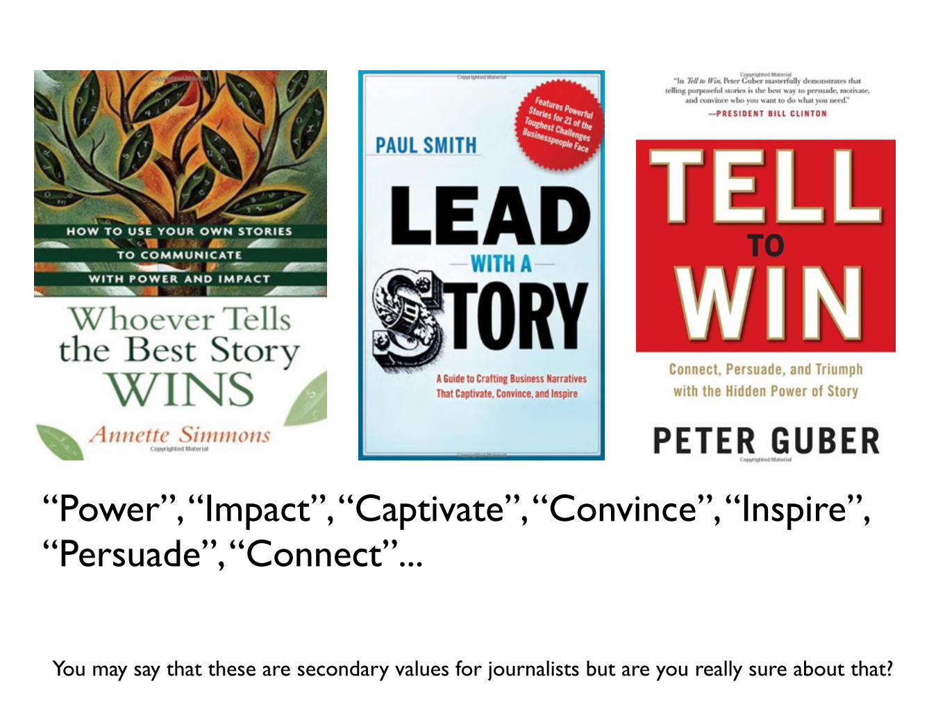
“Power”, “Impact”, “Captivate”, “Convince”, “Inspire”, “Persuade”, “Connect”...
You may say that these are secondary values for journalists but are you really sure about that?
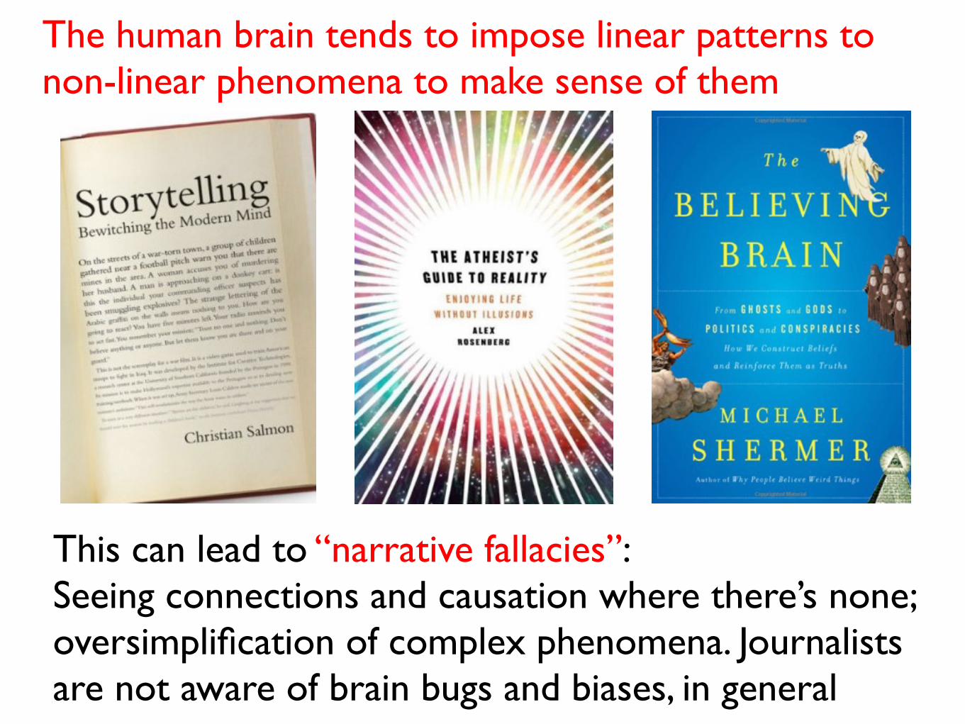
The human brain tends to impose linear patterns to non-linear phenomena to make sense of them
This can lead to “narrative fallacies”:Seeing connections and causation where there’s none;oversimplification of complex phenomena. Journalists are not aware of brain bugs and biases, in general

I don’t even need to remind you of this, right?
Many said that the main sin Lehrer committed was to make up quotes, but the main problem was not that: His books impose cohesive narrative structures to disperse bits of evidence
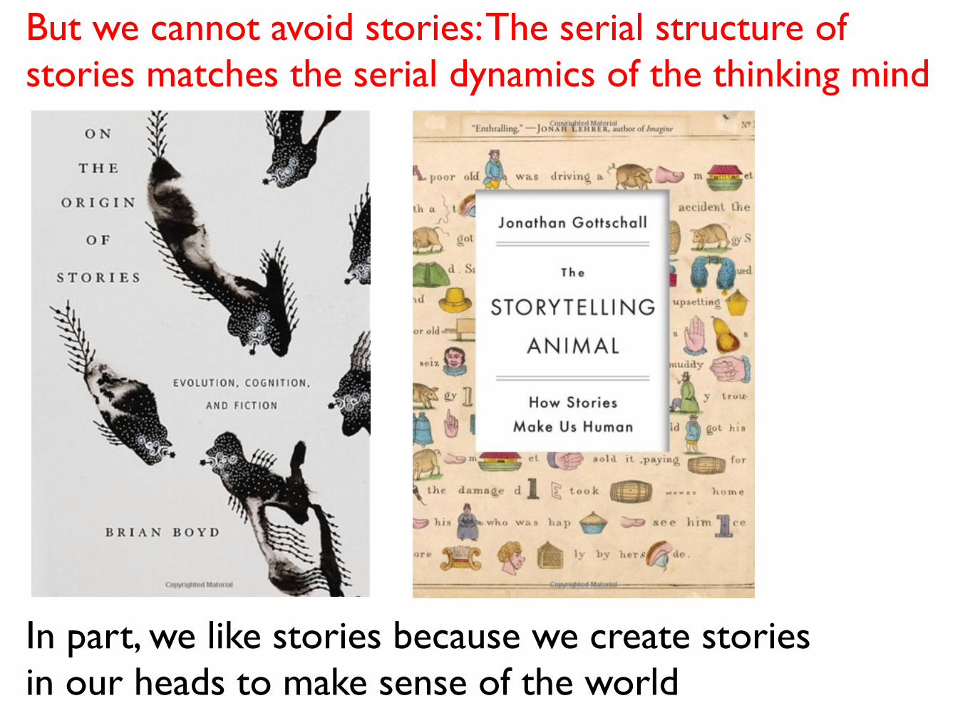
But we cannot avoid stories: The serial structure of stories matches the serial dynamics of the thinking mind
In part, we like stories because we create stories in our heads to make sense of the world
Perhaps we need to rethink how we teach storytelling at J-School and the scientific method in research classes: Less theory and abstraction; less “follow your instincts” BS. Make statistics and qualitative methods fun and exciting, and learn about cognitive biases and shortcomings

Two partsEvidenceRepresentation
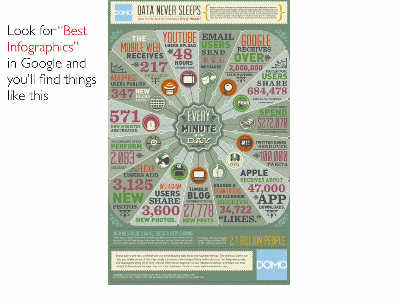
Look for “Best Infographics”in Google and you’ll find things like this
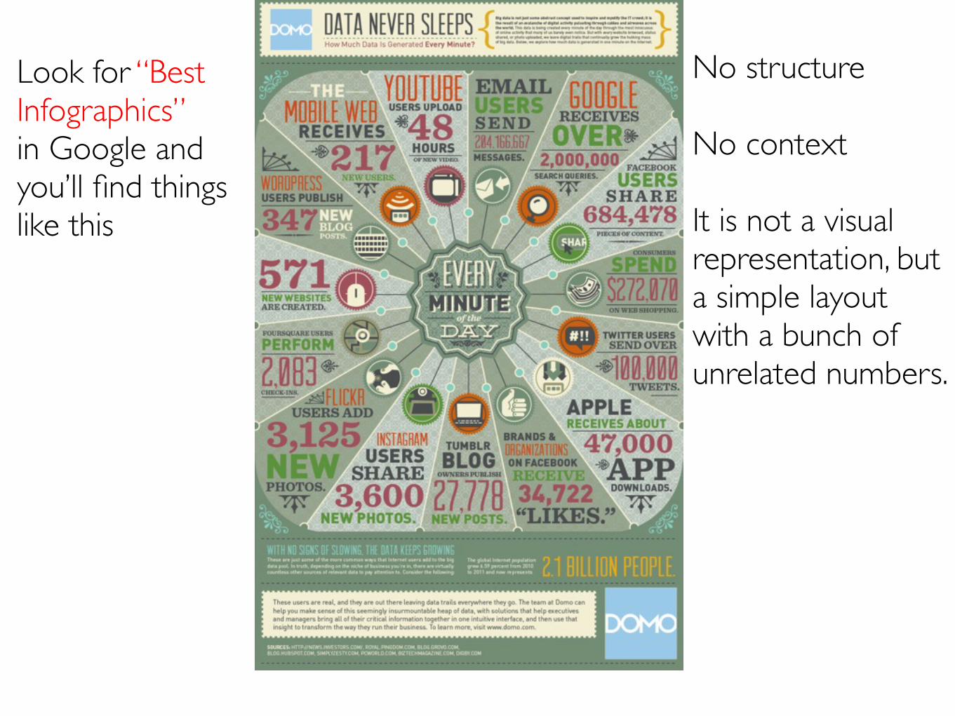
No structure
No context
It is not a visual representation, but a simple layout with a bunch of unrelated numbers.
Look for “Best Infographics”in Google and you’ll find things like this
An infographic (or visualization) should not be just a pretty picture but a structured, accurate visual presentation of evidence
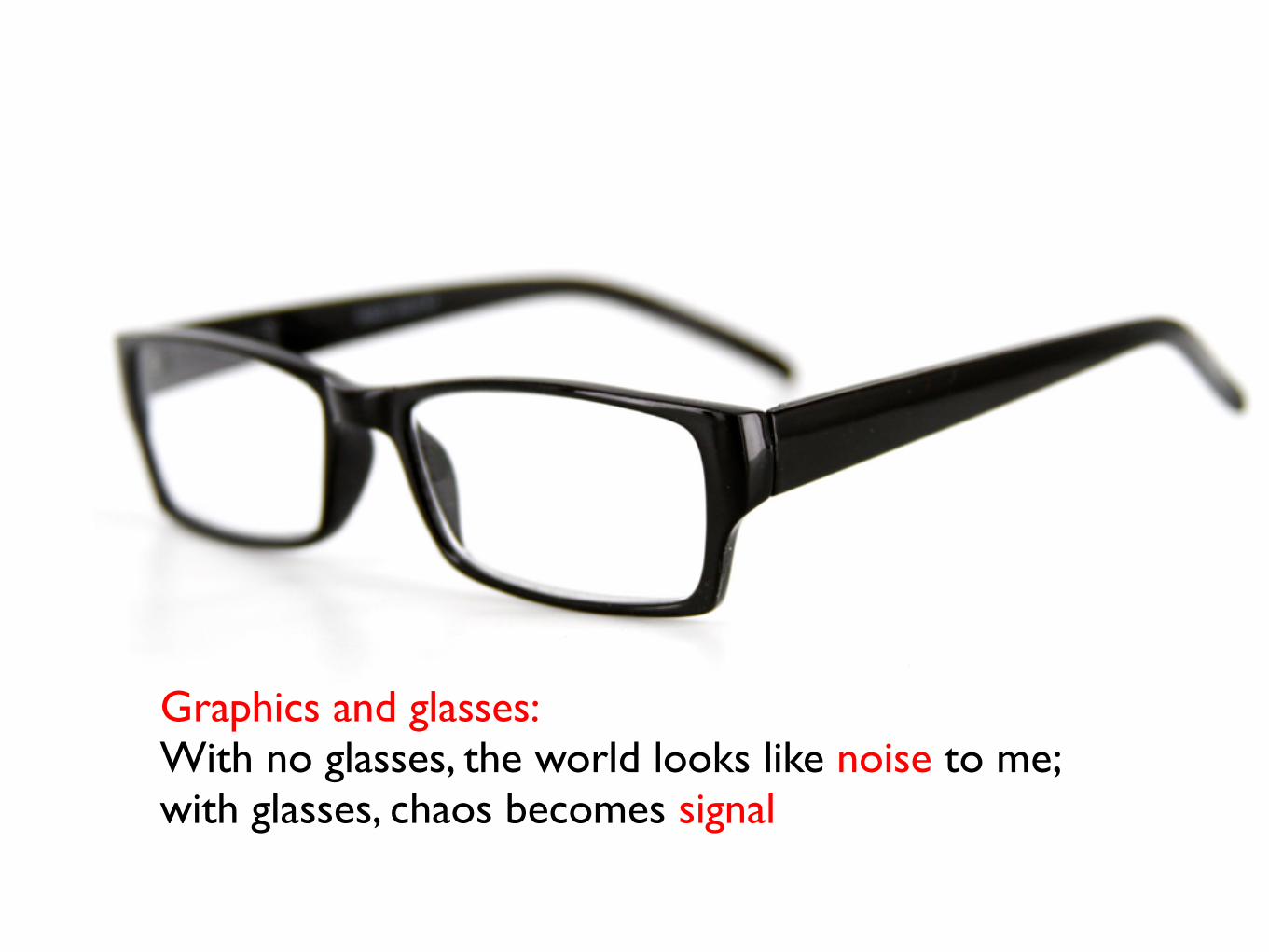
Graphics and glasses:With no glasses, the world looks like noise to me;with glasses, chaos becomes signal
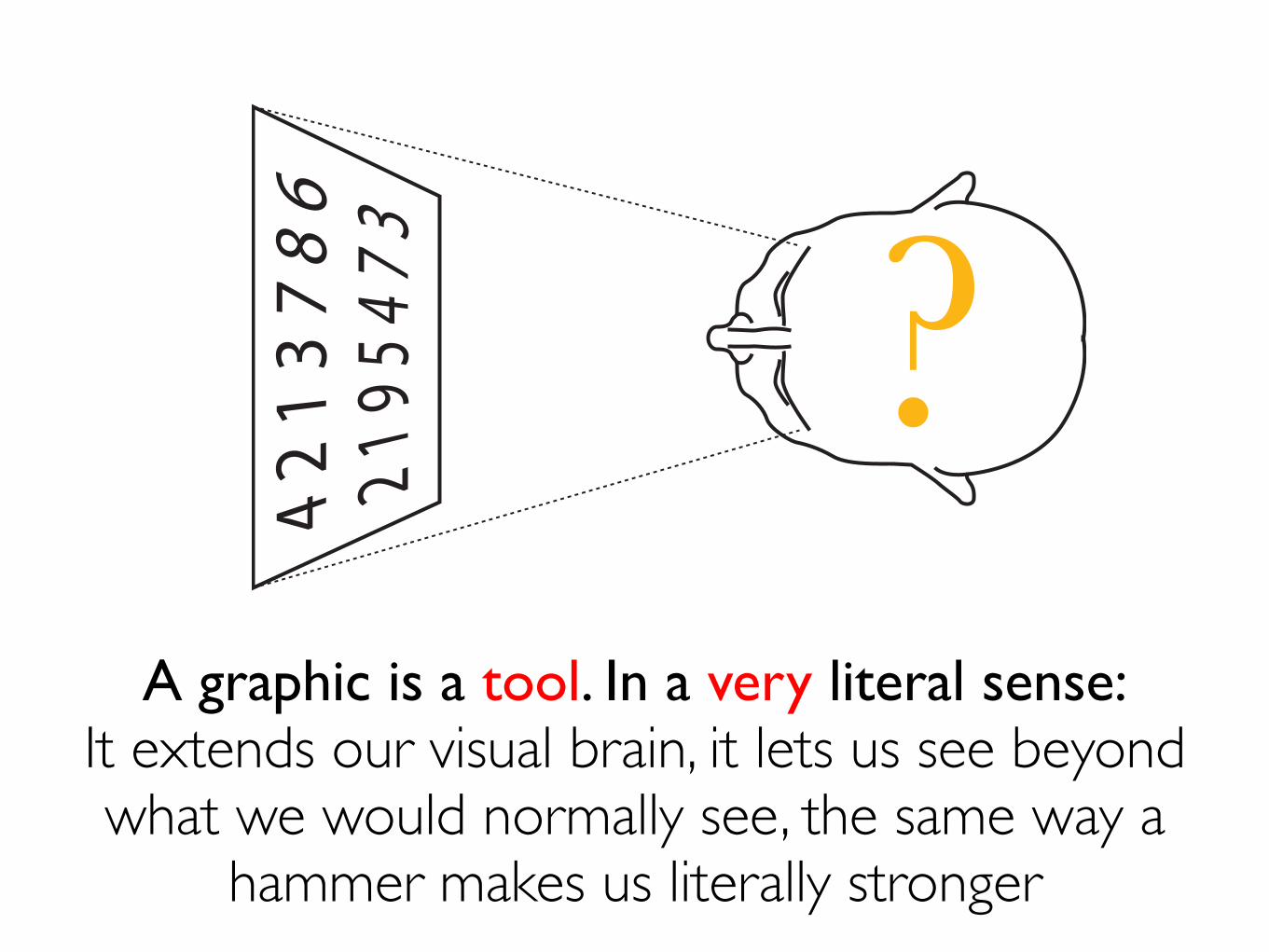
A graphic is a tool. In a very literal sense:It extends our visual brain, it lets us see beyond what we would normally see, the same way a
hammer makes us literally stronger
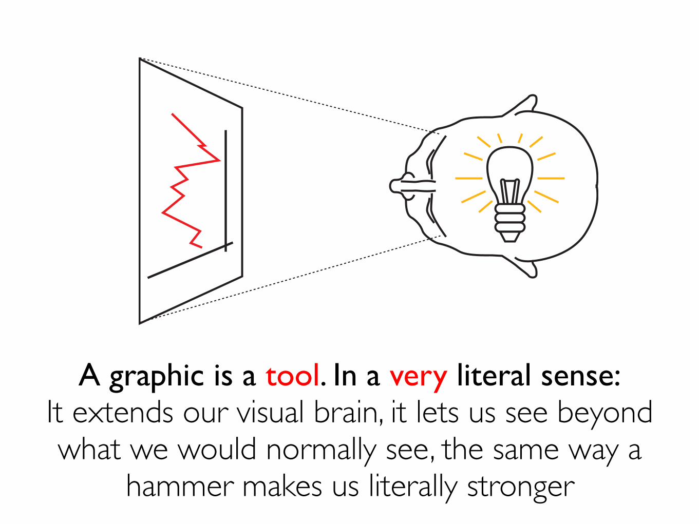
A graphic is a tool. In a very literal sense:It extends our visual brain, it lets us see beyond what we would normally see, the same way a
hammer makes us literally stronger
Before you even switch the computer on, ask yourself what are the questions that readers most likely will want to have answered. Or what tasks your graphic should help readers with
Choose graphic forms accordingly
Function doesn’t dictate form, but function does restrict the variety of forms it is acceptable to use for each story and set of data(choosing forms is not a matter of personal taste only)
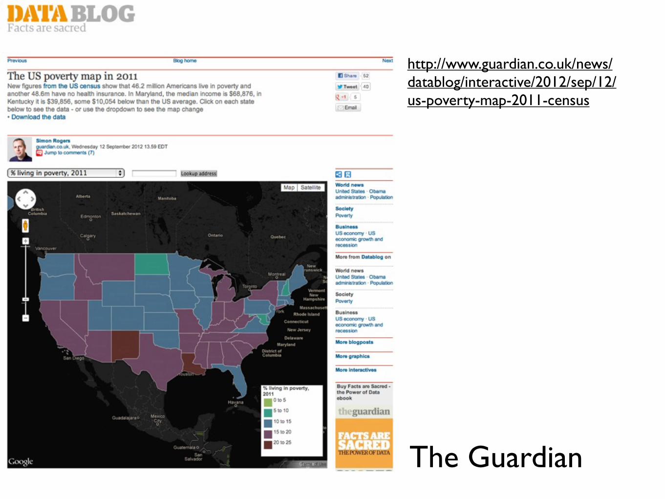
http://www.guardian.co.uk/news/datablog/interactive/2012/sep/12/us-poverty-map-2011-census
The Guardian
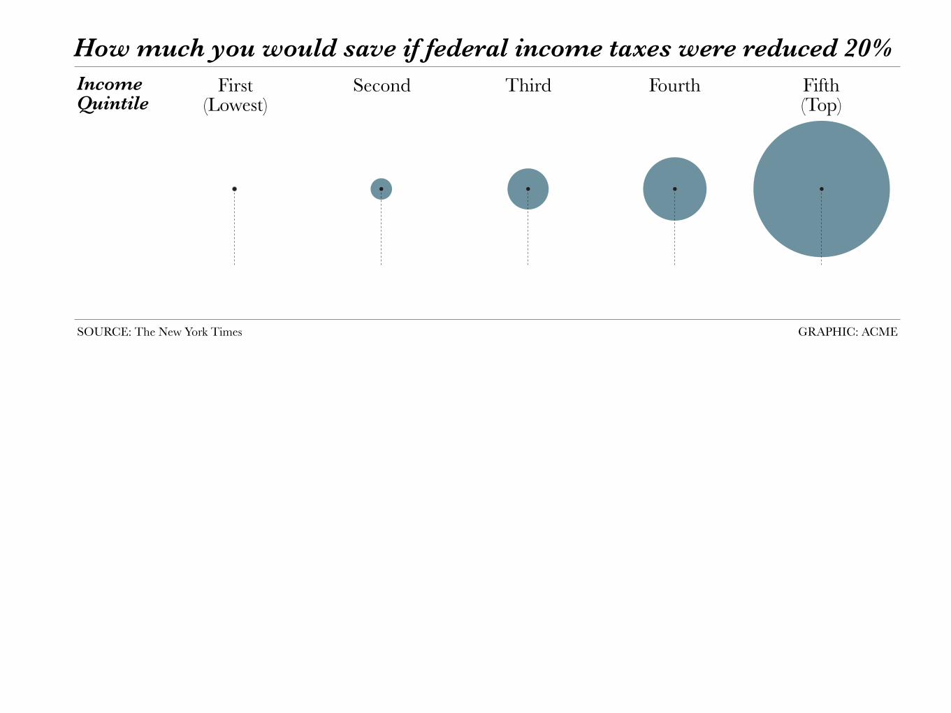
How much you would save if federal income taxes were reduced 20%
Average
tax change
Income
Quintile
First(Lowest)
SOURCE: The New York Times GRAPHIC: ACME
Second Third Fourth Fifth(Top)
-$10 -$192 -$706 -$1,679 -$7,762
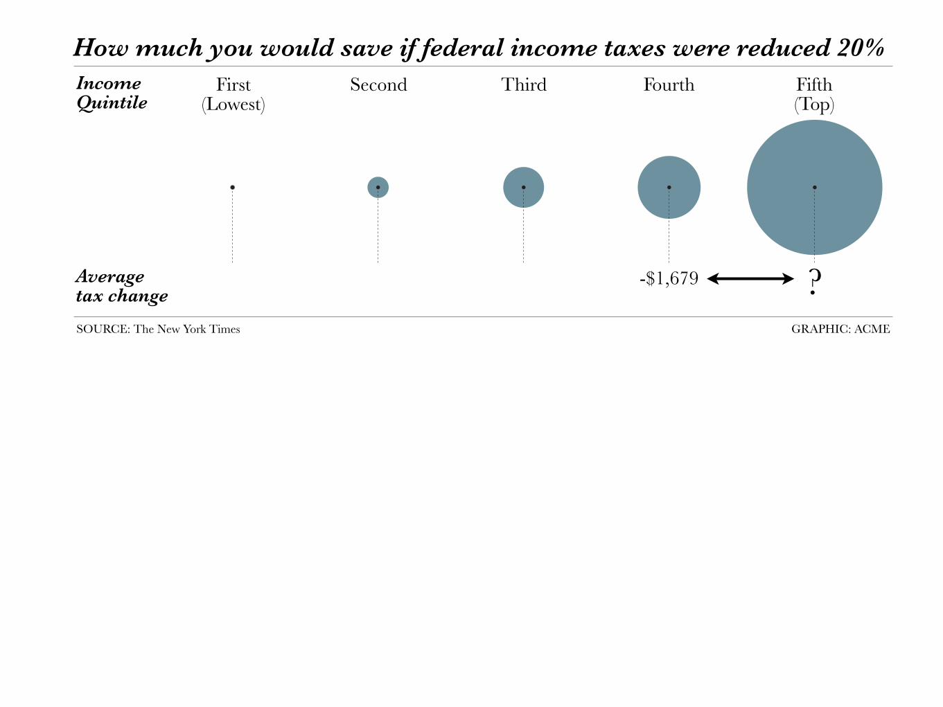
How much you would save if federal income taxes were reduced 20%
Average
tax change
Income
Quintile
First(Lowest)
SOURCE: The New York Times GRAPHIC: ACME
Second Third Fourth Fifth(Top)
-$10 -$192 -$706 -$1,679 -$7,762?
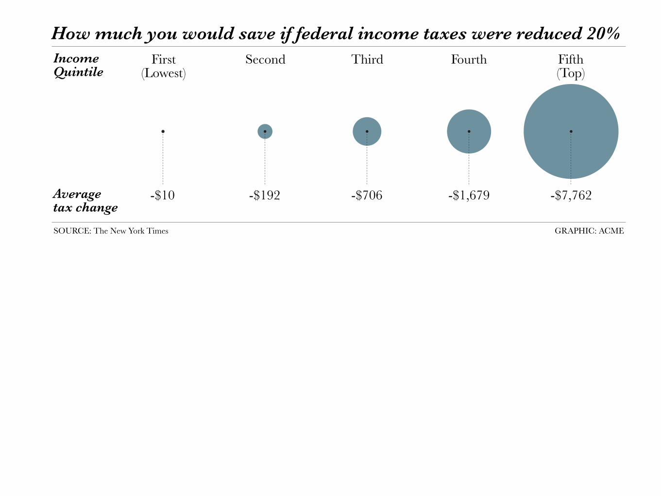
How much you would save if federal income taxes were reduced 20%
Average
tax change
Income
Quintile
First(Lowest)
SOURCE: The New York Times GRAPHIC: ACME
Second Third Fourth Fifth(Top)
-$10 -$192 -$706 -$1,679 -$7,762
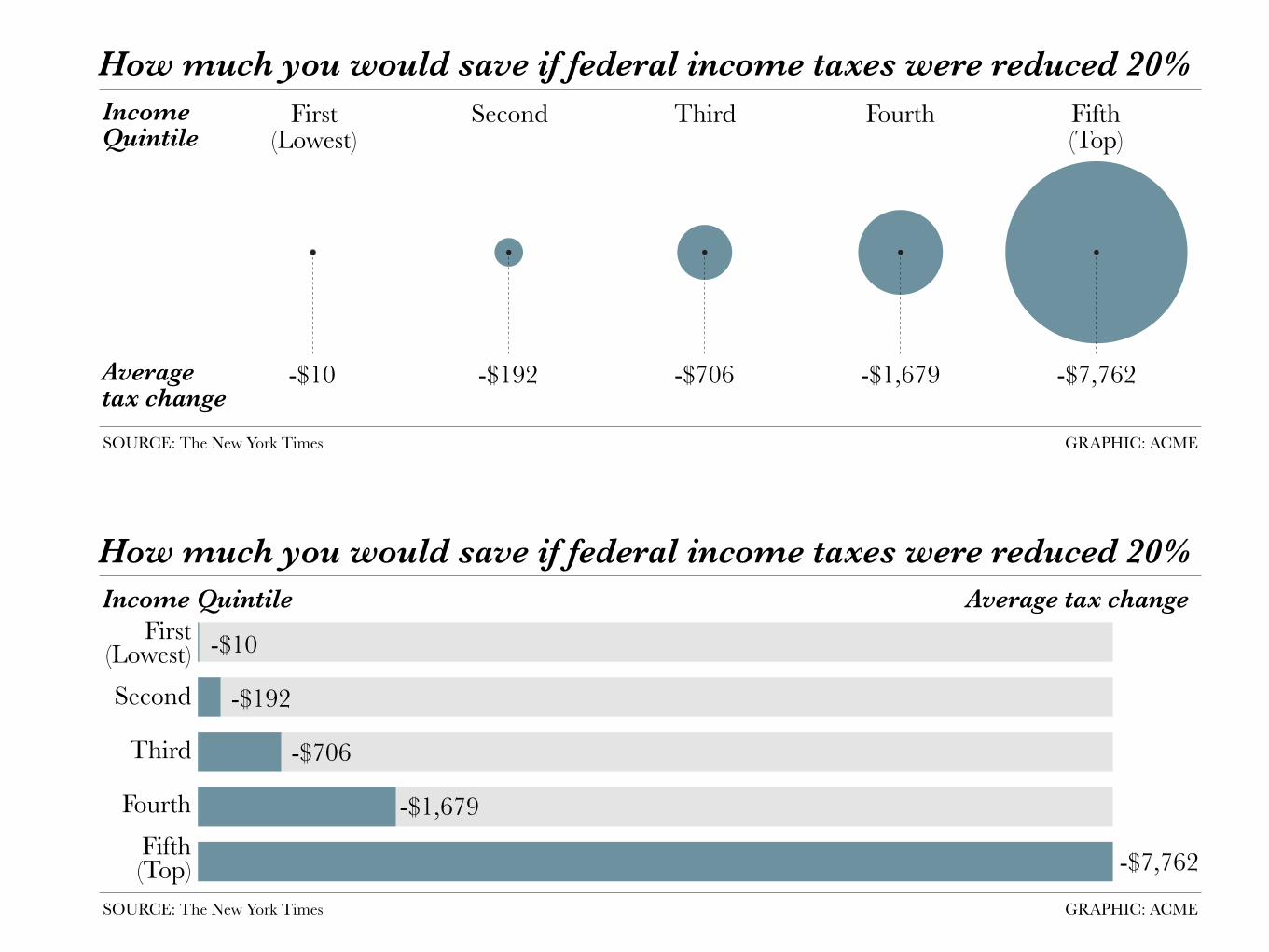
How much you would save if federal income taxes were reduced 20%
Average
tax change
Income
Quintile
First(Lowest)
SOURCE: The New York Times GRAPHIC: ACME
Second Third Fourth Fifth(Top)
-$10 -$192 -$706 -$1,679 -$7,762
-$10
-$192
-$706
-$1,679
-$7,762
How much you would save if federal income taxes were reduced 20%
Average tax changeIncome Quintile
First(Lowest)
SOURCE: The New York Times GRAPHIC: ACME
Second
Third
Fourth
Fifth(Top)
Infographics should not be used to simplify stories, but to clarify them
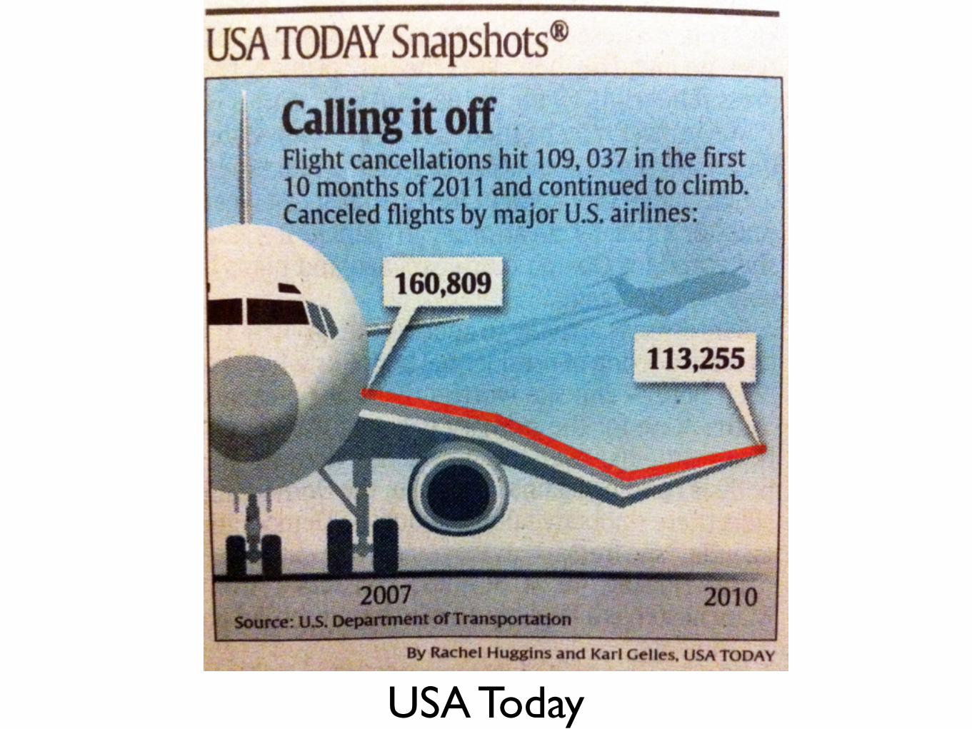
USA Today
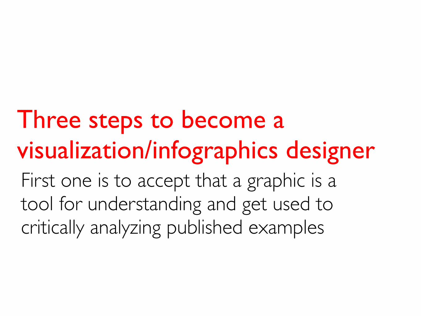
First one is to accept that a graphic is a tool for understanding and get used to critically analyzing published examples
Three steps to become a visualization/infographics designer
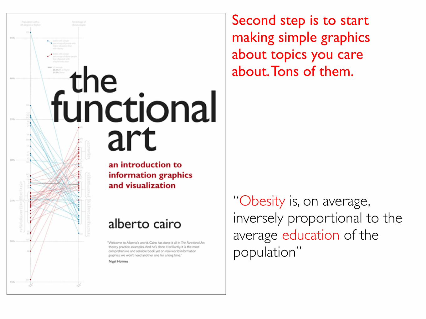
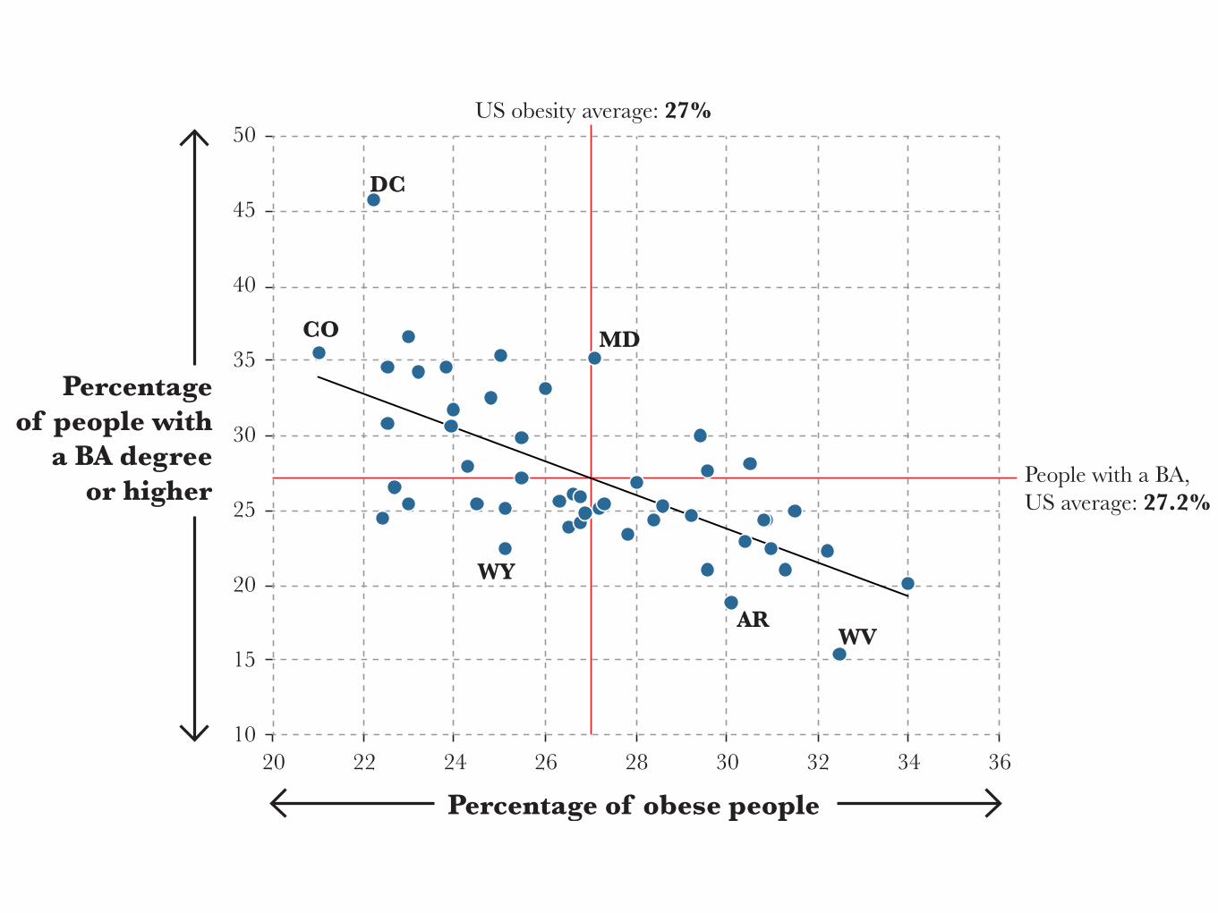
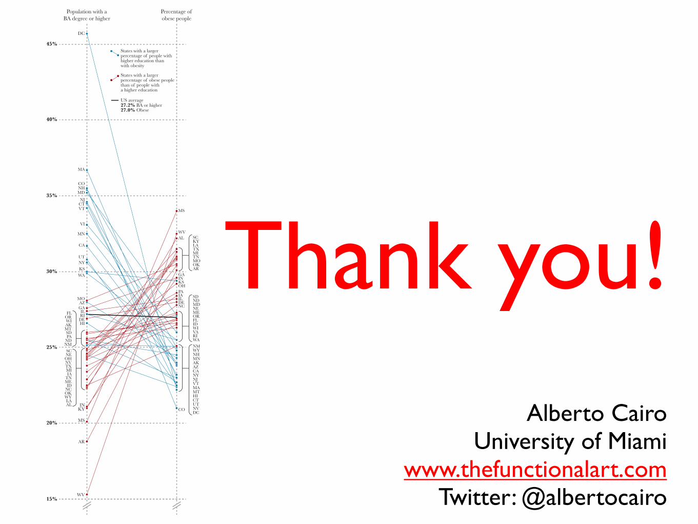
“Obesity is, on average, inversely proportional to the average education of the population”
Second step is to start making simple graphics about topics you care about. Tons of them.
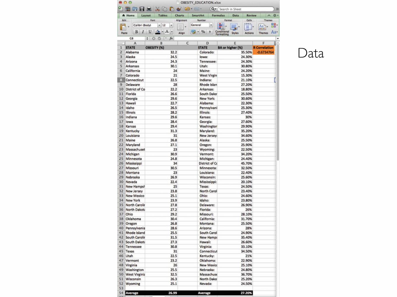
Data
Percentage with aBA degree or higher
Percentage ofobese people
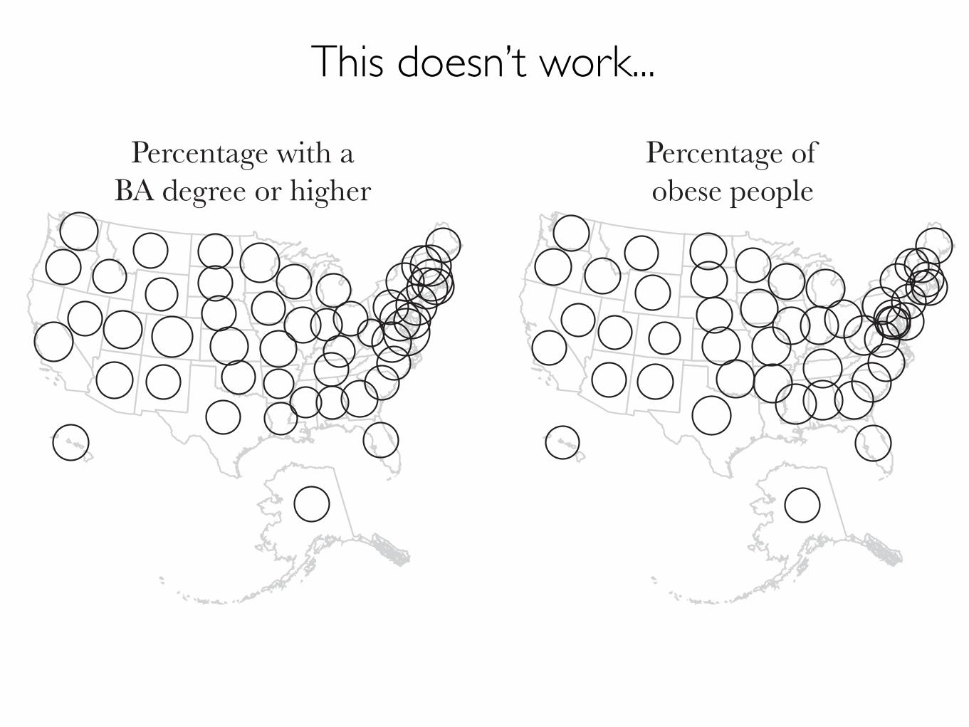
This doesn’t work...
Percentage with a
BA degree or higher
Percentage of
obese people
Lower Higher Lower Higher
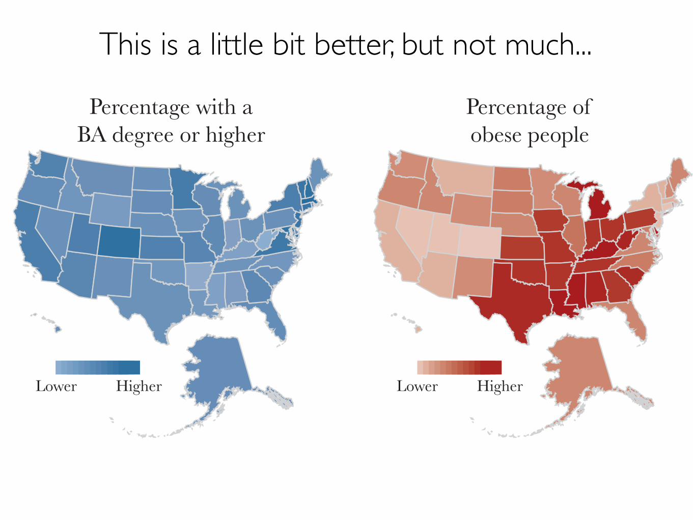
This is a little bit better, but not much...
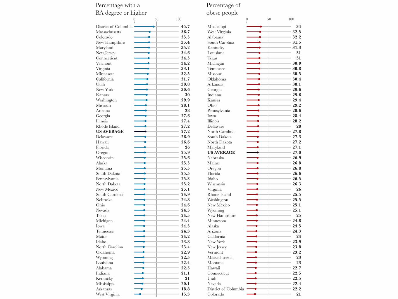
District of Columbia Massachusetts Colorado New Hampshire Maryland New Jersey Connecticut Vermont Virginia Minnesota California Utah New York Kansas Washington Missouri Arizona Georgia Illinois Rhode Island US AVERAGE Delaware Hawaii Florida Oregon Wisconsin Alaska Montana South Dakota Pennsylvania North Dakota New Mexico South Carolina Nebraska Ohio Nevada Texas Michigan Iowa Tennessee Maine Idaho North Carolina Oklahoma Wyoming Louisiana Alabama Indiana Kentucky Mississippi Arkansas West Virginia
45.736.735.535.435.234.634.534.233.132.531.730.830.630
29.928.128
27.627.427.227.226.926.626
25.925.625.525.525.525.325.225.124.924.824.624.524.524.424.324.324.223.823.422.922.522.422.321.121
20.118.815.3
Percentage with aBA degree or higher
Percentage ofobese people
MississippiWest VirginiaAlabamaSouth CarolinaKentuckyLouisianaTexasMichiganTennesseeMissouriOklahomaArkansasGeorgiaIndianaKansasOhioPennsylvaniaIowaIllinoisDelawareNorth CarolinaSouth DakotaNorth DakotaMarylandUS AVERAGENebraskaMaineOregonFloridaIdahoWisconsinVirginiaRhode IslandWashingtonNew MexicoWyomingNew HampshireMinnesotaAlaskaArizonaCaliforniaNew YorkNew JerseyVermontMassachusettsMontanaHawaiiConnecticutUtahNevadaDistrict of ColumbiaColorado
3432.532.231.531.33131
30.930.830.530.430.129.629.629.429.228.628.428.228
27.827.327.227.127.026.926.826.826.626.526.326
25.525.525.125.125
24.824.524.324
23.923.823.22323
22.722.522.522.422.221
0 50 100 0 50 100
2010
15
20
25
30
35
40
45
50
22 24 26 28 30 32 34 36
Percentage
of people with
a BA degree
or higher
Percentage of obese people
US obesity average: 27%
People with a BA,US average: 27.2%
DC
WV
COMD
WY
AR
40%
45%
35%
30%
25%
20%
15%
DC
MA
CO
MS
WV
NHMD
NJCTVT
VI
MN
CA
UTNYKSWA
MOAZGAILRI
DEHI
INKY
MS
AR
WV
AKWIORFL
MTSDPA
NDNMSCNEOHNVTXMIIA
TNMEID
NCOKWYLAAL
NC
SDDE ND
MDNEMEORFLIDWIVA
WYNH
WARI
NM
MNAKAZCANYNJVTMAMTHICTUTNVDC
CO
SCKYLATXMITNMOOKAR
GAINKSOHPAIAIL
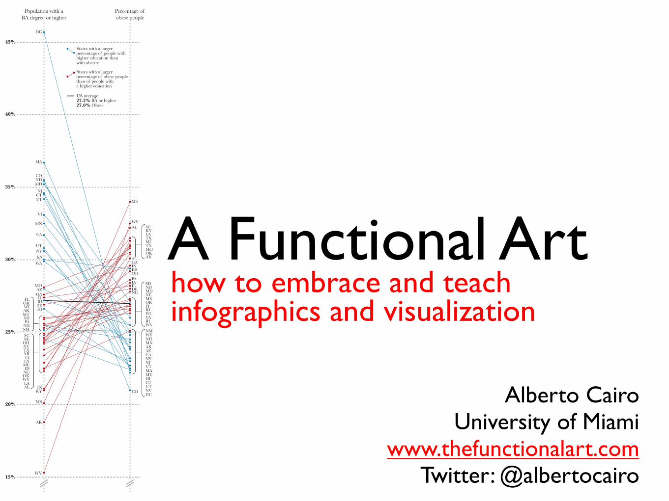
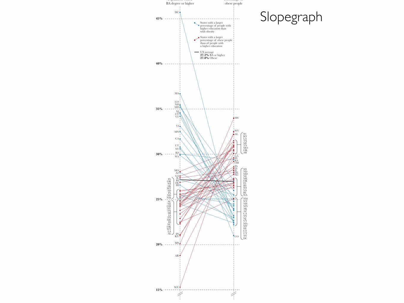
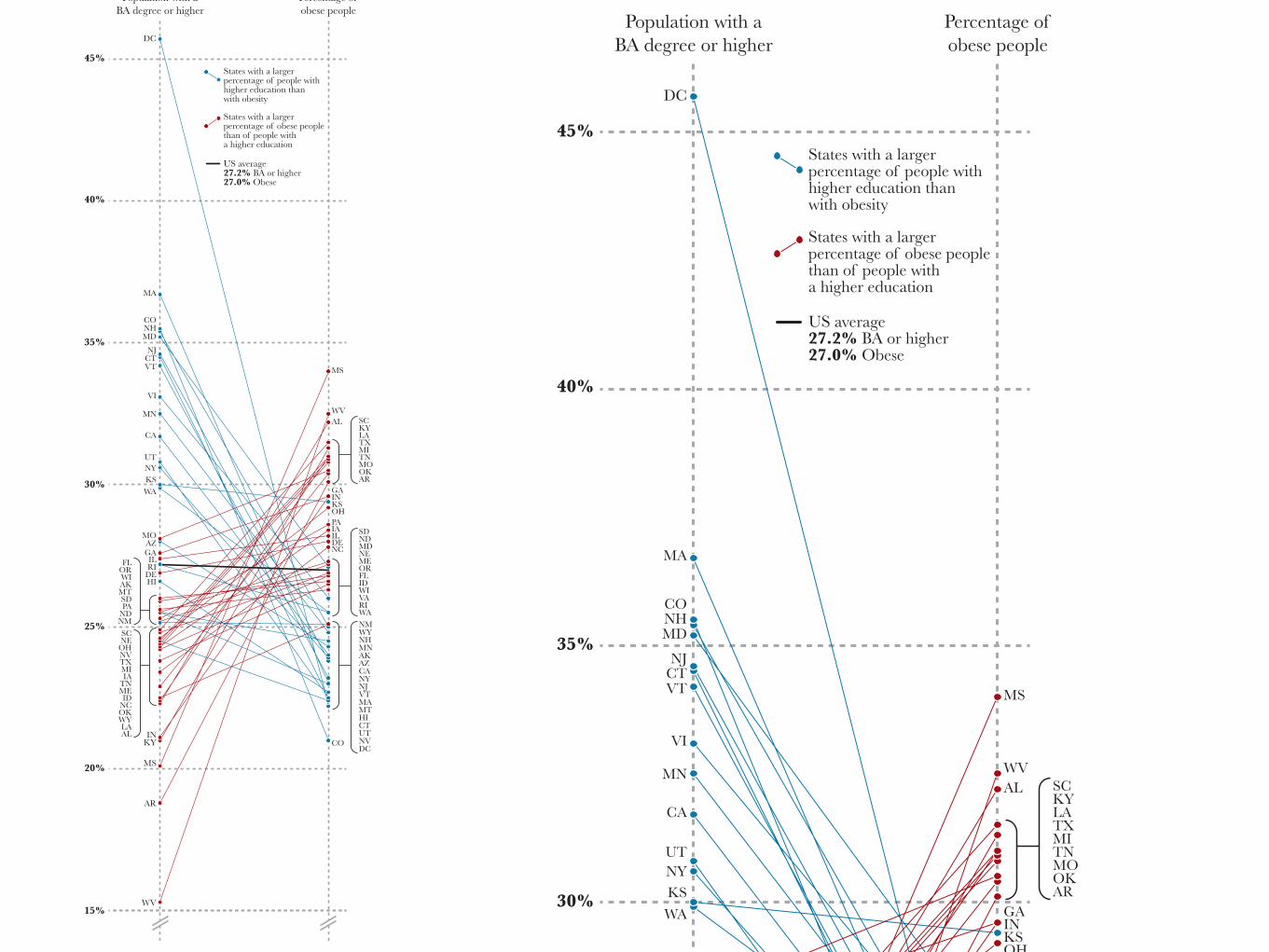
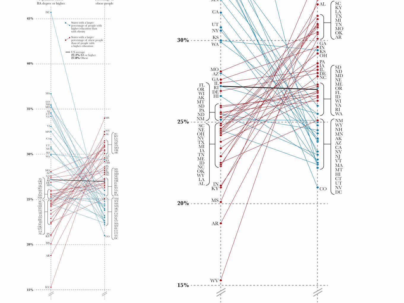
Population with aBA degree or higher
Percentage ofobese people
AL
States with a largerpercentage of people withhigher education thanwith obesity
States with a largerpercentage of obese peoplethan of people witha higher education
US average27.2% BA or higher27.0% Obese
Slopegraph
40%
45%
35%
30%
25%
20%
15%
DC
MA
CO
MS
WV
NHMD
NJCTVT
VI
MN
CA
UTNYKSWA
MOAZGAILRI
DEHI
INKY
MS
AR
WV
AKWI
ORFL
MTSDPA
NDNMSCNEOHNVTXMIIA
TNMEID
NCOKWYLAAL
NC
SDDE ND
MDNEMEORFLIDWIVA
WYNH
WARI
NM
MNAKAZCANYNJVTMAMTHICTUTNVDC
CO
SCKYLATXMITNMOOKAR
GAINKSOHPAIAIL
Population with aBA degree or higher
Percentage ofobese people
AL
States with a largerpercentage of people withhigher education thanwith obesity
States with a largerpercentage of obese peoplethan of people witha higher education
US average27.2% BA or higher27.0% Obese
40%
45%
35%
30%
25%
20%
15%
DC
MA
CO
MS
WV
NHMD
NJCTVT
VI
MN
CA
UTNYKSWA
MOAZGAILRI
DEHI
INKY
MS
AR
WV
AKWIORFL
MTSDPA
NDNMSCNEOHNVTXMIIA
TNMEID
NCOKWYLAAL
NC
SDDE ND
MDNEMEORFLIDWIVA
WYNH
WARI
NM
MNAKAZCANYNJVTMAMTHICTUTNVDC
CO
SCKYLATXMITNMOOKAR
GAINKSOHPAIAIL
Population with aBA degree or higher
Percentage ofobese people
AL
States with a largerpercentage of people withhigher education thanwith obesity
States with a largerpercentage of obese peoplethan of people witha higher education
US average27.2% BA or higher27.0% Obese
40%
45%
35%
30%
25%
20%
15%
DC
MA
CO
MS
WV
NHMD
NJCTVT
VI
MN
CA
UTNYKSWA
MOAZGAILRI
DEHI
INKY
MS
AR
WV
AKWI
ORFL
MTSDPA
NDNMSCNEOHNVTXMIIA
TNMEID
NCOKWYLAAL
NC
SDDE ND
MDNEMEORFLIDWIVA
WYNH
WARI
NM
MNAKAZCANYNJVTMAMTHICTUTNVDC
CO
SCKYLATXMITNMOOKAR
GAINKSOHPAIAIL
Population with aBA degree or higher
Percentage ofobese people
AL
States with a largerpercentage of people withhigher education thanwith obesity
States with a largerpercentage of obese peoplethan of people witha higher education
US average27.2% BA or higher27.0% Obese
40%
45%
35%
30%
25%
20%
15%
DC
MA
CO
MS
WV
NHMD
NJCTVT
VI
MN
CA
UTNYKSWA
MOAZGAILRI
DEHI
INKY
MS
AR
WV
AKWIORFL
MTSDPA
NDNMSCNEOHNVTXMIIA
TNMEID
NCOKWYLAAL
NC
SDDE ND
MDNEMEORFLIDWIVA
WYNH
WARI
NM
MNAKAZCANYNJVTMAMTHICTUTNVDC
CO
SCKYLATXMITNMOOKAR
GAINKSOHPAIAIL
Population with aBA degree or higher
Percentage ofobese people
AL
States with a largerpercentage of people withhigher education thanwith obesity
States with a largerpercentage of obese peoplethan of people witha higher education
US average27.2% BA or higher27.0% Obese
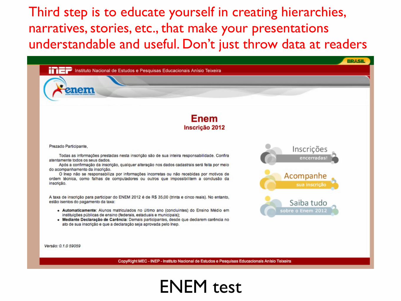
ENEM test
Third step is to educate yourself in creating hierarchies, narratives, stories, etc., that make your presentations understandable and useful. Don’t just throw data at readers
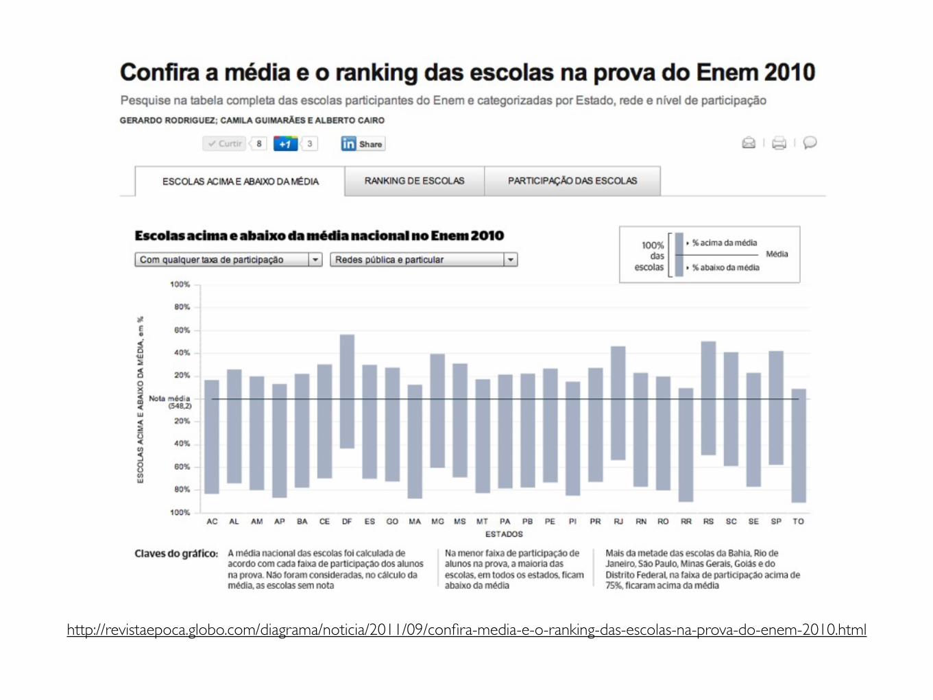
http://revistaepoca.globo.com/diagrama/noticia/2011/09/confira-media-e-o-ranking-das-escolas-na-prova-do-enem-2010.html
Show me what I’d not be able to see otherwise
Thank you!Alberto Cairo
University of Miamiwww.thefunctionalart.com
Twitter: @albertocairo
40%
45%
35%
30%
25%
20%
15%
DC
MA
CO
MS
WV
NHMD
NJCTVT
VI
MN
CA
UTNYKSWA
MOAZGAILRI
DEHI
INKY
MS
AR
WV
AKWIORFL
MTSDPA
NDNMSCNEOHNVTXMIIA
TNMEID
NCOKWYLAAL
NC
SDDE ND
MDNEMEORFLIDWIVA
WYNH
WARI
NM
MNAKAZCANYNJVTMAMTHICTUTNVDC
CO
SCKYLATXMITNMOOKAR
GAINKSOHPAIAIL
Population with aBA degree or higher
Percentage ofobese people
AL
States with a largerpercentage of people withhigher education thanwith obesity
States with a largerpercentage of obese peoplethan of people witha higher education
US average27.2% BA or higher27.0% Obese