the extron guide to graphical user interface...
TRANSCRIPT

68-1930-01 Rev. B06 11
The Extron Guide toGraphical User Interface Design
Standards Guide

Copyright© 2011 Extron Electronics. All rights reserved.
TrademarksAll trademarks mentioned in this guide are the properties of their respective owners.
Contents
Introduction ......................................................... 1
Layout Principles ............................................... 3
Consistency ....................................................... 3Affordance ........................................................ 3False Affordance .............................................. 4Information Mapping ...................................... 5Extron Standard Control Locations ................. 6
Static Areas ................................................... 7Dynamic Areas .............................................. 8Side Buttons .................................................. 9
Navigation Principles ..................................... 10Clear Entry Points ....................................... 10Global Navigation ...................................... 10
Aesthetics and Functionality ......................... 12Color Considerations ...................................... 13
Color Basics ................................................. 13RGB Color Wheel ........................................ 14Primary Colors ............................................ 14Secondary Colors ........................................ 14Tertiary Colors............................................. 15Complementary Colors .............................. 15Analogous Colors ....................................... 15Split Complementary Colors ...................... 16Warm Colors ............................................... 16Cool Colors .................................................. 16Hue, Saturation, and Brightness ............... 17Transparency ............................................... 18Hexadecimal Codes .................................... 19Choosing a Color Palette ........................... 20Monochrome Testing ................................. 22
Design Fundamentals .................................... 23
Human Factors and Ergonomics .................... 23Balancing Form and Function .................... 23
Building Blocks ............................................... 23Buttons............................................................ 24
Button Affordance ..................................... 24Button Aspect Ratio ................................... 25Button Size ................................................. 26Button Spacing ........................................... 27Button Labeling .......................................... 28Button Icons and Logos ............................. 28Button Orientation .................................... 29
Button Chunking ........................................ 30Button Keypads .......................................... 31
Text and Labels ............................................... 32Text Window Affordance ........................... 32Uppercase and Lowercase Text.................. 33Action Text .................................................. 33Text and Label Sizes ................................... 34Text Spacing ................................................ 34Redundant Text Elimination ...................... 35
Fonts................................................................ 36Serif and Sans Serif Fonts ........................... 36Font Size ..................................................... 36Font Style and Effects................................. 37Symbol Fonts .............................................. 38
Shapes ............................................................. 39Pages ............................................................... 40
Main Pages ................................................. 40Pop-up Pages .............................................. 40Modal Pop-up Page .................................... 41
Backgrounds ................................................... 42Images ............................................................. 43
Layout Standards ............................................. 45
Device Control Standards .............................. 45Layouts for Environmental Controls ......... 45Device Control Layouts for Limited Spaces 46Device Control Layouts for Large Spaces .. 46Keypad Layouts .......................................... 48
Conclusions ........................................................ 49
Resources ............................................................ 51
Books............................................................... 51Color Palette Resources ................................. 51Theory ............................................................. 51Extron Resources ............................................ 51
TouchLink™ Control Systems ...................... 51TouchLink Design Themes ......................... 52Reference Guide to Design Themes .......... 52Software Roadmap .................................... 52Training Web Site ....................................... 52Extron S3 Control Systems Support Hotline 52
Checklist for a Better Graphical User Interface Design ............................................ 54
The Extron Guide to Graphical User Interface Design • Contents iii

The Extron Guide to Graphical User Interface Design • Contentsiv
The Extron Guide to Graphical User Interface Design • Introduction 1
Introduction
The control system touchpanel interface is perhaps the most highly visible component of an installed A/V system, and may be the only A/V hardware with which a user has direct interaction. The quality of the entire A/V system is often judged by the experience the user has with the touchpanel.
Quality user interfaces balance style and function, with the emphasis on function, though aesthetics are important. A layout that is familiar and pleasing to the eye is more likely to be used. An interface must meet the needs of the user and function the way they expect. Operating a poorly or overly designed interface can be intimidating and overwhelming, so eliminating confusion is the key element to a successful design.
With limitless color options, graphics, and logos available to the designer, a touchpanel interface can be infinitely customized. The challenge for the designer is not to be overly creative, but to design a professional looking interface that is easy to navigate. Fortunately, there are a number of concepts that allow designers to make educated choices when creating an interface that is both functional and attractive.
This guide defines and explains those fundamental concepts within the context of A/V control systems. The aim is to enable touchpanel layout designers to choose with confidence the right tools and methods necessary to create an intuitive interface that gives the user a positive experience.
The Extron Guide to Graphical User Interface Design contains three main chapters:
Layout Principles
This chapter teaches the theories of consistency, navigation, screen layout, affordance, and color selection. A solid understanding of these theoretical building blocks is essential for touchpanel interface designers.
Design Fundamentals
This chapter teaches the designer how to apply the layout principles when creating different aspects of user interfaces, such as pages, buttons, text, fonts and images.
Layout Standards
This chapter shows the Extron standards for design consistency. The theory behind this chapter is to create a baseline for consistent layouts to be used when designing interfaces for environmental controls and other common A/V devices.
NOTE: This document relies heavily on the use of color images to emphasize its content. To see the colors and the touchpanel details as they were originally intended, it is strongly recommended that you view and use this document on-screen in its PDF format. A printed copy cannot reproduce colors and image details exactly as they appear on the screen.

The Extron Guide to Graphical User Interface Design • Introduction2

The Extron Guide to Graphical User Interface Design • Layout Principles 3
Layout Principles
ConsistencyOne of the most important design rules is consistency, and it is the rule most often broken. Extron stresses the importance of consistency throughout the user interface design. Consistency in colors, shapes, sizes, fonts, labels, and locations must be maintained in all aspects of the layout in every project. An interface designer should provide the same look and feel for every layout in a group of systems. This provides familiarity across all the rooms and minimizes the learning curve required to operate a system.
For example, at a single facility there may be a need for an A/V system in several training rooms, boardrooms, videoconferencing rooms, and conference rooms. Meeting the criteria for each of these rooms requires a uniquely-designed A/V system and user interface. Yet it is possible to have a consistent appearance and layout for all the user interfaces within the facility.
To this end, the designer must make the layout on all touchpanels consistent page to page and interface to interface. For example, a DVD player and a Blu-ray player have similar controls, so the common controls should be arranged similarly for both players. Furthermore, no matter where the user travels in the facility, the DVD and Blu-ray control pages are familiar if they have the exact same appearance and layout.
AffordanceAffordance is the quality of an object that provides a user with the visual cue to perform an action. The user should naturally perceive how to interact with touchpanel objects and quickly determine:zz What can be pressedzz What areas need inputzz What areas provide feedback
A common mistake is to create an interface that mimics web page design. On web pages it is obvious that certain words or graphics can be clicked. As the mouse pointer rolls or hovers over the word or graphic, the appearance of both the graphic and the mouse pointer changes (see figure 1). Touchpanel interfaces do not have this hover function, so objects that are intended to be pressed should look like they can be.
Figure 1. Pointer changes when rolled over a Web page word or graphic.

The Extron Guide to Graphical User Interface Design • Layout Principles4
Icons should be used in the layout design, but NOT as buttons. The visual characteristics of an icon are not naturally perceived as though they can be pressed. Placing an icon on a button gives the user confidence that the object can be pressed.
Figure 2. An icon, by itself, is not a button.
Figure 3. An icon on a button looks like it can be pressed.
False AffordanceFalse affordance is just the opposite of affordance. False affordance is when the visual characteristics of an object intuitively imply the wrong functionality and use. An example of this is when a designer uses characteristics to make a button look like it can be pressed and then applies same characteristics to a header or a text window. If an object is not intended to be pressed, never make it look like a button (see page 24, “Button Affordance”).
Figure 4. Do not make a label look like a button.
Figure 5. Make a label look distinct from a button, as in this example.
The Extron Guide to Graphical User Interface Design • Layout Principles 5
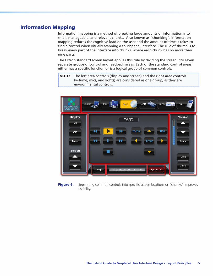
Information MappingInformation mapping is a method of breaking large amounts of information into small, manageable, and relevant chunks. Also known as “chunking”, information mapping reduces the cognitive load on the user and the amount of time it takes to find a control when visually scanning a touchpanel interface. The rule of thumb is to break every part of the interface into chunks, where each chunk has no more than nine parts.
The Extron standard screen layout applies this rule by dividing the screen into seven separate groups of control and feedback areas. Each of the standard control areas either has a specific function or is a logical group of common controls.
NOTE: The left area controls (display and screen) and the right area controls (volume, mics, and lights) are considered as one group, as they are environmental controls.
Figure 6. Separating common controls into specific screen locations or “chunks” improves usability.

The Extron Guide to Graphical User Interface Design • Layout Principles6
Extron Standard Control LocationsTouchpanel user interfaces must be designed using consistent, logical, and predictable layouts. Extron has created a standard screen layout that divides the touchpanel into seven logical and easily understood sections that consist of feedback areas and groups of controls. The philosophy behind this standard layout is to create an interface that someone can quickly become familiar with and feel comfortable using. The seven sections comprise of two basic area types: static areas (6) and dynamic areas (1).
NOTE: The left bar and right bar areas are considered as one, as they both contain the environmental controls.
Figure 7. The Extron standard screen layout has static and dynamic areas in set locations.

The Extron Guide to Graphical User Interface Design • Layout Principles 7
Static AreasStatic areas of a user interface have pre-assigned conditions that do not change during the navigation of the interface or the execution of an action. These static areas include A/V source selection, environmental control, and specific status messages. Those particular elements are the most likely to remain present and visible, never changing in appearance or location.
A consistent approach in a static area enables a user to always know exactly where an environmental control or an A/V source is on every touchpanel page. Reassurance is found in knowing that the type of controls found in the static areas do not move or disappear during operation. Moving common controls, such as volume, to a different location on the screen or removing it altogether may lead to confusion.
The following illustration and table show the Extron standards for the chunking and placement of static areas.
Figure 8. Extron standards for static areas: the area surrounding the dynamic area is divided into six distinct areas, each with a unique function.
Location Purpose Description
a Top left corner
Logo Location of the company or organization logo
b Top right side
A/V source selection
Location of A/V sources, such as DVD, PC, VCR, document camera, laptop, Blu-ray, or auxiliary input
c Left and Right sides
Environmental controls
Location of environmental controls, such as the display power, screen control, volume control, and lighting control
d Footer Status Location of status information, such as date, time, and location
e Bottom right System off Location of the System Off button
f Bottom left Help Location of the Help button
The Extron Guide to Graphical User Interface Design • Layout Principles8
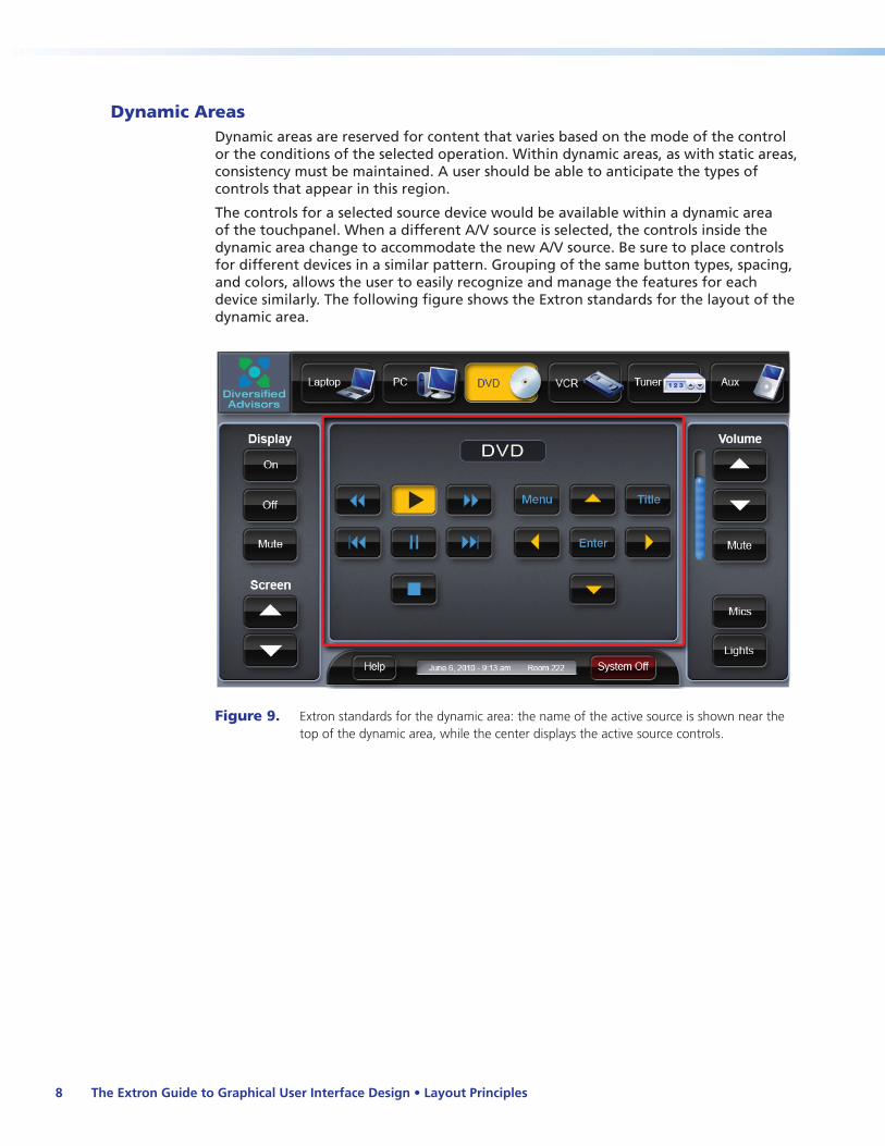
Dynamic AreasDynamic areas are reserved for content that varies based on the mode of the control or the conditions of the selected operation. Within dynamic areas, as with static areas, consistency must be maintained. A user should be able to anticipate the types of controls that appear in this region.
The controls for a selected source device would be available within a dynamic area of the touchpanel. When a different A/V source is selected, the controls inside the dynamic area change to accommodate the new A/V source. Be sure to place controls for different devices in a similar pattern. Grouping of the same button types, spacing, and colors, allows the user to easily recognize and manage the features for each device similarly. The following figure shows the Extron standards for the layout of the dynamic area.
Figure 9. Extron standards for the dynamic area: the name of the active source is shown near the top of the dynamic area, while the center displays the active source controls.

The Extron Guide to Graphical User Interface Design • Layout Principles 9
Side ButtonsOn smaller devices where touchscreen spacing is limited, external buttons should be used to relocate some of the functions normally placed on the touchscreen. Moving common controls from the static area of the touchscreen to a static, external button arrangement increases the dynamic area available on the touchscreen.
For instance, the Extron TLP 700MV has ten backlit side buttons adjacent to the touchscreen surface. Extron chose to allocate specific common static functions to the physical side buttons, where they are grouped for easy access. Controls for lighting, screen position, and muting were appropriate functions to relocate since they do not disrupt navigation.
.
Figure 10. Static controls can be assigned to side buttons to give more screen area to dynamic controls.
The Extron Guide to Graphical User Interface Design • Layout Principles10
Navigation PrinciplesA well designed interface is one that allows a user to recognize the context of available controls at a glance. It should be inviting and instill a high level of confidence in the system. The user should never have to press more than 3 buttons to perform a desired function. With this in mind, an interface designer must understand the navigation principles and apply them appropriately.
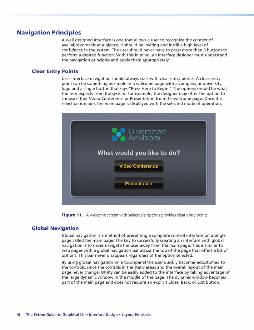
Clear Entry PointsUser interface navigation should always start with clear entry points. A clear entry point can be something as simple as a welcome page with a company or university logo and a single button that says “Press Here to Begin.” The options should be what the user expects from the system. For example, the designer may offer the option to choose either Video Conference or Presentation from the welcome page. Once the selection is made, the main page is displayed with the selected mode of operation.
Figure 11. A welcome screen with selectable options provides clear entry points.
Global NavigationGlobal navigation is a method of presenting a complete control interface on a single page called the main page. The key to successfully creating an interface with global navigation is to never navigate the user away from the main page. This is similar to web pages with a global navigation bar across the top of the page that offers a list of options. This bar never disappears regardless of the option selected.
By using global navigation on a touchpanel the user quickly becomes accustomed to the controls, since the controls in the static areas and the overall layout of the main page never change. Utility can be easily added to the interface by taking advantage of the large dynamic window in the middle of the page. The dynamic window becomes part of the main page and does not require an explicit Close, Back, or Exit button.

The Extron Guide to Graphical User Interface Design • Layout Principles 11
With global navigation, there is no complex navigation tree or hierarchy that the user needs to learn. The overall navigation approach is very flat, allowing all functions or controls to be no more than 2 or 3 presses away.
Figure 12. The dynamic area changes, but the user is never navigated away from the main page.

The Extron Guide to Graphical User Interface Design • Layout Principles12
Aesthetics and FunctionalityAn A/V system is only effective if the touchpanel interface is inviting and encourages the user to interact with it. An attractive and aesthetically pleasing layout is more likely to be used. The successful touchpanel’s appearance and usability are products of the intelligent use of colors, shapes, and space, all working together.
There has to be some balance between style and function, and yet the interface must be attractive and inviting.
Figure 13. Overly stylish user interface
Figure 14. Functionally balanced user interface
The screen should have a clean appearance, with each section distinctly separated and controls clearly labeled. Source buttons should be distinguishable not only by location, but also by button shape, size, color, text, and icons. Additionally, a user should be able to quickly see the difference between labels and buttons.
Use visual cues to convey information. An icon near text reinforces the functionality of a button. In each TouchLink™ theme kit, Extron provides several buttons with icons (such as the DVD buttons shown here) and button labels for use in design layouts.
Figure 15. Examples of buttons with icons found in TouchLink theme kits.
Contextual icons help to locate the relevant button more quickly, especially when using a familiar image. Icons should be descriptive and follow the theme used in the rest of the design.

The Extron Guide to Graphical User Interface Design • Layout Principles 13
Color ConsiderationsSelecting a color scheme or color palette is a core part of creating an appealing touchpanel user interface. Some color combinations are aesthetically pleasing while others are distracting and complicate the user experience. Knowing how colors mix and their relationships helps the designer choose compatible colors for a user interface design.
Color Basics
Subtractive ColorSubtractive color starts with light (white). The primary subtractive colors are cyan, magenta, and yellow (CMY).
In documents, such as this one, color printing is done using a combination of cyan, magenta, and yellow. Using different amounts of these three inks with black produces a wide range of colors. This is referred to as the CMYK print process with the “K” representing black.
NOTE: Because subtractive color has different primary colors than additive, the images in this book are not exact representations of how these images appear on a screen.
Additive ColorBased on light, additive color starts with black, or the absence of light, such as the black screen on monitors or touchpanels. As dispersed wavelengths of light are added to the black, a wide range of colors is created.
Sunlight is pure light that travels in many wavelengths. When this light is dispersed, as through a prism, the wavelengths form the complete spectrum. The wavelengths of these range from 400 nanometers for violet through 700 nanometers for red.
Figure 16. The dispersal of white light by a prism forms colors in a specific order: a spectrum.
The primary additive colors are red, green, and blue (RGB). These are the foundation for all the colors in the additive color spectrum.
Subtractive color is used primarily in printing, while additive color is used in display technology.
The Extron Guide to Graphical User Interface Design • Layout Principles14
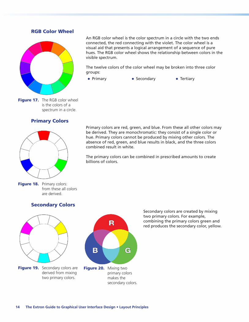
RGB Color Wheel
Figure 17. The RGB color wheel is the colors of a spectrum in a circle.
An RGB color wheel is the color spectrum in a circle with the two ends connected, the red connecting with the violet. The color wheel is a visual aid that presents a logical arrangement of a sequence of pure hues. The RGB color wheel shows the relationship between colors in the visible spectrum.
The twelve colors of the color wheel may be broken into three color groups:
zz Primary zz Secondary zz Tertiary
Primary Colors
Figure 18. Primary colors: from these all colors are derived.
Primary colors are red, green, and blue. From these all other colors may be derived. They are monochromatic: they consist of a single color or hue. Primary colors cannot be produced by mixing other colors. The absence of red, green, and blue results in black, and the three colors combined result in white.
The primary colors can be combined in prescribed amounts to create billions of colors.
Secondary Colors
Figure 19. Secondary colors are derived from mixing two primary colors.
Figure 20. Mixing two primary colors makes the secondary colors.
Secondary colors are created by mixing two primary colors. For example, combining the primary colors green and red produces the secondary color, yellow.

The Extron Guide to Graphical User Interface Design • Layout Principles 15
Tertiary Colors
Figure 21. Tertiary colors are derived from mixing two adjacent colors.
Tertiary colors complete the color wheel. A tertiary color is the resulting color formed when an equal amount of a primary and a secondary color are mixed. The primary and secondary color must be beside each other on the color wheel. For example, a mixture of 50-percent red (primary) and 50-percent yellow (secondary) would result in the tertiary color of orange. The newly formed tertiary color (orange) lies between the red and yellow on the color wheel.
Complementary Colors
Figure 22. Complementary colors are on exact opposite sides of the color wheel.
Complementary or contrasting colors are those on exactly opposite sides of the color wheel. Combining two complementary RGB colors creates white.
Selecting a contrasting color makes colors, such as yellow on a blue background, stand out more vibrantly. The opposite is true for text. Complementary colors do not work well with text.
Figure 23. Combining any two complementary colors creates white.
Analogous Colors
Figure 24. Analogous colors are next to each other on the color wheel.
Analogous colors are next to each other on the color wheel and are closely related. For example, the two analogous colors for light blue are cyan and blue.
Analogous colors contribute to a harmonious color scheme. Where these colors meet, they blend seamlessly.
The Extron Guide to Graphical User Interface Design • Layout Principles16
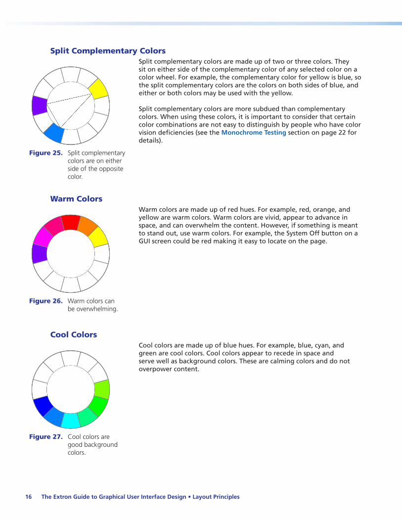
Split Complementary Colors
Figure 25. Split complementary colors are on either side of the opposite color.
Split complementary colors are made up of two or three colors. They sit on either side of the complementary color of any selected color on a color wheel. For example, the complementary color for yellow is blue, so the split complementary colors are the colors on both sides of blue, and either or both colors may be used with the yellow.
Split complementary colors are more subdued than complementary colors. When using these colors, it is important to consider that certain color combinations are not easy to distinguish by people who have color vision deficiencies (see the Monochrome Testing section on page 22 for details).
Warm Colors
Figure 26. Warm colors can be overwhelming.
Warm colors are made up of red hues. For example, red, orange, and yellow are warm colors. Warm colors are vivid, appear to advance in space, and can overwhelm the content. However, if something is meant to stand out, use warm colors. For example, the System Off button on a GUI screen could be red making it easy to locate on the page.
Cool Colors
Figure 27. Cool colors are good background colors.
Cool colors are made up of blue hues. For example, blue, cyan, and green are cool colors. Cool colors appear to recede in space and serve well as background colors. These are calming colors and do not overpower content.

The Extron Guide to Graphical User Interface Design • Layout Principles 17
Hue, Saturation, and BrightnessAll colors can be represented by their red, green, and blue (RGB) color values, as well as their hue, saturation, and brightness (HSB) values. The HSB model is a versatile color representation method commonly used by graphic designers because it is easier to pick a color and modify its shading with the HSB method than it is with the RGB method. HSB is based on the principle that each pure color is mixed with values of white and black to create various shades of the pure color. RGB and HSB values are simply two different ways to describe a specific color.
HueHues are the colors represented from the color wheel. A hue is a color that is pure and is represented in degrees: where 0° is at the top of the color wheel representing red. Zero to 359 degrees represent all the colors hues of the color wheel.
Saturation Saturation (or chroma) refers to how pure the color is. Highly saturated colors (for example, primary colors) look rich and full, and colors with low saturation look dull and grayish. A fully (100%) saturated color is the truest version of that color. Its saturation value decreases as chroma is removed, eventually leaving only the luminance (colorless cell) when the saturation value is 0%.
BrightnessBrightness (or luminance) is the measure of intensity of a hue. When the color is 100% pure, its brightness value is 100%. As the brightness value decreases to 0%, the intensity lowers until the color becomes completely black. If both saturation (chroma) and brightness (luminance) are 0%, then the result is black.
Figure 28. Hues are expressed in degrees on the color wheel, while saturation and brightness are expressed in percentages of color and intensity within the color.

The Extron Guide to Graphical User Interface Design • Layout Principles18
TransparencyTransparency quantifies the extent to which a foreground color allows visibility of background colors and images. It is the opposite of opacity.
Opacity is the level of visual solidity, the depth or amount of a color within the pixels of an object such as a button or text box. Reducing opacity in the pixels of a foreground object allows a background object (a logo, for example) to become visible through the foreground object. Increasing opacity blocks out the view of the background. The greater the transparency, the lower the opacity.
Transparency and opacity are usually represented in percentages (0-100%) where:
zz 0% transparency (100% opacity) indicates a solid, opaque foreground with no transparency
zz 100% transparency (0% opacity) indicates full transparency, where the foreground object has no color
Transparency: 0% 50% 75%Opacity: 100% 50% 25%
The Extron Guide to Graphical User Interface Design • Layout Principles 19
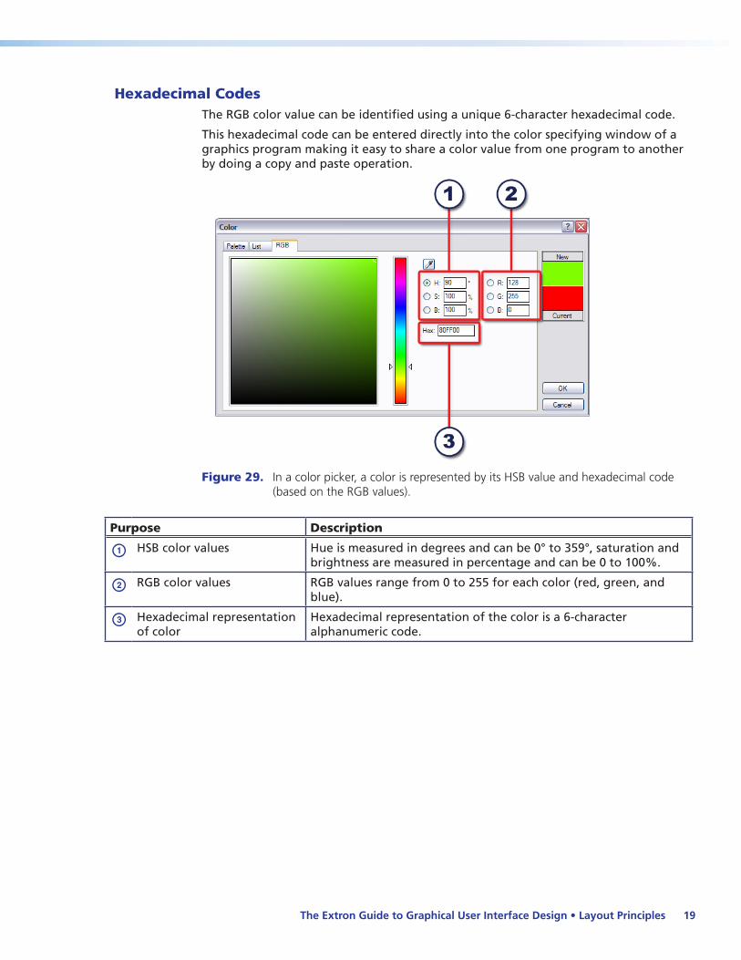
Hexadecimal CodesThe RGB color value can be identified using a unique 6-character hexadecimal code.
This hexadecimal code can be entered directly into the color specifying window of a graphics program making it easy to share a color value from one program to another by doing a copy and paste operation.
Figure 29. In a color picker, a color is represented by its HSB value and hexadecimal code (based on the RGB values).
Purpose Description
a HSB color values Hue is measured in degrees and can be 0° to 359°, saturation and brightness are measured in percentage and can be 0 to 100%.
b RGB color values RGB values range from 0 to 255 for each color (red, green, and blue).
c Hexadecimal representation of color
Hexadecimal representation of the color is a 6-character alphanumeric code.

The Extron Guide to Graphical User Interface Design • Layout Principles20
Choosing a Color PaletteA color palette is a collection of colors. A palette of harmonious colors should be selected before beginning any GUI design. Creating a cohesive color palette is second nature to all good graphic designers, but for many it can be challenging. Although the definition of an appealing color palette is highly subjective, here are some safe steps for the interface designer to follow.
1. Pick a base color.
A base color is the starting point for the color palette. The base color may be the dominant color of a corporation or school logo, or could be a color from the room that the touchpanel will be used in, or a specific color selected by the client.
Figure 30. The base color could be the company logo.
Figure 31. Same company logo but with a cooler base color.
2. Select a background color.
The background color should be calming and muted.
zz If the base color is warm: choose a gray or a color with low brightness and saturation values for the background.
zz If the base color is cool: use a gray or a cooler, analogous color with a very low saturation value.
Figure 32. The gray background color enhances the warm base color.
Figure 33. A cooler, analogous color works well with a cool base color.
3. Select a shape (see “Shapes” on page 39) color.
Shapes can be made using an color that is analogous to the base color yet maintains a good contrast against the background color. In some cases, a color that is not analogous to the base color but subtly contrasts against the background may work better for the shape color.
Avoid saturated colors for shapes, especially warm ones. Shapes should recede into the background. Choosing the base color as the border color around shapes is an effective way to tie the base color into your design. This is especially helpful with warm colors that can otherwise be overwhelming.

The Extron Guide to Graphical User Interface Design • Layout Principles 21
Figure 34. The shape created uses analogous colors.
Figure 35. The border of the shape uses the base color.
4. Choose button colors.
Off-state buttons should contrast with the surface they are on.
zz If the surface is dark, use a lighter color or one with lower saturation.
zz If the surface is light, use a darker color or one with higher saturation.
On-state buttons should have an illuminated effect. In general their color should be brighter and less saturated than the off-state button
Figure 36. Button text color or icon color depends on the button surface color.
Figure 37. On-state buttons (here DVD) should suggest an illuminated effect.
Five safe rules for color selection:
1. Never use more than six colors on a project.
2. Use grays, or colors having low brightness and saturation values for backgrounds.
3. Use complementary colors to draw attention to text or to buttons that must stand out.
4. Avoid using too many saturated colors.
5. Always maintain good contrast between elements.
There are several web-based color palette creation tools available that help simplify the color palette creation process. See the resource section at the end of this guide for a list of color palette tools that can be found online.

The Extron Guide to Graphical User Interface Design • Layout Principles22
Monochrome TestingMonochrome testing in grayscale is a good way to validate the readability of a user interface design by those who are color blind or color deficient. Color blindness is a color deficiency where a person experiences difficulty distinguishing between colors. A red-green deficiency is most common, although some individuals might have difficulty seeing the difference between blue and yellow. Only a limited number of people who are color blind see in black and white.
Monochrome testing strips away the chrominance from the design. When the chrominance is removed, it reveals the areas where the difference in luminance, or grayscale, is hard to perceive. If the layout is difficult to read in grayscale, then it may be unusable by a person who is color blind.
Figure 38. Example of a good color combination, screen is readable when monochrome tested.
Figure 39. Example of a poor color combination, screen is unreadable when monochrome tested.

Design Fundamentals
Human Factors and ErgonomicsWhen designing a user interface, place great care on crafting easy to operate controls that are both familiar and intuitive. A user rarely browses an A/V control interface to see what is available. More likely, they will want to get right down to the business of the meeting or presentation, needing to accomplish their desired task without distraction or hesitation.
The system operator is most likely to navigate using index fingers with stationary touchpanels and thumbs with mobile panels. Ergonomics play a larger role in making the interface comfortable to use. While most people can use either hand to make selections, they typically use their dominant hand. Be aware of hand dominance when designing layouts.
Balancing Form and FunctionInterface designers should assume that users are not likely to be trained on the system they are asked to operate. If there is training, it is probably on the system the user operates regularly and not on all of the systems at a site. Users should be able to move from one system to another without a noticeable change in interface design. Additionally, guest presenters from outside the organization must be able to easily operate the system.
An appropriate interface design limits the amount of clutter and graphical distractions in favor of functionality. While creative graphical elements may look pleasing in a home environment, in commercial applications these are viewed as distractions and slow the process of accomplishing a specific A/V task.
Building BlocksThe building blocks are the fundamental tools the designer uses to create user interfaces. If used correctly, the blocks work together to create a harmonious and intuitive interface to provide a positive user experience. This next section of the guide offers guidelines to assist in the proper deployment of:
zz Buttons
zz Text and labels
zz Fonts
zz Shapes
zz Pages
zz Backgrounds
zz Images
The Extron Guide to Graphical User Interface Design • Design Fundamentals 23
Buttons
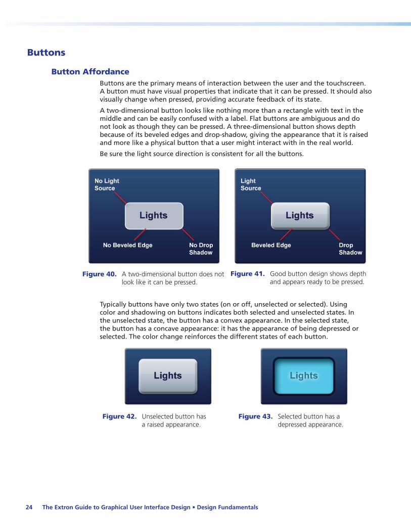
Button AffordanceButtons are the primary means of interaction between the user and the touchscreen. A button must have visual properties that indicate that it can be pressed. It should also visually change when pressed, providing accurate feedback of its state.
A two-dimensional button looks like nothing more than a rectangle with text in the middle and can be easily confused with a label. Flat buttons are ambiguous and do not look as though they can be pressed. A three-dimensional button shows depth because of its beveled edges and drop-shadow, giving the appearance that it is raised and more like a physical button that a user might interact with in the real world.
Be sure the light source direction is consistent for all the buttons.
Figure 40. A two-dimensional button does not
look like it can be pressed.Figure 41. Good button design shows depth
and appears ready to be pressed.
Typically buttons have only two states (on or off, unselected or selected). Using color and shadowing on buttons indicates both selected and unselected states. In the unselected state, the button has a convex appearance. In the selected state, the button has a concave appearance: it has the appearance of being depressed or selected. The color change reinforces the different states of each button.
Figure 42. Unselected button has a raised appearance.
Figure 43. Selected button has a depressed appearance.
The Extron Guide to Graphical User Interface Design • Design Fundamentals24

Button Aspect RatioPhi, the ratio of 1:1.62, first studied in Greece nearly 2400 years ago, is considered the Golden Ratio and is often referred to as the “golden rectangle.” This ratio is aesthetically pleasing and is used as the standard aspect ratio for buttons.
Figure 44. Use the Phi ratio to make buttons aesthetically pleasing.
Figure 45. This Audio Mute button is an example of implementing Phi.
Always apply the ratio of Phi when planning the button width. Wide buttons are easier to press than tall buttons and have more horizontal area for text and/or icon labeling.
The Extron Guide to Graphical User Interface Design • Design Fundamentals 25
Button SizeStudies have shown that the ideal button size for touchscreens is 0.75 inches (approximately 1.9 cm) square. Applying the Phi ratio to a button that is 0.75 inches high yields a button width of 1.215 inches or 1.22 inches (approximately 3.1 cm).
Figure 46. Applying Phi to the ideal button size for panels 12 inches and larger.
A button size of 0.75 inches x 1.22 inches (1.9 x 3.1 cm) is best suited for touchscreens of 12 inches (30.5 cm) diagonally and larger. Using this button size on smaller panels takes up too much screen space making the design of the panel unusable. For touchscreens smaller than 12 inches diagonally, the height of the button can be reduced to achieve Phi. Taking the button height of 0.75 inches and dividing it by 1.62 yields a height of approximately 0.45 inches (1.2 cm).
Figure 47. Applying Phi to the ideal button size for panels smaller than 12 inches diagonally.
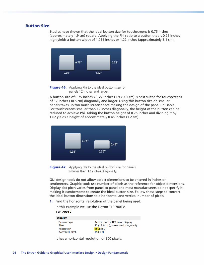
GUI design tools do not allow object dimensions to be entered in inches or centimeters. Graphic tools use number of pixels as the reference for object dimensions. Display dot pitch varies from panel to panel and most manufacturers do not specify it, making it cumbersome to create the ideal button size. Follow these steps to convert the ideal button dimensions to a horizontal and vertical number of pixels.
1. Find the horizontal resolution of the panel being used.
In this example we use the Extron TLP 700TV.
It has a horizontal resolution of 800 pixels.
The Extron Guide to Graphical User Interface Design • Design Fundamentals26

2. Measure the horizontal width of the screen being used.
Figure 48. Measure the width of the Touchpanel screen.
The horizontal width of the TLP 700TV screen is 6 inches (15.2 cm).
3. Divide the horizontal pixels by the measured width:
800 pixels / 6 inches = 133 pixels per inch or dots per inch (dpi).
NOTE: The actual specification for the TLP 700TV is 134 dpi.
4. Multiply the pixels per inch by the dimensions of the ideal button:
Width: 133 dpi x 0.75 inches = 100 pixel.s Height: 133 dpi x 0.45 inches = 60 pixels.
Figure 49. Determining the ideal button size
Button SpacingButtons are also easier to press if there is a small amount of spacing between them. This helps minimize false presses, which is less frustrating. As a general rule for small buttons of 72 pixels or less, there should be at least 5 to 10 pixels between them. Try to maintain uniform spacing both horizontally and vertically.
The Extron Guide to Graphical User Interface Design • Design Fundamentals 27
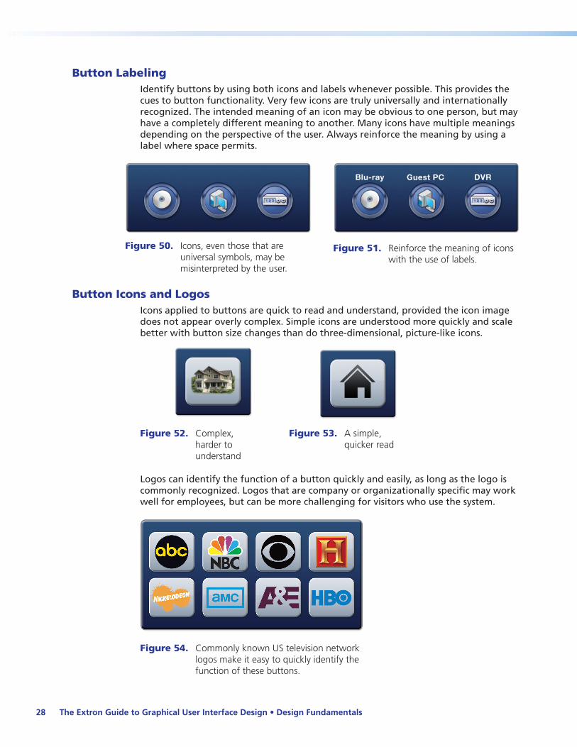
Button LabelingIdentify buttons by using both icons and labels whenever possible. This provides the cues to button functionality. Very few icons are truly universally and internationally recognized. The intended meaning of an icon may be obvious to one person, but may have a completely different meaning to another. Many icons have multiple meanings depending on the perspective of the user. Always reinforce the meaning by using a label where space permits.
Figure 50. Icons, even those that are universal symbols, may be misinterpreted by the user.
Figure 51. Reinforce the meaning of icons with the use of labels.
Button Icons and LogosIcons applied to buttons are quick to read and understand, provided the icon image does not appear overly complex. Simple icons are understood more quickly and scale better with button size changes than do three-dimensional, picture-like icons.
Figure 52. Complex, harder to understand
Figure 53. A simple, quicker read
Logos can identify the function of a button quickly and easily, as long as the logo is commonly recognized. Logos that are company or organizationally specific may work well for employees, but can be more challenging for visitors who use the system.
Figure 54. Commonly known US television network logos make it easy to quickly identify the function of these buttons.
The Extron Guide to Graphical User Interface Design • Design Fundamentals28

Button OrientationWhen done correctly, button orientation enables the user to easily recognize the purpose of the buttons. If the orientation matches the action of the button it clearly defines its use, and so increases its affordance.
For example when navigating left, right, up, or down, it becomes easy to recognize the purpose of the buttons if they are positioned in their natural orientation (the up button at the top, the left button to the left, and so forth).
Figure 55. It takes more than one glance to find the left navigation button in this layout.
Figure 56. The left button here is intuitively placed.
Controlling volume is another example. Seeing the volume up button positioned above the down and mute buttons is a natural visual cue to the purpose of the buttons.
Figure 57. This button positioning makes it difficult to find the needed button at a glance.
Figure 58. A more natural positioning enables the user to quickly find and operate the desired function.
The Extron Guide to Graphical User Interface Design • Design Fundamentals 29
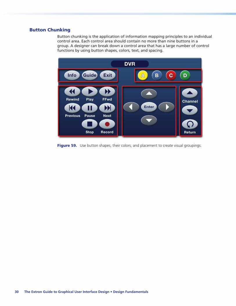
Button ChunkingButton chunking is the application of information mapping principles to an individual control area. Each control area should contain no more than nine buttons in a group. A designer can break down a control area that has a large number of control functions by using button shapes, colors, text, and spacing.
Figure 59. Use button shapes, their colors, and placement to create visual groupings.
The Extron Guide to Graphical User Interface Design • Design Fundamentals30
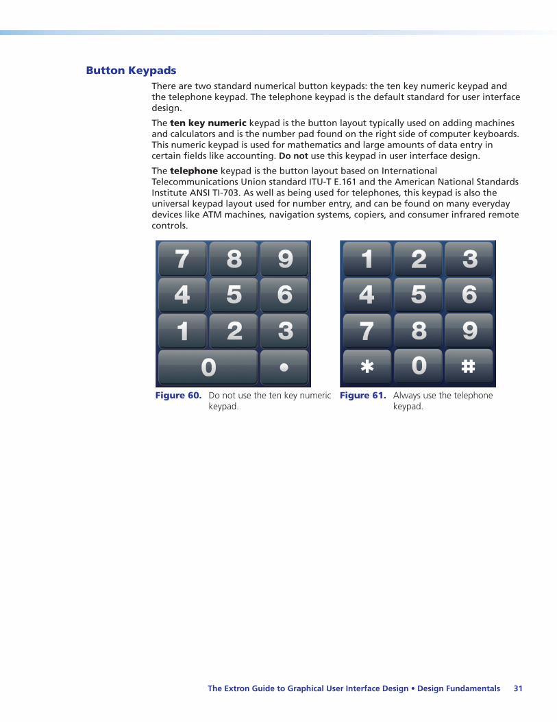
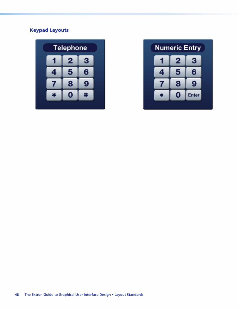
Button KeypadsThere are two standard numerical button keypads: the ten key numeric keypad and the telephone keypad. The telephone keypad is the default standard for user interface design.
The ten key numeric keypad is the button layout typically used on adding machines and calculators and is the number pad found on the right side of computer keyboards. This numeric keypad is used for mathematics and large amounts of data entry in certain fields like accounting. Do not use this keypad in user interface design.
The telephone keypad is the button layout based on International Telecommunications Union standard ITU-T E.161 and the American National Standards Institute ANSI TI-703. As well as being used for telephones, this keypad is also the universal keypad layout used for number entry, and can be found on many everyday devices like ATM machines, navigation systems, copiers, and consumer infrared remote controls.
Figure 60. Do not use the ten key numeric keypad.
Figure 61. Always use the telephone keypad.
The Extron Guide to Graphical User Interface Design • Design Fundamentals 31

Text and LabelsText and labels are placed on top of or near an object or a group of objects. Their purpose is to:
zz Give a description
zz Provide instructions
zz Clarify a purpose
Text and labels should never compete with each other or confuse or slow down the user. The text on a label or button should give a clear indication of what it represents.
Use abbreviations that are commonly accepted terms, like DVD or AUX. A less common term, for example “ALC” (Automatic Level Control), may be understood in the A/V industry, though not be commonly understood outside the industry.
Do not hyphenate words to achieve word wrap. Hyphenated words are very difficult to read and to understand.
Be consistent in your labeling of terms. Do not refer to the same thing in different ways. For example, if a document camera is referred to as a “Doc Cam,” refer to it as a “Doc Cam” throughout the project, and not as “Camera” or “Document Camera” elsewhere.
Text Window AffordanceA text window is used to give a description to a group of buttons or feedback to the user. One common mistake is to create a text window by placing text on a raised surface that may look like a button. This is considered false affordance, because the user is given the false indication that the text window can be pressed. If the object is not intended to be pressed, never make it look like a button.
Figure 62. False affordance: the text window looks like it can be pressed.
Figure 63. A text window should be distinct, never having the appearance of a button.
The Extron Guide to Graphical User Interface Design • Design Fundamentals32

Uppercase and Lowercase TextWhen designing a user interface, uppercase and lowercase letters are preferred. This aids the user to quickly read the text and understand the function. Text in all lowercase letters takes longer to read and comprehend. Text in all uppercase letters (all caps) should be reserved for headers and major groupings only. Overuse of all uppercase text is too distracting and slows down the selection process.
Figure 64. Words in all uppercase characters are difficult to read and should be reserved for major groupings.
Figure 65. Words in all lowercase characters take longer to read and comprehend.
Figure 66. Mixing uppercase and lowercase characters enables the user to quickly read and understand the text.
Figure 67. The uppercase and lowercase letters used on the button on the right are easier to read.
Action TextUse action text (verbs) to describe the intended function of buttons instead of statements. For example, when powering down a system, confirm the request with an action term rather than a simple “Yes” or “No.” The action text gives the user assurance that the selection is correct.
Figure 68. A simple yes or no is vague and confusing.
Figure 69. Action words verify the action to be taken.
The Extron Guide to Graphical User Interface Design • Design Fundamentals 33

Text and Label SizesThere should always be a visual hierarchy for label font sizes. Use larger fonts for group labels and smaller fonts for sublabels. If the same size font is used for all labels, then the labels visually compete for attention.
Figure 70. Using the same font size, labels compete.
Figure 71. Different font sizes provide a visual distinction between label types.
Text SpacingText spacing is critical. When identifying buttons that are in close proximity, be careful to move the text closer to the associated button. Spacing text evenly between two button groups can create confusion.
Figure 72. Centering text between buttons makes it difficult to determine the button association.
Figure 73. Placing the text close to the appropriate button makes the button association more obvious.
The Extron Guide to Graphical User Interface Design • Design Fundamentals34
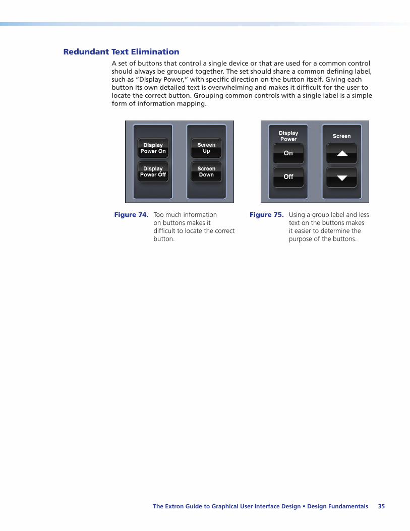
Redundant Text EliminationA set of buttons that control a single device or that are used for a common control should always be grouped together. The set should share a common defining label, such as “Display Power,” with specific direction on the button itself. Giving each button its own detailed text is overwhelming and makes it difficult for the user to locate the correct button. Grouping common controls with a single label is a simple form of information mapping.
Figure 74. Too much information on buttons makes it difficult to locate the correct button.
Figure 75. Using a group label and less text on the buttons makes it easier to determine the purpose of the buttons.
The Extron Guide to Graphical User Interface Design • Design Fundamentals 35

Fonts
Serif and Sans Serif FontsAll fonts are categorized as either serif or sans-serif:
Serif fonts are fonts that have little “tails” (serifs) at the tips of each character. Since displays have considerably lower dot pitch, or pixels per inch than printed materials do, the small serif details tend to distort and become jagged with smaller font sizes, and are difficult to read.
Do not use serif fonts for text in user interface design.
Sans-serif means “without serif.” Sans-serif fonts do not have the serifs (tails), making it easier for displays with low dot pitch to display them without distortion, and so are easier to read.
Only sans-serif fonts, such as Veranda®, Calibri®, Arial®, or Helvetica®, should be used for text on touchpanel interfaces.
Figure 76. Do not use serif fonts. They tend to become distorted and are difficult to read.
Figure 77. Always use sans-serif fonts.
They are easier to read when displayed on screen.
Font SizeText labels applied onto buttons can help convey the meaning of the function for the intended button. Applied correctly, the text should fill the button without encroaching on the border of the button. If the text does not fit, consider making all of the buttons in the group larger or use a smaller font.
To ensure the text on the user interface is easy to read, choose the correct font size. A larger font is better, but do not let the text overlap the beveled edge of the button.
Figure 78. When the font overlaps the beveled edge of a button, it is more difficult to read.
Figure 79. The font should fit in the portion of the button that appears raised.
Consistency and balance are important aspects of label design. Always use the same size font when placing text on a group of buttons. This consistency naturally groups the buttons and helps to create information mapping. If there is one label that does not fit, experiment with the button sizes or font sizes to achieve balance.
The Extron Guide to Graphical User Interface Design • Design Fundamentals36

Figure 80. “Subtitle” is too large for the button.
Figure 81. “Subtitle” is too small when compared to other buttons.
Figure 82. Here all the text sizes are adjusted so they appear equal and fit neatly on the buttons.
As a general rule, do not use a font size smaller than 0.1 inch in height on the touchpanel for capital letters (a 12 point font for the Extron TLP 700 series panel). Using a smaller font makes it difficult for people with average eyesight to read.
Font Style and EffectsFont style refers to regular, bold, italic, and bold italic. Extron recommends using a Sans serif, bold font.
DO NOT USE:
zz Any serif font style — they becomes distorted and difficult to read on the screen.
zz Italics or bold italics — these are more difficult to read on the screen.
zz Regular — this is too light and harder to read on the screen.
Figure 83. Regular, italics, and bold italic fonts are difficult to read on a screen.
Figure 84. The default font should be bold.
Font effects are difficult to read on a user interface screen. DO NOT USE font effects such as:
zz Underlines zz Small Caps
zz zz Strikethrough
zz zz Subscript
zz Script zz Superscript
zz Narrow
The Extron Guide to Graphical User Interface Design • Design Fundamentals 37
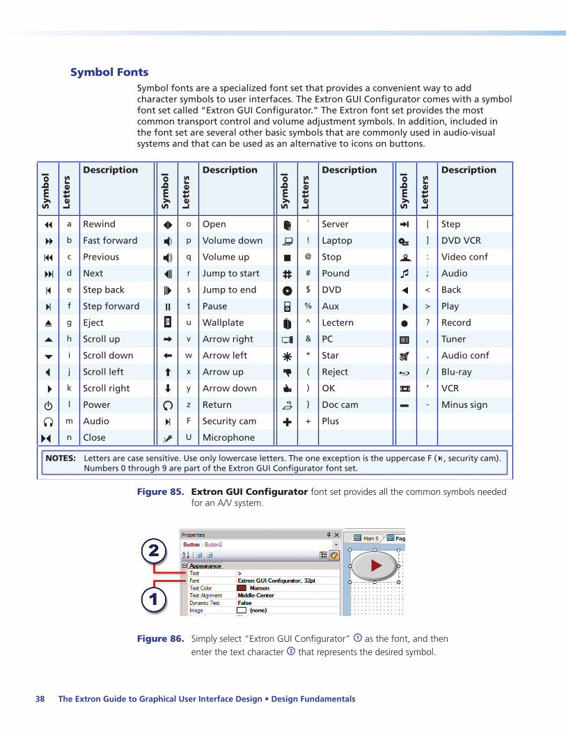
Symbol FontsSymbol fonts are a specialized font set that provides a convenient way to add character symbols to user interfaces. The Extron GUI Configurator comes with a symbol font set called “Extron GUI Configurator.” The Extron font set provides the most common transport control and volume adjustment symbols. In addition, included in the font set are several other basic symbols that are commonly used in audio-visual systems and that can be used as an alternative to icons on buttons.
Sym
bo
l
Lett
ers
Description S
ym
bo
l
Lett
ers
Description
Sym
bo
l
Lett
ers
Description
Sym
bo
l
Lett
ers
Description
a a Rewind o o Open ` ` Server | | Step
b b Fast forward p p Volume down ! ! Laptop ] ] DVD VCR
c c Previous q q Volume up @ @ Stop : : Video conf
d d Next r r Jump to start # # Pound ; ; Audio
e e Step back s s Jump to end $ $ DVD < < Back
f f Step forward t t Pause % % Aux > > Play
g g Eject u u Wallplate ^ ^ Lectern ? ? Record
h h Scroll up v v Arrow right & & PC , , Tuner
i i Scroll down w w Arrow left * * Star . . Audio conf
j j Scroll left x x Arrow up ( ( Reject / / Blu-ray
k k Scroll right y y Arrow down ) ) OK ' ‘ VCR
l l Power z z Return } } Doc cam - - Minus sign
m m Audio F F Security cam + + Plus
n n Close U U Microphone
NOTES: Letters are case sensitive. Use only lowercase letters. The one exception is the uppercase F (F, security cam). Numbers 0 through 9 are part of the Extron GUI Configurator font set.
Figure 85. Extron GUI Configurator font set provides all the common symbols needed for an A/V system.
Figure 86. Simply select “Extron GUI Configurator” a as the font, and then enter the text character b that represents the desired symbol.
The Extron Guide to Graphical User Interface Design • Design Fundamentals38

ShapesShapes are simple objects (for example squares, rectangles, and so forth) that can be added to any page to improve information mapping. They help by directing attention and providing division for the various groups of controls. Shapes can simply be outlines with variable edges, solid filled, or variably transparent. Be sure to maintain consistency with the look of the shapes within the project. Having shapes with different colors and styles on the same page is disruptive.
Figure 87. Lack of shapes to divide sections will cause a user to have difficulty finding the desired button.
Figure 88. Shapes improve usability by clearly defining the various groups of controls.
The Extron Guide to Graphical User Interface Design • Design Fundamentals 39
Pages
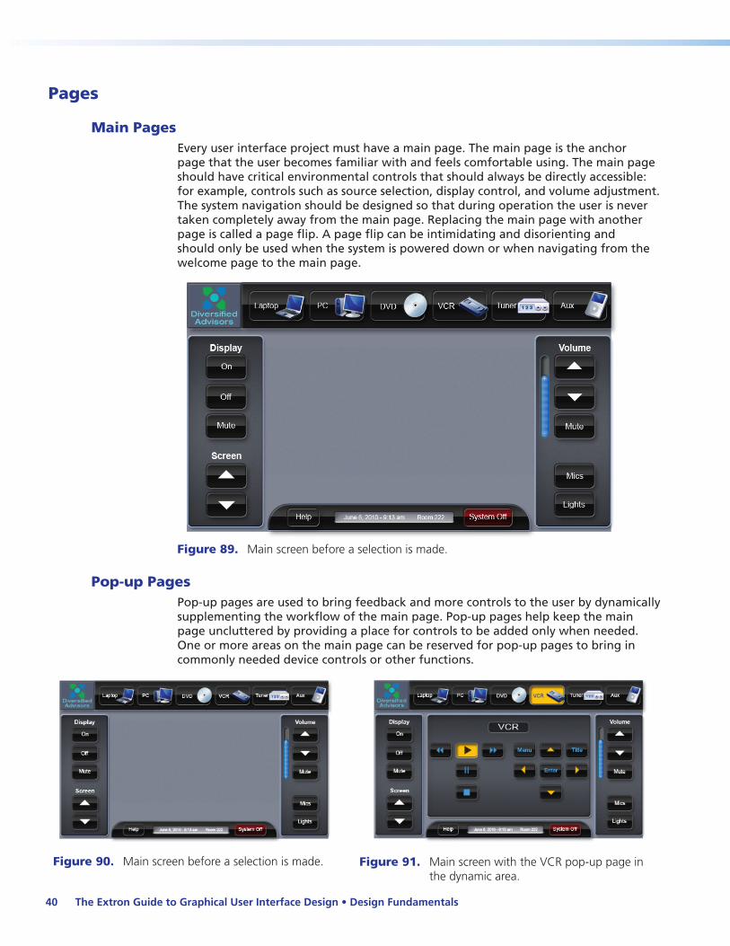
Main PagesEvery user interface project must have a main page. The main page is the anchor page that the user becomes familiar with and feels comfortable using. The main page should have critical environmental controls that should always be directly accessible: for example, controls such as source selection, display control, and volume adjustment. The system navigation should be designed so that during operation the user is never taken completely away from the main page. Replacing the main page with another page is called a page flip. A page flip can be intimidating and disorienting and should only be used when the system is powered down or when navigating from the welcome page to the main page.
Figure 89. Main screen before a selection is made.
Pop-up PagesPop-up pages are used to bring feedback and more controls to the user by dynamically supplementing the workflow of the main page. Pop-up pages help keep the main page uncluttered by providing a place for controls to be added only when needed. One or more areas on the main page can be reserved for pop-up pages to bring in commonly needed device controls or other functions.
Figure 90. Main screen before a selection is made. Figure 91. Main screen with the VCR pop-up page in the dynamic area.
The Extron Guide to Graphical User Interface Design • Design Fundamentals40

Modal Pop-up PageModal pop-up pages act as speed bumps to the user, forcing the user to complete an operation or make a decision before the modal pop-up can be closed and they can continue back to the main page.
Similar to pop-up pages, modal pop-up pages bring additional controls to the user. When a modal pop-up page is active, the main page and any active pop-up pages are covered with a translucent window and are disabled. This brings the user’s attention to the controls on the modal pop-up without visually leaving the main page.
The modal pop-up page is a great tool for controls that require confirmation, such as a power down command, or for controls that have granularity. For example, the main page always contains the master volume control, but in a system that may have a number of microphones that occasionally need separate adjustments, the modal pop-up page allows the user to make adjustments to each individual microphone.
Likewise, a system may have multiple lighting zones with separate presets that would otherwise clutter the main page. A modal pop-up page would bring up in one view all the individual lighting controls for the preset areas.
Figure 92. Modal popup page: this page overlays the main page and requires an action prior to closing the window and returning to the main page.
The Extron Guide to Graphical User Interface Design • Design Fundamentals 41
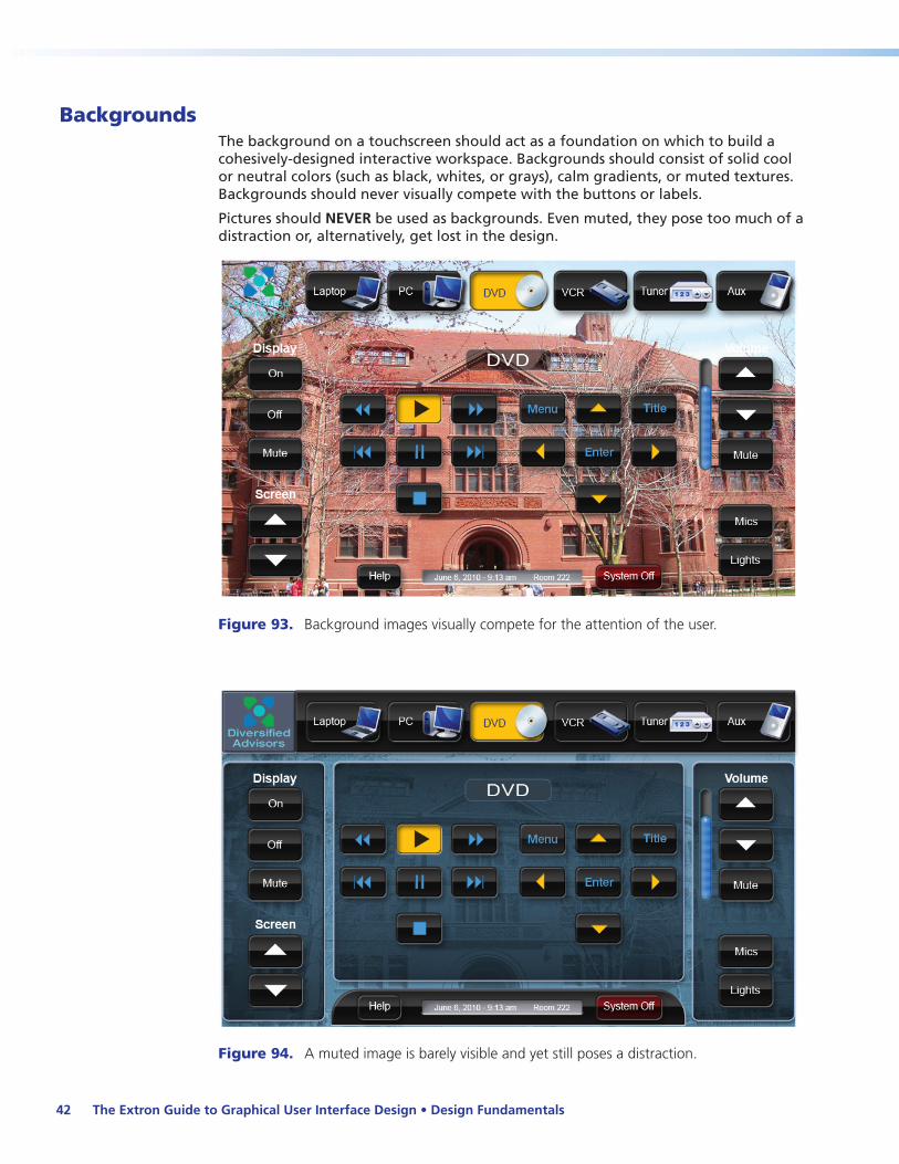
BackgroundsThe background on a touchscreen should act as a foundation on which to build a cohesively-designed interactive workspace. Backgrounds should consist of solid cool or neutral colors (such as black, whites, or grays), calm gradients, or muted textures. Backgrounds should never visually compete with the buttons or labels.
Pictures should NEVER be used as backgrounds. Even muted, they pose too much of a distraction or, alternatively, get lost in the design.
Figure 93. Background images visually compete for the attention of the user.
Figure 94. A muted image is barely visible and yet still poses a distraction.
The Extron Guide to Graphical User Interface Design • Design Fundamentals42
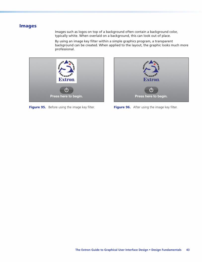
ImagesImages such as logos on top of a background often contain a background color, typically white. When overlaid on a background, this can look out of place.
By using an image key filter within a simple graphics program, a transparent background can be created. When applied to the layout, the graphic looks much more professional.
Figure 95. Before using the image key filter. Figure 96. After using the image key filter.
The Extron Guide to Graphical User Interface Design • Design Fundamentals 43

The Extron Guide to Graphical User Interface Design • Design Fundamentals44

Layout Standards
Device Control StandardsGraphical user interface device control consistency is of the utmost importance. As an example, the play button for the DVD transport controls page should be in the exact same place with the same exact orientation as the play button for the DVR. Users must be able to quickly identify a button and its capabilities without relearning the function for each new device control encountered.
Extron has developed the following standards for environmental and device control layouts: they are applied to all of our templates. We believe if these unified standards were implemented by the A/V industry, the resulting consistency would make touchpanel control less intimidating to the user.
Layouts for Environmental Controls
The Extron Guide to Graphical User Interface Design • Layout Standards 45

Device Control Layouts for Limited Spaces
Device Control Layouts for Large Spaces
The Extron Guide to Graphical User Interface Design • Layout Standards 46

The Extron Guide to Graphical User Interface Design • Layout Standards 47
Keypad Layouts
The Extron Guide to Graphical User Interface Design • Layout Standards 48
Conclusions
This guide was written to enable interface designers to create intuitive, functional, and well-designed graphical user interfaces for touchpanels for A/V control systems.
Within this guide are the design fundamentals and considerations that are essential to a successful user interface design for every A/V system control application.
Summary of the key concepts:
zz Consistency — Maintaining consistency (using fonts, shapes, placement, sizes, and colors) in the interface allows the easy recognition and location of each component of the system.
zz Affordance awareness — Affordance is the visual cue to the function of an object. If an image is intended to be a button that can be pushed, make it look like one. If it is not, then avoid making it look like one (false affordance).
zz Static and dynamic areas — Logical use of static (unchanging) and dynamic (variable content) areas provides constant access to commonly-used functions, and the ability to use controls specific to a selectable source or operation.
zz Navigation and pages — Start with clear entry points. Use uncomplicated navigation to get the user to where they want to be without leaving the main page and without introducing page flips. Use pop-up and modal pop-up pages wisely but sparingly.
zz Button design — Button size and shape, aspect ratio and orientation, spacing and chunking, labels and icons, are all important when creating controls for the interface. Giving visual feedback when performing the necessary actions also enhances the user experience.
zz Clutter and color — Avoid clutter. Too many options on a page are a distraction. Keep it as simple as possible. Use colors that “work”; start with analogous, harmonious colors and avoid using clashing colors (red and green for example). Be mindful of users who may have visual impairments.
zz Text and font styles — Never use serif fonts or italic styles, and avoid text effects (for example embossing, underlines, outlines).
zz Backgrounds — Never use images as backgrounds. Use solid, cool or neutral colors, or muted textures. Never make the background compete with the buttons.
zz Customer focus — Be mindful of the needs and expectations of the end user. Provide a well-conceived, recognizable layout that presents the user with everything necessary and easily accessible to operate the A/V system.
The Extron Guide to Graphical User Interface Design • Conclusions 49

The Extron Guide to Graphical User Interface Design • Conclusions50

Resources
Perhaps the single most important contributing factor to the successful graphical user interface design and integration is knowledge. Systems designers and integrators are encouraged to seek out training, seminars, technical articles, white papers, and other publications from industry organizations and trusted manufacturers. See the reference material and links below for additional graphical user interface design resources.
BooksCooper, A., Reimann, R., and Cronin, D. (2007). About Face 3: The Essentials of Interaction Design. Wiley Publishing, Inc..
Mullet, K. and Sano D. (1994). Designing Visual Interfaces: Communication Oriented Techniques. Prentice Hall.
Norman, D. (1988, 2002). The Design of Everyday Things. Basic Books.
Tidwell, J. (2005). Designing Interfaces: Patterns for Effective Interaction Design. O’Reilly.
Whelan, Bride M. (1994). Color Harmony 2: A Guide to Creative Color Combinations. Rockport Publishers.
Color Palette Resourceszz websitetips.com/colortools/sitepro/
zz www.gimp.org/
zz msdn.microsoft.com/en-us/library/bb263947(VS.85).aspx
zz www.colorschemedesigner.com
zz www.colorblender.com/
zz thelogocompany.net/logo-color-choices.htm
zz www.degraeve.com/color-palette/
zz www.colorschemer.com/online.html
Theoryzz www.joelonsoftware.com/uibook/chapters/fog0000000060.html
zz www.namahn.com/resources/documents/note-IM.pdf
Extron Resources
TouchLink™ Control SystemsExtron TouchLink is the first fully configuration-based touchpanel control system with the power to handle the most common A/V applications. Visit www.extron.com/touchlink for information on TouchLink Touchpanels, control processors, software, and accessories.
The Extron Guide to Graphical User Interface Design • Resources 51

TouchLink Design Themes TouchLink design themes include templates and resource kits. Templates are ready to use graphical user interfaces carefully matched to the most common A/V applications. Resource kits are available to create a customized graphical user interface from scratch, with all the backgrounds, icons, buttons, and sounds included. For more information on TouchLink design themes, the templates and resource kits, visit www.extron.com/guiresources.
Reference Guide to Design ThemesThe reference guide provides valuable information on Extron ready-to-use design templates and resource kits for TouchLink Touchpanels. For more information on this guide visit www.extron.com/guiresources.
Software RoadmapThis new online resource provides insight into upcoming new features and upgrades planned for Extron control system software applications at www.extron.com/roadmap.
Training Web SiteThe Extron training Web site at www.extron.com/training is the central resource for education and certification information. Here you will find program descriptions, course schedules by location, support material, and administrative information such as transcript verification. Below is a list of some of the programs offered:
zz Extron Control Associate Certification
zz Extron Control Specialist Certification
zz Extron Institutes for instructor-led courses
zz Customized on-site training for instruction at your facility
zz E-Training On Demand for online training
Extron S3 Control Systems Support HotlineFor direct access to “top tier” support for configurable control systems, call the S3 Control Systems Support Hotline at 1.800.633.9877. Our large group of dedicated applications engineers stands ready to answer all your control system questions and help you with system design, technical troubleshooting, configuration assistance, remote product or system diagnostics, repair/advance replacement services, and general product support.
The Extron Guide to Graphical User Interface Design • Resources52

The Extron Guide to Graphical User Interface Design • Resources 53

Extron USA - WestHeadquarters
+800.633.9876Inside USA/Canada Only
+1.714.491.1500+1.714.491.1517 FAX
Extron USA - East
+800.633.9876Inside USA/Canada Only
+1.919.863.1794+1.919.863.1797 FAX
Extron Europe
+800.3987.6673Inside Europe Only
+31.33.453.4040+31.33.453.4050 FAX
Extron Asia
+800.7339.8766Inside Asia Only
+65.6383.4400+65.6383.4664 FAX
Extron Japan
+81.3.3511.7655+81.3.3511.7656 FAX
Extron China
+400.883.1568Inside China Only
+86.21.3760.1568+86.21.3760.1566 FAX
Extron Middle East
+971.4.2991800+971.4.2991880 FAX
© 2011 Extron Electronics. All rights reserved. www.extron.com
Checklist for a Better Graphical User Interface Design
Design � Is the GUI design refined, uncluttered, and free of distracting elements?
� Does it have visual balance in terms of object placement, button groupings, and graphical elements?
� Is there a consistent approach in defining the static and dynamic areas of the user interface?
� Does all text fit within the boundaries of buttons, windows, and banners without overcrowding?
� Are objects centered where expected, aligned to each other within groups, and consistent, page to page?
� Are flashing or blinking elements used sparingly?
� Have the best practices of affordance been applied, so that buttons are easily discernible from labels?
Color Use and Appropriateness � Are the chosen colors aesthetically pleasing and suitable for the application?
� Is the color scheme used consistently throughout all the pages of the interface?
� Have the design and colors met the needs of users with visual impairment or color blindness?
� Is color used only to enhance functions, and not used as the sole way to convey information?
Accuracy � Do the symbols and icons used on buttons easily identify and appropriately reflect the button function?
� Do the buttons work as would be expected?
� Does button feedback correctly indicate when a button is pressed, or the function state?
� Are all the buttons, labels, and headings labelled correctly?
� Is the correct case and capitalization used for all button, label, and heading text?
� Is the spelling of all static text words correct, and are abbreviations used only where space is limited?
� Are any label names used more than once on the same page?
� Do all pop-up and modal pop-up windows operate correctly without leaving the main page?
Operation and Performance � Is it easy to turn on and turn off the system?
� Is the navigation approach suitable for the intended application?
� Is visual and aural feedback present where and when expected, and is that feedback consistent?
� Is the interface easy to navigate and understand without much training?
� Does it take three steps or fewer to accomplish critical functions and tasks?
� Are there clearly understood confirmation prompts where appropriate?
� Is the grouping of function buttons consistent among devices with similar controls?
Contact Information