the demography of aging. contents number and proportion of the elderly aging and the older...
Post on 21-Dec-2015
218 views
TRANSCRIPT
The Demography of Aging
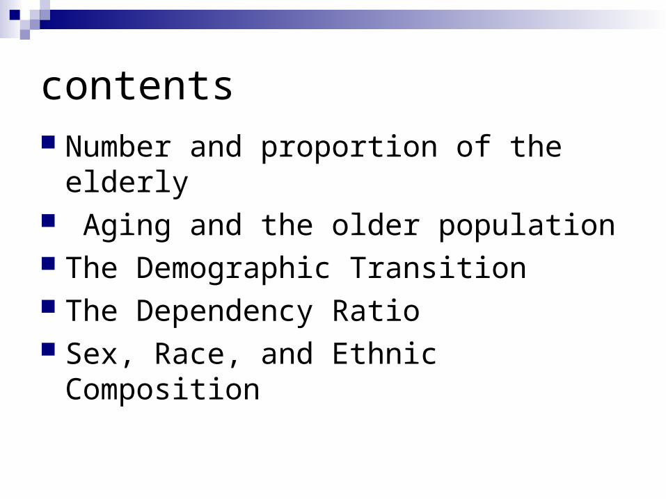
contents Number and proportion of the elderly Aging and the older population The Demographic Transition The Dependency Ratio Sex, Race, and Ethnic Composition

Assessing the circumstances of the old people in the United States (p. 42)
Requires an understanding
How this group is currently constituted
How the elderly population has changed
from the past,
How it may change in the future.
Demography of Aging (p. 42)
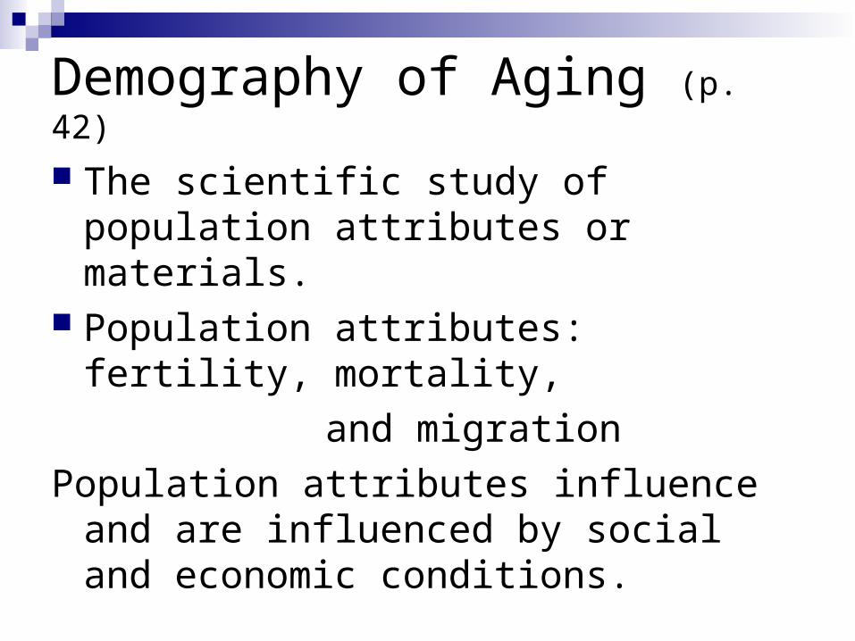
The scientific study of population attributes or materials.
Population attributes: fertility, mortality,
and migration
Population attributes influence and are influenced by social and economic conditions.
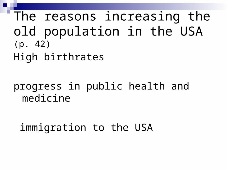
The reasons increasing the old population in the USA (p. 42)
High birthrates
progress in public health and medicine
immigration to the USA
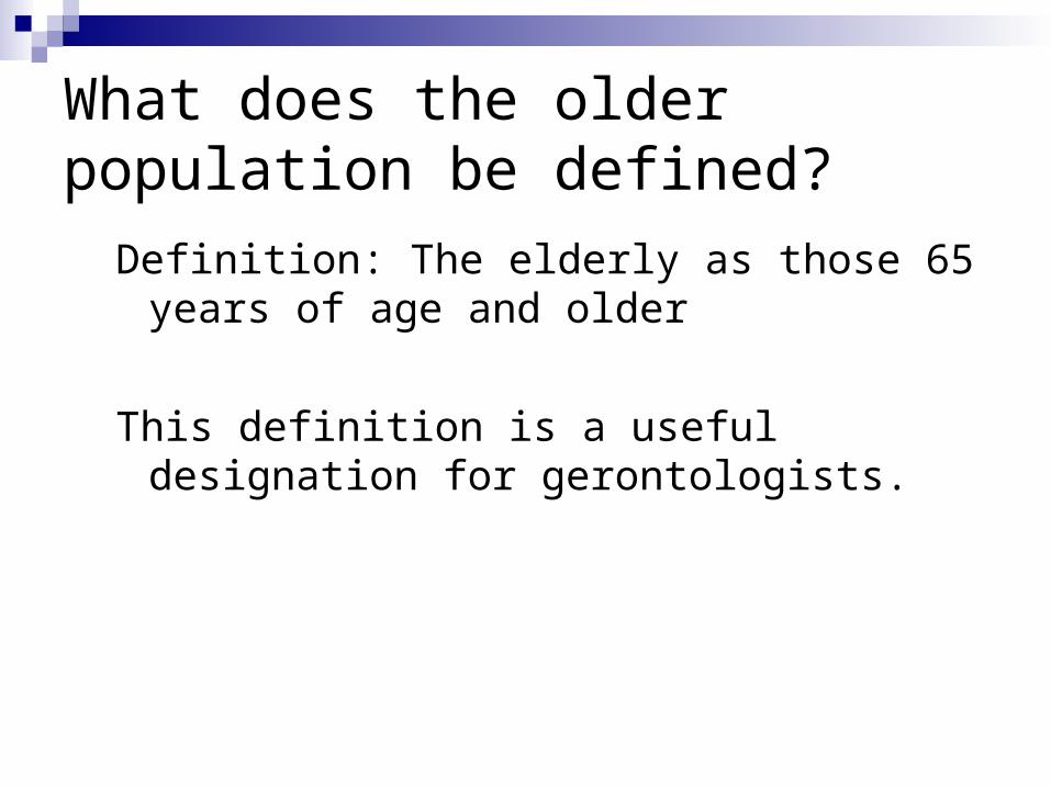
What does the older population be defined?
Definition: The elderly as those 65 years of age and older
This definition is a useful designation for gerontologists.
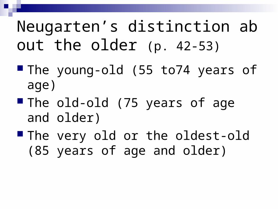
Neugarten’s distinction about the older (p. 42-53)
The young-old (55 to74 years of age) The old-old (75 years of age and older) The very old or the oldest-old (85 years of
age and older)
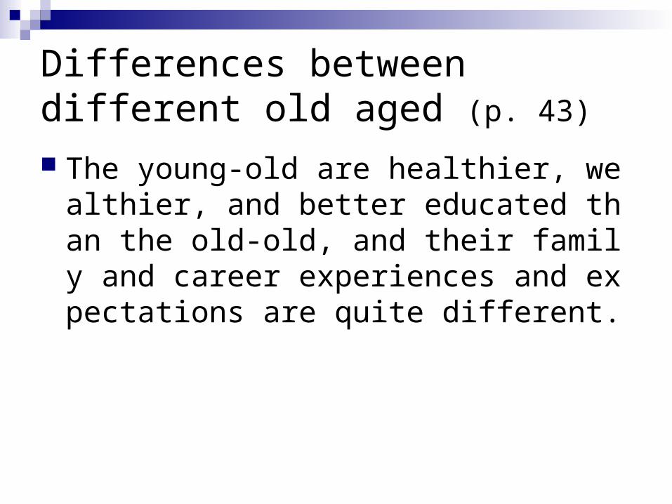
Differences between different old aged (p. 43)
The young-old are healthier, wealthier, and better educated than the old-old, and their family and career experiences and expectations are quite different.
Number and proportion of the elderly in the USA
(p. 43-44)
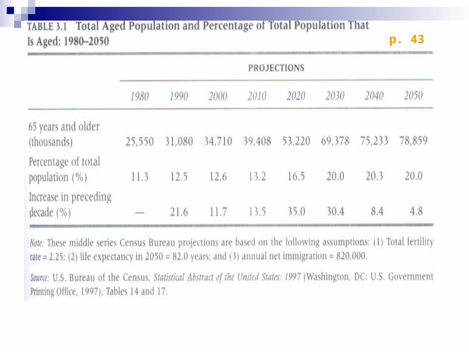
p. 43
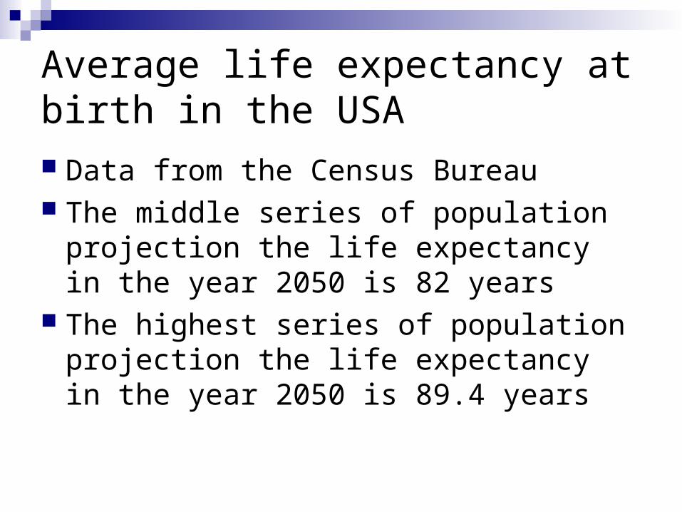
Average life expectancy at birth in the USA Data from the Census Bureau The middle series of population projection
the life expectancy in the year 2050 is 82 years
The highest series of population projection the life expectancy in the year 2050 is 89.4 years
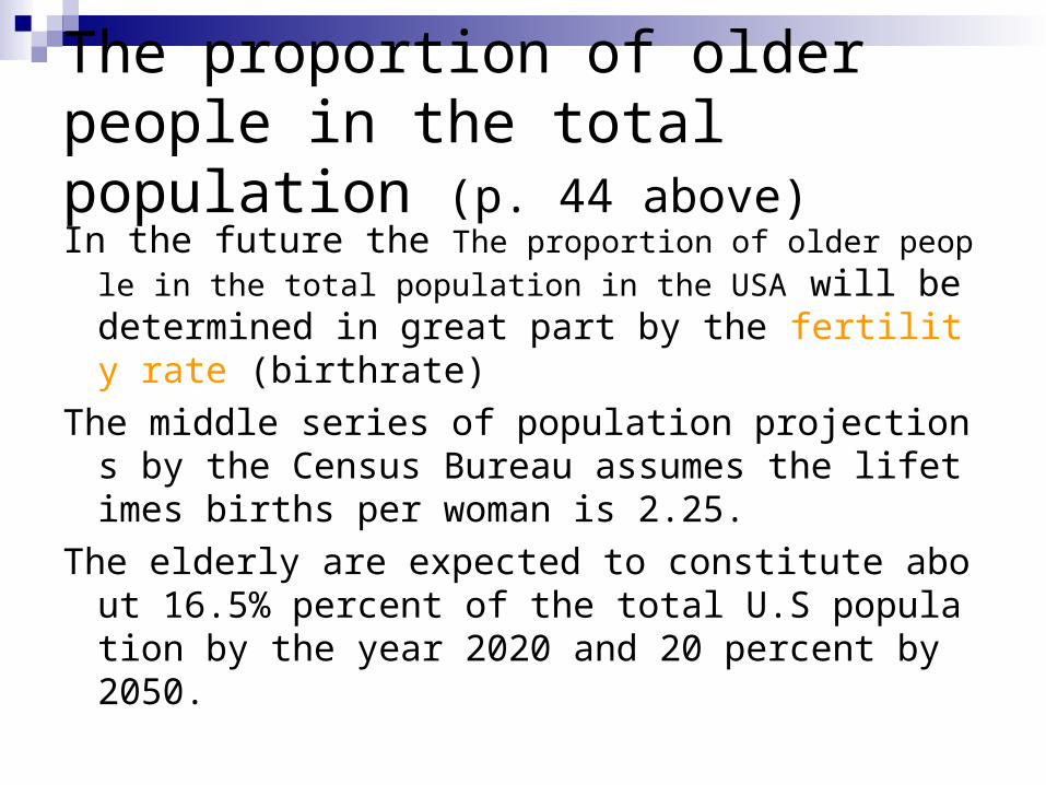
The proportion of older people in the total population (p. 44 above)
In the future the The proportion of older people in the tot
al population in the USA will be determined in great part by the fertility rate (birthrate)
The middle series of population projections by the Census Bureau assumes the lifetimes births per woman is 2.25.
The elderly are expected to constitute about 16.5% percent of the total U.S population by the year 2020 and 20 percent by 2050.
Aging of the older population
(p. 44-45)
proportion of older people in the total population in the USA (p. 44)
Not only did the older population of the United States grow in absolute size and in its proportion of the total population during 20th century but it also aged.
The median age of the 65-and-over population in the USA. See the table 3.2 below。
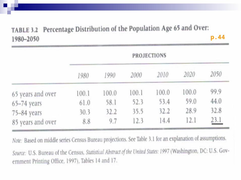
p.44
the most rapidly growing elderly age group.(p.44)
The oldest-old, those 85 years of age and over, are the most rapidly growing elderly age group.
Now 4 million or 12.3 percent of the elderly Thanks to expected high rates of
survivorship among the Baby Boom generation, it is expected that the oldest-old will number over 18 million in 2050, or 23.1 percent of elderly Americans and about 5 percent of all Americans.
Implication of the Aging population (p. 45) The aging of the older population that is
expected to occur over the next two decades or so has important policy implication for local, State, and federal agencies.
One example involves the question of whether quality health service will be available to the growing population of elderly and very old people at an affordable cost.
The Demographic Transition theory
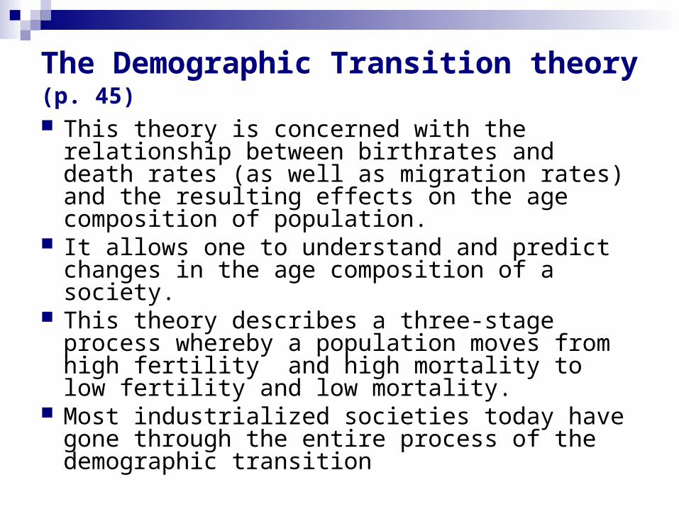
The Demographic Transition theory (p. 45)
This theory is concerned with the relationship between birthrates and death rates (as well as migration rates) and the resulting effects on the age composition of population.
It allows one to understand and predict changes in the age composition of a society.
This theory describes a three-stage process whereby a population moves from high fertility and high mortality to low fertility and low mortality.
Most industrialized societies today have gone through the entire process of the demographic transition
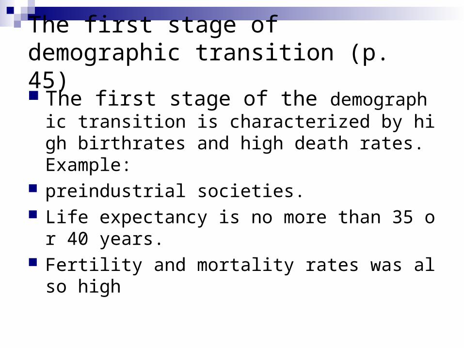
The first stage of demographic transition (p. 45) The first stage of the demographic transition i
s characterized by high birthrates and high death rates. Example:
preindustrial societies. Life expectancy is no more than 35 or 40 years. Fertility and mortality rates was also high
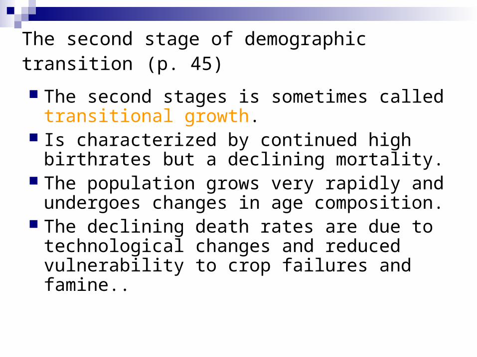
The second stage of demographic transition (p. 45)
The second stages is sometimes called transitional growth.
Is characterized by continued high birthrates but a declining mortality.
The population grows very rapidly and undergoes changes in age composition.
The declining death rates are due to technological changes and reduced vulnerability to crop failures and famine..
The second stage of demographic transition (p. 45)
The age composition changes usually involve a slightly increased proportion of the elderly and a marked increase in the proportion of the young.
Today, the less-industrialized countries of the world are in the middle stage of the demographic transition. Their death rates have fallen, but their birthrates remain high.
The third stage of demographic transition (p. 46)
It is characterized by low mortality and low or controlled fertility.
It is most often descriptive of modern Western societies.
The falling of birthrates in these countries are due to social and economic changes.
It is also resulted from the improving of the birth-control techniques
The decline in mortality
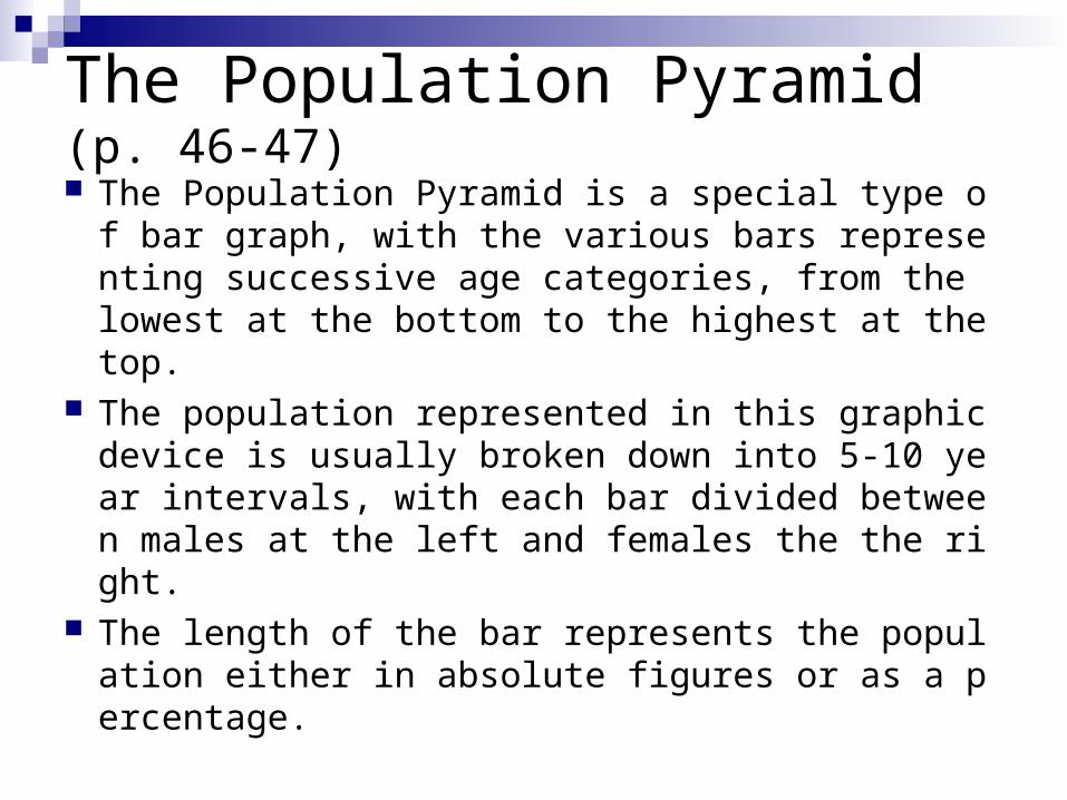
The Population Pyramid (p. 46-47)
The Population Pyramid is a special type of bar graph, with the various bars representing successive age categories, from the lowest at the bottom to the highest at the top.
The population represented in this graphic device is usually broken down into 5-10 year intervals, with each bar divided between males at the left and females the the right.
The length of the bar represents the population either in absolute figures or as a percentage.
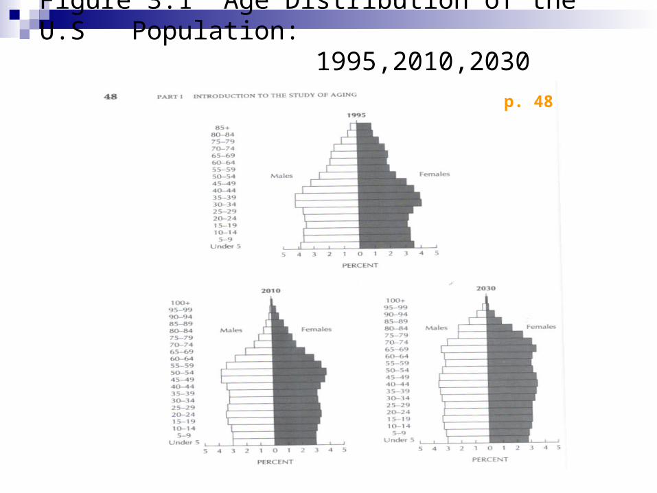
Figure 3.1 Age Distribution of the U.S Population: 1995,2010,2030
p. 48
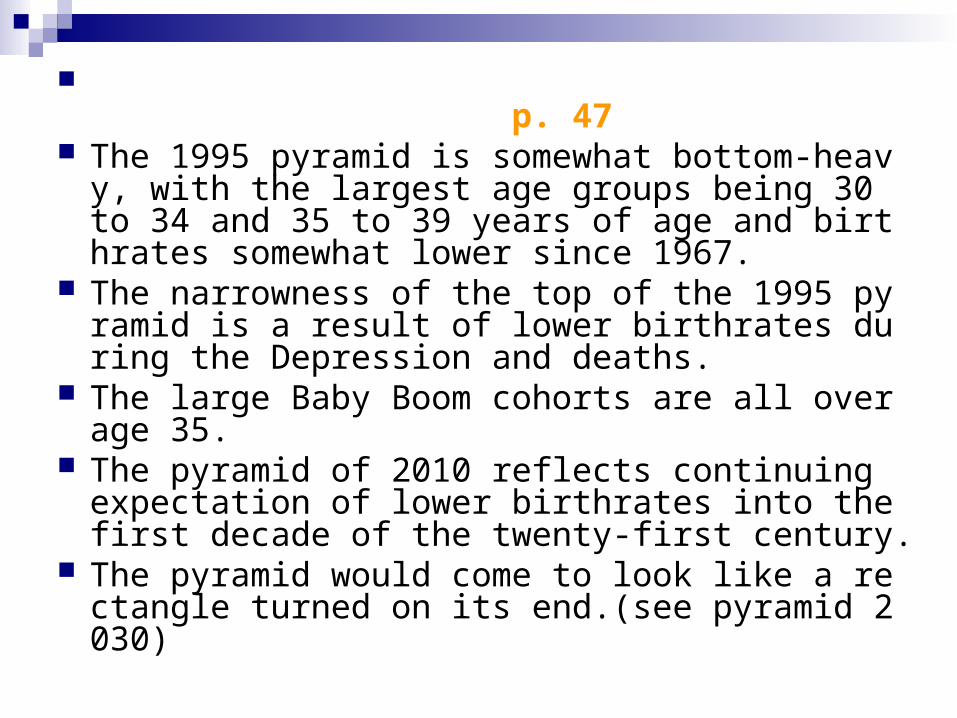
p. 47 The 1995 pyramid is somewhat bottom-heavy, w
ith the largest age groups being 30 to 34 and 35 to 39 years of age and birthrates somewhat lower since 1967.
The narrowness of the top of the 1995 pyramid is a result of lower birthrates during the Depression and deaths.
The large Baby Boom cohorts are all over age 35.
The pyramid of 2010 reflects continuing expectation of lower birthrates into the first decade of the twenty-first century.
The pyramid would come to look like a rectangle turned on its end.(see pyramid 2030)
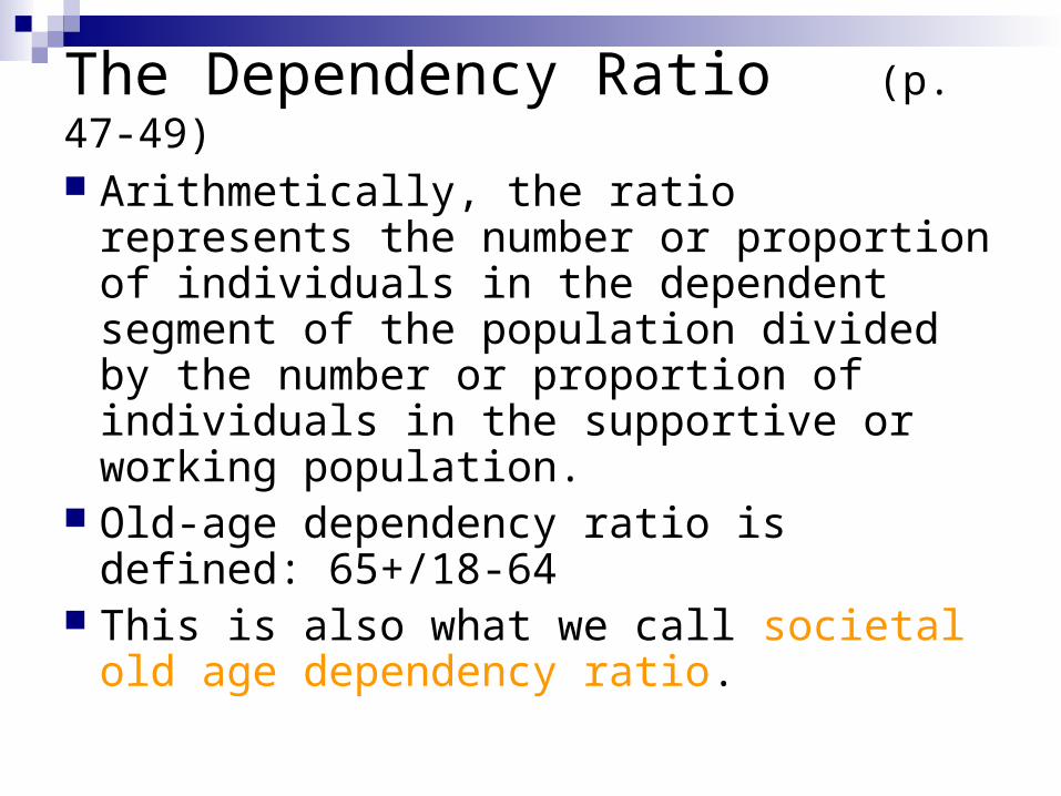
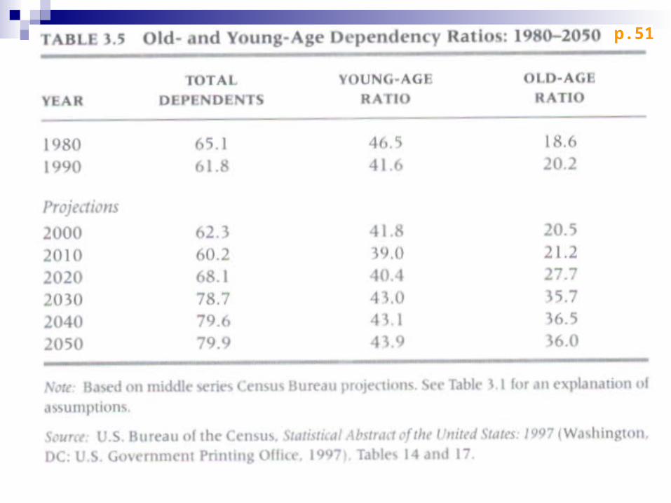
The Dependency Ratio (p. 47-49)
Arithmetically, the ratio represents the number or proportion of individuals in the dependent segment of the population divided by the number or proportion of individuals in the supportive or working population.
Old-age dependency ratio is defined: 65+/18-64
This is also what we call societal old age dependency ratio.

p.49
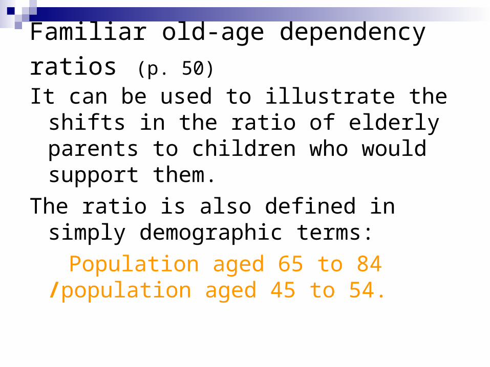
Familiar old-age dependency ratios (p. 50)
It can be used to illustrate the shifts in the ratio of elderly parents to children who would support them.
The ratio is also defined in simply demographic terms:
Population aged 65 to 84 /population aged 45 to 54.

p. 50
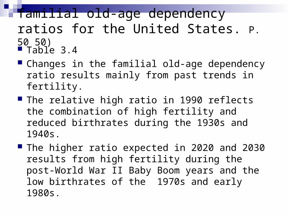
familial old-age dependency ratios for the United States. P. 50 50)
Table 3.4 Changes in the familial old-age dependency
ratio results mainly from past trends in fertility. The relative high ratio in 1990 reflects the
combination of high fertility and reduced birthrates during the 1930s and 1940s.
The higher ratio expected in 2020 and 2030 results from high fertility during the post-World War II Baby Boom years and the low birthrates of the 1970s and early 1980s.
p.51
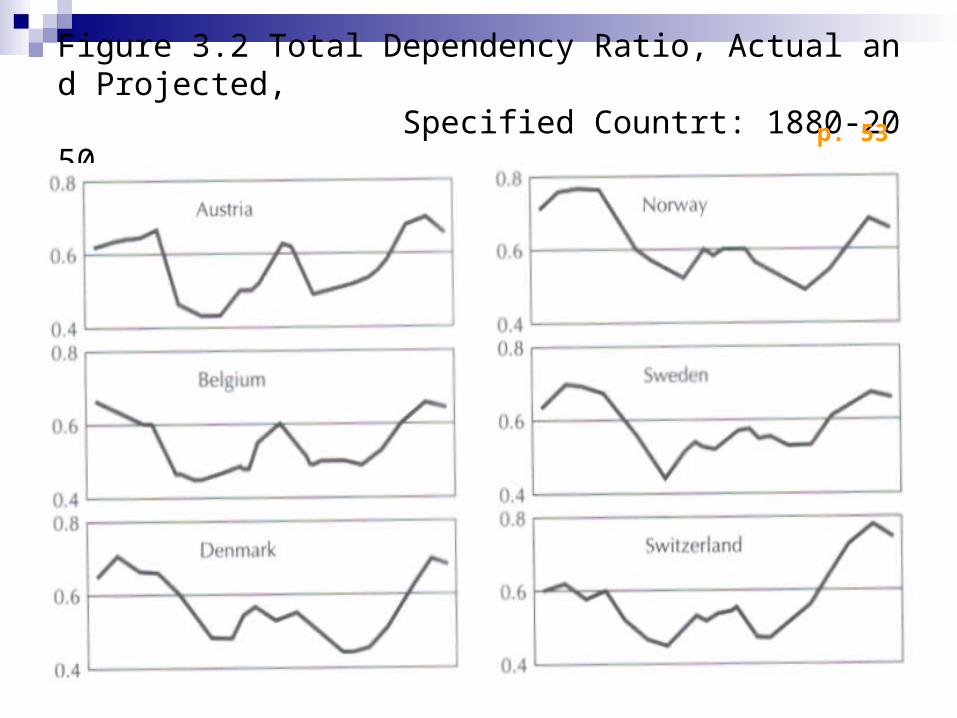
Figure 3.2 Total Dependency Ratio, Actual and Projected, Specified Countrt: 1880-2050 p. 53
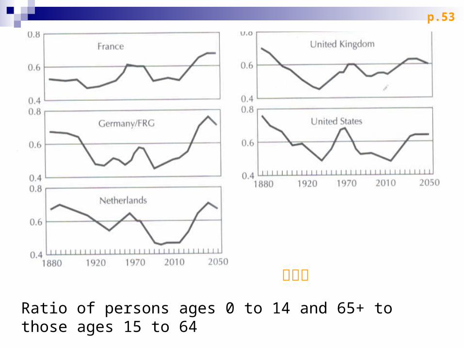
Ratio of persons ages 0 to 14 and 65+ to those ages 15 to 64
扶養比
p.53
Old-and Young-Age Dependency Ratios (p. 51-52)
The total dependency ratio From 1870 to 1986 population growth has
shown a downward trend in most industrialized countries.
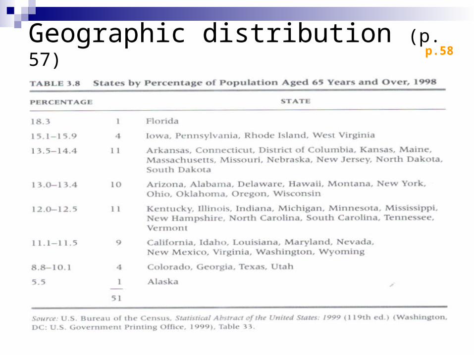
Geographic distribution (p. 57) p.58
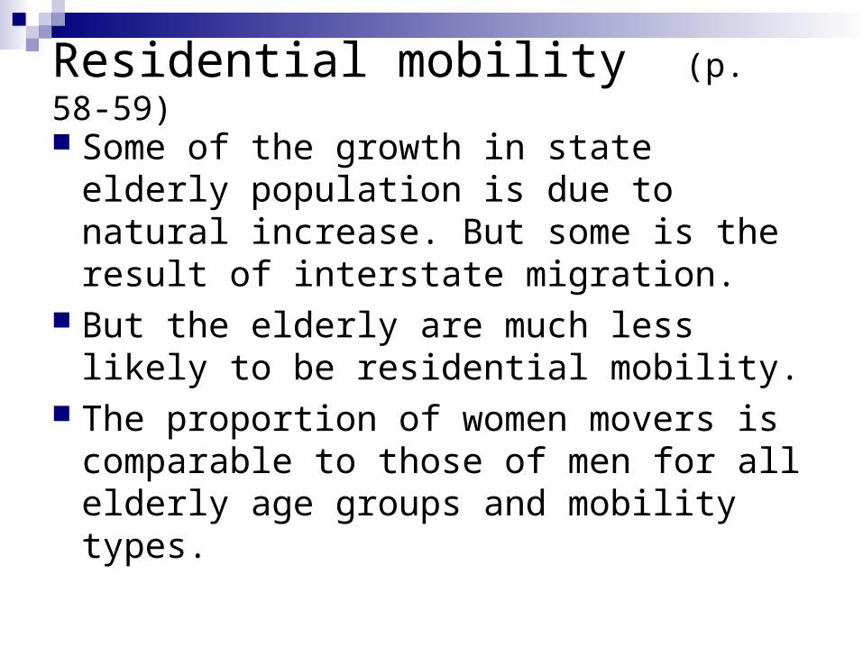
Residential mobility (p. 58-59)
Some of the growth in state elderly population is due to natural increase. But some is the result of interstate migration.
But the elderly are much less likely to be residential mobility.
The proportion of women movers is comparable to those of men for all elderly age groups and mobility types.
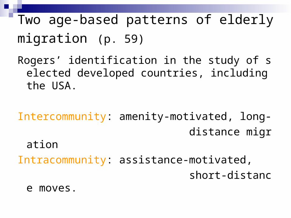
Two age-based patterns of elderly migration (p. 59)
Rogers’ identification in the study of selected developed countries, including the USA.
Intercommunity: amenity-motivated, long-
distance migration
Intracommunity: assistance-motivated,
short-distance moves.
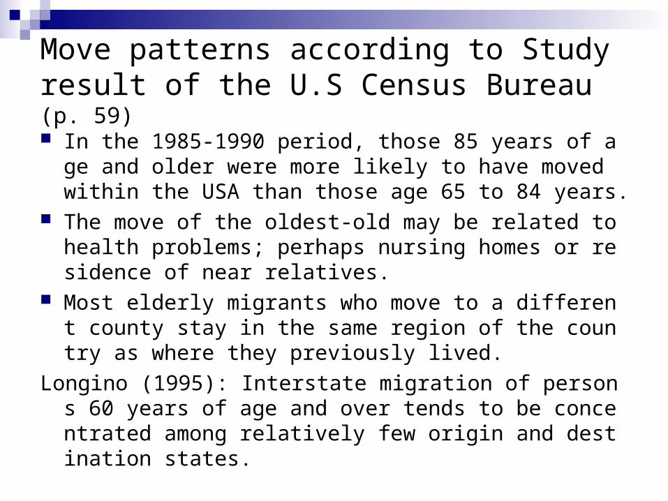
Move patterns according to Study result of the U.S Census Bureau (p. 59)
In the 1985-1990 period, those 85 years of age and older were more likely to have moved within the USA than those age 65 to 84 years.
The move of the oldest-old may be related to health problems; perhaps nursing homes or residence of near relatives.
Most elderly migrants who move to a different county stay in the same region of the country as where they previously lived.
Longino (1995): Interstate migration of persons 60 years of age and over tends to be concentrated among relatively few origin and destination states.
Geographic patterns of residential mobility in the USA (p. 59)
The U.S Census Bureau’s data
The 13 states with the highest net elderly inmigration rates are in the South and Southwest, the so-called Sunbelt.
Like Florida and Arizona
Economic implication of the elderly interstate
migration (p. 59)
Substantial amounts of retirement income may be transferred between states as a result of retirement migration.
1990 Census data, the Sunbelt states like Florida, California and Arizona would be expected to benefit from interstate migration of the aged.
Frostbelt states in the Midwest lose as a result of elderly interstate income transfers.
Elderly move (p. 59)
The first elderly move : the retirement move
The second elderly move
is motivated by the disability and widowhood.
represents an effort to move closer to the supportive efforts of adult children and other relatives.
The second elderly move may represent a double whammy in income transfer for many Midwest and Northeast “sending” states.

Residential Concentration (p. 60)
Increasing, the elderly have become an urbanized population, locating in central cities or in places that structurally and functionally are parts of larger metropolitan areas.
1990, only 26.4 percent of the elderly in the USA lived outside of large metropolitan areas.
Frey(1992) said that the growth in the urban elderly population is largely the result of younger cohorts aging “in place” and of residential relocations made earlier in the life span, rather than of relocation made after retirement.
Residential Concentration (p. 60)
In 1990, 79 percent of the U.S. population resided within a metropolitan area.
About 74 percent for the population age 65 years and over resided within a metropolitan area.
Metropolitan population growth in the USA has been a function of the growth of suburbs.
Racial difference of elderly residents (p.60) Elderly American Indians, Eskimos and Aleuts
were the only racial group which are more likely to live outside metropolitan areas.
Elderly Asian Americans were most likely to live inside metropolitan areas (13 inside to1 outside), followed by elderly Latinos (about 8 to1) , elderly African Americans (about 4 to 1), elderly whites (about 3 to 1)
In each of the racial groups, the oldest-old were somewhat more likely to be found residing outside metropolitan areas.