the art and craft of handmade books
TRANSCRIPT
1
My Version of
The Art and Craft of Handmade Books By Shereen LaPlantz
This is the companion to The Art and Craft of Handmade Books (2003) by the author.
Any book is collaboration between the author and the publisher, who supplies both the editor and the art department. For most instructional books, the author knows the subject and the editor knows English. My editor is/was skilled, experienced and generous enough to leave the book in my voice. Thank you. However, and this is an opinion that I've harbored the entire time I've been writing (since 1979), editors go off on flights of fancy and write fiction while signing my name. This time I feel, and it's strictly a personal opinion/feeling, that some of the instructions have been edited into inaccuracy. This part of my web site is an attempt to correct those edits. My editor, of course, thinks the manuscript is perfect, or near perfect. I recommend you rubber stamp over the questionable passages, which will remind you in the future to ignore those pages. I also recommend that you print out these pages. Binding instructions will be included at the end of this section. Bind up a thin booklet as a supplemental section and keep it with the book. FIRST, I believe artists should receive credit for their work. Tracy Aplin did the illustrations/diagrams -and- the models for this book. I gave her by-line credit on the title page. I believe that's where she belongs. Tracy came to my rescue when the doctors surprised me by finally doing a mastectomy -- on Wednesday. No prep time. And I really couldn't fold paper and act normal for weeks afterwards. Carla Tenret did all the calligraphy and also deserves by-line credit on the title page, which I asked for. Next, Lark was supposed to proof read their final edit. They did seriously clean up the typos on the laser proof I was shown. However, they needed one more read through with a fresh set of eyes. Apologies. CHAPTER ONE My tendency is to be picky. To tell you that my grandmother used art foam for her refrigerator art -OR- that the three definitions for glue, paste and adhesive are technically accurate, typically they are misused. If I get that picky, this errata will become a tome. I hate the overall sound of ignorance these mistakes give me, but have decided to redeem myself with the next book, which I will have complete control over! Next, I absolutely hate when a book tells me to look to page "X" for some instructions. Either put it where it belongs or leave it out. My editor felt the need to list the instructional page each and every time something was mentioned. It won't take long for you to memorize the page numbers for some techniques. I apologize. I know it's an attitudinal different between Lark and me, I believe you're intelligent and Lark believes you're short on time, crushed after a hard days or weeks work and just want to get something done, not think about it. Please forgive the page interruptions. Page 6: My editor, of course, is experienced with computer and can't imagine the current upsurge in book arts not being a result of computers -- and it probably is. However, you do NOT need a computer to make a book. I think we'll all agree that a few books were made before computers. Books were even made before Gutenberg and movable type. Handwritten books are elegant. Rubber stamped books are alive. Letterpress books are back to elegant and tasty. Please don't limit yourself to a computer.

2
Personally I do NOT use definitions. I consider them a straight jacket for creativity. If I want to make books, whatever I make I call a book. If I want to make faux postage or artists' stamps, whatever I make is called those. My editor is deeply into definitions (she even asked me to define what a pencil was). Unfortunately she happily substituted her definitions when I refused to supply any. It was fascinating to find out that my work did not fit the definition of artists' books. Please, please, please give yourself the freedom to work without definitions. If you need definitions, allow yourself to change them often, like daily or hourly. The point of making art is enjoyment and growth -- have fun! Page 7, second paragraph: There are 6 techniques and 1 format, not 7 techniques. The start tunnel format can be applied to many different techniques. This book shows 3 possible formats. Page 10 & 11: (We can imagine how much I was behind a glossary.) The definitions I argue with are: Book Cloth doesn't have to be dyed, Pastel paper if for pastels not oil colors, Printmaking paper - vellum means a soft surface paper, not textured, and Text Block refers to the pages not the contents (good luck binding words and illustrations that aren't on something, like paper.) Page 12: Please don't try to pour PVA straight out of the container onto your book. The containers tend to be too big and will make a mess. I transfer my PVA to squeeze bottles. They're wonderfully handy and you can squeeze a small enough amount out to use it directly on your book. Otherwise, please transfer the PVA to a small plastic or glass container that a brush can be dipped into. Page 13: Wheat paste needs to be cooked in a microwaveable bowl, not heat resistant. BONUS -- BONUS -- BONUS Dorothy Swendeman just came over and told me of her new method of cooking wheat paste in a double boiler. She uses the 1 part wheat paste to 8 parts water double boiler recipe, mixes it, then lets it sit in the double boiler for at least 2 hours. When she finally starts cooking the paste it only takes 5-10 minutes of constant stirring. Normally it takes 20 minutes of constant stirring. Rollataq® by Diage is a wonderful adhesive that has come onto the market. Sterling and Lark don't like any brand names mentioned because the book will be sold outside the US and we don't know if the product is available in other countries. It makes sense, no point in disappointing readers. But this is my web site so I can mention specific products. Rollataq is archival, non-toxic, water soluble (easy clean up) and has a 20 minute re-positioning time. Sounds like a miracle. The problem is the hand held or desktop applicators. They clog and freeze up unless cared for constantly. Then I started hearing about using it with a brush. It works -- great. I switched over to Rollataq for my workshops and we're all in love. Because it's water-soluble and has such a long set up time, a damp cloth or damp paper towel can wipe off any adhesive fingerprints on the surface. (That's a really good point.) We use sponge brushes here and because of the long set up time, we could keep the same brush going all day. Now, this adhesive is supposed to be burnished to make it permanent. However, I found weighting the book or page was sufficient. Around here I use 2 layers of resealable sandwich bags partially filled with BB's for weights. They're inexpensive and can be formed to fit unusual shapes. Rollataq is available at larger art supply stores, catalog art supply stores and archival photography houses. END -- BONUS -- END Page 13 continued: Almost any paper can be used -and- it will take a bit of experience to learn how each paper is best used. Page 14: I shy away from paperweights. Papers are weighed by -- I think it's 100 pieces of the parent sheet. Unfortunately parent sheets are different sizes. Try feeling a 20lb writing paper and both a 50lb and a 70 lb photocopy paper. Then try to figure out how those numbers relate. It's easier just to know the weights you like and buy accordingly.
3
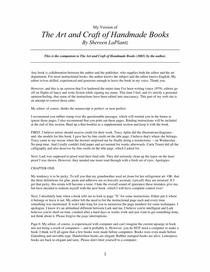
Page 15: Grain; No matter what type of store you buy paper in, if it's a western paper or a board, it will have grain. Board; everything is cut on a cutting board. Some tools, like the utility knives for cutting boards and hole punches, leave permanent canyons in a cutting board. Instead of ruining your board or buying a second board, simply turn the board over and declare the back the "canyon side." Page 16: I think they have figure 1-3a upside down. The name they're skirting around with craft knives, is "X-acto® knife." Again they don't like using brand names, but sometimes brand names help identify the item. Page 18: Sewing cradle materials, 4th item should be; 1 piece book cloth, fabric or sturdy paper, 2" x 30-32". All of the measurements are "essentially" -and- this cradle can be made whatever size is necessary for whatever project. These sizes are just a springboard.
Just thought you might like to see what my sewing cradle looks like, which means this is a bonus photo. Page 18 continued, #5: Two changes need to happen here, first on figure 1-10 rubber stamp over the 8 little stops. Then transfer the remaining diagram portion to step #6. Obviously figure 1-8 should be the 2 large rectangles it is, plus 2 smaller rectangles for the feet and they're missing, plus the 8 tiny rectangles from figure 1-10. You can imagine the diagram. Second, step #5 should be 2 steps. Please break #5 and make the last sentence #5A. Page 20 seems to be all messed up. Why isn't applying adhesive on page 12 & 13? Please make a note on 12 & 13 if you ever want to find this again. Likewise Punching and Poking holes should go on page 16. Again please note this on page 16 if you think you'll want the information again. The Cutting section doesn't make any sense to me; it seems to be space filler. Rubber stamp over it. Plus I think there's only one hard cover shown. Pressure Scoring: all 3 steps do not have to be done each and every time. Do what works. NEW CHAPTER -- CONCERTINA Page 23: At the bottom of the side bar a lap joint is shown. Please rubber stamp over the second, or last, paragraph. There are NO FOLDS in a lap joint. Just lay one piece of paper on top of the other and adhere in place. Fig 2-0b shows this.
4
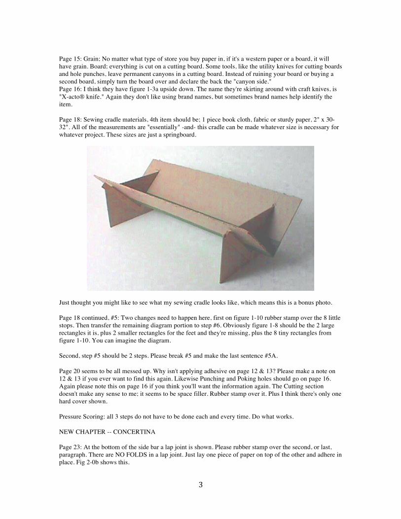
The second paragraphs on both pages 21 & 22 fit best at the top of the folding instructions. Then if the diagrams look a little odd to you it's because some of them have been flipped. Fig 2-1, 2-2, 2-3 & 2-6 have been flipped and as currently shown work easiest for a left-handed person. (Finally some directions written for you!) Fig 2-4 is non-directional and 2-5 was used in the correct direction, or, for a right handed person. Page 26: Unfortunately the sizes were left off these diagrams. Please handwrite them in. #6: I don't know how to fold the tabs under, their only action is to fold across, see Fig 2-10.
Matchboxes work best in small or miniature formats (for books, miniature is 3" in any direction, a bit big for a matchbox). Page 27: Making an inverted portion of a concertina does NOT add depth and dimension, that would require more paper added in some manner, which might be nice. The point of this technique and variation is to add visual interest. Page 28, #3: I think this is one of the places where two steps in the directions got combined, hopefully making English, but instead making chaos. For #3 let's make sure that the first fold in the concertina is a valley fold and the second a mountain fold. You may have to turn your concertina over. Please rubber stamp over all of #3 except for the first sentence. Rubber stamp over all of #4 and make it say: Decide how wide a bar is desired at the head and tail. The sizes in #3 are a good place to begin. Mark the head and tail bars. Decide how deep you wish the inverted portion. It cannot be more than half the width of the panel. Mark the depth measurements. Score these depth marks, all the way to the head and tail marks. Cut the head and tail, between the score lines. #5 needs too say: To invert the centerfold... Page 29: My ego is a bit miffed at the book being called a model. In my mind a model doesn't have content. This book has both text and illustrations. It also used the handmade envelope almost visible on the lower right as a presentation wrapper. This book was made in an edition of 300. Apologies for letting my ego intrude. Page 30, #2: Cover weight paper or a crisp printmaking or watercolor paper. It really wants to be crisp. Page 31, second paragraph #6: Figure 2-17 fits with "You can also create a pop-up within a pop-up,..." NEW -- BONUS -- NEW
5
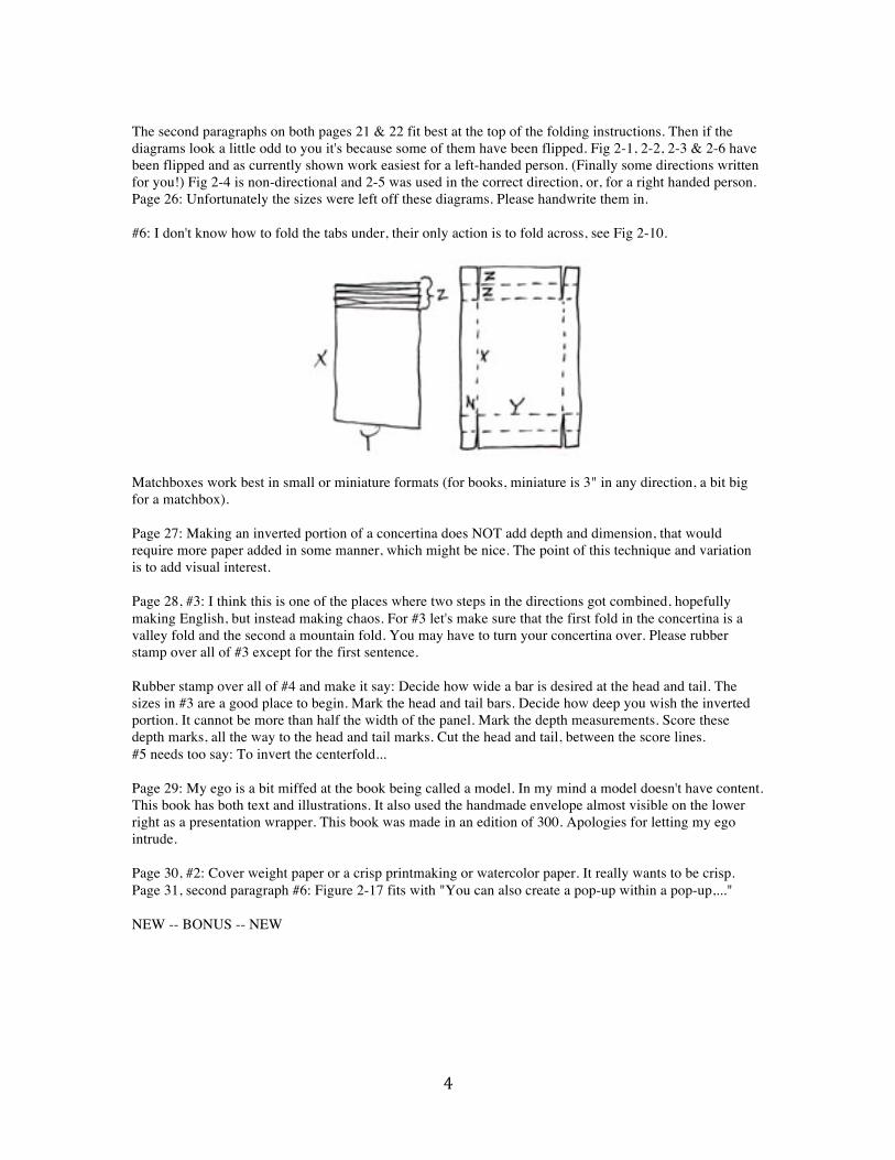
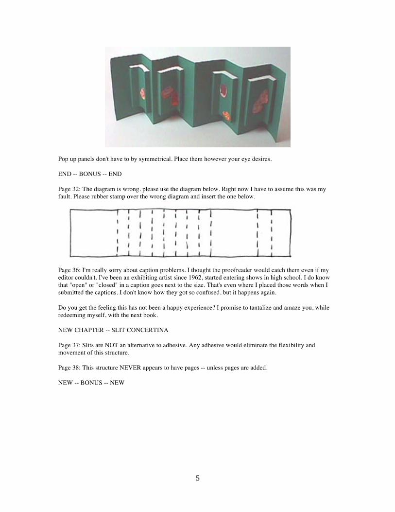
Pop up panels don't have to by symmetrical. Place them however your eye desires. END -- BONUS -- END Page 32: The diagram is wrong, please use the diagram below. Right now I have to assume this was my fault. Please rubber stamp over the wrong diagram and insert the one below.
Page 36: I'm really sorry about caption problems. I thought the proofreader would catch them even if my editor couldn't. I've been an exhibiting artist since 1962, started entering shows in high school. I do know that "open" or "closed" in a caption goes next to the size. That's even where I placed those words when I submitted the captions. I don't know how they got so confused, but it happens again. Do you get the feeling this has not been a happy experience? I promise to tantalize and amaze you, while redeeming myself, with the next book. NEW CHAPTER -- SLIT CONCERTINA Page 37: Slits are NOT an alternative to adhesive. Any adhesive would eliminate the flexibility and movement of this structure. Page 38: This structure NEVER appears to have pages -- unless pages are added. NEW -- BONUS -- NEW
6
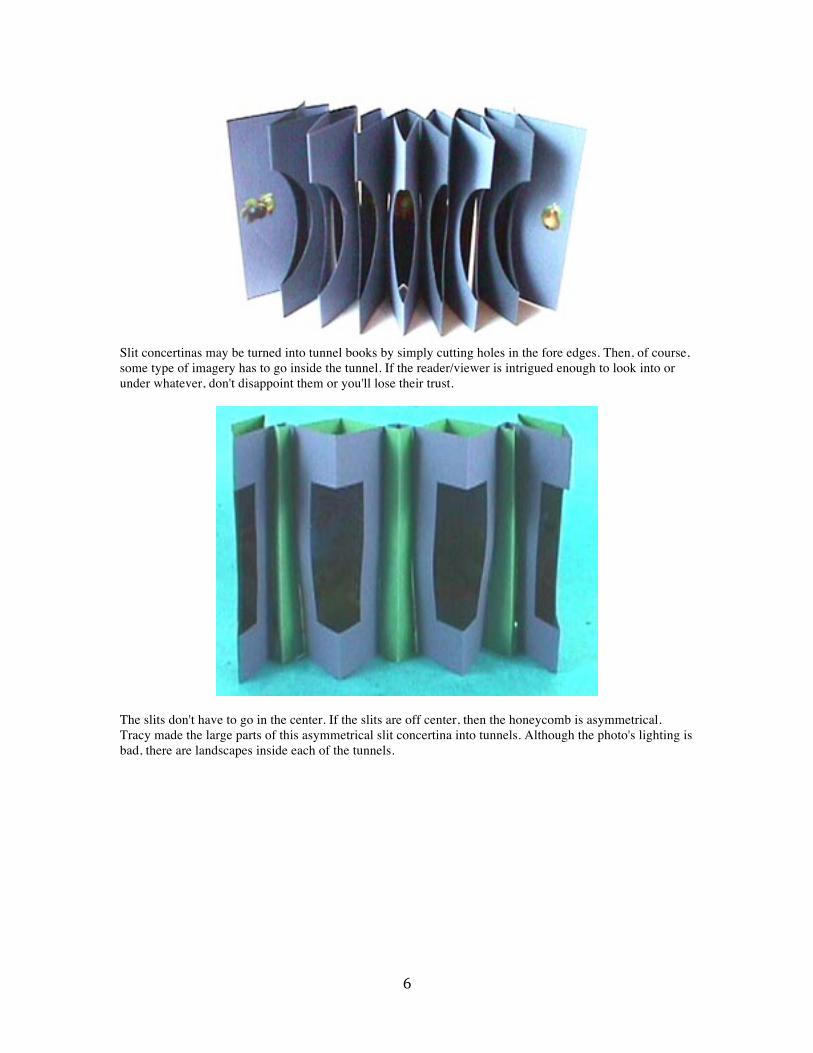
Slit concertinas may be turned into tunnel books by simply cutting holes in the fore edges. Then, of course, some type of imagery has to go inside the tunnel. If the reader/viewer is intrigued enough to look into or under whatever, don't disappoint them or you'll lose their trust.
The slits don't have to go in the center. If the slits are off center, then the honeycomb is asymmetrical. Tracy made the large parts of this asymmetrical slit concertina into tunnels. Although the photo's lighting is bad, there are landscapes inside each of the tunnels.
7
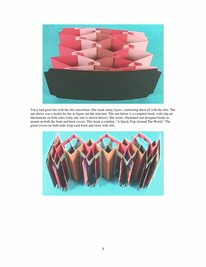
Tracy had great fun with the slit concertinas. She made many layers, connecting them all with the slits. The one above was a model for her to figure out the structure. The one below is a complete book, with clip art illustrations on both sides (only one side is shown below). She wrote, illustrated and designed books to mount on both the front and back covers. This book is entitled, "A Quick Trip Around The World." The green covers on both ends wrap each book and close with slits.

8
END -- BONUS -- END Page 41, #1: The sizes are your choice. #4 Please use 3/8" as the minimum pillar width, a 1/8" pillar would buckle. Page 42: Surfers and sea horses: Please rubber stamp over the first sentence. The interior strip must be concertina, even if it's only a two-panel concertina. Both the sea horses and the surfer dudes came from clip art. If you think the photo looks wrong it's because they photographed the back of the book. You can still see what's happening. Page 44: Fourth paragraph: Please rubber stamp over the first sentence. The size of your imposition model is unimportant, however there has to be the exact same number folds as in the finished book. With all of these instructions, perhaps one more diagram would help. This diagram shows one piece of paper folded in quarters. The first four pages are numbered. Page 45: This book is the first combination structure. Page 47: BONUS lower left photo 12 Days of Valentines, by Elaine S. Benjamin, has a different take to concertina. Notice the loops in the valleys they hang off pushpins, allowing this book to hang on the wall. STAR TUNNEL BOOK Page 49: Fourth paragraph: Star tunnel books are a format, that's why you can use almost any technique with them. Experiment. Page 51: #2: After "(see fig. 4-1 )" Please add in, repeat this process on all four arms. This is Gobbledygook. See fig. 4-2 on page 52. The layer you are measuring is -- the furthest back layer, illustrated in basket weave. This layer in the model was made out of elephant hide paper. The innermost layer is the front, all white layer. Hope this helps. #7: "Each cover fore edge" refers to front cover and back cover.
9
Page 52: #9: Obviously it is easier to adhere images before all the layers are connected. Please use logic. Page 53: At the end of the paragraph we need to include that six sets of these short pieces get adhered at the fore edge to make a star. Two panels do not make a star. TIP: This method is the easiest way to get odd numbers of star arms, like five or seven. Page 55: #2: Third sentence: The crochet tape, yarn, or ribbon must be twice as long as desired, NOT twice the length of the panels. The desired length will probably be the height of the panels -plus- something for a knot -plus- a good bit of length to hang it from. Then double it. Third sentence: Please break the sentence after, "Your concertina panels." #2 A starts with, "You'll use half..." #2B is the last sentence. Page 56: Second to the last paragraph: Obviously adding a strip of decorative paper to the fore edge is optional. However this is a fun way to add color and personality to a model or book. The decorative strip can even wrap around the fore edge. NEW -- BONUS – NEW
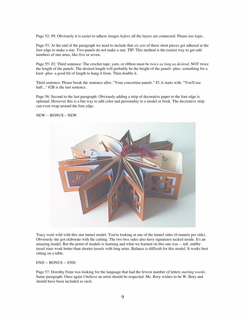
Tracy went wild with this star tunnel model. You're looking at one of the tunnel sides (6 tunnels per side). Obviously she got elaborate with the cutting. The two box sides also have signatures tucked inside. It's an amazing model. But the point of models is learning and what we learned on this one was -- tall, stubby tassel stars work better than shorter tassels with long arms. Balance is difficult for this model. It works best sitting on a table. END -- BONUS -- END Page 57: Dorothy Fenn was looking for the language that had the fewest number of letters starting words. Same paragraph: Once again I believe an artist should be respected. Ms. Bory wishes to be W. Bory and should have been included as such.

10
Fourth paragraph: There is no point in adding a brief story to each pictogram if you're using mnemonics. You're children and you will share the same visual memory. That means the stories would defeat the mnemonics. Page 58 & 59: Again, I think it's a book, but now I'm quibbling. Page 61: The diagram has been flipped. Again it is for a left-handed person, not a rightie. NEW -- BONUS TIP -- NEW The book shown on pages 60 and 61 was actually a workshop prospectus. When I first got into book arts I heard about ephemera (page 122). Since these are not meant to be kept I had a lot of freedom to play and experiment with bindings, how to make and use cutting and folding jigs, what to write, etc. That year I offered a different workshop every month in my binding and bound a piece of ephemera for each. I really learned edition binding, how to cut minutes off the process and still make the book look interesting. I recommend this to you. Challenge yourself to edition ephemera, like holiday cards -- some of mine have been multi-paged books -or- congratulation book/cards for the new library, new whatever. You have things you need during a year -- bind them! END -- BONUS TIP -- END Page 62: The words make sense, but not with these diagrams and photo. There needs to be two layers. One with cut openings for the tunnel. One without, to mount the imagery. The cut openings layer is smaller, allowing the other layer to be larger, forming the tunnel's background. The other part is like Fig 4-12 on the previous page. Put it all together just like the previous structure -- except that these two layers act as one.
The detail photo in the lower right corner doesn't show what it's supposed to. I'm including another photo, that's not a detail, butt does show the layering. The larger inside layer is dark brown and has faux postage of clip art animals.
11
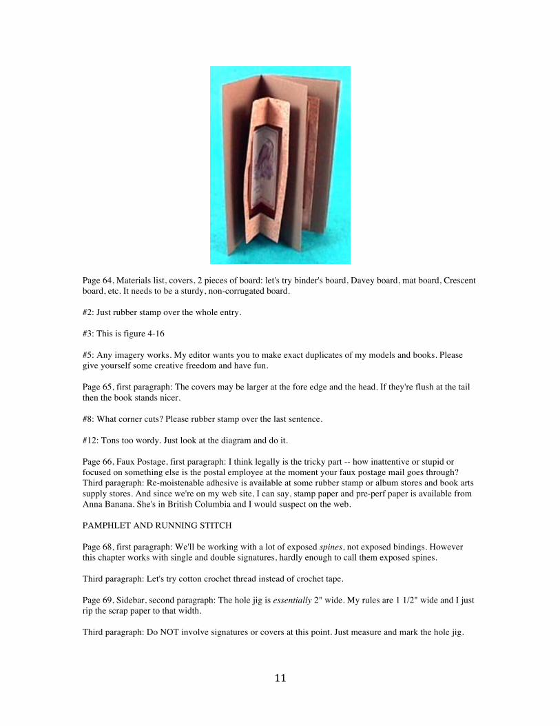
Page 64, Materials list, covers, 2 pieces of board: let's try binder's board, Davey board, mat board, Crescent board, etc. It needs to be a sturdy, non-corrugated board. #2: Just rubber stamp over the whole entry. #3: This is figure 4-16 #5: Any imagery works. My editor wants you to make exact duplicates of my models and books. Please give yourself some creative freedom and have fun. Page 65, first paragraph: The covers may be larger at the fore edge and the head. If they're flush at the tail then the book stands nicer. #8: What corner cuts? Please rubber stamp over the last sentence. #12: Tons too wordy. Just look at the diagram and do it. Page 66, Faux Postage, first paragraph: I think legally is the tricky part -- how inattentive or stupid or focused on something else is the postal employee at the moment your faux postage mail goes through? Third paragraph: Re-moistenable adhesive is available at some rubber stamp or album stores and book arts supply stores. And since we're on my web site, I can say, stamp paper and pre-perf paper is available from Anna Banana. She's in British Columbia and I would suspect on the web. PAMPHLET AND RUNNING STITCH Page 68, first paragraph: We'll be working with a lot of exposed spines, not exposed bindings. However this chapter works with single and double signatures, hardly enough to call them exposed spines. Third paragraph: Let's try cotton crochet thread instead of crochet tape. Page 69, Sidebar, second paragraph: The hole jig is essentially 2" wide. My rules are 1 1/2" wide and I just rip the scrap paper to that width. Third paragraph: Do NOT involve signatures or covers at this point. Just measure and mark the hole jig.
12
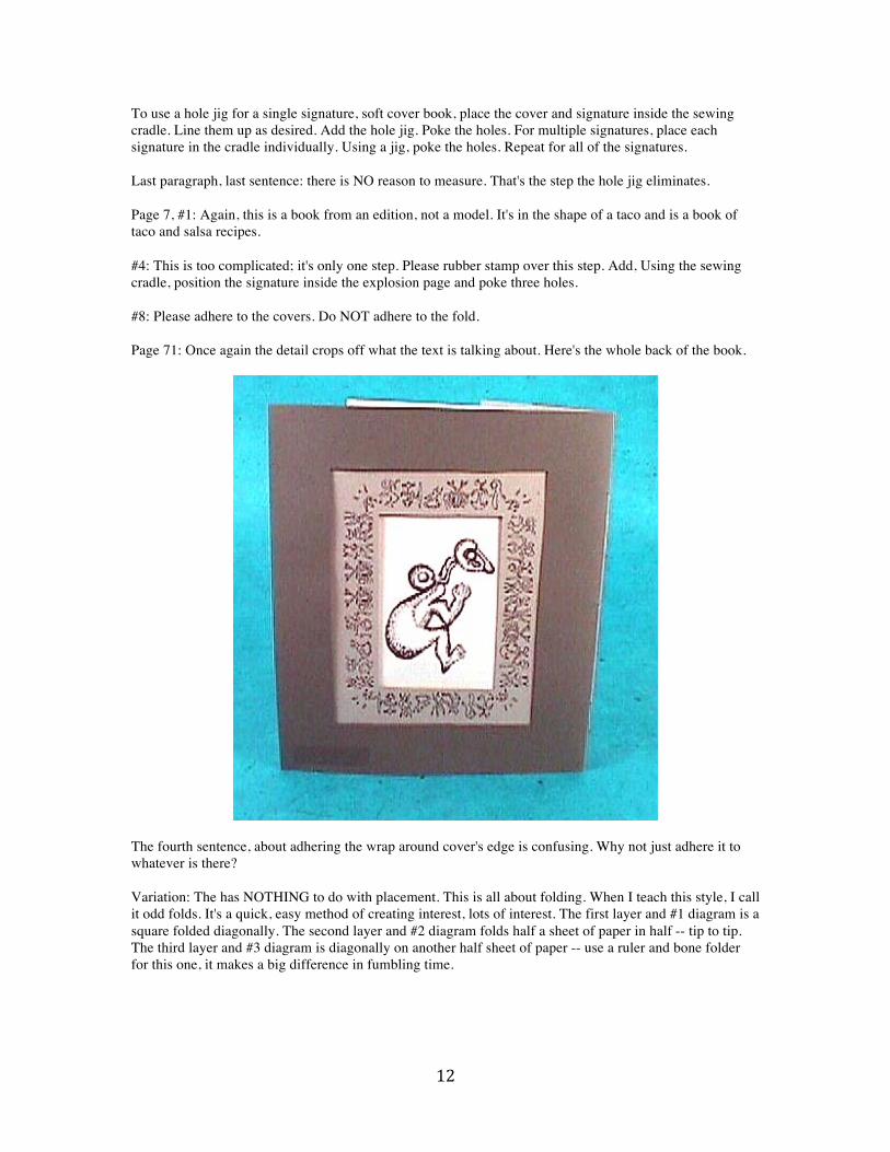
To use a hole jig for a single signature, soft cover book, place the cover and signature inside the sewing cradle. Line them up as desired. Add the hole jig. Poke the holes. For multiple signatures, place each signature in the cradle individually. Using a jig, poke the holes. Repeat for all of the signatures. Last paragraph, last sentence: there is NO reason to measure. That's the step the hole jig eliminates. Page 7, #1: Again, this is a book from an edition, not a model. It's in the shape of a taco and is a book of taco and salsa recipes. #4: This is too complicated; it's only one step. Please rubber stamp over this step. Add, Using the sewing cradle, position the signature inside the explosion page and poke three holes. #8: Please adhere to the covers. Do NOT adhere to the fold. Page 71: Once again the detail crops off what the text is talking about. Here's the whole back of the book.
The fourth sentence, about adhering the wrap around cover's edge is confusing. Why not just adhere it to whatever is there? Variation: The has NOTHING to do with placement. This is all about folding. When I teach this style, I call it odd folds. It's a quick, easy method of creating interest, lots of interest. The first layer and #1 diagram is a square folded diagonally. The second layer and #2 diagram folds half a sheet of paper in half -- tip to tip. The third layer and #3 diagram is diagonally on another half sheet of paper -- use a ruler and bone folder for this one, it makes a big difference in fumbling time.

13

14
Page 72, title page: Commercial publishers have to state the printing location for tax purposes. We don't, but it's a habit that's good to get into. A printer's mark or printer's device is an image, symbol or logo that the printer/publisher uses to identify themselves. Again, we don't have to have a mark, no one has to have a mark. It's just fun and makes us look a bit more professional. Colophon, first paragraph, end: There can also be a lettered portion of the edition, like A-G. The lettered copies are usually given to special people, family and friends. When I have a lettered portion my last sentence is; "This is a numbered edition of ___ and a lettered edition of ___, of which this copy is # . Then I sign the colophon page. Page 74: Again, this is an edition of books, not a model. #4 and Fig 5-5: These are the basic method of doing a two-signature pamphlet stitch. They do not apply to this book. Please mentally ease them to the beginning. #5, first sentence: Please apply only a bead of adhesive to the tail or bottom of the slipcase. Otherwise the slipcase is being sealed, as in closed. Page 75: Wilde Quotes is an edition book by Tracy Aplin. She definitely deserves credit for books she designs, gathers the text for, illustrates, prints and binds. Page 76: This is not a journal. It would be awkward to try and write over the lumps and bumps of explosion pages. It is another of Tracy's fun models. Page 77, #7 & #8: Fold the explosion pages BEFORE adhering. Page 78: Figure 5-12b should be a separate number. It has nothing to do with 5-12a. 5-12b is also upside down, making the mountain fold look like a valley. Traditional Explosion: Figure 5-12b goes with the third paragraph. The fourth paragraph is figure 5-13. Repeat this step on all four corrners. Done. Please rubber stamp over the entire fifth and sixth paragraphs, these are repeats. NEW -- BONUS -- NEW Page 79: I always write too much. This time, even after trimming whole chapters I submitted 19,000 words -- that's a lot. It also means about half of what I sent got cut. This hinge binding is from one of the chapters that I cut. But as long as the model is shown let me include directions. Start with a four-panel concertina out of cover weight paper. Decide on a hinge pin. Bamboo skewers work, as do chop sticks, colored pencils, etc. Measure around the hinge pin with a narrow piece of scrap paper. Mark the measurement -- I usually pinch it hard with my fingernails. This is the width for both your holes and barrels. Cut hinges into the two spines. Hinges are just rectangular holes and the solid paper partner -- makes "barrels." Hinges are made with an odd number of barrels and corresponding holes. (Go look at a door.) The odd number seems to stabilize the hinge, make it less wobbly. Tracy chose to cut the hinges (holes & barrels) inside the spines. This made the interior "pleat" just a little smaller so it wouldn't hang out of the fore edge. TIP: It matters that each holes matches up with a barrel. Lay the hinge pins on the inside of one hinge. Roll the paper around the hinge pin. This just convinces the paper that it wants to be a hinge.
15
Tracy and I wanted signatures in this model. First Tracy sewed the signatures directly onto the cover paper, right next to the spine. I thought it should work. However the signatures kept interfering with the hinge movement and function. This is Tracy's second solution. She made a "flying" concertina and attached the signatures to it. Her flying concertina is four panels, but a hair shorter than the original four panels. The signatures are sewn in place and then the flying concertina is adhered near the fore edges of the hinged concertina. The point of all this work: To make a multi-paged book with a deep hidden compartment. END -- BONUS -- END Page 81, second paragraph: The startling part of the number of pages is that each was a single signature. The whole book was one extremely thick signature. Photo: Notice that Jody tackets over the tapes. This is brilliant. I didn't include that technique in this book, because I don't know her and don't want any chance of her feeling ripped off. Study the photo. Learn from Jody. I have included the traditional forms of this technique, with non-traditional materials. Page 83, materials: Again, the editors are trying to let you make an exact copy of my book. I'm surprised they didn't print the text for you to copy. Please make the signatures however many pages you want. Figure 6-3: The labels must have fallen off. The short lines, both top and bottom, indicate the edges of the signature. The hole jig is the height of the cover. Figure 6-4: This is trying to be an overhead view of the sewing cradle. Page 84: Maybe I've been working on this too long. The whole page is confusing and seems to need a complete rewrite. I think it would be easiest to ignore the text and look at the illustrations. The illustrations show tacketing a single signature into a single fold. The other side has two signatures and two folds. Go for it. Page 86, second paragraph: Custom dies may be ordered. I own several. Since this is my web site I can plug company names, I have found AccuCut to be the easier company to work with. Have fun. If die cutting feels out of your range, think again. Today a lot of album and rubber stamp stores have dies and die cutting presses. They're usually available to customers for a small fee, or, for using the store's supplies. Check out what's available to you. Page 87, #1: The signature wrappers are the die cuts. That die is from Ellison and is called a "self closing card." #3: Again the words are confusing, look at the diagrams. Page 88, third paragraph: The cover paper should be -- cover + spine + cover + fore edge spine + flap. As it is, the cover will be too short. Also, score and fold the flap. Fourth paragraph: This doesn't make sense. Please rubber stamp over it. TIP: Tracy wasn't as happy with this binding -- and she had a point. Page 90, #4: Don't extend the hole. I don't know where some of these words came from. #9: I have no idea what this means. I didn't write it. Please rubber stamp over the whole instruction. Page 91: The tapes are still there. Tracy didn't like the holes spreading (enlargening with the stitching) so she added a concertina spine. It is quite effective.
16
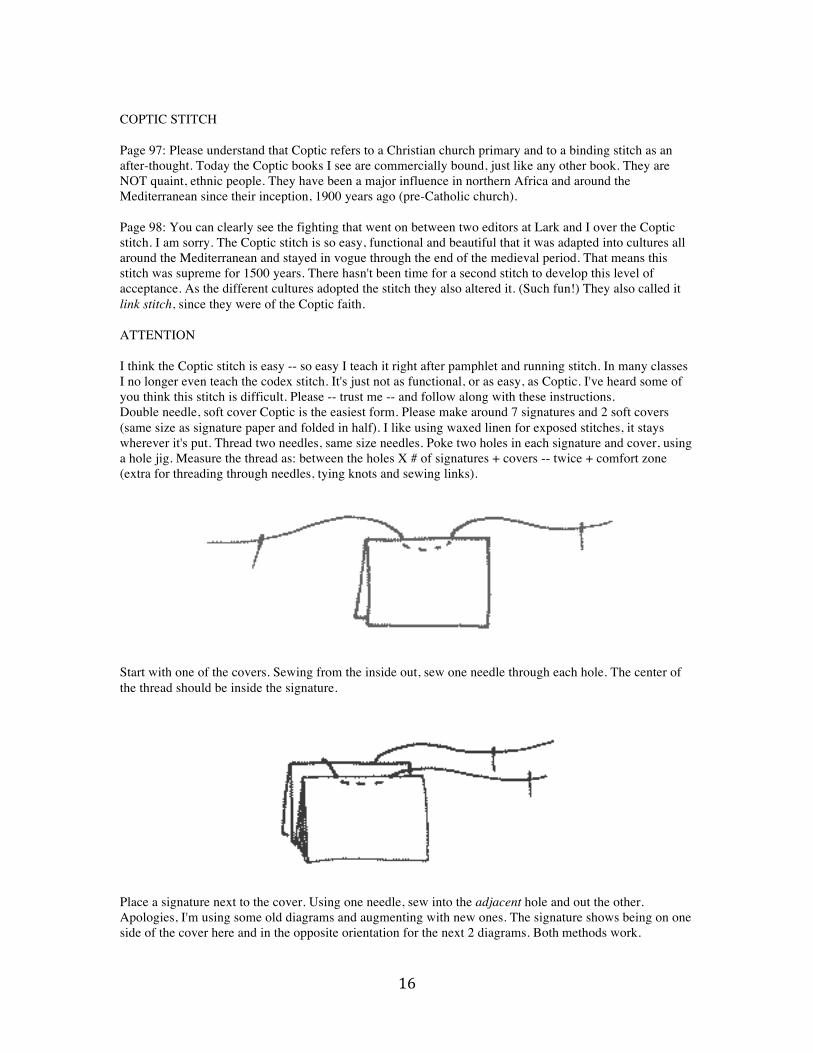
COPTIC STITCH Page 97: Please understand that Coptic refers to a Christian church primary and to a binding stitch as an after-thought. Today the Coptic books I see are commercially bound, just like any other book. They are NOT quaint, ethnic people. They have been a major influence in northern Africa and around the Mediterranean since their inception, 1900 years ago (pre-Catholic church). Page 98: You can clearly see the fighting that went on between two editors at Lark and I over the Coptic stitch. I am sorry. The Coptic stitch is so easy, functional and beautiful that it was adapted into cultures all around the Mediterranean and stayed in vogue through the end of the medieval period. That means this stitch was supreme for 1500 years. There hasn't been time for a second stitch to develop this level of acceptance. As the different cultures adopted the stitch they also altered it. (Such fun!) They also called it link stitch, since they were of the Coptic faith. ATTENTION I think the Coptic stitch is easy -- so easy I teach it right after pamphlet and running stitch. In many classes I no longer even teach the codex stitch. It's just not as functional, or as easy, as Coptic. I've heard some of you think this stitch is difficult. Please -- trust me -- and follow along with these instructions. Double needle, soft cover Coptic is the easiest form. Please make around 7 signatures and 2 soft covers (same size as signature paper and folded in half). I like using waxed linen for exposed stitches, it stays wherever it's put. Thread two needles, same size needles. Poke two holes in each signature and cover, using a hole jig. Measure the thread as: between the holes X # of signatures + covers -- twice + comfort zone (extra for threading through needles, tying knots and sewing links).
Start with one of the covers. Sewing from the inside out, sew one needle through each hole. The center of the thread should be inside the signature.
Place a signature next to the cover. Using one needle, sew into the adjacent hole and out the other. Apologies, I'm using some old diagrams and augmenting with new ones. The signature shows being on one side of the cover here and in the opposite orientation for the next 2 diagrams. Both methods work.

17
Repeat for the second needle -- going in the other direction, of course.
Place a third signature next to the last one. Repeat the stitch with both needles.
Now we finally get to the interesting part. Here we're back to the old diagrams and I showed two steps in one diagram. You can follow. The right side shows sewing under the first stitch. That means, skip the first opportunity to sew under a stitch and take the second opportunity -- which just happens to be between the cover and the first signature. Pull the stitch snug, but NOT tight. Tension is the critical element with Coptic and any other link stitch. Keep the tension even. (It will take a few tries. I always make 6 versions of a new stitch to stitch it in my brain and to get the tension problems under control. The left side of this diagram shows continuing the loop to the next/new signature -- and sewing through it. The right side also has to sew through the fourth signature.

18
Now it just a case of repeat. Both needles sew into a new signature. They then skip the first opportunity and sew under the stitch at the second opportunity. And continue. This stitch will look like a crochet chain.
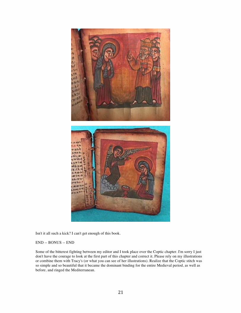
NEW -- BONUS -- NEW Now we get to have some fun. I treated myself to a Coptic Bible several years ago. It's old, but I don't know how old, at least a couple of hundred years. The covers are a dark wood, more a walnut color than an ebony. The edges are smoke darkened. The pages are goat skin parchment and if you look at the text page you'll see the scratch lines they made to write on. The language is Geez. I've been told it's the Coptic holy language, but I think it was their everyday language at one time, like Latin was for BC/AD Italians. And yes, it's an illuminated Bible. The style is typical of the Copts. Also notice the Coptic binding, it's the elongated Coptic stitch. And notice the repair. I would never think to use a book's pages to repair itself, but I love the look of the hand. One more also, the pages are also smoke darkened at the edges and the Bible smells of smoke or incense.

19

20
21
Isn't it all such a kick? I can't get enough of this book. END -- BONUS -- END Some of the bitterest fighting between my editor and I took place over the Coptic chapter. I'm sorry I just don't have the courage to look at the first part of this chapter and correct it. Please rely on my illustrations or combine them with Tracy's (or what you can see of her illustrations). Realize that the Coptic stitch was so simple and so beautiful that it became the dominant binding for the entire Medieval period, as well as before, and ringed the Mediterranean.
22
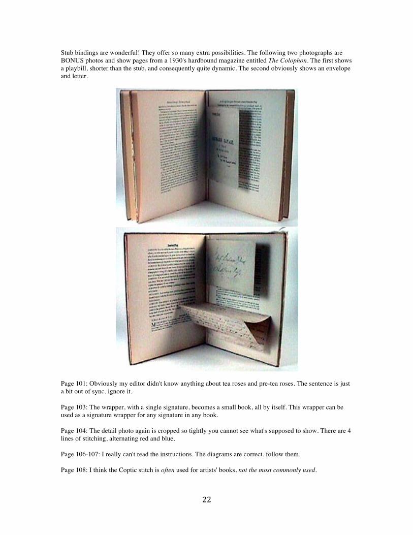
Stub bindings are wonderful! They offer so many extra possibilities. The following two photographs are BONUS photos and show pages from a 1930's hardbound magazine entitled The Colophon. The first shows a playbill, shorter than the stub, and consequently quite dynamic. The second obviously shows an envelope and letter.
Page 101: Obviously my editor didn't know anything about tea roses and pre-tea roses. The sentence is just a bit out of sync, ignore it. Page 103: The wrapper, with a single signature, becomes a small book, all by itself. This wrapper can be used as a signature wrapper for any signature in any book. Page 104: The detail photo again is cropped so tightly you cannot see what's supposed to show. There are 4 lines of stitching, alternating red and blue. Page 106-107: I really can't read the instructions. The diagrams are correct, follow them. Page 108: I think the Coptic stitch is often used for artists' books, not the most commonly used.

23
Page 109: There should be an asterisk between pages 8 and 9, indicating they are the centerfold. Page 111: Apologies to you and to Evelyn Eller for my editor's ignorance. I included Eller's slide in the specimen page segment because it shows specimen pages. My editor saw the wooden dowels and thought recessed skewer binding. This photo does NOT belong at the beginning of this chapter. Evelyn, I am very, very sorry. Page 113, #7: Really do cut the skewers inside a paper bag. The ends fly through the air for a surprising distance and are quite rapid. I always worry about damaging eyes. Page 114-115: She left out the diagram that explains what's happening! This is another method of making a single signature recessed skewer binding, however, I made two signatures. No big deal.
Page 115, Specimen Books, first paragraph: I don't know what calligraphy has to do with fabric, just rubber stamp over the whole sentence. The editor got the apostrophe wrong, forgive her. Second paragraph: Why talk about type specimen pages and not show the one I spent? Below is another one from my type book. You really do need to make this kind of specimen book; otherwise you won't know how to use your fonts.

24
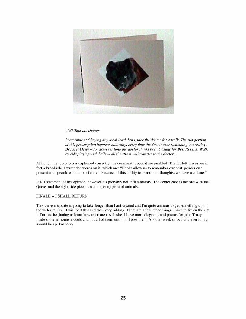
Page 117, second paragraph: Rubber stamp over all of it. Instead, look at the diagram, it seems understandable. Page 119, dry embossing, second paragraph: it's a dry embossing stylus. Fourth paragraph: The photo on page 117 show dry embossing that's been stencil painted. Wet embossing: Many recommend wetting the paper for 5 minutes. I don't. Mine always blithers down to being flat when I wet it for more than a few seconds. Page 120: this photo shows wet embossing with male and female dies. Page 122: My first attempt at writing humor was a book that I used as a New Year's card. The book is entitled The Dr. Menuki Stress Relief Program. Menuki was our dog, a chow chow. She has since died and we now have another chow, Kashira -- she's still a puppy. The book is below.
25
Walk/Run the Doctor Prescription: Obeying any local leash laws, take the doctor for a walk. The run portion of this prescription happens naturally, every time the doctor sees something interesting. Dosage: Daily -- for however long the doctor thinks best. Dosage for Best Results: Walk by kids playing with balls -- all the stress will transfer to the doctor.
Although the top photo is captioned correctly, the comments about it are jumbled. The far left pieces are in fact a broadside. I wrote the words on it, which are: “Books allow us to remember our past, ponder our present and speculate about our futures. Because of this ability to record our thoughts, we have a culture.” It is a statement of my opinion, however it's probably not inflammatory. The center card is the one with the Quote, and the right side piece is a catchpenny print of animals. FINALE -- I SHALL RETURN This version update is going to take longer than I anticipated and I'm quite anxious to get something up on the web site. So... I will post this and then keep adding. There are a few other things I have to fix on the site -- I'm just beginning to learn how to create a web site. I have more diagrams and photos for you. Tracy made some amazing models and not all of them got in. I'll post them. Another week or two and everything should be up. I'm sorry.