teamscope: teamwork made clear - university of...
TRANSCRIPT
Teamscope: Teamwork Made Clear
An Ju (SID: 3030915369)
May 10, 2017
1 IntroductionTeaching software development process is an important component of computer science and engi-neering education. In practice, processes are used by software development teams to coordinateactivities and combine skills[12]. As in social behavior studies, human behaviors in teams areconceptualized as activities, interactions, and sentiments[10]. Software development processes canbe both considered as activities (visible actions of individuals and correctness of the execution),and interactions (connectedness of two or more people regardless of the activities). The activityaspect of a process can be quantitatively measured (for example, the velocity of a team can bemeasured by the number of features developed). However, processes as interactions are more dif-ficult to measure. The goal of Teamscope is to provide visualizations that help understand boththe activity and interaction aspect.
Visualization has its advantage over traditional evaluation methods in terms of validity, reliabil-ity and scalability. In classrooms, processes are measured mainly through surveys, questionnaires,interviews and human observations[6][14][7]. In all cases, validity and reliability of the evaluationresult can be undermined by various reasons. For example, the evaluation can be biased by per-spectives of evaluator[9]. Some studies address this problem by having several graders grading thesame project[9][7], and/or having various data sources[7]. However, these methods also come withan increased amount of human power and expert time, and thus undermine the scalability of theclass.
Teamscope is designed to support instructors to give valid evaluation to processes in scale. Itprovides visualizations that presents the execution of processes in a clear and transparent way, sothat violations of processes can be noticed by instructors.
Teamscope is built upon several software development tools that are widely recognized in thesoftware engineering community. Tools such as GitHub1, PivotalTracker2, Travis CI3, Slack4, andCode Climate5 (see Table 1 for detailed descriptions) are infrastructure for software development.We believe data from these tools combined can be used as a profile of the team project and theteam itself. Teamscope collects data available from these data sources, synthesizes and analyzesfollowing well-established practices in software engineering community, and presents the informa-tion to instructors, so that the instructor can have an objective and comprehensive profile of theproject, and thus to design intervention accordingly.
2 Related WorkOur project is inspired by the work of Matthies et al. in 2016, in which they studied the teachingsoftware development from three aspects[14], including a software that analyzes conformance ofprocesses based on software development artifacts called ScrumLint (as is shown in Figure 1.Their work is built upon process conformance verification flow proposed in 2010 by Zazworka[17],in which they proposed a framework for design and improve metrics to measure the conformanceof practices. However, the idea of process conformance and models to measure the conformancecan be dated back to late 20th century[4][5].
1https://github.com/2https://pivotaltracker.com/3https://travis-ci.org/4https://slack.com/5https://codeclimate.com/
1

Figure 1: Screenshots from ScrumLint[14]
(a) Teaching git operations with visualizations. (b) Visualizing Repositories.
Figure 2: Some existing visualization works based on GitHub data.
The goal of our system is similar to ScrumLint. However, as is shown in Figure 1, Matthies etal. uses mostly metrics and rubrics, which is different from our system. We believe visualizationscan better help scale the evaluation of teams and teamwork.
Our system is designed to help the teaching of classes that involve team projects. However,the system can provide us with opportunities beyond process conformance. For example, it can beused to help novice programmers[3], and make defect predictions[16]. So the usage of the systemis not limited to classrooms.
Visualizing processes is relatively new in the area of software develop education. However, wehave seen previous works that apply visualization to software development tools such as GitHub.The goal of these works range from teaching git operations6 (see Figure 2a for a screenshot) tovisualizing the change of git repositories7 (see Figure 2b for a screenshot).
Data used in our case study is focused on teaching Agile methods. There has been severalstudies on teaching Agile methods, and more on the application of Agile methods in general[8].The design of our metrics follows some best practices studied and recommended in some of theseworks.
3 Methods and Design
3.1 DataWe collect data from a list of software development tools listed in Table 1. All these systemssupport API access. Necessary information to fetch data from API is provided by the instructor.
Our study uses past student projects from CS169 at Berkeley as dataset.
3.2 System DesignIn this section, we will present the design of our system. Targeted audience of our system includeboth instructors and students. The interface for both parties are similar, while the workflow is
6http://git-school.github.io/visualizing-git/7http://ghv.artzub.com
2

Tool DescriptionGitHub GitHub is one of the largest version
based code hosts. It is also a plat-form for project management andteam collaboration.
PivotalTracker Pivotal Tracker is a straightfor-ward project-planning tool that en-courages Agile software developmentmethod.
Code Climate Code Climate provides a suit ofstatic code analysis tools, and gener-ates real-time reports on code quali-ties.
Travis CI Travis CI is a continuous integra-tion service used to build and testprojects hosted on GitHub.
Slack Slack is a popular team communica-tion system.
Table 1: A list of data sources and their description
Figure 3: The dashboard page of Teamscope
slightly different. For simplicity, we present our design for instructors in this report. The differencebetween user interfaces for instructors and students will be mentioned in the description.
Our design follows Shneiderman’s Manta, which is
Overview first, zoom and filter, then details-on-demand.[2]
The user (instructor or student) first see the overview of the performance over all practices.Then he or she can move into a single team and on one specified practice only. A more detailedpage will presented that allows the user to explore data from different perspectives. The design ofvisualizations keeps most detailed information available on-demand, so that the user can analyzeabnormalities and outliers.
3.2.1 Dashboard
Dashboard page contains an overview for all projects. Figure 3 is a screenshot.The dashboard page is mainly composed of a table, whose rows are projects(teams) and columns
are practices. Each cell thus indicates how well each team performs on the corresponding practice.
3
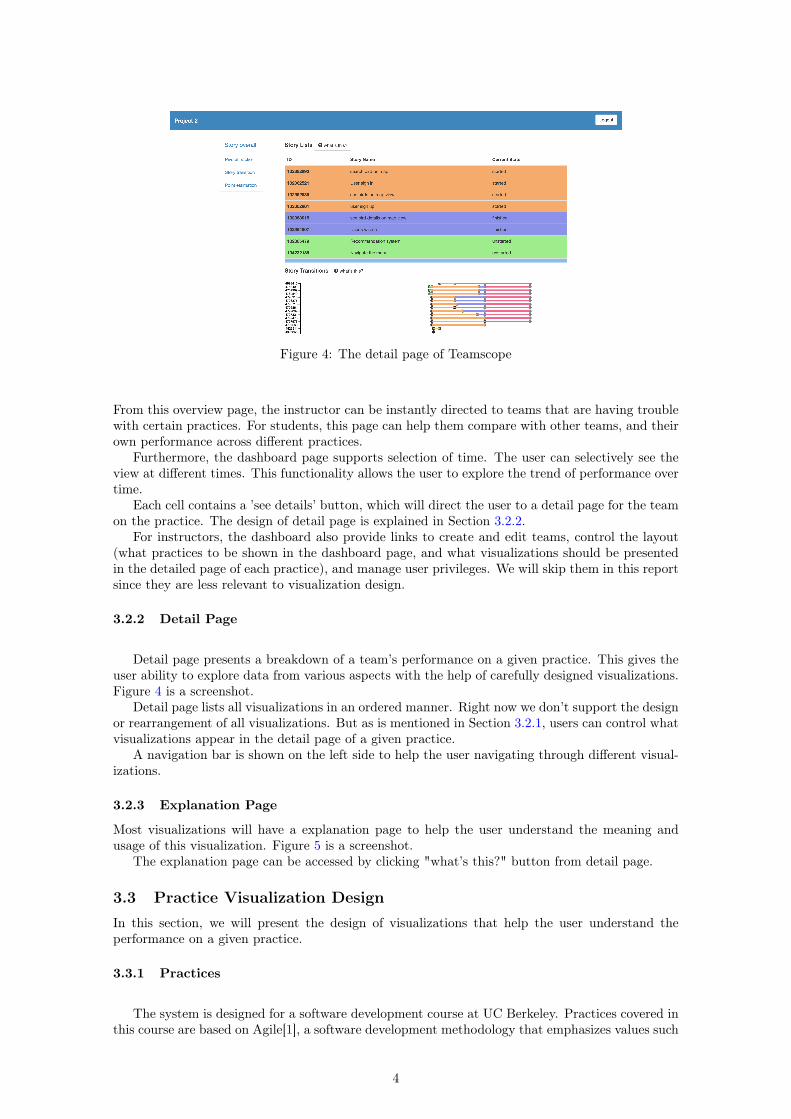
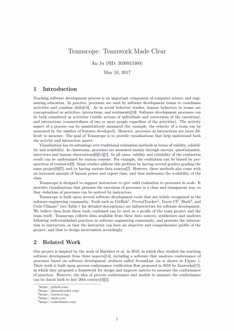
Figure 4: The detail page of Teamscope
From this overview page, the instructor can be instantly directed to teams that are having troublewith certain practices. For students, this page can help them compare with other teams, and theirown performance across different practices.
Furthermore, the dashboard page supports selection of time. The user can selectively see theview at different times. This functionality allows the user to explore the trend of performance overtime.
Each cell contains a ’see details’ button, which will direct the user to a detail page for the teamon the practice. The design of detail page is explained in Section 3.2.2.
For instructors, the dashboard also provide links to create and edit teams, control the layout(what practices to be shown in the dashboard page, and what visualizations should be presentedin the detailed page of each practice), and manage user privileges. We will skip them in this reportsince they are less relevant to visualization design.
3.2.2 Detail Page
Detail page presents a breakdown of a team’s performance on a given practice. This gives theuser ability to explore data from various aspects with the help of carefully designed visualizations.Figure 4 is a screenshot.
Detail page lists all visualizations in an ordered manner. Right now we don’t support the designor rearrangement of all visualizations. But as is mentioned in Section 3.2.1, users can control whatvisualizations appear in the detail page of a given practice.
A navigation bar is shown on the left side to help the user navigating through different visual-izations.
3.2.3 Explanation Page
Most visualizations will have a explanation page to help the user understand the meaning andusage of this visualization. Figure 5 is a screenshot.
The explanation page can be accessed by clicking "what’s this?" button from detail page.
3.3 Practice Visualization DesignIn this section, we will present the design of visualizations that help the user understand theperformance on a given practice.
3.3.1 Practices
The system is designed for a software development course at UC Berkeley. Practices covered inthis course are based on Agile[1], a software development methodology that emphasizes values such
4
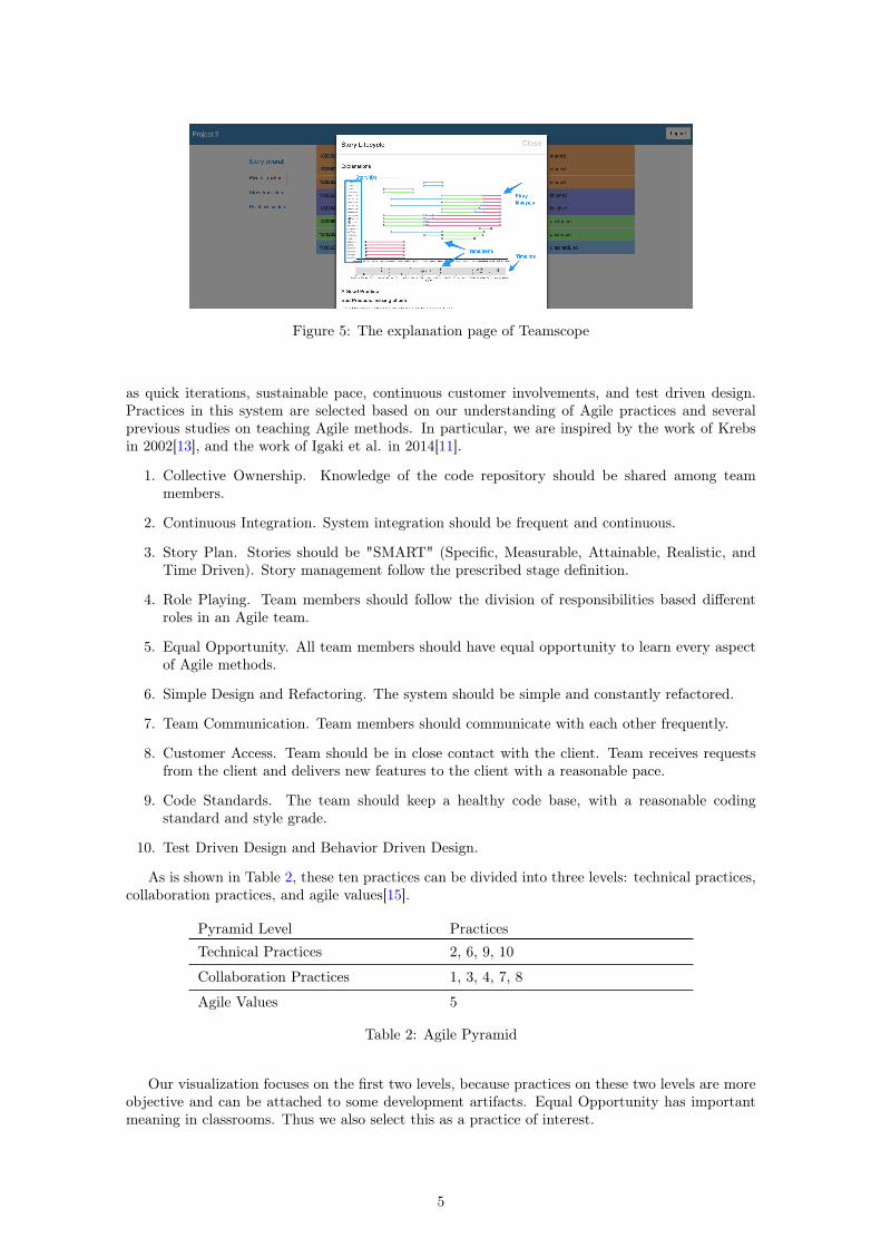
Figure 5: The explanation page of Teamscope
as quick iterations, sustainable pace, continuous customer involvements, and test driven design.Practices in this system are selected based on our understanding of Agile practices and severalprevious studies on teaching Agile methods. In particular, we are inspired by the work of Krebsin 2002[13], and the work of Igaki et al. in 2014[11].
1. Collective Ownership. Knowledge of the code repository should be shared among teammembers.
2. Continuous Integration. System integration should be frequent and continuous.
3. Story Plan. Stories should be "SMART" (Specific, Measurable, Attainable, Realistic, andTime Driven). Story management follow the prescribed stage definition.
4. Role Playing. Team members should follow the division of responsibilities based differentroles in an Agile team.
5. Equal Opportunity. All team members should have equal opportunity to learn every aspectof Agile methods.
6. Simple Design and Refactoring. The system should be simple and constantly refactored.
7. Team Communication. Team members should communicate with each other frequently.
8. Customer Access. Team should be in close contact with the client. Team receives requestsfrom the client and delivers new features to the client with a reasonable pace.
9. Code Standards. The team should keep a healthy code base, with a reasonable codingstandard and style grade.
10. Test Driven Design and Behavior Driven Design.
As is shown in Table 2, these ten practices can be divided into three levels: technical practices,collaboration practices, and agile values[15].
Pyramid Level PracticesTechnical Practices 2, 6, 9, 10
Collaboration Practices 1, 3, 4, 7, 8
Agile Values 5
Table 2: Agile Pyramid
Our visualization focuses on the first two levels, because practices on these two levels are moreobjective and can be attached to some development artifacts. Equal Opportunity has importantmeaning in classrooms. Thus we also select this as a practice of interest.
5
3.3.2 Visualization Design for Story Plan
For now, we only implemented visualization one practice, which is Story Plan. In this section, wewill present the design of this practice. The design for other practices will follow a similar idea.
Data used for this visualization comes from Pivotal Tracker. As a brief introduction, thecentral idea of Pivotal Tracker is ’story’. Each story in Pivotal Tracker is a feature for the team toimplement. Each story has specifications, types, estimations of required effort to finish ("points"),and should go through a series of stages (scheduled, started, finished, delivered, accepted).
Details is presented at the very beginning of our design. This part presents a list of all userstories from Pivotal Tracker Figure 6 shows an screenshot. This part presents all information thatwill be important for the user to understand the story.
The background color of table rows represent current state of the story. This informationis in particular important for the user because the user will focus more on stories that are fin-ished/delivered.
Transitions of stories are presented with a graph shown in Figure 7. In this graph, each rowrepresents a story. Dots represent story state transitions. The color of the line represents the stateof the story, which is consistent with the table list.
The lower part of the graph allows the user to selectively see story transitions in a given timeperiod. It also presents a abstract view of all transitions.
Figure 6: Visualization for Story Plan: Story list
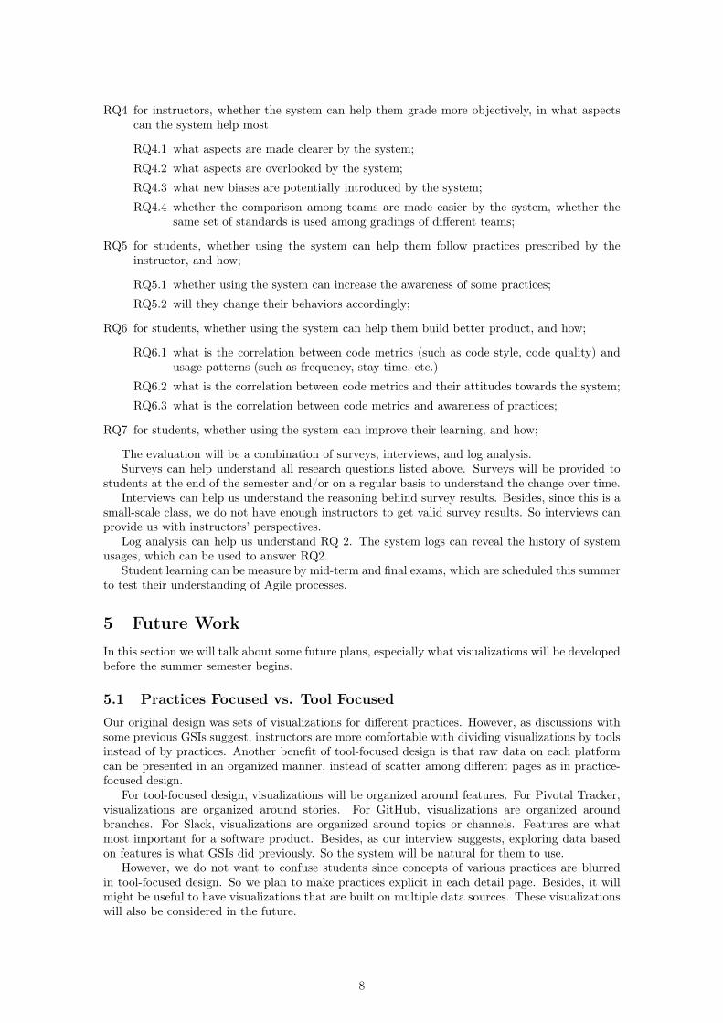
Two other graphs are also presented to help understand the conformance of some sub-practices,as is shown in Figure 8. Figure 8a shows the current states of all stories, while Figure 8b is designedto visualize whether students have a good estimation of story points. The coloring of pie chart isconsistent with other graphs.
Brush and linking is considered as an important feature of this design. Currently graphspresented above do not share the same dataset. This will be refactored in the future. In eachdetail page, the selection and filtering of elements in one graph will affect all graphs. This can helpthe user explore the dataset.
3.4 ToolsOur website is built with Ruby on Rails. Each metric is developed as a Gem for the system, whichcan be easily configured. This way the user can design their own version of the system and theirown metrics.
All visualizations are implemented with HTML and Javascript. Graphs are plotted mainly withD3 and Highcharts.
6
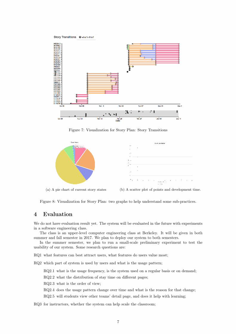
Figure 7: Visualization for Story Plan: Story Transitions
(a) A pie chart of current story states (b) A scatter plot of points and development time.
Figure 8: Visualization for Story Plan: two graphs to help understand some sub-practices.
4 EvaluationWe do not have evaluation result yet. The system will be evaluated in the future with experimentsin a software engineering class.
The class is an upper-level computer engineering class at Berkeley. It will be given in bothsummer and fall semester in 2017. We plan to deploy our system to both semesters.
In the summer semester, we plan to run a small-scale preliminary experiment to test theusability of our system. Some research questions are:
RQ1 what features can best attract users, what features do users value most;
RQ2 which part of system is used by users and what is the usage pattern;
RQ2.1 what is the usage frequency, is the system used on a regular basis or on demand;
RQ2.2 what the distribution of stay time on different pages;
RQ2.3 what is the order of view;
RQ2.4 does the usage pattern change over time and what is the reason for that change;
RQ2.5 will students view other teams’ detail page, and does it help with learning;
RQ3 for instructors, whether the system can help scale the classroom;
7
RQ4 for instructors, whether the system can help them grade more objectively, in what aspectscan the system help most
RQ4.1 what aspects are made clearer by the system;
RQ4.2 what aspects are overlooked by the system;
RQ4.3 what new biases are potentially introduced by the system;
RQ4.4 whether the comparison among teams are made easier by the system, whether thesame set of standards is used among gradings of different teams;
RQ5 for students, whether using the system can help them follow practices prescribed by theinstructor, and how;
RQ5.1 whether using the system can increase the awareness of some practices;
RQ5.2 will they change their behaviors accordingly;
RQ6 for students, whether using the system can help them build better product, and how;
RQ6.1 what is the correlation between code metrics (such as code style, code quality) andusage patterns (such as frequency, stay time, etc.)
RQ6.2 what is the correlation between code metrics and their attitudes towards the system;
RQ6.3 what is the correlation between code metrics and awareness of practices;
RQ7 for students, whether using the system can improve their learning, and how;
The evaluation will be a combination of surveys, interviews, and log analysis.Surveys can help understand all research questions listed above. Surveys will be provided to
students at the end of the semester and/or on a regular basis to understand the change over time.Interviews can help us understand the reasoning behind survey results. Besides, since this is a
small-scale class, we do not have enough instructors to get valid survey results. So interviews canprovide us with instructors’ perspectives.
Log analysis can help us understand RQ 2. The system logs can reveal the history of systemusages, which can be used to answer RQ2.
Student learning can be measure by mid-term and final exams, which are scheduled this summerto test their understanding of Agile processes.
5 Future WorkIn this section we will talk about some future plans, especially what visualizations will be developedbefore the summer semester begins.
5.1 Practices Focused vs. Tool FocusedOur original design was sets of visualizations for different practices. However, as discussions withsome previous GSIs suggest, instructors are more comfortable with dividing visualizations by toolsinstead of by practices. Another benefit of tool-focused design is that raw data on each platformcan be presented in an organized manner, instead of scatter among different pages as in practice-focused design.
For tool-focused design, visualizations will be organized around features. For Pivotal Tracker,visualizations are organized around stories. For GitHub, visualizations are organized aroundbranches. For Slack, visualizations are organized around topics or channels. Features are whatmost important for a software product. Besides, as our interview suggests, exploring data basedon features is what GSIs did previously. So the system will be natural for them to use.
However, we do not want to confuse students since concepts of various practices are blurredin tool-focused design. So we plan to make practices explicit in each detail page. Besides, it willmight be useful to have visualizations that are built on multiple data sources. These visualizationswill also be considered in the future.
8
5.2 Practice-based DesignThere are ten practices listed in Section 3.3.1. It is impractical and inappropriate to list all tenpractices in the dashboard. Some practices must be combined. In this section, we emphasize ontwo practices.
5.2.1 Visualizations for Collective Ownership
Following functionalities should be supported by visualizations
• Read the estimated knowledge of a given person on a given file.
• See estimated knowledge from different levels (files, directories, parts of the system).
• See the change over time.
There are several ways of estimating the knowledge of a person over a file. The simplest oneis to estimate based on lines of contribution. Some more advanced methods will consider fromfunction level instead file level.
5.2.2 Visualizations for Continuous Integration
Continuous integration is supported by TravisCI. Following functionalities should be supported byvisualizations
• See the history of integrations.
• Rearrange the history of integrations with different criteria (by branches, authors, or time).
• Highlight states of integrations, and calculate the time between two integrations.
• Read outputs of a given integration, better in a formatted way.
5.3 Tool-based Design5.3.1 Visualizations for GitHub
Following functionalities should be supported by visualizations
• Overview of branches, pull requests, and issues.
• Read all commits from a branch or pull request.
• Read the change of test coverage and number of test cases over time.
• Read the usage of branches and highlight merges.
5.3.2 Visualizations for Slack
Visualizations for Slack can suffer from the problem that it cannot capture all communications.But the design of visualizations is built upon the assumption that most necessary communications(discussions related to the development of the product) happen in Slack.
Following functionalities should be supported by visualizations
• Overview of communication frequencies in each channel for each person.
• Communication pattern of a given topic.
• Connect and highlight questions and responses.
9

References[1] Kent Beck, Mike Beedle, Arie Van Bennekum, Alistair Cockburn, Ward Cunningham, Martin
Fowler, James Grenning, Jim Highsmith, Andrew Hunt, Ron Jeffries, and others. 2001. Theagile manifesto. (2001).
[2] Stuart K Card, Jock D Mackinlay, and Ben Shneiderman. 1999. Readings in informationvisualization: using vision to think. Morgan Kaufmann.
[3] Rachel Cardell-Oliver. 2011. How can software metrics help novice programmers?. In Proceed-ings of the Thirteenth Australasian Computing Education Conference-Volume 114. AustralianComputer Society, Inc., 55–62.
[4] Jonathan E Cook and Alexander L Wolf. 1998. Discovering models of software processes fromevent-based data. ACM Transactions on Software Engineering and Methodology (TOSEM) 7,3 (1998), 215–249.
[5] Jonathan E Cook and Alexander L Wolf. 1999. Software process validation: quantitativelymeasuring the correspondence of a process to a model. ACM Transactions on Software Engi-neering and Methodology (TOSEM) 8, 2 (1999), 147–176.
[6] Vladan Devedzic and others. 2011. Teaching agile software development: A case study. IEEETransactions on Education 54, 2 (2011), 273–278.
[7] Yael Dubinsky and Orit Hazzan. 2005. A framework for teaching software development meth-ods. Computer Science Education 15, 4 (2005), 275–296.
[8] Tore Dybå and Torgeir Dingsøyr. 2008. Empirical studies of agile software development: Asystematic review. Information and software technology 50, 9 (2008), 833–859.
[9] Martin Hoegl and Hans Georg Gemuenden. 2001. Teamwork quality and the success of in-novative projects: A theoretical concept and empirical evidence. Organization science 12, 4(2001), 435–449.
[10] George C Homans. 1974. Social behavior: Its elementary forms. (1974).
[11] Hiroshi Igaki, Naoki Fukuyasu, Sachio Saiki, Shinsuke Matsumoto, and Shinji Kusumoto. 2014.Quantitative assessment with using ticket driven development for teaching scrum framework.In Companion Proceedings of the 36th International Conference on Software Engineering.ACM, 372–381.
[12] Steve WJ Kozlowski and Bradford S Bell. 2003. Work groups and teams in organizations.Handbook of psychology (2003).
[13] William Krebs. 2002. Turning the knobs: A coaching pattern for XP through agile metrics.In Conference on Extreme Programming and Agile Methods. Springer, 60–69.
[14] Christoph Matthies, Thomas Kowark, Keven Richly, Matthias Uflacker, and Hasso Plattner.2016. How surveys, tutors, and software help to assess Scrum adoption in a classroom soft-ware engineering project. In Proceedings of the 38th International Conference on SoftwareEngineering Companion. ACM, 313–322.
[15] Andreas Meier, Martin Kropp, and Gerald Perellano. 2016. Experience Report of Teach-ing Agile Collaboration and Values: Agile Software Development in Large Student Teams.In Software Engineering Education and Training (CSEET), 2016 IEEE 29th InternationalConference on. IEEE, 76–80.
[16] Raimund Moser, Witold Pedrycz, and Giancarlo Succi. 2008. A comparative analysis of the ef-ficiency of change metrics and static code attributes for defect prediction. In 2008 ACM/IEEE30th International Conference on Software Engineering. IEEE, 181–190.
[17] Nico Zazworka, Kai Stapel, Eric Knauss, Forrest Shull, Victor R Basili, and Kurt Schneider.2010. Are developers complying with the process: an XP study. In Proceedings of the 2010ACM-IEEE International Symposium on Empirical Software Engineering and Measurement.ACM, 14.
10