tag clouds and the case for vernacular visualizationhint.fm/papers/vernacular_visualization.pdf ·...
TRANSCRIPT

EDITORJonathan Grudin [email protected]
FORUM TIMELINEs
This is an exciting moment for visualization. It’s a time when the mainstream media is embracing sophisticated techniques born in university research labs—a time when you can open The New York Times and see complex treemaps and network diagrams. But just as exciting is the fact that some new visualizations, ones that get people talking and thinking about data in a new way, are emerging from outside the acad-emy as well.
This is starting to happen often enough that it’s worth coining a term for techniques that originate outside the research community. Borrowing terminology from the design world, we’ll call them “vernacu-lar” visualizations—in a nod to Tibor Kalman’s admiration of “low” art [1]. This article focuses on one ubiquitous type of street-wise visualization: tag clouds. Born outside the world of com-puters, they were raised to maturity by Web 2.0 sites coping with an unwieldy world of col-lective activity. Tag clouds are an eclectic bunch spanning a
variety of data inputs and usage patterns that defy much of the orthodox wisdom about how visualizations ought to work.
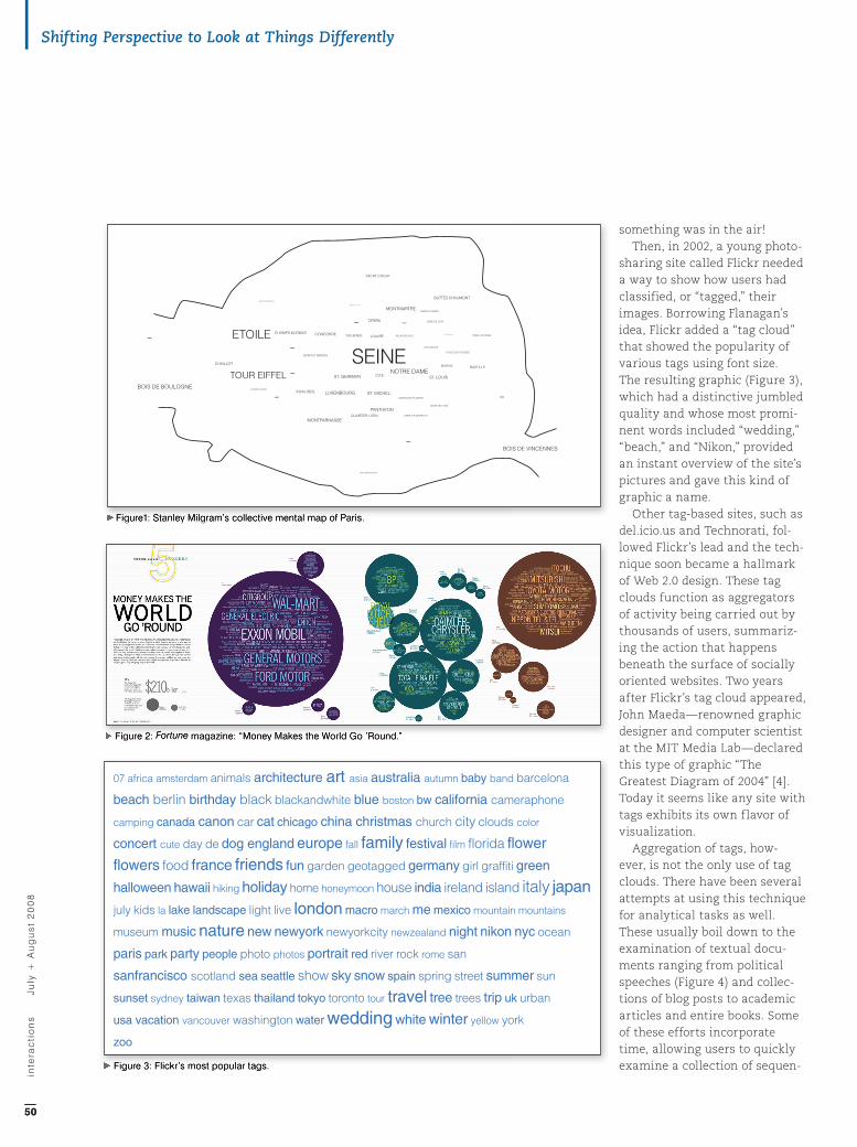
Tag Clouds: A historyThe basic look of a tag cloud—a combination of many different type sizes in a single view—goes back at least 90 years to Soviet Constructivism. Beyond the sur-face style, however, a tag cloud usually has a particular purpose: to present a visual overview of a collection of text. By this cri-terion, the first example may have been the outcome of an experiment carried out by social psychologist Stanley Milgram in 1976 [2]. Milgram asked people to name landmarks in Paris, and then created a collective “mental map” of the city using font size to show how often each place was mentioned (Figure 1).
Almost 20 years later, simi-lar diagrams were created by a computer—but a fictional one. In Microserfs, Douglas Coupland’s 1995 novel, one of the charac-ters writes a program to pick out random phrases from his electronic diary; the resulting
“subconscious files” are repro-duced in the book.
In 1997 real life caught up with Milgram’s collective uncon-scious and Coupland’s fictional computer. That year program-mer Jim Flanagan wanted a way to show which search terms had led people to his website. Varying type sizes was easy; in a page defined by HTML, he created a simple Perl script—“Search Referral Zeitgeist”—and the resulting graphic was eye-catching. However Flanagan’s script remained an obscure curiosity.
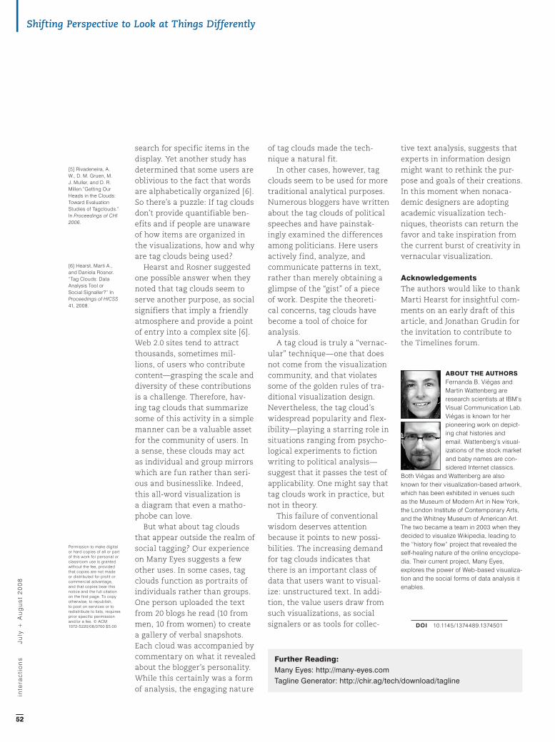
By 2001 clouds of words worked their way into main-stream media when Fortune magazine brought the “cloud aesthetic” to the world of finance [3]. A piece entitled “Money Makes the World Go ’Round” mapped the corporate landscape with circular masses of text showing the 500 largest corporations in the world, each cloud representing companies in a particular country (Figure 2). According to the graphic’s cre-ator, John Tomanio, this was an independent invention. Perhaps
Most HCI history articles trace digital developments back to the 1980s, 1960s, or earlier. Information visualization is
moving so rapidly that it’s great to have a look back and glance forward on tag clouds, just over a decade old in digital
form, from leading visualization researchers Fernanda Viégas and Martin Wattenberg. —Jonathan Grudin
Tag Clouds and the Case for Vernacular Visualization
Fernanda B. ViégasIBM Research | [email protected]
Martin Wattenberg IBM Research | [email protected]
[1] Kalman, Tibor, Peter Hall, Michael Bierut, and Tibor Kalman. Perverse Optimist. Princeton, N.J.:Princeton Architectural Press, 2000.
[2] Milgram, Stanley, and D. Jodelet. “Psychological Maps of Paris.” In Environmental Psychology, edited by W. I. H. Proshansky and L. Rivlin, 104–124. New York: Holt, Rinehart, and Winston. 1976.
[3] “Money Makes the World Go ‘Round.” Fortune. 23 July 2001. <http://money.cnn.com/magazines/fortune/fortune_archive/2001/07/23/ 307384/index.htm>
[4] Maeda, John. “The Greatest Diagram of 2004.” Simplicity Blog, 14 March 2005 <http://weblogs.media.mit.edu/SIMPLICITY/archives/000164.html>
inte
rac
tio
ns
J
uly
+ A
ug
us
t 2
00
8
4949
IA XV-4.V19.indd 49 6/19/08 3:23:33 PM
something was in the air!Then, in 2002, a young photo-
sharing site called Flickr needed a way to show how users had classified, or “tagged,” their images. Borrowing Flanagan’s idea, Flickr added a “tag cloud” that showed the popularity of various tags using font size. The resulting graphic (Figure 3), which had a distinctive jumbled quality and whose most promi-nent words included “wedding,” “beach,” and “Nikon,” provided an instant overview of the site’s pictures and gave this kind of graphic a name.
Other tag-based sites, such as del.icio.us and Technorati, fol-lowed Flickr’s lead and the tech-nique soon became a hallmark of Web 2.0 design. These tag clouds function as aggregators of activity being carried out by thousands of users, summariz-ing the action that happens beneath the surface of socially oriented websites. Two years after Flickr’s tag cloud appeared, John Maeda—renowned graphic designer and computer scientist at the MIT Media Lab—declared this type of graphic “The Greatest Diagram of 2004” [4]. Today it seems like any site with tags exhibits its own flavor of visualization.
Aggregation of tags, how-ever, is not the only use of tag clouds. There have been several attempts at using this technique for analytical tasks as well. These usually boil down to the examination of textual docu-ments ranging from political speeches (Figure 4) and collec-tions of blog posts to academic articles and entire books. Some of these efforts incorporate time, allowing users to quickly examine a collection of sequen-
Figure1: Stanley Milgram’s collective mental map of Paris. Figure1: Stanley Milgram’s collective mental map of Paris.
Figure 2: Fortune magazine: “Money Makes the World Go ’Round.” Figure 2: Fortune magazine: “Money Makes the World Go ’Round.”
Figure 3: Flickr’s most popular tags. Figure 3: Flickr’s most popular tags.
07 africa amsterdam animals architecture art asia australia autumn baby band barcelona
beach berlin birthday black blackandwhite blue boston bw california cameraphone
camping canada canon car cat chicago china christmas church city clouds color
concert cute day de dog england europe fall family festival film florida flower
flowers food france friends fun garden geotagged germany girl graffiti green
halloween hawaii hiking holiday home honeymoon house india ireland island italy japanjuly kids la lake landscape light live london macro march me mexico mountain mountains
museum music nature new newyork newyorkcity newzealand night nikon nyc ocean
paris park party people photo photos portrait red river rock rome san
sanfrancisco scotland sea seattle show sky snow spain spring street summer sun
sunset sydney taiwan texas thailand tokyo toronto tour travel tree trees trip uk urban
usa vacation vancouver washington water wedding white winter yellow york
zoo
inte
rac
tio
ns
J
uly
+ A
ug
us
t 2
00
8
5050
Shifting Perspective to Look at Things Differently
IA XV-4.V19.indd 50 6/19/08 3:23:37 PM

tial documents (Figure 5). In such cases it might be more logical to refer to the technique as a “word cloud” since it shows word frequency in a text pas-sage instead of tags on a site. (In a sense this is returning to the roots of Milgram’s and Coupland’s diagrams.)
Adding steam to the analyti-cal power of tag clouds, a few sites have created alternative versions of the technique. Our own IBM Research site Many Eyes, which lets users upload and visualize data in a variety of ways, features two flavors of tag clouds: the traditional one-word and an unconventional two-word view. The two-word cloud shows the most frequent two-word phrases in a body of text (disregarding stop words). This simple mechanism gives viewers a much different per-spective on the text being visu-alized, getting closer to some of the themes in the content. For example, the one-word and two-word clouds of a political speech uploaded to Many Eyes give viewers a dramatically distinct understanding of the material (see Figures 6a and 6b).
An Information-visualization TechniqueFrom a traditional information-design perspective, the rapid adoption of tag clouds is sur-prising because the method has glaring theoretical problems. Long words get undue emphasis over short ones, it is cumber-some to find any single word, and font sizes can be difficult to compare. Alphabetical ordering means that sets of related words are scattered: “East” is close to “Easter” but far from “west.”
Recent empirical work sup-
Figure 6A: Simple, one-word tag cloud of a speech given by Barack Obama in 2007. Created on Many Eyes.
Figure 6B: Two-word tag cloud of the same Barack Obama speech. This version reveals three main themes in the text: “health care,” “special interests,” and sending the “troops home.” Created on Many Eyes.
Figure 5: A time-based tag cloud. Figure 5: A time-based tag cloud. Figure 4: U.S. presidential speeches over time, created with Tagline Generator.
Figure 5: A time-based tag cloud. Figure 4: U.S. presidential speeches over time,
Figure 6A: Simple, one-word tag cloud of a speech given by Barack Obama in 2007. Created on Many Eyes.
000 abraham achievement afford age ago america american americans arrived back begin billsbring bringing broken building call called campaign care challenges chance change changed child children citizenship city civil college common communities congress costs countrycreation crisis crucial cynics death decency decisions disillusionment distracted divided dreams economyelection else’s end energy essential ethanol ethics executives expect face fail failure fair faith families finally forever
founders free future generation give government grand happen happened hardhealth heard heart home honor hope hopes ill immigrants instilling intelligence interests iraq job
joined journey kids late law lawyer lay-people lead learned learning life lincoln listen lives lobbyists longlove made make march meaning men military millions money moved nation neighborhoodsnorth offered oil opportunity page pass passed pay paycheck peace people plans play politicalpolitics poverty power president priorities problems production promises proud providing racerebuilding reform reminded rest rights role running safe schools senator serve set settle sharing single skepticism
south special spent springfield stand start stopped struggling system table teachers tells terrorists
things time times today told tough travel treatment trivial troops turn turned tyrannyunderstand uniquely veterans washington ways west who’ve women words work working world
write year years young
Figure 6B: Two-word tag cloud of the same Barack Obama speech. This version reveals three main themes in
$13,000 2008 letting abraham lincoln accept responsibility active participation afford child alternative fuelsamerica converge american lives american people americans feel anxiety americans awakened electoratebig problems boy’s heart bring hope broadband lines capital city capping greenhouse captives freecare costs care crisis cheap political cherished rights chicago’s poorest child care child turns christian faithchronic avoidance chronically ill citizenship restoring civil rights climate change cold today combat troopscommon dreams common hopes common purpose community organizer competitive economyconstitutional law control costs country offering country safe country’s middle-class crucial roledeadliest weapons death penalty death toll decades ago digital age distant executives divided north else’s civilelse’s fault ends poverty equality depend essential decency ethics reform ethics reforms families strugglingfamily connections finally frees finally tackles find peace freedom long frees america fuel-efficient carsfuture generations future schools gangly self-made gay people generations proud give health global warminggrand speeches grand sum greenhouse gases happen divided hard choices hard work hard-earned benefitshard-working americans harness homegrown health care health insurance helped freehigh standards homegrown alternative homeland security hopeful america house divided impossible oddsintelligence capabilities interests move interests who’ve iraq mounts job creation job sight job trainingjustice roll katrina happened king’s call lasting friendships law school lawyer tells life continued lifted millionslincoln understood living wage longer divided lost loved made lasting make college make hard make similarmakes future making grand mighty stream mistake today mounting debts nation’s workers north southodds people offering ten-point opened railroads to realize parties make passed ethics patriots broughtpenalty system people back people faced people reaching people turn perfect union plant closingspolitical disagreement political points poorest neighborhoods powerful idea problems people real failuresregion faith replace diplomacy republican senator rights lawyer rising health rural towns safe placescientific research scoring cheap self-made springfield senator dick september day set high set prioritiessigh unseen similar promises simple powerful single simple skewed priorities small part sound policiessouth east south slave special interests springfield lawyer stagnant wages start bringing steel millstronger military struggling paycheck sweeping ethics tall gangly taught constitutional tax systemteachers businessmen ten-point plans thousand miles time learning tough decisions tough talk tragic mistaketroops home ultimate victory uniquely qualified united states universal health unseen motivatedunyielding faith voices calling welcomed immigrants who’ve traveled who’ve turned working consensusworking families world’s deadliest years candidates young lives
ports these theoretical con-cerns. In one experiment subjects shown tag clouds per-formed worse in word recogni-tion and overall sense making compared with people looking
at simple vertical lists of words in alphabetical order [5]. The alphabetical ordering in tag clouds is an important organiz-ing principle because it pro-vides the only way to visually
inte
rac
tio
ns
J
uly
+ A
ug
us
t 2
00
8
51
FORUM TIMELINEs
IA XV-4.V19.indd 51 6/19/08 3:23:40 PM
search for specific items in the display. Yet another study has determined that some users are oblivious to the fact that words are alphabetically organized [6]. So there’s a puzzle: If tag clouds don’t provide quantifiable ben-efits and if people are unaware of how items are organized in the visualizations, how and why are tag clouds being used?
Hearst and Rosner suggested one possible answer when they noted that tag clouds seem to serve another purpose, as social signifiers that imply a friendly atmosphere and provide a point of entry into a complex site [6]. Web 2.0 sites tend to attract thousands, sometimes mil-lions, of users who contribute content—grasping the scale and diversity of these contributions is a challenge. Therefore, hav-ing tag clouds that summarize some of this activity in a simple manner can be a valuable asset for the community of users. In a sense, these clouds may act as individual and group mirrors which are fun rather than seri-ous and businesslike. Indeed, this all-word visualization is a diagram that even a matho-phobe can love.
But what about tag clouds that appear outside the realm of social tagging? Our experience on Many Eyes suggests a few other uses. In some cases, tag clouds function as portraits of individuals rather than groups. One person uploaded the text from 20 blogs he read (10 from men, 10 from women) to create a gallery of verbal snapshots. Each cloud was accompanied by commentary on what it revealed about the blogger’s personality. While this certainly was a form of analysis, the engaging nature
of tag clouds made the tech-nique a natural fit.
In other cases, however, tag clouds seem to be used for more traditional analytical purposes. Numerous bloggers have written about the tag clouds of political speeches and have painstak-ingly examined the differences among politicians. Here users actively find, analyze, and communicate patterns in text, rather than merely obtaining a glimpse of the “gist” of a piece of work. Despite the theoreti-cal concerns, tag clouds have become a tool of choice for analysis.
A tag cloud is truly a “vernac-ular” technique—one that does not come from the visualization community, and that violates some of the golden rules of tra-ditional visualization design. Nevertheless, the tag cloud’s widespread popularity and flex-ibility—playing a starring role in situations ranging from psycho-logical experiments to fiction writing to political analysis—suggest that it passes the test of applicability. One might say that tag clouds work in practice, but not in theory.
This failure of conventional wisdom deserves attention because it points to new possi-bilities. The increasing demand for tag clouds indicates that there is an important class of data that users want to visual-ize: unstructured text. In addi-tion, the value users draw from such visualizations, as social signalers or as tools for collec-
tive text analysis, suggests that experts in information design might want to rethink the pur-pose and goals of their creations. In this moment when nonaca-demic designers are adopting academic visualization tech-niques, theorists can return the favor and take inspiration from the current burst of creativity in vernacular visualization.
AcknowledgementsThe authors would like to thank Marti Hearst for insightful com-ments on an early draft of this article, and Jonathan Grudin for the invitation to contribute to the Timelines forum.
ABOUT ThE AUThOrS Fernanda B. Viégas and Martin Wattenberg are research scientists at IBM’s Visual Communication Lab. Viégas is known for her pioneering work on depict-ing chat histories and email. Wattenberg’s visual-izations of the stock market and baby names are con-sidered Internet classics.
Both Viégas and Wattenberg are also known for their visualization-based artwork, which has been exhibited in venues such as the Museum of Modern Art in New York, the London Institute of Contemporary Arts, and the Whitney Museum of American Art. The two became a team in 2003 when they decided to visualize Wikipedia, leading to the “history flow” project that revealed the self-healing nature of the online encyclope-dia. Their current project, Many Eyes, explores the power of Web-based visualiza-tion and the social forms of data analysis it enables.
Doi 10.1145/1374489.1374501
Permission to make digital or hard copies of all or part of this work for personal or classroom use is granted without the fee, provided that copies are not made or distributed for profit or commercial advantage, and that copies bear this notice and the full citation on the first page. To copy otherwise, to republish, to post on services or to redistribute to lists, requires prior specific permission and/or a fee. © ACM 1072-5220/08/0700 $5.00
[5] Rivadeneira, A. W., D. M. Gruen, M. J. Muller, and D. R. Millen.”Getting Our Heads in the Clouds: Toward Evaluation Studies of Tagclouds.” In Proceedings of CHI 2006.
[6] Hearst, Marti A., and Daniela Rosner. “Tag Clouds: Data Analysis Tool or Social Signaller?” In Proceedings of HICSS 41, 2008.
inte
rac
tio
ns
J
uly
+ A
ug
us
t 2
00
8
5252
Shifting Perspective to Look at Things Differently
Further reading:Many Eyes: http://many-eyes.comTagline Generator: http://chir.ag/tech/download/tagline
IA XV-4.V19.indd 52 6/19/08 3:23:40 PM