sviluppo css agile con sass e compass - css day 2015 faenza
TRANSCRIPT
CSS DAY ~ 27.03.2015
www.andreaverlicchi.eu ~ @verlok
Sviluppo CSS agile conSASS e Compass
• Grave dipendenza dasviluppo front-end
• Front-end Architect
• Speaker occasionale
www.andreaverlicchi.eu ~ @verlok
Linguaggio?
Ripetitività
Lunghezza
Disordine?

Manutenzione
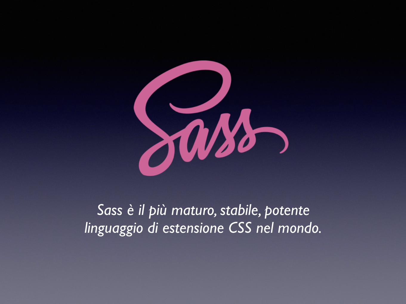
Sass è il più maturo, stabile, potente linguaggio di estensione CSS nel mondo.

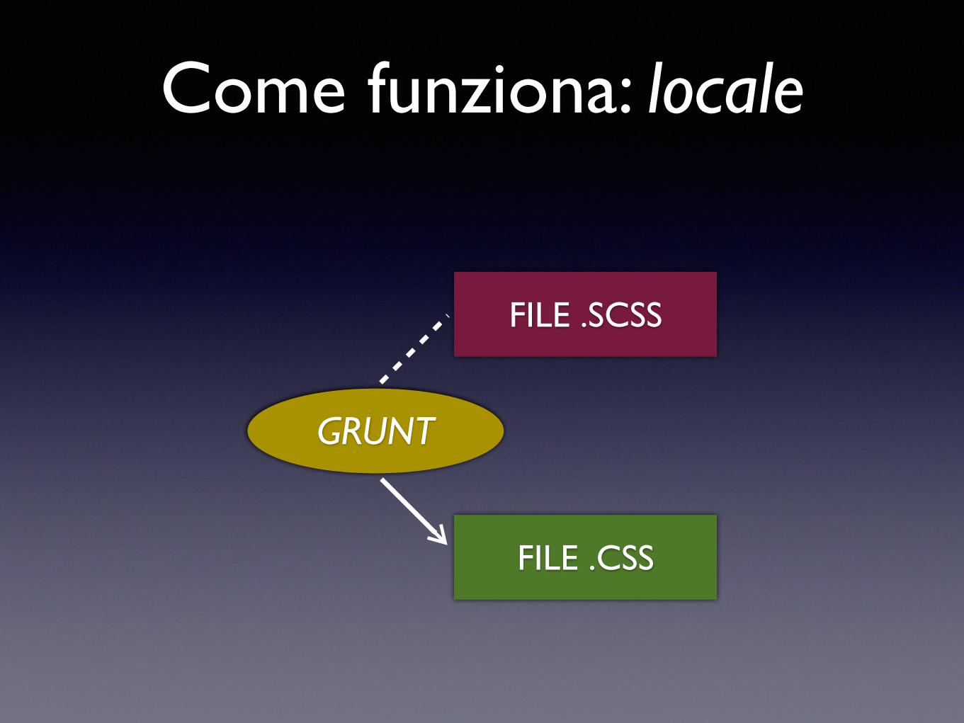
Come funziona: locale
FILE .SCSS
FILE .CSS
WATCH
Come funziona: locale
FILE .SCSS
FILE .CSS
WATCHGRUNT
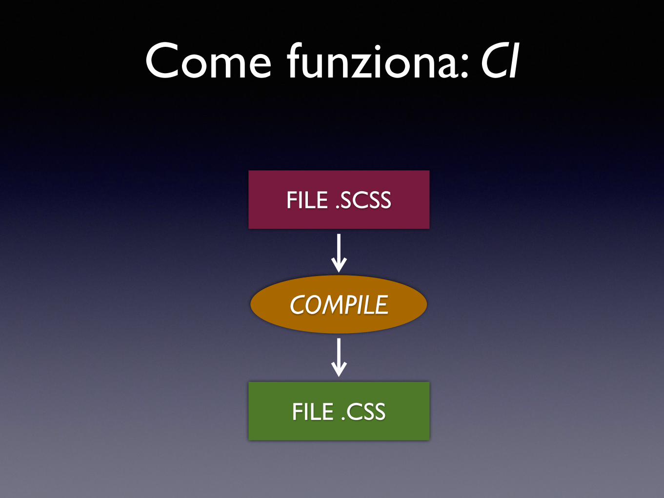
Come funziona: CI
FILE .SCSS
COMPILE
FILE .CSS
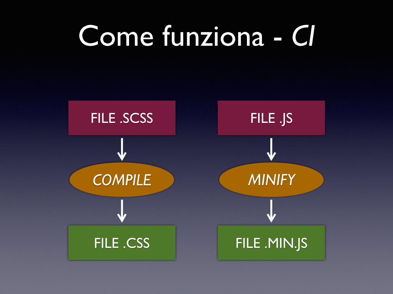
Come funziona - CI
FILE .SCSS
COMPILE
FILE .CSS
FILE .JS
MINIFY
FILE .MIN.JS
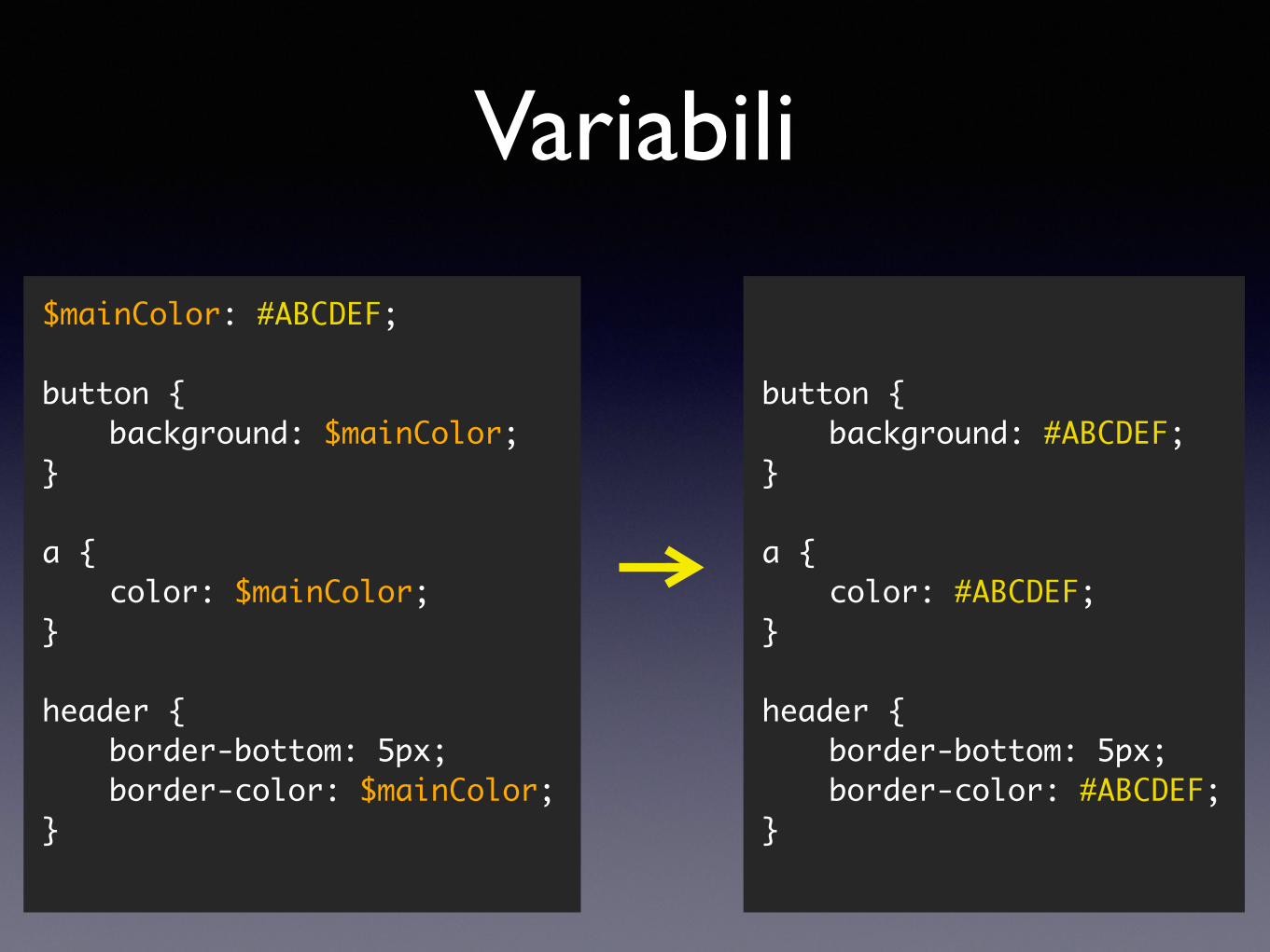
button {background: #ABCDEF;
}
a {color: #ABCDEF;
}
header {border-bottom: 5px;border-color: #ABCDEF;
}
$mainColor: #ABCDEF;
button {background: $mainColor;
}
a {color: $mainColor;
}
header {border-bottom: 5px;border-color: $mainColor;
}
Variabili
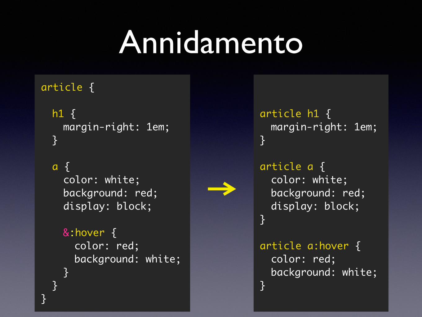
Annidamento
article h1 {margin-right: 1em;
}
article a {color: white;background: red;display: block;
}
article a:hover {color: red;background: white;
}
article {
h1 {margin-right: 1em;
}
a {color: white;background: red;display: block;
&:hover {color: red;background: white;
}}
}
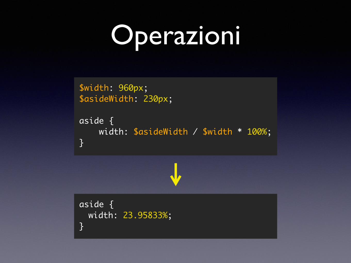
Operazioni
aside {width: 23.95833%;
}
$width: 960px;$asideWidth: 230px;
aside { width: $asideWidth / $width * 100%;}
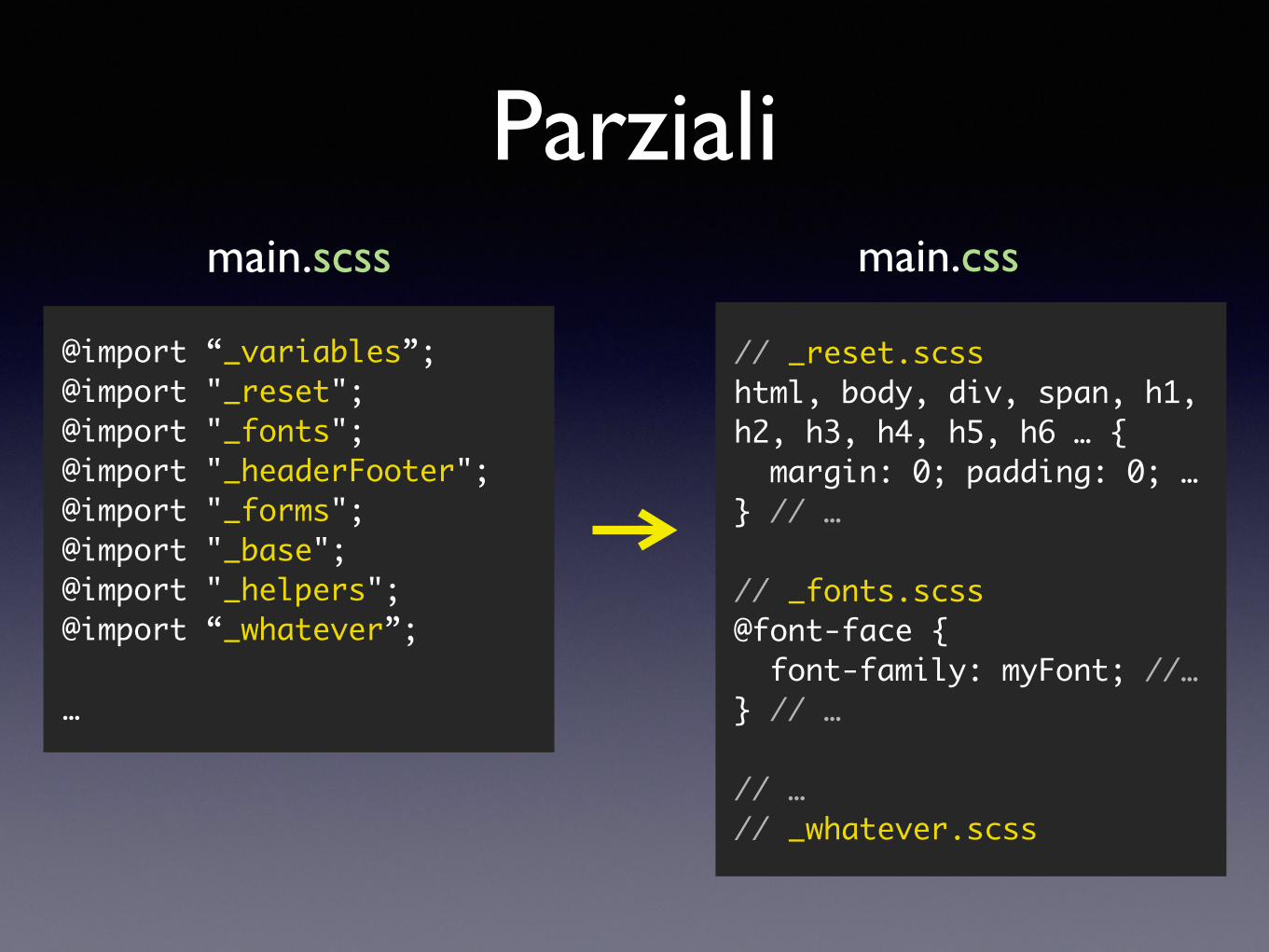
Parziali
@import “_variables”;@import "_reset";@import "_fonts";@import "_headerFooter";@import "_forms";@import "_base";@import "_helpers";@import “_whatever”;
…
main.scss main.css
// _reset.scsshtml, body, div, span, h1, h2, h3, h4, h5, h6 … { margin: 0; padding: 0; …} // …
// _fonts.scss@font-face { font-family: myFont; //…} // …
// …// _whatever.scss
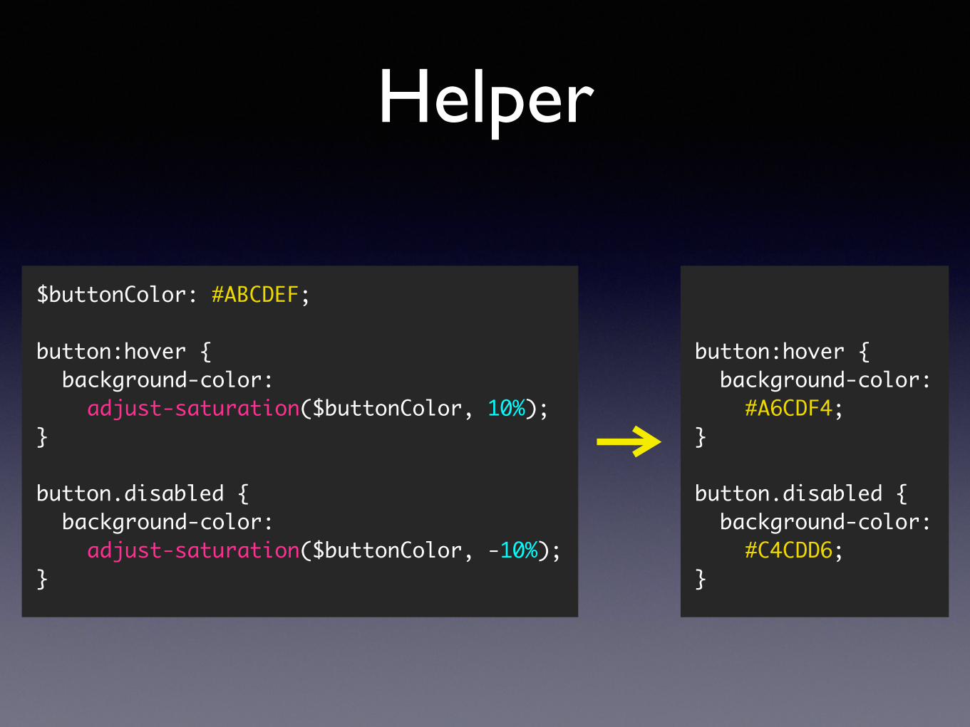
Helper
button:hover { background-color: #A6CDF4;}
button.disabled { background-color: #C4CDD6;}
$buttonColor: #ABCDEF;
button:hover {background-color: adjust-saturation($buttonColor, 10%);
}
button.disabled {background-color: adjust-saturation($buttonColor, -10%);
}
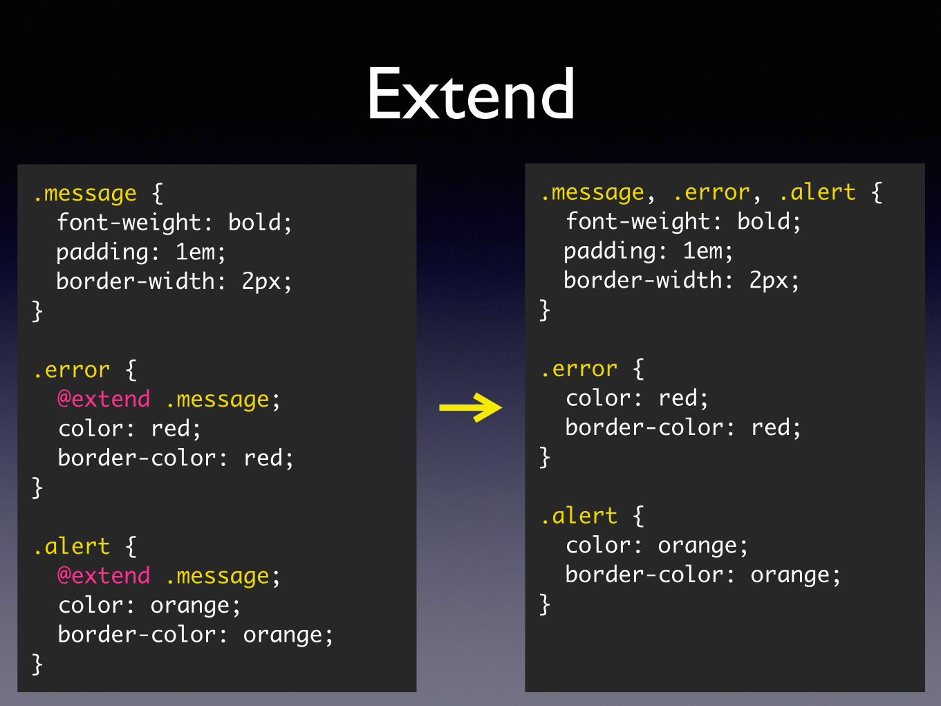
Extend.message {font-weight: bold;padding: 1em;border-width: 2px;
}
.error { @extend .message; color: red; border-color: red;}
.alert { @extend .message; color: orange; border-color: orange;}
.message, .error, .alert { font-weight: bold;padding: 1em;border-width: 2px;
}
.error { color: red; border-color: red;}
.alert { color: orange; border-color: orange;}
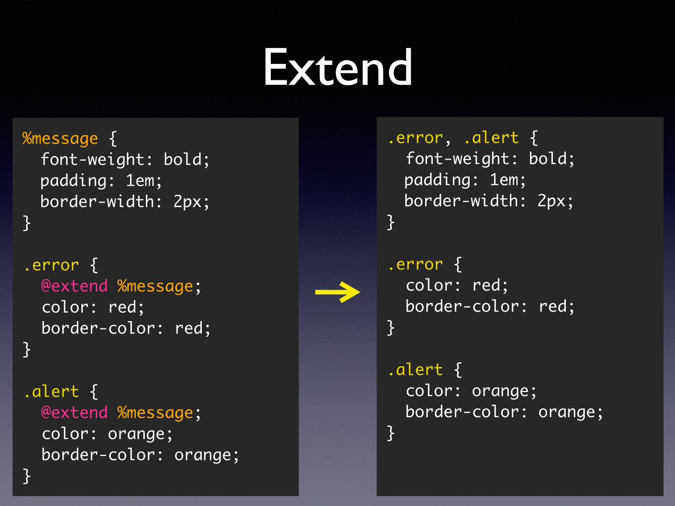
Extend%message {font-weight: bold;padding: 1em;border-width: 2px;
}
.error { @extend %message; color: red; border-color: red;}
.alert { @extend %message; color: orange; border-color: orange;}
.error, .alert { font-weight: bold;padding: 1em;border-width: 2px;
}
.error { color: red; border-color: red;}
.alert { color: orange; border-color: orange;}
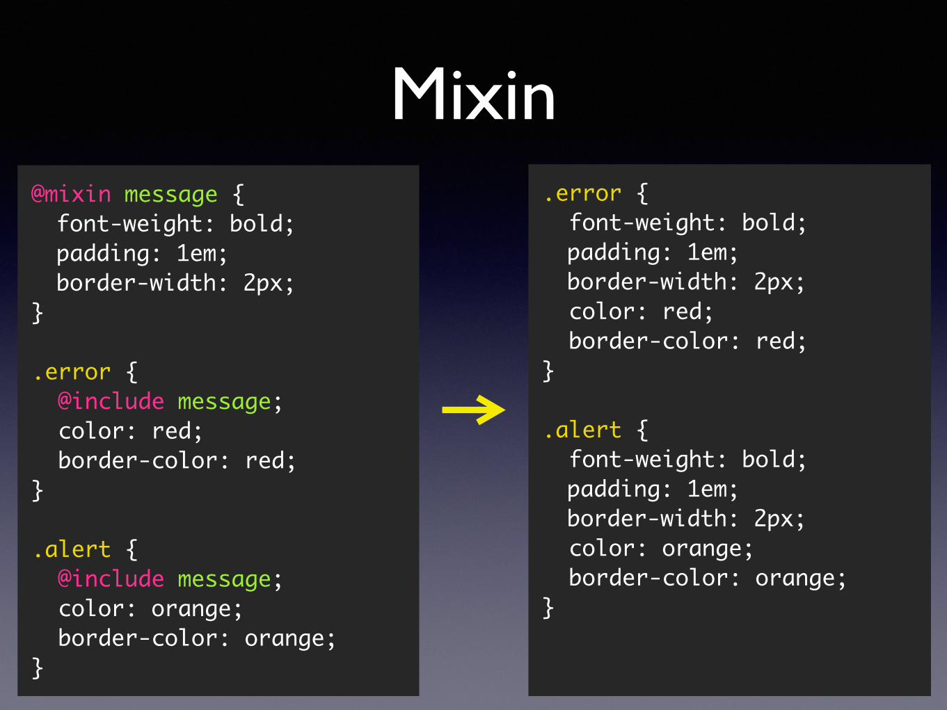
Mixin@mixin message {font-weight: bold;padding: 1em;border-width: 2px;
}
.error { @include message; color: red; border-color: red;}
.alert { @include message; color: orange; border-color: orange;}
.error { font-weight: bold;padding: 1em;border-width: 2px;
color: red; border-color: red;}
.alert { font-weight: bold;padding: 1em;border-width: 2px;
color: orange; border-color: orange;}
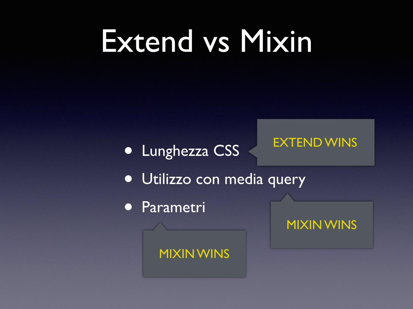
Extend vs Mixin
• Lunghezza CSS
• Utilizzo con media query
• Parametri
EXTEND WINS
MIXIN WINS
MIXIN WINS
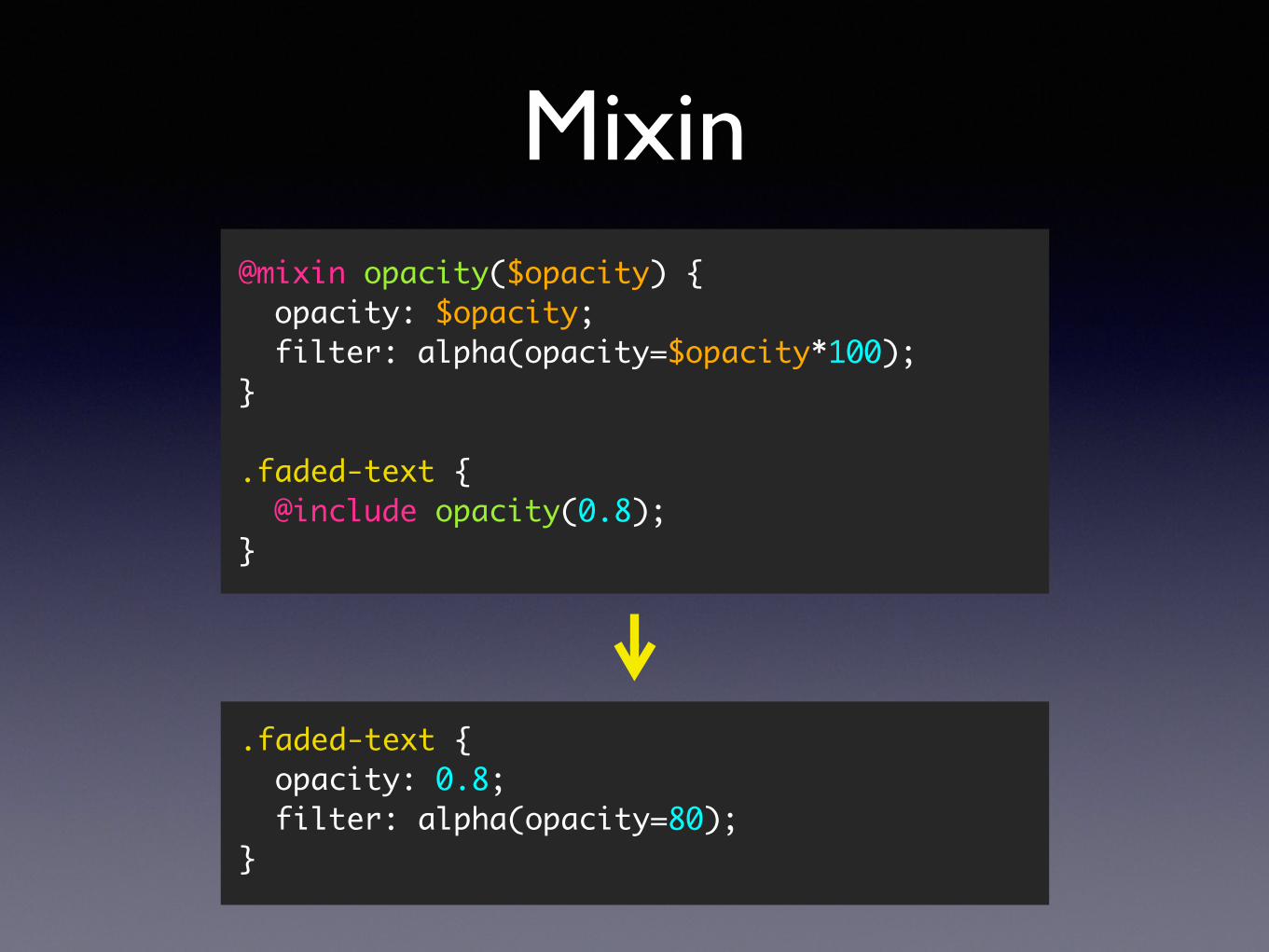
Mixin@mixin opacity($opacity) { opacity: $opacity; filter: alpha(opacity=$opacity*100);}
.faded-text { @include opacity(0.8);}
.faded-text { opacity: 0.8; filter: alpha(opacity=80);}
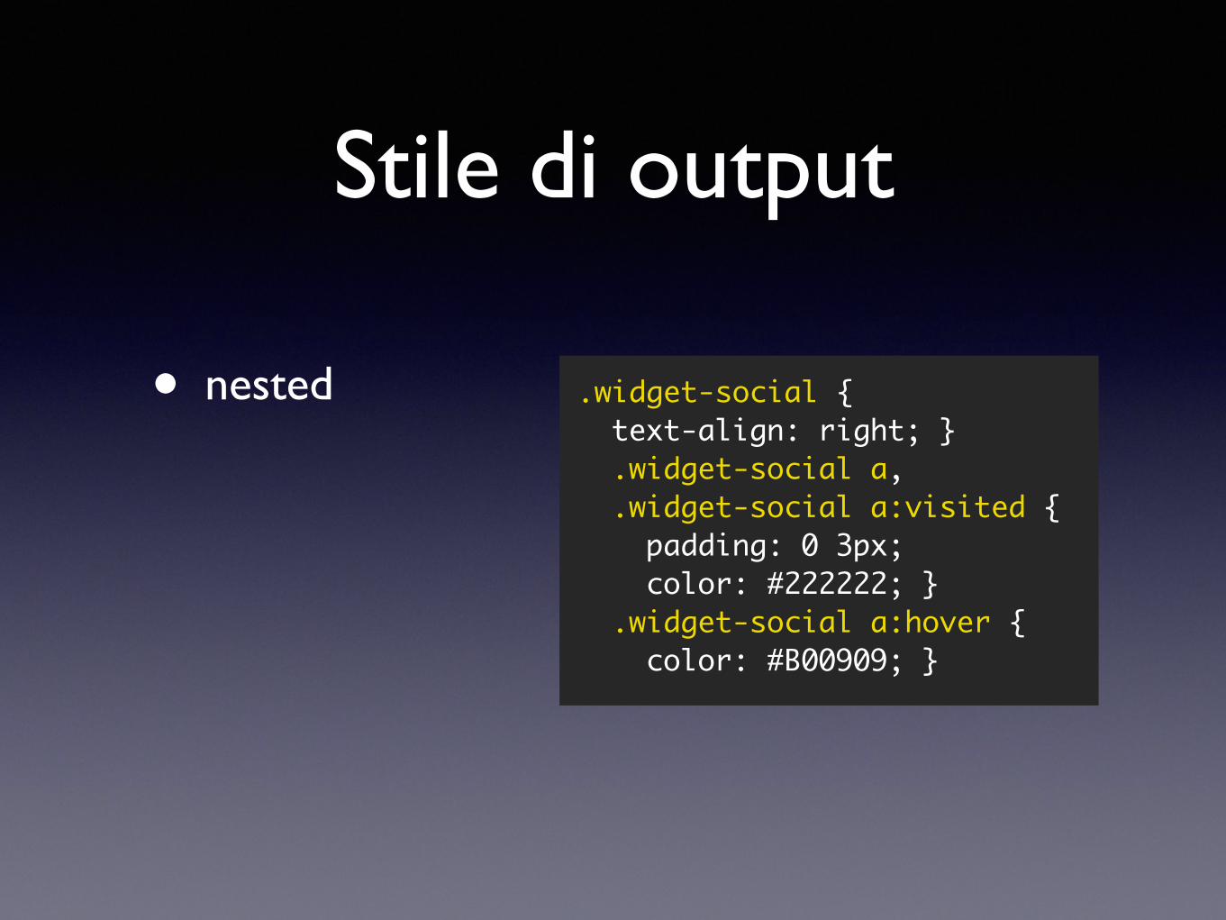
Stile di output
• nested .widget-social { text-align: right; } .widget-social a, .widget-social a:visited { padding: 0 3px; color: #222222; } .widget-social a:hover { color: #B00909; }
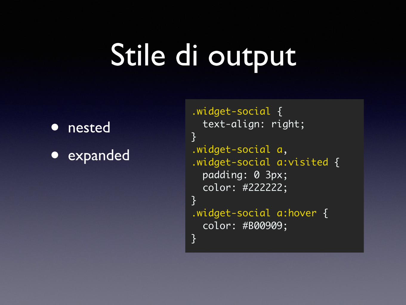
Stile di output
• nested
• expanded
.widget-social { text-align: right;}.widget-social a,.widget-social a:visited { padding: 0 3px; color: #222222;}.widget-social a:hover { color: #B00909;}
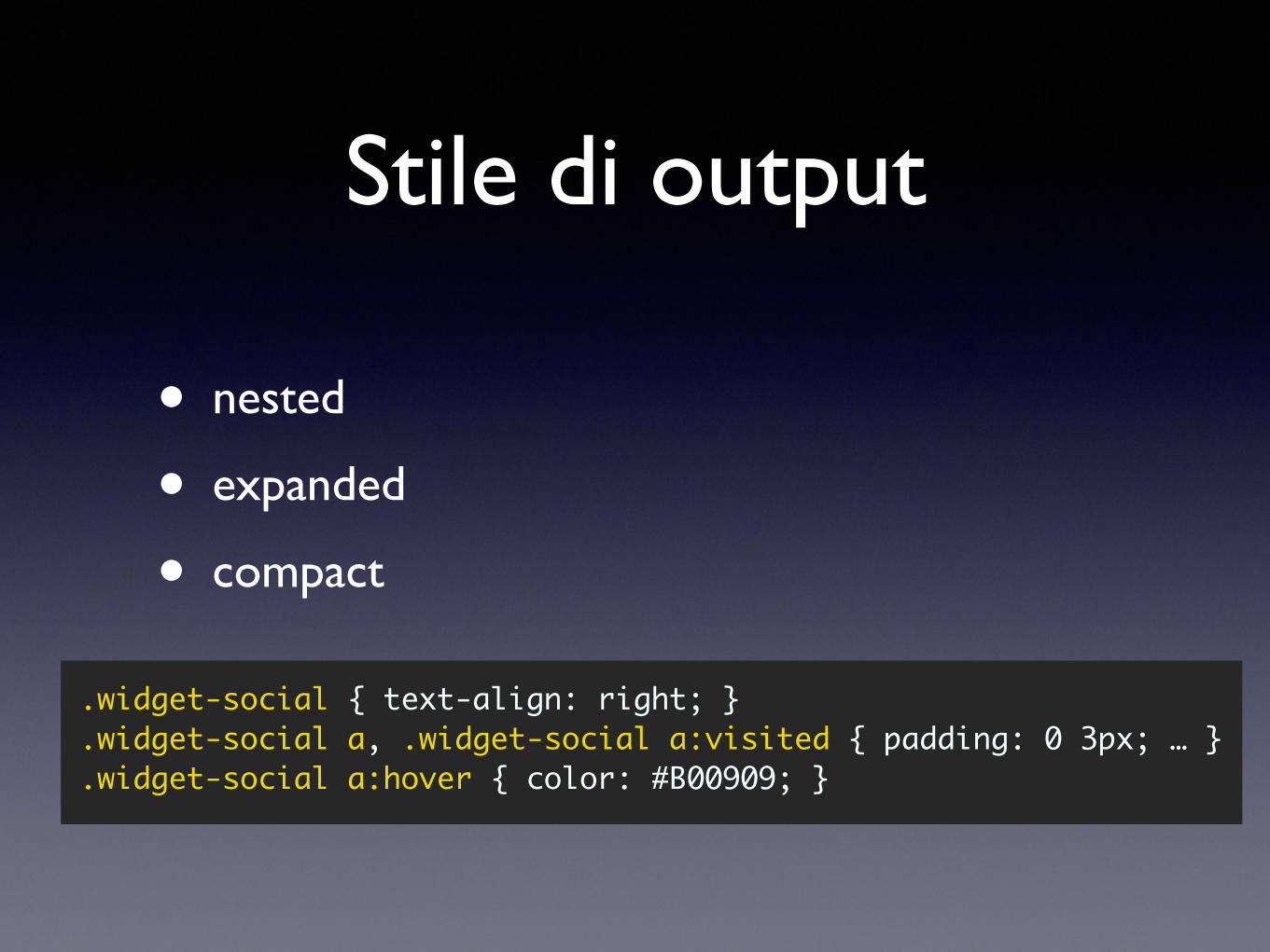
Stile di output
• nested
• expanded
• compact
.widget-social { text-align: right; }
.widget-social a, .widget-social a:visited { padding: 0 3px; … }
.widget-social a:hover { color: #B00909; }
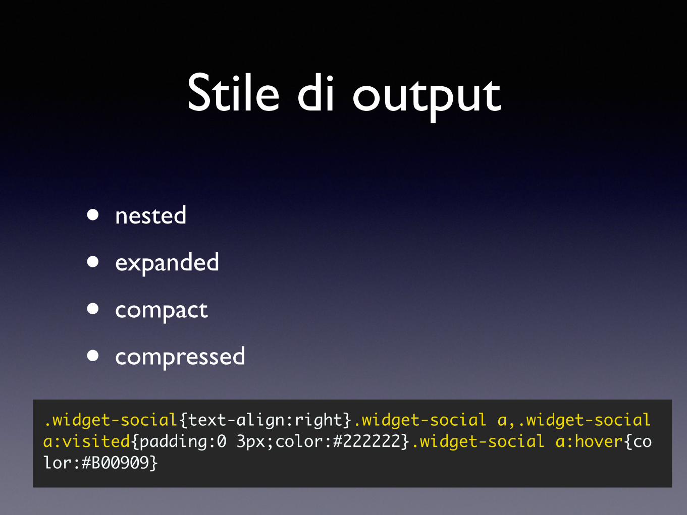
Stile di output
• nested
• expanded
• compact
• compressed
.widget-social{text-align:right}.widget-social a,.widget-social a:visited{padding:0 3px;color:#222222}.widget-social a:hover{co lor:#B00909}
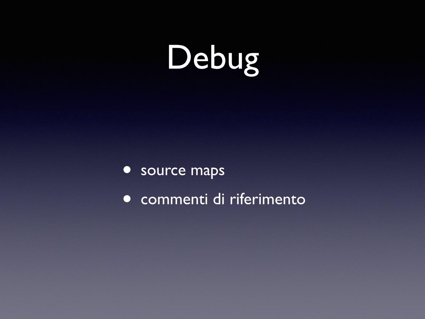
Debug
• source maps
• commenti di riferimento
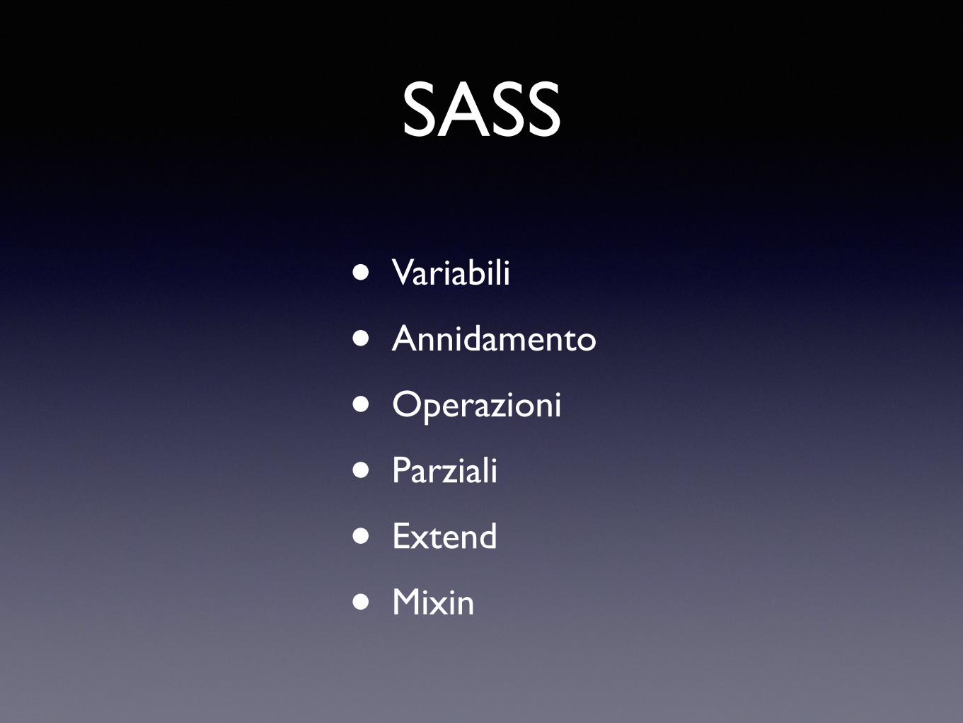
SASS
• Variabili
• Annidamento
• Operazioni
• Parziali
• Extend
• Mixin
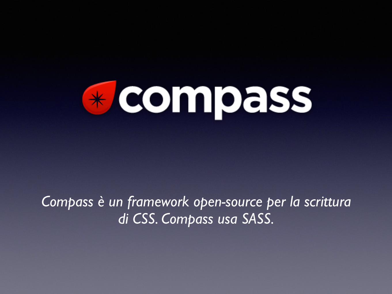
Compass è un framework open-source per la scrittura di CSS. Compass usa SASS.
Soglie browser
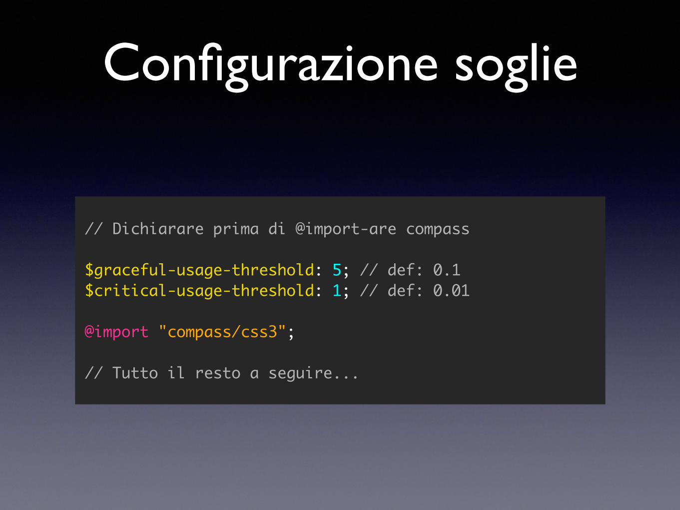
Configurazione soglie
// Dichiarare prima di @import-are compass
$graceful-usage-threshold: 5; // def: 0.1$critical-usage-threshold: 1; // def: 0.01
@import "compass/css3";
// Tutto il resto a seguire...
251 mixin inclusi
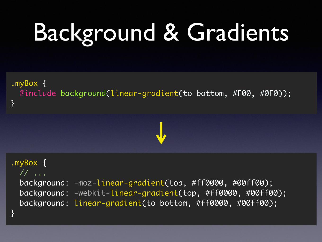
Background & Gradients
.myBox { @include background(linear-gradient(to bottom, #F00, #0F0));}
.myBox { // ... background: -moz-linear-gradient(top, #ff0000, #00ff00); background: -webkit-linear-gradient(top, #ff0000, #00ff00); background: linear-gradient(to bottom, #ff0000, #00ff00);}
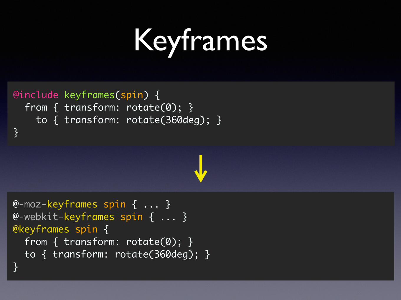
Keyframes
@include keyframes(spin) { from { transform: rotate(0); } to { transform: rotate(360deg); }}
@-moz-keyframes spin { ... } @-webkit-keyframes spin { ... } @keyframes spin { from { transform: rotate(0); } to { transform: rotate(360deg); }}
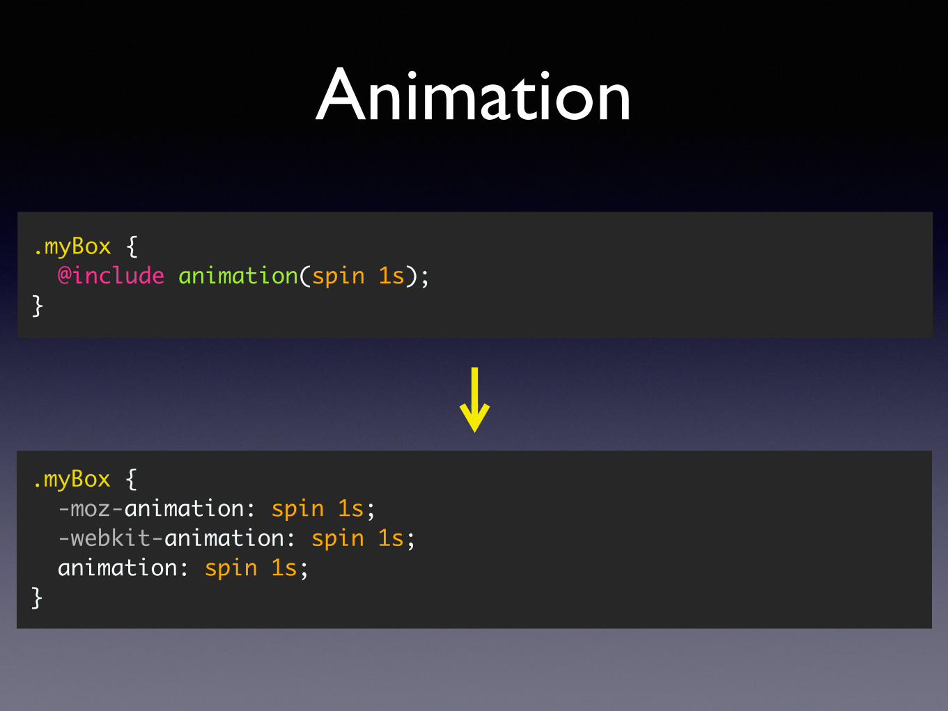
Animation
.myBox { @include animation(spin 1s);}
.myBox { -moz-animation: spin 1s; -webkit-animation: spin 1s; animation: spin 1s;}
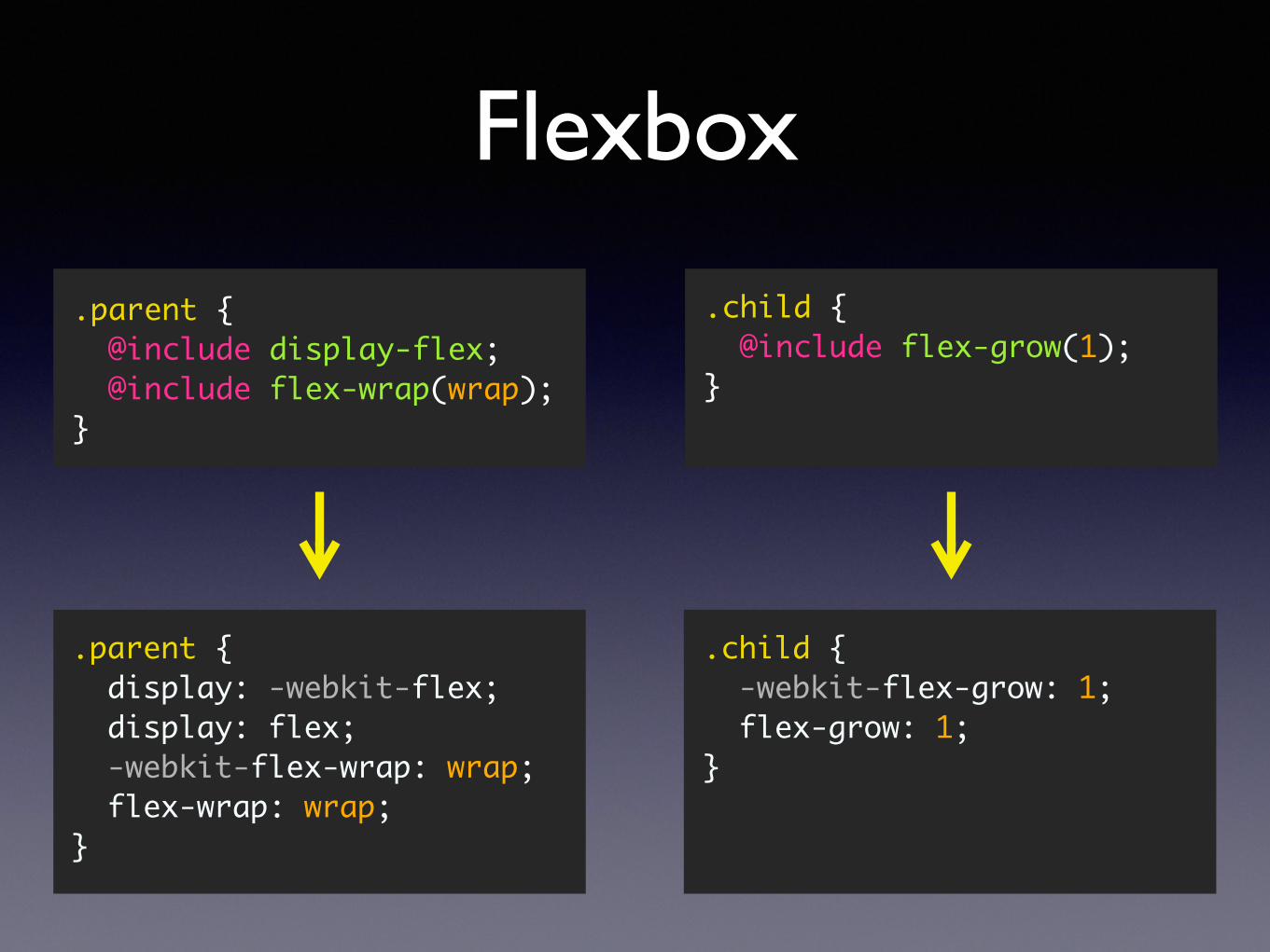
Flexbox
.parent { @include display-flex; @include flex-wrap(wrap);}
.child { @include flex-grow(1); }
.parent { display: -webkit-flex; display: flex; -webkit-flex-wrap: wrap; flex-wrap: wrap;}
.child { -webkit-flex-grow: 1; flex-grow: 1;}
http://compass-style.org/index/mixins
Sprite
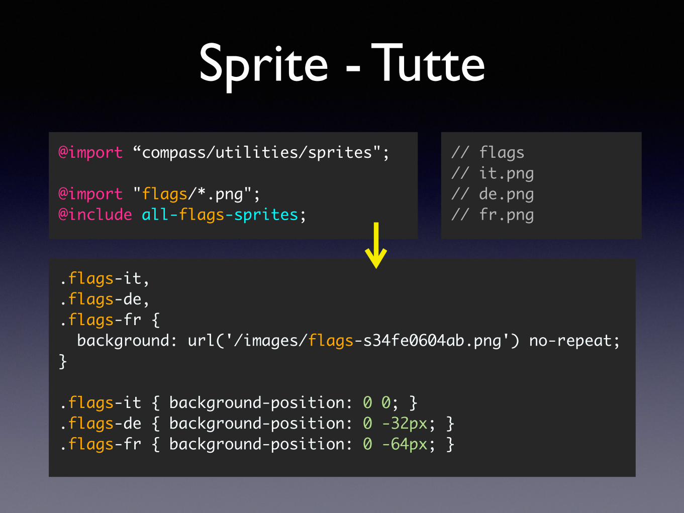
Sprite - Tutte@import “compass/utilities/sprites";
@import "flags/*.png";@include all-flags-sprites;
.flags-it,
.flags-de,
.flags-fr { background: url('/images/flags-s34fe0604ab.png') no-repeat; }
.flags-it { background-position: 0 0; }
.flags-de { background-position: 0 -32px; }
.flags-fr { background-position: 0 -64px; }
// flags// it.png // de.png// fr.png
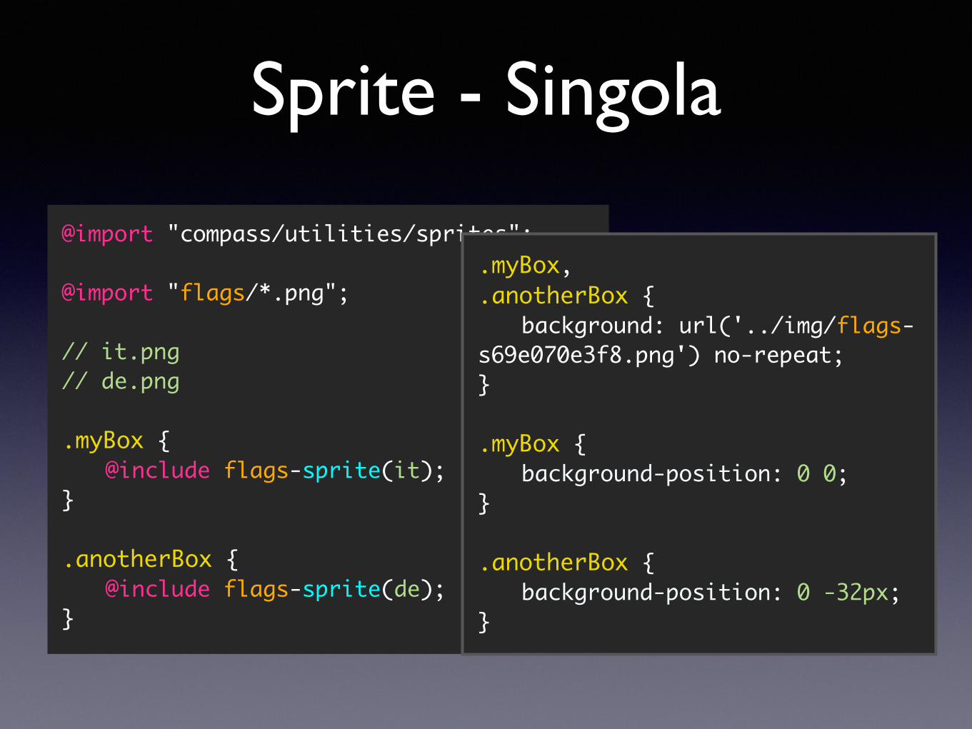
Sprite - Singola
@import "compass/utilities/sprites";
@import "flags/*.png";
// it.png // de.png
.myBox {@include flags-sprite(it);
}
.anotherBox {@include flags-sprite(de);
}
.myBox,
.anotherBox {background: url('../img/flags-
s69e070e3f8.png') no-repeat;}
.myBox {background-position: 0 0;
}
.anotherBox {background-position: 0 -32px;
}
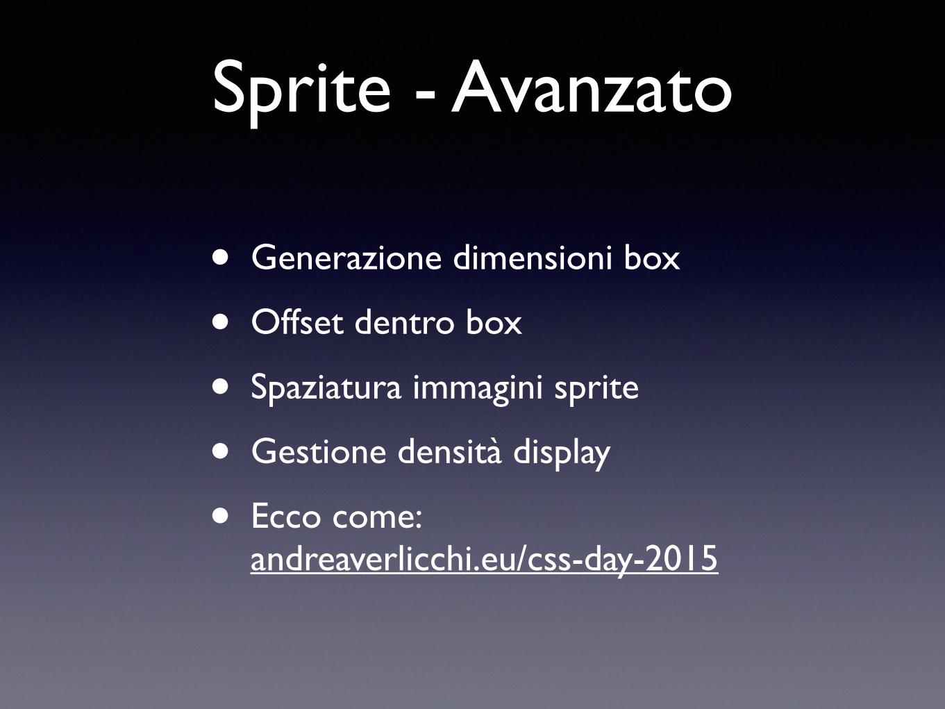
Sprite - Avanzato
• Generazione dimensioni box
• Offset dentro box
• Spaziatura immagini sprite
• Gestione densità display
• Ecco come:andreaverlicchi.eu/css-day-2015
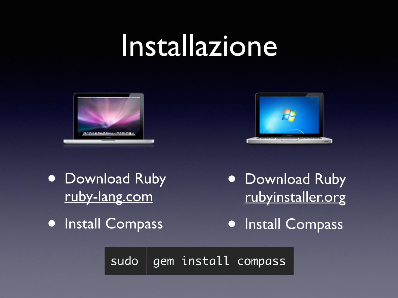
Installazione
• Download Ruby rubyinstaller.org
• Install Compass
• Download Ruby ruby-lang.com
• Install Compass
gem install compasssudo
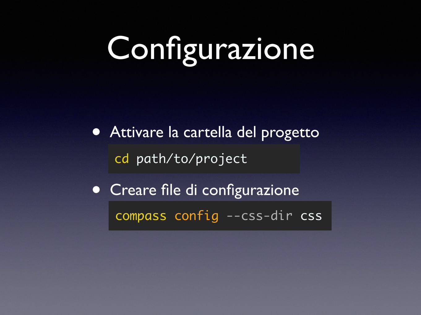
Configurazione
• Attivare la cartella del progetto
• Creare file di configurazione
cd path/to/project
compass config --css-dir css
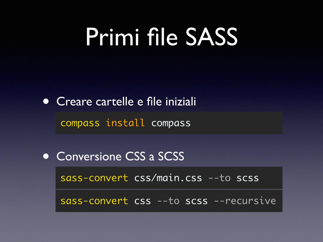
Primi file SASS
• Conversione CSS a SCSS
sass-convert css/main.css --to scss
• Creare cartelle e file iniziali
compass install compass
sass-convert css --to scss --recursive
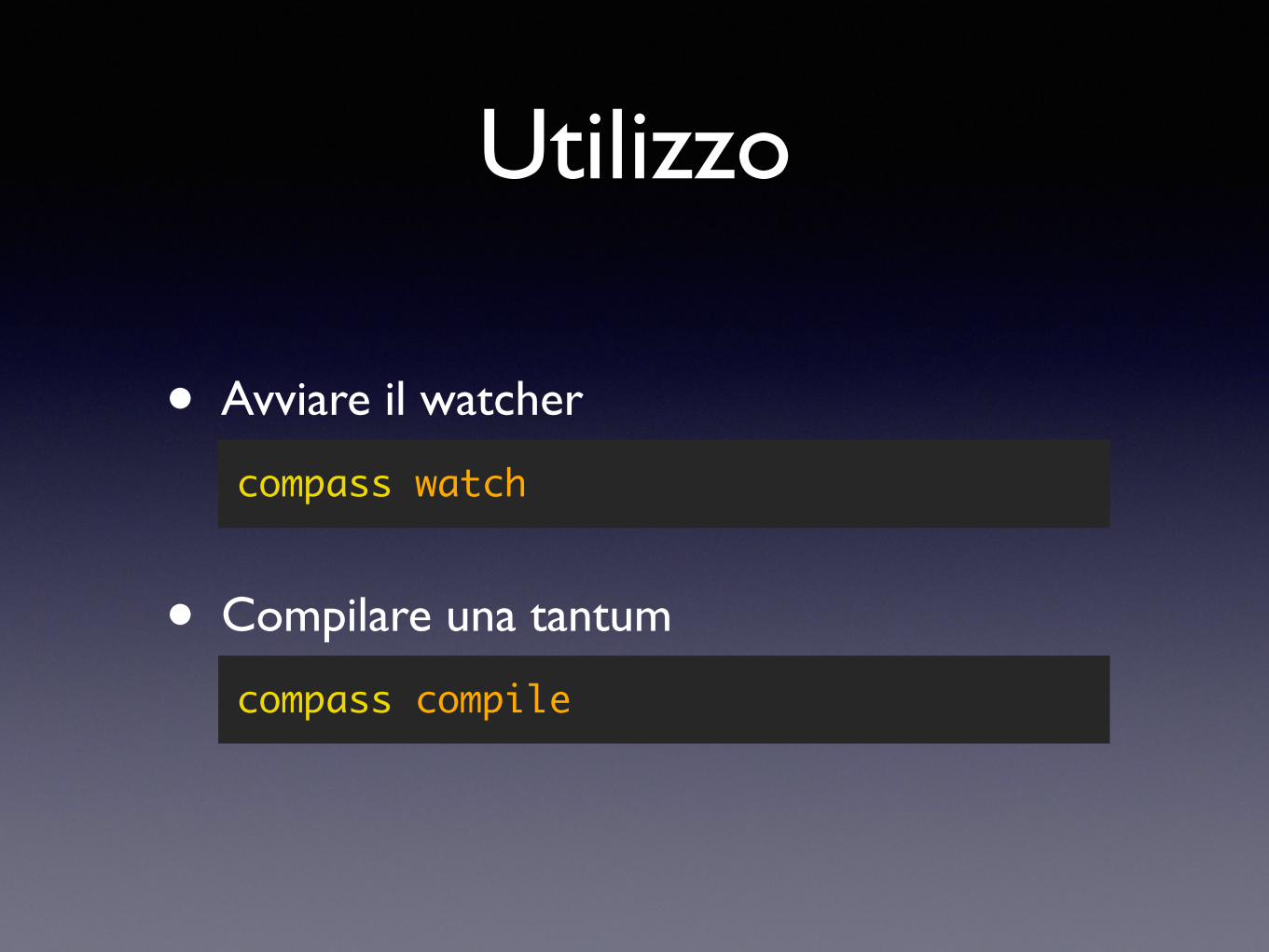
Utilizzo
• Compilare una tantum
compass compile
• Avviare il watcher
compass watch
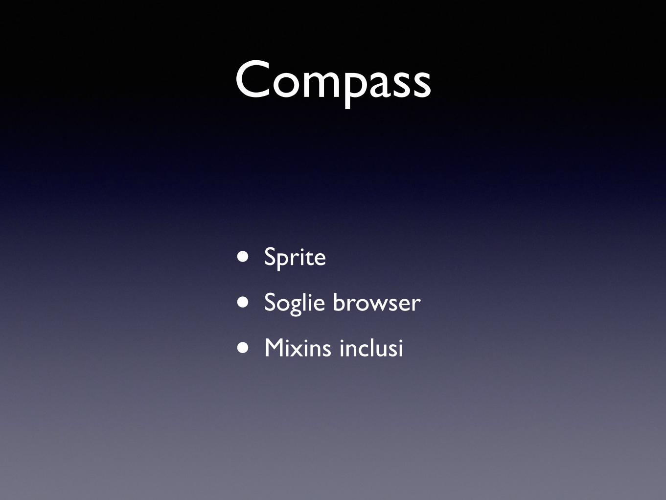
Compass
• Sprite
• Soglie browser
• Mixins inclusi

Un’ultima cosa…
csszengarden.com
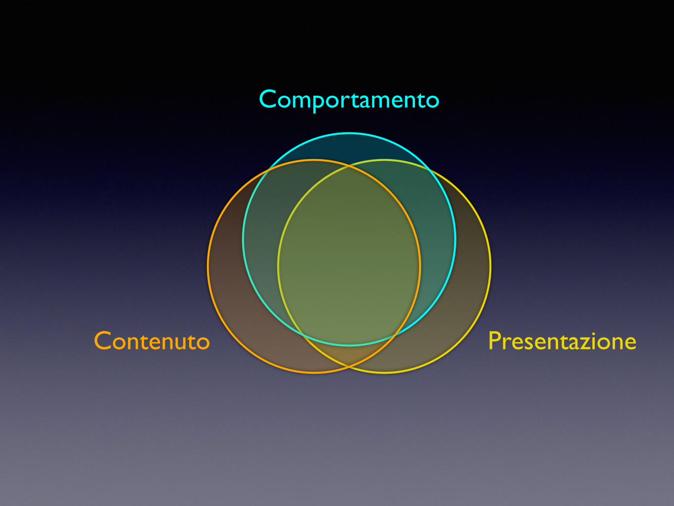
Comportamento
PresentazioneContenuto
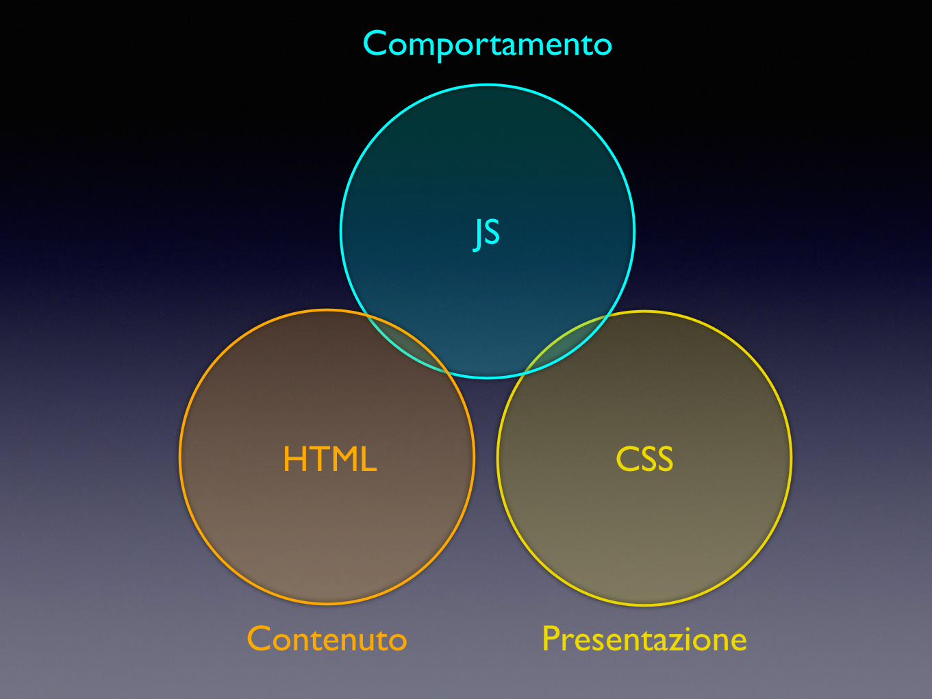
Contenuto Presentazione
Comportamento
JS
CSSHTML
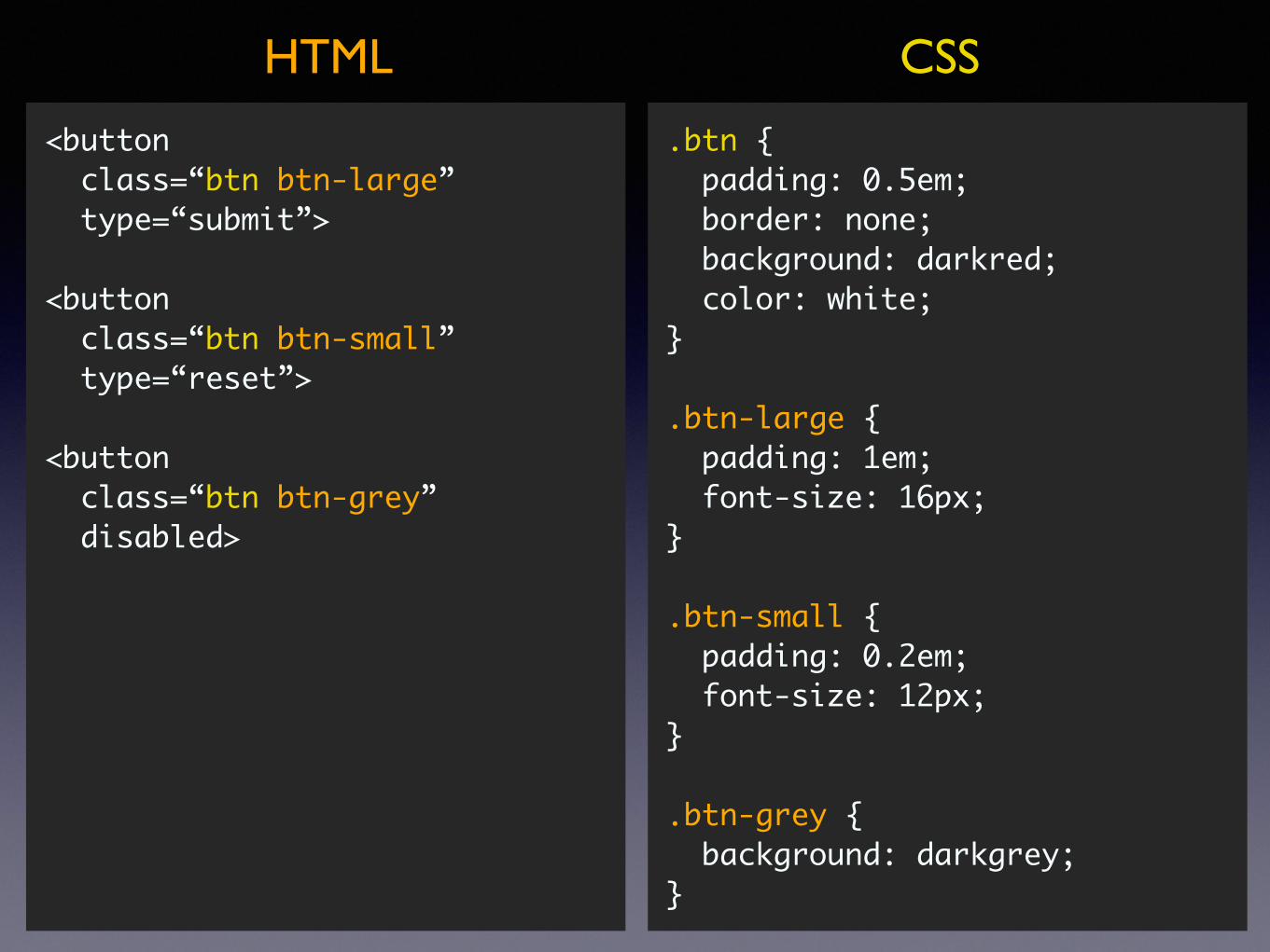
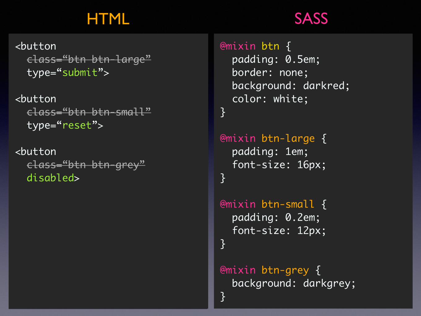
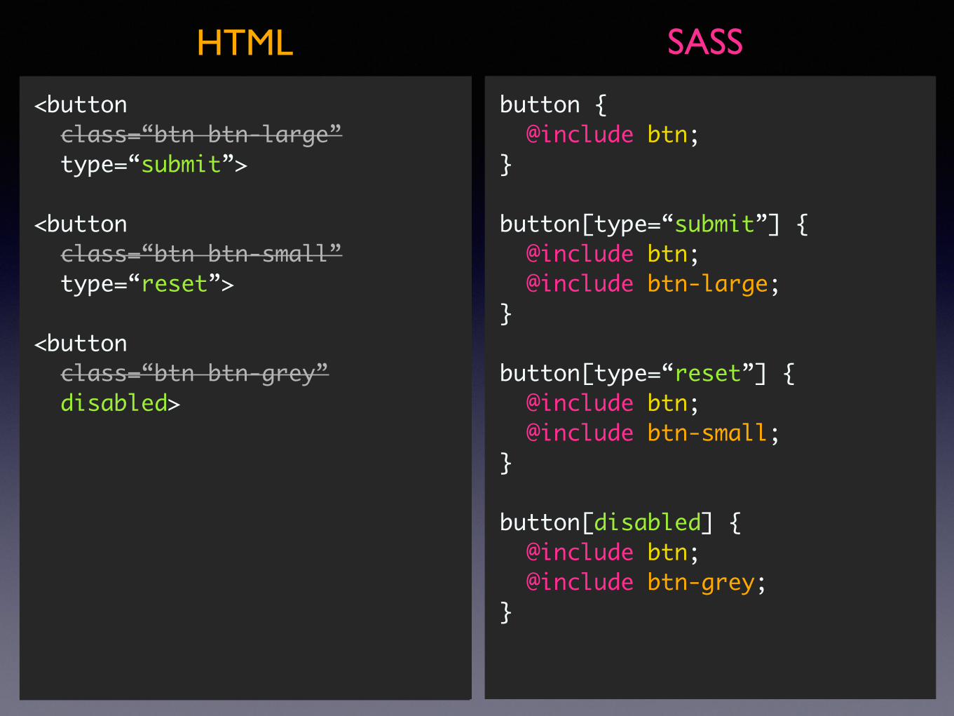
<button class=“btn btn-large” type=“submit”>
<button class=“btn btn-small” type=“reset”>
<button class=“btn btn-grey” disabled>
.btn { padding: 0.5em; border: none; background: darkred; color: white;}
.btn-large { padding: 1em; font-size: 16px;}
.btn-small { padding: 0.2em; font-size: 12px;}
.btn-grey { background: darkgrey;}
CSSHTML
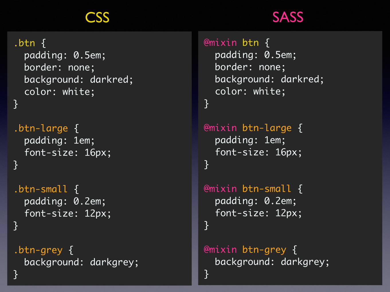
.btn { padding: 0.5em; border: none; background: darkred; color: white;}
.btn-large { padding: 1em; font-size: 16px;}
.btn-small { padding: 0.2em; font-size: 12px;}
.btn-grey { background: darkgrey;}
CSS
@mixin btn { padding: 0.5em; border: none; background: darkred; color: white;}
@mixin btn-large { padding: 1em; font-size: 16px;}
@mixin btn-small { padding: 0.2em; font-size: 12px;}
@mixin btn-grey { background: darkgrey;}
SASS
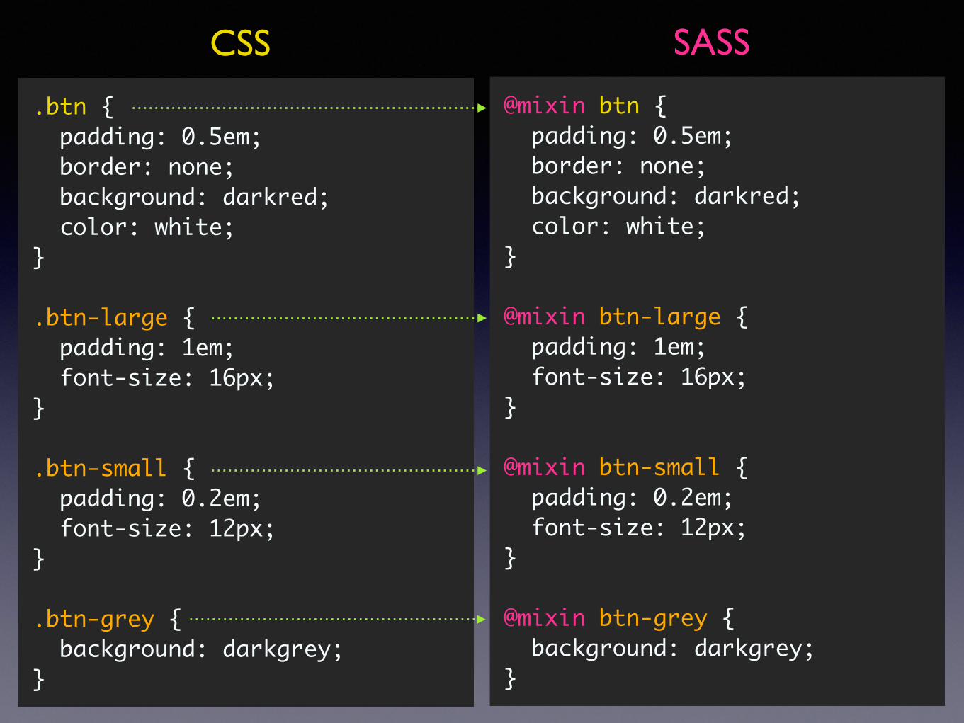
@mixin btn { padding: 0.5em; border: none; background: darkred; color: white;}
@mixin btn-large { padding: 1em; font-size: 16px;}
@mixin btn-small { padding: 0.2em; font-size: 12px;}
@mixin btn-grey { background: darkgrey;}
SASSHTML
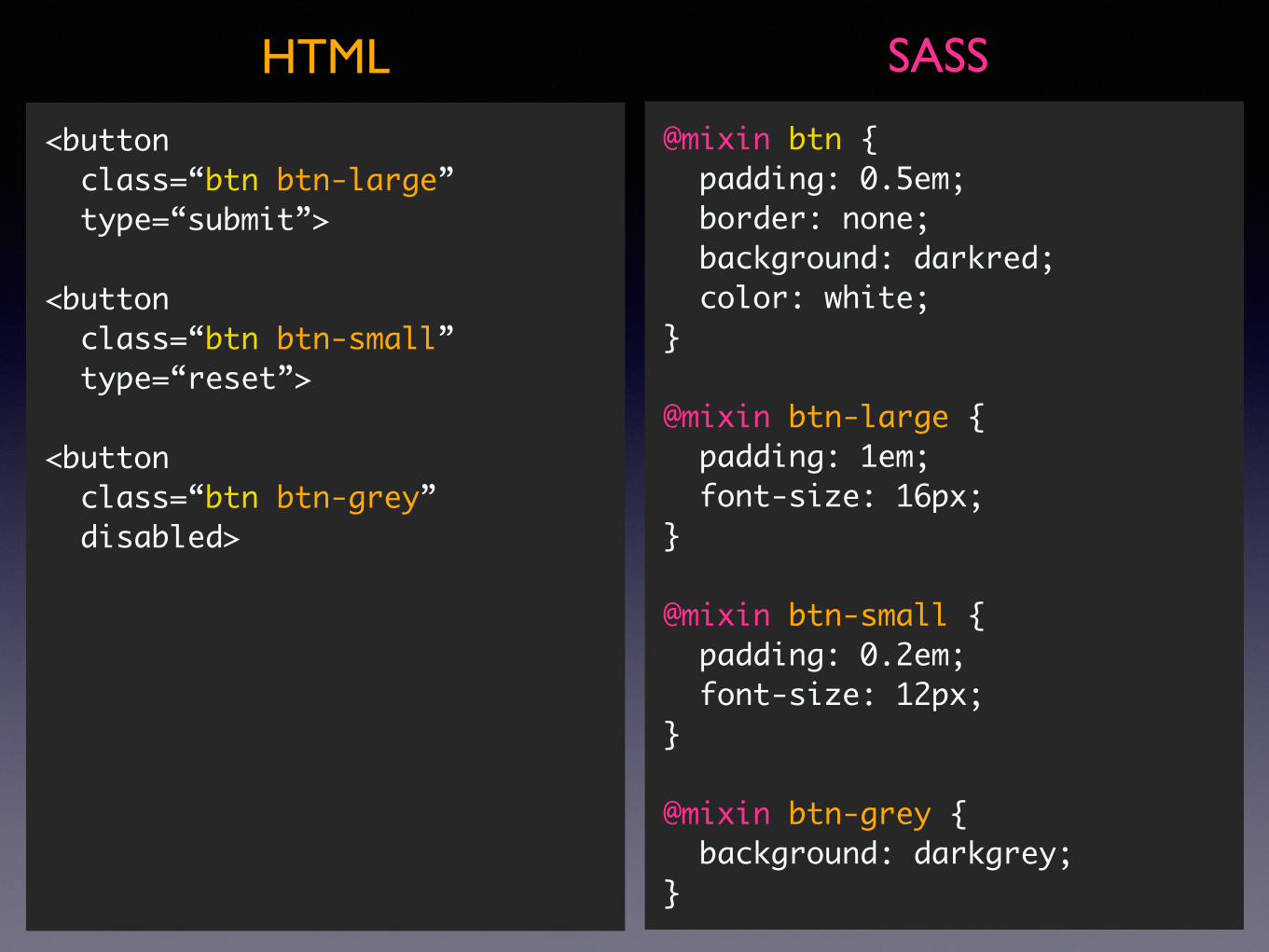
<button class=“btn btn-large” type=“submit”>
<button class=“btn btn-small” type=“reset”>
<button class=“btn btn-grey” disabled>
@mixin btn { padding: 0.5em; border: none; background: darkred; color: white;}
@mixin btn-large { padding: 1em; font-size: 16px;}
@mixin btn-small { padding: 0.2em; font-size: 12px;}
@mixin btn-grey { background: darkgrey;}
SASSHTML
<button class=“btn btn-large” type=“submit”>
<button class=“btn btn-small” type=“reset”>
<button class=“btn btn-grey” disabled>
<button class=“btn btn-large” type=“submit”>
<button class=“btn btn-small” type=“reset”>
<button class=“btn btn-grey” disabled>
@mixin btn { padding: 0.5em; border: none; background: darkred; color: white;}
@mixin btn-large { padding: 1em; font-size: 16px;}
@mixin btn-small { padding: 0.2em; font-size: 12px;}
@mixin btn-grey { background: darkgrey;}
button { @include btn;}
button[type=“submit”] { @include btn; @include btn-large;}
button[type=“reset”] { @include btn; @include btn-small;}
button[disabled] { @include btn; @include btn-grey;}
SASSHTML
<button class=“btn btn-large” type=“submit”>
<button class=“btn btn-small” type=“reset”>
<button class=“btn btn-grey” disabled>
<button class=“btn btn-large” type=“submit”>
<button class=“btn btn-small” type=“reset”>
<button class=“btn btn-grey” disabled>
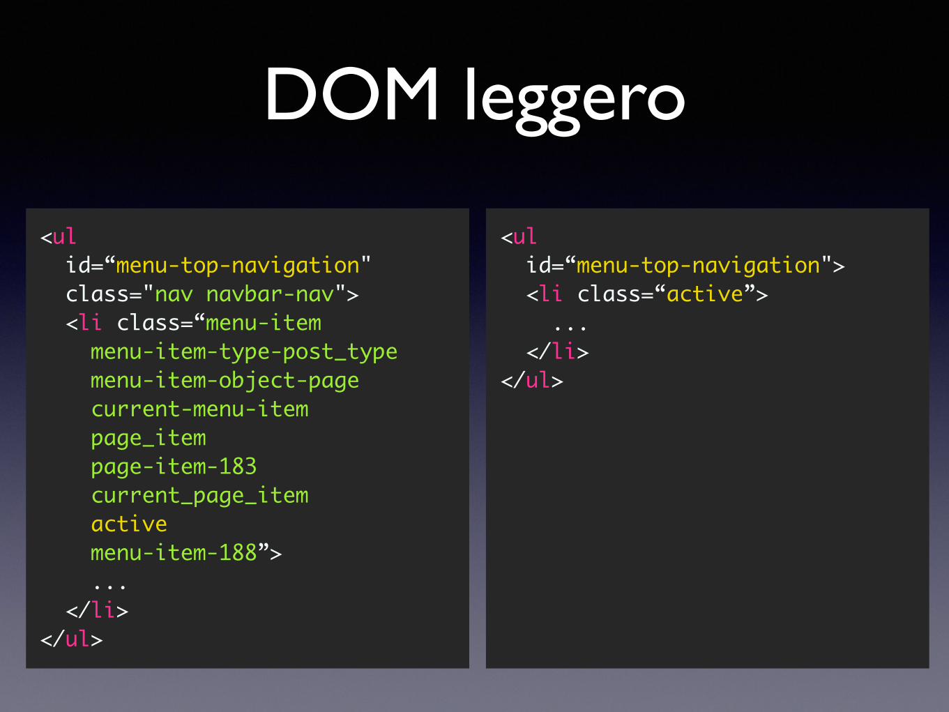
DOM leggero
<ul id=“menu-top-navigation" class="nav navbar-nav"> <li class=“menu-item menu-item-type-post_type menu-item-object-page current-menu-item page_item page-item-183 current_page_item active menu-item-188”> ... </li></ul>
<ul id=“menu-top-navigation"> <li class=“active”> ... </li></ul>
Markup
• Classi semantiche, non presentazionali
• Classi presentazionali → Mixin
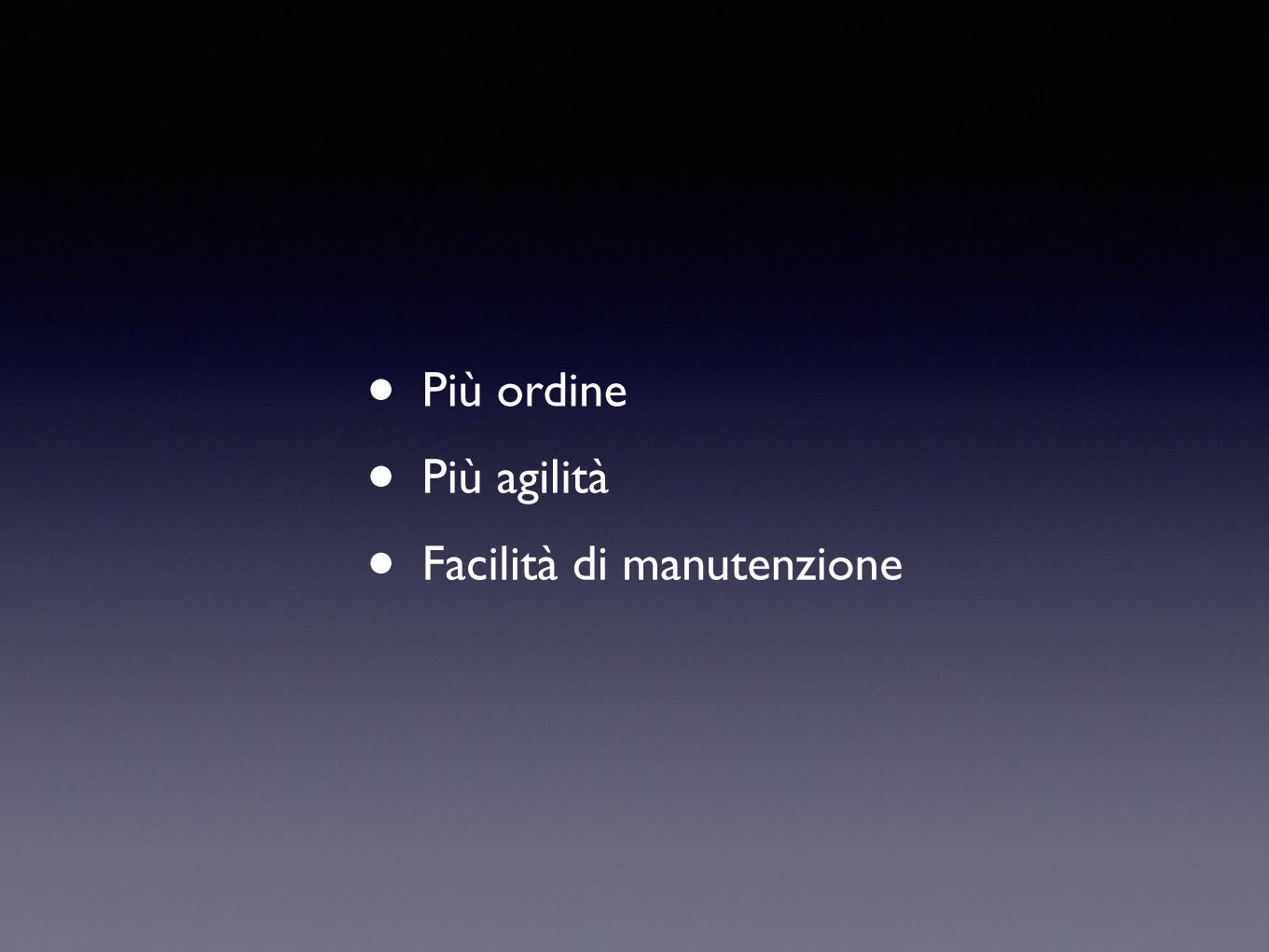
• Più ordine
• Più agilità
• Facilità di manutenzione


Q&A
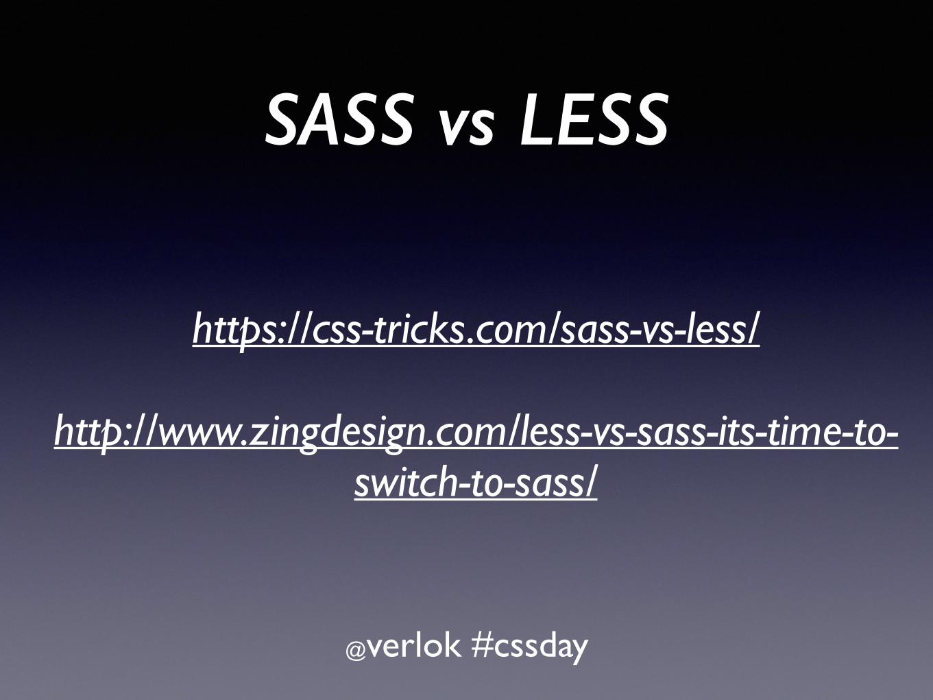
SASS vs LESS
@verlok #cssday
https://css-tricks.com/sass-vs-less/
http://www.zingdesign.com/less-vs-sass-its-time-to-switch-to-sass/
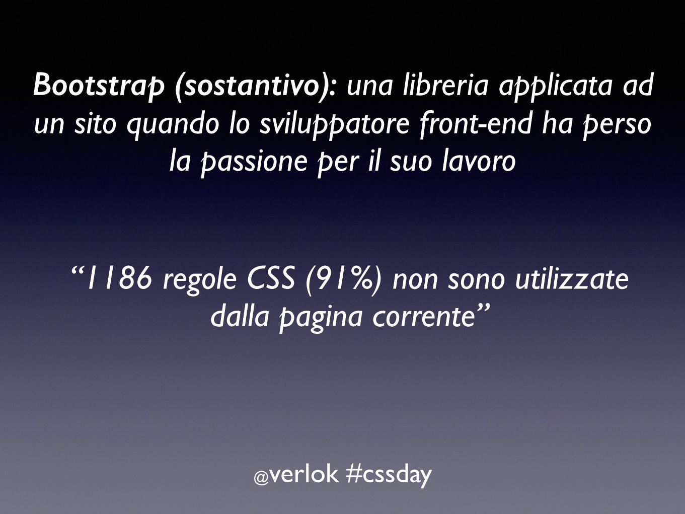
Bootstrap (sostantivo): una libreria applicata ad un sito quando lo sviluppatore front-end ha perso
la passione per il suo lavoro
@verlok #cssday
“1186 regole CSS (91%) non sono utilizzate dalla pagina corrente”
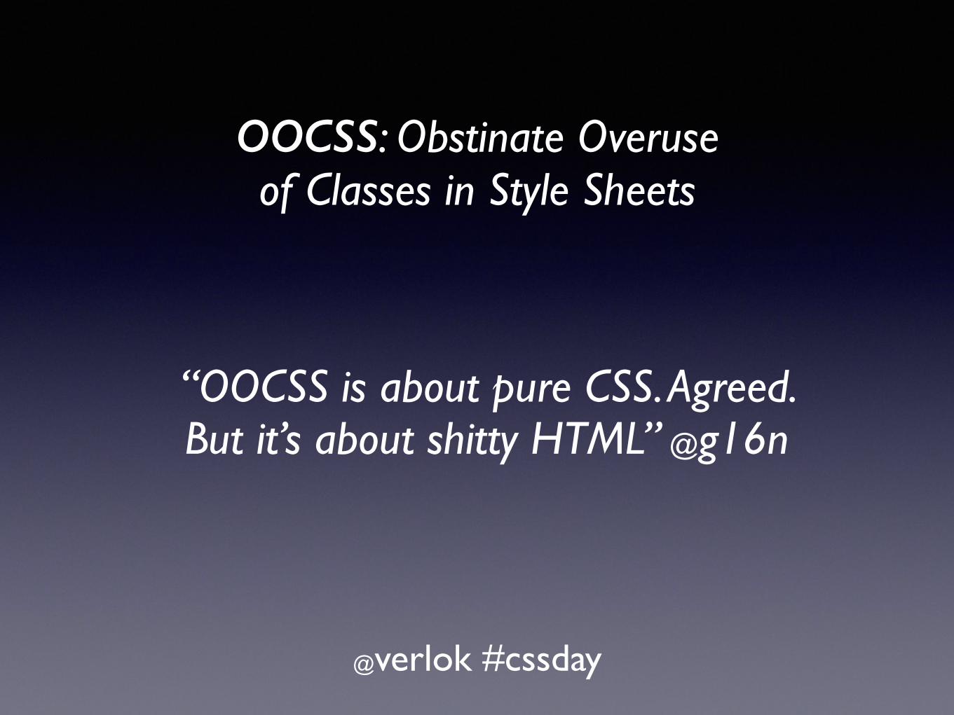
OOCSS: Obstinate Overuse of Classes in Style Sheets
@verlok #cssday
“OOCSS is about pure CSS. Agreed. But it’s about shitty HTML” @g16n