suzie eland portfolio 02.2013
DESCRIPTION
Graphic Design Portfolio February 2013TRANSCRIPT
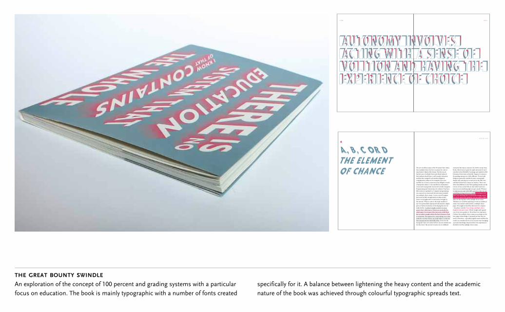
the great bounty swindle
An exploration of the concept of 100 percent and grading systems with a particular focus on education. The book is mainly typographic with a number of fonts created
4 |
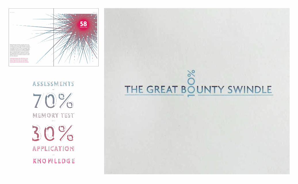
I do not recall how many of the 58 exams I have taken were multiple choice but two occasions do come to
that students should have a well rounded education and therefore assigned each student obligatory
enrolled on a science course you were obliged to study a humanities subject. I was enrolled on a humanities course and consequently was forced to study Computer Programming and Astronomy, two subjects I had very little interest or aptitude in. Computer programming was assessed on coursework but astronomy entailed two multiple choice exams. As you can well imagine
choice so my application to astronomy was light in
say I was particularly unprepared and aimed to simply pass as I had not intention of developing this area of
I confess I simply circled C to every answer that I didn’t know. Which was essentially the whole paper. In retrospect this may seem a little blazé
made the occasion stick in my mind rather it is the fact that I passed and not that badly either. It was not the best grade I have ever achieved but I am not entirely sure
university this time in America. In a bid to escape from Keele, which was not quite the right university for me I enrolled on the ERASMUS exchange and studied in Old Dominion University in Norfolk, Virginia. In America
things are generally considered easier consequently despite only entering my second year in the UK I was
reverse of ours; in the UK you start with 0 and every time you say something right you get a mark. Whereas in America you start with 100% and every time you say something wrong you loose a mark. So as long as you don’t say anything that is technically wrong, even if you don’t answer the question, you can achieve 100%.
exam I was instead confronted by a multiple choice
- but please consider I was siting a multiple choice English Literature exam. Which I might add I gained one of my worse grades in. From these two experience I believe that multiple choice exams are perhaps not the best judge of knowledge. It astounds me that they are used in education - especially English exams and that the results are considered to be of an accurate way of judging a person’s knowledge. Based on these two experiences I decided to test the multiple choice exam.
| |
specifically for it. A balance between lightening the heavy content and the academic nature of the book was achieved through colourful typographic spreads text.
|
Between the ages of 16 and 21, and only as far as I can remember, I sat 58 exams. Which although it seems like a lot could have been a lot higher. As far as I remember it
was fortunate in only doing one resit. I doubt that this
who studied under the new system of AS-Levels or Btec Diploma which has more subjects to study for. So what does this really mean?
respects all you need to do to succeed on paper is
however prepare you in any way for the real world.
|
58EXAMS IN 5 YEARS
| *
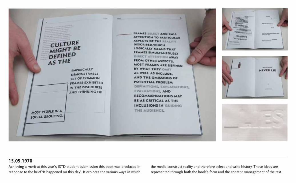
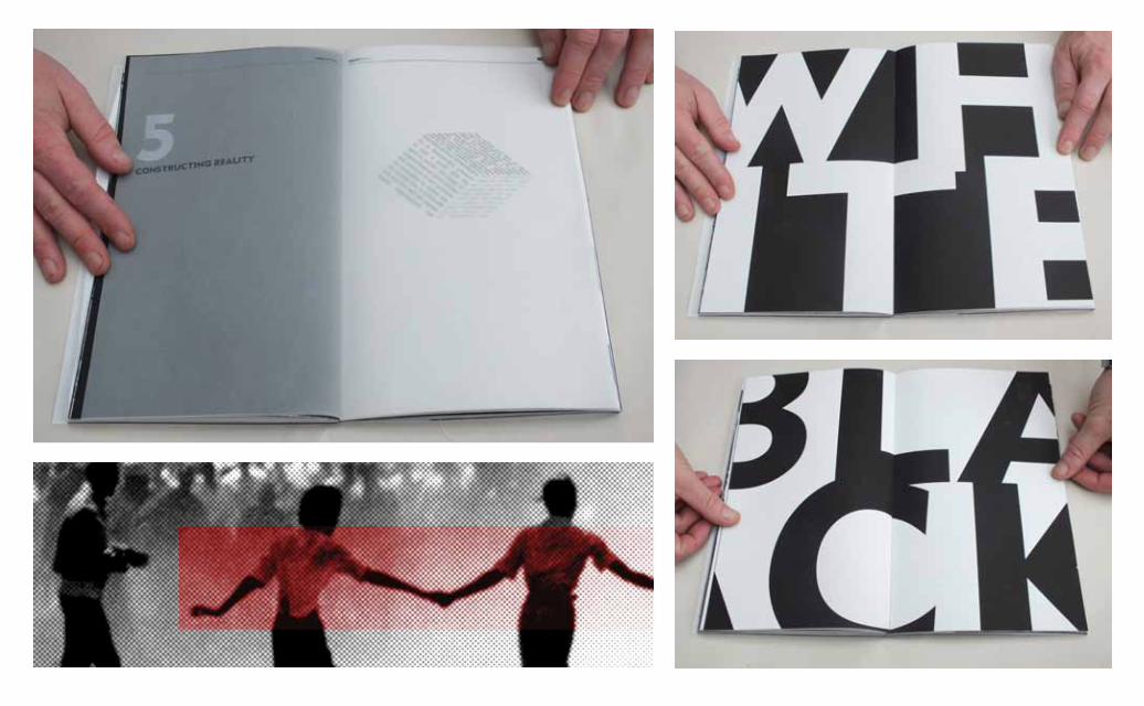
15.05.1970Achieving a merit at this year’s ISTD student submission this book was produced in response to the brief ‘It happened on this day’. It explores the various ways in which
the media construct reality and therefore select and write history. These ideas are represented through both the book’s form and the content management of the text.
64 BRAIN
~ 28 ~ ~ 29 ~
Das Unheimlich goes on to lie out and expand upon what Freud believes produces uncanny feelings. In fact despite promising not to Freud's essay seems to degenerate into a list of what Freud considers to cause uncanny sensations and where possible examples of these circumstances. Here it is in brief what causes the uncanny according to Freud:
Dolls which appear to be alive or rather ‘when there is intellectual uncertainty whether an object is alive or not, and when an inanimate object becomes too much like an animate one'.17
The Phenomenon of the ‘double.’ Or the doubling, dividing and interchanging of the self.
The constant recurrence of the same thing. The repetition of the same features or character-traits or vicissitudes, of the same crimes, or even the same names through several consecutive generations.
The evil eye. Here what is feared in the suspected secret intention of doing harm, and certain signs are taken to mean that intention has the necessary power at its command.
Something which is familiar and old established in the mind and which has become alienated from it through the process of repression.
� 1 �
� 2 �
� 3 �
� 4 �
� 5 �
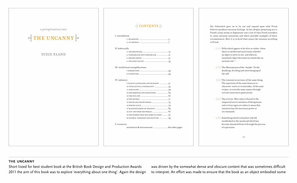
a peregrination into
� �
I. introdu� ion 1. 2.
II. hi¢ orically 3. 4. 5. 6.
III. intelle� ual exemplifi cations 7 8
IV. in¢ ances 9 10 11 12 13 14 15 16 17 18 - 19 20 ,
V. resources &
37
15213135
4345
515559636771757983879195
� �
the ocher pages
the uncanny
Short listed for best student book at the British Book Design and Production Awards 2011 the aim of this book was to explore ‘everything about one thing’. Again the design
was driven by the somewhat dense and obscure content that was sometimes difficult to interpret. An effort was made to ensure that the book as an object embodied some
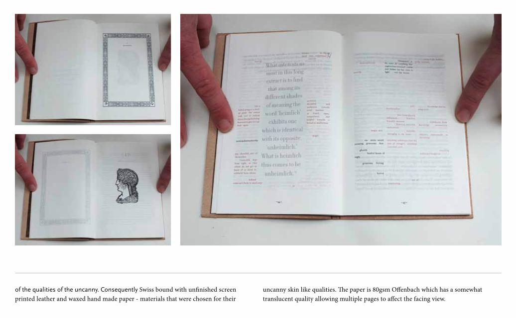
of the qualities of the uncanny. Consequently Swiss bound with unfinished screen printed leather and waxed hand made paper - materials that were chosen for their
uncanny skin like qualities. The paper is 80gsm Offenbach which has a somewhat translucent quality allowing multiple pages to affect the facing view.
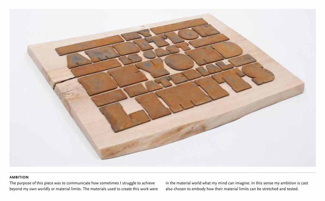
ambition
The purpose of this piece was to communicate how sometimes I struggle to achieve beyond my own worldly or material limits. The materials used to create this work were
in the material world what my mind can imagine. In this sense my ambition is cast also chosen to embody how their material limits can be stretched and tested.
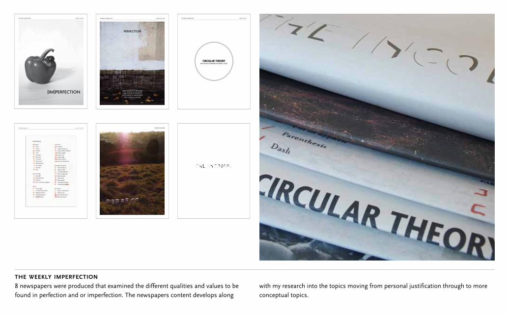
the weekly imperfection
8 newspapers were produced that examined the different qualities and values to be found in perfection and or imperfection. The newspapers content develops along
with my research into the topics moving from personal justification through to more conceptual topics.
ISSUE 1. 20.11.2011THE WEEKLY IMPERFECTION
PERFECTION
ISSUE2 29. 20.11.2011THE WEEKLY IMPERFECTION
THAT WHICH HAS NO FLAWTHAT WHICH IS COMPLETE
THAT WHICH IS CONSISTENTTHAT WHICH IS SOUND
ISSUE.3 6.12.2011THE WEEKLY IMPERFECTION
CIRCULAR THEORYAND THE ART OF DRAWING THE PERFECT CIRCLE
I 4. 23.1.2012The Weekly Imperfection ISSUE SIX 7.02.2012
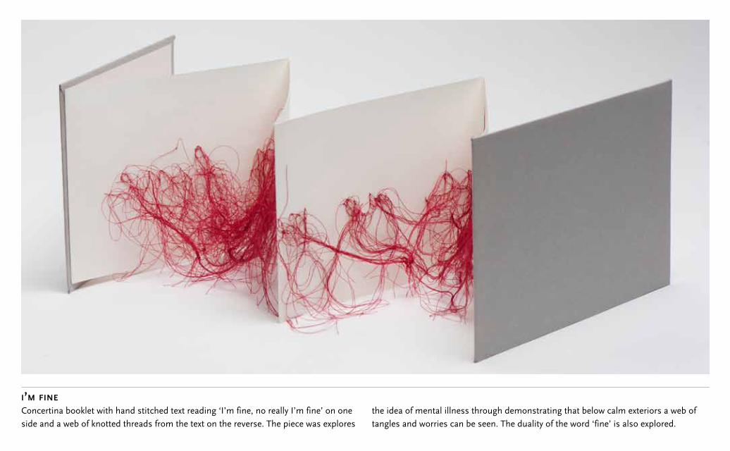
i’m fine
Concertina booklet with hand stitched text reading ‘I’m fine, no really I’m fine’ on one side and a web of knotted threads from the text on the reverse. The piece was explores
the idea of mental illness through demonstrating that below calm exteriors a web of tangles and worries can be seen. The duality of the word ‘fine’ is also explored.
SLABS ATTEMPTING TO BREAK OUT FROM THE LIMITATIONS OF THEIR OWN BOUNDARIES
#4 CAST
EXPLORING THE HIDDEN OR INNATE QUALITIES THAT CAN ADD VALUE AND MEANING
#1 FACE VALUEFOR THOSE WHO LIKE TO BE CHALLENGED TO LOOK FOR
WHAT CANNOT BE SEEN
#5 NISUS
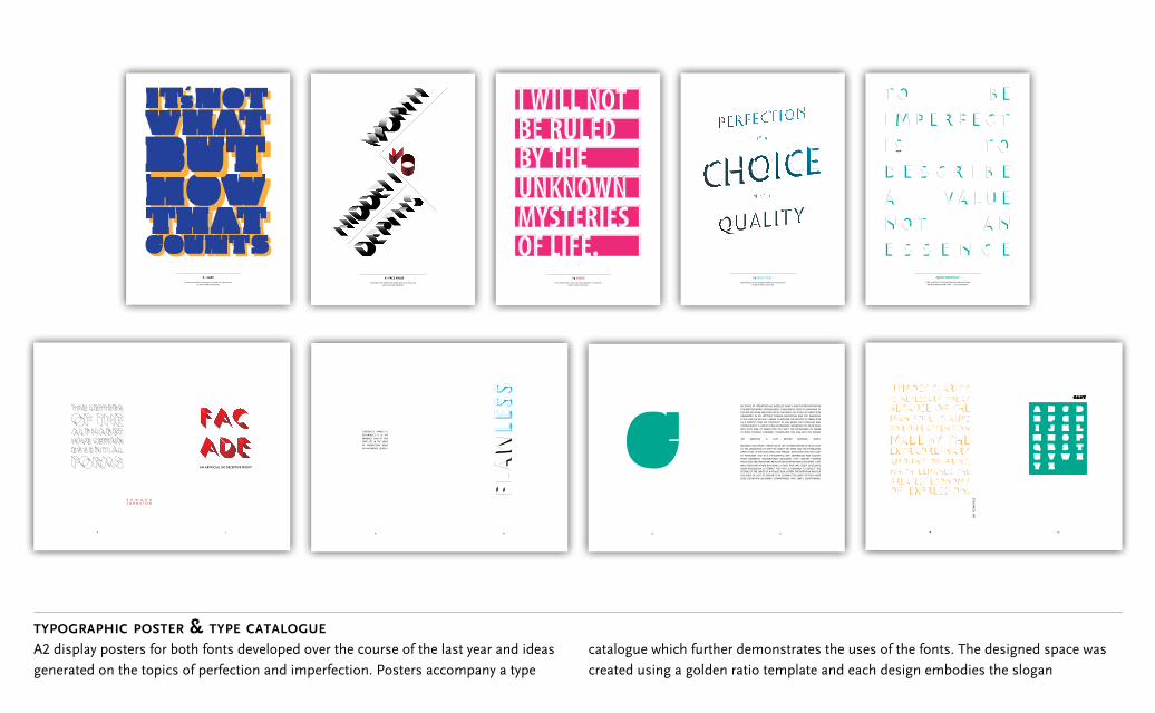
typographic poster & type catalogue
A2 display posters for both fonts developed over the course of the last year and ideas generated on the topics of perfection and imperfection. Posters accompany a type
catalogue which further demonstrates the uses of the fonts. The designed space was created using a golden ratio template and each design embodies the slogan
FOR CREATING SOLID MEANING WHEN ALL AROUND LIES VAGARIES AND CONFUSION
#1IF WE CONSTRUCT OUR OWN REALITIES WHAT HAPPENS
WHEN WE BREAK THEM DOWN ... ENLIGHTENMENT?
#3 DECONSTRUCT
20 21
MY STUDY OF LITERATURE HAS INSTILLED IN ME A GREAT APPRECIATION FOR THE WRITTEN WORD. CONSEQUENTLY I FREQUENTLY LOOK TO LANGUAGE TO EXPLORE MY IDEAS AND DEVELOP MY THOUGHTS. MY STUDY OF PERFECTION ORIGINATED IN MY ATTITUDE TOWARD PERFECTION AND THE INFLUENCE IT HAS HAD ON MY LIFE. I BEGAN TO EXPLORE THE NOTION OF PERFECTION AS A CONCEPT THAT WE CONSTRUCT IN OUR MINDS FOR OURSELVES AND CONSEQUENTLY IT HAS NO FIXED BOUNDARIES. WHENEVER YOU NEAR WHAT WAS YOUR IDEA OF PERFECTION YOU SHIFT THE BOUNDARIES IN ORDER TO DRIVE YOURSELF FORWARD. I TRANSLATED THIS IDEA INTO THE PHRASE ‘MY AMBITION IS CAST BEYOND MATERIAL LIMITS’.
MEANING THAT WHAT I STRIVE FOR IN LIFE IS NEVER WITHIN MY REACH DUE TO THE LIMITATIONS OF BOTH MY ABILITY, MY MIND AND THE POSSBILITIES OPEN TO ME. AFTER DEVELOPING THIS PHRASE I DEVELOPED THE FONT CAST TO REPRESENT THIS IN A TYPOGRAPHIC WAY. INSPIRATION WAS SOUGHT FROM NUMEROUS BACKGROUNDS INCLUDINH 19TH CENTURY FORGING PROCESSES AND INDUSTRIAL REVOLUTION EGYPTIAN AND SLAB SERIFS. CAST WAS DEVELOPED FROM BLACKOAK, A FONT THAT WAS ITSELF DEVELOPED FROM WOODBLACK LETTERING. THE FONT IS DESIGNED TO REFLECT THE TESTING OF THE LIMITS OF A PRODUCTION SYSTEM. THE INTENTION WAS FOR THE BODY OF CAST TO APPEAR TO BE PUSHING THE LIMITS OF ITSELF WITH EDGE DEFINITION BECOMING COMPROMISED AND SERIFS DISAPPEARING.
6 7
AN ARTIFICIAL OR DECEPTIVE FRONT
E D W A R D J O H N S T O N
14 15
CONTRUCT’S OPPOSIT IS DECONTRUCT. IT IS THE IMPERFECT HALF OF THIS FONT SET. IN THE SENSE OF INPERFECTION BEING AN INCOMPLETE QUALITY.
18 19
JAN
TSC
HIC
HO
LD
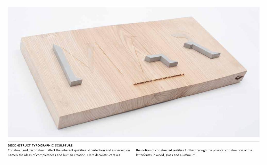
deconstruct typographic sculpture
Construct and deconstruct reflect the inherent qualities of perfection and imperfection namely the ideas of completeness and human creation. Here deconstruct takes
the notion of constructed realities further through the physical construction of the letterforms in wood, glass and aluminium.
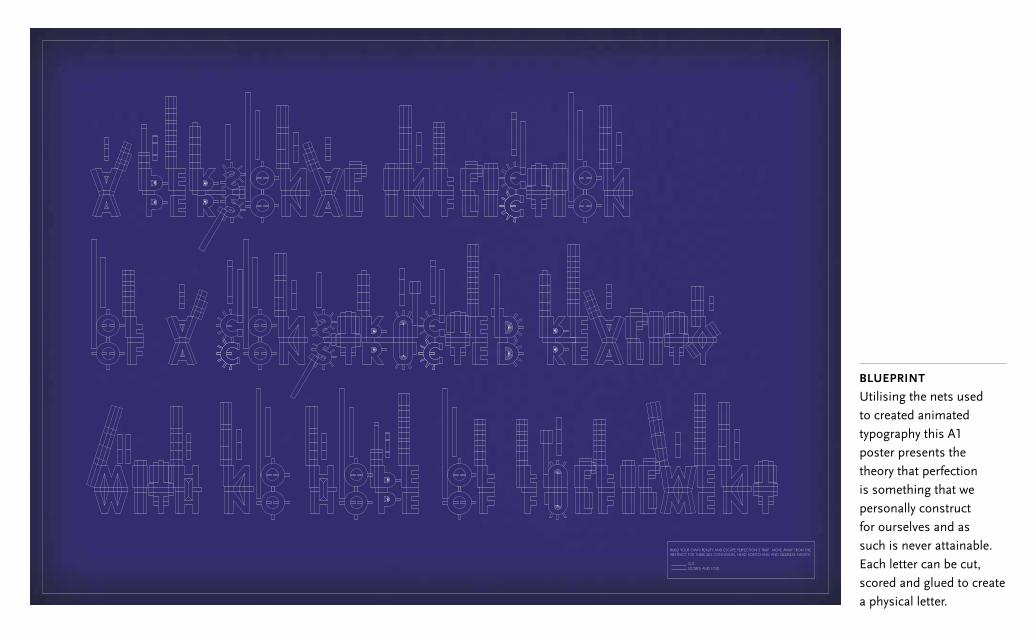
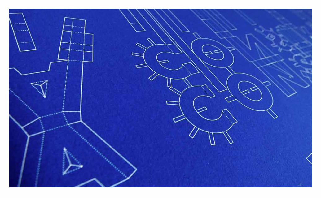
blueprint
Utilising the nets used to created animated typography this A1 poster presents the theory that perfection is something that we personally construct for ourselves and as such is never attainable. Each letter can be cut, scored and glued to create a physical letter.
BUILD YOUR OWN REALITY AND ESCAPE PERFECTION’S TRAP. MOVE AWAY FROM THE ABSTRACT FOR THERE LIES CONFUSION, HEAD SCRATCHING AND SLEEPLESS NIGHTS.
CUT SCORES AND FOLD
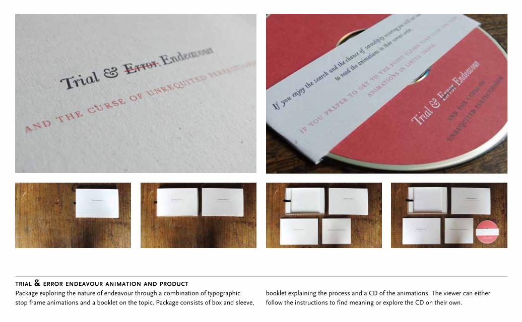
trial & error endeavour animation and product
Package exploring the nature of endeavour through a combination of typographic stop frame animations and a booklet on the topic. Package consists of box and sleeve,
booklet explaining the process and a CD of the animations. The viewer can either follow the instructions to find meaning or explore the CD on their own.
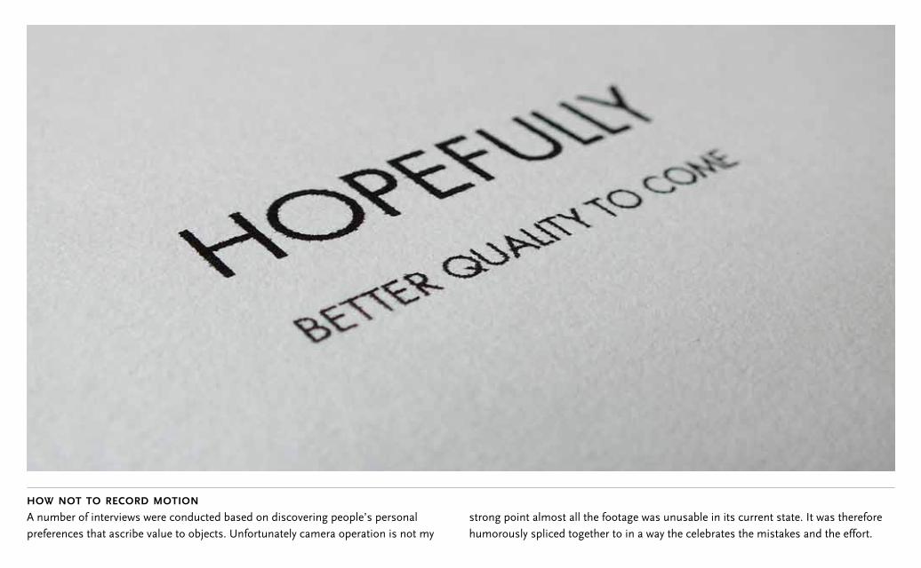
how not to record motion A number of interviews were conducted based on discovering people’s personal preferences that ascribe value to objects. Unfortunately camera operation is not my
strong point almost all the footage was unusable in its current state. It was therefore humorously spliced together to in a way the celebrates the mistakes and the effort.
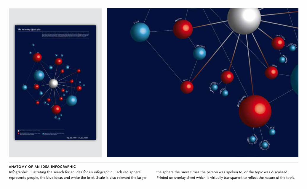
anatomy of an idea infographic
Infographic illustrating the search for an idea for an infographic. Each red sphere represents people, the blue ideas and white the brief. Scale is also relevant the larger
the sphere the more times the person was spoken to, or the topic was discussed. Printed on overlay sheet which is virtually transparent to reflect the nature of the topic.
with work by level 3 graphic design students from the department of art and design at UWE, bristol
UWEARE NEW
BLOOD2011
at
01.07.2011- 04.07.2011 private view 30.06.2011
old truman brewery15 hanbury streetlondon E1 6QR
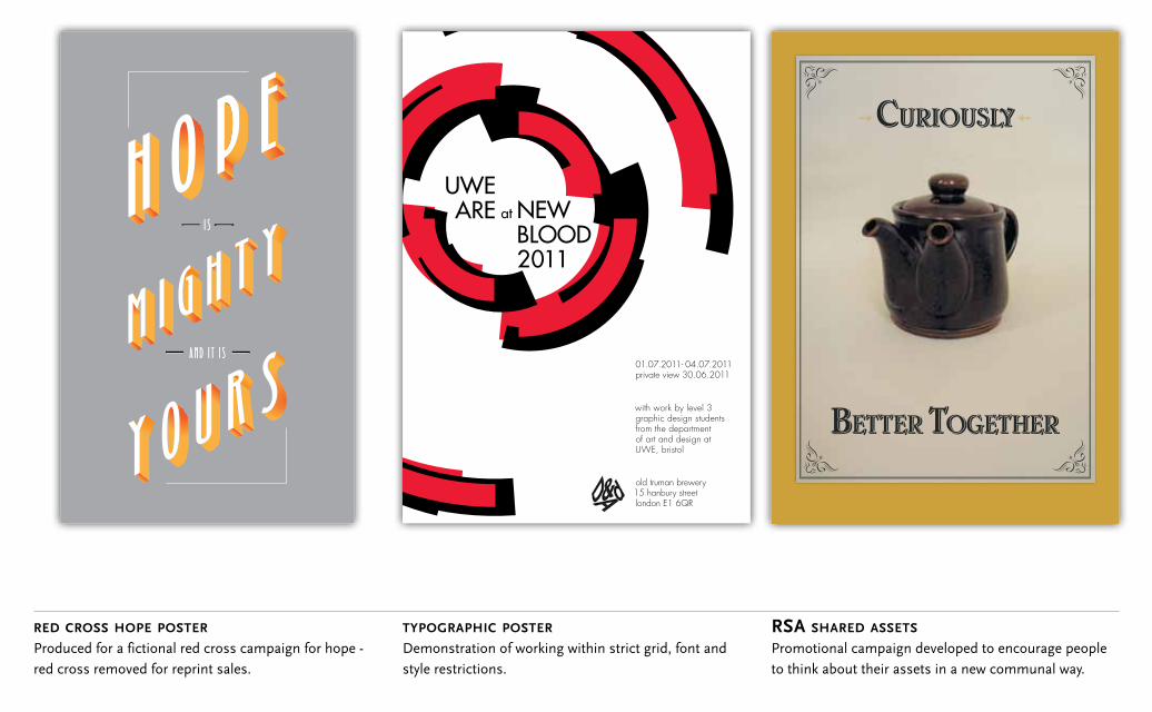
red cross hope poster
Produced for a fictional red cross campaign for hope - red cross removed for reprint sales.
typographic poster
Demonstration of working within strict grid, font and style restrictions.
rsa shared assets
Promotional campaign developed to encourage people to think about their assets in a new communal way.
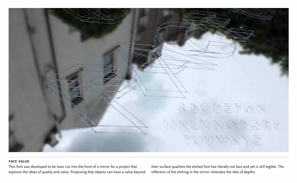
face value
This font was developed to be laser cut into the front of a mirror for a project that explores the ideas of quality and value. Proposing that objects can have a value beyond
their surface qualities the etched font has literally not face and yet is still legible. The reflection of the etching in the mirror reiterates the idea of depths.
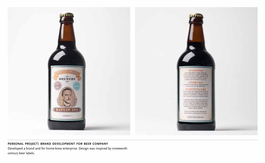
personal project: brand development for beer company
Developed a brand and for home-brew enterprise. Design was inspired by nineteenth century beer labels.
P L AY T H E L O N G G A M E
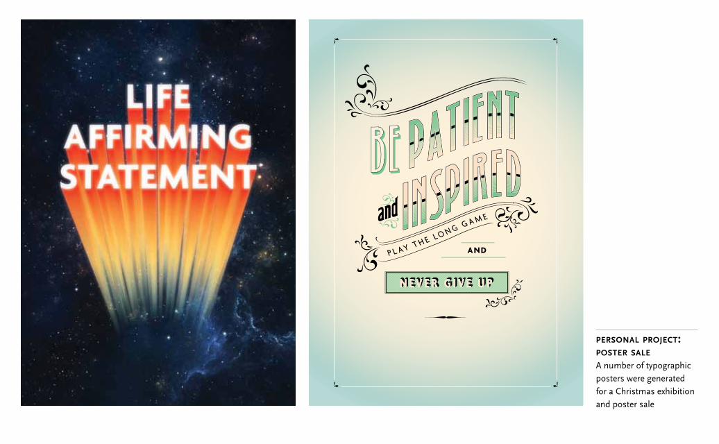
personal project:poster sale
A number of typographic posters were generated for a Christmas exhibition and poster sale