streit's redesign
TRANSCRIPT
STREIT’S REDESIGN: A PROPOSALMIRIAM HIERSTEINERJANUARY 2010PORTFOLIO & PROCESS
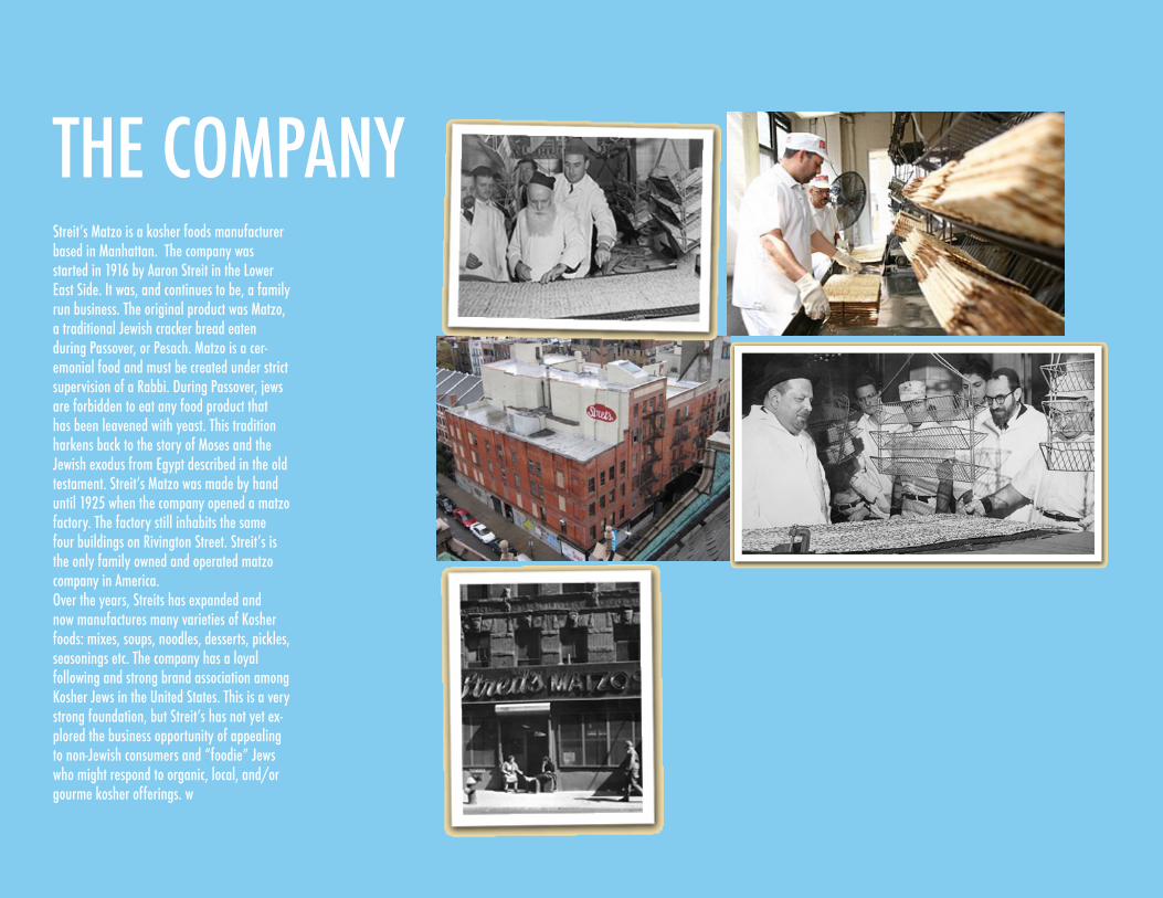
THE COMPANYStreit’s Matzo is a kosher foods manufacturer based in Manhattan. The company was started in 1916 by Aaron Streit in the Lower East Side. It was, and continues to be, a family run business. The original product was Matzo, a traditional Jewish cracker bread eaten during Passover, or Pesach. Matzo is a cer-emonial food and must be created under strict supervision of a Rabbi. During Passover, jews are forbidden to eat any food product that has been leavened with yeast. This tradition harkens back to the story of Moses and the Jewish exodus from Egypt described in the old testament. Streit’s Matzo was made by hand until 1925 when the company opened a matzo factory. The factory still inhabits the same four buildings on Rivington Street. Streit’s is the only family owned and operated matzo company in America. Over the years, Streits has expanded and now manufactures many varieties of Kosher foods: mixes, soups, noodles, desserts, pickles, seasonings etc. The company has a loyal following and strong brand association among Kosher Jews in the United States. This is a very strong foundation, but Streit’s has not yet ex-plored the business opportunity of appealing to non-Jewish consumers and “foodie” Jews who might respond to organic, local, and/or gourme kosher offerings. w
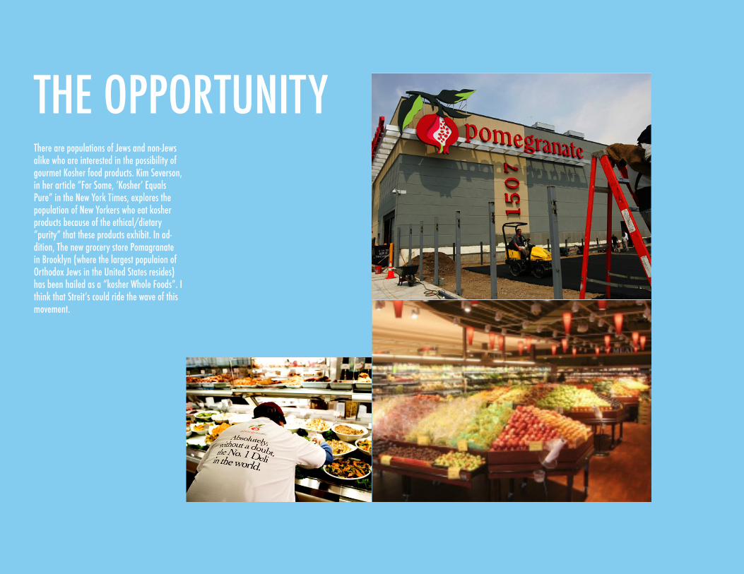
THE OPPORTUNITYThere are populations of Jews and non-Jews alike who are interested in the possibility of gourmet Kosher food products. Kim Severson, in her article “For Some, ‘Kosher’ Equals Pure” in the New York Times, explores the population of New Yorkers who eat kosher products because of the ethical/dietary “purity” that these products exhibit. In ad-dition, The new grocery store Pomagranate in Brooklyn (where the largest populaion of Orthodox Jews in the United States resides) has been hailed as a “kosher Whole Foods”. I think that Streit’s could ride the wave of this movement.
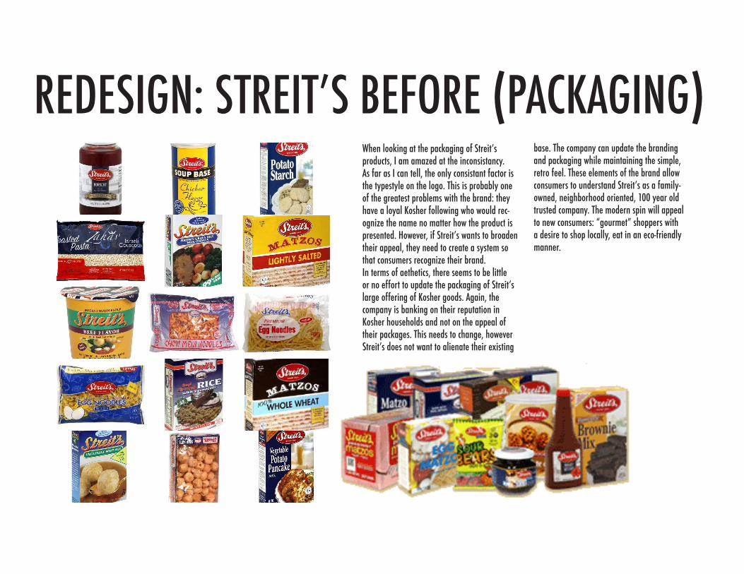
REDESIGN: STREIT’S BEFORE (PACKAGING)When looking at the packaging of Streit’s products, I am amazed at the inconsistancy. As far as I can tell, the only consistant factor is the typestyle on the logo. This is probably one of the greatest problems with the brand: they have a loyal Kosher following who would rec-ognize the name no matter how the product is presented. However, if Streit’s wants to broaden their appeal, they need to create a system so that consumers recognize their brand.In terms of aethetics, there seems to be little or no effort to update the packaging of Streit’s large offering of Kosher goods. Again, the company is banking on their reputation in Kosher households and not on the appeal of their packages. This needs to change, however Streit’s does not want to alienate their existing
base. The company can update the branding and packaging while maintaining the simple, retro feel. These elements of the brand allow consumers to understand Streit’s as a family-owned, neighborhood oriented, 100 year old trusted company. The modern spin will appeal to new consumers: “gourmet” shoppers with a desire to shop locally, eat in an eco-friendly manner.
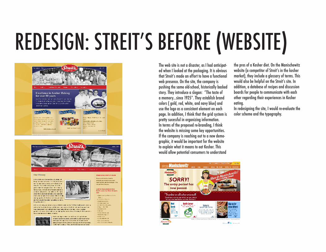
REDESIGN: STREIT’S BEFORE (WEBSITE)The web site is not a disaster, as I had anticipat-ed when I looked at the packaging. It is obvious that Streit’s made an effort to have a functional web presence. On the site, the company is pushing the same old-school, historically backed story. They introduce a slogan: “The taste of a memory...since 1925”. They establish brand colors ( gold, red, white, and navy blue) and use the logo as a consistent element on each page. In addition, I think that the grid system is pretty sucessful in organizing information. In terms of the proposed re-branding, I think the website is missing some key opportunities. If the company is reaching out to a new demo-graphic, it would be important for the website to explain what it means to eat Kosher. This would allow potential consumers to understand
the pros of a Kosher diet. On the Manischewitz website (a competitor of Streit’s in the kosher market), they include a glossary of terms. This would also be helpful on the Streit’s site. In addition, a database of recipes and discussion boards for people to communicate with each other regarding their experiences in Kosher eating.In redesigning the site, I would re-evaluate the color scheme and the typography.
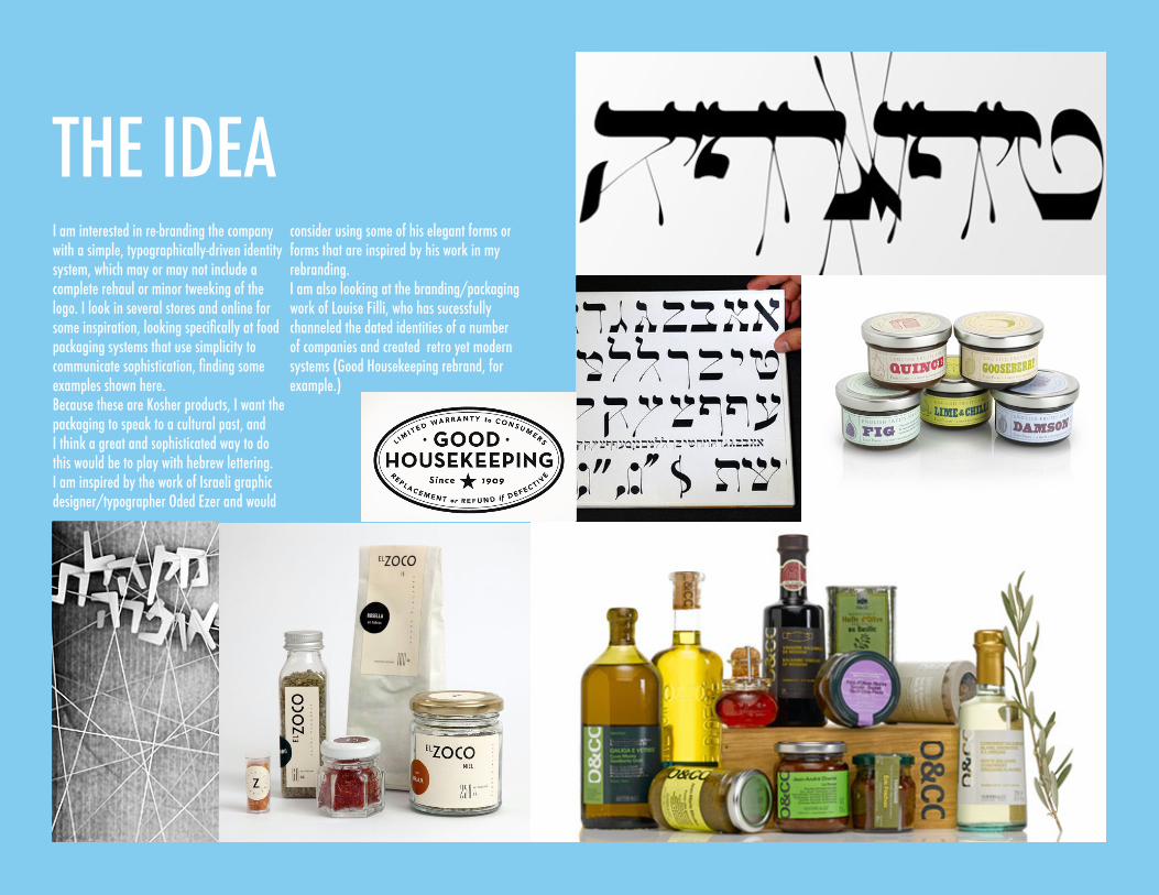
THE IDEAI am interested in re-branding the company with a simple, typographically-driven identity system, which may or may not include a complete rehaul or minor tweeking of the logo. I look in several stores and online for some inspiration, looking specifically at food packaging systems that use simplicity to communicate sophistication, finding some examples shown here. Because these are Kosher products, I want the packaging to speak to a cultural past, and I think a great and sophisticated way to do this would be to play with hebrew lettering. I am inspired by the work of Israeli graphic designer/typographer Oded Ezer and would
consider using some of his elegant forms or forms that are inspired by his work in my rebranding. I am also looking at the branding/packaging work of Louise Filli, who has sucessfully channeled the dated identities of a number of companies and created retro yet modern systems (Good Housekeeping rebrand, for example.)

THE GAMEPLANI will be re-designing the logo, the letterhead and the promotional items for Streit’s Matzo.
WEDNESDAY, FEBRUARY 17th: Re-worked logo and three packaging, letterhead, and promotional ideas.
WEDNESDAY, FEBRUARY 24: Final identity system, packaging system, and promotional system.