statistics data handling - stellenbosch universityacademic.sun.ac.za/mathed/malati/4datacal.pdf ·...
TRANSCRIPT

Statistics
Data Handling(using the graphing calculator)
Grades 8 and 9
Teacher document
Malati staff involved in developing these materials:
Kate BennieKate HudsonKaren Newstead
We acknowledge the valuable comments of Heleen Verhage and Donald Katz.
COPYRIGHT All the materials developed by MALATI are in the public domain. They may be freely used and adapted, withacknowledgement to MALATI and the Open Society Foundation for South Africa. December 1999

MALATI materials: Data Handling 1
The following activities are included as core activities for Data Handling in Grades 8and 9:
Activity Content Context
African Penguin 1Describing one set of data:Frequency tables, dependent/independentvariable, bar graph, mode, pie chart
Biology
HistoryGrouped bar graph, stacked column graph,trend
History
Cape of StormsSummarising data, bar graph, pie chart,statistical distortion
History
WeatherMean, line graph, range, influence of rangeon accuracy of predictions
Weather
African Penguin 2Regression between two variables:Scatterplots, dependent/ independentvariables, trendline, correlations
Biology
The following additional activities, in which the graphing calculator is not necessarilydirectly used, are available in the 4Data module:
History: An extension of the above-mentioned ‘History’ worksheet, in which pupilsare required to match a pie chart to a given historical timeline
Tourism (Enrichment): Real data on tourists to Robben Island, and further practicein calculating means with bigger numbers, mean percentage growth.
Another ‘African Penguin’ worksheet: Representing data (revision), bar graphsshowing positive and negative values
Water: A mini-project for determining water consumption. The concepts of sampleand population are introduced, as well as survey design and reporting findings.
Humidity (Enrichment): Relationship between two variables, using scatterplots andmodelling.
Tourism Brochure (Consolidation/Revision): A project in which pupils are requiredto collect and represent appropriate data.
Teaching Data Handling using the TI-82
It will take the pupils (and the teacher!) some time to become acquainted with thevarious keys and menus needed to record and represent data on the TI-82. Theteacher should act as ‘trouble-shooter’, helping pupils when they are stuck with thecalculator and helping them to identify the source of the problems when unexpectedthings occur on the graph screen! We enclose a useful manual withkey procedures for the TI-82 graphing calculator.
It is very important that there is sufficient reflection on the statistical and graphingconcepts. The use of the calculator should facilitate rather than prevent understandingand discussion. The calculator makes it possible to study concepts like regression at alevel on which pupils would otherwise not be able to carry out the difficult calculations

MALATI materials: Data Handling 2
required. Such concepts are extremely powerful and useful in interpreting the datafrom many sources with which we are constantly bombarded.
Although it may seem that tedious procedures are needed on the calculator, it is notrequired that pupils learn these procedures by heart. Rather they should becomefamiliar with them as they use the various options in the context of the problemsprovided.
Help list – essential keys:(* indicates that the 2nd function key is required)
STAT EDIT to create or edit data listsSTAT CALC to calculate statistics (e.g. means) and equations (e.g. linear
regression)STAT ClrList followed by the names of the lists* separated by commas, to clear
previous data lists
STATPLOT* to create scatterplots, line graphs and bar graphs by switching the plotON and selecting the appropriate plot type and data lists
GRAPH to draw graphs
QUIT* to return to the home screen (normal calculator functions)
WINDOW to adjust the window setting – domain, range and size of category inthe case of frequency data (Xscl)
Y= to enter formulae
VARS (amongst other things) to save regression lines on Y= in order todraw them on the graph
TRACE can be used to ‘follow’ the graph and read off the values
Trouble-shooting
Should the GRAPH look strange, check the following:
Make sure that other graphs have been switched off by checking that allSTATPLOTS not in use are switched OFF and that other functions in Y= are notselected
Check that the appropriate data lists have been selected and that the data hasbeen accurately entered
Check that the WINDOW settings are appropriate in terms of domain, range andscale
Teachers should also take note of ‘boxplot’ representations as pupils may ask aboutthis option on the STAT PLOT menu. Boxplots describe one set of data using a box-and-whisker plot, which shows the range and the spread of the data between the firstquartile, the median and the third quartile.

MALATI materials: Data Handling 3
“Robben Island has a harsh history as a place of banishment and dumping ground for
people deemed to be a threat to the ruling society. Those imprisoned there over the
centuries have included Khoikhoi leaders, exiled Muslims from the east and African
chiefs opposing Dutch and British imperialism, as well as petty criminals, lepers and
the mentally ill. It also served as a military base during World War II.
Then it became a prison for those fighting against Apartheid – youth leaders, MK
soldiers and members of the African National Congress, the Pan Africanist Congress,
the Black Consciousness Movement and other organisations. It became universally
known as a place of hardship and suffering. But Robben Island is also a place that
symbolises defiance, courage, perseverance and freedom. It was from here that the
leaders and ideas that inspired the new South African democracy emerged. It is
ultimately a place symbolising the triumph of the human spirit and the ability of
humanity to transcend hardship and oppression.”
Source:
Robben Island Tours Information Brochure
MALATI materials: Data Handling 4
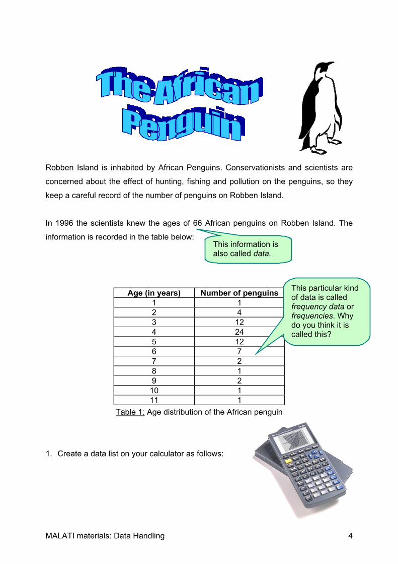
Robben Island is inhabited by African Penguins. Conservationists and scientists are
concerned about the effect of hunting, fishing and pollution on the penguins, so they
keep a careful record of the number of penguins on Robben Island.
In 1996 the scientists knew the ages of 66 African penguins on Robben Island. The
information is recorded in the table below:
Age (in years) Number of penguins1 12 43 124 245 126 77 28 19 2
10 111 1
Table 1: Age distribution of the African penguin
1. Create a data list on your calculator as follows:
This information isalso called data.
This particular kindof data is calledfrequency data orfrequencies. Whydo you think it iscalled this?

MALATI materials: Data Handling 5
Press the STAT button.
To select any option, always move the cursor by using the arrow keys and press
ENTER when your chosen option is highlighted.
First clear all previous data lists by selecting option 4.
Then enter the data lists to be cleared, for example
(2nd function) L1, L2 ENTER. Don’t forget the comma!
Then press STAT again and choose EDIT to enter your
data lists.
Enter the two columns of data under L1 and L2.
Press ENTER every time to move to the next row, or
use the arrow to move down.
2. We are now going to plot a graph (a bar graph) to show the frequencies of the
African Penguins in the various age categories:

MALATI materials: Data Handling 6
Choose the (2nd function) STATPLOT command.
Select Plot 1 by highlighting it and pressing ENTER.
In a similar way, select the following options:
Xlist: Select the list which contains your independent variable. This will appear on the
X-axis of your graph.
Freq: Select the list which contains your dependent variable (frequency data). This will
appear on the Y-axis of your graph.
Now press GRAPH to see your bar graph.
Hints:
1) If there are other graphs appearing on your screen besides the bar graph, you
must make sure that all the other plots on (2nd function) STATPLOT are OFF. Also
check whether any functions are highlighted on your Y= screen and if they are,
switch the graphs off by moving the cursor (using the arrow keys) to the = sign
and pressing ENTER.
2) You may need to adjust the screen so that the whole
bar graph shows. Do this by selecting WINDOW.
The default values may look something like this:
Decide on appropriate minimum and maximum X- and
Y-values which would accommodate your graph.
3) If you choose the FORMAT option (also obtained by choosing WINDOW), you can
switch gridlines on or off using GRIDOFF and GRIDON.
3. Look at your bar graph, and describe in a sentence or two the age distribution of
African penguins on Robben Island in 1995. Is the shape of the graph what you
expected?
The dependent variable depends on (is affected by)the independent variable. The independent variabledoes not depend on the dependent variable.

MALATI materials: Data Handling 7
4. Use your graphs to answer the following questions:
(a) Why do you think this type of graph is called a bar or column graph?
(b) Show how you can read off the number of three-year-old penguins from the
graph.
(c) What is the most common age?
(d) How old is the oldest penguin in this group of 66 penguins?
(e) How many age groups have more than 10 penguins?
(f) How could you use the graph to find the number of penguins that are less than
five years old?
5. Suppose that the scientists wish to group the penguins into 4 categories:
Juveniles: ages 0 – 3 years
Young adults: ages 4 – 6 years
Mature adults: ages 7 – 9 years
Old penguins: 10 years or more
Without changing your data list, draw a bar graph displaying these 4
categories. (HINT: Change the Xscl option on the WINDOW menu so that each
category contains the THREE years instead of ONE)
What is the most common of these age categories? Use your graph to determine
how many African penguins there are in this category.
This age is called the mode. Themode is the most common value.

MALATI materials: Data Handling 8
6. Below is a pie chart for the age distribution of the African Penguin using the new
categories.
Graph 1: Number of penguins per age category
(a) The key on the right hand side is also called a legend – it explains what each
slice of the pie chart represents. Complete the legend by describing which
category is represented by 1, 2, 3 and 4 respectively.
(b) What is the most common category according to the pie chart? Does this agree
with your answer in question 5?
(c) Use your pie chart to estimate what fraction of the penguins are 7 years old and
older. Check your estimate by examining the data list.
7. Discuss whether you think the bar graph or the pie chart is more suitable to
represent the data about the age distribution of the African Penguin. Why?
1234

MALATI materials: Data Handling 9
Teacher Notes: The African Penguin 1This worksheet is designed for pupils who have not encountered any data handlingbefore. It introduces simple tables of data. This data is then represented using bothbar graphs and pie charts. The terms data and frequencies are also introduced.The mode of a set of values is also introduced, and can be compared at a later stagewith the mean/average. The mode in this case is the age that occurs most frequently,namely 4 years old.
Pupils are required to enter the data into a data list, draw a bar graph (also called ahistogram or column graph) on the calculator and then to interpret the graph. Theyshould be encouraged to reflect on why the bar graph is particularly suited tofrequency data. The construction of the graph may take some time as the pupils willbe unfamiliar with the calculator options.
In the process of drawing the graphs, the teacher can encourage mathematicaldiscussion on the difference between independent and dependent variables, andcan tell the pupils about the convention of representing these on the X-axis and Y-axisrespectively. The concepts of domain and range can also be discussed whenadjusting the WINDOW settings, although the words do not necessarily need to beintroduced.
In question 5, pupils are required to ‘collapse’ the categories. The calculator is able todo this if the Xscl is adjusted to accommodate the correct number of originalcategories.
The TI-82 unfortunately does not construct pie charts. In this activity, pupils are givena pie chart in which the frequencies of the new (collapsed) categories are represented,and are required to interpret this by completing the legend and by answering somequestions. In order to be able to do this, they must interpret each frequency as afraction of the total number of penguins (66).
Finally pupils are expected to compare the suitability of bar graphs and pie charts forthe representation of the African Penguin data. Any justification provided by the pupilsfor their choice of representation should be discussed. However it would be useful topoint out that as the ages are sequential, the bar graph is probably more suitable. Inmany cases, for example when representing eye colour or food preferences, thecategories can be given in any order and we are mainly interested in what percentageof the total number of people (in these examples) each category represents. Thus apie chart may be preferable in these cases.
There are many examples of bar graphs and pie charts in the media. The teachershould encourage learners to collect these and discuss their suitability for representingthe given data. The teacher can help pupils to interpret the charts by asking suitablequestions.

MALATI materials: Data Handling 10
Since the fifteenth century, Robben Island has served as an informal settlement and a
refreshment station for sailors, and has also been a military fortification, a hospital and
a prison at various times. The most famous prisoner was, of course, President Nelson
Mandela, who was sentenced to life imprisonment in 1964. In 1982 Mandela and other
famous prisoners were transferred to Pollsmoor prison.
1. The following table contains information about prisoner statistics in the 18th
century1:
Date European Non-European Total1728 26 16 421761 24 46 701789 31 106 134
Table 1: Prisoner data as classified in the 18th century records
The following graph can be used to represent this information:
Graph 1: Prisoner data as classified in the 18th century records
1 All information in this worksheet is from the book EsiQithini by Deacon, Penn, Odendaal & Davison;
South African Museum & Mayibuye Books; 1996
0
20
40
60
80
100
120
1728 1761 1789European Non-European
This type of graph iscalled a groupedcolumn (or bar) graph.Can you explain why?

MALATI materials: Data Handling 11
(a) How many European prisoners were on the island in 1761? Where could you
read this from the graph?
(b) Between what years was there a decrease in the number of European
prisoners? Can you see this clearly on the graph?
(c) Redraw the grouped column graph in a way that emphasises this decrease in
European prisoners. How did you change the graph?
(d) What was the increase in the number of Non-European prisoners between
1761 and 1789? How could you get this information from the graph and the
table?
(e) What trend(s) can you identify in the above grouped column graph?
(f) Do you think a grouped column graph is a sensible way of representing this
data? Explain your reasoning clearly.
(g) When do you think it would be more sensible to use a table to represent your
data? When would you use a graph?
2. The following table contains information about patients and staff during the time that
Robben Island was a hospital:
Date Patients Staff Staff to Patient ratio1846 194 13 1:151859 396 191894 668 1501905 1024 250
Table 2: Patient and staff data between 1846 and 1905
A trend is an overall pattern.

MALATI materials: Data Handling 12
The following graph can be used to represent this information:
Graph 2: Patient and staff data between 1846 and 1905
(a) Are there more than 1000 patients at any stage? Show how you got your
answer from the table and from the graph.
(b) Can you tell from the graph when there were the most staff members at the
infirmary? Explain.
(c) Between which years did the number of patients increase the quickest?
Carefully explain your answer.
(d) Why do you think a stacked column graph has been chosen to represent the
above data? Can you suggest an alternative way of representing the data?
(e) Complete the staff to patient ratio column in the table 2. (Round off to the
nearest person – what happens when we round off?). If you were a patient at
the infirmary, when would have preferred to have been there? Why?
0
500
1000
1500
1846 1859 1894 1905
Patients Staff
This type of graph iscalled a stackedcolumn (or bar) graph.Can you explain why?

MALATI materials: Data Handling 13
Teacher Notes: HistoryThis worksheet builds on the ‘The African Penguin’. Bar graphs that compare twovariables are introduced. The concept of variable should be discussed and comparedto the concept of constants, and the teacher can give suitable examples to helppupils understand. Two variations on the bar graph are used, namely the groupedcolumn (or bar) graph and the stacked column (or bar) graph. Both these graphtypes are commonly found in the media. The naming of these graphs is in line with thecomputer terminology on any computer spreadsheet package.
Pupils are first given a table of data and a grouped column (or bar) graph. In agrouped column graph two variables are represented (in this case the number ofEuropean and Non-European prisoners). For each year that data is available, acolumn is drawn for each variable so that they can be compared. Pupils are requiredto interpret the graph. In question 1(c) they are asked how they could alter the graphto emphasise a specific change; discussion on scale should arise from this.
The term trend is introduced. It is important that pupils grasp the concept that a trendgives us the overall picture of how data is changing over time.
Pupils are required to state when they are more likely to use a table or a graph. Anyjustification provided by the pupils for their choice of representation should bediscussed. However it is important to stress that graphs, if carefully labelled, convey amessage more quickly, easily and visually, and make it easier to identify trends.Tables are useful when collecting and storing data and are a necessary stage in thepreparation for representing the data. Pupils may be familiar with spreadsheets on thecomputer, which are also tables in which we store and manipulate data.
Pupils are then given a table of data and a stacked column (or bar) graph. In astacked column graph two variables are represented (in this case the number ofpatients and staff at the infirmary). For each year that data is available a single columnis drawn with one variable below the other variable. The height of the columnrepresents the total number of people at the infirmary (patients plus staff). Becauseeach data set has a different colour you can quickly see how the total is made up fromthe two data sets (much in the same way that a pie chart shows you what part of thetotal each category is). Pupils are required to interpret the graph. In question 2(c) therate at which the number of patients increased is discussed. The teacher shouldensure that pupils note that the dates when data are available are not evenly spaced(the spaces are 11 years, 35 years and 11 years respectively).
In question 2(d) pupils are asked to suggest alternatives to the stacked column graph.Here they may suggest grouped column graphs or invent their own representation,and all suggestions should be discussed. Ensure that whichever representations theychoose have suitable scales, that the information is concisely and clearly displayed,and that a key (or legend) is provided.
Question 2(e) refers back to the table. Pupils are required to calculate the staff topatient ratio. When each staff member is responsible for fewer patients we wouldexpect the conditions to be better. Pupils should be referred to the graph at this pointto determine whether or not they could also have predicted from the graph when the

MALATI materials: Data Handling 14
conditions would have been most favourable. Pupils are required to round off to thenearest person when calculating staff:patient ratios; encourage a discussion at thispoint on how this may affect any conclusions reached. In some cases, more accuracymay be required but on the other hand, with the given scale used for the graph, onewould probably not notice a “fraction of a person” that has been necessarily discardedor added in the rounding-off process.
Once again, the teacher should encourage the pupils to collect examples of thesetypes of bar graphs from the media, and to discuss the interpretation of these graphs.
MALATI materials: Data Handling 15
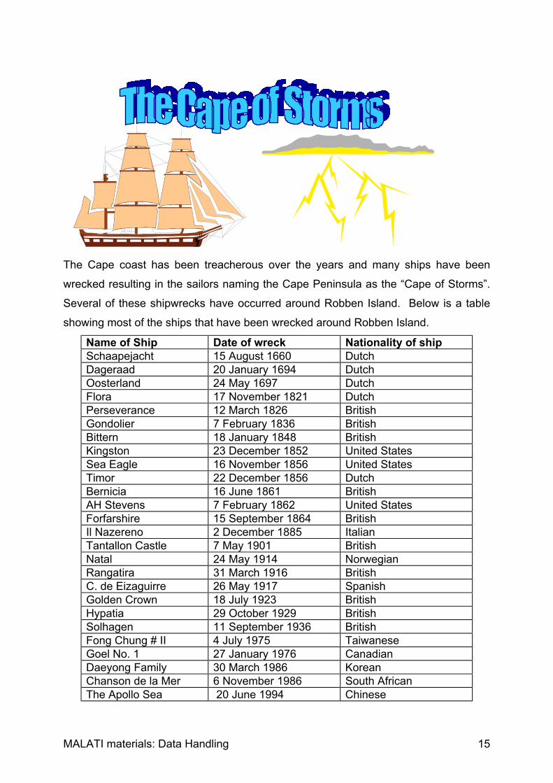
The Cape coast has been treacherous over the years and many ships have been
wrecked resulting in the sailors naming the Cape Peninsula as the “Cape of Storms”.
Several of these shipwrecks have occurred around Robben Island. Below is a table
showing most of the ships that have been wrecked around Robben Island.
Name of Ship Date of wreck Nationality of shipSchaapejacht 15 August 1660 DutchDageraad 20 January 1694 DutchOosterland 24 May 1697 DutchFlora 17 November 1821 DutchPerseverance 12 March 1826 BritishGondolier 7 February 1836 BritishBittern 18 January 1848 BritishKingston 23 December 1852 United StatesSea Eagle 16 November 1856 United StatesTimor 22 December 1856 DutchBernicia 16 June 1861 BritishAH Stevens 7 February 1862 United StatesForfarshire 15 September 1864 BritishIl Nazereno 2 December 1885 ItalianTantallon Castle 7 May 1901 BritishNatal 24 May 1914 NorwegianRangatira 31 March 1916 BritishC. de Eizaguirre 26 May 1917 SpanishGolden Crown 18 July 1923 BritishHypatia 29 October 1929 BritishSolhagen 11 September 1936 BritishFong Chung # II 4 July 1975 TaiwaneseGoel No. 1 27 January 1976 CanadianDaeyong Family 30 March 1986 KoreanChanson de la Mer 6 November 1986 South AfricanThe Apollo Sea 20 June 1994 Chinese

MALATI materials: Data Handling 16
1. During which season would you expect there to be the most shipwrecks around
Robben Island? Explain.
2. Draw a bar graph showing the number of shipwrecks that happened at different
times of the year.
3. According to your bar graph, is there a particular time of the year when shipwrecks
are more likely to happen?
4. There was only one shipwreck in August, which is in the middle of winter, yet there
were three in December, which is in the middle of summer. Is this what you
expected? Can you explain why this might have happened?
5. Is there a nationality that has had more shipwrecks than any other nationality?
Does this mean that this nationality is poor at sailing? Explain.
6. Draw a pie chart to illustrate the proportion of shipwrecks that each nationality has
had around Robben Island. Why do you think a pie chart is used to represent the
data?
7. A lighthouse was built after the Forfarshire was wrecked and a foghorn introduced
after the Tantallon Castle was wrecked. Do you think these safety measures were
successful? Give reasons for your answer.

MALATI materials: Data Handling 17
Teacher Notes: The Cape of StormsThis worksheet gives pupils further practice in constructing bar graphs and pie charts,but first they have to summarise the given data in a sensible way.
This activity is also designed to make pupils aware that statistics can be misleading.Historical data needs to be put in context. In this case the increase in shipping, theimproved technology, and the seafaring history of various nations are not revealed inthe statistics, but all these factors necessarily influence the number of shipwrecks.
Pupils are first given a table of data on all the shipwrecks that have occurred aroundRobben Island. In question 1 they are encouraged to make a prediction, which theywill compare with their findings at a later stage. In question 2 the pupils must draw abar graph showing the number of shipwrecks at different times of the year. Theindependent variable is the time of year, as the number of shipwrecks does not affectit. The dependent variable is the number of shipwrecks as we are trying to find out ifthis is affected by the time of year. The time of year can either be divided into monthsor seasons; pupils must justify their choice. Differences which arise in their resultinggraphs must be discussed.
The teacher should allow time for discussion on various factors which may cause thebar graph to be different to that pupils predicted, for example, before the advent ofmodern technology, ships did not usually sail around the Cape when storms wereexpected (winter).
In question 6 pupils are required to draw a pie chart illustrating the proportion ofshipwrecks that each nationality has had. Again it is important that pupils do not jumpto conclusions about one nationality being ‘poor sailors’. In Robben Island’s earlyhistory, ships were predominantly Dutch and later they were mainly British. Clearly thiswill distort the statistics. In more recent times ships of various nationalities have sailedaround the Cape.
Finally in question 7 pupils need to determine whether the various safety measuresthat were introduced were effective. Again, pupils need to think about the number ofships that sail around the Cape (more in recent times) and also the improvedtechnology that is available today.

MALATI materials: Data Handling 18
The weather at Robben Island affects the number of visitors at various times of the
year. In 1993, the Weather Bureau established a weather station on Robben Island.
The monthly rainfall and temperature data in this activity was supplied by the SA
Weather Bureau.
Year J F M A M J J A S O N D Total
1993 X X 4,2 103,8 114,8 35,2 93,6 55,0 2,0 1,8 7,8 15,2
1994 6,0 0,0 3,2 14,4 28,0 162,6 56,8 9,6 19,2 5,2 6,6 2,4
1995 7,0 1,6 4,2 14,8 44,8 98,4 77,4 10,8 14,0 22,0 6,6 18,0
1996 1,0 27,8 16,4 26,2 33,0 94,8 48,6 50,0 50,8 27,8 22,2 26,4
1997 6,8 2,2 0,2 6,4 69,2 56,0 5,4 62,4 4,6 7,6 43,6 X
Mean 5,2 7,9 5,6 33,1 58,0 89,4
Table 1: Monthly rainfall figures (in mm) for Robben Island between 1993 and 1997
1. During which months would you expect the most tourists to visit the island? Use
the data in the table to explain why.
2. The last row of the table contains the mean (average) monthly rainfall. This is one
way of summarising the data. What does it mean?
Calculate the missing values and fill them in the last row of the table.
There are two ways of calculating the average value of a set of data using the
TI-82 graphing calculator.
An X means that nodata is available.

MALATI materials: Data Handling 19
1) One can use the usual calculator functions: Press (2nd function) QUIT to return to
the ‘home screen’. Then add all the available values and divide by the number of
values. For example, the monthly average for January is 4
8,60,10,70,6 while
the monthly average for March is 5
2,204,162,42,32,4.
2) The calculator has many statistical calculation options, one of which is the
calculation of means.
Enter each column of data (for which you want to find the mean) as a data list
using the STAT EDIT commands (refer to the activity “The African Penguin” if you
are stuck).
Then return to the STAT menu, but select CALC and
choose option 1: 1-variable statistics which gives
summary data for one set of data.
You will have to tell the calculator which data list contains your data, by choosing,
for example, (2nd function) L1 and pressing ENTER.
3. During which month would you expect the highest rainfall? Explain.
4. During which month does Robben Island usually get the most rain? Why is the
word usually used?
5. Calculate the total annual rainfall for each of the years where there is a complete
record (i.e. where no month’s figures are missing) and fill this in the final column of
the table. Calculate the mean annual rainfall on Robben Island.
x is the symbol for the mean value, while x refers to the sum of all
the values. Other values such as S x and x refer to the spread or
variance of the data set.

MALATI materials: Data Handling 20
6. Do you think 1997 had more or less than rainfall than the mean annual rainfall?
Explain.
7. Describe in your own words what a mean (or average) is and how one calculates it.
Year Jan Feb Mar Apr May Jun Jul Aug Sep Oct Nov Dec1993 X 24,1 24,4 19,5 17,4 17,1 17,5 17,9 18,3 20,2 22,7 24,11994 24,8 25,7 23,4 22,3 17,4 16,6 17,0 17,0 18,4 21,3 21,8 24,41995 24,5 25,7 24,8 20,8 19,1 17,2 15,1 15,1 18,2 19,2 21,5 23,81996 24,5 25,0 22,6 22,9 19,8 17,5 16,5 16,5 17,3 20,1 20,1 23,41997 25,2 24,7 23,0 20,3 19,4 15,7 17,3 17,3 20,3 22,1 21,6 XMean
Table 2: Monthly maximum temperatures for Robben Island between1993 and 1997
8. Summarise the information given by calculating the mean monthly maximum
temperatures.
9. Is the maximum temperature at this weather station 27 C? Explain.
10. Now plot line graphs on the same horizontal axis for the monthly average rainfall
and temperature as follows:
MALATI materials: Data Handling 21
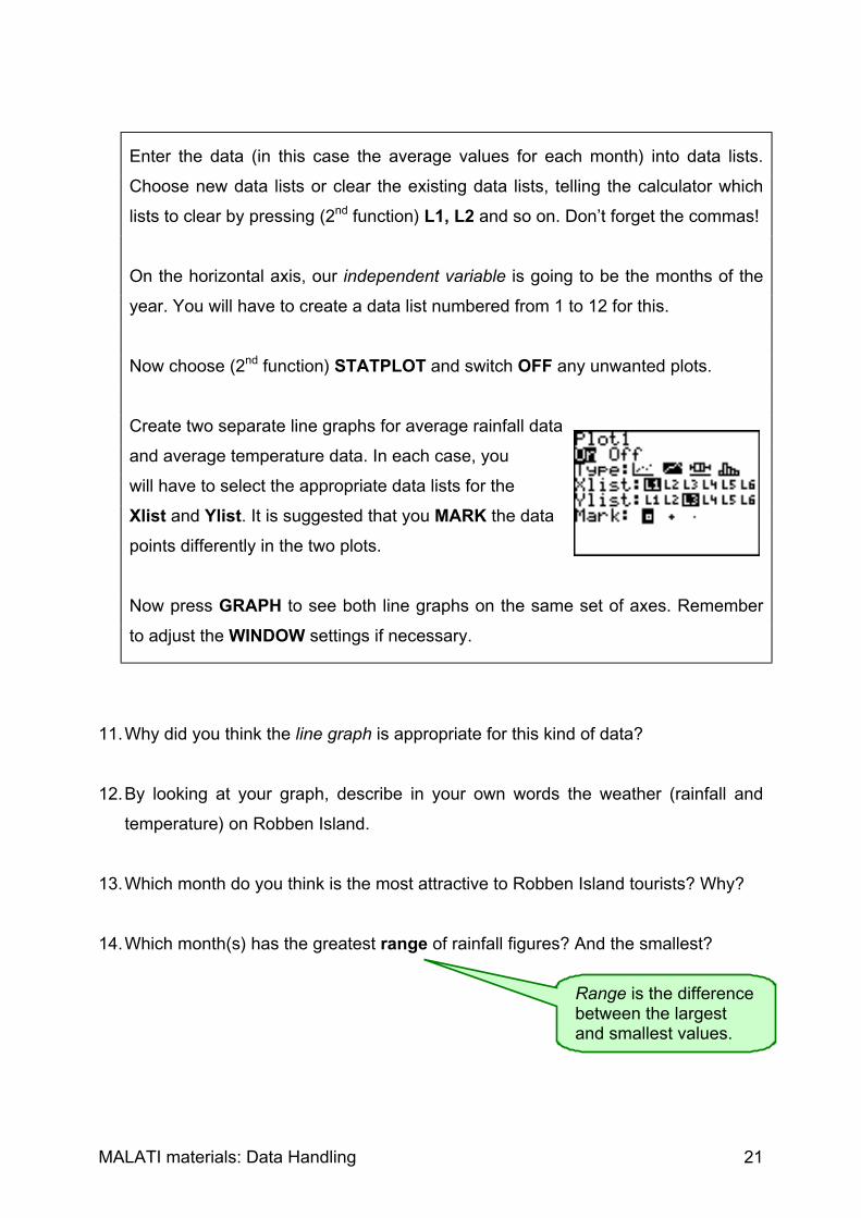
Enter the data (in this case the average values for each month) into data lists.
Choose new data lists or clear the existing data lists, telling the calculator which
lists to clear by pressing (2nd function) L1, L2 and so on. Don’t forget the commas!
On the horizontal axis, our independent variable is going to be the months of the
year. You will have to create a data list numbered from 1 to 12 for this.
Now choose (2nd function) STATPLOT and switch OFF any unwanted plots.
Create two separate line graphs for average rainfall data
and average temperature data. In each case, you
will have to select the appropriate data lists for the
Xlist and Ylist. It is suggested that you MARK the data
points differently in the two plots.
Now press GRAPH to see both line graphs on the same set of axes. Remember
to adjust the WINDOW settings if necessary.
11. Why did you think the line graph is appropriate for this kind of data?
12. By looking at your graph, describe in your own words the weather (rainfall and
temperature) on Robben Island.
13. Which month do you think is the most attractive to Robben Island tourists? Why?
14. Which month(s) has the greatest range of rainfall figures? And the smallest?
Range is the differencebetween the largestand smallest values.

MALATI materials: Data Handling 22
15. Use your answers to question 14 to answer the following:
(a) During which month in 1998 do you think you would be most likely to correctly
predict the rainfall figure? Explain.
(b) During which month in 1998 do you think you would be least likely to correctly
predict the rainfall figure? Explain.
16. During which month in 1998 do you think you would be least likely to correctly
predict the mean maximum temperature? Explain.
17. Was there any year between 1993 and 1997 that was much hotter than other
years? Give reasons for your answer.

MALATI materials: Data Handling 23
Teacher Notes: Weather
This worksheet introduces the concept of mean as a way of summarising the data bydescribing the central tendency. The term central tendency implies that the data isgrouped around this central value, e.g. a mean temperature of 22 C in May inBlikkiesdorp implies that one would expect temperatures close to 22 C in Blikkiesdorpin May. At this point the difference between mean and mode could be discussed. Themean is calculated by adding all the values and dividing by the number of values. Themode is simply the most commonly occurring value. The concept of range is alsointroduced as another way of summarising a set of data, in this case as a measure ofspread of the data set. The teacher should allow enough discussion on the differencebetween these two different ways of summarising a set of data, and the need for bothwhen describing a set of data.
Rainfall data is given for Robben Island from 1993 to 1997. Pupils must understandthat the figures for a given month represent the total amount of rain that fell during thatmonth. An X means that no data is available for that month (pupils may reflect on whythis may be the case?). When one works with ‘real’ data, it is common that there aremissing values. Pupils should be made aware that in February 1994 the 0,0 meansthat no rain fell during the month, not that there is no data available.
Two possible methods of calculating means using the TI-82 are suggested. It isimportant that pupils understand that the second method entails entering eachmonth’s rainfall data as a data list. They should, however, use the first method tocalculate at least some of the mean values, so that they become familiar with theformula for calculating means. In the case where only four values are available, theteacher should ensure that the pupils understand that in these cases they shoulddivide by 4 and not 5 in order to compensate for the missing values.
Pupils are also required to compute annual mean rainfall for Robben Island during theperiod when data was recorded (Question 5) by adding the annual rainfall values anddividing by the number of years. Mean monthly or annual rainfall can be used topredict possible rainfall in the future. However, pupils must also be aware that theactual rainfall that occurs in the future is likely to be different from the mean. Inquestion 6 the data for December is missing. Pupils will need to estimate (predict) therainfall that is likely to fall in December then use this figure to estimate (predict) theannual rainfall for 1997.
It is important that the teacher ensures that pupils understand the concept ofmean/average intuitively and not just procedurally. Questions 4, 7 and 9 can beused to diagnose problems with this. It is important that when pupils answer question7 they do not just give a method of calculating the mean but they also give adescription of their understanding of a mean. The teacher should try to ensure that thepupils have made a distinction between mean and mode. The mean is the single valuethat represents the combined values of a variable, while mode is the value of thevariable that occurs most often, and is therefore not affected by outliers (very big orsmall values).
The worksheet then continues by introducing line graphs. Rainfall and temperaturedata (monthly means) are plotted on the same independent variable axis, in this case

MALATI materials: Data Handling 24
representing the 12 months of the year. Pupils should be encouraged to reflect on thetwo line graphs in terms of what they know about the Cape as a winter rainfall region.
The influence of range on the accuracy of predictions is introduced. If the range islarge, some of the data points will be scattered far away from the mean value of thedata and it is more difficult to predict future values accurately. If the range is small allthe data points will be close to the mean value and it is easier to predict future values.

MALATI materials: Data Handling 25
Researchers at the Sea Fisheries Institute have been keeping records on the breeding
of the African penguins on Robben Island as well as the anchovy fish they eat in the
waters around Robben Island.
Anchovy fish are too small to count individually so researchers estimate the number of
tons of fish in the water using acoustic techniques. They call this the anchovy
biomass.
Researchers collected the following data about the anchovy biomass and the mean
number of chicks fledged (successfully raised) by each breeding pair from 1989 to
1995:
YearAnchovy biomass
(in million tons)Mean number ofchicks fledged
1989 0,55 0,421990 0,47 0,321991 1,68 0,591992 1,50 0,591993 0,75 0,541994 0,48 0,461995 0,43 0,38
Table 1: Anchovy biomass and the mean number of chicks fledged perbreeding year between 1989 and 1995

MALATI materials: Data Handling 26
We are going to investigate the relationship (if any) between anchovy biomass and the
mean number of chicks fledged. In order to do this we are going to draw a scatterplot
of the data:
Clear at least two previous data lists (for example L1, L2) using the STAT menu.
You will have to tell the calculator which lists to clear by pressing (2nd function) L1, L2
and so on. Don’t forget the commas!
Enter the data using the STAT menu again but select EDIT.
Plot a scatter plot of the data using the (2nd) STATPLOT
Menu.
Choose appropriate data lists for the Xlist and Ylist.
How did you decide which variable should be the independent variable, and which
should be the dependent variable?
Remember to switch other plots OFF.
Press GRAPH to show your scatterplot. Remember to adjust the WINDOW settings if
necessary.
1. Describe the relationship between the anchovy biomass and the mean number of
chicks fledged per breeding pair.
2. What do you think the formula might be for the trendline or line of best fit for this
data?
3. Check your estimate by using the calculator to find and plot the equation for the
linear regression between these two variables:
The trendline gives us the overall picture: Itis the line around which the data is spread.

MALATI materials: Data Handling 27
On the STAT menu, choose the following CALC option:
Enter L1, L2 (if these are your correct data lists). The
calculator gives you values of a and b in the linear
regression equation y=ax+b.
4. What is the equation of the regression line? The calculator calculates this by
minimising the distance between this line and all the datapoints.
5. Plot this line together with the scatterplot:
You can either make a note of the (rounded off) values
for a and b and enter the equation using Y=, making
sure that the = is highlighted so that the graph is selected:
OR you can get the calculator to do enter the equation: While the linear regression
equation shows on your home screen, press Y= and position your cursor so that
an equation can be entered.
Then press VARS and select 5: Statistics.
Select EQ.
Choose 7: Reg EQ.
Plot the line by pressing GRAPH.
6. Use your graph to estimate the mean number of chicks fledged per breeding pair if
the anchovy biomass was 1 million tons.
7. Use your graph to estimate the anchovy biomass if the mean number of chicks
fledged per breeding pair is 0,5.

MALATI materials: Data Handling 28
8. What would the mean number of chicks fledged per breeding pair be if there were
no anchovies?
9. What would the mean number of chicks fledged per breeding pair be if the anchovy
biomass were to increase to 20 million tons?
10. African Penguins also eat sardines. The following data is available for the sardine
biomass in the waters surrounding Robben Island:
Year Sardine biomass (million t)1989 0,361990 0,271991 0,451992 0,321993 0,471994 0,601995 0,58
Table 2: Sardine biomass between 1989 and 1995
Is there a relationship between the anchovy biomass and the sardine biomass?
Plot the data (without deleting the existing data lists) and determine and plot the
equation of linear regression.
Describe the relationship between the anchovy biomass and the sardine biomass.
11. Return to your linear regression values which you found using the STAT CALC
menu and selecting 5: LinReg (ax+b).
The ‘r’ value refers to the correlation between the two variables.
If two variables are related we say that they are correlated. In the case of theanchovy biomass and the mean number of chicks fledged, a linear (straight-line) regression line was drawn. We saw that if the anchovy biomass was highthe number of fledged chicks per breeding pair was high, and similarly lowbiomass was associated with a low number of chicks fledged. Thus thecorrelation was a positive correlation (r > 0).
If the one variable increases while the other one decreases, then we say that
is a negative correlation (r < 0).

MALATI materials: Data Handling 29
Describe the correlation between the sardine biomass and the anchovy biomass.
Is it positive or negative, weak or strong? Motivate your answer by describing the
graph AND by examining the r-value given by the calculator.
We can also say that the relationship between the anchovy biomass and themean number of chicks fledged per breeding pair is a strong linearcorrelation because all the points are quite close to the regression line (thevalue of the correlation coefficient r is then close to 1 or, in the case of anegative correlation, -1).
If the data points are widely scattered away from the regression line thenthey have a weak linear correlation.
If it is impossible to draw a regression line through the data points becausethey are so scattered then there is no linear correlation (r = 0).
If all the data points fall on the regression line, then it is a perfectcorrelation (r = 1 or -1).

MALATI materials: Data Handling 30
Teacher Notes: The African Penguin 2This worksheet introduces the concepts of regression and correlation between twovariables. Scatter plots and lines of best fit (trendlines) are introduced.
A scatter plot is drawn by making one of the variables (the anchovy biomass) theindependent variable (or x-axis) and the other variable (the number of chicks fledgedper breeding pair) the dependent variable. From the given scatter plot pupils should beable to see that when the anchovy biomass is small, less chicks are fledged and whenthe biomass is large, more chicks are fledged (Question 1). It is important that thepupils predict the equation of the trendline before plotting the line of best fit usingthe calculator. Pupils should have an intuitive feel for this line as ‘going through themiddle of the points’ or more accurately, minimising the distance from all the points.
Questions 6 and 7 encourage pupils to interpret and read off the graph, whilequestions 8 and 9 are designed to encourage pupils to reflect on the situation. If therewere no anchovies there would still be other food so we would expect the penguins tocontinue breeding even if their success rate was not as high. If there were 20 milliontons of anchovies we could not expect the number of successfully raised chicks toincrease proportionally as we know that they usually only lay two eggs. Thus it ishighly unlikely that the number of fledged chicks will ever exceed 2.
Question 10 requires pupils to practise by doing a similar regression analysis usingdata about sardine biomass and anchovy biomass. It is important that pupils realisethat although there is a relationship between anchovy biomass and the mean numberof chicks fledged and (we can assume) between sardine biomass and the meannumber of chicks fledged, it DOES NOT NECESSARILY FOLLOW that there is arelationship between anchovy biomass and sardine biomass. In fact the latterrelationship is weak and negative - pupils should suggest possible reasons for this,e.g. if anchovies and sardines eat the same food then they are competing againsteach other. Thus when there are lots of sardines you would expect a drop in thenumber of anchovies and vice-versa.
The terminology regarding correlations is social knowledge and is therefore given tothe pupils. However, they should be given many examples from the media on thebasis of which they can describe correlations by examining graphs and predictcorrelations by examining data, for example in table form.