statistical inference for exploratory data analysis and …buja/papers/06-buja-cook...andreas buja,...
TRANSCRIPT
doi: 10.1098/rsta.2009.0120, 4361-4383367 2009 Phil. Trans. R. Soc. A
Deborah F. Swayne and Hadley WickhamAndreas Buja, Dianne Cook, Heike Hofmann, Michael Lawrence, Eun-Kyung Lee, and model diagnosticsStatistical inference for exploratory data analysis
Supplementary data
367.1906.4361.DC1.htmlhttp://rsta.royalsocietypublishing.org/content/suppl/2009/10/01/
"Data Supplement"
Referencesl.html#ref-list-1http://rsta.royalsocietypublishing.org/content/367/1906/4361.ful
This article cites 15 articles, 2 of which can be accessed free
Rapid response1906/4361http://rsta.royalsocietypublishing.org/letters/submit/roypta;367/
Respond to this article
Subject collections
(33 articles)statistics � collectionsArticles on similar topics can be found in the following
Email alerting service herein the box at the top right-hand corner of the article or click Receive free email alerts when new articles cite this article - sign up
http://rsta.royalsocietypublishing.org/subscriptions go to: Phil. Trans. R. Soc. ATo subscribe to
This journal is © 2009 The Royal Society
on January 28, 2010rsta.royalsocietypublishing.orgDownloaded from
on January 28, 2010rsta.royalsocietypublishing.orgDownloaded from
Phil. Trans. R. Soc. A (2009) 367, 4361–4383doi:10.1098/rsta.2009.0120
Statistical inference for exploratory dataanalysis and model diagnostics
BY ANDREAS BUJA1, DIANNE COOK2,*, HEIKE HOFMANN2,MICHAEL LAWRENCE3, EUN-KYUNG LEE4, DEBORAH F. SWAYNE5
AND HADLEY WICKHAM6
1Wharton School, University of Pennsylvania, Philadelphia, PA 19104, USA2Department of Statistics, Iowa State University, Ames, IA 50011-1210, USA
3Fred Hutchinson Cancer Research Center, 1100 Fairview Avenue, Seattle,WA 98109, USA
4Department of Statistics, EWHA Womans University, 11-1 Daehyun-Dong,Seodaemun-Gu, Seoul 120-750, Korea
5Statistics Research Department, AT&T Laboratories, 180 Park Avenue,Florham Park, NJ 07932-1049, USA
6Department of Statistics, Rice University, Houston, TX 77005-1827, USA
We propose to furnish visual statistical methods with an inferential framework andprotocol, modelled on confirmatory statistical testing. In this framework, plots take onthe role of test statistics, and human cognition the role of statistical tests. Statisticalsignificance of ‘discoveries’ is measured by having the human viewer compare the plotof the real dataset with collections of plots of simulated datasets. A simple but rigorousprotocol that provides inferential validity is modelled after the ‘lineup’ popular fromcriminal legal procedures. Another protocol modelled after the ‘Rorschach’ inkblot test,well known from (pop-)psychology, will help analysts acclimatize to random variabilitybefore being exposed to the plot of the real data. The proposed protocols will beuseful for exploratory data analysis, with reference datasets simulated by using a nullassumption that structure is absent. The framework is also useful for model diagnosticsin which case reference datasets are simulated from the model in question. This latterpoint follows up on previous proposals. Adopting the protocols will mean an adjustmentin working procedures for data analysts, adding more rigour, and teachers mightfind that incorporating these protocols into the curriculum improves their students’statistical thinking.
Keywords: permutation tests; rotation tests; statistical graphics; visual data mining;simulation; cognitive perception
*Author for correspondence ([email protected]).
Electronic supplementary material is available at http://dx.doi.org/10.1098/rsta.2009.0120 or viahttp://rsta.royalsocietypublishing.org.
One contribution of 11 to a Theme Issue ‘Statistical challenges of high-dimensional data’.
This journal is © 2009 The Royal Society4361

4362 A. Buja et al.
on January 28, 2010rsta.royalsocietypublishing.orgDownloaded from
1. Introduction
Exploratory data analysis (EDA) and model diagnostics (MD) are two dataanalytic activities that rely primarily on visual displays and only secondarily onnumeric summaries. EDA, as championed by Tukey (1965), is the free-wheelingsearch for structure that allows data to inform and even to surprise us. MD, whichwe understand here in a narrow sense, is the open-ended search for structure notcaptured by the fitted model (setting aside the diagnostics issues of identifiabilityand influence). Roughly speaking, we may associate EDA with what we do toraw data before we fit a complex model and MD with what we do to transformeddata after we fit a model. (Initial data analysis (IDA) as described in Chatfield(1995), where the assumptions required by the model fitting are checked visually,is considered a part of, or synonymous with, EDA.) We are interested here inboth EDA and MD, insofar as they draw heavily on graphical displays.
EDA, more so than MD, has sometimes received an ambivalent response.When seen positively, it is cast as an exciting part of statistics that has to dowith ‘discovery’ and ‘detective work’; when seen negatively, EDA is cast as thepart of statistics that results in unsecured findings at best, and in the over-or misinterpretation of data at worst. Either way, EDA seems to be lackingsomething: discoveries need to be confirmed and over-interpretations of dataneed to be prevented. Universal adoption of EDA in statistical analyses mayhave suffered as a consequence. Strictly speaking, graphical approaches to MDdeserve a similarly ambivalent response. While professional statisticians mayresolve their ambivalence by resorting to formal tests against specific modelviolations, they still experience the full perplexity that graphical displays cancause when teaching, for example, residual plots to student novices. Students’countless questions combined with their tendencies to over-interpret plots impresson us the fact that reading plots requires calibration. But calibrating inferentialmachinery for plots is lacking and this fact casts an air of subjectivity on their use.
The mirror image of EDA’s and MD’s inferential failings is confirmatorystatistics’ potential failure to find the obvious. When subordinating commonsense to rigid testing protocols for the sake of valid inference, confirmatorydata analysis risks using tests and confidence intervals in assumed models thatshould never have been fitted, when EDA before, or MD after, fitting could haverevealed that the approach to the data is flawed and the structure of the datarequired altogether different methods. The danger of blind confirmatory statisticsis therefore ‘missed discovery’. This term refers to a type of failure that shouldnot be confused with either ‘false discovery’ or ‘false non-discovery’, terms nowoften used as synonyms for ‘Type I error’ and ‘Type II error’. These confirmatorynotions refer to trade-offs in deciding between pre-specified null hypothesesand alternative hypotheses. By contrast, ‘missed discovery’ refers to a state ofblindness in which the data analyst is not even aware that alternative structurein the data is waiting to be discovered, either in addition or in contradiction topresent ‘findings’. Statistics therefore needs EDA and MD because only they canforce unexpected discoveries on data analysts.
It would be an oversimplification, though, if statistics were seen exclusivelyin terms of a dichotomy between the exploratory and the confirmatory. Someparts of statistics form a mix. For example, most methods for non-parametricmodelling and model selection are algorithmic forms of data exploration, but some
Phil. Trans. R. Soc. A (2009)
Statistical inference for graphics 4363
on January 28, 2010rsta.royalsocietypublishing.orgDownloaded from
are given asymptotic guarantees of finding the ‘truth’ under certain conditions,or they are endowed with confidence bands that have asymptotically correctcoverage. Coming from the opposite end, confirmatory statistics has becomeavailable to ever larger parts of statistics due to inferential methods that accountfor multiplicity, i.e. for simultaneous inference for large or even infinite numbersof parameters. Multiplicity problems will stalk any attempt to wrap confirmatorystatistics around EDA and MD, including our attempt to come to grips with theinferential problems posed by visual discovery.
The tools of confirmatory statistics have so far been applied only to featuresin data that have been captured algorithmically and quantitatively and our goalis therefore to extend confirmatory statistics to features in data that have beendiscovered visually, such as the surprise discovery of structure in a scatterplot(EDA), or the unanticipated discovery of model defects in residual plots (MD).Making this goal attainable requires a re-orientation of existing concepts whilestaying close to their original intent and purpose. It consists of identifying theanalogues, or adapted meanings, of the concepts of (i) test statistics, (ii) tests,(iii) null distribution, and (iv) significance levels and p-values. Beyond a one-to-one mapping between the traditional and the proposed frameworks, inferencefor visual discovery will also require considerations of multiplicity due to theopen-ended nature of potential discoveries.
To inject valid confirmatory inference into visual discovery, the practice needsto be supplemented with the simple device of duplicating each step on simulateddatasets. In EDA, we draw datasets from simple generic null hypotheses; in MD,we draw them from the model under consideration. To establish full confirmatoryvalidity, there is a need to follow rigorous protocols, reminiscent of those practisedin clinical trials. This additional effort may not be too intrusive in the lightof the inferential knowledge acquired, the sharpened intuitions and the greaterclarity achieved.
Inference for visual discovery has a pre-history dating back half a century.A precursor much ahead of its time, both for EDA and MD, is Scott et al. (1954).Using astronomical observations, they attempted to evaluate newly proposedspatial models for galaxy distributions (Neyman et al. 1953), by posing thefollowing question: ‘If one actually distributed the cluster centres in space andthen placed the galaxies in the clusters exactly as prescribed by the model,would the resulting picture on the photographic plate look anything like thaton an actual plate…?’ In a Herculean effort, they proceeded to generate asynthetic 6◦ × 6◦ ‘plate’ by choosing reasonable parameter values for the model,sampling from it, adjusting for ‘limiting magnitude’ and ‘random ‘errors’ ofcounting’, and comparing the resulting ‘plate’ of about 2700 fictitious galaxieswith a processed version of the actual plate, whose foreground objects had beeneliminated. This was done at a time when sampling from a model involvedworking with published tables of random numbers, and plotting meant drawingby hand—the effort spent on a single instance of visual evidence is stunning!The hard work was of course done by ‘computers’, consisting of an office withthree female assistants whose work was acknowledged as requiring ‘a tremendousamount of care and attention’. (The plots, real and synthetic, are reproduced inBrillinger’s 2005 Neyman lecture (Brillinger 2008), albeit with undue attributionsto Neyman. Scott et al. (1954) acknowledge Neyman only ‘for his continuedinterest and for friendly discussions’.) Much later, when computer-generated
Phil. Trans. R. Soc. A (2009)
4364 A. Buja et al.
on January 28, 2010rsta.royalsocietypublishing.orgDownloaded from
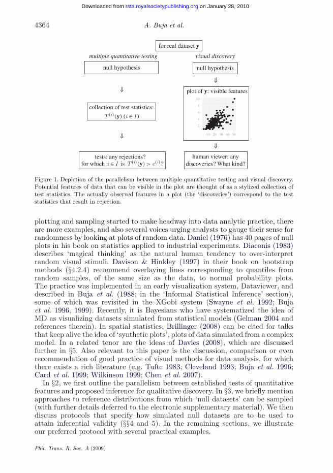
for real dataset y
collection of test statistics:
plot of y: visible features
human viewer: anydiscoveries? What kind?
tests: any rejections?for which
null hypothesis null hypothesis
2
4
6
8
10
10 20 30 40 50
visual discoverymultiple quantitative testing
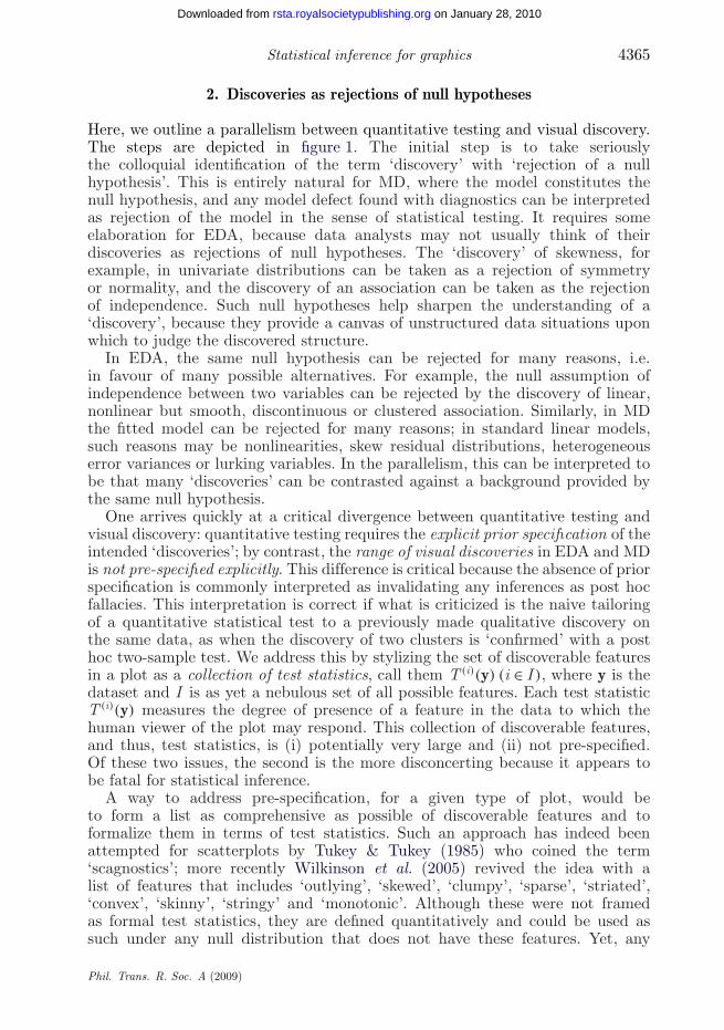
Figure 1. Depiction of the parallelism between multiple quantitative testing and visual discovery.Potential features of data that can be visible in the plot are thought of as a stylized collection oftest statistics. The actually observed features in a plot (the ‘discoveries’) correspond to the teststatistics that result in rejection.
plotting and sampling started to make headway into data analytic practice, thereare more examples, and also several voices urging analysts to gauge their sense forrandomness by looking at plots of random data. Daniel (1976) has 40 pages of nullplots in his book on statistics applied to industrial experiments. Diaconis (1983)describes ‘magical thinking’ as the natural human tendency to over-interpretrandom visual stimuli. Davison & Hinkley (1997) in their book on bootstrapmethods (§4.2.4) recommend overlaying lines corresponding to quantiles fromrandom samples, of the same size as the data, to normal probability plots.The practice was implemented in an early visualization system, Dataviewer, anddescribed in Buja et al. (1988; in the ‘Informal Statistical Inference’ section),some of which was revisited in the XGobi system (Swayne et al. 1992; Bujaet al. 1996, 1999). Recently, it is Bayesians who have systematized the idea ofMD as visualizing datasets simulated from statistical models (Gelman 2004 andreferences therein). In spatial statistics, Brillinger (2008) can be cited for talksthat keep alive the idea of ‘synthetic plots’, plots of data simulated from a complexmodel. In a related tenor are the ideas of Davies (2008), which are discussedfurther in §5. Also relevant to this paper is the discussion, comparison or evenrecommendation of good practice of visual methods for data analysis, for whichthere exists a rich literature (e.g. Tufte 1983; Cleveland 1993; Buja et al. 1996;Card et al. 1999; Wilkinson 1999; Chen et al. 2007).
In §2, we first outline the parallelism between established tests of quantitativefeatures and proposed inference for qualitative discovery. In §3, we briefly mentionapproaches to reference distributions from which ‘null datasets’ can be sampled(with further details deferred to the electronic supplementary material). We thendiscuss protocols that specify how simulated null datasets are to be used toattain inferential validity (§§4 and 5). In the remaining sections, we illustrateour preferred protocol with several practical examples.
Phil. Trans. R. Soc. A (2009)
Statistical inference for graphics 4365
on January 28, 2010rsta.royalsocietypublishing.orgDownloaded from
2. Discoveries as rejections of null hypotheses
Here, we outline a parallelism between quantitative testing and visual discovery.The steps are depicted in figure 1. The initial step is to take seriouslythe colloquial identification of the term ‘discovery’ with ‘rejection of a nullhypothesis’. This is entirely natural for MD, where the model constitutes thenull hypothesis, and any model defect found with diagnostics can be interpretedas rejection of the model in the sense of statistical testing. It requires someelaboration for EDA, because data analysts may not usually think of theirdiscoveries as rejections of null hypotheses. The ‘discovery’ of skewness, forexample, in univariate distributions can be taken as a rejection of symmetryor normality, and the discovery of an association can be taken as the rejectionof independence. Such null hypotheses help sharpen the understanding of a‘discovery’, because they provide a canvas of unstructured data situations uponwhich to judge the discovered structure.
In EDA, the same null hypothesis can be rejected for many reasons, i.e.in favour of many possible alternatives. For example, the null assumption ofindependence between two variables can be rejected by the discovery of linear,nonlinear but smooth, discontinuous or clustered association. Similarly, in MDthe fitted model can be rejected for many reasons; in standard linear models,such reasons may be nonlinearities, skew residual distributions, heterogeneouserror variances or lurking variables. In the parallelism, this can be interpreted tobe that many ‘discoveries’ can be contrasted against a background provided bythe same null hypothesis.
One arrives quickly at a critical divergence between quantitative testing andvisual discovery: quantitative testing requires the explicit prior specification of theintended ‘discoveries’; by contrast, the range of visual discoveries in EDA and MDis not pre-specified explicitly. This difference is critical because the absence of priorspecification is commonly interpreted as invalidating any inferences as post hocfallacies. This interpretation is correct if what is criticized is the naive tailoringof a quantitative statistical test to a previously made qualitative discovery onthe same data, as when the discovery of two clusters is ‘confirmed’ with a posthoc two-sample test. We address this by stylizing the set of discoverable featuresin a plot as a collection of test statistics, call them T (i)(y) (i ∈ I ), where y is thedataset and I is as yet a nebulous set of all possible features. Each test statisticT (i)(y) measures the degree of presence of a feature in the data to which thehuman viewer of the plot may respond. This collection of discoverable features,and thus, test statistics, is (i) potentially very large and (ii) not pre-specified.Of these two issues, the second is the more disconcerting because it appears tobe fatal for statistical inference.
A way to address pre-specification, for a given type of plot, would beto form a list as comprehensive as possible of discoverable features and toformalize them in terms of test statistics. Such an approach has indeed beenattempted for scatterplots by Tukey & Tukey (1985) who coined the term‘scagnostics’; more recently Wilkinson et al. (2005) revived the idea with alist of features that includes ‘outlying’, ‘skewed’, ‘clumpy’, ‘sparse’, ‘striated’,‘convex’, ‘skinny’, ‘stringy’ and ‘monotonic’. Although these were not framedas formal test statistics, they are defined quantitatively and could be used assuch under any null distribution that does not have these features. Yet, any
Phil. Trans. R. Soc. A (2009)
4366 A. Buja et al.
on January 28, 2010rsta.royalsocietypublishing.orgDownloaded from
such list of features cannot substitute for the wealth and surprises latent in realplots. Thus, while cumulative attempts at pre-specifying discoverable featuresare worthwhile endeavours, they will never be complete. Finally, because fewdata analysts will be willing to forego plots in favour of scagnostics (which infairness was not the intention of either group of authors), the problem of lackof pre-specification of discoverable features in plots remains as important andopen as ever.
Our attempt at cutting the Gordian Knot of prior specification is by proposingthat there is no need for pre-specification of discoverable features. This can be seenby taking a closer look at what happens when data analysts hit on discoveriesbased on plots: they not only register the occurrence of discoveries, but alsodescribe their nature, e.g. the nature of the observed association in a scatterplotof two variables. Thus data analysts reveal what features they respond to andhence, in stylized language, which of the test statistics T (i)(y) (i ∈ I ) resulted inrejection. In summary, among the tests that we assume to correspond to thepossible discoveries but which we are unable to completely pre-specify, those thatresult in discovery/rejection will be known.
The next question we need to address concerns the calibration of the discoveryprocess or, in terms of testing theory, the control of Type I error. In quantitativemultiple testing, one has two extreme options: for marginal or one-at-a-timeType I error control, choose the thresholds c(i) such that P(T (i)(y) > c(i) |y ∼ H0) ≤ α for all i ∈ I ; for family-wise or simultaneous Type I error control,raise the thresholds so that P(there exists i ∈ I : T (i)(y) > c(i) | y ∼ H0) ≤ α. Falsediscovery rate control is an intermediate option. Pursuing the parallelism betweenquantitative testing and visual discovery further, we ask whether the practiceof EDA and MD has an equivalent of Type I error control. Do data analystscalibrate their declarations of discovery? Do they gauge their discoveries toguarantee a low rate of spurious detection? They usually declare discoveriesby relying on past experience and trusting their judgement. In clear-cut casesof strong structure, dispensing with explicit calibration is not a problem,but in borderline cases there is a need to calibrate visual detection withoutresorting to the pseudo-calibration of post hoc quantitative tests tailored tothe discovery.
We argue in favour of a protocol that attacks the problem at the level ofplots as well as data analysts’ reactions to plots. We propose to consider dataanalysts as black boxes whose inputs are plots of data and whose outputs aredeclarations of discoveries and the specifics thereof. To calibrate the discoveryprocess, simultaneously for all discoverable features T (i) (i ∈ I ), the process isapplied to ‘null datasets’ drawn from the null hypothesis, in addition to the realdataset. In this manner, we learn the performance of the discovery process whenthere is nothing to discover, which is the analogue of a null distribution. We alsoescape the post hoc fallacy because we avoid the retroactive calibration of justthe feature T (io) that the data analyst considers as discovered. In essence, wecalibrate the family-wise Type I error rate for the whole family of discoverablefeatures T (i) (i ∈ I ), even though we may be unable to completely enumerate thisfamily. If data analysts find structure of any kind in the ‘null plots’, they willtell, and we can (i) tally the occurrences of spurious discoveries/rejections, andmore specifically we can (ii) learn the most frequent types of features T (i) thatget spuriously discovered.
Phil. Trans. R. Soc. A (2009)
Statistical inference for graphics 4367
on January 28, 2010rsta.royalsocietypublishing.orgDownloaded from
simulation-based testing
quantitative visual
real values of test statistics: T(i) (y)
null values of test statistics: T(i) (y*1)
null values of test statistics: T(i) (y*2)
null values of test statistics: T(i) (y*R)
plot of real dataset y
plot of null dataset y*1
plot of null dataset y*2
plot of null dataset y*R
2
4
6
8
10
10 20 30 40 50
2
4
6
8
10
10 20 30 40 50
2
4
6
8
10
10 20 30 40 50
2
4
6
8
10
10 20 30 40 50
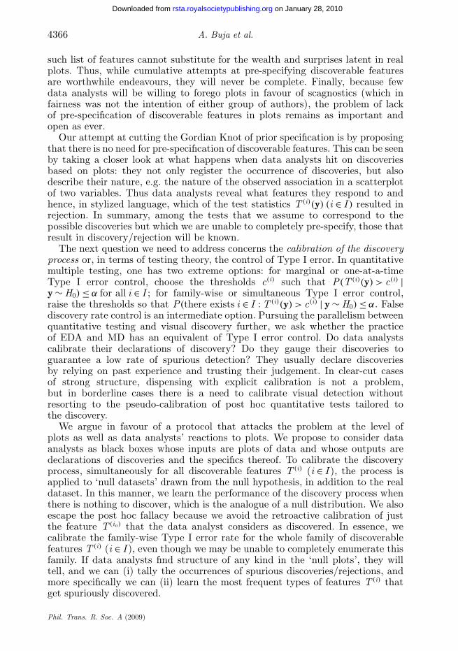
Figure 2. Depiction of simulation-based testing.
3. Reference distributions, null datasets and null plots
In visual inference, the analogue of a collection of test statistics is a plot of thedata. Accordingly, we introduce the concept of a ‘null distribution of plots’ asthe analogue of the null distribution of test statistics. This refers conceptually tothe infinite collection of plots of ‘null datasets’ sampled from H0. In practice, wesample a finite number (R, say) of null datasets y∗1, y∗2, . . . , y∗R and generate agallery of R ‘null plots’ (see figure 2 for a schematic depiction).
The question that arises next is what ‘sampling from H0’ means becausethe null hypothesis H0 rarely consists of a single distribution. Instead, H0 isusually ‘composite’, i.e. a collection of distributions indexed by the so-called‘nuisance parameters’. Fortunately, the problem of reducing composite nullhypotheses to single ‘reference distributions’ has found several solutions instatistical theory, and three principles that can be applied are (i) conditioning,(ii) plug-in, and (iii) posterior inference. Expressed as sampling schemes,they are:
(i) conditional sampling given a statistic that is minimal sufficient under H0,(ii) parametric bootstrap sampling whereby nuisance parameters are
estimated under H0, and(iii) Bayesian posterior predictive sampling.
Phil. Trans. R. Soc. A (2009)
4368 A. Buja et al.
on January 28, 2010rsta.royalsocietypublishing.orgDownloaded from
Of these approaches, the first is the least general but when it applies it yields anexact theory. It does apply to the examples used in this paper: null hypotheses ofindependence in EDA, and of normal linear models in MD. The resulting referencedistributions are, respectively:
EDA: permutation distributions, whereby the observed values are subjected torandom permutations within variables or blocks of variables; and
MD: ‘residual rotation distributions’, whereby random vectors are sampled inresidual space with length to match the observed residual vector.
Of the two, the former are well known from the theory of permutation tests,but the latter are lesser known and were apparently explicitly introduced onlyrecently in a theory of ‘rotation tests’ by Langsrud (2005). When H0 consistsof a more complex model where reduction with a minimal sufficient statistic isunavailable, parametric bootstrap sampling or posterior predictive sampling willgenerally be available. More details on these topics can be found in the electronicsupplementary material. We next discuss two protocols for the inferential use ofnull plots based on null datasets drawn from reference distributions according toany of the above principles.
4. Protocol 1: ‘the Rorschach’
We call the first protocol ‘the Rorschach’, after the test that has subjects interpretinkblots, because the purpose is to measure a data analyst’s tendency to over-interpret plots in which there is no or only spurious structure. The measure isthe family-wise Type I error rate of discovery, and the method is to expose the‘discovery black box’, meaning the data analyst, to a number of null plots andtabulate the proportion of discoveries which are by construction spurious. It yieldsresults that are specific to the particular data analyst and context of data analysis.Different data analysts would be expected to have different rates of discovery, evenin the same data analysis situation. The protocol will bring a level of objectivityto the subjective and cultural factors that influence individual performance.
The Rorschach lends itself to cognitive experimentation. While reminiscent ofthe controversial Rorschach inkblot test, the goal would not be to probe individualanalysts’ subconscious, but to learn about factors that affect their tendency tosee structure when in fact there is none. This protocol estimates the effectivefamily-wise Type I error rate but does not control it at a desired level.
Producing a rigorous protocol requires a division of labour between a protocoladministrator and the data analyst, whereby the administrator (i) generates thenull plots to which the data analyst is exposed and (ii) decides what contextualprior information the data analyst is permitted to have. In particular, the dataanalyst should be left in uncertainty as to whether or not the plot of the real datawill appear among the null plots; otherwise, knowing that all plots are null plots,the data analyst’s mind would be biased and prone to complacency. Neither theadministrator nor the data analyst should have seen the plot of the real dataso as not to bias the process by leaking information that can only be gleanedfrom the data. To ensure protective ignorance of all parties, the administratormight programme the series of null plots in such a way that the plot of the realdata is inserted with known probability in a random location. In this manner, the
Phil. Trans. R. Soc. A (2009)

Statistical inference for graphics 4369
on January 28, 2010rsta.royalsocietypublishing.orgDownloaded from
administrator would not know whether or not the data analyst encountered thereal data, while the data analyst would be kept alert because of the possibilityof encountering the real data. With careful handling, the data analyst can inprinciple self-administer the protocol and resort to a separation of roles with anexternally recruited data analyst only in the case of inadvertent exposure to theplot of the real data.
While the details of the protocol may seem excessive at first, it should bekept in mind that the rigour of today’s clinical trials may seem excessive to theuntrained mind as well, and yet in clinical trials this rigour is accepted and heavilyguarded. Data analysts in rigorous clinical trials may actually be best equipped towork with the proposed protocol because they already adhere to strict protocolsin other contexts. Teaching environments may also be entirely natural for theproposed protocol. Teachers of statistics can put themselves in the role of theadministrator, while the students act as data analysts. Such teaching practice ofthe protocol would be likely to efficiently develop the students’ understanding ofthe nature of structure and of randomness.
In the practice of data analysis, a toned-down version of the protocol maybe used as a self-teaching tool to help data analysts gain a sense for spuriousstructure in datasets of a given size in a given context. The goal of the trainingis to allow data analysts to informally improve their family-wise error rate anddevelop an awareness of the features they are most likely to spuriously detect.The training is of course biased by the analysts’ knowledge that they are lookingexclusively at null plots. In practice, however, the need for looking at some nullplots is often felt only after having looked at the plot of the real data and havingfound merely weak structure. Even in this event, the practice of looking at nullplots is useful for gauging one’s senses, though not valid in an inferential sense.Implementing this protocol would effectively mean inserting an initial layer intoa data analysis—before the plot of the real data is revealed a series of null plotsis shown.
5. Protocol 2: ‘the lineup’
We call the second protocol ‘the lineup’, after the ‘police lineup’ of criminalinvestigations (‘identity parade’ in British English), because it asks the witness toidentify the plot of the real data from among a set of decoys, the null plots, underthe veil of ignorance. The result is an inferentially valid p-value. The protocolconsists of generating, say, 19 null plots, inserting the plot of the real data ina random location among the null plots and asking the human viewer to singleout one of the 20 plots as most different from the others. If the viewer choosesthe plot of the real data, then the discovery can be assigned a p-value of 0.05(=1/20)—under the assumption that the real data also form a draw from thenull hypothesis there is a one in 20 chance that the plot of the real data will besingled out. Obviously, a larger number of null plots could yield a smaller p-value,but there are limits to how many plots a human viewer is willing and able to siftthrough. This protocol has some interesting characteristics.
(i) It can be carried out without having the viewer identify a distinguishingfeature. The viewer may simply be asked to find ‘the most special picture’among the 20, and may respond by selecting one plot and saying ‘this
Phil. Trans. R. Soc. A (2009)
4370 A. Buja et al.
on January 28, 2010rsta.royalsocietypublishing.orgDownloaded from
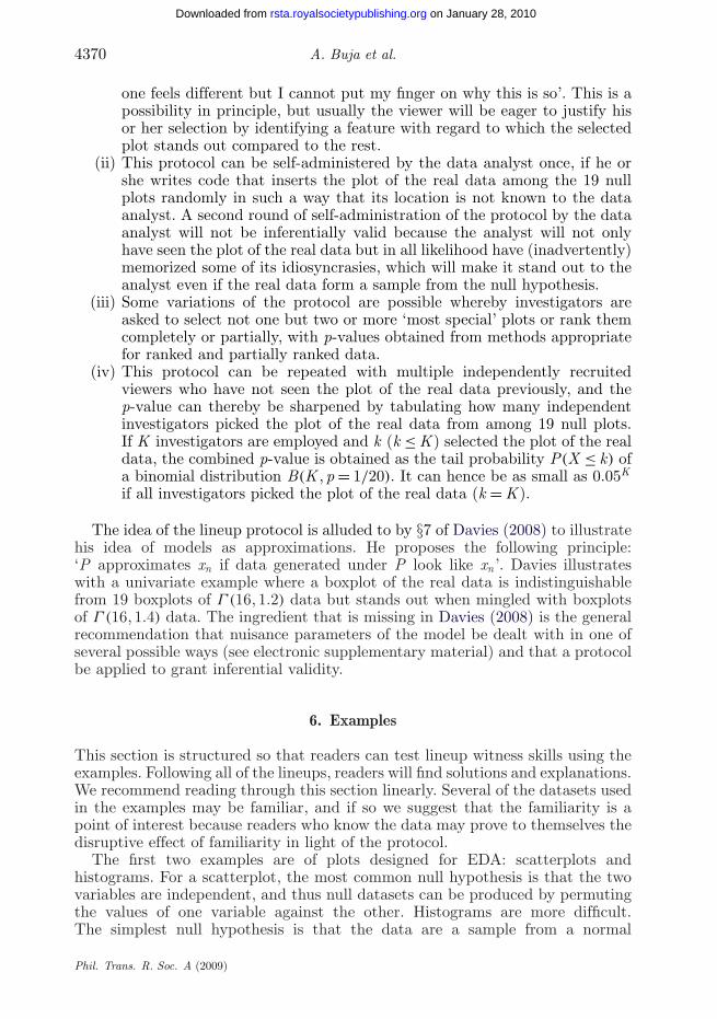
one feels different but I cannot put my finger on why this is so’. This is apossibility in principle, but usually the viewer will be eager to justify hisor her selection by identifying a feature with regard to which the selectedplot stands out compared to the rest.
(ii) This protocol can be self-administered by the data analyst once, if he orshe writes code that inserts the plot of the real data among the 19 nullplots randomly in such a way that its location is not known to the dataanalyst. A second round of self-administration of the protocol by the dataanalyst will not be inferentially valid because the analyst will not onlyhave seen the plot of the real data but in all likelihood have (inadvertently)memorized some of its idiosyncrasies, which will make it stand out to theanalyst even if the real data form a sample from the null hypothesis.
(iii) Some variations of the protocol are possible whereby investigators areasked to select not one but two or more ‘most special’ plots or rank themcompletely or partially, with p-values obtained from methods appropriatefor ranked and partially ranked data.
(iv) This protocol can be repeated with multiple independently recruitedviewers who have not seen the plot of the real data previously, and thep-value can thereby be sharpened by tabulating how many independentinvestigators picked the plot of the real data from among 19 null plots.If K investigators are employed and k (k ≤ K ) selected the plot of the realdata, the combined p-value is obtained as the tail probability P(X ≤ k) ofa binomial distribution B(K , p = 1/20). It can hence be as small as 0.05K
if all investigators picked the plot of the real data (k = K ).
The idea of the lineup protocol is alluded to by §7 of Davies (2008) to illustratehis idea of models as approximations. He proposes the following principle:‘P approximates xn if data generated under P look like xn ’. Davies illustrateswith a univariate example where a boxplot of the real data is indistinguishablefrom 19 boxplots of Γ (16, 1.2) data but stands out when mingled with boxplotsof Γ (16, 1.4) data. The ingredient that is missing in Davies (2008) is the generalrecommendation that nuisance parameters of the model be dealt with in one ofseveral possible ways (see electronic supplementary material) and that a protocolbe applied to grant inferential validity.
6. Examples
This section is structured so that readers can test lineup witness skills using theexamples. Following all of the lineups, readers will find solutions and explanations.We recommend reading through this section linearly. Several of the datasets usedin the examples may be familiar, and if so we suggest that the familiarity is apoint of interest because readers who know the data may prove to themselves thedisruptive effect of familiarity in light of the protocol.
The first two examples are of plots designed for EDA: scatterplots andhistograms. For a scatterplot, the most common null hypothesis is that the twovariables are independent, and thus null datasets can be produced by permutingthe values of one variable against the other. Histograms are more difficult.The simplest null hypothesis is that the data are a sample from a normal
Phil. Trans. R. Soc. A (2009)
Statistical inference for graphics 4371
on January 28, 2010rsta.royalsocietypublishing.orgDownloaded from
distribution, and null datasets can be simulated. The viewer’s explanation ofthe structure will be essential, though, because often the plot of the real data willbe so obviously different from those of the simulated sets. The next two examplesinvolve time series of stock returns, to examine whether temporal dependenceexists at all; here again permutations can be used to produce reference sets.MD is examined in the fourth example, where rotation distributions are used toprovide reference sets for residuals from a model fit. The fifth example examinesclass structure in a large p, small n problem—the question being just how muchseparation between clusters is due to sparsity. This might be a good candidatefor the Rorschach protocol, to help researchers adjust their expectations in thisarea. The last example studies MD in longitudinal data, where a non-parametricmodel is fitted to multiple classes. Permutation of the class variable is used toprovide reference sets.
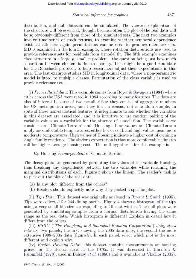
(i) Places Rated data: This example comes from Boyer & Savageau (1984) wherecities across the USA were rated in 1984 according to many features. The data arealso of interest because of two peculiarities: they consist of aggregate numbersfor US metropolitan areas, and they form a census, not a random sample. Inspite of these non-statistical features, it is legitimate to ask whether the variablesin this dataset are associated, and it is intuitive to use random pairing of thevariable values as a yardstick for the absence of association. The variables weconsider are ‘Climate-Terrain’ and ‘Housing’. Low values on Climate-Terrainimply uncomfortable temperatures, either hot or cold, and high values mean moremoderate temperatures. High values of Housing indicate a higher cost of owning asingle family residence. The obvious expectation is that more comfortable climatescall for higher average housing costs. The null hypothesis for this example is
H0: Housing is independent of Climate-Terrain.
The decoy plots are generated by permuting the values of the variable Housing,thus breaking any dependence between the two variables while retaining themarginal distributions of each. Figure 3 shows the lineup. The reader’s task isto pick out the plot of the real data.
(a) Is any plot different from the others?(b) Readers should explicitly note why they picked a specific plot.
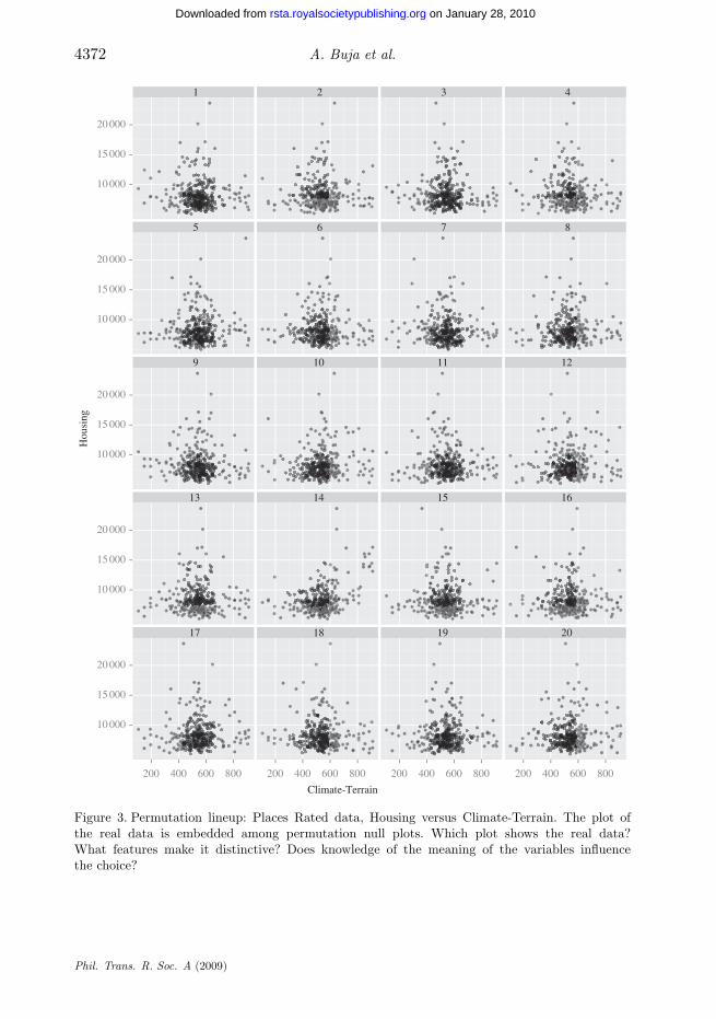
(ii) Tips Data: This dataset was originally analysed in Bryant & Smith (1995).Tips were collected for 244 dining parties. Figure 4 shows a histogram of the tipsusing a very small bin size corresponding to 10 cent widths. The null plots weregenerated by simulating samples from a normal distribution having the samerange as the real data. Which histogram is different? Explain in detail how itdiffers from the others.
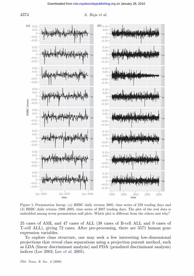
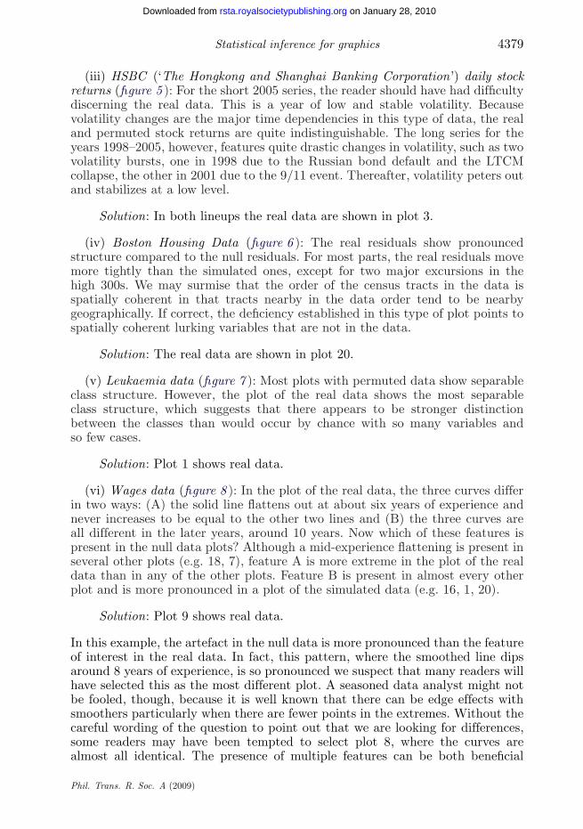
(iii) HSBC (‘The Hongkong and Shanghai Banking Corporation’) daily stockreturns: two panels, the first showing the 2005 data only, the second the moreextensive 1998–2005 data (figure 5). In each panel, select which plot is the mostdifferent and explain why.
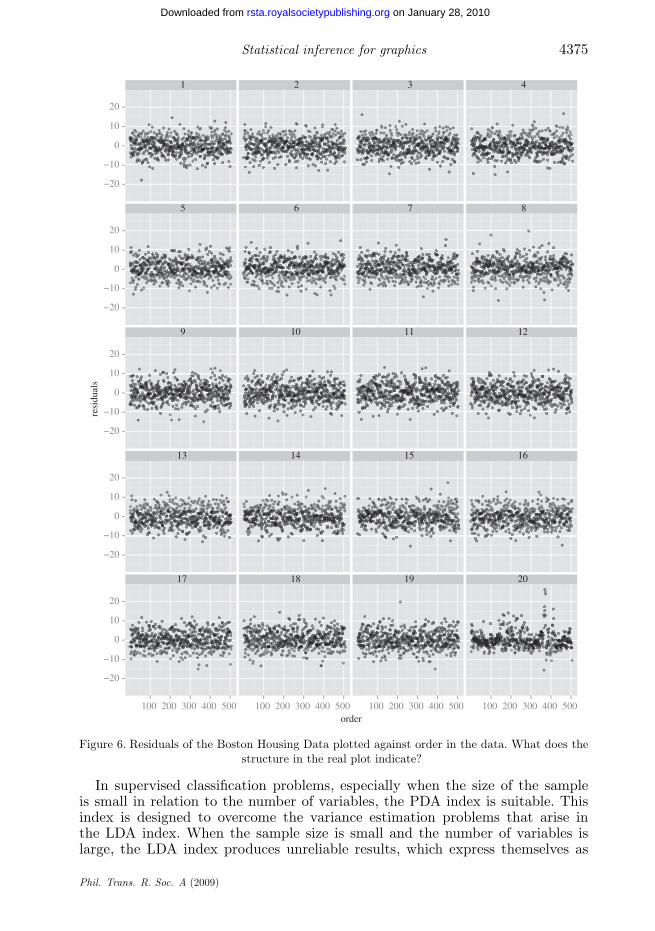
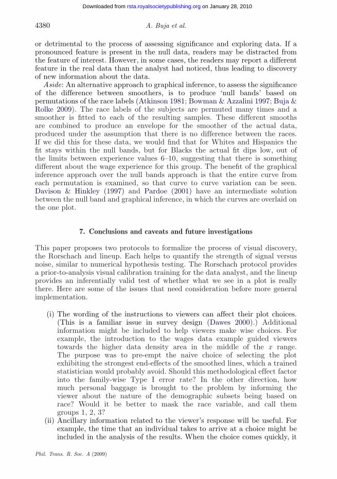
(iv) Boston Housing Data: This dataset contains measurements on housingprices for the Boston area in the 1970s. It was discussed in Harrison &Rubinfeld (1978), used in Belsley et al. (1980) and is available at Vlachos (2005).
Phil. Trans. R. Soc. A (2009)
4372 A. Buja et al.
on January 28, 2010rsta.royalsocietypublishing.orgDownloaded from
Climate-Terrain
Hou
sing
10 000
15 000
20 000
10 000
15 000
20 000
10 000
15 000
20 000
10 000
15 000
20 000
10 000
15 000
20 000
1
5
9
13
17
200 400 600 800
2
6
10
14
18
200 400 600 800
3
7
11
15
19
200 400 600 800
4
8
12
16
20
200 400 600 800
Figure 3. Permutation lineup: Places Rated data, Housing versus Climate-Terrain. The plot ofthe real data is embedded among permutation null plots. Which plot shows the real data?What features make it distinctive? Does knowledge of the meaning of the variables influencethe choice?
Phil. Trans. R. Soc. A (2009)
Statistical inference for graphics 4373
on January 28, 2010rsta.royalsocietypublishing.orgDownloaded from
tips
coun
t
0
10
20
30
40
0
10
20
30
40
0
10
20
30
40
0
10
20
30
40
0
10
20
30
40
1
5
9
13
17
2 4 6 8 10
2
6
10
14
18
2 4 6 8 10
3
7
11
15
19
2 4 6 8 10
4
8
12
16
20
2 4 6 8 10
Figure 4. Simulation lineup: Tips Data, histograms of tip. Which histogram is most different?Explain what makes it different from the others.
Figure 6 shows residuals plotted against the order in the data. Structure in thereal plot would indicate the presence of lurking variables. The plot of the realdata is embedded among decoys, which were produced by simulating from theresidual rotation distribution, as discussed in §3 and the electronic supplementarymaterial. Which is the plot of the real data? Why? What may be ‘lurking’?
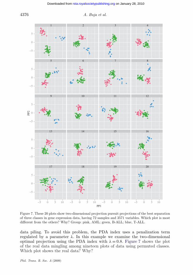
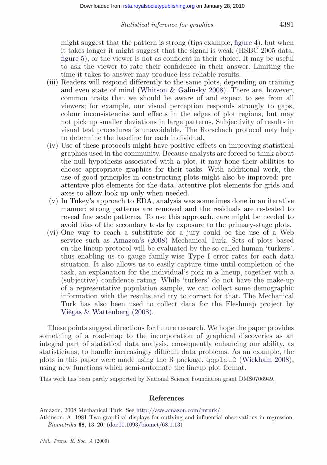
(v) Leukaemia data: This dataset originated from a study of gene expressionin two types of acute leukaemia (Golub et al. 1999), acute lymphoblasticleukaemia (ALL) and acute myeloid leukaemia (AML). The dataset consists of
Phil. Trans. R. Soc. A (2009)
4374 A. Buja et al.
on January 28, 2010rsta.royalsocietypublishing.orgDownloaded from
time
HSB
C r
etur
ns
−0.02−0.01
00.010.02
−0.02−0.01
00.010.02
−0.02−0.01
00.010.02
−0.02−0.01
00.010.02
−0.02−0.01
00.010.02
−0.02−0.01
00.010.02
−0.02−0.01
00.010.02
−0.02−0.01
00.010.02
Jan−2005 Jul−2005 Jan−2006
12
34
56
78
0.050.10
0−0.05−0.10
0.050.10
0−0.05−0.10
0.050.10
0−0.05−0.10
0.050.10
0−0.05−0.10
0.050.10
0−0.05−0.10
0.050.10
0−0.05−0.10
0.050.10
0−0.05−0.10
0.050.10
0−0.05−0.10
1998 2000 2002 2004 2006time
1
(a) (b)
23
45
67
8
Figure 5. Permutation lineup: (a) HSBC daily returns 2005, time series of 259 trading days and(b) HSBC daily returns 1998–2005, time series of 2087 trading days. The plot of the real data isembedded among seven permutation null plots. Which plot is different from the others and why?
25 cases of AML and 47 cases of ALL (38 cases of B-cell ALL and 9 cases ofT-cell ALL), giving 72 cases. After pre-processing, there are 3571 human geneexpression variables.
To explore class structure, one may seek a few interesting low-dimensionalprojections that reveal class separations using a projection pursuit method, suchas LDA (linear discriminant analysis) and PDA (penalized discriminant analysis)indices (Lee 2003; Lee et al. 2005).
Phil. Trans. R. Soc. A (2009)
Statistical inference for graphics 4375
on January 28, 2010rsta.royalsocietypublishing.orgDownloaded from
order
resi
dual
s
−20
−10
0
10
20
−20
−10
0
10
20
−20
−10
0
10
20
−20
−10
0
10
20
−20
−10
0
10
20
1
5
9
13
17
100 200 300 400 500
2
6
10
14
18
100 200 300 400 500
3
7
11
15
19
100 200 300 400 500
4
8
12
16
20
100 200 300 400 500
Figure 6. Residuals of the Boston Housing Data plotted against order in the data. What does thestructure in the real plot indicate?
In supervised classification problems, especially when the size of the sampleis small in relation to the number of variables, the PDA index is suitable. Thisindex is designed to overcome the variance estimation problems that arise inthe LDA index. When the sample size is small and the number of variables islarge, the LDA index produces unreliable results, which express themselves as
Phil. Trans. R. Soc. A (2009)
4376 A. Buja et al.
on January 28, 2010rsta.royalsocietypublishing.orgDownloaded from
PP1
PP2
−5
0
5
−5
0
5
−5
0
5
−5
0
5
−5
0
5
1
5
9
13
17
−5 0 5 10
2
6
10
14
18
−5 0 5 10
3
7
11
15
19
−5 0 5 10
4
8
12
16
20
−5 0 5 10
Figure 7. These 20 plots show two-dimensional projection pursuit projections of the best separationof three classes in gene expression data, having 72 samples and 3571 variables. Which plot is mostdifferent from the others? Why? Group: pink, AML; green, B-ALL; blue, T-ALL.
data piling. To avoid this problem, the PDA index uses a penalization termregulated by a parameter λ. In this example we examine the two-dimensionaloptimal projection using the PDA index with λ = 0.8. Figure 7 shows the plotof the real data mingling among nineteen plots of data using permuted classes.Which plot shows the real data? Why?
Phil. Trans. R. Soc. A (2009)
Statistical inference for graphics 4377
on January 28, 2010rsta.royalsocietypublishing.orgDownloaded from
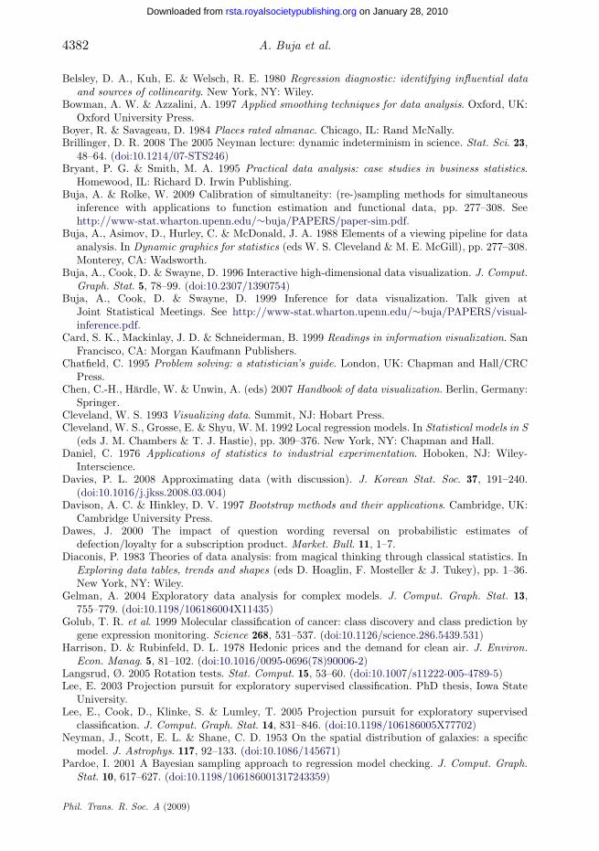
(vi) Wages data: In this example, we study the relationship between wagesand experience in the workforce by race for a cohort of male high-schooldropouts. The data are taken from Singer & Willett (2003) and containlongitudinal measurements of wages (adjusted to inflation), years of experiencein the workforce and several covariates, including the subject’s race. A non-parametric approach for exploring the effect of race is to fit a smootherseparately to each racial subgroup in the data. If there appears to be adifference between the curves, how can we assess the magnitude and significanceof the difference? The null scenario is that there is no difference betweenthe races. To generate null sets, the race label for each subject is permuted.The number of longitudinal measurements for each subject varies from oneto 13. Each subject has an id and a race label. These labels are re-assignedrandomly. There will be the same number of subjects in each racial group,but the number of individual measurements will differ. Nineteen alternativedatasets are created. For each dataset, a loess smooth (Cleveland et al. 1992)is calculated on each subgroup, and these curves are plotted using different linetypes on the same graph, producing 20 plots, including the original (figure 8).The plots also have the full dataset shown as points underlying the curves,with the reasoning being that it is helpful to digest the difference betweencurves on the canvas of the variability in the data. Here is the question forthis example.
These 20 plots show smoothed fits of log(wages) to years ofexperience in the workforce for three demographic subgroups. Oneuses real data, and the other 19 are produced from null datasets,generated under an assumption that there was no difference betweenthe subgroups. Which plot is the most different from the others,paying particular attention to differences in areas where there aremore data?
This next part discusses the lineups, revealing the location of the real data,and explaining what we would expect the viewers to see.
(i) Places Rated data (figure 3): There is a slight positive association, butit is not strong. Also, there are two clusters on the right, coastal Californiaand the Pacific Northwest. The so-called Climate-Terrain index is really justa measurement of how extreme versus how moderate the temperatures are,and there is nothing in the index that measures differences in cloud cover andprecipitation.
Solution: The real data are shown in plot 14.
(ii) Tips Data (figure 4 ): Three features are present in the real data: skewness,multi-modality (with peaks at dollar and half-dollar amounts) and three outliers.Of these the first two are most obviously different from the null sets, and wewould expect these to be reported by the viewer.
Solution: The real data are shown in plot 11.
Phil. Trans. R. Soc. A (2009)

4378 A. Buja et al.
on January 28, 2010rsta.royalsocietypublishing.orgDownloaded from
3.0
2.5
2.0
1.5
1.0
3.0
2.5
2.0
1.5
1.0
3.0
2.5
2.0
1.5
1.0
3.0
2.5
2.0
1.5
1.0
3.0
2.5
2.0
1.5
1.0
2 4 6 8 10 12 2 4 6 8 10 12 2 4 6 8 10 12 2 4 6 8 10 12
1 2 3 4
5 6 7 8
9 10 11 12
13 14 15 16
17 18 19 20
Figure 8. These 20 plots show loess smooths on measurements of log(wages) and workforceexperience (years) for three subgroups in a sample of high-school dropouts. The soft grey pointsare the actual data used for the smoothing, before dividing into subgroups. One of the plots showsthe actual data, and the remainder have had the group labels permuted before the smoothing.Which plot is the most different from the others, with particular attention paid to more differencesbetween curves where there are more data? What is the feature in the plot that sets it apart fromthe others? Race: solid line, Black; dotted line, White; dashed line, Hispanic.
Phil. Trans. R. Soc. A (2009)
Statistical inference for graphics 4379
on January 28, 2010rsta.royalsocietypublishing.orgDownloaded from
(iii) HSBC (‘The Hongkong and Shanghai Banking Corporation’) daily stockreturns (figure 5 ): For the short 2005 series, the reader should have had difficultydiscerning the real data. This is a year of low and stable volatility. Becausevolatility changes are the major time dependencies in this type of data, the realand permuted stock returns are quite indistinguishable. The long series for theyears 1998–2005, however, features quite drastic changes in volatility, such as twovolatility bursts, one in 1998 due to the Russian bond default and the LTCMcollapse, the other in 2001 due to the 9/11 event. Thereafter, volatility peters outand stabilizes at a low level.
Solution: In both lineups the real data are shown in plot 3.
(iv) Boston Housing Data (figure 6 ): The real residuals show pronouncedstructure compared to the null residuals. For most parts, the real residuals movemore tightly than the simulated ones, except for two major excursions in thehigh 300s. We may surmise that the order of the census tracts in the data isspatially coherent in that tracts nearby in the data order tend to be nearbygeographically. If correct, the deficiency established in this type of plot points tospatially coherent lurking variables that are not in the data.
Solution: The real data are shown in plot 20.
(v) Leukaemia data (figure 7 ): Most plots with permuted data show separableclass structure. However, the plot of the real data shows the most separableclass structure, which suggests that there appears to be stronger distinctionbetween the classes than would occur by chance with so many variables andso few cases.
Solution: Plot 1 shows real data.
(vi) Wages data (figure 8 ): In the plot of the real data, the three curves differin two ways: (A) the solid line flattens out at about six years of experience andnever increases to be equal to the other two lines and (B) the three curves areall different in the later years, around 10 years. Now which of these features ispresent in the null data plots? Although a mid-experience flattening is present inseveral other plots (e.g. 18, 7), feature A is more extreme in the plot of the realdata than in any of the other plots. Feature B is present in almost every otherplot and is more pronounced in a plot of the simulated data (e.g. 16, 1, 20).
Solution: Plot 9 shows real data.
In this example, the artefact in the null data is more pronounced than the featureof interest in the real data. In fact, this pattern, where the smoothed line dipsaround 8 years of experience, is so pronounced we suspect that many readers willhave selected this as the most different plot. A seasoned data analyst might notbe fooled, though, because it is well known that there can be edge effects withsmoothers particularly when there are fewer points in the extremes. Without thecareful wording of the question to point out that we are looking for differences,some readers may have been tempted to select plot 8, where the curves arealmost all identical. The presence of multiple features can be both beneficial
Phil. Trans. R. Soc. A (2009)
4380 A. Buja et al.
on January 28, 2010rsta.royalsocietypublishing.orgDownloaded from
or detrimental to the process of assessing significance and exploring data. If apronounced feature is present in the null data, readers may be distracted fromthe feature of interest. However, in some cases, the readers may report a differentfeature in the real data than the analyst had noticed, thus leading to discoveryof new information about the data.
Aside: An alternative approach to graphical inference, to assess the significanceof the difference between smoothers, is to produce ‘null bands’ based onpermutations of the race labels (Atkinson 1981; Bowman & Azzalini 1997; Buja &Rolke 2009). The race labels of the subjects are permuted many times and asmoother is fitted to each of the resulting samples. These different smoothsare combined to produce an envelope for the smoother of the actual data,produced under the assumption that there is no difference between the races.If we did this for these data, we would find that for Whites and Hispanics thefit stays within the null bands, but for Blacks the actual fit dips low, out ofthe limits between experience values 6–10, suggesting that there is somethingdifferent about the wage experience for this group. The benefit of the graphicalinference approach over the null bands approach is that the entire curve fromeach permutation is examined, so that curve to curve variation can be seen.Davison & Hinkley (1997) and Pardoe (2001) have an intermediate solutionbetween the null band and graphical inference, in which the curves are overlaid onthe one plot.
7. Conclusions and caveats and future investigations
This paper proposes two protocols to formalize the process of visual discovery,the Rorschach and lineup. Each helps to quantify the strength of signal versusnoise, similar to numerical hypothesis testing. The Rorschach protocol providesa prior-to-analysis visual calibration training for the data analyst, and the lineupprovides an inferentially valid test of whether what we see in a plot is reallythere. Here are some of the issues that need consideration before more generalimplementation.
(i) The wording of the instructions to viewers can affect their plot choices.(This is a familiar issue in survey design (Dawes 2000).) Additionalinformation might be included to help viewers make wise choices. Forexample, the introduction to the wages data example guided viewerstowards the higher data density area in the middle of the x range.The purpose was to pre-empt the naive choice of selecting the plotexhibiting the strongest end-effects of the smoothed lines, which a trainedstatistician would probably avoid. Should this methodological effect factorinto the family-wise Type I error rate? In the other direction, howmuch personal baggage is brought to the problem by informing theviewer about the nature of the demographic subsets being based onrace? Would it be better to mask the race variable, and call themgroups 1, 2, 3?
(ii) Ancillary information related to the viewer’s response will be useful. Forexample, the time that an individual takes to arrive at a choice might beincluded in the analysis of the results. When the choice comes quickly, it
Phil. Trans. R. Soc. A (2009)
Statistical inference for graphics 4381
on January 28, 2010rsta.royalsocietypublishing.orgDownloaded from
might suggest that the pattern is strong (tips example, figure 4), but whenit takes longer it might suggest that the signal is weak (HSBC 2005 data,figure 5), or the viewer is not as confident in their choice. It may be usefulto ask the viewer to rate their confidence in their answer. Limiting thetime it takes to answer may produce less reliable results.
(iii) Readers will respond differently to the same plots, depending on trainingand even state of mind (Whitson & Galinsky 2008). There are, however,common traits that we should be aware of and expect to see from allviewers; for example, our visual perception responds strongly to gaps,colour inconsistencies and effects in the edges of plot regions, but maynot pick up smaller deviations in large patterns. Subjectivity of results invisual test procedures is unavoidable. The Rorschach protocol may helpto determine the baseline for each individual.
(iv) Use of these protocols might have positive effects on improving statisticalgraphics used in the community. Because analysts are forced to think aboutthe null hypothesis associated with a plot, it may hone their abilities tochoose appropriate graphics for their tasks. With additional work, theuse of good principles in constructing plots might also be improved: pre-attentive plot elements for the data, attentive plot elements for grids andaxes to allow look up only when needed.
(v) In Tukey’s approach to EDA, analysis was sometimes done in an iterativemanner: strong patterns are removed and the residuals are re-tested toreveal fine scale patterns. To use this approach, care might be needed toavoid bias of the secondary tests by exposure to the primary-stage plots.
(vi) One way to reach a substitute for a jury could be the use of a Webservice such as Amazon’s (2008) Mechanical Turk. Sets of plots basedon the lineup protocol will be evaluated by the so-called human ‘turkers’,thus enabling us to gauge family-wise Type I error rates for each datasituation. It also allows us to easily capture time until completion of thetask, an explanation for the individual’s pick in a lineup, together with a(subjective) confidence rating. While ‘turkers’ do not have the make-upof a representative population sample, we can collect some demographicinformation with the results and try to correct for that. The MechanicalTurk has also been used to collect data for the Fleshmap project byViègas & Wattenberg (2008).
These points suggest directions for future research. We hope the paper providessomething of a road-map to the incorporation of graphical discoveries as anintegral part of statistical data analysis, consequently enhancing our ability, asstatisticians, to handle increasingly difficult data problems. As an example, theplots in this paper were made using the R package, ggplot2 (Wickham 2008),using new functions which semi-automate the lineup plot format.This work has been partly supported by National Science Foundation grant DMS0706949.
References
Amazon. 2008 Mechanical Turk. See http://aws.amazon.com/mturk/.Atkinson, A. 1981 Two graphical displays for outlying and influential observations in regression.
Biometrika 68, 13–20. (doi:10.1093/biomet/68.1.13)
Phil. Trans. R. Soc. A (2009)
4382 A. Buja et al.
on January 28, 2010rsta.royalsocietypublishing.orgDownloaded from
Belsley, D. A., Kuh, E. & Welsch, R. E. 1980 Regression diagnostic: identifying influential dataand sources of collinearity. New York, NY: Wiley.
Bowman, A. W. & Azzalini, A. 1997 Applied smoothing techniques for data analysis. Oxford, UK:Oxford University Press.
Boyer, R. & Savageau, D. 1984 Places rated almanac. Chicago, IL: Rand McNally.Brillinger, D. R. 2008 The 2005 Neyman lecture: dynamic indeterminism in science. Stat. Sci. 23,
48–64. (doi:10.1214/07-STS246)Bryant, P. G. & Smith, M. A. 1995 Practical data analysis: case studies in business statistics.
Homewood, IL: Richard D. Irwin Publishing.Buja, A. & Rolke, W. 2009 Calibration of simultaneity: (re-)sampling methods for simultaneous
inference with applications to function estimation and functional data, pp. 277–308. Seehttp://www-stat.wharton.upenn.edu/∼buja/PAPERS/paper-sim.pdf.
Buja, A., Asimov, D., Hurley, C. & McDonald, J. A. 1988 Elements of a viewing pipeline for dataanalysis. In Dynamic graphics for statistics (eds W. S. Cleveland & M. E. McGill), pp. 277–308.Monterey, CA: Wadsworth.
Buja, A., Cook, D. & Swayne, D. 1996 Interactive high-dimensional data visualization. J. Comput.Graph. Stat. 5, 78–99. (doi:10.2307/1390754)
Buja, A., Cook, D. & Swayne, D. 1999 Inference for data visualization. Talk given atJoint Statistical Meetings. See http://www-stat.wharton.upenn.edu/∼buja/PAPERS/visual-inference.pdf.
Card, S. K., Mackinlay, J. D. & Schneiderman, B. 1999 Readings in information visualization. SanFrancisco, CA: Morgan Kaufmann Publishers.
Chatfield, C. 1995 Problem solving: a statistician’s guide. London, UK: Chapman and Hall/CRCPress.
Chen, C.-H., Härdle, W. & Unwin, A. (eds) 2007 Handbook of data visualization. Berlin, Germany:Springer.
Cleveland, W. S. 1993 Visualizing data. Summit, NJ: Hobart Press.Cleveland, W. S., Grosse, E. & Shyu, W. M. 1992 Local regression models. In Statistical models in S
(eds J. M. Chambers & T. J. Hastie), pp. 309–376. New York, NY: Chapman and Hall.Daniel, C. 1976 Applications of statistics to industrial experimentation. Hoboken, NJ: Wiley-
Interscience.Davies, P. L. 2008 Approximating data (with discussion). J. Korean Stat. Soc. 37, 191–240.
(doi:10.1016/j.jkss.2008.03.004)Davison, A. C. & Hinkley, D. V. 1997 Bootstrap methods and their applications. Cambridge, UK:
Cambridge University Press.Dawes, J. 2000 The impact of question wording reversal on probabilistic estimates of
defection/loyalty for a subscription product. Market. Bull. 11, 1–7.Diaconis, P. 1983 Theories of data analysis: from magical thinking through classical statistics. In
Exploring data tables, trends and shapes (eds D. Hoaglin, F. Mosteller & J. Tukey), pp. 1–36.New York, NY: Wiley.
Gelman, A. 2004 Exploratory data analysis for complex models. J. Comput. Graph. Stat. 13,755–779. (doi:10.1198/106186004X11435)
Golub, T. R. et al. 1999 Molecular classification of cancer: class discovery and class prediction bygene expression monitoring. Science 268, 531–537. (doi:10.1126/science.286.5439.531)
Harrison, D. & Rubinfeld, D. L. 1978 Hedonic prices and the demand for clean air. J. Environ.Econ. Manag. 5, 81–102. (doi:10.1016/0095-0696(78)90006-2)
Langsrud, Ø. 2005 Rotation tests. Stat. Comput. 15, 53–60. (doi:10.1007/s11222-005-4789-5)Lee, E. 2003 Projection pursuit for exploratory supervised classification. PhD thesis, Iowa State
University.Lee, E., Cook, D., Klinke, S. & Lumley, T. 2005 Projection pursuit for exploratory supervised
classification. J. Comput. Graph. Stat. 14, 831–846. (doi:10.1198/106186005X77702)Neyman, J., Scott, E. L. & Shane, C. D. 1953 On the spatial distribution of galaxies: a specific
model. J. Astrophys. 117, 92–133. (doi:10.1086/145671)Pardoe, I. 2001 A Bayesian sampling approach to regression model checking. J. Comput. Graph.
Stat. 10, 617–627. (doi:10.1198/106186001317243359)
Phil. Trans. R. Soc. A (2009)

Statistical inference for graphics 4383
on January 28, 2010rsta.royalsocietypublishing.orgDownloaded from
Scott, E. L., Shane, C. D. & Swanson, M. D. 1954 Comparison of the synthetic and actualdistribution of galaxies on a photographic plate. Astrophys. J. 119, 91–112. (doi:10.1086/145799)
Singer, J. D. & Willett, J. B. 2003 Applied longitudinal data analysis. Oxford, UK: OxfordUniversity Press.
Swayne, D. F., Cook, D. & Buja, A. 1992 XGobi: interactive dynamic graphics in the X windowsystem with a link to S. In Proc. Section on Statistical Graphics at the Joint Statistical Meetings,Atlanta, GA, 18–22 August 1991, pp. 1–8.
Tufte, E. 1983 The visual display of quantitative information. Cheshire, CT: Graphics Press.Tukey, J. W. 1965 The technical tools of statistics. Am. Stat. 19, 23–28. (doi:10.2307/2682374)Tukey, J. W. & Tukey, P. A. 1985 Computer graphics and exploratory data analysis: an
introduction. In Proc. 6th Annual Conf. and Exposition of the National Computer GraphicsAssociation, Dallas, TX, 14–18 April 1985, pp. 773–785.
Viègas, F. & Wattenberg, M. 2008 Fleshmap. See http://fernandaviegas.com/fleshmap.html.Vlachos, P. 2005 Statlib: data, software and news from the statistics community. See http://lib.
stat.cmu.edu/.Whitson, J. A. & Galinsky, A. D. 2008 Lacking control increases illusory pattern perception. Science
322, 115–117. (doi:10.1126/science.1159845)Wickham, H. 2008 ggplot2: an implementation of the grammar of graphics in R. R package version
0.8.1. See http://had.co.nz/ggplot2/.Wilkinson, L. 1999 The grammar of graphics. New York, NY: Springer.Wilkinson, L., Anand, A. & Grossman, R. 2005 Graph-theoretic scagnostics. In Proc. 2005 IEEE
Symp. on Information Visualization (INFOVIS), pp. 157–164.
Phil. Trans. R. Soc. A (2009)