simple linear regression
TRANSCRIPT
SIMPLE LINEAR REGRESSION Avjinder Singh Kaler and Kristi Mai
In the first part of this section we find the equation of the straight line that best fits the paired sample data. That equation algebraically describes the relationship between two variables.
The best-fitting straight line is called a regression line and its equation is called the regression equation.
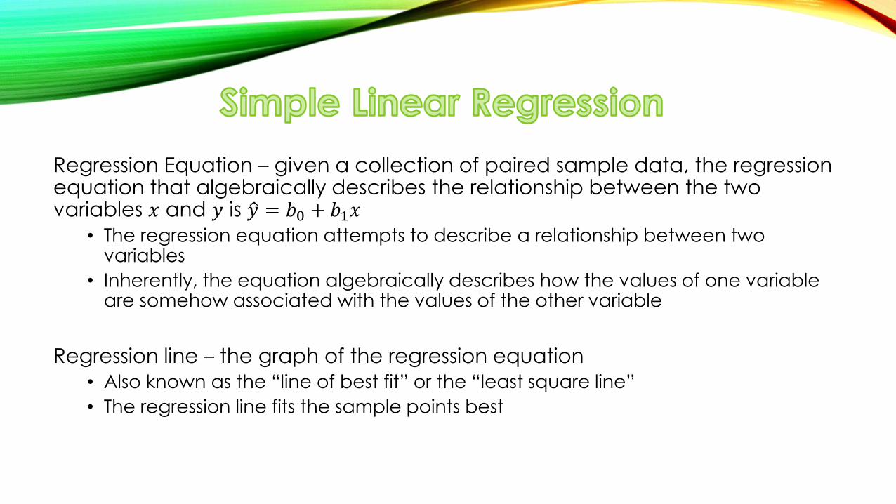
Regression Equation – given a collection of paired sample data, the regression equation that algebraically describes the relationship between the two variables 𝑥 and 𝑦 is 𝑦 = 𝑏0 + 𝑏1𝑥
• The regression equation attempts to describe a relationship between two variables
• Inherently, the equation algebraically describes how the values of one variable are somehow associated with the values of the other variable
Regression line – the graph of the regression equation
• Also known as the “line of best fit” or the “least square line”
• The regression line fits the sample points best
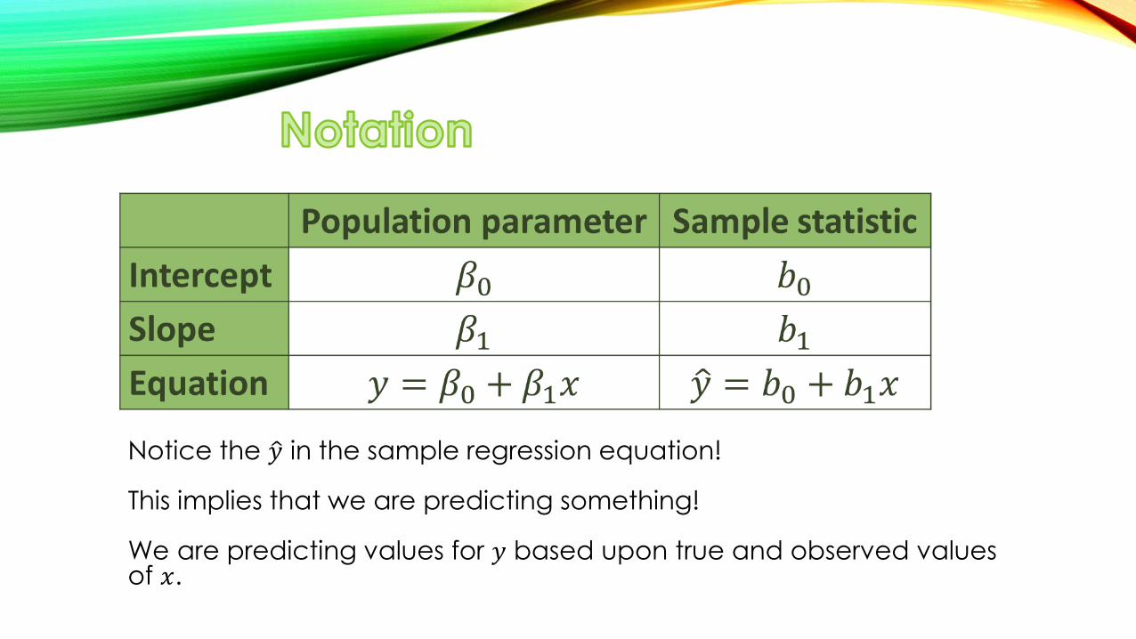
Notice the 𝑦 in the sample regression equation! This implies that we are predicting something! We are predicting values for 𝑦 based upon true and observed values of 𝑥.
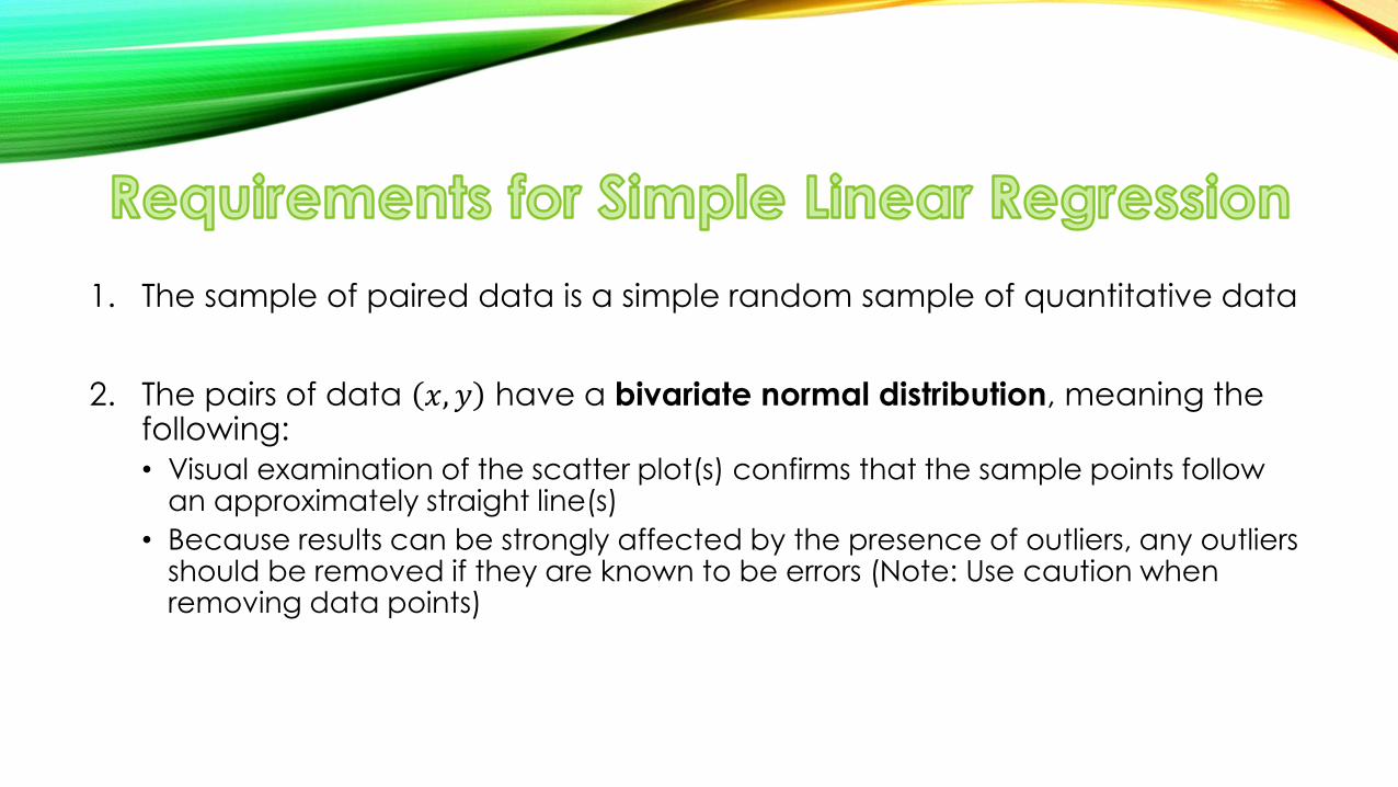
1. The sample of paired data is a simple random sample of quantitative data
2. The pairs of data 𝑥, 𝑦 have a bivariate normal distribution, meaning the following:
• Visual examination of the scatter plot(s) confirms that the sample points follow an approximately straight line(s)
• Because results can be strongly affected by the presence of outliers, any outliers should be removed if they are known to be errors (Note: Use caution when removing data points)
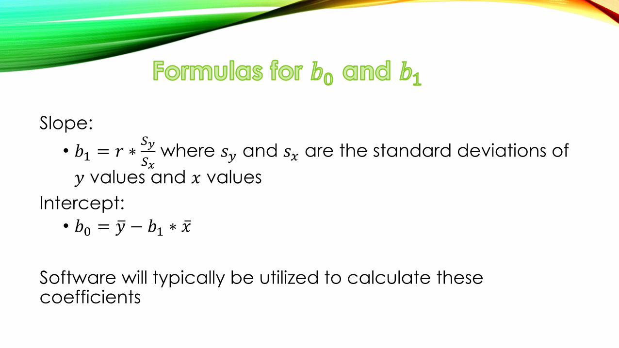
Slope:
• 𝑏1 = 𝑟 ∗𝑆𝑦
𝑆𝑥 where 𝑠𝑦 and 𝑠𝑥 are the standard deviations of
𝑦 values and 𝑥 values
Intercept:
• 𝑏0 = 𝑦 − 𝑏1 ∗ 𝑥
Software will typically be utilized to calculate these coefficients
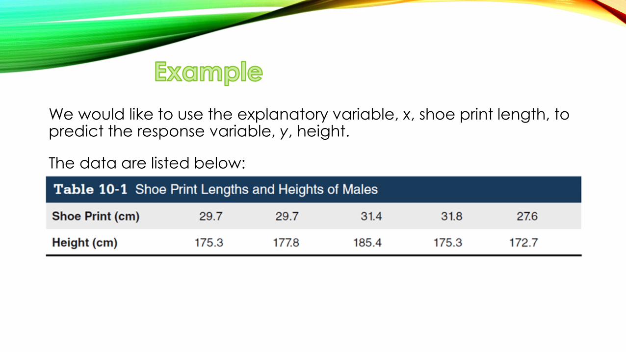
We would like to use the explanatory variable, x, shoe print length, to predict the response variable, y, height.
The data are listed below:
Requirement Check:
1. The data are assumed to be a simple random sample.
2. The scatterplot showed a roughly straight-line pattern.
3. There are no outliers.
The use of technology is recommended for finding the equation of a regression line.
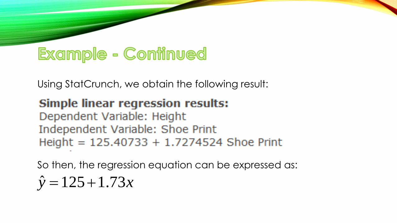
Using StatCrunch, we obtain the following result:
So then, the regression equation can be expressed as:
125 1.73y x
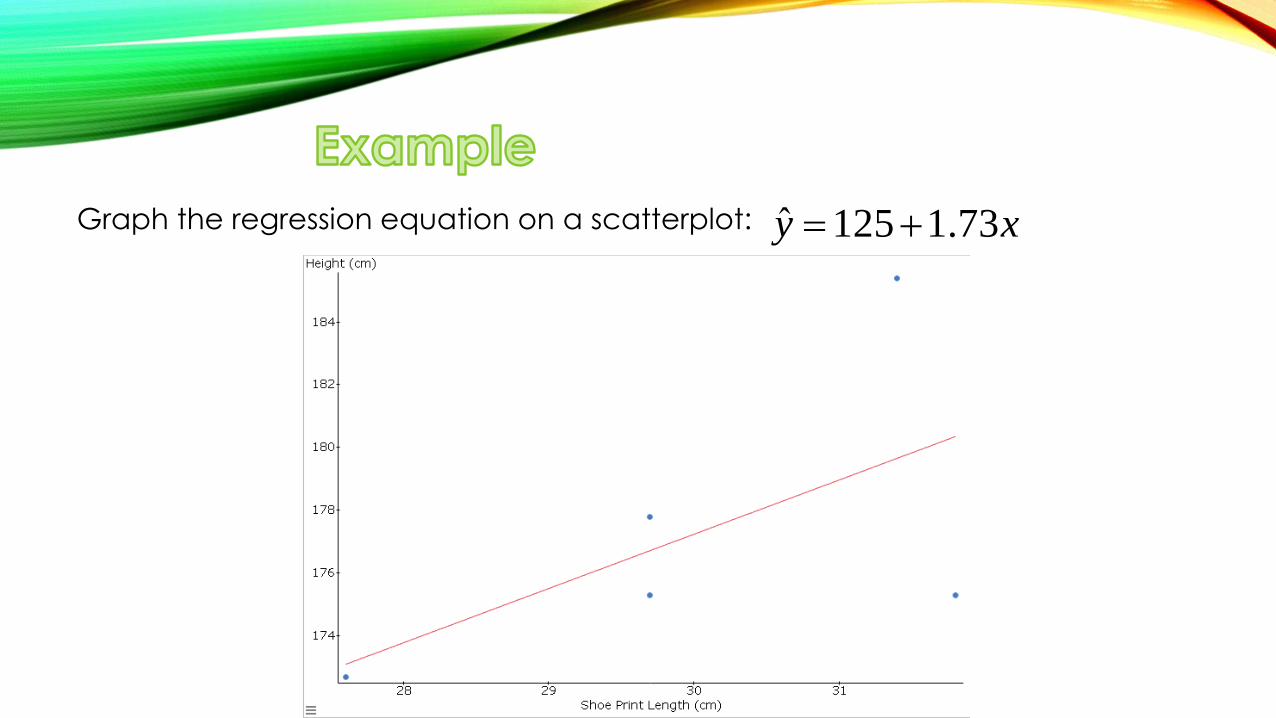
Graph the regression equation on a scatterplot:
ˆ 125 1.73y x
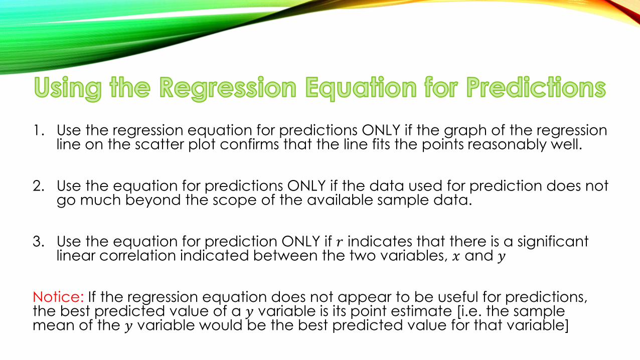
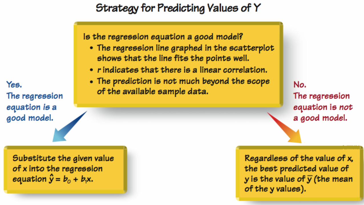
1. Use the regression equation for predictions ONLY if the graph of the regression line on the scatter plot confirms that the line fits the points reasonably well.
2. Use the equation for predictions ONLY if the data used for prediction does not go much beyond the scope of the available sample data.
3. Use the equation for prediction ONLY if 𝑟 indicates that there is a significant linear correlation indicated between the two variables, 𝑥 and 𝑦
Notice: If the regression equation does not appear to be useful for predictions, the best predicted value of a 𝑦 variable is its point estimate [i.e. the sample mean of the 𝑦 variable would be the best predicted value for that variable]
Marginal change – in working with two variables related by a regression equation, the marginal change in a variable is the amount that the variable changes when the other variable changes by exactly one unit
• The slope, 𝑏1, in the regression equation is the marginal change in 𝑦 when 𝑥 changes by one unit
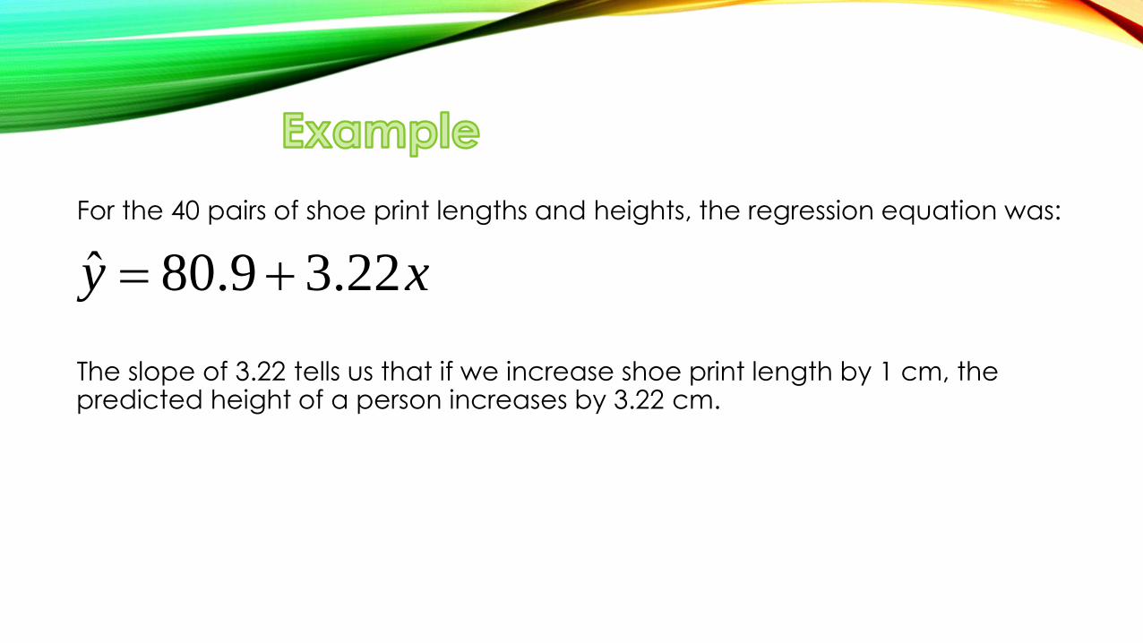
For the 40 pairs of shoe print lengths and heights, the regression equation was:
The slope of 3.22 tells us that if we increase shoe print length by 1 cm, the predicted height of a person increases by 3.22 cm.
ˆ 80.9 3.22y x
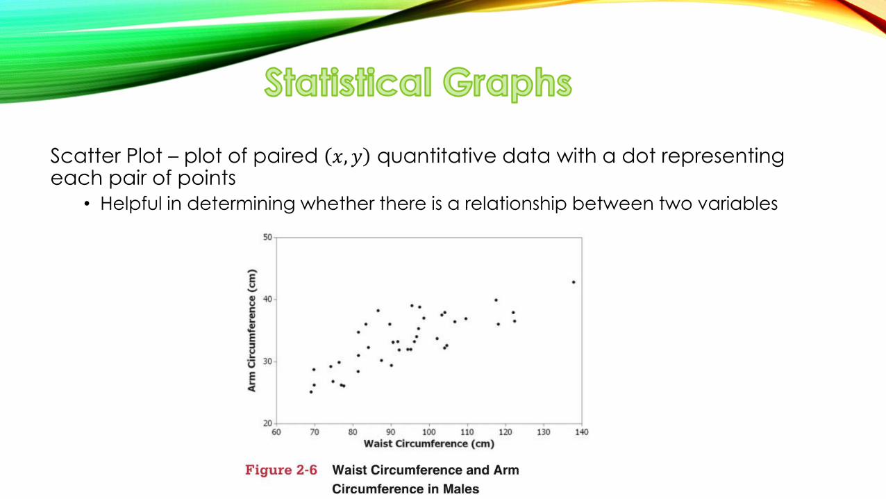
Scatter Plot – plot of paired 𝑥, 𝑦 quantitative data with a dot representing each pair of points
• Helpful in determining whether there is a relationship between two variables
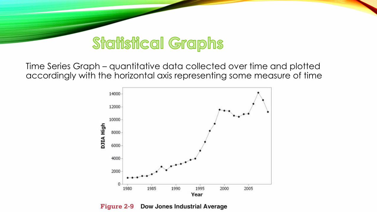
Time Series Graph – quantitative data collected over time and plotted accordingly with the horizontal axis representing some measure of time
• Outlier – in a scatter plot, an outlier is a point lying far away from the other data points
• Influential point – a point that strongly affects the graph of the regression line
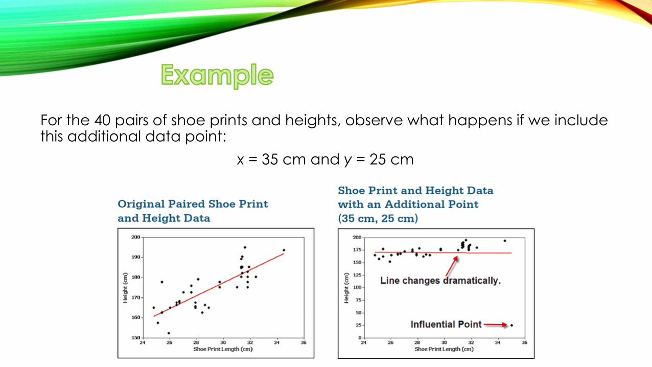
For the 40 pairs of shoe prints and heights, observe what happens if we include this additional data point:
x = 35 cm and y = 25 cm
The additional point is an influential point because the graph of the regression line because the graph of the regression line did change considerably.
The additional point is also an outlier because it is far from the other points.
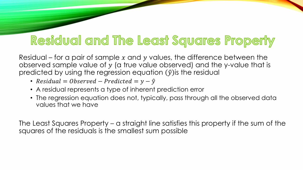
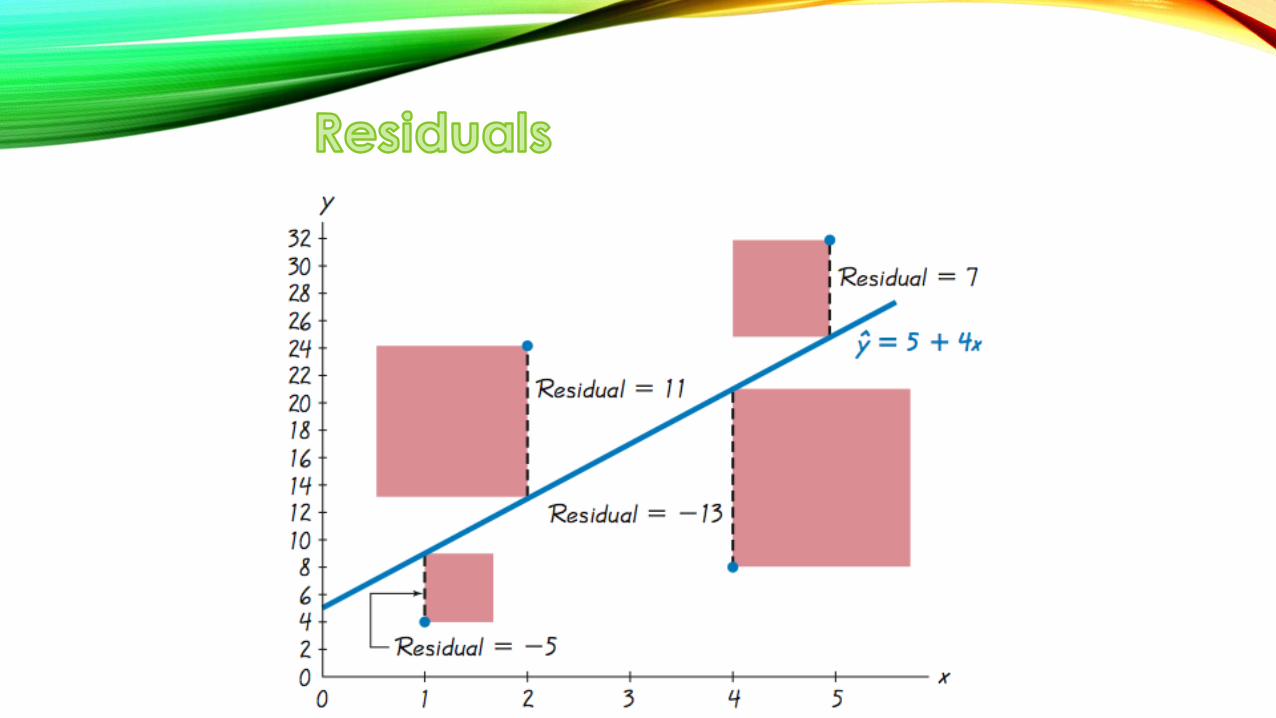
Residual – for a pair of sample 𝑥 and 𝑦 values, the difference between the observed sample value of 𝑦 (a true value observed) and the y-value that is predicted by using the regression equation 𝑦 is the residual
• 𝑅𝑒𝑠𝑖𝑑𝑢𝑎𝑙 = 𝑂𝑏𝑠𝑒𝑟𝑣𝑒𝑑 − 𝑃𝑟𝑒𝑑𝑖𝑐𝑡𝑒𝑑 = 𝑦 − 𝑦
• A residual represents a type of inherent prediction error
• The regression equation does not, typically, pass through all the observed data values that we have
The Least Squares Property – a straight line satisfies this property if the sum of the squares of the residuals is the smallest sum possible
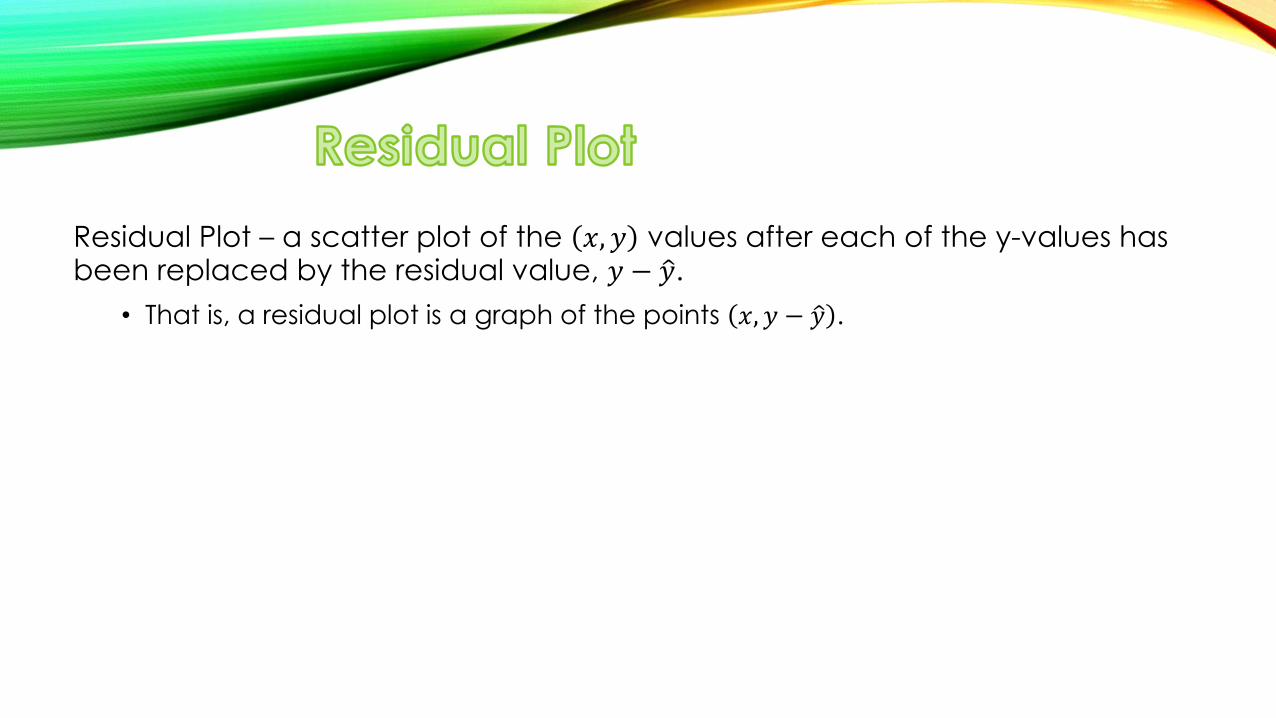
Residual Plot – a scatter plot of the 𝑥, 𝑦 values after each of the y-values has been replaced by the residual value, 𝑦 − 𝑦 .
• That is, a residual plot is a graph of the points 𝑥, 𝑦 − 𝑦 .
When analyzing a residual plot, look for a pattern in the way the points
are configured, and use these criteria:
The residual plot should not have any obvious patterns (not even a
straight line pattern). This confirms that the scatterplot of the sample
data is a straight-line pattern.
The residual plot should not become thicker (or thinner) when viewed
from left to right. This confirms the requirement that for different fixed
values of x, the distributions of the corresponding y values all have the
same standard deviation.
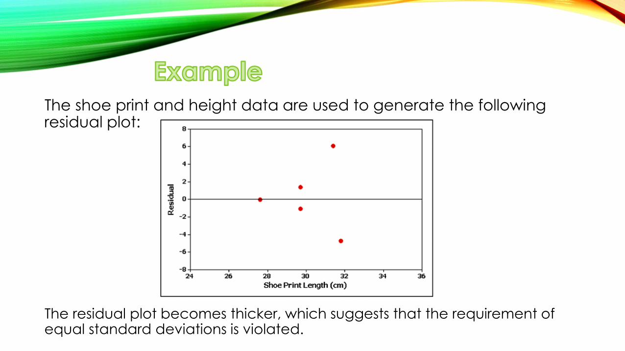
The shoe print and height data are used to generate the following residual plot:
The residual plot becomes thicker, which suggests that the requirement of equal standard deviations is violated.
The following slides show three residual plots.
Let’s observe what is good or bad about the individual regression models.

Regression model is a good model:
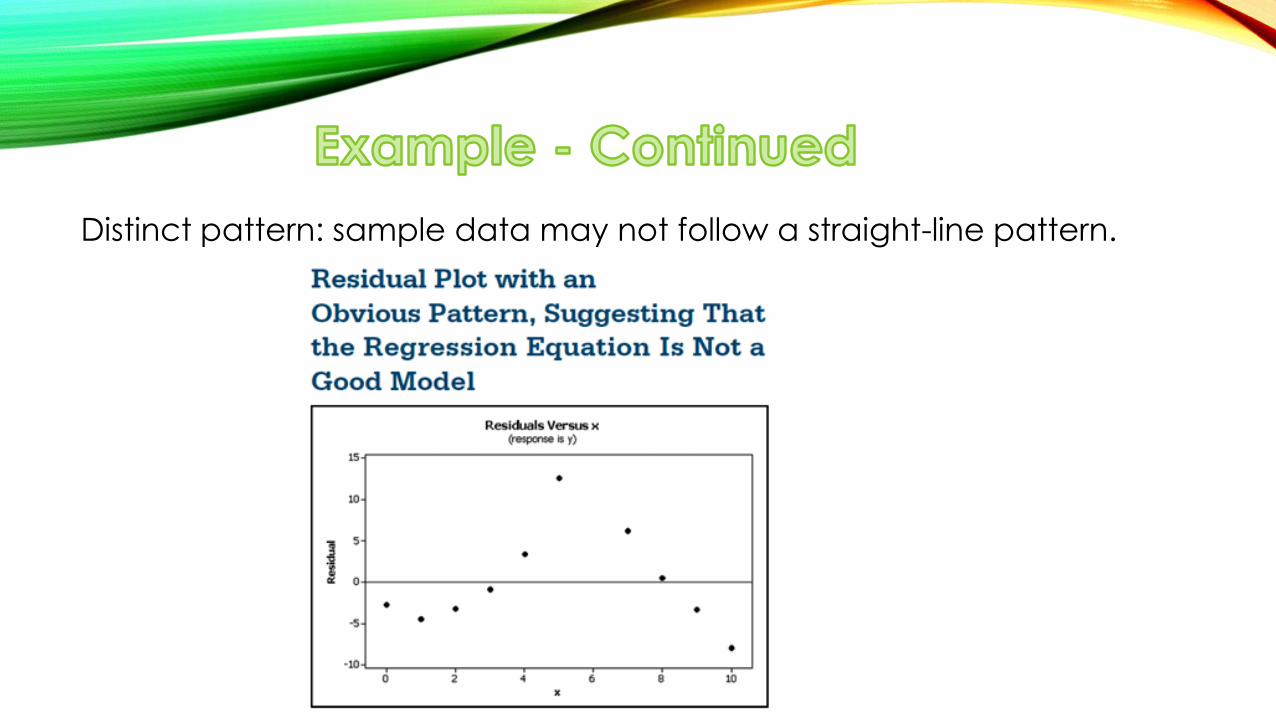
Distinct pattern: sample data may not follow a straight-line pattern.
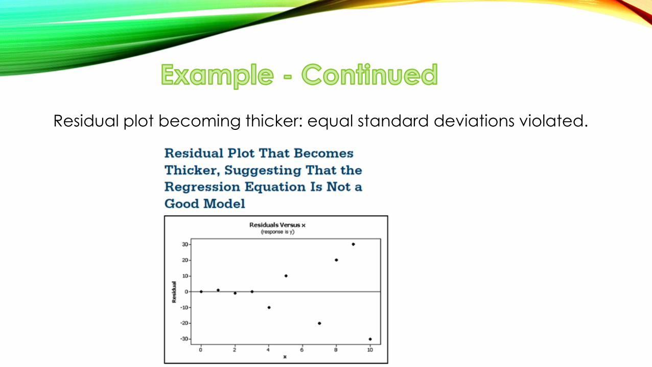
Residual plot becoming thicker: equal standard deviations violated.
1. Construct a scatterplot and verify that the pattern of the points is
approximately a straight-line pattern without outliers. (If there are
outliers, consider their effects by comparing results that include the
outliers to results that exclude the outliers.)
2. Construct a residual plot and verify that there is no pattern (other
than a straight-line pattern) and also verify that the residual plot
does not become thicker (or thinner).
3. Use a histogram and/or normal quantile plot to confirm that the
values of the residuals have a distribution that is approximately
normal.
4. Consider any effects of a pattern over time.