screenshots of my front cover
TRANSCRIPT

Screen Shots of how I created my Front Cover of my Music Magazine

1 Screen Shot
• I made my front cover on Adobe Photoshop CS6. I started by making a blue background using the paint bucket tool.

2 Screen Shot
• On this screen shot I added a picture of my model and it’s a close up of the face I added a black and white effect as the background has colour, if I left the image normal it would be too many colours. Also I added different shades of blue using the sponge tool to see if it gave a better effect but I didn’t like it because it looked to messy on the page for me and you don’t usually see that type of backgrounds on magazines.

3 Screen Shot
• On this screen shot I got rid of the blue shaded bits but there is still some left but you cant see it as much. Also I added my masthead which is ‘BASS’ which is bold and all in capital letters, the font I used is Gill Sans Ultra Bold and the colour I used is white so its stand out from the dark colours.

4 Screen Shot
• On this screen shot I added a bar code which is one of the main codes. I placed it in the bottom right corner because in most magazine the barcodes are at the bottom also they can’t be too big because it would take up too much space and it wouldn’t look normal.

5 Screen Shot
• On this screen shot I added a left-hand third ‘Melisa&Chris’ in Gill Sans Ultra Bold Condensed font so it stands out on the page as it the main head title in the magazine. Also it white so you can see it on the black background, I placed it there as it didn’t fit anywhere else on the page.

6 Screen Shot
• On this screen shot I added another plug on the left-hand third which is ‘What is HOT and NOT!’. It’s a baby pink colour and Goudita Sans SF font which I think goes well with the blue and white colours. The main words are in capital letter so it catches peoples eyes, I placed it near the top to fill out the space on the magazine.

7 Screen Shot
• On this screen shot I added another sentences on the left-hand third which says ‘Melissa is Back from Tour’. The writing is white and it’s the Goudita Sans SF Bold front, it’s to inform the audience what is happening in the magazine and it makes people buy the magazine because they want to know what happening to celebrity. I put it in the middle of other plugs so the space is filled and there’s barley any space left but not too much.

8 Screen Shot
• On this screen shot you can see that I started a new page on Adobe Photoshop CS6. I left the page blank so the back ground is white.

9 Screen Shot
• On this screen shot I added my picture which I took. This picture had a different background so I had to cut it out by using the quick selection tool. I left some space at the top for the masthead so the picture is near the bottom. It’s a close up of the face because you can see the face of the model really well but you still got space around it to put all of the other codes and convections on the magazine.

10 Screen Shot
• On this screen shot I added my masthead which is ‘BASS’ in capital letters, the font is Gill Sans Ultra Bold and it’s in orange and it stands out on the white background also I put it behind the picture but you can still read the masthead, I put it there because on the magazines I looked at do that quite often.

11 Screen Shot
• On this screen shot I added a cover line at the top of the page. The text is orange so it stand out on the white background and the font of it is Goudita Sans Light SF. I put it at the top as it fitted there perfectly and it would fit any where else on the page.

12 Screen Shot
• On this screen shot I added all of the codes and conventions which is the barcode, date, price and website which every magazine usually has most of them. I put them in the bottom right corner all together because I thought that’s where it would fit the most and barcodes are usually at the bottom of the page.

13 Screen Shot
• On this screen shot I added a cover lines and puff to boost up the status. The text which is “MELISSA & DRAKE…BACK TOGETHER?” is in white and the font of it is Goudita Sans Light SF. I put the cover line as question to attract the audience because they would want to know the answer to the question also it’s the only text in white so it stands out from all the rest.

14 Screen Shot
• On this screen shot I added a puff to boost the status up it’s in capital letters and the writing is black and orange and the font of it is Goudita Sans SF. I put it on the right hand side in the blank space which fits perfectly. It stands out because its short and quite large.

15 Screen Shot
• On this screen shot you can see I added Left-side third/ Left-hand third, Plug and Puff. The font of writing is the same but different colours I got important information to attract potential readers and some of the text is bold so it stands out and attracts the readers attention as it stands out from the rest and some are even bigger for example on mine ‘50 TOP HITS’ and ‘MELISSA&DRAKE…’ is enlarged to it stands out and shows it’s the most important information in the magazine.

First Attempt of Front Cover In my first attempt of the front cover I used
the ‘VIBE’ magazine as I like the way it sets everything out and it’s a R&B style which I was doing. I used quite a simply one. On the first attempt I struggled with using Photoshop as I didn’t use it before, therefore I had to experience more and play around with all the tools and edits to make my own magazine look like the ‘VIBE’ magazine but it didn’t work out. I didn’t like the way I made it as I couldn’t get similar writing and was looking to plane for me also I couldn’t edit the image properly so it looked unprofessional and I couldn’t get the contrast of the colours on her face. Although I liked the colour scheme for the front cover which is blue, black and white maybe if I changed the background to white and done the writing in black and blue it might of looked better and tried to use similar fonts and filled in the blank spaces more to make it look more interesting. Overall I didn’t like that style so I changed it as you can see on the next slide.
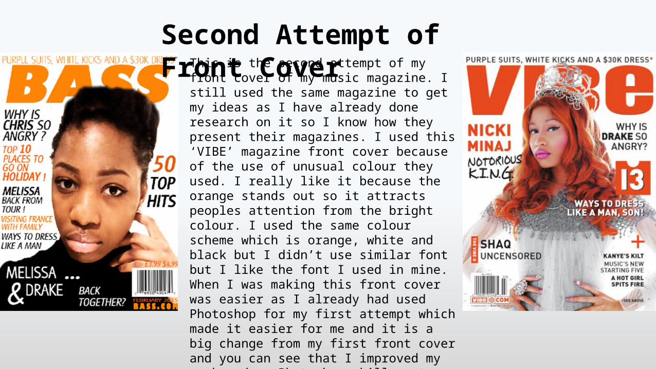
Second Attempt of Front Cover This is the second attempt of my front cover of my
music magazine. I still used the same magazine to get my ideas as I have already done research on it so I know how they present their magazines. I used this ‘VIBE’ magazine front cover because of the use of unusual colour they used. I really like it because the orange stands out so it attracts peoples attention from the bright colour. I used the same colour scheme which is orange, white and black but I didn’t use similar font but I like the font I used in mine. When I was making this front cover was easier as I already had used Photoshop for my first attempt which made it easier for me and it is a big change from my first front cover and you can see that I improved my work and my Photoshop skills got better and I focussed on all of the details so that my magazine looks like a real magazine. Comparing to my first front cover I used all of the codes and conventions like the barcode, date, price and website also I added more text to fill out the blank space.