screenshots of my contents page
TRANSCRIPT

Click to edit Master subtitle style
07/04/14
Screenshots of my contents page
Rebecca Walsh
07/04/14
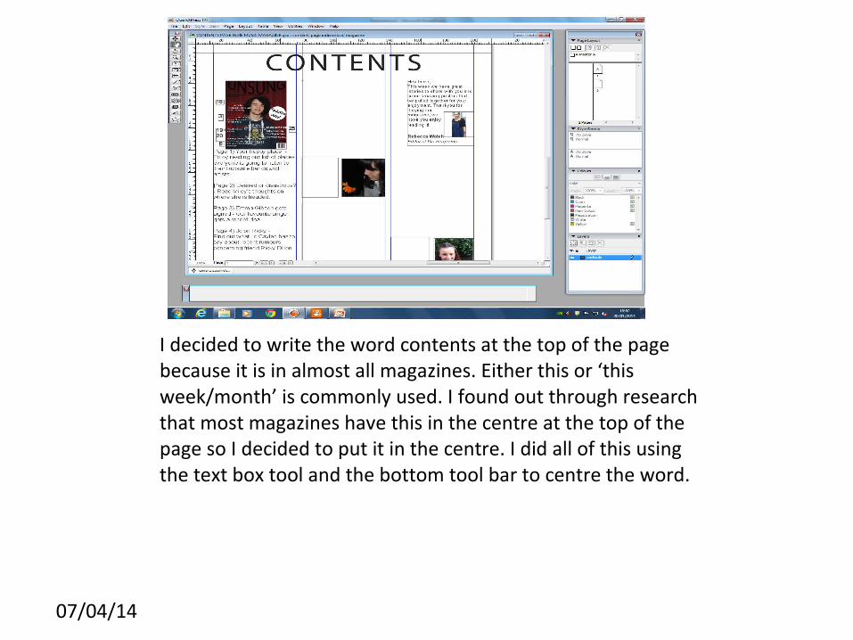
I decided to write the word contents at the top of the page because it is in almost all magazines. Either this or ‘this week/month’ is commonly used. I found out through research that most magazines have this in the centre at the top of the page so I decided to put it in the centre. I did all of this using the text box tool and the bottom tool bar to centre the word.
07/04/14
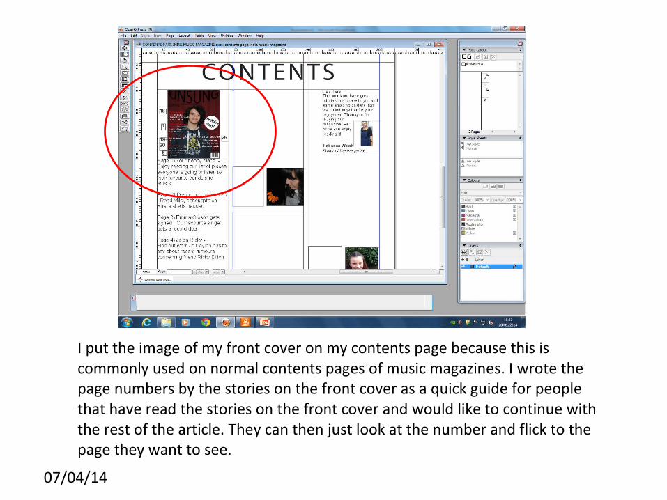
I put the image of my front cover on my contents page because this is commonly used on normal contents pages of music magazines. I wrote the page numbers by the stories on the front cover as a quick guide for people that have read the stories on the front cover and would like to continue with the rest of the article. They can then just look at the number and flick to the page they want to see.

07/04/14
I have also included the editors letter on my contents page. On magazines that are published and circulated they have the editors letter in every issue. I used the insert image and the insert text tool to do this. The editors letter makes the magazine look more professional overall.
07/04/14
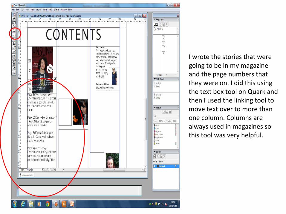
I wrote the stories that were going to be in my magazine and the page numbers that they were on. I did this using the text box tool on Quark and then I used the linking tool to move text over to more than one column. Columns are always used in magazines so this tool was very helpful.
07/04/14
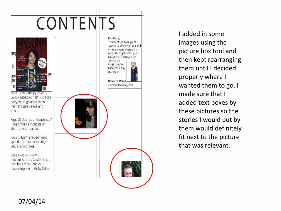
I added in some images using the picture box tool and then kept rearranging them until I decided properly where I wanted them to go. I made sure that I added text boxes by these pictures so the stories I would put by them would definitely fit next to the picture that was relevant.
07/04/14
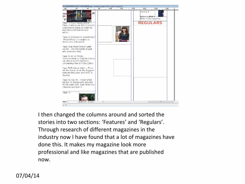
I then changed the columns around and sorted the stories into two sections: ‘Features’ and ‘Regulars’. Through research of different magazines in the industry now I have found that a lot of magazines have done this. It makes my magazine look more professional and like magazines that are published now.
07/04/14
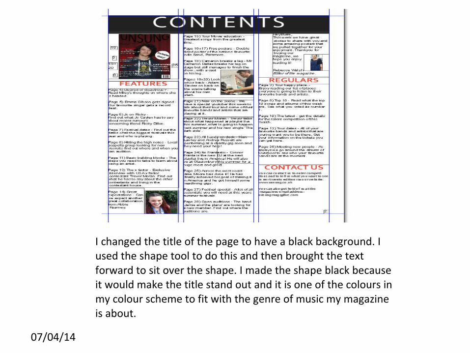
I changed the title of the page to have a black background. I used the shape tool to do this and then brought the text forward to sit over the shape. I made the shape black because it would make the title stand out and it is one of the colours in my colour scheme to fit with the genre of music my magazine is about.

07/04/14
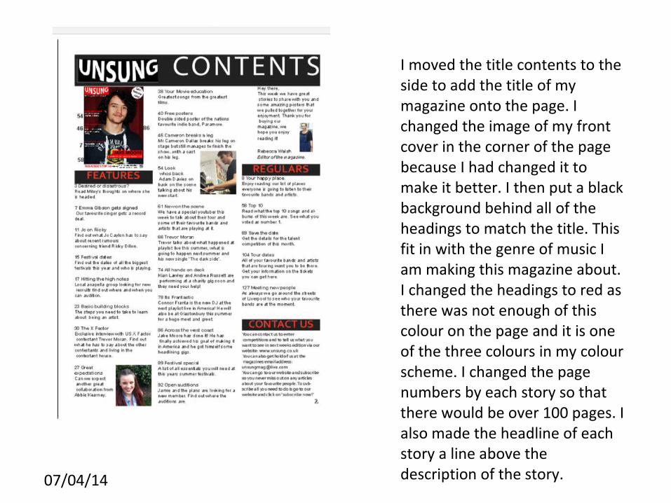
This is my image of my main task contents page. I included a contact us section where the readers of the magazine could get in touch with anyone from the magazine. I made the heading ‘contact us’ in the same colour and font as ‘Features’ and ‘Regulars’ as it is another section of the magazine. I also took some of the images off the page because there was not enough room.
07/04/14
I moved the title contents to the side to add the title of my magazine onto the page. I changed the image of my front cover in the corner of the page because I had changed it to make it better. I then put a black background behind all of the headings to match the title. This fit in with the genre of music I am making this magazine about. I changed the headings to red as there was not enough of this colour on the page and it is one of the three colours in my colour scheme. I changed the page numbers by each story so that there would be over 100 pages. I also made the headline of each story a line above the description of the story.