reading response
DESCRIPTION
reading responseTRANSCRIPT
Reading ResponsesSpring 2012
Obioma Obiaguzor
2
Table of Contents
Doyald Young...............................................................................1
Helvetica......................................................................................2
Margo Chase................................................................................3
Art Series.....................................................................................4
Kit Hinrichs................................................................................5
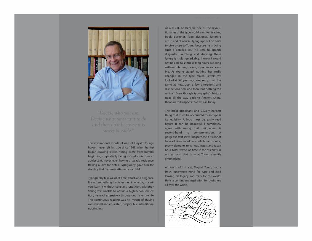
The inspirational words of one of Doyald Young’s heroes never left his side since 1948, when he �rst began drawing letters. Young came from humble beginnings repeatedly being moved around as an adolescent, never ever having a steady residence. Having a love for detail, typography gave him the stability that he never attained as a child.
Typography takes a lot of time, e�ort, and diligence. It is not something that is learned in one day nor will you learn it without constant repetition. Although Young was unable to obtain a high school educa-tion, he read extensively throughout his entire life. This continuous reading was his means of staying well-versed and educated, despite his untraditional upbringing.
obioma obiaguzor
As a result, he became one of the revolu-tionaries of the type world; a writer, teacher, book designer, logo designer, lettering artist, and of course, typographer. I do have to give props to Young because he is doing such a detailed art. The time he spends diligently sketching and drawing these letters is truly remarkable. I know I would not be able to sit those long hours daddling with each letters, making it precise as possi-ble. As Young stated, nothing has really changed in the type realm. Letters we looked at 500 years ago are pretty much the same as now. Just a few alterations and distinctions here and there but nothing too radical. Even though typography’s history goes all the way back to Ancient China, there are still aspects that we use today.
The most important and usually hardest thing that must be accounted for in type is its legibility. A logo must be easily read before it can be beautiful. I completely agree with Young that uniqueness is second-hand to comprehension. A gorgeous text serves no purpose if it cannot be read. You can add a whole bunch of nice, pretty elements to various letters and it can be a total waste of time if the visibility is unclear and that is what Young steadily emphasized.
Although old in age, Doyald Young had a fresh, innovative mind for type and died leaving his legacy and mark for the world. He is a continuing inspiration for designers all over the world.
“Decide who you are. Decide what you want to doand then do it because it is
surely possible.”
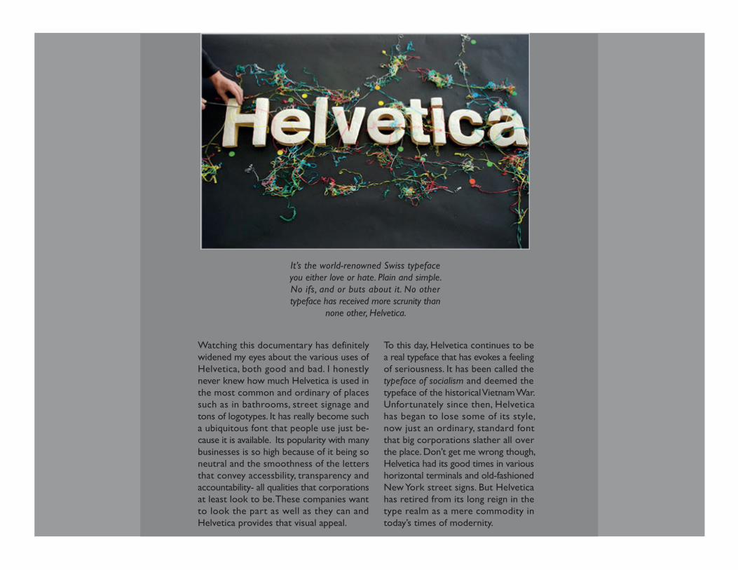
It’s the world-renowned Swiss typeface you either love or hate. Plain and simple. No ifs, and or buts about it. No other typeface has received more scrunity than
none other, Helvetica.
Watching this documentary has definitely widened my eyes about the various uses of Helvetica, both good and bad. I honestly never knew how much Helvetica is used in the most common and ordinary of places such as in bathrooms, street signage and tons of logotypes. It has really become such a ubiquitous font that people use just be-cause it is available. Its popularity with many businesses is so high because of it being so neutral and the smoothness of the letters that convey accessbility, transparency and accountability- all qualities that corporations at least look to be. These companies want to look the part as well as they can and Helvetica provides that visual appeal.
To this day, Helvetica continues to be a real typeface that has evokes a feeling of seriousness. It has been called the typeface of socialism and deemed the typeface of the historical Vietnam War. Unfortunately since then, Helvetica has began to lose some of its style, now just an ordinary, standard font that big corporations slather all over the place. Don’t get me wrong though, Helvetica had its good times in various horizontal terminals and old-fashioned New York street signs. But Helvetica has retired from its long reign in the type realm as a mere commodity in today’s times of modernity.
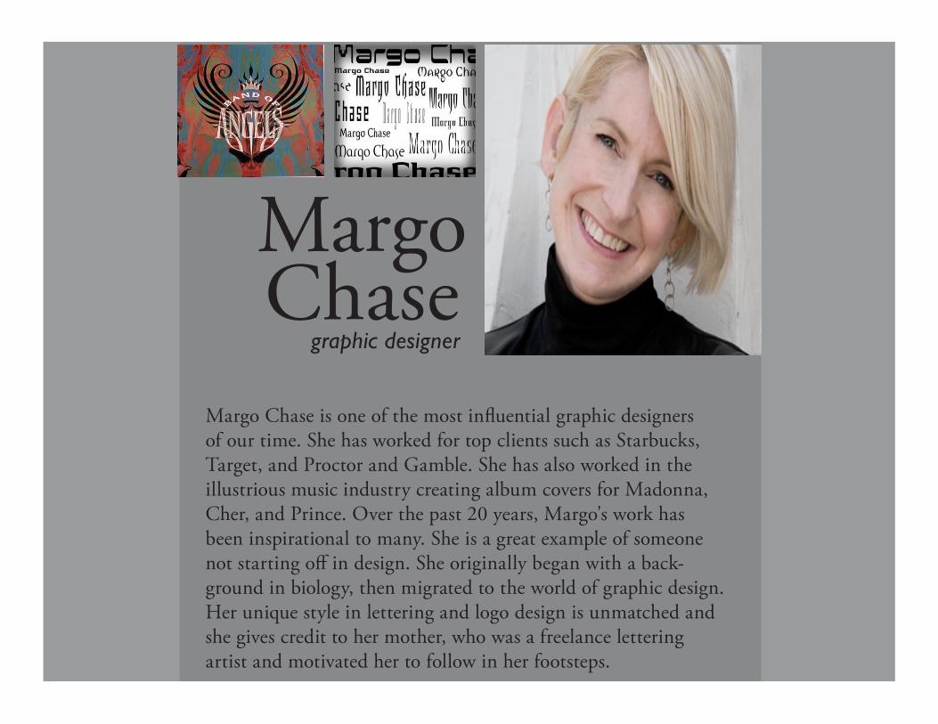
Margo graphic designer
ChaseMargo Chase is one of the most in�uential graphic designers of our time. She has worked for top clients such as Starbucks, Target, and Proctor and Gamble. She has also worked in the illustrious music industry creating album covers for Madonna, Cher, and Prince. Over the past 20 years, Margo's work has been inspirational to many. She is a great example of someone not starting o� in design. She originally began with a back-ground in biology, then migrated to the world of graphic design. Her unique style in lettering and logo design is unmatched and she gives credit to her mother, who was a freelance lettering artist and motivated her to follow in her footsteps.
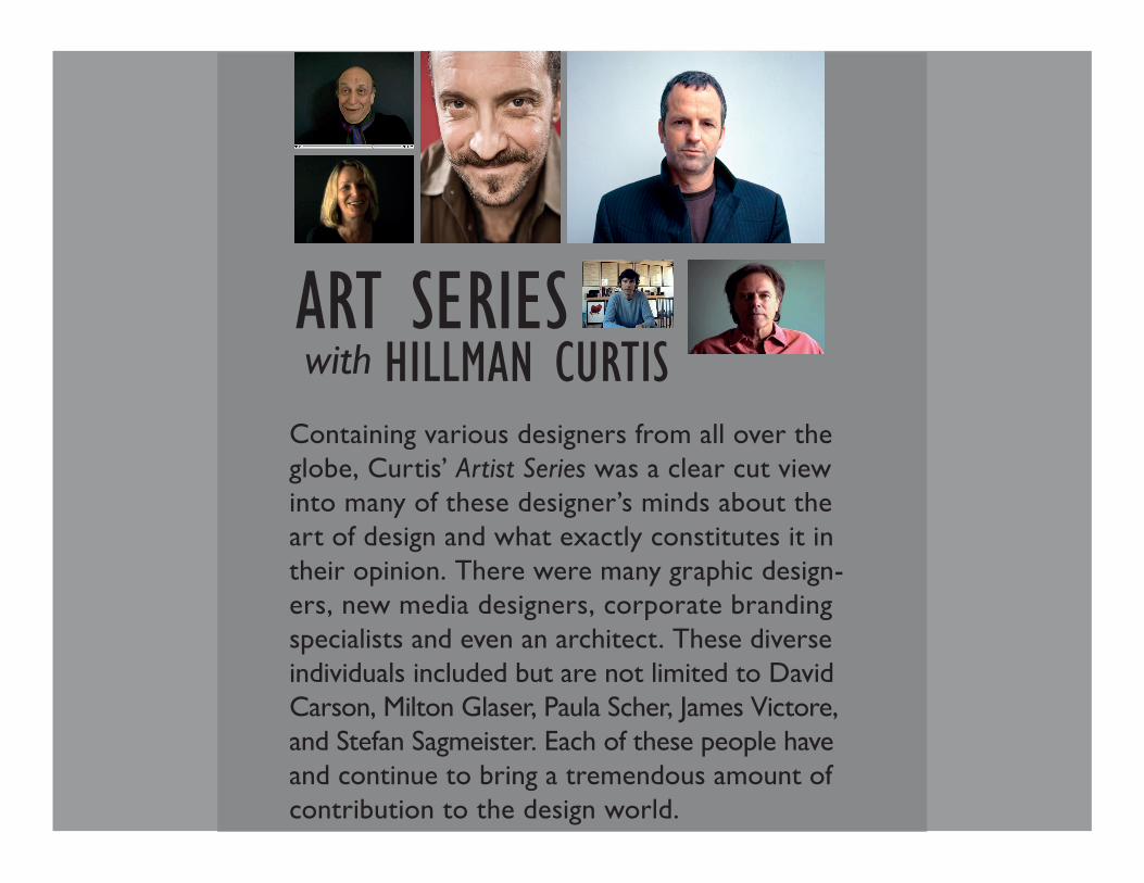
ART SERIES with HILLMAN CURTIS
Containing various designers from all over the globe, Curtis’ Artist Series was a clear cut view into many of these designer’s minds about the art of design and what exactly constitutes it in their opinion. There were many graphic design-ers, new media designers, corporate branding specialists and even an architect. These diverse individuals included but are not limited to David Carson, Milton Glaser, Paula Scher, James Victore, and Stefan Sagmeister. Each of these people have and continue to bring a tremendous amount of contribution to the design world.
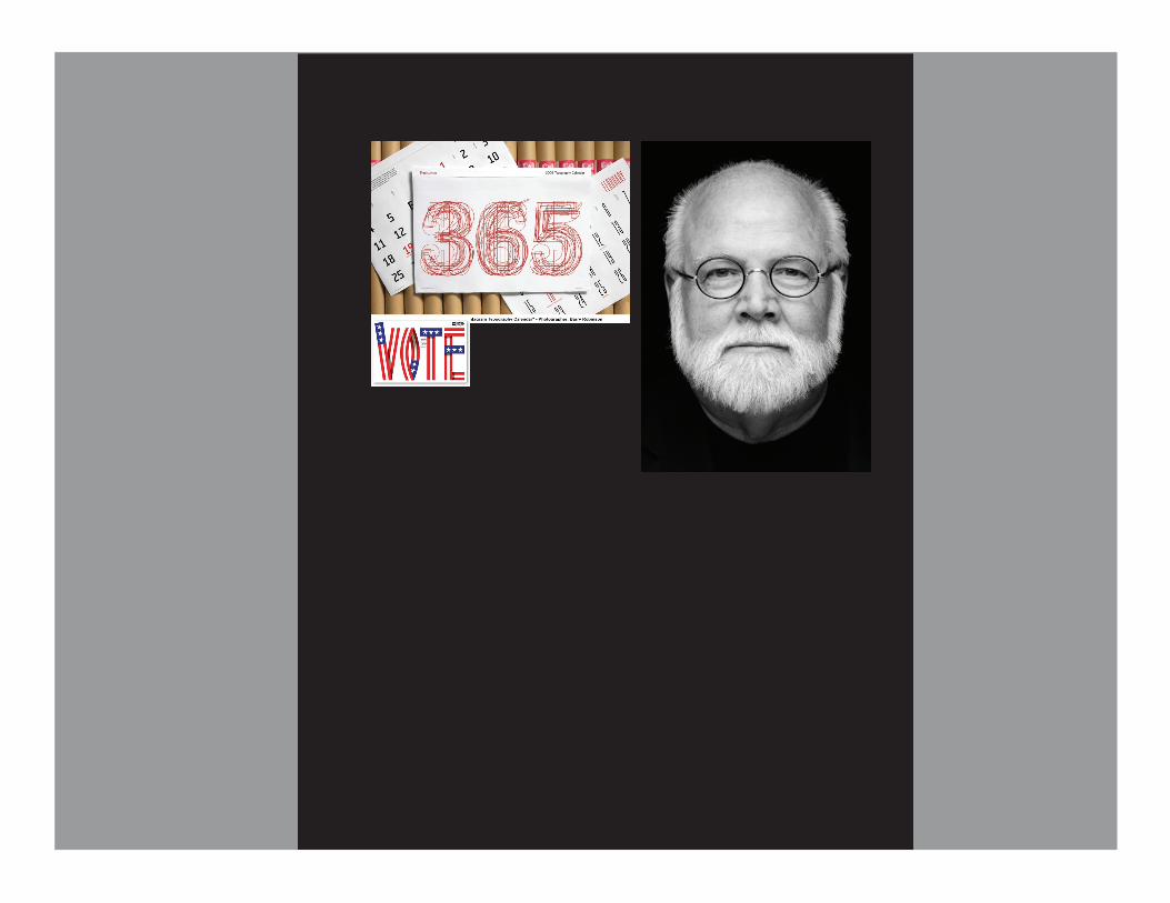
Kitgraphic designer
HinrichsKit Hinrichs is one of the most accomplished and respected graphic designers and illustrators of the last �fty years. He has been awarded the highest honor in his �eld: the AIGA Medal and has been a great in�uential force in the realm of design. Hinrichs founded Studio Hinrichs in October 2009, following 23 years as a partner of the international design �rm, Pentagram. He has taught at many schools including the School of Visual Arts in New York, the California College of the Arts and the Academy of Art in San Francisco. Participating in corporate identity, packag-ing, exhibition, editorial and promotional campaign programs, Kit Hinrichs is the all-inclusive graphic designer who has stayed at the top of his game for nearly �ve decades.