x vertex framework guide vertex framework - unipv · vertex framework is compatible with most major...
TRANSCRIPT
http://www.shape5.com
Vertex Framework http://www.shape5.com
Vertex Framework Guide http://www.shape5.com J
oo
mla
Ve
rtex
http://www.shape5.com
http://www.shape5.com
The S5 Vertex Framework is a set of functionality that creates the core logic and structure of a
template. The purpose of the S5 Vertex framework is to unify the layouts, designs, and functions that
Shape5 has built over the years to create one of the most flexible, robust and powerful template blue
prints available! The S5 Vertex Framework is used in all templates released after June 2011. Start
building your new sites on Vertex Today!
Copyright © 2012 Shape5.com
Revision History
------------------------------------------------------
Vertex 2.0 – 6/15/2012
Initial Release for Vertex 1.0 – 5/15/2011
Table of Contents:
1. Preamble ..................................................................................................................................... 1
2. Vertex Framework Requirements.............................................................................................. 2
2.1 Server Requirements
2.2 Browser Compatibility
2.3 Installation
2.4 Download
3. Template Specific....................................................................................................................... 4
4. Layout – Fixed, Fluid, Responsive and Mobile ....................................................................... 5
4.1 Overview - Fixed, Fluid
4.2 Responsive Introduction
4.3 How Responsive Works in Vertex
4.4 Column Sizes, Small Tablets, and Mobile
4.5 IE7 and Responsive
4.6 Responsive How To’s
5. Menu .......................................................................................................................................... 12
5.1 Overview
5.2 Installing the Plugin
5.3 Enabling the Mootools Upgrade Plugin
5.4 Where to Configure Menu Items
5.5 Splitting a Menu into Multiple Columns
5.6 Publishing a Module to the Menu
5.7 Grouping Children Under Their Parent
5.8 Setting up the Sub Text
5.9 Adding a Menu Icon
5.10 Configuring Effects, Menu Selection, Delays and Orientation
5.11 Menu Flexibility
6. Row Sizes .................................................................................................................................. 21
http://www.shape5.com
6.1 Brief Overview
6.2 Changing Module Sizes
7. General ..................................................................................................................................... 23
8. Javascripts ................................................................................................................................ 24
8.1 Multibox
8.2 Lazy Load
8.3 Tooltips
8.4 Info Slide
9. Fixed Tabs ................................................................................................................................. 28
10. Drop Down .............................................................................................................................. 28
11. Advanced Users …………........................................................................................................29
11.1 How To Add a New Module Position in Vertex?
11.2 How To Add New Admin Options?
11.3 Where are all the Joomla functions defined?
12. FAQ …………............................................................................................................................32
1. Preamble
The content of this document is related to the Shape5 Vertex template framework.
Vertex Framework is licensed under GNU/GPL All images, CSS, php, and Javascript are
© Shape5 2012
The Software 'Vertex Framework’ is intended for use in Joomla! (1.6+)
(Joomla! is free Software, licensed under GNU/GPL; Joomla! is available from www.joomla.org
[http://www.joomla.org])
2. Vertex Framework Requirements/Installation
2.1 Server Requirements
The Vertex Framework has the following System Requirements:
• PHP version 5.2.16 or higher - http://www.php.net
http://www.shape5.com
• Joomla! 1.6.x or higher - http://www.joomla.org
2.2 Browser Compatibility
Vertex Framework is compatible with most major browsers including: Internet Explorer (version 7.0+),
Firefox, Chrome, Safari,
2.3 Installation
Please refer to http://www.shape5.com/joomla_tutorials.html for installation instructions on a Vertex
Site Shaper or just the template itself.
2.4 Download
The newest version of the Vertex Framework is available under the downloads section of shape5.com
once you are logged in:
http://www.shape5.com/component/option,com_docman/Itemid,96/task,cat_view/gid,190/
Please refer to the following page for more information:
http://www.shape5.com/joomla/framework/vertex_framework.html
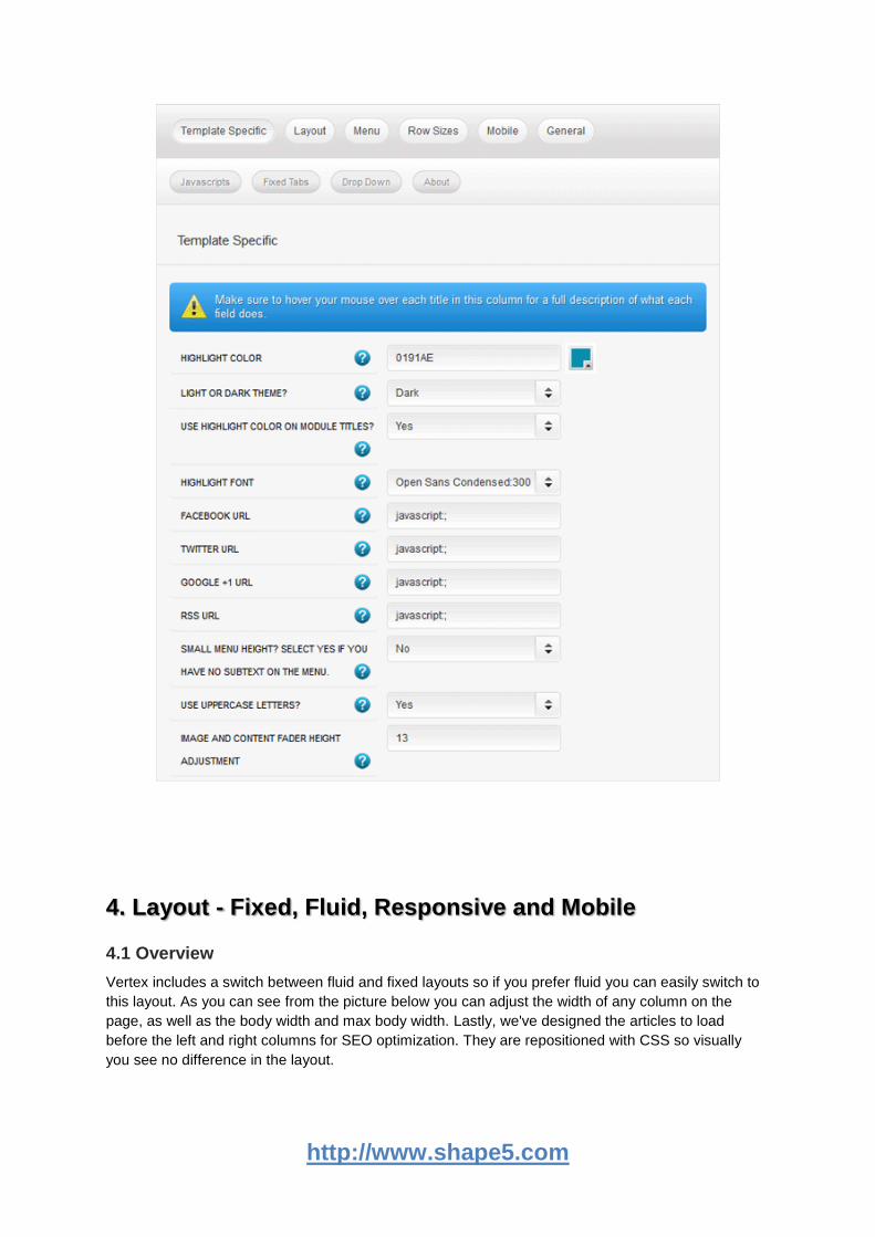
3. Template Specific
Every template built on Vertex also comes with its own unique template specific options applicable to
that particular template such as highlight colors, social icons, and much more. These features are in
addition to the standard functions of Vertex, and are still controlled through the very user friendly
interface of Vertex. The below screenshot is an example of a template with these options:
http://www.shape5.com
4. Layout - Fixed, Fluid, Responsive and Mobile
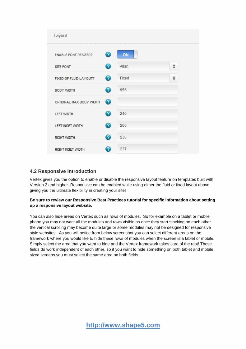
4.1 Overview
Vertex includes a switch between fluid and fixed layouts so if you prefer fluid you can easily switch to
this layout. As you can see from the picture below you can adjust the width of any column on the
page, as well as the body width and max body width. Lastly, we've designed the articles to load
before the left and right columns for SEO optimization. They are repositioned with CSS so visually
you see no difference in the layout.
http://www.shape5.com
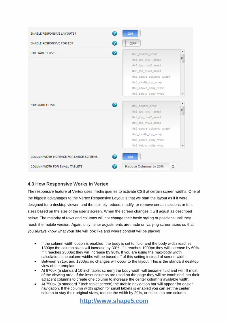
4.2 Responsive Introduction
Vertex gives you the option to enable or disable the responsive layout feature on templates built with
Version 2 and higher. Responsive can be enabled while using either the fluid or fixed layout above
giving you the ultimate flexibility in creating your site!
Be sure to review our Responsive Best Practices tutorial for specific information about setting
up a responsive layout website.
You can also hide areas on Vertex such as rows of modules. So for example on a tablet or mobile
phone you may not want all the modules and rows visible as once they start stacking on each other
the vertical scrolling may become quite large or some modules may not be designed for responsive
style websites. As you will notice from below screenshot you can select different areas on the
framework where you would like to hide these rows of modules when the screen is a tablet or mobile.
Simply select the area that you want to hide and the Vertex framework takes care of the rest! These
fields do work independent of each other, so if you want to hide something on both tablet and mobile
sized screens you must select the same area on both fields.
http://www.shape5.com
4.3 How Responsive Works in Vertex
The responsive feature of Vertex uses media queries to activate CSS at certain screen widths. One of
the biggest advantages to the Vertex Responsive Layout is that we start the layout as if it were
designed for a desktop viewer, and then simply reduce, modify, or remove certain sections or font
sizes based on the size of the user's screen. When the screen changes it will adjust as described
below. The majority of rows and columns will not change their basic styling or positions until they
reach the mobile version. Again, only minor adjustments are made on varying screen sizes so that
you always know what your site will look like and where content will be placed!
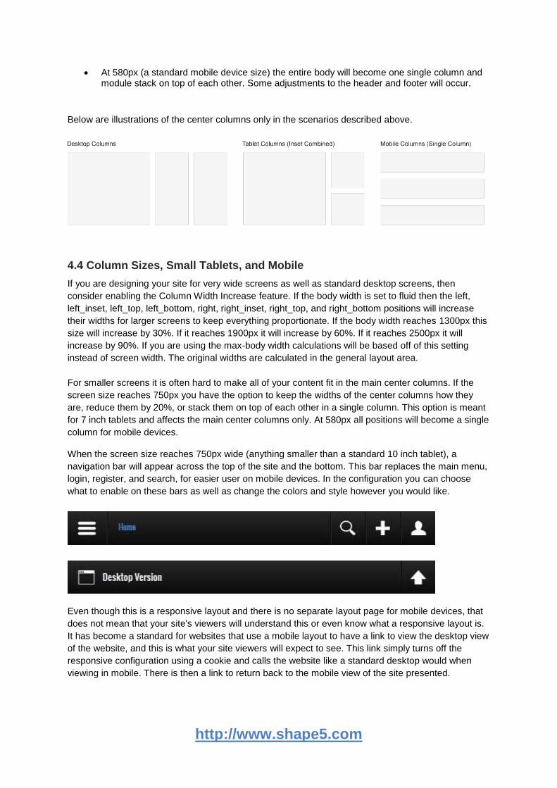
If the column width option is enabled, the body is set to fluid, and the body width reaches 1300px the column sizes will increase by 30%. If it reaches 1900px they will increase by 60%. If it reaches 2500px they will increase by 90%. If you are using the max-body width calculations the column widths will be based off of this setting instead of screen width.
Between 971px and 1300px no changes will occur to the layout. This is the standard desktop view of the template.
At 970px (a standard 10 inch tablet screen) the body width will become fluid and will fill most of the viewing area. If the inset columns are used on the page they will be combined into their adjacent columns to create one column to increase the center column's available width.
At 750px (a standard 7 inch tablet screen) the mobile navigation bar will appear for easier navigation. If the column width option for small tablets is enabled you can set the center column to stay their original sizes, reduce the width by 20%, or stack into one column.
http://www.shape5.com
At 580px (a standard mobile device size) the entire body will become one single column and module stack on top of each other. Some adjustments to the header and footer will occur.
Below are illustrations of the center columns only in the scenarios described above.
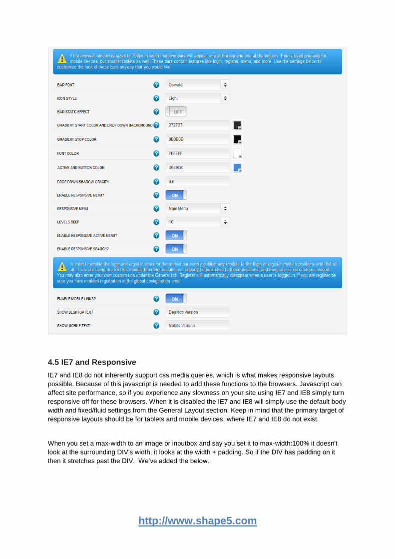
4.4 Column Sizes, Small Tablets, and Mobile
If you are designing your site for very wide screens as well as standard desktop screens, then
consider enabling the Column Width Increase feature. If the body width is set to fluid then the left,
left_inset, left_top, left_bottom, right, right_inset, right_top, and right_bottom positions will increase
their widths for larger screens to keep everything proportionate. If the body width reaches 1300px this
size will increase by 30%. If it reaches 1900px it will increase by 60%. If it reaches 2500px it will
increase by 90%. If you are using the max-body width calculations will be based off of this setting
instead of screen width. The original widths are calculated in the general layout area.
For smaller screens it is often hard to make all of your content fit in the main center columns. If the
screen size reaches 750px you have the option to keep the widths of the center columns how they
are, reduce them by 20%, or stack them on top of each other in a single column. This option is meant
for 7 inch tablets and affects the main center columns only. At 580px all positions will become a single
column for mobile devices.
When the screen size reaches 750px wide (anything smaller than a standard 10 inch tablet), a
navigation bar will appear across the top of the site and the bottom. This bar replaces the main menu,
login, register, and search, for easier user on mobile devices. In the configuration you can choose
what to enable on these bars as well as change the colors and style however you would like.
Even though this is a responsive layout and there is no separate layout page for mobile devices, that
does not mean that your site's viewers will understand this or even know what a responsive layout is.
It has become a standard for websites that use a mobile layout to have a link to view the desktop view
of the website, and this is what your site viewers will expect to see. This link simply turns off the
responsive configuration using a cookie and calls the website like a standard desktop would when
viewing in mobile. There is then a link to return back to the mobile view of the site presented.
http://www.shape5.com
4.5 IE7 and Responsive
IE7 and IE8 do not inherently support css media queries, which is what makes responsive layouts
possible. Because of this javascript is needed to add these functions to the browsers. Javascript can
affect site performance, so if you experience any slowness on your site using IE7 and IE8 simply turn
responsive off for these browsers. When it is disabled the IE7 and IE8 will simply use the default body
width and fixed/fluid settings from the General Layout section. Keep in mind that the primary target of
responsive layouts should be for tablets and mobile devices, where IE7 and IE8 do not exist.
When you set a max-width to an image or inputbox and say you set it to max-width:100% it doesn't
look at the surrounding DIV's width, it looks at the width + padding. So if the DIV has padding on it
then it stretches past the DIV. We’ve added the below.
http://www.shape5.com
-webkit-box-sizing: border-box; /* Safari/Chrome, other WebKit */
-moz-box-sizing: border-box; /* Firefox, other Gecko */
box-sizing: border-box; /* Opera/IE 8+ */
This tells it to strictly look at the DIV's width and then everything works fine. IE8 supports it but IE7
does not. So for images in IE7 we’ve just added the following:
<?php if ($browser == "ie7") { ?>
img.ie7, img.boxed, img.boxed_black, img.padded {
max-width:95% !important;
}
<?php } ?>
So images with those class names will never get larger than 95%. We’ve added in a class "ie7" that
someone can add if they need it to. So just remember to check your site in IE7 to be sure all images
are showing properly in responsive mode.
4.6 Responsive How To’s
Hide Specific Modules via the Hide Classes
For a complete list of Hide Classes download our Responsive Best Practices document from the
tutorials page:
http://www.shape5.com/joomla_tutorials.html
If you have only a specific module that you would like to hide at certain screen sizes, and not an entire
section of the template, this is the best approach. This is important, a hide class should be used to
hide an entire module position, but rather a specific module published to that position. In other words
if you have two modules published to the same position you can hide one, but not both, or the layout
will be wrong. A hide class is a class that can be applied to any element on the page and hides that
particular element at certain screen sizes. Classes range in 100px increments for large screens and
50px increments for small screens. Use these sparingly if you can. As a recommendation, the primary
target of these classes should focus on tablet and mobile sized screens. Wide screen monitors vary in
size so it's much harder to use these classes correctly for large monitors. Tablet and mobile devices
are much more consistent in size so it is much easier to apply the smaller hide classes.
For example, say you want to hide a specific module when the screen sizes reaches 900px wide, and
remain hidden for any screen below 900px. Simply add class=hide_900 to the title of the module like
this:
The class is simply put into the title of the module. There must be a space just before class= , and
don't worry, the class area of the title won't actually show on the live site, it's only shown in the
backend. It must be entered exactly as shown above. The title can be published or unpublished, it
http://www.shape5.com
does not matter which. Simply adding the classes to the title will apply the classes to the entire
module.
What if you want it to hide the module only for a certain range? That's easy just add _only to the
end of the class name. hide_900_only will only hide that element from 900px to the next increment in
the hide classes, which is 850px. So it will only be hidden from 850px to 900px. You can also add
multiple classes to the title like this class=hide_900_only hide_850_only which will apply both classes
to the module.
What if you want to hide the module and then show it again later? That's simple, use show_ in
the class instead of hide_. This will make the module show for the specified size no matter what other
settings are on the module. So if you want to hide the module from 1000px and below, but you want
to show it again later then do something like the following class=hide_1000 show_600. This will hide
the module from 600px to 1000px.
Is there a more simple way? Yes, of course, the above directions are for experienced users who
want to tweak their content for every available screen size. If you don't want to mess around with
specific window sizes simply use the following classes instead, which have preset screen sizes
applied to them:
hide_wide_screen
hide_standard_screen
hide_large_tablet
hide_small_tablet
hide_mobile
show_wide_screen
show_standard_screen
show_large_tablet
show_small_tablet
show_mobile
Hide Specific Content via the Hide Classes
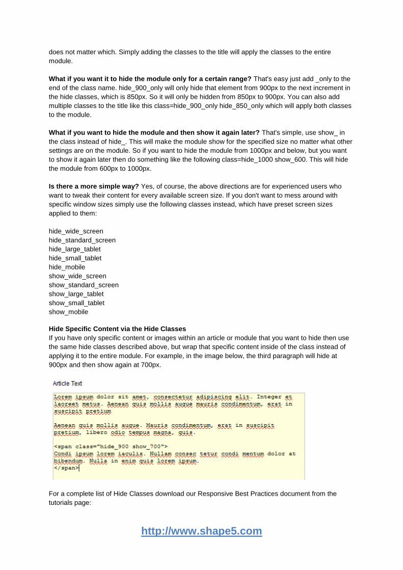
If you have only specific content or images within an article or module that you want to hide then use
the same hide classes described above, but wrap that specific content inside of the class instead of
applying it to the entire module. For example, in the image below, the third paragraph will hide at
900px and then show again at 700px.
For a complete list of Hide Classes download our Responsive Best Practices document from the
tutorials page:
http://www.shape5.com
http://www.shape5.com/joomla_tutorials.html
5. Menu
5.1 Overview
The S5 Flex Menu system is a very powerful plugin that provides functionality far beyond what the
standard Joomla menu system can provide. This plugin is intended to be as an extension of the
existing menu system in Joomla to add many new features. This plugin may only be used with
Shape5 templates specifically designed around this plugin. If a template is compatible with this plugin
it will be specified on the template's demo page at http://demo.shape5.com.
5.2 Installing the Plugin
1. If you have installed a Shape5 template using a site shaper the S5 Flex Menu plugin is already
included and installation is not necessary. If you have installed a template into an existing Joomla
installation then installation is required for the menu system to perform correctly.
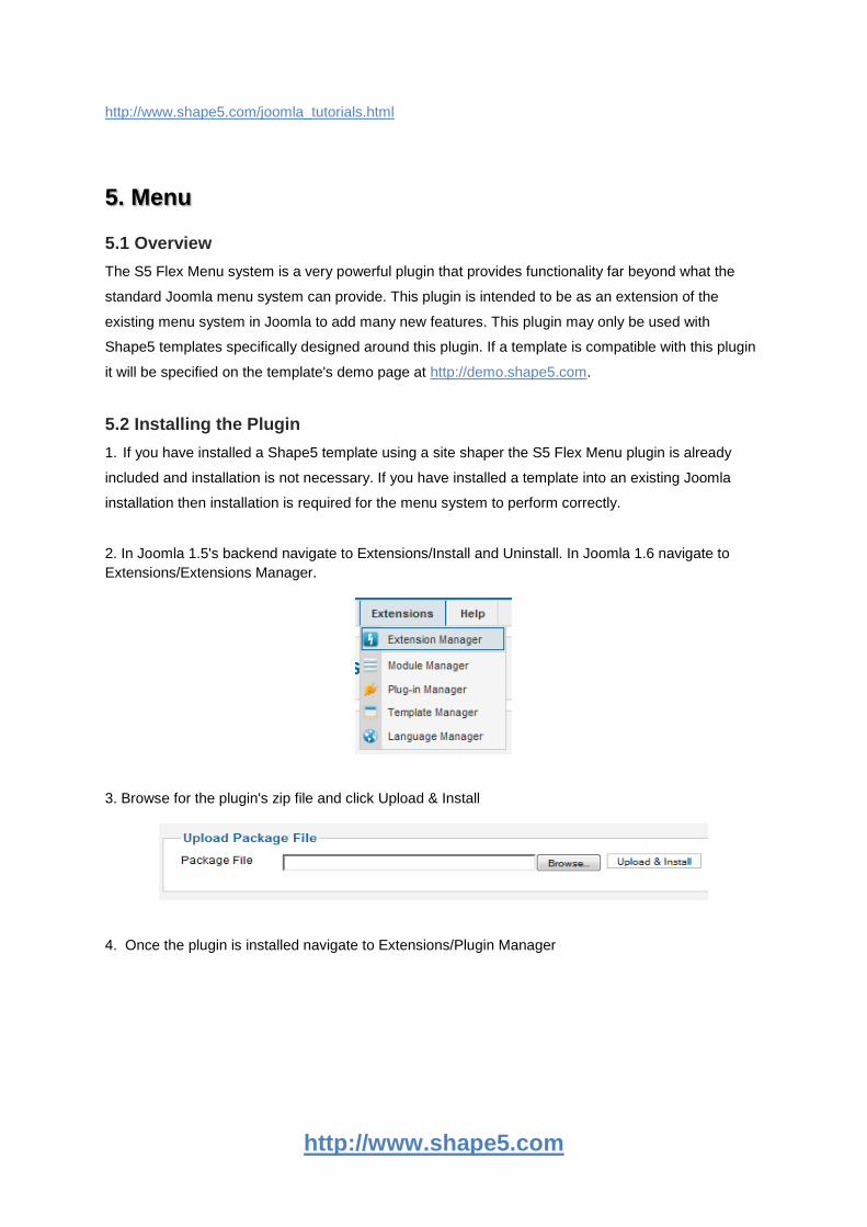
2. In Joomla 1.5's backend navigate to Extensions/Install and Uninstall. In Joomla 1.6 navigate to
Extensions/Extensions Manager.
3. Browse for the plugin's zip file and click Upload & Install
4. Once the plugin is installed navigate to Extensions/Plugin Manager
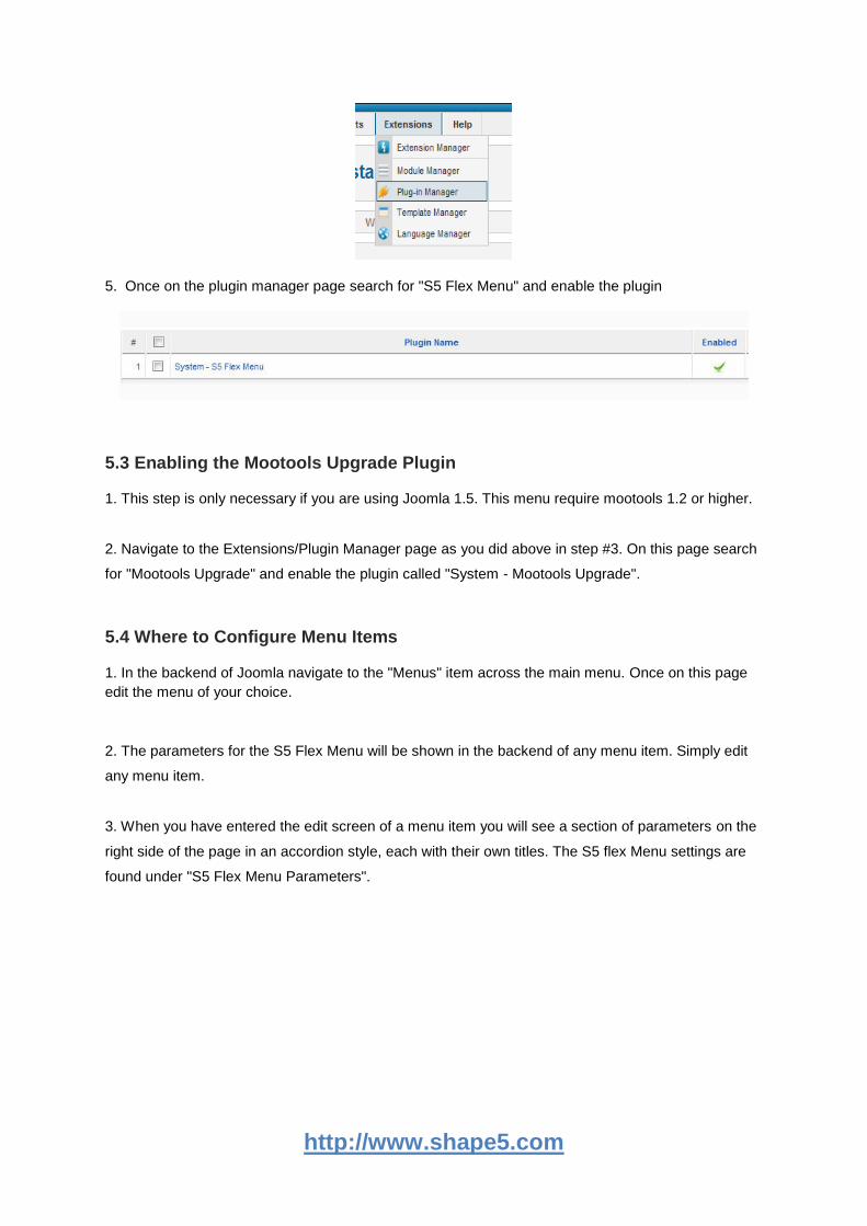
http://www.shape5.com
5. Once on the plugin manager page search for "S5 Flex Menu" and enable the plugin
5.3 Enabling the Mootools Upgrade Plugin
1. This step is only necessary if you are using Joomla 1.5. This menu require mootools 1.2 or higher.
2. Navigate to the Extensions/Plugin Manager page as you did above in step #3. On this page search
for "Mootools Upgrade" and enable the plugin called "System - Mootools Upgrade".
5.4 Where to Configure Menu Items
1. In the backend of Joomla navigate to the "Menus" item across the main menu. Once on this page
edit the menu of your choice.
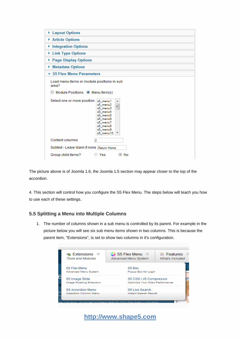
2. The parameters for the S5 Flex Menu will be shown in the backend of any menu item. Simply edit
any menu item.
3. When you have entered the edit screen of a menu item you will see a section of parameters on the
right side of the page in an accordion style, each with their own titles. The S5 flex Menu settings are
found under "S5 Flex Menu Parameters".
http://www.shape5.com
The picture above is of Joomla 1.6, the Joomla 1.5 section may appear closer to the top of the
accordion.
4. This section will control how you configure the S5 Flex Menu. The steps below will teach you how
to use each of these settings.
5.5 Splitting a Menu into Multiple Columns
1. The number of columns shown in a sub menu is controlled by its parent. For example in the
picture below you will see six sub menu items shown in two columns. This is because the
parent item, "Extensions", is set to show two columns in it's configuration.
http://www.shape5.com
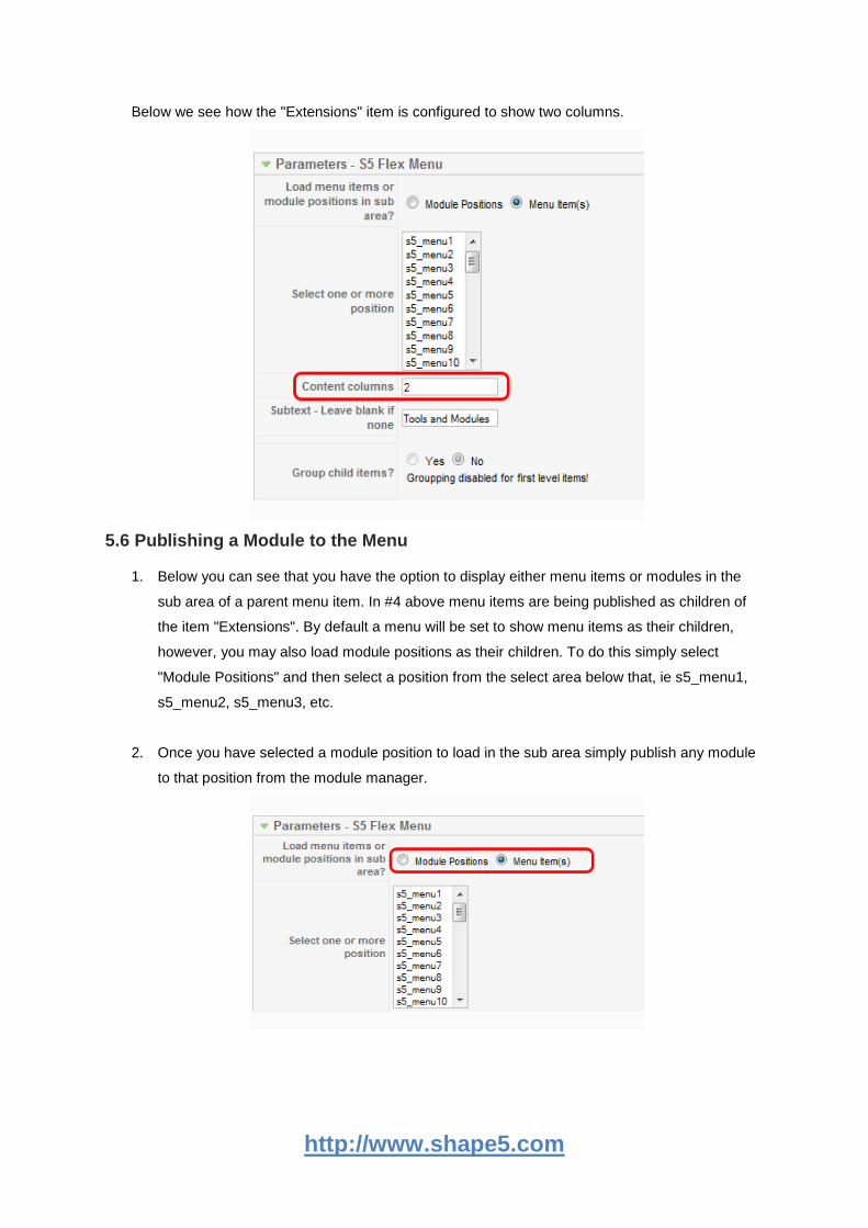
Below we see how the "Extensions" item is configured to show two columns.
5.6 Publishing a Module to the Menu
1. Below you can see that you have the option to display either menu items or modules in the
sub area of a parent menu item. In #4 above menu items are being published as children of
the item "Extensions". By default a menu will be set to show menu items as their children,
however, you may also load module positions as their children. To do this simply select
"Module Positions" and then select a position from the select area below that, ie s5_menu1,
s5_menu2, s5_menu3, etc.
2. Once you have selected a module position to load in the sub area simply publish any module
to that position from the module manager.
http://www.shape5.com
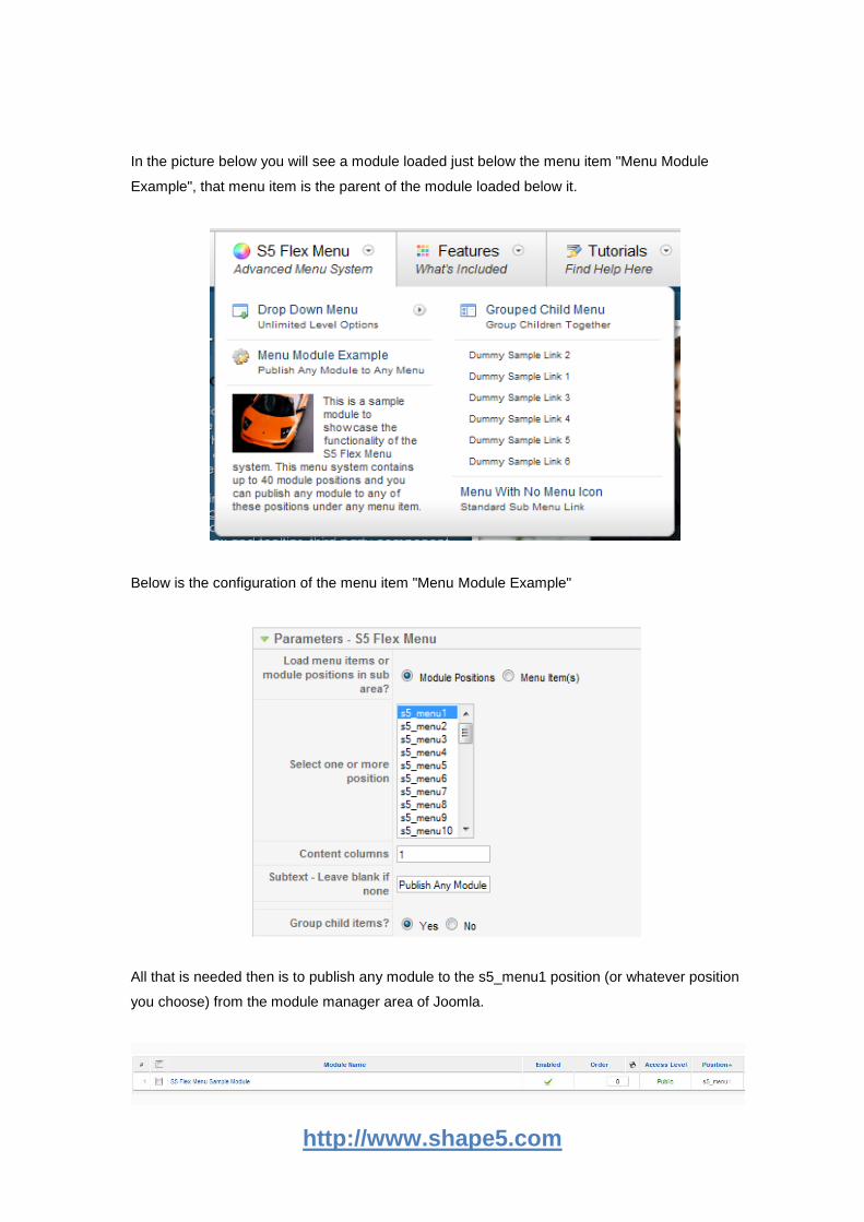
In the picture below you will see a module loaded just below the menu item "Menu Module
Example", that menu item is the parent of the module loaded below it.
Below is the configuration of the menu item "Menu Module Example"
All that is needed then is to publish any module to the s5_menu1 position (or whatever position
you choose) from the module manager area of Joomla.
http://www.shape5.com
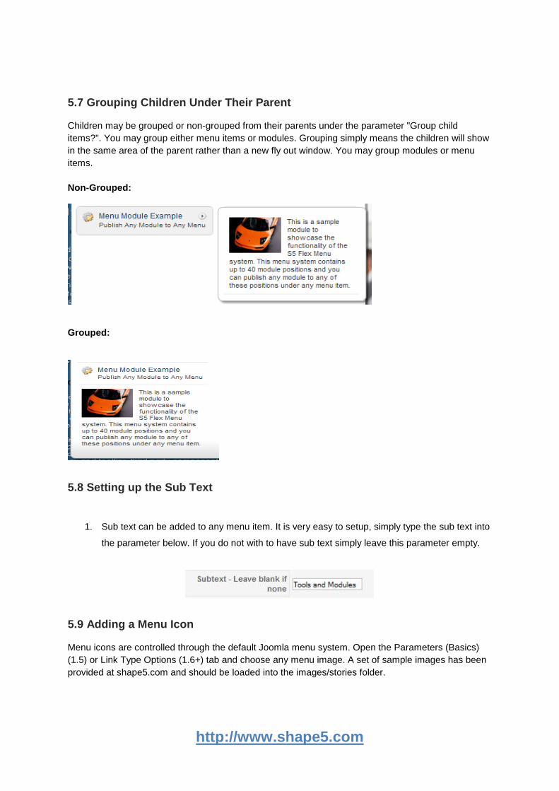
5.7 Grouping Children Under Their Parent
Children may be grouped or non-grouped from their parents under the parameter "Group child
items?". You may group either menu items or modules. Grouping simply means the children will show
in the same area of the parent rather than a new fly out window. You may group modules or menu
items.
Non-Grouped:
Grouped:
5.8 Setting up the Sub Text
1. Sub text can be added to any menu item. It is very easy to setup, simply type the sub text into
the parameter below. If you do not with to have sub text simply leave this parameter empty.
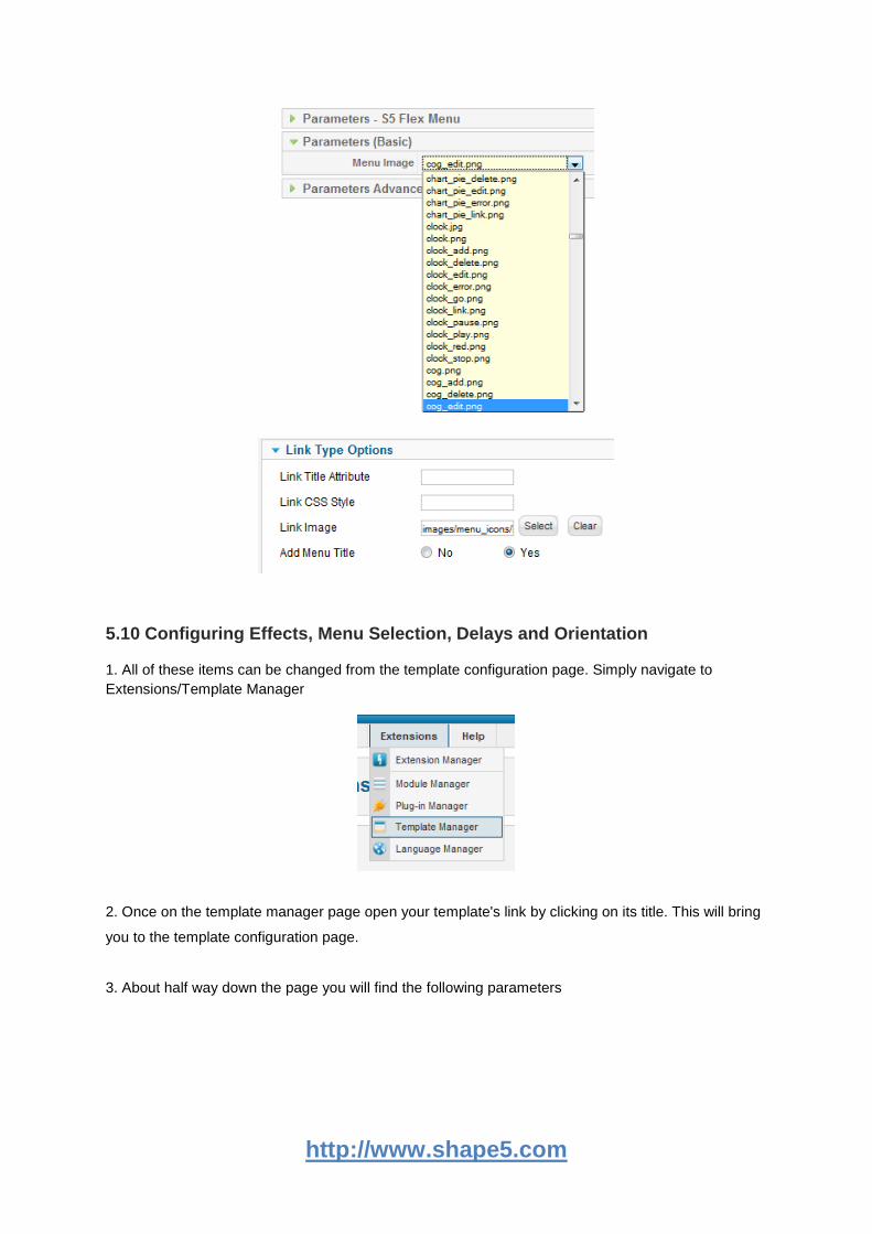
5.9 Adding a Menu Icon
Menu icons are controlled through the default Joomla menu system. Open the Parameters (Basics)
(1.5) or Link Type Options (1.6+) tab and choose any menu image. A set of sample images has been
provided at shape5.com and should be loaded into the images/stories folder.
http://www.shape5.com
5.10 Configuring Effects, Menu Selection, Delays and Orientation
1. All of these items can be changed from the template configuration page. Simply navigate to
Extensions/Template Manager
2. Once on the template manager page open your template's link by clicking on its title. This will bring
you to the template configuration page.
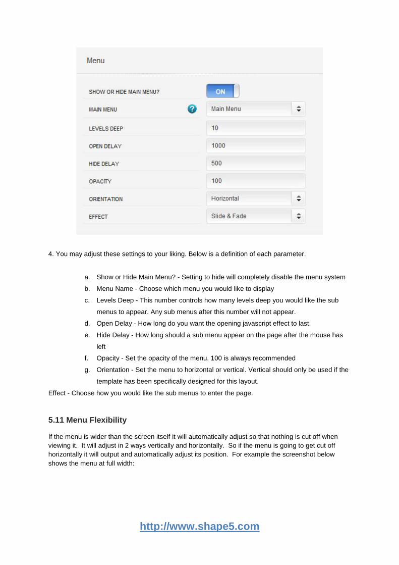
3. About half way down the page you will find the following parameters
http://www.shape5.com
4. You may adjust these settings to your liking. Below is a definition of each parameter.
a. Show or Hide Main Menu? - Setting to hide will completely disable the menu system
b. Menu Name - Choose which menu you would like to display
c. Levels Deep - This number controls how many levels deep you would like the sub
menus to appear. Any sub menus after this number will not appear.
d. Open Delay - How long do you want the opening javascript effect to last.
e. Hide Delay - How long should a sub menu appear on the page after the mouse has
left
f. Opacity - Set the opacity of the menu. 100 is always recommended
g. Orientation - Set the menu to horizontal or vertical. Vertical should only be used if the
template has been specifically designed for this layout.
Effect - Choose how you would like the sub menus to enter the page.
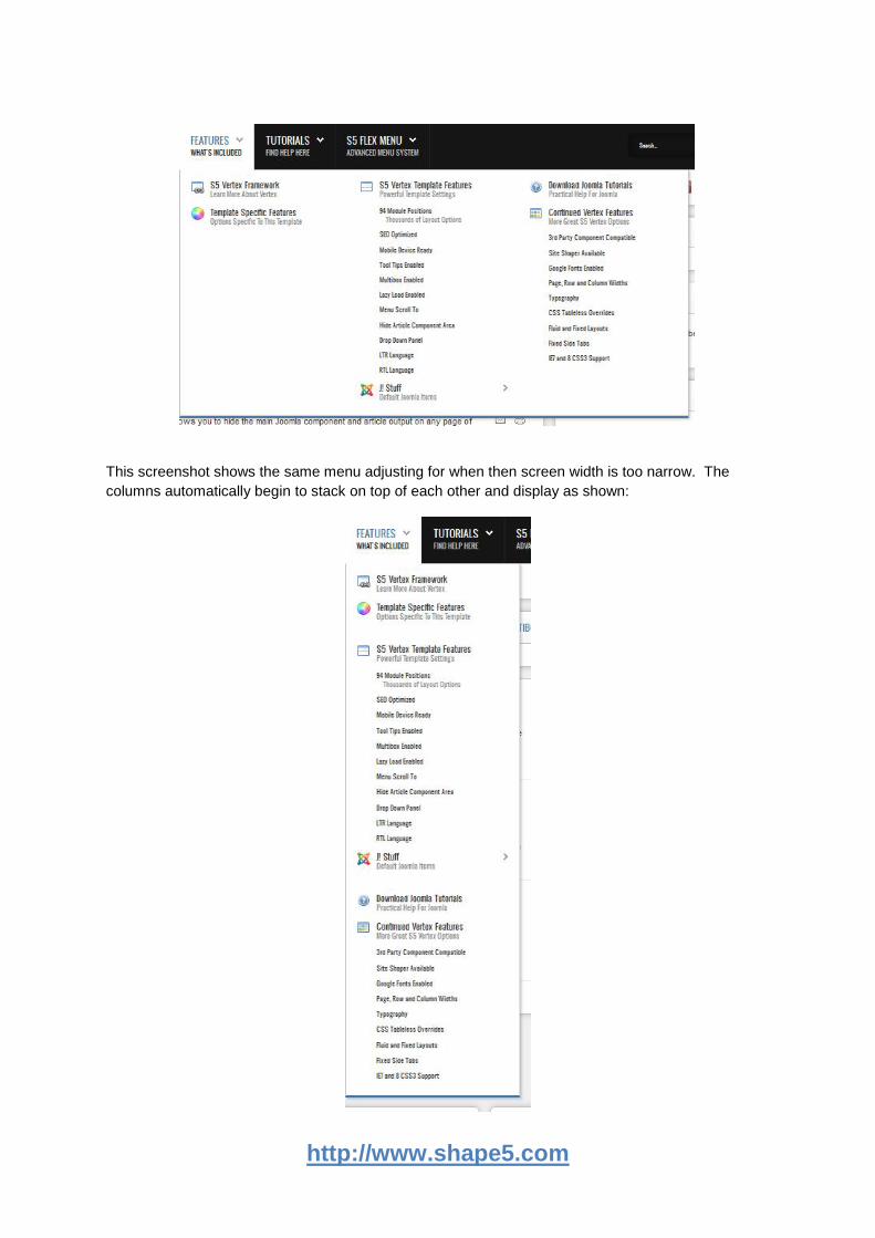
5.11 Menu Flexibility
If the menu is wider than the screen itself it will automatically adjust so that nothing is cut off when
viewing it. It will adjust in 2 ways vertically and horizontally. So if the menu is going to get cut off
horizontally it will output and automatically adjust its position. For example the screenshot below
shows the menu at full width:
http://www.shape5.com
This screenshot shows the same menu adjusting for when then screen width is too narrow. The
columns automatically begin to stack on top of each other and display as shown:
http://www.shape5.com
6. Row Sizes
6.1 Brief Overview
Infinite Layouts:
Because there are so many module positions available in so many different areas, the number of
layouts you can create are limitless! An average of 90 positions are included in each design!
For example, if you would like to show your main content area on the right side of your site but still
have a column of modules, simply published your modules to the right or right_inset positions or both.
The same would be true for the opposite, if you want a column on the left simply publish modules to
left or left_inset. Of course you can always choose to not have a column at all. Remember, any
module not published to will automatically collapse and the remaining area will automatically adjust.
There is no need to choose a pre-defined layout for your entire site, simply use the power of
collapsing module positions and take advantage of the numerous amounts of module positions to
create any layout you can dream of! Be sure to checkout the layout of modules below.
All modules are fully collapsible:
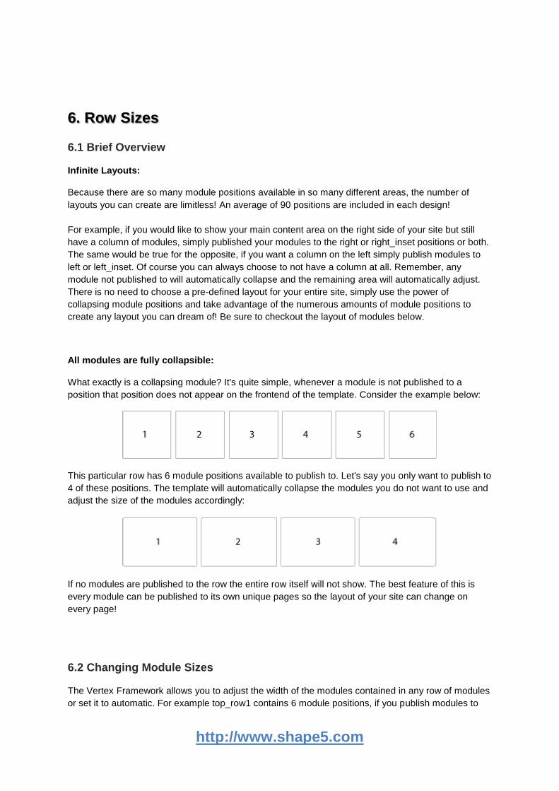
What exactly is a collapsing module? It's quite simple, whenever a module is not published to a
position that position does not appear on the frontend of the template. Consider the example below:
This particular row has 6 module positions available to publish to. Let's say you only want to publish to
4 of these positions. The template will automatically collapse the modules you do not want to use and
adjust the size of the modules accordingly:
If no modules are published to the row the entire row itself will not show. The best feature of this is
every module can be published to its own unique pages so the layout of your site can change on
every page!
6.2 Changing Module Sizes
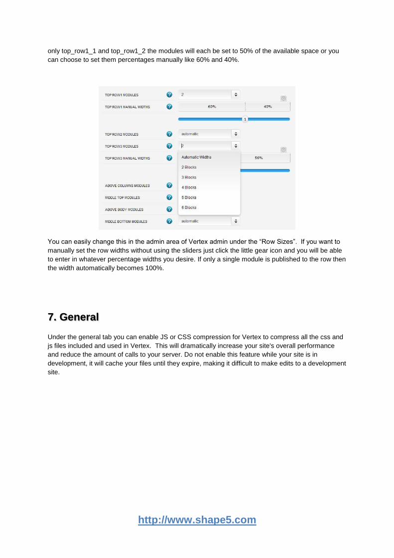
The Vertex Framework allows you to adjust the width of the modules contained in any row of modules
or set it to automatic. For example top_row1 contains 6 module positions, if you publish modules to
http://www.shape5.com
only top_row1_1 and top_row1_2 the modules will each be set to 50% of the available space or you
can choose to set them percentages manually like 60% and 40%.
You can easily change this in the admin area of Vertex admin under the “Row Sizes”. If you want to
manually set the row widths without using the sliders just click the little gear icon and you will be able
to enter in whatever percentage widths you desire. If only a single module is published to the row then
the width automatically becomes 100%.
7. General
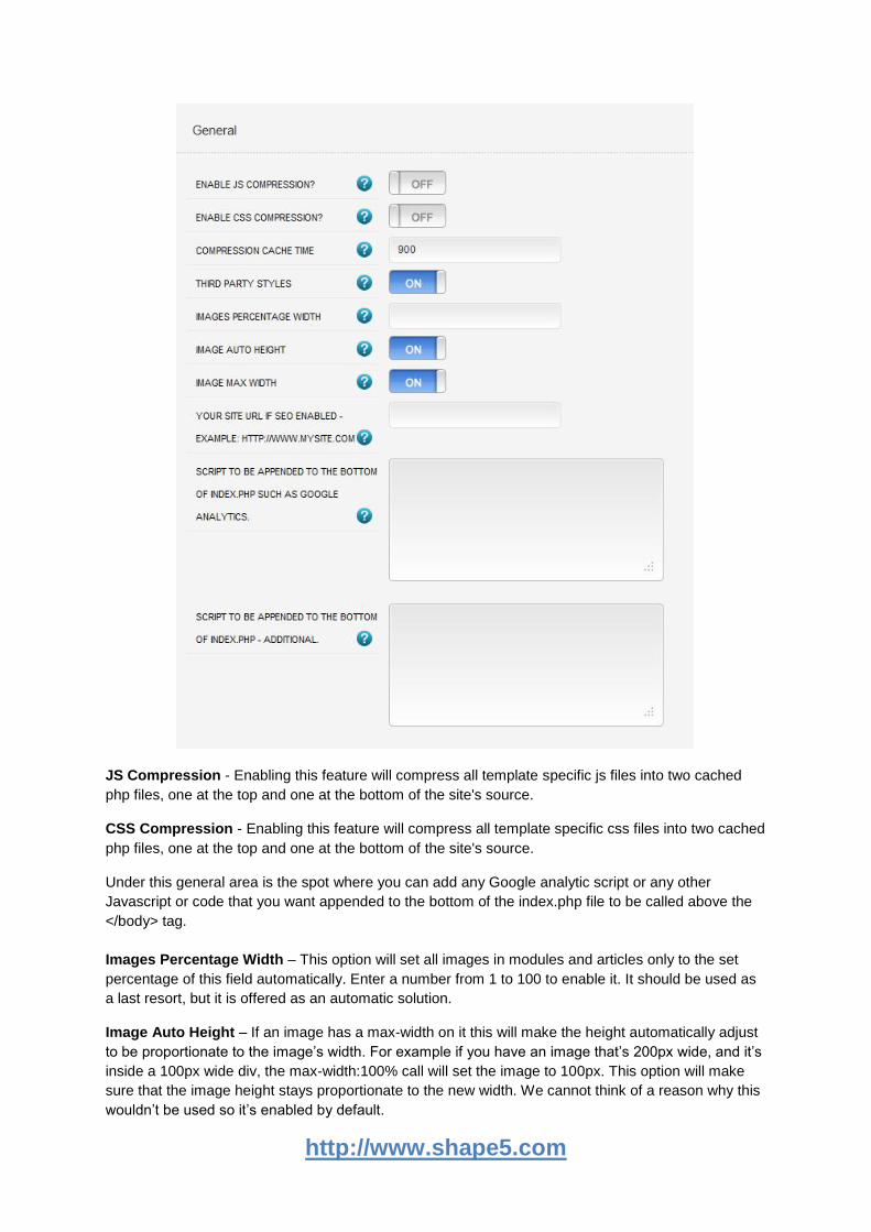
Under the general tab you can enable JS or CSS compression for Vertex to compress all the css and
js files included and used in Vertex. This will dramatically increase your site's overall performance
and reduce the amount of calls to your server. Do not enable this feature while your site is in
development, it will cache your files until they expire, making it difficult to make edits to a development
site.
http://www.shape5.com
JS Compression - Enabling this feature will compress all template specific js files into two cached
php files, one at the top and one at the bottom of the site's source.
CSS Compression - Enabling this feature will compress all template specific css files into two cached
php files, one at the top and one at the bottom of the site's source.
Under this general area is the spot where you can add any Google analytic script or any other
Javascript or code that you want appended to the bottom of the index.php file to be called above the
</body> tag.
Images Percentage Width – This option will set all images in modules and articles only to the set
percentage of this field automatically. Enter a number from 1 to 100 to enable it. It should be used as
a last resort, but it is offered as an automatic solution.
Image Auto Height – If an image has a max-width on it this will make the height automatically adjust
to be proportionate to the image’s width. For example if you have an image that’s 200px wide, and it’s
inside a 100px wide div, the max-width:100% call will set the image to 100px. This option will make
sure that the image height stays proportionate to the new width. We cannot think of a reason why this
wouldn’t be used so it’s enabled by default.
http://www.shape5.com
Image Max Width – This option makes sure that images cannot become larger than their available
space. Enabling this feature will set images to a max-width of 100% (meaning 100% of the
surrounding element’s width). This option is highly recommended to keep enabled.
Hide Component Area:
You can choose whether or not show the content/component area on the frontpage. If you choose no
you must have a module published in one of the following rows: middle_top, above_body,
below_body, or middle_bottom, or the layout will not show correctly because no middle column will be
present. If you choose no and disable all modules published to the main, middle area of the site, ie:
left, right, left_inset, above_body, etc. then entire middle section will collapse.
Optional Login and Register URLs:
By default the login and register links found at the bottom of the General tab are designed to work
with the S5 Box module. However, you can override this and simply enter your own custom urls that
the website will redirect to onclick.
8. Javascripts
The scripts mentioned in this section will need to be entered into the html source viewer of your editor.
Each javascript needs to be enabled under the Javascripts tab in the configuration.
8.1 Multibox
Supports a range of multimedia formats: images, flash, video, mp3s, html!
Auto detects formats or you can specify the format
Html descriptions
Grouping of images, videos, etc
Enable/Disable page overlay when multibox pops up (via template parameters)
Enable/Disable controls (via template parameters)
http://www.shape5.com
To enable multibox use the following around any image. Below are 3 examples of multibox used on
some images:
<a href="http://www.shape5.com/demo/images/multibox1_lrg.jpg" id="mb1" class="s5mb" title="Image
Example #1:"> <img src="http://www.shape5.com/demo/images/multibox1.jpg" class="boxed" alt="" />
</a> <div class="s5_multibox mb2">Multiple Image #1. It can support <strong>html</strong>.</div>
<a href="http://www.shape5.com/demo/images/multibox2_lrg.jpg" id="mb2" class="s5mb" title="
Image Example #2:"> <img src="http://www.shape5.com/demo/images/multibox2.jpg" class="boxed"
alt="" /> </a> <div class="s5_multibox mb3">Multiple Image #2. It can support
<strong>html</strong>.</div>
<a href="http://www.shape5.com/demo/images/multibox3_lrg.jpg" id="mb3" class="s5mb" title="
Image Example #3:"> <img src="http://www.shape5.com/demo/images/multibox3.jpg" class="boxed"
alt="" /> </a> <div class="s5_multibox mb4">Multiple Image #3. It can support
<strong>html</strong>.</div>
How to group the above images?:
To group images you simply add in a name to the rel tag, which is called inside of the <a>. You can
make up any name but just be sure to use that same name in all the images you want to show in a
particular group. For example to add images under a group named called “firstset” you would do the
following using rel="[firstset]" on each item:
<a href="http://www.shape5.com/demo/images/multibox1_lrg.jpg" id="mb1" rel="[firstset]"
class="s5mb" title="Grouped Image Example #1:"> <img
src="http://www.shape5.com/demo/images/multibox1.jpg" class="boxed" alt="" /> </a> <div
class="s5_multibox mb2">Multiple Image #1. It can support <strong>html</strong>.</div>
<a href="http://www.shape5.com/demo/images/multibox2_lrg.jpg" id="mb2" rel="[firstset]"
class="s5mb" title="Grouped Image Example #2:"> <img
src="http://www.shape5.com/demo/images/multibox2.jpg" class="boxed" alt="" /> </a> <div
class="s5_multibox mb3">Multiple Image #2. It can support <strong>html</strong>.</div>
<a href="http://www.shape5.com/demo/images/multibox3_lrg.jpg" id="mb3" rel="[firstset]"
class="s5mb" title="Grouped Image Example #3:"> <img
src="http://www.shape5.com/demo/images/multibox3.jpg" class="boxed" alt="" /> </a> <div
class="s5_multibox mb4">Multiple Image #3. It can support <strong>html</strong>.</div>
Youtube Example:
You can use the following video formats: flv, mov, wmv, real and swf. Just insert the URL to the
videos in the href of the hyperlink, here is an example of how we did this for a Youtube video:
<a href="http://www.youtube.com/v/VGiGHQeOqII" id="youtube" class="s5mb" title="Youtube.com
Video"> Youtube.com Video - CLICK ME </a> <div class="s5_multibox youtube">UP: Carl and Ellie
</div>
How to grab proper youtube video URL?:
http://www.shape5.com
YouTube Tutorial: Simply right click on a youtube video and copy the embed code, then paste into a
text editor and look for the embed src and use that URL in your hyperlink.
<embed src= http://www.youtube.com/v/VGiGHQeOqII
MP3 Example:
<a href="http://www.shape5.com/demo/images/music.mp3" id="mb8" class="s5mb"
title="Music">MP3 example</a> <div class="s5_multibox mb8">mp3 example - CLICK ME</div>
iFrame Example:
<a href="http://www.getfirebug.com" rel="width:790,height:600" id="mb28" class="s5mb"
title="http://getfirebug.com/">iFrame/HTML Example - CLICK ME</a> <div class="s5_multibox
mb28">getfirebug.com</div>
8.2 Lazy Load
The lazy load script is a great way to save bandwidth and load your pages much faster. Images that
are not visible on the initial page load are not loaded or downloaded until they come into the main
viewing area. Once an image comes into view it is then downloaded and faded into visibility.
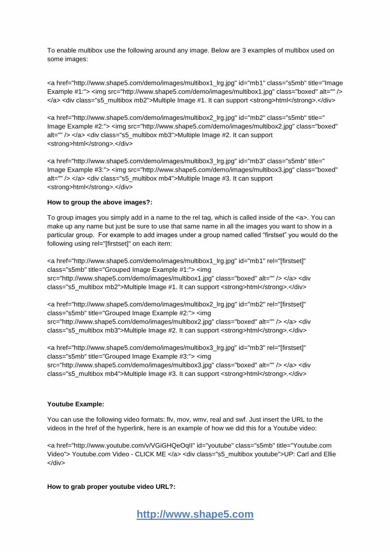
Setup is very easy! By default this script is disabled, in order to enable it simply choose All Images or
Individual Images from the drop down, as shown below from inside the template configuration page.
“All Images” will load every standard image on the page with lazy load. There is no extra configuration
or extra code to add with this configuration, it will just happen automatically. Individual images would
be used if you want only certain images to load with this script and not all of them. To do this simply
add class="s5_lazyload" to the image like this:
<img class="s5_lazyload" src="image.jpg"></img>
8.3 Tooltips
Note - The tool tips script is by default disabled. If you wish to use it you must enable this script in the
template's configuration area. This also includes site shaper installations.
http://www.shape5.com
Single Image:
<a onmouseover="Tip('This is a sample tooltip.', WIDTH, 140, OPACITY, 80, ABOVE, true,
OFFSETX, 1, FADEIN, 200, FADEOUT, 300,SHADOW, true, SHADOWCOLOR,
'#000000',SHADOWWIDTH, 2, BGCOLOR, '#000000',BORDERCOLOR, '#000000',FONTCOLOR,
'#FFFFFF', PADDING, 9)" href="http://www.shape5.com/demo/etensity/">
<img class="boxed2" alt="" src="http://www.shape5.com/demo/smart_blogger/images/tooltip.jpg"/>
</a>
Image with Tooltip:
<a href="/demo/salon_n_spa/index.htm" onmouseover="Tip('Image Demo
<img src=http://www.shape5.com/demo/smart_blogger/images/tooltip.jpg width=220
height=147>')">Demo 2 Image Tool Tip </a>
Image with Tooltip:
<a href="#" onmouseover="Tip('Image Demo<br /> <br /><img
src=http://www.shape5.com/demo/smart_blogger/images/tooltip.jpg width=220
height=147>',SHADOW, true, BGCOLOR, '#000000', FADEIN, 400, FADEOUT, 400,
SHADOWCOLOR, '#000000', BORDERCOLOR, '#000000',OPACITY, 90,FONTCOLOR,
'#FFFFFF')"><strong>Demo 3 Image Tool Tip</strong></a>
8.3 Info Slide
The info slide script is a great way to display your content to your customers! It will place a sliding text
box over any image on the page. It can be placed inside of content or modules. It will also
automatically adjust to any size screen size on window resize. You can have as many as you need on
the same page. To use this feature your code will look like this.
<div class="s5_is">
<img alt="description" src="image.jpg"></img>
<div class="s5_is_slide">
<h3>Example Slide</h3>
This is dummy text. You can add any text or html markup here.
</div>
</div>
9. Fixed Tabs
This is a side tab option that you can enable and publish on your site and will show in a fixed position
on either the left or right side of the screen. The great feature about the fixed tabs is that you can
http://www.shape5.com
enter any text you desire and the text is automatically flipped vertically! This is great for search
engines to read your text and also saves the hassle of creating an image with vertical text and placing
it on the side of your site. The tabs are published site wide and can have the following options that
can be changed via the template parameters area and can link to any URL that you desire.
The following is a quick list of features:
Change background to any hex color
Change the border to any hex color
Change the font to any hex color
Set vertical position of each tab
Set the height of each tab
Set each tab to either the left or right of the screen
Add a class to each fixed tab to enable s5 box or perhaps a lightbox or other 3rd party
extension
Add a URL to each fixed tab so onclick the URL loads
Enter any text you desire
10. Drop Down
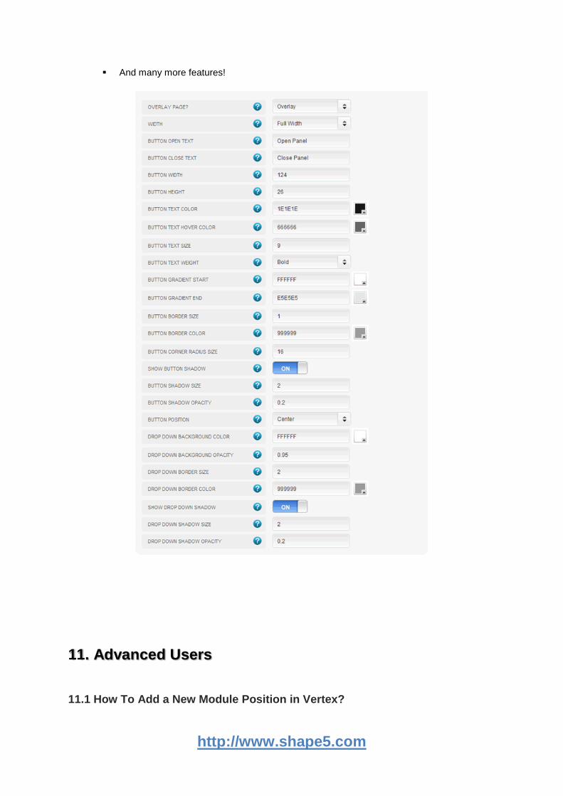
The S5 Drop Down Panel itself contains six module positions. You may publish any module that you
wish into these positions. It comes packed with features so be sure to check out the list and
screenshot below.
Customize almost everything! Shadows, borders, gradient, opacity
Contains 6 module positions drop_down_1, drop_down_2, drop_down_3, drop_down_4, drop_down_5 and drop_down_6
Auto adjust to the height of your content
Set your own open and close text
Auto collapse if no modules are published to it
http://www.shape5.com
And many more features!
11. Advanced Users
11.1 How To Add a New Module Position in Vertex?
http://www.shape5.com
1. To add a new module position to your template you can simply do so by using the following code:
<?php s5_module_call('yourposition','notitle'); ?>
"yourposition" would be replaced with the new module position you would like to add, we'll
just call it "yourposition" for reference.
2. Next you'll need to open up the templatedetails.xml file found in the template’s folder and look for:
<positions>
You will then need to add your new position here so in your Joomla admin area you can
select your newly added module position:
<position>yourposition</position>
3. If you want to make this new module position collapse you simply wrap it with <?php if
(s5_countmodules('yourposition') { ?> as follows:
<?php if (s5_check_module('yourposition')) {
s5_module_call('yourposition','notitle');
} ?>
11.2 How To Add New Admin Options?
1. The following will show you how to add a new admin option under the “Template Specific” area of
the Vertex admin area. First you will need to open up the “specific.xml” file which is located here:
\templates\templatename\xml\specific.xml
2. Next you will need to add your new field name definition, you will see several already there so you
can just add a new one anywhere between the current ones listed. You simply would add something
like the below, changing “yournamehere” to whatever you want to call your new option:
<field name="xml_yournamehere" type="text" default="" label="enter your label here"
description="enter your description here for your new option" />
3. When adding options in vertex you php variable will be everything after the “xml_” so for example
from the above you can determine that your php variable will be “yournamehere” so outputting the
below in your index.php file will then output your new admin option. Its as simple as that!
<?php echo $yournamehere; ?>
4. So now that you have your new admin option outputting in your index.php file you may want to
hide it and any surrounding DIVs if nothing is published to it in the admin, so to do this you’d simply
do the following:
<?php if ($yournamehere != "") { ?>
<div>
<?php echo $yournamehere; ?>
</div>
http://www.shape5.com
Whatever you put in here will be hidden if nothing is published to the admin option you
created.
<?php } ?>
5. Perhaps you want to create an option that gives a choice in the admin vs just a plain text box, to
do this you would follow suite the following. The “option label here” text can be changed to whatever
you desire but the “option1” that is referenced by value is what you’ll use in your php if statement to
determine which option to output:
<field name="xml_yournamehere" type="select:list" default="horizontal" label="label here"
description="description here">
<option value="option1">option label here</option>
<option value="option2"> option 2 label here </option>
</field>
So notice below for the php if statement notice how its referencing the admin options:
<?php if ($yournamehere == "option1") { ?>
To use in your index.php file you would do the following and it would only output if the “option1” was
selected in the Vertex admin area.:
<?php if ($yournamehere == "option1") { ?>
<div>
<?php echo $yournamehere; ?>
</div>
Whatever you put in here will be hidden if anything besides option1 is selected
<?php } ?>
6. The following is a list of all types supported in Vertex fields, as well as default fields, that you can
use when creating or edit admin options:
type="radio" vars="yes:no|Yes:No" default="yes"
type="text"
type="menu_list" default="mainmenu"
type="select:list" default="automatic"
type="textarea" filter=”raw”
type="spacer"
type="text:6:6" default="838383" size="6"
type="multselect" default=""
http://www.shape5.com
11.3 Where are all the Joomla functions defined?
The following file is where all Joomla fuctions are defined, modules, component output, etc:
\templates\templatename\vertex\cms_core_functions.php
This is done so that no Joomla calls are made in the index.php file.
12. FAQ
Q. The language file won't load in the backend of Vertex?
A. If you created the site with jUpgrade. Go into your user account, selected Front end and Back end
language and then save. Go to Template Manager and it was fine. All you should have to do is re-
save your user profile and that should clear it up.
Q. The frontend of my site is all messed up, there is no width?
A. If you just installed the template be sure to save it also so that the settings may take place and be
saved so the frontend can use them.
Q. I can’t save in the Vertex admin?
A. Make sure your vertex.json file is writable test with CHMOD 777 to be sure. The file is located here
“templates/templatename/vertex.json”
Q. Multibox won’t load in IE8?
A. Make sure IE8 has flash installed.