question 7
TRANSCRIPT
WHAT HAVE I LEARNT FROM MY PRELIMINARY
TASK?QUESTION 7
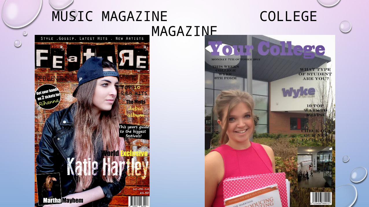
MUSIC MAGAZINE COLLEGE MAGAZINE
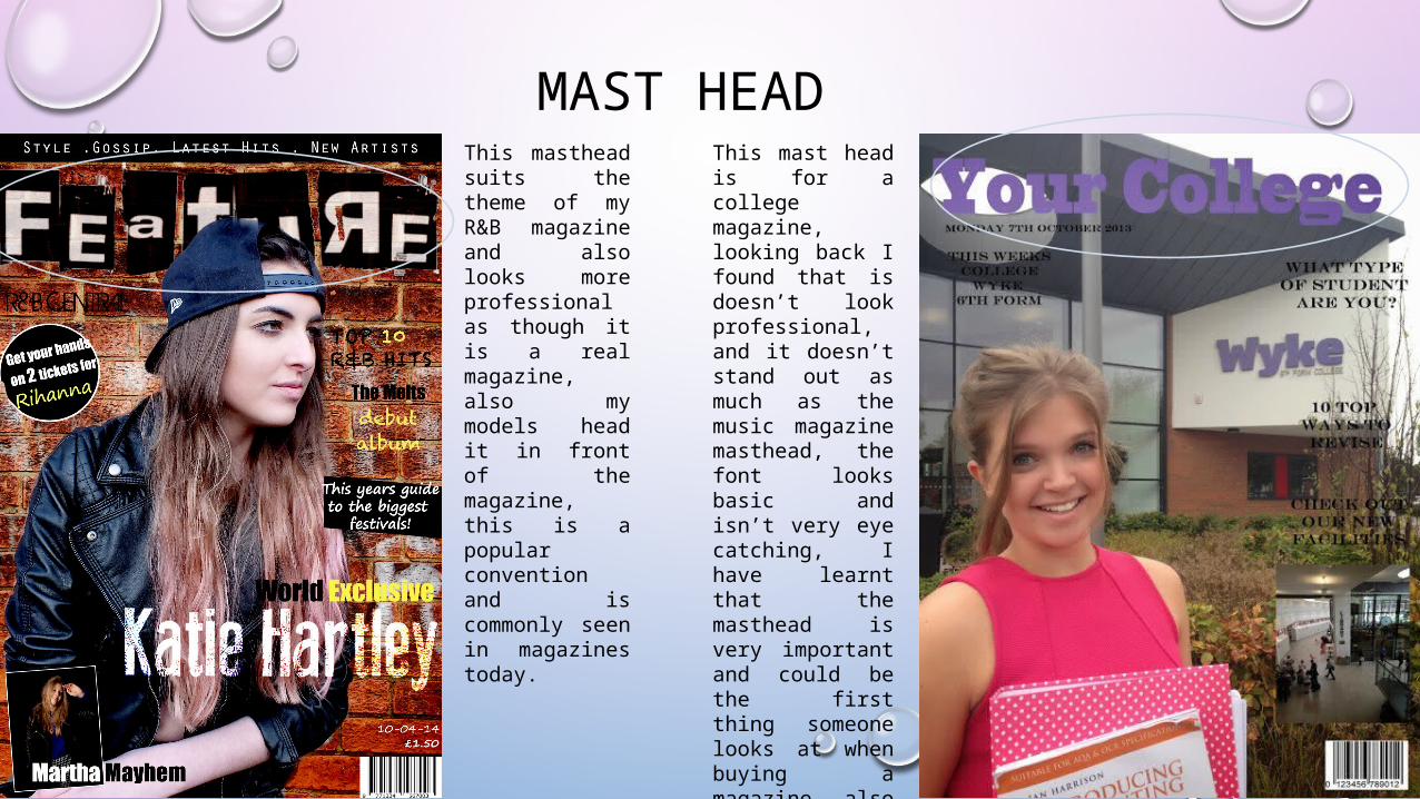
MAST HEADThis masthead suits the theme of my R&B magazine and also looks more professional as though it is a real magazine, also my models head it in front of the magazine, this is a popular convention and is commonly seen in magazines today.
This mast head is for a college magazine, looking back I found that is doesn’t look professional, and it doesn’t stand out as much as the music magazine masthead, the font looks basic and isn’t very eye catching, I have learnt that the masthead is very important and could be the first thing someone looks at when buying a magazine, also it gives the magazine an identity.
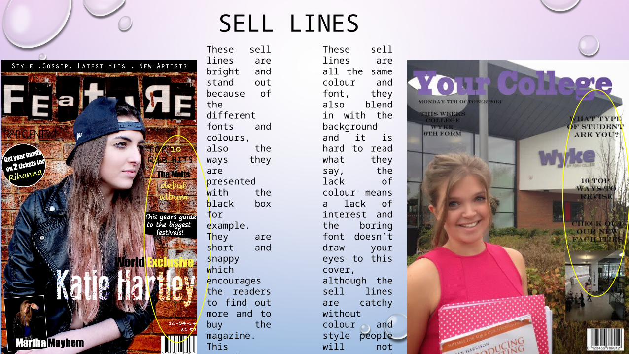
SELL LINESThese sell lines are bright and stand out because of the different fonts and colours, also the ways they are presented with the black box for example.They are short and snappy which encourages the readers to find out more and to buy the magazine. This magazine also has a headline when the college magazine doesn’t.
These sell lines are all the same colour and font, they also blend in with the background and it is hard to read what they say, the lack of colour means a lack of interest and the boring font doesn’t draw your eyes to this cover, although the sell lines are catchy without colour and style people will not want to read them to know what this magazine involves.
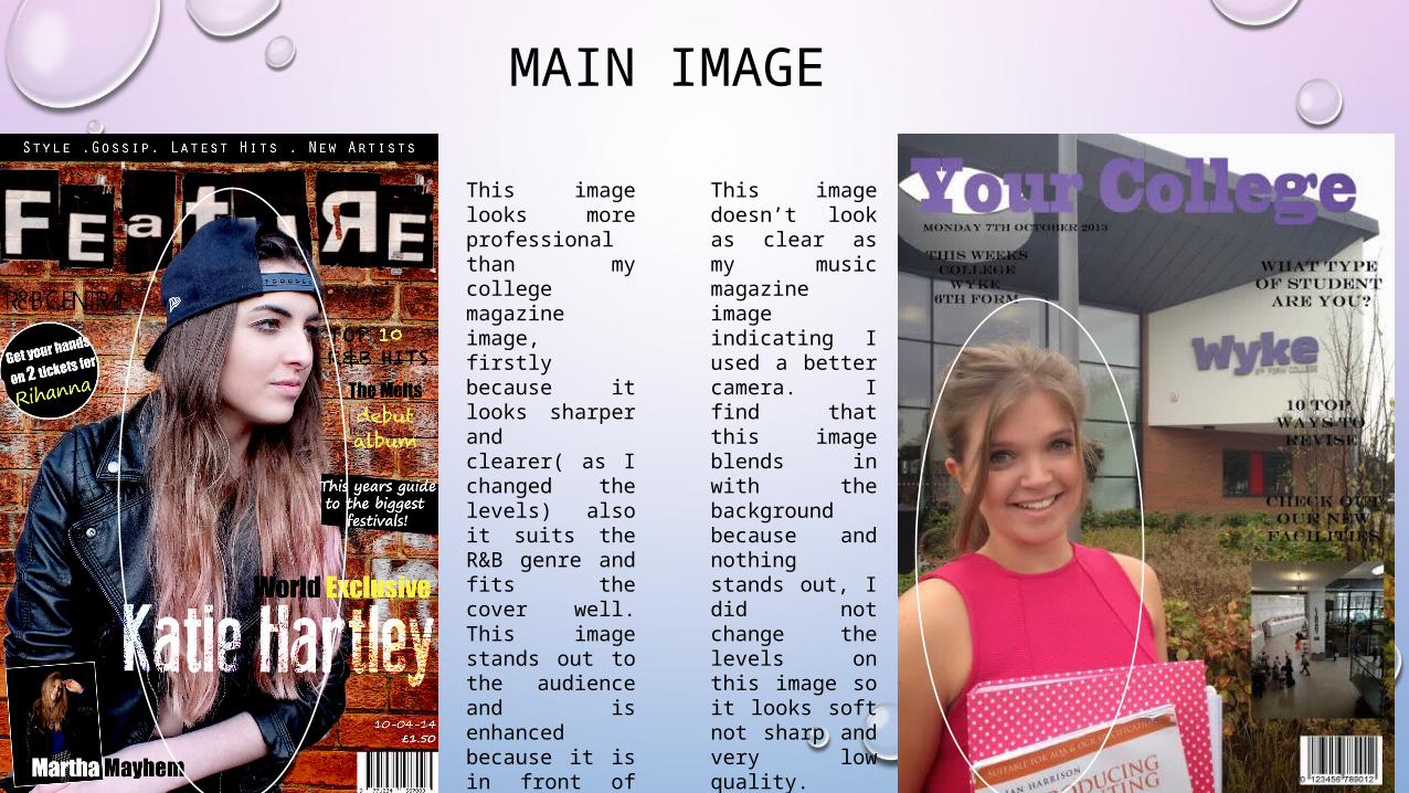
MAIN IMAGE
This image looks more professional than my college magazine image, firstly because it looks sharper and clearer( as I changed the levels) also it suits the R&B genre and fits the cover well. This image stands out to the audience and is enhanced because it is in front of the masthead creating a 3D effect.
This image doesn’t look as clear as my music magazine image indicating I used a better camera. I find that this image blends in with the background because and nothing stands out, I did not change the levels on this image so it looks soft not sharp and very low quality.
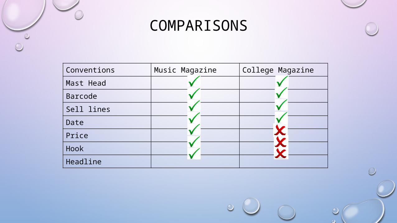
COMPARISONS
Conventions Music Magazine College Magazine
Mast Head
Barcode
Sell lines
Date
Price
Hook
Headline
HOW I HAVE IMPROVED/WHAT HAVE I LEARNT?
• I HAVE IMPROVED MY LEARING HOW TO USE PHOTOSHOP FULLY.
• ALSO BY RESEARCHING PRODUCTS MORE I GOT A BETTER UNDERSTANDING FOR WHAT CONVENTIONS WERE NEEDED IN MY MAGAZINE.
• BY DRAFTING MY PRODUCT A LOT I LEARNT WHERE I NEEDED TO IMPROVE BECAUSE I COULD SEE WHERE I WENT WRONG.
• I HAVE IMPROVED MY UNDERSTANDING OF MAGAZINE CONVENTIONS AND WHAT WILL ATTRACT AN AUDIENCE.