question 1
TRANSCRIPT

Evaluation
In what ways does your media product use, develop or challenge forms and
conventions of real media texts ?
FRONT COVER
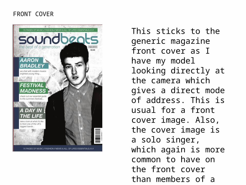
This sticks to the generic magazine front cover as I have my model looking directly at the camera which gives a direct mode of address. This is usual for a front cover image. Also, the cover image is a solo singer, which again is more common to have on the front cover than members of a band. The cover lines jump out at the reader and enhance their view.

Contents PageThe main way my contents page has stuck to the usual format is the grouping of the different features within the magazine, this is very common within professional contents pages.
I have also highlighted the more important articles by the size that they are on the page, again this is typical on a contents page to be presented to the reader.
I have used subheadings to group the different features along with images which will grab the readers attention, the pictures are only present in the more important articles to prioritise the readers attention.

My double page spread uses the large whole page image to grab the readers attention instantly, this is also enhanced with the pulled quote layering the picture which will also appeal to the reader.
I have used a question and answer interview for my article as this sort of article is very popular within the modern day magazines.
I have used the columns to separate the text within the article, this is a convention used in many magazines as it looks more pleasing and it is also easier for the reader to follow.
Double Page Spread
Masthead
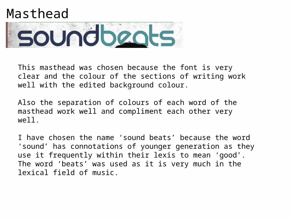
This masthead was chosen because the font is very clear and the colour of the sections of writing work well with the edited background colour.
Also the separation of colours of each word of the masthead work well and compliment each other very well.
I have chosen the name ‘sound beats’ because the word ‘sound’ has connotations of younger generation as they use it frequently within their lexis to mean ‘good’. The word ‘beats’ was used as it is very much in the lexical field of music.

Skyline
I chose to use this as my skyline because the statements are very powerful yet they inform the reader of what they are going to find within the music magazine.
The colour of white font on the blocked green background works well together as the white font is highlighted.
The use of the number when it is telling the reader how many pages there are, this is a good way of showing the reader that there is a lot of content within the music magazine and its all relevant.
Cover Lines
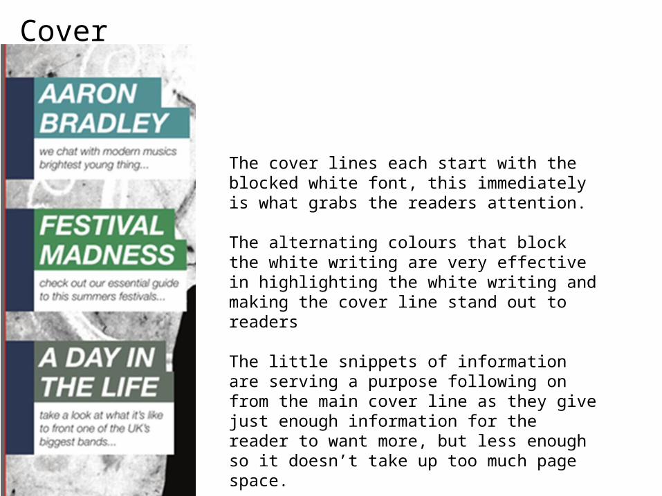
The cover lines each start with the blocked white font, this immediately is what grabs the readers attention.
The alternating colours that block the white writing are very effective in highlighting the white writing and making the cover line stand out to readers
The little snippets of information are serving a purpose following on from the main cover line as they give just enough information for the reader to want more, but less enough so it doesn’t take up too much page space.

Imagery
The image of this front cover is powerful therefore it grabs the readers attention instantly. The editing that has been done to pale out the background colour highlights the model as he is wearing dark clothes. Therefore, the contrast is effective in highlighting the model.
The solo model is very common of a mainstream magazine, as they know that they are well branded enough to draw readers in through a powerful image.
Subscribe
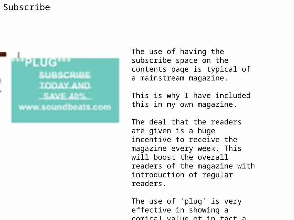
The use of having the subscribe space on the contents page is typical of a mainstream magazine.
This is why I have included this in my own magazine.
The deal that the readers are given is a huge incentive to receive the magazine every week. This will boost the overall readers of the magazine with introduction of regular readers.
The use of ‘plug’ is very effective in showing a comical value of in fact a very business orientated idea. This is used in existing magazines that I looked at.

Pull Quotes
The use of pull quotes within a magazines double page spread is very common as a lot of magazines do use these.
The pull quote will be one of the first things that the readers notices as it is layered on top of the main image.