q3 final products audience feedback
TRANSCRIPT
Final Products Audience Feedback
Trailer, Magazine cover, Poster

Trailer
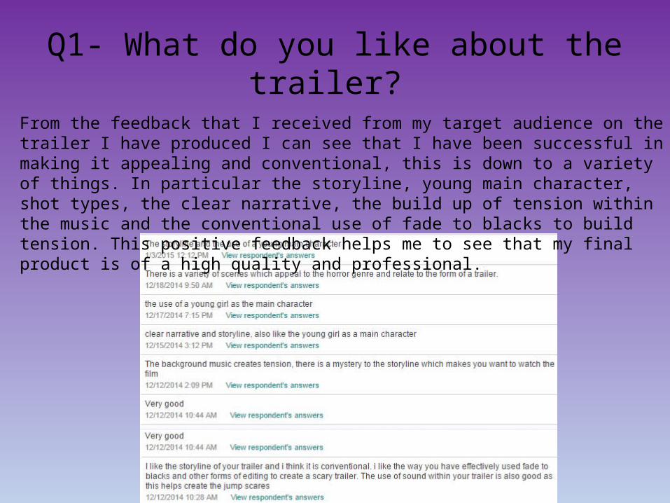
Q1- What do you like about the trailer? From the feedback that I received from my target audience on the trailer I have produced I can see that I have been successful in making it appealing and conventional, this is down to a variety of things. In particular the storyline, young main character, shot types, the clear narrative, the build up of tension within the music and the conventional use of fade to blacks to build tension. This positive feedback helps me to see that my final product is of a high quality and professional.
Q2- Do you feel there are any improvements to be made? If so what?
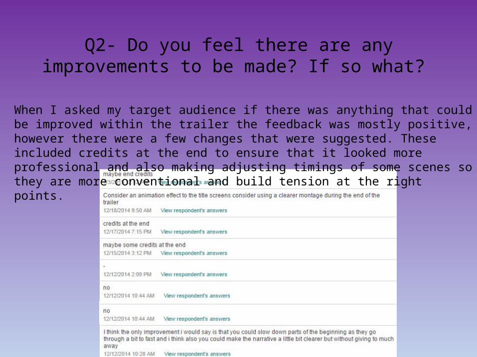
When I asked my target audience if there was anything that could be improved within the trailer the feedback was mostly positive, however there were a few changes that were suggested. These included credits at the end to ensure that it looked more professional and also making adjusting timings of some scenes so they are more conventional and build tension at the right points.
Q3- Do you think my trailer is conventional to the horror genre?
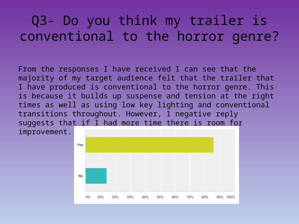
From the responses I have received I can see that the majority of my target audience felt that the trailer that I have produced is conventional to the horror genre. This is because it builds up suspense and tension at the right times as well as using low key lighting and conventional transitions throughout. However, 1 negative reply suggests that if I had more time there is room for improvement.

Q4- Does this trailer include everything you would expect from the format of a trailer?
When I asked members of my target audience if the format of my trailer is everything that you would expect from a professional trailer all of my target audience answered ‘Yes’. This shows me that it is conventional to form and includes many different aspects that a trailer should include and therefore is successful in presenting my film and then further promoting it.
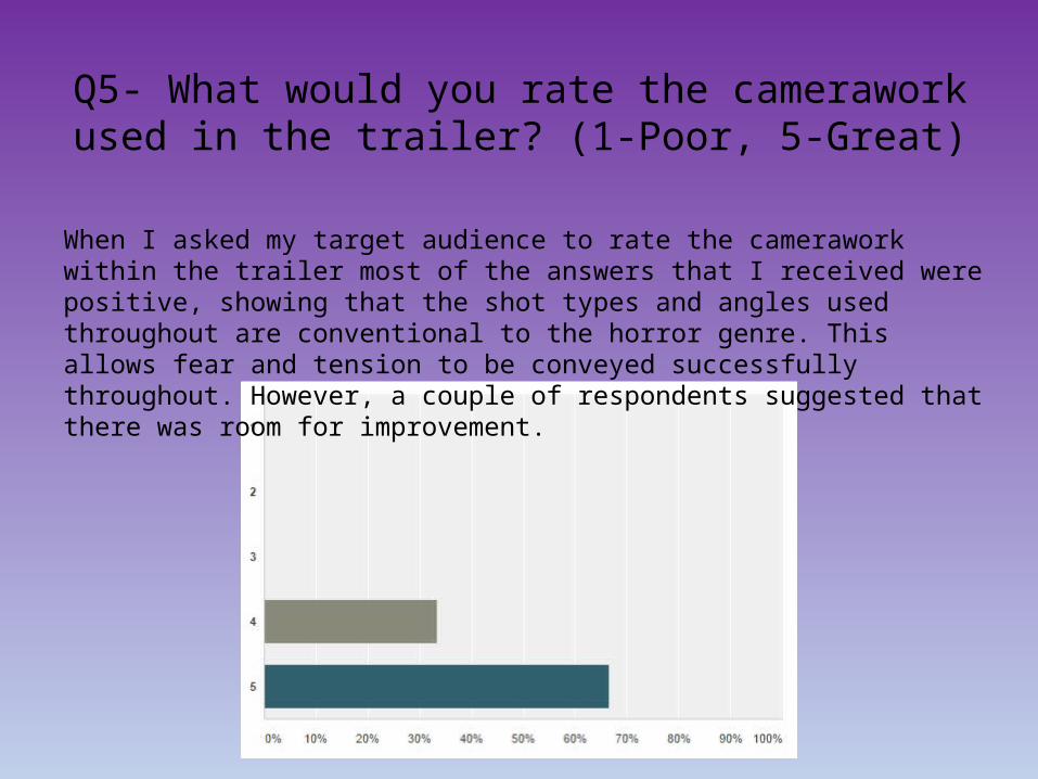
Q5- What would you rate the camerawork used in the trailer? (1-Poor, 5-Great)
When I asked my target audience to rate the camerawork within the trailer most of the answers that I received were positive, showing that the shot types and angles used throughout are conventional to the horror genre. This allows fear and tension to be conveyed successfully throughout. However, a couple of respondents suggested that there was room for improvement.
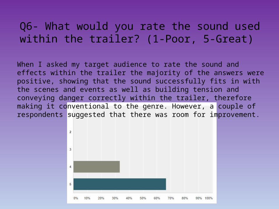
Q6- What would you rate the sound used within the trailer? (1-Poor, 5-Great)
When I asked my target audience to rate the sound and effects within the trailer the majority of the answers were positive, showing that the sound successfully fits in with the scenes and events as well as building tension and conveying danger correctly within the trailer, therefore making it conventional to the genre. However, a couple of respondents suggested that there was room for improvement.
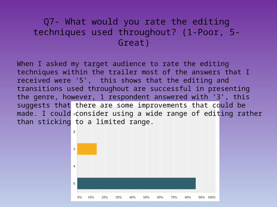
Q7- What would you rate the editing techniques used throughout? (1-Poor, 5- Great)
When I asked my target audience to rate the editing techniques within the trailer most of the answers that I received were ‘5’, this shows that the editing and transitions used throughout are successful in presenting the genre, however, 1 respondent answered with ‘3’, this suggests that there are some improvements that could be made. I could consider using a wide range of editing rather than sticking to a limited range.

Q8- What would you rate the Mise-en-scene used within the trailer?
(1-Poor, 5-Great)
When I asked respondents to rate the mise-en-scene used throughout the trailer most of the answers that I gained suggested that it is conventional to the genre as well as contributing to the quality of the trailer. This allows my characters to be represented successfully, as well as conveying the genre stereotypically. However, some of the feedback suggests that I could spend more time and consider more locations.

Poster

Q1- Do you think that my film poster is conventional?
From the feedback that I received from my target audience on the film poster I have created I can see that I have been successful in making it appealing and conventional. The majority of my target audience have replied ‘Yes’ to the conventions suggesting that the planning and research into professional film posters was effective in the production of my film poster. I have also ensured that all of my products link together, and my film poster is highly associated with the main product.

Q2- Why?When I asked my target audience why they found my film poster conventional there was a variety of answers. They ranged from the image used to the colours and layout, showing that my film poster is appealing to my target audience and the different aspects have all contributed to this when they are placed together. This helps to see that the research and planning and the previous audience research that I have received have all contributed to the final product I have produced.

Q3- What would you rate the image used? (1-Poor, 5-Good)
When I asked my target audience to rate the main image used on the poster many of the answers helped me to see that it was well planned and helped to make my poster conventional. However, a couple of my target audience felt that there was room for improvement. When I asked them why they said that they would have preferred to see the face of the main character. If I was to do this again this is definitely something that I would consider.

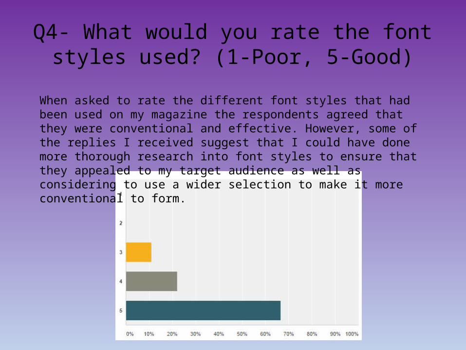
Q4- What would you rate the font styles used? (1-Poor, 5-Good)
When asked to rate the different font styles that had been used on my film poster my target audience agreed that they were conventional and effective. However, some of the replies I received suggest that I could have done more thorough research into font styles to ensure that they appealed to my target audience.

Q5- What would you rate the layout of the poster? (1-Poor, 5-Good)
When I asked my target audience to rate the layout of my poster most of the replies were positive showing that I had planned the layout well. However, some replies suggest that I should have done further research into professional posters and their layouts. In particular the billing block at the bottom and the arrangement of the logos.

Q6- What would you rate the colours used? (1-Poor, 5-Good)
When my target audience rated the colour scheme used throughout my poster most of the replies told me that they were a good choice due to there connotations. This shows that when I researched into colours used within the horror genre I was successful in what I found out. However I did receive some negative feedback maybe suggesting that I should have used a wider palette of colours.

Q7- What improvements could be made?
When I asked my respondents if there was anything that could be improved within the poster I had made, the feedback was mostly positive, however there were a few changes that were suggested. These included alternative editing within the image, and the layout of the billing block and logos at the bottom of the poster. This allows me to see that the research into professional film posters was successful in highlighting the conventions.

Magazine Cover

Q1- Do you think that the magazine is conventional?
From the responses I have received I can see that the majority of my target audience felt that the magazine cover that I created is overall conventional. This is because it correctly displays information, considers the basics of a film magazine and does not stick to one genre allowing it to discuss a variety of film genres not just horror. However, one of the answers I received suggests that I could have made some changes to make it more flexible among genres.

Q2- Why?When I asked my target audience why they found the magazine cover conventional there was a selection of different answers. They ranged from the image used to the layout and the clear route of the eye being followed. This shows that my magazine is appealing to my mass target audience and the different aspects have all contributed to this when they are placed together. This helps to see that the research and planning and the previous audience research that I have received have all contributed to the final product I have produced.

Q3- What would you rate the image used? (1-Poor, 5-Good)
When I asked my target audience to rate the main image used on the magazine cover many of the replies helped me to see that it was well planned and helped to make my poster conventional. However, a couple of my target audience felt that there was room for improvement. When I asked them why they said that they would have preferred to see an image that was more focussed and had been edited more conventionally.
Q4- What would you rate the font styles used? (1-Poor, 5-Good)
When asked to rate the different font styles that had been used on my magazine the respondents agreed that they were conventional and effective. However, some of the replies I received suggest that I could have done more thorough research into font styles to ensure that they appealed to my target audience as well as considering to use a wider selection to make it more conventional to form.

Q5- What would you rate the layout of the magazine? (1-Poor, 5-Good)
When I received my replies from my target audience from rating the layout of my magazine cover most of the replies were positive showing that I had planned the layout well. However, some replies suggest that I should have done further research into following the route of the eye as clearly as possible. It was also mentioned to add more cover lines to make it more conventional to form.
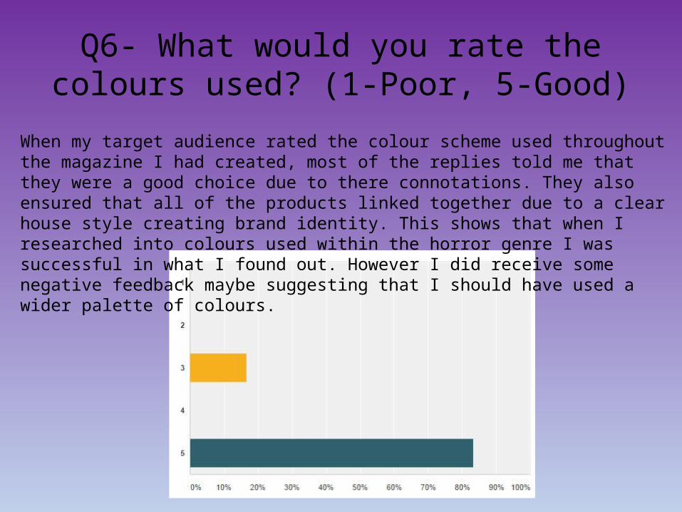
Q6- What would you rate the colours used? (1-Poor, 5-Good)
When my target audience rated the colour scheme used throughout the magazine I had created, most of the replies told me that they were a good choice due to there connotations. They also ensured that all of the products linked together due to a clear house style creating brand identity. This shows that when I researched into colours used within the horror genre I was successful in what I found out. However I did receive some negative feedback maybe suggesting that I should have used a wider palette of colours.
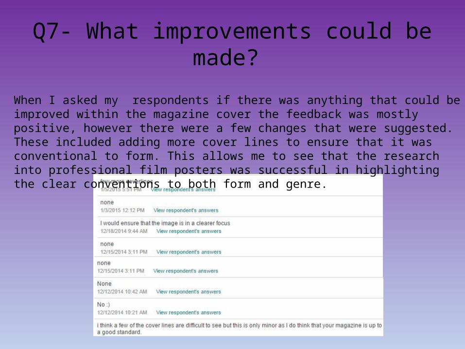
Q7- What improvements could be made?
When I asked my respondents if there was anything that could be improved within the magazine cover the feedback was mostly positive, however there were a few changes that were suggested. These included adding more cover lines to ensure that it was conventional to form. This allows me to see that the research into professional film posters was successful in highlighting the clear conventions to both form and genre.

Overall the feedback that I have received not only on the final products but throughout research, planning and production have
all contributed to the success and quality of my final horror trailer, magazine cover and also film poster. It has helped me
create professional products that all link together successfully promoting the film as well as creating brand identity for film.
Magazine Main product - trailer Poster