propellerhead brand manual
TRANSCRIPT

Brand Manual

Table of Contents

Propellerhead p.1
Reason p.13
Record p.19
ReCycle p.41
ReFills p.53
The Producers Conference p.65
Supporting Brands p.69
Usage Guidelines p.74

The Propellerhead Brand
What is this book?
The aim of the Propellerhead brand manual is simple enough: we want to help you help us communicate. Whenever a Propellerhead product appears in print, online or even on film, a number of key identifiers come into play: fonts and logos and their colors and placement, graphical components and their respective uses, even tonality and wording. By following the guidelines presented in this book, and by simply doing things the way we do them, you will help us communicate our brand and our products in a clear, effective way.
p.1
Respect the brandPlease follow the guidelines laid out here to the best of your ability – we need to maintain harmony and coherence in all Propellerhead communi-cation. A Propellerhead related ad or newsletter should be instantly identifiable as just that. Significant time and effort were invested in the creation of our brands and their respective design platforms, so by doing things by the book (this book), you’re honoring not just the brands themselves, but also the ideas behind them.
The master brandThe Propellerhead brand is the master brand. The products are all sub brands to the master brand and inherit style and tonality from the master brand. The master brand does not take center stage as the products do, but acts as an identifier next to its sub brand. For a good example, see the Reason box.
How we communicateWe don’t shout. Never have, never will. All Propellerhead communication is based on the notion that our products and their features are strong enough to speak for themselves. When we do big ourselves up, it’s always a tongue-in-cheek thing – we are safe in the knowledge that when it comes down to it, our products can walk the walk.

Propellerhead Logo
The Propellerhead logo has gone through some minor changes. It now takes a more laid back role, to better complement our product brands.
In cases when Propellerhead the company acts as sender, we embed the corporate logo in the white/red/black corporate design framework pictured on the right. In communication related to our product brands, as in advertisements or on product boxes, the Propellerhead logo is reduced to white text on a black background.
p.3

Corporate logo
Product host logo
When Propellerhead acts as the sender, outside of a product context, the soft red and white components are used.
When Propellerhead acts as the host for a product brand such as Reason, ReCycle or a Propellerhead produced ReFill, the Propellerhead logo usually stays within the black and white framing.

Propellerhead Colors
The Propellerhead brand has the color red as its main color. It repre-sents the energetic, warm core of Propellerhead. The color gray acts as a partly invisible background. Around the warm red of Propeller-head is the matte white cover. The white cover acts as a plate, presenting Propellerhead’s products and inspirational media.
p.5

Corporate backgroundThe Propellerhead logo background color has been updated. Propeller-head uses only one complimentary color: one shade of gray.
Corporate main colorThe red core of Propellerhead.
Product host primary color
Secondary host color
Black is important for the Propeller-head brand. It is widely used in all packaging and communication.
Pantone: 5507 CCMYK: C:10 M:06 Y:0 K:27RGB: R:209 G:217 B:179Web #AEBCBA
Pantone: 185 CCMYK: C:0 M:100 Y:100 K:7RGB: R:215 G:0 B:10Web #E31B23
Pantone: BlackCMYK: C:0 M:0 Y:0 K:100RGB: R:0 G:0 B:0
White

Propellerhead Components

Positioning and scaleTo maintain harmony, the golden ratio is applied as often as possible. The Propellerhead logo is placed under-neath the product logo to better reflect Propellerhead as the originator of the software.
Corporate logo framingThe Propellerhead corporate framing is used only by Propellerhead in business to business communication, or as theme for propellerheads.se when Propellerhead speaks.
Hosting logo framingWhen Propellerhead acts as the master brand for a product, the framing should be relative to the logos. The black framing now uses a bigger area to show off the Propeller-head brand’s encompassing role.
2
1+2
1
4(1+2) is to 1 As 1 is to 2.
PRODUCT

Do’s and Don’ts
With the updated brand profile for Propellerhead Software, it’s more important than ever to be stringent when using the brand’s visual components. To avoid confusing users, customers and any recipients of our communication, we ask you to make sure that any old versions of the Propellerhead logo are removed and replaced with the new and updated version.
p.9

Do not use the old logoThe Propellerhead logo has been revised and refined, especially the “e”. Make sure to use the new version of the Propellerhead logo. Do not use the subtext “software” or the symbol.
No other colorsDo not use colors other than the defined Propellerhead colors.Never place the logo on images or gradient backgrounds.
Stay flatDo not use 3D. Do not use shadows, bevels or in any way create an illusion of depth in any material produced. The software is 3D, the brand is not.
Logo stays the sameNever reshape or break up the logo. If it does not fit your design, redesign. The shape and whitespace of the logo come first.

Typography
ap.11
The chosen font for the Propellerhead brand as well as all Propeller-head products, is Berthold Akzidenz Grotesk – a realist sans-serif typeface originally released by the H. Berthold AG type foundry in 1896. It is seen as the first widely spread sans-serif (typeface without decorative strokes in the letters). It is in our opinion perfect for manifesting the no-nonsense approach of the entire Propellerhead identity.

Black, white and the other Propeller-head colors can be used for headers.When using different colors on the same page make sure that the
Berthold Akzidenz Grotesk BoldHeaders use capitalization of proper nouns only. Subheaders do not.
Berthold Akzid
Berthold Akzid
Berthold Akzid
Berthold Akzid
Berthold Akzidenz Grotesk Bold
Berthold Akzidenz Grot
Sub headers use Berthold Akzidenz bold.Body text uses Berthold Akzidenz Grotesk regular.
Header colorsBlack, white and the other Propeller-head colors can be used for headers.When using different colors and sizes on the same page, make sure that the hierarchical structure is maintained as outlined below.
Header
Subheader
Body


Reason Logo
The Reason logo has matured over the years and we are very proud of it, so please be careful when handling our baby.
The logo consists of two elements: 1) the symbol, which is the cubic figure 2) the type part, which is the Reason text
Never ever break up these elements and use them individually for any reason. We do however graciously forgive the Reason user who tattooed the logo by itself on his arm.
p.15

Logo
Whitespace
The Reason logo on the Reason green background. It is Propeller-head's wish that the logo is always presented this way.
Use the letter “R” from the logo to measure the correct spacing around the logo. The logo’s reserved free area can be quickly assessed by remem-bering “Double R” space.
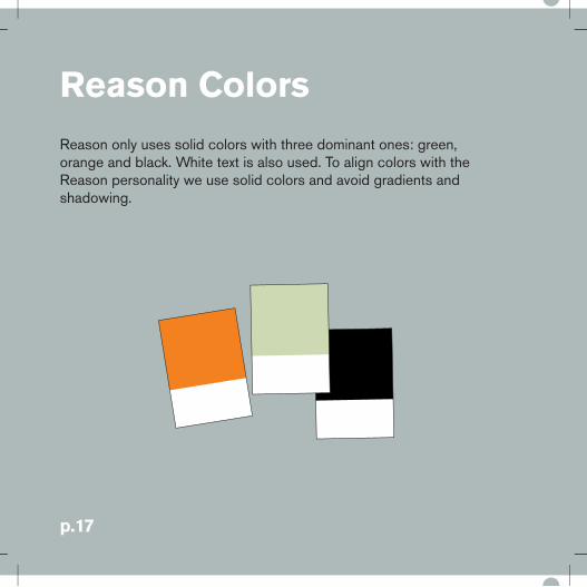
Reason Colors
Reason only uses solid colors with three dominant ones: green, orange and black. White text is also used. To align colors with the Reason personality we use solid colors and avoid gradients and shadowing.
p.17

BackgroundThe Reason logo background color has been updated. Reason uses only one complimentary color: one shade of green.
Symbol main colorThe orange of Reason is reserved for the logo. Avoid using it for other elements.
Symbol secondary colorBlack is an important color for the Reason brand. It is widely used in all packaging and communication.
Pantone: 580 CCMYK: C:20 M:05 Y:35 K:0RGB: R:209 G:217 B:179Web: #CEDBB3
Pantone: 715 CCMYK: C:0 M:60 Y:100 K:0RGB: R:218 G:128 B:46
Pantone: BlackCMYK: C:0 M:0 Y:0 K:100RGB: R:0 G:0 B:0

Reason Components
The Reason identity is based on the powerful logo itself, the Reason colors, the use of irregular framing and non-centered asymmetrical layouts.
This gives the identity a trustworthy and rational expression – and at the same time it’s different from our competition.

BackgroundThe Reason brand is asymmetrically presented. To maintain harmony, the golden ratio is applied whenever possible. The Propellerhead and Reason logos should be equally prominent and horizontally aligned.
FramingThe fins and frame (5) should always have equal thickness. Green area should be placed in the top right corner on the black.
CommunicationThe Reason brand has very strict guidelines. Certain productions can contain new elements, but only under strict supervision and approval from Propellerhead’s marketing depart-ment.
Lorem ipsum dolor sit amet, consectetuer adipiscing elit. Vivamus lorem. Aliquam sagittis, velit eu auctor faucibus, tellus justo eleifend dolor, et adipiscing arcu nibh at nulla. Nam condimentum iaculis magna. Duis rhoncus nisl quis urna. Fusce tempor purus at diam. Cras lorem mauris, commodo in, malesuada ultricies, suscipit a, velit. Ut porttitor pellentesque augue. Donec a massa. Pellentesque ac erat ut lorem dapibus tempor. Cras diam. Proin at quam. Aenean vitae risus id orci hendrerit sodales. Sed ut neque at tellus convallis venenatis. Aenean mollis posuere dolor. Duis mauris. Phasellus dignissim dolor eu ipsum. Vivamus ultrices, nunc id iaculis rhoncus, leo pede pharetra justo, ac venenatis pede est et pede. Sed porttitor ante eu tellus.
2
1+2
1
4(1+2) is to 1 as 1 is to 2.
5

Reason Do’s and Don’ts
There is of course no way you can exemplify every possible situation that might occur for improper brand usage – so good judgement is the key factor here. Try to understand the basic principle, so you can make educated guesses in your decision-making, or simply contact the Propellerhead Marketing Department when in doubt.
The logo consists of two elements: 1) the symbol, which is the cubic figure 2) the type part, which is the text Reason
Never ever break up these elements or see them as something you can use as illustrations or decorative elements. Avoid situations where you twist, spin, turn or in any other way corrupt the logo and its elements. Another rule of thumb is to not put the logo in circum-stances where it’s hard to see.
p.21

Black backgroundsDo not place logo on a black back-ground. Use the framing components or place logo on the defined Reason complimentary green.
No other colorsDo not place logo on backgrounds in any color other than the Reason green. Never use gradients as background.
Stay flatDo not use 3D. Do not use drop-shadows, bevels or in any way create an illusion of depth in any material produced. The software is 3D, the brand is not.
Logo stays togetherDo not use the Reason symbol by itself. Do not rearrange the logo in any way.
Typography
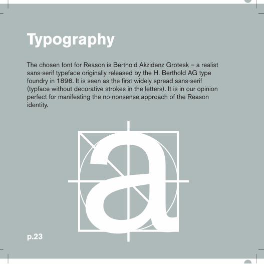
aThe chosen font for Reason is Berthold Akzidenz Grotesk – a realist sans-serif typeface originally released by the H. Berthold AG type foundry in 1896. It is seen as the first widely spread sans-serif (typface without decorative strokes in the letters). It is in our opinion perfect for manifesting the no-nonsense approach of the Reason identity.
p.23

Berthold Akzidenz Grotesk BoldHeaders use capitalization of proper nouns only. Subheaders do not.
The body copy is usally set in Berthold Akzidenz Grotesk regular. The body should be left justified, ragged right for readability. The body copy of Reason is often placed on a black background or placed on the Reason green background. Preferred font color is white on black background and black on Reason green background. Instead of bullets, the “,” dingbat is commonly used (FFDingbats arrows one, comma key). Typographic layout should remain calm and structured.
Lorem ipsum dolor sit ametConsectetur adipiscing elit. Aliquam vel velit. In placerat massa ut purus. Etiam condimentum dui sed tortor. In hac habitasse platea dictumst. Curabitur suscipit faucibus ipsum. Aenean turpis. Etiam pede justo, mollis ac, dictum ac, feugiat quis, lorem. Maecenas risus.
Phasellus vel:,Mauris leo ,Nam pretium justo eu nisl ,Etiam sit amet lectus id felis ultrices tincidunt ,Fusce ac massa ,Morbi viverra. In et magna sed nibh bibendum placerat ,Fusce interdum condimentum mi ,Proin euismod risus nec quam. Cras blandit purus quis risus.
Lorem ipsum dolor sit ametConsectetur adipiscing elit. In arcu. Dodio odio, bibendum ac, auctor at, luctempor, felis. Maecenas odio odio, dicongue in, commodo ac, nunc. Sed esapien, luctus a, graavida blandit, lacamet, libero. Sed laoreet magna vitaemagna metus, ultrices ut, vulputate egfeugiat sit amet, quam. Proin ac enimtortor sapien, faucibus pretium, viverrultrices, malesuada vitae, metus. Integ
l N ll

Reason Adapted Logo
Reason Adapted is a slimmed down version of Reason. This is illustrated by making three faces of the Reason logo “transparent.”
The logo consists of two elements: 1) the symbol, which is the cubic figure 2) the type part, which is the text Reason Adapted
Never ever break up these elements or use them individually for any reasons.
p.25

Logo
Whitespace
The Reason Adapted logo sits on the Reason green background. It is Propellerhead’s wish that the logo is always presented this way.
Use the letter “R” from the logo to measure the correct spacing around the logo. The logo’s reserved free area can be quickly assessed by remembering “Double R” space.

Reason AdaptedDo’s and Don’ts
There is of course no way you can exemplify every possible situation that might occur for improper brand usage – so good judgement is the key factor here. Try to understand the basic principle, so you can make educated guesses in your decision-making, or simply contact the Propellerhead Marketing Department when in doubt.
Avoid situations where you twist, spin, turn or in any other way corrupt the logo and its elements. Another rule of thumb is not to put the logo in circumstances where it’s hard to see.
p.27

Black backgroundsDo not place logo on a black back-ground. Use the framing components or place logo on the defined Reason complimentary green.
Do not fill empty diamondsWe have placed a grid behind the logo to illustrate how the “transparent” parts of the logo shold be presented.
Stay flatDo not use 3D. Do not use drop-shadows, bevels or in any way create an illusion of depth in any material produced. The software is 3D, the brand is not.
Logo stays togetherDo not use the Reason Adapted symbol by itself. Do not rearrange the positions or size of the logo elements.


Record Logo
The Record logo is carefully crafted to fit with the Propellerhead family although it represents something new in our product portfolio, so please be careful when handling the logo.
The logo consists of two elements: 1) the Record symbol, which is inspired by a record button2) the text Record.
Never ever break up these elements or use them individually for any reasons. The symbol should not be used as a decorative element.
p.31

Logo
Whitespace
The Record logo uses the same play on dimensional depth as the Reason logo. It has been designed in a way that allows it to stand next to Reason and have the same impact. The difference is that Record has a sense of forward motion. The red core of the logo can be viewed as a merge between a play “” and a Record “ • ” symbol.
To give the logo an ability to stand out by itself, it is important to maintain a clutter free area around the logo. By visualizing the letter “o” from the logo it is easy to see the minimum whitespace area.

Record Colors
Record only uses solid colors with one dominant color: Record brown. Three complementing colors are available: yellow, red and dark brown.
To align colors with the Record identity we use solid colors and avoid gradients and shadowing.
p.33

BackgroundThe background used for all Record communication is this shade of orange/brown.
Symbol main colorYellow is the main complimentary color of Record.
Symbol secondary colorThe darker brown is only used in the logo.
Symbol family colorThe red speaks to the general pictogram of the function “record” and the master brand Propellerhead.
Pantone: 7407CCMYK C:15, M:30, Y:78, K:0RGB: R:217 G:175 B:86Web: #D9AF56
Pantone: 803CCMYK: C:0, M:7, Y:100, K:0RGB: R:255 G:218: B:0Web: #FFE300
Pantone: 1685CCMYK: C:30 M:75 Y:80 K:25RGB: R:146 G:75 B:55Web: #924B37
Pantone: 185 CCMYK: C:0 M:100 Y:100 K:7RGB: R:215 G:0 B:10Web #E31B23

Record Components
The Record identity is based on the new powerful logo itself, the Record colors, the use of irregular framing and non-centered asym-metrical layouts. This gives the identity a trustworthy and rational expression – and at the same time it’s different from our competition. The Propellerhead and Record logo should be equally prominent and horizontally aligned.

BackgroundThe Record brand is asymmetri-cally presented. To maintain harmony, the golden ratio is applied as often as possible.The Propellerhead and Record logos should be equally prominent and horizontally aligned.
FramingThe fins and frame(5) should always have equal thickness. The brown area should be placed in the top right corner on the black.
2
1+2
1+2
1
1
1 24
5
is to as is to

Record Do’s and Don’ts
There is of course no way you can exemplify every possible situation that might occur for improper brand usage – so good judgement is the key factor here. Try to understand the basic principle, so you can make educated guesses in your desicion-making, or simply contact the Propellerhead Marketing Department when in doubt.
The logo consists of two elements: 1) the symbol, which is the stylized record figure2) the type part, which is the text Record Never ever break up these elements or see them as something you can use as illustrations or decorative elements. Avoid situations where you twist, spin, turn or in any other way corrupt the logo and its elements. Another rule of thumb is that you don’t put the logo in circumstances where it’s hard to see.
p.37

Black backgroundsDo not place the logo on a black background. Use framing components or place the logo on the defined Record complimentary brown.
No other colorsDo not place the logo on back-grounds any color other than the Record brown. Never use gradients as background.
Stay flatDo not use 3D. Do not use drop-shadows, bevels or in any way create an illusion of depth in any material produced. The software is 3D, the brand is not.
Logo stays togetherDo not use the Record symbol by itself. Do not rearrange the logo-elements.

Record Typography
The chosen font for Record is Berthold Akzidenz Grotesk – a realist sans-serif typeface originally released by the H. Berthold AG type foundry in 1896. It was the first sans-serif typeface (typeface without decorative strokes in the letters) to be widely used and influenced many later neo-grotesque typefaces. It is in our opinion perfect for manifest-ing the no-nonsense approach of the Record identity.
ap.39

Berthold Akzidenz Grotesk BoldThis sans-serif typeface is used in all Propellerhead communication.Most headers use the bold version for emphasis.
The body copy is usually set in Berthold Akzidenz Grotesk regular. The body should be left justified, ragged right for readability. The body copy of Record is often placed on a black background or placed on the Record brown background. Preferred font color is white on black, and black on Record brown. Instead of bullets, the “,” dingbat is commonly used (FFDingbats arrows one, comma key).
Lorem ipsum dolor sit ametVonsectetur adipiscing elit. Aliquam vel velit. In placerat massa ut purus. Etiam condimentum dui sed tortor. In hac habitasse platea dictumst. Curabitur suscipit faucibus ipsum. Aenean turpis. Etiam pede justo, mollis ac, dictum ac, feugiat quis, lorem. Maecenas risus.
Phasellus vel:,Mauris leo ,Nam pretium justo eu nisl ,Etiam sit amet lectus id felis ultrices tincidunt ,Fusce ac massa ,Morbi viverra. In et magna sed nibh bibendum placerat ,Fusce interdum condimentum mi ,Proin euismod risus nec quam. Cras blandit purus quis risus.
Lorem ipsum dolor sit ametConsectetur adipiscing elit. In arcu. Donec odio odio, bibendum ac, auctoat, luctus tempor, felis. Maecenas odiodio, dictum ac, congue in, commodoac, nunc. Sed enim sapien, luctus a, graavida blandit, lacinia sit amet, libero. Sed laoreet magna vitae dui. Inmagna metus, ultrices ut, vulputate eget, feugiat sit amet, quam. Proin acenim. Nulla tortor sapien, faucibus
i i l i l d


ReCycle Logo
The iconic logo is based on the well established recycling symbol, with an audio waveform inserted to mark its relation to music and sampled sound. The triangular shape also marks its relation to the other Propellerhead logos.
p.43

Logo
Free space
The Recycle logo is a delicate match of colors. The logo has been updated and now only consist of black, purple blue and a warm yellow.
To allow the logo to stand out by itself, it is important to maintain a clutter free area around the logo. By visualizing the letter “R” from the logo it is easy to see the minimum whitespace area.

ReCycle Colors
The colors of ReCycle hint of Propellerhead’s origins and location on planet Earth, Sweden. Blue as the blue sky. Yellow as the sunlight on Midsummer’s Eve. Dark blue and black as the brackish water of the Baltic sea. Yellow is also the most striking color to the human eye, making it a great color to attract attention.
p.45

BackgroundBlue as the sky is the background color of ReCycle.
Symbol main colorArrows use a slightly more purple and darker shade of blue.
Symbol secondary colorThe waveform of the ReCycle logo is this warm yellow.
Pantone: 299CCMYK: C:70, M:15, Y:0, K:0RGB: R:41 G: 170 B:226Web: #27AAE1
Pantone: 279CCMYK: C:73, M:42, Y:0, K:0RGB: R:72 G:132 B:196 Web: #4884C4
Pantone: 7409CCMYK: C:0, M:27, Y:100, K:6RGB: R:239 G:179 B:16Web: #EEB310
Pantone: Black

ReCycle Components
All of the ReCycle graphical components have been updated and now share a similar look and feel to the identity of Reason and Record. A major difference is ReCycle’s use of blue. The black framing and blue background set ReCycle close but slightly apart from the other Propellerhead product brands.

BackgroundThe ReCycle brand is asymmetrically presented. To maintain harmony, the golden ratio is applied as often as possible. The Propellerhead and ReCycle logo should be equally prominent and horizontally aligned.
FramingThe fins and frame (5) should always have equal thickness. The blue area should be placed in the top right corner on the black.
CommunicationWhen communicating the ReCycle brand, remember to follow the design guidelines as closely as possible.
Lorem ipsum dolor sit amet, consectetuer adipiscing elit. Vivamus lorem. Aliquam sagittis, velit eu auctor faucibus, tellus justo eleifend dolor, et adipiscing arcu nibh at nulla. Nam condimentum iaculis magna
Lorem ipsum dolor sit amet, consectetuer adipiscing elit. Vivamus lorem. Aliquam sagittis, velit eu auctor faucibus, tellus justo eleifend dolor, et adipiscing arcu nibh at nulla. Nam condimentum iaculis magna. Duis rhoncus nisl quis urna. Fusce tempor purus at diam. Cras lorem mauris, commodo in, malesuada ultricies, suscipit a, velit. Ut porttitor pellentesque augue. Donec a massa. Pellentesque ac erat ut lorem dapibus tempor. Cras diam. Proin at quam. Aenean vitae risus id orci hendrerit sodales. Sed ut neque at tellus convallis venenatis. Aenean mollis posuere dolor. Duis mauris. Phasellus dignissim dolor eu ipsum. Vivamus ultrices, nunc id iaculis rhoncus, leo pede pharetra justo, ac venenatis pede est et pede. Sed porttitor ante eu tellus.
Cut it up!
2
1+2
1+2
1
1
1 24
5
is to as is to

ReCycle Do’s and Don’ts
The ReCycle logo and graphical components were updated early 2009. To avoid confusion, we ask you to make sure any old versions of the ReCycle logo is removed and replaced with the new.
p.49

Use the new logoReCycle has been revised and refined. Make sure to use the new version of the ReCycle logo.
No other colorsDo not place logo on backgrounds any other color than the ReCycle blue. Never use gradients as background.
Do not use the ReCycle symbol by itself. Do not rearrange the logo elements.
No moving around
Do not use 3D. Do not use drop-shadows, bevels or in any way create an illusion of depth in any material produced. The software is 3D, the brand is not.
Stay flat

ReCycle Typography
The chosen font for ReCycle is Berthold Akzidenz Grotesk – a realist sans-serif typeface originally released by the H. Berthold AG type foundry in 1896. It is seen as the first widely spread sans-serif, a typeface without decorative strokes in the letters. It is in our opinion perfect for manifesting the no-nonsense approach of the ReCycle identity.
ap.51

Lorem ipsum dolor sit ametConsectetur adipiscing elit. Aliquam vel velit. In placerat massa ut purus. Etiam condimen-tum dui sed tortor. In hac habitasse platea dictumst. Curabitur suscipit faucibus ipsum. Aenean turpis. Etiam pede justo, mollis ac, dictum ac, feugiat quis, lorem. Maecenas risus.
Phasellus vel:,Mauris leo ,Nam pretium justo eu nisl ,Etiam sit amet lectus id felis ultrices tincidunt ,Fusce ac massa ,Morbi viverra. In et magna sed nibh bibendum placerat ,Fusce interdum condimentum mi ,Proin euismod risus nec quam. Cras blandit purus quis risus.
Lorem ipsum dolor sit ametConsectetur adipiscing elit. In arcu. Donec odio odio, bibendum ac, auctoat, luctus tempor, felis. Maecenas odiodio, dictum ac, congue in, commodoac, nunc. Sed enim sapien, luctus a, graavida blandit, lacinia sit amet, libero. Sed laoreet magna vitae dui. Inmagna metus, ultrices ut, vulputate eget, feugiat sit amet, quam. Proin acenim. Nulla tortor sapien, faucibus pretium, viverra ultrices, malesuada i I l
Berthold Akzidenz Grotesk BoldThis sans-serif typeface is used in all Propellerhead communication.Most headers use the bold version for emphasis.
The body copy is usally set in Berthold Akzidenz Grotesk regular. The body should be left justified, ragged right for readability. The body copy of ReCycle is often placed on a black background or placed on a ReCycle blue background. Preferred font color is white on black, and black on ReCycle blue. Instead of bullets the “,” dingbat is commonly used (FFDingbats arrows one, comma key).

The ReFill BrandThe Propellerhead ReFills are all about capturing sought-after live instruments using state of the art recording techniques, then turning those into fully playable instruments for the Reason rack.
These sound libraries owe their playability and immense flexibility to Propellerhead’s trademark Hypersampling technique.
Within the ReFill brand there are three additional products: , The Reason ReFill Collection, a collection of Hypersampled ReFills by Propellerhead, made to expand the Reason user’s sonic palette., The Creator Series are ReFills created by top producers, artists, musicians and sound designers from all over the globe, all with their own unique style. , The free ReFill Downloads are ReFills from the Reason user community available from the Propellerhead website’s ReFill down-load section.
The ReFill brand is a vital part of the Propellerhead brand portfolio.
p.53

ReasonInstrumentReFill

The ReFill Logo
The Refill logo is a simple yet strong symbol. It ties well into the overall look and feel of the Propellerhead brand. The red square combined with the white symbol and text placed on a solid black background creates a clear logo that separates it from any clutter surrounding it.
p.55

Logo
Free space
A ReFill is a kind of component package for Reason that can contain patches, samples, REX files, MIDI files and song files. The ReFill logo illustrates its plugability and functional values.
To allow the logo to stand out by itself, it is important to maintain a clutter free area around the logo. By visualizing the letter “R” from the logo it is easy to see the minimum whitespace area.

The ReFill Colors
The chosen palette for the ReFill brand is a combination of sophisti-cated yet eye-catching colors. The black, solid base is paired with the traditional fresh white. To allow flexibility, grey is added. And to accent the brand presence a dark red is used. This attracts attention and gives the identity a sense of warmth.
p.57

Main logo colorThe Propellerhead red is the main color for the ReFill logo.
Propellerhead gray is used for the plug-in component of the ReFill logo.
Product host primary color
FramingAll ReFills use white framing around the black, in the usual fin and frame configu-ration.
Pantone: 185 CCMYK: C:0 M:100 Y:100 K:7RGB: R:215 G:0 B:10Web #E31B23
Pantone: BlackCMYK: C:0 M:0 Y:0 K:100RGB: R:0 G:0 B:0
White
Pantone: 5507 CCMYK: C:10 M:06 Y:0 K:27RGB: R:209 G:217 B:179Web #AEBCBA
Plug-in color
Black is the prominent color of the ReFill brand. Its main purpose is to serve as the background for the photos vignetted on the black background on the box.

The ReFill Components
A vital function of the ReFill brand components is to portray that it is all about genuine, high quality sound. This feeling is conveyed through visuals of original instruments, creating a sense of drama, simplicity and opportunity for the individual to express their ideas.
ReasonInstrumentReFill
p.59

FramingThe fins and frame (1) should always have equal thickness.
Instrument orientedThe ReFills differ a bit from other Propellerhead products in the way that they shows photos or illustra-tions of actual instruments. It is important to make the instrument the star. The instrument is in the spotlight.
BundlesWhen ReFills are combined in one box the white framing is expanded to fit bundle name.
1
Studio ComboHypersampled ReFill collection for Reason
Hyper sampled
Hypersampled Bass and Drum ReFills for Reason
Hyper sampled
RhythmComboHypersampled Bass andDrum ReFills for Reason
ReFill Do’s and Don’ts
There is of course no way you can exemplify every possible situation that might occur for improper brand usage – so good judgement is the key factor here. Try to understand the basic principle, so you can make educated guesses in your desicion-making, or call the Propeller-head Marketing Department when in doubt.
Avoid situations where you twist, spin, turn or in any other way corrupt the logo and its elements. Another rule of thumb is that you don’t put the logo in circumstances where it’s hard to see.
p.61

Do not change the logoProducts using the ReFill technol-ogy are allowed to use the ReFill logo. However the ReFill logo can not be altered, combined or in any way changed.
BackgroundDo not place the ReFill logo on cluttered backgrounds. Use the same black as logo when placing the logo on black backgrounds
Do not use the ReFill symbol by itself. Do not rearrange the logo elements.
No moving around
Do not use 3D. Do not use dropshadows, bevels or in any way create an illusion of depth in any material produced. The software is 3D, the brand is not.
Stay flat

ReFill Typography
The chosen font for the ReFill brand is Berthold Akzidenz Grotesk – a realist sans-serif typeface originally released by the H. Berthold AG type foundry in 1896. It is seen as the first widely spread sans-serif (typeface without decorative strokes in the letters). It is in our opinion perfect for manifesting the no-nonsense approach in the Reason ReFills. ap.63

Berthold Akzidenz Grotesk BoldThis sans-serif typeface is used in all Propellerhead communication.Most headers use the bold version for emphasis.
The body copy is usally set in Berthold Akzidenz Grotesk regular. The body should be left justified, ragged right for readability. The body copy of all Propellerhead ReFills is often placed on a black background or placed on a white background. Preferred font color is white on black, or black on white. Instead of bullets, the “,” dingbat is commonly used (FFDingbats arrows one, comma key).
Lorem ipsum dolor sit ametConsectetur adipiscing elit. In arcu. Donec odio odio, bibendum ac, auctoat, luctus tempor, felis. Maecenas odiodio, dictum ac, congue in, commodoac, nunc. Sed enim sapien, luctus a, graavida blandit, lacinia sit amet, libero. Sed laoreet magna vitae dui. Inmagna metus, ultrices ut, vulputate eget, feugiat sit amet, quam. Proin acenim. Nulla tortor sapien, faucibus
i i l i l d
Lorem ipsum dolor sit ametConsectetur adipiscing elit. Aliquam vel velit. Iplacerat massa ut purus. Etiam condimentum dui sed tortor. In hac habitasse platea dictumst. Curabitur suscipit faucibus ipsum. Aenean turpis. Etiam pede justo, mollis ac, dictum ac, feugiat quis, lorem. Maecenas risus
Phasellus vel:,Mauris leo ,Nam pretium justo eu nisl ,Etiam sit amet lectus id felis ultrices tincidun,Fusce ac massa ,Morbi viverra. In et magnased nibh bibendum placerat ,Fusce interdumcondimentum mi ,Proin euismod risus nec quam. Cras blandit purus quis risus.
p.65
The Producers ConferenceThe Producers Conference is an educational and networking event, which features a series of in-depth seminars and discussions to help music producers take their music to the next level. Produced locally by Propellerhead’s exclusive distributors, each conference aims to take attendees beyond the boundaries of a typical music store clinic. The Producers Conference topics start at more advanced levels than typical clinics, e.g. how to get the most out of music software, principles of mixing, music industry issues or even motivational talks. Conference clinicians include industry insiders, technologists and renowned artists who share their ideas and tips.
The TPC brand usally uses red as background but mixing red, black and white is welcome. It is important that all three colors are used. When printing techniques limits the use to black and white, the preferred way is to have white text and illustration on a black back-ground.


The Producers ConferenceComponentsThe Producers Conference brand is a mix of two worlds. One being the music industry, the other one being the feel and emotional part of music. The most common component is the mixer-sneaker illustration. The other component is snare drum synthesizer.
The Producers Conference use the color red as background and use white text on red background.
p.67

Sneaker mixer illustrationThe most commonly used illustra-tion in The Producers Conference communication.
Snare syntheziserThis illustration is used to show the mix of feelings and technologies that fills The Producers Conference.

Hypersampled
The Supporting BrandsEveryone has their favorites among Propellerhead products. So to help the user identify devices and features, even they have their own supporting names and brands. There are many more but we will only cover the four most important. Some of these logos are used by third parties. When in doubt if the logo can be placed on your product, please contact Propellerhead.
p.69

Hypersampled
HypersampledThe Hypersampled technology brand is only used for ReFills produced by Propellerhead Software.
RexThis is the logo for the REX file format. The logo is used both for indicating REX capable software (Logic, ProTools, Reason, etc.) and REX file sound libraries.
RemoteThis is the logo for Remote, a protocol for handling communi-cation between software and control surfaces.
RewireThis is the logo for ReWire, a technology for transferring audio data between two computer applications, in real time.
Usage Guidelines
General acceptable usage guidelines for logos and brand treatment
In general Propellerhead Software reserves the Propellerhead corpo-rate logo and brand for its own use. Use of the Propellerhead logo requires approval from Propellerhead Software AB in writing.
Legitimate authorized Propellerhead distributors and resellers may use all product and technology logos and artwork in the presentation for sale and marketing of Propellerhead products.
Licensees of Propellerhead technologies (ReWire, REX, REX2 and Remote) may use these logos and artwork in the presentation of their compatible products.

Developers of software applications, content and library products or hardware who wish to show compatibility with Propellerhead software may use the Reason, ReCycle, ReFill and Record in their packaging and presentation, so long as Propellerhead is properly attributed, and it is clear to the end user/consumer that Propellerhead is not the developer, author, publisher, distributor or manufacturer of the third-party product. In particu-lar, this means third parties can not use the Propellerhead corporate logo or Propellerhead design framework described elsewhere in this manual.
All use of logos and brand trademarks must attribute Propellerhead by including the text “[Propellerhead Product/Brand Name] is a trademark of Propellerhead Software AB. References or use of logos or trademarks do not necessarily constitute or imply an endorsement or recommendation by Propellerhead Software.”
The Hypersampled logo is for exclusive use of Propellerhead Software AB, and may not be used without the express written consent of Propellerhead Software AB.
In general if you have a question, just ask us. We’re happy to clarify and help you.

Brand Manual