production log & questionnaire research
TRANSCRIPT
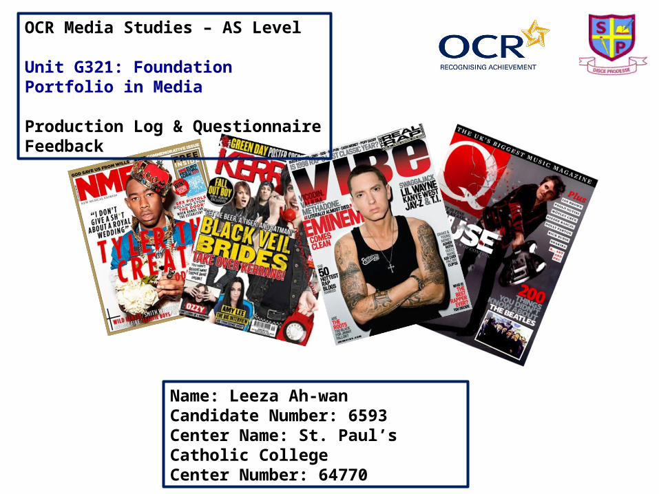
OCR Media Studies – AS Level
Unit G321: Foundation Portfolio in Media
Production Log & Questionnaire Feedback
Name: Leeza Ah-wanCandidate Number: 6593Center Name: St. Paul’s Catholic CollegeCenter Number: 64770

Vibe Magazine -
‘Vibe’ was founded by producer Quincy Jones and as of April 2013 it has been owned by Spin Media. Spin Media are located in Los Angeles and are well known for operating many pop culture related websites such as Buzznet and Absolute-Punk. The main target demographic of ‘Vibe’ are young adults, particularly teenagers who are fans of hip hop and urban music. ‘Vibe’ magazines are issued every other month, giving it a quarterly frequency. This is a ‘difference’ (Steve Neale) compared to other well known music magazines such as ‘Q’ who distribute a new issue monthly. Furthermore, ‘Vibe’ have a international readership as despite being based in New York City, the magazine is available in a number of countries around the world including the United Kingdom. In terms of circulation, in 2011 ‘Vibe’ had a circulation of 301,408.
Genre Research
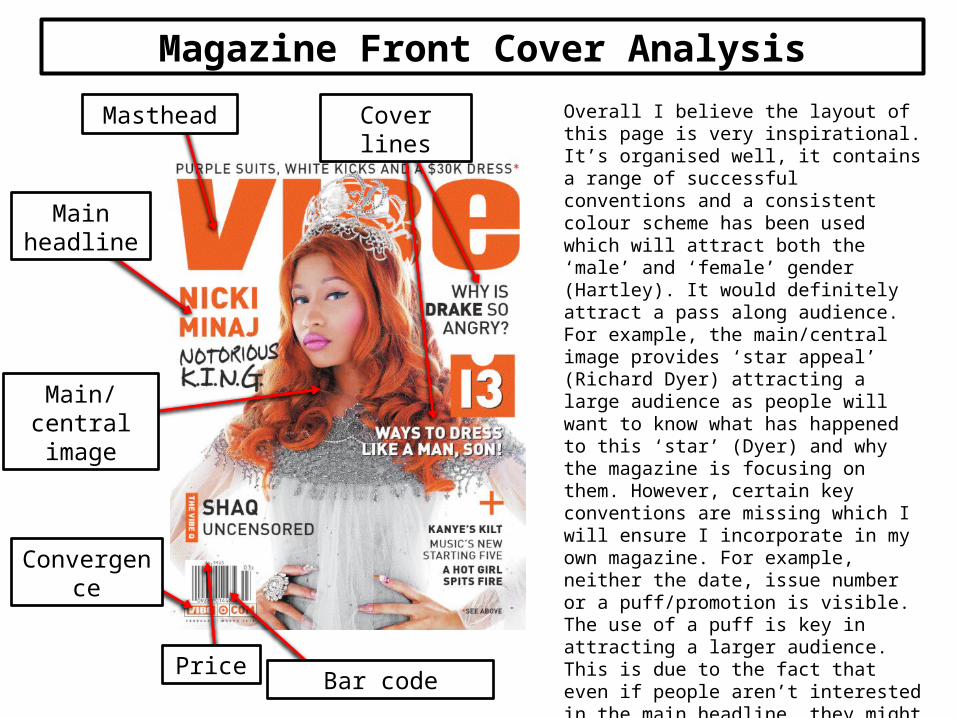
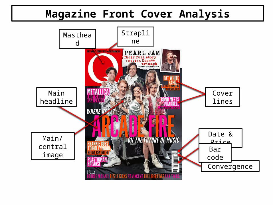
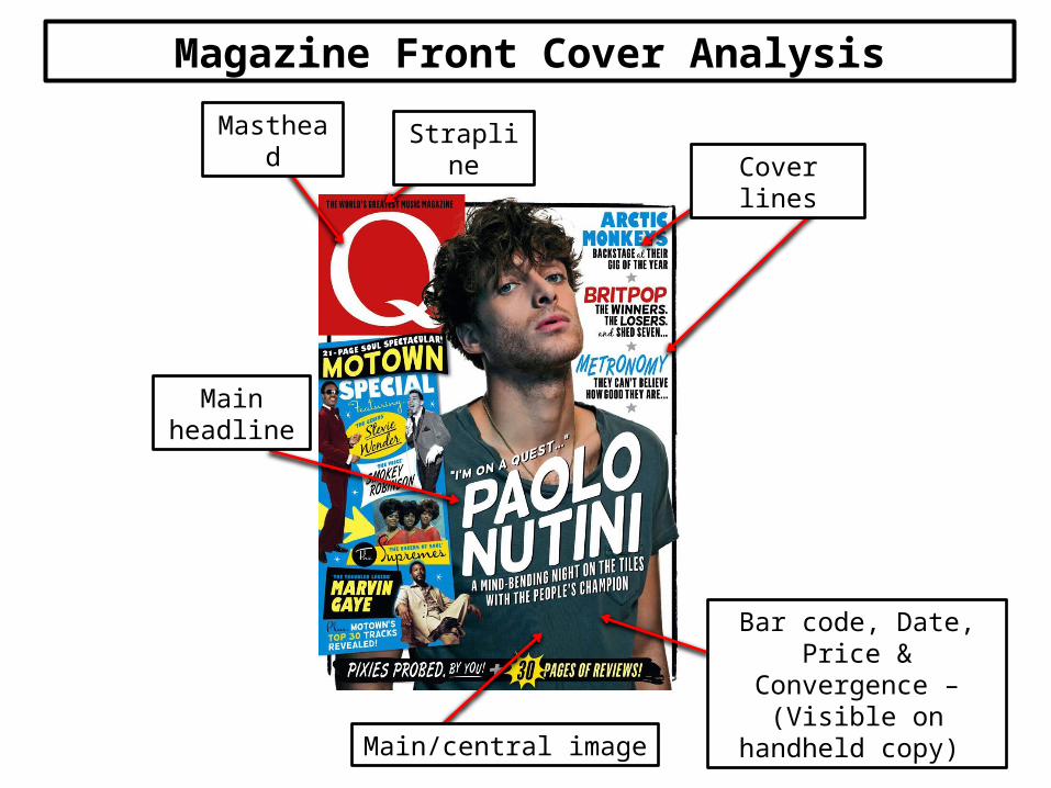
Masthead
Main headline
Main/central image
Bar code
Cover lines
Convergence
Overall I believe the layout of this page is very inspirational. It’s organised well, it contains a range of successful conventions and a consistent colour scheme has been used which will attract both the ‘male’ and ‘female’ gender (Hartley). It would definitely attract a pass along audience. For example, the main/central image provides ‘star appeal’ (Richard Dyer) attracting a large audience as people will want to know what has happened to this ‘star’ (Dyer) and why the magazine is focusing on them. However, certain key conventions are missing which I will ensure I incorporate in my own magazine. For example, neither the date, issue number or a puff/promotion is visible. The use of a puff is key in attracting a larger audience. This is due to the fact that even if people aren’t interested in the main headline, they might purchase the magazine as they have a chance of winning something they like or want. Furthermore, ‘Vibe’ doesn't have a strapline which would help in making the magazine not only more memorable to an audience but also more appealing as a strapline can be used to make the company sound impressive.
Price
Magazine Front Cover Analysis
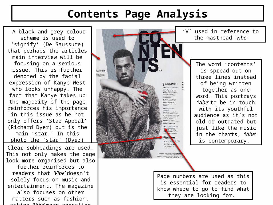
A black and grey colour scheme is used to ‘signify’ (De Saussure) that perhaps the articles main interview will be focusing on a serious issue.
This is further denoted by the facial expression of Kanye West who looks
unhappy. The fact that Kanye takes up the majority of the page reinforces his importance in this issue as he not only offers ‘Star Appeal’ (Richard Dyer) but
is the main ‘star.’ In this photo the ‘star’ (Dyer) looks extremely arrogant
and confident. Audience members will not be surprised by this as many
celebrities in the music industry portray themselves in this way.
The word ‘contents’ is spread out on three lines instead of
being written together as one word. This portrays ‘Vibe’ to be in touch with its youthful
audience as it’s not old or outdated but just like the
music in the charts, ‘Vibe’ is contemporary.
‘V’ used in reference to the masthead ‘Vibe’
Page numbers are used as this is essential for readers to know where to go to find
what they are looking for.
Clear subheadings are used. This not only makes the page look more organised but
also further reinforces to readers that ‘Vibe’ doesn't solely focus on music and
entertainment. The magazine also focuses on other matters such as fashion, making ‘Vibe’ more appealing to a mass
audience.
Contents Page Analysis
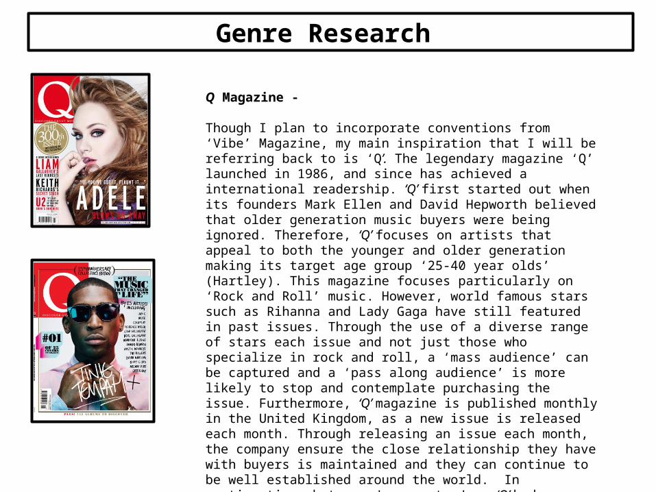
Q Magazine -
Though I plan to incorporate conventions from ‘Vibe’ Magazine, my main inspiration that I will be referring back to is ‘Q’. The legendary magazine ‘Q’ launched in 1986, and since has achieved a international readership. ‘Q’ first started out when its founders Mark Ellen and David Hepworth believed that older generation music buyers were being ignored. Therefore, ‘Q’ focuses on artists that appeal to both the younger and older generation making its target age group ‘25-40 year olds’ (Hartley). This magazine focuses particularly on ‘Rock and Roll’ music. However, world famous stars such as Rihanna and Lady Gaga have still featured in past issues. Through the use of a diverse range of stars each issue and not just those who specialize in rock and roll, a ‘mass audience’ can be captured and a ‘pass along audience’ is more likely to stop and contemplate purchasing the issue. Furthermore, ‘Q’ magazine is published monthly in the United Kingdom, as a new issue is released each month. Through releasing an issue each month, the company ensure the close relationship they have with buyers is maintained and they can continue to be well established around the world. In continuation, between January to June ‘Q’ had circulation figures of 48,353. Between January to December 2013 readership figures were 339,000. These figures greatly denote the success of this magazine.
Genre Research
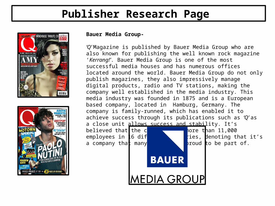
Bauer Media Group-
‘Q’ Magazine is published by Bauer Media Group who are also known for publishing the well known rock magazine ‘Kerrang!’. Bauer Media Group is one of the most successful media houses and has numerous offices located around the world. Bauer Media Group do not only publish magazines, they also impressively manage digital products, radio and TV stations, making the company well established in the media industry. This media industry was founded in 1875 and is a European based company, located in Hamburg, Germany. The company is family-runned, which has enabled it to achieve success through its publications such as ‘Q’ as a close unit allows success and stability. It’s believed that the company have more than 11,000 employees in 16 different countries, denoting that it’s a company that many people are proud to be part of.
Publisher Research Page
Convergence
Strapline
Date & Price
Masthead
Cover lines
Bar code
Main/central image
Main headline
Magazine Front Cover Analysis

‘Q’ Front Cover Analysis –
I also love the layout that ‘Q’ magazine uses for its front cover. In particular, I love the way that the cover lines have been arranged. Due to the colour blocks behind each cover line they all stand out and are eye catching, ensuring that a mass audience can be captured as everyone should be intrigued by at least one of the stories that feature. Cover lines are essential in making a front cover successful because not everyone will be interested in the main headline. Therefore, there would be a smaller amount of buyers if only one story was advertised. Furthermore, ‘Q’ has all the conventions needed to achieve greatness as through the use of a large, bold, masthead the name of the company and the logo will become memorable to a pass along audience. The main headline is large and spreads across the central image denoting that Arcade Fire will be the main focus of this issue of ‘Q’. The use of a main headline is important in order to provide the audience with ‘Star Appeal’ (Richard Dyer). White is used for the text that explains that Arcade Fire will be discussing the future of music. This colour has been chosen in particular as the outfits of the band members are also white, making the colour scheme consistent. Unlike the ‘Vibe’ magazine which Nicky Minaj features on, ‘Q’ magazines have a strapline. I believe this is extremely important and was one of the flaws on the ‘Vibe’ magazine I analysed.
Magazine Front Cover Analysis
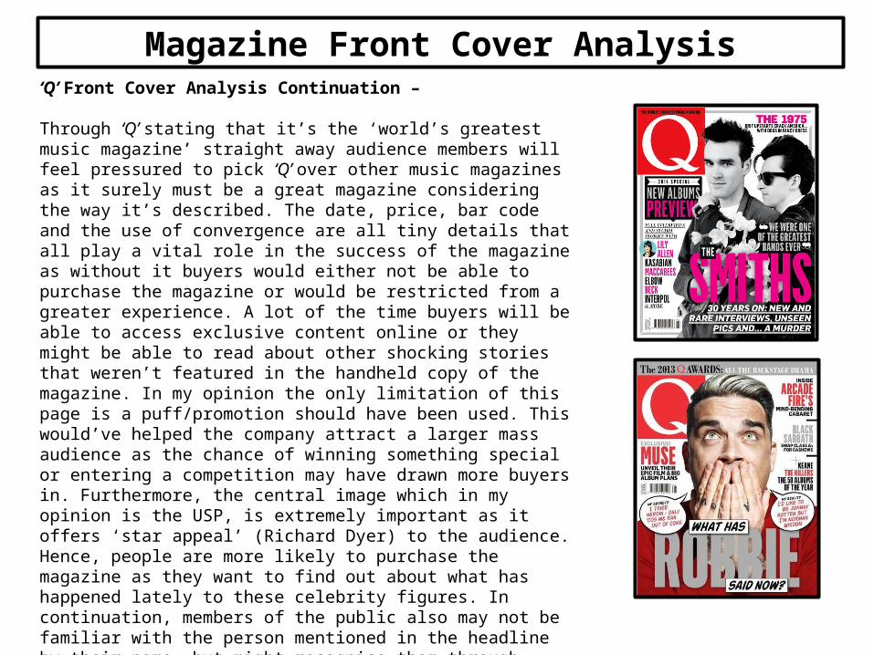
‘Q’ Front Cover Analysis Continuation –
Through ‘Q’ stating that it’s the ‘world’s greatest music magazine’ straight away audience members will feel pressured to pick ‘Q’ over other music magazines as it surely must be a great magazine considering the way it’s described. The date, price, bar code and the use of convergence are all tiny details that all play a vital role in the success of the magazine as without it buyers would either not be able to purchase the magazine or would be restricted from a greater experience. A lot of the time buyers will be able to access exclusive content online or they might be able to read about other shocking stories that weren’t featured in the handheld copy of the magazine. In my opinion the only limitation of this page is a puff/promotion should have been used. This would’ve helped the company attract a larger mass audience as the chance of winning something special or entering a competition may have drawn more buyers in. Furthermore, the central image which in my opinion is the USP, is extremely important as it offers ‘star appeal’ (Richard Dyer) to the audience. Hence, people are more likely to purchase the magazine as they want to find out about what has happened lately to these celebrity figures. In continuation, members of the public also may not be familiar with the person mentioned in the headline by their name, but might recognise them through appearance. As a company you want to give potential buyers the most relaxing experience possible, the last thing you want to do is make any potential buyers confused.
Magazine Front Cover Analysis
Target Audience –
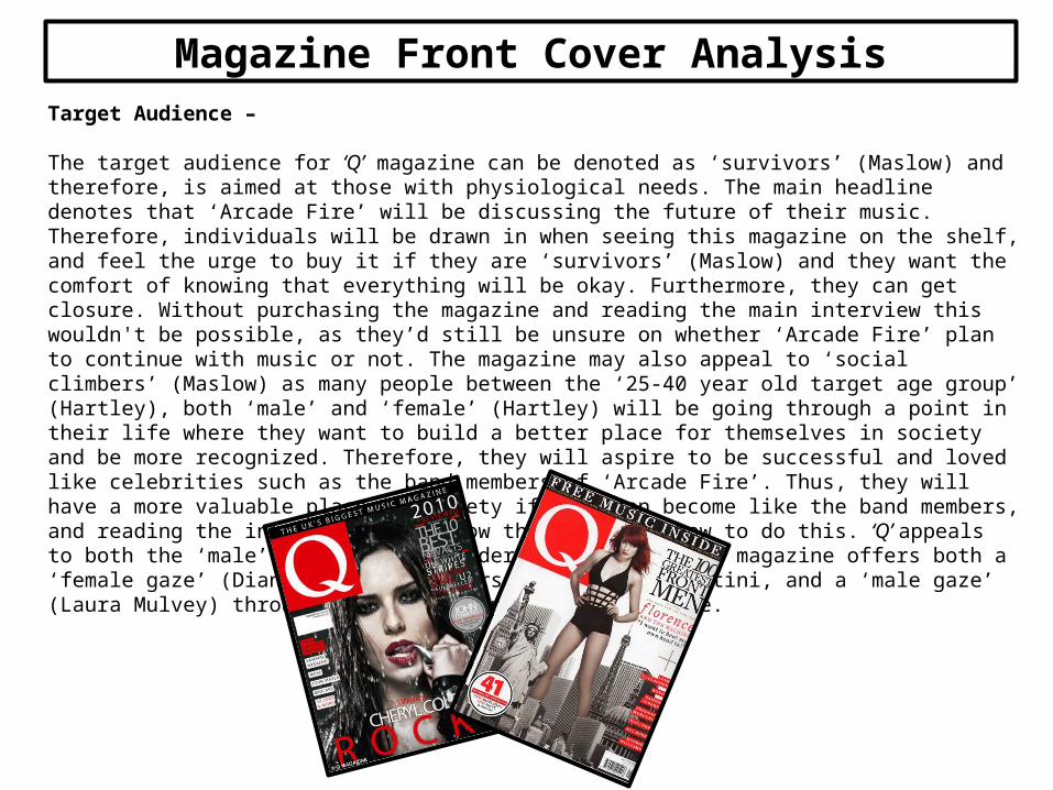
The target audience for ‘Q’ magazine can be denoted as ‘survivors’ (Maslow) and therefore, is aimed at those with physiological needs. The main headline denotes that ‘Arcade Fire’ will be discussing the future of their music. Therefore, individuals will be drawn in when seeing this magazine on the shelf, and feel the urge to buy it if they are ‘survivors’ (Maslow) and they want the comfort of knowing that everything will be okay. Furthermore, they can get closure. Without purchasing the magazine and reading the main interview this wouldn't be possible, as they’d still be unsure on whether ‘Arcade Fire’ plan to continue with music or not. The magazine may also appeal to ‘social climbers’ (Maslow) as many people between the ‘25-40 year old target age group’ (Hartley), both ‘male’ and ‘female’ (Hartley) will be going through a point in their life where they want to build a better place for themselves in society and be more recognized. Therefore, they will aspire to be successful and loved like celebrities such as the band members of ‘Arcade Fire’. Thus, they will have a more valuable place in society if they can become like the band members, and reading the interview will allow them to learn how to do this. ‘Q’ appeals to both the ‘male’ and ‘female’ gender (Hartley) as the magazine offers both a ‘female gaze’ (Diana Saco) with stars such as Paolo Nutini, and a ‘male gaze’ (Laura Mulvey) through celebrities such as Cheryl Cole.
Magazine Front Cover Analysis
Target Audience Continued –
In continuation, the target audience for ‘Q’ magazine can further be denoted as those that have a ‘personal relationship’ (Katz) with the ‘stars’ (Richard Dyer) featured in the issue. A large majority of buyers will be those who are eager to know what is happening in the life of a celebrity they greatly adore. As fans they will feel as if it’s their duty to buy the issue and learn precious, exclusive information in order to maintain the strong, ‘personal relationship’ (Katz) they believe they have built over the years. ‘Q’ will also appeal to those that can ‘personally identify’ (Katz) with the ‘stars’ (Dyer) that feature in the issue, in particular those mentioned in the main headline. For example, in this case individuals who have also experienced a time when they were making a important decision about their future, will understand the important decision that ‘Arcade Fire’ are discussing/making and so they will be intrigued by how the decision is reached. The only way they can find this out, is if they purchase the magazine to read the interview. Therefore audience members can also be those that want to be ‘informed’ and ‘educated’ (Katz) on how a important decision can be reached.
In relation to Hartley, as the magazine is written in English it is aimed at a range of nations and ethnicities. However, as the magazine is produced in the United Kingdom, people with a British ‘ethnicity’(Hartley) are more likely to be the main target audience as they will be more common with any typical English phrases used, or any English humor. People who are more middle ‘class’ (Hartley) are likely to purchase ‘Q’ as the magazine is priced at around £3.00, making it quite expensive. Hence, it would appeal to those in the D bracket of the socioeconomic needs system, as they are most likely to be semi skilled or unskilled workers who earn a decent living.
Magazine Front Cover Analysis
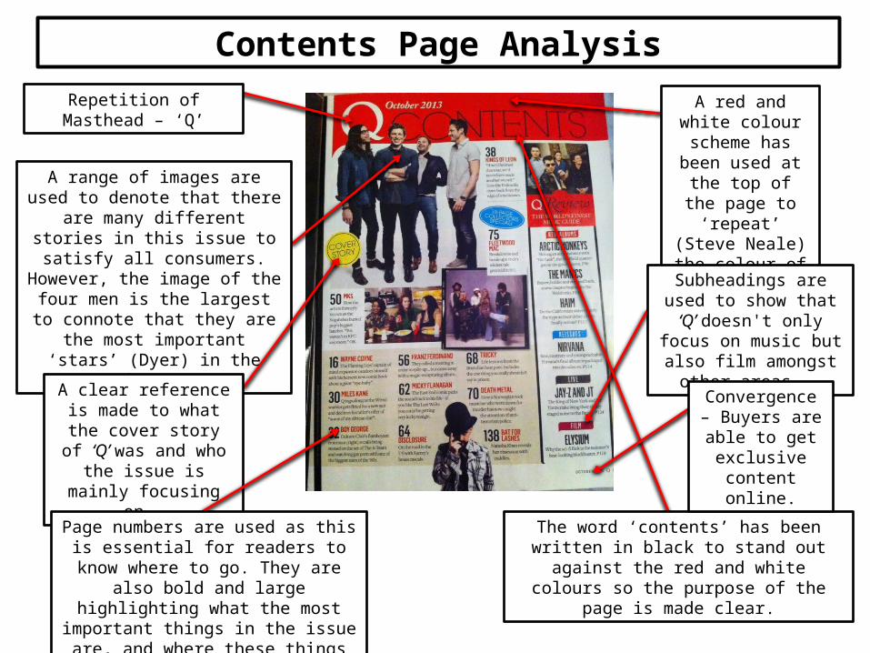
Repetition of Masthead – ‘Q’
A range of images are used to denote that there are many different stories in this issue to satisfy all consumers. However, the image of the four men
is the largest to connote that they are the most important ‘stars’ (Dyer)
in the issue.
A red and white colour scheme has been used at the
top of the page to ‘repeat’ (Steve
Neale) the colour of the ‘Q’ logo.
A clear reference is made to what the cover story of ‘Q’ was and who the issue
is mainly focusing on.
Page numbers are used as this is essential for readers to know where to go. They are also bold and large highlighting what the
most important things in the issue are, and where these things can be found.
Subheadings are used to show that ‘Q’ doesn't only
focus on music but also film amongst other areas.
The word ‘contents’ has been written in black to stand out against the red and white colours so
the purpose of the page is made clear.
Convergence – Buyers are able to
get exclusive content online.
Contents Page Analysis
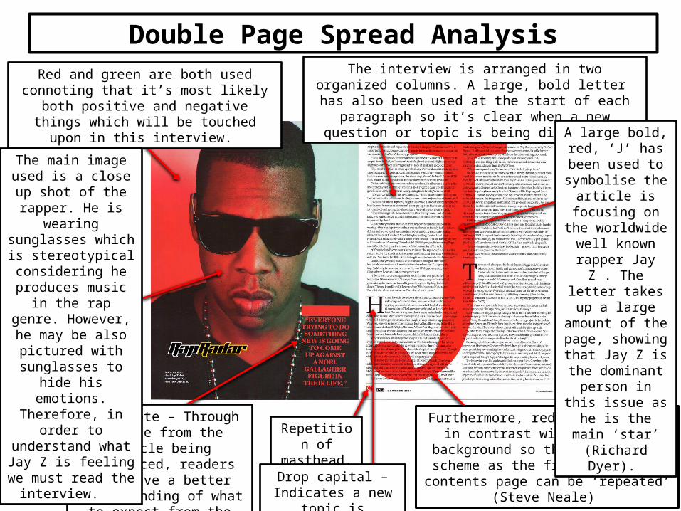
Red and green are both used connoting that it’s most likely both positive and negative things which will be touched upon in this interview.
Pull Quote – Through a quote from the article being
referenced, readers will have a better understanding of what to expect from the interview
and the issues discussed.
The main image used is a close up shot of the rapper. He is wearing sunglasses which is
stereotypical considering he
produces music in the rap genre. However, he
may be also pictured with sunglasses to hide
his emotions. Therefore, in order to understand what Jay Z is feeling we must read
the interview.
The interview is arranged in two organized columns. A large, bold letter has also been used at the start of each paragraph so it’s clear when a new question or topic is being discussed.
Furthermore, red has been used in contrast with the white background so the same
colour scheme as the front cover and contents page can be ‘repeated’ (Steve Neale)
A large bold, red, ‘J’ has been used to
symbolise the article is focusing on the worldwide well known rapper
Jay Z . The letter takes up a large amount of the
page, showing that Jay Z is the
dominant person in this issue as he is
the main ‘star’ (Richard Dyer).
Repetition of masthead.
Drop capital – Indicates a new topic is
discussed.
Double Page Spread Analysis
StraplineMasthead
Main/central image
Bar code, Date, Price & Convergence –(Visible on
handheld copy)
Main headline
Cover lines
Magazine Front Cover Analysis
‘Q’ Front Cover Analysis –
The ‘Q’ magazine issue which Paolo Nutini features on is a prime example of a successful magazine front cover in the music genre. One of the main reasons why ‘Q’ are so successful is clearly apparent when studying two of their front covers as it’s clear to see that the conventions they use are extremely consistent. Just like the issue which Arcade Fire feature on, this cover includes a masthead, a strap line, a date, price, the use of convergence, an extremely good quality main image and cover lines. Furthermore, it’s clear to see that white, black and red are the main colours used for each issue. As this magazine seems to be extremely successful I will try and incorporate a similar colour scheme in my own magazine to make sure my magazine is also attractive and eye catching to a pass along audience, so that people will stop and purchase the issue. Once again I believe the main image is definitely the USP of this particular issue as it’s of magnificent quality, large and original. Without a central image to support the main headline, the main headline would not stand out as much and the issue itself would look extremely boring as it would be mostly just text. The non verbal code of Nutini’s body language also conveys a confident personal, which is supported by the text “I’m on a quest”. Therefore, through the USP audience members will see how driven the main ‘star’ (Dyer) actually is. A pass along audience may stop and want to buy the magazine as they appreciate such a positive personality which is being presented, and as a result want to read more about Nutini if they are not familiar with him or his work. This issue also features a ‘Motown’ special and so names and images of famous Motown stars like Marvin Gaye and Stevie Wonder have been placed in a blue box. The designer of this issue was very clever in doing this to make sure a pass along audience stop and realise that this is not just another typical cover line, instead ‘Q’ has something special and different to offer. Therefore, it’s more likely a mass audience will be captured as both people who are interested in both Motown music will buy the issue, but so will people who enjoy listening to acoustic music. At the bottom of both ‘Q’ issues I have analysed, extra information is also given on who else or what else can be seen inside the magazine. In my opinion, this extra information is a small yet crucial part in making sure buyers get as much information as possible about the magazine so that they can make the right decision about whether they should spend their money on ‘Q’ or not.
Magazine Front Cover Analysis
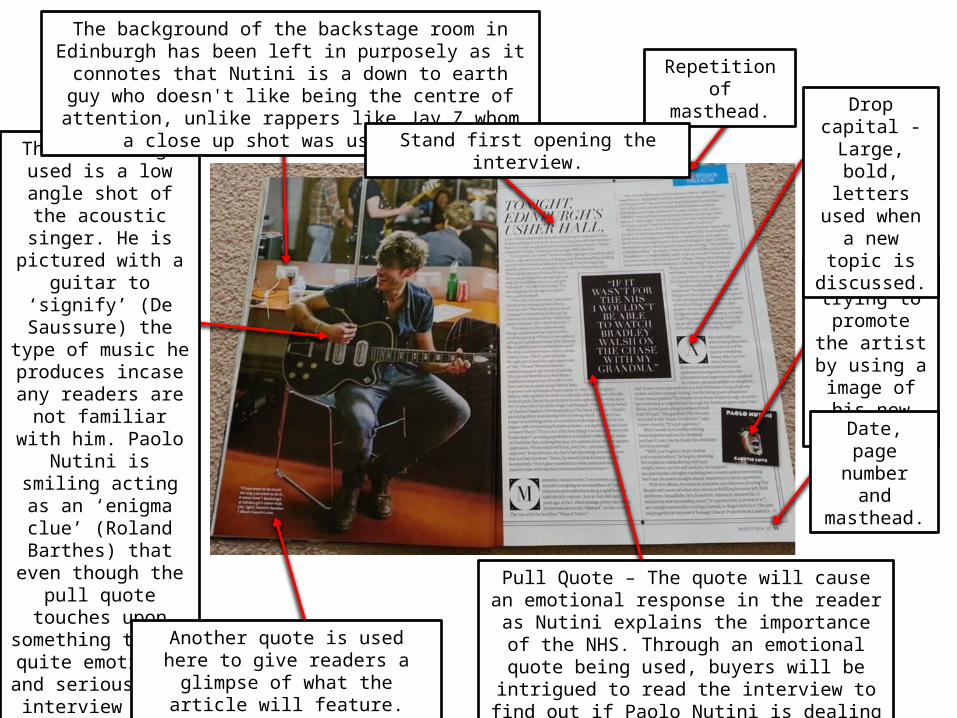
The main image used is a low angle shot of the
acoustic singer. He is pictured with a guitar
to ‘signify’ (De Saussure) the type of
music he produces incase any readers are not familiar with him. Paolo Nutini is smiling acting as an ‘enigma
clue’ (Roland Barthes) that even though the
pull quote touches upon something that’s
quite emotional and serious, the interview will also feature funny and uplifting moments
that buyers cannot miss.
Another quote is used here to give readers a glimpse of what the article
will feature.
The background of the backstage room in Edinburgh has been left in purposely as it connotes that Nutini is a down to earth
guy who doesn't like being the centre of attention, unlike rappers like Jay Z whom a close up shot was used for.
‘Q’ is trying to promote the
artist by using a image of his new album.
Repetition of masthead.
Drop capital -Large, bold, letters used when a new
topic is discussed.
Date, page number and masthead.
Stand first opening the interview.
Pull Quote – The quote will cause an emotional response in the reader as Nutini explains the
importance of the NHS. Through an emotional quote being used, buyers will be intrigued to read the interview to find out if Paolo Nutini is dealing
with a loss and if he’s okay.
Questionnaire Results
This PowerPoint contains the results I gathered from the ten surveys I distributed. I specifically asked certain individuals
to take part as a representative of my target audience of young adults. The questions that I asked will help me to identify what consumers look for in a music magazine.
Hence, I will use these results in order to create the most successful magazine that I possibly can.

Music Magazine Questionnaire Results
I asked 5 males and 5 females to answer my questionnaire. I want my magazine to appeal to both the ‘male’ and ‘female’ gender (Hartley) and so I believed it was important to get a good understanding of
how to cater for both their needs.
Male Female0
1
2
3
4
5
6
Gender?
Music Magazine Questionnaire Results
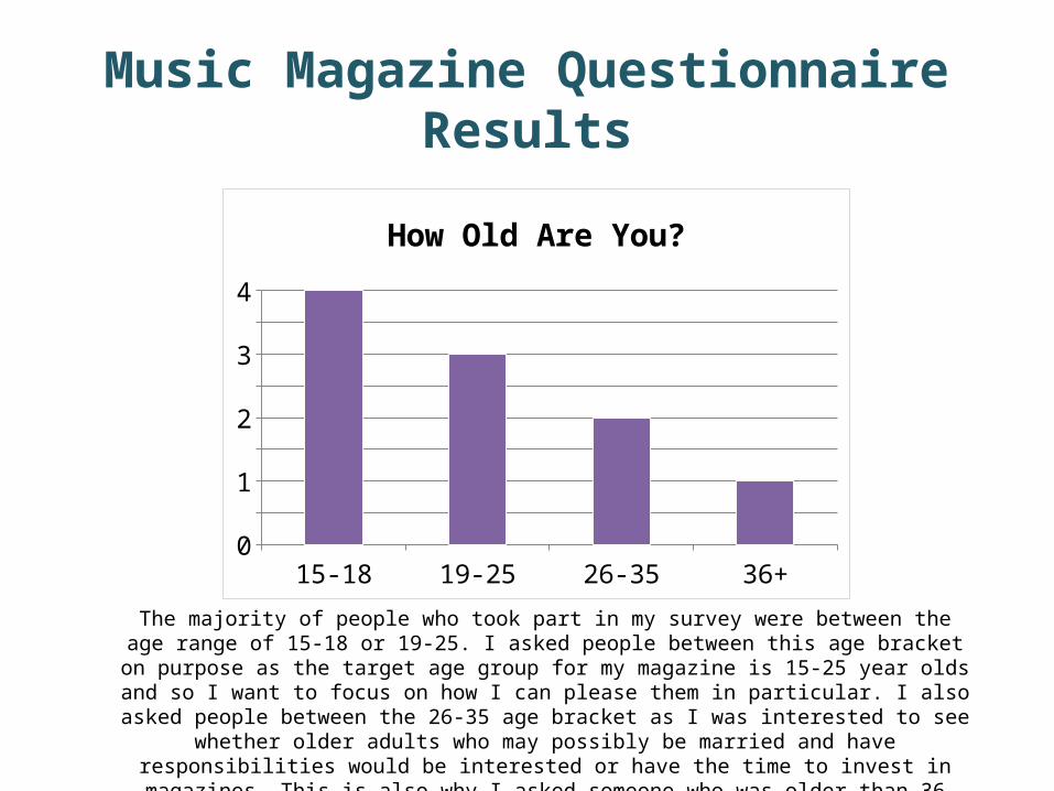
The majority of people who took part in my survey were between the age range of 15-18 or 19-25. I asked people between this age bracket on purpose as the target age group for my magazine is 15-25 year olds and so I want to focus on how I can please them in particular. I also asked people between the 26-35 age bracket as I was interested to see whether older adults who may possibly be married
and have responsibilities would be interested or have the time to invest in magazines. This is also why I asked someone who was older than 36 years old.
15-18 19-25 26-35 36+0
0.51
1.52
2.53
3.54
How Old Are You?
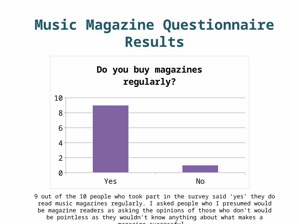
Yes No0123456789
10
Do you buy magazines regularly?
9 out of the 10 people who took part in the survey said ‘yes’ they do read music magazines regularly. I asked people who I presumed would be magazine readers as asking the opinions of those who don’t
would be pointless as they wouldn't know anything about what makes a magazine successful.
Music Magazine Questionnaire Results
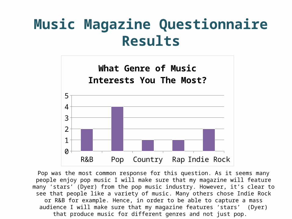
Pop was the most common response for this question. As it seems many people enjoy pop music I will make sure that my magazine will feature many ‘stars’ (Dyer) from the pop music industry. However, it’s
clear to see that people like a variety of music. Many others chose Indie Rock or R&B for example. Hence, in order to be able to capture a mass audience I will make sure that my magazine features ‘stars’ (Dyer)
that produce music for different genres and not just pop.
R&B Pop Country Rap Indie Rock
0
1
2
3
4
What Genre of Music Interests You The Most?
Music Magazine Questionnaire Results

The majority of people who answered my questionnaire said that they would spend £3 on a good quality music magazine. As ‘Q’ are my magazine of inspiration and their magazines are priced at £3.99,
even before gathering these results I was thinking of a price range at around £3. This means my magazine will be cheaper than competitors such as ‘Q’ and so I’m more likely to draw in buyers.
$1.00 $2.00 $3.00 $4.00 $5.0001234567
What is the maximum amount of money you would spend on a good
quality magazine?
Music Magazine Questionnaire Results
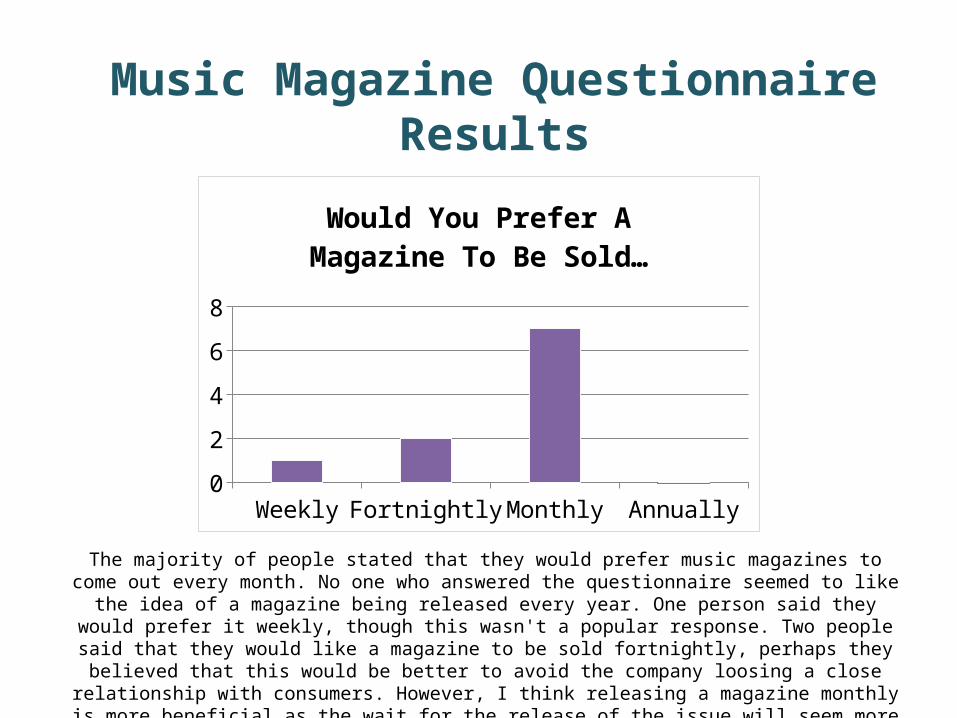
The majority of people stated that they would prefer music magazines to come out every month. No one who answered the questionnaire seemed to like the idea of a magazine being released every year. One person said
they would prefer it weekly, though this wasn't a popular response. Two people said that they would like a magazine to be sold fortnightly, perhaps they believed that this would be better to avoid the company loosing a close relationship with consumers. However, I think releasing a magazine monthly is more beneficial as the wait for the release of the issue will seem more amazing and be more anticipated. Hence, I will listen to the majority
vote and a new issue of my magazine will be released monthly.
Weekly Fortnightly Monthly Annually012345678
Would You Prefer A Magazine To Be Sold…
Music Magazine Questionnaire Results

The main colours that would draw in a pass along audience would be red and blue. I’m very pleased to here this as the successful magazine ‘Q’ which I’m referring back to for guidance uses both of these colours frequently. As these colours seem to draw potential buyers in I will definitely be using them
throughout my magazine pages. At least one person or more selected black, pink or white and so it’s clear that people also appreciate these colours. Hence, if I can I will also try and incorporate these too.
.
Red Black Blue Pink White Purple Other0
0.51
1.52
2.53
3.5
What colour would attract you most to a magazine?
Music Magazine Questionnaire Results
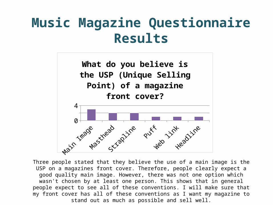
Three people stated that they believe the use of a main image is the USP on a magazines front cover. Therefore, people clearly expect a good quality main image. However, there was not one option which
wasn't chosen by at least one person. This shows that in general people expect to see all of these conventions. I will make sure that my front cover has all of these conventions as I want my magazine to
stand out as much as possible and sell well.
Main
Imag
e
Mast
head
Strap
line
Puff
Web lin
k
Headlin
e0123
What do you believe is the USP (Unique Selling Point) of a mag-
azine front cover?
Music Magazine Questionnaire Results
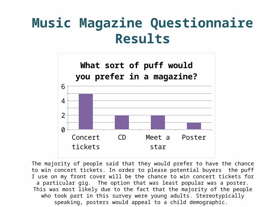
The majority of people said that they would prefer to have the chance to win concert tickets. In order to please potential buyers the puff I use on my front cover will be the chance to win concert tickets for
a particular gig. The option that was least popular was a poster. This was most likely due to the fact that the majority of the people who took part in this survey were young adults. Stereotypically
speaking, posters would appeal to a child demographic.
Concert tickets
CD Meet a star Poster0123456
What sort of puff would you pre-fer in a magazine?
Music Magazine Questionnaire Results

Incorporating a range of images was the most popular response. I plan to use a range of images on my contents page in particular. As all the options were chosen at least once it seems that all of these factors
seem to be important to people and so I will try my best to successfully incorporate all of these. However, only one person said they want lots of information. I will make sure my magazine features information that
will ‘inform’ and ‘educate (Katz) readers, though I will do this in a eye catching manner.
Good colour s
cheme
Range
of imag
es
Lots
of inform
ation
A editoria
l
Catchy m
asthead
0123
What do you think is the most important factor in a magazine?
Music Magazine Questionnaire Results
Survey Monkey Results
This PowerPoint contains the results I gathered from the ten surveys I designed and sent out using Survey Monkey. I will
be using these responses in identifying what consumers expect from a magazine. Thus, these results will have a big
impact on my final product.
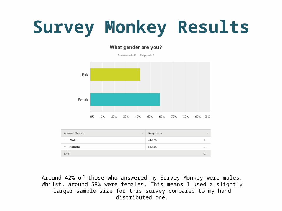
Around 42% of those who answered my Survey Monkey were males. Whilst, around 58% were females. This means I used a slightly larger sample size for this survey compared to my
hand distributed one.
Survey Monkey Results
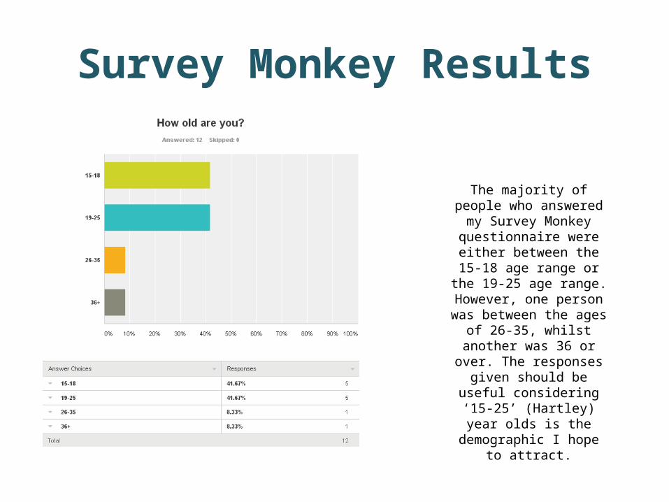
The majority of people who answered my Survey Monkey
questionnaire were either between the 15-18 age range
or the 19-25 age range. However, one person was
between the ages of 26-35, whilst another was 36 or over. The responses given should be
useful considering ‘15-25’ (Hartley) year olds is the
demographic I hope to attract.
Survey Monkey Results
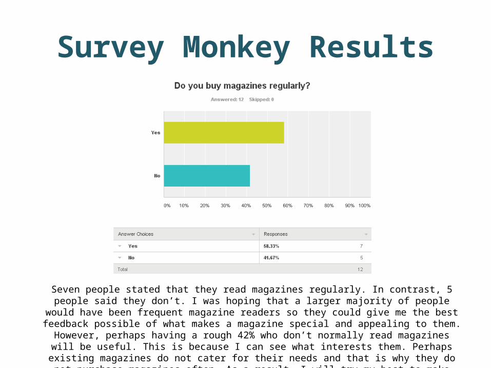
Seven people stated that they read magazines regularly. In contrast, 5 people said they don’t. I was hoping that a larger majority of people would have been frequent magazine readers so they could give me the best
feedback possible of what makes a magazine special and appealing to them. However, perhaps having a rough 42% who don’t normally read magazines will be useful. This is because I can see what interests them.
Perhaps existing magazines do not cater for their needs and that is why they do not purchase magazines often. As a result, I will try my best to make sure that my magazine does appeal to them by incorporating
their appreciated feedback.
Survey Monkey Results
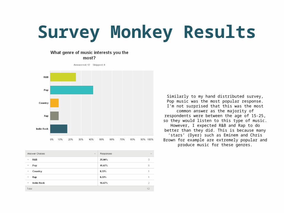
Similarly to my hand distributed survey, Pop music was the most popular response. I’m not surprised
that this was the most common answer as the majority of respondents were between the age of 15-25, so they would listen to this type of music.
However, I expected R&B and Rap to do better than they did. This is because many ‘stars’ (Dyer) such as
Eminem and Chris Brown for example are extremely popular and produce music for these
genres.
Survey Monkey Results

I’ve begun to see many common trends between this and my hand distributed survey. In this survey the majority of
people also said they would pay £3 for a good quality magazine. As this has been
the most populist response in both cases, I have decided that £3 will definitely be the amount my magazine is priced at. 25% of people said they would pay £4. This and
the 58% figure for £3, conveys that people aren’t afraid to pay a high price as long as
they get something worthy out of it.
Survey Monkey Results

Survey Monkey Results
The majority of people who answered this questionnaire would prefer magazines to
come out monthly. Many existing magazine corporations distribute issues monthly. This
seems to work in their favor as they maintain popularity. Therefore, I will release a new issue every month also. Surprisingly, one person actually said they would like a
magazine to be sold annually. This is quite a unusual response as you would only receive news from one single issue to last you the
whole year. Perhaps, the person who selected this option was one of the
individuals who don’t read magazines regularly. Thus, they aren’t concerned about maintaining a ‘personal relationship’ (Katz)
with ‘stars’ (Dyer).
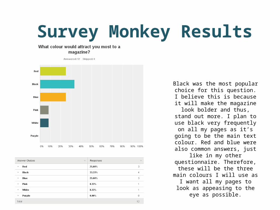
Black was the most popular choice for this question. I believe this is because it will make the magazine look bolder and
thus, stand out more. I plan to use black very frequently on all my pages as
it’s going to be the main text colour. Red and blue were also common
answers, just like in my other questionnaire. Therefore, these will be
the three main colours I will use as I want all my pages to look as appeasing
to the eye as possible.
Survey Monkey Results
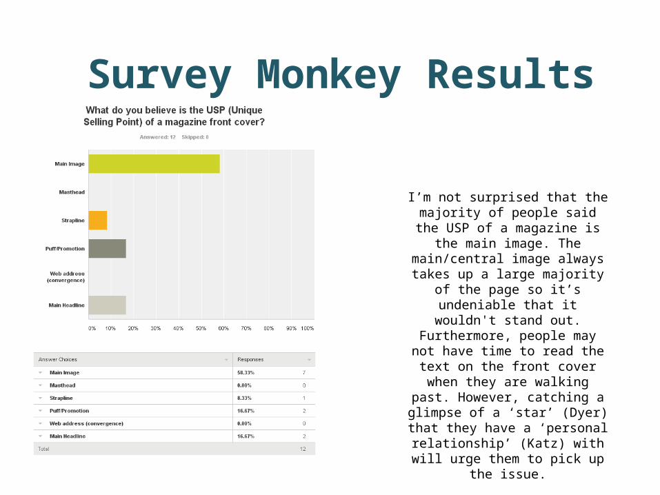
I’m not surprised that the majority of people said the USP of a magazine is
the main image. The main/central image always takes up a large majority
of the page so it’s undeniable that it wouldn't stand out. Furthermore,
people may not have time to read the text on the front cover when they are
walking past. However, catching a glimpse of a ‘star’ (Dyer) that they have a ‘personal relationship’ (Katz) with will
urge them to pick up the issue.
Survey Monkey Results
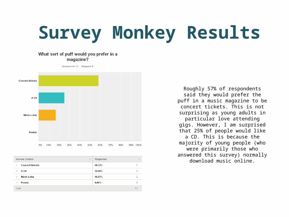
Roughly 57% of respondents said they would prefer the puff in a music
magazine to be concert tickets. This is not surprising as young adults in
particular love attending gigs. However, I am surprised that 25% of people
would like a CD. This is because the majority of young people (who were primarily those who answered this survey) normally download music
online.
Survey Monkey Results

It seems that the majority of people would really value the use of a good colour scheme. I will make sure that I use a
consistent colour scheme across my pages and that all the colours work well together. I wasn't planning on having a editorial on
my contents page prior to constructing both questionnaires. However, as it was a
popular response in both surveys I am now considering having one. I believe
incorporating one will be beneficial as it’s a great way to welcome readers to the first
issue.
Survey Monkey Results