presentation q7
TRANSCRIPT

Looking back at your preliminary task, what do feel you have learnt
in the progression from it to the full production.

Looking back at my preliminary task I know I have made vast improvements. I have improved my skills and techniques on photoshop for instance changing the effect of a picture. Also taking my original image and cutting out the background. For instance the images below. This was done on photoshop.
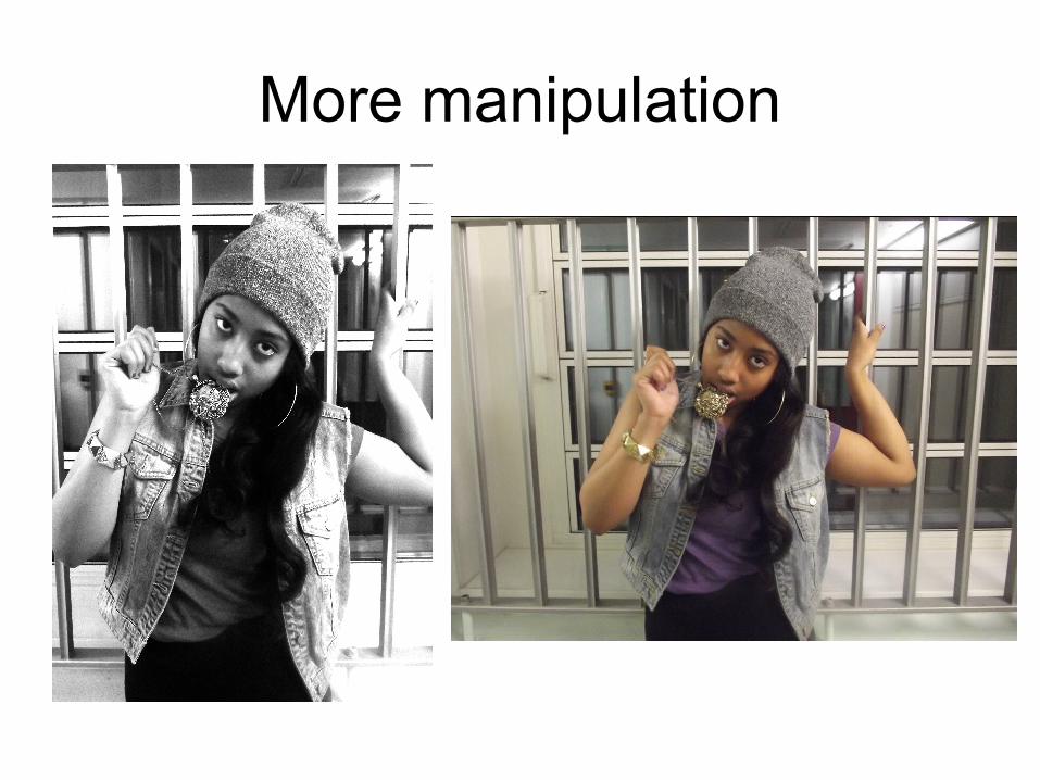
More manipulation
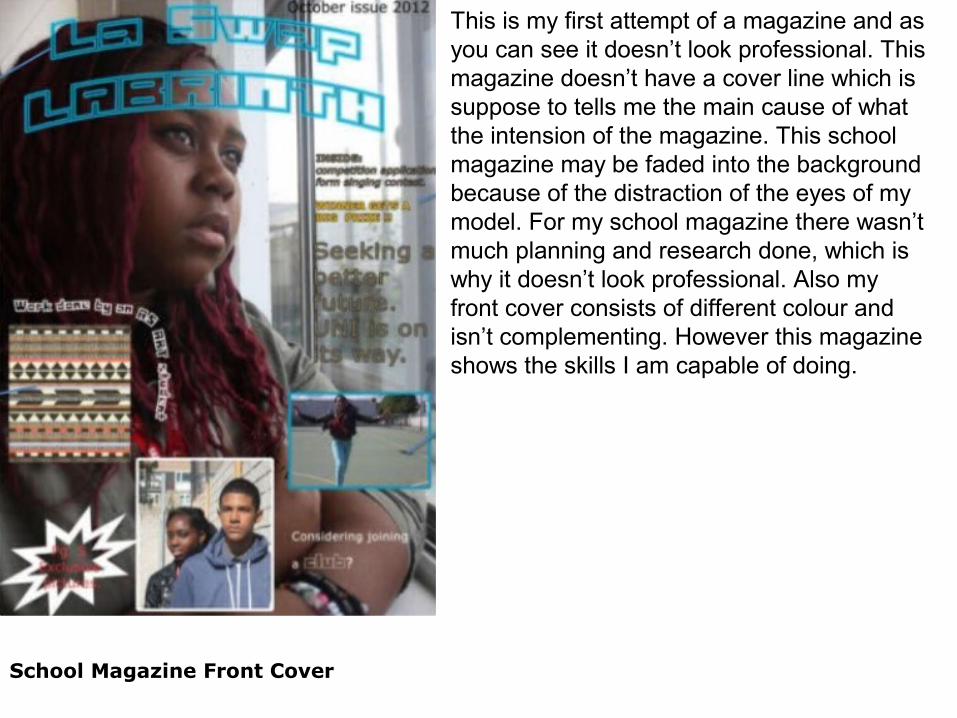
School Magazine Front Cover
This is my first attempt of a magazine and as you can see it doesn’t look professional. This magazine doesn’t have a cover line which is suppose to tells me the main cause of what the intension of the magazine. This school magazine may be faded into the background because of the distraction of the eyes of my model. For my school magazine there wasn’t much planning and research done, which is why it doesn’t look professional. Also my front cover consists of different colour and isn’t complementing. However this magazine shows the skills I am capable of doing.

Music Magazine Front Cover
However comparing my music magazine to my school magazine, my music magazine looks professional. Unlike my school magazine my music magazine has a cover line. The piercing eyes of my model will attract my audience because the eyes are directly looking at you. My mast head typography that I used was from dafont which is a font website that I grew to learn how to use. Also for my music magazine there was research and a lot of planning.

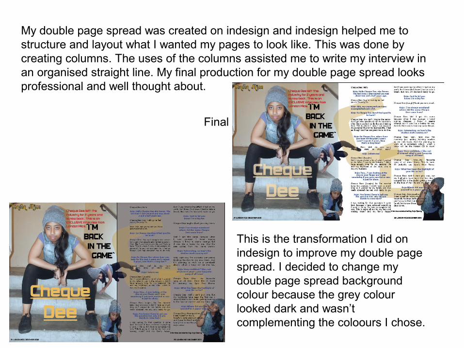
My double page spread was created on indesign and indesign helped me to structure and layout what I wanted my pages to look like. This was done by creating columns. The uses of the columns assisted me to write my interview in an organised straight line. My final production for my double page spread looks professional and well thought about.
This is the transformation I did on indesign to improve my double page spread. I decided to change my double page spread background colour because the grey colour looked dark and wasn’t complementing the coloours I chose.
Final