practical performance measurement excerpt · performance measurement using the pump blueprint ......
TRANSCRIPT
EXCERPTPRactical PeRfoRMance MeasUReMent
Using the PuMP Blueprint for Fast, Easy and Engaging KPIs
Stacey Barr
Barr_CS6_revise.indd 7 3/5/14 3:42 PM
EXCERPT
317step 8: reachIng performance targets
performance targets are simple habits that are the foundation of almost every successful continuous performance improvement effort. If we leave one of the steps out, we lose control or influence over performance im-provement, and we have to rely on luck or good fortune instead. That’s a very stressful way to manage an organisation or business.
The five steps of the PuMP Reaching Performance Targets frame-work do not prescribe a decision-making process but a natural flow for a conversation that should occur throughout our decision processes and performance review meetings. As you read on and learn more about each of these five steps for responding to performance measures, ask yourself this question: How would I embed these steps into a formal and regular performance and strategy review process at my organisation?
the 5 steps to use measures to reach performance targets
step 8.1: set sensible targetsWe’ve arrived at one of the logical places in the performance measure-ment process to be thinking about targets. When we understand where the performance level truly is now, using our XmR charts, then we can as-sess how much of a performance improvement we can realistically aim to achieve. That expectation can become our first target, the short- or medi-um-term target that everyone believes is achievable. We can also set a lon-ger-term or stretch target that we don’t yet know exactly how to achieve, or whether we’ll achieve it. Stretch targets can be exciting and motivating when they’re set in the right context, but, whatever we do, we don’t set tar-gets for 100% (or any other value that represents perfection). Rarely do we ever have enough influence over a performance result to achieve a perfect outcome. We set targets that stretch us to find as much influence as we can to get performance results to improve. Even though we might want zero workplace accidents, and setting a target of zero is what our hearts want to do and we ethically feel compelled to do, it’s not going to help people feel empowered. Anything short of zero will feel like failure even if we achieve something amazing like halving the number of accidents. So we set targets in the context of continual improvement, acknowledging
Barr_CS6_revise.indd 317 3/5/14 3:42 PM
EXCERPT
318 chapter 11
that perfection can’t happen overnight, next month, or perhaps ever. If the average is 10 accidents per week right now, then we set a target of no more than six accidents per week, or, phrased positively, preventing four accidents per week.
It’s important not to let the improvement projects or strategic initia-tives take on a life of their own. They have to stay focused on achieving a real change in our performance measures. The idea is to give time and money only to the most elegant solutions that fix—or at least reduce the impact of—the things that are constraining our performance. So we need to gauge how well our solutions are working.
Generally people set targets without really thinking enough. What ex-actly are they setting the target for? Is the target the ideal level to hit every day or every week or every month? Is the target the ideal level to hit by the end of the year? If we’ve absorbed the messages of Step 7 in the PuMP Blueprint, we will appreciate that routine variation is part of every single measure, so comparing performance each month with a target value is a dumb comparison to make (yes, dumb). But when we use XmR charts and set targets for the central line or the natural process limits, they make much more sense. We can clearly visualise what hitting the target means in that case.
The Federal Aviation Administration (FAA) in the United States wanted to reduce the time it takes to find placements for those people who don’t pass the flight controller’s exam (referred to as ‘training fail-ures’). The FAA formed a Measures Team, headed by Steve Silvers, Em-ployee Services Team Manager of the Central Service Center. Steve and his 17 staff members provide staffing and position management support to around 10,800 employees located in 17 states in the central U.S. One of the things they do is place training failures in jobs they are better suited for, at different facilities throughout the United States. The team mea-sured this result using Training Failure Processing Time, the average number of days it takes from the date they are notified of a person failing to pass the exam to the date that human resources are notified of that person’s new placement.
Based on the XmR chart, Training Failure Processing Time was sit-ting at an average of 67 days. This meant a lot of lost productivity as the people who failed the exam waited for alternative assignments and a lot of angst for those people as they waited in limbo to find out whether they
Barr_CS6_revise.indd 318 3/5/14 3:42 PM
EXCERPT
319step 8: reachIng performance targets
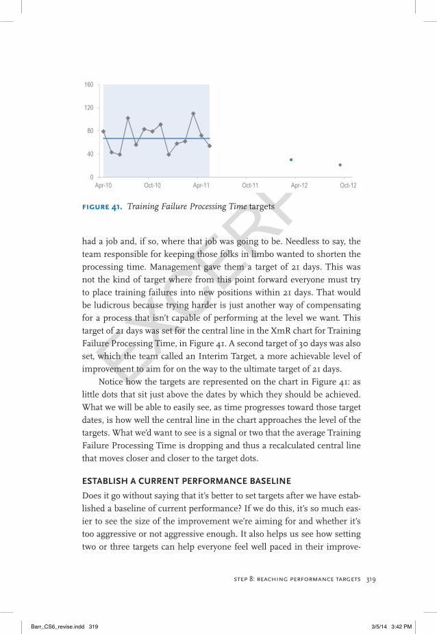
had a job and, if so, where that job was going to be. Needless to say, the team responsible for keeping those folks in limbo wanted to shorten the processing time. Management gave them a target of 21 days. This was not the kind of target where from this point forward everyone must try to place training failures into new positions within 21 days. That would be ludicrous because trying harder is just another way of compensating for a process that isn’t capable of performing at the level we want. This target of 21 days was set for the central line in the XmR chart for Training Failure Processing Time, in Figure 41. A second target of 30 days was also set, which the team called an Interim Target, a more achievable level of improvement to aim for on the way to the ultimate target of 21 days.
Notice how the targets are represented on the chart in Figure 41: as little dots that sit just above the dates by which they should be achieved. What we will be able to easily see, as time progresses toward those target dates, is how well the central line in the chart approaches the level of the targets. What we’d want to see is a signal or two that the average Training Failure Processing Time is dropping and thus a recalculated central line that moves closer and closer to the target dots.
estaBlish a cURRent PeRfoRMance Baseline
Does it go without saying that it’s better to set targets after we have estab-lished a baseline of current performance? If we do this, it’s so much eas-ier to see the size of the improvement we’re aiming for and whether it’s too aggressive or not aggressive enough. It also helps us see how setting two or three targets can help everyone feel well paced in their improve-
FIgure 41. Training Failure Processing Time targets
0
40
80
120
160
Apr-10 Oct-10 Apr-11 Oct-11 Apr-12 Oct-12
Barr_CS6_revise.indd 319 3/5/14 3:42 PM
EXCERPT
320 chapter 11
ment effort and not freaked-out by a scary stretch target. So the first target should be a modest improvement that most people believe is achievable, the second possibly more challenging but still one that people can see is possible. Finally, the stretch target can be one that no one is sure yet is possible or how to even reach it. We can worry later about how to reach that target after we achieve the first two targets. So target time frames don’t have to align with our planning horizon. We don’t have to have an end-of-year target only. We can have several along the way and beyond.
Define the signals to ResPonD to
When we understand the XmR chart signal types (Step 7 of PuMP) and how to set sensible targets, we might want to review the response section in our measure’s definition (from Step 5 of PuMP) to be more specific about the rules for interpreting each of our performance measures. We might recall from Step 5 the following signal types, which ought to make a bit more sense now:
Signal 1: Performance has reached or exceeded the target.
Signal 2: Performance is improving at a rate fast enough that the target will likely be met.
Signal 3: Performance is improving, but not fast enough to reach the target.
Signal 4: Performance is stable and not changing.
Signal 5: Performance is getting worse.
Signal 6: Performance is unpredictable or chaotic.
This method of target setting also has implications for how we use traffic lights, those red, amber, and green symbols on dashboards that summarise whether performance is unacceptable, so-so, or good. Which colour of traffic light would you give to each of the signals in the above list? I’d make signals 1 and 2 green lights, signals 3 and 4 amber lights, and signals 5 and 6 red lights.
If the initiatives in our strategic or operational plans are the right ones, we should see patterns in our performance measures that show performance improving when we expect it to, correlated with implemen-tation of our planned initiatives. And if that is the signal we get, then we
Barr_CS6_revise.indd 320 3/5/14 3:42 PM
EXCERPT
321step 8: reachIng performance targets
don’t need to go beyond this first step in responding to that performance measure. But if that’s not the signal we get, if our performance measure isn’t showing improvement despite our chosen initiatives, then some-thing needs to be done. But we don’t do just anything. We have to find the root cause first and make the change there.
step 8.2: Prioritise the performance gapsPerformance management is about closing the gaps between actual per-formance and the levels of performance that we deliberately choose to pursue. It’s not about making everything better. It’s about making the most important things better, injecting energy, time, and money into the fewest things that matter most to being better able to fulfil our mission and achieve our vision. Even if the nicest person on the planet says that everything matters, they’re wrong. Do you remember the manager I men-tioned back in Chapter 2, who had 87 KPIs? The stress he put his staff through, and the nervous breakdown he ultimately suffered himself, were a sure sign that 87 priorities is too many. You can’t achieve performance excellence without sharp focus.
Next to having a ruthlessly small set of performance results and ac-companying measures, another tenet of performance excellence is priori-tising which of these measures needs attention first. There are a few types of signals that our measures can show us when we include a target in our XmR charts. The first is the loveliest: actual performance is at or better than the target. The second is comforting: performance is moving toward target, and there is still time to reach the target by the due date. The third is frustrating: performance is improving but nowhere near enough to reach the target on time. The fourth is disturbing: despite our efforts, performance isn’t changing at all. The fifth is alarming: performance is moving in the opposite direction from our target. The sixth is alarming also: it shows chaotic performance, which means we have little control or influence at all over that performance result.
Each of these signals carries a relative sense of urgency, which, when combined with the relative importance of each of our performance mea-sures, helps to prioritise which performance gaps to close first. And that’s important because often we have more to do than we have time or re-sources to do with excellence.
Barr_CS6_revise.indd 321 3/5/14 3:42 PM
EXCERPT
322 chapter 11
It’s easy enough to see why the FAA’s Central Service Center priori-tised Training Failure Processing Time as something to improve. Looking back at the XmR chart for Training Failure Processing Time in Figure 41 (page 237), we can see that the time varied chaotically between 40 and 110 days between May 2010 and April 2011. The natural process limits suggest that we could expect it to take as long as 148 days. This is Signal 6: Performance is unpredictable or chaotic. Generally, the approach to take when we see unpredictable or chaotic performance is simply to examine the business process and make it consistent; standardise the tasks in the workflow that have the greatest impact on the results the process ought to deliver. The chaos is often a sign that things are happening in an ad hoc fashion.
We set targets to raise the bar, to become better than we have been in the past, to focus us on a real improvement. To be better, we have to change something. The gaps between actual performance and targeted performance aren’t closed just because everyone tries harder. Almost al-ways, something fundamental in the work process has to be changed, like the procedures, skill levels, or technical systems.
Changes rarely happen overnight, and changes don’t always work as well as we intended. So it’s unreasonable to expect that next month should hit the target. There is a time lag for performance to fundamentally im-prove, for us to see a signal in our performance measure that tells us performance has improved, and by how much. That time lag is because we are working out what is holding performance down and making the changes to elevate performance.
step 8.3: find the causesStep 8.3 of the PuMP Reaching Performance Targets framework is find-ing the causes of the signals we see in our performance measures, the triggers that let us know if, when, and how we need to respond. When we see a signal, if we see a signal, we want to find out what caused it before we spend any time or effort to improve performance. Cause analysis is a systematic investigation that often makes use of additional data to under-stand what was happening at the time and place where a signal occurred. But before we go looking for the data, we want to first be sure we under-stand the system that is producing the result we’re measuring.
Barr_CS6_revise.indd 322 3/5/14 3:42 PM
EXCERPT
323step 8: reachIng performance targets
UnDeRstanD the PRocess PRoDUcing a PeRfoRMance ResUlt
In this discussion of cause analysis, I’m referring to business process management in general, and methods like Six Sigma and Lean, which are specifically for business process re-engineering. Rather than repeat what has been documented in myriad books and websites about process improvement techniques, I’ll simply discuss two techniques that are par-ticularly useful in guiding our cause analysis.
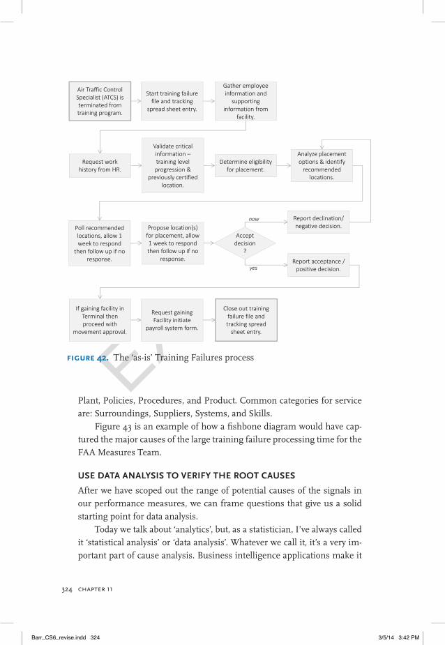
First, flow charting or process mapping helps us define the scope of the system that produces the performance result we’re measuring. FAA’s Central Service Center examined the existing or ‘as-is’ method of pro-cessing into new placements the individuals who failed air traffic control training. Valerie, one of Steve’s colleagues in the FAA Measures Team, worked with a group of field managers and the executive adviser and brainstormed the problems that they were seeing from a field perspec-tive. They brainstormed what they thought was delaying the process and the complaints they were getting from the employees and the union. And they created a flow chart of the entire process. As you might agree on look-ing over Figure 42, they discovered that much of the time taken to process training failures was spent waiting: waiting for responses, waiting for ap-provals, waiting for the failed air traffic control specialists to make their decisions about alternative placements.
Flow charts of a workflow or business process, like the one in Figure 42, provide a big-picture view of where problems are and of their scope. That’s the starting point for finding the root causes of the problems.
scoPe oUt PossiBle caUses of PeRfoRMance gaPs
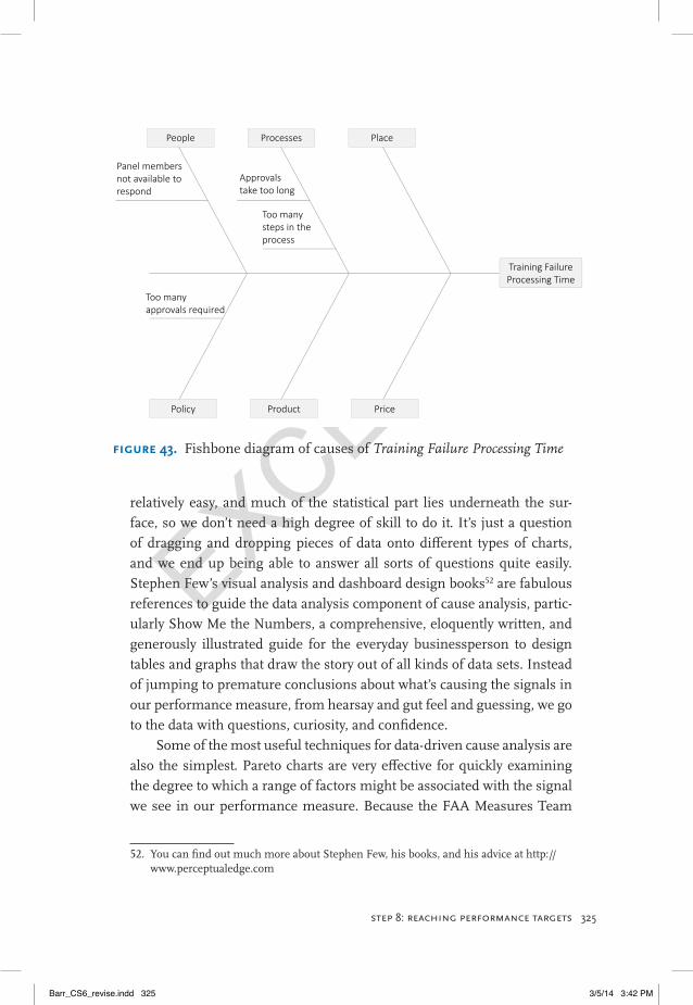
With flow charts or maps of the business process before us, we can use Fishbone or Ishikawa diagrams to scope out the range of potential causes of our measures’ signals. These diagrams are useful because they give us a practical structure for thinking thoroughly through relevant causes as a preliminary step to guide our data analysis. Each of the ‘bones’ that angles off the spine in a fishbone diagram can be a general category; within each general category, we can brainstorm related causal factors. In manufac-turing processes, a common array of categories is: Equipment, Process, People, Materials, Environment, and Management. For service processes, a good array of categories is: Price, Promotion, People, Processes, Place/
Barr_CS6_revise.indd 323 3/5/14 3:42 PM
EXCERPT
324 chapter 11
Plant, Policies, Procedures, and Product. Common categories for service are: Surroundings, Suppliers, Systems, and Skills.
Figure 43 is an example of how a fishbone diagram would have cap-tured the major causes of the large training failure processing time for the FAA Measures Team.
Use Data analysis to veRify the Root caUses
After we have scoped out the range of potential causes of the signals in our performance measures, we can frame questions that give us a solid starting point for data analysis.
Today we talk about ‘analytics’, but, as a statistician, I’ve always called it ‘statistical analysis’ or ‘data analysis’. Whatever we call it, it’s a very im-portant part of cause analysis. Business intelligence applications make it
FIgure 42. The ‘as-is’ Training Failures process
Start training failure file and tracking
spread sheet entry.
Air Traffic Control Specialist (ATCS) is terminated from training program.
Request work history from HR.
Gather employee information and
supporting information from
facility.
Determine eligibility for placement.
Validate critical information –training level progression &
previously certified location.
Analyze placement options & identify recommended
locations.
Report declination/ negative decision.Propose location(s)
for placement, allow 1 week to respond then follow up if no
response.
Poll recommended locations, allow 1 week to respond
then follow up if no response. Report acceptance /
positive decision.
Accept decision
?
now
yes
If gaining facility in Terminal then proceed with
movement approval.
Request gaining Facility initiate
payroll system form.
Close out training failure file and tracking spread sheet entry.
Barr_CS6_revise.indd 324 3/5/14 3:42 PM
EXCERPT
325step 8: reachIng performance targets
relatively easy, and much of the statistical part lies underneath the sur-face, so we don’t need a high degree of skill to do it. It’s just a question of dragging and dropping pieces of data onto different types of charts, and we end up being able to answer all sorts of questions quite easily. Stephen Few’s visual analysis and dashboard design books52 are fabulous references to guide the data analysis component of cause analysis, partic-ularly Show Me the Numbers, a comprehensive, eloquently written, and generously illustrated guide for the everyday businessperson to design tables and graphs that draw the story out of all kinds of data sets. Instead of jumping to premature conclusions about what’s causing the signals in our performance measure, from hearsay and gut feel and guessing, we go to the data with questions, curiosity, and confidence.
Some of the most useful techniques for data-driven cause analysis are also the simplest. Pareto charts are very effective for quickly examining the degree to which a range of factors might be associated with the signal we see in our performance measure. Because the FAA Measures Team
52. You can find out much more about Stephen Few, his books, and his advice at http://www.perceptualedge.com
FIgure 43. Fishbone diagram of causes of Training Failure Processing Time
Training Failure Processing Time
People Processes Place
Policy Product Price
Too many approvals required
Panel members not available to respond
Approvals take too long
Too many steps in the process
Barr_CS6_revise.indd 325 3/5/14 3:42 PM

EXCERPT
326 chapter 11
had noted that waiting time was a big contributor to the total processing time for training failures, it could have been very useful to find out the main reasons for delays. This analysis could have been displayed in a Pa-reto chart of the percentage of waiting time accounted for by each reason, like the example in Figure 44.
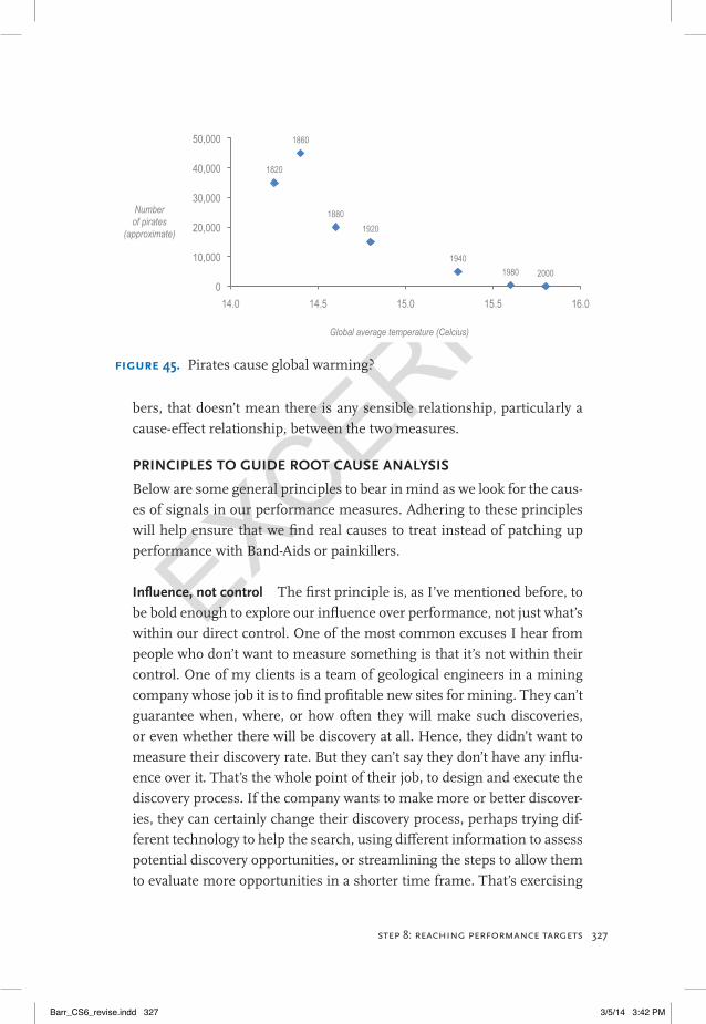
Scatter plots offer another simple, insightful means to analyse data and explore the factors that correlate with performance measurement results. It’s critical, however, to keep in mind that correlation is not the same as causation. A few funny examples of this warning appear on a blog for statisticians and data analysts.53 One particularly cool example (ahem) is the scatter plot in Figure 45, which shows how global average temperatures have increased with the decline of the pirate population. Of course it’s ludicrous to think that pirates have anything to do with global warming (and I’m not sure how reliable this data is). But there are plenty of silly leaps from correlation to causation that aren’t as obviously daft as concluding that increasing the number of pirates would be the answer to global warming. Just because there is correlation in two sets of num-
53. You can find the blog post at http://stats.stackexchange.com/questions/36/examples-to-teach-correlation-does-not-mean-causation
0% 10% 20% 30% 40% 50%
Deciding on placement option
Manager not available
Complex case
Unknown
Request not received
Insufficient information
Inaccurate information
Request misplaced
Sent to wrong manager
FIgure 44. Example of a Pareto Chart for Training Failure Processing Time
Barr_CS6_revise.indd 326 3/5/14 3:42 PM
EXCERPT
327step 8: reachIng performance targets
bers, that doesn’t mean there is any sensible relationship, particularly a cause-effect relationship, between the two measures.
PRinciPles to gUiDe Root caUse analysis
Below are some general principles to bear in mind as we look for the caus-es of signals in our performance measures. Adhering to these principles will help ensure that we find real causes to treat instead of patching up performance with Band-Aids or painkillers.
influence, not control The first principle is, as I’ve mentioned before, to be bold enough to explore our influence over performance, not just what’s within our direct control. One of the most common excuses I hear from people who don’t want to measure something is that it’s not within their control. One of my clients is a team of geological engineers in a mining company whose job it is to find profitable new sites for mining. They can’t guarantee when, where, or how often they will make such discoveries, or even whether there will be discovery at all. Hence, they didn’t want to measure their discovery rate. But they can’t say they don’t have any influ-ence over it. That’s the whole point of their job, to design and execute the discovery process. If the company wants to make more or better discover-ies, they can certainly change their discovery process, perhaps trying dif-ferent technology to help the search, using different information to assess potential discovery opportunities, or streamlining the steps to allow them to evaluate more opportunities in a shorter time frame. That’s exercising
1820
1860
1880 1920
1940 1980 2000
0
10,000
20,000
30,000
40,000
50,000
14.0 14.5 15.0 15.5 16.0
Number of pirates
(approximate)
Global average temperature (Celcius)
FIgure 45. Pirates cause global warming?
Barr_CS6_revise.indd 327 3/5/14 3:42 PM
EXCERPT
328 chapter 11
influence over the outcome even if they don’t have control over it. And when we realise that our target doesn’t have to be perfection—we’re only aiming to make continual improvements—it’s easier to see that we can indeed influence performance improvement at least to some extent. Pos-sibly the root of this excuse is the old mantra ‘you cannot control what you do not measure’. I think a better mantra for performance excellence is ‘influence, not control’.
look at patterns, not points The second principle is to look for causes of the patterns or signals in a performance measure, not causes for individ-ual points. If we try to explain the reasons that every month is different from the last one, we’ll just set off on a tampering escapade that will lead to a lot of wasted time, effort, and money and bring about more chaos rather than more control. Recall the earlier example of the sawmill and their kneejerk reactions to their performance dashboard’s signals?
setting targets requires understanding why performance is falling short The third principle is to accept that sometimes we can’t set a meaningful target until we have some idea of why performance isn’t cur-rently good enough. The way we’ll reach our targets is by removing or reducing the effect of the causes on our performance result, which is go-ing to cost time and money. If our target is too big too soon, we can de-moralise people when they are held accountable for something that they don’t have the resources to rectify. But when they know the causes of under-performance, they can more easily explore the influence they can have to pursue an affordable target.
Don’t look at one measure in isolation And, finally, remember the prin-ciple of not just looking at one performance measure in isolation. Rath-er, look at the patterns among all the measures that are related to one another. Our Results Maps and Measure Definitions will have identified the performance measures that are related to one another in our organi-sations, and when these measures are reported together, we’ll get a more complete story that focuses us on looking for root causes rather than treat-ing symptoms.
All of the analysis that Steve and his Measures Team in the FAA did to understand the causes of delays in the training failure process re-
Barr_CS6_revise.indd 328 3/5/14 3:42 PM
EXCERPT
329step 8: reachIng performance targets
vealed that getting approvals was the biggest time-eater. Bureaucracy at its finest!
step 8.4: choose high-leverage solutions If your experience is anything like mine, the most common response to poor performance results is to make excuses. ‘It’s outside of our control...’ ‘It’s their fault. . . ’ ‘It’s the economy. . . ’ Truth is, almost everything is out-side of anyone’s complete control. We’d be doing ourselves a really, really big favour if we simply assumed that everything is indeed outside of our control. Then we’d be free to focus only on our influence, as I’ve mentioned earlier. We need to have this mindset before we can fundamentally improve performance. Let’s not wait until we have complete control; let’s not wait for ‘them’ to fix it; let’s not wait for the economy to improve. Let’s embrace the idea that ‘if it’s going to be, it’s up to me’ and look for solutions that address the fundamental obstacles to achieving the performance we want.
Playing the blame game is not on. The healthy and emotionally in-telligent way to deal with performance gaps is to go find what is holding those gaps open. This is why the design of performance reports includes cause analysis: to focus the discussion on ‘why’ rather than ‘why not’, and on exercising influence rather than making excuses.
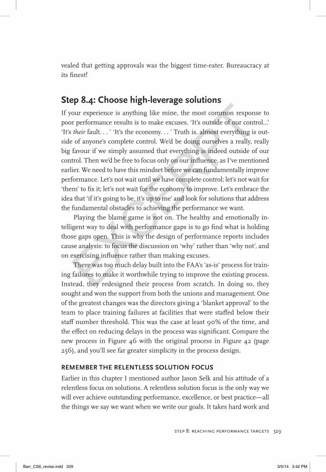
There was too much delay built into the FAA’s ‘as-is’ process for train-ing failures to make it worthwhile trying to improve the existing process. Instead, they redesigned their process from scratch. In doing so, they sought and won the support from both the unions and management. One of the greatest changes was the directors giving a ‘blanket approval’ to the team to place training failures at facilities that were staffed below their staff number threshold. This was the case at least 90% of the time, and the effect on reducing delays in the process was significant. Compare the new process in Figure 46 with the original process in Figure 42 (page 256), and you’ll see far greater simplicity in the process design.
ReMeMBeR the Relentless solUtion focUs
Earlier in this chapter I mentioned author Jason Selk and his attitude of a relentless focus on solutions. A relentless solution focus is the only way we will ever achieve outstanding performance, excellence, or best practice—all the things we say we want when we write our goals. It takes hard work and
Barr_CS6_revise.indd 329 3/5/14 3:42 PM
EXCERPT
330 chapter 11
undying devotion to truly stand out and excel. And making excuses or giv-ing up on a goal are conspicuous clues that the get-up-and-go to achieve that goal either got up and went or was never there in the first place. Those ex-cuses are clues that the lofty words in the strategic plan are empty platitudes.
KeeP solUtions focUseD on the Root caUses
When we start the search for solutions, it’s going to help if we keep front and centre in our view the obstacles that are constraining performance the most. Most solutions treat the symptoms of unacceptable performance, essentially compensating for it rather than truly fixing it. For example, a billing team, who followed a similar approach to the FAA training failures team, wanted to increase the percentage of invoices paid on time and in full. They first believed that educating their customers about on-time bill payment was the solution. But the real solution turned out to be simplify-ing their pricing model and increasing the accuracy of their invoices. The question to start a search for solutions to improve performance shouldn’t be ‘how do we improve our measure’? It should be ‘how can we reduce the impact of this particular cause of poor performance’?
A high-leverage solution has a high benefit-to-cost ratio. We get a big
FIgure 46. The new Training Failures process
Step 1. Facility provides
documentation to EST.
Air Traffic Control Specialist (ATCS) is terminated from training program.
EST reviews the information & recommends
placement options.
ATM is informed of placement options and allows ATCS 7 days to select.
Facility / Air Traffic Manager (ATM)
Employee Services Team (EST)
Panel member determines
appropriate facility placement &
conducts job search.
Panel Review
EST reviews job search results and obtains placement
options.
EST and HR process the transfer of the ATCS to new facility.
Barr_CS6_revise.indd 330 3/5/14 3:42 PM
EXCERPT
331step 8: reachIng performance targets
return for the investment. It’s like the sugar train example, in which a very small investment in modelling the sugar system produced far greater capacity in the rail system to meet recent and future growth in sugar pro-duction. And this investment saved money too; the organisation had been prepared to invest millions of dollars in new trains and wagons to achieve the same outcome. But the new trains and wagons would have simply been an expensive painkiller, not a true solution.
To find high-leverage solutions, we have to do the opposite of the advice ‘don’t just stand there, do something’! Often we should instead ‘don’t just do something, stand there’! We need to stand there and look more carefully at the options we have for dealing with the causes of poor performance. We might even need to stand there long enough to test a few different options—potential solutions—and get some objective evi-dence about their relative impacts. This means pilot testing or simulating potential solutions to gauge their impact and cost-benefit before we make a decision about what exactly to do.
PRoject ManageMent veRsUs PeRfoRMance ManageMent
If we want to properly manage the implementation of a performance im-provement, we need to rely on proper project management strategies. Part of proper project management is to use milestones to pace the successful progress of the project over time. At this point, it’s worth remembering our observation from Step 3 of PuMP that many people still use mile-stones as performance measures. I argue that milestones are different from performance measures. And now it’s easier to see why. A milestone is a project management tool that helps us keep track of the project’s implementation but gives no indication at all about the degree of success of the project in achieving its intended outcome (such as its impact on a performance result). That’s what true performance measures do: mea-sure the degree of success of something in achieving the desired impact. Milestones and performance measures are completely different from one another. Both are important, but they serve different purposes.
step 8.5: look for signals and check for impactAlmost identical to Step 7.5 of the PuMP framework for interpreting sig-nals from measures is this final step in the framework for reaching per-
Barr_CS6_revise.indd 331 3/5/14 3:42 PM
EXCERPT
332 chapter 11
formance targets: look for signals during and after the implementation of solutions to fix the causes of poor performance. It might feel like the job is done when the improvement project reaches its final milestone, and everyone will be keen to rush off to the next exciting project. So it will take some discipline, but it’s essential to continue checking the measure for signals that confirm whether or not the fix that we implemented really did some fixing.
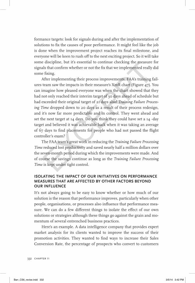
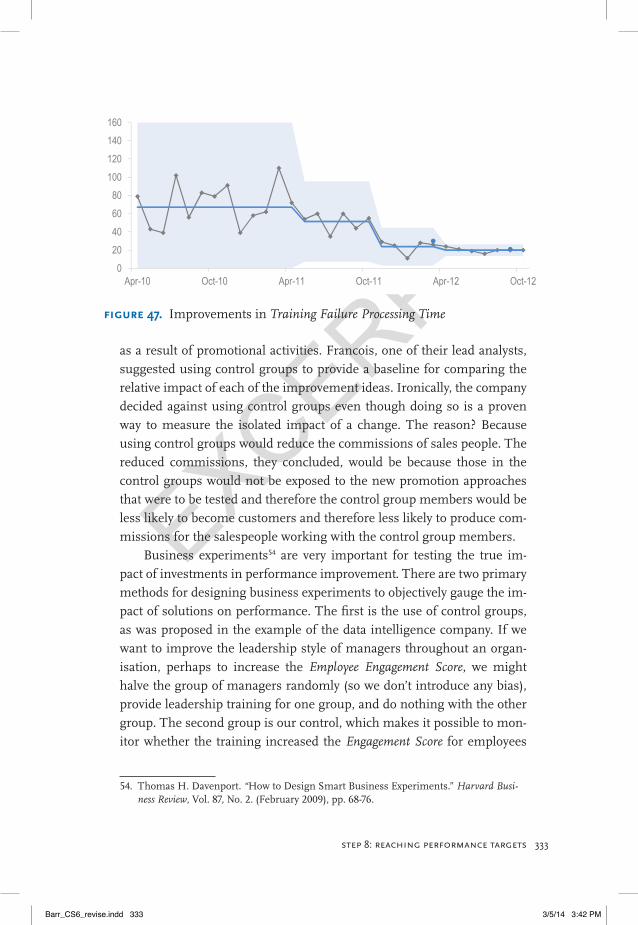
After implementing their process improvements, FAA’s training fail-ures team saw the impacts in their measure’s XmR chart (Figure 47). You can imagine how pleased everyone was when the chart showed that they had not only reached their interim target of 30 days ahead of schedule but had exceeded their original target of 21 days also! Training Failure Process-ing Time dropped down to 20 days as a result of their process redesign, and it’s now far more predictable and in control. They went ahead and set the next target at 14 days. Do you think they could have set a 14 -day target and believed it was achievable back when it was taking an average of 67 days to find placements for people who had not passed the flight controller’s exam?
The FAA team’s great work in reducing the Training Failure Processing Time reduced lost productivity and saved nearly half a million dollars over the seven-month period during which the improvements were made. And of course the savings continue as long as the Training Failure Processing Time is kept under tight control.
isolating the iMPact of oUR initiatives on PeRfoRMance MeasURes that aRe affecteD By otheR factoRs BeyonD oUR inflUence
It’s not always going to be easy to know whether or how much of our solution is the reason that performance improves, particularly when other people, organisations, or processes also influence that performance mea-sure. We can do a few different things to isolate the effect of our own solutions or strategies although these things go against the grain and mo-mentum of several entrenched business practices.
Here’s an example. A data intelligence company that provides expert market analysis for its clients wanted to improve the success of their promotion activities. They wanted to find ways to increase their Sales Conversion Rate, the percentage of prospects who convert to customers
Barr_CS6_revise.indd 332 3/5/14 3:42 PM
EXCERPT
333step 8: reachIng performance targets
as a result of promotional activities. Francois, one of their lead analysts, suggested using control groups to provide a baseline for comparing the relative impact of each of the improvement ideas. Ironically, the company decided against using control groups even though doing so is a proven way to measure the isolated impact of a change. The reason? Because using control groups would reduce the commissions of sales people. The reduced commissions, they concluded, would be because those in the control groups would not be exposed to the new promotion approaches that were to be tested and therefore the control group members would be less likely to become customers and therefore less likely to produce com-missions for the salespeople working with the control group members.
Business experiments54 are very important for testing the true im-pact of investments in performance improvement. There are two primary methods for designing business experiments to objectively gauge the im-pact of solutions on performance. The first is the use of control groups, as was proposed in the example of the data intelligence company. If we want to improve the leadership style of managers throughout an organ-isation, perhaps to increase the Employee Engagement Score, we might halve the group of managers randomly (so we don’t introduce any bias), provide leadership training for one group, and do nothing with the other group. The second group is our control, which makes it possible to mon-itor whether the training increased the Engagement Score for employees
54. Thomas H. Davenport. “How to Design Smart Business Experiments.” Harvard Busi-ness Review, Vol. 87, No. 2. (February 2009), pp. 68-76.
0
20
40
60
80
100
120
140
160
Apr-10 Oct-10 Apr-11 Oct-11 Apr-12 Oct-12
FIgure 47. Improvements in Training Failure Processing Time
Barr_CS6_revise.indd 333 3/5/14 3:42 PM
EXCERPTStacey Barr is an internationally recognised specialist in organisational performance mea-surement, and creator of the PuMP® method-ology. She has directed her own company since 1999, helping organisations of all shapes and sizes around the world to meaningfully mea-sure what matters.
Stacey challenges the long-held beliefs and bad habits that cause the common strug-gles people have in choosing, creating and
using performance measures to improve organisational performance. She helps people get tangibly clear about the results they really intend to achieve in their business or organisation, and to know how to recognise how well they are achieving those results.
Performance measurement is the best tool to do this. Done meaning-fully and engagingly, it is the most powerful way to focus and motivate people to achieve organisational performance excellence.
Stacey balances her work schedule with her passions for running, ex-ploring nature and indulging in dark chocolate. She lives in a semi-rural Australian village where wallabies graze on the front lawn, and goannas and echidna roam the back yard.
Contact Stacey by email at [email protected] or visit her online at www.staceybarr.com.
Barr_CS6_revise.indd 348 3/5/14 3:42 PM