population chapter 2. a.d. 2000 a.d. 1000 a.d. 1 1000 b.c. 2000 b.c. 3000 b.c. 4000 b.c. 5000 b.c....
TRANSCRIPT
Population
Chapter 2
A.D.2000
A.D.1000
A.D.1
1000B.C.
2000B.C.
3000B.C.
4000B.C.
5000B.C.
6000B.C.
7000B.C.
1+ million years
8
7
6
5
2
1
4
3
OldStoneAge New Stone Age
BronzeAge
IronAge
MiddleAges
ModernAge
Black Death —The Plague
9
10
11
12
A.D.3000
A.D.4000
A.D.5000
18001900
1950
1975
2000
2100
Future
Billions
Source: Population Reference Bureau; and United Nations, World Population Projections to 2100 (1998).
World Population Growth Through History
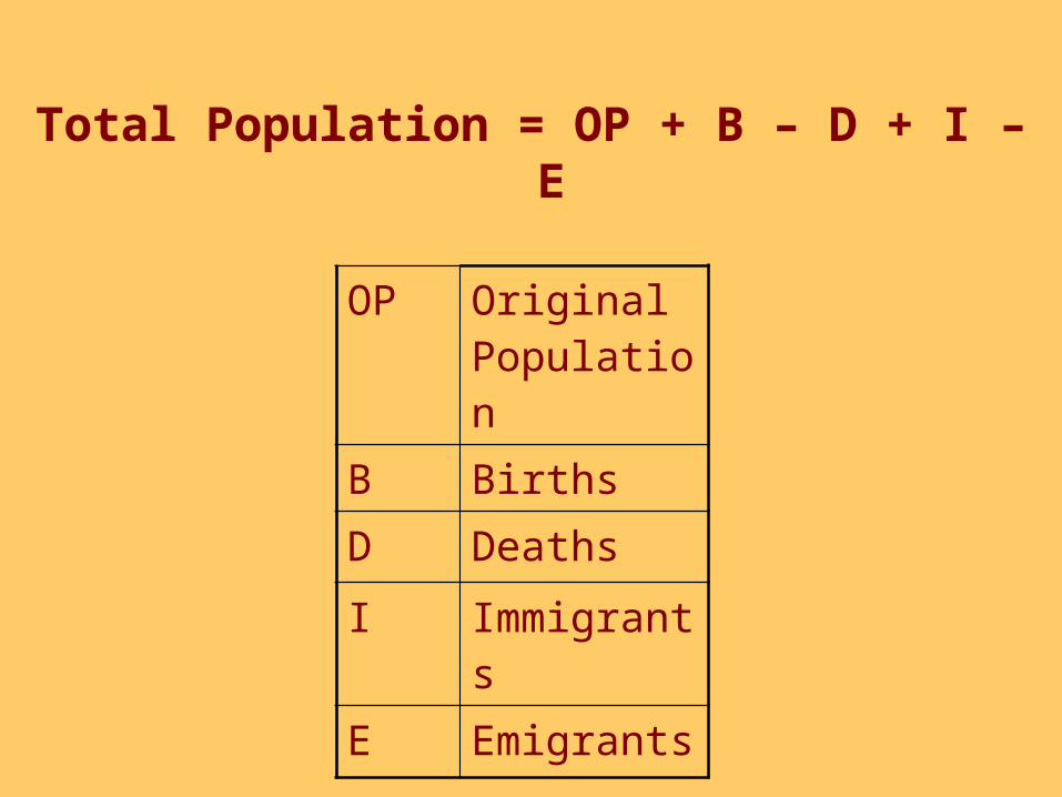
Total Population = OP + B – D + I – E
OP Original Population
B Births
D Deaths
I Immigrants
E Emigrants
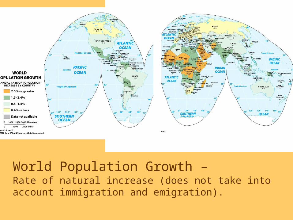
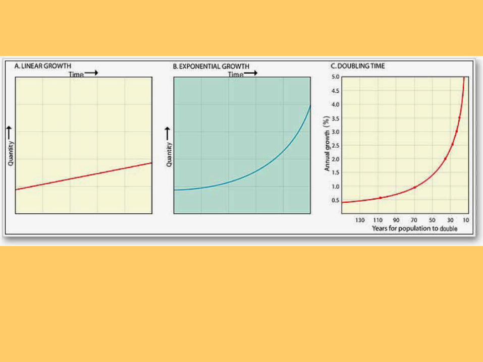
World Population Growth –Rate of natural increase (does not take into account immigration and emigration).
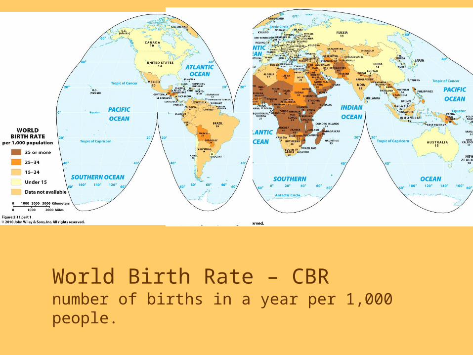
World Birth Rate – CBRnumber of births in a year per 1,000 people.
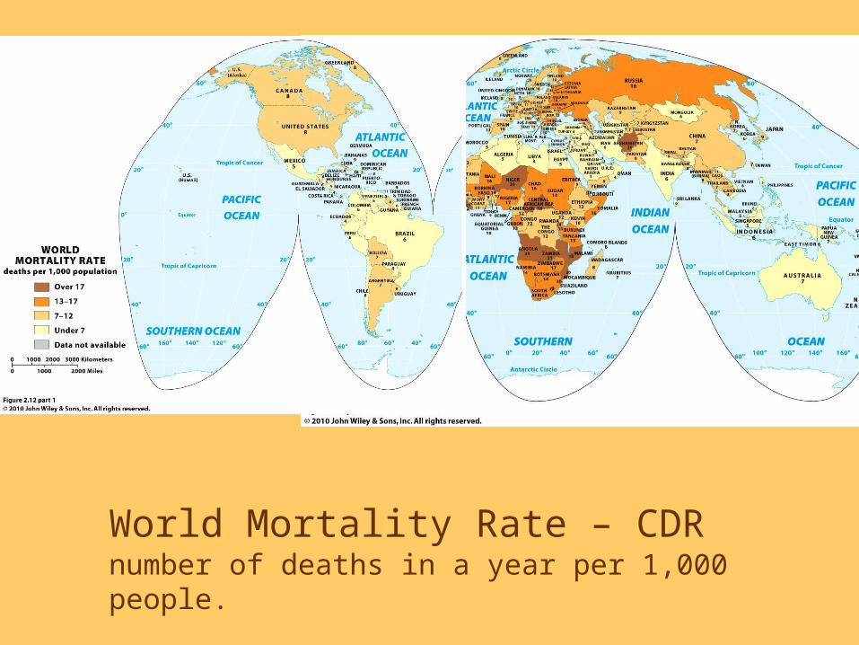
World Mortality Rate – CDRnumber of deaths in a year per 1,000 people.

Today, the pace of world population growth is
slowing. Where have Total Fertility Rates (TFRs) fallen below replacement level and why?

The Demographic Transition• Stage 1: Low Growth
• Stage 2: High Growth
• Stage 3: Moderate Growth
• Stage 4: Low Growth (Stationary)
• NEW: Stage 5: Declining growth
• Stationary population level (SPL)
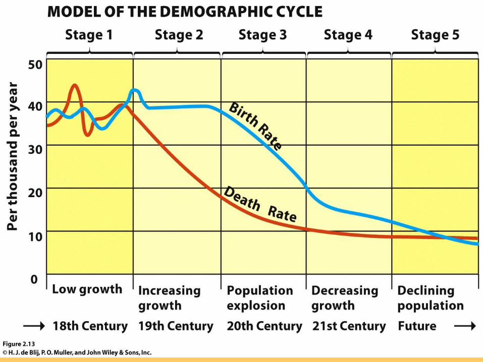
The Demographic Transition

Time
Stage 1 Stage 2 Stage 3 Stage 4
Naturalincrease
Birth rate
Death rate
Note: Natural increase is produced from the excess of births over deaths.
The Classic Stages of Demographic Transition
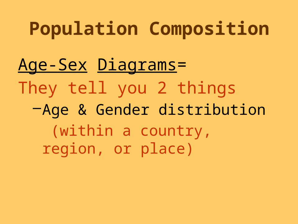
Population Composition
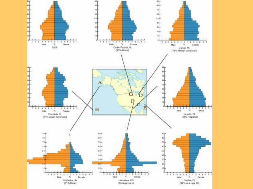
Age-Sex Diagrams=They tell you 2 things
–Age & Gender distribution (within a country, region, or place)

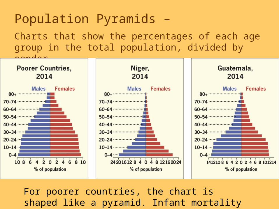
Population Pyramids – Charts that show the percentages of each age group in the total population, divided by gender.
For poorer countries, the chart is shaped like a pyramid. Infant mortality rates are high, life expectancy is shorter.
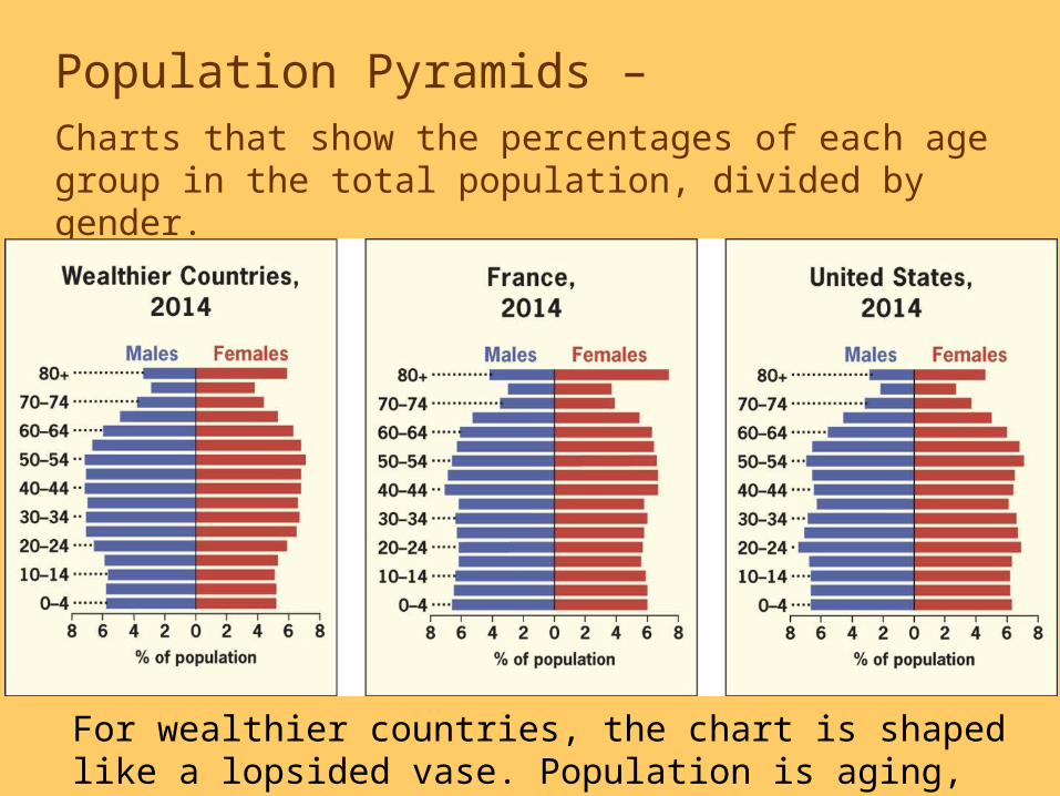
Population Pyramids – Charts that show the percentages of each age group in the total population, divided by gender.
For wealthier countries, the chart is shaped like a lopsided vase. Population is aging, TFRs are declining.

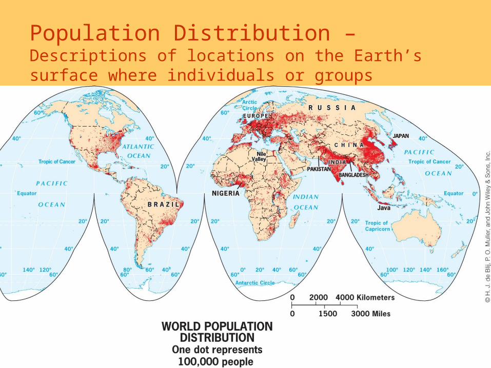
Population Distribution – Descriptions of locations on the Earth’s surface where individuals or groups (depending on the scale) live.
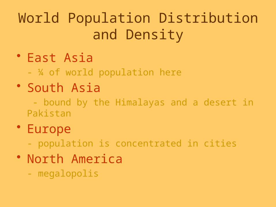
World Population Distribution and Density
• East Asia- ¼ of world population here
• South Asia - bound by the Himalayas and a desert in Pakistan
• Europe- population is concentrated in cities
• North America- megalopolis

East Asia Population
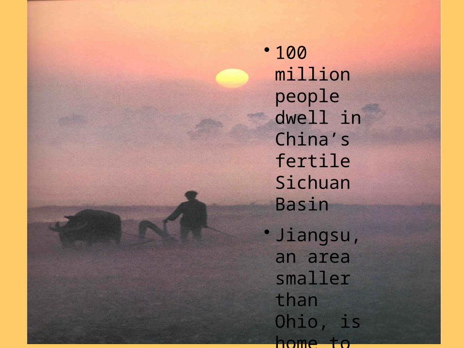
• 100 million people dwell in China’s fertile Sichuan Basin
• Jiangsu, an area smaller than Ohio, is home to more than 70 million people
Government Population Policies
• Expansive Population Policies- Encourages population growth.
• Eugenic Population Policies- Favors one racial or cultural sector over others.
• Restrictive Population Policies- range from toleration of unapproved birth control to outright prohibition of large families.
Make sure you are familiar with examples: past & present of each
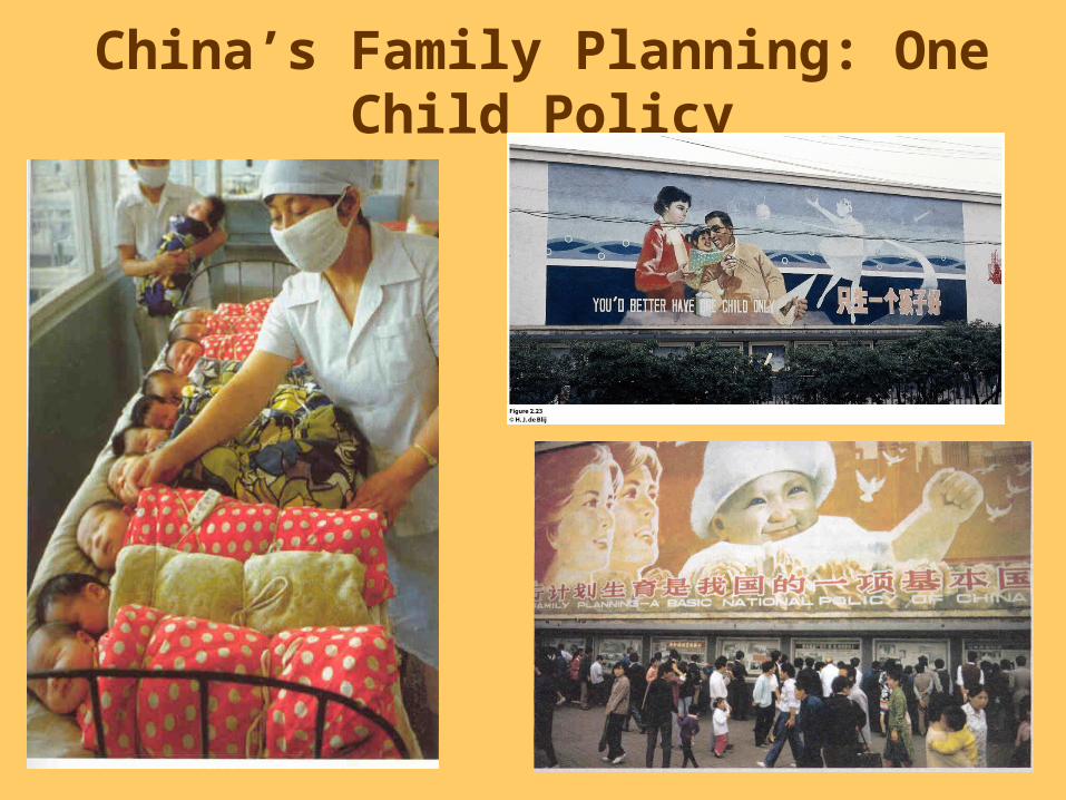
China’s Family Planning: One Child Policy

China• What does China’s sex - age pyramid look
like?• What stage is it in the Demographic
transition model?Stage 1: Low Growth
Stage 2: High Growth
Stage 3: Moderate Growth
Stage 4: Low Growth or Stationary
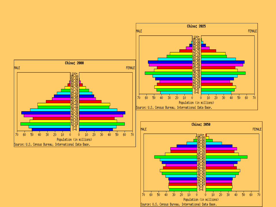
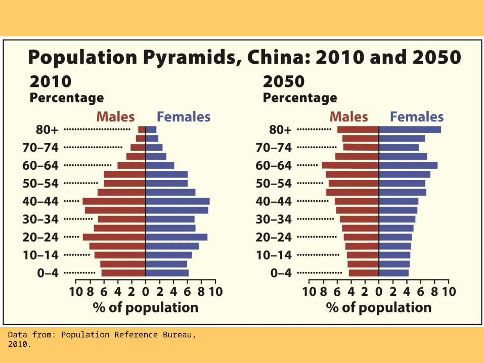
Data from: Population Reference Bureau, 2010.

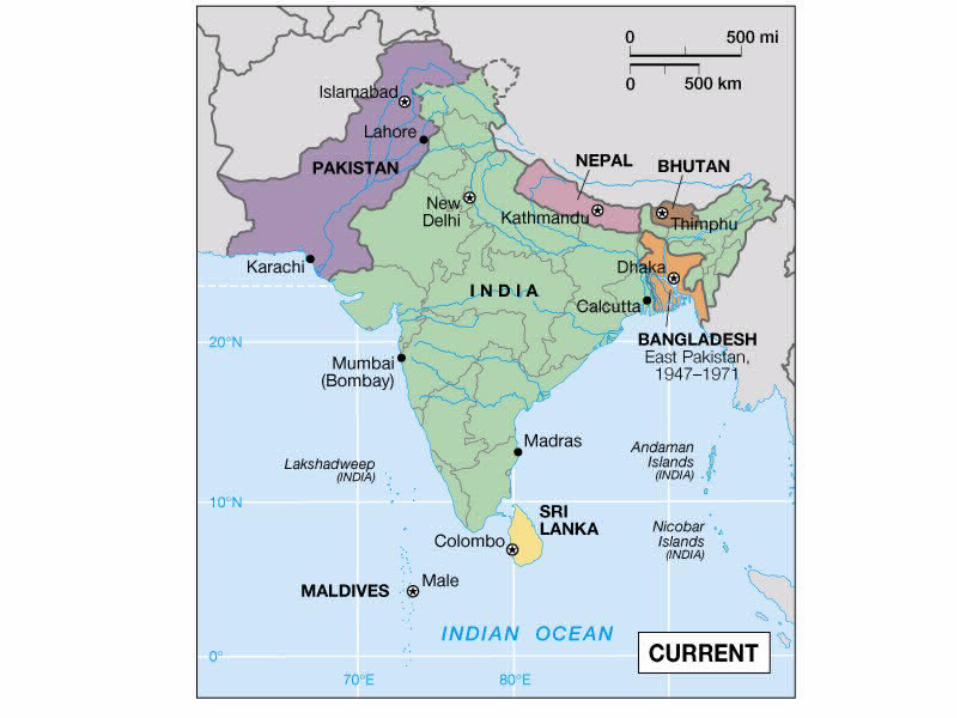
Population Growth in India
• Significant demographic variations occur within countries. – In India,
growth rates are higher in the east and northeast.
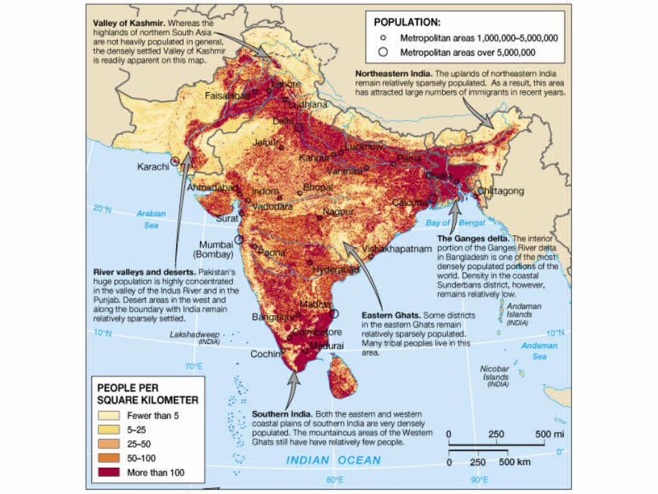
South Asian Population
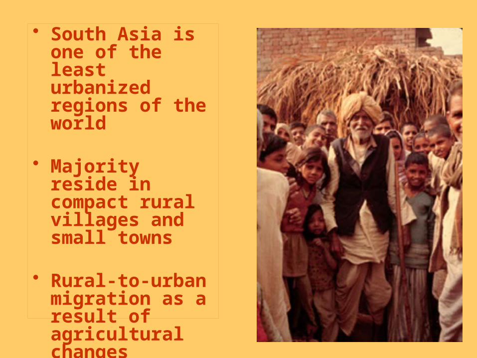
• South Asia is one of the least urbanized regions of the world
• Majority reside in compact rural villages and small towns
• Rural-to-urban migration as a result of agricultural changes

Family Planning
• India• Since the 1950s
the TFR has dropped but not enough
• TFRS vary widely within the country
• Strong correlation between women’s education and family planning
• 27% of India’s married women are sterilized
• Cultural preference for male children
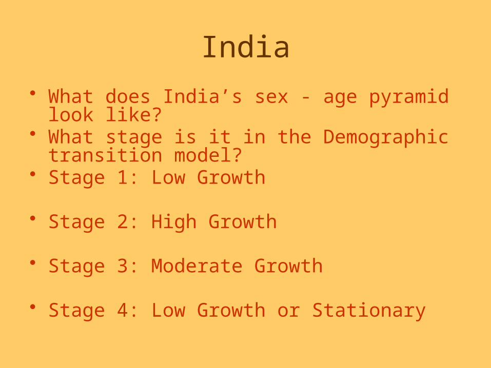
India• What does India’s sex - age pyramid look
like?• What stage is it in the Demographic
transition model?• Stage 1: Low Growth
• Stage 2: High Growth
• Stage 3: Moderate Growth
• Stage 4: Low Growth or Stationary
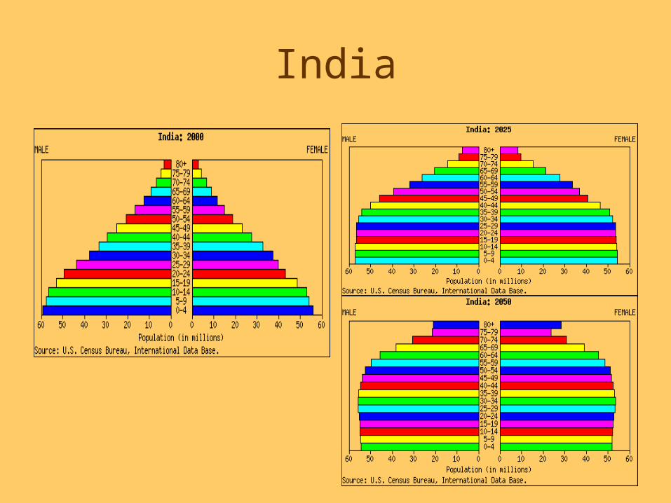
India

Two Ways of Population Density:
Arithmetic Density – measure of total population relative to land size
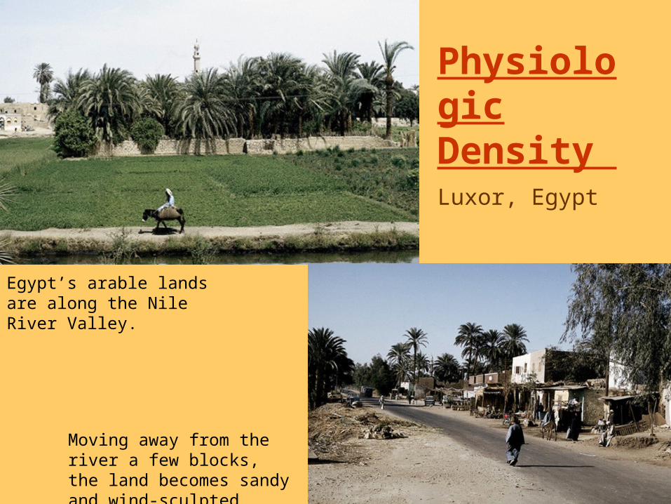
Physiologic Density Luxor, Egypt
Egypt’s arable lands are along the Nile River Valley.
Moving away from the river a few blocks, the land becomes sandy and wind-sculpted.
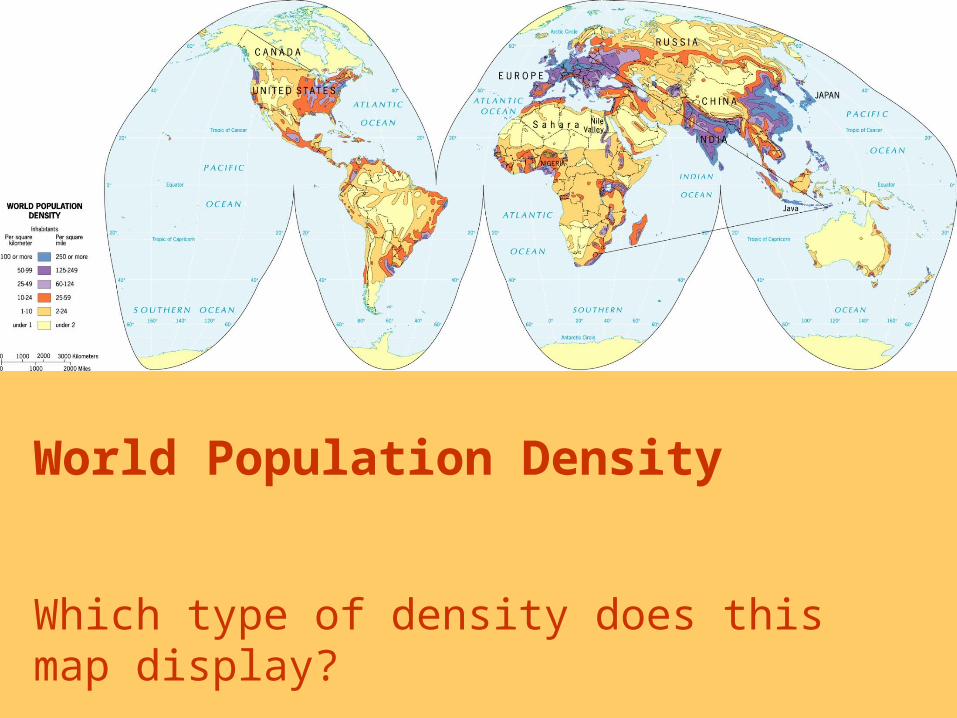
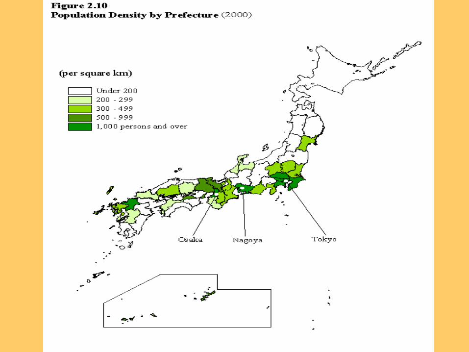
World Population Density
Which type of density does this map display?
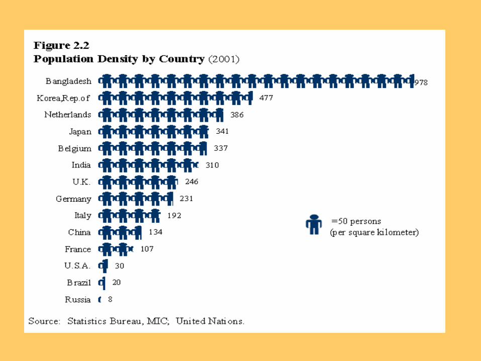

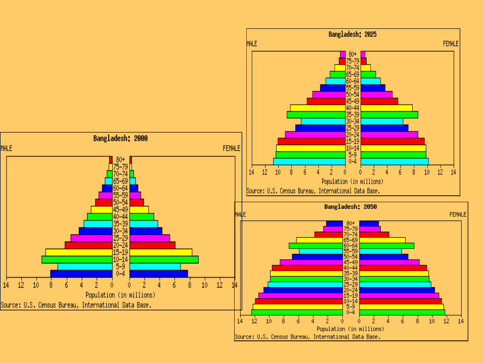
• Has one of the highest settlement densities in the world– TFR has been
nearly cut in half between 1975 and the late 1990s
– 50% of Bangladesh women use oral contraception
– Strong government support for family planning
Bangladesh
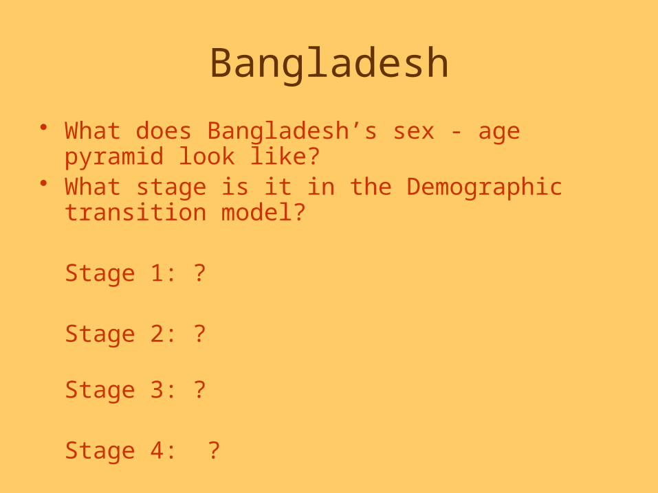
Bangladesh
• What does Bangladesh’s sex - age pyramid look like?
• What stage is it in the Demographic transition model?
Stage 1: ?
Stage 2: ?
Stage 3: ?
Stage 4: ?
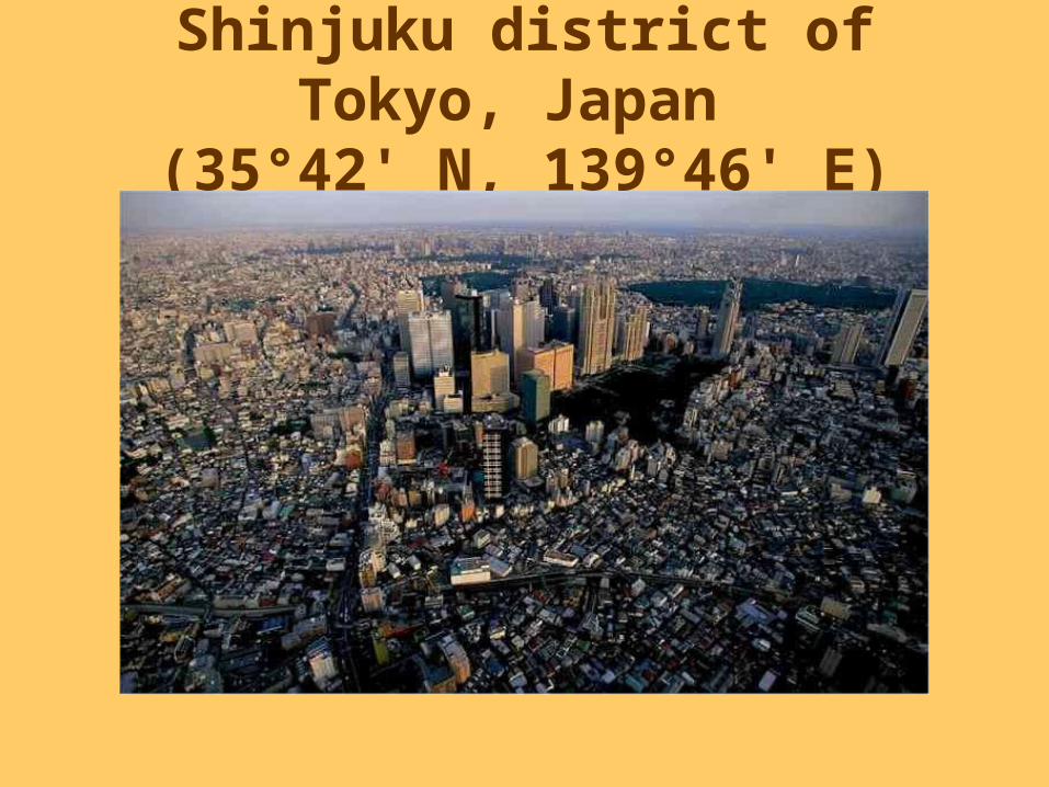
Shinjuku district of Tokyo, Japan
(35°42' N, 139°46' E)

Tokyo
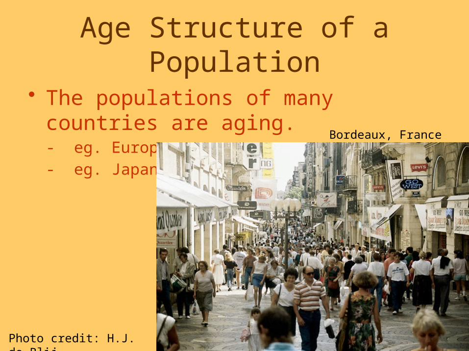
Age Structure of a Population
• The populations of many countries are aging. - eg. Europe - eg. Japan
Photo credit: H.J. de Blij
Bordeaux, France

Trends in Aging, by World Region
Population Ages 65 and OlderPercent
World Africa Asia Latin America/ Caribbean
More Developed Regions
7
3
6 6
14
11
4
10 10
21
2000 2025
Source: United Nations, World Population Prospects: The 2002 Revision (medium scenario), 2003.
Japan• What does Japan’s sex - age pyramid look
like?• What stage is it in the Demographic
transition model?Stage 1: ?
Stage 2: ?
Stage 3: ?
Stage 4: ?
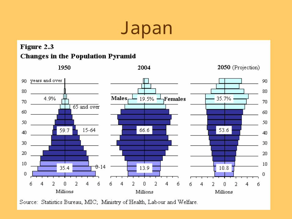
Japan
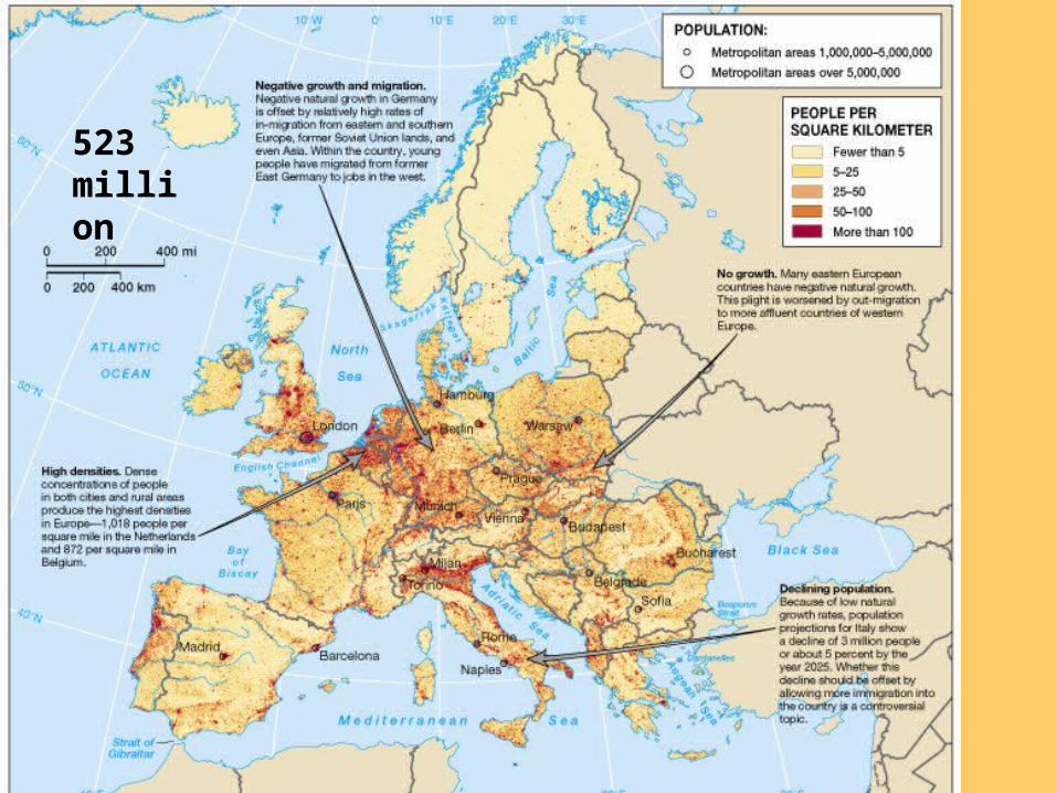
Europe Population523 million
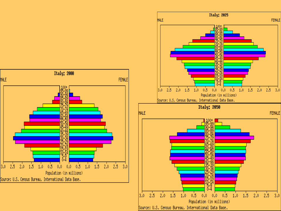
Italy
• What does Italy’s sex - age pyramid look like?
• What stage is it in the Demographic transition model?Stage 1: Stage 2: Stage 3:Stage 4:
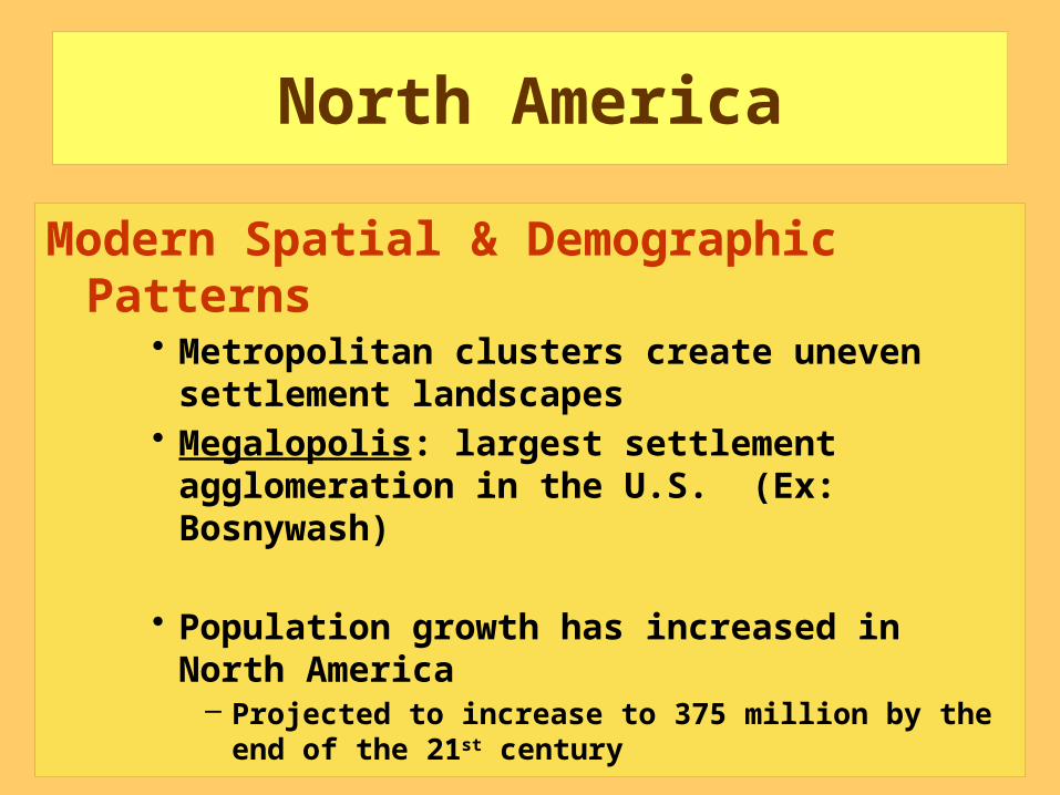
North America
Modern Spatial & Demographic Patterns
• Metropolitan clusters create uneven settlement landscapes
• Megalopolis: largest settlement agglomeration in the U.S. (Ex: Bosnywash)
• Population growth has increased in North America
– Projected to increase to 375 million by the end of the 21st century
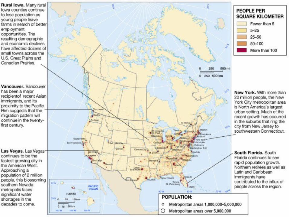
Metro Area Population

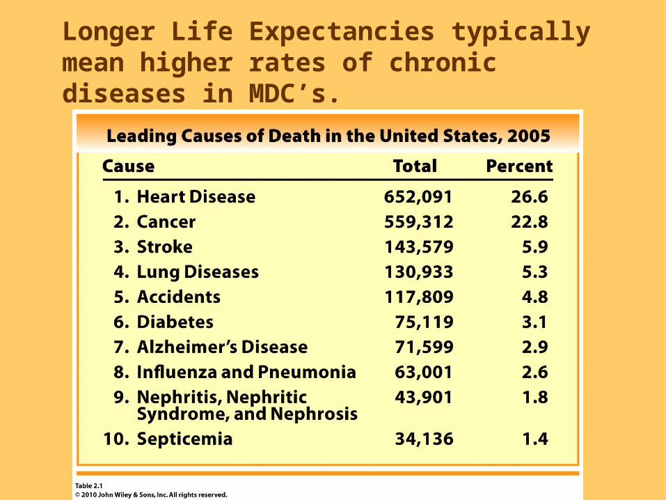
Longer Life Expectancies typically mean higher rates of chronic diseases in MDC’s.

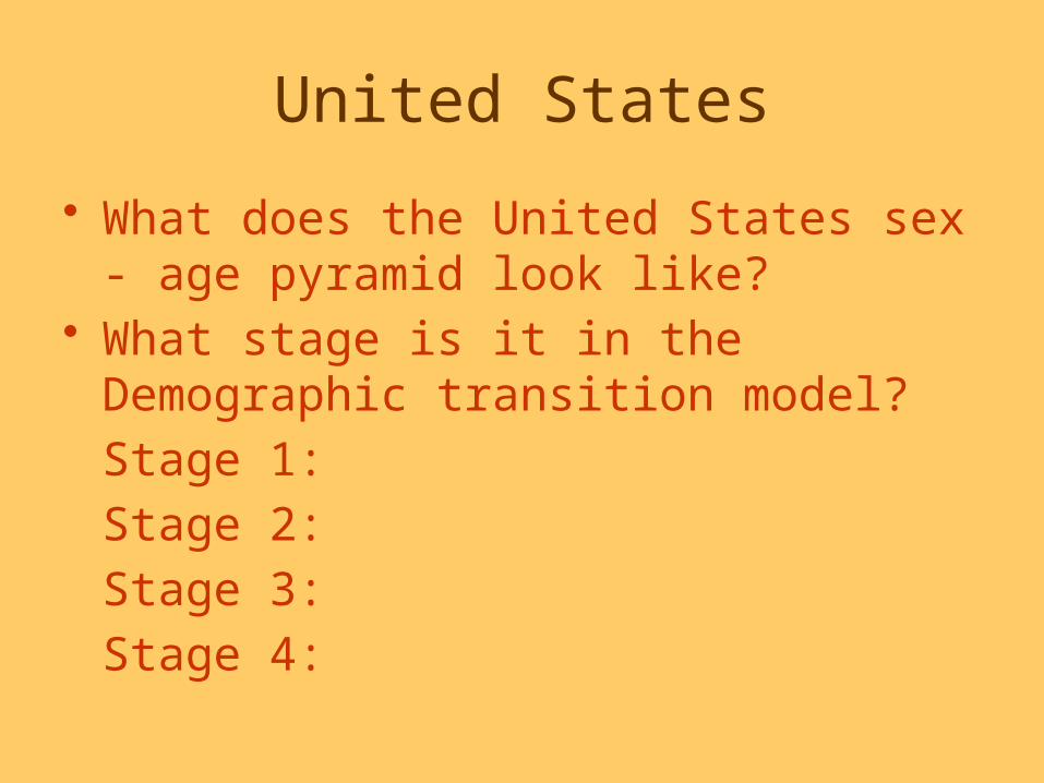
United States
• What does the United States sex - age pyramid look like?
• What stage is it in the Demographic transition model?Stage 1: Stage 2: Stage 3:Stage 4:
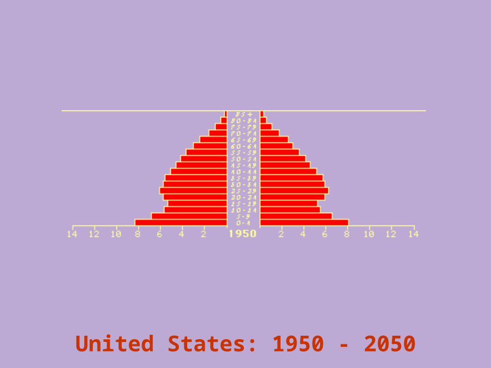
United States: 1950 - 2050

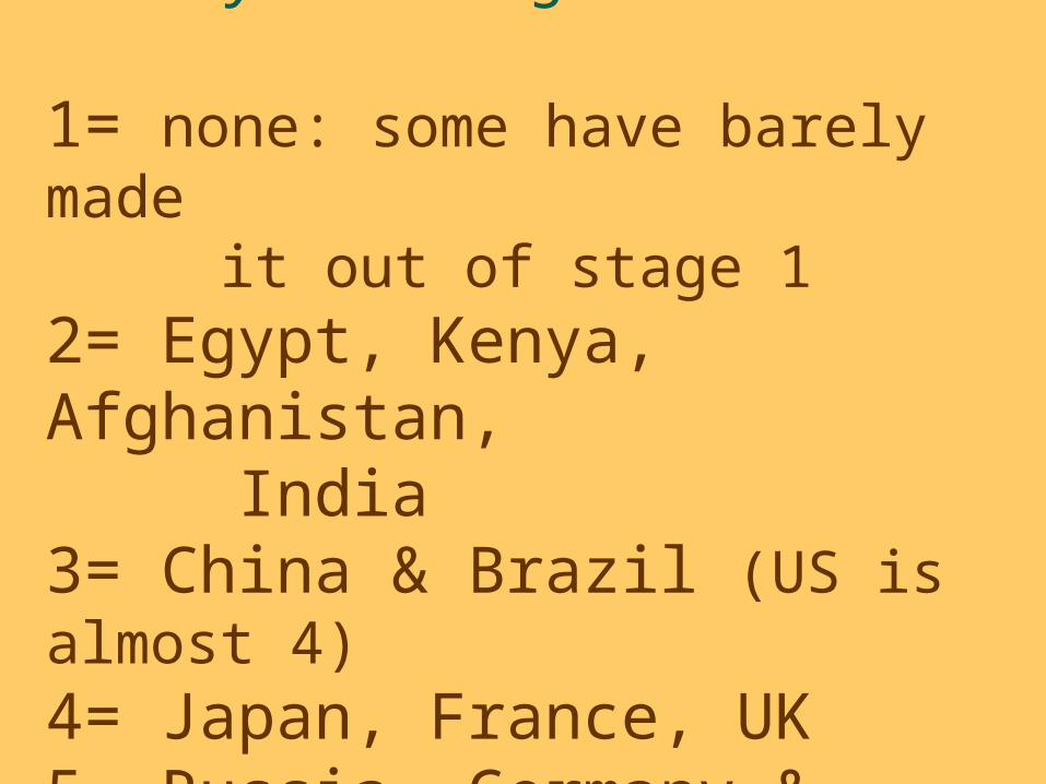
Examples of country’s/DTMstages:
1= none: some have barely made it out of stage 12= Egypt, Kenya, Afghanistan, India3= China & Brazil (US is almost 4)4= Japan, France, UK5= Russia, Germany & future of JP
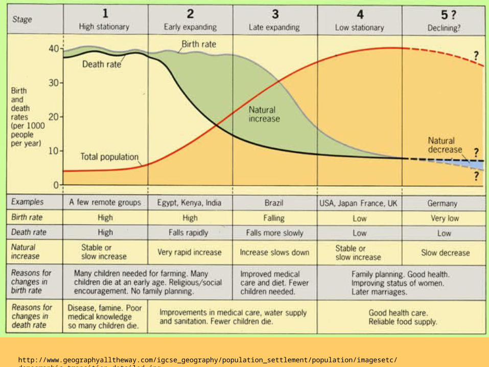
http://www.geographyalltheway.com/igcse_geography/population_settlement/population/imagesetc/demographic_transition_detailed.jpg

In poorer countries, Infant Mortality Rates are usually high, which is reflected in the pyramid shape.

In poorer countries, Life Expectancy is usually shorter, which is also reflected in the pyramid shape.

Population Density in Sub-Saharan Africa
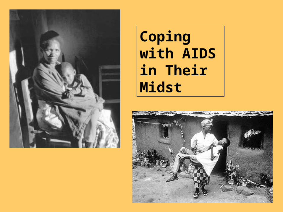
Coping with AIDS in Their Midst

AIDS is leaving large numbers of AIDS orphans.
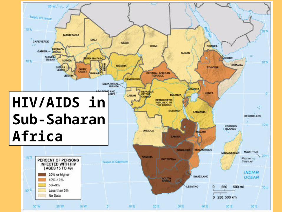
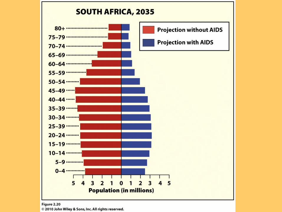
HIV/AIDS in Sub-Saharan Africa
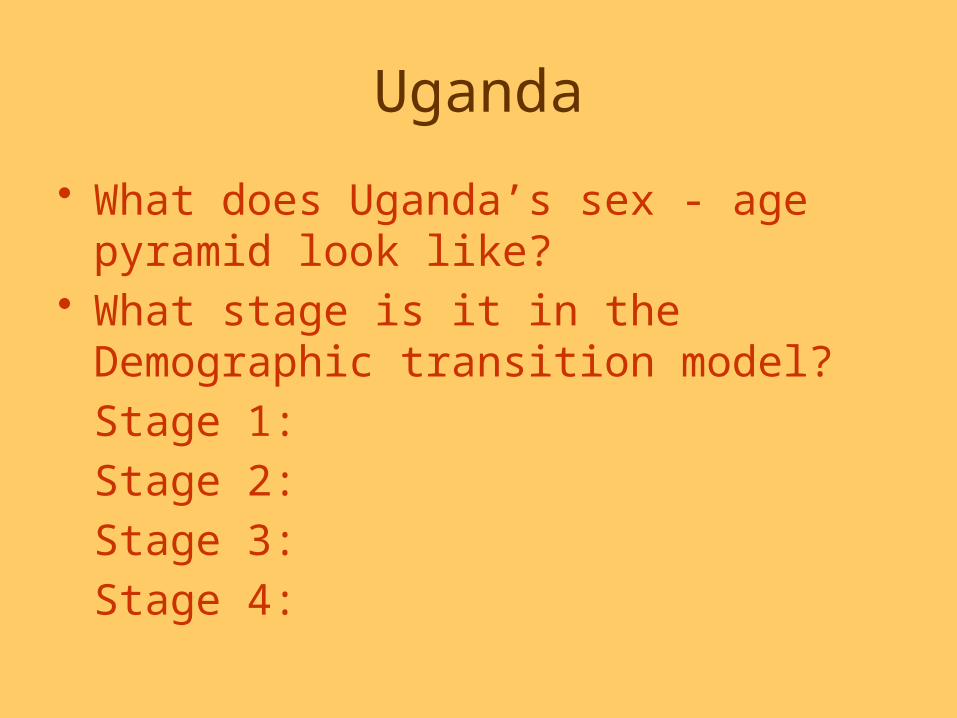
Uganda
• What does Uganda’s sex - age pyramid look like?
• What stage is it in the Demographic transition model?Stage 1: Stage 2: Stage 3: Stage 4:

Uganda
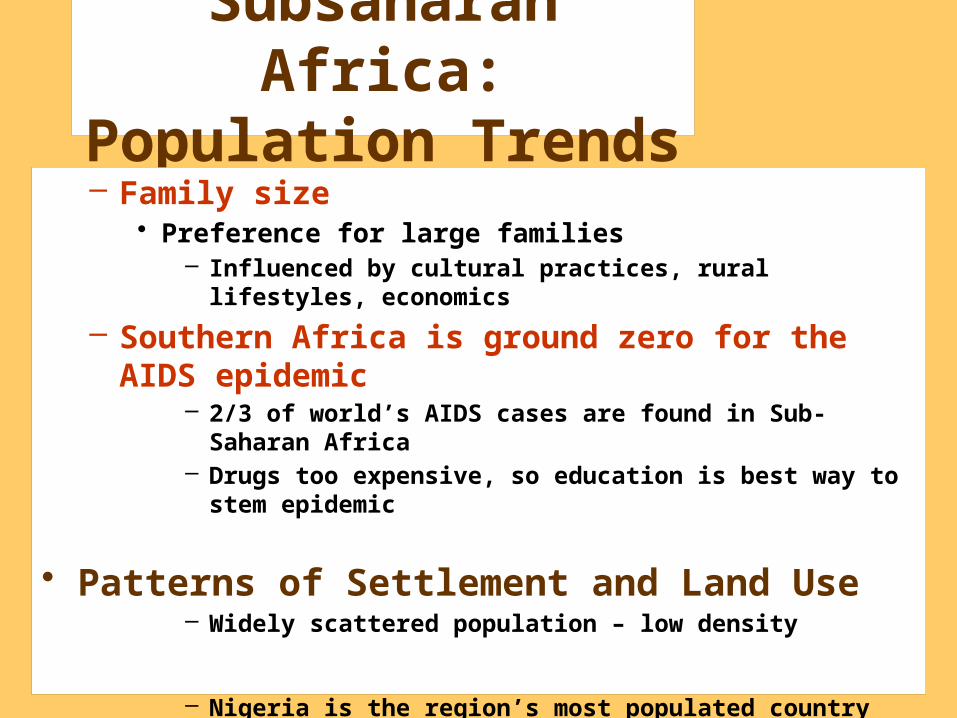
Subsaharan Africa: Population
Trends– Family size
• Preference for large families– Influenced by cultural practices, rural lifestyles, economics
– Southern Africa is ground zero for the AIDS epidemic
– 2/3 of world’s AIDS cases are found in Sub-Saharan Africa– Drugs too expensive, so education is best way to stem
epidemic
• Patterns of Settlement and Land Use– Widely scattered population – low density
– Nigeria is the region’s most populated country (127 million)