paper jmp50 integrating sas with jmp to build an ...analytics.ncsu.edu/sesug/2014/riv-07.pdfpaper...
TRANSCRIPT
Paper JMP50
Integrating SAS with JMP to Build an Interactive Application
ABSTRACT
This presentation will demonstrate how to bring various JMP visuals into one platform to build an appealing, informative, and interactive dashboard using JMP Application Builder and make the application more effective by adding data filters to analyze subgroups of the population with a simple click of a button. Even though all the data visualizations are done in JMP, importing and merging large data files, data manipulations, creating new variables and all other data processing steps are performed by connecting JMP to SAS. This presentation will demonstrate connecting to SAS to create a data file ready for visualization using SAS data manipulation capabilities; building interactive visuals using JMP; and, building an application using JMP application builder.
INTRODUCTION
With the increase in the variability and the complexity of data available to us today, there is an increased need to produce more complex and flexible reports. JMP Application Builder enables you to build interactive applications that not only save you from repeating the same tasks over and over but also allows you combine a wide range of graphs, charts, and reports into one platform, which enables you to look at data from different perspectives and explore interactions efficiently. It is also a great tool to share with the management as it provides a lot of information in a very user-friendly format. Even though JMP can perform data manipulations very effectively, the data manipulations shown in this paper are performed by connecting JMP to SAS. This connection enables you to utilize the dynamic visualization capabilities in JMP and extensive data management and statistical capabilities of SAS together. Once the data file is ready to be analyzed and brought into JMP, JMP visualization capabilities and Application Builder will provide you all the tools you need to make discoveries and communicate your findings in an effective way. This paper demonstrates how to connect SAS from JMP, introduces some of the data visualization platforms available in JMP, and illustrates some of the functionalities available in the Application Builder.
BACKGROUND
This project came about in my attempts to move away from static reporting such as power point presentations and to provide the management with a more flexible and complex reporting tool that allows them to dig deeper into the data without me adding more pages to our existing reports. The example uses fake philanthropic giving data at Johns Hopkins University. The goal is to track Homewood undergraduate alumni participation rate, the percentage of alumni who made a gift to JHU in a given fiscal year, and identify trends and patterns.
MANIPULATE DATA IN SAS
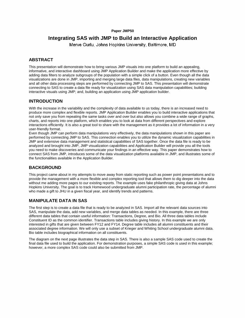
The first step is to create a data file that is ready to be analyzed in SAS. Import all the relevant data sources into SAS, manipulate the data, add new variables, and merge data tables as needed. In this example, there are three different data tables that contain useful information: Transactions, Degree, and Bio. All three data tables include Constituent ID as the common identifier. Transactions table includes giving history. In this example we are only interested in gifts that are given between FY12 and FY14. Degree table includes all alumni constituents and their associated degree information. We will only use a subset of Krieger and Whiting School undergraduate alumni data. Bio table includes biographical information on all constituents.
The diagram on the next page illustrates the data step in SAS. There is also a sample SAS code used to create the final data file used to build the application. For demonstration purposes, a simple SAS code is used in this example; however, a more complex SAS code could also be submitted from JMP.
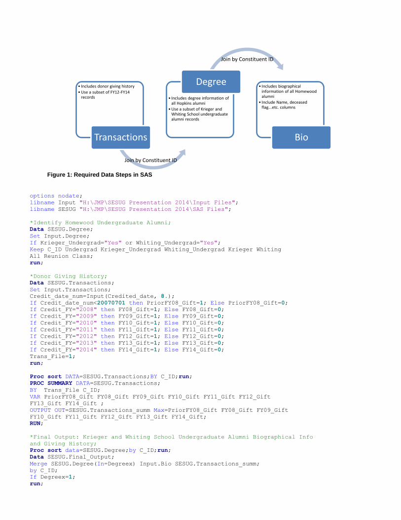
Figure 1: Required Data Steps in SAS
• Includes donor giving history
• Use a subset of FY12-FY14 records
Transactions
• Includes degree information of all Hopkins alumni
• Use a subset of Krieger and Whiting School undergraduate alumni records
Degree • Includes biographical
information of all Homewood alumni
• Include Name, deceased flag...etc. columns
Bio
options nodate;
libname Input "H:\JMP\SESUG Presentation 2014\Input Files";
libname SESUG "H:\JMP\SESUG Presentation 2014\SAS Files";
*Identify Homewood Undergraduate Alumni;
Data SESUG.Degree;
Set Input.Degree;
If Krieger_Undergrad="Yes" or Whiting_Undergrad="Yes";
Keep C_ID Undergrad Krieger_Undergrad Whiting_Undergrad Krieger Whiting
All Reunion Class;
run;
*Donor Giving History;
Data SESUG.Transactions;
Set Input.Transactions;
Credit_date_num=Input(Credited_date, 8.);
If Credit_date_num<20070701 then PriorFY08_Gift=1; Else PriorFY08_Gift=0;
If Credit_FY="2008" then FY08_Gift=1; Else FY08_Gift=0;
If Credit_FY="2009" then FY09_Gift=1; Else FY09_Gift=0;
If Credit_FY="2010" then FY10_Gift=1; Else FY10_Gift=0;
If Credit_FY="2011" then FY11_Gift=1; Else FY11_Gift=0;
If Credit_FY="2012" then FY12_Gift=1; Else FY12_Gift=0;
If Credit_FY="2013" then FY13_Gift=1; Else FY13_Gift=0;
If Credit_FY="2014" then FY14_Gift=1; Else FY14_Gift=0;
Trans_File=1;
run;
Proc sort DATA=SESUG.Transactions;BY C_ID;run;
PROC SUMMARY DATA=SESUG.Transactions;
BY Trans_File C_ID;
VAR PriorFY08_Gift FY08_Gift FY09_Gift FY10_Gift FY11_Gift FY12_Gift
FY13_Gift FY14_Gift ;
OUTPUT OUT=SESUG.Transactions_summ Max=PriorFY08_Gift FY08_Gift FY09_Gift
FY10_Gift FY11_Gift FY12_Gift FY13_Gift FY14_Gift;
RUN;
*Final Output: Krieger and Whiting School Undergraduate Alumni Biographical Info
and Giving History;
Proc sort data=SESUG.Degree;by C_ID;run;
Data SESUG.Final_Output;
Merge SESUG.Degree(In=Degreex) Input.Bio SESUG.Transactions_summ;
by C_ID;
If Degreex=1;
run;
Join by Constituent ID
Join by Constituent ID
CONNECT TO SAS FROM JMP
After writing your SAS code, you can run it from JMP by connecting to SAS. Select File>Open to open an existing SAS code in JMP. Then, browse to the SAS code and click Open. JMP will keep the original format of the SAS program. Alternatively, you could build your SAS code in JMP by opening a new SAS code by selecting File>SAS>New SAS Program.
You have the option to open the SAS log or the SAS Output Windows in JMP by selecting File>SAS>Open SAS Log Window and File>SAS>Open SAS Output, respectively.
Figure 2: Open SAS log and SAS Output Windows
To run the SAS code in JMP, select Edit<Submit to SAS or File>SAS>Submit to SAS. You may be prompted to
choose whether you would like to connect to a SAS server or to the local SAS on your machine.
Figure 3: Sample SAS Code Opened in JMP
Go to File>SAS to open SAS log and SAS Output Windows.
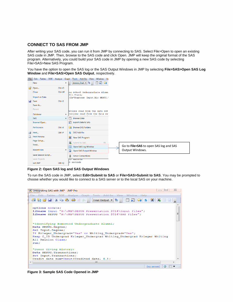
USE JMP TO BUILD VISUALS
Below are a few examples of some of the visualizations used in this paper. Once you create a visual, you can save it to the data table by clicking the red arrow next to the analysis and selecting Script>Save Script to Data Table. You
can rename the script by double-clicking on the script name on the left. You can recreate these visualizations by right-clicking on the script name on the left and selecting Run Script.
Figure 4: Save Script to Data Table
Analyze>Tabulate Create a contingency table using tabulate platform by dragging the columns in interest to the appropriate zone. In this example, I dropped the Potential_FY09 to the Drop zone for rows and the Sum, N, and Mean of FY09_Participation to the Drop zone for columns. You can double-click on column names Sum, N, and Mean and rename them. In this case I named them Donors, Alumni, and Participation Rate. You can also change the column format by clicking Change Format. You can add totals by checking Add Aggregate Statistics.
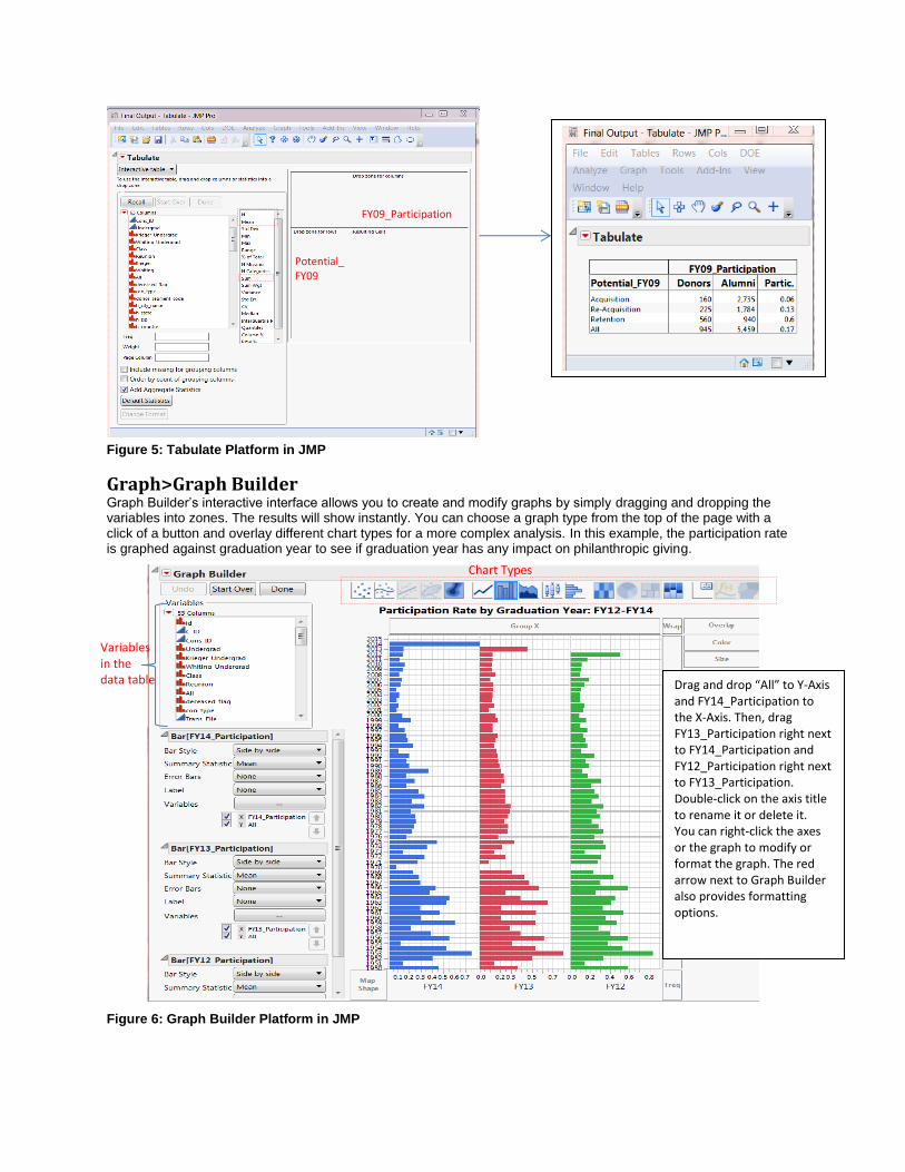
Figure 5: Tabulate Platform in JMP
Graph>Graph Builder Graph Builder’s interactive interface allows you to create and modify graphs by simply dragging and dropping the variables into zones. The results will show instantly. You can choose a graph type from the top of the page with a click of a button and overlay different chart types for a more complex analysis. In this example, the participation rate is graphed against graduation year to see if graduation year has any impact on philanthropic giving.
Figure 6: Graph Builder Platform in JMP
Potential_FY09
FY09_Participation
Drag and drop “All” to Y-Axis and FY14_Participation to the X-Axis. Then, drag FY13_Participation right next to FY14_Participation and FY12_Participation right next to FY13_Participation. Double-click on the axis title to rename it or delete it. You can right-click the axes or the graph to modify or format the graph. The red arrow next to Graph Builder also provides formatting options.
Chart Types
Variables in the data table
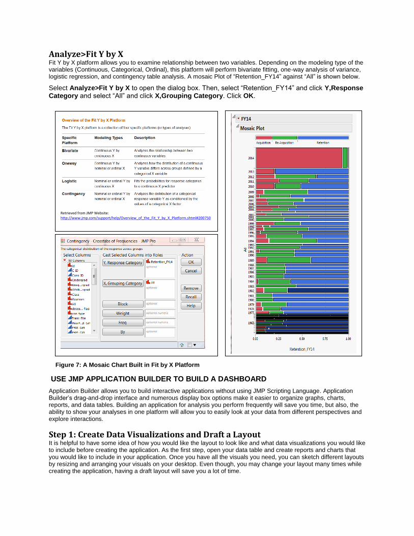
Analyze>Fit Y by X Fit Y by X platform allows you to examine relationship between two variables. Depending on the modeling type of the variables (Continuous, Categorical, Ordinal), this platform will perform bivariate fitting, one-way analysis of variance, logistic regression, and contingency table analysis. A mosaic Plot of “Retention_FY14” against “All” is shown below.
Select Analyze>Fit Y by X to open the dialog box. Then, select “Retention_FY14” and click Y,Response Category and select “All” and click X,Grouping Category. Click OK.
USE JMP APPLICATION BUILDER TO BUILD A DASHBOARD
Application Builder allows you to build interactive applications without using JMP Scripting Language. Application Builder’s drag-and-drop interface and numerous display box options make it easier to organize graphs, charts, reports, and data tables. Building an application for analysis you perform frequently will save you time, but also, the ability to show your analyses in one platform will allow you to easily look at your data from different perspectives and explore interactions.
Step 1: Create Data Visualizations and Draft a Layout It is helpful to have some idea of how you would like the layout to look like and what data visualizations you would like to include before creating the application. As the first step, open your data table and create reports and charts that you would like to include in your application. Once you have all the visuals you need, you can sketch different layouts by resizing and arranging your visuals on your desktop. Even though, you may change your layout many times while creating the application, having a draft layout will save you a lot of time.
Retrieved from JMP Website: http://www.jmp.com/support/help/Overview_of_the_Fit_Y_by_X_Platform.shtml#200750
Figure 7: A Mosaic Chart Built in Fit by X Platform
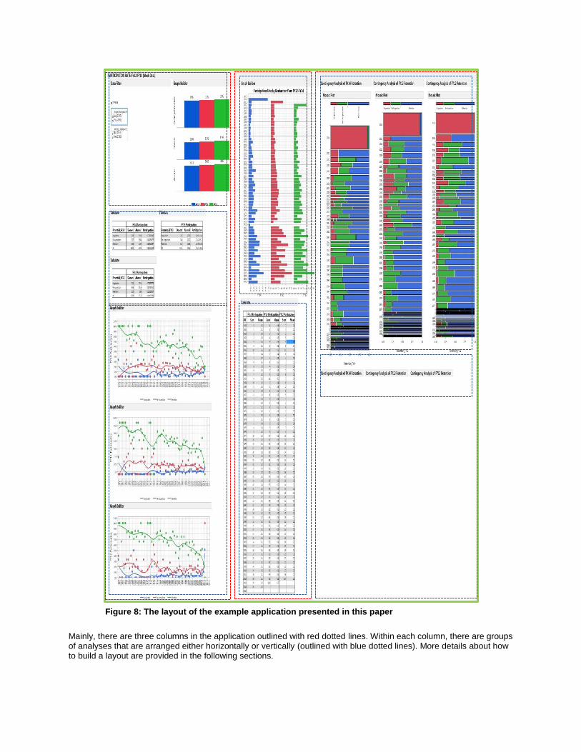
Mainly, there are three columns in the application outlined with red dotted lines. Within each column, there are groups of analyses that are arranged either horizontally or vertically (outlined with blue dotted lines). More details about how to build a layout are provided in the following sections.
Figure 8: The layout of the example application presented in this paper
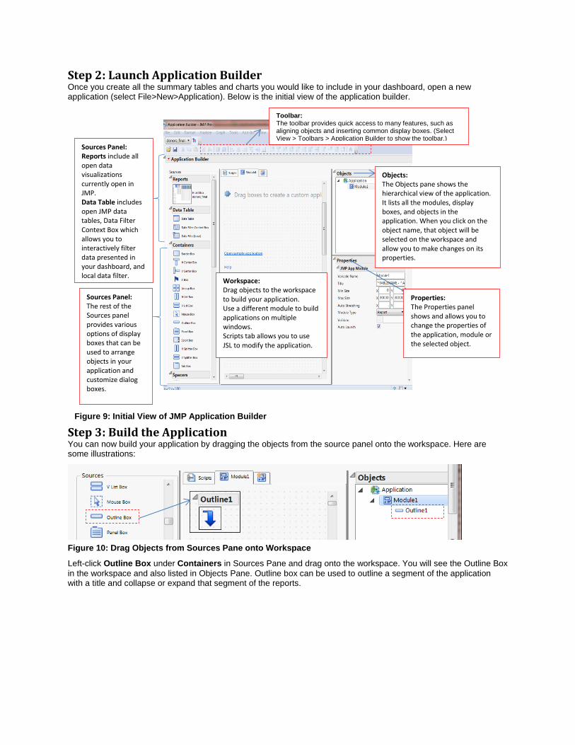
Step 2: Launch Application Builder Once you create all the summary tables and charts you would like to include in your dashboard, open a new application (select File>New>Application). Below is the initial view of the application builder.
Step 3: Build the Application You can now build your application by dragging the objects from the source panel onto the workspace. Here are some illustrations:
Figure 10: Drag Objects from Sources Pane onto Workspace
Left-click Outline Box under Containers in Sources Pane and drag onto the workspace. You will see the Outline Box
in the workspace and also listed in Objects Pane. Outline box can be used to outline a segment of the application with a title and collapse or expand that segment of the reports.
Workspace: Drag objects to the workspace to build your application. Use a different module to build applications on multiple windows. Scripts tab allows you to use JSL to modify the application.
Sources Panel: Reports include all open data visualizations currently open in JMP. Data Table includes open JMP data tables, Data Filter Context Box which allows you to interactively filter data presented in your dashboard, and local data filter.
Sources Panel: The rest of the Sources panel provides various options of display boxes that can be used to arrange objects in your application and customize dialog boxes.
Objects: The Objects pane shows the hierarchical view of the application. It lists all the modules, display boxes, and objects in the application. When you click on the object name, that object will be selected on the workspace and allow you to make changes on its properties.
Properties: The Properties panel shows and allows you to change the properties of the application, module or the selected object.
Toolbar: The toolbar provides quick access to many features, such as aligning objects and inserting common display boxes. (Select View > Toolbars > Application Builder to show the toolbar.)
Figure 9: Initial View of JMP Application Builder
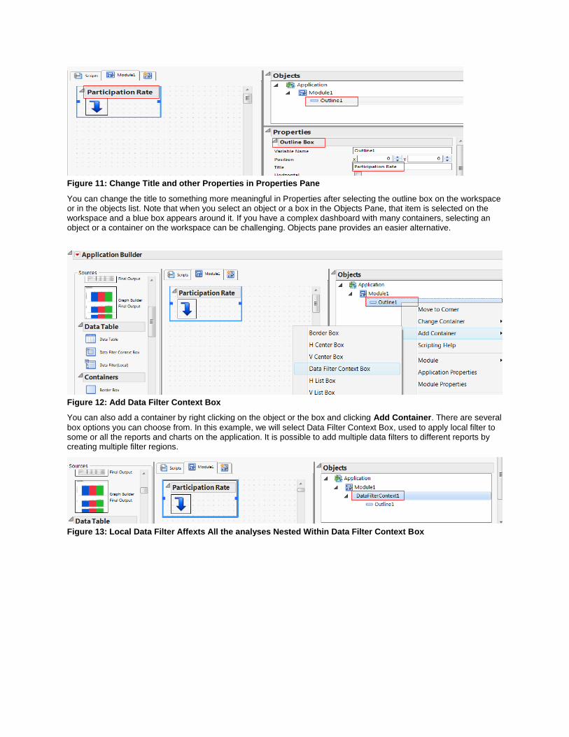
Figure 11: Change Title and other Properties in Properties Pane
You can change the title to something more meaningful in Properties after selecting the outline box on the workspace or in the objects list. Note that when you select an object or a box in the Objects Pane, that item is selected on the workspace and a blue box appears around it. If you have a complex dashboard with many containers, selecting an object or a container on the workspace can be challenging. Objects pane provides an easier alternative.
Figure 12: Add Data Filter Context Box
You can also add a container by right clicking on the object or the box and clicking Add Container. There are several
box options you can choose from. In this example, we will select Data Filter Context Box, used to apply local filter to some or all the reports and charts on the application. It is possible to add multiple data filters to different reports by creating multiple filter regions.
Figure 13: Local Data Filter Affexts All the analyses Nested Within Data Filter Context Box
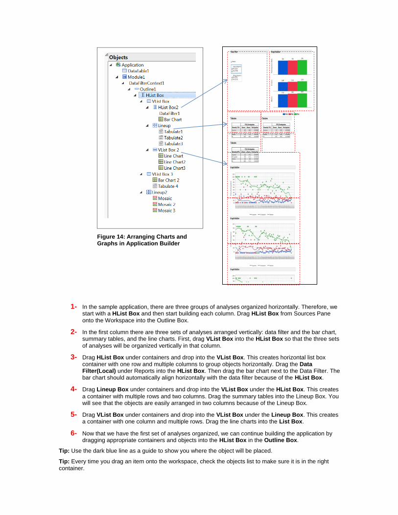
1- In the sample application, there are three groups of analyses organized horizontally. Therefore, we start with a HList Box and then start building each column. Drag HList Box from Sources Pane
onto the Workspace into the Outline Box.
2- In the first column there are three sets of analyses arranged vertically: data filter and the bar chart, summary tables, and the line charts. First, drag VList Box into the HList Box so that the three sets
of analyses will be organized vertically in that column.
3- Drag HList Box under containers and drop into the VList Box. This creates horizontal list box container with one row and multiple columns to group objects horizontally. Drag the Data Filter(Local) under Reports into the HList Box. Then drag the bar chart next to the Data Filter. The bar chart should automatically align horizontally with the data filter because of the HList Box.
4- Drag Lineup Box under containers and drop into the VList Box under the HList Box. This creates
a container with multiple rows and two columns. Drag the summary tables into the Lineup Box. You will see that the objects are easily arranged in two columns because of the Lineup Box.
5- Drag VList Box under containers and drop into the VList Box under the Lineup Box. This creates a container with one column and multiple rows. Drag the line charts into the List Box.
6- Now that we have the first set of analyses organized, we can continue building the application by dragging appropriate containers and objects into the HList Box in the Outline Box.
Tip: Use the dark blue line as a guide to show you where the object will be placed.
Tip: Every time you drag an item onto the workspace, check the objects list to make sure it is in the right
container.
Figure 14: Arranging Charts and Graphs in Application Builder
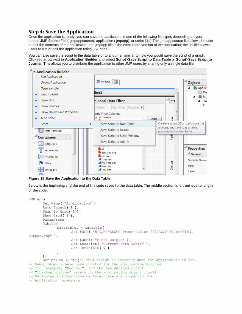
Step 4: Save the Application Once the application is ready, you can save the application in one of the following file types depending on your needs: JMP Source File ( .jmpappsource), application (.jmpapp), or script (.jsl).The .jmpappsource file allows the user to edit the contents of the application; the .jmpapp file is the executable version of the application; the .jsl file allows users to run or edit the application using JSL code.
You can also save the script to the data table or to a journal, similar to how you would save the script of a graph. Click red arrow next to Application Builder and select Script>Save Script to Data Table or Script>Save Script to Journal. This allows you to distribute the application to other JMP users by sharing only a single data file.
Figure 15:Save the Application to the Data Table
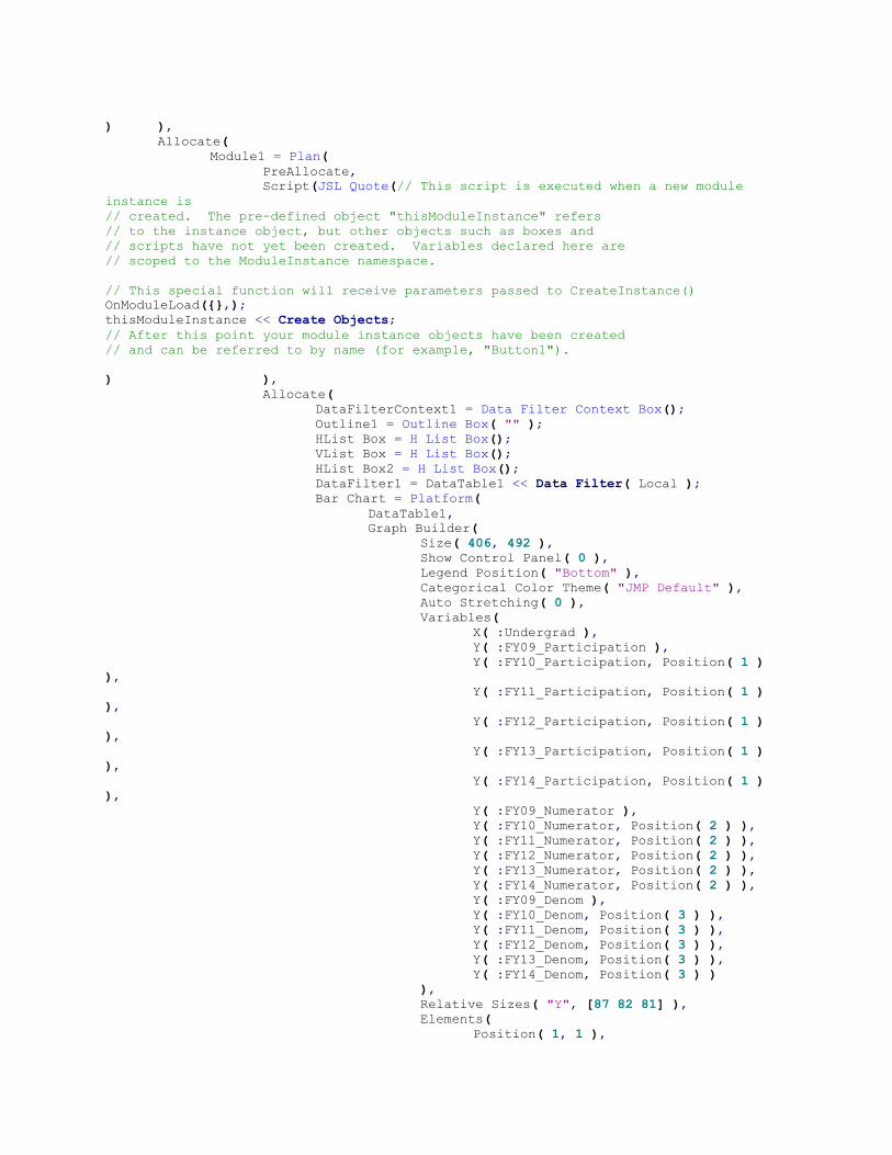
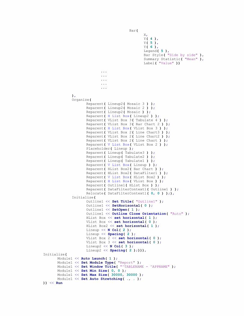
Below is the beginning and the end of the code saved to the data table. The middle section is left out due to length of the code. JMP App(
Set Name( "Application" ),
Auto Launch( 1 ),
Snap To Grid( 1 ),
Show Grid( 1 ),
Parameters,
Tables(
DataTable1 = GuiTable(
Set Path( "H:\JMP\SESUG Presentation 2014\SAS Files\Final
Output.jmp" ),
Set Label( "Final Output" ),
Set Location( "Current Data Table" ),
Set Invisible( 0 )
)
),
Script(JSL Quote(// This script is executed when the application is run.
// Named objects have been created for the application modules
// (for example, "Module1") and the pre-defined object
// "thisApplication" refers to the application object itself.
// Variables and functions declared here are scoped to the
// Application namespace.
) ),
Allocate(
Module1 = Plan(
PreAllocate,
Script(JSL Quote(// This script is executed when a new module
instance is
// created. The pre-defined object "thisModuleInstance" refers
// to the instance object, but other objects such as boxes and
// scripts have not yet been created. Variables declared here are
// scoped to the ModuleInstance namespace.
// This special function will receive parameters passed to CreateInstance()
OnModuleLoad({},);
thisModuleInstance << Create Objects;
// After this point your module instance objects have been created
// and can be referred to by name (for example, "Button1").
) ),
Allocate(
DataFilterContext1 = Data Filter Context Box();
Outline1 = Outline Box( "" );
HList Box = H List Box();
VList Box = H List Box();
HList Box2 = H List Box();
DataFilter1 = DataTable1 << Data Filter( Local );
Bar Chart = Platform(
DataTable1,
Graph Builder(
Size( 406, 492 ),
Show Control Panel( 0 ),
Legend Position( "Bottom" ),
Categorical Color Theme( "JMP Default" ),
Auto Stretching( 0 ),
Variables(
X( :Undergrad ),
Y( :FY09_Participation ),
Y( :FY10_Participation, Position( 1 )
),
Y( :FY11_Participation, Position( 1 )
),
Y( :FY12_Participation, Position( 1 )
),
Y( :FY13_Participation, Position( 1 )
),
Y( :FY14_Participation, Position( 1 )
),
Y( :FY09_Numerator ),
Y( :FY10_Numerator, Position( 2 ) ),
Y( :FY11_Numerator, Position( 2 ) ),
Y( :FY12_Numerator, Position( 2 ) ),
Y( :FY13_Numerator, Position( 2 ) ),
Y( :FY14_Numerator, Position( 2 ) ),
Y( :FY09_Denom ),
Y( :FY10_Denom, Position( 3 ) ),
Y( :FY11_Denom, Position( 3 ) ),
Y( :FY12_Denom, Position( 3 ) ),
Y( :FY13_Denom, Position( 3 ) ),
Y( :FY14_Denom, Position( 3 ) )
),
Relative Sizes( "Y", [87 82 81] ),
Elements(
Position( 1, 1 ),
Bar(
X,
Y( 4 ),
Y( 5 ),
Y( 6 ),
Legend( 5 ),
Bar Style( "Side by side" ),
Summary Statistic( "Mean" ),
Label( "Value" ))
...
...
...
...
...
),
Organize(
Reparent( Lineup2( Mosaic 3 ) );
Reparent( Lineup2( Mosaic 2 ) );
Reparent( Lineup2( Mosaic ) );
Reparent( H List Box( Lineup2 ) );
Reparent( VList Box 3( Tabulate 4 ) );
Reparent( VList Box 3( Bar Chart 2 ) );
Reparent( H List Box( VList Box 3 ) );
Reparent( VList Box 2( Line Chart3 ) );
Reparent( VList Box 2( Line Chart2 ) );
Reparent( VList Box 2( Line Chart ) );
Reparent( V List Box( VList Box 2 ) );
Placeholder( Lineup );
Reparent( Lineup( Tabulate3 ) );
Reparent( Lineup( Tabulate2 ) );
Reparent( Lineup( Tabulate1 ) );
Reparent( V List Box( Lineup ) );
Reparent( HList Box2( Bar Chart ) );
Reparent( HList Box2( DataFilter1 ) );
Reparent( V List Box( HList Box2 ) );
Reparent( H List Box( VList Box ) );
Reparent( Outline1( HList Box ) );
Reparent( DataFilterContext1( Outline1 ) );
Relocate( DataFilterContext1( 0, 0 ) );),
Initialize(
Outline1 << Set Title( "Outline1" );
Outline1 << SetHorizontal( 0 );
Outline1 << SetOpen( 1 );
Outline1 << Outline Close Orientation( "Auto" );
HList Box << set horizontal( 1 );
VList Box << set horizontal( 0 );
HList Box2 << set horizontal( 1 );
Lineup << N Col( 2 );
Lineup << Spacing( 2 );
VList Box 2 << set horizontal( 0 );
VList Box 3 << set horizontal( 0 );
Lineup2 << N Col( 3 );
Lineup2 << Spacing( 2 );))),
Initialize(
Module1 << Auto Launch( 1 );
Module1 << Set Module Type( "Report" );
Module1 << Set Window Title( "^TABLENAME - ^APPNAME" );
Module1 << Set Min Size( 0, 0 );
Module1 << Set Max Size( 30000, 30000 );
Module1 << Set Auto Stretching( ., . );
)) << Run
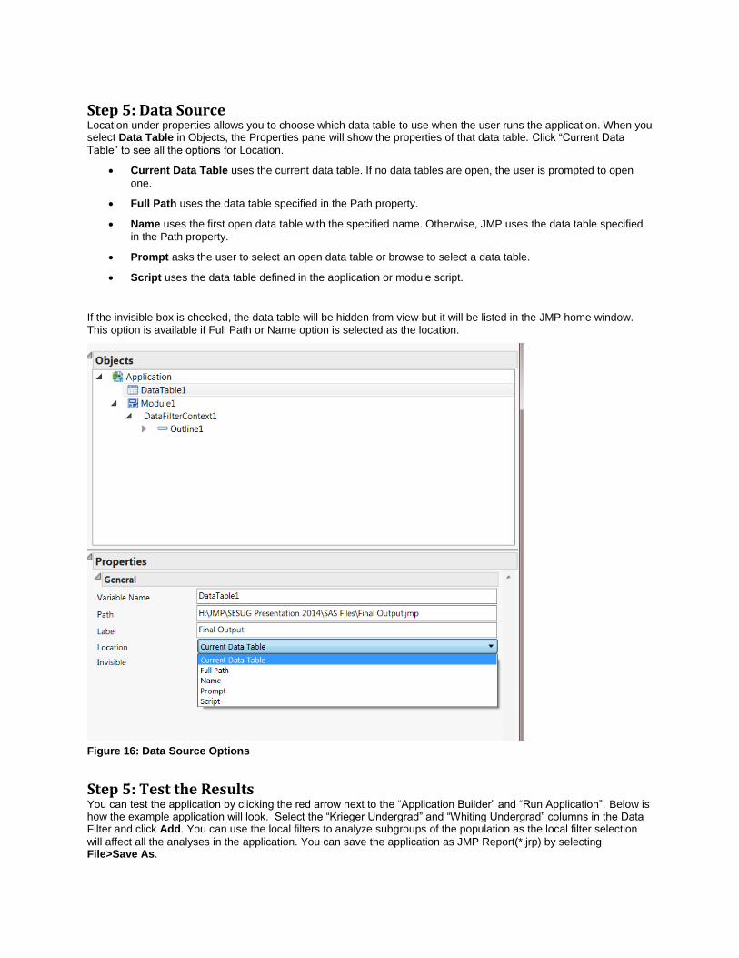
Step 5: Data Source Location under properties allows you to choose which data table to use when the user runs the application. When you select Data Table in Objects, the Properties pane will show the properties of that data table. Click “Current Data
Table” to see all the options for Location.
Current Data Table uses the current data table. If no data tables are open, the user is prompted to open
one.
Full Path uses the data table specified in the Path property.
Name uses the first open data table with the specified name. Otherwise, JMP uses the data table specified
in the Path property.
Prompt asks the user to select an open data table or browse to select a data table.
Script uses the data table defined in the application or module script.
If the invisible box is checked, the data table will be hidden from view but it will be listed in the JMP home window. This option is available if Full Path or Name option is selected as the location.
Figure 16: Data Source Options
Step 5: Test the Results You can test the application by clicking the red arrow next to the “Application Builder” and “Run Application”. Below is how the example application will look. Select the “Krieger Undergrad” and “Whiting Undergrad” columns in the Data Filter and click Add. You can use the local filters to analyze subgroups of the population as the local filter selection
will affect all the analyses in the application. You can save the application as JMP Report(*.jrp) by selecting File>Save As.
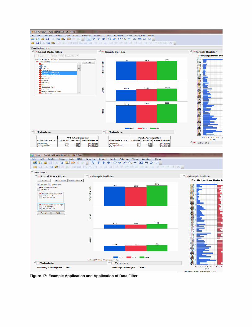
Figure 17: Example Application and Application of Data Filter
CONCLUSION
JMP Application Builder is a great way to combine various analyses into one platform that is interactive and user-friendly. Using JSL will allow you to further customize your applications; however, it is not required. JMP Application Builder enables you to run similar analyses on different data tables (with the same column names) or to build custom reports with flexible data filtering options. This presentation does not cover all the capabilities of Application Builder but provides an introduction to building a JMP Application without using JSL and by connecting to SAS from JMP.
REFERENCES
http://www.jmp.com/support/help/Application_Builder.shtml
Schikore, Daniel, “Custom Analysis and Reporting with the JMP Application Builder”. 2012, Available at
http://support.sas.com/resources/papers/proceedings12/015-2012.pdf
Anawis, Mark, “Building Applications Interactively”. April 17, 2013, Available at
https://www.google.com/url?sa=t&rct=j&q=&esrc=s&source=web&cd=6&cad=rja&uact=8&ved=0CEkQFjAF&url=http%3A%2F%2Fwww.gljug.com%2Fdocs%2FGLJUG%2520Building%2520Applications%2520Interactively.doc&ei=pFHuU7TnOsWYyASArYDAAw&usg=AFQjCNGj0nsTOZDKh3bIVzWxwEAsbbvInA&sig2=nDS7xZa0TbV95nXA1tzuyQ&bvm=bv.73231344,d.aWw
http://www.jmp.com/academic/pdf/learning/12_connect_to_sas_on_windows_from_jmp.pdf
http://www.jmp.com/academic/pdf/learning/12_entering_and_running_sas_programs.pdf
CONTACT INFORMATION
Your comments and questions are valued and encouraged. Contact the author at:
Name: Merve Gurlu Enterprise: Johns Hopkins University Address: 3400 N. Charles St. City, State ZIP: Baltimore, MD 21009 Work Phone: 410-516 3405 E-mail: [email protected]
SAS and all other SAS Institute Inc. product or service names are registered trademarks or trademarks of SAS Institute Inc. in the USA and other countries. ® indicates USA registration.
Other brand and product names are trademarks of their respective companies.